#there a kajillion of these on Instagram
Explore tagged Tumblr posts
Visit Tumblr Blog
Explore Tumblr blogs with no restrictions, modern design and the best experience.
Last Seen Tumblr Blogs


Fun Fact
Tumblr is used by 21% of adults online aged 18-29 years.
Text
I've been stalling on my episode recaps lately. I'm really really stuck. I want to get my creative juices flowing again and I still have a mighty need to continue Looking at Things and Talking About Them. So I present to you: Pastries Admist Fire Hazards While Watching Gilmore Girls. Pictures I found on Instagram. Inspired by @vindieselsfacebook-blog's similar post from several days ago. I wil be rating the assorted hazards and dangers present in these photos. We will always assume the coffee is scalding hot.
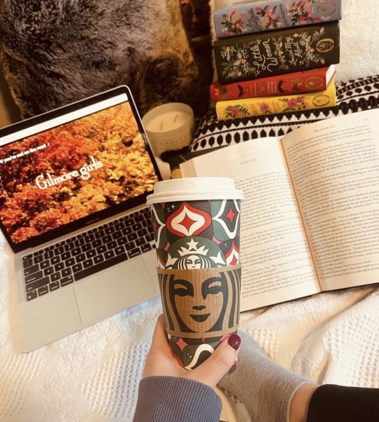
Title: Tipping Starbucks Cup Over Foot and Open Laptop. Fire Hazard/ Coffee Spillage Rating: Undetermined. Although it appears to be tilting dangerously downwards towards our subject's foot, laptop, and books, my intuition tells me that the coffee cup, much like the cups on Gilmore Girls, or Dean Forrester's braincase, is completely empty and devoid of matter. Our Gilly Girls viewer was wise not to light the candle seen in the background. I will not alert the fire department.
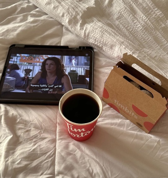
Title: Completely Phoning It In. Hazard Rating For Human: 0. No open flame, no body parts visible within distance of hot beverage. Hazard Rating For Tablet And Sheets :10. Hot beverage teetering perilously close to a tablet and white sheets. A stiff breeze or a cat jumping onto the bed and that tablet is toast with a capital T. Points awarded for using donuts instead of cookies or pastries AND for the fact that Lorelai is on the screen instead of the same exact Gilmore Girls With Leaves thing everyone else is doing. We like a rebel.
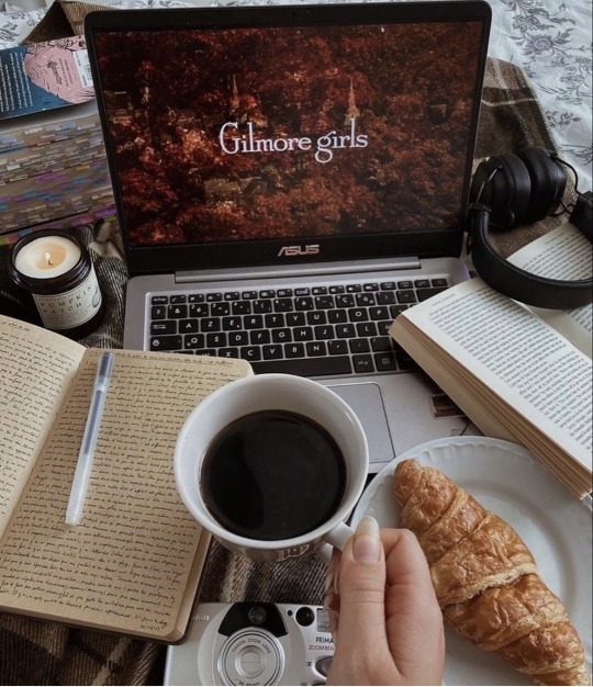
Title: Gilmore GIrls and Cwassont Fire Hazard/Coffee Spillage Rating: 10. Open flame inches away from laptop, set on top of a flammable flannell blanket (say that one three times fast) and she's got some nice kindling ready with those two little journals. Coffee cup positioned directly above digital camera and perilously close to laptop, croissant in danger of recieving a soaking.
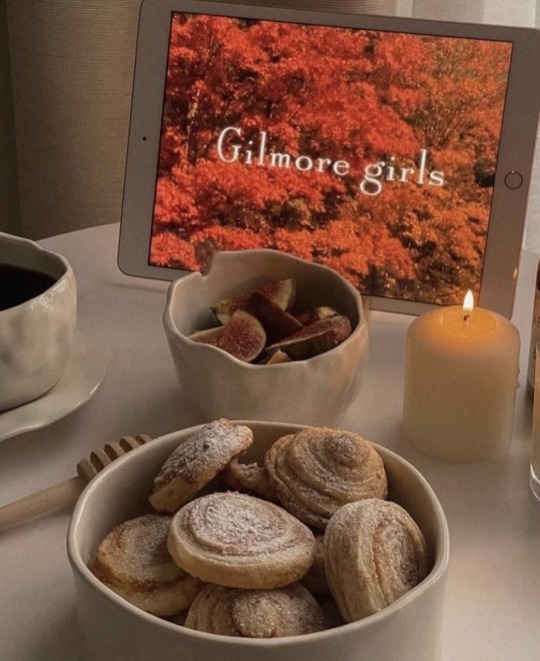
Title: Very White Fire Hazard Rating: 3. Open flame inches away from tablet but, I'm calling this one borderline. I think this person should be safe. Interesting use of fruit in addition to pastries. Is that a very large mug of coffee off to the left? I can't tell what it is. No spillage hazard, if so. No flammable bedding or paper. I will not be alerting the fire department.
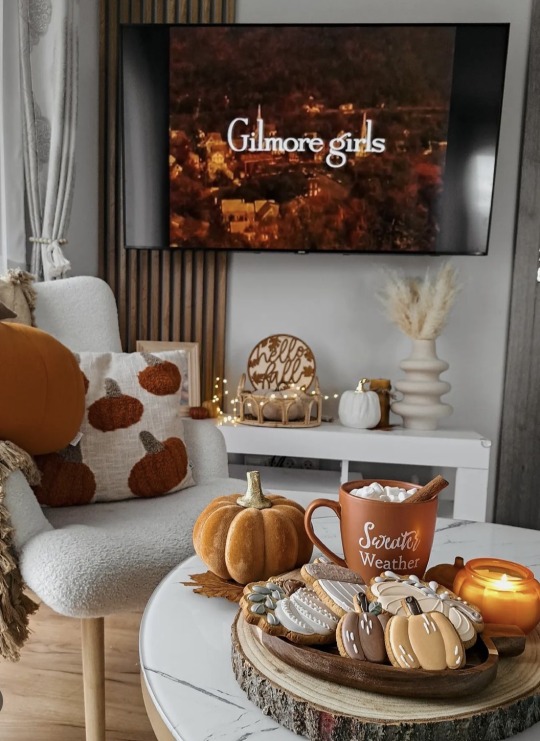
Title: Oh The Pumpkins Hazard Rating: 0. Scalding hot beverage and lit candles present, but no techology or humans in danger. Candle is safely positioned away from blankets and pillows. I will not be calling the fire department.
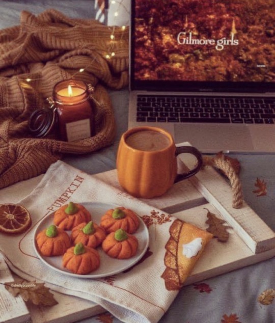
Title: Pumpkin Flambé (aka More Fucking Pumpkins) Fire Hazard Rating: 11. Open flame positioned directly on top of sweater, inches away from towel, inches away from technology and wooden kindling (the tray), scalding hot beverage inches away from laptop. As soon as there's a jump scare (like Dean Forrester showing up in an episode and giving them a jolt) that candle is going to tilt and they're totally befucked.
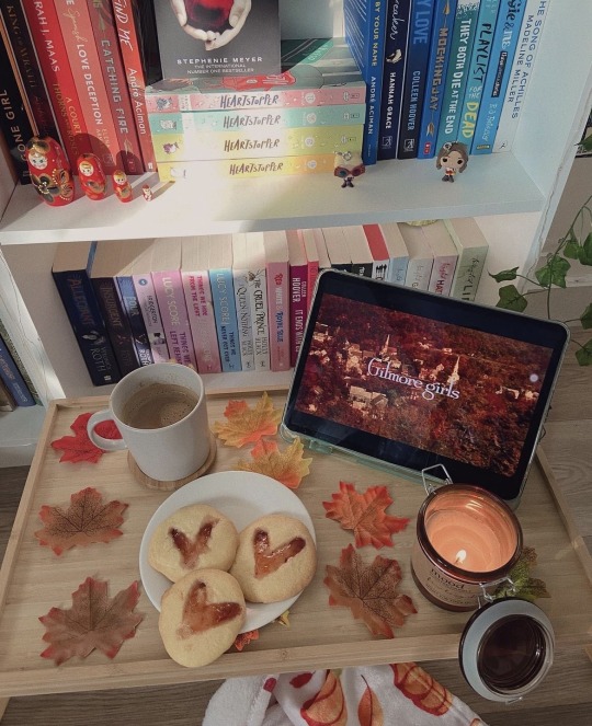
Title: Orange Cookies Fire Hazard Rating: 6. Candle is perilously close to tablet, kindling (leaves and books) and a blanket but the candle looks sturdy enough not to tilt if this person is careful. No scalding hazard; no body parts present and the mug of cocoa looks half finished and is probably lukewarm. Athough the cookies are untouched at least we finally have our first piece of evidence that these foods and beverages are actually being consumed occasionally. Unlike the hot dog that Milo only pretended to eat during Lorelai's Graduation Day.
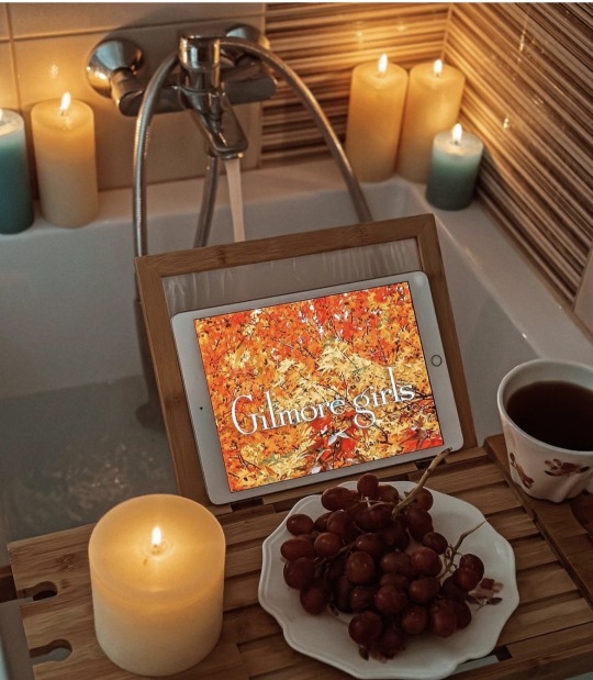
Title: Tub Time With Grapes Fire Hazard: Undetermined. Can't even snark on someone bringing their tablet or phone into the tub which is practically a daily ritual for me. I've only dropped my phone in water once in 15 years, when I dropped it in a hot tub (it survived). But, I somehow trust myself holding it above water with my hands more than I would some stand on a tray. Since your legs are presumably laying underneath the tray, what happens if you stand up from the tub and forget to move the tray first? Plop goes your tablet. Plop plop plop go your grapes. Points for using grapes instead of pastries. If some grapes plop in the tub your bath can be salvaged. Grapes are a safe Bath Food. I can't say the same about that tea, which is absolute teetering on the edge of that tray. You're gonna have some pretty gross water there. A lot of candles, sure. The one on the tray could tilt over and ignite that tray or your tablet, but hey, easy access to water.
We are left with one last burning (pun intended) question. How many of these people are actually in the act of watching the show further than the title screen? We may never know since they all likely perished in their own fire traps or are still nursing third degree burns from their spilled coffees and are in too much agony to tell us.
#gilmore girls#there a kajillion of these on Instagram#sorry for not crediting anyone#I'm not gonna bother#but if you see your Fire Hazard here just ask me and I'll add your handle to it#candles
14 notes
·
View notes
Text
Fave lesbian whos ever hit on me on this app was this girl who wrote everything out with a very potent old fashioned southern accent (darlin, hun, sugar, left the Gs off the end of words even in writing, constantly talking abt how country she was, etc) and I was like hm this feels a little forced. But whatever who am I to assume. And anyway it turned out she was from fucking LA and she just acted like that for no reason
#to be clear abt the situation she didnt have southern family. wasnt from the south originally. not rural. middle class boring. etc#she just was rly into the idea of being southern and rural and poor so she put on a fake accent and changed her speech#to like this archetypal sexy southern butch.#if she had just said she was from cali i wouldnt have blinked btw a lottt of texans have moved over there over the years#my very southern grandparents lived there for a while before they came here#but she was like a middle class instagram variety LA girl who had zero idea was pretending to be like. a southern rancher#she reminded me of the rich tourists that come here and pay a kajillion dollars pretending to be rural and gritty for 2 weeks#buying cowboy boots and taking pictures at ranches and getting mauled by bears bcs they wont listen to the locals#before they get back in their cars and drive back to their stupid big houses lmfaooo
8 notes
·
View notes
Text
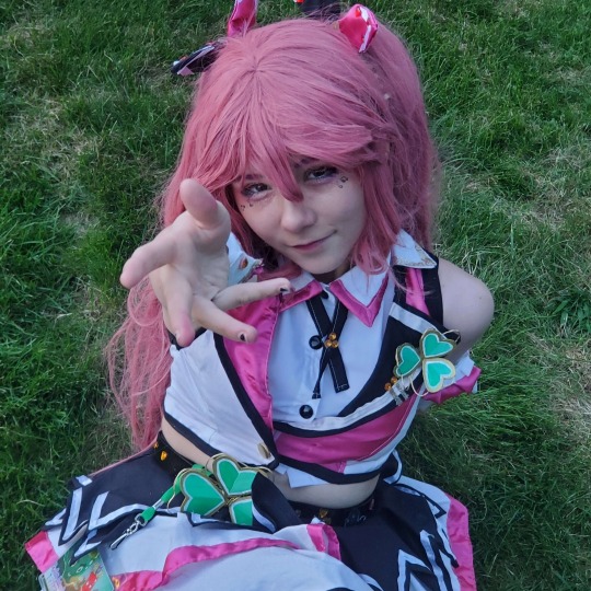
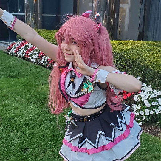
the thing about cosplay is that unless you pour a kajillion dollars and hours into it you are going to look kinda silly. but that is fine because cosplay is about having fun. don't let the professional cosplayers on instagram who pour a kajillion dollars and hours into it discourage you from putting on your silly little wig and having fun dressing up as your favorite character
#or you don't have to wear a wig you can just wear the outfit. they don't tell you this on instagram
8 notes
·
View notes
Text

popcult ! yippee !! heres my recap!!!
saturday was really fun! busy, but fun. woke up around 7am after getting virtually no sleep, and drove the ... hefty hour down to massachusetts. my manager made sandwiches [this is important] and we had redbull to keep us going so all was still well!
it was really fun getting to cosplay a lesser known character for my am cosplay. even though i had posted that I was there on instagram, nobody seemed to bother me! it was great!
i wish that there were more ARP cosplayers in the states, but afaik it's not super popular in japan either? maybe one day ill find merch that isnt a kajillion dollars.

the panel i held with kitsune metal was a hit! we were full! i was so shocked that so many people wanted to see me talk about being an idol!
i plan on posting a q&a on all of my platforms sometime soon. i think it went really well, and im so happy that everything went as well as it did.
i hope everyone had a good time!
getting to sing and dance with our sekai was so fun! it was very rushed, and ill probably never do something like this in THIS LITTLE TIME ever again, but it was fun. the adrenaline did its job lol
i sang 「the snow white princess is...」 and despite forgetting some lyrics and absolutely messing up others [sorry japanese speakers in the chat] i did ... ok. ill post a vocal cover of it soon, just to redeem myself TT
i also did a cover of 「newly edgy idols」 and had a BLAST!!! I LOVE NEWLY EDGY IDOLS !!!!!!!!! i love u mitchie m . thank u mitchie m .

... now for the idol showcase. what i came to the con for.
now, i auditioned for this before i did idoljam. i didnt even KNOW about idoljam when i auditioned. if i knew i was doing something before this, i wouldve picked a different song.
its not that i hate the vampire, i love it! its one of my favourite deco*27 tracks! its just that its not a showcase worthy song. its simple choreography. im a bit mad i fumbled during my ending fairy. it pisses me off a lot actually lol
but i did it. and now i have to post my vod .. next weekend i think? anyways.
people seemed to like it, and looking back at it, i was pretty sharp on all of my movements. my manager drilled me on my sloppiness, so im glad that all worked out well. maybe one day ill do the full version. i wish susupara let me do the full vers. they were a bit strict with me.
im just happy i didnt let my fans down. there are one or two oshi//ten6 that have made it to everything ive done so far, and it makes me really happy to know that im somebodys favourite. i said in my interview that my main goal as an idol is to prove to childhood me that no dream is too stupid to live out. i spent my entire life being told that my passion was weird and that i should just stick to chorus and theatre. im glad i didnt let it stop me ... because now there are people who oshi me! there are people with jyuu merch ! there are people who have seen me dance and sing and have shaken my hand !! i have a costume !! i have over a hundred followers on ig ! im happy. im so happy. i feel like exploding and imploding at the same time. i hope im still an idol when im old and wrinkly, too.
i hope little kid me is proud.
[one day, all of your blood sweat and tears will turn to glitter.] ♡ make it! by I☆Ris
#jyuuchan#jyuu#uvs48jyuu#idol#jpop idols#uvs48#overseas idol#kaigai idols#jyuu speaks#popcult 2023#one day ill get someone to take chekki with me . bro ive been PRACTICING ! IM AN IDOL PLS TAKE CHEKKI WITH ME PLS PLS PLS PLS PLS PLS [shot]#maybe im just happy im someones favourite. maybe im twirling my hair and kicking my feet a bit.
1 note
·
View note
Note
Have you noticed the latest edition of Charlie Bowater can only draw one (1) face? She did The Princess Will Save You and Cast In Firelight both YA Fantasy set to be released this year. And they are how you say... the same fucking cover
Ah yes so you saw the same tweet I did
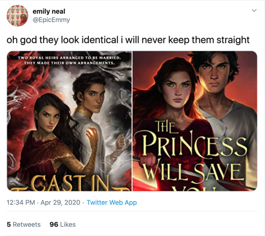
I know I literally just posted that we cannot outlaw book covers from looking like each other, but ! Oof!
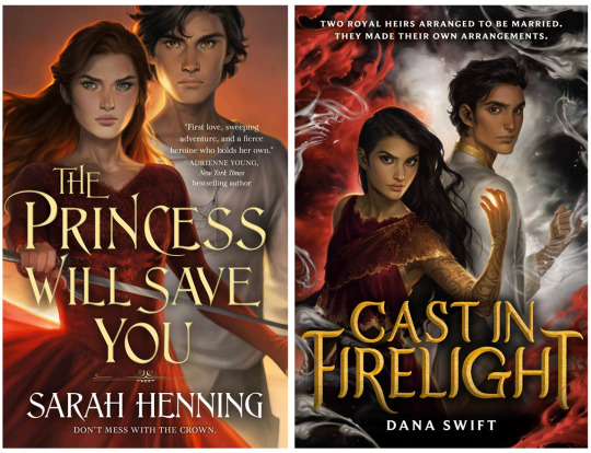
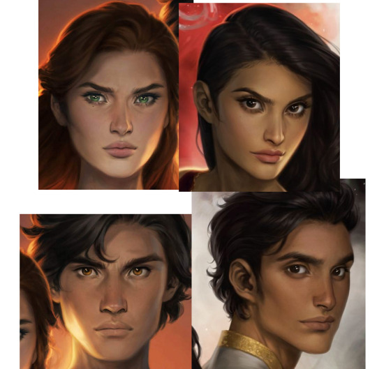
The only thing that softens the blow here is that Charlie has improved at representing nonwhite features such that characters look like POC rather than tan white people, although,, that bar was low. Anybody remember the ACOTAR coloring book.
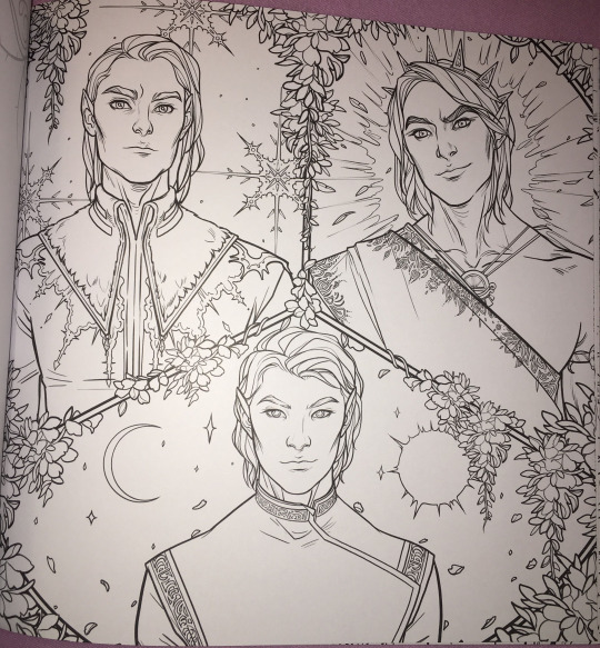
(Would you have guessed that 2/3 of these people are nonwhite? Or even that they’re supposed to be three different men? I guess all the men in Prythian have the same haircut?)
But that minor victory is mostly lost in the quagmires of the fact that Charlie’s style is to give everyone instagram face:
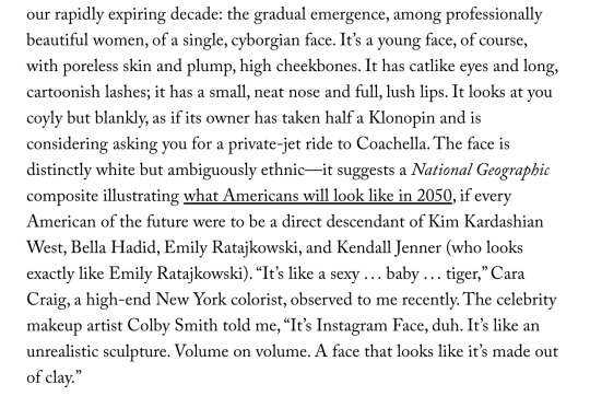
I wouldn’t even call this “Sameface” necessarily: that implies limitation, that an artist is only capable of drawing a single facial structure competently. Bowater is incredibly technically talented, she just chooses to give everyone catlike fae eyes and the cheekbones of a starving nymph. (My previous post on this here.)
But I don’t really blame her for that, or for these hilariously identical, nearly devoid of personality covers. Artists are allowed to do whatever they want. Artists who make art for covers are being art directed by designers and marketing teams who bear responsibility for how the finished pieces turn out.
No, this is our fault, as a community and an industry and..... society, kind of, for valuing character portraits that are “pretty” (“pretty” being an extremely loaded, culturally subjective concept) over art that actually Says Something About The Story. Bowater’s style happens to dovetail perfectly with what we currently collectively find pretty, and so we’ve put her art on a pedestal at the cost of everything else art can or should do for our stories.
And this is understandable: in contemporary western culture, pretty is a value unto itself. Seeing our characters portrayed as pretty denotes them as special, as smart, as powerful. It’s almost impossible to de-program ourselves from that reaction. There are approximately five kajillion studies on how beautiful people are at personal and professional advantages; how they’re perceived to be happier, healthier, more successful, and how those perceptions can translate into realities. (Nevermind how thinness and whiteness enter that equation, see above note about “pretty”.) I would love to see more “average” or weird- looking characters abound (and be accurately visually represented) in the YA/ Genre lit sphere, but for now... everyone is pretty.
Which sometimes means everyone is pretty boring.
But that’s just the specific, "What’s the deal with Bowater’s success in book circles and her style and all the sameiness” part of this equation. What if we backed up and asked: why character art at all? Beyond a question of “pretty”-ness (and general obvious Artistic Quality), why do we gravitate towards it, what's the purpose of it, how does it fall flat in a general sense, and how can it be utilized more effectively?
This is something I think about all the time. I follow writers on social media (because..... I am a writer on social media, regrettably), and we have an enormous collective boner for character art. “Getting fanart [of the characters]” is one of the achievement pinnacles constantly cited when people get or want to get published. Commissioning character art is something we reward ourselves with, or save up for (WHICH IS GOOD AND CORRECT. FREE ART IS GREAT BUT DO NOT SOLICIT IT. PAY YOUR ARTISTS). And like???? Same????? We love our stories because we’re invested in our characters. Most humans, even prose writers, are visual creatures to some extent, and no matter how happy we are with our text-based art, it’s exciting to see our creations exist in that form. So we turn that art into promo material and we advocate for it on our covers-- because it’s so meaningful to us! It goes with the story perfectly!! Look at my dumb beautiful children!!!!!
But on an emotional level, it’s hard to grasp that it only means something to us. Particularly when you take into account the aforementioned vast landscape of beautiful visual blandness of many characters (in the YA/ genre lit sphere, that’s pretty much all I’m ever talking about), character art can be like baby photos. If you know the baby, if that baby is your new niece or your friend’s kid, if you’ve held them and their parent texts you updates when they do cute shit, you’re probably excited to see that baby photo. But unless it’s exceptionally cute, a random stranger’s baby photo isn’t likely to invoke an emotional reaction other than “this is why I don’t get on facebook.”
Seeing art of characters they don’t know might intrigue a reader, but especially if the characters or art are unremarkable-looking, it’s doing a hell of a lot more for the people who already have an emotional attachment to that character than anybody else. And that’s fine. Art for a small, invested audience is incredibly rewarding. But like the parent who cannot see why you don’t think their baby is THE MOST BEAUTIFUL BABY IN THE WORLD???? I think we have trouble divesting our emotional reaction to character art from its actual marketing value, which.... is often pretty minimal. This is my hill to die on #143:
Character portraits, even beautiful ones, are meaningless as a marketing tool without additional context or imagery.
I love character art! I’m not saying it should not exist or that it’s worthless! Even art that appeals to only the one single person who made it has value and the right to exist. And part of this conversation is how important for POC to see themselves on covers, whether illustrations or stock imagery, particularly in YA/kidlit. I’m not saying character portrait covers are “bad”.
I am saying that I have seen dozens and dozens of sets of character art for characters who look interchangeable, and it has never driven me to preorder a book. (Also one character portrait for a high-profile 2019 debut that was clearly just a painting of Amanda Seyfriend. You know the one. There’s nothing wrong with faceclaims but lmfao, girl,,,,)
I’m sure that’s not true for everyone! I am incredibly picky about art. It’s my job. There’s nothing wrong with your card deck of cell-shaded boys of ambiguous age and ethnicity who all have the same button nose and smirk if it Sparks Joy for you.
But if your goal is not only to delight yourself, but to sell books, it’s in your best interest to remember that art, like writing, is a form of communication. The publishing industry runs on pitches: querys, blurbs, proposals, self-promo tweets. What if we applied that logic to our visuals? How can we utilize our character design and art to communicate as much about our stories as possible, in the most enticing way?
Social media has already driven the embrace of this concept in a very general sense. Authors are now supposed to have ~ aesthetics. “Picspams” or graphics, modular collages that function as mini moodboards, are commonplace. But the labor intensity and relative scarcity of character art visible in bookish circles, even on covers, means that application of marketing sensibility to it is less intuitive than throwing together a pinterest board.
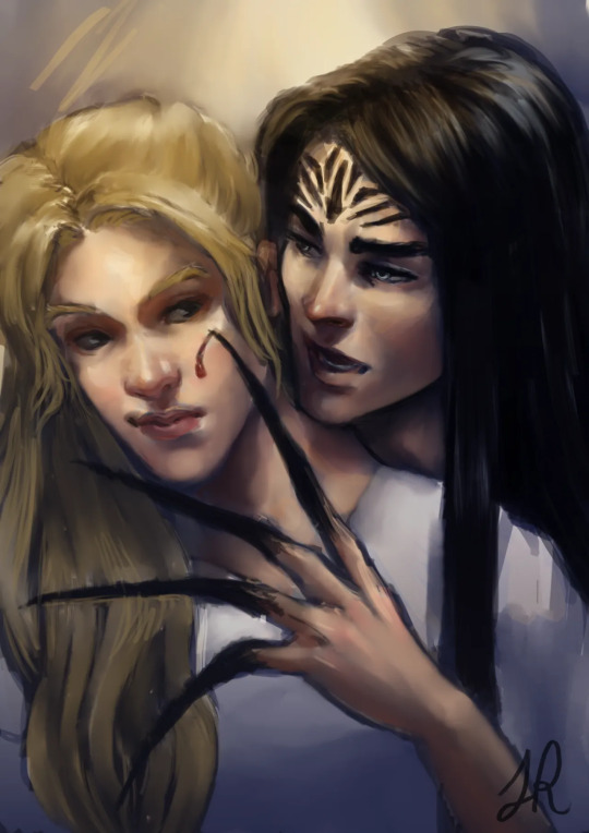
Since we were talking about it earlier, WICKED SAINTS, as a case study of a recent “successful” fantasy YA debut, arguably owed a lot of its early social media momentum to fanart.
(Early fanart by @warickaart)
The most frequently drawn character, Malachiasz, has long hair, claws, and distinctive face tattoos. WS has a strong aesthetic in general, but those features clearly marked his fanart as him in a way even someone unfamiliar with the book could clearly track across different styles. Different interpretations of his tattoos from different artists even became a point of interest.
(Art by Jaria Rambaran, also super early days of WS Being A Thing)
Aside from distinctiveness, it's a clear visual representation of his history as a cult member, his monstrous powers, and the story’s dark, medieval tone. The above image is also a great example of character interaction, something missing from straightforward portraits, that communicates a dynamic. Character dynamics draw people into stories: enemies-to-lovers, friends-to-lovers, childhood rivals, platonic life partners, love triangles, devoted siblings, exes who still carry the flame-- there’s a reason we codify these into tropes, and integrate that language and shared knowledge into our marketing. For another example in that vein, I really love this art by @MabyMin, commissioned by Gina Chen:
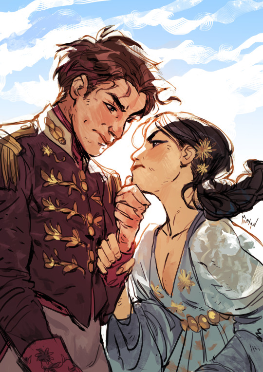
The wrist grip! The fancy outfits! These are two nobles who hate each other and want to bone and I am sold.
In terms of true portraits, the best recent example I can think of is the set @NicoleDeal did for Roshani Chokshi’s GILDED WOLVES (I believe as a preorder incentive of some kind?):
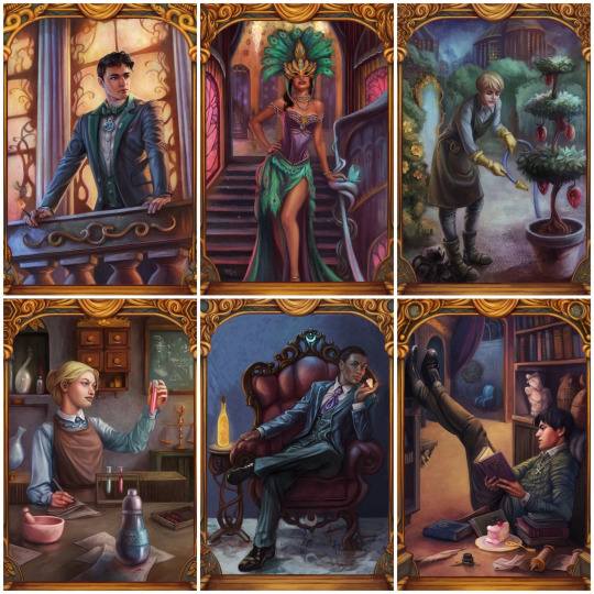
They showcase settings, props, and poses that all communicate the characters’ interests, skills, and personality, as well as the glamorous, elaborate aesthetic of the overall story. Even elements in the gold borders change, alluding to other plot points and symbology.
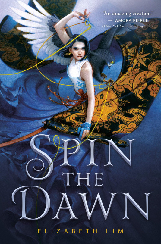
For painterly accuracy in character portraits on covers, I love SPIN THE DAWN. The heroine looks like a beautiful badass, yes, but the thoughtful, detailed rendering of every element, soft textures, and dynamic, fluid composition form a really cohesive, stunning illustration that presents an intriguing collection of story elements.
The devil isn’t always in the details, though: stark, moody, highly stylized or graphic art with an emphasis on textural contrast and bold color and shape rather than representational accuracy can communicate a lot (emotionally and tonally) while pretty much foregoing realism.
The new Lunar Chronicles covers are actually the best examples I found of this (Trying to stay within the realm of existing bookish art rather than branch into All Art Of Human Figures Forever):
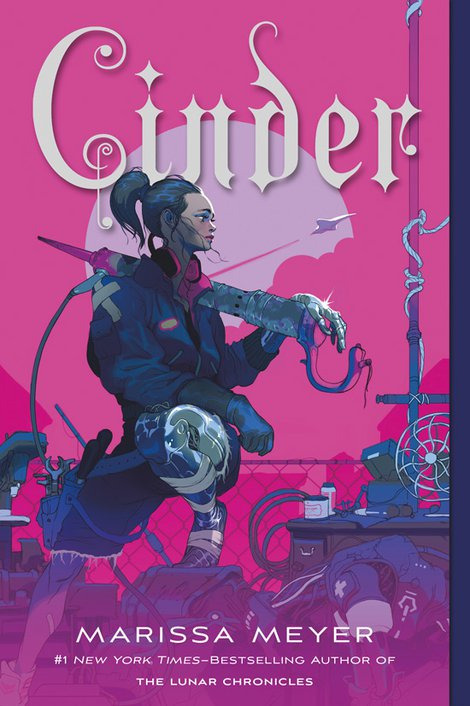
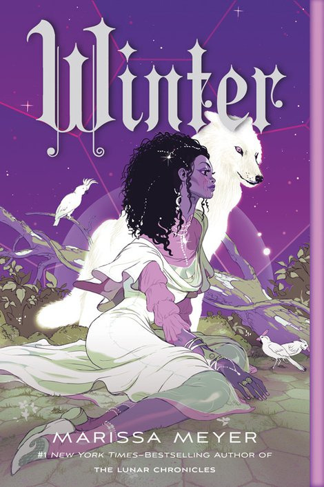
Taking cues from styles more typical of the comics and video game industries. (Games and comics, as visual mediums, are sources of incredible character art and I highly recommend following artists in those industries if you want to See More Cool Art On Your Timeline.)
TL;DR: Character art and design, as a marketing tool (even an incidental one) should be as unique to your story and your characters as possible, and tell us about the story in ways that make us want to read it. I tried to give examples because there are so many ways to do this, and so many different kinds of art, and I could give many more! But I’m bored now. So to circle all the way back:
These are not just bad because they look like each other, although that is embarrassing and illuminating. These are bad covers (although,,,,, PRINCESS is the far worse offender, at least FIRELIGHT suggests a thoughtful cultural analogue) because a desire for Pretty Character Art overrode the basic cover function to tell us about the story. We get no sense of who these people are, what their relationships are, what these books are about beyond the most general genre, or why we might care. The expressions are vague, the characters generic-looking, the compositions uninteresting and the colors failing to be indicative of anything in particular.
They’re somebody else’s baby pictures.
(And yes, that’s the CRUEL PRINCE font on PRINCESS. I better not have to do a roundup post but it’s on thin fucking ice.)
329 notes
·
View notes
Text
In which I try to sell a friend on France NT fandom
More or less directly from an email I just sent:
Your new favorite team are playing the USMNT in a pre-World Cup friendly tomorrow at noon your time! The game will be broadcast on ESPN!
My recommended players to look out for are:
Olivier Giroud: forward, the one who isn't good-looking to me until he's in action celebrating a goal, whether it's his own or a teammate's. 31, so ogling him feels basically age-appropriate.
Antoine Griezmann: forward, tiny, adorable, FINALLY cut his terrible bleachy hair and lost the headband, thank goodness. (I've been on the record as hating that hair for well over a year.) The internet (especially Tumblr) loves him. 27, so we're getting into creepy old lady territory, and also there was a reeeeeeeaaaaalllll unfortunate blackface costume incident for which he lost about a kajillion cuteness points. Oh, and his nickname is Grizi. I can't make this merde up.
Paul Pogba: midfielder, makes everything around him happen. More style and flair than it is really fair for any one human to possess. He loves the internet (especially Instagram). 25, so I'm sure my appreciation for him is purely aesthetic.
I recommend running an image search on any of these gentlemen but "Paul Pogba hair" in particular.
That said, they also have Raphaël Varane and Samuel Umtiti in defense, N'Golo Kanté and Blaise Matuidi in the midfield, Kylian Mbappé and Ousmané Dembele as up-and-coming young whippersnapper forwards, and really if Didier Deschamps can get them to play together they will go deeeeeeeeeep into this tournament.
Love and less than a week less than a week less than a week I totally just rescheduled a meds!shrink appointment that conflicted with the opening match, -Tracy
5 notes
·
View notes
Photo

Here we are... a full day with a brand-spanking new 8-year old. Happy Birthday Jasper, if you think ever think you know how much your mama and I love you, just multiply that by a kajillion. May this Golden Birthday in Sydney, be the shiniest ever! 1924/2191 via Instagram http://bit.ly/2TYAuLy
0 notes
Photo

A kajillion below zero outside. — view on Instagram http://bit.ly/2UtMzch
0 notes
Text
Hey hey hey y'all, I'm allison and this is gonna be a taylor swift tumblr blog thingie. I wanna try out tumblr bc i don't really ever use it and i have a million kajillion instagram fanpages soooooo yeah😁
0 notes
Text
What do sponsored instagram posts feel when they get kajillion bajillion likes?
Company sponsoring post: We have a variety of different furniture for our customers to choose from *Gets 1,773,499,374 Likes* Company: Fuck off and buy our stuff you twats
0 notes