#their whole blue/yellow colour scheme is so pretty
Explore tagged Tumblr posts
Text
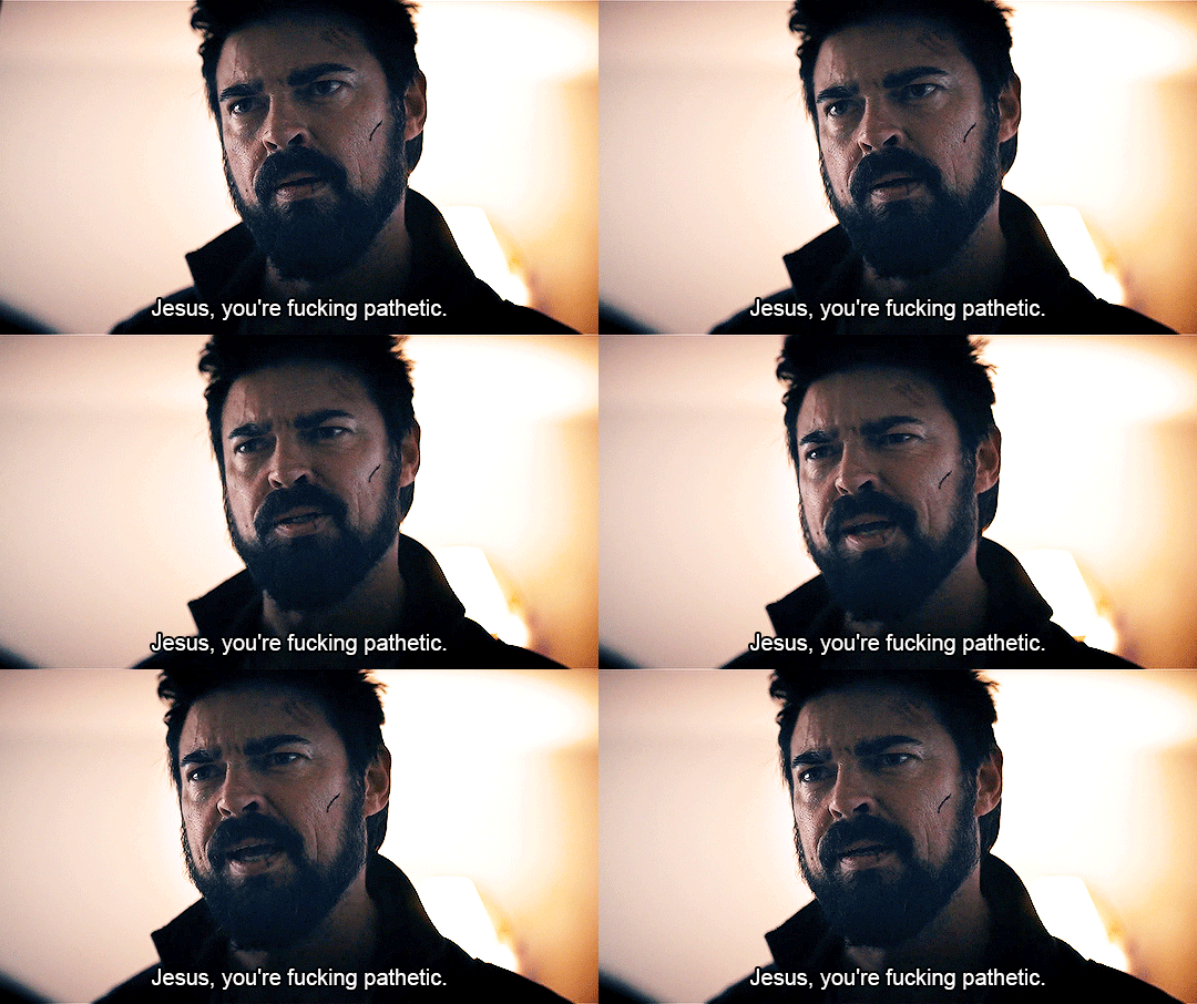
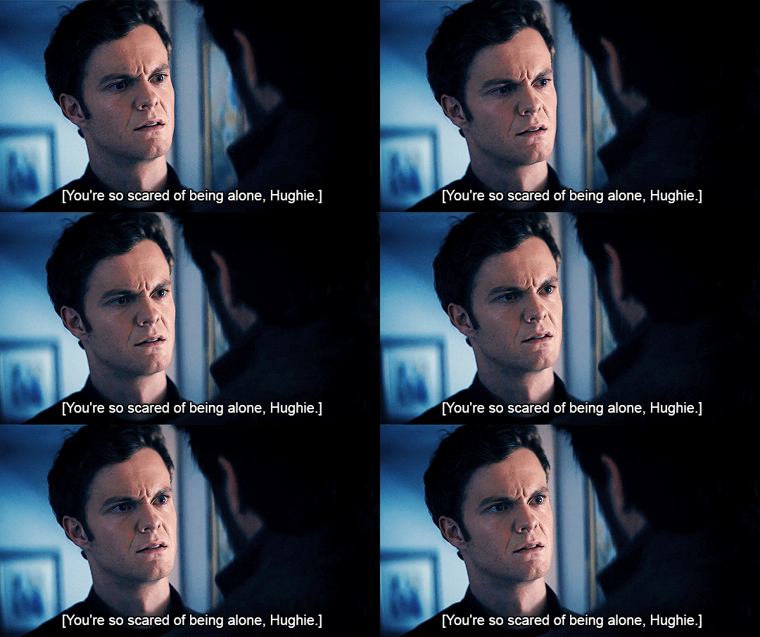


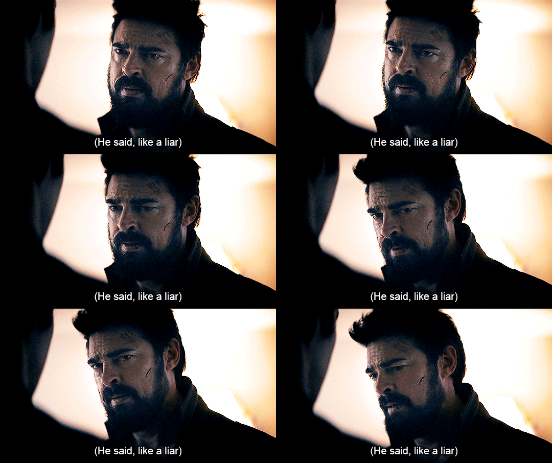

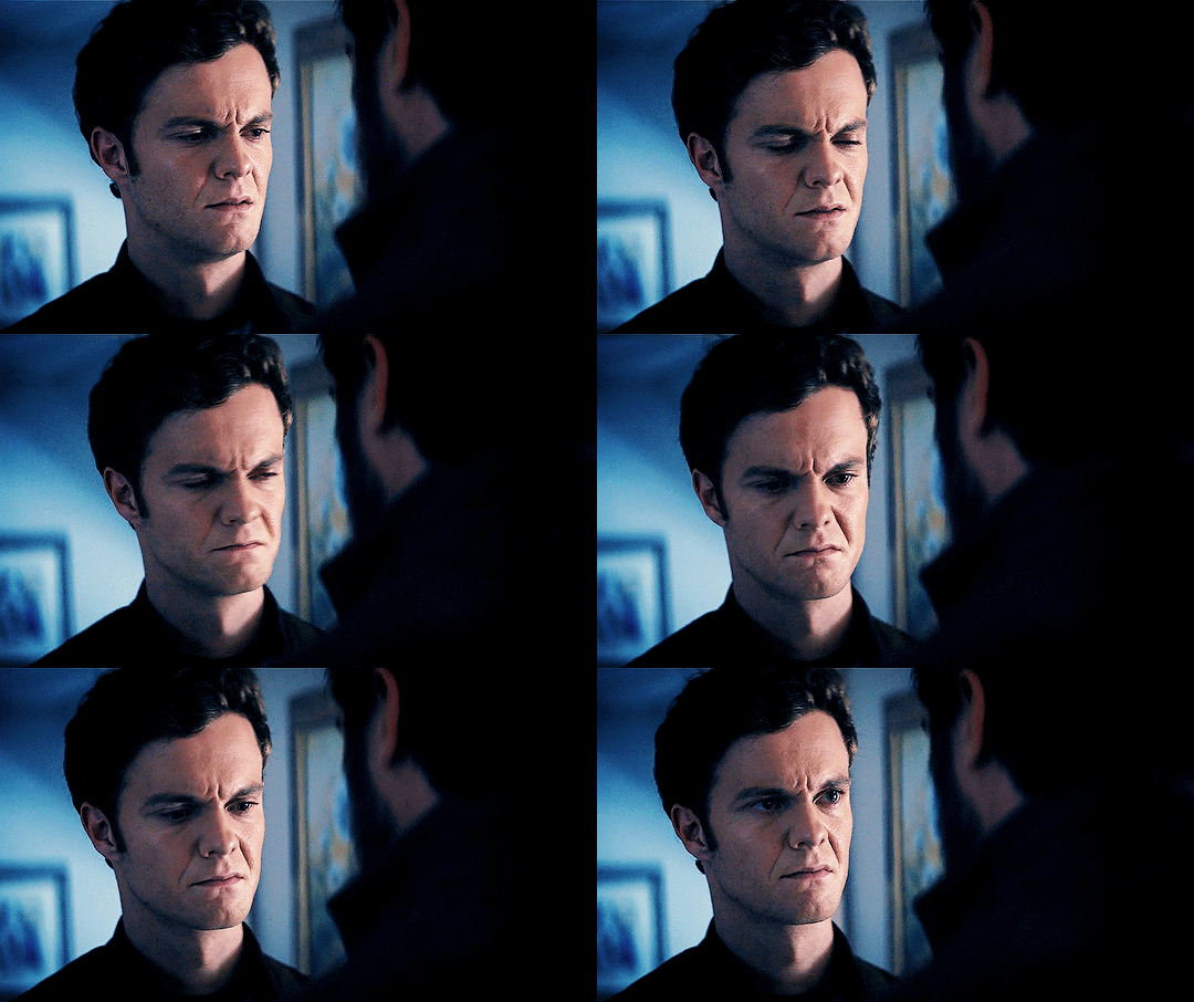
Hughie really said 🥺
The Boys S02E05: We Gotta Go Now
#tbh butcher also made that face#butchie#billy butcher#hughie campbell#the boys#cara gifs#jack quaid#karl urban#their whole blue/yellow colour scheme is so pretty#they're in a toxic relationship your honour
316 notes
·
View notes
Text
OKAY SO I FOUND SOME STUFF ABOUT RINK O'MANIA
Hi, Hello, Welcome as I take you down the journey I fucking went through
So I was watching byler clips, as one does, and I was wondering whether or not they got lucky with the yellow and blue lighting in Rink O'Mania or whether they like – change the light bulbs or whatever. So I decided to stalk the Skating Rink they filmed at.
And holy shit did I find some interesting things.
I have no idea whether or not this was discovered before but I JUST NEED TO SHARE. SO HERE WE GO.
So, first of all, the place was originally called Roller King but they changed it to Skate O'Mania. Which, pretty similar to Rink O'Mania right? THAT'S BECAUSE THEY REMODELLED THE ENTIRE FUCKING ROLLER RINK FOR THE SHOW
LIKE I'm not even kidding.
They posted this message
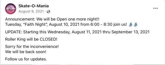
Followed by a video (which is just a photo) with a little clipart of "under construction"
THEN, on August 10th they posted that they wrapped filming.
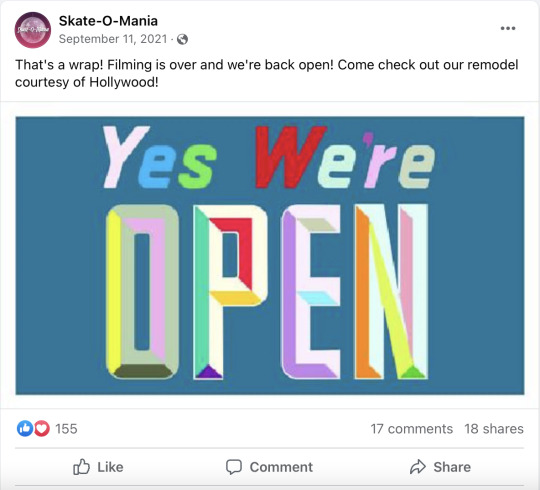
"Remodel courtesy of Hollywood" They deadass redecorated the entire roller rink for the however many minutes spent in ONE episode of the season. (The probably spent half the month redecorating and the other half filming which I'm losing my mind over?? no way this is a one time setting).
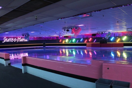
LIKE– Let me show you the difference in before and after the remodelling
The Roller Rink Before and After.
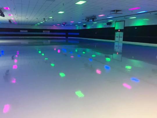
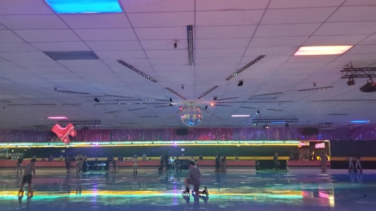
They added the blue and yellow light strips and the disco ball. And I can’t say 100 but it looks like they removed the pink and green coloured light(?)
And they added the whole ‘Skate/Rink O’mania’ sign (basically everything honestly was added by them–)
The Snack Station Before and After.
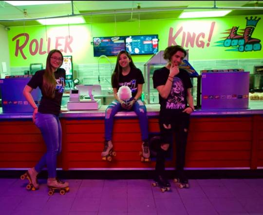
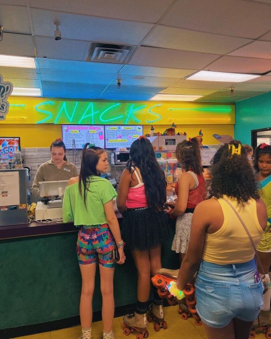
Again, we see the blue and yellow lighting.
The Table/Seating Area Before and After.
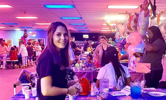
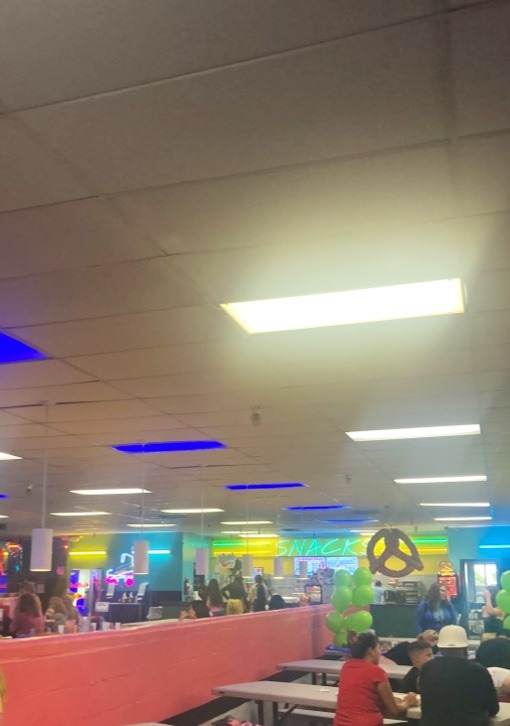
And okay I’m sorry about the quality of the second one I couldn’t find a better photo from their Google maps gallery or Facebook bUT- you can see that originally the lighting scheme was pink and blue but now it’s yellow and blue.
(here's another photo)

Like idk I’m losing my mind over this- they really like remodelled the entire fucking roller rink and added so much yellow and blue like?? I just think it's insane and I needed to share this discovery.
#byler#mike wheeler#will byers#stranger things#stranger things 4#stranger things analysis#I have no idea if anyones done this before#hopefully this just helps prove that everything in the set is literally 100% intentional
1K notes
·
View notes
Text
thinking about how the izombie pilot episode used a pale blue colour scheme (very clean, very cool, very understated, very sterile and calm even though it's a stressful situation) for its opening:
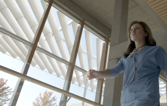


only in the corners/the periphery, there are some other colours that are really standing out, most notably red and yellow:

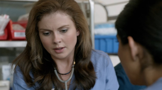
but then, the red and yellow become more prominent:
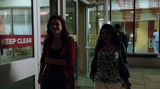
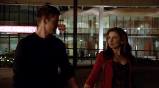
(remember how I once made a joke that those red splatter patterns on the windows give awful children's hospital colour theory vibe? like...what a specific choice)
anyway, as we've gotten darker and more yellow and red, note how the composition of the screen is also much busier and less pristine that in the previous shots - even though nothing is happening here and it's pretty peaceful. On the other hand, it is still very systematic and contained with these many kinds of rectengular shapes and very consistent shots.
That gets us to the boat party. Which is a clashing mess of red and yellow (the fire, the clothes, the cups, the pool toys - which is definitely a choice bc you'd expect the Max Rager theme to be more prominent) and a lot of altering shots with a lot of movement and colours being far less contained:

now, I'm going to forward a little to the second flashback bc it becomes even more prominent there. Just remember we go from this setting:
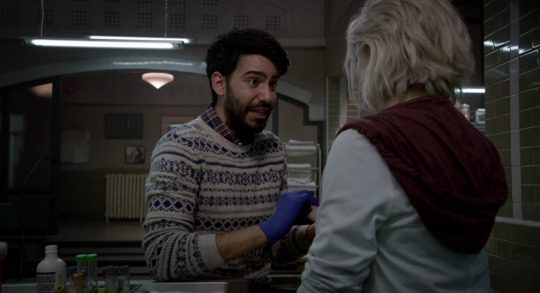
which has its whole own colour scheme which kind of picks up the cooler, calmer colour scheme of the hospital with some of the darkness of the previous scene + some murky greenish tinge that really gives 'morgue death decay'.
Then, another boat party flashback following the same patterns as mentioned earlier:
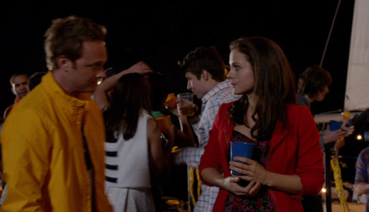
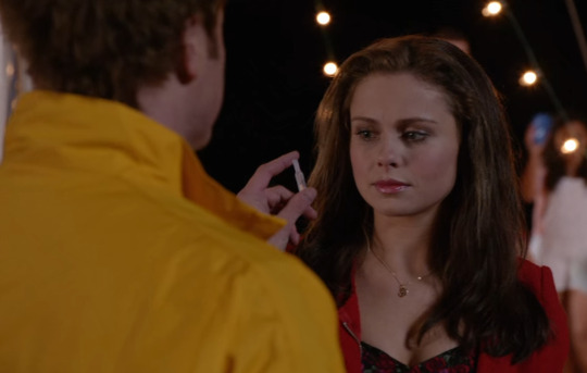


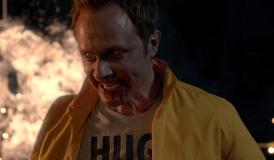
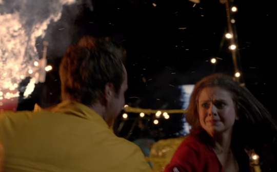
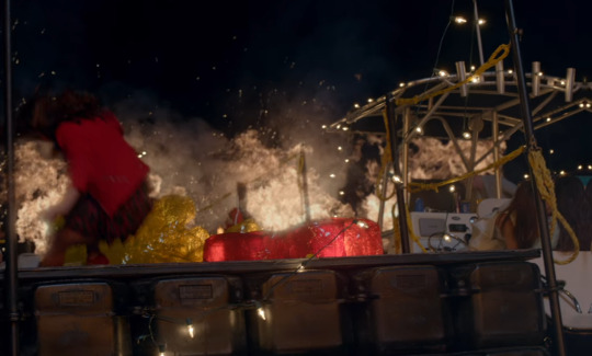
(you might actually notice that towards the end of it, yellow is even overtaking red with its presence. I actually think it is very interesting because yellow often symbolises life, joy, vitality - but I feel like here, it really cuts closer to death and destruction. Yellow also often makes an appearance when it comes to disease, infection, putrid, sulphur, haz-maz suits etc. So yellow here definitely leans into a death and disease symbolism and I remember I already once made a post how deeply these things are associated with Blaine - who is widely regarded to be the zombie Patient Zero, considering that he was already high on Utopium when he arrived and started drinking Max Rager - it really is fitting that he's literally wearing bright yellow here. He's kind of the most prominent source of yellow.)
Then, cut to black. Followed by this:
In the next scene, which has a really strong birth-symbolism, we see the world from Liv's perspective, after she just drowned and wakes up in a body bag and it's really ALL yellow:
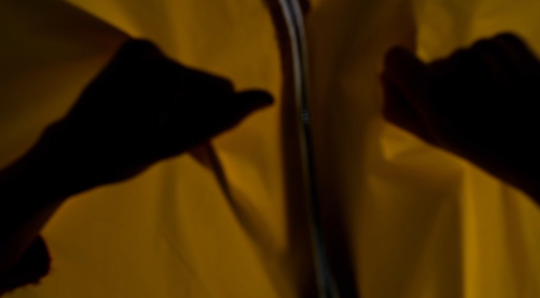
until she rips open the body-bag and we see clean, calm blue again on the other side:
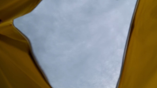
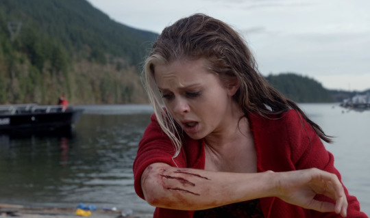
and then you have the beach scene, where you first see the world from Liv's perspective (ripping opening a yellow body bag to reveal blue sky).
Liv is still in red in front of the blue backdrop (and spitting up fluid, did I mention birth symbolism. She now carries the 'red' into the normal, calm and orderly world)

Cut to the emergency worker in the same light blue (at least his front) that Liv wore earlier, surrounded by emergency vehicles, stretchers, and bodies (laid out on yellow):
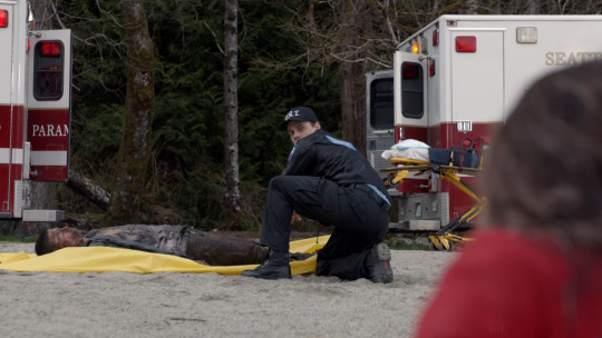
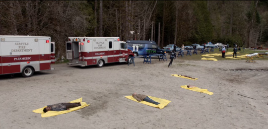
again, with red, yellow, and blue, with blue being in the background.
Something interesting I noticed while speeding through the episode is that we rediscover this theme mostly in the tint of the screen colour and some outfit choices: Liv always likes to wear a bit of red (something she clearly liked before, but now it kind of mirrors the red-yellow scheme:)

you also have this kind of slight yellow-ish tint in the scene with her friends and family trying to stage an intervention, with Liv knowing it is hopeless:
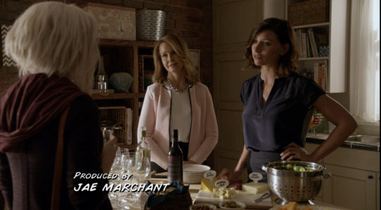
the scenes where she's with Ravi in the morgue or working with Clive however are much cooler, even if still dark:

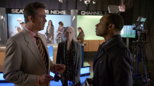
Now, after Peyton gives Liv a big Talk To about how she's losing herself, we get this scene:
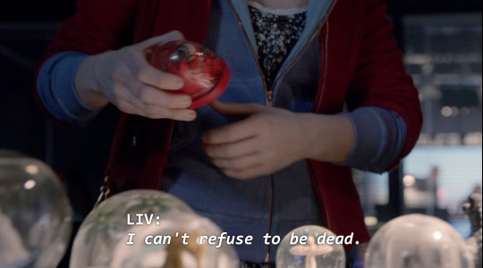
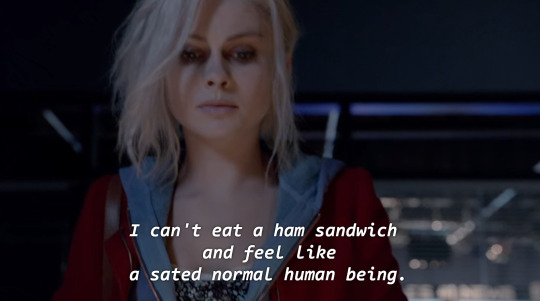

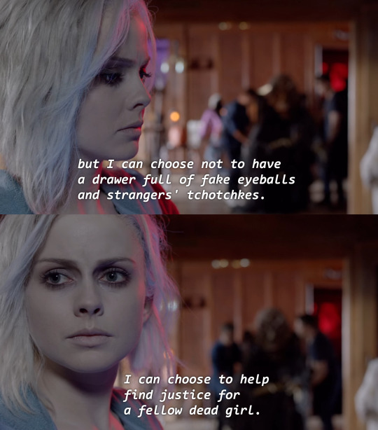
Now, in this scene, Liv is returning all the items she stole bc she was under the influence of cleptomaniac brain but couldn't really be bothered to fight back, because she was too depressed (among them a red eyeball, a red-framed photograph and a red snowglobe)
But also notice how in this scene, the blue and the red is combined: Both in her outfit as well as in the lighting in the second one - the red that was previous associated with blood/suffering/her new zombiefication and the blue that was associated with healing/order/her previous human life.
At the same time, red also often stands for heart-blood and passion. Now, Liv in her previous life was definitely driven and ambitious (this post was actually supposed to be about the theme of amibition on iZombie) but...mostly she was ambitious for the sake of it and mostly, by going through the motions. This is addressed in a lot of later episode and also plays a big role in relationship with her mother and her brother: Liv was a desperate people-pleaser and obsessed with being perfect, being systematic, getting the best grades. She was the golden child of her mother, who is usually held up over her brother (who still is very good at stuff, just more laid back)
We never really see her as particularly invested or passionate in medicine as a field - in fact, the show resolves without ever having her return to work in a hospital or this being a major issue. (Compare that to Major's passion for social-working) The real loss she felt was (other than losing her engagement to Major and disappointing her family) was that she was no longer helping people. But that is something she learnt in this episode she could reclaim and that she could do by using her new 'powers' in a constructive way. Combining her old life and her new life. The blue and the red.
Unfortunately tumblr doesn't allow me to post anymore pictures so I'll just verbalise it: Another important subplot of this episode is Liv's struggle to sleep. She cannot sleep and hasn't for five months. The scenes where she tries to sleep are usually kept in dark blue - with the red letters of her alarm clock showing us that she cannot sleep, counting down the minutes that she's lying awake. But in those scenes, red and blue weren't 'working together' so to speak - they were clashing. Because she can't pretend to be normal or okay. But at the same time.
Towards the end, she does manage to sleep - and towards the end, we also have a sleeping scene of her in almost perfect bright white with only a light blue tinge - the darkness is gone. Symbolising how she did get rest and calm, after she started accepting her new self.
(cut to another yellow scene, when she has a vision in her sleep of Blaine in his jacket chasing a guy in an alley with yellow-ish street lamps)
56 notes
·
View notes
Note
Bestie, please break down those costumes.Plssss.I am soooooo jealous of U🫀❤️♥️
of course!
the 2018 regent's park open air theatre little shop of horrors production is pretty standout visually because (while they didn't change the script by updating it) they did move away from the typical 1960s historical fashion for the characters and instead played with modern outfits and a blend of textures. the whole show had a strong colour scheme of black and white, neon green, pink, and blue. costumes & scenic design was by tom scutt.
we'll start with seymour, as played by the lovely marc antolin. his outfit is all blue, down to his glasses. (why are the curtains blue? you could say for his boyishness, or that he's kind of a melancholy character, or that white guys always wear blue, take your pick haha)
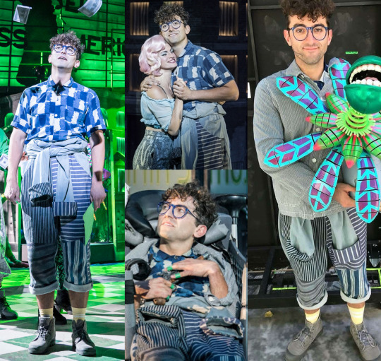
the main bit is a boiler suit made of different patchworked denim in various contrasting stripes and tied around his waist. his short sleeve button up continues the patchwork vibe with the painted brushstroke-esque check pattern. he also wears a shacket at certain points, and while hard to see in the above image it also had a thin pinstriped pattern. seymour is all about pattern mixing. a fun detail to note is that audrey ii's main colour is obviously green: in the centre bottom photo you can see he wore green band-aids on his fingers :')
also: while in these above photocall pictures that were used in promotion here had him in yellow socks, it's important to note that, at least when i saw it, his socks were pink. who's main colour is pink? it's audrey.
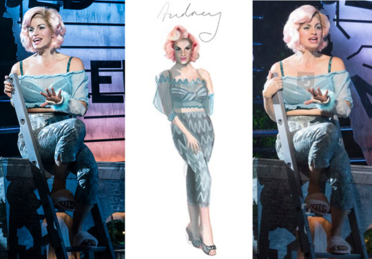
actually, her first outfit is also mostly blue. seymour and audrey have the most similar colour scheme so that gives them a strong visual link. so her first outfit is very much giving sexy: she's got a frilly top that we can see her bra through. we have a nod to vintage fashion with her cigarette pants. also while these photos show her wearing fluffy slide slippers, when i saw it she was wearing the little clear plastic kitten heels shown in the design sketch - we can tell this is her 'im trying to look sexually appealing to my boyfriend' look. she's showing it all off.
but notably, her hair is this adorable bubblegum pink shade, so i thought it was extra cute that seymour had socks to match. just a little hint of who he's thinking about.
anyway, during act 2, when audrey & seymour's relationship is blossoming further, audrey debuts a different look entirely:
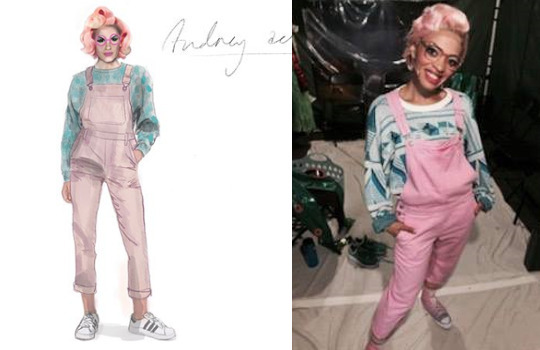
(concept sketch shown along with a photo of understudy rosalind james.) in dramatic constrast to her 'sexy-for-orin' look, now she's in dungarees and a cute sweater, and she's swapped the heels out for sneakers. also, she's got on a pair of pink glasses, suggesting that contact lenses were part of her sexy look. this look is all about comfort: because she's happy and in love with seymour, who makes her feel more comfortable than orin did, and this outfit looks nicely like the 'partner' look to seymour's outfit.
this is getting long, so the rest is going under a readmore. click through!
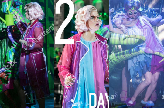
so this is her 'sominex' outfit, the look she wears when she encounters audrey ii just before she dies. the clear raincoat is honestly just fun. i think if i recall right the stage directions in the script do call for her to be wearing a yellow rain-slicker, but pink is this audrey's colour, so she's rocking this. the glasses are still on too.
underneath, she's wearing this fun floaty half-blue half-pink nightie with matching 'mismatched' pompom slippers. she is giving everything in this look honestly. the meeting of the pink-and-blue, because she's wearing both her own and seymour's main colours (she'd still love him, even if he'd never found the plant, and all she wanted was to be with seymour 😭)
i'll do orin next:
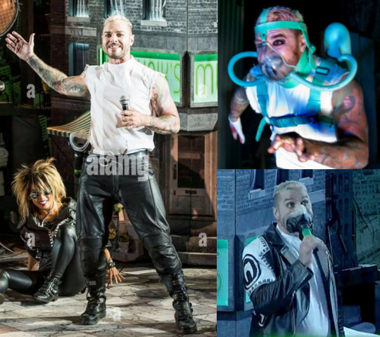
absolutely obsessed with matt willis as the dentist. as a busted fan in my childhood, i went to see this production specifically for him :') so he's got a much more dishevelled punk look he's very ghoulish with his white foundation and heavy black eyeliner. also love the detail of him having a blacked-out tooth too, really emphasises how he's probably not the best of dentists. his dentist gear including bloody apron is in a very medical neon blue-green, and i love how utterly sci-fi horror the gas mask harness is. LOVE the ripped off sleeves on his white coat. he also had this amazing leather jacket with tooth design on and the ensemble had matching outfits:
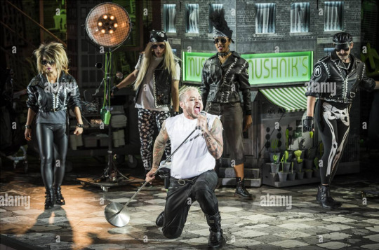
get a load of the teeth print leggings on the backup dancer on the middle left, absolutely obsessed. love the 1980s punky vibe for the 'dentist' number. this production makes great use of matt willis' own tattoos: after seymour kills orin, he came back on stage with some dismembered orin bits, and the creative team had gone to the effort of painting matt willis' tattoos onto the fake arms that seymour fed to the plant :')
okay let's move on and look at mr mushnik, played by forbes masson:
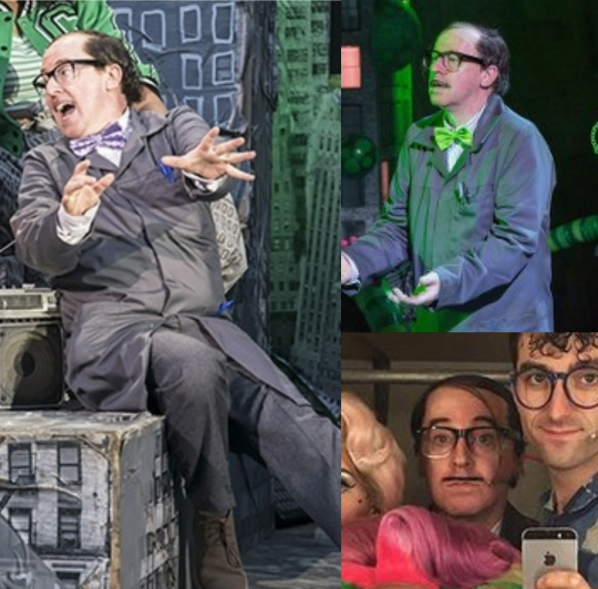
small guy, huge voice, absolute standout. they've gone for 'little greasy man' as the vibe here, complete with a drawn-on pencil moustache. his outfit, much like the ensemble, doesn't have a lot of colour, just a fairly normal grey suit with a work jacket. the most notable thing about his look is that while he starts out in a purple bow tie, once the shop starts seeing success, he wears a bow tie in audrey ii's neon green. like seymour's band-aids, audrey ii's colour (and therefore her influence/impact) shows up in the costumes of a lot of the other characters.
let's do audrey ii next then, as played by vicky vox:
so this production makes use of both the usual 'audrey ii is a puppet' situation plus then having the drag queen performer on stage to interact with the other characters as like, the plant personified. absolute LOVED it. let's start with the puppet:
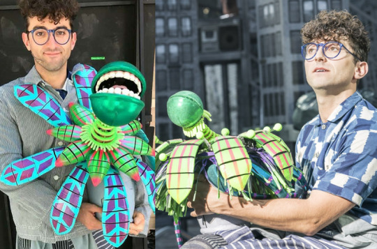
we've got the baby form and slightly bigger form i think here, it's a fun alien looking plant, love the spherical head with human teeth. for the plant to 'grow', a bigger version of this plant head is placed inside of a 'mouth' that can open and close sort of like an aperture:
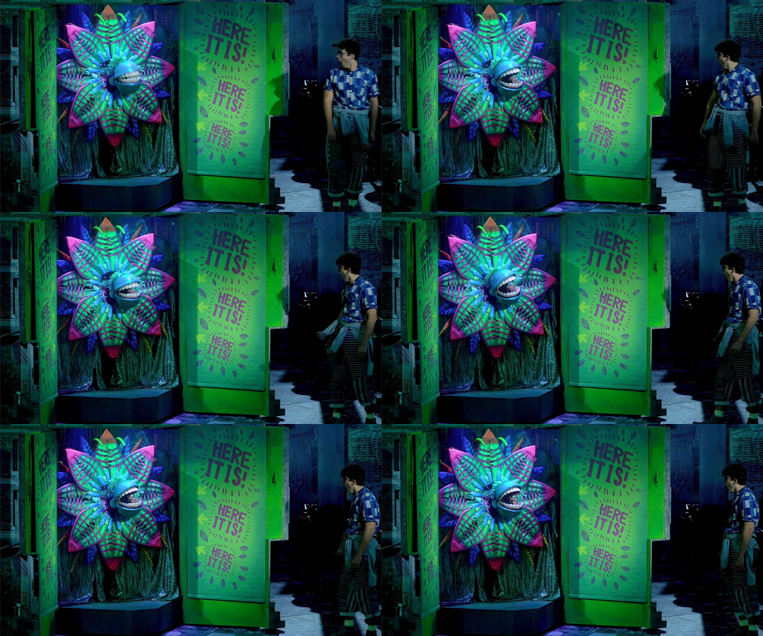
and upon opening it, drag queen audrey ii steps out. she kind of comes in and out of it, and mostly just interacts with seymour.
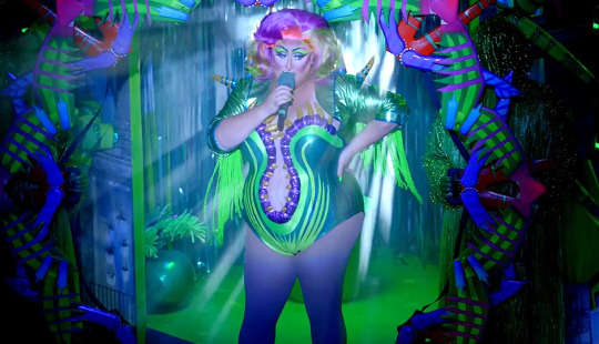
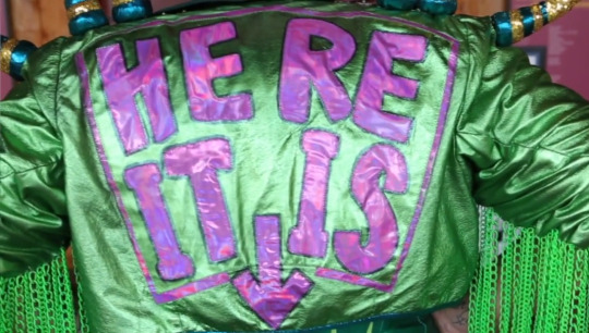
this outfit is absolutely fabulous, and i especially love the 'HERE IT IS' pointing down to her booty on the back of the jacket.
then a notable progression for audrey ii's appearance is the changing wigs. we can see that her first wig shown here below is the direct partner of audrey's, (after all, the plant was named after her) and is styled the same way.
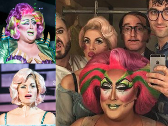
when i saw the show, both audreys were wearing different wigs that i thought weren't really as pretty as the ones from the photocall, these wigs are on the left of the above image. i'll call these the round wigs.
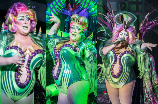
the most important thing to note though is that when audrey ii first appears, she has that strong visual link to original audrey. and this is played up in the way that audrey ii interacts with seymour during 'feed me' - audrey ii acts quite flirtatious with seymour and he seems receptive to it and has to visibly shake himself out of it. then in the second act, audrey ii switches wigs to the style in the above middle. during suppertime, there was more of audrey ii trying to be flirtatious with seymour, but at this point he is much more disgusted by it: audrey ii's wig no longer resembles original audrey’s, and by now seymour hates her guts.
the final look for audrey ii via photocall features what seems to be the original wig but with the curls blown out, styled to be more messy and windswept, but by the end of the run during the finale audrey ii just wore the round wig, with the added venus flytrap headpiece and feathered cape.
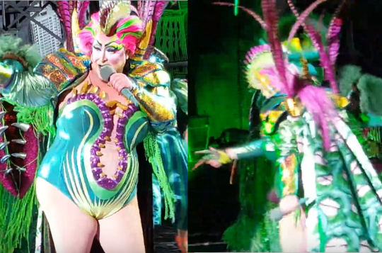
apologies for the terrible screencaps: the fabric the cape was made of featured green rocky horror-esque lips showing teeth. it was mega. the wig also featured some long pink extensions at the back.
let's go back a bit to some other characters who have been wearing audrey ii's green consistently, and that's the urchins:
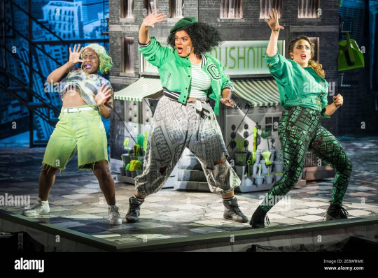
they wear these punky, i would say more 1990s streetwear inspired costumes throughout the whole show, and don't change until the end. the two gals on the left wear pieces that tie in strongly to the set, which is a crumbling grayscale newspaper-inspired city/drive-in theatre set proclaiming 'GOD BLESS AMERICA' across the top.
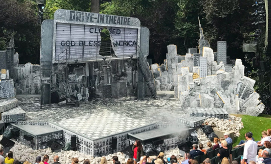
we can see the girl on the far left has a grayscale US flag top, while the middle girl has grey cityscape patterned sweatpants. then all three of them are wearing the bright neon of audrey ii, reminded us and the audience who's story they're telling. out of the 3, my definite fave look is the girl on the right, with the green jacket and shiny 'FEED ME' print leggings. i need those leggings. but yes what we can notice is that 2/3 urchins' outfits align strongly not only with audrey ii's green but with the same grayscale/cityscape patterns that the ensemble wear during skid row & other scenes:
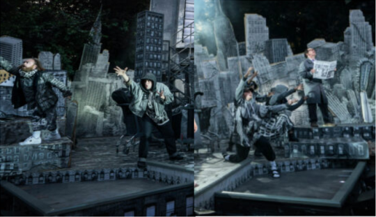
anyway i like that the ensemble's look speaks to like... the set coming alive to tell the story. it's cool. this comes back during act 2 when the ensemble put on gloves that resemble audrey ii's vines and push around shopping trolleys with bits of building set inside:
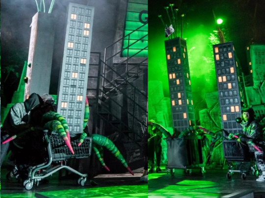
not so easy to see that they were wearing the gloves, but basically they had long fingers that looked like smaller versions of these vines.
and with all this green let's get to the finale, where everyone has a different look. we've already seen audrey ii, here's the urchins.
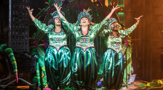
lovely and shiny looks, this time they're all wearing the same thing. these are their sort of... idk i guess this is circus vibes tbh? welcome to this absolute circus: the finale definitely DOES have a circus vibe, making clowns of the cast, particularly seymour. here's a look at everyone with audrey ii lording over everything at the top:
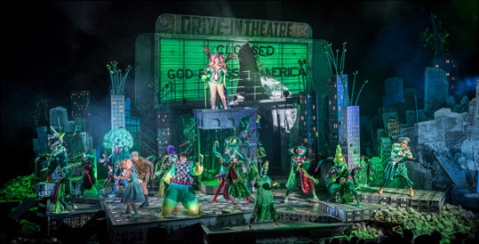

the enesmble have VERY fun alien plant costumes on, with a big focus on toothy mouths and floppy tongues (we've seen audrey ii's cape with its green lips so it's all on the same oral fixation) let's take a closer look at seymour's outfit, which is definitely giving clown, considering he was the great fool of the story.
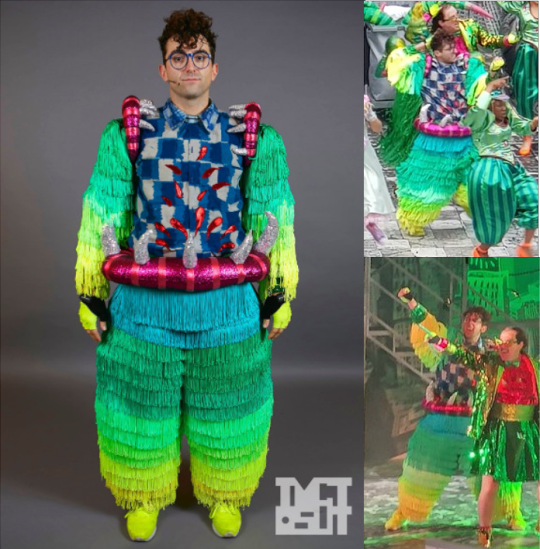
so it's this great big fluffy clown suit over his blue shirt that now his this shiny blood appliqued on, love it, with the green on the limbs ending at the shirt with the plant lips and teeth at his shoulders/waist, implying that his limbs have been eaten by the plant. this is great to see in action!
now let's take a look at the rest which i'm gonna have to show via very low quality screencaps because seymour's was the only photo tom scutt posted. here's audrey, orin & mushnik's 'plant looks', these guys are more like... audrey ii's put them in drag.
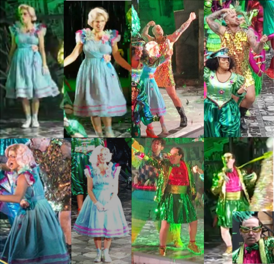
audrey's achieved her somewhere that's green fantasy, in a great swirly dress with full skirt and ruffly sleeves, still in her blue and pink colour scheme, in her same sneakers and pink glases. she's also got white lace gloves on. audrey ii said 'okay girl you can have this as a treat'. hers is the least alien-plant because it's like... audrey's fantasy look, and i love that.
orin's in a gold sequin mini-dress, but still his same combat boots. it reminds me of a brad pitt photoshoot from rolling stone 1999. look it up and i think you'll agree and i'd hazard a guess that it was a direct inspiration for this look.
mushnik's got on the long vine-finger gloves that the ensemble has during the meek shall inherit, and then a spectacular sequined set: blazer, bow tie, and the actor forbes masson said it's specifically supposed to be a kilt, because he is scottish and i think chose this as part of his look. he's also got light up gold sneakers, obsessed, and in the close up you get a look at his gold & green cats eye glasses and green lipstick.
okay i think! i've covered all of the main looks, or at least everything that i could find reasonably clear images of. iirc seymour did have a leather jacket for the scene where he's trying to make himself more like orin because he thinks audrey will like that, but i couldn't find any photos.
thanks for reading! i know this was a long post but i absolutely adoooore the visuals of this production and its a damn shame that it doesn't have a recording 😭😭😭
#little shop of horrors#regent's park open air theatre#LSOH#seymour krelborn#audrey fulquard#orin scrivello
78 notes
·
View notes
Text
Helmet Watch 2024
*cracks knuckles* I'm back to yell about driver helmets.
Like talking about and rating all the liveries last year, I had a lot of fun doing the same for the drivers helmets, so helmet watch has returned for 2024! (Under a read more as to not clog up everyone's dashes, with the drivers listed in alphabetical order by surname.)
NB - I'm just doing the "core" helmet designs, as if the drivers come out with one-off helmets at the rate they did last year I wouldn't have any free time.
Alex Albon (Williams)

Like the 2024 Williams livery, it's an evolution of last year's design. Though with less sharp angles and using something much more bubble font-esque.
We still have the double As which is neat and I also loooooooove the baby pink and navy blue combo, especially with how much pink is on the helmet. It will really pop against the dark blue livery of the car.
8/10
Fernando Alonso (Aston Martin)

Pretty much a copy and paste from last year's helmet with a couple of minor tweaks. But in saying that I do feel that the minor adjustments make the design look a lot less busy. Like last year the colour scheme is great and it'll look great with the car, and I love the Aston Martin wings by the visor, it's one of my favourite details.
7/10
Valtteri Bottas (Sauber)
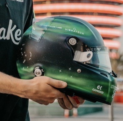
Any feelings I had about Valtteri taking forever to drop his 2024 helmet design have been immediately forgiven. I absolutely love this Northern Lights inspired design so so much. Both because of how unique a design it is but also the execution of it is just gorgeous. I love all the inclusion of the North star and all the different constellations, and that the number 77 has also been written like waves from the aurora. I would genuinely buy a mini-helmet of this I love it that much.
10/10
Pierre Gasly (Alpine)

I absolutely LOVE this one. The splashes of white and the subtle gradient shading adds so much dimension to the whole design (proof that if done right monochromatic designs can absolutely work!). I also just love the shade of pale blue as well, it's going to look really nice with both liveries Alpine are running this year.
10/10
Lewis Hamilton (Mercedes)
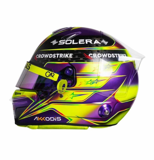
Misty eyes aside about this being the last core helmet design from Lewis as a Mercedes driver, I do absolutely love this. It's pretty much another copy and paste from last year, minus the rainbow band on the top. I'm glad that Lewis kept the rainbow lines otherwise the contrast between the neon yellow and purple would look quite jarring. But like last year I absolutely love it (apart from the exposed carbon at the top)
9/10
Nico Hulkenberg (Haas)
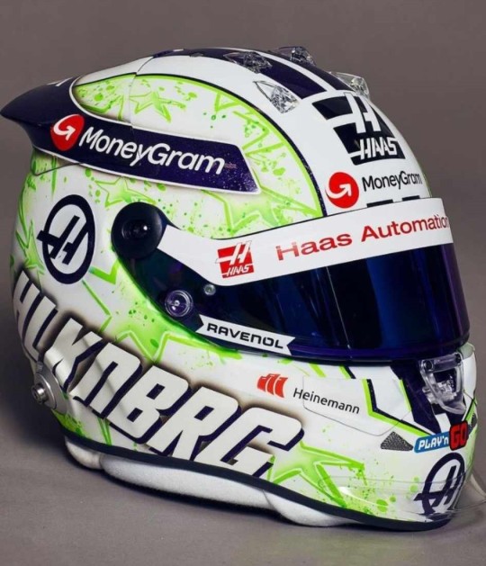
JMD Helmets really do never miss. Like his helmet from last year I love the paint splatter effect and I really like the choice to change it from orange and purple to acid green. I'm unsure on what to make of the purple and green combo as it def plays into the whole Hulk nickname, but the shades chosen do look good together.
9/10
Charles Leclerc (Ferrari)
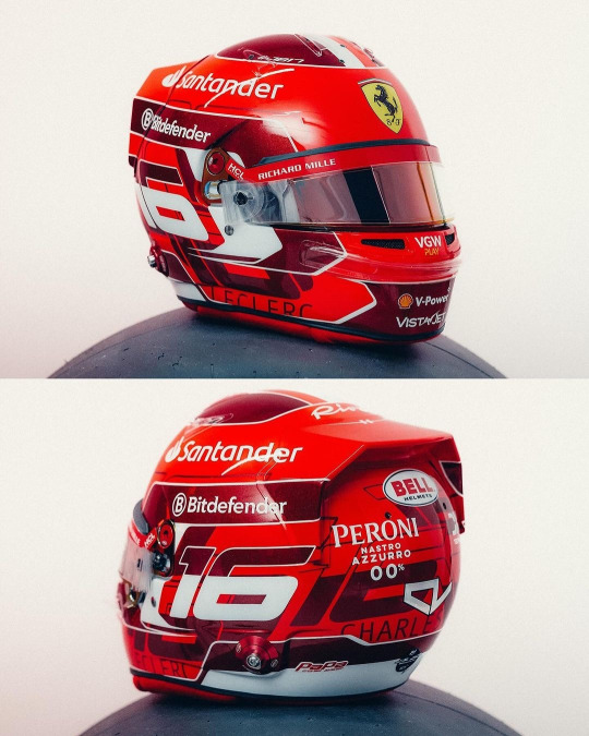
Currently kissing Charles on his pretty little head for the addition of the dark metallic red accents. It's so pretty and adds a lot of dimension to his helmet design (while I did like his '23 helmet, it did feel a bit plain). I also really like the pattern on the base of the number 16 going round the helmet, it's been done in just the right font size and colour that again adds some more dimension instead of looking busy.
8/10
Kevin Magnussen (Haas)
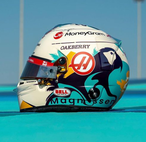
This is a complete 180 from his previous helmet designs, and while I have zero idea what the inspiration is I really like it!
The bright splash of turquoise is really nice (I will always love fun colours on helmets) and it complements the parrot design really well. (Again, I don't know why Kevin has put a parrot on his helmet, but it's fun so I'm allowing it). I would never have thought to pair turquoise and marigold together, but somehow it works, and both looks really nice on the off-white base.
8/10
Lando Norris (McLaren)

I genuinely cannot fault this. I love that it's glossy, I love the neon yellow, I love the abstract black detailing. My new favourite helmet design of Lando's
10/10
Esteban Ocon (Alpine)

I am so happy to see Esteban carrying on the red and black colour scheme from last year. While I don't love this design as much as last year's (the big carbon fibre E is a tad off putting) it's still a really solid design that will not only stand out against the Alpine livery, but against the rest of the grid's helmets too.
He also gets a kiss on the head for keeping his helmet glossy instead of matte
8/10
Sergio Perez (Red Bull)
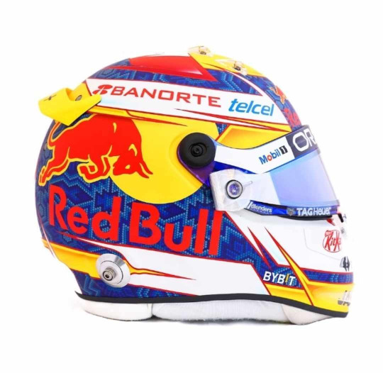
I'm unsure how I feel about Checo's helmet this year. On the one hand it does have a more cohesive colour palette than last year (and I LOVE the traditional Mexican inspired patten on the blue base), on the other it does feel a bit simple. I also wish the Red Bull logo with the white outline had been used instead, the text is a bit hard to read against the blue. But I do enjoy the splashes of yellow that do well to set his helmet apart from Verstappen's
6.5/10
Oscar Piastri (McLaren)
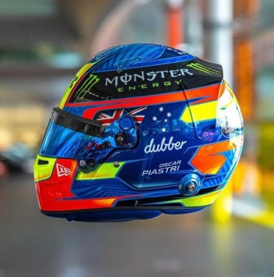
Another evolution of last year's design and I love the version for 2024! For me Oscar's helmet was too busy last year and I feel like it's been streamlined. My favourite part, the colour palette, has remained unchanged and like last year I just love how bright it is. I also really like the pattern on the medium blue base, it adds a really nice dimension to the overall design. However I do miss the silver holographic detailing from last year's helmet, it's a shame it didn't make the cut.
9/10
Daniel Ricciardo (Racing Bulls)
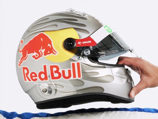
This is a colossal upgrade on last year's helmet (the tan and blue colourway was not it). And while the grey and silver colour scheme is plain, it definitely helps the flame design look a lot better than on last year's helmet and will look really good against the bright blue RB livery.
As with Gasly's helmet I also like the gradient shading, and the chrome (!!!) silver outline going around the flames.
7.5/10
George Russell (Mercedes)
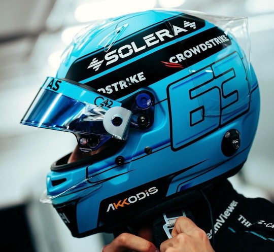
I am so glad George stuck with a blue design instead of the acid green he trialled at some races last year. It's a really gorgeous shade of blue that looks stunning with the Mercedes W15 livery, and I really like the little bits of darker blue shading and the blue visor (again I don't talk much about matching visors much but I do appreciate them!!).
He also gets a bonus point for having the black parts painted instead of carbon fibre.
8/10
Carlos Sainz Jr (Ferrari)

Again another copy and paste from last year, but thankfully with less black. It looks so much brighter with just having the black on the top. I like that the design is a even more abstract than his design last year, it definitely makes it look different. And of course the red and yellow colour scheme means that it will look really good with the Ferrari livery
7/10
Logan Sargeant (Williams)

I really, really want to like this design but the American flag just completely takes me out of it. If it wasn't there this helmet would be gorgeous because imho it's not needed as the white and blue with the red accents already does a great job in showcasing Logan's home country colours.
Apart of that, the design is really nice and it will look so stunning with the car, it just has an echo of a Haas US GP livery 😭
5/10
Lance Stroll (Aston Martin)

A moment of silence for the fallen Aston Martin wings, they were very pretty 😔
Lance's helmet design for 2024 is a throwback to the design he ran in his championship winning European F3 season, but refreshed in Aston Martin colours. I did have a somewhat negative reaction upon seeing the exposed carbon but the more I look at it the more I'm on board with it. It definitely helps that it's all over glossy. Also shoutout to Lance's continued commitment to the Aston brand by having the flashes of neon lime to match the car's livery, I will always appreciate a proper commitment to the bit.
7/10
Yuki Tsunoda (Racing Bulls)

The Japanese maple leaves are baaaaaaaack!!!!!
I'm not so sure on the navy base... but then I also don't know what colour base I would switch it out for that would look good and also complement the Racing Bulls livery. But Yuki's helmet was one of my favourites last year so I'm really happy to see a version of it back for 2024.
7/10
Max Verstappen (Red Bull)
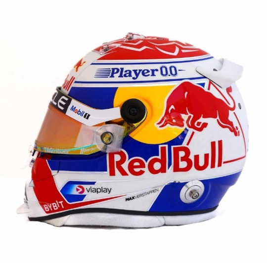
ngl I do like this a lot more than his design from last year. I love the cobalt blue (oh how I wish the RBR would be as bright as this) and I especially love the silver chrome accents, if they were a little bit thicker and more prominent I'd like them even more.
I also want to shoutout the red/orange duo-chrome visor, I never talk about them enough but I love it when the colour of the visors complement the rest of the helmet design (in this case the red and yellow in the Red Bull logo)
8/10
Zhou Guanyu (Sauber)
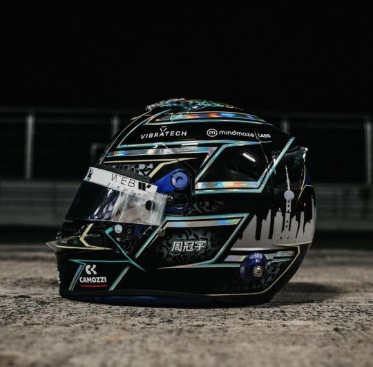
No notes. And dare I say, best helmet on the grid. I just love the pairing of all over black with the hints of the porcelain pattern and silver holographic accents. It's sexy as hell.
10/10
#Formula 1#Helmet Watch#2024#Helmet Watch 2024#Helmet#this took forever to put together bc the drivers took their sweet time in putting their HQ helmet pics out#but spoiler alert the drivers once again out designed their teams
7 notes
·
View notes
Text
{Kimtaegis’ GFX Breakdowns, Ep. 1:
↳ SARANG/SARAM; a namgi web weave}
better late than never – I’ve mentioned that this year, I will start writing my thought process behind my graphics down in actual posts instead of hiding them in the tags of a self-reblog, both for myself and those who are interested in that, so here we go!
the first more graphic-y post of the year was a little birthday present for @outroindigo, who told me that namgi’s dynamic as well as their solo music are extremely important to her, so that was the starting point basically! I initially wanted to use a web-weave-like layout for yoongi's birthday post this year, but thought that it just fit too well for this project, since including lyrics and website screenshots made it so convenient to explain the topic. the main source of inspiration but also material source was doolsetbangtan, an incredible blog that not only translates bts' lyrics, but also gives extra insights and explanations of their word plays, references to reoccuring lyrical themes and even links to other media that are connected to the songs' content. they were a huge help, most elements that ended up in the post had been already pointed out under their sites for trivia: love, people, and people pt. 2 respectively, I pretty much only had to follow the mentions and use them!
my post starts with the first half of a quote from namjoon from his november 2016 vlive and ends with it as well (in the caption) to tie the whole set together. I tried to organize the elements in a way that even someone who has never heard of the whole live/love/sarang/saram thing can easily follow and understand it, while also maintaining a pleasant overall layout and colour change (planning that took quite some time, I tell you). the trivia: love lyrics panel is a screenshot I took from spotify, I just changed the background colour to fit. underneath the people performance gif is an excerpt of yoongi's billboard interview from july 2023. the rest are screenshots directly from doolset, gifs from yoongi's iu's palette interview and selfmade visualisations of lyrics, etc. I decided against listing all the content elements in the caption - as usually done for an actual web weave - because some media was used multiple times and it would've felt weird to repeat it in the listing.
regarding more stylistic choices, I decided on a blue and warm yellow-orangy colour scheme, both because kari's current blog layout is this beautiful blue, but also because I associate blue with both namjoon (especially after indigo, obvs) and yoongi (his painting from 2020 instantly comes to mind). since 'love' on the other side is often portrayed as something warm and cosy, red/orange/yellow became the contrasting colours. I tried very hard to make all the colours look as consistent as possible and to match the shades of blues to kari's blog colours. funnily enough, there always seemed to be either something blue or warm-toned in the actual content, which was pretty convenient. besides the pseudo-screenshots for some of the lyrics (typed out in fonts that are typically used in books), I created three graphic elements as well, simply because I know sweet kari appreciates them and I wanted to have a personal kimtaegi touch in it. the first one is a visual representation of people pt. 2's lyrics. I always thought of faceless silhouettes when thinking of people, and combined that with yoongi's painting style (you see that painting means a whole lot to me lmao). since I can't really draw, I used paintings I found on pinterest (you can find the whole board in the source of the og post), masked the person and the heart out and changed their colour (which is not as easy as it sounds!). the fading effect was achieved by carefully going over both until I liked how it looked (which again, took embarrassingly long). the second graphic element is again a direct visualisation of the lyrics used in the panel: I digitally cut up a picture of namgi, in multiple rectangles that are supposed to represent the letter ㅁin saram. I actually printed the picture out first and cut it up with scissors, but I couldn't find a good way to scan it back in :( so digital cutting it was; please note that the edges of every snippet are rough, I always try my best to make it look as realistic and tangible as possible which is time-consuming but adds a nice touch in my opinion.

the collage effect of this graphic is inspired by works of anthony garace. his artworks are stunning, and I do love a good mixed media effect! also it just fits perfectly with the lyrics... among all these straight lines (-> the rectangles), [I find/ is] my love, my love, my love (-> little snippets of a picture of the two). the flowers in the last graphic both represent yoongi (the lotus flower cutout, referencing his amygdala lyrics about blooming like a lotus flower, which is also achieved by love, y'know :( ) and namjoon (the wildflower; yes it's an actual blue wildflower, I researched! it's a wild blue flax; referencing his same-named song). I used an actual photograph of it and made it look like a painting with photoshop magic. it also was supposed to look just a litte like a cynotype as used in his album design.
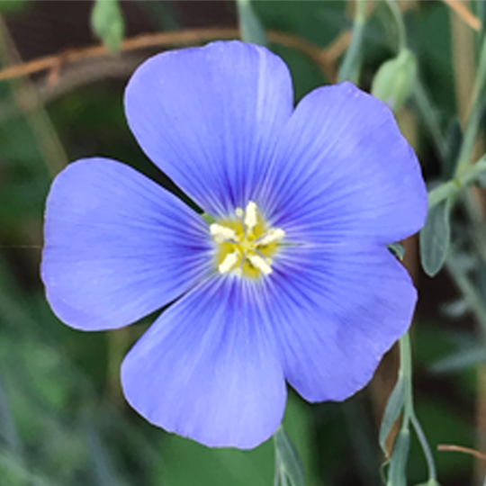
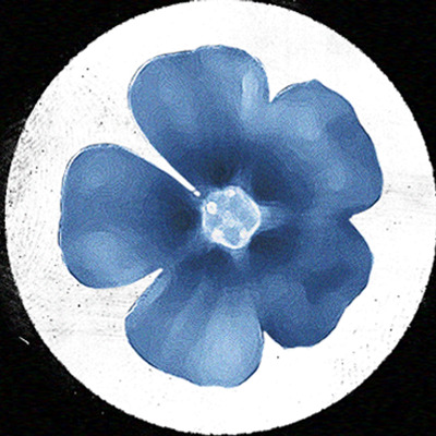
again, look at all those nice rough edges in that panel, this is all added intentionally. I hope everyone who saw the post also caught the teeny tiny animation of the hangul letter ㅁ to ㅇin the text on the left side; quite literally eroding edges <3
the last gif of ot7 was perfect to round it all up, referencing the lyrics above quite emotionally, starting off with the two of them, then them being joined by the rest....sigh. I will be honest, there have been a few tears falling onto the keyboard. I hope this set can convey namgi's beautiful lyricism in an interesting, artistic way. it's easy to get inspired by their art, it definitely makes you appreciate everything they do even more.
10 notes
·
View notes
Note
u r sooo right about the red team blue team rivalry which is also what I thought about the aesthetics of some pictures of fabio q vs pecco in the last title fight races of 2021. pecco was so unsure back then and fabio had more natural talent and gumption and pecco seemed nervous and fabio seemed like he was having a good time and they made for good a narrative in their blue and red leathers.
we have only had four title fights this century between a blue team and a red team! and even that is me being generous by including 2007 - which imo counts because casey had to outscore valentino not dani at motegi to clinch the title and dani only nicked second in the championship off valentino at valencia. so yeah, four title fights: 2007, 2008, 2021, 2022. just isn't good enough
I will say by the END of 2021 pecco had mostly finished finding his feet and was winning a bunch of races, whereas fabio was less self-assured and more going 'yeah this title is nice but... uh...? guys we might be a bit fucked?' but. yeah. aesthetically their title fights were nice vibes! I was totally pro that rivalry conceptually! in practise, these aesthetics were let down somewhat by the absence of this little thing I like to call 'actually fighting on-track', which as a traditionally-minded viewer I do on occasion like to see in my title fights. like, valentino and casey's whole rivalry aesthetic was enhanced by how you have cool shots of them actually being, y'know, in the same shot
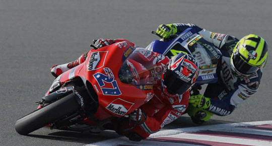

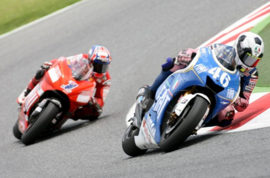

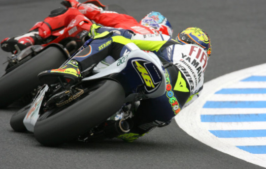

a selection from some of my favourite on-track battles of theirs during the time they were at ducati and yamaha respectively (minus assen 2007 + phillip island 2009 for obvious reasons). very nice distinct colour scheme, colours really popped, we know casey was paying attention to luminous yellow covering things and it's symbolically neat that one of 'valentino's colours' is on casey's bike (no, I do not care about what the australian flag looks like and indeed refuse to acknowledge the existence of 'australia'). also generally liked their helmets during that era, strong stuff all round
I've been thinking a fair bit lately about how this era compares to the other era this century that is generally associated with poor quality of racing, aka the alien era. the word that is commonly associated with those few years is 'processional', not unfairly... I think a refrain I see quite commonly is that some fans still have too much nostalgia for the alien era because they're only thinking of the laguna 2008's and catalunya 2009's of this world, not all the many many races of that era that weren't laguna 2008 or catalunya 2009. which is true! my general take is that the average race quality these last few years has been higher and there's often something interesting happening somewhere - you don't get the abysmal lows of the alien era quite so often. on the flip side, while the alien era certainly is associated with technical regulations that produced some poor racing... well, it did seem to at least be possible when all the stars aligned to have a duel that lasted for more than three corners. that used to be a thing even in the alien era. like it did happen
as much as I find the alien era deeply frustrating and agree with the general point that race quality these days doesn't plummet quite the same depths, I also think you need those highlights!! just to give people stuff to remember seasons by, stuff that lives on in years to come because it was just such a foundational cool memory. the current dearth isn't primarily the fault of the riders, but we have been pretty short on outright classics since end of 2019 - and the ones we have had tend to be more in the dogfight category of the typical phillip island mould than the race long duel. my sense is the current formula makes these even more impossible than 800cc did, which also weren't conducive to duels but at least didn't have this infernal tyre pressure crap week in week out that makes it impossible for riders to follow each other closely. also does feel like one of the real issues with increased homogeneity between the bikes... like casey/vale was kinda the motorcycling rivalry for babies because you knew that casey would have the edge in the straights and valentino would have the edge in the twisty bits. now a bike like the current ducati just has a way more balanced performance profile, and that's what everyone else is chasing. which. y'know. harder to be doing dramatic duels if you're all good in the same places
anyway, the point is that fabio and pecco had all the ingredients for a perfectly enjoyable rivalry... fabio as the more precocious one but also by 2021 a somewhat steadier performer, pecco cerebral but also volatile, self-critical to a fault. pecco's actually someone who I'd kill to see in a better version of this sport just for a bit, seeing as one of his biggest strengths as a rider is how excellent he is at defending - which would be nice to see tested more in races where that like... actually matters. they're both a little bit too nice and non-confrontational for my tastes, like you kinda worry any rivalry between them is destined to just be quite friendly, but there was still enough contrast in personalities and approaches to theoretically generate intrigue. plus, obviously, most importantly - they did have a red and blue colour scheme

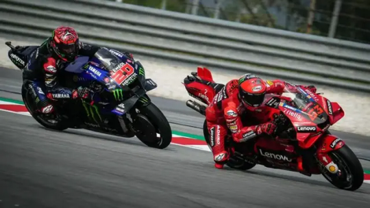

while I'm generally a fan of dark colour schemes, I do feel like the white of the fiat yamaha era did allow the blue to pop a little more. and maybe it would've helped if the red had been a bit brighter to provide more contrast - I like both of these designs on their own, but together they do look a tad bleak. also my god have these bikes become massive
unfortunately, however, it comes back to the lack of memorable on-track battles. 2021 and 2022 were both kinda weird years, with pecco not really establishing himself as The Title Rival until quite late into 2021, and then 2022 being... y'know, a truly bizarre experience. they were never really good at the same time! didn't ever really hash it out for the win! even when they came close, like jerez/mugello 2022, it wasn't all that much of a fight... it's a shame - we know they're both theoretically capable of perfectly compelling on-track battles, they just never really did it with each other. pecco's had more good fights with jorge than with fabio, and that's also not exactly happening at the rate I'd like
in conclusion. it is time to bring back red vs blue sports contests. let us return to this


and the only way to do that? well, that would be for the blue team to get its act together
#i have to be honest i don't really associate fabio in my head with 'having a good time'#he was kinda happy for stretches of 2019 and like. a decent proportion of 2021. a chunk of 2022#but that is a man who is too french for that kind of nonsense. late 2021 he was already making anxious screeching noises at yamaha#it's actually kinda pleasant the discourse has moved on from calling fabio a bottler... after 2020 the situation was DIRE#even after 2022 lbr#admittedly we've just moved on to the next victim but ah well. plus ça change etc etc#//#brr brr#current tag#heretic tag#batsplat responds#god the front tyre shit pisses me off so badly. we're gonna have at least another year of awful races#because the riders/teams/dorna all suck. idiots
2 notes
·
View notes
Text
Now for initial impressions of the character designs.

Cure Sky is an immediate winner in my books. Obviously the Blue Leader aspect alone makes her a standout but even with a different palette this would be a great design. I am a sucker for asymmetrical and gradient hair so this serves me well, and the hairstyle is also good; pretty simple twintails but the stray strands (both short and long) make it more memorable, and the bangs are fun too. Plus the wing decorations are super cute. And then there is of course the half cape which is the standout detail of the design, capes are always badass by default and especially long capes, and having it be a half-cape makes the design more airy. The dark red inside helps the overall palette by making it less monochrome.

Even if Cure Sky wasn’t such a praiseworthy design there would be plenty to like in the Hirogaru designs since I like Cure Prism too. A cute pastel palette and lovely poofy shape with the skirt. Fun heart braids. The ribbon behind her has a nice detail with having different decorations on the front and back side, and I really like the oversized ascot. The most noteworthy detail to me is the dark part of the dress, the peeking night sky makes for a great contrast to an otherwise very light colour scheme.

Cure Wing I didn’t really feel at first but upon closer inspection I like the design more. Pants in Cure form is an immediate plus and the overall suit-like look is cool too. Plus this is almost a short-haired Cure, I wish they had dared to go through with that but at least the ponytail looks like it’ll look good in action. Colour-wise the design feels a little too monochrome for me, but the inside of the jacket has a great combo with the teal and yellow.

For Cure Butterfly I really like the colour palette, especially for something else than the main character, and there are individual parts of the outfit that I really enjoy too, but I’m not sure how well everything fits together. Now the huge bow on her back gets a little lost in her hair. However like with Milky I’m a fan of one-leg gradient tights, and she has the same kind of gradient that merges into her skin with her gloves, which is weird but I liked it in Flip Flappers and I like it here as well. The frilly layered top is cute too.
--
Overall I like them all, no duds this time around. It is a shame that there’s not much of a common theme but I guess that hasn’t been a thing in Precure for like a decade so there’s not much of a point in complaining about it here specifically. One thing that’s a little meh is how some of them have multicoloured hair while others don’t, I think that’s the kind of detail that should be consistent in the whole season. Or I guess if you count Prism’s hair having two different tones that are like one shade apart and that tiny strand in Wing but I’d rather have a more noticeable theme. At least Wing puts the gradient in the clothes, but if gradient is supposed to be the theme, Prism should have it a bit more noticeable.
46 notes
·
View notes
Note
What colours do you associate with the characters? Like if someone says Asmodeus to me "white" because he is bascially a grey ass bitch
Lucifer red
Satan - Red
Beel - orange
Mammon - yellow
levi - purple
Belphie - blue
Hello, anon!
This is actually a complicated question for me! Because when I do headcanon posts, I always use the color associated with each brother's sin for their names. Then the dateables are just whatever I feel fits them, which is usually based on their actual design. So I actually have some colors that I associate with each brother that are not necessarily their sin color. And sometimes I accidentally use the wrong color - especially with Lucifer. So if you're reading one of my headcanon posts and suddenly Lucifer's name is red instead of blue... that'd be why lol.
So here are the colors I generally associate with all the characters:
Lucifer - blue is his sin color, but I barely associate that with him, due to his design I always think of him as red and black
Mammon - yellow is his sin color and I definitely associate that color with him, but also white because of his hair/markings/nails and often black because I just think it looks cool with the other colors
Levi - orange is his sin color and while I do associate it with him a little bit, it's definitely more purple for me on this guy though also blue or like blueish-purple... almost indigo
Satan - green for everything lol, green for the sin but his design is all green, just various shades of it
Asmo - pink for the sin and pink for everything else, too, but also black because black and pink look super cool together
Beel - red is his sin color, but I definitely think of Beel as more orange and even a little bit of dark blue, mostly because of his casual outfit colors
Belphie - purple for the sin, and I think that fits, but definitely mixed with blue - honestly I love Belphie's whole aesthetic, I really associate him with night sky vibes so to me it's all purples and blues, but also black and white like the cow print
Now the dateables have sins that they're associated with that people have based on the color of the glowsticks they use in the OG. I'm pretty sure the devs just went in order when determining who used what, but it certainly adds an interesting concept to their characters. However, I go with my own ideas when making posts for the colors of their names because I don't feel like the sin colors fit them at all lol.
Diavolo - technically pride which would be blue, but this guy is all red and gold to me, so I use red for his name
Barbatos - his sin is greed which would be yellow, but uh no my man is all teal and green and black
Luke - he's next because his glowstick is orange for envy, but I generally associate all the angels with blues and yellows, so I use yellow for Luke
Simeon - his is green for wrath, but again I use blue because that just feels more accurate lol
Solomon - his is pink for lust, but I use purple for him, though his color scheme really tends to be more of a blend of pink, purple, and green, I think... or maybe it was pink, blue, and green? Anyway, it's a little more on the pastel rainbow side of things. But I also kind of associate dark blues with him because of his cloak, as well as black and white.
Wow this response ended up being way longer than I thought it would be! Anyway, I hope I answered the question!
#I just love their colors lol#it's all about the aesthetics#obey me#obey me nightbringer#obey me colors#obey me brothers#obey me dateables#anon asks#misc answers
10 notes
·
View notes
Text
tu bshvat 5784
Welcome to the new tradition around here, sharing my family's tu bshvat table! Pictures imperfect because we needed to sit and eat!
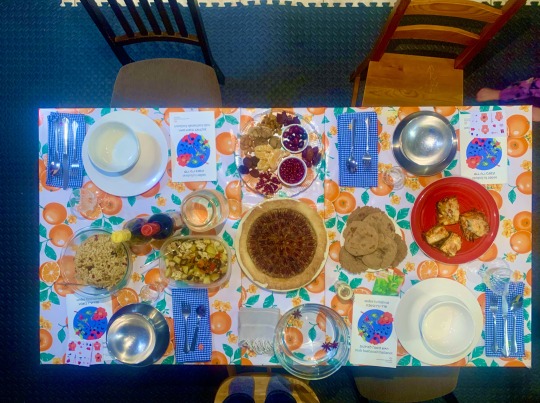
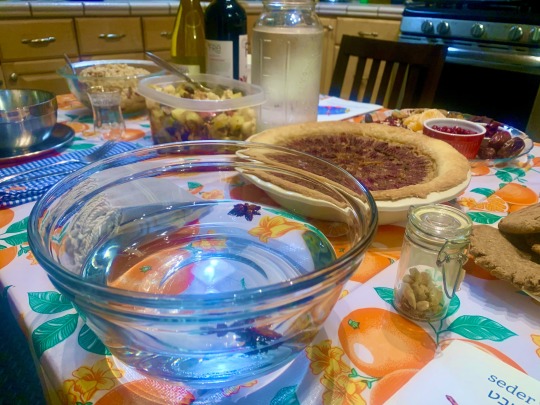

Image description. Three photos of a table set with a meal, described below. One from overhead, the other two from just over tableheight at two different angles.
The whole table! This is a secondhand dropleaf table that I fixed up a bit with oilcloth, but I'd love to have one of those old country kitchen wooden tables that serve as prep table, dining table, and ad hoc operating table for La Résistance. The kids keep grabbing onto the edge and trying to swing off this, and you can imagine that will one day soon end very poorly.
Since I live an actually not aesthetically cottagecore life, we have nothing but the finest dollar store plain white dishware for us adults, and metal sets for the kids. I haven't finished making all the colour coded napkins, but eagle eyed individuals will notice each blue gingham napkin has a flower embroidered in the corner in each of our colour coding scheme, from top left clockwise that's red, yellow, green, orange. Each setting has a bowl on a plate, a fork and spoon on a blue napkin, and a haggadah with a pomegranate branch on blue circle. Adult settings also have a butter knife and a stemmed port glass, and the kid settings have two small square sticker sheets and a turkish teaglass.
The table has, from top left clockwise, an adult place setting, a fruit plate on glass, a child setting, a red plate with four servings of melanzane alla parmigiana, an adult place setting, a paper packet of parsley seeds, a small glass jar with cardamom pods, a glass bowl of wash water with three star anise floating in it, a gray towel with white stripes, and a child setting. Down the center of the table from left to right is a bowl of fruit and nut studded barley, a bottle of white and a bottle of red wine, a square container with mixed roasted vegetables, a half gallon mason jar with water, a pecan pie with circular pattern, and a plate of homemade thick matzah. Yes, I made matzah because I thought it would be easier than making bread. Yes, my oven hasn't been cleaned in a while and so started smoking. Yes, the smoke alarms went off multiple times. Yes, I did have to stand there facing the street while it rained pumping the side door while all the windows were open to get all the steam and smoke particles out of the air. Holiday adventures with Sahar!
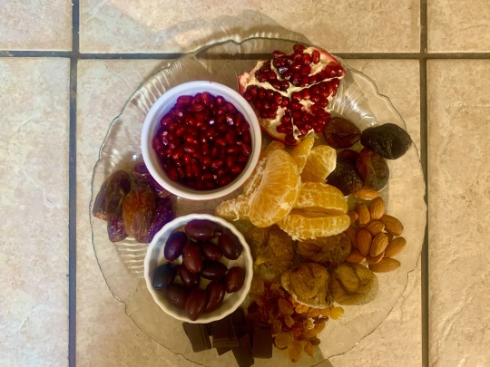

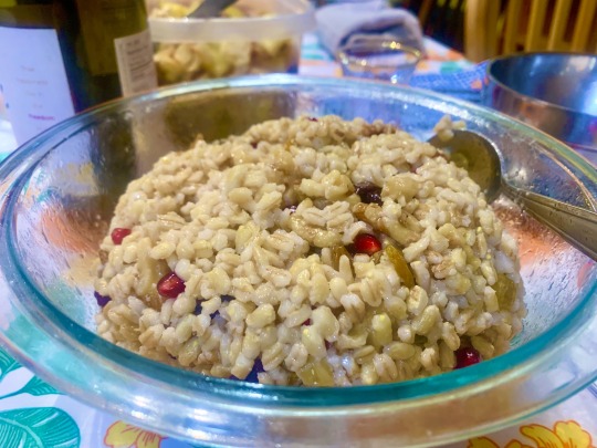
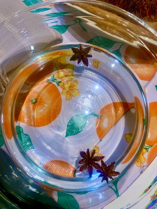
Image description. Four close up shots of foods, described below. All are birds eye except the barley, which is at an angle to show the careful mounding.
the fruit plate! Our minhag is at least twelve tree fruits so we piled most of them on the tasting plate. From the ramekin going clockwise, that's a ramekin of pomegranate arils, a chunk of pomegranate, segmented tangerine slices, dried apricots, almonds, dried figs, golden raisins (the baby calls them 'ravens'), extra-dark chocolate chunks (cacao is a tree fruit, it's what the ancestors would want), a ramekin of pitted kalamata olives, and some dried medjool dates. Bonus: the kids ate the plate remnants as a serve-yourself breakfast the next morning. Always wonderful when a holiday yields some batch cooking and child autonomy.
a pecan pie. We use the King Arthur Flour Old-Fashioned Pecan Pie recipe because corn syrup tastes off to me. The changes we made this time are making a savory not sweet pie crust (my spouse makes it with iced water and vodka), cream instead of milk, toasting the filling nuts just shy of burnt, and cream instead of milk. It worked really well to reduce the sweetness from 'sickening' to 'very.' It's our traditional dessert and we eat it only once a year because it's so sweet. I like laying the pecans flat side up in rings on the top for full coverage and so it looks a little like tree rings.
The washwater bowl. It's just a glass mixing bowl with water, but I dropped in some orange blossom water and floated some star anise to make it pretty, and I liked it. Will have to repeat the anise for pesach, but skip the orange blossom water - the anise completely overpowered it.
The barley. We cooked it plain and then added walnuts, pine nuts, dried cherries, fresh pomegranate, and a lot of olive oil. We didn't salt it, which was fine, because we let the kids salt the eggplant before we roasted it, which was not fine. Together they taste great. For those keeping count, the barley dish rounds out the tree fruits to thirteen, and with the whole-wheat matzah that makes all seven species! Side note on the matzah, keep your eyes peeled around pesach for my recipe. Once I learned how to make it, I'm never going back to store matzah. Mine is delicious and oil rich, and we eat it as a pleasant flatbread, not just the bread of affliction.
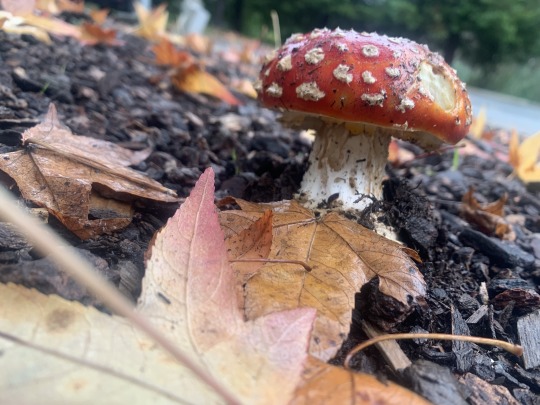
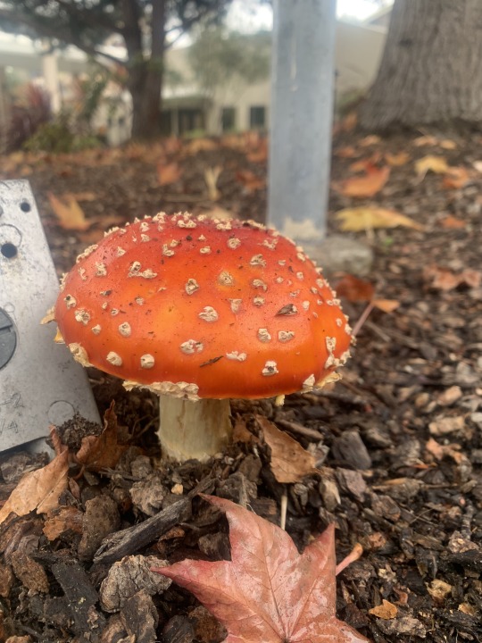
Image description. Two photos of amanita mushrooms from overhead angles.
As a final bit, please enjoy these amanita mushrooms from the JCC. The groundskeeper is in a months-long battle with this patch that just keeps coming back. He keeps knocking over all but one so the preschoolers can safely enjoy looking only, and they keep popping up. I'm delighted - I thought these were mythical and didn't realize they grew where I live now!
If you'd like to support my work, you can buy a copy of my tu bshvat haggadah here, and the two tu bshvat stickers here and here.
#witchcraft#jewish magic#jewitch#tu bshvat#tu b’shvat#tu bishevat#jewish#judaism#haggadah#seder#siddur#jumblr#thefifthacre
6 notes
·
View notes
Text
Punitapi Chan Review!
Not exactly a virtual pet, more of a collecting game, but still featuring little guys to play with. Punitapi Chan is a cute device with simple, but quite fun gameplay. And very adorable aesthetics.
General score: 7/10
1. Design
The device is much larger than a Tamagotchi and way thicker. It's shaped like a boba tea half-cup - the back is flat. At first I thought that it would be cooler if it was a full, round cup, but then I realised that not only would it take up too much space, but it would also be impossible to play with it while it's lying flat on the desk. With the current design, you can both rest it on its back and make it stand like a real cup.
On top there is a slightly translucent straw made of rubbery plastic. It's used for many interactions and games, which I'll describe later. You can see it behind the screen - everything is displayed as an overlay for it. For now I didn't have any problems with it, but you need to be very mindful of it while putting Punitapi Chan in a backpack or generally travelling with it - it's definitely a part that could get easily damaged.
The device has 3 buttons - the ones on the side are shaped like hearts, while the centre one is shaped like a boba. They might seem a bit loose if you're used to Tamagotchi, but they are actually very reactive and there is no problem with them. They are just a bit soft while pressing.
The screen is quite tall. It's lit up by four lights located on the inner sides of the device. They are quite visible as their placement is shallow - it's a bit of a problem while taking photos of the screen and might be annoying to some users. The very quality of the screen is good, the animations are smooth and the colours are vibrant. Generally, it looks way better in real life than on photos - for some reason, on photos it may seem less sharp than it actually is.
Finally, the weakest point of the design - the colour. For now, there are two designs available: Peach Milk (the one I have) and Aqua Milk.
Peach Milk is pastel-pink, with purple buttons, top and blue/purple faceplate around the screen. Then there is Aqua Milk, which is... kinda ugly. It looks unfinished - the device body is almost the same colour as the top and buttons (light blue), only slightly more greenish. It seems as if the whole thing was made of the same plastic, making it all visually melt and looks like a prototype before the graphic design phase rather than a finished product. The faceplate is blue/yellow/purple, which in my opinion doesn't really match the colour of the shell.
Generally, I'm a bit disappointed in the design. Punitapi Chan is big, so there is enough space for patterns similar to Tamagotchi. Instead, there is just an empty plain of the same colour. In case of Peach Milk version, it still looks cute as the very colour scheme is pleasant to look at. Aqua Milk looks, as I've mentioned, quite unfinished.

2. General idea
The whole idea behind Punitapi Chan is catching little boba to make new drinks. The protagonist has a boba tea stall and wants to develop the business. To do that, she needs to make new drinks and attract more clients.
There are 5 stages of the game. You start with a simple, small stall. Once you catch all boba from the 1st chapter of the boba book and make all drinks that use them, you automatically evolve into a boba truck. The process repeats every time you make all drinks from a certain stage.
That's basically it. The gameplay is very simple - there is no taking care of a pet, no more challenges etc. I can see how some users can quickly get tired of Punitapi Chan - it doesn't surprise you with anything. The most original and changing thing are some boba that you can catch only at special hours/days/months/seasons. It's not a device that keeps you entertained for hours - rather something to play with from time to time. If you're looking for an investing gameplay, you're going to be disappointed. But if you want something pretty to look at and play only from time to time, Punitapi Chan is perfect.
3. Catching the boba
The main mechanic of Punitapi Chan is catching boba. The first icon on the main menu lets you do that. Choose the tea type, the level of ice and the level of sugar. With next stages, you unlock more tea types.
At first, the different combinations will give you different boba. Once you try all combinations, from my experience, you just have to randomly mix to find the rest.
Catching is a simple minigame - a screen with many boba will appear. Use the straw to mix them. After a moment, one different boba will be revealed - it might be small and round or large and more chunky, wearing dark glasses and/or face mask. To catch it, pin it with the straw once it enters a heart-shaped field in the middle bottom of the screen. Then, the second stage starts. Press the straw down, but don't leave the bar on the bottom. Depending on the size of the boba, you will face a different problem. The small boba will get surrounded by others and you need to wave the straw to chase them away. The big boba will get stuck, so you need to wave the straw to free it. Once the boba reaches the top of the straw, you caught it!
If it's a new one, you will get informed about that and it will be added to your catalogue.
4. Custom clock screen
The second icon allows you to customise the clock screen. If you are in the main menu and click the exit button, you will see the clock screen with the date and some boba floating around. Over time, the level of tea will drop and the boba will get upset, being squished at the bottom of the screen. Swirl them around with the straw to raise the level of tea.
Under the second icon, you can choose the tea and boba that you want to have displayed. You will unlock more types of tea and more boba with the next stages of the game, so you will be able to customise the lock screen further. There is a certain number of boba you can have at the same time, so at some point you'll have to start choosing.
5. Mini-games
The third icon allows you to enter the mini-game menu. There are 6 games to unlock in total. You start with 2 of them, and unlock more with the next stages of gameplay.
The mini-games earn you Puni Coins that you need to buy ingredients to make new drinks. They are also pretty fun - catch falling boba, compose drinks for clients as fast as possible, dance and much more. The mini-games are one of my favourite features of the device.
6. Tapi Market
Here you can buy ingredients for new drinks. You find out what you need to make new drinks from in the Kitchen. The items are pretty cheap and with every next stage you unlock more.
7. Kitchen
Under this icon you can make new drinks. Choose the boba and the ingredient it wants (it will appear over the boba once you click it.) The boba and the ingredient will be thrown into a blender. Move the straw to mix it. There is no mini-game this time - I feel like it's a lost opportunity, but not a big issue.
If a new drink can't be made with this particular boba, or you chose a wrong side-ingredient, it will turn into a nasty failure-drink. If you're successful, you will see the new drink and it will be added to your catalogue.
8. Catalogue
Here you can see all the boba, drinks and ingredients you've collected so far and the ones that are still locked.
In the boba screen, you can also add/remove them from the clock screen. Interesting thing - there is a page with special boba that you can unlock either at particular times, or through special codes. I recommend checking out Fuzzy N Chic's guides for the codes and how to enter them.
In the drink screen, you can see your drinks and try to guess what you need to make the locked ones - if you click on the locked recipe, you will see the outlines of the boba and ingredient you need. The shapes are quite characteristic, so you can guess when you unlocked the needed stuff. It really takes away the time spent in the Kitchen, making fail-drinks.
The ingredient screen shows, well, the ingredients you've unlocked. Not much more to it.
9. Settings
Change the sound, brightness, date, time, your birthday or remove all data from the device to return it to factory state.
Some observations: the device is quite loud even on the lowest setting. I'd use a slightly lower one instead of full sound, which is basically unusable. Fortunately, you can also turn the sound off completely.
The brightness settings are alright, though just as with sound, I'd like one level less than the lowest. But this is a small thing.
Now something more surprising - the day date sometimes randomly jumps one day forward. I've found some people complaining about the same thing, meaning that it's probably an issue in the code generally, rather than an individual error. I'm planning on looking into the code to see what could be causing that, but I'm probably too inexperienced to figure it out lol
10. Conclusion
Do I recommend Punitapi Chan? You can probably guess by the rating score that I like it. But the real answer depends on what you're expecting from your device.
If you're a classic Tamagotchi player, with your enjoyment dependent on things like evolving your pet and taking care of it, Punitapi Chan will probably seem boring and underwhelming. As a huge Tamagotchi fan myself, at first I wasn't sure if I liked the collecting-oriented gameplay, but I grew fond of it.
If you're ready to accept a bit less action, compensated by very cute aesthetics, Punitapi Chan is a cool gadget. Not as cool as e.g. Tamagotchi Pix, still a nice thing to have. I'd recommend searching for some sales, though - they can get quite expensive
4 notes
·
View notes
Text
bracelet tour
in no particular order, except it's in somewhat of a particular order. kind of a long one, don't click the read more if you don't want to read more
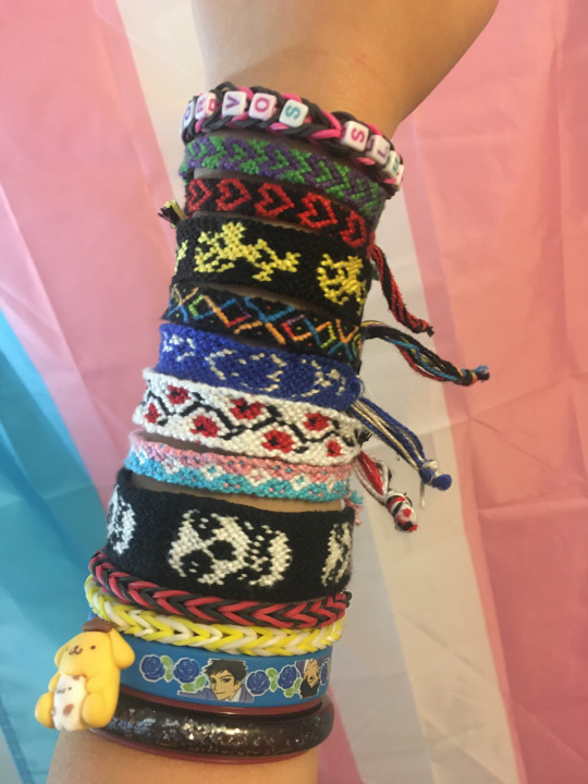
preamble
structured by name, picture, description, story/extra information, and standard location. you don't have to read anything just look at the pictures <3 piling them on one arm is just for the pic i don't actually wear them in that specific configuration
1. "rave bracelet"

made of somewhat malleable plastic, translucent in the middle with glitter that's slowly become more and more unevenly dispersed, outlined with pink on the edges.
i don't really know why i call it my rave bracelet, i'm not going to any raves, it might've said something on the packaging? it was 50 cents at the dollar store and my friend bought it for me on their birthday. i'm such a good friend. it featured in two of my high school art projects because it's such a powerful symbol of friendship. sometimes i'll squeeze it when i'm feeling anxious
standard location: base of left arm, at the very bottom. it can go up to like half my bicep because i'm a scrawny bitch
2. mori from ouran high school host club

a blue rubber bracelet with blue roses and mori ohshc printed on it
i had to google his name. i've never seen ohshc. purchased at hot topic in a pack with the other characters on a group mall outing, i was assigned this guy for lack of a more fitting character. i think it's pretty funny, maybe i should watch the show at some point? who knows, i'm pretty bad at watching long form media
standard location: base of left arm, second in command, above the rave bracelet.
3. pompompurin
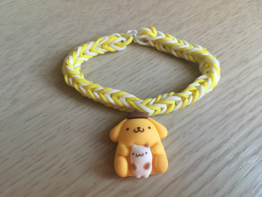
a fishtail rainbow loom bracelet made from alternating white and yellow bands. in the middle is attached a charm of pompompurin
made the same day as my corvo's slut bracelet. my best friend assembled this and a matching cinnamoroll one for herself. i'm going to be honest i like cinnamoroll more, but i have accepted pompompurin into my life.
standard location: left arm. he hangs above mori, flat and facing me. if my arms are down, he's upside down.
4. black and red fishtail rainbow loom

what the title says.
also made by my best friend, but earlier. i don't really wear this one anymore because i had one in the same colour that said "vampir" (as in. the character from dick fight island. we read dick fight island and then she made bracelets for a couple of us with the names of the characters on them) but it broke </3 rip vampir i don't remember what you did at all besides being in the dick fight on the island
standard location: retired
5. black and red hearts
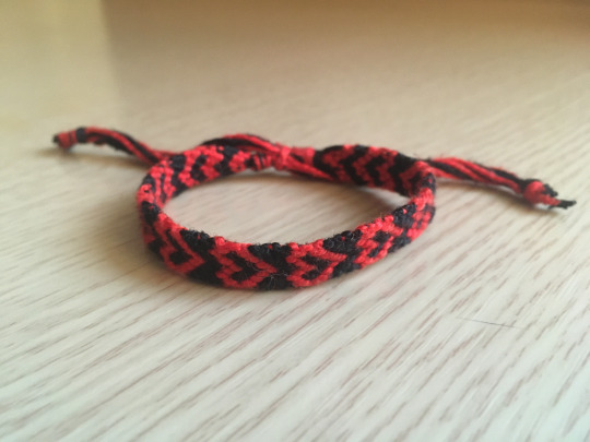
a heart friendship bracelet made from craft string. the hearts are red and the background is black.
i've made like 14 of these things in different colours. i'm not sure on the exact number, but most of them were for my friends. we all get one in our own colour scheme :) of course, mine is black and red, because of the my chemical romance poisoning. this whole thing started when my mom gave me a big pack of thread intended for friendship bracelet making, and i said, ok sure why not. they're all size adjustable, so you don't need to tie anything.
standard location: left arm, 3rd from the top, always has to be facing the way it is in the above picture (with the top of the hearts facing my left)
6. green and purple hearts
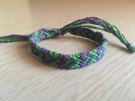
a heart friendship bracelet made from craft string. the hearts are purple and the background is green.
the latest of these specific heart ones that i made, alongside one that's inversed (purple with green hearts). me and the bestie are going joker mode 👍 also funny because i was called the joker (specifically jared leto joker) once by a fourteen year old trying to bully me
standard location: left arm, above the black and red hearts, also always has to be oriented with the top of the hearts facing left.
7. red flowers (friendship-bracelets.net pattern #9173)

red flowers on a black vine-like stem on a white background. kind of reminds me of the rose health bar in alice: madness returns
second non-heart bracelet i made if my friendship-bracelets.net account is to be believed, made this one just cause i like how it looks. the edges curl up on themselves but it's fine if you just flatten them out.
standard location: i don't wear this one that much, but it sometimes appears on the left arm. sometimes on the right. just, somewhere in the middle, wherever i think it looks right. flowers face left when on the left arm, right when on the right.
8. this bracelet is transgender (pattern #106540)
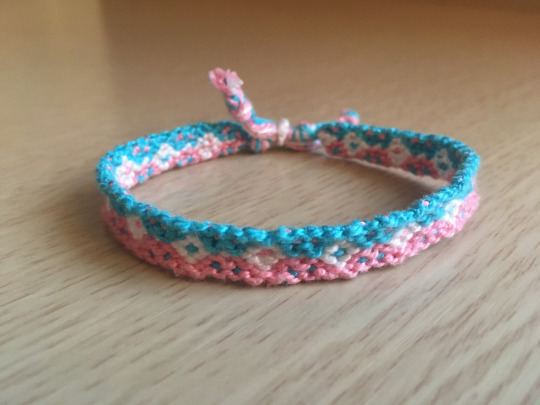
half blue and half pink, with white diamonds with alternating blue and pink interiors.
i just made this one because of the colour scheme it came in. the pattern's also nice i guess
standard location: same as the previous one, not always worn and location not set. i don't even have a preference for which side is up, though i think the blue side usually is.
9. emoticon mice (pattern #3228)
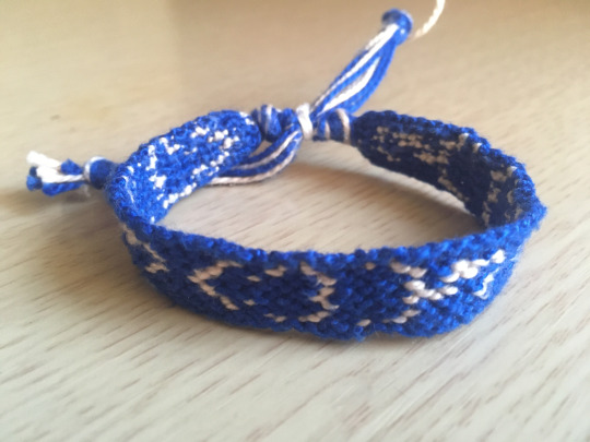
white emoticon mice on a blue background
<:3)~ mice. or maybe they're rats. who knows, they've been abstracted to smiley face levels. i wanted rat friends like i summoned them with devouring swarm. i don't like this one that much because it's so goddamn uneven, idk if you can see it that clearly but it's super obvious when it's flat. i am so ashamed of how wiggly this is that i didn't upload a picture onto friendship-bracelets.net when i finished it.
standard location: not always worn and location not set. the mice face my left when on the left arm, and right when on the right arm.
10. papa's games new years decoration lookin-ass (pattern #110541)

rainbow x's and infinity symbols on a black background.
i'm pretty sure i'm autistic. me and the boys out here experiencing patterns symptoms and behaviours. anyways that's why i made this one
standard location: not always worn and location not set, but i think i prefer it on the right arm.
11. corvo's slut

a black and pink fishtail rainbow loom bracelets that says "corvo's slut" in blue, purple, and pink cube letter beads
you've already seen this one but you can see it again! it's kinda hard to stretch it out so all of the words can be seen since the letters take up more than half of the whole bracelet. very funny. i love this thing, my friend was a genius when she suggested this one. turned the pic sideways so it matches the others.
standard location: top of the left arm, above everything else. this is cause it was pretty tight but i stretched it out, it's still kinda tight tho.
12. misfits fiend skull (pattern #2902)

white fiend skull on black background
a little convex??? my string tension is garbage. it's also pretty thick at 25 strings so i got creative with how i tied the ends. this one makes me think of leyendecker because i was watching a video about him when finishing it.
standard location: don't always wear this one but i wear it more often than some of the others. can go on either arm but mostly the left, above pompompurin and below the hearts. top of skull faces left when on left arm faces right when on right arm you get the pattern right.
13. woodstock (pattern #5082)

woodstock from peanuts on a black background
i just finished this one today so i'd have it for this post. matching with a snoopy i made for my friend months ago. finally, snoopy is no longer alone. we also have snoopy and woodstock plushies (i'm woodstock she's snoopy) with magnets in their heads so they can stick together
standard location: i literally just made this like 2 hours ago. i'll put it on my left arm tho, between pompompurin and the hearts. he has to be oriented exactly like he is in the picture etc. you know.
postamble
ok that took longer than i expected bye have fun the end. one time one of my friends said that i should sew them all together to make one big arm warmer and i told him i already thought about that and he said "oh no am i becoming as crazy as you are"
4 notes
·
View notes
Text
LEVEL DESIGN: Making my own tile maps
To begin with, I opened up my game and took a screenshot of my level from afar.
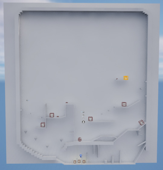
I then added some vague sketches/ideas of what I wanted the levels to look like.

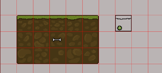
before: I don't like the little patterns in them, I think that they are ugly.
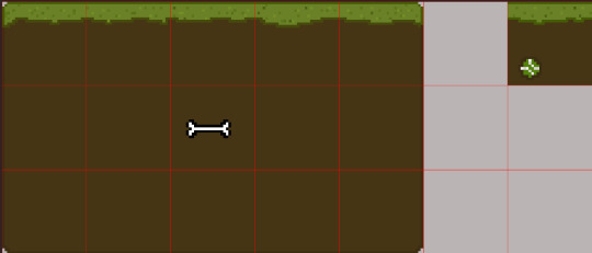
after: This is the final result of what my grass will be. I like the mono-colored dirt because it adds a sense of simplicity to the game which I enjoy, because that's the type of vibe I wanted for my game. It also makes my life a lot easier when connecting the tiles together in my games
When making trees, I couldn't really decide on a color pallet to use. I thought it would be fun to make the trees more vibrant, so that the level looked less boring. And then I also thought that it would be cool to make it so that the trees were how a dog would see them. However, dogs can only really see three colors- that being blue, yellow and gray. I didn't like the idea of making a solely using those three colors though, because I thought it wouldn't make my game look interesting enough.
At first, I made a regular looking tree.
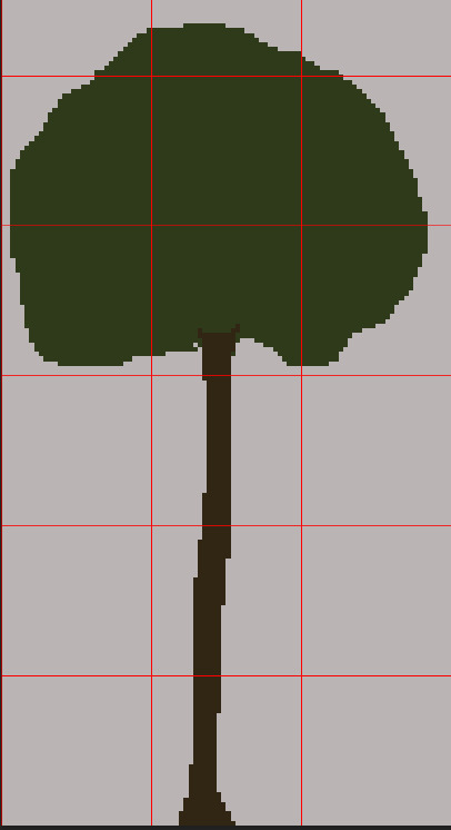
I didn't like it, I felt like it didn't match the vibe for what I wanted my game to feel like- a fun adventure game about a dog. And, I was worried my character would blend in too much with the bark of the tree.
So i decided to revisit my previous idea of using dogs colorblindness to make a color scheme.
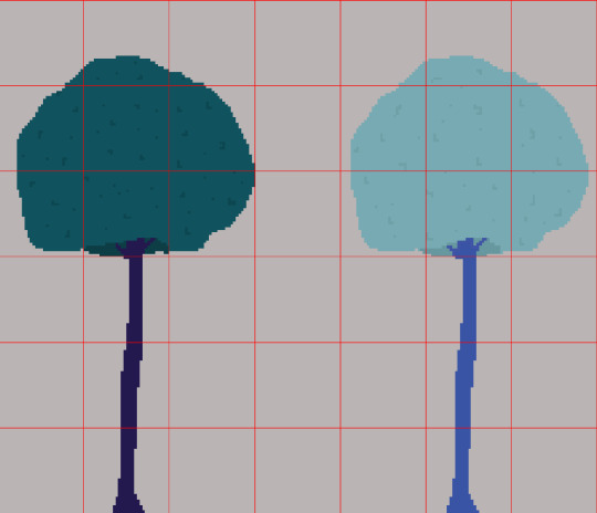
I like these much better!
At first, I made 2 just to compare and see which ones I liked better. But I honestly really like them both. I think I'll use the darker one on the left to be a background tree, and then the lighter tree on the left will be used more so in the foreground, so that it gives an illusion of depth to my game.
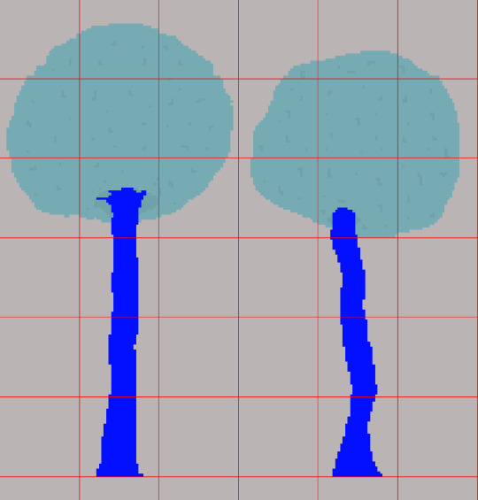
I made some different variations of the tree, just to make my game more visually interesting.
I was advised to try and add some depth to my trees, because apparently the colours I chose for the trees make it feel like its leaning away from the screen. I chose not to change my trees in the end for two main reasons:
I didn't like the way they looked. I prefer the solid colours, I feel like they fit the vibe that I'm trying to create with my game.
My game is supposed to be pretty simple looking. In my eyes, it's from the perspective of a dog. A dog wouldn't really take in enough detail from the world around it.
I will say, finding a balance of what is too complex and what is too simple has been probably one of the hardest parts about designing my level. I don't want to go crazy with detail, because then I wouldn't be sticking to what I think is right for my game and what my creative processes are. But at the same time, I don't want my game to be too simple, and therefore visually unappealing.
I hope I'm able to find a balance. It has been interesting trying to get into the mind of a dog, and trying to see things from a whole other perspective entirely.
0 notes
Text
Another G2 rant since the earlier one and this one are really my only complaints about it. The doubling up of trans light blue to represent both the element of ice and the mask maker/light is stupid, if ekimu is is supposed to be a takanuva stand in he should be pure gold, if they really needed a transparent colour on him they could have used trans yellow. Also the creatures and uniters should have been unified in the colour scheme, Gali, Lewa and Pohatu being smaller sets that Tahu, Kopaka and Onua shouldn't affect their colour scheme, the whole point of 2016 was unity so why aren't the heroes unified in appearance! The silver on the creatures also feels out of place with the unity masks and since we're talking about the creatures, why are Melum and Terak seemingly identical? I only own Melum and Ikir and haven't checked the instructions but aside from colour the look pretty much exactly the same.
#bionicle#bionicle g2#ranting#i don't mind the trans blue on the smaller ekimu but the larger one is just too much
1 note
·
View note
Text
Helmet Watch 2023
So, I had way too much fun rating all the team’s liveries this year (if you missed any of it you can find my thoughts here), so much so that I’ve decided to rate all the driver’s helmets as well! (I’ve also had a helmet tag on my blog pretty much ever since I got back into watching F1 because I just love how much effort gets put into each drivers helmet design... and I’m a Seb fan. Stanning helmet designs is in my blood by default)
Under a read more bc we have A LOT to get through! (Listed in alphabetical order by surname bc that just felt the best way to organise it)
Alexander Albon (Williams)
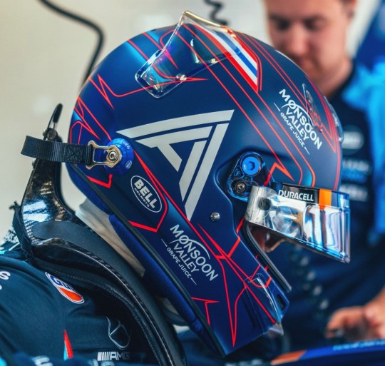
Starting off very, very strong. I LOVE the blue and red pairing, it looks so clean but so eye catching at the same time. And the stripes of the Thai flag is a really nice touch. I’m not sure why there’s the odd flash of light blue though?? It kinda feels like an afterthought.
8.5/10
Fernando Alonso (Aston Martin)

I do like the colour scheme, it just feels a tad busy with all the various stripes. But it is a really nice update to his traditional helmet design. I wish the Aston Martin wings were in the darker blue though, they would stand out so much better.
6.5/10
Valtteri Bottas (Alfa Romeo)
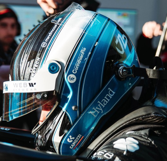
I do love me a mix of metallic finishes. The colour scheme as a whole is also top tier, the softer metallic blue with the more glittery charcoal, paired with the crème white is excellent. The overall design is super clean and looks really slick, his partner Tiffany who designed it did a really nice job!!
8/10
Pierre Gasly (Alpine)
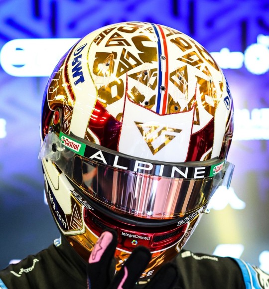
CHROME MY MOST BELOVED!!!
I really liked his Monaco helmet last year and his design for this year is almost as good. I am obsessed with mixed finishes so the chrome on the crème white base it so nice, I like the pops of red, and the thin French flag going down the middle is a nice touch.
9/10
Lewis Hamilton (Mercedes)

So so so so much yes. There’s just SO MUCH I love about his 2023 design. Echoing his original helmet design with the yellow, but mixing in the purple from recent years. And the subtle rainbow gradient lines are so pretty and so perfect. And it looks gorgeous with the black Merc livery, which is always an excellent plus.
10/10
Nico Hulkenberg (Haas)
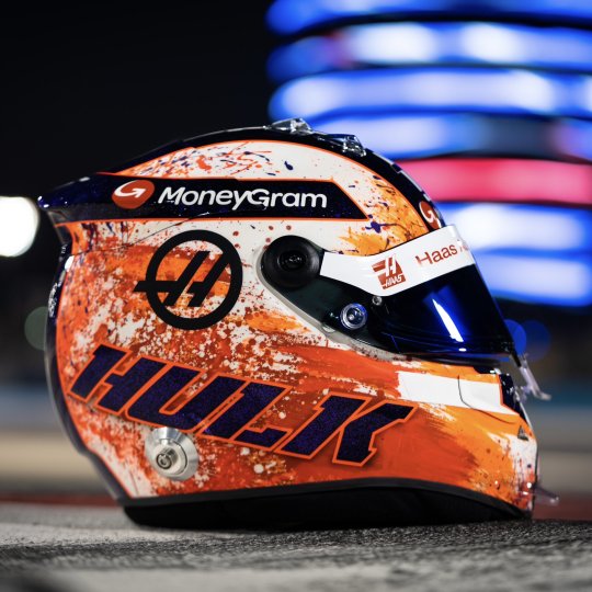
You know what... I really like it. The paint splatter effect is so pretty, I don’t recall seeing it on a helmet before and I think it looks great! It helps that there’s three different shades of orange to give some dimension. I am also obsessed with the glittery metallic purple. It works really well with the orange, and as it’s a warm-toned it should look somewhat coherent with the red in the Haas livery.
8.5/10
Charles Leclerc (Ferrari)
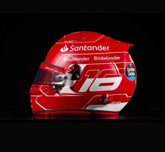
Not gonna lie, I got major Schumi vibes when I saw this. Which did make me every so slightly weepy, but he has made it slightly his own with the addition of the Monaco flag. It’s really simple, but it works. But like so much of F1 this year I really wish it was glossy instead of matte.
7/10
Kevin Magnussen (Haas)
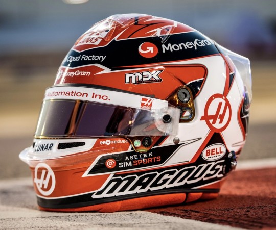
Gotta respect the consistency Kevin has had with his helmet design since 2014. The colour scheme is also great, it’ll look really nice with the Haas livery, and stand out against his team mate’s (always nice to be able to tell the difference, looking at you 2013 yellow helmet Brocedes). I’m not overly wowed, but I also don’t hate it, it’s a really solid design.
7/10
Lando Norris (McLaren)

F1 teams take note bc THIS is how you make exposed carbon work!. The design feels properly thought out, so it doesn’t feel like anything is missing, as opposed to a few of the car liveries this year. And like Lewis’ helmet with the Merc livery, the simple two colour palette looks so good. Probably my favourite helmet design of Lando’s thus far.
9/10
Esteban Ocon (Alpine)

Yes. Absolutely no notes. Excellent work. Bloody gorgeous.
10/10
Sergio Perez (Red Bull)
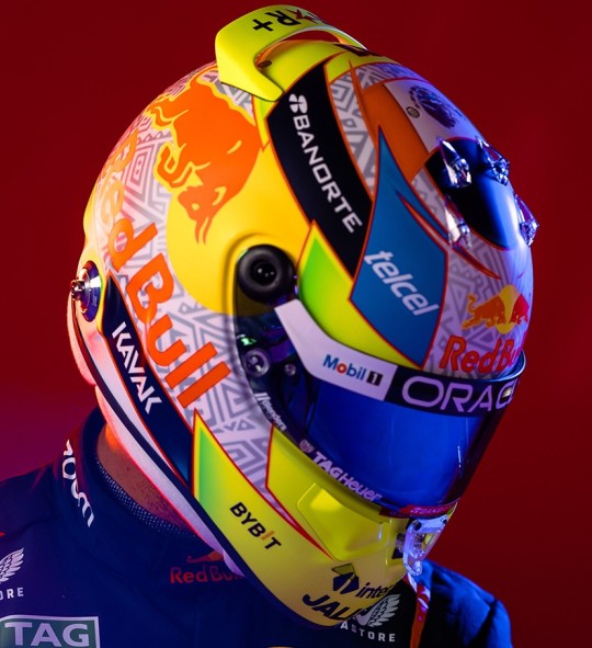
It’s ever so slightly busy, but I still do like it!! The white and grey is the perfect base for all the bright pops of colour, and the pattern is very funky. Honestly it’s the Red Bull logo that lets it down for me with the different shade of yellow. If it was the same chartreuse as the accents it would look really good.
7/10
Oscar Piastri (McLaren)

I have mixed feelings about this one. One the one hand I love how bright and colourful it is (unlike the MCL60) and I think the colour scheme is really fun (peep the silver holo!!). On the other, the design and layout feels a little too busy. However I do think it will still look really nice with the car, and as always bonus points for not being matte.
6.5/10
George Russell (Mercedes)

I LOVE the shade of blue George picked, it’s really bright which will go really well with the black livery. Though it does remind me of the 2014 Malaysia helmet that Lewis never got to use (which, after 9 years, I’m still mad about) which colour scheme wise I definitely prefer. Overall it’s another super clean design which isn’t too simple that it looks plain.
7.5/10
Carlos Sainz Jr (Ferrari)

I find it a bit wild that Carlos and Fernando have done updates of their classic designs in the same year. Anyway, the geometric pattern is fun! It does make it look a lot more dynamic than just flat lines, though the black feels a bit jarring and out of place to me. I can only assume it’s to differentiate from Charles’ all red helmet.
6/10
Lance Stroll (Aston Martin)
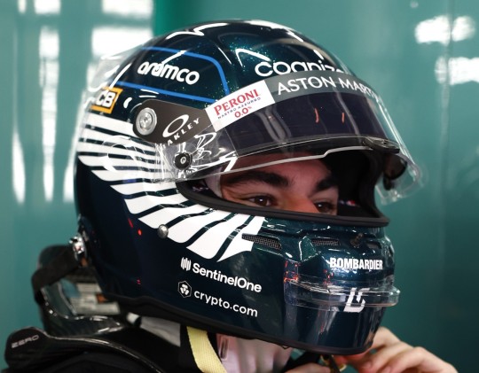
Lance is once again staying true to the AM brand and I’m honestly not that mad about it. As a British Racing Green enthusiast I loooooove the base colour, especially bc it’s both glossy and has a super subtle sparkle to it!!! The Aston Martin wings looks great solid as opposed to an outline, but for me they’re a bit too big. And I’m not really sure why there’s a blue outline on the top, white or silver would have looked more coherent.
7.5/10
Yuki Tsunoda (Alpha Tauri)

I looooooooove this design so much!!! It’s so different, which I always appreciate, and I always enjoy it when a driver pays homage to their home country/heritage. I should add that we have a Japanese Maple tree in our garden (which is what the leaves are) and using different colour leaves is so so so pretty. I wish he had been able to put the Alpha Tauri logo in a different colour to make it look more coherent.
9/10
Nyck de Vries (Alpha Tauri)

I really like the colour scheme on this one, incorporating hints of Dutch orange into the navy and white AT colour scheme works so well, and I also like the flashes of lighter blue. And I especially love the slivers of silver holo, I just wish there was a tad more to contrast against the matte finish.
7.5/10
Max Verstappen (Red Bull)

Obviously, I do have my Seb fan bias of there only being one superior ‘white helmet with driver’s flag colours’ design, but this does look nice. It’s really clean, and unlike Perez’s the Red Bull logo feels like it fits in with the design much better. But, I do feel like it could use a little jazzing up, maybe making the dark blue stripes a glossy metallic.
6.5/10
Zhou Guanyu (Alfa Romeo)

Lad is really going for the paddock fashionista title and I respect that. I adored his porcelain design at Abu Dhabi, so the ode to that around the visor is really cool (peep the smidge of silver holo, more of that please!!). I like that it’s an overall warm toned colour palette that should complement the red and black Alfa well. It’s so bright and I think it will really stand out at both day and night races.
8.5/10
#so many helmets; so little time#Formula 1#2023#Helmet#Helmet Watch#Helmet Watch 2023#I've said it in the tags of a few posts; but the drivers have trounced the livery launches with their helmets this year#dare I say Ocon's is up there on my all time fave helmet list#it's just so so good
9 notes
·
View notes
Text
Character Design Final (Part 2)
For this composition people liked this composition for it's "Looming" threat, feeding into the 100 words the most. But, also at the same time the title looks like it's clashing with the creature. My Response: I definitely agree that this tells the story the best, but, I also think people missed another critique here. I think that the composition is quite left heavy with the title, the main character, and the main monster appearing on that side specifically. People also critiqued the title, saying it clashed with the monster, and I both agree and disagree. I agree that it definitely covers up parts of the monster, but I also disagree because it wouldn't clash in the final design where the title looks quite different and quite bold.
2. For this composition people really liked the fisheye perspective which could be an element that I play into more. Someone said that the creature being at the top made it look small.
My response: I agree that the creature at the top looks too small, I might make it look more like it's looming over the train stop. Something like this:
Except from a different perspective.
3. For this composition, people complimented the perspective of the image, I might find a way to play into this. Also, someone appreciated the relative calmness of the scene compared to the other compositions.
My Response: I appreciate the feedback, but I would've liked to see more critiques for this one in particular. Here's some of my critiques: The person and car in the background are too small, the sidewalk makes no sense, there's not much going on in terms of building ambient visuals, and the body proportions of the monster is off a bit. The main character could also use a decent dynamic pose, and the monster could be doing something other than just standing there.
A general comment someone made was that hunter doesn't feel like a main character as his presence isn't the main focus of pretty much all of the posters, and I agree kind of, and I feel like that's an issue that'll fix itself when I introduce colour.
FINAL WORKINGS:
Which did I choose?
Why? I guess I just really like the fish eye perspective, it looks quite good in my opinion. It's definitely memorable, and quite an unusual choice for a movie poster, but I think it works really well. Usually fisheye perspectives are relegated to fashion photoshoots and album covers (which were my main inspiration), but I think it's definitely underrated. It looks super dynamic, brings focus to the centre of the composition, and has arcs warping around it allowing for interesting shapes to pull through. I was initially hesitant to even try a fisheye perspective because of how difficult it looked to pull of on paper, but it definitely worked out.
Figuring out Colour/Values: The next few images are me testing the values and colours for my final image early on so I am able to keep in mind a general tone of the image.
Here's my base value scheme. The character is going to be silhouetted by the light from the main building in the composition with main lightness coming into the middle area.
Here's a split complimentary palette with greenish yellow, pinkish red, and cyan blue. It mixes both blue elements and red elements which was the plan from the beginning. It's got an aquatic vibe to it which could work, I might consider this palette.
This is another split complimentary palette. I'm not sure what to think about it, because it's risky to go without blue as it is a major theme. I do like this, I like the green especially and how it makes the character stick out a whole lot more, but I'm not sure.
Another split complimentary palette, this time swapping the blues for reds and reds for blues, and I have mixed feelings. I think the red works well in the background, making the whole image look quite apocalyptic, but I'm not sure about the blue/green. It looks sort of out of place. It might work really well, definitely one to experiment with when the time comes.
This is more what I'm going for, and will probably end up as my final palette. It works well with the idea I already had planned out, and I've already explained the importance of the blue/red contrast.
MAIN PROJECT:
OK, here we go. Firstly, responding to feedback. I've made the title more defined, but it still might not stand out against the background, so I'll have to figure out how to make it more apparent. I've also made the monster at the top a lot bigger, and it definitely looks better. I've also adjusted what type of heads I'm using. Since my theme is quite Americana based, a dragon head doesn't really work, so I went for a snake head instead cause snakes are actually integral to culture in the U.S acting usually as villains (take the bible and how christianised the states are). I've also aimed for forming the dog head to look more coyote-ish, not sure if the difference is there, and I've made the owl head a barn owl, an owl I love and it's found in North America so it fits. I've added some looming hands, though I'm not sure about their shape.
I've fixed the hands, added some wing structural stuff, and added a body. I definitely like the hands here a lot more, almost giving emphasis to the title as if the monster is presenting the title itself. I've added the smoke collar thing, and I'm not sure if it works, I might have to adjust the snake head to be a little less detailed, it might be good to line up the snake head to improve the monster's silhouette. I've added these tiles under the title to further seperate the title from the background and I love it. It looks awesome, and I specifically too inspiration from this font here:

because I love how it looks. The title will probably need some adjusting to make it look less messy though.
I've made the title blocks more consistent in which ones look like they're overlapping, the might need further adjustment. I've also taken this opportunity, to add a sneaky little subtitle as graffiti to the top of the main building. I've adjusted the pose to the character to have the crowbar in hand, and looking afraid, so it makes sense. The wings curved in also close off the composition as well, keeping focus within the centre of the composition with directional lines at the tips of the wings pointing towards the title. The line thickness will be adjusted in the final outline. I've also added these patterns on the lining of the cloak, a eye and tear to represent why these creatures are here to begin with, to associate them with negative emotion.
I've updated the snake head to work better with the silhouette and I've removed the detail from it as well looking less clunky and more balanced. I've added some details to the buildings, taking inspiration from some smaller apartment buildings that you might find in a smaller town. Less sleek and slick windows with sharp metallic silhouettes and more homely brick and arches.
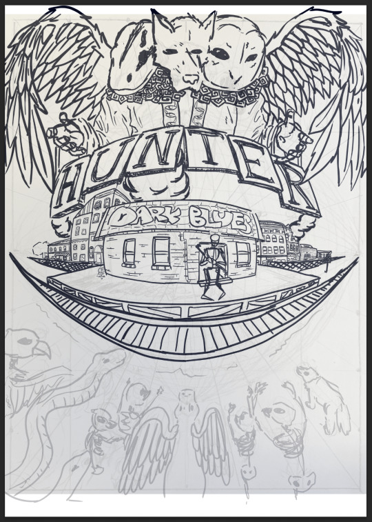
I've updated some details, adding some smoke to the right, but I might need to add something in between the TER tiles and the buildings below cause it feels a little empty. I've also used the transform tool to stretch out the graffiti to fit better in the fisheye perspective.
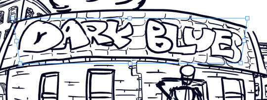
I did this by holding command while adjusting the transform corners.
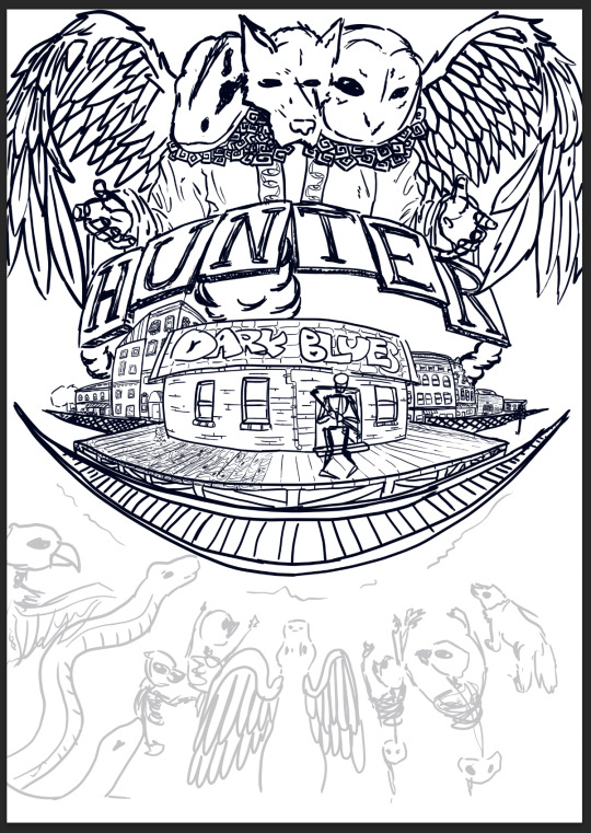
I've tried adding some detail to these planks, but it's out working out too well. It looks like a complete mess, i might leave this part out.
I'm just going over the monsters at the bottom to give them detail.
I've created some skeleton monsters somewhat related to Americana themes. I just need to add something to that middle part.
Here's the final outline, I've added some more smoke to balance out the composition wich I might change later. Now I need to outline it in A2 and fix some of the lines.
0 notes