#the way the colors get colder when they aren't together and get warmer when they are
Explore tagged Tumblr posts
Text

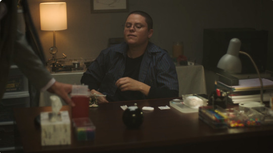
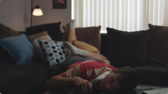

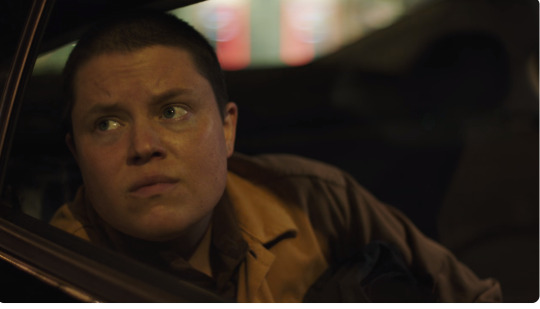


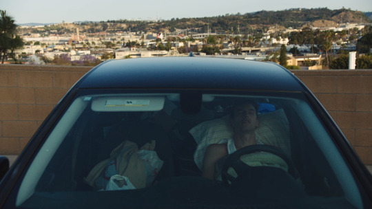


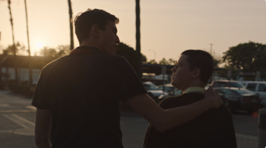
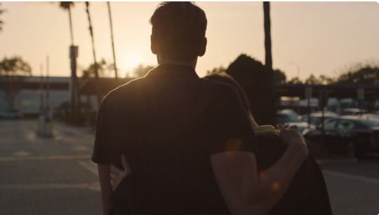
Will and Glenn
The Disruptors (2024) dir. Adam Frucci
#so so sorry i think i'm maybe obessed with them#the way the colors get colder when they aren't together and get warmer when they are#i'll scream#the disruptors#the disruptors 2024#will kerrigan#glenn marnell#ally beardsley#grant o'brien
45 notes
·
View notes
Text
How I Choose Colors.
Choosing colors is one of my favorite parts of drawing. It can really pull a piece together and help portray a mood. There are so many different ways to go about color there is no way I would be able to go over them all. I can go over 2 of my favorites that I tend to use the most in my work though. This is going to be a longer post but I do hope that you stick around. I am not a professional artist so some of the terms I use may not be 100% accurate but I do hope that I can get my point across.
Muted Color schemes.
When trying to convey themes of sadness I will often go with cooler colors. Using muted tones can also help bring about a sort of calmness as they aren't as striking to the eyes.
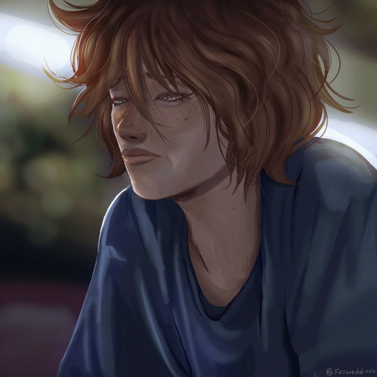

On the left, the colors are warmer, and while we can see on his face he is experiencing some sort of sadness, the overall color scheme of the image doesn't necessarily convey that. In my opinion, a warmer color scheme is much better for conveying happier moods. it shows more comfort and joy.
On the right, the colors are cooler and it makes the drawing look colder. It makes it feel a bit more like he is feeling isolated and his environment reflects his sadness.
Having a warm background and a cool character(or vice versa) may introduce an interesting contrast though. I haven't tried it myself much but now that I am thinking about it, I think it could work well to show how a character feels versus the way the world is around them.
RED.
A lot of the time when I use saturated reds in a drawing it's supposed to portray some sort of shock factor. I haven't used it much lately but I will show you an older piece I drew for someone that utilized a lot of red.
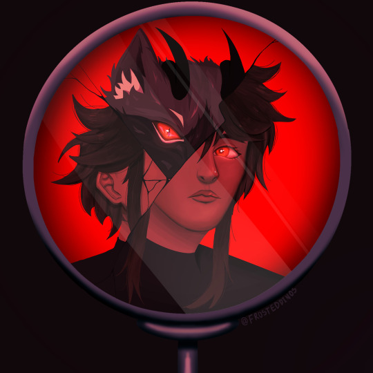
In this piece the shock is supposed to come from the fact that this character is not completely human. The red sort of aids in this as it introduces a certain air of danger. The cracked mirror portrays the shattering of a facade and that general Idea.
Red can also be used to aid in portraying one character being the one inducing fear or a character being angry. This color language can be used with other colors as well such as yellow showing joy and blue showing tranquility or peace.
Anyway, those are the top two ways I choose colors. I hope that this helped, even if just a little.
#art#drawing#art tutorial#beginner artist#color theory#how to color#digital art#digital illustration#artwork#artists on tumblr#tutorial#drawing tips#tips and tricks#art advice
7 notes
·
View notes