#the typography...... g o d
Explore tagged Tumblr posts
Text
Cazador's Ritual Runes, Translated
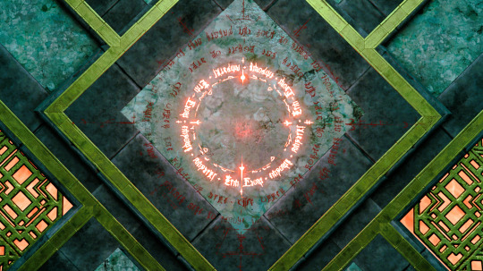
Inner: AMPLIFY + HIM + FLOW + EMPOWR [sic] Middle: WE OFFER THE FORCE OF LIFE Outer: WE GATHER HERE TO INVOKE THE POWER OF BLOD [sic]
Mephistopheles can't spell for beans.
(Detailed analysis & conjecture regarding this text, the Rite of Profane Ascension, & Astarion's translated scars under the cut.)


The second ring was the easiest, as the characters are very similar to Latin letters and clearly read out "WE OFFER THE FORCE OF LIFE." Characters were now known for C, E, F, H, I, L, O, R, T, and W. It wasn't clear yet if there were cases.
I was struggling with the first ring, though after decoding the second, I could get a likely "_M_LIF_ + _IM + _LOW + EM_OWR". Guessing the character for P, Y, and A based on context gave me "AMPLIFY + _IM + _LOW + EMPOWR", but I had doubts over the first characters for words two and three. I suspected they would be HIM and FLOW, but the H and F characters didn't match the H from the second ring's "THE" or the F from "AMPLIFY". Also, "empower" was misspelled, which made me pause.
Abandoning those for a moment, the third ring mapped well onto "WE _ATHER HERE TO I__O_E THE _OWER OF _LO_". Ruling out known letters which were not present, I could guess "WE GATHER HERE TO I__O_E THE POWER OF _LO_", but again the P from "POWER" was not the same as the P from "AMPLIFY" in the inner ring. However, it was very, very similar, and nothing else fit, so I committed, now suspecting there were capital versions of some letters included in the text.
At this point I went digging for resources. I found a copy of an Infernal alphabet on the Forgotten Realms wiki, and while it looks like the typeface Larian used is a bespoke creation for the game rather than a 1:1 copy of this alphabet, the letters for lowercase G, N, K, B, and D were nearly identical. Y (from AMPLIFY) also matched perfectly, confirming that earlier guess. This gave a clear "WE GATHER HERE TO INVOKE THE POWER OF BLOD."
This resulted in: AMPLIFY + _IM + _LOW + EMPOWR WE OFFER THE FORCE OF LIFE WE GATHER HERE TO INVOKE THE POWER OF BLOD
Looking at the wiki for capital letters, the only ones I could find which might reasonably fit the _IM missing character (assuming the Larian alphabet was based off this wiki typography) were A, B, H, O, T, V, and Y. Of those choices, only AIM, HIM, TIM, and VIM were words, and as cheesy as Cazador is, I couldn't imagine him saying AMPLIFY TIM FLOW EMPOWR. Given the alternatives, HIM was the only choice which made sense.
I went through the same process for _LOW, but this character seems unmatchable to me. By far it looks the most like the E from the Infernal alphabet, with maybe a capital Y being a distant second. However, ELOW and YLOW are certainly not words, and absent all other comparatives, the character in question does resemble a fancy F. Barring other languages, FLOW with a capital or unique F fits best.
AMPLIFY + HIM + FLOW + EMPOWR WE OFFER THE FORCE OF LIFE WE GATHER HERE TO INVOKE THE POWER OF BLOD
I did double-check the texts available in Cazador's mansion just to make sure this hadn't been translated elsewhere (after I'd done all the work, of course), and the only written text of relevance is from the Black Mass scroll you find near Vellioth's skull. It reads:
The Rite of Profane Ascension Oh, piteous dead! Oh, ravenous dead! Immortality is your gift, but darkness is your prison and hunger its gaoler. The Rite of Profane Ascension will release you. Walk in the sun. Suffer not from hunger. Grow your power beyond anything you imagined. A pact has been made with the Lord of Hellfire. Deliver unto him seven thousand souls, each bearing an Infernal mark, and you shall be free of your chains. You shall know true power. Deliver the souls. Speak the words. Ecce dominus, Has animas offero in sacrificio, Nunc volo potestatem quam pollicitus es mihi.
The Latin translates (as best I can tell with my incredibly weak Latin) to:
Behold [the] Lord, I offer these souls in sacrifice, I want the power thou hast promised me.
Which is interesting, but not clearly mapped to the Infernal above. Then I started wondering what relationship Astarion's scars have with all this, but thankfully, someone else has done the work here!
Astarion's scars have been transcribed and translated in a wonderfully detailed Reddit post by northpaw_s in 2020, but the salient points are that they appear to be in a mishmash of mangled Latin and Romance languages ("Infernal") and read:
Hoyc inferiu non iurare per igneu Naec virba loquor Eoai mundo muoat
Which appears to roughly translate to:
This soul swears no oath by fire Nor words does he speak In the realm of death
This makes sense if it's a fragment of a contract. I suspect the other spawn's scars are all identical to Astarion's for game mechanics/development reasons, but it'd be wild if they did have minor differences to complete the rest of the phrases! I know the scars don't show on their backs they way they do on Astarion's outside of the moment of the ritual, but it really does make me wonder if there's a complete text of the poem in some writer's documentation somewhere.
Anyway, what did you do with your Thursday night?
#astarion#cazador#no wonder the rite was so secretive mephistopheles didn't want anyone to know he's a terrible speller#baldur's gate 3#plus a lot of talk about astarion's scars' meaning & the rite's text#puzzles! neat!#i don't know what to tag this so i'll be able to find it again#quark plays bg3#quark rambles#each phrase is repeated three times on each ring by the by
365 notes
·
View notes
Text
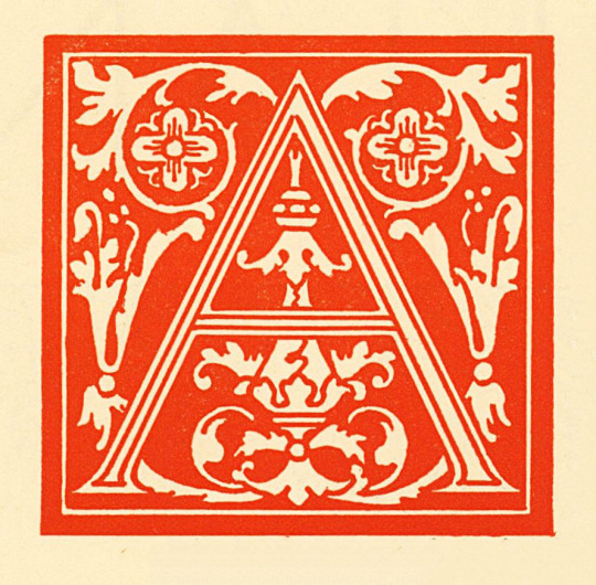
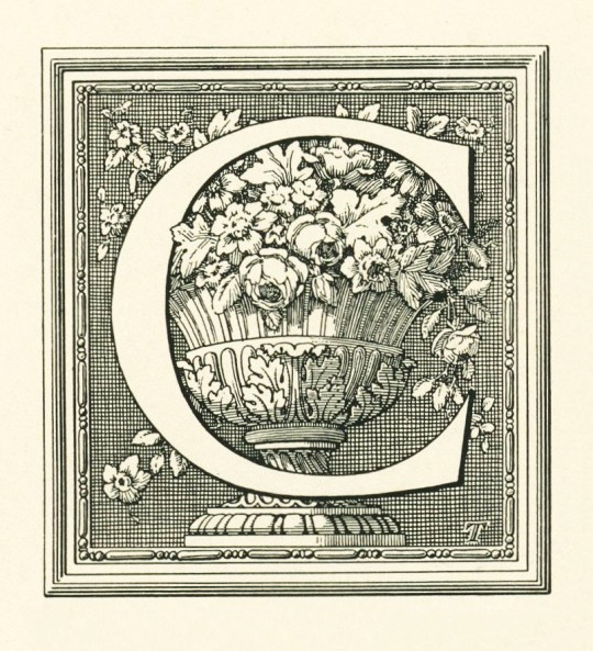
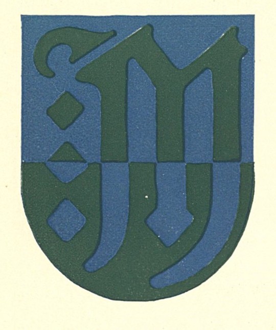
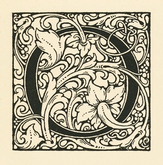
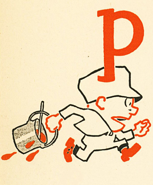

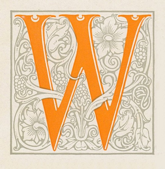
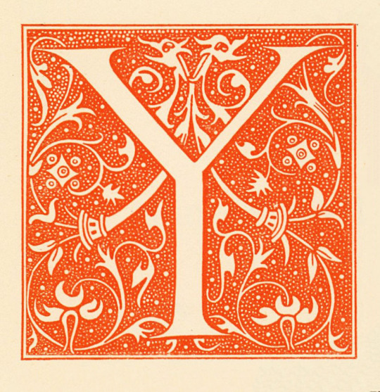
Typography Tuesday
Today, we complete the initials from Some Examples of the Work of American Designers, edited and arranged by J. M. Bowles. Shown here from top to bottom are:
A - Ralph Fletcher Seymour
C - Walter D. Teague
M - Guernsey Moore
O - Frederic Goudy
P - Charles E. Howell
T - Egbert G. Jacobson
W - Carlton D. Ellinger
Y - Bruce Rogers
Some Examples of the Work of American Designers was printed in Philadelphia by Edward Stern & Co. for Dill & Collins Co. Papermakers in 1918 on thirty styles of paper manufactured by Dill & Collins Co in Philadelphia.
View our previous post on initials from this volume.
View our other Typography Tuesday posts.
#Typography Tuesday#typetuesday#initials#historiated initials#Some Examples of the Work of American Designers#J. M. Bowles#Edward Stern & Co.#Dill & Collins Co.#paper samples#20th century type
135 notes
·
View notes
Text
previous URL(s): trnscndnt, x2s, z0v, c9x, d-openess 🌐 P o r t a l 🖥️
Halloween Techno Mix 2024! Music Uploads, DJ Mixes, DJ Sets, Soundcloud, Bandcamp, Spotify, Discord, Letterboxd, Twitter / X, Insta
️️️🏷️ T a g s 📌
Monthly Archival Upload History (2023, 2022, 2021, 2020, 2019) Uploads, Archive, Art, Photography, Graphic Design, Typography, Cinema
💡📩��📫💬 Any links or tags you'd like to see more of, leave a comment or msg me!
see you in the future, 389 Last Updated: 11/03/24
136 notes
·
View notes
Text

SPN ABC's April Challenge
This month's creation challenge is simple: each day from April 5th - April 30th will be devoted to one letter of the alphabet. And you are invited to create any type of graphic or gifs pertaining to something SPN related with that letter.
For example: For letter "A" you could make a graphic of Abaddon, or a gifset of various SPN Angels, or a collage of multiple characters whose names start with "A", or a moodboard for a pairing whose ship name starts with "A", etc etc.
What Can You Make?
Any type of graphic! Edits, manips, moodboards, picspams, collages. Gifs are also accepted, though we'd like to see gifsets that play creatively with color, layout / form, typography, and/or textures.
Letter Prompts + Dates
While this is a monthly "challenge", please do not feel pressured to do every single day.
Additionally, these dates are not hard "deadlines." We'd like to see whatever creations you make, whenever you make it!
April 5th: Letter A (ex: Anna, Amara, Adam, Angels…) April 6th: Letter B (ex: Bobby, Bela, the Bunker…) April 7th: Letter C (ex: Cas, Claire, Charlie, Cassie…) April 8th: Letter D (ex: Dean, Death, Demons, Donna…) April 9th: Letter E (ex: Eileen, Emma, Ellen, the Empty, Enochian…) April 10th: Letter F (ex: Fergus, Famine, Faith, Fire…) April 11th: Letter G (ex: Gabriel, Gadreel, Garth, Ghosts, God…) April 12th: Letter H (ex: Heaven, Hell, Hannah, Hael, Home…) April 13th: Letter I (ex: the Impala, Ishim, Illusions…) April 14th: Letter J (ex: Jack, Jo, Jody, John's journal…) April 15th: Letter K (ex: Kevin, Ketch, Kelly…) April 16th: Letter L (ex: Linda, Lisa, Lebanon, Lily Sunder…) April 17th: Letter M (ex: Mary, Missouri, Meg, Michael…) April 18th: Letter N (ex: Naomi, Novaks, Nephil, Nightmare…) April 19th: Letter O (ex: Oskar, Optimism, Ouroboros, Ostium…) April 20th: Letter P (ex: Patience, Purgatory, Prophets, Psychics…) April 21st: Letter Q (ex: Queen of Hell) April 22nd: Letter R (ex: Rowena, Ruby, Raphael, Rufus, Reapers…) April 23rd: Letter S (ex: Sam, Sarah, Scoobynatural, Shapeshifters…) April 24th: Letter T (ex: Tessa, Toni Bevell, Tyson Brady...) April 25th: Letter U (ex: Uriel, Undead, Unhuman Nature, Unity...) April 26th: Letter V (ex: Victor, Vampires, Vessels...) April 27th: Letter W (ex: Winchesters, Werewolves, Witches…) April 28th: Letter X (Ex's / Divorce arcs or Wild Card) April 29th: Letter Y (ex: Yellow Eyes, Young Version of characters...) April 30th: Letter Z (ex: Zachariah, Zanna, Zombies...)
Rules
🚫 NO AI generated content. 🚫 NO incestuous or adult/minor relationships. 🚫 Goes without saying but, no hateful / bigotted content. 🏷️ Please tag any NSFW content accordingly. 🏷️ Please tag for any additional content warnings.
🌟 Additionally please @ us or use our tracked tag #spngraphics-archive so we can see and reblog your creations!
29 notes
·
View notes
Text
TypeScape: Where Letters Create Landscapes # Type Anatomy
Type anatomy is the structure of letterforms, including elements like ascenders, descenders, serifs, stems, bowls, and counters. These parts shape a typeface's style, readability, and character.

Bracket: The curved or angled connection between a serif and the main stroke.
Crossbar: The horizontal line in letters like "A" and "H."
Stem: The main vertical or diagonal stroke in letters (e.g., in "T" or "V").
Terminal: The end of a stroke that doesn’t have a serif.
Counter: The enclosed or partially enclosed space inside letters, like in "o" or "d."
Ascender: The part of a lowercase letter that rises above the x-height (e.g., "b" or "d").
Neck: The thin, connecting stroke in letters like "g."
Loop: The enclosed lower part of a double-story "g."
Ear: The small stroke that projects from the top of a lowercase "g" or "r."
Bowl: The curved, enclosed part of letters like "b," "d," or "o."
Axis: The angle through which the thinnest parts of curved strokes align.
Overshoot: The slight extension of curved or pointed letters beyond the baseline or cap height.
Finial: A tapered, delicate end to a stroke, often in letters like "e."
Eye: The enclosed space in the lowercase "e."
Shoulder: The curved stroke in letters like "n" or "h."
Tail: A decorative stroke on letters like "Q" or "y."
Serif: The small extensions at the ends of strokes in serif typefaces.
Descender: The part of a letter that extends below the baseline (e.g., "p" or "g").
Cap Height: The height of uppercase letters from the baseline.
X-Height: The height of lowercase letters without ascenders or descenders, typically measured by "x."
Baseline: The imaginary line on which most letters sit.
#Expressive Typography
Expressive typography is the art of designing letters and words to convey emotions, themes, or concepts beyond just their meaning. It uses creative manipulation of letter shapes, sizes, colors, and composition to evoke specific feelings or moods. Instead of focusing solely on legibility, expressive typography enhances the emotional impact of the text by transforming it into a visual experience.
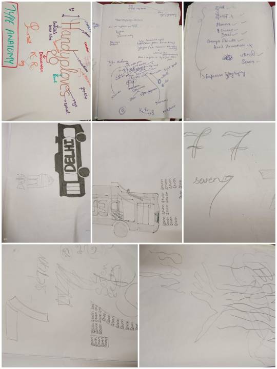
DTC BUS (DELHI)
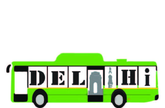
Delhi on Wheels: Transforming the Word "Delhi" into a DTC Bus
Typography isn’t just about letters; it’s about conveying stories, culture, and identity. Capturing the essence of Delhi—through its iconic DTC bus. Using the letters in "Delhi," I transformed the word itself into a design that resembles the city’s lifeline, a DTC bus. Here’s a deep dive into how this piece came together and the inspiration behind it.
The Inspiration: Delhi’s Iconic DTC Bus
Delhi’s public buses, especially the green DTC (Delhi Transport Corporation) buses, are an intrinsic part of the city’s identity. They connect the diverse areas and people of Delhi, carrying millions every day through bustling streets, historical landmarks, and modern hubs. My goal was to capture this essence by merging typography with the visual style of a DTC bus, creating a piece that celebrates Delhi’s unique spirit.
Designing "Delhi" as a DTC Bus
In this project, I turned each letter in "Delhi" into a part of the bus, so the whole word not only spells out "Delhi" but also visually resembles a moving DTC bus.
Letter Forms as Windows and Doors: Each letter in "Delhi" is designed as if it were a window or door of the bus, with D, E, L, H, and I placed across the side of the bus like passenger windows.
Landmark Details: The middle letters incorporate iconic Delhi landmarks such as the India Gate and a representation of Qutub Minar. These landmarks symbolize the heart of Delhi and add a cultural touch to the design, emphasizing the city’s rich heritage and modern identity.
Color Scheme: I used the vibrant green and yellow associated with DTC buses, which adds a layer of authenticity and immediately evokes the feeling of seeing a DTC bus on the streets of Delhi.
The Design Process and Challenges
Merging a readable typography piece with a recognizable DTC bus structure required careful planning. Each letter had to be clear enough to spell "Delhi" at a glance, while also integrating with the rectangular bus layout. Balancing these elements without losing the essence of either the word or the bus was a rewarding design challenge.
Final Outcome: Delhi on the Move
The final result is a piece of expressive typography that embodies both the word "Delhi" and the form of a DTC bus, seamlessly blending them into one. It’s a visual representation of Delhi’s character—lively, connected, and constantly moving. This design pays homage to the iconic buses that are a lifeline for millions, embodying the city’s vibrant energy.
Also, it was created in acrylic sheets too.
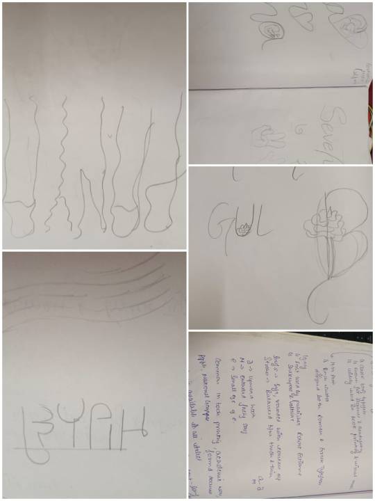
2. BANYAN TREE
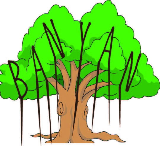
I explored this concept by designing the word "Banyan" as an expressive typography piece that captures the beauty, strength, and symbolism of a banyan tree. This project turned each letter into a unique element of a banyan tree, merging nature with typography in a meaningful way. Here’s a closer look at how I brought this design to life.
Inspiration Behind the Project
The banyan tree holds a special place in many cultures, representing growth, resilience, and shelter. Known for its sprawling roots and thick, sheltering canopy, the banyan is often a gathering place, offering shade and comfort. By transforming the word "Banyan" into a tree, I aimed to capture these qualities and create a design that reflects both the natural beauty of the banyan tree and the symbolism it carries.
The Typography Concept
In this design, each letter of "Banyan" becomes a part of the banyan tree, creating a cohesive visual that blends the letters with elements of the tree’s form.
Root-Like Strokes: The elongated downward strokes of each letter resemble the aerial roots of a banyan tree, giving the word a grounded, natural look. These strokes represent the tree’s strength and deep-rooted nature, symbolic of stability and endurance.
Branching Canopy: The letters are positioned within a canopy of leaves, illustrating the wide-spread branches and dense foliage of the banyan tree. This integration of letters with the tree canopy creates a harmonious visual that balances typography with illustration.
Organic Flow: The curves and flow of the letters are designed to mimic the natural, flowing shape of a banyan tree, adding an organic feel to the typography.
Design Process and Challenges
The main challenge in this project was ensuring that each letter in "Banyan" was legible while blending seamlessly into the tree structure. Each stroke and curve was carefully designed to resemble natural elements without losing the clarity of the word. Achieving the right balance between typography and illustration required multiple iterations, adjusting the thickness and flow of each letter to resemble branches and roots effectively.
Colors and Style
The green leaves and brown trunk bring a vibrant yet earthy tone to the design, creating a warm and natural color scheme. This palette reflects the life and energy of the banyan tree, making the piece visually appealing and authentic to its subject.
Final Outcome: Typography Rooted in Nature
The result is a piece of expressive typography that visually represents the essence of a banyan tree, with letters growing out like branches and roots. This design serves as a celebration of nature, growth, and resilience, turning the word "Banyan" into a tree that symbolizes shelter and strength.
3. Gulaab
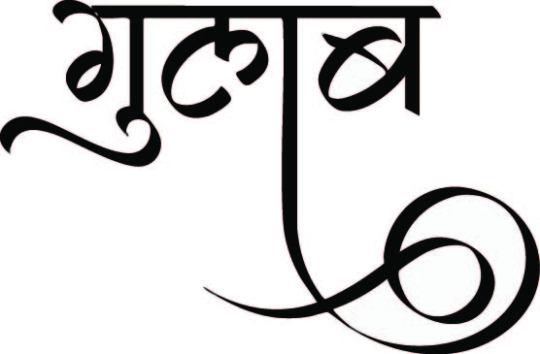
I explored the Hindi word Gulaab (meaning "rose") through expressive typography. The challenge was to translate the essence of a rose—its softness, beauty, and elegance—into a typographic design.
I used flowing, curved letterforms to mimic the delicate petals of a rose and incorporated shades of pink and red to evoke its vibrant colors. The design blends fluidity with depth, capturing the essence of a blooming flower.
This project highlights how typography can do more than communicate meaning—it can evoke emotions, transforming the word itself into a visual representation of beauty. Through Gulaab, I’ve shown how typography can be an art form that speaks directly to the heart.
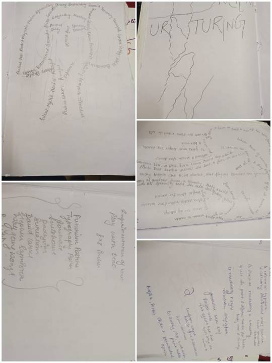
4. Maa
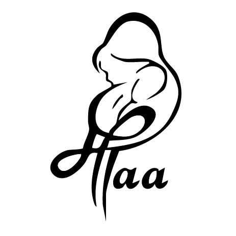
I transformed the word Maa (meaning "mother") into a visual expression of love, warmth, and strength. The challenge was to capture the nurturing and protective essence of a mother through typography.
I chose soft, rounded letterforms to convey warmth and tenderness, while bold strokes represent the strength and resilience of a mother. The color palette of soft earth tones adds to the feeling of comfort and support, creating a design that reflects the deep emotional connection we have with the word Maa.
Through this expressive typography, I’ve aimed to showcase how words can transcend their meaning and evoke deep emotions, turning Maa into a visual tribute to the bond of motherhood.
5. seven (7)
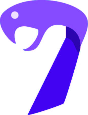
I explored the word Seven with a twist, combining two distinct meanings—seven and snake—into a single design. The challenge was to visually represent both concepts in one unified typographic piece.
I used sharp, sinuous curves to give the design the fluid, twisting shape of a snake, while the number 7 remained prominent, symbolizing the numeral itself. The design plays with duality, allowing the viewer to see both the number and the snake in the same word, depending on perspective.
This piece explores how typography can have multiple layers of meaning, allowing one word to convey different ideas at once, making Seven a visual metaphor for both the numeral and the serpent.
6. Jahnavi in Gurmukhi
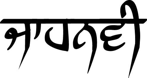
I explored the name Jahnavi written in Gurmukhi script. The goal was to create a visual representation that not only honors the beauty of the name but also the cultural and spiritual significance it carries.
I focused on the fluid, graceful strokes of Gurmukhi to mirror the elegance and softness of the name Jahnavi. The design incorporates smooth, sweeping lines that flow naturally, reflecting the serene and divine qualities often associated with the name, which means "Ganga" or "river" in Sanskrit.
This piece celebrates the harmony between language and visual design, showcasing how the beauty of a script can enhance the depth of meaning behind a name, turning Jahnavi into a delicate and powerful work of art.
7. Champak (champa in sanskrit)
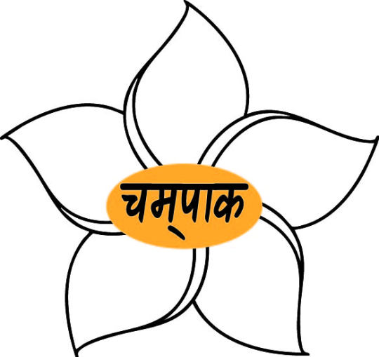
I explored the Sanskrit word Champak, which refers to the Champa flower in Hindi. The challenge was to capture the essence of the flower's beauty, fragrance, and elegance through expressive typography.
I used delicate, flowing letterforms to reflect the soft, graceful petals of the Champak flower. The curves and loops of the typography mimic the organic shapes of the flower, while a warm, golden color palette symbolizes its vibrant hue and sweet scent.
This design demonstrates how typography can visually interpret the meaning of a word, with Champak becoming a symbol of natural beauty, grace, and serenity in the form of expressive, artistic lettering.
#Experimental Typography
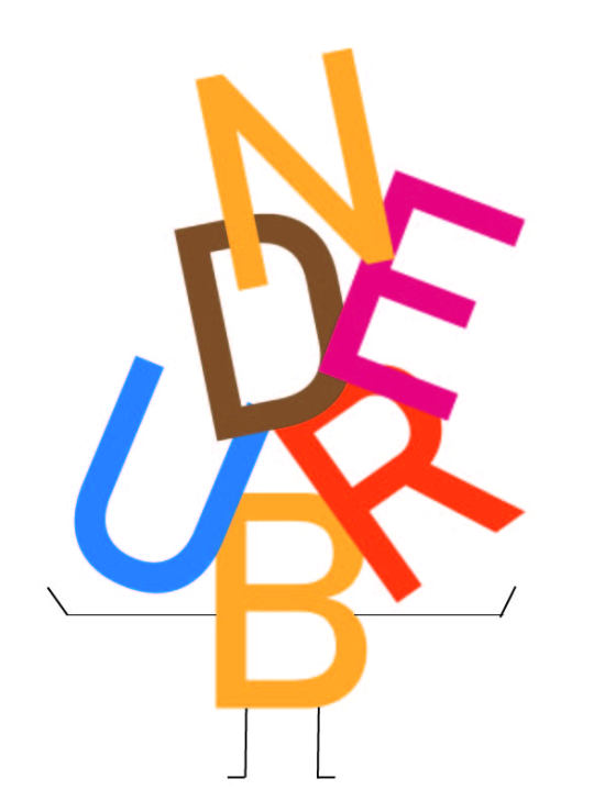
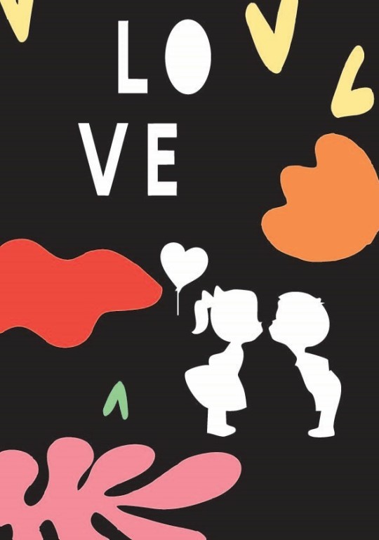
Experimental typography involves breaking traditional typographic rules to create innovative and unconventional designs. It focuses on manipulating type in creative ways—distorting, deconstructing, or combining it with other elements—to explore new visual expressions, often prioritizing art and concept over legibility. The posters were created in reference to some major and famous art movements.
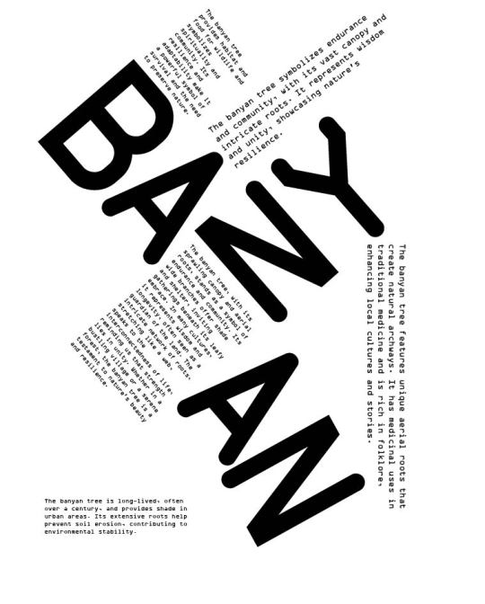
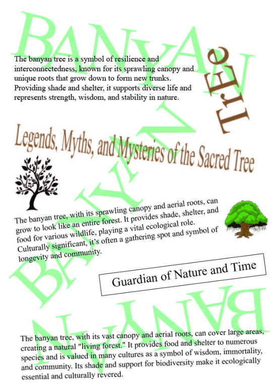
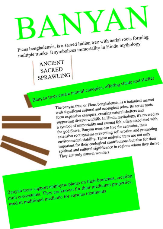
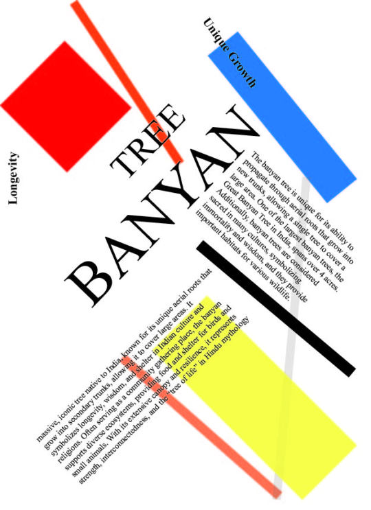
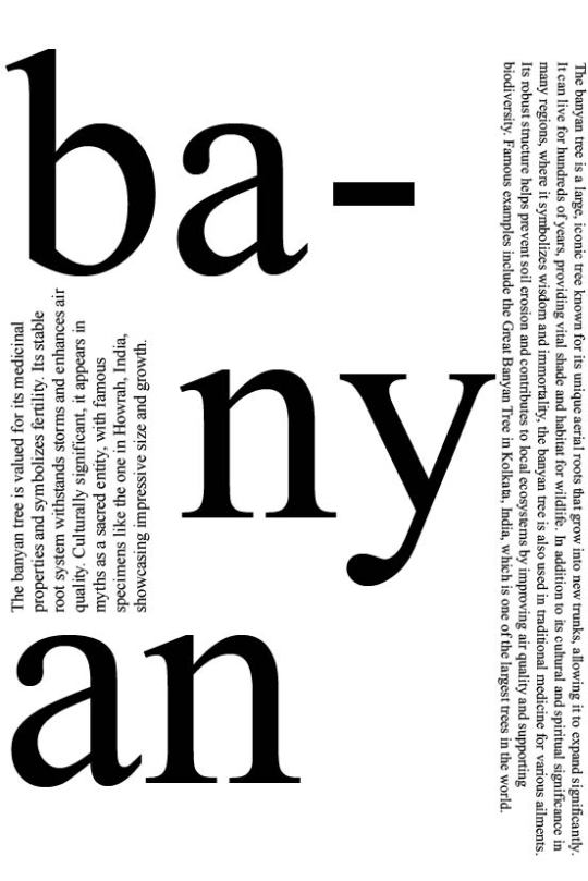
#Magzine Layouts
In our magazine layout project, we worked through three stages. First, we replicated an existing layout to learn the basics of design. In the second stage, I introduced the Garamond font, adding sophistication while keeping the layout intact. Finally, in the third stage, I embraced experimental typography, playing with unconventional font placements and creative elements to push the boundaries of traditional design. This process helped me explore how magazine layouts can evolve from standard to innovative while maintaining visual impact.


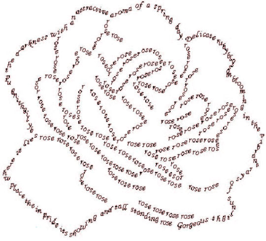
#Concrete Poetry
Concrete poetry in typography is a form of poetry where the arrangement and visual presentation of the text play a key role in conveying the meaning or emotion. The layout, shapes, and patterns of the words themselves become part of the poem's expression, often forming pictures or structures that complement or enhance the written content. The design of the text is as important as the words, creating a visual experience that adds depth to the message.
#Blackout Poetry
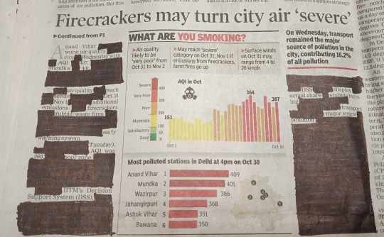
Blackout poetry in typography is a creative process where words from an existing text (like a page from a book or newspaper) are selectively "blacked out" using ink or markers, leaving behind only a few words or phrases that form a new, poetic meaning. The remaining visible words and their arrangement become a visual element, with the typography playing a key role in shaping the poem's tone and structure. The result is a combination of visual design and poetic expression.
#Typoday Posters

#Log Book
0 notes
Text
「 Typography Terminology 」
基本术语
字形(Glyph):字体中的每个独立字符或符号。每个字母、数字、标点符号或特殊符号都可以称为一个字形。
字体(Typeface/Font):指一套具有共同设计特征的字形集合。比如 Helvetica、Times New Roman 是字体的名字。
字体家族(Font Family):一组具有不同样式(如粗体、斜体、细体等)的相关字体的集合。例如,Helvetica 包括 Helvetica Regular、Helvetica Bold、Helvetica Italic 等。
字形结构
字高(Cap Height):大写字母的高度,从基线到顶部。
升部(Ascender):小写字母中高于 x 高度的部分,如 "b"、"d" 中向上的笔画。
降部(Descender):小写字母中低于基线的部分,如 "g"、"p"、"y" 中的下部笔画。
x高度(x-height):指小写字母的高度,通常以字母 "x" 为参考,不包括升部和降部。
3. 字形细节
衬线(Serif):字母笔画末端的装饰性小线条。衬线字体(如 Times New Roman)有衬线,而无衬线字体(如 Arial)没有。
笔画(Stroke):构成字形的基本线条。
横笔(Crossbar):字母中的水平线,如 "A" 和 "H" 中的横线。
开口(Counter):字母中封闭或半封闭的负空间部分,如 "O"、"e"、"a" 中的空间。
连笔(Ligature):两个或多个字母组合成一个字符,常见于 “fi”、“fl” 等。
耳朵(Ear):字母 "g" 等字母中小的装饰性笔画或附加部分。
轴线(Axis):指字母的粗细变化的倾斜方向,通常用于描述字母的笔画粗细变化的对称轴,如字母 "O" 的倾斜度。
字形风格
斜体(Italic):字体呈现出倾斜的设计,常用于强调。
常规体(Roman/Regular):字母直立,非倾斜的字体。
粗体(Bold):字母笔画比常规字体更粗的
在平面设计和字体设计中,**轴线(Axis)** 是指字母或字形中笔画粗细变化的倾斜方向或对称轴。它通常用于描述字体的形态,尤其是在字母的圆形或弯曲部分,例如字母 "O"、"C"、"G" 等。
字体中的轴线可以分为两种常见类型:
1. 垂直轴线(Vertical Axis):字母笔画的粗细变化是垂直的,轴线没有明显的倾斜。这种设计通常出现在现代字体中,如 Helvetica 或 Futura。
2. 倾斜轴线(Oblique Axis):字母笔画的粗细变化沿着倾斜的角度,通常从左上到右下。这种轴线设计常见于老式字体或手写风格字体,如 Garamond或 Caslon,它们模仿了书写工具的自然笔触。
0 notes
Text
Design Scavenger Hunt Module 4
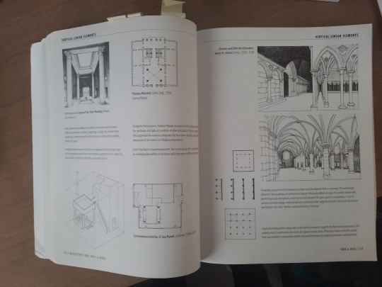
An example of a publication that has rhythm is this architecture book by Francis D.K Ching. The pages are filled with images and descriptions that showcase architecture examples and concepts. The placements of the images and text throughout the pages are very dynamic and forces readers to move throughout the pages both vertically and horizontally. The pages also have enough white space for the eyes to rest or focus on the illustrations.
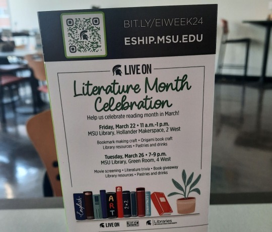
In this sign advertising Literature Month Celebration, there is a clear hierarchy of importance created by the typography. The words “Literature Month Celebration�� are the most important as not only do they have the largest font, but it also has a unique curving font type that does not match the rest of the signage. The dates are also given high emphasis as they are the only words that are typed out in bold making them larger and more noticeable.

In this description from a poster for “Beyond the Show” episode, there are many letters ascenders. The letters h in show, f in first, and t in talk are examples of ascender as the letter’s top terminal extends above the letter’s mean line.

In the poster for recycling paper, the lower case letters g in magazines and p in Newspaper are great examples of letters with descenders. Their lower terminals extend below the baseline.
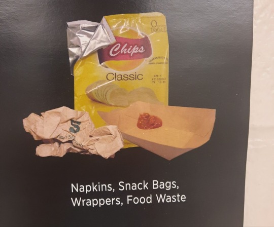
In this poster for throwing away trash there are many examples of letters with a counter. The lower case letters a, o, and are letters with a counter as they have enclosed spaces inside.
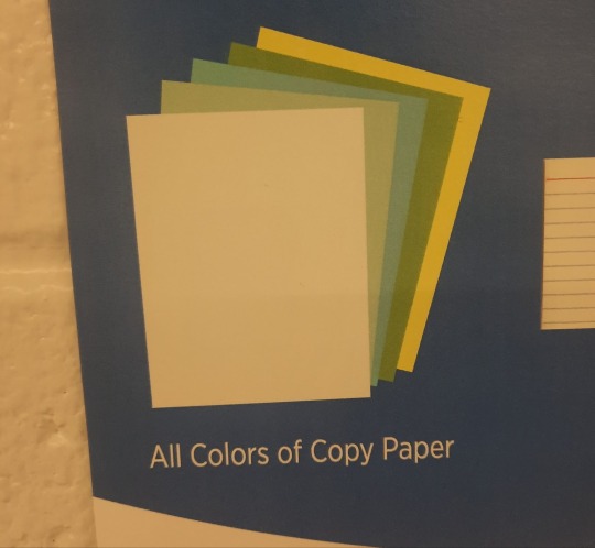
This poster for recycling paper has an example of a letter with a crossbar. The capital letter A in all has a crossbar, as a horizontal line moves across the center of the letter.
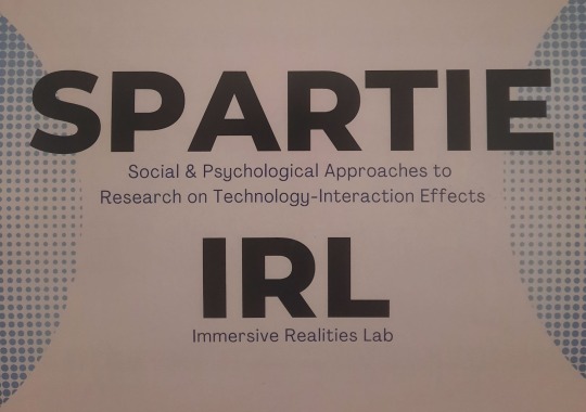
The font in between the Spartie IRL sign is a great example of large x-height. The ascenders and descenders in the lower case letters are short and less noticeable. While the lower case letters y and t are larger than letters without an ascender or descender like a, s, and e, it is still relatively small compared to other typefaces.
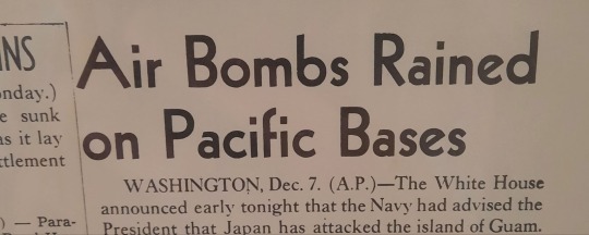
This old newspaper headline is a great example of a font with a small x-height. Here the ascender in the lower case d is much more pronounced as the letter is twice the height of letters without ascenders like a, n and e.
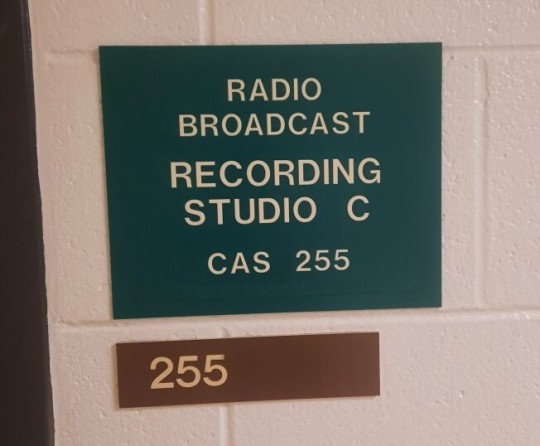
A great example of designs and fonts that are modernist are these door signs that you can often find throughout modern buildings. They are clear and straightforward, and the font types are straight and emphasize legibility, which are key hallmarks of modernist typography.

This poster for “Fragile Remnants” not only uses its unique fonts to draw attention to the poster, but to connote a natural feeling to the film. By using a font that looks more handwritten than mechanical, viewers automatically get a sense that the film is very human and dramatic without even reading the type of title.
#module4
0 notes
Text
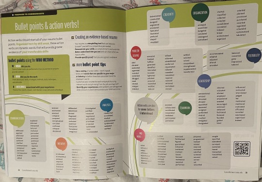
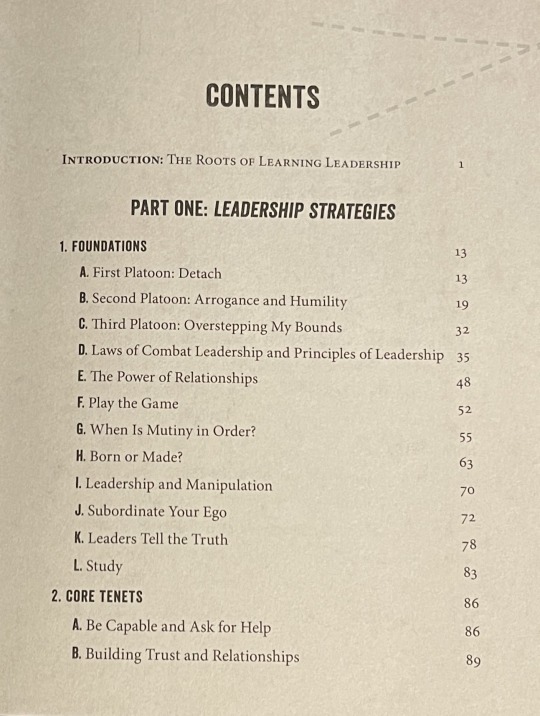
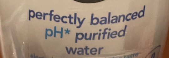
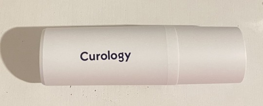
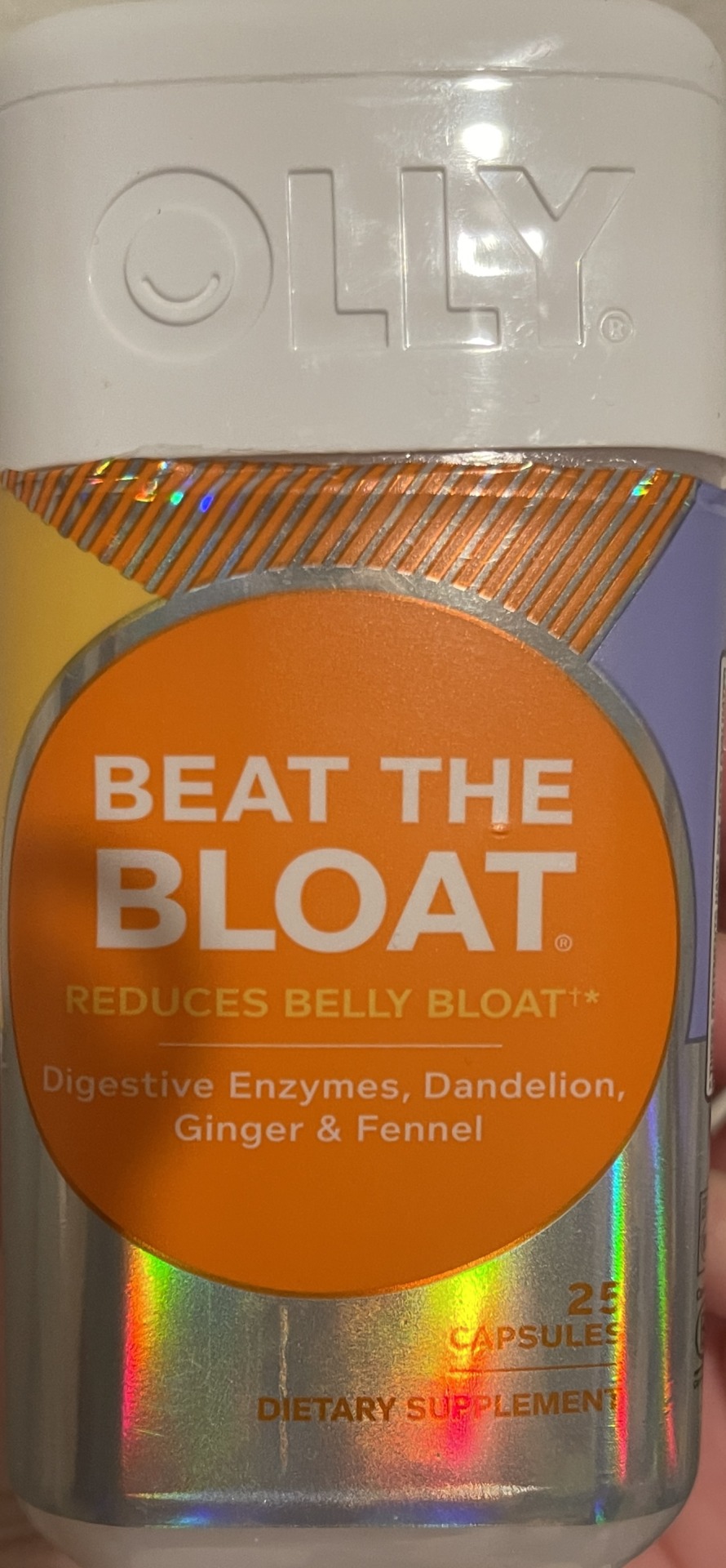
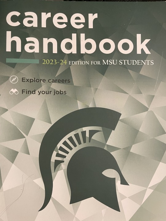
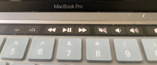
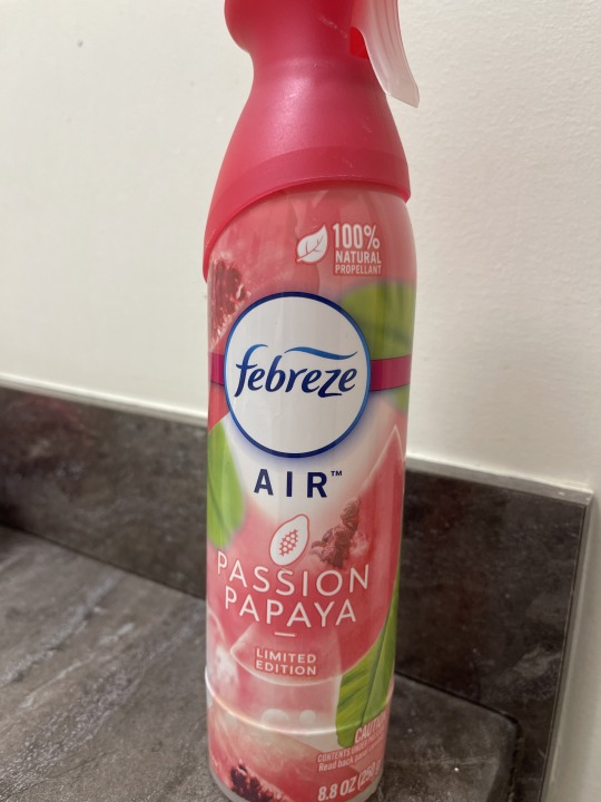
Image 1, Rhythm: The support poster shows rhythm in the publication of design through the way of the numbers and bubble title. The repeating shapes and bubbles help create harmony and pull your eye across the poster.
Image 2, Hierarchy: The application of bolding, italicizing, size variations, and placement within the typography establishes a hierarchy, indicating the relative importance of various typographic elements.
Image 3, Ascender: In this image, the letters t, f, b, d, and l all have ascenders. The ascender is the upward part of a letterform that extends above the x-height and usually above the cap height.
Image 4, Descender: Descender in graphic design, g and y in Curology.
Image 5, Counter: The O, P, R, and A all include a counter in this example.
Image 6, Crossbar: The letter E, A, and H includes a crossbar.
Image 7, Large x-height: The "career" in "career handbook" is designed with a larger x height because it has very short ascenders
Image 8, Small x-height: The "l" seem to be higher compared to the other letters in the typography.
Image 9, 'Modernist': "MacBook Pro" has a font used perfect example of a modern font because a modern font should be simplistic and effective.
Image 10, Connotation: The 'Febreze' typeface not only communicates its textual content but also conveys a sense of breeze, air, and refreshment. These elements symbolize the qualities the brand aims to emulate.
0 notes
Text
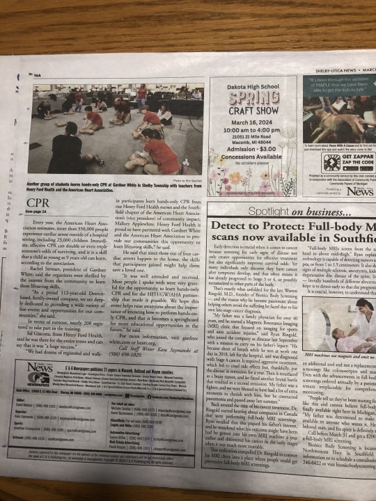
This newspaper article shows off rhythm in publication design because of the sections and paragraphs. It kind of directs the viewers eye around the page as to where they should be reading next. It has a flow of top to bottom and left to right which is known as the rhythm here.
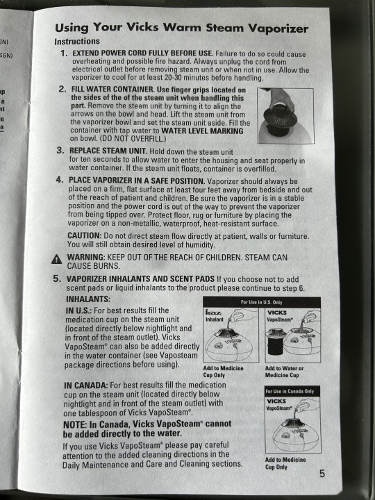
2. This instructional pamphlet is an example of typographic hierarchy because of the differences we see in the type. For example, the title at the top is bold and bigger than the rest of the content, the headlines are bolded but smaller font size than the title, and the text is smaller and has the regular font weight. All of this contributes to the order and hierarchy on the page.
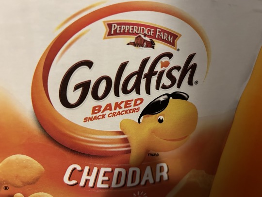
3. The type in the Goldfish logo has a few good examples of an ascender because there are a lot of parts of the letters that extend upward above the x-height. A good letter here would be the lowercase f as the hook part extends above the crossbar and x-height.
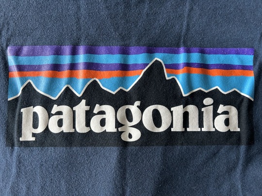
4. The Patagonia logo is an example that shows what a descender is. The p and g are both letters with descenders as they have parts of their letters that extend below the baseline of the entire type.
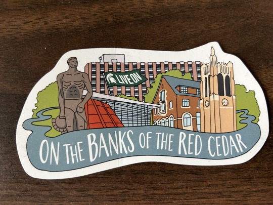
5. This MSU Live On sticker has a few examples of what a counter is. Letters like o, b, a, r, and d all have spaces within the letters themselves and these are known as the counters.
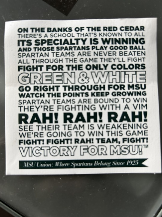
6. This next MSU sticker has a few good examples of what a crossbar is in typography. For example, looking at the words RAH! RAH! RAH!, you can see that in the capital a and capital h, there is a horizontal line that connects each stem/main stroke of the letter.

7. The Meijer logo is a good example of a type with a large x-height because the ascenders and descenders do not drastically extend above or below the baseline or the mean line.
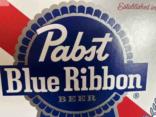
8. The Pabst Blue Ribbon logo type is a good example of a type with a small x-height because the type has many ascenders that extend drastically above the mean line. You can see this by looking at letters like the P, b, t, l, and i, and comparing them to letters like the a, s, u, or e for example.
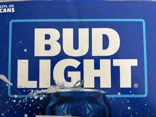
9. I feel like this Bud Light logo is an example of what classifies as "modernism" according to the Helvetica documentary because modernism type is very simplistic and versatile as it could be used in any situation really. Also modernist type is usually pretty big and bold and takes up a decent amount of the space it occupies as does the Bud Light type here.
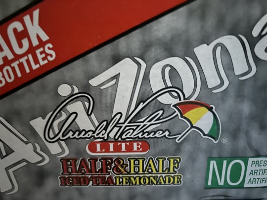
10. The Arnold Palmer type is an example of a type that is trying to connote something rather than just being a readable typeface. The type here is trying to connote the class or fanciness of the drink with the cursive scripted typeface.
0 notes
Text
Type Workshop - Legibility and Gestalt (LO1)
Legibility Talk 1 (How to obtain it using features/measurements of typography)
Glyph x-height (height) - A larger x-height (typically) means it’s a legible typeface. (Bigger so it’s easier to read) but if it’s too big, you loose the distinction between the ascender and cap-height. (Ascender and descender needs to be same).
Glyph cap height (top) and Glyph descender height (below the baseline) needs to be the similar measurement for legibility.
Typefaces with an appropriate contrast between cap height, the ascenders, and descenders with the x-height will have greater legibility.
Glyph width - Needs to be balanced. A balanced width that best showcases the recognisable shape of the letterforms will have higher legibility.
Glyph weight - A balanced weight that doesn’t distort the recognisable details of the letterforms will have greater legibility.
Glyph design traits - Individual aesthetic traits of the typeface will either define or distract from the acuity of the letterform. (You can customise type but old type is more distinct)
Glyph stress - The stress of the strokes is a reflection of the device used to craft them. The higher the contrast, the less legible the typeface.
Glyph counters and Glyph apertures - Open counters and apertures will create more defined legibility the letterforms.
Workshop 1
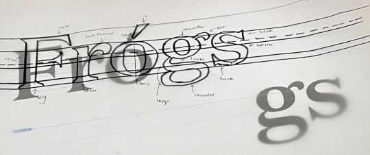
The task was to draw the type and label the features with a given guide. I didn’t finish labelling but learnt new things like the loop is part of a G. Thus, it was very enlightening.
Legibility Talk 2 (Continuation)
Cap height and x height are the same for readable type.
Apex is the tall pointed part of an A. W sometimes have an apex.
1 and 3% is calculated for the overshoot and overhang.
All curved forms have overshoot and overhang.
For d, the counter sits on the overhang and the leg on the overshoot.
Thinner strokes don’t line up than thicker strokes in type.
Everything appears to sit on a line, even if it doesn’t. Everything appears aligned, even if it isn’t.
Every typeface is designed to the same lines, even if the lines aren’t the same.
Workshop 2
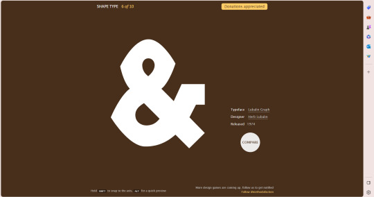
The task was to line up the anchor points to match with the typeface. I found it difficult at first( I use Illustrator a lot so I was disappointed in myself) as I don’t focus on type and their names. Eventually, I got better but didn’t finish as I prefer to take my times with things. I discovered the solution was aligning the strokes to be in a similar proportion.
Legibility Talk 3 (Latin ligatures)
Examples of Latin ligatures are fi and fj.
The ampersand is the oldest ligature born from the French (&)
Discretionary Ligatures (shown in Indesign feature) It’s to reduce the negative space in the typeface.
Workshop 3
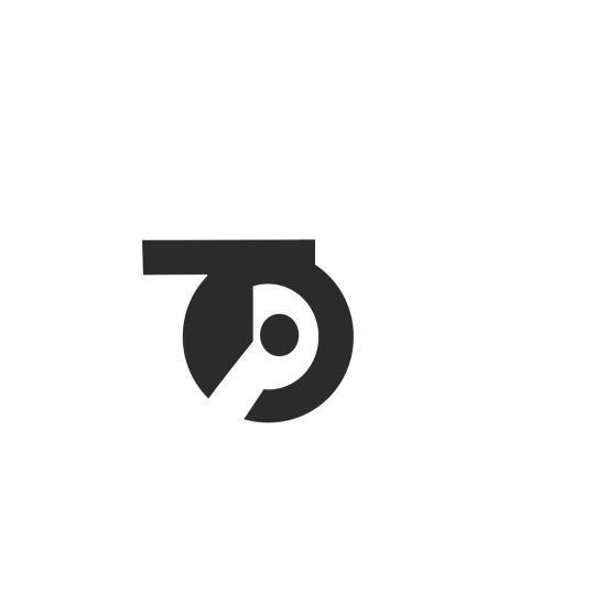
The task was to produce a ligature using our monograms as reference. I found difficulty with the T and O but worked with what I had and achieved the above ligature.
Gestalt Talk and Theorem
Negative space (White space) - gives relationship between objects.
Empty space - no relationship
When seeing a complex arrangement of elements we tend to look for a single recognisable pattern.
Building a cohesive relationship between the content on the page.
Closure = Control Meaning
12 is the best for creating a magazine layout because you can breakdown stuff.
Closure = Control Meaning Grids = Control Proportion
Closure = Where in this space do I put a thing. Grids = What size should the thing be.
This gives us objectively rational answers to questions regarding position and size.
Free our minds to seek the more interesting question of how can I creatively utilise this space.
Consistent in grids. Use mathematical 12 grids so the relationship can be the same.
Bend over rules for display text.
If someone give you copy, craft it a visually appealing way.
Page furniture (after the bleed for navigation such as page numbers)
Develop your design taste.
Make pull quote and caption
Workshop 3


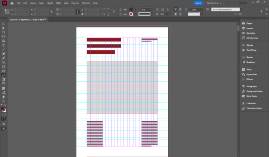
The task was to use the Gestalt theory, closure in creating spreads. I struggled but ended up making a few and learnt it's best to have a rationale for my design choices rather than how aesthetically pleasing they appear.
0 notes
Text
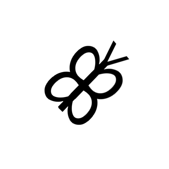
I wanted to delve into letterforms and what they could be used to represent, beyond their apparent academic function. So I took to searching for forms within letters. For my analogy, I focused on using the Futura font. I found that the letter ‘d’ in the Futura font had a bowl that sloped more at the top than at the bottom. This instantly clicked in my head as a butterfly shape, so I got to work. I felt that the illusion of a butterfly could be achieved by duplicating the letter and stacking them on top of eachother. Then, after completing the one wing, I could select both letters and duplicate them. Afterwards I would simply flip the duplicated wings and attach them along their stems. Finally, I added a ‘v’ to the top of the butterfly to be better convincing as a butterfly, as the ‘v’ could resemble antennae.
After completing my little endeavor, I was able to view this creature in its entirety. I was then able to appreciate its uniformity. I felt that the thick and even strokes of Futura were reminiscent of that of a crayon, or perhaps a marker. This, I believe, helps connect the font to a feeling of innocence and purity. Some may view Futura as a very rigid font due to its lack in line width, but I think the curved forms help to counteract that stiffness to create a sort of balance. The final product overall reminds me of a child's doodle, a very honest and innocent depiction of an endearing creature.
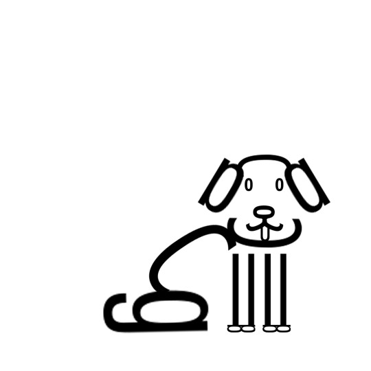
After the completion of my humble little butterfly, I was drawn to create a more involved piece. How could I take what I have learned in my first exercise and expand upon it? Once again I found myself drawn to the curved letters within Futura and Futura families. I thought that their rounded edges and uniform line weight would lend themselves to a simple and almost cartoonish style. After experimenting around and laying out all of the Futura letters, I had a thought. I could create a cute caricature of a floppy eared dog using ‘o’ as the eyes and the nose and ‘a’ as the ears.
After reaching this epiphany, I started scaling my letters to the appropriate sizes. I knew I wanted my dog to be sitting, since I found the lowercase ‘g’ resembles a dog’s haunch and tail. I also wanted the dog to be sitting because the thick line of a large lowercase ‘g’ would take up a lot of visual weight. If I depicted the dog sitting at an angle, I could display the dog’s haunch in the lower left and the head in the upper right. Due to the business of the head, it counteracts the heavily outlined back leg, even though the head has much thinner lines. Additionally, due to the mostly empty space on either side of the dog’s back, there is a sense of balance to the illustration. Overall I think this piece is well executed and contributes to a theme of innocence.
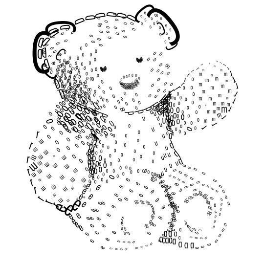
When I completed my little dog, it was time for the final step in my series of understanding typography. I went out to create a more detailed representation of something in the real world. This would require me to view letters based on their value. How dark or how light do these letters appear when by themselves? How about when they are stacked together? The completion of this project was dependent on me understanding value and balance.
I knew for this part I would need a reference image. I tried to find one that had high contrast since that would make for a stronger composition. However, since I wanted to make a stuffed teddy bear, that proved pretty difficult. Turns out people do not like taking high contrast photos of teddy bears. So, I decided I would just have to exaggerate the shadows in my final product to get the range of value I was looking for.
After choosing my reference photo, I put it into photoshop and started working. I began by placing large ‘o’s in the darkest shadows of the teddy bear’s tummy. I figured if the values were not dark enough, I would simply go back and fill them in more later. However, this strategy ran into a problem; time. I only had a certain amount of work hours to complete this piece. I did my best to compensate by copying existing groups of letters and layering them on top of others. Overall I felt I was easily able to create proper shading with letters. If at any point I was unsure about my values, I would squint my eyes while looking at my screen. This made the forms of the letters disappear so I could more easily see and work on values.
1 note
·
View note
Photo
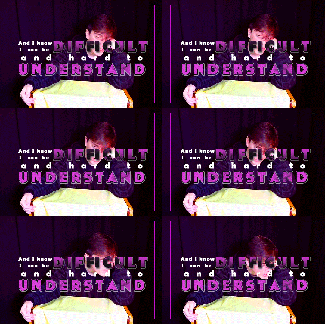

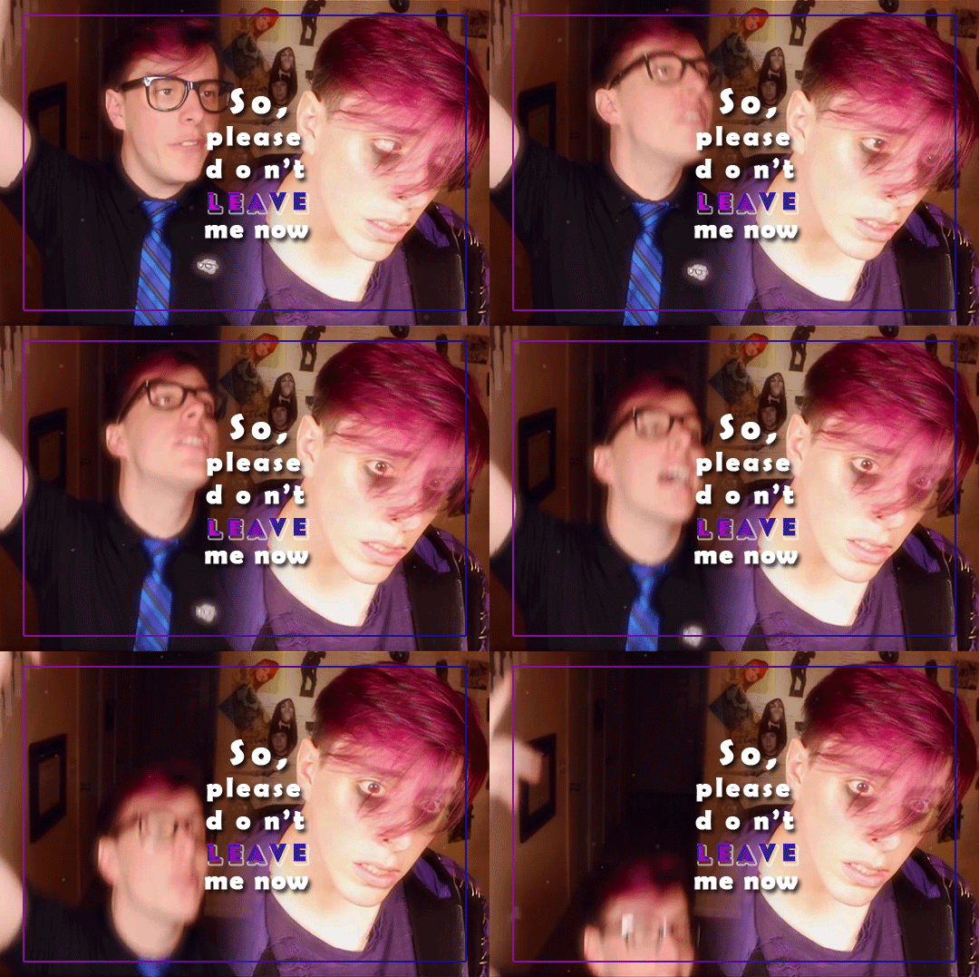

It might seem a little selfish If it is, I am so sorry I just don’t feel safe without you When you’re gone, it just feels so goddamn dreary So goddamn dreary
“please don’t” by mxmtoon
analogical week day 2: song / stars
@analogicalweek
ids in reblog
#sanders sides#analogical#virgil sanders#logan sanders#becca edited some shit#analogicalweek#sanders sides edit#the typography...... g o d
225 notes
·
View notes
Photo


Typography Tuesday
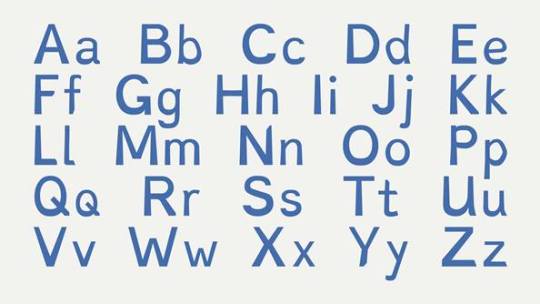
FONTS FOR DYSLEXIC READERS
This weekend I was introduced to several typefaces that are designed specifically for readers with dyslexia. My personal interest in type design derives partially from my own difficulty with reading. My preference for a reading font is one that is similar to or derived from Hermann Zapf’s Optima. The default font for Tumblr is supposedly ABC Favorit, but it looks a lot more like Helvetica to me, a typeface that is also easy for me to read. Those of you who have followed us for some time will have noticed that some of the features that make our posts distinctive are the use of bolding and typographic hierarchy, as you can see in this post. As the principal style editor for our Tumblr blog, I realize now that this is because it helps me, as an individual with reading difficulties, parse out the essential elements of a blog post.
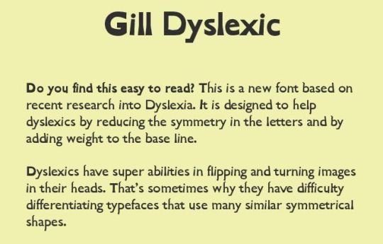
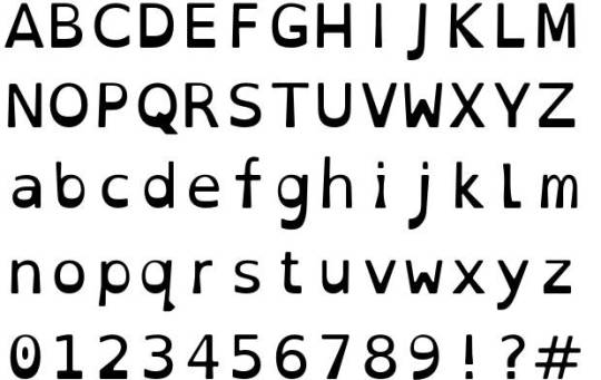
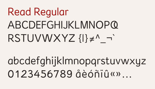
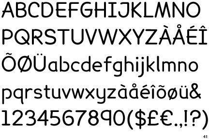
Several fonts have been developed recently to address dyslexic reading issues. Such fonts manipulate various aspects of letter form and spacing to enhance reading accessibility, including relative body weights, thickness and thinness of line, spacing between letters, adjustments to ascenders and descenders, and adjusting and deforming shapes and slants to help prevent the perception of letters reversing or swapping places. Most, if not all, are san serif. Shown here, from top to bottom, are:
Dyslexie, designed by the Dutch, dyslexic, graphic designer Christian Boer in 2008. Features include heavier line thickness at the bottom of most characters; slight downward slant on the curvature of the letters; elongation or diminishment of stems on some letters such as 'h and 'n'; added space between letters.
Gill Dyslexic, also designed by Boer. It aims to reduce the symmetry between letters, making them easier to distinguish. Like Dyslexie, the base of each letter is heavier than most other fonts, helping to orient the letter correctly.
OpenDyslexic, created by American designer Abelardo Gonzalez and released as a free and open source font in 2011. Shares many of the same design elements as Dyslexie (which has led to some conflict with Boer), such as heavy-weighted bottoms, unique shapes to each letter to prevent reversing and swapping, and wider letter spacing.
Read Regular, designed by Natascha Frensch at the Royal College of Art in London. Each character is designed to stand on its own and work together with its previous or next character. Ascenders and descenders are longer than most fonts to ensure distinction. Spacing within the o, e, a and u is enhanced and the openings in e and g are kept from visually closing in.
Lexia Readable, designed by Keith Bates at K-Type. This font has been called "Comic Sans for adults." Much like the other fonts, Lexia features long ascenders and descenders combined with generous letter spacing and asymmetrical lowercase b and d to help distinguish letters.
Sylexiad, designed by Robert Hillier, a Senior Lecturer at Norwich University College of Arts, and based on his PhD dissertation conducted on the font. Sylexiad features long ascenders and descenders, light weight, uniform strokes, perpendicular design, and generous inter-word spacing.
Despite all the laudable effort spent on these designs, however, no independent research has found that any font significantly improves reading speed or comprehension for dyslexics. This 2013 study, for example, found that Helvetica, Courier, Arial, and Verdana were the best fonts for dyslexics, the same fonts of choice for many efficient readers. Specially-designed typefaces may not really matter. It appears that san serif fonts with generous spacing between letters and words are most efficient, whether you are dyslexic or not.
Still, I do find the fonts shown here to be rather readable.
View more Typography Tuesday posts.
-- MAX, Head, Special Collections
#Typography Tuesday#typetuesday#dyslexia#specialty typefaces#Dyslexie#Gill Dyslexic#Christian Boer#OpenDyslexic#Abelardo Gonzalez#Read Regular#Natascha Frensch#Lexia Readable#Keith Bates#K-Type#Sylexiad#Robert Hillier#Typography Tuesday
116 notes
·
View notes
Note
jupiter what is your favorite font i need to hear it. mine is oswald
oswald is a Fantastic font choice 10/10,,, hmmm ok. my fav font. hmmmm.
OK WAIT I GOT IT. atkinson hyperledgible!!!!
SO this font is absoooooolutely amazing!! i use it basically everywhere i can (docs, my blog, it's basically my go-to font lol). so like the name! it's an accessible font that's meant to be legible by basically everyone. and "atkinson" came from the founder of the braille institute himself, robert atkinson! there's so many subtle changes in atkinson hyperledgible but it still looks amazing:
so characters in fonts are Meant to be similar and uniform, right? that's what makes them look cohesive! take futura (which i absolutely love btw, no hate to it <3):
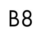
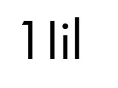

as much as i love this font, it's just not accessible yk? the b and 8 look similar, the capital I and lowercase L are basically the same with only a *bit* of height difference, and there's virtually no difference between c, o, p, q, b, & d at all! all they did was rotate one line around a circle. to be fair, futura was never meant to be a read as a text font at small sizes, but my point still stands: it's difficult to tell apart!
enter, atkinson hyperledgible. each chracter is different from the other in small ways that make a big difference. the serif on the lowercase I along with the distinctly rounded dot makes it stand out against the lowercase L, which also has a slight tail. the 8 is heavily pear shaped while the B is more even with less curves bumps. at small sizes or read by someone w/ impared vision, it's much easier to read.
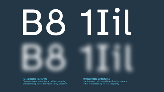
and the best part? it looks good!! it's still cohesive and doesn't stand out too much, but it's still a bit fun and quirky yk?

i love this font sm. it blends two of my fav things: typography and accessibility. there's just so much abt it aaaaa <3 my personal fav chracters are the "0", with a backwards slash that makes it stand out from a capital "O", and the lowecase "G", with large counters and a diagonally terminated tail. it should look weird or off bc of how the proportions are so different, but they made it work! it's just so amazing :D
id for that last image under the cut!
[ID: A grapic titled, "Atkinson Hyperlegible". Small text underneath the name reads: "A bold proclamation of a name, sure, but that's why it's here." The body of text reads:
Atkinson Hyperlegible is a typeface created in partnership with Braille Institute. It has been developed specifically to increase legibility for readers with low vision, and to improve comprehension.
04 - Four fonts, including two weights, in both roman and oblique
992 - Nine hundred and ninety-two total glyphs across all fonts
248 - Two hundred and forty-eight glyphs per font
Åä - Adobe Latin 2 character map
Named for the founder of Braille Institute, Atkinson Hyperlegible is a traditional grotesque sans-serif at its core. It departs from tradition to incorporate unambiguous, distinctive elements-and at times unexpected forms-always with the goal to increase character recognition, and ultimately improve readability.
Braille Institute is a nonprofit organization that embraces the unique challenges of sight loss and low vision, and rejects perceived limitations. Atkinson Hyperlegible will be made available to all designers producing materials for people across the entire visual-ability spectrum.
The image is signed with, "Braille Institute" along with its logo. /End ID]
#ask#bluecanarybythelightswitch#domino 🎹#typography#hyfix/spin posting#i love a good excuse to talk abt my fav fonts lol
3 notes
·
View notes
Photo

DAILYGRANDE’S MONTHLY EVENT
Each month, we will reveal an Ariana-related theme or prompt to edit. Show us your best graphics, gifs, icons, typography edits and more. Entries will be showcased on a page on our blog!
september event: favorite collaborations
We love our contributors and our followers who constantly tag us in their content (you keep this blog alive), so for our first event, let us know your favorite collaborative projects/songs or artists/producers whom Ariana has worked with!
RULES
Reblog this post
OPEN TO EVERYONE (you do not need to be a member of our blog to participate)
Post original creations only
Mention us @dailygrande and the month’s event in your caption
Tag #dailygrande
This event runs from September 1st - September 30th
There are no limits—post as much as you want and be as creative as possible! Feel free to suggest future prompts or message us with any questions here.
104 notes
·
View notes
Photo

welcome to iconfrenzy, a blog dedicated to completing requests for icons, headers and/or tumblr themes!
G U I D E L I N E S
if you send me a request you can expect five icons and/or one header made from the same image in one specific color using textures/doodles/typography disclaimer: i only complete request from my fandoms due to lack of resources.
if you sent in a request and you want to know if it will be completed, you can take a look at my updates page, where i keep track of ongoing proyects. keep in mind that it is updated weekly.
if you would like a customized icon and/or header, regardless if it is part of my fandoms, you can send me a commission for a customized creation.
if you are a fellow icon maker, you can tag your creations with #iconfrenzy, so they will be reblogged
if you have any further questions please check out our F.A.Q..
♡ if you enjoy my creations, please consider supporting me by buying me a ko-fi ♡
63 notes
·
View notes