#Sylexiad
Explore tagged Tumblr posts
Note
Are there plans to add the ability to change subtitle/text sizes and colors? I am hard of hearing and the text is so small it strains my eyes :(
Hello there! We're sorry to hear the text styling isn't working for you, could you let us know what size screen you're playing at?
The game is created for a screen size of 1920×1080, which means players on smaller screens may suffer some display issues.
We will definitely be looking at the accessibility settings again for the game's full release, but in the meantime we'd suggest changing the font used in-game to one which may read more easily for you.
You'll find this in the Visuals section of the game's Settings menu! The default font is Lora, but Fira Sans and Sylexiad Serif Medium are also available:

Hope this helps you out! 🙏💌
4 notes
·
View notes
Text
I built the whole typeset around the single concept of doing a story about a dyslexic character in a dyslexia-friendly font. I chose Sylexiad, and I think it looks great.
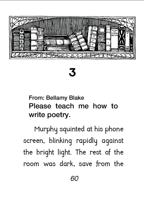

Many thanks go to @red-0ak-tree for the lovely story that stayed with me through the years, and to Six for the wonderful binding. It feels so good to hold, I literally couldn’t stop touching the cover <3
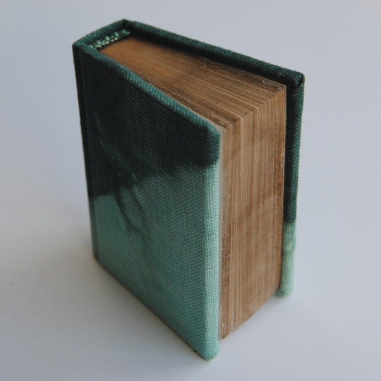


because he's a poet by red0aktree [link]
Bound for the @renegadepublishing Tiny Book Bang. Typeset by @mythrilthread. Bookcloth hand dyed by @epitomereally for her Everything is Relative to You project... and I think she gave me the end pages as well...? Edges are buff 'n rub wax.
453 notes
·
View notes
Photo
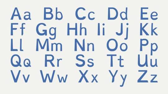


Typography Tuesday
FONTS FOR DYSLEXIC READERS
This weekend I was introduced to several typefaces that are designed specifically for readers with dyslexia. My personal interest in type design derives partially from my own difficulty with reading. My preference for a reading font is one that is similar to or derived from Hermann Zapf’s Optima. The default font for Tumblr is supposedly ABC Favorit, but it looks a lot more like Helvetica to me, a typeface that is also easy for me to read. Those of you who have followed us for some time will have noticed that some of the features that make our posts distinctive are the use of bolding and typographic hierarchy, as you can see in this post. As the principal style editor for our Tumblr blog, I realize now that this is because it helps me, as an individual with reading difficulties, parse out the essential elements of a blog post.
Several fonts have been developed recently to address dyslexic reading issues. Such fonts manipulate various aspects of letter form and spacing to enhance reading accessibility, including relative body weights, thickness and thinness of line, spacing between letters, adjustments to ascenders and descenders, and adjusting and deforming shapes and slants to help prevent the perception of letters reversing or swapping places. Most, if not all, are san serif. Shown here, from top to bottom, are:
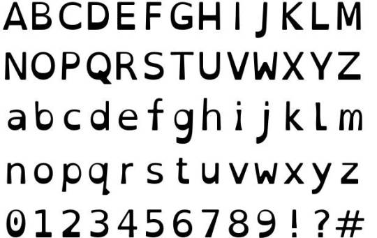
Dyslexie, designed by the Dutch, dyslexic, graphic designer Christian Boer in 2008. Features include heavier line thickness at the bottom of most characters; slight downward slant on the curvature of the letters; elongation or diminishment of stems on some letters such as 'h and 'n'; added space between letters.
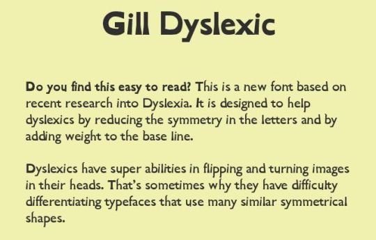
Gill Dyslexic, also designed by Boer. It aims to reduce the symmetry between letters, making them easier to distinguish. Like Dyslexie, the base of each letter is heavier than most other fonts, helping to orient the letter correctly.
OpenDyslexic, created by American designer Abelardo Gonzalez and released as a free and open source font in 2011. Shares many of the same design elements as Dyslexie (which has led to some conflict with Boer), such as heavy-weighted bottoms, unique shapes to each letter to prevent reversing and swapping, and wider letter spacing.
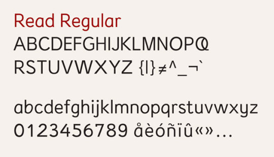
Read Regular, designed by Natascha Frensch at the Royal College of Art in London. Each character is designed to stand on its own and work together with its previous or next character. Ascenders and descenders are longer than most fonts to ensure distinction. Spacing within the o, e, a and u is enhanced and the openings in e and g are kept from visually closing in.
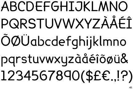
Lexia Readable, designed by Keith Bates at K-Type. This font has been called "Comic Sans for adults." Much like the other fonts, Lexia features long ascenders and descenders combined with generous letter spacing and asymmetrical lowercase b and d to help distinguish letters.
Sylexiad, designed by Robert Hillier, a Senior Lecturer at Norwich University College of Arts, and based on his PhD dissertation conducted on the font. Sylexiad features long ascenders and descenders, light weight, uniform strokes, perpendicular design, and generous inter-word spacing.
Despite all the laudable effort spent on these designs, however, no independent research has found that any font significantly improves reading speed or comprehension for dyslexics. This 2013 study, for example, found that Helvetica, Courier, Arial, and Verdana were the best fonts for dyslexics, the same fonts of choice for many efficient readers. Specially-designed typefaces may not really matter. It appears that san serif fonts with generous spacing between letters and words are most efficient, whether you are dyslexic or not.
Still, I do find the fonts shown here to be rather readable.
View more Typography Tuesday posts.
-- MAX, Head, Special Collections
#Typography Tuesday#typetuesday#dyslexia#specialty typefaces#Dyslexie#Gill Dyslexic#Christian Boer#OpenDyslexic#Abelardo Gonzalez#Read Regular#Natascha Frensch#Lexia Readable#Keith Bates#K-Type#Sylexiad#Robert Hillier#Typography Tuesday
114 notes
·
View notes
Note
omg I love the way you customized!! -libra
Thanks!
The theme I used is Jude by Flipse, which allows you to use a Google Font of your choice all over the theme.
Since I'm a writer and I plan on uploading/crossposting lots of writing here, I wanted to get a good body font (a font that is good for reading in a long continuous form). I'm using Libre Baskerville.
If it were in the Google Font library, I would've gone for Sylexiad sans since I think it looks very nice as a body font but it be like that sometimes 😔
Note: All of the above-mentioned only applies to the desktop/web version of my blog! On mobile or the app, I just made sure to match what I could edit on the appearance section with the dark mode version of my blog.
4 notes
·
View notes
Text
Crawford, W. (1990). Beyond courier: Good writing deserves good typography. 8(3), 93-111. https://doi.org/10.1108/eb047803 Dyson, M. C. (2011). Do Designers Show Categorical Perception of Typefaces? , 45(3), 193-220. chrome-extension://efaidnbmnnnibpcajpcglclefindmkaj/https://content.ebscohost.com/cds/retrieve?content=AQICAHioQh6vaQ1f_660avHqehX5LEStxh3GpqBCg7yJ_AGctQHl94w7rWLGJBjHyDEwyzV5AAAA4TCB3gYJKoZIhvcNAQcGoIHQMIHNAgEAMIHHBgkqhkiG9w0BBwEwHgYJYIZIAWUDBAEuMBEEDFeVPGgsonE8opJ_RgIBEICBmR8DRrMpeP9UE7QvBRJLZWxFNqKWII7vB1jm1Qs6eeLQWfE7APZnogE_3Mvp1jSaWkCBUlldY94PnYkgXBpEnGe0ATnsZHbPbNFcUl85vnJisFlSZuHVGWmcN6pH8sNe89BqjUVHugPqkYoSfrCrElvVqPEsfR8asfHSfryipXQ7jDxUU4Y_qK__q6A12kLt_H-0JaPjpQLL5A== Fig.1. AvivaM.Cantor. (2020). Unique psychedelic art examples and how to use them in design and branding. https://musebycl.io/design/how-wes-wilsons-psychedelic-concert-posters-steeped-past-soared-future Fig.2. freerangecalligrapher. (2020). A month of work https://www.instagram.com/p/CCId1X8DfBe/ Garfield, S. (2010). Just my Type. Profile Book. Hillier, R. (2008) Sylexiad. A typeface for the adult dyslexic reader., 1(3), 275-291. https://doi.org/10.1386/jwcp.1.3.275_1 McCarthy, S. J. (2013). The designer as author, producer, activist, entrepreneur, curator & collaborator: new models for communicating. 51-61. https://content.talisaspire.com/aut/bundles/6315990fb72b12079b734944 (Bis) Warde, B. (1900 -- 1969). The Crystal Goblet. From http://gmunch.home.pipeline.com/typo-L/misc/ward.htm
0 notes
Text
position research part two
As a typographer and as a designer, I would still consider myself fairly new to the practice. But after doing more of it, it has really made me more acutely aware of how prevalent it is in everyday life. Especially within in terms of typography, as it is everywhere. As a person that struggles with just the simple task of reading/writing, it is interesting to see how much a particular typeface may help with that issue. More recently as I have been moving more into the world of typography, I have been discovering the nuances within this type of design while playing around with display typeface, which has inspired me to look further.The typefaces/ techniques I have been trailing and using have been inspired by a range of sources, such as looking into the psychedelic area of design, and the impressive swelling typeface created by people like Wes Wilson. To practices such as calligraphy looking at more modern-day calligrapher such as Peter Gilderdale and then past examples of examples of calligraphy like the work relating back to the late 1890. These typefaces and these examples use these different points of intrigue to capture the user's attention. And what I have impartially noticed is that by using these typefaces it helps to convey more meaning to the viewer and context of which it was formed for. Which is an art from within itself, as it requires a lot of learning and practicing, plus being able to get the right combination, which then also involves following a set of rules that very’s on use and context. This is something that I have tried to break on a couple of accusations in terms of seeing if it could be done, like trying to combine Black letter and the swelling type of the 60s which has never worked as much as I have tried. Despite talking about display typefaces so far, I think it better to think in terms of the value that typography brings as a whole to not only decorative uses. Even minimalistic typefaces follow these same principles and if not more. Like in Beatrice Warde’s, Crystal Goblet “functional type devoid of decoration or personality – is not with meaning.” An example of this is a typeface called Sylexiad, which is a more minimalistic typeface. However it is designed with the purpose to allow more accessibility for people like adults with dyslexia, as it makes it easier to read. To do this the typographer did a series of small tests to work out which ones were preferred and why by their sample group.
0 notes