#module4
Explore tagged Tumblr posts
Visit Tumblr Blog
Explore Tumblr blogs with no restrictions, modern design and the best experience.
Last Seen Tumblr Blogs


Fun Fact
China blocked Tumblr because of pornography and censorship problems in 2013.
Text

University Diaries: Friday Sunset
March 7, 2025
Our prelim exam in Review in Professional Subjects 2 covering Module 4 (Biopharmaceutics & Pharmacokinetics, Pharmacology, and Toxicology) was now officially done. I was on my way to the bus stop when I caught a glimpse of sunset as I looked behind. I decided to capture this image signifying the success of my hardwork in taking the pre-board exam.
2 notes
·
View notes
Text
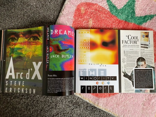

1. Chip Kidd Book One interior: This photo shows a page spread in a book that takes a look at Chip Kidd's history and book cover design. The book as a whole uses rhythm, with this photo being an example of it in use. throughout the book, there is lots of images used in blocky layouts such as what is depicted, with small black sections carved out with white text about what is being displayed on the page.
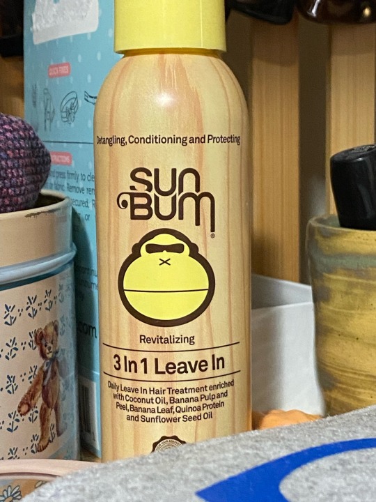
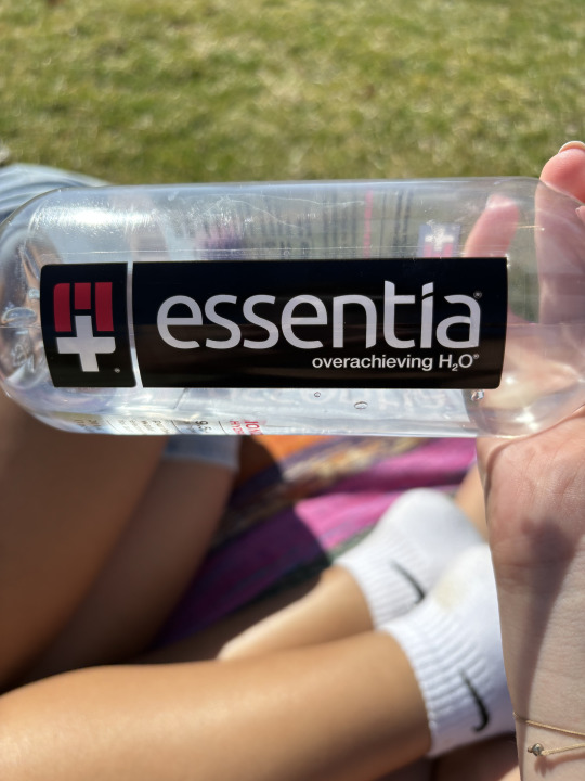
2. Sun Bum bottle: This design uses typographical hierarchy to depict the most important information displayed on the bottle. The largest text is the Sun Bum text logo, which tells the user what brand the product is. The next largest text describes what exactly this product is, with the smallest text going into more detail about the product. This hierarchy allows the viewer to quickly understand what the product is and allows them to choose whether they are interested in reading the smaller text and learning more about the product.
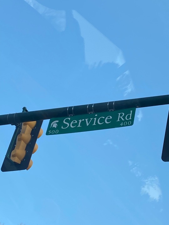
3. Service Road sign: The "d" in "Rd." has an ascender.
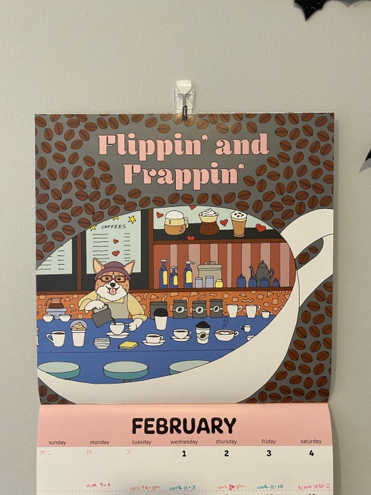
4. Calendar: The "p"'s in "flippin" and in "frappin" have descenders.
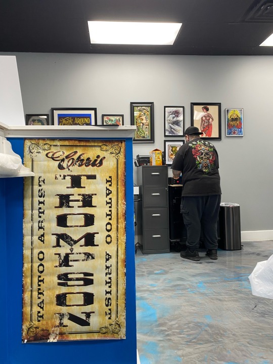
5. Poster: The "O"'s in "tattoo" have counters.
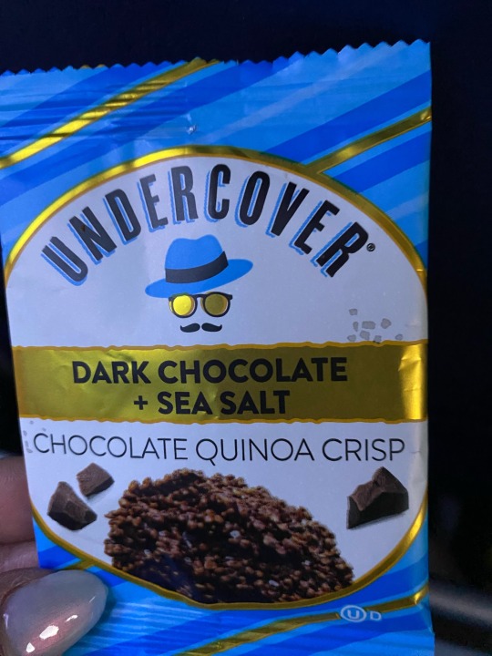
6. Quinoa crisp snack: The "A"'s have crossbars.
7. Physical Therapy Tote Bag: The text that is a link ("team-rehab.com") has a relatively tall x-height with short ascenders ("h", "b").
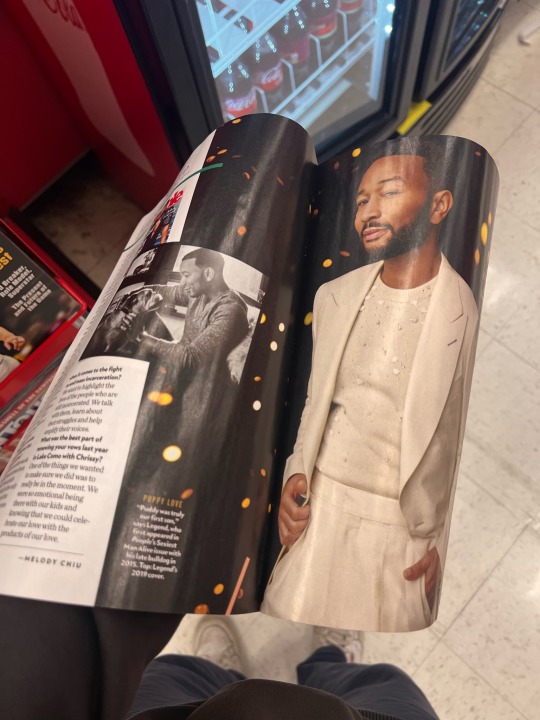
8. Back of a magazine: The bold heading in the blue section has relatively short x-height with tall ascenders ("l", "b").
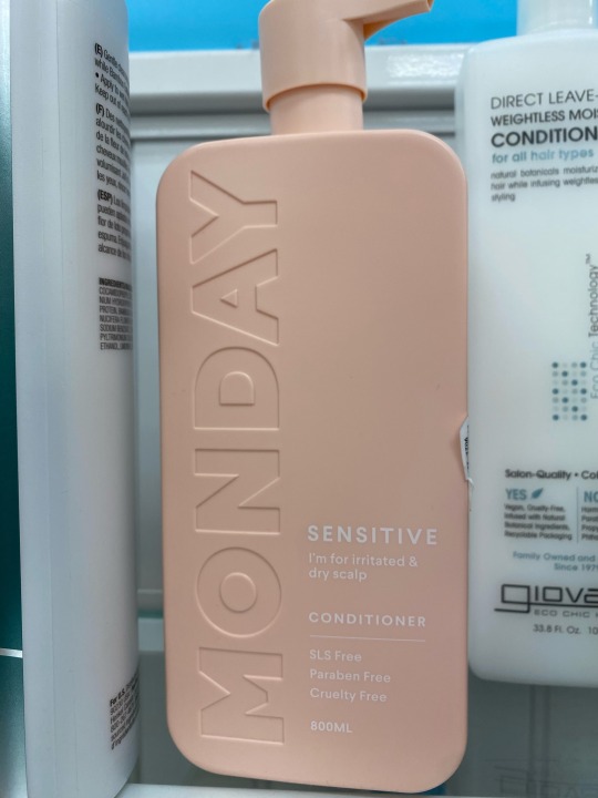
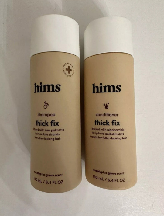
9. Monday brand conditioner: This product uses a simple sans-serif font, with the brand name "Monday" displayed on the left edge and the product information displayed in a flush-left ragged-right format. It is very clear and concise, without unnecessary elements, leading me to believe that this design can be considered "Modernist".
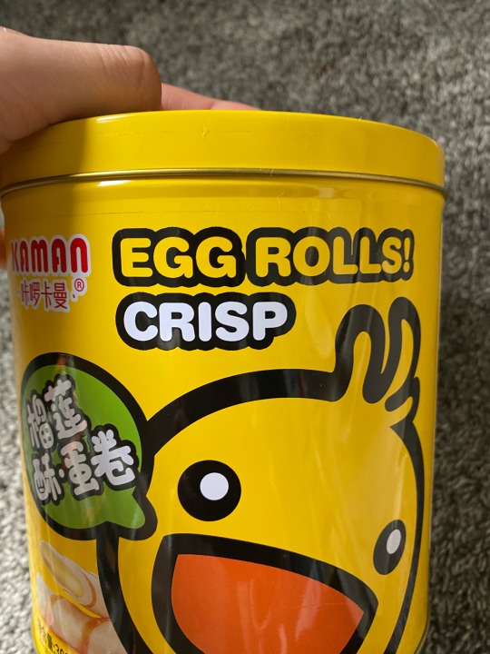
10. Snack can for crispy egg rolls: The font used for "crisp" utilizes round terminals, giving it a soft and bubbly look. It is describing that the product is "crisp" however the font does not connote "crispiness". Perhaps this font choice is trying to connote more than just the crispiness, such as the fact that the snack itself is round.
2 notes
·
View notes
Text
Module 4
Image 1: Magazine - This magazine shows rhythm in design. You can see it is sleek and makes you follow the page with its visuals.
Image 2: This card shows the importance of certain information which includes a colored icon, font size, and boldness.
Image 3: This bottle shows the ascenders which are the letters “h” and “i” they hang up above the others.
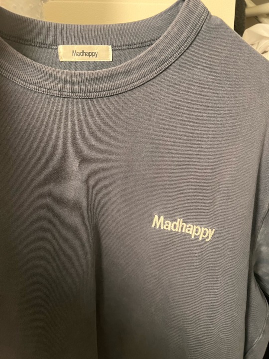
Image 4: Madhappy t-shirt and tag. As you can see in this logo the descenders are the double “p” and “y” which go below the baseline.
Image 5: Febreze - You can see the counter in this design within the logo.
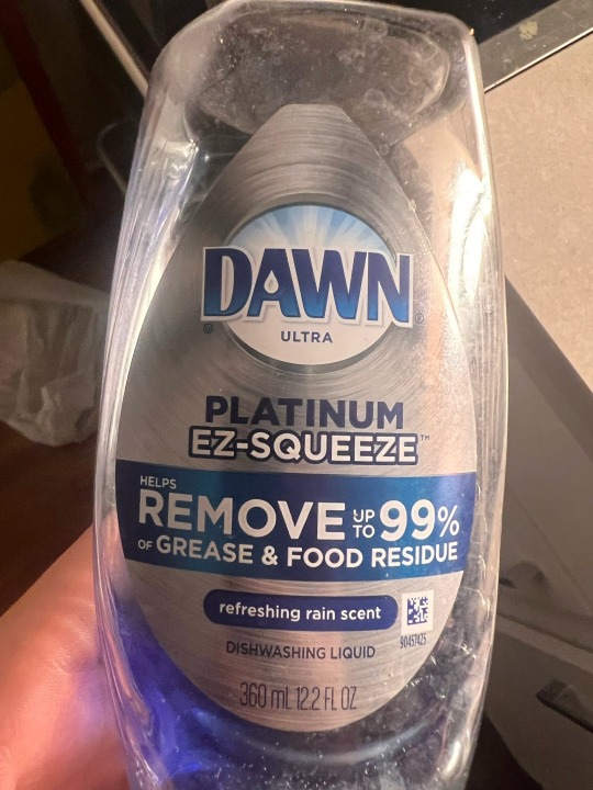
Image 6: Dawn dish soap - you can see the crossbar in the letter and how they are such as the letter “A.”
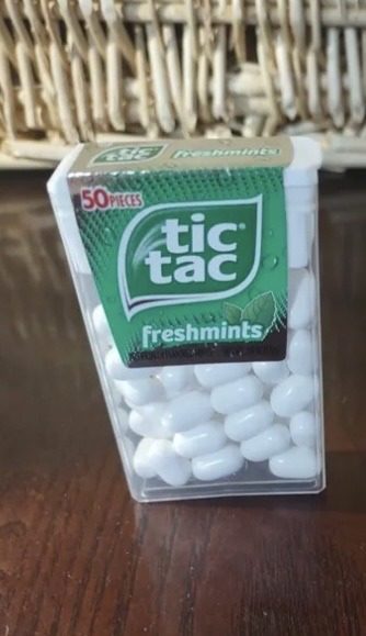
Image 7: Tic Tac logo - there is a larger x-height and how they look together.
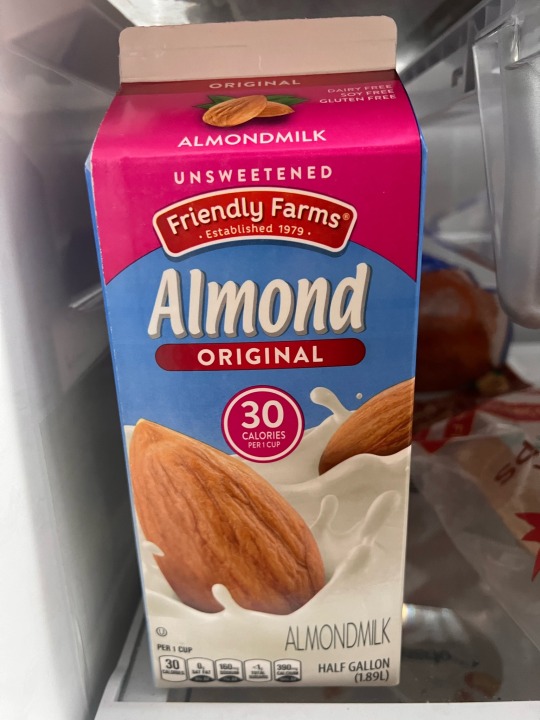
Image 8: almond milk - in this, there is a smaller x-height with larger ascenders.
Image 9: Xbox logo and packaging - you can see that the logo is simple and modern as well as the console itself. It's very sleek and has an elegant look to it.
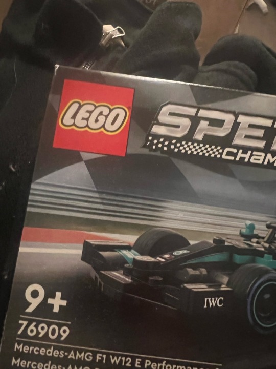
Image 10: lego - this logo is meant to be more than building blocks. This logo is fun and playful for what the brand is trying to display.


0 notes
Text
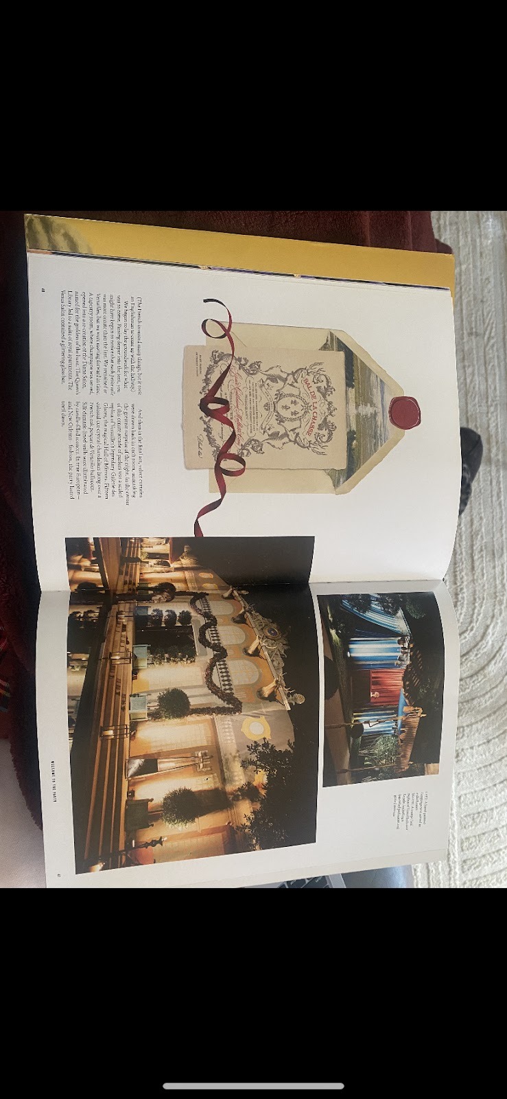
1. This coffee table book uses the rhythm and movement of the red ribbon to move the viewers’ eye across the page. At first glance, I thought the ribbon connected cleverly to the garland in the image on the right. Although it doesn't, the parallel between the whimsical ribbon and draped garland helps the eye move seamlessly across the page.
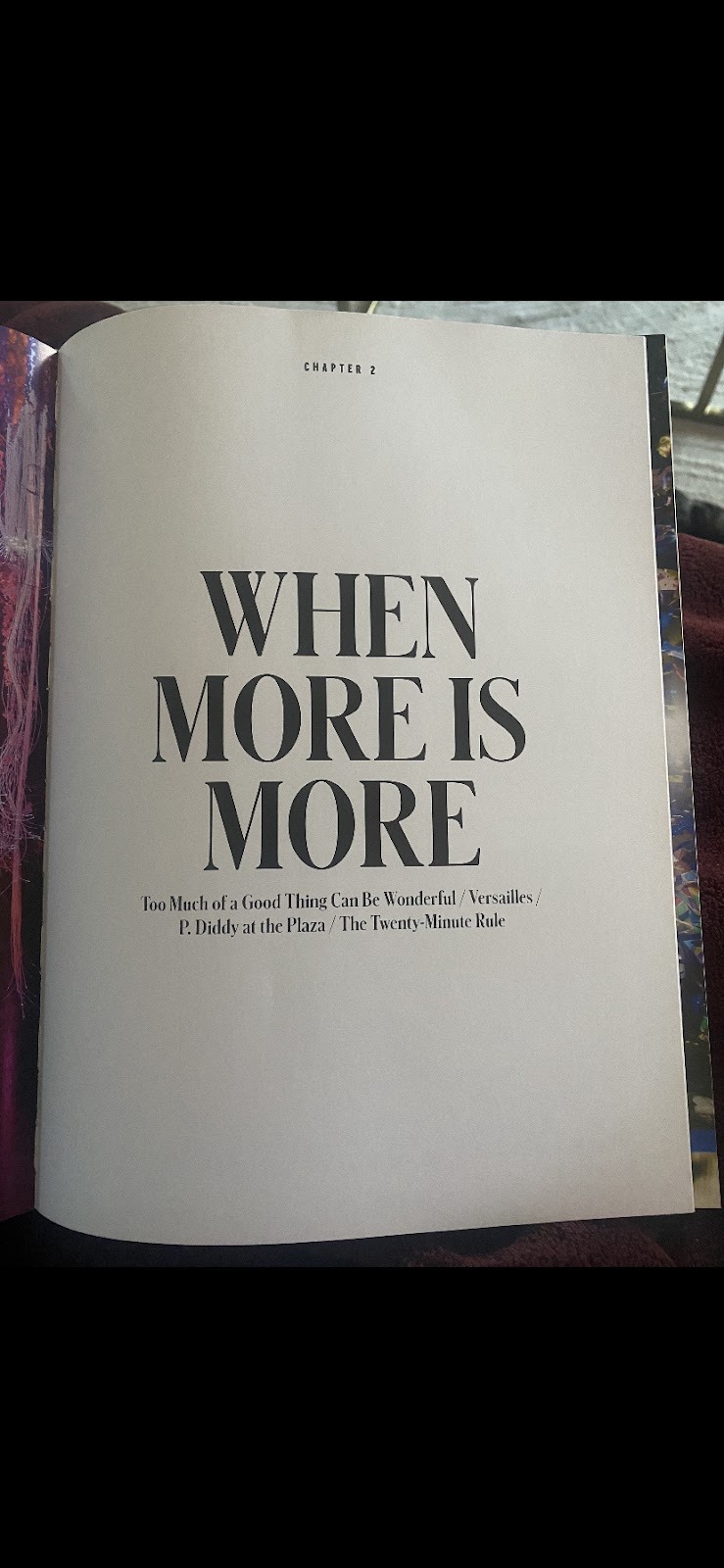
2. The phrase “WHEN MORE IS MORE” is centered on this page in bolded and capitalized serif font. This combined with its extreme size make this whitty hook the center of attention for the viewer. The chapter number at the top of the page and the chapter’s table of contents at the bottom of the page are barely even noticed due to the extreme size contrast that places the chapter's title on the top of the typographic hierarchy of this page
.
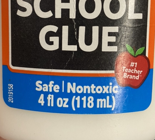
3. The word “safe” highlighted in blue at the bottom of the glue bottom includes the letter “f” that is a letter with an ascender. This means that the “f” extends above the letters' mean line where most other letters stop.
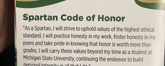
4. This image includes the descender letter “p” in the word “Spartan”. A letter with a descender is a letter that extends below the base line of a word.
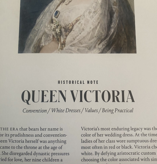
5. The “O” in “Victoria” in simple, serif font is a letter with a counter. This “O” is an example of a fully closed counter, whereas the “U” in “Queen” is a partially closed counter.
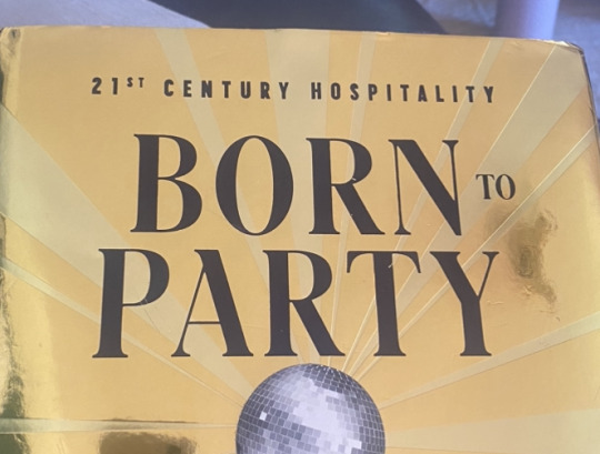
6. The “A” in the word “party” has a crossbar. The uneven line weight of this typeface throws each “A” off centered, making the crossbar and left leg of the “A” seem weak compared to the right leg.
7. This use of a large or regular X-height makes the rest of the world stand out. All of the lower case letters in this word do not look too small compared to the uppercase letter. This allows the word to seamlessly display its content without drawing too much attention to the text itself.
8. This font uses a small X-height to make its upper case letter stand out and catch the eye more. It highlights the first letter of each word by making them significantly bigger than the following letters in each word. The more drastic contrast with small X-heights allow the words to pop and stand out against the crowd.
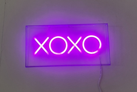
9. This sign that says “XOXO” is modernist based on my understanding of the film Helvetica. The Xs and Os are extremely simple, serif letters. They have zero flare, are perfectly spaced, and are all the same height and weight. This sign follows traditional spacing principles, and was designed based on its intended use which is to be easily hung up. If the sign was more postmodernism, it may have the letters spaced differently and more whimsically, making the sign difficult to hang and decorate with.
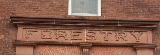
10. This font is trying to connote feelings of nature using its text. The extremely ornate leaf detailing of each letter connotes a feeling of care, patience, and creativity. No other building sign uses this style of decorative text, or any other style of purely decorative text to represent what building it is. Each letter is unique to the next, and represents the gentleness and attention to detail of nature, which forestry studies.
#module4
0 notes
Text
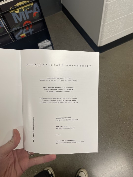
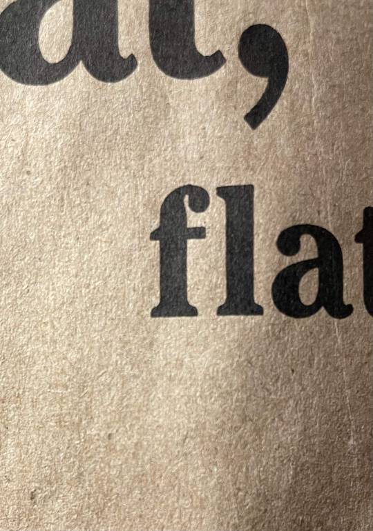
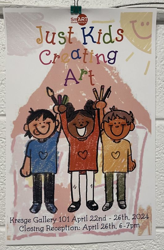
Image #1- An example of rhythm in a publication design
Image #2- An example of typographic hierarchy to establish the order of importance on a page
Image #3- A letter with an ascender (d)
Image #4- A letter with a descender (y)
Image #5- A letter with a counter (O)
Image #6- A letter with a crossbar (f)
Image #7- A font that has a large x-height
Image #8- A font with a small x-height
Image #9- A piece of design that appears to be “Modernist”
Image #10- An example of a font being used that is trying to connote something more than just the text typed in that font (Just kids creating art)
0 notes
Text
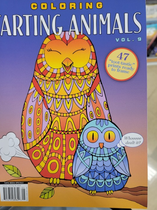

The first design is the cover of a coloring book. The cover shows rhythm with the feathers of both the owls have repeating elements within them. Also, the interior of the book matched the rhythm of the cover with all the pages having the same layout.
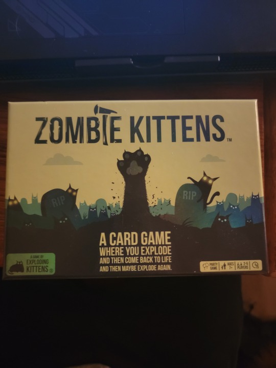
The 2nd design is the box for the game "Zombie Kittens". The design on the front of the box shows typographic hierarchy to establish importance with the title of the game being the largest and other text being shown small as it is of less importance.
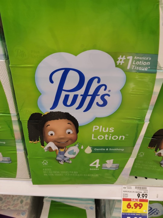
The third design is the "Puffs" logo. The f's in the typography have ascenders.
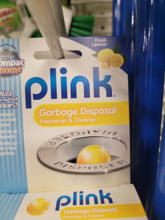
The fourth design show the work "plink" with the p containing a descender.
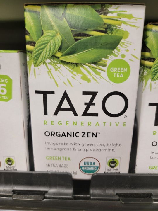
The "O" and the "A" in Tazo contain counters.
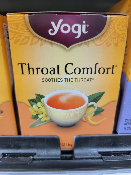
The "t"'s and "f" in Throat Comfort contain crossbars.
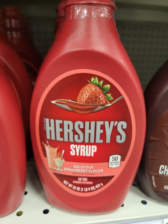
In the seventh design, the word "Hershey's has a large x-height.
In the eigth design, the word "Bigelow" has a small x-height.
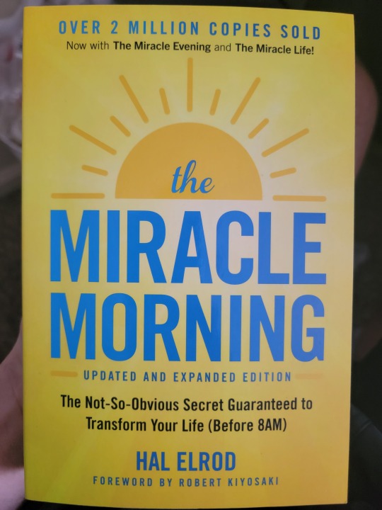
The book cover for the book Miracle Morning appears to be a "Modernist" design. I think this because of the use of bold, primary colors, as well as the design sticking to the grid.
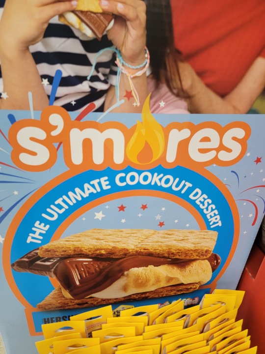
In the final design, the typography used for the work "s'mores" contain an "o" that is replaced with a flame. The font is trying to connote that s'mores is more than a food, but an experience of making them around the fire.
0 notes
Text
Image 1: The cover of this User Experience book has a nice rhythm to it. You see a rhythm of lines and colors that repeat themself, along with the shadows. It is almost like a sequence with flow.

Image 2: This Dr. Bronner's soap label has a lot of words but the font size is what makes it easier to read and find the information that you need. The title is the largest and boldest. Then you have the certification that is the second largest to show that it is a trusted product. So on and so forth. Despite the business, the font sizes make it easier, showing you the order of importance.

Image 3: Two letters are ascenders in this image, "t" and "l". They ascend above the x-line, making them ascenders.

Image 4: In contrast to ascending letters, the "y" in this image is a descender because it extends below the x-line.

Image 5: On this Barbecue chip bag, we have a couple of counters, which have no opening. For example, The "D" and the "Q" have counters because they are closed letters.

Image 6: Letters with crossbars have a line going through them. In this case, we can see that the cross bar letters are "A" and "H".

Image 7: This font has a large x-height, with the small ascenders being "f, l and d". The largeness of the x-height make the letters look slightly wider than normal.

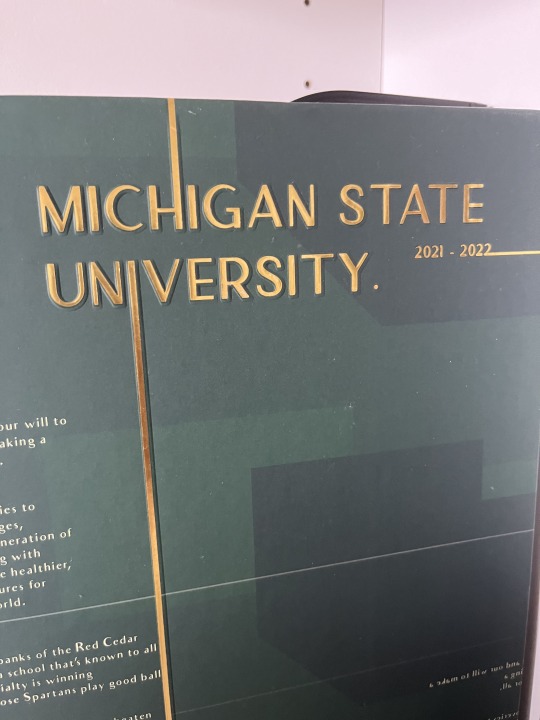
Image 8: This font has a small x-height, but with large ascenders, which tend the make the letters look thinner and longer than normal. Specifically where it says "Michigan State University" on the name tag.

Image 9: This font, specifically "Think" and "Thoughts" helps to define modernism to me because of how sleek the font is. It is very clean and it does not interfere with the other font that is used. It also the type of font to be used in a modern home, an advertisement or anything professionally related.

Image 10: The typography in this poster is straight-forward. But has a sparkly and shiny design to it. Renaissance is typically associated with history or a building. But in this image, its connotative meaning seems to be something new. Because new things are typically shiny.

0 notes
Text
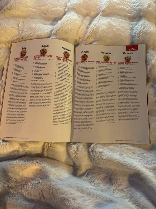

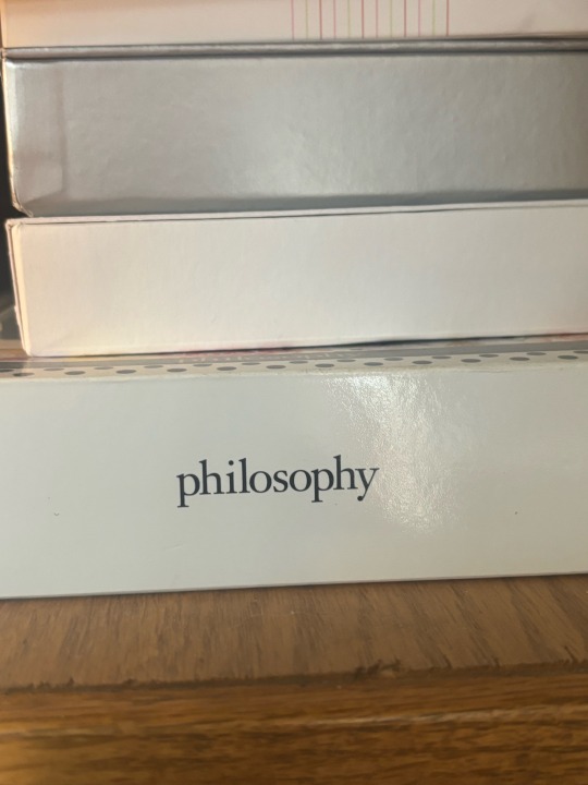
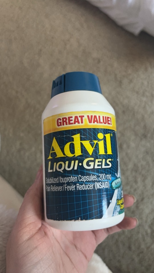
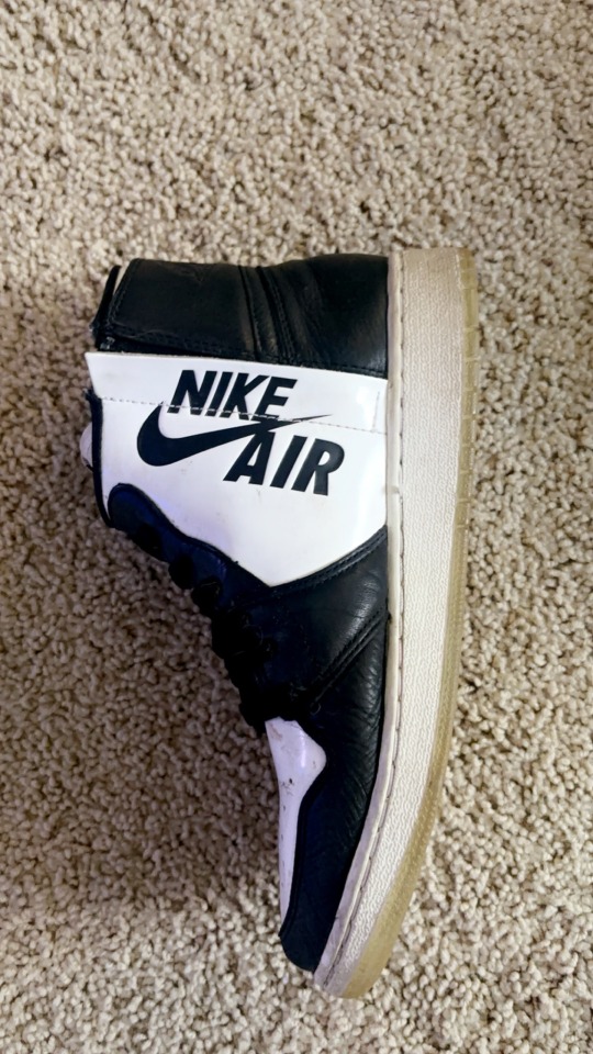

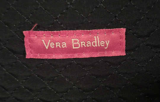

Photo 1: There is a use of rhythm in this magazine. This page allows the viewer to view the instructions of how to make certain muffins without being distracted. The focus of the topic flows from one page to the next. It allows the viewer to pick up the importance of the topic.
Photo 2: The page in this book uses typographic hierarchy. You can see that section of the book is in bold (the topic of what you are about to read) whereas the rest of the writing below it is not bold, using a smaller more simplistic font. It allows the reader to understand the focus of the reading before reading it and also keeps focus on the actual reading itself.
Photo 3: In this photo you can see the word “hismile” with letters that have an ascender. These letters are “h” “i” “i” and “l”. An ascender is the section of a lowercase letter that goes above the mean line, which marks the top of lowercase letters except ascenders.
Photo 4: In this photo you can see the word “philosophy” with letters that have a descender. These letters are “p” “p” and “y”. A descender is any lowercase letter that drops below the baseline, which is the bottom of where letters sit.
Photo 5: In this photo you can see the word “Advil” with letters that have a counter. These letters are “A” and “d”. A counter is when a letter has an enclosed space inside of it.
Photo 6: In this photo you can see the words “NIKE AIR” with a letter that has a crossbar. This letter is “A”. A crossbar is any letter with a horizontal stroke moving across its center.
Photo 7: In this photo you can see a font in “Digestive Advantage” that has a large x-height. The x-height is the distance from the baseline to the mean line. You can tell that it has a large x-height because the ascenders are shorter than they usually would be.
Photo 8: In this photo you can see a font in “VeRa BRadley” that has a small x-height. You can see that it has a small x-height because the ascenders are larger than they usually would be.
Photo 9: In this photo you can see a piece of design being the logo “X-BOX” that is “Modernist”. This design is “Modernist” in the terms of “Helvetica” because it expresses its meaning while remaining simplistic. It tells you what the product is without any “distraction”, keeping the viewer focused on the product and the meaning over the actual design.
Photo 10: You can see the word “LEGO” where a font is being used which is trying to connote something more than just the word “LEGO” typed in that font. The font is in bubble letters to possibly imply “fun” and “playful”. “LEGO” is associated with fun building toys for children and adults which could be the reason for using this font, attracting people and explaining its purpose.
0 notes
Text


Image 1: The design and typography in this image to me symbols rhythm with the way they wrote out the text.
Image 2: On this DayQuil bottle they use hierarchy by making the most important information bigger in text size and also by making it bolded. The most important is also towards the top of the bottle.
Image 3: On this poster that I found in the library there uses a lot of ascender letters, the one that is most seen in the letter b and h.
Image 4: On this body butter the name of the body better has two descending letter both being g.
Image 5: The title of this book has alot of counters the E, A as all examples of closed counters and on the other hand the M, and K has examples of open counters.
Image 6: In this newspaper there are a lot of letters with a crossbar. The ones that stand out most are the T and N in the title The State News.
Image 7: The tic tac font has a large x-height because all the letters meet high up, what I mean by that is the bar in the t is fairly high and then the I, C, and A match up to the same height.
Image 8: The font of the letter has a small x-height because all the letters are towards the bottom.
Image 9: A piece of design that appears to be “Modernist” is the YOU NEED YOUR ID signs that you can see all around campus, the text size is all consistent and has a modern feel.
Image 10: The font at the top of this flier reads The Challenge your eyes go directly towards Challenge because of how bold the best is and also because it is in all caps.
0 notes
Text
#module4
Throughout this specific magazine, pages are similar to this one, creating rhythm while skimming throughout the magazine.
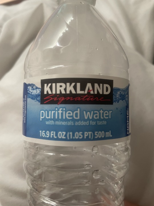
2. First, your eyes go to the brand of the water, then to what kind of water it is and then the detail under it.
3. The captial F has a few lines that goes above the mean line.
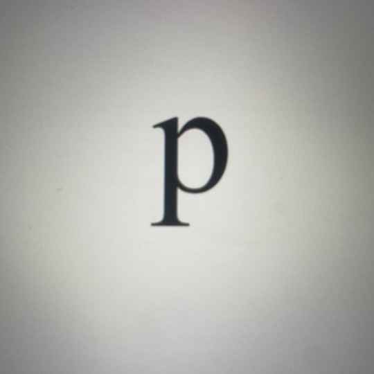
4. The lowercase p drops below the baseline.
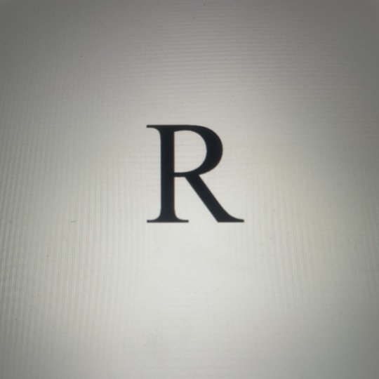
5. The R has an enclosed space in it.
6. The horizontal stroke in the middle of the H is the crossbar.
7. Helvetica has short ascenders so it would have a large x-height.
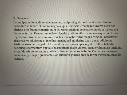
8. Eb Garamond has large ascenders so it would have small x - height
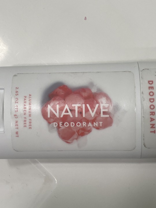
9. The Native deodorant uses a font that is legible and clear which would make it a modern piece of graphic design.
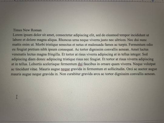
10. The connote of Times New Roman font is professional, academic and the times at night where I'm trying to finish an essay due soon.
0 notes
Text
Design Scavenger Hunt Module 4
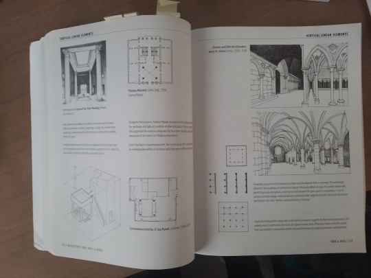
An example of a publication that has rhythm is this architecture book by Francis D.K Ching. The pages are filled with images and descriptions that showcase architecture examples and concepts. The placements of the images and text throughout the pages are very dynamic and forces readers to move throughout the pages both vertically and horizontally. The pages also have enough white space for the eyes to rest or focus on the illustrations.
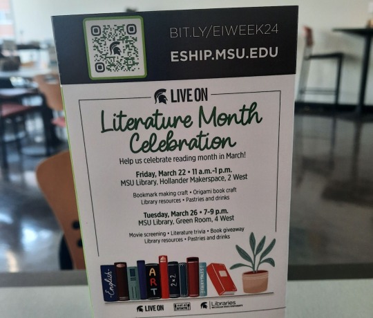
In this sign advertising Literature Month Celebration, there is a clear hierarchy of importance created by the typography. The words “Literature Month Celebration” are the most important as not only do they have the largest font, but it also has a unique curving font type that does not match the rest of the signage. The dates are also given high emphasis as they are the only words that are typed out in bold making them larger and more noticeable.

In this description from a poster for “Beyond the Show” episode, there are many letters ascenders. The letters h in show, f in first, and t in talk are examples of ascender as the letter’s top terminal extends above the letter’s mean line.

In the poster for recycling paper, the lower case letters g in magazines and p in Newspaper are great examples of letters with descenders. Their lower terminals extend below the baseline.

In this poster for throwing away trash there are many examples of letters with a counter. The lower case letters a, o, and are letters with a counter as they have enclosed spaces inside.
This poster for recycling paper has an example of a letter with a crossbar. The capital letter A in all has a crossbar, as a horizontal line moves across the center of the letter.

The font in between the Spartie IRL sign is a great example of large x-height. The ascenders and descenders in the lower case letters are short and less noticeable. While the lower case letters y and t are larger than letters without an ascender or descender like a, s, and e, it is still relatively small compared to other typefaces.
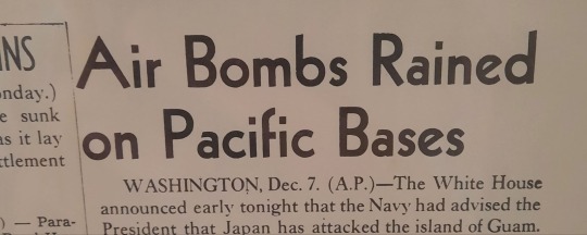
This old newspaper headline is a great example of a font with a small x-height. Here the ascender in the lower case d is much more pronounced as the letter is twice the height of letters without ascenders like a, n and e.
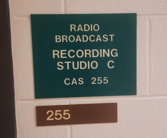
A great example of designs and fonts that are modernist are these door signs that you can often find throughout modern buildings. They are clear and straightforward, and the font types are straight and emphasize legibility, which are key hallmarks of modernist typography.

This poster for “Fragile Remnants” not only uses its unique fonts to draw attention to the poster, but to connote a natural feeling to the film. By using a font that looks more handwritten than mechanical, viewers automatically get a sense that the film is very human and dramatic without even reading the type of title.
#module4
0 notes
Text
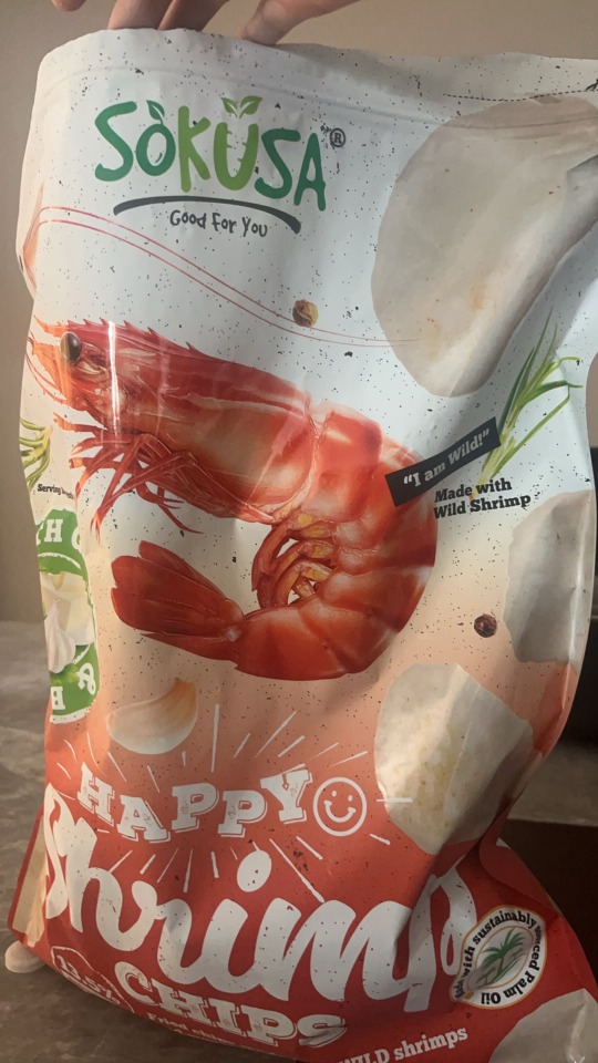
Sokusa Happy Shrimp-This font helps communicate more than the words do themselves, it uses fun curvy typography to show the fun and yummy of the shrimp chips.
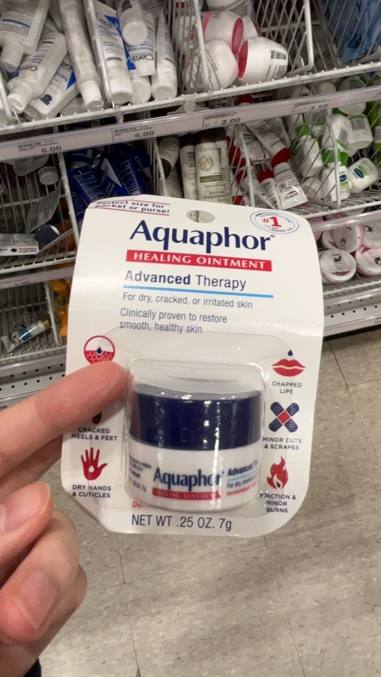
2.Aquaphor: The "q" and "p" is an descender in the design.
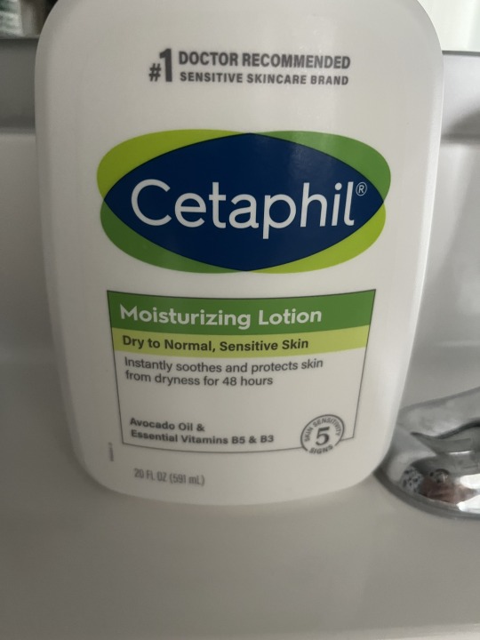
3.Cetaphil: The "t" is an ascender in the design.
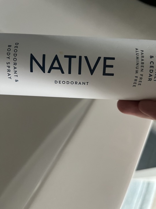
4.Native: This design could be considered as "modernist" because it's easy to read and can be used in all situation.
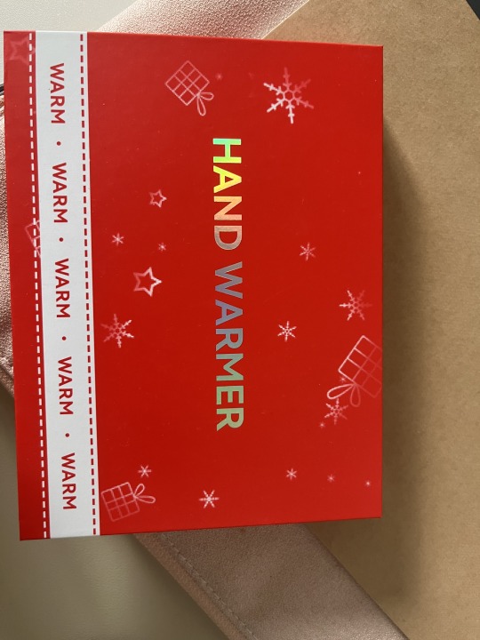
5.Hand Warmer: The "H", "A", and "E" are crossbars in this design.
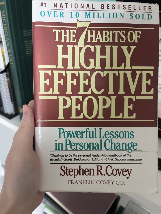
6.The 7 Habits High Effectve People Book:
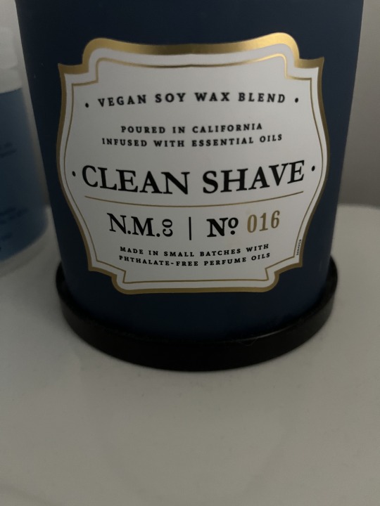
7.Candle:These letters have a small x-height and small ascenders.
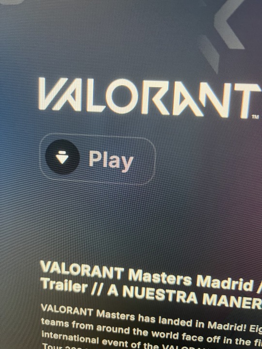
8.Valorant: Rthym is evident in this Valorant title photo because some letters are crossed by others. It also have a very unique spacing to it too.
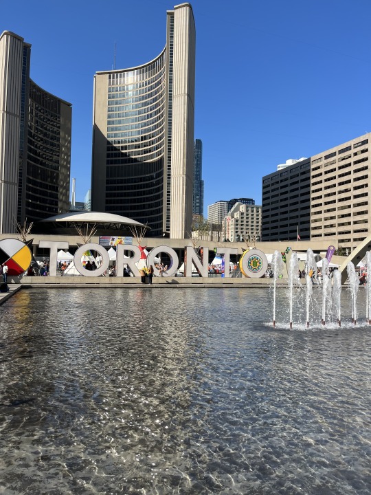
9.Toronto:These letters have a large x-height and large ascenders.
10. Michigan State University: The big MSU typography hierarchy is on the top of the book emphasize that this book is from Michigan State University
0 notes
Text
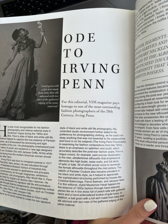
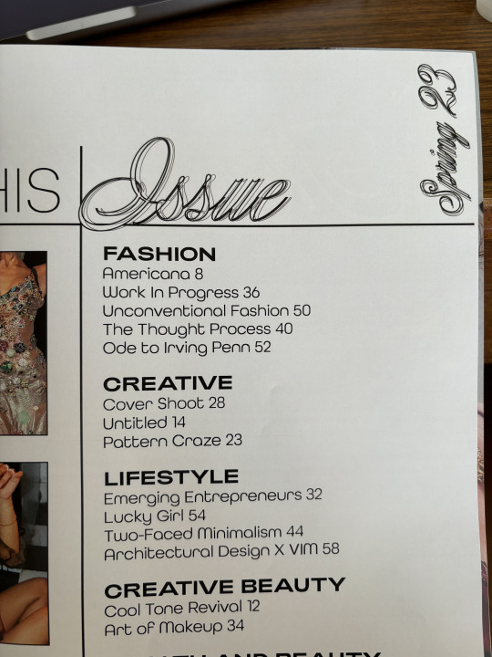
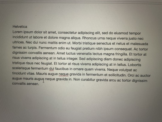
Rhythm is evident in this magazine made by VIM through letter spacing.
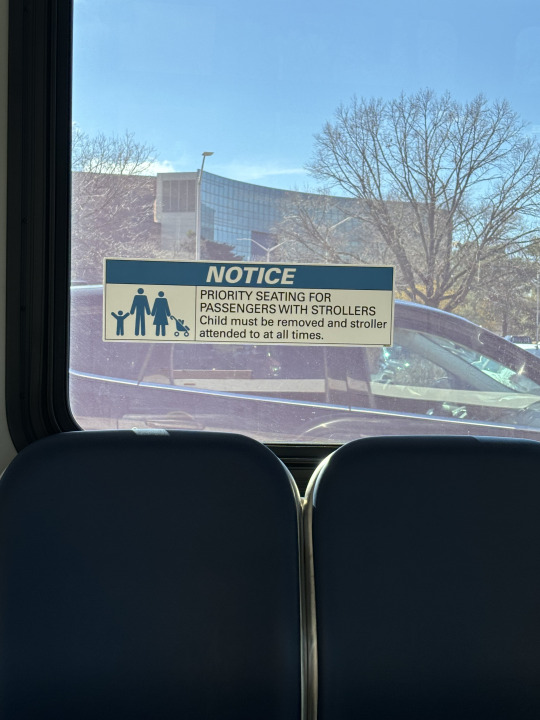
This design uses typographic hierarchy to emphasize the importance of the word "notice," since it is in a larger font than the other text.
The letter "t" is an ascender in this design.
The letter "a" is a descender in this design.
The letters "o" and "a" are counters in this design.
The letters "t" and "f" are crossbars in this design.
These letters have a large x-height and short ascenders.
These letters have a small x-height and large ascenders.
This design could be considered “Modernist” because it is unconventional.
This font helps communicate more than the words do themselves because the font communicates athleticism.
0 notes
Text
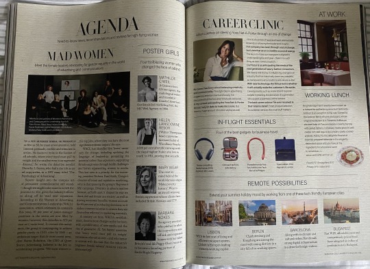
Image #1: Harper's Bazaar Sept. 23 spread. This is an example of rhythm in publication design as the same fonts are used to organize different subcategories of the spread. There is a rhythm established in the images and fonts used. Along with the repeated lines boxing in the text.
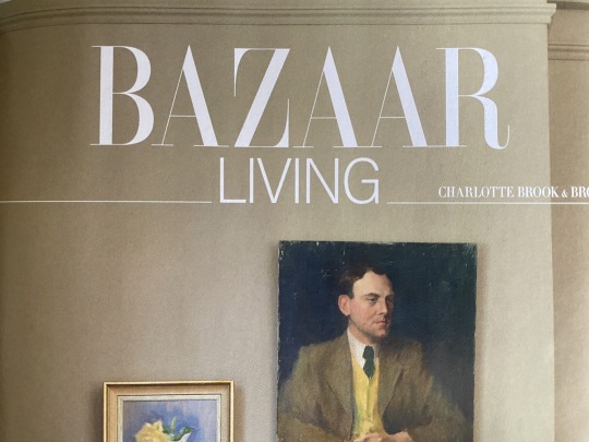
Image #2: Harper's Bazaar Sept. 23 title spread. This is an example of a typographic hierarchy establishing an order of importance on a page. You can tell you are going into a new section of the magazine from this page. Living is a section in the Bazaar magazine.
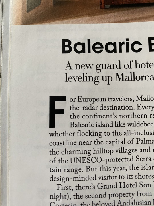
Image #3: This spread incorporates an example of an ascender. The letter "f" is an ascender because it ascends above the X-height of a typeface.
Image #4: This spread incorporates an example of a descender. The letter "g" is a descender because it extends below the baseline of a typeface.
Image #5: This is an example of a letter with a counter. The letter "O" is a counter because there is a negative space within the letter. With the letter "O" the counter is fully enclosed.
Image #6: This is an example of a letter with a crossbar. The letter "A" has a crossbar which is the horizontal stroke connecting the two strokes in the letterform.
Image #7: This is an example of a font that has a large x-height and comparatively short ascenders. The ascenders used are "a", "f" and "t".
Image #8: This is an example of a font that has a small x-height and comparatively large ascenders. The ascenders used are "d" and "f".
Image #9: This is an example of a spread with a modernist design. The fonts used on the spread promote a sleek and clean design meanwhile the spread has little design embellishments distracting it which is an aspect of modernist design.
Image #10: This is an example of a font being used to connote something more than just the typed text in the font. The word "Ambition" stands out on the page from the font. Without using such a creative font it would not stand out and contribute to the design of the page.
0 notes
Text
Module 4
I believe the font used here forms perfectly with the inscription like design.
2. Here's an interesting example of typographic hierarchy. Colleen's last name is larger than her first and I'm not really sure why. Clearly this is a bit anti-typographic hierarchy but why is it used here? When I asked my mom (her book), she also had no clue and that she wasn't a fan.
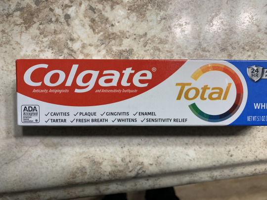
3. Easy example of ascenders, and a descender in "Colgate". I believe this is using a large x-height as well.
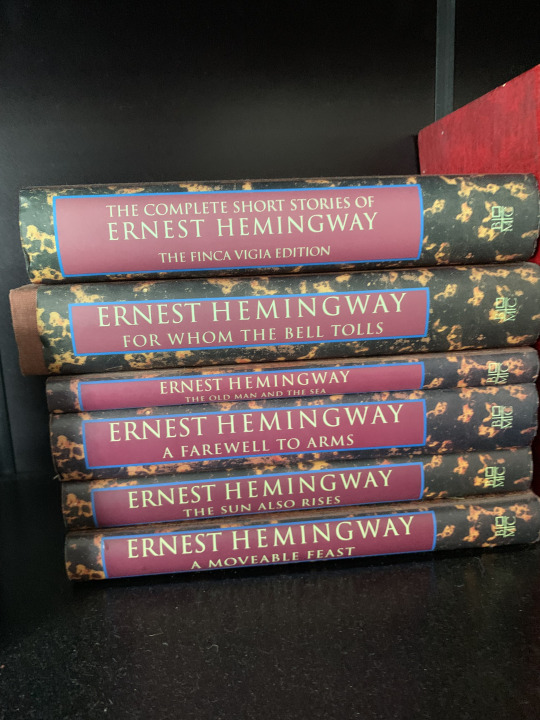
4. I really like the designs on the spines of these books. Displays counters and crossbars.
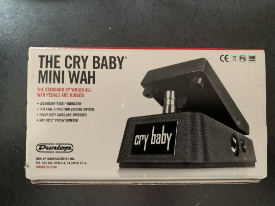
5. This guitar pedal has very large ascenders and descenders indicating a small x-height.
6. The red text uses a font that has a relatively large x-height. I somehow couldn't find a better example than this.
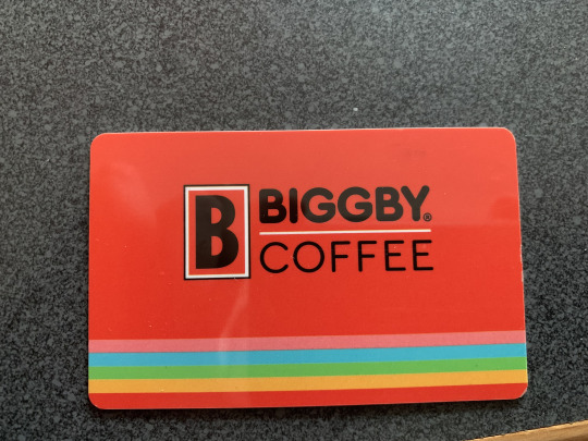
7. Biggby uses a modernist font that's more rounded on the edges. Whenever I see a font like this it always reminds me of the fonts toy companies like Duplo use.
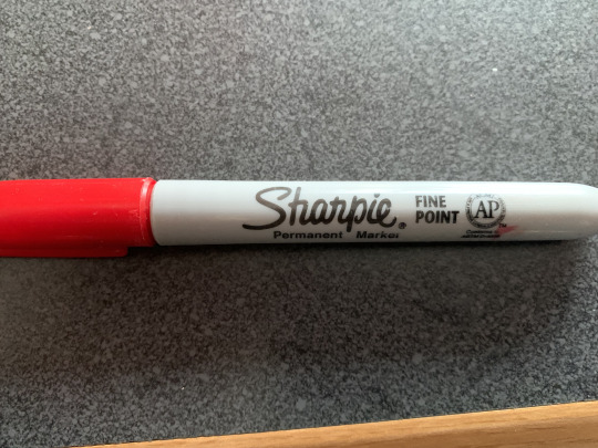
8. I love the handwritten style font Sharpie uses. I think it conveys how their markers perform because it looks like someone wrote the logo with one.
0 notes
Text
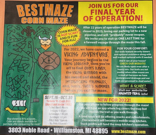
1. The magazine ad for the corn maze cleverly utilizes repetition to reinforce its message and enhance visual impact. Repetition is evident in several aspects of the design. Firstly, the vibrant colors of green, orange, and yellow are consistently repeated throughout the ad, creating a cohesive and unified visual theme. Secondly, the use of bold typography and exclamation points in the statements emphasizes repetition, capturing attention and reinforcing key points. Finally, the repetition of the maze motif, both in the imagery and the dynamic map, reinforces the central theme of exploration and adventure. By strategically employing repetition, the ad creates a memorable and cohesive design that effectively communicates its message to the audience.
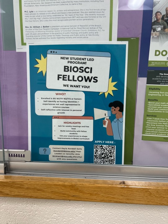
2. The power of typography hierarchy is in action on this poster for students diving into the realm of science. With the subject boldly emphasized in larger font size, and subheadings highlighted in striking red, the design expertly guides attention, creating a dynamic visual flow that beckons learners to explore and connect within their scientific community.

3. This sign at a beach in Florida contains words that use letters with ascenders such as the d in “Landon” and the h in “the”.
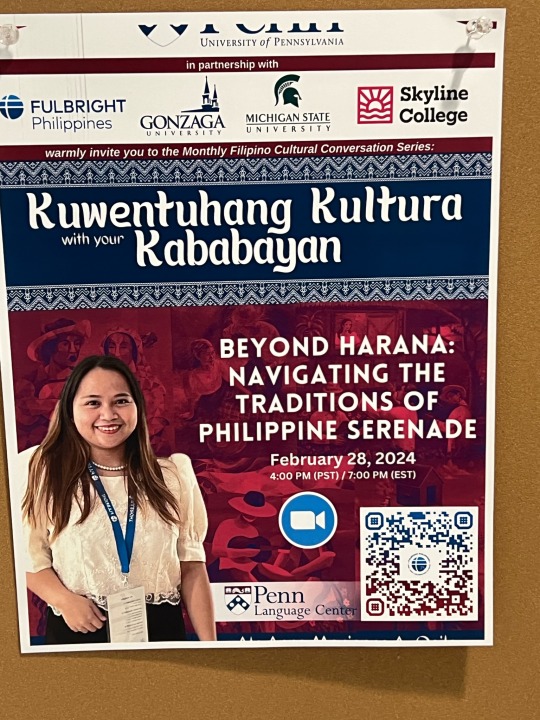
4. This vibrant poster features words adorned with descenders like the 'g' in “kwentuhang” and the 'y' in “kababayan”.
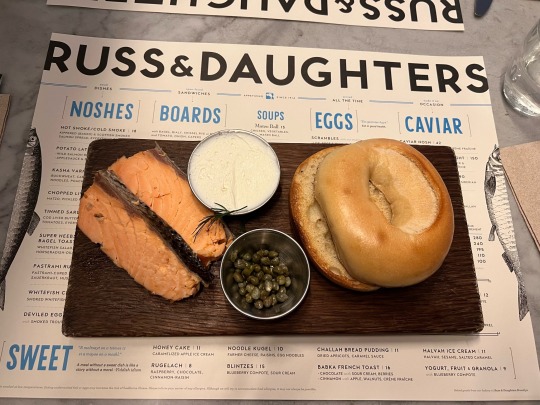
5. This Russ & Daughters menu contains words that use letters with counters like 'd', 'g', 'e', and 'a' in the word “daughters” offering glimpses into the meticulous craftsmanship of every dish. These elegantly designed counters not only enhance readability but also add a layer of sophistication to the menu, inviting patrons to savor not just the flavors but the artistry behind each culinary creation.
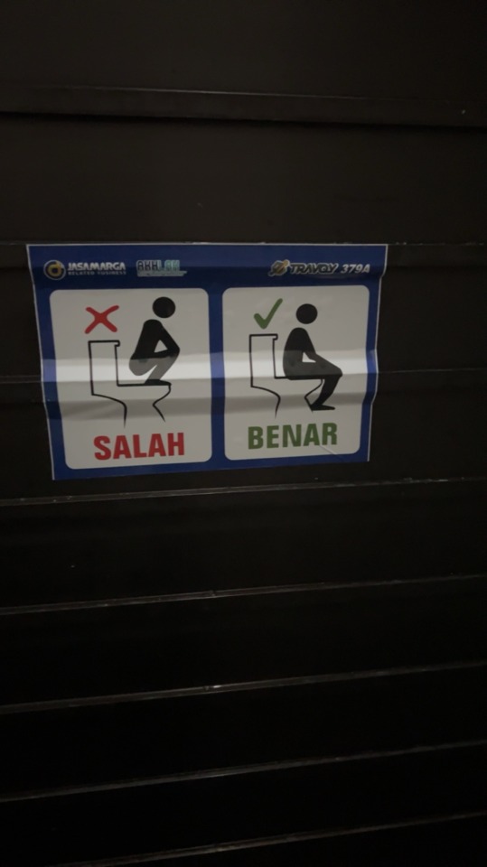
6. This design of a sign that shows you how to properly use a toilet in Indonesia. This is needed as it is common to use a squat toilet in Southeast Asian countries but it is not acceptable in all public toilet locations. We can see that the design uses words that contain a letter with crossbars such as the A and Es.

7. This soap bottle showcases a font with a notably large x-height, evident in features like the prominent ascenders, such as the 'f'. The decision to use a typeface with a generous x-height enhances the legibility of the text, making it easier to read from a distance or at small sizes. Additionally, the larger x-height adds a sense of modernity and cleanliness to the design, aligning well with the product's aesthetic and purpose.
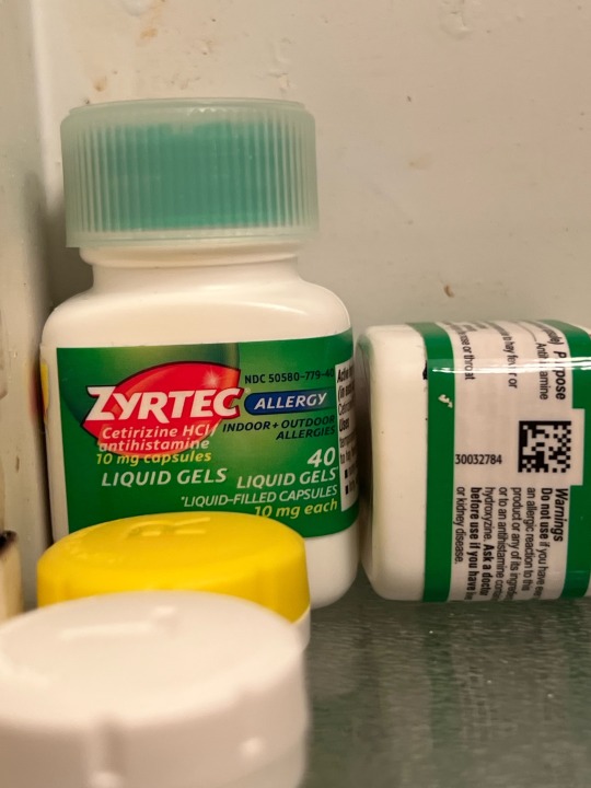
8. This is an example of a small x-height in the typography of a Zyrtec bottle. It allows for more text to fit within a confined space, such as on a small label, without sacrificing legibility. Also, it can create a sleek and compact appearance, which is desirable for packaging design where space efficiency is key. Lastly, a smaller x-height can contribute to a more sophisticated and refined aesthetic, aligning well with the brand's image of reliability and effectiveness.
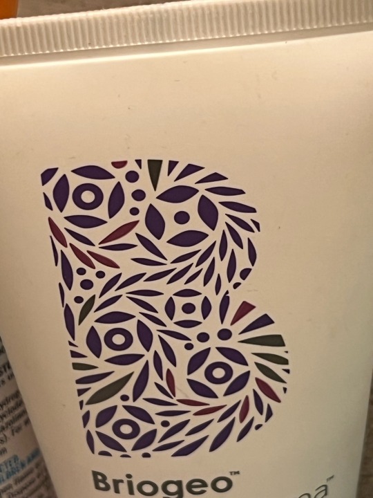
9. This anti-frizz product logo, has a sleek arrangement of purple shapes effortlessly forms the letter 'B'. Embracing simplicity with a touch of sophistication, the design evokes a sense of sleekness and effectiveness, promising a solution to frizz with contemporary flair.
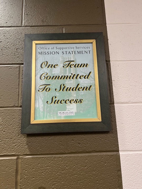
10. This poster elegantly declares 'one team committed to student success' in a fancy cursive font, evoking a sense of unity, dedication, and sophistication. The choice of typography transcends mere text, conveying a message of collaboration and excellence in style.
0 notes