
Don't wanna be here? Send us removal request.
Statistics
We looked inside some of the posts by kennyameblog and here's what we found interesting.
Average Info
Notes Per Post
1
Likes Per Post
1
Reblog Per Post
0
Reply Per Post
0
Time Between Posts
13 days ago
Number of Posts By Type
Text
7
Last Seen Tumblr Blogs


Fun Fact
Tumblr has been providing a Korean-language service since 2013.
Text


The first design uses contrast in weight. The right side of the poster is filled by the artist himself, while the left side is mainly negative space. This draws the viewer's attention to Drake.
The second design features an icon used by Tower 28 to represent contour. This uses progression in lines. Each line becomes closer and closer together from top to bottom. This directs the eye from top to bottom to see the brand name followed by the product details.
The third design utilizes contrast through scale. The heading "Fresh Catch" is much larger in size than the subtitle. This gets the needed information across while stressing that the fish is fresh.
The fourth design uses contrast in rotation by slanting the title of the product. This captures the viewers attention first, followed by the smaller less important details.
The last design uses contrast in weight. The left side has less occupied space to emphasize the picture of the food. The right is condensed with many words. The makes the image of the food stand out.
0 notes
Text


This infographic titled, "With more wells, we're producing more natural gas than ever before" shows a data visualization of wells that produce natural gas. This clearly has an underlying agenda which is trying to persuade viewers against the installation of wells. While it may seem objective because of its professional style choices, a closer look at it reveals its misinformation. The y-axis does not start at zero, and the intervals are very close together. This makes the line appear more drastic than it really is. By reading closely, it is evident that the number of gas producing wells has only actually increased by around 80,000 over five years.
This hand cream from Bath and Body Works is part of the Aromatherapy line within their brand. Each product in this line includes the gold logo and a gold accent strip with the product's scent. Consistency is achieved by carrying this logo and utilizing a specific typeface that is in all capital letters. The lettering also appears to be kerned a bit more than the average font. Each product also features a background photo of the source of the scent. For example, here they used a sage green color and a eucalyptus plant to capture the scent. For another, they used a lavender purple and a lavender plant in the background. Each product also emphasizes its purpose. This hand cream scent's purpose is for stress relief, so it is highlighted by a larger text size and heavier weight.
0 notes
Text
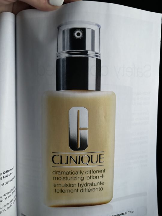


The design of this moisturizer bottle has the denotative meaning of acting as a container for the moisturizer. It exists to promote the brand while containing the product.
This bottle also has a connotative meaning because its design utilizes silver to portray wealth and the font of the brand Clinique is written in a typeface which suggests elegance. This draws on the feelings of consumers by building trust between the brand and wealthy customers.
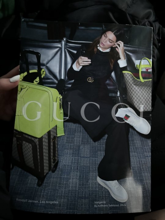
The iconic function is evident in the Gucci brand. In this Vogue magazine, the Gucci logo is strategically placed at the center of the page on Kendall’s belt. Gucci portrays luxury through its iconography by using a gold color and by having a timeless, unique, and recognizable logo and brand. The signifier, being the Gucci icon, signifies luxury.
This mandarin oranges brand utilizes the indexical function of a halo to communicate their product. In one context, a halo is a circle of light placed over one’s head to represent their holiness. In this context, they use the halo to represent health. The subtitle reads, “pure goodness.” This could be considered a tribute to holiness. They are referring to the ‘holiness’ of the oranges.
In this flier for a conference, the design features a tall mountain. The mountain’s symbolic function means it represents reaching high in terms of goals. The smaller text above the word apex reads, “Reach higher. Think deeper.” This further emphasizes that the mountain is a symbol for reaching high.
This flier represents a past style used in the seventies. The bold red color chosen for the background and the black and white figures are communicating an old setting. This is verified by the setting of the musical that the flier is advertising.
0 notes
Text
Rhythm is evident in this magazine made by VIM through letter spacing.
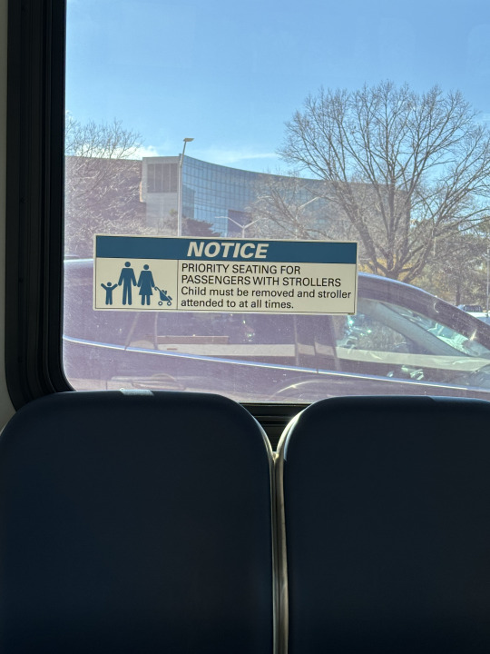
This design uses typographic hierarchy to emphasize the importance of the word "notice," since it is in a larger font than the other text.
The letter "t" is an ascender in this design.
The letter "a" is a descender in this design.
The letters "o" and "a" are counters in this design.
The letters "t" and "f" are crossbars in this design.
These letters have a large x-height and short ascenders.
These letters have a small x-height and large ascenders.
This design could be considered “Modernist” because it is unconventional.
This font helps communicate more than the words do themselves because the font communicates athleticism.
0 notes
Text


The colors orange and blue are prominent on the plane, which are complementary colors. Since the orange is much brighter, my eye is drawn to the fire design part of the logo. This draws me to the logo, therefore effectively promoting the airline.
The analogous colors, green and yellow are being used to present a very aesthetically and interesting poster. Without the yellow, the poster would be boring.
The cool colors in the informational poster are trying to communicate the seriousness of the message.
The warm colors are communicating a bright and exciting tone, which make customers want to purchase the food.
The use of contrast between the red and blue is used to emphasize the political tone of the design, but also to draw your eye to the voting times in red.
Continuity is used in the graphic that is on the left of the words. The pattern is continuous in stroke.
The A looks like a cut out in the U and the B. This shows an active figure ground relationship.
The graphic is giving a historical tone because of the colors that are used. This helps communicate their message well.
0 notes
Text


The first photo shows contrast through texture. The woman is lying in a sea of colors and patterns which suggest what texture they each are. For example, the wood in the back contrasts with the patterned sofa. I am very intrigued by the use of texture in this piece, but I wonder if because the variation of texture, patterns, and colors are so consistent that there is not much contrast. However, my eyes are drawn to the woman which leads me to believe that is where the most contrast lies.
The second photo of a statue shows contrast through positioning and weight. The statue has large and thin parts which progress to a point on the top right. The positioning of this top right loop contrasts with the rest of the statue. This is most likely why my eyes are drawn to the top right loop.
The third photo of a canvas shows contrast through spacing and rotation. The white appears as the negative space which contrasts with the black positive space. I found my eyes tracing the left edge of the humps, which may be because that is the line of contrast.
The fourth photo of a dream catcher shows contrast through spacing and texture. The top half strings are spaced in a weaved pattern, which contrasts with the bottom half that lies straight. This pattern technique creates an appearance of texture contrast in the two halves. My attention immediately is drawn to the top, more empty half. I think this is because design is more interesting.
The last photo at a concert shows contrast through scale in the set design of the concert. The background shows a huge version of the artist, which contrasts with the smaller, actual artist himself.
0 notes
Text


Image 1: Muscle Milk Bottle; The design features bold colors and rugged font type to appeal to the muscle-building audience. The design is simple yet captivating to communicate its superior brand.
Image 2: FedEx truck; The logo itself represents graphic design, but there was also design involved in the placement and size of the logo. It is in a large font to grab drivers' attention as they pass by. This way, it serves its purpose as an advertisement.
Image 3: Coffee mug; Between the color choices and contrast, the designers chose a simple font to communicate the funny message. The drawing of the woman serves as a compelling visual aid. This speaks to the definition of graphic design as an experience because this elevates the average coffee drinking experience.
Image 4: Bob Marley poster; The interesting background contrasts against the bold black lettering and image. It communicates his concert information in a pleasing way.
Image 5: Personalized planner; This daily planner can be customized by the user. The beautiful cover design speaks to its primarily female customer base and its design exists to enrich the mundane activity that planners usually exist for.
1 note
·
View note