Don't wanna be here? Send us removal request.
Text
Module 4
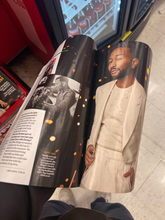
Image 1: Magazine - This magazine shows rhythm in design. You can see it is sleek and makes you follow the page with its visuals.
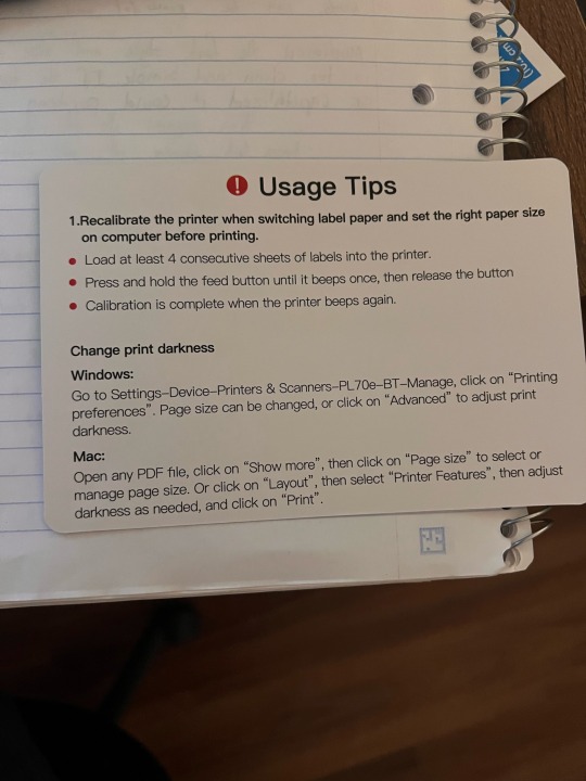
Image 2: This card shows the importance of certain information which includes a colored icon, font size, and boldness.
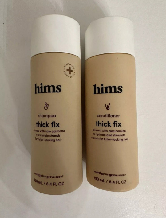
Image 3: This bottle shows the ascenders which are the letters “h” and “i” they hang up above the others.
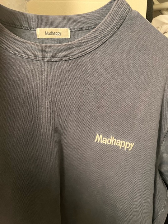
Image 4: Madhappy t-shirt and tag. As you can see in this logo the descenders are the double “p” and “y” which go below the baseline.
Image 5: Febreze - You can see the counter in this design within the logo.
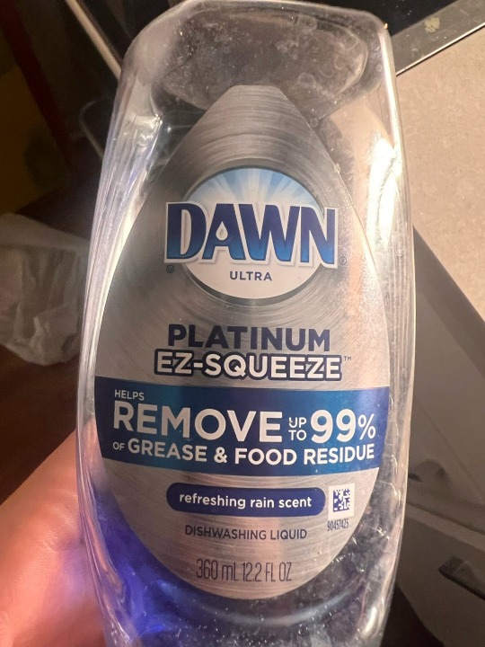
Image 6: Dawn dish soap - you can see the crossbar in the letter and how they are such as the letter “A.”
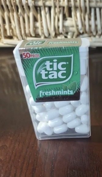
Image 7: Tic Tac logo - there is a larger x-height and how they look together.
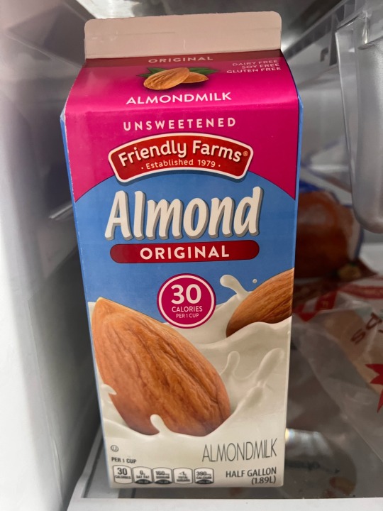
Image 8: almond milk - in this, there is a smaller x-height with larger ascenders.
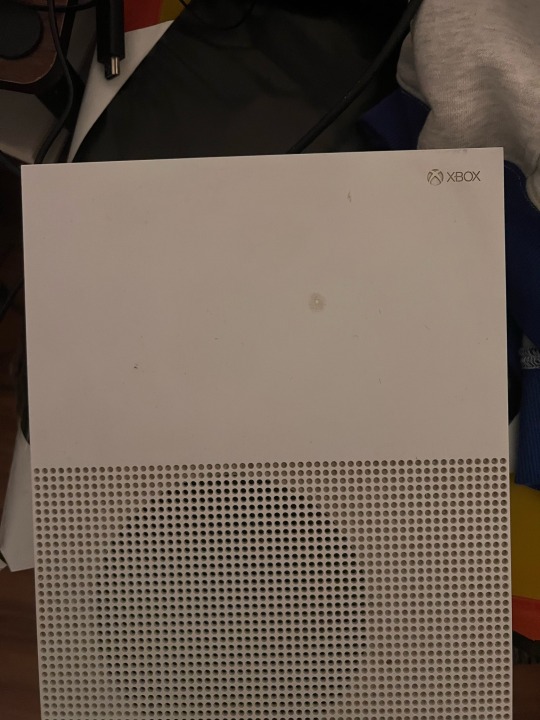
Image 9: Xbox logo and packaging - you can see that the logo is simple and modern as well as the console itself. It's very sleek and has an elegant look to it.
Image 10: lego - this logo is meant to be more than building blocks. This logo is fun and playful for what the brand is trying to display.

0 notes
Text


Module 5
Image 1: Charcoal Toothpaste - I chose charcoal toothpaste since there is charcoal in the toothpaste. The ingredients come together to make the product great. The meaning is that it can make your teeth whiter and freshen up your smile. It is supposed to make the user more confident in themselves.
Image 2: Exit - This sign tells the user where to go by the graphic and arrow. It leads them to the direction that they are looking to go. It helps navigate the area easier.
Image 3: Keep away from children label - This is a warning to not let children play or engage with the product which can cause harm.
Image 4: Stop sign - this is one that tells the driver to stop and warns them. The colors and font scream caution and to stop. The red makes it stand out. Also, many people know it by its shape which is an octagon.
Image 5: Abuelita - This is a hot chocolate packaging that is Hispanic hot chocolate and shows culture and history. It also shows how nostalgic it can be because it's called “grandmas” in English. Everyone has those memories with their grandmas making them food or a drink.
0 notes
Text


Module 6
Image 1 - This is an infographic I found online about education around the world. As you see they are communicating through text, color, and numbers. It’s a great layout and way to spread information and statistics.
Image 2 - This is Paula’s Choice packaging and you can tell that they are different from others. They choose great colors that describes their brand. Also, they have the same text throughout all bottles, you can see that they rotate the text in “clinical,” “clear,” and “exfoliate.”
0 notes
Text

Module 3
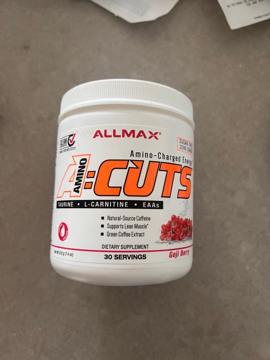
Image 1: Complimentary Colors - This pre-workout packaging shows complementary colors because the bright orange, white, and back complement each other by the orange being the main attraction, and the black and white add small accents to the packaging. It makes the name stand out.
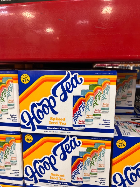
Image 2: Analogous Colors - This packaging and cans show analogous colors because, for each flavor/type, there is a different color separating all 4 flavors. Including the names of the flavors are different colors.
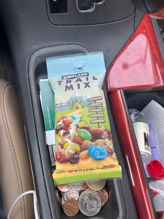
Image 3: Cool Colors - This packaging shows cool colors and how close to transparent it is. Almost like you can look through it but you can’t. All colors are cool and compliment.
Image 4: Warm Colors - I chose Mcdonald's ketchup for these warm colors. You can see there is white, red and yellow. These colors show the tomato in the packaging and express it through color.
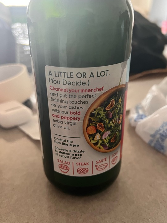
Image 5: Olive Oil - This label shows the foods that are used with the olive oil in red such as salad, steak, saute, soup, and more. This is a way to explain to the user without using words but just changing the color of the text or icon.
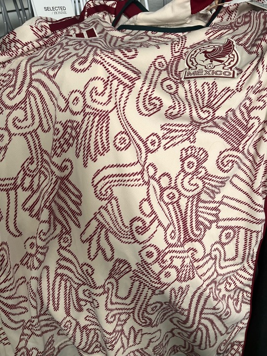
Image 6: This Mexico soccer jersey has different patterns which is unique. They may look the same but the patterns are different. They are rotated as well some of them.
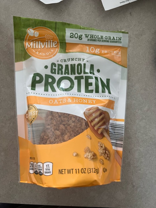
Image 7: This granola protein packaging shows a figure-ground relationship because there is a see-through opening where you can see whatever is in the bag no matter what u put in it.
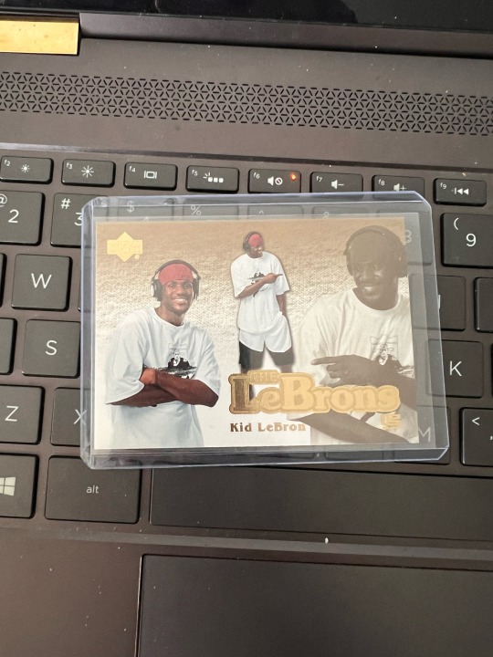
Image 8: Lebron James sports card, this sports card is the “kid Lebron,” as we see they try to replicate the older style by using baggy clothes and the black and white image to make it look older.
0 notes
Text


Image 1: Tide Pods - This packaging is bright and as you can see there are font sizes and text. The design of it shows the contrast with the colors and where things are placed.
Image 2: Easter Bucket - This easter bucket shows contrast with the design and pattern of the bucket. As you can see there are flowers and strawberries but are different shapes and are rotated to show the differences.
Image 3: Book Cover - This book cover is a great design and shows contrast with the colors and how it's faded over the title. Also, the different styles of fonts work together well.
Image 4: Poster - This poster has a lot of elements to it including the font sizes and rotation. Also the halftones in the A in jazz. The placement of the characters and the objects. Either bigger or smaller to show that they are separate.
Image 5: Fantastik - This packaging shows the different styles and works with text to show contrast with the background. The texts on this packaging are arched down and up. Also, has a stroke around its text.
0 notes
Text

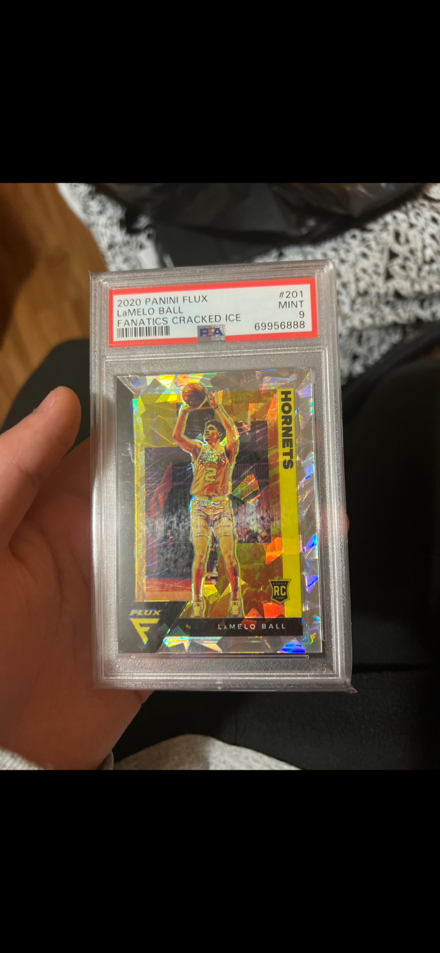


Image 1: Hot Wheels - This is a Hot Wheels toy cover where it shows their logo across the packaging with a big print of the car that is in the card. This text and design is meant to explain the car such as the model and which category it belongs in.
Image 2: Sports Card - This is a sports card. The card itself is very creative and appealing but there is also a design in which what is called “PSA Grading,” the top red part of the card. This is on cards that get graded.
Image 3: This was a sign that I saw for a restaurant while walking in Chicago. It is an advertisement and the logo and name itself are graphic design.
Image 4: This is a ZBar, which shows a visual with the flavor. Also, shows nutritional labels which is an aspect of design.
Image 5: Book Cover - This is a cover of the 48 Laws of Power. The colors go well together and you see the title is vertical showing text and letter placement.
#module1 #gd260
1 note
·
View note