Don't wanna be here? Send us removal request.
Text
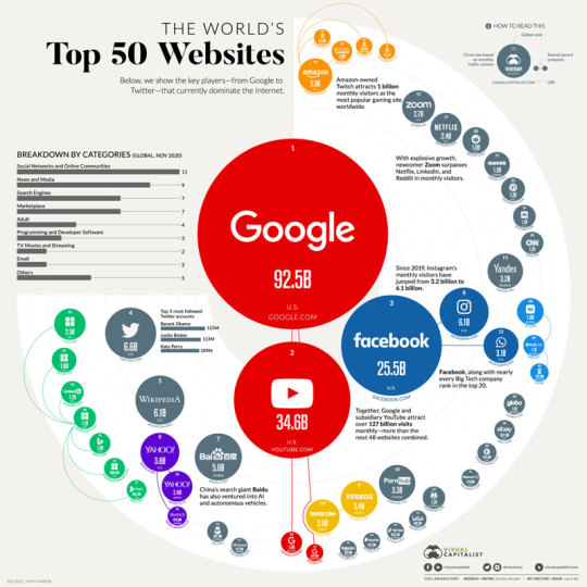
Image #1: The World's Top 50 Websites (Data Visualization). This data visualization breaks down what websites are used the most. Google, of course dominates the internet so it is placed at the center surrounding other sites. The visualization gives a lot of data and breaks down the websites even more by categories. The underlying agenda to this visualization is to promote Google as the internets dominate search engine. You don't see other search engines like Safari or Firefox listed. That makes this visualization not objective.

Image #2: Clif Energy Bar. Clif is part of a larger identity system as the logo and design is kept consistent within their products. The visual "relationships" between the elements that are constructed in this system revolve around the Clif bar logo and placement of the name and flavor. Throughout Clif's products this logo is kept consistent making the brand notable for its signature look.
0 notes
Text
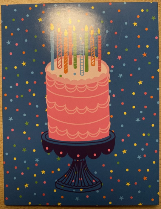
Image 1: Birthday Cake. This a straightforward image of a cake. It's a simple image and design, you would not think it had a deeper meaning by just looking at it. A denotative image is a straightforward rendering of something. Here the denotative meaning is of a nicely decorated cake.
The connotative meaning of cake goes deeper than one would think. It has the connote of a birthday, which relates to aging and occurs annually. Anytime you see a cake, your mind automatically wonders if it's someone's birthday because our brains think cake means birthday.
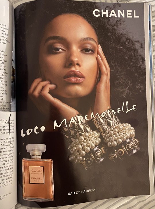
Image 2: Chanel. This image serves an iconic function as the brand Chanel is known to be luxurious and expensive. Upon hearing the word Chanel, you think of rich material bags and strong perfume. This ad does a good job of encapsulating the brand's chic reputation. Chanel as a brand is instantly recognizable making it have an iconic function.

Image 3: La Croix Nutrition Facts. This image has an indexical function within the nutrition facts box. The box gives direct information about what is actually in the drink. I find it ironic when they still put the labels in when it's all 0's. There is a clear indexical relationship between the nutrition facts and the customer. The customer turns to this information to guide their choice as a consumer.
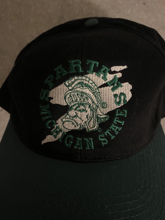
Image 4: Spartan Head. This image has a symbolic function of Michigan State University, but also of strength, courage, loyalty, and power. As the mascot of the university, the symbol has become an iconic part of the Michigan State trademark and logo. Anytime people in the state of Michigan see a spartan head they think of the university.
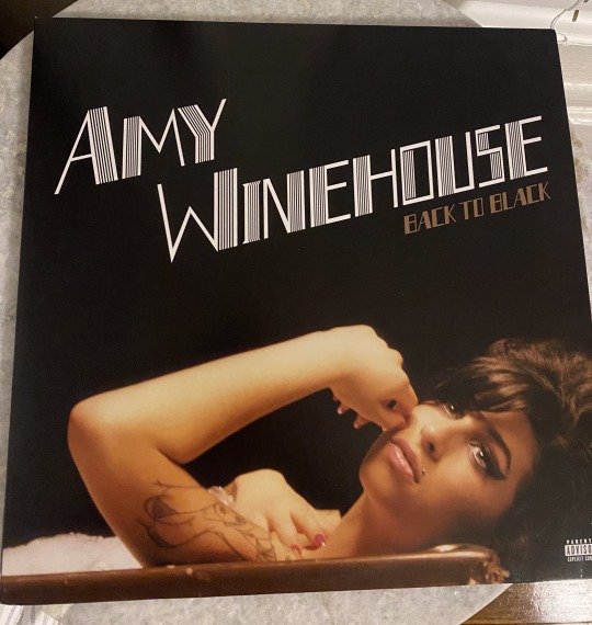
Image 5: Amy Winehouse Record. This image references the 1920s in the font choice. Amy channeled the 1920s on her album cover in the simplicity of her design. Black and gold were major colors of design at the time and thin, elegant white text with lines embodied layouts. The album was released in 2006 so it channeled design from the past. The design is trying to signify the timelessness of Amy's voice.
0 notes
Text
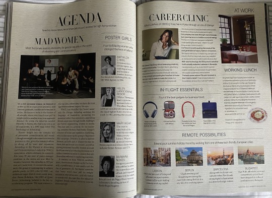
Image #1: Harper's Bazaar Sept. 23 spread. This is an example of rhythm in publication design as the same fonts are used to organize different subcategories of the spread. There is a rhythm established in the images and fonts used. Along with the repeated lines boxing in the text.
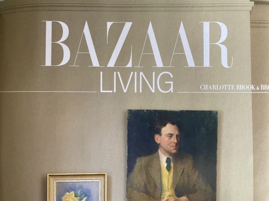
Image #2: Harper's Bazaar Sept. 23 title spread. This is an example of a typographic hierarchy establishing an order of importance on a page. You can tell you are going into a new section of the magazine from this page. Living is a section in the Bazaar magazine.
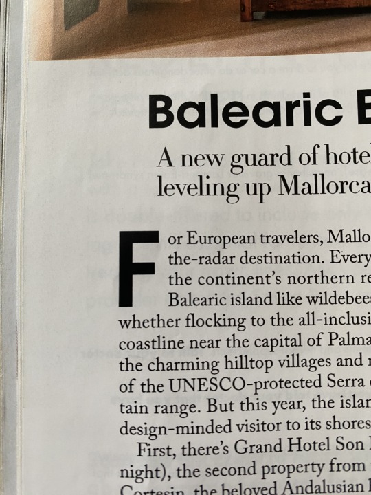
Image #3: This spread incorporates an example of an ascender. The letter "f" is an ascender because it ascends above the X-height of a typeface.
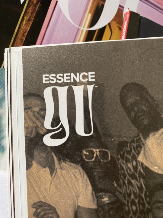
Image #4: This spread incorporates an example of a descender. The letter "g" is a descender because it extends below the baseline of a typeface.
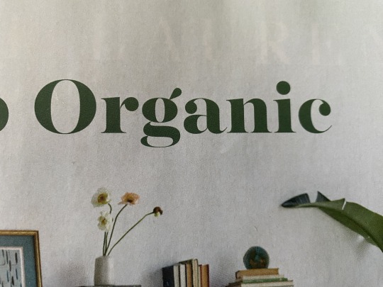
Image #5: This is an example of a letter with a counter. The letter "O" is a counter because there is a negative space within the letter. With the letter "O" the counter is fully enclosed.

Image #6: This is an example of a letter with a crossbar. The letter "A" has a crossbar which is the horizontal stroke connecting the two strokes in the letterform.
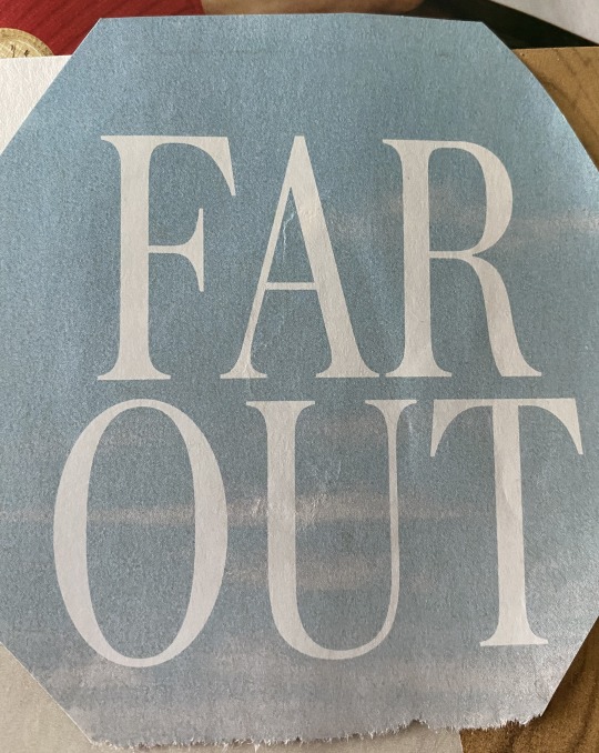
Image #7: This is an example of a font that has a large x-height and comparatively short ascenders. The ascenders used are "a", "f" and "t".
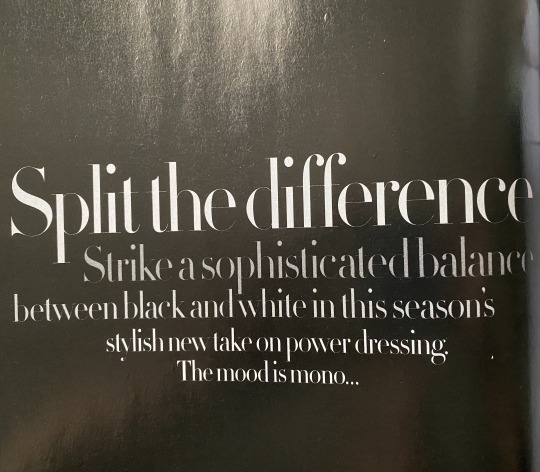
Image #8: This is an example of a font that has a small x-height and comparatively large ascenders. The ascenders used are "d" and "f".
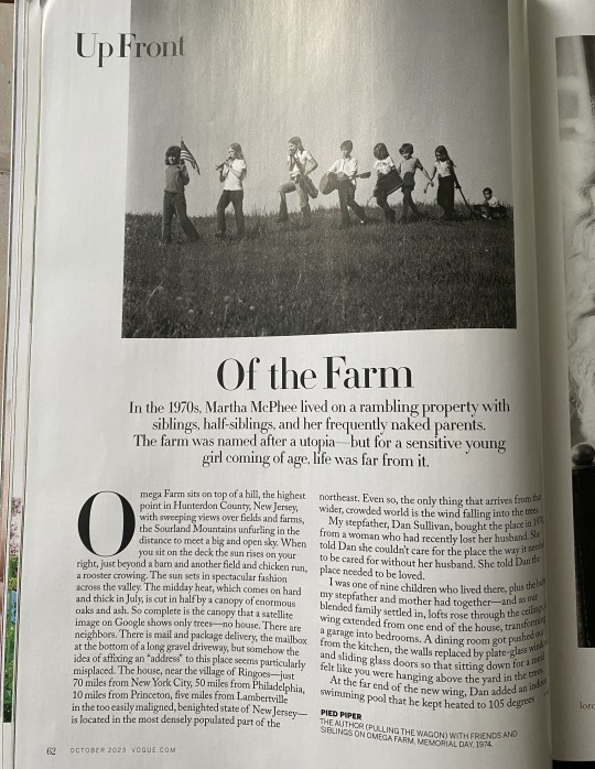
Image #9: This is an example of a spread with a modernist design. The fonts used on the spread promote a sleek and clean design meanwhile the spread has little design embellishments distracting it which is an aspect of modernist design.
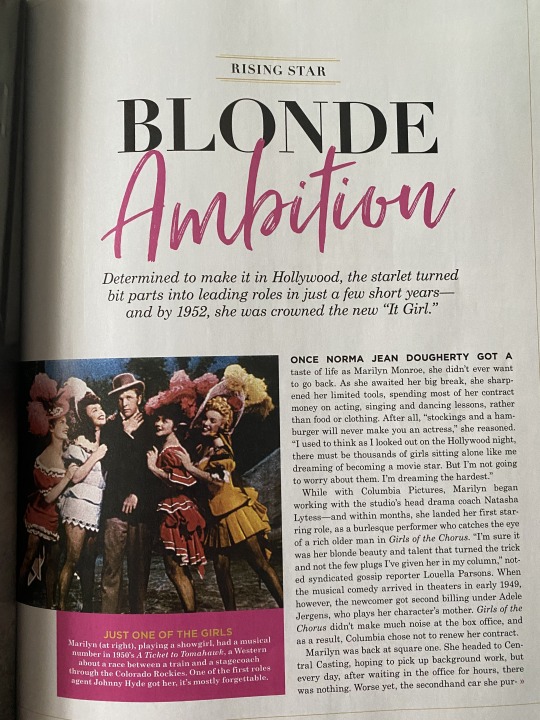
Image #10: This is an example of a font being used to connote something more than just the typed text in the font. The word "Ambition" stands out on the page from the font. Without using such a creative font it would not stand out and contribute to the design of the page.
0 notes
Text
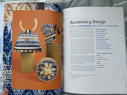
Image #1 Complementary Colors: This design layout and image focuses on using orange and blue as complementary colors. The orange background draws your eye into the intricate blue lines of the design. The purse depicted in the design subtly incorporates the color orange allowing the blue to show up more.

Image #2 Analogous Colors: This yearbook cover utilizes the green group of analogous colors to add depth to the cover's main image and text surrounding it. Without the use of the green analogous colors, the cover would not flow as well. The analogous colors are being used to make the text pop more and appear to be prominent. They are also working to make a visual connection to the cover's main image and text by following the same color format.

Image #3 Cool Colors: This bookmark utilizes cool colors of blue and purple to focus readers' attention on the text displayed. If the designer had chosen to use warmer colors the bookmark would not have the same effect. The designer is hoping to help readers focus on the text written on the bookmark and give off a calm, orderly sense.
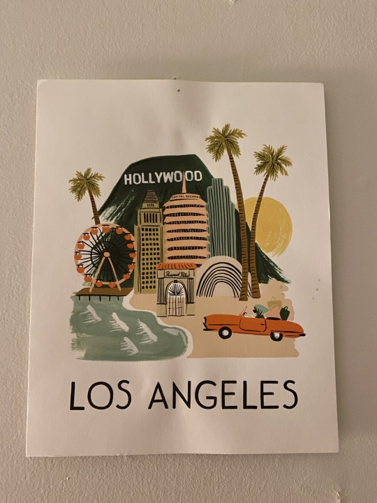
Image #4 Warm Colors: This poster utilizes warm colors to add depth to different parts of the design. Without the use of neutrals and orange the design parts of it would not stand out. The design would not match what it's reflecting such as sunny, bright Los Angeles. Warm colors should be used in a design reflecting the area and places within it. The designer is trying to communicate the busy, bright, and close-together proximity of LA.

Image #5 Contrasting Colors: This book from the Savannah College of Art and Design utilizes contrasting colors to make the cover background stand out against the rest of the design. Both blue and red are from different segments of the color wheel. The colors highlight other parts of the design such as the white clouds and gold stars.
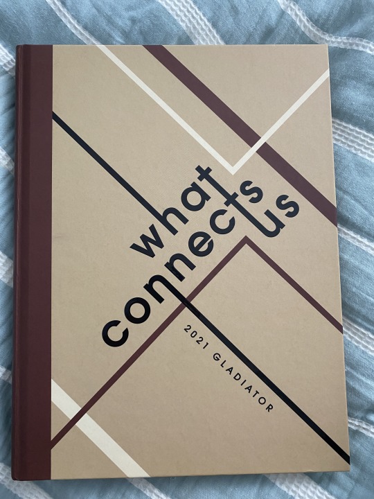
Image #6 Continuity: I designed this cover for my senior year school yearbook. The design was inspired by Bauhaus and we wanted to utilize the Gestalt principle of continuity to emphasize our title of "What Connects Us" visually. Every word connects on the cover and stretches across it. The colors are limited to only three and remain cohesive.

Image #7 Active figure-ground relationship: This portrait presents an active figure-ground relationship by centering a circle in the middle of it and lines around it. The half circle above the lines works with the lines to center viewers' eyes around the circle itself. Without the circle in the center, your eyes would not know where to go. The design would lack direction.
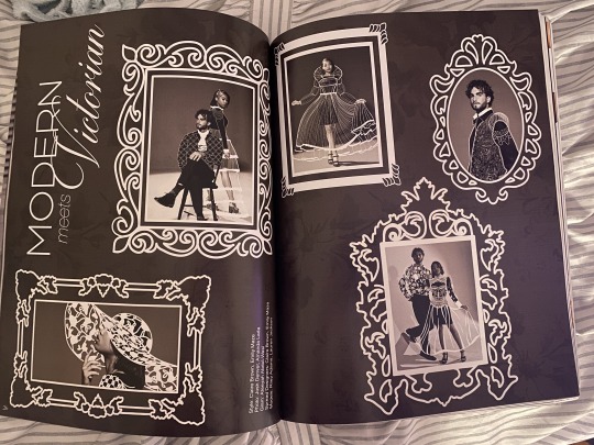
Image #8 Historical: This magazine spread was designed to look historical as if it was from the Victorian era by drawing Victorian outfits on the models and portrait frames around them. Looking at this spread automatically transports viewers into the era. The typography used also has this effect.
0 notes
Text
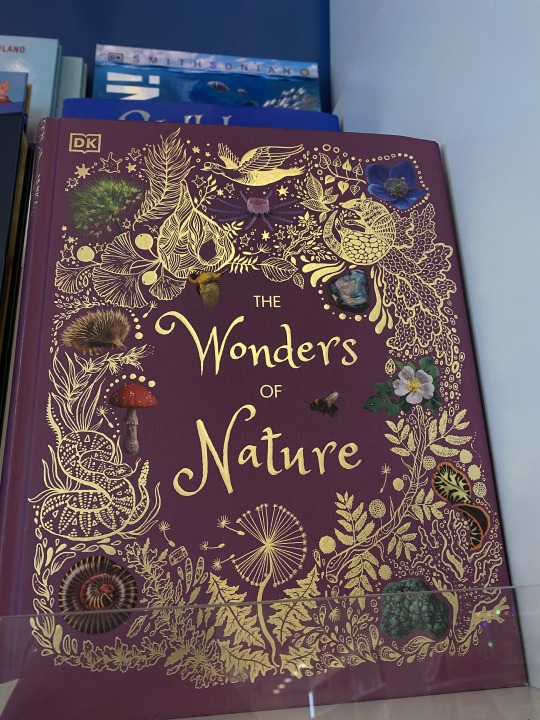
Texture: The Wonders of Nature. Contrast is achieved here with the gold outline of the book being outlined and embossed. When you put your hands over the book you can feel the texture of it increasing its appeal. The cover artist likely designed the book this way to bring attention to the nature elements showcased around the title. This gives a visual cue to what the book is about and what is in store within it. There's a lot of activity in this design.

Scale: Parenting for Liberation: A Guide for Raising Black Children. Contrast is achieved here with the scale of the text being different weights and sizes. There is also a difference in thickness within the title font. The word "for" is scaled down in size to fit between the words "parenting" and "liberation." Without scale, the word would not stand out, the point of the word is for it to not draw attention away from the two other words in the title. The way the rest of the cover is designed to guide your eyes to the bolded words. There is a lot of activity in this design along with repetition/progression.
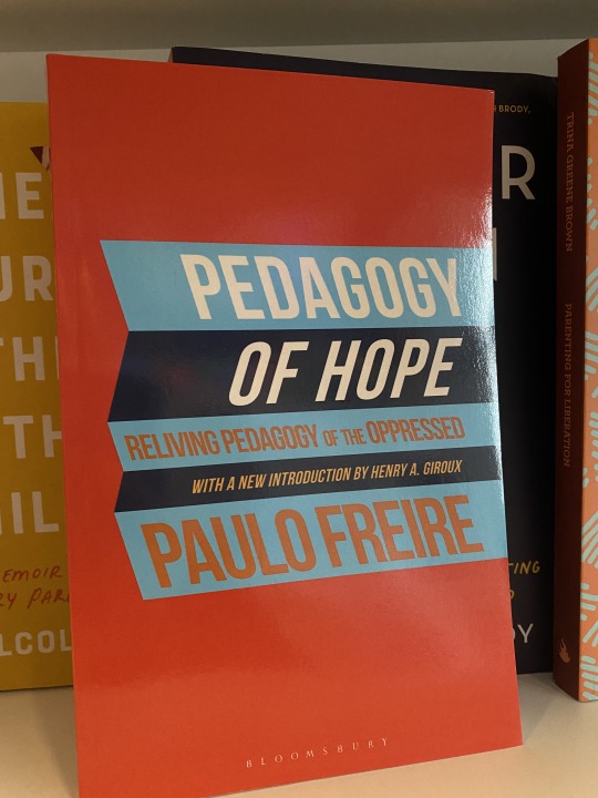
Rhythm/Balance: Pedagogy of Hope: Reliving Pedagogy of the Oppressed. Contrast is achieved here with the rhythm and balance of the words being evident. They work together to promote this and are italicized/angled in the direction of the colored rectangle they are in. Rhythm is involved as the title reflects movement and showcases a folding aspect. Balance is involved with the difference in size of the title fonts. The other words involved in the title are balanced in the middle promoting a hierarchy within the title. Attention is drawn to the words that stand out within the title because they summarize the smaller ones. Repetition/progression is also utilized on the cover.

Point/Line/Plane: SchoolTalk: Rethinking What We Say About- And To- Students Every Day. Contrast is achieved here with the lines across the page. The bright yellow arrow guides readers' eyes to the center of the page which is where the title lies. The points leading to the text bubbles around the title font guide attention back to the center as well but also stand out on their own. The arrow leads to another description of the book at the top. Without the use of lines and points on the cover the title would not have as much meaning or be as organized. There's a lot of activity in this design.
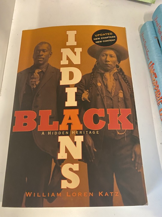
Scale: Black Indians: A Hidden Heritage. Contrast is achieved here within the title. It's hard to tell what word is suppose to come first with how they are scaled against each other. This develops a contrast just within the title itself. The additional information to the title is scaled down in size so it doesn't take away from the attention of the title. The title font is bold and has the same style for both words concentrating attention on the middle letter 'A.' Repetition/progression and activity are also utilized on the cover.
0 notes
Text

Image 1: Soft Parade Fruit Ale beer. Over Labor Day Weekend I discovered this beer from Short's Brewing Company. The main reason I picked it up was the design. I had never seen a beer with such a unique design concept. It has a vintage feel with color, alignment, and hierarchy design elements. The can communicates what's on the inside, its bright colors indicate its berry flavor.
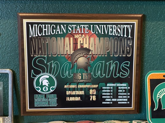
Image 2: MSU NCAA National Champions plaque. When I saw this plaque I knew it was unique. It's hard to make plaques with this much information look good. You have to know how to structure it so it's easy to read. It has design elements of alignment, contrast, and proportion. Typography is also involved as it provides a distinction in the information. Stats that stand out are are bolded. Ths communicates MSU's championship records.
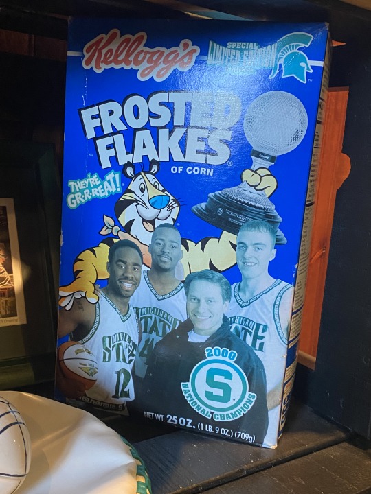
Image 3: Frosted Flakes box. This cereal box is SO COOL. When I saw it I knew I had to take a picture. The design itself involves a lot of cutouts and structure. The design elements involved are direction, hierarchy, and alignment. The company made it clear that this was a special addition of their cereal honoring the MSU basketball team on their National Championship.

Image 4: Frank Ocean's Blond album cover poster. Every time I see this poster I am put in a trance. I have it on my bedroom wall so I see it every day. Needless to say, it's a personal favorite. The design elements involved are space, alignment, and color. Frank Ocean's design direction is just unique in itself. It is very minimalistic yet captures your eye. It's more of a modern design. This communicates the content in his Blond album.
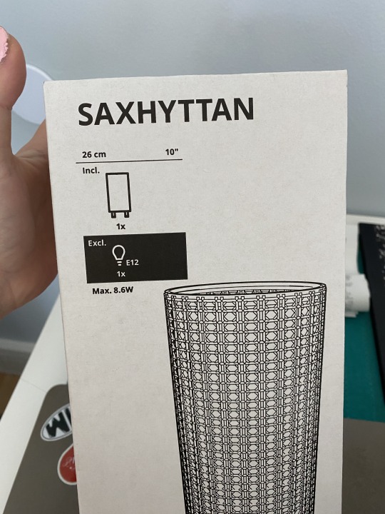
Image 5: Saxhyttan lamp. I bought this lamp from IKEA for my bedroom. I think IKEA does a great job with its marketing and design. The box has a simple design and communicates what the lamp would need without words. You can tell what you visually will need for the lamp. This keeps the design simple and meaningful. I like how minimalistic everything is. It makes you believe it is all easy. Even the instructions on putting it together were simple. The design elements involved are space, typography, and structure.
0 notes