#the style is also woodcut inspired :)
Text


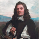
hansel and gretel illustration assignment
#hansel and gretel#ngl i kinda slayed with this#shat in the mother toilet if you will#im sorry#not sorry enough though#my art#i tried to really emphasize the starved look for the children#hollow cheekbones#big bulging eyes#apparently the og folktale was inspired by a famine in the 1300s#parents abandoned their children to try to stay alive#and ‘hansel and gretel’ is supposed to serve as like a#moral warning to hashtag Not Do That#anyways#the style is also woodcut inspired :)
11 notes
·
View notes
Text

Happy Desmond Day !
What a chill guy, so happy he didn't die 10 years ago
#my art#desmond miles#desmond miles deserved better#assassin's creed#ac#assassin's creed 3#ac3#i tried to shade it in a medieval woodcut style but it didn't work that well#also the pose is inspired by representations of jesus christ stepping on the world#because that's a thing
39 notes
·
View notes
Photo
Paul
(Image description, and close ups of elements, behind the cut)
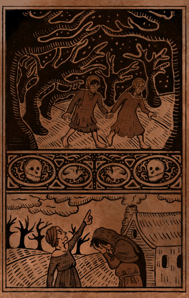
I have been obsessed with the idea of Paul as the Rebis, the Great Alchemical Work, since the moment I read the birth scene (a few weeks ago now). It just fits too perfectly, and I am sure it is not a coincidence. From Wikipedia:
The Rebis (from the Latin res bina, meaning dual or double matter) is the end product of the alchemical magnum opus or great work.
After one has gone through the stages of putrefaction and purification, separating opposing qualities, those qualities are united once more in what is sometimes described as the divine hermaphrodite, a reconciliation of spirit and matter, a being of both male and female qualities as indicated by the male and female head within a single body.
I wanted to do it in a style evocative of the time that alchemy was 'popular,' and include imagery evocative of story elements surrounding Paul's birth and origins. I looked at a lot of medieval illustrations, especially woodcuts, for inspiration. This took me 84 years to do, so I hope you will enjoy! :)
Like what I do? Please consider supporting me!
Prints and other merch is available on redbubble, or you can sponsor me on patreon!
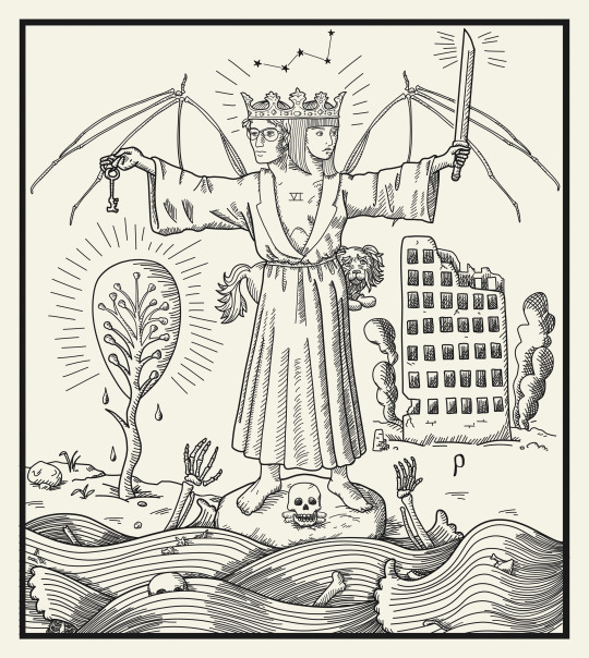
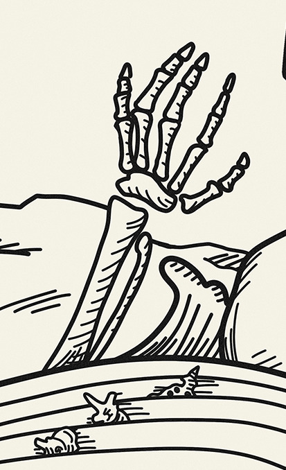
Image description: An illustration in medieval woodcut style of Cam/Pal/Paul as the Rebis, the great alchemical work. It is a fusion of their male and female bodies. Their heads are crowned, and skeletal bat wings spread from their shoulders. Camilla, on the right, holds one of her knives, while the half that is Palamedes holds a key. Immediately behind the figure is Noodle. In the Background on the right is the ruins of the Building, with the Greek letter Rho below it; and on the left is the Tree of Knowledge of Good and Evil. The figure is standing on a rock where also rests the skull of the sixth house. In the foreground the River is depicted with skeletal hands reaching upward, and bones bobbing among the waves. The constellation Cassiopea is above.
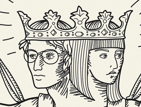
#the locked tomb#nona the ninth#camilla hect#palamedes#palamedes sextus#locked tomb#paul#religious imagery#alchemy#rebis#art#my art#finally I can rest
951 notes
·
View notes
Text
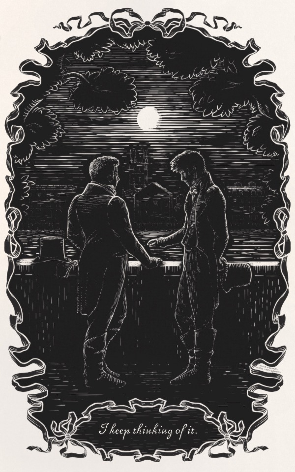
^this one is large, definitely open it in new tab to view full size if you're on desktop!

^ The woodcut-style illustration from chapter 10 and the banner I did for @gorgeousundertow's gorgeous fic, Half Agony, Half Hope, as part of the Ineffable Idiots Big Bang!
@queenofthecute also did some lovelyyy art for chapter 2 that everyone should see!
closeups and info about inspirations under the cut:


faces and southwark cathedral in bg // snek do a hiss // lol i really like to make these guys aaalmost touch hands
As you can see I got very excited about the regency AU and decided to do art inspired by illustrations in Jane Austen novels.
The banner is me trying to be like Charles and Henry Brock with a dash of snek and nightingale.
The ''woodcut'' is inspired by Joan Hassall's work with a Brock-esque ribbon frame bc I liked doing the one in the banner so much.
--
I also wrote a separate post where I share some of the resources I found while researching and show some of the amazing artwork by Hassall and the Brocks that inspired these pieces! You can read it here.
#this was my first bang and i had so much fun!#ineffable idiots big bang#joan hassall#charles edmund brock#henry matthew brock#good omens fanart#good omens fic#good omens fanfiction#woodcut#good omens au#regency au#eccles makes
97 notes
·
View notes
Text
image spoilers for furina's story quest cutscene (and lyney's, if you haven't done it yet)
Fontaine's story teaser artstyle is actually so gorgeous T_T it also bears great resemblance to woodcuts and I think that's very cool—seems like that's the irl inspiration that Fontaine's artstyle is based off of (like how Mondstadt pvs resemble stained glass, Inazuma's draw from ukiyo-e, etc).
out of the 3 fontaine pvs (lyney's sq, oceanid cutscene from 4.1, furina's sq) they're all really consistent with the art direction and god it looks like fairy tale illustrations
notice the use of lines (eg in the clouds, in the water) to represent shadows and convey texture


it's easier to see in environment shots (the above are from 4.1 waterborne poetry, and furina's story quest teaser, la vaguelette), but you can see it on characters too (the additional hatching on the characters' hair, hats, and clothes)

vs these woodcuts

it's also neat how all 3 story pvs we've seen have animated some element of water or flowing liquid—fitting for the hydro nation and also extremely pretty to watch. the style looks super nice and even possibly hand drawn
tumblr not letting me add 4 separate videos meant I had to stitch all of them together into one so here you go. a compilation of water in fontaine story teasers. the art is so gorgeous I'm in love
#id in alts#everything except the video... sorry ..#just some small observations i noticed! the story teasers for fontaine are literally. so good. so good#waterborne poetry#fontaine#meta#?? if i dare#teyvat thoughts#furina#lyney#lynette#callirhoe#story teaser#furina story quest spoilers#genshin spoilers#genshin impact#genshin fontaine#genshin
35 notes
·
View notes
Text
Over the last 6 weeks I have been working on a book for a LARP here in the UK, the holy book of one factions god of the hunt, Kubeth.
Leant into a woodcut style that I think came out well. The title page came in mostly to make a nice symetry in the binding, bringing the total to 36 pages, also made the font and a lil moose for a makers mark.

The writing was done by the player of Ardentia, she wanted something simple and rustic, Kubeth is one of the most feral gods of a faction with a lot of gods that lean towards people and civilisation. I wanted a nice rough look to the images, looking at actual woodcuts is impressive, I honetly feel like my facimilie is a bit of a disservice to how wonderful they can be.
I have two @3eyedog linocut prints above my desk and I'd often look at them for inspiration on texture and technique.


The hare here is the second image I did and when i really felt confidence that the style would work, angular, defined prints with some soft watercolours is just nice, and quite striking. the occasional bits of ink running throughout. The pup in spoils was a lot of fun, and while the subject is grim I don't think the gore of it is initially striking, with the indistinct shape of the kill in the background, a little "it gets worse the longer you look".


The "Eyes of the Hunted" 'chapter' was the first section I fully finished, the "To Survive" and "Too Slow" are majority black ink, I wanted the hunted to feel a bit opressed, minimal colour. "Too Slow" was the style test concept image, to make sure the writer was happy, it turned out a bit more stylised than the rest of the book imo. "Defend yourself" is one of my favourite pages, the page turn for it is great. After the darker pages it is quite barren, with a little running ink. There isn't much triumph to the page, for the hunted the victory is only temporary.
Finally the "Prey Medley" (and therefore all of the medleys) are very inspired by @mothsprout, I was constantly looking in their blog for vibes, and when I saw "Canis Lupus + Flora" I knew that this was how I'd want to end each chapter to end.


Probably my favourite section, every one of this images fights for my favourite, the bear intentionally pushes up on all the margins for the power, the swooping eagle for the speed, the utterly desolate hungry wolf, it's also where the colour pallet shined, I used a pallete someone kindly put on the CSP asset store featuring historical pigments so i could stick with a little fantasy, even the black ink is "bone charcoal ink" rather than just pure digital black.
The "Hunters" medley took a couple goes, the first one was mostly neutral, writer wanted snarls, I had put a wolf head on in the center, then again Moth Sprout as an inspiration with the swooping owl, looks so much better. There's more than a few hidden layers of different animals on that file.


Ok cutest image in the book, writer insisted that not all this section would be human, and i struggled to think, until she suggested just a cuddle relaxed pile of wolves which I felt like, of course, I had been wanting to make some hunters not on the hunt. This whole section was very guided by her, and I feel that it comes off well.
The "Gifts Medley" is my least favourite, I think it was the one place where I found the style to lack, I also had issue coming up with enough items to feel I'd fleshed out the medley, and then also depicting them in such a style, I think the message is conveyed, but at the cost of some of my self imposed style rules.

And here we go, the final image, I like this one, the final medley as a probably the most colourful page.
This was a really fun project, different from OCTs I had a more intricate brief with a longer time frame, so I took my time, grabbed refs overall I'm happy with the project.
Though I do now have a goal of trying to do some linocut prints of some of the pages.

Ardentia did the bookbinding, and a pretty good job of it too!
My greatest regret? I didn't take any good photos of the finished product, I did a rambly video but it was finished day of the event it was due for, and has now left my hands and is loose in the system.
Below are the links to the CSP pen, watercolour brush, and historical pallete I used to complete this.
#art#self reflection#retrospective#illustration#long post#very long post#for real noone cares this is too long
9 notes
·
View notes
Text


Aubrey Beardsley
Aubrey Beardsley (1872–1898) was a distinctive and influential English illustrator and author, whose career, though brief, left a significant mark on the Art Nouveau and Aesthetic movements. Born in Brighton, England, Beardsley showed an early aptitude for drawing and music, but his artistic talents truly blossomed in his late teens.
Early Life and Education
Beardsley's early life was marked by bouts of illness; he was diagnosed with tuberculosis at a young age, a condition that would affect him throughout his life. Despite these challenges, he attended the Brighton Grammar School and later moved to London, where he briefly studied at the Westminster School of Art.
Artistic Style and Influences
Beardsley's work is characterized by its striking black-and-white contrast, intricate lines, and elaborate, often grotesque, imagery. He was heavily influenced by the Japanese woodcuts that became popular in Europe during the late 19th century, as well as the Pre-Raphaelites, particularly the works of Edward Burne-Jones and Dante Gabriel Rossetti. His art often depicted themes of decadence, mythology, and eroticism, blending the macabre with the beautiful in a unique and provocative manner.
Notable Works
One of Beardsley's most famous works is his illustration for Oscar Wilde's play "Salomé" (1894), where his dramatic and sensuous drawings perfectly complemented Wilde's scandalous text. The illustrations were controversial for their explicit content and intricate style, establishing Beardsley's reputation as both a brilliant artist and a provocateur.
Another significant contribution was his work for "The Yellow Book," a quarterly periodical of the 1890s that became associated with the Decadent movement. As the art editor, Beardsley's illustrations became synonymous with the magazine's avant-garde and often controversial content.
Beardsley also illustrated "The Rape of the Lock" by Alexander Pope, "Le Morte d'Arthur" by Sir Thomas Malory, and numerous other works that showcased his distinctive aesthetic.
Personal Life and Legacy
Beardsley's personal life was as colorful as his art. He was known for his flamboyant personality and was part of the bohemian circles in London. His relationship with Wilde and the scandal surrounding Wilde's trial for gross indecency further cemented Beardsley's reputation as a key figure in the Decadent movement.
Despite his deteriorating health, Beardsley continued to produce a prolific amount of work until his death at the young age of 25. His final years were spent in France, where he converted to Catholicism and reportedly asked for the destruction of his more erotic drawings, a request that was largely ignored.
Influence and Modern Appreciation
Aubrey Beardsley's influence extends far beyond his lifetime. His bold, innovative style paved the way for modern graphic design and illustration. Contemporary artists and illustrators continue to draw inspiration from his work, appreciating his ability to combine beauty with the bizarre in ways that challenge and captivate audiences.
Beardsley's work remains a powerful testament to the creative spirit of the fin de siècle, reflecting the complexities and contradictions of an era obsessed with beauty, transgression, and the boundaries of artistic expression.
9 notes
·
View notes
Text
Video games I would love to make: Art history inspired games ade to mimic the art style of actual artists.
- A Carceri game made to look like Giovanni Piranesi's Carceri d'invenzione series, where you're trying to break out of a seemingly endless prison. Fancy nonsensical clockwork Renaissance weapons, probably a soulslike?
- A ukiyo-e game inspired by... probably Hiroshige and Toriyama Sekien? 57 Demons of the Tokkaido, hah. Maybe a dialogue-heavy roguelike?
- A Hieronymous Bosch-inspired point and click puzzle game, somewhere between Myst and Machinarium.
- a Bayeaux Tapestry side-scrolling beat-em-up, Streets of Rage style. (This would also probably work for ancient Egyptian carvings, which were very comic-book ish?)
- A Gustave Dore RPG. Full on sixty hour game all in Dore woodcut style, with lots of super classic fantasy tropes. Maidens chained to rocks, hippogriffs and flying palaces, lots of Arthuriana... Literally all right from his stuff.
- An Oregon Trail-inspired game in the style of the Hudson River School (my favorite school of landscape painting)
I love being a novelist, it's my dream job, but I'm endlessly dreaming up ideas for games, movies, shows, comics, radio plays, whatever. I think I'd be happy as long as I got to create for a living. These art history game ideas, though, are especially close to my heart. Huge chunks of my physical bookshelves are just art history books. Getting to have it be part of my games library too would be so cool. Alas, game designers don't usually line up at novelist doors...
(and yes, I've played Monument Valley, it's great. Definitely gave me a solid Escher fix.)
25 notes
·
View notes
Note
Dude I saw one of your pieces with the saying "tem que haver um jeito de tirar ele de lá" are you brazilian?? I am! I noticed the wood carving style some of your art have like cordel wood prints! Also I wanna fuck your art. I'm not even attracted to men but WOW the feelings your art give me... Breathtaking work! I'm a fan of surrealism as well!
oh gosh!! it's actually from one of my favorite 3xbullet fics, lateat scintillula forsan!
i'm not brazilian sadly 😔✊ ("i wish i was british" copypasta but it's for brazil and i mention caio fernando abreu somewhere in it)
but the story is by my friend + i speak spanish so i use that knowledge + online translators to read it!!
and THAT IS SUCH A WONDERFUL COMPARISONNN i love printmaking and all of its curious visual artifacts... especially woodcut prints and lino prints... always looking for more inspiration and cordel woodcut prints are up my alley! (had never heard of them until now... wow)
AND... GIGGLES... i'm glad my love for some specific guys also inspires love and Other feelings in you... ("surrealism and sensuality 4ever" forum signature here)
12 notes
·
View notes
Note
Do you game? I recently got a switch and gaming computer but I'm not sure what games to pick up
I do! I actually just lucked into a Playstation 5 so I'm really excited to see what games are available for that, but here are some of my favorites that are available on Switch or on PC:
Switch:
I think a lot of these you can also find on PC, but I played them first as Switch games, so that's why they're on this list:
Starting out with the classics, all of the Mario games are super fun and Switch exclusive. Super Mario Odyssey is my favorite of the Mario platformers, Paper Mario: The Origami King is a great RPG/puzzle game, and Luigi's Mansion 3 is a super fun action/adventure game. If you want to play with other people, Mario Kart 8, Super Smash Bros, and Super Mario Party are great.
Another group of classics are any of the Zelda games. These are action-adventure games where you play as Link, a hero who's trying to save Princess Zelda and prevent the world from being destroyed. I would start with Breath of the Wild, which is widely considered to be one of the best video games of all time.
If you like The Sims or other social simulation games like that, Animal Crossing: New Horizons and Stardew Valley are both super fun and you can sink a ton of time into them. In this same vein, I also really enjoyed Wylde Flowers, which has a little bit more of a story than other social simulation games.
If you want something that's just kind of unhinged, We ♥ Katamari and Katamari Damacy Reroll are puzzle-action games where you play as a little alien Prince who has to roll up objects on earth to try and impress his father, The King of All Cosmos. The Katamari franchise also has the greatest soundtrack of any game I've ever played.
If you want to be the most frustrated you've ever been in your entire life, Cuphead is a run and gun game drawn in a really cool 1930s style (it's really fun, I swear).
Okami is a action-adventure game where you play as Amaterasu, a wolf who uses the power of the Celestial Gods in order to save the world. The game is done in a woodcut, watercolor style, meant to look like Japanese ink-illustration, and it's just so beautiful.
My personal favorite game franchise has always been Kingdom Hearts. These games are hack and slash action RPGs where characters from the Final Fantasy Franchise team up with Mickey, Donald, and Goofy from the Disney Animation Franchise to go to different worlds from Disney movies so that they can prevent darkness from consuming the universe (multiverse?). This seems unhinged, and that's because it is. 10/10. As a bonus, I think there's a free trial for the Switch version so you can see if you like it before you buy.
Most recently, I've been playing Disco Elysium, which is a role playing game where you're an amnesiac detective trying to solve a murder mystery. This is also considered to be one of the greatest video games ever made, but I haven't finished it yet, so I'm tentatively recommending it.
Some other games that I've really liked but that are maybe a little less accessible are Chinatown Detective Agency, The Stanley Parable, Return of the Obra Dinn, and Gris.
PC Games:
I'm actually not a PC gamer, but I do have a Playstation, and there's quite a bit of overlap in terms of where games get released, so here are some of my recommendations that you can find on PC.
Inside and Limbo, both puzzle-platformer games where you explore a surreal and monochromatic world. They're really beautiful and tense and are considered some of the greatest video games of all time.
If you want something in a similar vein but not as dark and tense, I really love Planet of Lana. It's a puzzle-platformer, but its design style is inspired by Studio Ghibli, and it has a really nice story about a girl trying to rescue her sister from hostile alien machines that have taken over her world.
For something really beautiful and relaxing, I love Journey, which is a indie adventure game where you are trying to reach a mountain in the distance. What's cool about this game is that even though you can't speak with other players, the game fosters an emotional connection between players. It was designed to evoke a sense of smallness and wonder in the player, and I think it does that really well.
If you want to play a game that - and this is true - sent me into an emotional tailspin for several weeks, Wattam is a puzzle-platformer where you play as the Mayor of a planet that's empty. As the game goes on, you unlock and befriend other inhabitants of the world, including trees, flowers, rocks, toilets, poop, and mouths by holding hands, uncovering secrets, playing minigames, and solving puzzles. It's designed to be a game that "makes people notice how our ordinary life is great".
Life is Strange is an episodic adventure game where you play as Max, a high school student in the Pacific Northwest who can turn back time. The choices that you make change how the narrative goes. Some people find this game kind of cringey and the ending is... kind of disturbing, so fair warning, but I think it's a really well-made game.
I'm sure there are others that I've loved, but these are the ones that come to mind. I'll add to this list if I think of more. Happy gaming! Let me know what you think if you end up trying any of these.
3 notes
·
View notes
Text
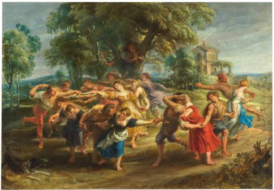
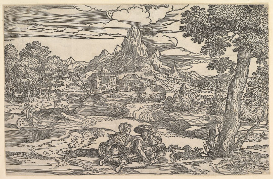
Peter Paul Rubens, Dance of Mythological Figures and Villagers (Antwerp, 1630–35.)
A group of figures dance to the tune of a flute played by a man perched on an oak tree, and to the bells that some dancers have attached to their lower legs. The scene evokes the dances that are part of Ancient Greek history and myths and the tradition that followed—the book Hypnerotomachia Poliphili includes a description and a woodcut of a similar dance. The painting also evokes the arcadian settings of pastoral lyric and drama inspired by Theocritus’s Idylls. In that tradition, and in Rubens’s interpretation of it in numerous paintings, the countryside is considered as an ideal place of plenitude, romance, and sexual fantasy for men. The setting is enlivened by the handling of brown, green, and blue paint. The texture builds on the panel support defining the folds of draperies, head buns and ornaments, and the areas where the light hits the trees. In the middle distance is a farm building with a Palladian motif of arch and lintel—if we were to take this literally, we would place the scene in the Veneto. Rubens favoured this style of sixteenth-century Italian architecture, as witnessed by his designs for his own palatial house and garden in Antwerp.
The dancing figures move their limbs and contort their bodies, an expression of the passionate feelings involved in dancing as it is described in Greek literature. Two dogs positioned as mirror images of each other emphasise the circular movement, and the flowing draperies also contribute to the sense of motion. Many of the figures seem concentrated on the mechanics of the complicated dance, as they try not to lose the hands of the others. In the centre foreground, one of the women appears to be upset by the proximity between a woman with a bare breast and a large bearded man with an ivy wreath; his lascivious attitude is intimidating. To the right another couple come close to kissing. Dionysius, ressed in his tiger skin and crowned with a wreath of leaves, looks back apparently pleased by what he sees.
Only the young Dionysius is clad in attributes that allow us to identify him; the exotic tiger skin alludes to his exploits in the Orient. The epic poem Dionysiaca by Nonnos is full of references to such animals. It also mentions a dance that was part of a celebration of Dionysius’s conquest of India: "The foot-soldiers of Bromios danced round with their oxhides and mimicked the pattern of the shieldbearing Corybants, wildly circling in the quick dance under arms". This is not to imply that Rubens is depicting that specific dance, but a reminder of the very frequent descriptions of such activity in Ancient Greek texts, including whirlwind-like ones similar to the one Rubens painted. The most famous is perhaps one of the scenes that Hephaestus designed on the shield he made for Achilles, as described by Homer in the Iliad: "And young men were whirling in the dance, and with them flutes and lyres sounded continually".
Other than Dionysius, the identity of the figures in this painting is ambiguous. I see them as timeless, generic characters inspired by ancient texts.
The flute player takes on the role of Pan, the sex driven, pipe playing shepherd god, but he has no animal features. The other dancers bring to my mind the satyrs, frequent companions of Dionysius (but none bear their animal features). Silenus usually formed part of Dionysius’s train as well; perhaps he inspired the large bearded man between the two women in blue in the foreground.
Some women wear high end outfit and sandals, others are barefoot and seem more peasant like. In fact, none of the figures in the scene dress the way high class or countrywomen did during Rubens’s time (as they are shown in his own paintings and in those by Jan Brueghel, David Teniers, or other roughly contemporary Flemish artists). Necks, breasts, and shoulders are more exposed here than they would have been in contemporary society and their uncovered hair and bare feet are also evocative of a different time and place. What the women dancers resemble is a host of timeless allegorical and mythological female figures painted by Rubens throughout his life. They also remind me of some of the bacchantes and nymphs that Titian painted in his Bachanals, following descriptions by Philostratus the Elder—dancing was a favourite activity of both types of creatures, which had the form of beautiful women.
Text translated from Alejandro Vergara, 'Comentario' in: Pasiones mitológicas, Madrid, Museo Nacional del Prado, 2021, p.110-113 nº10
#myth#mythological figure#dancers#dance#Dance of Mythological Figures and Villagers#Peter Paul Rubens
2 notes
·
View notes
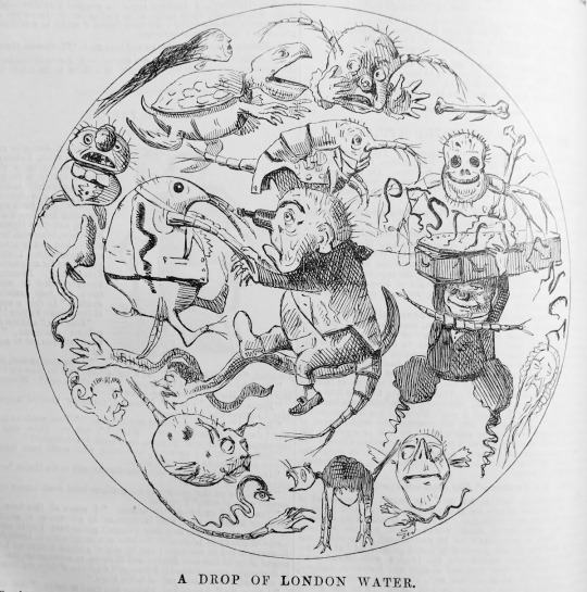
Text
The Crop Circle Mystery | Crop Circles in England Controversy
Let's explore how the crop circles or crop circles in England are man-made landscape art, debunking the myth of alien involvement.
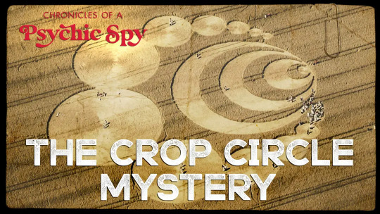
Explanation - The Crop Circle Mystery:-
Crop circles are a simple phenomenon: they are landscape art created by people.
Despite proof to the contrary, certain individuals still think that aliens transported by UFOs created crop circles.
But how did mysterious flying objects become associated with flattened swaths of cereal grains? And why are these styles historically connected to southern England?
The answers to these questions are straightforward: Doug Bower and Dave Chorley. Chorley and Bower were buddies who resided near Winchester in England. In 1978, both of them were sitting in a bar, "thinking about what they could do for something of a laugh," Chorley recalled in Time magazine in 1991. Inspired by earlier reports of UFO landings — the UFO craze was growing in the late 1970s, having gained traction shortly after a retired military officer gave an interview regarding the Roswell event, stating a mysterious alien had fallen in the New Mexico desert in 1947 — Chorley and Bower decided to build their own fictitious UFO landing site.
Bower and Chorley went into a field, armed with some boards, rope, and a twist of wire affixed to the brim of a baseball hat to sit their patterns and began working on their masterpiece. Nobody noticed. The two needed to make repeated trips to the southern English area over a few years before the global media picked up their newly constructed crop circles in England. When the tale went viral and UFO enthusiasts showed them in droves, the painters stepped forward and admitted to the fake.
Since then, crop circles have become both an outdoor art form and a visitor attraction. Their credibility as otherworldly artefacts have faded, but devout believers, known as "croppies," continue to believe aliens have been accountable for at least some crop circles. Marketers are now more likely to be to blame, with crop circles being used to promote games and chips for computers.
What is a crop circle?
Crop circles are massive designs created by flattening crops like wheat, barley, and canola. Crop circle artists continue to stomp out patterns with boards of wood, as a National Geographic movie made in 2004 showed. The painters cover their tracks in current tractor-tire ruts, giving the impression that the pattern fell from the sky.
Crop circles can be easy or complex. England remains a hotbed for crop circle creators, with masterpieces featuring triangles, spinner forms, and crescents. They've also appeared elsewhere in the world, with one story in the Illinois daily Courier & Press describing them as a "plague" in the state during the 1990s. "We feel it's possibly just kids," Rock Island County Sheriff Tod VanWolvelaere told the publication decades later.
A Reference to The Edge of Wonder TV:-
Join Edge of Wonder TV for a detailed video on how crop circles are man-made landscape art, debunking the myth of alien involvement. Doug Bower and Dave Chorley were the individuals behind the creation of these mysterious formations in southern England. Find out the weirdest news in history, hidden facts and mysteries, and much more only on the Rise TV Show.
Join Chronicles of Psychic Spy on The Rise TV Show to watch the full episode on the crop circle mystery that is uncovered by remote viewing of many different crop circles to understand if they come from the same source.
Famous crop circles:-
The first mention of a crop-related enigma currently associated with crop circles was a woodcut chapbook, or tiny book containing ballads, songs, and tracts, titled "The Mowing Devil," which dates back to 1678. As stated by Oxford Reference, this chapbook depicts the story of a low-wage farmer who declined to pay a labourer to chop his oats. The devil accomplished the job overnight, "shaving them in rounds." Though the oats in the narrative were mowed rather than flattened, crop circle proponents used this anecdote to support their claims about crop circles' long-standing origins.
In 1996, a spectacular crop circle named the "Julia Set" emerged near Stonehenge. Following the Skeptical Inquirer, a local pilot claimed to have flown over the area for an hour before the crop circle formed and seen nothing, before returning to witness a spiral of ever larger circles. The crop circle's purported abrupt appearance fueled speculation that it was of otherworldly origin. However, according to the Skeptical Inquirer, these testimonies from witnesses were dubious — and the regional creator claimed to know who created the Julia set and that it was done the night before the crop circle was discovered, rather than in broad daylight.
Final Thoughts:-
Crop circles are large designs made by flattening crops, often created by artists using wood boards. They can be found in various shapes and have been reported in different parts of the world, including England and Illinois. Some believe that kids make them.
Bower and Chorley created crop circles in a field in England using simple tools, but it took years before their work gained attention. Once the media picked up the story and UFO enthusiasts flocked to see the circles, the artists revealed that they were responsible for the hoax.
The story of "The Mowing Devil," a woodcut chapbook from 1678, is often cited by crop circle proponents as evidence of the long-standing origins of crop circles, even though the oats in the story were mowed rather than flattened.
4 notes
·
View notes
Note
NEW TAT IS AMAZING!! WHERE DID YOU GET THE INSPIRATION FOR THE ART?
a friend of mine from work recommended the artist so i checked out her instagram (@lapotattoos) as one does. she had another mermaid in this style which she described as a combination of woodcut and american traditional and i really vibed with it
the artist said on her booking form that she would love to take on more custom designs where she could have a lot of creative freedom (especially around ocean and nature subjects) so i wrote in and said hey, love your style, would you want to design a jellyfish mermaid preferably with some bioluminescence and deep sea vibes, and she wrote back the same night like HI YES.
im always nervous about customs cuz artists generally just show it to you day of but i am IN LOVE with where she took this prompt and in awe of her ability to take an client's concept and, in her words, fuckin send it!!!
also its relatively big but she somehow did it in less than two hours?? which is good because man this one HURT especially the bell part close to the crook of my knee lol i have a pretty high pain tolerance but i had to really breathe through this one at times
3 notes
·
View notes
Text
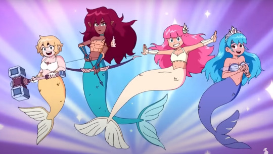
High Guardian Spice Redesigns: Mermaid Edition
I just couldn’t stay away. Let’s dive back in (pun very much intended) to some High Guardian seas.
Part 1 and Part 2 of this series covered the show’s general issues and the thought process behind my redesigns in depth, but as a quick recap:
I’ve styled the new art direction after 17th-century woodcuts depicting witchcraft (what with the magic in the story and all)
The master palette is reduced to six base colors, all taken from spices
Everyone’s pupils are now drawn like Snapdragon’s for the sake of consistency and making the art style look more unique
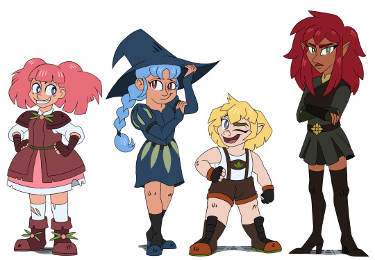
Now let’s look at the results of the mermaid transformation sequence and see what needs improvement:
(Screenshot from this video, and I must say the music and sound effects add some much-needed excitement to the scene, even with the sluggish pacing that holds the animation back.)
For starters, the tail colors seem a bit random. They don’t echo the girls’ hair, skin, eyes, or the clothes they wore on land - with one exception. Parsley’s tail matches her hair, giving me an idea as to how to make the tails more consistent across the board.
Also, the tailfins look pretty generic, like the first thing someone would doodle when they were bored without doing any research. What if the tails were inspired by fish that match each girl’s personality?
Plus, the weight of Parsley’s hammer would make it difficult for her to swim upward, while the water would significantly slow down Thyme’s arrows. And yet they get to keep their weapons while Caraway takes Rosemary’s sword? Yeah, it’d make more sense for them to leave all their usual weapons on land (except maybe Sage’s terrasphere-?) and take light, water-friendly knives for self defense during their mission.
Bit of a nitpick, BUT: I get why Rosemary and Sage’s hair is loose now, since the free-flowing look jives better with the whole mermaid aesthetic. Okay, cool. But if their hair had already been held in pigtails and braids for hours that day, you’d think it’d have more waves in it rather than coming out perfectly straight in the transformation sequence.

(And this is more of a continuity error on the animation side than a design thing, but holy shit I just realized how much longer Rose’s tail is in the final shot compared to seconds earlier in the transformation.)
Enough yammerin’. Let’s get to the redesigns.
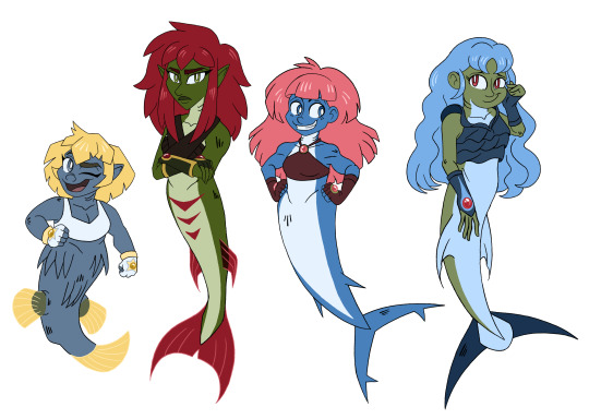
In the end I decided to merge the mermaid tails with the skin on their upper bodies, making them the same color. The first three girls’ skin color matches their eyes, though Sage was trickier. Her reddish eye color just made her skin look sunburnt, so I went with a green similar to the one used for the leaf design on her dress. Everyone has the same hair color they did on land (keeping them recognizable despite the major appearance changes), and the transformation now includes gills. Leaning into the fish elements helped me move away from the overdone Disney princess mold.
Speaking of fish, each character’s tailfin is now inspired by specific species.
Parsley- Pufferfish Small and unassuming at first glance, but not one to be trifled with.
Thyme- Barracuda This arrow-shaped fish reminded me of Thyme’s weapon of choice.
Rosemary- Great White Shark Based more on general vibes, really. I think Rose would freak out with glee if she had a tail inspired by one of these badass chonkers.
Sage- Swordfish An allusion to the sharpness of Sage’s mind. (Alleged sharpness, anyway; apparently some of the choices she makes in the show aren’t consistent with this characterization.)
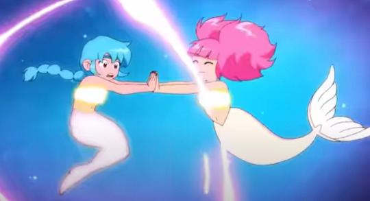
Also, each girl now sports a pair of gloves with gems on them. These are terraspheres customized specifically to make blades appear in the user’s hands (and store themselves again) when she concentrates and performs the proper motions (shown below).

This way, the crew will always have access to weapons when they need them, but said weapons will be much more portable and useful for underwater fights.
As for the original accessories like decorative shells, earrings, tiaras and such... Ehh. They seemed superfluous to me, as they served no purpose other than looking pretty. The whole point of turning into mermaids was to help the undersea folk deal with a dangerous creature, not play dress-up. If a character design element is only present because “it looks cool” rather than serving the story or the character, toss it.
That’s all for now, though in the last High Guardian Spice post, I did mention possibly redesigning the dragons... Hmm.
#high guardian spice#character design#redesign#mermaid#mermaids#magical girl transformation#critique#criticism#anime#art direction#hgs
52 notes
·
View notes
Text
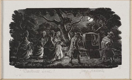
Darkness Lane by Joan Hassall [ x ] - the piece that most inspired my recent woodcut-style piece.
When I found out I was drawing for @gorgeousundertow's regency AU fic, Half Agony, Half Hope, as part of the @ineffableidiotsbigbang, I started looking up Jane Austen novel illustrations for inspiration and ended up finding some really cool art and websites! I'm posting about some of the images and resources I found because I think it may be interesting to others too (and even if it isn't, I'll have gotten the infodump out of my system haha).


Illustrations from Mansfield Park by Joan Hassall [ x ]
The link above points to a gallery on pemberley.com which has deliciously old-school DIY website HTML and a wealth of Jane Austen illustrations, as well as references for regency clothing. This was where I discovered Joan Hassall's work and decided I wanted to do a woodcut style piece (and then subsequently regretted it many times during the process of making it because I had no idea what I was doing). The detail, visual texture and dramatic lighting in her work is so cool and I just got more obsessed the more I saw.
See more Joan Hassall on tumblr via @uwmspeccoll (a very cool account!) here, here, and here.
The gallery on pemberley.com also had a bunch of Charles Edmund Brock illustrations, which I could not get enough of and so returned to the searchpage and found Molland's Circulating-Library. SO COOL! Jane Austen fans have bought illustrated editions of her novels and uploaded scans of them and oh my gosh they are all so beautiful.
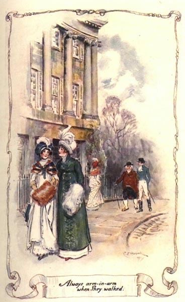
Northanger Abbey watercolour illustrations by C.E. Brock [ x ]
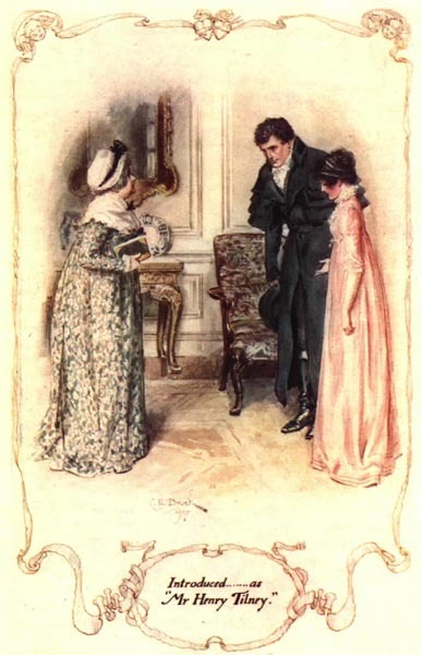
Side note about Henry Tilney (Catherines' love interest in NA), I also came across this old fan page for him from a mostly-broken-links-now site called THE CULT OF DA MAN and um it's great haha, check it out. (reviews of artists representations of him, more delicious HTML, and pixel art (!) of da aforementioned man)
There's also an article on Molland's about Charles and Henry Brock and their Jane Austen works that I found interesting. Charles is better known and did far more JA illustrations, but I do really enjoy Henry's tinted line pieces! (the article also dunks on some bad reproductions of them haha)


Pride & Prejudice tinted line illustrations by H.M. Brock [ x ]
C.E. Brock also did really cool title pages and when I found out that fic banners were a thing I knew what I wanted to do! (with the help of the symmetry tool and undo haha, so much respect for traditional art)


Title pages illustrated by C.E. Brock [ x ] and my banner - the banner design uses elements of both of the Brock images.
So, research in hand/bookmarks folder and banner completed, I decided on a scene from Chapter 10 where our beloveds are standing beside the Thames in the moonlight after walking around London for hours together and talking (CUTE). I wasn't sure what buildings to include in the background, so @gorgeousundertow gave me a few suggestions: Old Southwark Bridge, London Bridge, Southwark Cathedral, and Clink Prison. I realized after a bit of sketching that bridges would be hard to show with the straight-on view I wanted to do, so I decided on the Cathedral, partially because I had also considered drawing a scene that takes place in Salisbury Cathedral in Ch. 7.
OK BUT HOW? I struggled finding reference images for a while until I realized this was LONDON and would be very Google Earth-able. Big ups to Frank Cosgrove, whoever they are, for uploading this haha. This was also where I found out that all the suggestions were from a very small area!


View of Borough High Street, London, 1830, by George Scharf [ x ]
The building in front of the cathedral looked too new, so I went searching for an older image and found the second image. It's a completely different angle but it was enough to get me past the 'oh no idk what do'.
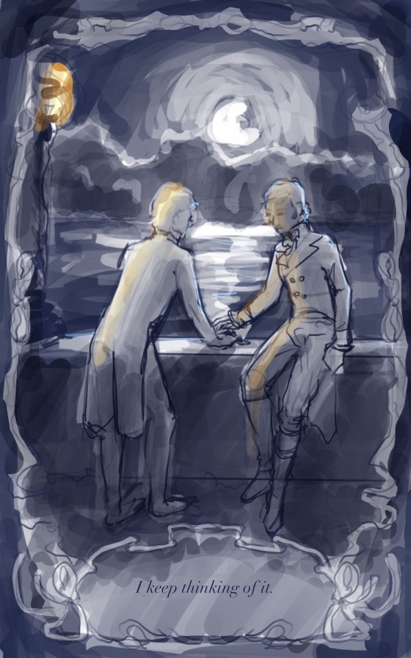

the much brighter concept vs the much darker finished product, featuring a barely-visible Southwark Cathedral
While looking for images of the Thames pre-Google Earth, I also found this website called Dictionary Of Victorian London which has a whole bunch of old images and excerpts from newspapers, etc on a variety of topics. One of the categories, Sex > 'unnatural offences', had this excerpt from The Times (1863), which reads:
Thomas Lane, a coffeehouse keeper, No.9, Love-lane, Eastcheap, city, and James Mortimer, a seaman, were charged with unlawfully meeting each other to commit an unnatural offence. ... The Magistrate committed both prisoners for trial.
Ugh. I hate that so much. Some sexy stuff happens right after the moment I'd chosen, and reading that reminded me that such things would be much more comfortable and safe in darkness (or if ppl just stopped being homophobic, but barring that). I wanted them to feel alone, like the whole world was asleep and it was just them, outside of time.
With that in mind, the iconic Thames Walk Lamp had to go bye bye, and when rendering the background I tried to minimize any light - it's just the suggestion of buildings. I also added tree cover! I tried to imitate how Joan Hassall does trees in some of her artwork, but when she rendered trees like this they were usually farther away/smaller, so my version looks more stylized with how prominent they are.
The ribbon border and book quote presentation is of course more Brock, but by making it black and having the interior image use it as a border instead of a fade-out inside it, I made it a bit of a reference to the very cool foliage edges you see in the very first Hassall image at the top.
I used the procreate brushes from this post on the Procreate Folio forums if anyone wants to try them!
Also fun fact! The font for the quote is called Chanson D'Amour <3 (I initially downloaded it when making the banner before changing the banner font to one called Dark & Black)
------
That's all I have to say about the process for the piece, but here's a comic from Dictionary Of Victorian London, Thames > Sanitary condition that I thought was cute (and gross ig? but also cute):
a Punch comic from 1850, I can't link the page due to how the website URL system works but it's from the Thames > Sanitary condition page
#lol anyway back to reading fanfiction from the bang!#joan hassall#charles edmund brock#henry matthew brock#art process#eccles makes#ineffable idiots big bang#jane austen#illustration
18 notes
·
View notes
Text
A Christmas Carol Holiday Season: "A Christmas Carol" (1971 animated short)
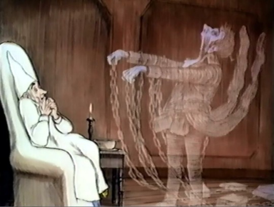
This 25-minute animated short, produced by famous Warner Bros. animator Chuck Jones and directed by Richard Williams (Who Framed Roger Rabbit), is the only Christmas Carol adaptation ever to have won an Oscar. In 1973, it won the award for Best Short Subject, Animated Film. And it deserves the honor! With no pun intended, this is truly a Christmas Carol of haunting beauty.
Short and succinct though it is, this Carol is one of the most faithful to Dickens's book, with all the ghostly surrealism that other adaptations downplay. For example, no other version offers as faithful a portrayal of the Ghost of Christmas Past, which constantly changes shape and age just as Dickens described. We also see such rarely adapted episodes as Scrooge's childhood visions of his favorite book characters, and his travels with the Ghost of Christmas Present to a miners' camp, a lighthouse, and a ship at sea. This is also a Carol unafraid of the book's dark side – the moody opening image of snow flying in a tempest of wind should make that clear – and it features several often-forgotten moments of horror. This is the first adaptation since the classic 1951 Scrooge to include the vision of the phantom children Ignorance and Want, and the very first, as far as I know, to show the jaw of Marley's Ghost falling down onto his chest. To make matters worse, he never raises his jaw again, but goes on speaking as it hangs open without moving his lips.
Both in these eerie moments and in scenes of Christmas cheer, the beautiful soft-lined animation creates a truly Victorian atmosphere. The art style and character designs are inspired by John Leech's original woodcut illustrations and etchings, and they have the look of 19th century illustrations come to life – sometimes with rich realistic detail, at other times with atmospheric impressionism. Meanwhile, the score makes excellent use of "God Rest Ye Merry Gentlemen" (the only carol mentioned by name in Dickens's book) as its main theme.
Adding to the prestige of this elegant short is the fact that two of the leading actors from the classic 1951 film reprise their roles in the voice cast. Alastair Sim voices Scrooge, still able to inhabit the role at age 71, and Michael Hordern again lends his rich tones to the agony of Marley's Ghost. The supporting voice cast does a fine job too, with narration by Michael Redgrave binding the story together.
This animated Carol might not appeal to children the way more lighthearted versions do. But for adults who love animation as an art form and who enjoy faithful Carol adaptations that capture the light and the darkness of Dickens with equal vividness, this is a must-see!
@ariel-seagull-wings, @thealmightyemprex, @faintingheroine, @reds-revenge, @thatscarletflycatcher
#a christmas carol holiday season#a christmas carol#1971#richard williams#chuck jones#animation#animated short#alastair sim
31 notes
·
View notes
Last Seen Blogs