#the kind of brush I'm looking for is one of the default csp ones I think
Explore tagged Tumblr posts
Text
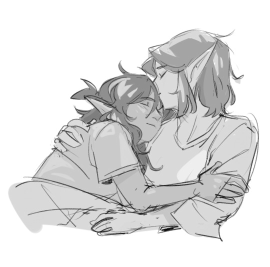
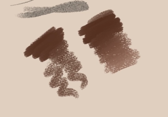
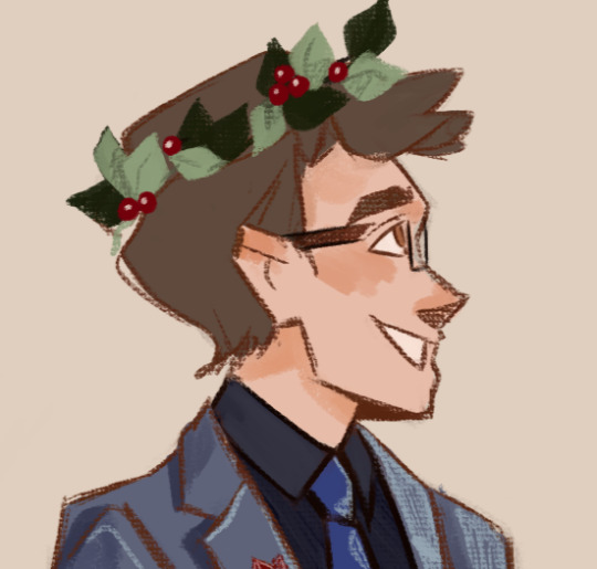
Barriss portrait because I'm going through that phase where I all of a sudden hate the brushes I've used for 3 years. I edited my existing lineart brush and I like it better but it's not perfect and I'm struggling to find one I like more because I don't know how to describe it!
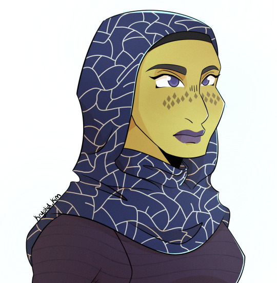
#the kind of brush I'm looking for is one of the default csp ones I think#but it doesn't exist in procreate#and I also don't know what the name is so I can't find a recreation or info about it to make one myself#star wars#star wars fanart#the clone wars#barriss offee#kryptidkreations#tales of the empire
44 notes
·
View notes
Note
Hey, I was wondering if you had any starter tips for digital art? I'm a traditional artist and have been for years, but I was recently given a tablet and clip studio. I am having SUCH a hard time getting anything to look right: shaky lines, flat/too soft pieces, just an absolute childish mess every single time. I see all these gorgeous digital pieces and have NO IDEA how to get there.
Heya!
So, it's been a very very long time since I transitioned from traditional to digital art, but I DID do proper traditional for a few years; we're talking ink pens, color pencils, markers, watercolor, fancy papers, the works. I did some acrylic painting too but only monochrome (and before anyone asks, these works no longer exist so I can't share them) all that to say that I do have some experience with the former and definitely felt the learning curve when I changed to a tablet.
To get the unhelpful advice out of the way first: It's a different and unfamiliar medium, and there is probably nothing significant that you're "missing" about it except time and exploration. There are pillars to digital art just like there are in traditional art, but when it comes to personal process everyone has their quirks and habits - you gotta mess around and find what works for you. I suggest looking up tutorials and speedpaints on youtube even if you know all the basics or if the style you see doesn't appeal to you; just watching how others do their thing might help you figuring out how you would like to do yours!
Now, for the more practical advice:
-I don't know what kind of tablet you got, but assuming it's a non display, that's an extra hurdle you have to get over in developing the eye-hand coordination necessary to use it. This feels very alien at first but it shouldn't take longer than a few weeks to feel completely natural.
-On that note, if there is a significant size discrepancy between the tablet and the screen you are looking at, that might mess you up. Try adjusting the size of the CSP window so it fits the size of the actual drawing surface you are using more closely.
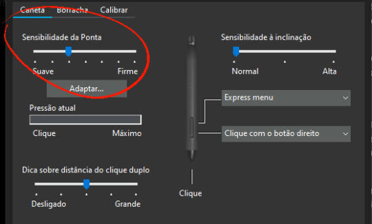
-Every drawing tablet's pen has pressure settings that can be tweaked to your liking, I for one always make it a little softer than the default.
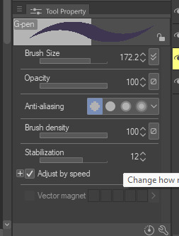
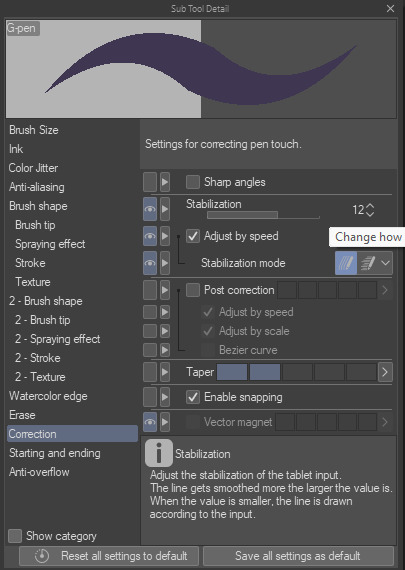
-BRUSH STABILIZATION! That's a setting every individual brush (and almost every tool, I believe) on CSP has. It does as advertised: stabilizes your brush strokes. A lot of people like this set between 8-20 depending on the brush, and it can make a huge difference to the way you draw.
It is usually always visible in the tool properties, but if not, you can toggle it on through the "sub tool details" menu by clicking the little wrench symbol on the bottom right.
Hopefully this has been helpful at all. Good luck!
190 notes
·
View notes
Note
hello! i love your zelink stuff sm😭 do you have any advice on how you get your characters so textured? like,, idk how to explain, but the clothes, hair and skin have a cool smudged effect. it might be rendering, but i really like your style of it!
uhhh okay im not sure exactly what you mean so i'm just going to go over everything you could potentially be talking about lmfao. (this is the problem with having multiple coloring styles)
what i think you're probably talking about is the very soft, smudgy rendering style that I sometimes use for more finished pieces. I haven't used it that much recently though so i'm not entirely sure?? for examples it looks like this:


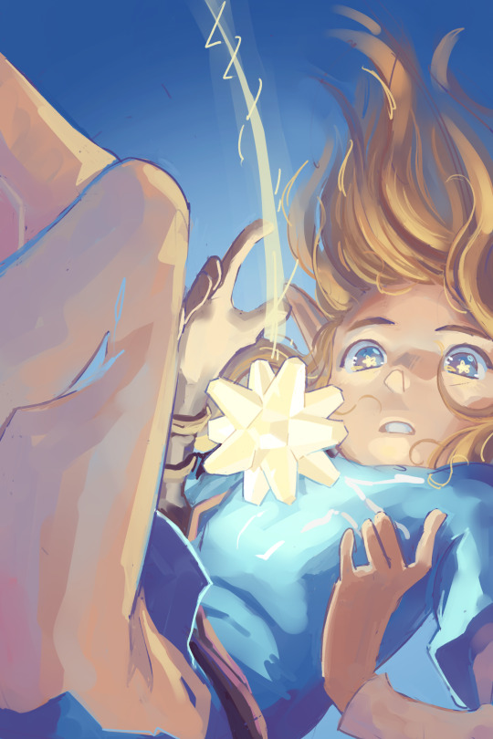
this is a combination of 3 different sai brush presets. I sketch with a custom crayon brush, do flat colors with sai's default paper acrylic brush, and shade with a custom watercolor brush, and then i do a second pass overtop of all that with the crayon brush again to smooth things out and define important details. these are the settings for those brushes:

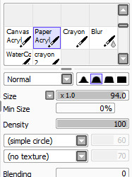
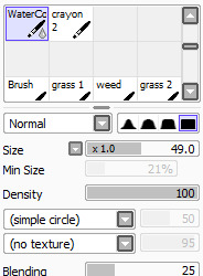
if you're talking about the kind of cleaner block-color look like this, which I think is the style I use most often:

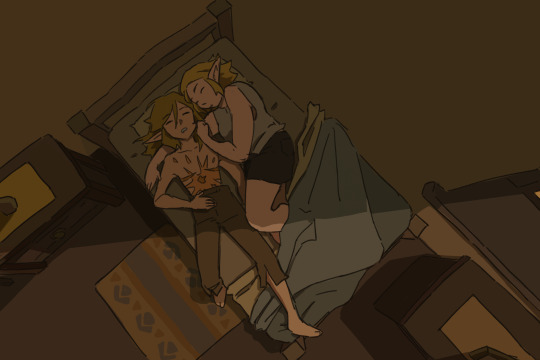
this is the same crayon brush and paper acrylic brush mentioned above, but instead of shading with the soft watercolor brush I use the same paper acrylic brush to cell-shade. color and line do most of the heavy lifting here, since the only brush with any special texture is the paper texture on the crayon brush that's used for the linework.
the third potential style this could maybe (?) be about is this rougher, more obviously textured style, although in my mind i wouldn't call this 'smudged':
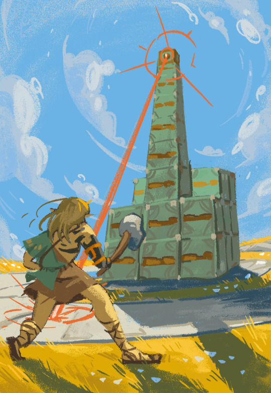

this is my new holy grail brush. i love her and i use her for absolutely everything. this one is for CSP, not sai. it's called sketches / doodles by REN99W, content ID 2024976 on the asset store, and it's FREE which is insane because it's the best csp brush ive ever used in my entire life. its pressure sensitivity is really cool because at normal pressure it will basically act like a normal linework brush with a bit of nice crunchy texture, but if you press harder than normal you get that sort of spray effect that looks almost like a halftone. literally incredible. works for sketching, lining, painting, ANYTHING. this brush has carried my art for the past semester and a half
#asks#i hope one of these was the answer you're looking for <3 if not im gonna need a specific example because i switch it up so often lol
127 notes
·
View notes
Note
Hi, your art is stunning. May I ask what program you use to draw digitally, and if you have any tips on how to get the forms and colors as incredibly accurate as you do?
Aw, thank you! I still feel like very much an amateur at this; my first digital painting of this type was this one, a month ago, and I don't really know what I'm doing, so take my advice with a grain of salt.
I use Clip Studio Paint currently, though an older version from when it was a one-time purchase instead of a subscription. (Why is everything subscriptions these days.) In the past, I've used Krita, which was free, but I haven't used it for this kind of painting per se.
For these paintings I've been using the default "Dense watercolor" brush for laying out blobs of color and the "Transparent watercolor" brush for subtler shading and smoothing. I expect these are not the ideal tools for this or anything, just sort of the brushes I've gotten most used to working with in coloring in CSP, which I stumbled into kind of randomly while messing around.
To get the forms right: something I started doing for my Good, the Bad and the Ugly kick early when I'd started on that in September was to do a rough sketch with the screenshot on the canvas at the same size and every now and then drag the sketch layer over the screenshot to check myself off - see if I'd made some feature too small or positioned it weirdly, etc. This felt a little like cheating but it did also just kind of help give me a better sense for it and for the ways in which my initial eyeballing tends to be off so I can adjust for it, and then once I had the very rough sketch of where everything is, I could detail freehand on a second sketch layer from there which feels a lot less like cheating.
However, for the last three paintings I did, instead of doing that I have been using a trick I saw my dad using when doing traditional oil painting, namely using a grid: enable the grid option in the CSP view settings, line the reference up with the grid, and then focus on each individual 'tile' of the grid. While working on this latest one, my canvas looked like this, for example:

So when sketching and while working on it from there, I could look at the individual square on the grid that I was working on and try to match it to that individual bit of the reference, which is a lot easier than trying to eyeball the whole thing at once.
As you may be able to tell, the colors don't feel super accurate to me when I'm working on it and actually looking at the screenshot beside it; it's all a little off and less detailed, but then it looks a lot nicer once you crop the reference out of the canvas. For this one I actually experimented with using the color picker tool to pick out some of the extremes of the colors I worked with for each given area - some of the brightest highlights on the face, a nice midtone, some of the deepest shadow - but this isn't all that helpful because film grain means the overall impression of the color is different, and there are a lot of nuances. Something I did do, also for some of the previous paintings where I specifically didn't use the color picker as a challenge to myself, is try painting a brush stroke on top of the area in the screenshot whose color I'm trying to replicate and keep adjusting until it feels like it just about blends in. But even then color is very hard. There are so many subtle nuances and shades and it's hard to adjust the exact shade of some color I've already put down other than by just painting over it again and then redoing the details - unless, of course, I just put another layer on top and set it to Hue or something. I did that a little with the barbed wire around his neck on this one, to make it less blue after I'd first put it down.
Buuuut mainly I think the key to making these sorts of things look good, as far as I've felt, is just to be willing to spend a whole lot of time noodling on them. There's always more you can do with it to make it better.
I found the checking myself off by dragging the sketch on top of the screenshot trick very helpful, even if it does feel like cheating, just by virtue of the fact it makes the outcome look better, which makes me less likely to ultimately go "ugh, this isn't right" and just want to stop working on it and move on. And that's very helpful, at least to me.
Finally there's the general just draw a lot, etc. I have been posting art daily on this blog since the beginning of 2016, and it's been a slow journey of my very intermittent efforts at human portraits getting slightly, slightly, slightly better each time. Just these feel like a pretty massive level up in the space of a couple of months, though, and I think that's largely just because I got obsessed enough with a movie to want to spend the time to draw one million cowboys instead of doodling Pokémon, and also allowed myself to use whatever neat tricks would help me make them come out well enough to stay motivated on it.
7 notes
·
View notes
Note
i'm curious about your technique ..... the texture in your fabrics, metals and skin is magnificent, do you have some favorite brushes and how do you approach drawing these materials? thank you!
Hello!! :D First things first, thank you so much for your kind words!! My favorite brushes to render with are these:

I don’t remember where I got this brush exactly :( It might be an old Photoshop brush that I tweaked and/or changed its properties quite a bit over time to suit my preferences. The good thing is, this brush is easily replicable, all you need to do is take a simple round brush and enable color mixing!! Then adjust how much paint you want the brush to pick up and/or how intense you want the color mixing to be :D I use this brush for pretty much everything, from skin to fabrics to metal!! I also want to mention that Clip Studio’s default “Smooth watercolour” and “Transparent watercolour” are decent alternatives!

I've worked with this brush for years now! Nowadays I use it for really fine details which require hard edges or opacity. There isn’t much to say except I really like its texture and it balances between being a hard and soft brush really well ^__^ You can get it here!

I got this one from the CSP Asset store, however it originally had a Japanese name which I couldn’t read, so I changed it to just TEXTURE. I don’t see it in my downloaded brushes catalogue though, so I’ll update this post if I manage to find a link

Really good brush for adding some fancy texture – it’s a simple rake brush consisting of 9 lines, nothing too complicated AND easily replicable :D I consider it a good addition to my personal brushset. It’s really fun to use!
Now... I’ll try my best to explain how I approach things during rendering :D (disclaimer: I am no professional artist…this is just how I do things when painting) So! With skin I always keep in mind that light penetrates its surface and, in a way, illuminates it from the inside. This usually leads to experimenting with many colors depending on the subjects skintone and lighting of their surroundings/scene they're placed in :]
Fabrics - I generally paint them very close to how I paint skin :D Of course it’s not a one-fits-all solution, as there are different types of fabric with different properties. Whenever I render a specific fabric - let’s say for example leather – I keep asking myself “How do I make this look like leather? What properties does a leather surface display? Is it shiny, thick or thin, does the material allow subsurface scattering?”
For metals, I usually stick to a general rule of thumb - use stark contrasting values when rendering (really push those dark, saturated shadows and really shiny lights) and don't forget about how reflective metallic surfaces can be!
That's pretty much it! ^__^ ❤️
#ask#phEWWW this was a lot to type#anyways I hope I answered your question anon!! ^__^#much love#faq#brushes
96 notes
·
View notes
Note
What program/brushes do you use?
Hello, anon! I use Krita, a desktop program that is completely free ✨ (The current version I am using is 5). I switched to Krita from CSP because I found painting there to be easier.
As for brushes, apart from the standard flat brush and eraser tool, I use these two that come with Krita by default:


I generally use Pencil-2 for sketching, line art, and details and Dry Bristles for painting and laying down flat colors, but I do use them interchangeably. Pencil-2 does not blend and Dry Bristles blends only a little.
The following is an explanation of how I draw with them, because technique and process also influence my style as much as the brushes do. I felt that that kind of information is more useful in case anyone wanted to try drawing like I do!
---
My main painting technique is to layer and blend colors using Dry Bristles and draw in details with Pencil-2. I also tend to use only one layer (after merging the sketch/line art with flat colors) or anywhere between 2 to 4 layers, in which I have separate layers for sketch/line art and flat color and one or two layers on top to add details and draw over the errors. In the latter I usually focus on corrections in the detail layers instead of switching back and forth to fix the lines and flats (unless I needed to erase something outside of the lines). With this relaxed drawing process I am able to create some of my favorite pieces that are featured below:
---
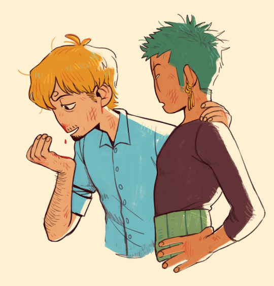

Here I used Dry Bristles for the flat colors and Pencil-2 to scribble in some details. The blush on the face was also painted using Dry Bristles with light pressure.
---
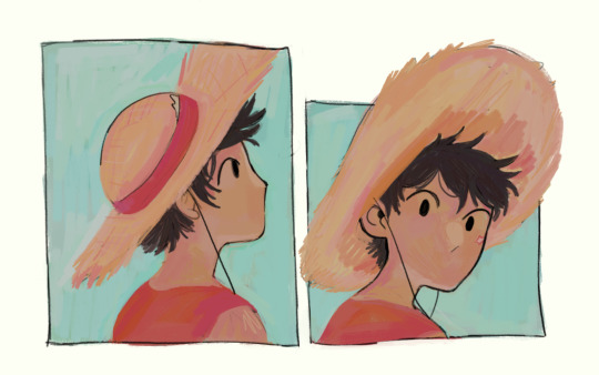
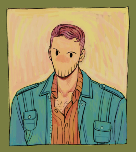
For these ones I use the same brushes but with the color jitter effect applied (here is a tutorial on how to do that). I like using color jitter because it gives this more analogue (traditional) feel, like drawing with dry medium. The unpredictability of the colors is a bit hard to get used to at first but you learn to work with it! When I am happy with the colors I will switch back to plain Pencil-2 (w/o the jitter) to add details, along with the eyedropper tool to blend and "even out" the jittered colors for a better effect.
---
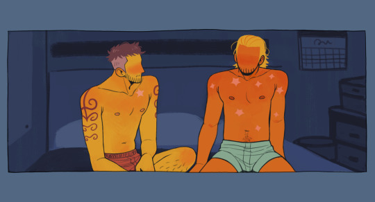
For this one I used both Dry Bristles and Pencil-2 to blend colors into each other. You can better see where and how I did it in these close-ups:
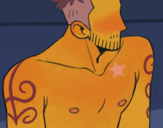

The way I blend here is like using a colored pencil.
---
Sometimes my lines are crisp, sometimes my lines are sketchy. In most cases I use a "painting" method to draw lines, which is to say I draw a line and then I erase/paint on top of it to get the desired look and weight (like cleaning up a sketch), instead of following an "inking" method (where you draw the line art as it is before coloring). I really just approach it as if I'm painting with acrylics!
I hope this explanation is okay! Let me know if you need more clarity on some parts ^^
#brushes#i would record a video of my process so i can show it better but it's difficult to do it in krita#csp is a lot better for recording but i still have yet to find brushes that closely replicate my favorite krita brushes#someday! someday#jakkenpoy answers
133 notes
·
View notes
Note
Hi!! I just wanted to hop in and say that I love your art / style so much!!! Do you have any advice for newbies to procreate? No worries if not! I just *clenches fist* you're art is so fucking good and I just love it a lot, it brightens my day
RAAH TYSMMMMMM ur too kind :') <3
putting the yapfest under a cut /o/
honestly i'd say number one is to learn all the shortcuts for actions (two finger tap for undo,, three finger tap for redo, etc) to speed up the whole process. there's lotsa tuts on yt that go through them all!!
i'd also just generally learn what everything is/what it's function is. like if you don't know what alpha lock is you might be torturing yourself with cleaning edges when you dont need to kinda thing, or trying to blend with colours when you can try the smudge tool instead, or not using clipping masks to make your life easier, and so on
i know everyone says this and it sounds tired but i promise you, reference and practice work. you're fueling your brain's internal library and learning way faster!!
id prob play around with brushes and find a handful to favourite and play around with the most when you start off, it has a lot of choices but it can be a bit overwhelming so i'd stick with a few to start with, and switch up if something doesn't feel 'right.' (it has a lot of cool texture brushes but imo it's better to start with the simple brushes and move up) this is a personal thing, but as someone who gets brainbored when sketching sometimes, i throw effect layers over top to make it feel more appealing to me. whether it's a colour wash or something that creates a neat contrast, i think it helps me feel like it looks more neat/slightly more finished?? idk if this is just a me thing but it makes me feel better when i'm playing around lol
i would also recommend duplicating brushes you kinda like but dont feel quite right, and play around with the brush creation settings! it's pretty thorough and fun to see what you can come up with. some of my staple brushes are just basic default airbrushes that i tinkered with a bunch. there's also a tooooon of free brush packs online, would recommend browsing and see if any speak to you!!
i will say procreate is pretty fantastic with the price/usability balance, but the thing that's made me steer away from 'finishing' pieces in it over the last 6 months or so is it's colour blending can be fuuuunky and it doesn't have correction layers (yet?). which is why i will send my procreate sketches to my comp to finish them in csp x) tis absolutely a banger to learn digital in though!! play around and have fun!!
#im soooooo sorry this took me so long to respond to i highkey forgot to check my inbox on this acct for months at a time :''')#kai talks#procreate
5 notes
·
View notes
Note
hiii your art always make my day better, so hope u had a good day too. But can I ask what brushes you usually use in your arts? Like the way you use brushes and colors are so good TuT I can't fathom it sometimes. How do u make those kinds of textures. I'm new in this tumbler, so apologies if it's already been answered before. <33
Heyo anon, thanks for asking and no problem! I've answered this a couple of times before across all my platforms, but ig this is a good opportunity to answer and add to my carrd FAQ! <3 Let me break down what I use them for a bit too. (lots of blabbing below so I'll but a read-more tab)
Main:
(sketching) Design pencil (default in CSP, you can probably find it on the assets store because it was from the earlier version of CSP)
(sketching/coloring/general use) G-pen
(sketching/coloring/general use) Dense watercolor (same case as the design pencil)
As for brushes that I use for texturing and painting, I use the Daub brush pack for CSP. My favorites come from the aenigma, pigmento, and basiliscus sets. You can find them on gumroad, or just google! I believe they have brushes for procreate and photoshop too but I think the brush packs aren't the same across platforms.
For making the texture itself, it's kind of a random process that idk how to explain properly lmao. Let me link my Kokomi timelapse so you can see how much I jump around the canvas to carve out the textures:
I like to use different blending modes and layer tons of different colors. The color jitter function is super amazing too for that purpose, but probably shouldn't be overused for the sake of balance. (personally still trying to avoid over-saturating my works with textures tbh)
To be 100000% honest though, I tend to jump around a lot, and I certainly don't use all of those brushes in every piece.
I used to lurk around a lot myself and hoard tons of brushes other artists were using, until I saw a comment of an artist I admire: "sometimes the brush you use really isn't important. Without practice the painting will be ugly."(not the most accurate translation probably because it was written in another language)
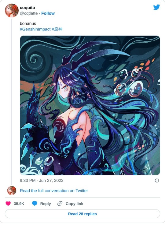
After that I had like… an epiphany moment where I really believed them, and drew a Bonanus fanart in June. I made the lineart with a g-pen (which I never used cuz I always thought I'd be somehow inhibiting my creative power using default brushes or something), and the piece ended up blowing up on twt much to my surprise.. LOL. After that, I started to care less about other's brushes and instead of looking for more, try to figure out how I could make cool textures and strokes with the ones I currently had at my disposal.
(said bonanus art)
This isn't a statement to say "stop looking for other artist's brushes, copying brushes bad, etc" because there is a LOT that you can learn from using other artist's brush inventory.
But you can also have a lot of fun drawing when you focus less about what other's use, and more about what brushes YOU are comfortable using + feels right to you. Sometimes you may even need to tweak them a bit in their brush settings instead of using their default form before they feel comfy for you! It's a matter of exploring and figuring out what works and what doesn't in your workflow, hehe.
Anyways I hope this answer helps as we all continue our art journey together. Sending positive vibes your way anon! <3
20 notes
·
View notes
Text
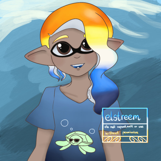
Aroace colors Inkling I made in Procreate for practice!
I've been trying to figure it out so I'm not making any good art to upload yet. This is the first thing I made that looks ok, and it's still pretty rough compared to what I usually do.
My experience working with an ipad below because wow that got long.
My dad got me an Ipad to replace my 2014 Samsung Galaxy because it's getting some battery issues but uh...I haven't used an Apple product in forever. It's been two weeks and using an ipad still feels like someone sawed off my hand and stapled it back on :') I think it's a combination of having to learn to use new hardware and software, but it's been so tough trying to make digital art on this thing.
I wish I could use Medibang since it's what I'm most used to, but for some reason the pen I'm using won't register pressure with Medibang, so I have to use Procreate. I changed the pressure settings to work with Procreate, but it's still weird and hardly works the way I want it to, so I'm not sure if it's something with the 3rd party pen I'm using, or something else. We did order a paperlike screen so hopefully that fixes some issues for me. I never had to use one for my Galaxy even though it had a glossy screen cover, but its stylus and the pen for Ipads have different tips and it's not easy using the pen to draw.
I had an easier time working with my wacom and CSP, but then again CSP and Medibang have similar layouts so it's not too difficult to adjust. Procreate is nice, but it's so different from what I'm used to that it feels like I'm arguing with someone just using its basic functions lol. I found the default brushes so difficult to use, too. My dumb monkey brain isn't flexible enough for this thing.
Kind of a rant, but it's just me complaining and it's a matter of my getting used to it. I did manage to make this, so hopefully I can consider Procreate as my next tool, But in the meantime, I still have my Galaxy and Medibang on it, so that's still where I'm mainly working. I reserve CSP for really big digital works or more complicated paintings since...it's a hassle setting up my pc and wacom tablet lol.
6 notes
·
View notes
Note
what brushes do you use?? if you don't mind sharing
depends! it depends so much!!
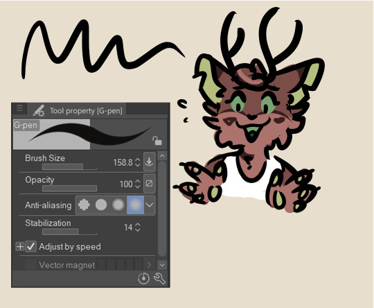
if i'm using this brush, it's usually because i decided to sketch with it. i'll do my sketch and then i'll erase the messier parts and that will be my "lineart." from there i'll color but i never shade with it i don't like how it looks. i tend to think of it as my messy doodling brush :) if i bust this one out at any point, i'm probably not going to make a fully rendered piece (i totally have though)
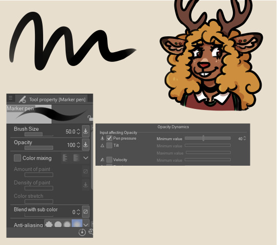
i use this one for a little bit of everything! sketches, lines, coloring, and i'll occasionally block in basic shadows and light sources with it, but as far as that kind of thing goes i prefer to useeeeeeeeeee
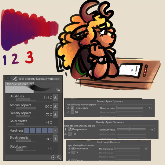
my favorite brush <3... i do all my coloring business on one layer, and that's how i get the blending to look the way it does. you could probably get the same effect by shading on a separate layer from your base colors, but it wouldn't be as easy :/ and we like art to be easy in this house. but if you're shading a heavily patterned character and you don't want to end up blending all of that work away, what i sometimes do is make a copy of my color layer and i'll shade on that instead. this way, you get the easy blending effect and you won't have to redraw anything because the og will still be underneath
with these settings the blending will be pretty much automatic. you might feel like tweaking them a bit, but all you gotta do is just scribble a bunch until it looks good (stellar advice i know). i usually like a not-quite-perfectly-blended look, but if i'm not happy with it for whatever reason i'll use...

this! for Smoothness. OR
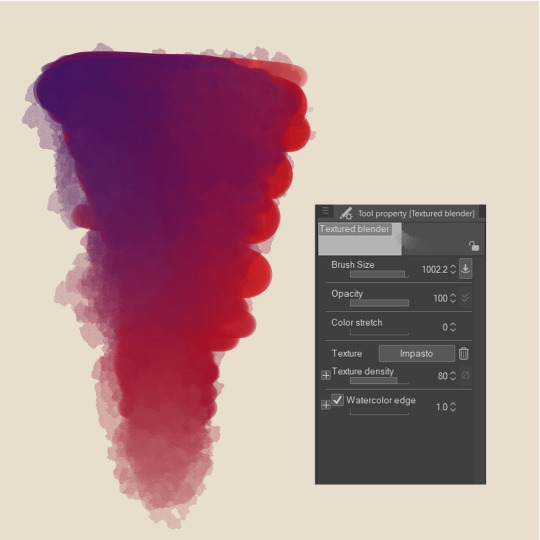
i'll use this ^^ it's nice for hair and such! other than these i only use two other brushes
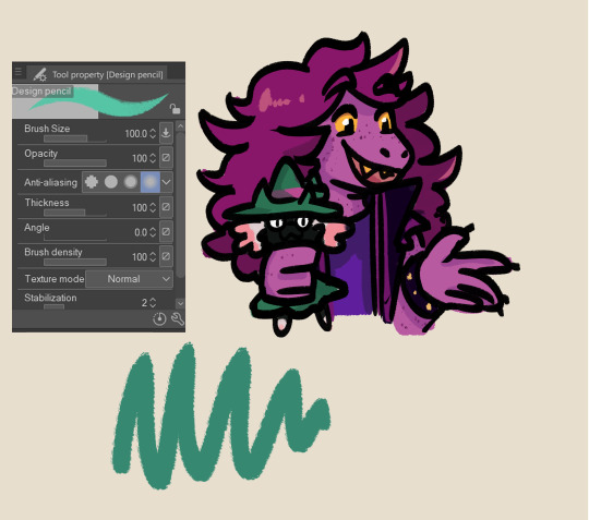
(ralsei likes being held like that)
this one tends to not look too much different from like, the g-pen at first glance but it's just kinda fun to use. it's my other Messy Doodle brush
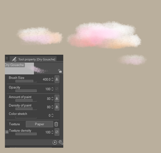
this brush has one purpose and it's clouds.
if i've ever used anything else it was one time to experiment with and it didn't stick so i forgot about it forever (these are all default brushes in csp btw! nothing downloaded because i don't know how to download brushes)
#basically i have 500 gazillion ways of completing any given art piece and this is the closest you'll ever get to me explaining my process#because i usually don't know what it is either <3#doodles#mailbox#the little drawings to showcase the brushes were my warm ups today... i draw noelle so much she comprises 90% of my warm up doodles
23 notes
·
View notes
Note
Is it too much to ask what brushes you use for your art? They're just so pretty and blocky and I can't for the life of me find good replicants.
(Love your art, by the way. I've been meaning to study your style for a while now and your colouring pages are perfect for it.)
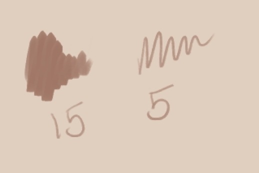
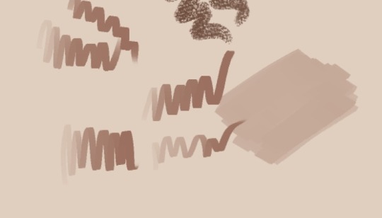
Of course! All the brushes that I use are free, because I'm cheap and also because I couldn't figure out the payments methods inside of CSP, but I did pay for the program I use (clip studio paint) so this only works for CSP unless the artist released them on some other programs:
For example for this:
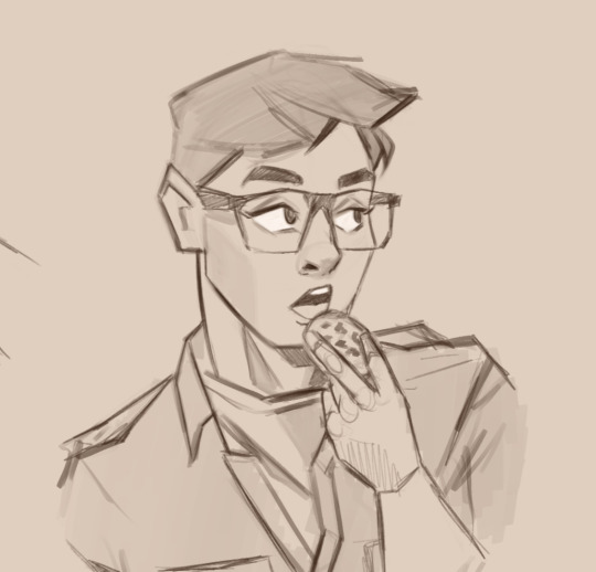
I play a lot with the width of the brush so I don't actually use that many, just these 2 that are kinda new for me:
https://assets.clip-studio.com/es-es/detail?id=1702961
https://assets.clip-studio.com/es-es/detail?id=1702959

The first one is really dense so I like to set it really small to use as liner for small but dark details
The second one it's a funny one because it's actually really sensitive to pressure, you can go from really faint to really strong color and that can feel weird however with a bit of care you can get a constant pressure, but I really like it because of that!!! You can get some really neat translucent efects because it overlaps and it's really sharp! I also used them for Remys birthday drawing,
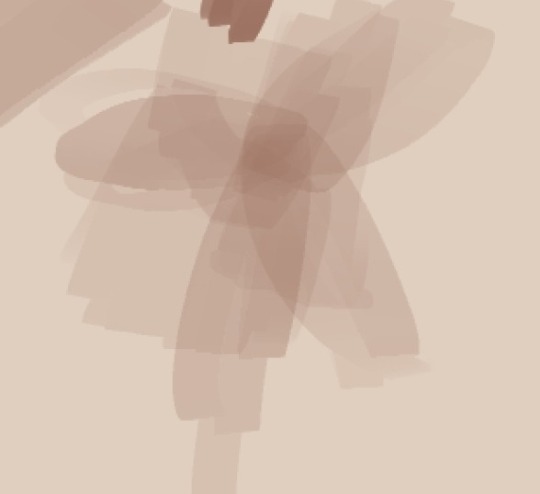
For stuff like this however:
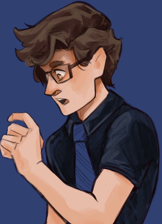
I really like these three, which I actually think are default brushes on CSP, in case they are not I can share the brush file and it's really easy to install but I'm pretty sure they are, names might be different tho because mine is in spanish but there are simply "tempera paint", "fine brush" and "oil"

I really like the "tempera" because it has so much texture!!! but also can look really smooth depending on how much pressure you use and also it's easy to mix with other colors (in the right side I'm mixing with another color)
Meanwhile Oil I like it for sketching or for really rough looks (like in logan's lines here)

Basically I use the same 3/4 brushes per piece but I change the width and stuff a couple of times,
My style is actually really messy, so I lean into brushes that have a lot of texture and these are some of my current favorites, I also reached the limit of 10 pictures on a single post so I might continue on a reblog with the pencil ones that I like.....which are also mainly default brushes (ノ◕ヮ◕)ノ*.✧
I'm not only cheap but I'm also kind of lazy about looking for new brushes, only when I see an art style that really looks like it's using a very specific brush that I don't have, but it's really fun when I download new brushes, it feels like buying new art materials, just plain fun!!!
Also I really like using brushes for things that they arent meant for lmao
28 notes
·
View notes
Text
Brush Resolving Power Chart
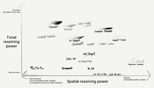
I'm trying to prepare a chart for where some of my common brushes in EnpitsuP would land according to these properties.
Plotting them in the chart is kind of difficult because it doesn't fully capture what each brush is about. But I like how these axes approximate how these brushes are different for a certain purpose.
And I hope it helps people better understand their preferences for their brush.
It has some ambiguities.
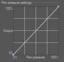
There's a certain ambiguity between
the ability of a brush to get thicker and thinner, which can just be achieved by plainly enabling pressure response. and...
how easy it is to control the width of the stroke based on what the brush is supposed to be for. eg, having a tuned pressure response curve.
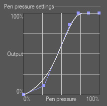
For example, the default CSP G-Pen is notoriously difficult to use because it just gives you the full linear brush size response. But its response isn't representative of how G-Pens work (yield and give) in real life.
And arguably, yeah, it's hard to fully represent that given our current technology. It's definitely a lot easier for pens than it is for paintbrush-type brushes. And yes, setting global pen pressure settings helps with the problem of controllability. But different brushes inevitably require different pressure curves for each of its dynamics (size, thickness, opacity, texture, etc).
And sure, you can adjust it yourself. I'm not sure if CSP's default G-Pen was designed for that. But more than just copying this one graph to fix the problem; digital, grayscale line art has to pass some of the responsibility for the line width falloff to brush density or brush opacity, because otherwise, we get nasty aliasing or other jaggie artifacts that also make lines harder to adjust. I've tried to account for this when I made the Superclean Linework set in EnpitsuP.
There are many other instances of variability vs controlability. It's a hard balance to get right and I hope it's something that my best brushes are able to achieve, even as I try to get the brushes to look great and have a visible personality.
2 notes
·
View notes
Note
aaaa hello, i recently found your blog and fell in love w aa again bc of your retro brushes! if it's alright to ask, what are the other brushes you've used like for your lineless art? the subtle textures and edges are so sweet and i'd love to experiment ^^
Ooh hi !! It's totally fine to ask about my other brushes :D I'm putting this under read more because of how long it got though lmao
Thank you for liking my retro brushes! The ones I uploaded aren't actually all the ones I used in that piece. They're actually missing the textured brush I used to recreate the ink texture that riso printing has. I also had to make these brushes myself, but since I used a texture pack that's been uploaded to csp assets (This one, I used the one called solid-uneven tones, which is actually really good on its own!), I wasn't allowed to upload them without violating the rules on the csp site, but you can get it from my google drive here! I could have just used one brush for all four colors considering there's no halftones, but observe:

On your left, the irregularity you're going for would've been the same on all layers, which creates a lot of blank white spots that might be pleasing for some, but it wasn't what I was going for... plus if you move the layers around it sort of creates a 3d effect that might be cool but also ends up being a bit distracting, so I just duplicated the brushes and set the texture rotation to different angles ^^ In the end it's really up to the look you're going for, though. So feel free to experiment!
I also used this vertical line brush that's super fun to play with. You can see how that looks alone in here (I changed the texture's scale ratio, the actual brush has thicker lines and a wider gap between them):
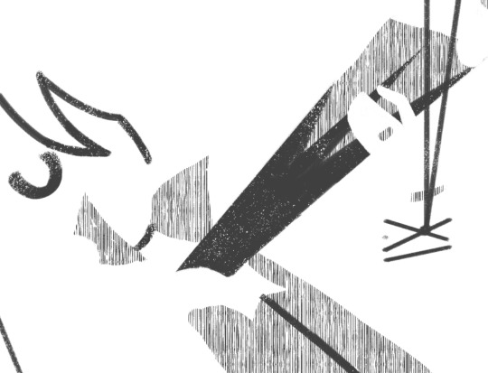
As for most of my lineless art, I actually only use four brushes!

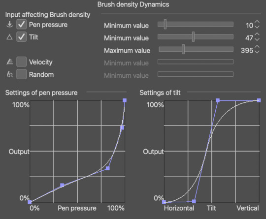
This, for example, was sketched with a modified colored pencil brush that comes default with csp 1.10.9 which you can find here, since it's gone by the version 10.10 update
if you want the exact modifications I did, (since the default brush comes out super light no matter how hard you press) just go into brush tip > brush density > brush density dynamics and change the settings to these! Or however you see fit. The brush engines in csp are surprisingly easy to get the hang of once you've been doing it for a while
I color with two to three brushes! depending on if i want to put in the extra effort or nah
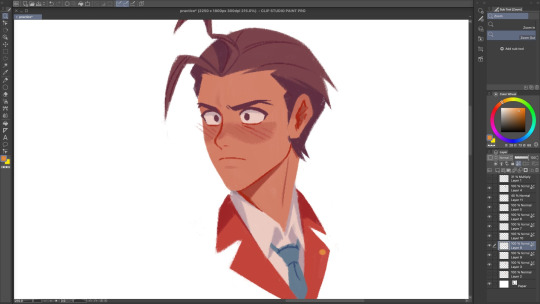
The main brush i use is the flatman soft from @/frenden's megapack which you can find in this post ! It costs maybe 15 bucks? But I believe it's worth it! It might actually be the only brushpack I'm willing to spend some cash on. You get access to so many brushes + any future updates (aka more brushes) so it's a pretty good deal hihi
For softer edges (like blushes, and the fur on this girl's hoodie wahoo) I use either the colored pencil brush from above or the flatman hard from the aforementioned megapack, depending on the kind of "soft edge" I'm going for. colored pencil brush is for anything fuzzy and the flatman hard is good for blending two colors together!

Last brush is the SU-Cream pencil! You can get it over here. I mostly use this for details, like adding lines and drawing the eyes, nose, mouth... the larger it gets the fuzzier it is, too! So you can just as well use it for soft edges if you don't dig the former two brushes
For adding texture to things, I just use this noise texture and the paper texture from this material catalogue ^^ I don't use them much, but I tend to combine the two, and it ends up looking like this, which I think is p neat:

Lastly, did you know you can import abr files to csp? and that adobe gives photoshop subscribers free access to a ton of brushes? and that I don't believe in the inherent elitism and capitalism and anti-ownership mindset that adobe's subscription service model perpetuates?
Anyway, unrelated, but here's a google drive of all the brushes offered by an unnamed over-charging company that I hate that you may or may not be able to use in programs like krita, csp, and procreate
Have fun!!! I'm sorry this is really long I just like handing out brush recs :3
#filing this under uhh#resources#and#brushes#i hope this helps !!!#ask#anonymous#edit: I FORGOT TO ADD TBE LAST LINK F.... but i put it in just now lmao
18 notes
·
View notes
Note
hi!! sorry if i'm being a bother or you've answered it before, but i was just wondering what kind of brush you use for lineart, specifically from the senber video i just watched! i don't use clip studio paint but i'm trying to get settings or ideas of a brush i can use in my program (procreate) and always love the softer lineart brush other people use but i can't figure it out in my own thing
hello! don’t worry, you’re not a bother at all!
i’m gonna be honest, i hate doing lineart so most of the time i just clean up the sketch a little and call it a day lmao. here’s the brush i use (which i think are the default settings):

i love this brush because it feels like a real pencil, as in the opacity builds up as you trace over it again. i also use this one sometimes, mostly for cleaner lines and such:

here’s an example of what they both look like:

from what i’ve seen, the best softer brushes for lineart are ones found in the “pencil” or “pastel” section (or whatever similar thing you have in your art program). tho, tbh i feel like there’s not a lot of brushes in csp so maybe this is just me struggling to do decent with what i have lmao
i’m not very good with brushes myself so i definitely feel you. i think the best advice i can give you is to find what’s best for you; all artists have a different way of working and we all prefer different stuff, and none of it is better than others! so, experiment with what you have until you find something that feels the most comfortable.
(also something to keep in mind, the lineart won’t look quite the same depending on the canvas. i tend to use very big canvas to draw on, usually size 4000x3500, and then make the final image smaller when posting it on sites and such. but again, do what works best for you!)
hope this helped! feel free to hmu if you have more questions :)
3 notes
·
View notes