#EnpitsuP User Notes
Explore tagged Tumblr posts
Visit Tumblr Blog
Explore Tumblr blogs with no restrictions, modern design and the best experience.
Last Seen Tumblr Blogs


Fun Fact
Forty percent of Tumblr users are between the ages of 18 to 25.
Text
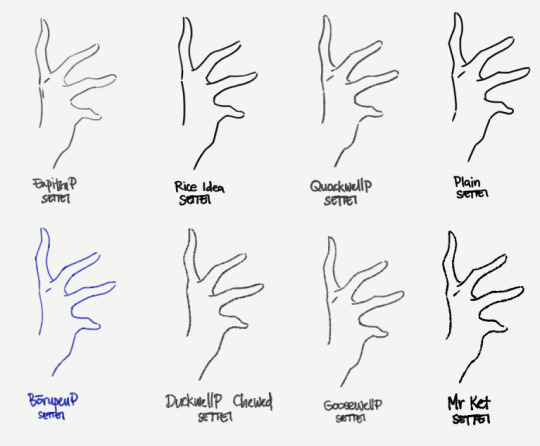
EnpitsuP Settei
I'm trying to finish up on the few demo/showcase/test uses for the EnpitsuP Settei
I figured the better way to document these brushes in a way that's actually usable for users is to just put down my thoughts as I go. So I started this separate blog.
Motivation
The Settei set was inspired by a pretty common need that comes up for me:
Sometimes, I just need a pencil or line brush that's not overly clean (has some texture and grit) and doesn't have too much variation in opacity and thickness.
What is it for?
I know some people just like the feel of this style of brush. But for me, this is particularly useful for:

animation and animation tests, where variations in thickness and opacity causes distracting flickering; A little bit of it can add to a charming look, but too much will make movements fall apart.
writing, where the evenness helps readability;
clean, uniform lineart, like simple, cute illustrations, or anime-inspired illustrations;

and just certain of styles of studies and line doodles in general.
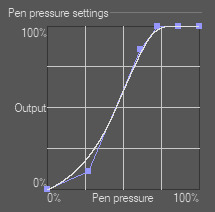
Why have pressure response at all?
This is sort of halfway towards having a plain brush with the pressure sensitivity turned off altogether, which makes me feel uneasy when I use it because it feels a bit like an uncontrollable firehose when I just press the pen lightly.
The Settei set is designed to have a little bit of pressure response so I can at least still feel like it's obeying my stroke, but still mostly stay within a narrow and predictable range of thickness and density so that it's easy to achieve uniform lines. It's a bit more like a pen with flowy ink than a straight binary tool.
The pencil ones retain their ability to side-shade with a really low opacity. I'm actually not sure how useful this will be in most cases, or if it will adversely affect iPad users in particular. I’ll have to update it if it becomes a problem but from testing, it has been okay.
On pencils and [Compare Density]
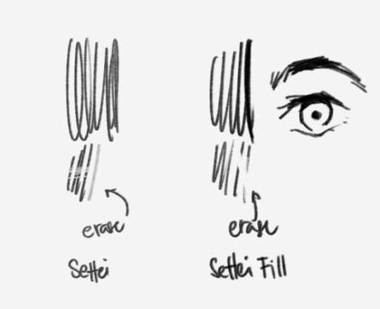
I've chosen to set the brush blend mode of the pencilly ones like Quackwell to [Compare Density] which serves the purpose of better uniformity. But that makes it not work well as an eraser (when you switch to Transparent color). Not everyone uses this but I recognize that enough people do, so I included a "Settei Fill” version of Quackwell as an example of how to make it work better for that purpose, which is just to set the brush blend mode to [Normal].
Incidentally, this is useful in cases where you may prefer to sculpt the strokes or fill-in areas with black, like parts of anime-style eyes.
Of course, it's not for everything
Like most brushes, I don't think think this is a literally-use-it-for-everything-now brush.
For sketching most things, I'm more comfortable with pencil-like brushes that do have opacity response. And I know a lot of artists who prefer to work that way too. I'd be pretty stressed out while drawing if I used the Settei brushes for the sketch stage of a big, clean drawing and I didn't know where it was supposed to go both in big chunks and in the small details.
On "standard" anime cels
The actual typical anime pipeline requires a lot of things to be predictable, efficient and easy to edit and process. So don't misunderstand this set as anything close to what is actually used to produce anime frames.
The standard practice for anime production is to use pure black, aliased/pixelated pen brushes and curve tools.
This is necessary to make it easy for different artists to work on different steps and pass it to each other for editing, correction or completion. And the aliased lines and blocks of colors are especially important for the compositing step (in a program like After Effects), where colors are adjusted, final lines are smoothed, and overlays and effects and motions are added.
One type of character sheet specifically uses the same aliased brushes to be used in their actual production to help different animators keep the same look (brush size, simplification levels, etc) when making actual frames for the animation.
Using custom textured brushes for a finished animation is a deliberate artistic direction that has to be made, and comes at a cost of increased complexity to a scaled up anime production.
If you're just one or two people making stuff for fun though, using something like the Settei set for short animations is not a problem at all.
13 notes
·
View notes
Text
Brush Resolving Power Chart
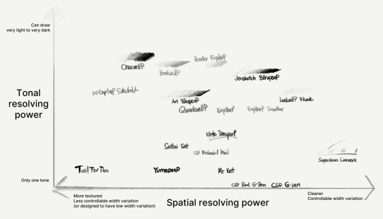
I'm trying to prepare a chart for where some of my common brushes in EnpitsuP would land according to these properties.
Plotting them in the chart is kind of difficult because it doesn't fully capture what each brush is about. But I like how these axes approximate how these brushes are different for a certain purpose.
And I hope it helps people better understand their preferences for their brush.
It has some ambiguities.
There's a certain ambiguity between
the ability of a brush to get thicker and thinner, which can just be achieved by plainly enabling pressure response. and...
how easy it is to control the width of the stroke based on what the brush is supposed to be for. eg, having a tuned pressure response curve.
For example, the default CSP G-Pen is notoriously difficult to use because it just gives you the full linear brush size response. But its response isn't representative of how G-Pens work (yield and give) in real life.
And arguably, yeah, it's hard to fully represent that given our current technology. It's definitely a lot easier for pens than it is for paintbrush-type brushes. And yes, setting global pen pressure settings helps with the problem of controllability. But different brushes inevitably require different pressure curves for each of its dynamics (size, thickness, opacity, texture, etc).
And sure, you can adjust it yourself. I'm not sure if CSP's default G-Pen was designed for that. But more than just copying this one graph to fix the problem; digital, grayscale line art has to pass some of the responsibility for the line width falloff to brush density or brush opacity, because otherwise, we get nasty aliasing or other jaggie artifacts that also make lines harder to adjust. I've tried to account for this when I made the Superclean Linework set in EnpitsuP.
There are many other instances of variability vs controlability. It's a hard balance to get right and I hope it's something that my best brushes are able to achieve, even as I try to get the brushes to look great and have a visible personality.
2 notes
·
View notes