#the beginnings of the circle artstyle lol
Explore tagged Tumblr posts
Text


#ff7#tifa lockhart#cloud strife#aerith gainsborough#final fantasy 7#my art#probably the oldest of my silly looking ff7 art#the beginnings of the circle artstyle lol
461 notes
·
View notes
Text
one of the little subtleties in season of mists i love is the subtly different way Dream presents himself to the different ambassadors, like even down to what he’s wearing. he’s slightly different for everyone and i love thinkin about the attention to detail, it would have been so easy for him to be just in his full on dream king mode all the time but instead we get this (sorry this is gonna be long but i love this. its a sandman blog this is what u signed up for lol)
the first one to show up is odin, who offers up a prediction of ragnarok containing a fragment of dream’s soul

dream is in his casual moping outfit, t shirt and probably jeans, but sits above odin. it’s possible this is to sort of remind odin that dream is in charge here, since odin is a trickster and considers tricking dream through basically the whole book. the candles are probably a reference to something smart neil gaiman read but i just think they also add to the neat border, separating odin and dream.
he’s also pretty polite to odin, genuinely considering the offer and generally being nice about it (well. nice for dream lol)
next we cut to jemmy (ambassador for chaos)
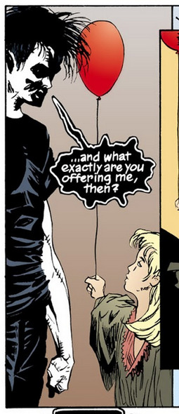
this is immediately distinct because she’s stood so close to him. while odin was a little bit away and dream was sat above him, here thanks to the height difference that’s already there i guess he didnt think he needed to bother
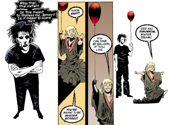
dream is much harsher to her than odin (although not the worst he gets) the other think i wanna say is i think the image of dream with his balloon is very sweet
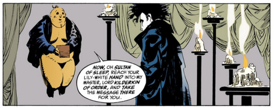
the candles are back when order’s messenger shows up, and he’s put his big dramatic coat on for being big and dramatic in. with the wide shot at the end the candles seem to once again be a barrier, this time against the floating emissary, shielding dream and keeping him in a little circle (whether this is the intention of dream or it’s a fun little bit of imagery to show how isolated dream has made himself, who’s to say)
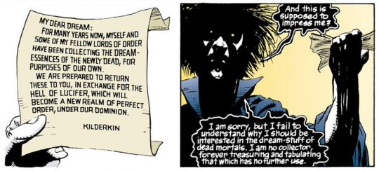
he’s also a lot meaner again, outright dismissing kilderkin, which shows that he was being very nice to odin at the beginning. maybe he puts on his coat to be scarier after chaos just straight up threatened him
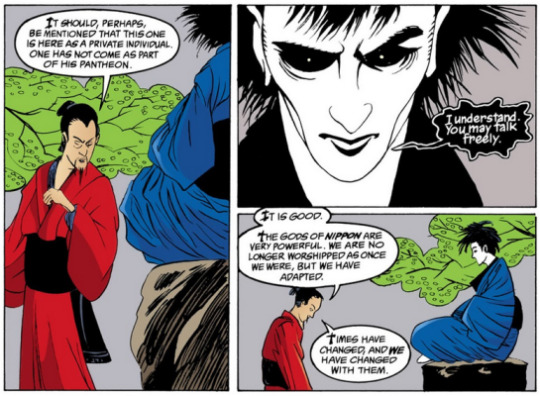
i always enjoy a shift in artstyle to represent the perspectives of other cultures, especially dream in similar clothes that i do not know the name of (sorry) also it’s weird seeing him in blue instead of black, obviously the way they draw black often uses blue to highlight but idk it’s just different and i like it. his words are similar to how he spoke to odin, and the offer is considered on the same level
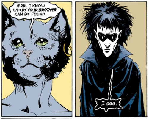
bast and dream have at least something of a history together (correct me if im wrong it’s a while since i last read brief lives) and are a lot more direct. maybe the short, single word phrases mean he’s slightly taken aback or maybe it means this is the fifth meeting he’s had and he just remembered there’s still more to come and is very tired
also, lovin the collar
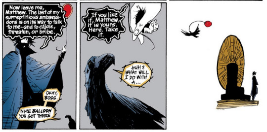
matthew interlude! this is very cute. moving swiftly on!
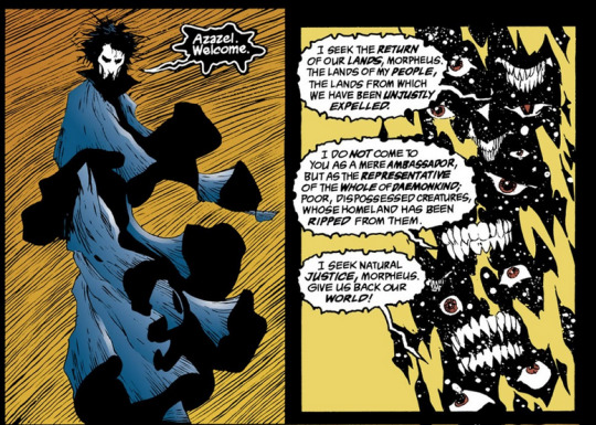
in terms of his physical presentation, i think azazel is the most interesting. for one thing, he’s hovering to match, and his cloak thing idk what to call it has a bunch of layers overlapping much like azazel’s many eyes mouths etc. the fact that azazel is the one one to really take offense with his cautious diplomatic tone is fun but not really unexpected, he’s a fucking demon.
oh also he’s back in his t shirt when the angels come and take the key. worth mentioning but i forgot to get screenshots lol
#writing this up makes me wanna get that annotated sandman book#comicc#season of mists#sandman#the sandman#lily liveblogs#dream of the endless#neil gaiman#long post#sorry but also not sorry
209 notes
·
View notes
Photo
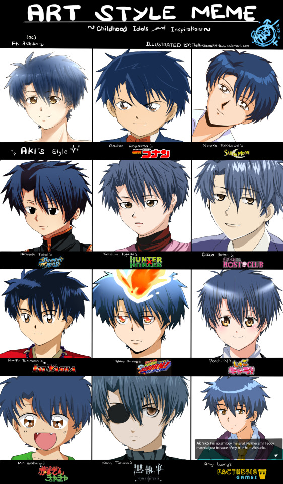
An artstyle meme of my childhood inspirations! Drawn from 2016年. I butchered a lot of them but, close enough :’)
Ridiculously lengthy description from DeviantArt:
You can find the blank template here: fav.me/dalsfkf
If you're using it, make sure to tag me so I can see your work! ;w;
Okay, so, I've wanted to do this for a long time now. xD
Took me 3 days to make, but holy flying potatoes, it's all worth it. My younger self can rest in peace now. ; n ;
There were a bunch of art styles I wanted to try to mimic but I decided to cut it in sets and start with this one for now; a set as a tribute to the art styles that helped me develop and improve my very own from the beginning of time--Featuring my male OC persona [*at this time lol], Akihiko Shourikawa.
I'm aware most of these are anime adaptions (thus pure cell-shading with my coloring)and perhaps the company that animated the series did some changes on the original art style, but eh. I think the spirit of the original art style's still there haha
I also thought of including other series that have been part of my childhood like
Cardcaptor Sakura,Yakitate Japan,Samurai X,Slam Dunk,Yamato Nadeshiko, Special A, Kaichou wa Maid-Sama, and Ranma 1/2 but those weren't really much help in my art style's development (that, or I just really couldn't attempt to mimic their styles x'D)
And so, here's 11 art styles that made it in this art meme that I owe a lot with my own from childhood.
The hyperlinks will redirect you to the author/artist's and series' information, as well as the character's picture that I used as a reference for drawing.
Oh and this lengthy lengthy description per art style is just a bit of my reflection, perhaps with some really old drawings of mine occasionally linked here and there to see how they influenced me haha it's too long, carry on if you must xD
GOSHO AOYAMA ( Edogawa Conan fromDetective Conan ) This is one of my very first anime series, and it scared the living lights out of me while simultaneously making me feel like aiming to become a real detective someday.(Buuut reality's a douche, real life detective work ain't that fun, and I got no brains for it. Dreams shattered.) What intrigued me the most was the way the nose was drawn in the series. Noses in animes were usually triangular in shape, but this one has a literal triangle as a nose. XD It had a very distinct art style that was very easy to mimic for me, and helped me with mischievous facial expressions like the symbol smirk Shinichi/Conan usually does in the show. It is much, much simplistic compared to the other art styles, but it's very memorable and neat.
NAOKO TAKEUCHI ( Tuxedo MaskBut I used a different character as reference hahafromSailor Moon ) This one brings me back to good 'ol days haha. I remember being addicted to Sailor Moon at one point and some other similar shows like Sugar Sugar Rune and I made (or attempted to, anyway) my own Mahou Shoujo story...it's giving me the nostalgia and cringe. .v. Anyway. Her art style was certainly girly, but I liked it. The earliest memory I have of this is basically sparkles. This might as well be where my love for sparkles originated haha I didn't do very good in imitating it, but I tried my best. xD Akihiko's hair wasn't the easiest to emulate into Sailor Moon's style. And I was trying not to imagine the kimochii face meme, but failed midway. I am so sorry Naoko Takeuchi.
HIROYUKI TAKEI ( Yoh Asakura fromShaman King ) Because of an older sister, I've been influenced and made fun of from watching a lot of shoujo/mahou-shoujo animes. But there was also a point in my life where it was all pure Shounen. Shaman King is part of that. xD Aside from the characters themselves in the series, I found the art style cool; The eyes were barely anything special and it was only black fill with a bit of circle lighting on an upper portion (for the most characters), but it looked cool and even much more expressive compared to some anime styles that have full detailed eyes. And for the lols, enjoy this and this and this Shaman King fanarts I made when I was...8? 9? 10?? Basically really really weabish and kiddish orz to make you feel good about yourself and your art. Dear lord. xD
YOSHIHIRO TOGASHI ( Killua Zoldyck fromHunterXHunter ) You cannot talk about HunterXHunter without hearing me fangaying into the distance. Jk, I just really love this series. The actual show aside, the art style was...honestly, okay. It wasn't bad, but it wasn't really that good either. But it shined the best in its best moments in the anime. Oh and I'm talking about the 1999 version one, btw. x'D After some years went by and just recently I replayed the series, and it inspired me a lot. There was one time in class I doodled and it came out kiiiinda similar to Killua and Gon and this one random OC that I made while thinking of Komugi from rewatching the series over and over too much. JK who am I kidding, there's no such thing as rewatching HxH "too much", amirite. And I really love Killua. Hhhhhhhiatus.
BISCO HATORI ( Tamaki Sou fromOuran Highschool Host Club ) Wow, I made Akihiko look bishie with this style o-o; Anyhoo, hands down, this is probably my most favorite reverse harem anime/manga. Outside the show, I didn't really find the art style all that appealing at first; it looked like the short and thin style similar to most shoujo stuff like Special A and whatnot. But I eventually saw the beauty of it; the gracefulness and smoothness of the style was pleasing to my eyes and I eventually loved it. I did make a fanart of the group from 2 years ago, buuut it was 'eh' xD I might as well remake it sometime. As for what it contributed to my own style, I can't think of any obvious traits but from this style, I've learned that eye highlights can also be placed at the bottom lol (because I always see them on the upper left or right and I just went with that ever since. xD)
RUMIKO TAKAHASHI ( Inuyasha fromInuyasha ) This one was the first anime series I ever binge-watched. It also influenced me the most when I was just starting with drawing, along with the series Ranma 1/2, also made by the same person. But the style I mostly absorbed was the one on Inuyasha's. My oldest drawings got burned but the ones I saved that had the most prominent Rumiko Takahashi-style influence was this and this. My eyes are cringing to death. I was like 6 or 7, dammit. Anyway, this style in general, now that I look back to it, wasn't the best. It had the old feel most 90's animes do, but it was still very memorable and still displayed coolness with Inuyasha's best moments in my memory.
AKIRA AMANO ( Sawada Tsunayoshi fromKatekyo Hitman Reborn! ) Tsuna isn't the coolest shounen protagonist, especially from the beginning of his story. Characters like Yoh and Gon were already intriguing and gave off a 'cool' feeling since the very first episode, but Tsuna was...no good. xD I always found the style on Tsuna's character a little too girly and unfitting, and it was sorta annoying at first. But when later arcs came along with other characters, I saw the variety in Akira Amano's art style; The cuteness of the arcobalenos and child characters, the girlyness of most female characters and the coolness of characters like Hibari, Lal Mirch, and especially Tsuna's dying will mode. It was amazing, and I aimed to have that sort of variety in my own style, too. I'm still struggling with that goal, but I'm slowly working on it. xD
PEACH-PIT ( Amu Hinamori fromShugo Chara! ) Oh. my. god. This was the shoujo series I got most hooked at. I was so obsessed with this series that I made so much fanart for consecutive years. Like this and this and this and ooh, this and of course this one. What can I say, I loved this series when I was a weabkid and I still love the art style up until today. I aim to make mine as cute and neat...and so far I'm failing, but I'll slowly get there. xDD And now I can see how a lot of its art style influenced my own. It's kinda cool and weird to see lol And Akihiko turning into a full shota xD
MIN AYAHANA ( Chacha fromAkazukin Chacha ) It's one of those silly old animes I really enjoyed and loved. The cute art style complimented the show very well. I found it to be similar with some other animes that aired in its time (around the 90's, I guess? I dunno, I was born in 2000 sooo... xD), but this one had bigger eyes and bigger mouths. It was...odd, but super, duper charming and cute. xD It helped me a lot with chibi expressions and developing my own chibi style in general.
YANA TABOSO ( Ciel Phantomive fromKuroshitsuji ) Yana Taboso's artstyle is one of the prettiest art styles I've ever seen. I first saw the anime, and it was great. When I took a look with the manga, holy crapola the art is just as good, if not, even better. It's unfortunate that I butchered it. XD I AM SO SORRY YANA TABOSO, I'VE DISGRACED YOUR HOLY ART STYLE-- I didn't really absorb much with this style, ( Even though I wish I did, I should revisit this series =w=; ) but upon watching the series, there was a dark time for me when my art style was changing and so confused from my desire to be alike to this style, kinda like this and this. Dark times. But I surely want to further study this art style.
And lastly, but definitely not the least,
AMY LUONG( Teddy Emmick from @Pacthesis Games (Specifically, Chrono Days Sim Date) ) Where do I even begin. Amy's my flash hero, as well as the reason why I pursued digital drawing and told my parents "Hey, I think I want a drawing tablet". Aside from spending most of my adolescent days playing her games, (wait, am I still considered adolescent now. I'm confused xD)I also splurged in attempting to make my own. It's still in the works, but hey, it's slowly comin'. xD I think this was unconsciously done by my brain, but now I can see how kinda similar my art is from hers. She's definitely one of the most biggest impact on me and my art as of today.
And so, if you got all through that, congratulations haha
And a big thank you to these artists, even if they'll never see this, they're the reason why my art is how it is today. And I wouldn't be drawing if it weren't for them. Please do check them out if you've got some time! They're wonderful and inspiring artists and creators. ^^
AND I'M SO SORRY FOR BUTCHERING YOUR STYLES OMFG I SWEAR I DID MY BEST ; A ;
Welp, now that this is done, I'm gonna go rest and start on my pending stuff haha
I'll probably make more of these, the next batch being art styles of some close drawing buddies I got.
But that's all for now, and I hope you have a great day! > w < )/
~ How about you, who were your childhood idols and inspirations? ^^ ~
#akazukin chacha#art style#art meme#challenge#detective conan#hunter x hunter#black butler#pacthesis#sailor moon#shaman king#ohsc#ouran high school host club#inuyasha#khr#katekyo hitman reborn#hxh#shugo chara#art style meme#headshot#digital art
57 notes
·
View notes
Note
heyyyy!!! i was wondering, do you have any advice on making heavy stylisation look good? I really like your art style and I want to stylise my art in a similar vway (obv not actually copying) but it looks weird. how do you make it good? ( i'm sorry if you don't do asks like this pls feel free to ignore my stupidity )
hmmmm i think i kiiiinda get what ur tryna say but im also not very smart so if i answer this wrong then i am sorry 👍 also this is rlly long sorry again LOL
when it comes to heavy stylization you can be pretty free as long as you make sure the thing u drawing is still recognizable as what u want it to be, so maybe if u struggling with people not being able to tell what ur drawing, ask them/ur friends how to make it look like what ur tryna draw. if that makes sense.
u also gotta keep the MAIN things that represent what ur drawing. like. whats the first thing u think of when u think of it, for example: when i think of cats, i think of long tails, unique faces, and funky poses. so when i draw a cat those are the things i KNOW i NEED to add or else it wont make sense. when i think of a dog, i think of expressive eyes, big mouths & snouts and strong legs. when i think of birds i think of very different beaks and lots of types of feather patterns & colours. that makes sense? i think? if u arent sure what the thing ur drawings main things are, LOOOK AT REFERENCES!!!!!! LOOK AT REFERENCES EVEN IF U KNOW WHAT UR DRAWINGS MAING THINGS ARE ACTUALLY!!!! TRUST ME, IT HELPS!!!!!
when it comes to MY artstyle, specifically when i draw cats, i always like to make the head the most interesting part. the head is the beginning, where i start. the head can either be a circle or a square, with a little chin added to the bottom. then on the cheeks i add the fur. the fur, imo, is one of the things that can either make or break a good design. if you make a soft, kind, motherly, cute character spiky and over detailed, people wont recognize it and it wont make sense to then, so u gotta make the character soft and round. the ears are… the ears. they are simple in shape, but strong in the emotions they convey. to me, ears down means sad, ears back means angry, ears pointed up mean interested/shocked and then a relaxed looking ear means. they are relaxed. i try to over exaggerate this alot because it helps the character show their emotion better
the face of the character is the hardest & most important to me. the size of everything on the face is very important; younger/ “cuter” characters have bigger eyes, and a less detailed muzzle while stronger/menacing characters have small eyes, a bigger muzzle & more detailed facial features. i LOVE to use eyebrows to exaggerate the emotions the character is feeling. thats also why i believe the eyebrows are one of the MOST important parts in ur art, because just changing them slightly can alter the entire way a character looks. the nose is. idk the nose is the nose i dont add anything special to it other than in i want to make a character look bratty/mad i add a little…. uhhhh… line above the nose that looks like snarling ??? i hope that makes sense. the mouth is also pretty important. i like to make the mouth extra big and think about the way a HUMAN mouth expresses emotions, instead of a cats. try not to add too much detail to the inside of the mouth aswell, UNLESS your trying to get that to be the main thing people look at
for the body, you can be pretty free with the body, ESPECIALLY when its a cat. remember this; cats are VERY flexible, so u can have alot of fun with the pose. ive seen alot of artists sketch out their poses with boxes and circles, but imo, it makes the character look stiff (unless its a person). try to sketch your cat with lots of curves, less sharp angles (unless thats what ur going for), DONT draw the fur in your sketch; it wont help and will probs just confuse u. body SHAPE is also rlly importan. similar to what i said earlier, if u draw a cat whos meant to be muscular and menacing and big, drawing them with soft, little legs and a small, round body will confuse the person looking at ur art. cat bodies irl are kinda all the same but thats BORING so u gotta mess with it. make legs and necks tall and skinny, make neck fur way too big and make ur cat look like its a body builder, make it look like a munchkin cat. HAVE FUN WITH THE BODY!! thats all im tryna tell u here. if u limit urself to realism, you’ll never develop your own special artstyle. youve gotta put a bit of creativity into ur art, yknow? make u cats look like theyre from a cartoon! make it look like a kid did it! who cares!!!!!
other important things u gotta watch out for; you MUST. size the body up enough that it looks like it could hold the head. what im saying is try not to make ur cat look like a funko pop (unless thats what ur going for then thats fine). you can still make the head big, but dont make it look like a toy (like i said, unless thats what ur going for). and when it comes to patterns & fur colours, i like to try to make the patterns look semi-realistic but i go CRAZY with the colours. ive found no matter what colours u give ur cat its probably still gonna look like a cat, so have fun!!!!!
i hope this sort of makes seense ?????? if it doesnt then im sorry
24 notes
·
View notes