#that’s why the lines are thicker
Explore tagged Tumblr posts
Visit Tumblr Blog
Explore Tumblr blogs with no restrictions, modern design and the best experience.
Last Seen Tumblr Blogs


Fun Fact
Mobile US users spent an average of 115.8 minutes on Tumblr app monthly.
Note
Not sure if you ever mentioned, but what IS your favorite flavor? I can't tell from looking at the cake.
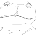
#uhhhh uhhhhh i dont have a reason#leave him be he needs to fix his mascara!!!!!!#the top line (whatever thats supposed to be) will be a bit thicker for a while i guess lol#teehee#[you've got mail!]#spamton#spamton g spamton#deltarune#deltarune spamton#deltarune chapter 2#his must have tube of mascara always in his inner blazer pocket or smth cant go without it lmao#no clue why but i had the urge to do the text. i didnt need to. it was like 10 minutes of extra time. but... idk waiting to see what he say#has more charm#hes using his little really really dim reflection on the monitor to clarify#its bright enough in the dark alley that it isnt an issue :-3#i feel like hes a chocolate guy what can i say
157 notes
·
View notes
Text
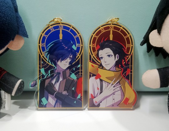
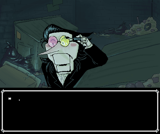
after months of doing this art i finally got them made as charms ehehe they turned out great i wanna make more
#ryomina brainrot#theres a little tiny problem with the printing with makoto's#but im not too bothered by it since i made these for myself#maybe if i made that line thicker maybe it would have printed?#idk the earphone wire printed fine idk why the blue shadow thing for it didnt#thank fvck i didnt mess up the colors this time#the first ryomina charm i made was too dark#didnt go well as cmyk#but i really only made that as a test#trial and error yeee#thank you to my twt mutual for showing me that manu that was just what i needed LKHFSKDF
77 notes
·
View notes
Note
what kind of brushes do you like to use for your art? i can see from your tt that you don’t use procreate, but are there types that you like?

hmm i'm kinda lazy so honestly if i find a brush that feels right i'll stick with it until i find myself in an art slump, and what feels right depends on what mood i'm in?
the first brush is the one i've used for pretty much everything in the last year - i've been favoring chunkier lineart/filled in shaded areas with a slightly gritty texture and this brush is perfect for that! i also set it to like 70% opacity so i can add value by layering my strokes
the brush in the middle is what i used most around 2022-2023 and it's almost the opposite of what i'm using rn 😂 it's a little hard to see but it gets thinner/more transparent depending on how fast the line is drawn and i love that it works like an ink pen
the last brush is just a fun one i like to use for texture, mostly when i'm coloring!
#in the end i think finding a good brush comes down to how you draw and what you want to focus on#like i've been focusing on general shapes and sort of carving out lines by making them thick and using an eraser to shape them in areas#which is why i love the brush i'm using now#but that's harder to do with the pen brush because the transparency and the fact that it gets thicker at the ends instead of tapering#makes it obvious when you start and stop or erase a line in the middle but the pen is good for building speed/line confidence and precision#which is what i wanted most then!#okay i'm done rambling but i hope this helps!!!#michelle answers#waveoftheocean faq#theora-aura
26 notes
·
View notes
Text
Linktober day 15- sword


Guess who found her duck eggs >:)
In case you were curious, duck eggshells are much thicker than chicken eggs. This means that for carving holes, they are suitable, whereas chicken eggs are much more difficult. Also my chickens have starting laying more so. More egg carving yay
#linktober#Loz#Zelda#I haven't been able to carve as in fully cut through shells in a while without a thicker type like duck eggs#which is why some of these lines are wobbly it's been a bit#smoll art
27 notes
·
View notes
Photo
Maybe I just missed it, but I haven’t seen anyone do this absolute classic with Huntlow yet, so I took it upon myself!
#ranty draws#hunter toh#willow park#huntlow#winter toh#golden garden#the owl house#the golden guard#treasure planet#fanart#why yes this does take place between ASIAS and Hollow Mind#because shenanigans#had fun with this#really want a thicker line style but this will do for now#I forgot Willow's green streak but at least I remember Hunter's eye bags for once in my life#hunter noceda
841 notes
·
View notes
Text

drew Starlo from memory >:3
#undertale yellow#starlo uty#art#traditional art#fanart#I initially drew him in a pencil sketch earlier#but then I looked him up earlier and I panicked cuz the sketch looked horrible#so I did the lineart over it cuz I wanted it to look good#but it wasn’t cooperating#so I made it thicker#…the lines#and then I colored him which made him look a lot better#until I messed up and panicked again#but I fixed it 👍#goddamn I just wrote a whole fuckin story in the tags wtf#I think I have the purple soul#cuz I can’t go anywhere without my notebook#and I wear glasses#what if they make like an undertale purple or something#that would be so cool#GODDAMIT I DID IT AGAIN#HERE I GO RAMBLING IN THE TAGS AGAIN#yeah I started talking with a southern accent after drawing this#what of it#i mean i was already really good with the accent prior to that drawing#cuz I grew up in Texas#why do i keep doing this#why do i keep rambling#keki draws :3#ktp25
39 notes
·
View notes
Text
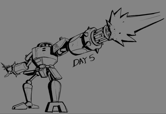
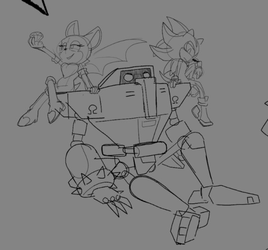
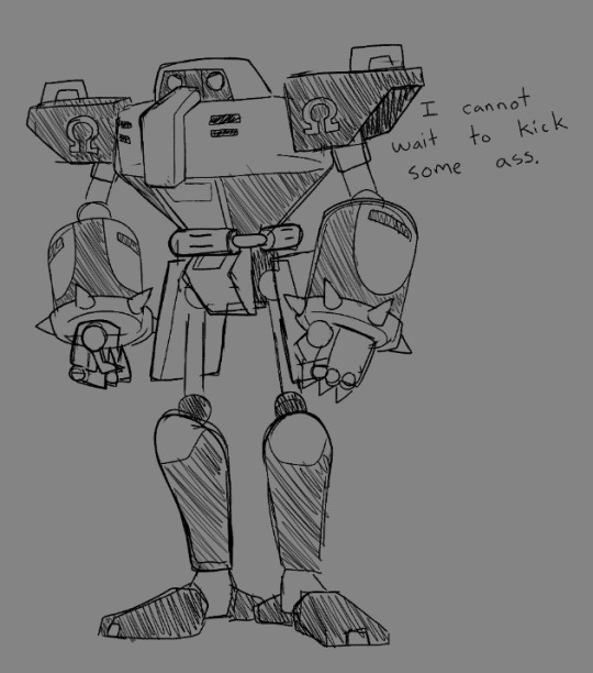
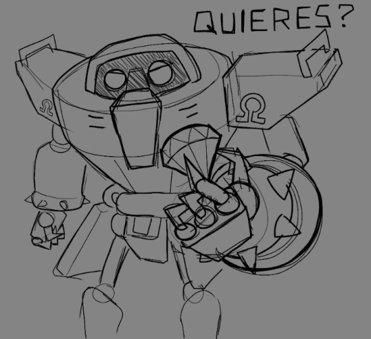
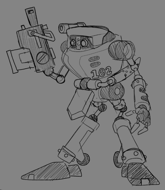
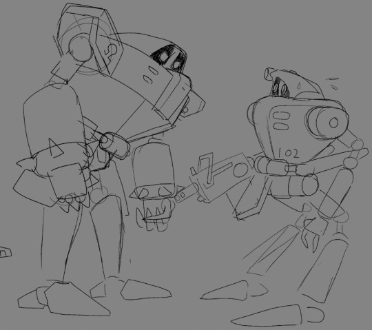
Day 5, the ANNIHILATORS!!
#i didnt draw these guys as much as i wanted to but it was fun regardless#big fan of these funky bots#i really like how that first one came out with the thicker lines :)))#when these guys come up again i might make a more dramatic sketch for gamma <3#art art#sonic#sonic fanart#sth#e 123 omega#e 102 gamma#if youre curious why i dont tag guest characters like rouge or shadow here its because i dont wanna clog tags#if you want shadow fanart.. this isnt that just because he happens to be in the bg of a post thats 95% robots
62 notes
·
View notes
Text
Wake up babe, I fixed your son.


It's not perfect but I tried, kept the heart bc I thought it was cute, but got rid of the rest of the random lines bc I don't get why they were there in the first place. They don't even line up with any actual articulation points or anything.
In the original, he's smiling but doesn't have any skin crease under his eye, so the smile doesn't read as "I'm a friendly fellow who's glad to see you!" it comes across more as "I am about to bite you😀 "
All of his iris and pupil are visible which almost always looks creepy bc you only ever have a completely unobscured eye if you're pulling a surprised/scared or really angry expression. His eye closest to the camera is also slightly too small and looking in the wrong direction so he looks really vacant and like he's not actually "seeing" anything, just staring blankly. He also didn't seem to have an eyelid of any kind. like a crease just above the visible eye where the eyeball is lying under the skin and makes a slight lump, without it his face looks really flat and weird.
I gave him a tad more nose bridge just because his nose is so tiny that on a 3d model under any bright light it just completely vanishes. Also, i get that his eyes are meant to look like camera lenses, which is a very cool idea in theory but in practice looks REALLY creepy to have his whole eye like that, I could see it working if it was just his pupil (03 kinda does this in close-ups when he scans stuff) but having that texture on the iris too just looks grim. not to mention that it'd be a massive robot giveaway that would mess with the whole secret identity thing they're planning.
Got rid of his individual teeth and turned them into just one white slab bc they p much always look horrifying on cartoon characters and this is no exception. And lastly, I smoothed out the weird dent in his hair because I don't get why it's there in the first place, it looks like he was dropped on the head.
Also, this is very much a random thing I noticed, but the lines on his chest are really warped on one side which looks to me like his model isn't mapped/rigged (< not a 3d artist so idk if that's the right term) very well and it's causing weird texture stretching because of the extreme posing.
#When in doubt make the lash line thicker#idk why they keep trying to make him 3d#it don't look good...#astro boy#astro boy reboot#tetsuwan atom#osamu tezuka#edit#screenshot edit
46 notes
·
View notes
Text
Babe wake up new sanrio collab

Transparent under cut!
#I don’t think I’ll ever master the sanrio art style wwww😔#LC’s wonky art#yume time#I’ll tag the reach stuff later#I SHOULDVE MADE THE ONLY LINES IN THIS DRAWING THICKER WAHHHHHHHHH#I never like making and looking at my art that’s made to mimic this collab but I do it anyway bc uh. bc. I.#why do I do this?#a3! yume
13 notes
·
View notes
Text
unfinnished wip

so i just remembered i have like 45 different unfinnished wips (aka like all my art) and i remembered i was going to make som e art for a sound i found on tiktok, i never finnished it duh but heres a frame of the "not animation but its like 3 different images that change when the time is right so its basicaly an animation but now im rambling and entirely forgot what i was talking about because my brain is entirely focused on being gay". i thought this frame was the funniest
#jesus christ these lines are thicker than your mom#homestuck#dapper.bmp#homestuck art#june egbert#vriska serket#junevris#vrisjune#spiderbreath#how did i think this was acceptable#where the fuck does her hand go#why is the line thickness 15????#what the fuck is that blush#at least theres vriska sit edited to have a singular kiss mark and blush#so thats fun#“hey look at me i'm a homosexual 8 have gay sex w8th my girlfr8end June Eg8ert 8luh 8luh huge FAG (fut8rearachnidsGr8p)”#this is a very old one btw
37 notes
·
View notes
Text
i dont want to give in to Modern Shapewear but i really hate when im trying to have a Fun Outfit and theres fucking Distinct Lines from various under wear bands (bra, undies, maybe a pair of tights?) all at separate points? that are impossible to hide bc the outer wear is fucking form fitting spandex
#toy txt post#if it were easier to make bespoke structured underclothing to create a smoother silhouette. god. i would. but thats so much more investment#in time and money and materials and hours to probably fuck it up at least the first coupke times vs just buying a fucking tummy control#camisole or some shit. but i cannot fucking stand the marketing around it. i dont want to put money to that. im not trying to Look Thinner#im trying to achieve a specific smoother silhouette w my clothing to look like a little clown and vintage silhouettes#rely so often on structured underclothing that the closest analogue to today is: fucking shapewear! unless i go out and get an actual#corset. but those tend to be more expensive. and im not aiming necessarily for the classic corset look i feel like a lot of the ones for#sale offer which seems to be very......booby. but the flatter more smoothing silhouette that was consistent between both menswear#and womenswear. the lengths it takes to be a nonbinary fucking clown. sighs deeply#also thinking again about the stupid fucking gold harley quinn jumpsuit i got like the movie that i Want to like and it Isnt Bad#but the material of the one in the movie is much thicker so its doesnt BEHAVE the same way as fucking form fitting spandex. and i know why#they did spandex. cos like. easier to sell cheaper to make fits a wider range etc. but i just want a fucking piece like that as an Actual#Garment of Clothing not a fucking spandex Halloween costume and couldnt find anything like it for less than $500. which is honestly#probably a reasonable price for labor and materials but not one i can justify? its just frustrating cos its So Close to good but the fuckin#Material just Ruins it for me and not even necessarily cos of like lack of shapewear lumpiness but like the way it drapes on the body the#way it stretches as spandex just looks Wrong. aaaaaaagaghgghghghggh#rage. anger. etc. need to learn how to sew my own shit at least a little. maybe a full length binder like 1 size up for comfort? scary#for context i also struggle with breathing from the lightest amount of Too Much Chest Compression. like sometimes bras will Get Me#so thats the other factor here. i dont know that this is necessarily looking for advice mostly im whining and complaining while doing#Nothing. ugh#also how much of this issue could be avoided if the form fitting spandex stuff had like. a lining. idk
3 notes
·
View notes
Text

end of year "colors" (sketch)
#wip#yes she's straight cheat- uh#she's helping him help //her// by checking his cards while he's distracted <3#and strange came back with food. truly the highlight of unusual's night#anyway hows this? i tried doing a more wacky perspective like i did that one year#but it was difficult because all i saw was Wrong(tm)#truly the worse part about...being able to see more#so instead this; which i hope is a still intresting comp!#i tried overlapping things and making closer things bigger and also the#the vanishing thing i did with white! it pissed me off (skill issue; you understand) but i liked how it's turning out!#im thinking though im not doing a good job on the carpet just yet#the table is what im basing the perspective on and its throwing me off#but god i love the table you get me? it looks like cube :) friendly round cube#oh..i didnt add the line depth thing at this point yet(thicker lines for closer things)#anyway i'mma schedule this because just in case i dont finish it by uuh; lets say the 31st because why not?#this can be my last year...sketch; yeah lets go with that#edit from future: i like how im doing the window. reminds me of when i liked how a sink i did turned out. im truly so simple minded.
2 notes
·
View notes
Text

Sobbing
Monomi's lineart is thiner than Takaaki's 😭
2 notes
·
View notes
Text
Capcom is… not great at aging up their characters…
#jill and claire don’t look that much older than the younger versions of them#despite them being around 40 in the new movie#leon is a totally different dude#he’s got an entirely different face shape (longer chin. thinner jaw. thicker nose) and like. no lines or wrinkles or anything#despite being almost 40#it’s like they thought making his hair a bit longer. giving him facial hair. and making his face shaped completely differently would pass#as making him look older#he’s older sure but not as old as she should look and not an older version of the correct guy#he’s like 30 and an entirely different man#chris is okay but that’s probably just b/c they got so much shit for RE7 Chris#idk why no one is as mad abt Leon tho! RE7 chris got shit for looking like a different dude#movie leon looks like a different dude but no one cares#that is not the same man#re6 leon is better than the movie ones#they could have kept his design mostly the same but just… made his jaw thicker and his chin shorter#like that’s it. that would fix it#the lower half of his face is just a different guy#they need to take some notes from Final Fantasy XV
5 notes
·
View notes
Text
not me being so desperate to see chais plan drawing in full as a texture or whatever that i'm putting in the encryption key for the game
#idk how to use this goddamn app 😭😭 this is gonna take ages but im determined i will not rest until i can see it in full#by app i mean the ue texture viewer#pls know that me and technology are enemies i dont understand this stuff at all 💀 im so lost but i press on#today i also learned what anti aliasing is in video games and why chais scarf had 'ghosting' in my game but i dont wanna turn it off it#it makes his face more visible from afar and the lines thicker and crispier 😩 but it also makes his mouth n eyes blurry when they move..#was called taa or smt its in options#txt
2 notes
·
View notes
Text
I am so normal about the artsyle choices here
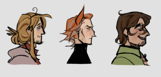
profiles of my fav ₍ᐢ. ̫.ᐢ₎
#Strade's thicker lines and dimples#Fox's hooked and somehow also pointy nose and mob boss aura#Law's one stray hair and eye bags#Speaking of hair you somhow managed to capture their personalities THERE TOO#Law's messy bun (is he w a wattpad protag? /j) showing just how tired the poor baby is#Fox's hair being as pointy as the rest of him to show he#means business#And dont get me started on those greasy ass curls strade has#Op i love your style sm#Why were you never on my dsah before now. Youve earned a follow
2K notes
·
View notes