#textile label printing
Explore tagged Tumblr posts
Text


just finished this upcycled cropped cotton top ❤️🔥 i added hand embroidery around the collar and a block printed patch appliqué on eco-friendly felt ✨
etsy
#not in the shop rn but i’ll add it soon!#labeled as a sz large but can def fit smaller sizes. i’m an xs and can wear it comfortably#mine#my art#art#textile art#embroidery#fiber art#artists on tumblr#hand embroidery#printmaking#patches#fashion#hearts#traditional tattoo#tattoo design#heartcore#lovecore#heart aesthetic#love aesthetic#slow fashion#sewing#upcycled#block printing
82 notes
·
View notes
Text

BYLD / Supply.Family / Tag (01) / Mockup / 2024
Download
#byld#supply.family#tag#01#mockup#2024#cardboard#garment#hoodie#label#paper#printed matter#psd#textile
12 notes
·
View notes
Text
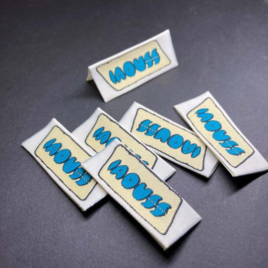
#custom woven labels#seo#fabric labels#website#textile#design#woven label#woven labels#textiles#printed labels#clothing labels#best#friends#netflix#love#like#likes#likes4likes#likesforlikes#google#technology#search#chatbots#app#threads#twitter#twitch#twilight#my little pony#queen chrysalis
2 notes
·
View notes
Photo
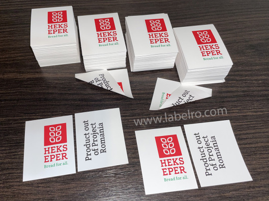
Etitech supplier of personalised garment labels, specialised in printed fabric labels, care labels, brand name and other custom clothing labels for sewing. Usualy care labels assist the brand label in subtly reminding the consumer of who they’re wearing, long after the swing tag has been removed. Care labels are usually printed either on a satin material or a more natural looking cotton material.
#labels#carelabels#care labels#label#brandlabel#brand labels#apparel#clothes#clothing#tailor#mode#fashion#print#fabric#polyester#custom#workshop#factory#textile#satin#satinlabels
2 notes
·
View notes
Text
Custom Woven Labels
0 notes
Text
CHIC Textile Printed Cotton Label
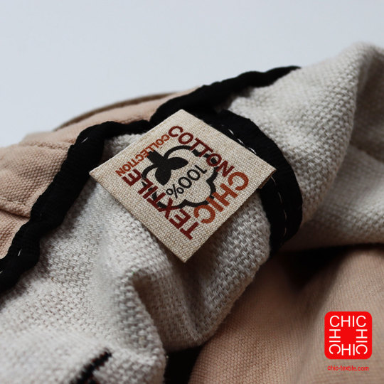
For More : chic-textile.com
#ChicTextile#printed#label#cool#green#accessibility#oekotex#fsc#certificate#Recycled#sustainable#reuse#reduce#textile#Innovative#fabric#fashion#design#art#photography#fyp#followme#cotton
0 notes
Text
The Empowering Impact of African Fashion Brands on Local Artisans
Investigate how the rise of African fashion brands has empowered local artisans by providing them with opportunities, recognition, and sustainable livelihoods.
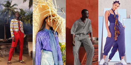
Fully backed by customers, powerhouses, and the design community, African style is set to cement its place as a critical force in the worldwide design scene into the indefinite future.
African design has encountered a noteworthy resurgence on the worldwide stage, catching the attention of style lovers and industry pioneers alike. The mainland’s rich social legacy and imaginative variety have prepared nearby craftsmen to change their manifestations into worldwide design symbols.
The ascent of African fashion brands from neighborhood craftsmen to worldwide symbols is a demonstration of the force of imagination, culture, and social cognizance. These brands have opposed generalizations, enabled nearby networks, and carried Africa’s rich legacy to the cutting edge of the style business.
#African fashion brands#African clothing brands#Afrocentric fashion#African-inspired fashion#Ethnic fashion brands#African couture#African designer labels#Contemporary African fashion#Afro-fashion designers#African textiles and fashion#African prints clothing#Traditional African attire brands#Global African fashion icons#Authentic African fashion#African fashion industry#African fashion trends#Afro-modern fashion#African heritage in fashion#Ethical African fashion brands#African fashion culture
1 note
·
View note
Note
Hi, hope I'm not late to requests.
Could I request Jack, Jade, Trey, and Malleus with a s/o who likes textile design?
What If Their S/O Liked Textile Design?
Type of Writing: Request Name: What If Their S/O Liked Textile Design? Characters: Jack Howl, Jade Leech, Trey Clover, and Malleus Draconia Requester: Anonymous
A/N: The reader in this piece is stationed in Pomefiore, since I think it fit well with the prompt.
✧⋆⋅⋆⋄✧⋄⋅⋆⋄✧⋄⋆⋅⋄✧⋄⋆⋅⋄✧⋄⋅⋆⋄✧⋄⋆⋆⋄✧⋄⋆⋆⋄✧⋄⋅⋆⋄✧⋆⋅⋆⋄✧⋄⋆⋆⋄✧⋄⋆⋆⋄✧⋄⋅⋆⋄✧⋆⋅⋆⋄✧⋆⋅⋆⋄✧⋄⋆⋅
✧⋆⋅⋆⋄✧⋄⋅⋆⋄✧⋄⋆⋅⋄✧⋄⋆⋅⋄✧⋄⋅⋆⋄✧⋄⋆⋆⋄✧⋄⋆⋆⋄✧⋄⋅⋆⋄✧⋆⋅⋆⋄✧⋄⋆⋆⋄✧⋄⋆⋆⋄✧⋄⋅⋆⋄✧⋆⋅⋆⋄✧⋆⋅⋆⋄✧⋄⋆⋅
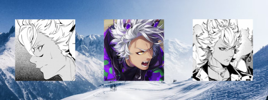
🐺 Textile design? This is something that Jack has never heard of before, but he is willing to learn about
🐺 When you had first invited Jack to your dorm in Pomefiore so that you could show him the ropes of how this 'textile design' worked, he smiled and showed up right on time
🐺 He was pulled inside the room by you as you asked him what was one pattern that he loved or that reminded him of his home, in which he just said the snowy mountains was one thing he liked and reminded him of home
🐺 You smiled and sat down at your desk, using your pen to pull up another chair for your boyfriend to sit down on so he could observe without his legs hurting
🐺 Jack watched as you pulled up a drawing of mountains with snow on top of them in a cartoon-ish style and he chuckled as you nervously rubbed your neck, telling him that you had drawn this one night when you couldn't sleep
🐺 You then began the process of printing the design onto a blanket that you had found woven -and cheap- at Sam's and you adjusted your device above the fabric and began to code in the printing's location
🐺 Watching with his ears stiffly up and his tail slightly swaying with every decoration added by the machine, Jack would be lying if he said that he wasn't amused or enamored with how the machine printed such a pretty design on the thick material
🐺 When you said it was done and you held it up for him to see it, your boyfriend smiled as his tail swayed faster with each step closer you took. And you knew why that was happening; he knew you were gonna give it to him
" I hope you like your new blanket, Jacky. " " Thank you very much, my soulmate. "
✧⋆⋅⋆⋄✧⋄⋅⋆⋄✧⋄⋆⋅⋄✧⋄⋆⋅⋄✧⋄⋅⋆⋄✧⋄⋆⋆⋄✧⋄⋆⋆⋄✧⋄⋅⋆⋄✧⋆⋅⋆⋄✧⋄⋆⋆⋄✧⋄⋆⋆⋄✧⋄⋅⋆⋄✧⋆⋅⋆⋄✧⋆⋅⋆⋄✧⋄⋆⋅

✧⋆⋅⋆⋄✧⋄⋅⋆⋄✧⋄⋆⋅⋄✧⋄⋆⋅⋄✧⋄⋅⋆⋄✧⋄⋆⋆⋄✧⋄⋆⋆⋄✧⋄⋅⋆⋄✧⋆⋅⋆⋄✧⋄⋆⋆⋄✧⋄⋆⋆⋄✧⋄⋅⋆⋄✧⋆⋅⋆⋄✧⋆⋅⋆⋄✧⋄⋆⋅
🍄 Jade knows about a lot more things than other merpeople when it comes to the surface. But when you mentioned textile design, Jade had drawn a blank
🍄 He had turned around from the mushroom terrarium and asked you to repeat what you had said before, and since he normally listens very well, you kinda chuckled at his reaction
🍄 You had brought him back to your dorm when Azul had closed Mostro Lounge for the day, due to some personal issues surfacing and how he would be busy that day. And let's be honest, who trusts Jade and Floyd with the Lounge?
🍄 When you practically shoved him into a chair of yours, Jade smiled and chuckled at your actions that were filled with excitement
" My, my, Y/N~ You really seem excited to show me this 'textile design' of yours. "
🍄 You had held out three different pieces of paper for him to chose, in which he lifted up a print of mushrooms in the woods and you pushed it onto a a piece of white fabric
🍄 Holding a small fragment of magic stones, you dropped them into the 'printer' and activated it, smiling as you sat down and held your boyfriend's arm as he chuckled and watched unwavering at the device's work
🍄 Once it let out a small beep, you jumped up and grabbed the fabric, holding it for the eel-mer to see. And he smiled, enjoying the observing picture of the mushrooms
" Wait- look at the back! "
🍄 When you turned the blanket around, Jade's eyes slightly widened, there was a small drawing of a mushroom with expertly labeled spots
" Aw, my dear~ You really do love me~ "
✧⋆⋅⋆⋄✧⋄⋅⋆⋄✧⋄⋆⋅⋄✧⋄⋆⋅⋄✧⋄⋅⋆⋄✧⋄⋆⋆⋄✧⋄⋆⋆⋄✧⋄⋅⋆⋄✧⋆⋅⋆⋄✧⋄⋆⋆⋄✧⋄⋆⋆⋄✧⋄⋅⋆⋄✧⋆⋅⋆⋄✧⋆⋅⋆⋄✧⋄⋆⋅
✧⋆⋅⋆⋄✧⋄⋅⋆⋄✧⋄⋆⋅⋄✧⋄⋆⋅⋄✧⋄⋅⋆⋄✧⋄⋆⋆⋄✧⋄⋆⋆⋄✧⋄⋅⋆⋄✧⋆⋅⋆⋄✧⋄⋆⋆⋄✧⋄⋆⋆⋄✧⋄⋅⋆⋄✧⋆⋅⋆⋄✧⋆⋅⋆⋄✧⋄⋆⋅
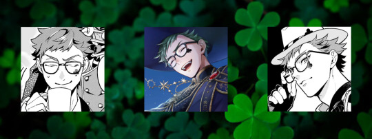
🧁 Unlike most of the men at Night Raven College, Trey does know some patterns when it comes to clothing. It comes with the benefits of working with his parents and having a little sister (his brothers don't care enough about clothes)
🧁 When you and him were spending a lot of time speaking about things such as your likes and dislikes, he had caught you speaking of clothing patterns
🧁 While he wasn't shocked, as many Pomefiore members love learning about these kinds of stuff, he was slightly shocked at the amount of knowledge about textile design you had kept in your brain
🧁 He had asked if you could show him a piece you had made, in which you smiled and reached into your bag to pull out a small fabric keychain that had a tiny clover on a tray
🧁 As a man who loves puns himself, he laughed at the joke. His name was Trey, hence the tray, and his surname was Clover, hence the four-leaved plant on the rectangle of metal
🧁 Trey held the fabric item in his hands and looked at it with love as he wrapped his arm around your shoulders, giving you a strong side-hug as you chuckled and flushed at his form of affection. He normally wasn't too fond of PDA himself
" I love this, Honey. Thank you for such a lovely gift. I'm sure this will stumble my sibling's minds when they see it. "
🧁 Laying your head on his shoulder as he placed the chain onto his bag, you smiled and replied with a 'no problem', making him rub his hand on your head, messing up your hair slightly
🧁 He was such a dork with you
✧⋆⋅⋆⋄✧⋄⋅⋆⋄✧⋄⋆⋅⋄✧⋄⋆⋅⋄✧⋄⋅⋆⋄✧⋄⋆⋆⋄✧⋄⋆⋆⋄✧⋄⋅⋆⋄✧⋆⋅⋆⋄✧⋄⋆⋆⋄✧⋄⋆⋆⋄✧⋄⋅⋆⋄✧⋆⋅⋆⋄✧⋆⋅⋆⋄✧⋄⋆⋅
✧⋆⋅⋆⋄✧⋄⋅⋆⋄✧⋄⋆⋅⋄✧⋄⋆⋅⋄✧⋄⋅⋆⋄✧⋄⋆⋆⋄✧⋄⋆⋆⋄✧⋄⋅⋆⋄✧⋆⋅⋆⋄✧⋄⋆⋆⋄✧⋄⋆⋆⋄✧⋄⋅⋆⋄✧⋆⋅⋆⋄✧⋆⋅⋆⋄✧⋄⋆⋅
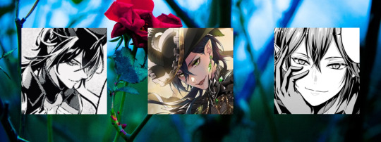
🐉 Malleus, as a royal, has studied many different things over his many years of life. Including types of fabric so that someone would not be able to trick him into wearing something damageable to himself
🐉 But, as we all should know, this poor guy does not understand technology in any kind of way. So he does not know what textile design is very well
🐉 So, when you had been taking a small walk with him one day and mentioned textile design, he had no idea what you were talking about. And, like Jack, Malleus is welcoming to the idea of learning how this stuff is made
🐉 Much to your enjoyment
🐉 You had mentioned your offer to show Yuu how people in Twisted Wonderland made the fabric design with magic, and that made Malleus smile and ask if he could observe as well
🐉 You just smiled and agreed for your boyfriend to watch alongside your shared friend, and when he arrived and watched alongside Yuu how you took a crystal and mixed it inside a tiny vial for it to work with the technology so the fabric could be made faster, he was meticulously astounded
🐉 Yuu was as well, but watching a powerful dragon fae's eyes just widen with sparkles at you working on something so simple for him to do was something that could make anyone chuckle
🐉 You had made two items, one being a small grim keychain and the other being a tiny version of a photograph of Malleus, Lilia, Silver, Sebek, and you during your last vacation from school
🐉 Yuu thanked you and left, dragging Grim behind him as the cat groaned and whined about going to meet with Ace and Deuce, as your boyfriend stared at the item and smiled gently, his eyes being filled with adoration and love
" Thank you so much for this, love. You have no idea how much this means to me. I knew I made no mistake choosing you as mine. "
#Twisted Wonderland#Twst#Heartslabyul#Savanaclaw#Octavinelle#Diasomnia#Night Raven College#NRC#Twisted Wonderland x Reader#Twst x Reader#Heartslabyul x Reader#Savanaclaw x Reader#Octavinelle x Reader#Diasomnia x Reader#Night Raven College x Reader#NRC x Reader#S/O! Reader#GN! Reader#Jack Howl#Jack Howl x Reader#Jade Leech#Jade Leech x Reader#Trey Clover#Trey Clover x Reader#Malleus Draconia#Malleus Draconia x Reader
231 notes
·
View notes
Text
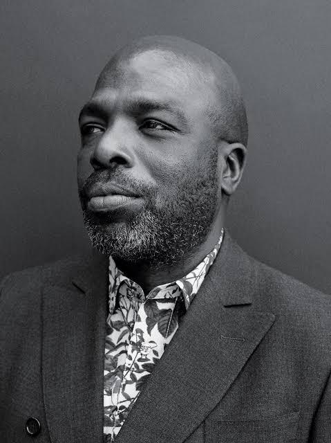
Duro Olowu
Olowu was born in Lagos, Nigeria, to a Jamaican mother and Nigerian father.He grew up in Lagos, spending summers in Europe and immersing himself in multiple cultures.
He moved to the United Kingdom when he was 16 , and like his father before him, Olowu studied law in England and later returned to Nigeria.
He soon gave up a legal career and moved back to London to pursue his true vocation as a self taught fashion designer, first designing womenswear collections for the now defunct London based label Olowu Golding.
In 2004, Olowu launched his women's wear label, beginning with a Spring/Summer 2005 collection, his womenswear label is known for its innovative combinations of colors and patterns, harmonious juxtapositions of vintage textiles with custom fabrics, and impeccably tailored silhouettes.
Olowu’s aesthetic vision is informed by his multicultural and international background, art, and other creative practices.
An empire-waist multi print silk dress from his debut collection, discovered by American Vogue editor Sally Singer, became an international hit. Selling out in renowned stores in New York, London and Chicago
In 2005, Olowu won the New Designer of the Year Award at the British Fashion Awards. The only designer to do so prior to their first catwalk show.
In 2009 he was named the Best International Designer at the African Fashion Award
In recent years, Olowu also began curating contemporary art exhibitions in galleries and museums beginning with his highly praised exhibitions, "Material" (2012) and "More Material (2014) at Salon94 gallery in New York.
His first museum exhibition was 2016, the critically acclaimed, "Making & Unmaking" at the Camden Arts Centre in London.
In early 2020, Olowu curated his second museum exhibition,"Duro Olowu: Seeing Chicago" at The Museum of Contemporary Art, Chicago
66 notes
·
View notes
Text
An absurdly and unnecessarily over-the-top and thorough breakdown of using my embroidery machine for a cosplay piece.
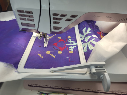
Part 1) The piece:
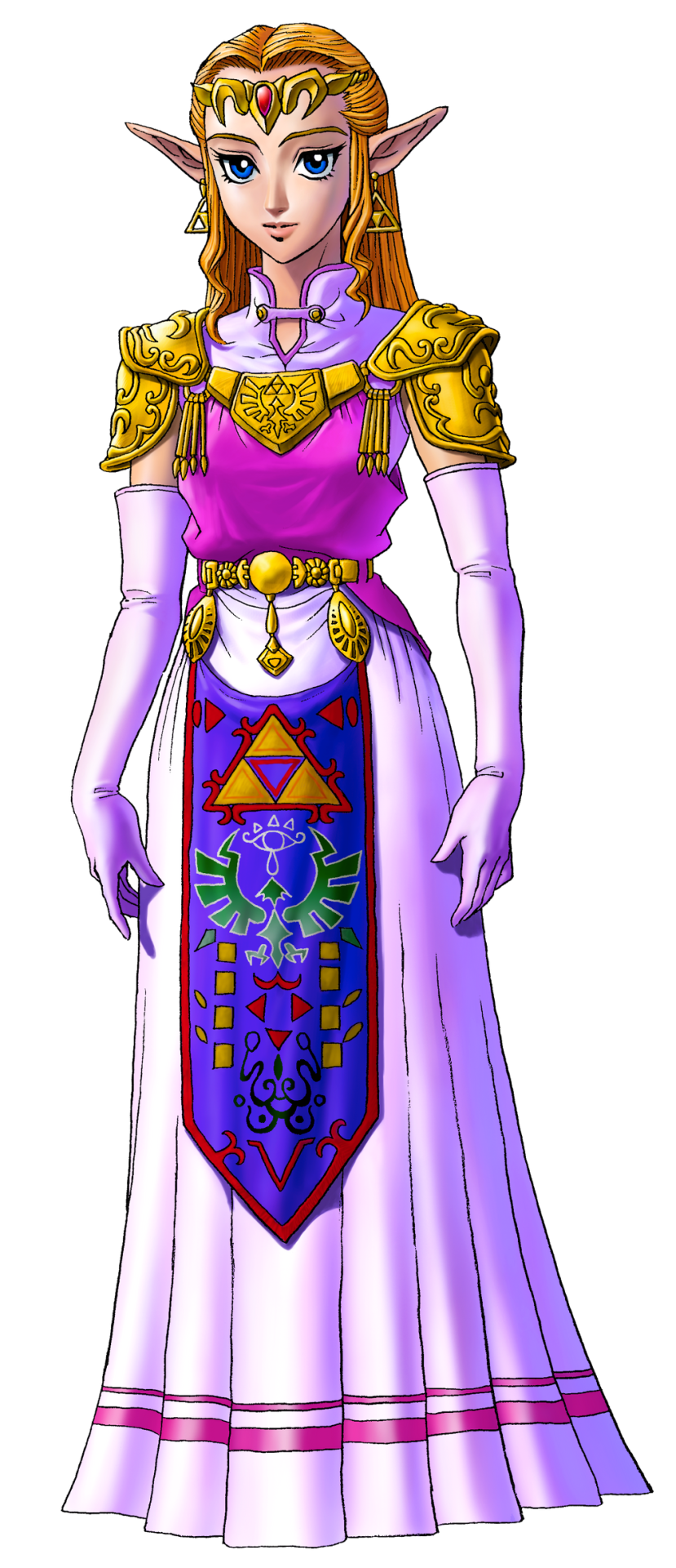
Many iterations of Princess Zelda from the Legend of Zelda series has this tapestry front piece. I've looked for a technical name for this piece as well as extant examples of it from our history, and my research is indicating that it's just a fantasy piece and doesn't have a name.
So we're calling it an apron. IDK. "Heraldic apron," sounds fancy enough.
One of the things that's been a bitch through all cosplay of all time is custom textiles. Since the early days of cosplay, we've been looking for ways to handle this at home. Back when I got into cosplay and took it really seriously, Worbla hadn't been invented, there was no Friendly Plastic, Wonderflex had to be purchased in 15-yard lots, the Glowforge and home 3D printing was just a fantasy, and Cricut machines ran off cartridges and couldn't design from your computer. Also, when I was cosplaying seriously, I was a college student with no job and a $100/month allowance for food (which I spent on cosplay, mostly). We didn't do fancy shit. You know what we did?
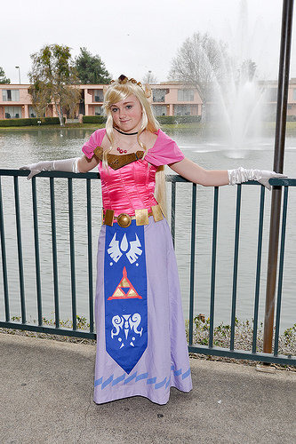
We had fuckin' hand-traced and hand-cut stencils. Mother fuckin' freezer. Paper. Stencils. Now, this version of Zelda that 2009 Me is cosplaying up there does have a much simpler heraldic apron than Ocarina of Time Zelda does. However, since I've gotten access to embroidery machines, I've had this great need to remake this sort of concept with adult me's current budget and skill set.
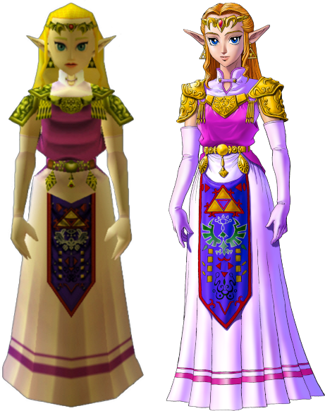
Now, there's a few issues from the start about making this. The notable one is that the in-game textures for the apron do not completely line up with the official artwork. When you start looking at the 3DS remakes, they re-textured the apron, giving us yet a third canonical way that this thing might be laid out.

Obviously, the easiest thing to do is to get several references, and then to slap them next to each other and compare. I've got GIMP pulled up here, and have several versions here. I adjusted color levels until the pattern in the garment was as clear as I could make it. There's horizontal guide lines going across to divide the apron into sections. We'll call those sections thusly, top to bottom: Triforce, Eyeball, Bird, 8 Rectangles, and V.
***
This is going to be long and boring. I have my reasons for writing a long and boring post, but sadly, I'm not able to share them without becoming un-boring, thus defeating the purpose of this work.
***
I forgot to label them, so that reference image is, from left to right: N64 screenshot, 3DS screenshot, N64 character model, small inset at the bottom is 3DS, official artwork that was released alongside the N64 game, a heraldic tabard, some official rendering of the Hylian crest, and another 3DS screenshot.
Some are pretty self-explanatory, and some are more open to interpretation. Notably, let's take a look at the Bird section. The official artwork and the 3DS remake both distinctly have the Hylian Family Crest there. The N64 version has a very distinctly different bird thing.
So, I had to decide, which one do I put on my apron? I had to consider several things, but one of them was the process of how game textures from the N64 era were made. Textures for this game were very small image files, smaller than your 2009 cosplay.com forum avatar. The reference art would be made and then other people would be in charge of turning that art into a usable texture file, so there was artistic license involved in adapting that. This game was released before the Hylian crest had been used in multiple places across several games. Therefore, we can justify making the assumption that the texture artists didn't have an understanding of how important it was to keep this part the exact shape it was, and turned "stylized bird" into "stylized bird" in a way that would read clearly on screen at 45x100 pixels. We can assume this to be the case, because, when Grezzo did the 3DS remake, their texture artist used the Hylian crest instead of the OoT bird thing.
***
Sorry for all the embroidery stuff in the past few days. I've attracted the attention of a couple people online and embroidery seems to bore them, so we're doing that for a little bit until I stop being interesting.
,***
Cosplay has a spectrum of screen-accuracy to full-nonsense. In some things, you can do screen accuracy very well. Screen-Accurate Princess Leia from EpIV is pretty easy to make look good. Sometimes, you can do full nonsense pretty well, too. Princess Leia, but in if Star Wars was steampunk, also pretty easy to make look good.
Some things aren't as easy to make look good when you're doing screen-accurate. Sephiroth's hair in most of the Final Fantasy games stands up off his head by like 30% the height of his face. If you math that out, you have a wig with 5" antennas swooping up in the front. When you put that on a head, it looks silly. Do you want your Sephiroth to look silly? No? Then you need to do something about that hair.
My cosplay rule that I try to stick with is this: If you need to make a decision between what is "accurate" and what looks good, you pick what looks good. As long as the character reads as the character when you're done, it's better to look good than to be accurate.
And this is why, instead of just tracing any of these aprons in my embroidery software, I broke out a pen and drew the whole thing out.

Actually, I drew half of it out. The left half to be specific. I know that I'm going to mess with this later on my computer, and I know that I want the thing to be symmetrical, so let's save everyone (mostly me) some trouble and just do half of it.
Why was it important to me to draw it full size? Remember, that texture we're referencing is less than 100 pixel wide. The final piece is going to be full size, so there's a lot of things that just don't scale up easily. We're basically going from a texture the size of my thumb nail to something that has to be more high-def than 8K. This basically meant that I needed to redraw it from scratch to get that resolution. Lots of little details are going to have to be added, and I'm much better at adding them with a pen than I am just guessing while I'm digitizing the file to embroider.

So, I took it, pulled it into GIMP, and made some adjusting. I mirrored it so that I have both a left and a right side to work with. I changed the contrast so that I could see the lines better. I didn't like the Hylian crest that I drew so I just plopped the official SVG onto it and dragged it around until it fit.
And then, and this is kind of important, I cropped the image so that it's the exact proportions that I want the final thing to be. My whole design is in this file, and there's no outside image. This is important, because I'm going to use this as a template to trace in MySewnet, and the easiest way to get the background to behave properly is to pre-set it to the exact size you need in another program. Good thing this software isn't stupid absurdly expensive, or else the fact that you needed to do that would be really annoying.
The digitizing process:
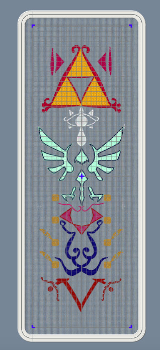
Okay, so the first thing that I do is to make a custom hoop the size of the finished project. There's no way that I can actually stitch this out this big, because a 25" long hoop doesn't exist anywhere, but it's way easier to design all of it and then split it up than it is to design in pieces and then fit them together. I open the hoop in the digitizing software and load my template as the background.
Digitizing from a technical viewpoint is really simple: you click points all around the area you want to make a shape, and then you hit "make this thing", and then it renders the thing. You can then give that thing a different kind of fill or line. Easy.
So instead, I'm going to go into the art part. Because yes, I've already drawn this whole template, but I haven't figured out how to fill each of those shapes. This isn't like a coloring book where I can just fill a shape with color. Embroidery means that I have to pick how exactly I fill all those areas.

First up, I have the legendary Golden Triumph Forks. The Magical Eating Utensils. I wasn't super sold on how this was rendered in the official art. We can vaguely see how, in the game art, it looks a little more like a red outline with corner flourishes, rather than what we got in the artwork. I probably should have looked up some historical flourishes from time periods in world history where technology matched the apparent technology of the world of the Legend of Zelda, but I just kind of picked a random frilly shape.
The Triforce is one of the most important symbols in Zelda, so I knew that I wanted it to be a bright shape. This meant that I wanted to fill the shape with stitches in such a way that none of the purple backing is showing through. In embroidery terms, this usually means either a full pattern fill, or an applique. I picked applique, because this is an easy shape to applique. I knew from the start that I was going to use metallic tissue lamé. Lamé's great for a lot of things, but it's weak and shows creases. To avoid that, I wanted to put in a fill stitch to support the fabric and prevent damage, as well as hiding any big creases. I picked a big and open motif fill that will still show a lot of the applique fabric.
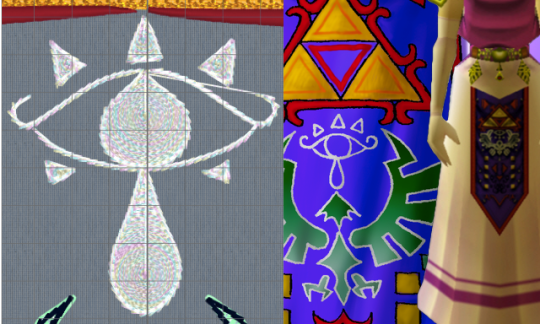
Eyeball:
So this is, specifically, the Sheikah Eye. It's an important symbol in the series. The Sheikah stick this eye on pretty much everything. However, it's not a fancy, gaudy, ostentatious symbol.
I grabbed a motif line at random from the list of motif lines, and happened to like it. It's a very heavy stem stitch that goes over each stitch 4-6 times, making a big, raised area. To make sure the eye was visible, I filled in the iris, teardrop, and eyelashes. I picked an opaque spiral fill, because it's a circle and these general shapes are circles. A while back, I bought some metallic white "iris" thread, and thought that a subtly-iridescent white would fit nicely.
Those little eyelashes at the bottom that aren't there in the art? Well, there's there in the game render juuuuust a little bit, and also they fall into "if it looks better that way, it's the correct way" mentality.
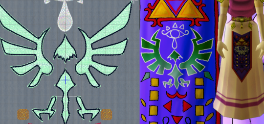
The Hylian Crest.
Fuck this thing.
All you need to know about this is two things: 1) I just traced the SVG that I found on the Zelda wiki, and 2) I didn't plan on stitching it out with black outlining. That black outline is just there to confuse my software into doing what I want.
Since this is as important as the triforce, I knew I wanted to do it in silver lamé. That means all of this is an applique. Quick tip: if you're going to be breaking a design into smaller segments, don't do any applique so big that it has to be spread over two segments.
Ask me how I know.

I originally had this filled with the same chain stitch that I used on the Triforce, but it made things look very samey and very mushy. I later switched it to a triangle-shaped spaced fill. I selected the triangle as the correct shape by clicking every shape one at a time and seeing what they looked like. Since this was going to be a running stitch on a shiny applique background, the fine details don't really matter. You actually can't see them normally, which is why I had to change the color here.
The outline there is the same stem motif that I used in the Sheikah eye. I found that it's wide enough to cover an applique edge without having to look like a satin stitch.
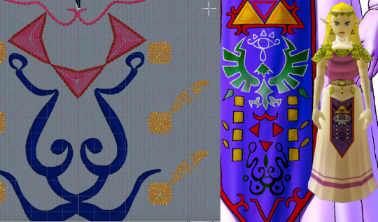
Squares, Triangles, and the Face Thing.
I have no idea what that face thing is supposed to be and apparently neither did anyone else on the internet. Since it just kind of looked like a scribble, I just rendered it as a scribble. I used a satin column so that it could have line weight similar to a drawing with a paint brush, and the shiny satin line would look like wet ink. Also known as phoning it in.
The triangles are filled with a contour fill that just traces the edges of the shape. I left some space between the lines so that the purple background can show through. This gives is sort of an optical illusion of movement. The outside of this was originally that same stem motif line from before, but after I stitched it out, I realized ti was too heavy. The final version had the same motif, but smaller, and with fewer repeats of the stitch.
I'm so damn proud of those fucking gold boxes. Okay, so, let's look at the design. Why are there gold boxes? What do they do? What do they mean? Do they represent the eight dungenons in the original game? Nope, because there were nine dungeons in the original game. Are they the eight sages? No, because there's seven sages. Is it what happens when you average the number of dungeons and sages out? I don't know. Anyway, they looked stupid just being little gold boxes, so I gave them blunted corners. I did another contour fill because I wanted them to lie flat on the finished apron and not draw any attention to themselves. As for the little tail, folks, I discovered a technique and I'm FULLY READY to abuse the heck out of it. So, I traced the lines with a satin column, ready to try to mess with the spacing to see if it'd lie flat with enough work. I hit "convert to tapered motif" by complete accident, and it was kind of cool. So, then, I went through the various motif options, found some cool looking scrolls, hit "fit to line" and slapped those in there. And I think that the little tails being written in some weird language I can't understand is SO COOL. I love how this part looks and I will not be taking other opinions on it at this time.

The V.
I didn't like how either of them looked in the original, so I just kind of winged it. I was getting bored at this point so I took a pattern fill that was supposed to be linked chains, and then I twisted it around until I was the least bored I could be with it. Again, I went with the smaller stem stitching on the outside.
Those little tails on the circles there are also filled with the scroll as tapered motif thing. If you go for this, don't forget to run the "delete short stitches" filter or else there'll be like 1100 unnecessary tiny stitches in your motifs. Ask me how I know.
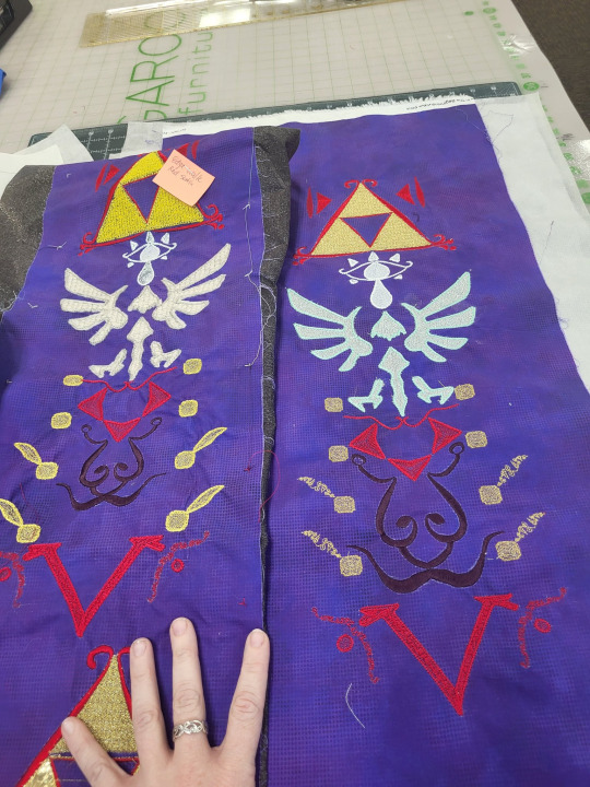
Now, we learn by making mistakes, and the best way to make mistakes is to just jump in and wing it. On the left, we have the first version of this that I tried. On the right, we have the second version, which is the one I'm going to use. I've made a couple of adjustments to the file since that final version, so if I make it again, that'll be just a hair better.
So, for starters: backing fabric. I liked the movement and texture on this subtle dot tonal better than a solid purple, so i used that for both my test and my final project. The main drawback with using a printed tonal instead of a dyed solid is that the back of the printed fabric is still white. On some things, specifically the area around the satin stitching on the ink face thing, you can see subtle white haloing where the stitching's displaced the background. I don't like it. No one else seemed to notice or care.
I knew that I'd be doing this in my endless repositionable hoop, but I hadn't taken into account that I'd be doing it in the endless hoop sideways. The endless hoop expects you to go from top to bottom, and my design goes left to right. This means that I have to fight the fabric around the clamp of the hoop. The endless hoop also doesn't hold things as tightly as a regular hoop does. Because of the way the fabric is moved through the hoop, a fusible or sticky stabilizer has to be applied to the fabric before, instead of being hooped with the fabric. All of this meant that I just didn't get the support that I needed on the first go around. You can see this in the way that the fabric has bunched up around the 8 boxes. For the first round, I used some fusible no-show mesh stabilizer. It wasn't wide enough, so I had to cut it in chunks and apply it sideways. For the second round, I used two layers of Power Mesh (same stuff but different brand) as well as a layer of light+tacky paperless sticky tear-away. I really hate that light+tacky stuff so ti's exciting to finally use it up.
My first trial was mostly to see if I could make the endless hoop work like I wanted it to. In this trial, I learned a lot of things. I kept the computer nearby to make changes as I noticed them. When I was done, I looked at what I'd made. I didn't like all the proportions in all of the design, so I dragged some stuff around in the file. This was when I realized that the heavy stem stitch motif everywhere was looking clunky, and reduced or removed it from several places. I changed the fill of the Hylian crest to the triangular fill. shout out to anyone from That One Anonymous Message Board who made it this far in this post to try to prove how deranged I am. You've got a lot of time on your hands, don't you? I completely changed all of the instructions to tell the computer how to do the applique on the Hylian crest (which I STILL got wrong), and added some aligment stitches to help with the applique process. This was when I changed the color of the outline in the software. Ideally, you should now be able to lay the applique down as one fabric, let the machine sew the whole thing, and then trim it. This is important, because that applique spreads out over two hoopings, so it's kind of a mess. The secret to making this work is for hooping #2 (eye and top half of crest) to stitch out the eye BEFORE the applique, so that the whole fabric can be placed over the completed eye. We learn.
Once it was all combined and digitized, it's important to render all the digitized elements as stitches, and then do a bit of cleaning up.

Notably, I really needed to take those tapered motifs and run the stitch optimizer program. The stitch optimizer's job is to remove stitches that are too short to stitch out nicely. When looking at the 3d views in the software, I can't tell which of the samples is the before and which is the after. If I zoom up really close in illustration mode, I can see it, but remember that this is like a 1" wide strip of stitching. The basic rule is that any time the software wants to remove 3300 stitches and you can't see the difference in the stitch-out, you REALLY WANTED to remove those 3300 stitches. That's not 3100 stitches from all over the design, BTW. That's just 3100 stitches from that one section.
I go over my test swatch, section by section, and make sure there's nothing that I forgot to put into the software. I also just delete every jump cut and then make the software add them all back in. The program that adds cuts automatically tends to be more judicious wit them than the digitizing program is when you make the design, so it's a way to make a design stitch out a lot smoother with just two clicks.
So, once all of that is done, we can just run the design splitter program. The design splitter says it has "intelligent splitting" settings, which is an absolute joke, but I use inteligent setting anyway. It's not necessarily any better at picking where to split than a straight line is, but our eyes are trained to see straight lines. The allegedly-intelligent splitting does at least split at random points, making it harder for your eyes to pick out what's a splice and what's a continuous line.

So, in addition to "intelligently" splitting the design apart, the program adds two color blocks to each split piece. One is before the stitches, and it's four stitches long. This just does one stitch at each corner of the design area.
The second block it adds is at the end. This block stitches a corner marker at each corner in the design. In this picture, the before line is green and the after line is red. I offset them by a little bit so that you can see what's going on, but they do happen directly on top of each other.
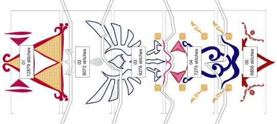
This is important, because you're trying to lay your design out so that every section of the split design lies perfectly next to the other ones. When you re-hoop your fabric, you can step through the first four stitches. If you've placed your fabric correctly, then those stitches should perfectly touch the markers that were sewn in the previous blocks. If they don't line up, you can just re-hoop over and over and over and over until it lines up.
In theory, you can line up an entire design just using these markers and the alignment stitches. You can just keep rehooping forever until it lines up. It's great. On the other hand, if your embroidery machine has literally ANY KIND of design placement setting onboard, that can help a whole lot. The astute observer will note that, on that picture way up at the top, that machine isn't my Topaz 50. That's because the T50 has some nice basic design positioning that will let you place within a certain range, but it won't let you tilt the design if you hooped it crooked. I did the first attempt at this on my Topaz, and it was fine, but there was a lot of re-hooping. So I might have taken this to work, to do this on the machine that's a step up from mine. (While I was there, I used a sit-down Bernina longarm to "hand"-baste the stabilizer on. That's not the intended use of the machine, but if you set stitch regulation to like 1 stitch per inch, and then you just pull the fabric straight through from the side, you get perfectly straight basting lines. If you're not feeling like dedicating an entire room in your house to having a free-motion machine just to baste straight lines, most mid-tier sewing machines have a fake hand-basting setting in them somewhere). Anyway, if you don't already have a bunch of hoops from HV, you can get that kind of positioning setup on Brother and Baby Lock for much less than the cost of the machine I was working on. If doing big multi-hoop projects like this is a priority for you, ask your salespeople about machines that make this really easy.
You now also have the great trade-off: the smaller the hoop, the tighter the design will hoop, and the less stabilizer you'll need. However, the bigger the hoop, the more you can shift the design around in the machine without hitting the edge. The tighter the hoop grabs, the less stabilizer you need, but the harder it is to shift the fabric that's already being held in the hoop to get it where you need it to go.
I handled this by just fucking throwing a shit ton of fucking stabilizer at it like there was no tomorrow. There's three layers on this bad boy.
You might be saying "Why didn't you just use a heavier cut-away?" and you'd be right, except for two things. 1) if I use two lighter layers, then I can trim the stabilizer away in layers, avoiding the stabilizer showing through and 2) my store didn't have any wide fusible cut-away in stock so
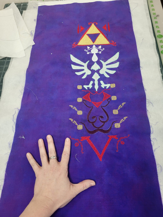
Anyway, here it is, time to make it into the actual apron. I'm very excited for this project. I'll probably break out the repositionable hoop again to do a border on the outside of the completed project, but I don't know for sure exactly what that'll look like.
#long post#really long post#zelda#legend of zelda#cosplay tutorial#machine embroidery#not lolita#i did this instead of doing a thing i don't want to do
118 notes
·
View notes
Text

Rosita Missoni
Co-founder of the eponymous Italian fashion label celebrated for its colourful textiles and zigzag knitwear
Rosita Missoni, who has died aged 93, came out of the historic heartland of Italian textiles in northern Lombardy, and though she travelled worldwide for decades and the Missoni fashion and decor brand became famous globally, she remained devoted to her native terroir. All the artistic, artisanal, and ever-inventive technological skills that sustained the company’s success over 70 years were as much part of the locality as its mountains and lakes.
The other company founder, her husband, Ottavio (Tai) Missoni, was originally from the shores of the Adriatic, but was working in knits, and on marriage migrated to her territory. Theirs was a union of complementary talents – Tai was an artist of great colour gifts who choreographed how yarns should be fed into which machine to knit what pattern, while she shaped the firm’s overall fashion direction and uses of the output.
Rosita’s grandmother and mother had been commanding powers in their family factory, Torrani and Jelmini, established in 1921 in the town of Golasecca, specialising in embroidered fine lingerie, and machine-knit accessories, especially shawls.
Rosita experimented with scraps from babyhood, always aware of the interplay of colour, cloth, technology and fashion. In 1953, the newly married Missonis set up their own small machine-knitwear workshop, Maglificio Jolly, in nearby Gallarate. This was part of a postwar Italian movement that put together centuries-old knowledge of materials with sophisticated machinery developments (originally funded by American Marshall Plan money to revive European industry) and a new preference for informal, ready-to-wear clothes.
At first their few machines could manage only three-colour-stripe garments for other labels. By 1955, a Milan boutique stocked Maglificio Jolly; in 1958, Milan’s grand department store La Rinascente bought a collection of stripes of many colours, labelled “Missoni”. Tai and Rosita’s pattern repertoire expanded with each new machine from horizontal stripes to vertical, tartans to jacquard repeats.
The signature chevrons arrived in 1962 when they discovered an update of the more-than-century-old Raschel machines: Rosita remembered how her grandparents had used similar to knit silky shawls echoing antique flamestitch embroidery, the kind of shawls, she said, “you would throw over a lampshade”. Bolder Missoni versions were suited to the craze for geometrical pattern early in the 1960s, and Missoni was enthusiastically promoted by Anna Piaggi of Italian Vogue and Diana Vreeland in US.
By 1967, the Missonis had outlets in New York and Paris, and their own boutique in Milan; they presented collections in clever shows in interesting spaces – a theatre, a swimming pool – around the city. They helped shove the focus of Italian fashion from crusty Florence and snooty Rome to artisan Milan, where it remains.
The next decade brought the Missoni’s best years. First came an art deco revival – thanks to Rosita’s memories, the Missoni deco designs were affectionate but not pastiche. Then fashion hankered for handmade craftwork, mostly knitted goods, and welcomed Missoni machine-knits because of their related aesthetic heritage.
And then, as more people flew internationally and observed the ways other cultures dressed, designers such as Kenzo Takada and Bill Gibb experimented with outfits assembled from knitted, printed, embroidered and woven textiles, with geometric and floral patterns, all worn at once.
The Missonis could supply everything. Rosita regularly went on collecting trips to places where clothes, ceramics and furniture were still happily handmade, or rose early in cities across Europe to truffle for flea market finds. She wanted Missoni design to be part of a worldscape of decoration, and she hated waste – the appeal of knitting was that it wasted less yarn than cut and sewn cloth. She reclaimed workshop scraps for patchwork and rugs for their home. In 1978, the Missonis showed their collection at their quarter-century retrospective in the Whitney Museum of American Art in New York. Their work was at home there.
Born in Golasecca, Rosita was the daughter of Diamante and Angelo Jelmini, who both worked for the family firm; she had two brothers, Alberto and Giampiero. Besides her factory-floor education, she had been sent away to school on the Ligurian coast, for her health, and then to London in 1948 to learn English, supervised by Swiss nuns.
The sisters took their students to Wembley Stadium to witness track events in the summer Olympics, and there Rosita spotted handsome Tai, a decade older, competing in the Italian hurdles and relay team. They eventually arranged a proper meeting by the Eros statue in Piccadilly. Back home in Italy, Tai, who was designing knitted tracksuits – he later made the Italian uniforms for the 1952 Olympics – courted her. Their families approved, and the pair married in 1953.
Rosita and Tai decided in their first, late 60s, flush of success that they were artisan producers and wanted to stay as such, with a full life right beside their joint work. They commissioned from the architect Enrico Buzzi a factory and nearby home with a view of the Alps in Sumirago, under 10km from Golasecca, among gardens that grew produce and plumped hens to be cooked for their children, Luca, Vittorio and Angela.
All three grew up to work in the firm. Luca became menswear designer, Vittorio the marketer, and Angela, after adventures elsewhere, took over from her parents as head of design in 1996.
That freed Rosita, who felt she had nothing more to contribute to fashion (although her own magpie style stayed imaginative to the end), to be creative director of the Missoni home line, which maintained a steady customer appeal while the clothes had periods out of – the 80s – and in – the 2000s – favour in fashion.
Her decor ideas drew on her lifetime collecting, and the personal pleasure she and Tai had in the constant making of things for their Sumirago home.
Tai died in 2013, not long after Vittorio was killed in a plane crash. Rosita is survived by Luca and Angela (who passed a senior design role to her daughter, Margherita), and by eight more grandchildren and 10 great-grandchildren, and by Alberto.
🔔 Rosita Jelmini Missoni, designer, born 20 November 1931; died 1 January 2025
Daily inspiration. Discover more photos at Just for Books…?
3 notes
·
View notes
Text

Bendito Mockup / Supply.Family / Label (N04) / Mockup / 2023
Download
#bendito mockup#supply.family#label#n04#mockup#2023#garment#merch#paper#printed matter#psd#tag#textile#t-shirt
9 notes
·
View notes
Text
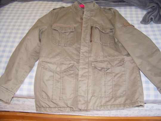
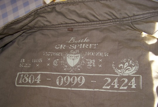
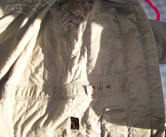
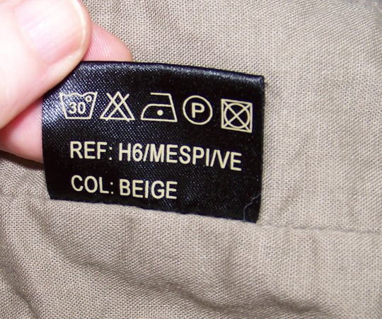
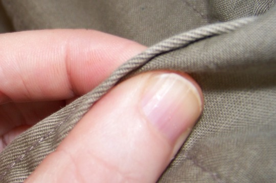
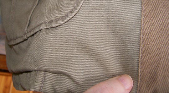
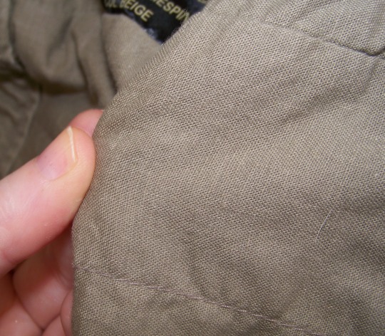
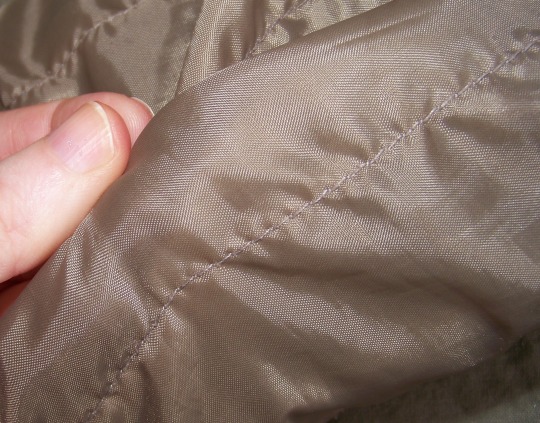
@dollsahoy This is the jacket: it is very heavy, it hangs like a dream and feels like a hug. I look so feminine in this ugly beige-green man's coat, it's shocking. It is made of pockets, secret inner pockets and ~*~textures~*~ from tough to very tough to ultra soft cotton that feels like pure cotton sheets from the 70s to a satiny lining in the sleeves.
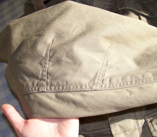
No idea on the brand, or if it's a generic knock off - it came from the area where tourists and vagrants drop off stuff so it could be French but it could be from anywhere. The finishings are very cool like the inner pockets and the 'pleats' around the elbows.
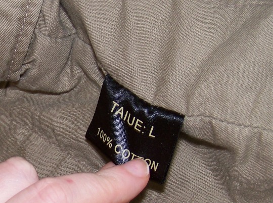
TAIUE looks like a misprint of "taille", coton with one n is the french spelling of cotton so it could be missing a "made in China" label.
Not sure how much credence to give the 100% Cotton label. None of it *feels* like poly/acrylic fibres and I'm someone who doesn't mind the plastic-y feels and sounds of non-natural fibres. It feels like it's got enough natural fibre in the satin-ish part to feel warm, textured and un-static if that makes any sense. I'm sure there are textile specific words for sensations like with food.
Either way it's not going to spoil anything if it's acrylic and the printed stuff is gibberish. Can an item be cotton and canvas?
20 notes
·
View notes
Photo
satin care labels
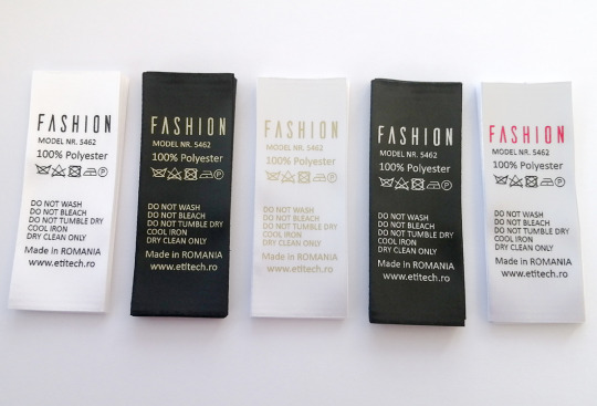
Soft satin care labels, made to your design. Personalized garment labels, ideal for clothes or any textile product, printed on satin as brand labels.
#labels#carelabels#brandlabels#satinlabels#satin#apparel#clothes#textile#fashion#mode#tailor#print#factory#workshop#fabric#tape#custom#poliester#polyester
0 notes
Text
0 notes
Text
"Eco-solvent inks in 2024: sustainability and high quality change the printing industry"
In an era where environmental concerns are at the forefront, the emergence of eco-solvent ink represents a significant milestone in the printing industry.
Unlike its counterparts, UV and water-based inks, eco-solvent ink is a composition of non-toxic solvents and natural pigments.
Please take note: a remarkable 50% of its components derive from renewable resources. With a minimal volatile organic compound (VOC) content, this ink is virtually odorless.
The Birth of Eco-Solvent Ink:
Since the advent of inkjet printers in the 1990s, the ink industry has grappled with toxicity, irritation, and high pollution.
However, through three generations of technological evolution and the relentless efforts of scientists, the printing world has been introduced to a game-changer – the non-toxic, non-irritating, and odorless eco-solvent ink. It signifies the industry's definitive break from the stigma of high pollution associated with traditional printing practices.
Cost Control and Print Quality of Eco-Solvent Ink:
The high cost of traditional inks has long been a bone of contention in the printing industry. Eco-solvent ink has opened a window of opportunity, epitomized by the phrase “a long slope with thick snow.” The substantial investment required yields a steady and stable return. Boasting excellent adhesion and vibrant color, eco-solvent ink has solidified its position in an era where print quality is a critical differentiator.
Applications of Eco-Solvent Ink:
A chasm exists between traditional inks and eco-solvent inks in the industry. The market for eco-solvent inks spans a wide range, from outdoor billboards to textile banners and car stickers, showcasing its boundless adaptability. It also defines the contours of modern printing practices:
Indoor and outdoor advertising and signage printing Automobile body stickers and wraps Industrial labeling and packaging printing Textile and eco-friendly fabric printing
Amidst the daunting challenges, from increasingly stringent regulations to technological iterations, our company, Panjet(https://www.pan-jet.com/), remains committed to the path of green and sustainable development. We stand as your provider of high-quality printing ink solutions.
3 notes
·
View notes