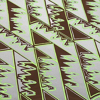
#text-based typography prints
Explore tagged Tumblr posts
Visit Tumblr Blog
Explore Tumblr blogs with no restrictions, modern design and the best experience.
Last Seen Tumblr Blogs


Fun Fact
In 2020, Tumblr had 29.4 million users in the US.
Text
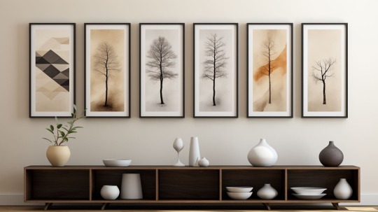
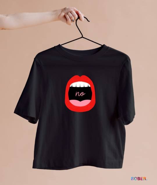
The Unexpected Way Minimalist Prints Can Increase Your Earnings
The top minimalist print trends for 2023 that can increase your POD earnings! Learn the styles and tips in this quick video.
Discover the top minimalist print trends for 2023 that can help increase your print-on-demand earnings this year. Learn specific tips to implement these artistic styles. The Unexpected Way Minimalist Prints Can Increase Your Earnings Minimalism has become a major interior design and art trend over the last few years. This style is all about simplicity – using a limited color palette, clean…
View On WordPress
#abstract shapes#earning passive income#geometric prints#geometric shapes#home decor trends#interior design trends#minimalist affirmations#Minimalist Art#minimalist art trends#minimalist prints#minimalist quotes#nature scenes with negative space#passive income#print on demand#selling art online#simplicity in black and white#text-based typography prints#typography prints
1 note
·
View note
Text
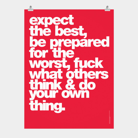
“How to be happy: Focus on your own shit.”
Word Series: Do Your Own Thing Poster. Size: 18 x 24 in. On a matte paper. Heavyweight stock.
Both physical and NFT items are now available in our store.
#nft#quotes#nft art#luxury#typography#poster#print#text based art#nft community#nft artist#inspiration#motivation#do not destroy#print making#house#art#nft drop#millionaire#interior decor#interior#home decor#decor#Christmas#billionaire#graphic design#wall art#peace#love#print design#do not destroy store
1 note
·
View note
Text
did u know the affinity suite has a six month free trial, no card needed? stumbled* into it and have been slowly teaching myself how to vector in designer
(*this is not hashtag sponsored, i legit did stumble into it and have been having fun, a+ marketing affinity)
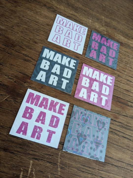
these bad boys are STICKERS and involved a lot of trial and error
> MAKE BAD ART stickers measure apx 2"x2" and are home printed, laminated with holo film, and hand cut
the og black with white text was perhaps not ideal to start with, i definitely chewed through a lot of ink troubleshooting, but the end result makes me very happy. they're a lil janky but full of love, and truly fit the goal of making bad art
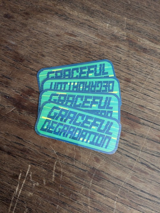
> GRACEFUL DEGRADATION stickers measure 3"x2" and are a love letter (love sticker?) to several of my favorite people, because i have a type and that is type includes chronically ill techno wizards
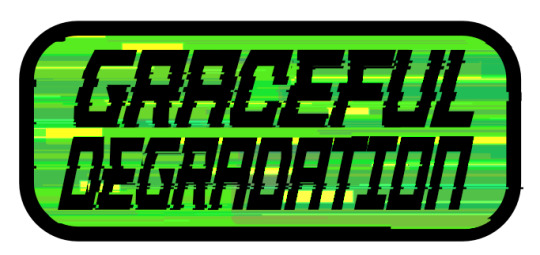
@craftsbyrom helped me a ton with some explanation on how to create the glitch effects i desired via a bespoke text based tutorial (why do those not exist anymore), which i then layered with this streaky holo film following the direction of the glitches. the end result is super cool!!
font was made by the typography artist yutaONE (insta: @/yuta_ptv_jp )
you can find these guys listed on my ko-fi shop for a couple bucks each, along with a bunch of other fun goodies
#cybercore#punk art#queer artist#graceful degradation#handmade stickers#diy#mochi rambles#mochi crafts#mochi makes stickers#mochi makes graphics#graphic design
42 notes
·
View notes
Text
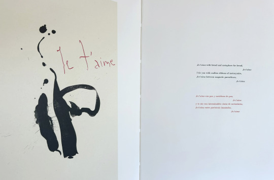
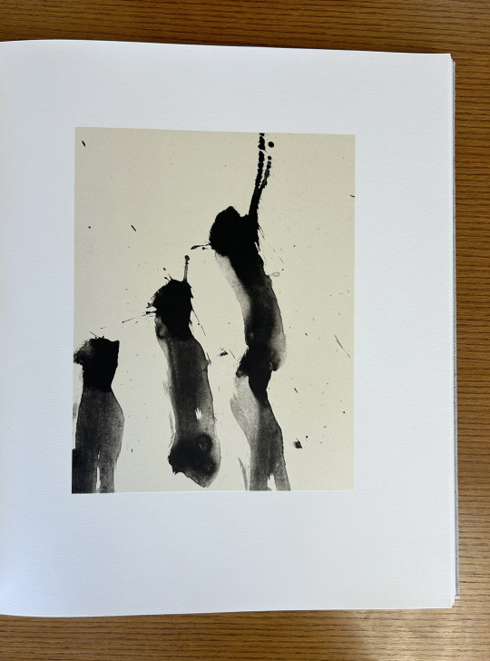
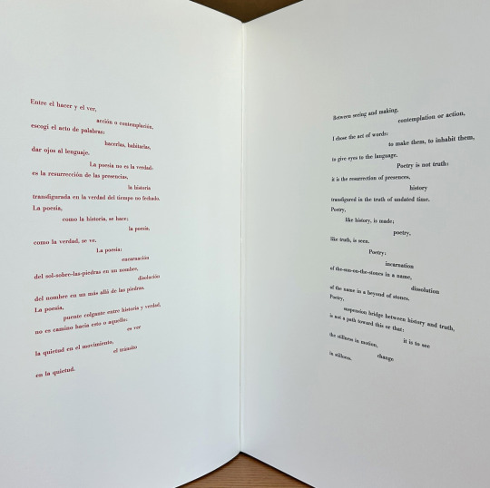
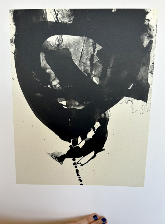
It’s Fine Press Friday!
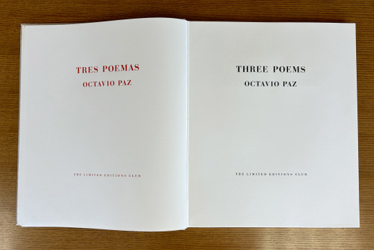
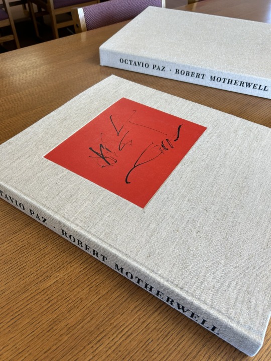
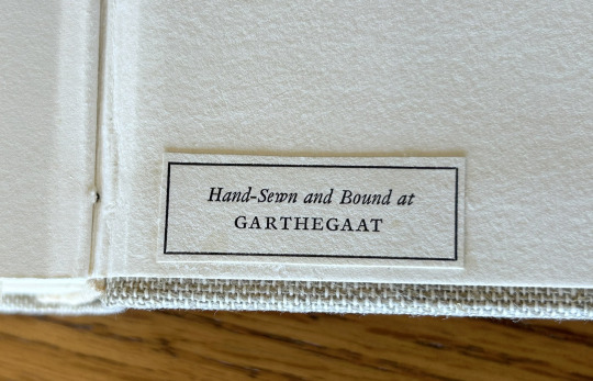
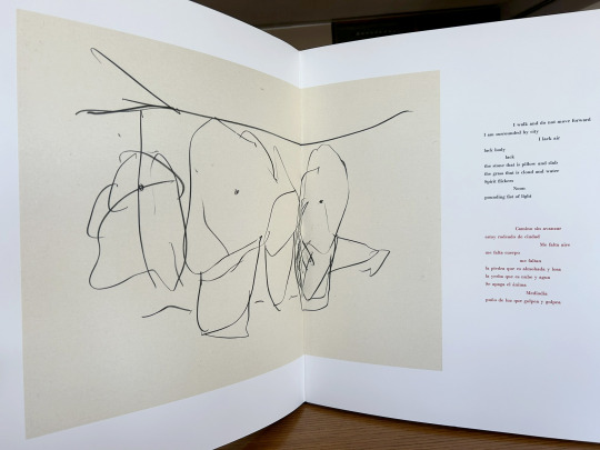
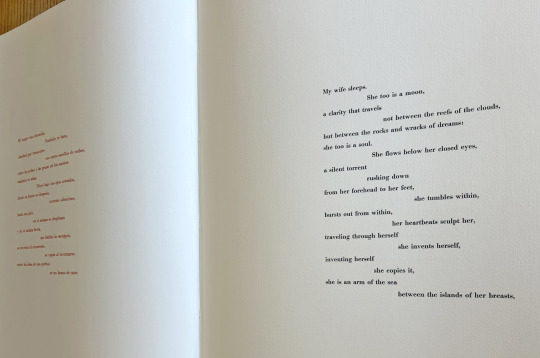
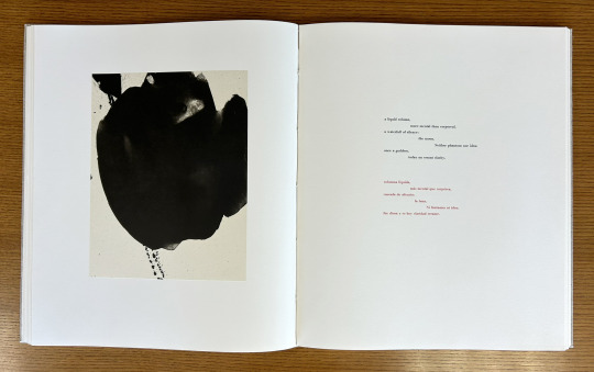
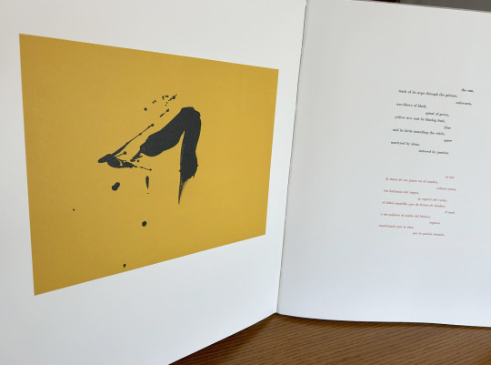
Today we’re taking a look at our 1987 Limited Editions Club release of poet, diplomat, and Nobel laureate Octavio Paz’s (1914–1998) Three Poems. Published as a bilingual Spanish-English edition of selections from The Collected Poems of Octavio Paz, 1957-1987 (translated by Eliot Weinberger, the primary translator of Paz’s work into English), this prodigious publication measures 56 cm and features lithographic illustrations by abstract expressionist painter and printmaker Robert Motherwell (1915-1991). The text was handset at Stamperia Valdonega (Verona, Italy) in Bauer Bodini Bold and Bauer Bodini Bold Italic typefaces, both of which were cast by Fundicíon Tipográfica Neufville (Barcelona, Spain). Lithographs were printed at Trestle Editions on hand-made Japanese papers and text was printed at Wild Carrot Letter Press (Hadley, MA), Stamperia Valdonega, and The Heritage Press on mould made paper from Cartiere Enrico Magnani (Pescia, Italy). It was hand-sewn and bound at the Garthegaat Bindery.
The book was designed by Benjamin Shiff, LEC book designer and son of Sidney Shiff, who had purchased the debt-ridden Limited Editions Club in 1979. Under the leadership of Shiff, a one-time Wall Street broker, the LEC gained a broadened subscription base, increased the quality of their publications, diversified their roster of artists, and returned to profitability.
Though minimal and modern in presentation, the production of this edition plumbed the depths of printing history. The Magnani paper mill was established on the banks of the Pescia river (known for its clear water- a necessity for paper production) in 1404, half a century before Gutenberg’s printing press was first put to commercial use. And the Fundicíon Tipográfica Neufville (operational 1885-1995), also known as Neufville Typefoundry, was the biggest 20th century supplier of the printing industry in Spain. After a number of ownership transfers, the company, alongside Bauersche Gießerei (a German typefoundry, operational 1837-1972), was succeeded by Bauer Types, which would leverage ownership of the rights to many of the original typefaces from both foundries to lead the way from lead type production to digital typography.
--Ana, Special Collections Graduate Intern
View more Limited Editions Club posts
View more lithography posts
View more Cartiere Enrico Magnani posts
View more Stamperia Valdonega posts
#Fine Press Fridays#Fine Press Friday#Limited Editions Club#lithography#Cartiere Enrico Magnani#Stamperia Valdonega#Bauer Types#Magnani paper mill#Bauersche Gießerei#Octavio Paz#Eliot Weinberger#Robert Motherwell#Fundicíon Tipográfica Neufville#Three Poems#Tres Poemas#Wild Carrot Letter Press#Trestle Editions#mould made paper#Garthegaat Bindery#Benjamin Shiff#Ana
26 notes
·
View notes
Text
Crafting Eye-Catching Designs: Tips and Ideas for Custom Print T-Shirts
Introduction:
In the world of custom print t-shirts, creativity knows no bounds. From witty slogans to intricate illustrations, the possibilities for designing eye-catching t-shirts are endless. In this comprehensive guide, we'll explore a variety of tips and ideas to help you unleash your creativity and craft unique and memorable designs for custom print t-shirts.
Know Your Audience:
Understanding your target audience is key to creating designs that resonate with them. Consider their demographics, interests, and preferences when brainstorming design ideas. Tailoring your designs to appeal to specific groups will increase the likelihood of your t-shirts being well-received.
Stay on Trend:
Keeping up with current fashion trends and popular culture can inspire fresh design ideas. Incorporate elements such as popular hashtags, memes, or cultural references into your designs to capture the attention of your audience and stay relevant.
Play with Typography:
Typography can make or break a t-shirt design. Experiment with different fonts, sizes, and arrangements to create visually striking text-based designs. Consider mixing and matching fonts to add depth and personality to your designs.
Embrace Minimalism:
Sometimes, less is more when it comes to t-shirt design. Embrace minimalism by using clean lines, simple shapes, and limited color palettes to create understated yet impactful designs. A well-executed minimalist design can make a powerful statement.
Incorporate Humor:
Humor is a universally appealing element that can instantly make your t-shirt designs more engaging. Inject some wit and whimsy into your designs with clever wordplay, puns, or humorous illustrations that are sure to elicit a smile from your audience.
Experiment with Illustrations:
Illustrations are a versatile design element that can add personality and charm to your t-shirts. Whether hand-drawn or digitally rendered, illustrations offer endless possibilities for creativity. Experiment with different styles, themes, and techniques to create unique and visually compelling designs.
Create a Series:
Developing a series of related designs can add depth and cohesion to your t-shirt collection. Consider creating designs that follow a common theme or tell a story when viewed together. This approach can also encourage repeat purchases from customers who collect multiple designs from the series.
Think Outside the Box:
Don't be afraid to think outside the box and push the boundaries of conventional t-shirt design. Explore unconventional materials, printing techniques, or interactive elements to create designs that stand out from the crowd and leave a lasting impression.
Seek Inspiration:
Draw inspiration from a variety of sources, including art, nature, literature, and pop culture. Keep a sketchbook handy to jot down ideas or sketches whenever inspiration strikes. Additionally, browse online platforms, such as Pinterest or Instagram, for design inspiration and trends.
Solicit Feedback:
Finally, don't hesitate to seek feedback on your designs from friends, family, or peers. Constructive criticism can help you refine your designs and identify areas for improvement. Additionally, consider conducting focus groups or surveys to gather feedback from your target audience.
Conclusion:
In conclusion, creating unique and eye-catching designs for custom print t-shirts requires a combination of creativity, inspiration, and strategic thinking. By knowing your audience, staying on trend, experimenting with typography and illustrations, and thinking outside the box, you can craft designs that captivate attention and leave a lasting impression. Whether you're designing for personal expression, brand promotion, or profit, these tips and ideas will help you unlock your creative potential and create t-shirt designs that truly stand out.
3 notes
·
View notes
Text
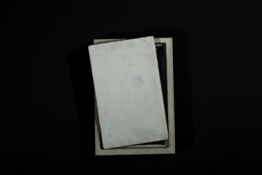
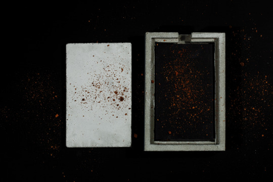
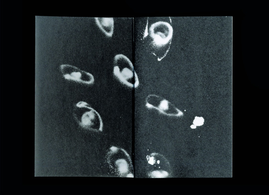
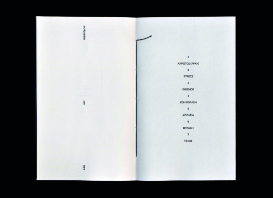
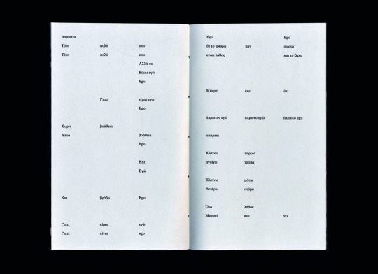
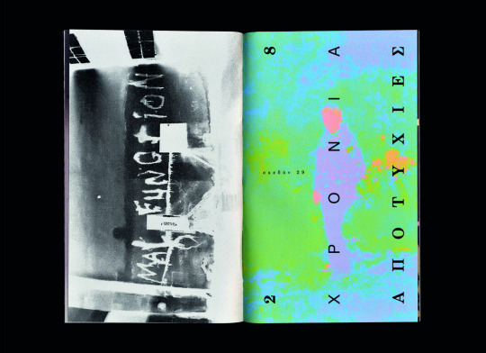
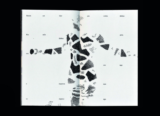
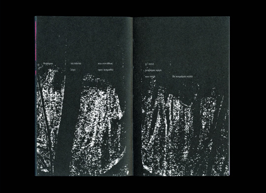
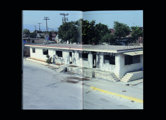
Spreads and photography of my book "EGOΕΓΩ - A Concrete Diary," designed as part of my Bachelor studies.
Some words on that:
The work EGOΕΓΩ - A Concrete Diary is the product of personal concerns and explorations. The purpose of this project was my need to record, as freely as possible, the things that have been on my mind in recent years, and to compose them into a cohesive work that, in its final stage, would be presented to a wider audience. In this project, I play a dual role: that of the designer and that of the client. The goal is to explore design based on a specific concept, and to develop my time management and decision-making skills. In the second phase, as some aspects of the project were the result of collaboration, I had the opportunity to further develop my organizational and communication skills—important abilities for my professional career. Lastly, the project highlights the importance of collaboration and the DIY (do it yourself) philosophy.
This idea stems from my personal involvement in various fields of applied arts, my love for collecting printed material, and my obsession with photographing everything that happens around me. The methodology behind the work combines photography, illustration, and typography. I aimed to explore the use of different materials in order to experiment with new textures, and to test the limits of both my creativity and the methods I chose. The creative thinking behind the project revolves around the individual as both a unit and a member of society. Through storytelling, I attempt to express internal dilemmas, concerns, insecurities, fears, and emotions of all kinds that shape who we are. There are references to memories and grievances—things that lead us on an endless journey of questioning what takes precedence: our self or our ego? These questions are based on real thoughts and situations, either my own or those of people close to me.
The approach to the message I seek to convey takes shape through the narration of a familiar circumstance, framed by a plethora of symbols. The circumstance I refer to is the simulation of a "burial," and the structure of the presentation of the work at the university is based on this practice. I chose this parallel because it is an event that concerns all individuals. It is an honest moment of expression for the participants, and despite the lack of justice that sometimes weighs it down, it remains the most just event in our lives. In the case of EGOΕΓΩ, the individual is represented by the book. Anyone who approaches it—whether out of curiosity or natural attraction—and opens its pages, is confronted with its content. Images and texts spill over the edges of the pages, like repressed thoughts. The book closes, perhaps it will open again, but to do so requires hands to grasp it and a will to understand. With each touch, it is given new life. With the end of one era, a new one is born. New bonds are created: solidarity, understanding, and empathy. Perhaps even new friendships. In such an intense moment, the feelings that are born merge and bring to the surface something new—stronger and ready to move forward. In other words, just as one cycle closes and through it we gain resources for the next phase, this presentation is both an end and a beginning, a transition to something else.
The explanation of the name EGOΕΓΩ clearly touches on the "battle" between our self and our "ego," setting the stage for what is to follow. The logo is fully typographic, highlighting the two words (EGO and ΕΓΩ). Schematically, it represents the form of a person—very abstract. The purpose of this decision is not merely to make the design interesting, but to capture the two aspects of ourselves: "EGO" and "ΕΓΩ".
Project supervisor: Anna Altouva
Published by Brick Home Studio, in Athens, June 2023
Edition of 34
11 X 18 cm, 92 pages
Digital offset printing: Fotolio S.A.
Handmade coptic binding: Brick Home Studio
Cover: 1190gsm total black bookbinding paper / Body: Munken Print white 115 gsm
Photography and scans: Christos Kotsinis
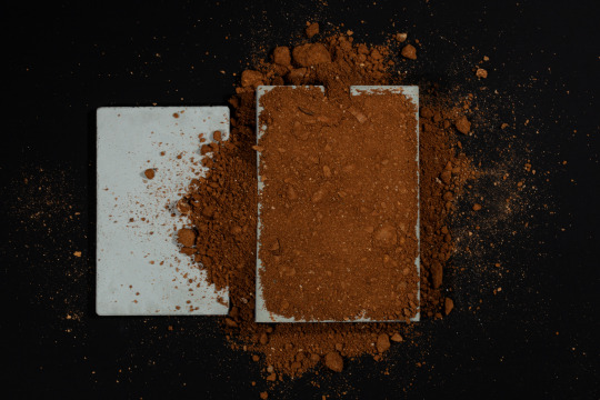
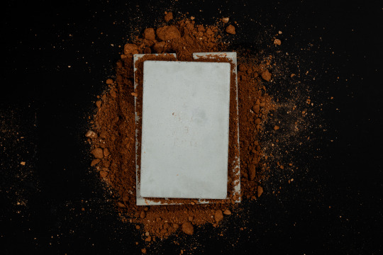
Concrete case: Sergios Fotiadis (We design)
#2022#2023#graphic design#visual communication#concrete poetry#editorial design#art book#a concrete diary
7 notes
·
View notes
Text
Week 4
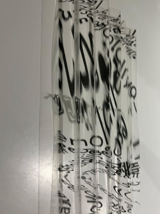
Week 4 went more experimental based on the concepts of week 3. I tried to create the same concept with transparent paper but reverted the negative space from transparent to black and had the texts in transparent areas.
This experiment, however, was unsuccessful because each layer affected the bottom layer with black space covering texts.
My second idea was inspired by the Forest of Typographic Design by Toshiyasu Nanbu.


However, I wanted to try printing it on transparent paper since I would have trouble cutting between the letters (some of the scripts have letters that are not connected to the baseline).
It did not turn out the way I wanted, especially in black and white, so I might explore this design later for experimental or 3D.
I created a smaller version (prototype) of these two experiments to cut the expenses and save more money.
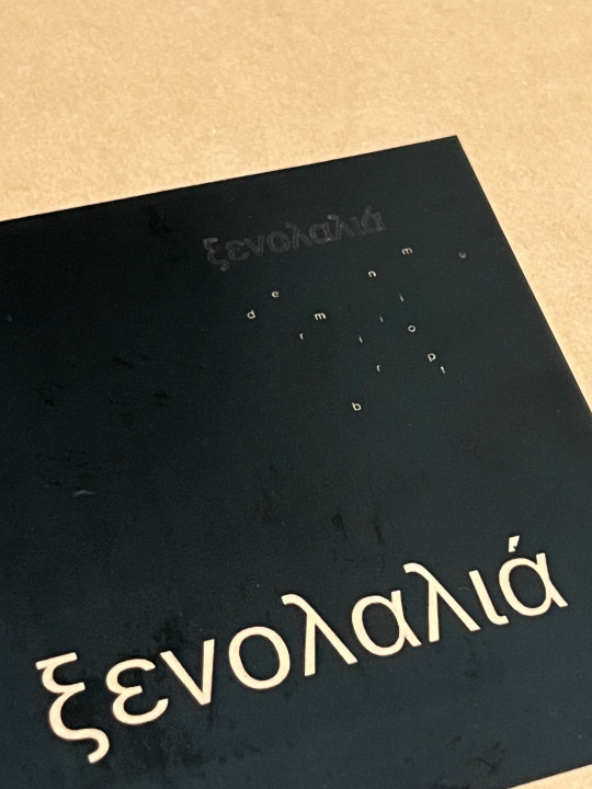
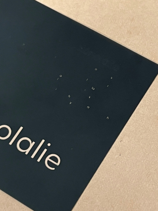
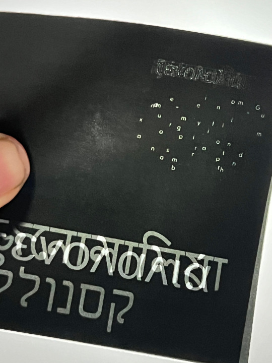
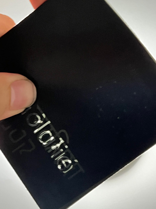
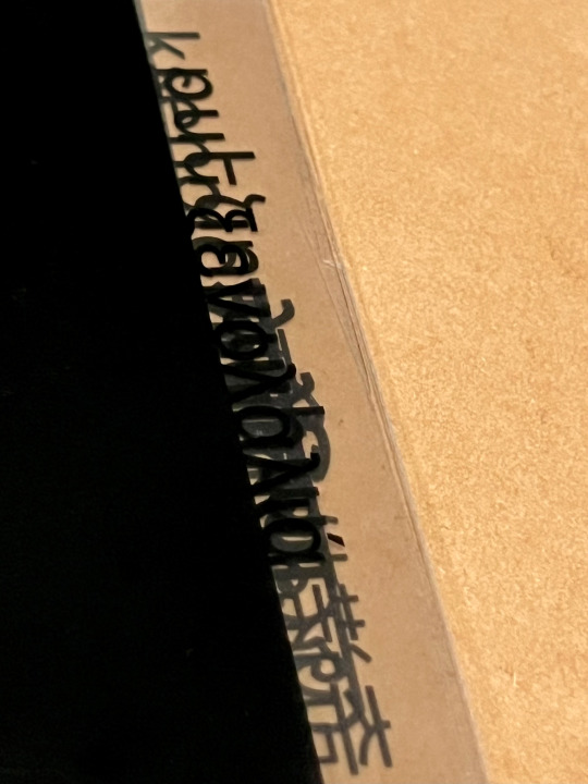
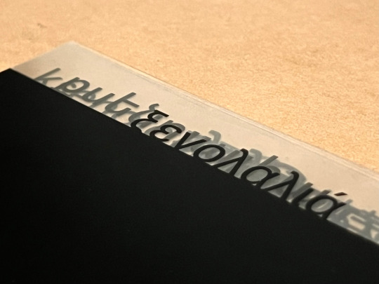
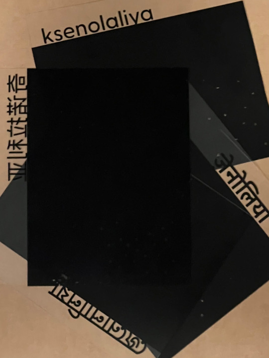
Inspired by a project called Lenticular Signage by Josh Fathers, I created my third experiment, but on transparent paper based on the melted-words design and Xenolalia typography, which I did in the second week.
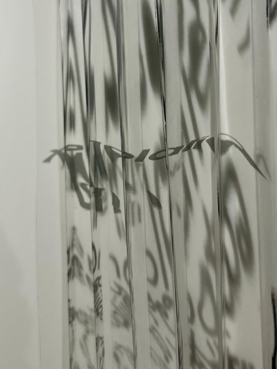
This experiment relies more on how you look at it, and I might work on it for another part of this course. By looking at it from left to right, you will see the abstract melted words, and from right to left is the Xenolalia typography.
However, I will definitely print it on another material instead of transparent paper to see the details and designs more clearly without other elements interrupting eyes while looking at one side.
2 notes
·
View notes
Text
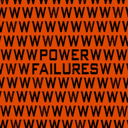
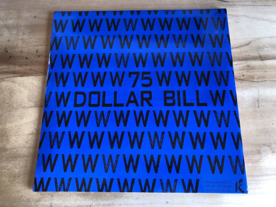
Uncovered: 75 Dollar Bill - Power Failures
The shortlisted album artworks have been announced for our annual art prize Best Art Vinyl 2023. We now begin to delve into the creative process behind some of the 50 nominees. First up is 75 Dollar Bill's re-release of Power Failures for the first time on vinyl. We were lucky enough to catch up with the band's guitarist and album cover designer Che Chen.
Che Chen founded 75 Dollar Bill in 2011 with percussionist Rick Brown. He tells us, "I wanted to be a painter before I wanted to be a musician, so the visual aesthetic of the band has always been really important to me. I've done the artwork for all of our physical and digital releases, and many of our posters and fliers too."
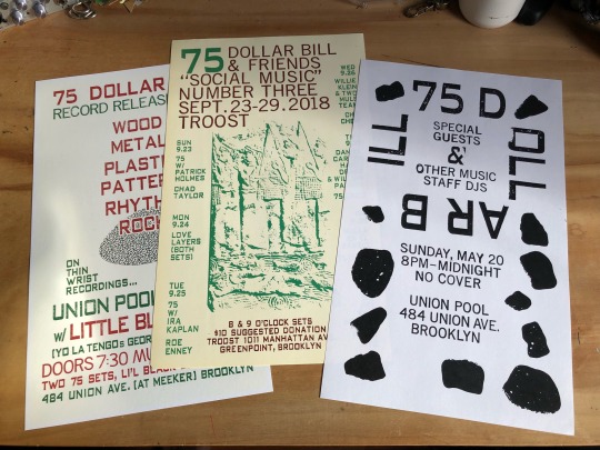
Che Chen flyer design work for 75 Dollar Bill
Che Chen explains, "Power Failures first came out as a digital release on Bandcamp in July of 2020. It was our first pandemic summer, Trump was still president (hopefully for the last time!) and George Floyd had been murdered by Minneapolis Police Officers earlier that summer. There were protests everywhere, against police violence, institutional racism, wage inequality for essential workers, etc. The title of the record was very much a response to all of this, the way the pandemic exposed the failures of the state on all these different fronts."
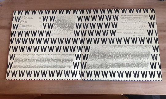
The use of text-based artwork has in fact been a consistent theme for the artist, he told us, "Text has always been central to the visual language of the band, and many of our record covers feature text as the only "image" in the designs. This approach made sense to me for Power Failures, since the title was very evocative of everything that was going on, but also open-ended enough that I didn't want to add an image that might get in the way of whatever associations someone looking at those words might have. I wanted to push the idea of a text only image a bit by using the typography to create a pattern (of W's in this case) which is only broken by the album title. The digital album just had the single square image as its artwork, so when Karl Records in Berlin offered to make a vinyl edition of the album as a gatefold double album, we got to expand the art significantly. I repeated this process on the back cover with the band name and changed the background colour. The LP centre labels refer back to the font and colour schemes of the front and back cover. I should also mention that the beautiful inside layout was done by Roland Küffner at Karl who did a fantastic job."
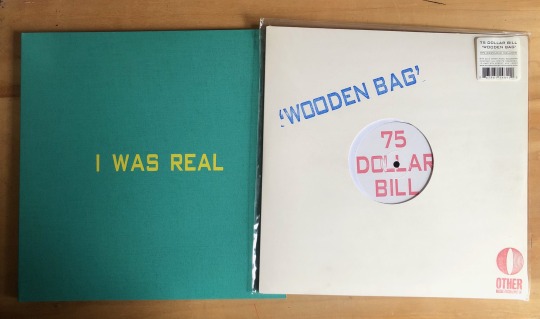
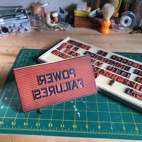
We asked Che Chen about the techniques he uses for his artworks, he explained, "The fonts I've used in most of my designs are actually from industrial moveable rubber stamp type. I've scanned physical prints of each set, several versions so that there are multiple versions of each character with slightly different imperfections, etc. I like the physical character of these fonts, how each impression is unique. For our first LP, Wooden Bag, Rick and I actually hand stamped the covers for the entire first edition using this rubber stamp type, but these days I mostly do the type setting on the computer."
Chen Chen got into music as a teenager in the suburbs of Washington DC in the 1990s when the post-hardcore scene around Dischord Records was thriving. The DIY ethos of bands taking control of their own production, from running their own labels and booking their own tours, to playing protests and benefits for local causes and working the door at their own shows, was and is still a big inspiration to him.
He tells us, "I've tried to carry those ideals on in my own work as best I can. Doing the art and the design for music projects I am involved with (and occasionally for friends) feels like an obvious extension of this. I love bands and labels that have a strong visual aesthetic and also really respect when artists are resourceful and can make striking designs using sometimes limited means. Sun Ra's home made jackets covers for his Saturn Records LPs and Harry Partch's Gate 5 Records are both examples of this for me."

Taken from the 'Sun Ra: Art on Saturn' Book - The Album Cover Art of Sun Ra's Saturn Label
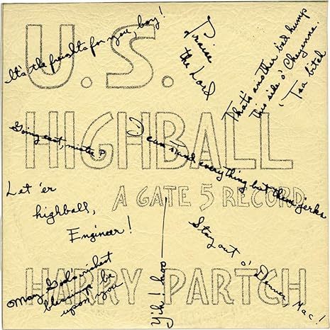
U.S. Highball |Gate 5 Records, Issue No. 6 (First pressing, inscribed to Amos Vogel in 1960) Hardcover – January 1, 1956
Che continues, "Lisa Alvarado’s screen printed album covers for the Natural Information Society records and her paintings that hang while they play (she plays harmonium in the group too) are another perfect fusion of visual and musical aesthetics to me."
Mandatory Reality by Joshua Abrams & Natural Information Society. Artwork by Lisa Alvarado
Power Failures by 75 Dollar Bill on Karl Records is shortlisted for the Best Art Vinyl 2023 Award. Artwork by Che Chen.
#bestartvinyl2023#record cover art#record frame#75 dollar bill#album artwork#contemporary art#art and design#best art vinyl#flip frame
2 notes
·
View notes
Text

fere-humanistica revival
illustration is figure 1., «Text page from Die Nachtfeier der Venus. Printed by Officina Serpentis. 1919.», from «Tendencies in Geman Book-Printing since 1914» by dr hanna kiel [The Fleuron, no. iv, at the office of the fleuron, london, 1923, p81]. dr kiehl tells us: «The ‘Officina Serpentis’, established in 1911 by Tieffenbach [eduard wilhelm tieffenbach], is comparable to the Vale Press, being almost entirely a reflection of its founder’s personality. He is his own publisher, type-designer and printer. In contrast to other German book-artists, he has been influenced more by the Kelmscott Press than by the Doves. His own type is based upon that used for Schoeffer’s Bible …» [ibid., p75]. ‘schöffer’s bible’ refers to the first Latin Bible printed by fust & schöffer, mainz, 1462, which was set in types cut by peter schöffer: these types were a further essay of an earlier cut by schöffer and first shown in the fust & schöffer edition of durandus [Rationale Divinorum Officiorum, mainz, 1459]. [cf. harry carter, A View of Early Typography, at the clarendon press, oxford, 1969, p33.] of the model for the durandus types a.f. johnson says: «The letter shares some Renaissance characteristics and others of the Middle Ages. Hence it has been called Fere-humanistica or Gotico-antiqua. … The hand is gothic but with considerable roman tendencies. It was the formal book-hand of the earlier Italian humanists of the fourteenth century, and in particular of Petrarch.» [a.f. johnson, Type Designs, grafton & co., london, 1959, p11].
for more on petrarch’s script vide ‹mano del petrarca›.
for more on peter schöffer vide ‹not schöffers roman›.
2 notes
·
View notes
Text
Exploring Florida's Unique Business Card Design Styles
Since they function as a logo of an individual's identity and brand, business cards are crucial for professional networking. They assist people in connecting and building rapport. Thus, a well-made card is important for possible business partnerships. Hispanic, Caribbean, and Southern cultural elements are among the various that greatly affect card design in Florida. Bright colors, distinctive typeface, and imaginative layouts that capture the local surroundings and, therefore, the characteristics of the people are the outcomes of this variety. Business cards from Florida are frequently distinctive, exhibiting originality and a sense of location that appeals to both the giver and, therefore, the recipient.
Historical Context
In the US, business cards were first employed for promotion by merchants in the 17th century. Due to the impact of regional businesses like land and tourism, Florida's design styles have progressed from straightforward text-based cards to intricate designs that showcase the state's culture and wonder.
Cultural Influences
The style of business cards is influenced by Florida's varied population, which incorporates Hispanic and Caribbean groups. Design choices are greatly influenced by the tourist sector, which places a robust emphasis on aesthetic appeal and regional attractions. Indigenous patterns and tropical themes are samples of cultural elements that provide distinctiveness and significance to card designs.
Industry-Specific Styles
Florida's many businesses, like land, healthcare, and tourism, all have distinctive card designs. These cards have images and expert designs, with luxury hotel samples demonstrating their dedication to quality. These cards frequently contain elaborate designs and premium materials, demonstrating the industry's distinct branding strategy.
Color Palettes and Typography
Popular color schemes like sunset oranges and pinks, which suggest warmth and creativity, and ocean blues and greens, which evoke peace and freshness, represent Florida's nature. Trends in typography, such as handwritten styles for a private touch and sans-serif fonts for modernity, are appealing to local companies. While typography sets the tone and conveys brand values, colors foster emotional ties and improve recognition.
Innovative Materials and Techniques
The use of bizarre materials, like recycled paper, sustainable materials, metal, wood, and plastic, in the creation of business cards is examined within the book. The cards are made more luxurious and textured by using techniques like die-cutting, foil stamping, and embossing. Tech startups, creative firms, and native craftspeople are all successful samples of companies that use innovative designs. They use unique, contemporary designs to speak innovation.
Digital Business Cards
Because they're easy to share and access, digital business cards are getting more and more common as smartphone usage rises. Unlike traditional cards, which are often forgotten or misplaced, these cards are convenient and are updated instantly. Florida-based businesses are setting the quality for digital card design, with marketing agencies and IT companies developing the primary user-friendly interfaces. QR codes are frequently used during networking events for seamless digital platforms.
Sustainability practices
With the usage of recycled paper, biodegradable plastics, and plant-based inks, the trend of environmentally friendly card design is growing. Digital cards are also used to chop down paper waste. Initiatives just like the Miami Beach Eco-Design Awards encourage sustainable practices, and native companies like Print It USA are setting the quality. Customers' perceptions of environmentally conscientious firms could also be improved by using sustainable design to extend brand loyalty and attract eco-aware customers.
Tips for Creating a Unique Card
This blog offers advice on the way to design a particular card, stressing the importance of layout, color schemes, font, and tactile components. It highlights how important it is to match the planning to the target market, mission, and values of the brand. Brand identification is strengthened when all marketing materials are consistent. A business card design company in Florida like Print It USA is a good place to seek out ideas and expert design services.
Conclusion
Florida's distinctive card designs uphold professionalism while highlighting the importance of regional trends. These designs improve networking possibilities and private branding. Additionally, to serve as a way of exchanging contact details, a well-designed card is a crucial component of a knowledgeable persona that will make an impact.
0 notes
Text
Tee Shirt Design Trends That Are Dominating Streetwear
Fashionable graphics on tee shirts function as self-expression by uniting art elements with cultural values with personal identities. Clothing designers in 2025 create T-shirts that feature striking images and simple art styles combined with modern production materials. People gravitate towards different clothing elements as 2025 trends combine modern creative elements with memorable past aesthetics.
This piece examines the most popular T-shirt styles that have taken control of the streetwear fashion world during 2025.
1. Vintage and Retro Graphics – The Nostalgia Effect
Clothing industry draws strength from nostalgia because it resurrects famous designs from historical periods. The streetwear aesthetic includes vintage concert t-shirts with fading as well as cartoons from the 1990s. The T-shirt designs integrate historical facts with contemporary interests which creates a link between people of today and the past.
The streetwear industry uses contemporary fabrics to bring back classic designs without sacrificing comfort elements. The oversized fashion style specifically benefits from this nostalgic look because these types of garments emphasize the vintage vibe.
2. A minimalist style in fashion design focuses on presenting as little as possible.
Minimalism has developed its own space within streetwear even though several people still choose bold visual elements. Typhoon Clothing T-Shirts that combine modern text design elements with monochrome colour schemes and delicate visual elements bring a professional atmosphere to everyday wear.
The main essence of minimalist tee shirt design involves using a few elements to achieve maximum impact. Pastel colors together with small embroidered logos and brief phrases form an effortless style on simple tees. Someone who desires elegant yet subtle style should choose this fashion trend.
3. Hand-Drawn Illustrations – Wearable Art
The trend of customization in 2025 supports hand-drawn illustrations which give T-shirts exclusive artistic designs. The designs stand apart from mass-produced graphics because they accomplish a personal and one-of-a-kind feel originating from street art as well as abstract patterns and cultural symbols.
Personality is celebrated through illustrated tees because they let people display their creative nature. Address any topic with original hand-drawings or artistic graffiti drawings or day-to-day sketches because these tees create noticeable appearances.
➡ Get an artistic edge with the Local Adventure Oversized Loose Fit T-Shirt.
4. Photo Tees – A Visual Story
A typical T-shirt design turns into dramatic clothing through the photo-tee trend. The use of high-quality image printing transforms city views and landscape pictures together with candid images into new streetwear designs. Through their innovative design tees have the ability to portray narratives through amazing visual content.
Modern printing methods allow photo tees to display clean outlines and intense colours which gives them their added appeal in wardrobes.
5. Typography-Focused Tees – Making a Statement
Typography-based designs have become more popular in tee shirt production because brands use bold fonts and asymmetrical layouts and distorted text. The recent fashion trend substitutes language with short statements comprised of slogans and single words that create artistic works from words.
The correct combination of font design and positioning transforms an ordinary T-shirt into an impactful message thus making this trend attractive to people who use style as their method of expressing beliefs and personality traits.
6. The oversized fit style presents a match between comfort and modern style appeal.
Cultural fashion makes Oversized T-shirts essential items because they deliver comfort along with versatility. The oversized T-shirt design provides a unique style when paired with any type of casual pants or when it serves as a base layer below a hoodie.
The oversized trend enables brands to be creative with graphics because it provides expanded design possibilities for print patterns and nonstandard placements. The outfit combination strikes an excellent harmony between casual comfort and fashionable elements.
7. Pastel and Earthy Tones – Soft but Bold
Streetwear designers have moved their choice toward pale pastel colors instead of the previous intense neoncolor palette. The fashion world selects pastels such as lavender and sky blue and peach with earthy colors featuring olive green and terracotta for their T-shirt design choices.
The streetwear aesthetic gets an updated look through these colours which create a mature and refined style of portraiture suitable for various fashion choices.
Learn More:- Tee Shirt Design Trends That Are Dominating Streetwear
0 notes
Text
Top 10 Trendy Tee Shirt Designs for 2023: Explore the Latest Fashion
Tee shirts are an essential part of everyday fashion, and 2024 brought in some of the most exciting trends in t-shirt design. Whether you’re into minimalism, bold statements, or vintage vibes, there’s something for everyone. Here are the top 10 trendy tee shirt designs of the year:
Retro Graphics – Nostalgic designs featuring vintage logos, 90s pop culture references, and old-school typography are making a strong comeback.
Oversized Prints – Large, bold graphics that cover most of the shirt, including abstract art, anime, and surreal designs, are in high demand.
Minimalist Typography – Simple yet striking text-based designs with short, powerful quotes or brand logos continue to dominate.
Y2K Aesthetic – Inspired by the early 2000s, these tees include cyber graphics, neon colors, and futuristic elements.
Sustainable and Eco-friendly Prints – Designs that promote environmental awareness, nature motifs, and sustainable fashion messages are trending.
Tie-Dye & Handcrafted Styles – The DIY and handmade look remains stylish, with unique color blends and patterns standing out.
Vintage Band Tees – Classic rock, punk, and hip-hop band tees remain an essential part of street fashion.
Street Art & Graffiti-Inspired Prints – Urban and edgy, these designs bring a creative and rebellious look to everyday wear.
Cartoon and Anime-Inspired Tees – Popular characters and creative manga-inspired art continue to attract fans of all ages.
Techwear & Cyberpunk Themes – Reflecting futuristic and digital aesthetics, these tees often feature glitch effects, barcodes, and sci-fi elements.
Tee shirts in 2024 have pushed the boundaries of creativity, allowing individuals to express their personalities and style like never before.
0 notes
Text
Master Graphic Designing
Graphic designing is more than really developing visually attractive pictures. It’s a powerful device utilized by corporations, artists, and marketers to talk messages, construct producers, and captivate audiences. With the rise of digital systems, the demand for professional photo designers has skyrocketed. Whether you’re a novice looking to discover the creative international or an expert searching to beautify your capabilities, image format schooling is a vital factor to unlocking your capacity.
What is graphic design?
Graphic layout combines art and generation to speak thoughts visually. It involves using images, typography, and illustrations to create designs that can be both informative and aesthetically attractive. The purpose of photograph layout is to deliver a message simply and efficiently. To acquire this, one wants to grasp several software programs and design concepts.
Why Should You Take Graphic Designing Training?
If you want to pursue a career on this subject, proper training is essential. Here’s why:
Skill Development: Graphic layout schooling permits you to build foundational talents. From gaining knowledge of a manner to apply industry-massive software like Adobe Photoshop and Illustrator to information design thoughts, proper schooling ensures to procure the talents had to be successful.
Career Opportunities: An educated photo designer can discover many possibilities in various industries, collectively with advertising and marketing, net layout, print media, and advertising. Companies are continuously in search of specialists who can create compelling designs to attract customers.
Boost Creativity: Graphic design schooling permits you to expand your modern boundaries. Through mounted education and actual-international initiatives, you’ll advantage the self-warranty to experiment with new ideas and patterns.
The Key Components of Graphic Designing Training
Effective photograph designing training packages recognition on several critical factors:
Design Principles
A strong information of design standards is vital. These encompass balance, contrast, alignment, and proximity. When you grasp these, you’ll create visually attractive designs that can be nicely based and clean to understand.
Mastering Graphic Design Software
Today, maximum photo designers paint with software applications like Adobe Photoshop, Illustrator, and InDesign. During education, you’ll discover ways to navigate these packages, utilize shortcuts, and create designs correctly.
Three. Typography
Typography refers back to the art of arranging text in a way that enhances readability and visual appeal. Whether it’s deciding on the proper font or adjusting line spacing, typography plays a vital position in layout.
Four. Color Theory
Understanding how sun shades engage could make or break a format. A specific photographer is aware of a manner to apply shade to rouse feelings, highlight important content material, and create harmony within a layout.
Five. Portfolio Creation
A portfolio is crucial for any photograph style clothier. Training programs normally assist you in constructing a portfolio that showcases your great work. This portfolio will be a treasured device even as making use of it for jobs or freelance opportunities.
How to Choose the Right Graphic Design Training Program
Choosing the proper educational utility is vital for your success. Here are a few suggestions:
Accreditation: Ensure the program is permitted and offers diagnosed certification. This guarantees you’ll be gaining knowledge of the maximum updated strategies.
Flexibility:
Many online photo layout guides provide flexibility in terms of time and place. If you’re going for walks or analyzing complete-time, online training can be a great option
1 note
·
View note
Text
Artist Research:
Gabriella Joyce:
Gabriella Joyce is an artist and designer from Mexico currently based in Dublin. She creates bright and colourful prints inspired by Mexican culture and also by her time in Ireland.


I love how she includes bold bright patterns in her work, while also including cultural aspects ie using Irish language and incorporating pints and cathedrals etc.
Id like to incorporate bold text in some of my future work (maybe during graphic design workshop) as I love typography and how text can show feeling, mood and can add a lot to a piece of work. I think id like to combine painting and graphics to create a new piece of work.
0 notes
Text
13 Timeless Niches for Print-on-Demand Designs (That Never Go Out of Style)
Ever wondered why some designs keep selling year after year? While trends come and go, certain niches have a magical staying power. Whether you’re a newbie or a seasoned designer, focusing on timeless print-on-demand (POD) niches can be your golden ticket to steady sales. Let’s explore 13 evergreen categories that never lose their charm.
Why Timeless Niches Matter in POD
Consistent Demand Over Time Timeless niches cater to universal human interests—think humor, love for pets, or wanderlust. These themes don’t fade with seasons; they’re always relevant. Imagine selling a “Coffee First, Questions Later” mug today and still selling it five years later! You can find unique and trending designs in my store here: TeePublic Store.
Reduced Market Saturation Risks Trendy niches (looking at you, fidget spinners) get flooded fast. Evergreen niches, however, attract steady buyers without cutthroat competition.
Building a Loyal Customer Base When your designs resonate deeply, customers return. A dog lover who buys a “Proud Dog Mom” shirt today might come back for matching pet bandanas tomorrow.
The Ultimate List of 13 Timeless POD Niches
1. Humor and Sarcasm Everyone loves a good laugh. Sassy slogans like “I’m Not Lazy, I’m in Energy-Saving Mode” work on mugs, shirts, and stickers. Design Tips for Funny Merchandise Keep text concise and pair it with bold visuals. Use relatable inside jokes—think Monday blues or caffeine addiction.
2. Pet Lovers’ Paradise Pet owners are a passionate (and spendy!) bunch. Designs featuring cats, dogs, or quirky pet quotes (“Treats Please”) are instant hits. Popular Pet-Related Design Themes Try breed-specific art or puns like “I Work Hard So My Dog Can Have a Better Life.”
3. Wanderlust and Travel Inspiration Globetrotters adore showcasing their adventures. Maps, vintage suitcases, or quotes like “Not All Who Wander Are Lost” sell well. Capturing the Spirit of Adventure Use earthy tones and minimalist landscapes to evoke wanderlust.
4. Motivational and Inspirational Quotes From gym-goers to entrepreneurs, everyone needs a pep talk. “Rise and Grind” or “She Believed She Could, So She Did” never get old. Crafting Quotes That Resonate Focus on empowerment and simplicity. Pair with subtle graphics like mountains or arrows.
5. Vintage and Retro Aesthetics Nostalgia sells. Think 80s neon vibes, retro band tees, or classic car designs. Nailing the Retro Vibe Use faded colors, distressed textures, and era-specific typography.
6. Hobby-Centric Designs Gardening, knitting, gaming—designs that celebrate passions build instant connections. Examples: Crafting, Gardening, etc. A shirt saying “Gardening Is My Therapy” or a mug with “But First, Coffee… Then Quilting” taps into niche communities.
7. Seasonal Classics (Without the Expiry Date) Avoid holiday-specific designs. Instead, focus on year-round themes like autumn leaves or cozy winter vibes. Year-Round Seasonal Appeal A “Hello Fall” sweater or “Winter Is Coming” hoodie works beyond December.
8. Pop Culture Throwbacks Nostalgic references to 90s cartoons, retro video games, or iconic movie quotes (“You Can’t Handle the Truth!”) attract loyal fans. Leveraging Nostalgia Effectively Stay away from copyrighted material. Instead, use subtle nods like pixel art or retro color schemes.
9. Fitness and Wellness Motivation Fitness buffs love gear that keeps them motivated. Think “Sweat Now, Shine Later” or yoga-themed art. Designs That Encourage Active Lifestyles Use bold typography and dynamic visuals like runners or dumbbells.
10. Nature and Environmental Themes Eco-conscious buyers gravitate toward nature-inspired designs—forests, oceans, or wildlife. Eco-Friendly Design Trends Use muted greens and blues, and highlight sustainability in product descriptions.
11. Foodie Culture and Culinary Art Foodies can’t resist quirky food puns or minimalist illustrations of coffee cups, pizzas, or avocados. Appetizing Visuals That Sell Make designs colorful and whimsical. Think “But First, Coffee” with a steaming mug graphic.
12. Gaming and Geek Fandom Gamers and comic fans are a devoted crowd. Retro game controllers, abstract Zelda motifs, or witty gamer quotes (“Respawn in 3… 2… 1…”) work wonders. Tapping into a Passionate Community Engage with forums or social media groups to understand trending themes.
13. Minimalist and Typography-Based Art Less is more. Clean lines, single-word designs (“Breathe,” “Imagine”), or elegant fonts appeal to modern aesthetics. Less Is More in Design Stick to neutral palettes and high-contrast layouts for maximum impact.
How to Choose Your Niche Wisely
Assessing Your Interests and Expertise Design what you love! Passion fuels creativity—if you’re a hiking enthusiast, nature themes will feel authentic.
Analyzing Market Trends and Gaps Use tools like Google Trends or Etsy searches to spot demand. Look for niches with steady traffic but fewer competitors. Need inspiration? Check out my latest POD designs here: TeePublic Store.
Conclusion: Building a Sustainable POD Business Timeless niches aren’t just safe—they’re smart. By focusing on evergreen themes, you create designs that sell today, tomorrow, and years down the line. Ready to turn your creativity into a lasting venture? Pick a niche, start designing, and watch your POD business thrive! Don’t forget to explore more designs in my store: TeePublic Store.
FAQs
1. How do I avoid copyright issues in pop culture designs? Focus on original art inspired by trends, not direct replicas of logos or characters.
2. Can I mix multiple niches? Absolutely! A “Coffee-Loving Cat Mom” design combines pets, food, and humor.
3. Which platforms are best for selling POD products? Etsy, Redbubble, and Printful are popular choices for beginners.
4. How often should I add new designs? Aim for 5–10 new designs monthly to keep your store fresh.
5. Do I need design experience to start? Nope! Use tools like Canva or hire freelancers on Fiverr to bring your ideas to life.
#timeless print-on-demand niches#best POD niches 2024#evergreen POD designs#profitable print-on-demand ideas#trending POD niches#top-selling POD designs#print-on-demand success tips#best-selling t-shirt designs#POD business growth#passive income with print-on-demand
1 note
·
View note
Text

Designing for Print: Posters, Brochures, and Flyers
Designing for Print: Posters, Brochures, and Flyers. In a world dominated by digital media, print design retains a powerful presence. Posters, brochures, and flyers remain essential tools for communication and marketing, offering a tangible and engaging way to connect with audiences. However, designing for print presents unique challenges and considerations compared to digital design. Institutes like MAAC Institute recognize these nuances, offering specialized training in print design to equip students with the skills needed to excel in this domain. This involves understanding print production processes, mastering layout principles, and employing effective visual communication strategies.
Key Principles of Print Design
1. Purpose and Audience: Before embarking on the design process, clearly define the purpose of the printed material and the target audience. This will guide design choices and ensure the message resonates with the intended recipients.
2. Layout and Hierarchy: Effective print design relies on a clear visual hierarchy, guiding the reader's eye through the information. Utilize headings, subheadings, and visual cues to organize content and emphasize key messages.
3. Typography: Choose fonts that are legible and appropriate for the content and audience. Consider font size, weight, and style to create visual interest and hierarchy. Limit the number of fonts used to maintain a cohesive and professional look.
4. Color: Color plays a crucial role in evoking emotions and attracting attention. Utilize a color palette that aligns with the brand and message, ensuring colors are vibrant and reproduce accurately in print.
5. Imagery: High-quality images are essential for capturing attention and conveying information. Select images that are relevant to the content, visually appealing, and appropriate for the target audience.
6. White Space: Don't underestimate the power of white space. Adequate spacing between elements improves readability and creates a clean, uncluttered design.
Specific Considerations for Different Formats
Posters:
Designed to be viewed from a distance, so utilize large, bold fonts and eye-catching graphics.
Keep the message concise and focused, using minimal text.
Consider the environment where the poster will be displayed to ensure it stands out.
Brochures:
Offer more space to convey detailed information, utilizing multiple panels and folds.
Employ a clear hierarchy and structure to guide the reader through the content.
Use a combination of text, images, and graphics to create an engaging and informative experience.
Flyers:
Typically single-page handouts designed for quick, impactful communication.
Prioritize a clear call to action and essential information.
Consider using eye-catching visuals and a concise message to grab attention.
Print Production Process
Understanding the print production process is crucial for achieving high-quality results. Key factors to consider include:
Bleed: Extend the design slightly beyond the trim edge to avoid white borders after cutting.
CMYK Color Mode: Ensure images and colors are in CMYK format for accurate print reproduction.
Resolution: Use high-resolution images (300 dpi) to avoid pixelation in print.
Paper Stock: Choose paper stock that complements the design and purpose of the printed material.
Printing Techniques: Explore different printing techniques, such as offset printing or digital printing, based on the project's needs and budget.
Tools of the Trade
Several software applications are essential for print design:
Adobe InDesign: Industry-standard layout software for creating multi-page documents with precise control over typography and imagery.
Adobe Illustrator: Vector-based graphics editor ideal for creating logos, illustrations, and scalable graphics.
Adobe Photoshop: Image editing software for manipulating photos, creating graphics, and preparing images for print.
Trends in Print Design
Print design continues to evolve, embracing new trends and technologies:
Minimalism: Clean, uncluttered designs with a focus on essential elements.
Geometric Patterns: Utilizing geometric shapes and patterns to create visual interest.
Bold Typography: Employing large, expressive fonts to make a statement.
Unique Finishes: Utilizing special finishes, such as embossing or spot UV coating, to add tactile and visual appeal.
Conclusion
Designing for print requires a blend of creativity, technical knowledge, and an understanding of print production processes. At MAAC Institute Pune, aspiring designers are trained in these essential aspects, gaining proficiency in industry-standard software and learning the nuances of print production. By mastering layout principles, typography, color theory, and imagery, designers can create impactful posters, brochures, and flyers that effectively communicate messages and capture attention. As print and digital media continue to coexist, embracing new trends and technologies will ensure that print design remains a vibrant and relevant form of communication.
0 notes