#text animation css
Explore tagged Tumblr posts
Text
Text Animation with Video Background
#text animation css#video background#html css animation#css animation#frontend#html css#css#html#css3#pure css animation#css animation examples
2 notes
·
View notes
Text

CSS Typing Text Animation
#css typing text animation#css text animation#text animation css#css animation tutorial#html css animation#css animation examples#pure css animation#html5 css3#html css#codenewbies#frontenddevelopment#css
4 notes
·
View notes
Photo
Shining Text CSS Effect Get Code from divinectorweb website
#shining text effect css#css shining text animation#simple text animation css#text animation css#css text effects#pure css animation#css animation examples#css animation#divinectorweb
2 notes
·
View notes
Text
💥 100+ CSS Text Animations 💻✨
Looking to make your web content more dynamic and engaging? Our September 2024 update features 22 new CSS text animation examples!
Ready to add some flair to your site? 🔥 Check it out!
→ https://freefrontend.com/css-text-animations/
9 notes
·
View notes
Text
I've made my blog's sidebar so much sexier by the way. if you even care
#rambling#spent a few days suffering at the hands of CSS and HTML to add a little tag nav section#with little menus for all my tags#and also made the search bar look nicer and do a little animation when you click on it#the last bit i'm trying to figure out is how to make the sidebar only able to be dragged and moved around by one point#so the text within can be selected and such#right now i've only been able to make it not-draggable around the avatar section but i'll get there when i have the time!!!#another fun thing i wanna add is a little secret section somewhere to play secret fun music from :] but again when i have the time
2 notes
·
View notes
Text
Scroll Driven Animations Notebook
New Post has been published on https://thedigitalinsider.com/scroll-driven-animations-notebook/
Scroll Driven Animations Notebook
Adam’s such a mad scientist with CSS. He’s been putting together a series of “notebooks” that make it easy for him to demo code. He’s got one for gradient text, one for a comparison slider, another for accordions, and the list goes on.
One of his latest is a notebook of scroll-driven animations. They’re all impressive as heck, as you’d expect from Adam. But it’s the simplicity of the first few examples that I love most. Here I am recreating two of the effects in a CodePen, which you’ll want to view in the latest version of Chrome for support.
This is a perfect example of how a scroll-driven animation is simply a normal CSS animation, just tied to scrolling instead of the document’s default timeline, which starts on render. We’re talking about the same set of keyframes:
@keyframes slide-in-from-left from transform: translateX(-100%);
All we have to do to trigger scrolling is call the animation and assign it to the timeline:
li animation: var(--animation) linear both; animation-timeline: view();
Notice how there’s no duration set on the animation. There’s no need to since we’re dealing with a scroll-based timeline instead of the document’s timeline. We’re using the view() function instead of the scroll() function, which acts sort of like JavsScript’s Intersection Observer where scrolling is based on where the element comes into view and intersects the scrollable area.
It’s easy to drop your jaw and ooo and ahh all over Adam’s demos, especially as they get more advanced. But just remember that we’re still working with plain ol’ CSS animations. The difference is the timeline they’re on.
Direct Link →
#animation#animations#chrome#code#comparison#CSS#CSS Animation#css animations#css-tricks#easy#effects#how#it#Link#links#list#One#scientist#scroll#Scroll Driven Animation#simplicity#slider#text#timeline#transform#Version#view
0 notes
Text
0 notes
Text
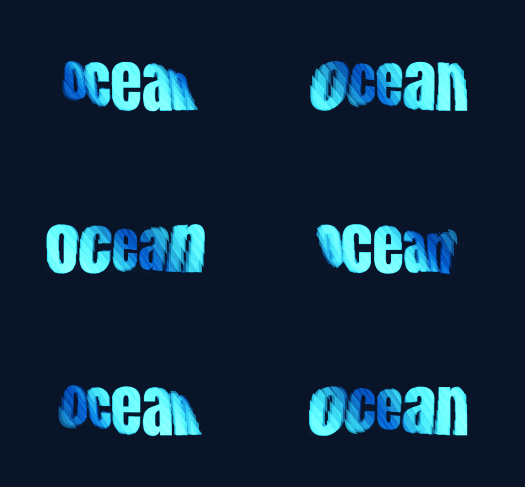
Pure CSS Text Wave
Here’s another nice text effect, a pure CSS text wave effect that you can customize and use in your next web project. Continue reading Untitled
View On WordPress
#Animation#Code#CSS#CSS3#HTML#HTML5#Resource#Snippets#Text Effect#Typography#Web Design#Web Development
0 notes
Text
I did some digging around on this! You know how if you're on non-mobile layout and if you hover your mouse over the "tumblr" logo in the top left, there's a rainbow animation? The CSS to render this animation is always running in the background and can chew up a surprising amount of CPU.
How tf does tumblr drain battery faster than YouTube
#tumblr is a competently-coded website.#I installed a tampermonkey script to disable CSS animations and saw my idle CPU when I have tumblr open drop precipitously#quality text post
760 notes
·
View notes
Text
"Hotel Couches & Other Hail Marys" Fic Notes
These aren't the traditional format but I have enough Hidden Little Things I wanna do very loose an informal fics notes
The "Hotel Couch" was Catra's Hail Mary, but the shared bed was Catradora's, and Catradora's reunion was the fans' Hail Mary.
The way I do tweets was invented back in DITM and "perfected" in SaD, when I also invented how I do Instagram posts/stories/reels/DMs. I wasn’t reinventing shit for the changes Twitter has made, it’s ~historically accurate~ to when Dashcon happened. The one change I made was not using the block quote indent for all the digital posts I usually do, but that entire fic was digital, so I only ended up using it for indented reply chains on Twitter (which worked out better tbh) and on the Instagram chapter to distinguish the posts and the descriptions of the images/videos.
Fake tumblr posts/alternate reality dashboard simulators are already a popular format on Tumblr so there really was very little for me to do there. I made some tweaks by adding in the comment/share/like icons I use for Twitter, but overall that part was easy. The hardest part was getting the follow button blue. On Tumblr that's easy, colored text is a built-in option, but for AO3 I had to use a work skin to include some CSS for the color code. I ended up modifying the Reddit skin I had made using this tutorial because I was planning to capstone with a Reddit post anyway so I could just add on the blue on. Normally I don’t consider using colored text for many reasons (hard to read, might look great on my site skin and be invisible on others, etc), but in the case of the follow buttons they could just as easily not be there and contribute nothing but realism, so I wanted to have them in their standard blue.
Normally I don’t even consider using Tumblr when doing social media posts in a fic but considering this was inspired by Dashcon which was literally a Tumblr convention, I had to for this one. As such, the first chapter is mostly set-dressing for the disaster the convention is itself so when people complain in future chapters it makes sense. The rough outline was: Tumblr (convention background) Twitter (reconnect and beef background) Instagram (bond) DMs/texts (get together) Reddit (retrospective epilogue wrapping up the story)
Most of the usernames are just like. Random shit I could come up with. The ones on Tumblr are supposed to be random stuff on the site and the ones on Twitter lean more towards fandom-associated stuff for the She-ra fandom since it’s transitioning from the pool of All Con Attendees to the microcosm of their fans affected. Most of these can be found in previous fics such as DITM. That said, here are the name(s) with inspo behind them:
🍕nnlftbf: none pizza left beef. And no vowels. I have always desperately wanted to eat the none pizza
🦉pewpew4gloria: Star Siblings fan (reference to Starla’s bird)
🐍nagashed: this is a reference to both the plethora of (human animal hybrid)(bodypart) tumblr usernames (ex: dragongirlsnort) and a manga that my friend is reading.
🎃pumpkakitty: reference to a really cute hat in Pokemon Go 🥺 (okay it’s supposed to be a pikachu but it looks like a kitty tbh)
🌈edgeofgloria: another Star Siblings fan
He-Ro in the Freak Zone @frightzest: He-Ro is an actual MOTU character, frightzest is from DITM
Aside: the “looki loo” thing is a reference to Razz’s good ol pal Looki, hence the fandom in-joke
praying mantis wife @nineten02: nineten is a reference to my Stardew Valley chickens <3
Katastrophe @viviviolence: Vi’s shoulders you mean so much to me
Oh yeah Zeni is Zine just. Flipped. Also the original She-ra artist was one of the two sponsors who pulled out and the entire reason they were there. I mean what?
When Adora called Catra aggravating on camera she was doing it in a horny way but with Real Beef between them it didn’t come across that way. She also said they wouldn’t work together as a factual thing rather than spiteful. There was no way the studio OR Catra would let them.
When Catra said she’s “finally suing” she’s referring to the long-standing rumor that the previous showrunner “stepped back” because Catra was threatening to sue for the wage/credit theft, or the discrimination, or the abusive work environment, or the-
The dates Adora reached out to Catra via DMs were all significant ones for the real series — season 1 debut for when they were nominated, prompting the thank you story, season 2 debut for when they won the award (I didn’t look up and don’t care when the actual GLAADs are lol), and season 3 debut when ZeniCon is actually taking place. Almost three years have passed since Catra’s ousting from the show back between seasons 3 and 4, tho.
Given the NDA and general threat-level from the studio, Adora didn’t think she could mention Catra on her main page without getting a talking to even with Weaver officially departed, so she tried to do it on her story, but Catra did NOT want the heat that could bring.
The foam She-ra crown from the Instagram reel is the same one they gave out at cons in 2018 and 2019.
Adora calling it the “season 5” rather than “season 4” wrap part led to fan speculation that season 5 really was written by Catra except for the weakest parts — some stuff needing to be condensed, the insertion of a new storyline — which like. Well they are right. But she said season 5 rather 4 (which was wholly Catra’s) because it’s the part she’s most proud of even after they took it from her. It’s what she was building to the whole time.
Catra and Adora lasted like ten minutes lying next to each other in bed before they ended up kissing and when it started progressing they snuck into the bathroom. It was obvious Bow was asleep and they were just hoping Glimmer was too. Glimmer, too, wishes she was asleep.
Glimmer refers to Catra being “at her worst” because she got really aggressive and disparaging of her old cast out of bitterness after they wouldn’t back her up in the press (to keep their jobs). They all understand why, but it is still frustrating.
Melendy is from my fic lore, she’s a magicat character I use sometimes who is named after Catra’s VA in the 80s. She plays a recurring character on the show, though on the minor side.
I linked the Ohio con video because 1) that video is the ONLY time I’ve heard of it and I love the drama 2) to hammer home all the shit I say in this isn’t just from Dashcon, I am not here to libel people and 3) because I like my secret little links, BUT if you want to see a good video on Dashcon, watch this one and literally never watch Internet Historian he’s a POS: https://www.youtube.com/watch?v=ZAqy-KDJAUM
The behind the scenes shitshow for She-Ra itself was inspired by the TV show Lost (though Catra keeping her storylines secret was inspired by Real She-ra and ND Stevenson)
Like I said, I had been wanting to do a fic that was “just digital” for a while. The massive problem with that is getting across the shit people don’t post online because there is not a single trace of Catra and Adora potentially being a couple until after ZeniCon. Catra and Adora were basically wildly attracted to each other from the moment they met on the show but wouldn’t cross that barrier because they worked together (especially because of where they worked together). They ended up hooking up during some high-stress times for the show just to deal with how much they wanted each other. Catra felt really betrayed when the cast wouldn’t stick their necks out for her when she was ousted. Privately they were all on her side and told the studio so, but to publicly side with her was to lose their jobs, and the show was their entire life. They ultimately picked their passion & livelihood over showing public support they didn’t think would make a difference anyway and she cut all ties with them. They did what they felt they could, which was mostly never denying her version of events and deflecting questions when they had no other choice, but they all felt bad about it and tried to reach out to her privately. She didn’t want to hear it, but fans were right that the real beef was with the studio. She fell back into their arms eventually because she could see they were doing what they could while keeping their jobs, and she knew just how much being unemployed sucked. Adora was also telling the truth when she said they were fighting for her version of the story by staying on the show and no matter how much Catra calls it theft, that is what she wants for her characters. Being forced into the same room let them all remember what it was like to be friends, and that’s what led them to eventually giving their apologies.
I have no idea why, when presented with “lol dashcon au” my brain goes “rampant wage theft, behind the scenes abuse, disgrace and scandal, show extension hell a la supernatural, brrrrrrrrrr” but there we go
#ff 25#fic notes#hcaohm#I'll edit some things when I get home I have to run errands before things get rudely close to closing time
26 notes
·
View notes
Text
Make Your Text Glow with CSS Join Telegram
#css text glow effect#css text effects#css tricks#css text animation#text animation css#codingflicks#html css#learn to code#code#frontend#css#css3#html#frontenddevelopment
9 notes
·
View notes
Text
Changing Text Animation using HTML CSS
#changing text animation#codenewbies#html css#frontenddevelopment#css animation examples#html5 css3#css#pure css animation#css animation tutorial#text animation css#css text animation
1 note
·
View note
Text

Responsive Hero Section with Animated Text
#responsive hero section#text animation css#html css#divinector#learn to code#frontenddevelopment#webdesign#html#css3#css#css animation tutorial#css animation examples#responsive web design
1 note
·
View note
Text
Here is a Pinned Post!

ℹ️ — My name is Rico! I go by he/him pronouns and I am 20 years old (march 10 2004). I am a multimedia animal artist - I have a special interest in furries/anthropomorphic animals, which are usually the subjects of my art. I also make music under the fake netlabel "PIPE DREAM SOUNDSYSTEMS" as aliases GYNX, Evenghost, and Azineo.
⚠️— Content warnings for my blog are here
❓️— Frequently Asked Questions are here
🏷️— A directory for the tags I use on my blog is here
Here is my Linktree, a nifty little directory that has all of my links, including social media, places to buy/stream my music, ways to support me (patreon/ko-fi), merch shops, and more!
I also have 2 discord servers - one of them is bigger and anyone old enough to use discord is allowed to join, but the other one is smaller, 18+ only, and each member must be manually vetted by me before being allowed to chat.
PIPE DREAM SOUNDSYSTEMS (All ages) ▒ Lucky Clover Patch (18+ ONLY)
My inbox is almost always open and I love receiving asks about my art, music, and characters, so feel free to send any questions you may have even if it's not about those things! ^_^
If you need to directly contact me, you can do so via one of the methods listed on this page (plain text, no CSS)
37 notes
·
View notes
Text

My recent foray into CSS for the sake of Ao3 site skins wound up not being as complex as expected—largely because it turns out the complicated thing I wanted to do can't be done on Ao3 at all.
(If I'm wrong about that, and you happen to know how to make text animation work with Ao3's limited CSS guidelines, please let me know.)
But! I did make this!
A work skin allowing for typewriter-style font with or without ominous red and gold shadow and glow. Perfect for dialogue spoken by Alastor from Hazbin Hotel, or any other creepy bitch with a transatlantic accent!
Work skin CSS below the cut:
#workskin .radio { font-family: 'American Typewriter', 'Courier', 'Andale Mono', 'Courier New', monospace; } #workskin .glitch { font-family: 'American Typewriter', 'Courier', 'Andale Mono', 'Courier New', monospace; text-shadow: 2px 2px #FF0000, 0 0 3px #DAA520, 0 0 5px #8B0000; }
69 notes
·
View notes
Text
The Law of Diminishing Returns
New Post has been published on https://thedigitalinsider.com/the-law-of-diminishing-returns/
The Law of Diminishing Returns


Some animation can make things feel natural. Too many animations becomes distracting.
Some line spacing can help legibility. Too much hurts it.
Some alt text is contextual. Too much alt text is noise.
Some padding feels comfy. Too much padding feels exposed.
Some specificity is manageable. Too much specificity is untenable.
Some technical debt is healthy. Too much of it becomes a burden.
Some corner rounding is classy. Too much is just a circle.
Some breakpoints are fluid. Too many of them becomes adaptive.
Some margin adds breathing room. Too much margin collapses things.
Some images add context. Too many images takes a long time to download (and impacts the environment).
Some JavaScript enhances interactions. Too much becomes a bottleneck.
A font pairing creates a typographic system. Too many pairings creates a visual distraction.
Some utility classes come in handy. Too many eliminates a separation of concerns.
Some data helps make decisions. Too much data kills the vibe.
Some AI can help write the boring parts of code. Too much puts downward pressure on code quality.
Some SEO improves search ranking. Too much mutes the human voice.
Some testing provides good coverage. Too much testing requires its own maintenance.
A few colors establish a visual hierarchy. Too many establish a cognitive dissonance.
Some planning helps productivity. Too much planning creates delays.
Striking the right balance can be tough. We don’t want cool mama bear’s porridge or hot papa’s bear porridge, but something right in the middle, like baby bear’s porridge.
#ADD#ai#alt text#animation#animations#Articles#baby#classes#code#colors#CSS#css-tricks#data#digitalocean#Environment#human#images#Impacts#Inspiration#it#JavaScript#law#margin#natural#noise#Planning#Productivity#search#SEO#specificity
0 notes