#technically a redraw of some really old art from when I first got into this show
Explore tagged Tumblr posts
Text

finished this a little over a week ago, someone get this man therapy (& his brother & communication skills)
#gravity falls#stanford pines#bill cipher#mindscape shenanagains#nightmare#technically a redraw of some really old art from when I first got into this show#blood#backgrounds are evil#this took forever#dammit Bill leave Ford alone#ford pines#this man needs a possession free nap#not a ship#possessed ford#mild eye bleeding
5 notes
·
View notes
Text
Lettering sound effects in Shiori Experience
Hi! I’m Toast, the letterer on #dropout’s English translation of Shiori Experience. This series was my first time doing typesetting, and I’ve learned a lot over the two years I’ve been involved in the project. Each new chapter brings new challenges, and as our team has matured we’ve gotten more ambitious. We recently began translating the comic’s sound effects along with the dialogue, a decision which instantly doubled the size of our workload.
Our most recent release, Chapter 64, was probably the most technically complex chapter we’ve done so far. The sound effects in this chapter were varied and complicated, presenting a number of interesting challenges. Today I thought it would be fun to give y’all a peek behind the curtain, and show the thought process and effort that goes into the adaptation of sound effects in Shiori Experience.
Shiori Experience is a music manga [citation needed], so it isn’t surprising that the sound effects can get pretty complicated. Music manga need to convey not just the sound, but more importantly the impact of a performance, conveying an auditory experience in a totally silent medium. Shiori Experience’s approach to this problem is to make the sound effects semi-diegetic objects. They hang in the air, burst out of crowds, get obscured by foreground objects, and cast shadows on their environment. This is a really cool effect, but also makes converting them from Japanese to English a fucking nightmare.
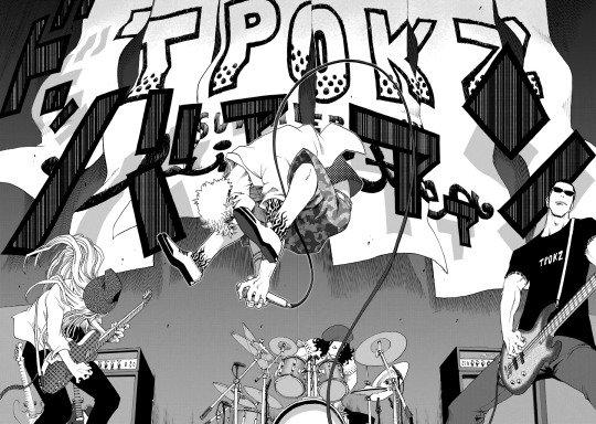
(Look at the shadows)
Shiori Experience is kind of a nightmare
In some ways, lettering for Shiori Experience isn’t actually that difficult. Sound effects in this series are goddamn everywhere and they’re fucking gigantic, but they’re always straightforward. Much like the art of the series, the sound effects are clean and angular, strong dynamic shapes which are easy to parse even if you can’t read the katakana. For a great example of this, look at this sequence from Chapter 64.
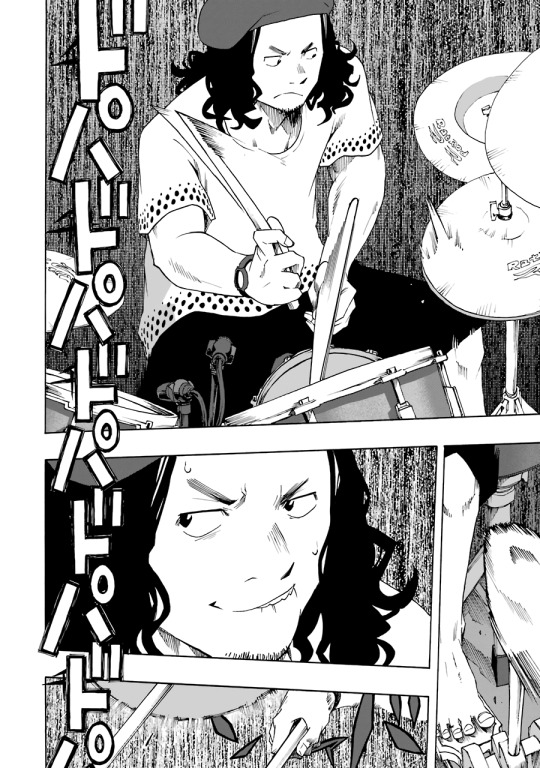
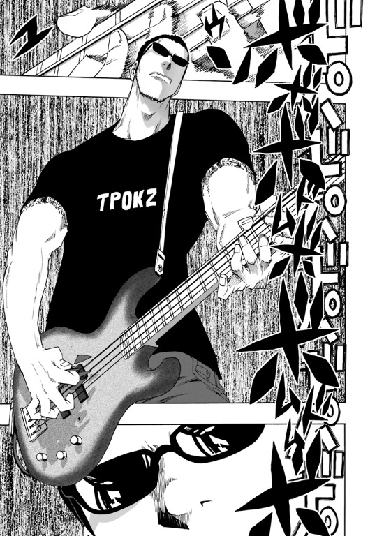
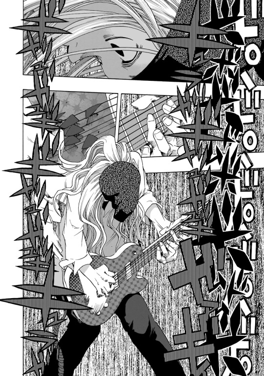
This sequence demonstrates what you can achieve with good lettering. The sound of the band is conveyed perfectly with these visuals. The clear and regular beat of the drums, the dark and energetic bass line, the screaming uncontrollable energy of the electric guitar. We didn’t even bother translating it. We didn’t need to.
But look at the sequence again. In spite of its apparent complexity, there’s only two fonts here, a dynamic block text and an angular brush. Those two fonts represent the vast majority of SFX in Shiori Experience. The rest is just text effects and perspective tricks.
So to convert these sound effects into English, we just have to find equivalent fonts. It took me a while to pin down a set of fonts I was happy with. For the pointy brush font I eventually settled on Jolly Lodger, a brush font with a sort of piratey vibe. I’m still not 100% satisfied with this conversion, it isn’t as pointy as the original, but it’s good enough for now.

And for the big block font I chose Boogaloo. It looks a little thin when it’s on its own like this, but it really bulks up with the right text effects.

Great! We’ve got our fonts! Doing the sound effects should be as simple as erasing the old text and replacing it with the new text, right? Wrong. The nightmare begins.
Different approaches
There are several schools of thought when it comes to lettering manga SFX. One is the "keikkaku means plan" approach. In a translator's note outside the panel, or in plain text near the SFX, describe what the sound is. This is incredibly easy. This is also lame.
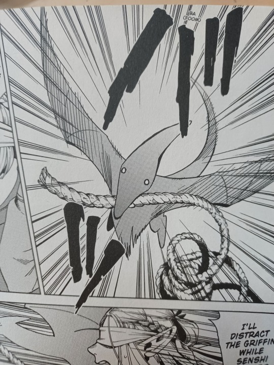
(This is from the official release of Dungeon Meshi. I wouldn’t want to redraw this one either, but like, come on guys.)
Another school of thought is style matching. Similar to the translator’s note approach, but rather than plain text, the translation uses similar text effects to the original SFX. This works fine, but it can create a lot of visual clutter if implemented poorly.
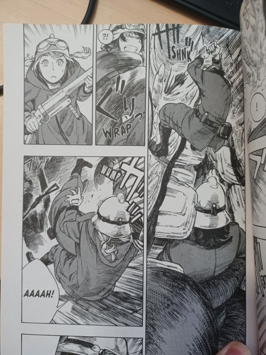
(This is from Drifting Dragons. Please read Drifting Dragons.)
The last approach is full replacement. In this approach, the original SFX is (are you ready for this?) fully replaced by the new SFX.
SFX Redrawing
Replacing a sound effect isn’t as simple as just erasing it. We work with tankoban pages, scans of the Japanese volume release. These files are flattened, with the art and text all on one layer as a single image. We can’t just disable the text. In order to remove the original SFX, we have to redraw them.
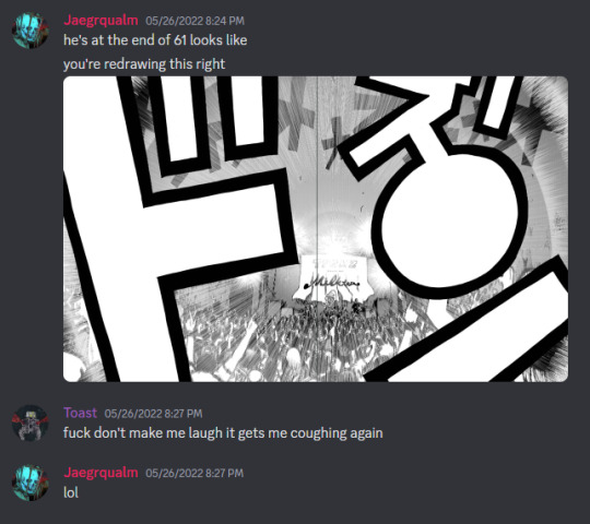
(for context this is from when I had covid)
Redrawing means recreating the art hidden by the original SFX. This is a complex process, requiring a steady hand, sharp eyes, and a lot of guesswork. Since we don’t know what precisely is underneath the original SFX, we have to use context to reconstruct it. The goal of any localization is to make the translation invisible to the reader. The same principle holds true in redrawing. The art we add needs to be invisible, meshing seamlessly with the original artwork.
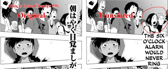
(I made this dude up out of whole cloth. I’m honestly really proud of how he came out.)
#Dropout uses a mix of style matching and full replacement, with the choice between the two being determined by a number of factors. To illustrate that decision-making process, let’s break down the process of redrawing a page of Shiori Experience, specifically the spread across pages 172 and 173 from Chapter 64.
Deciding between Style Match and Full Replacement
This is the original untranslated page, and there’s a lot going on.
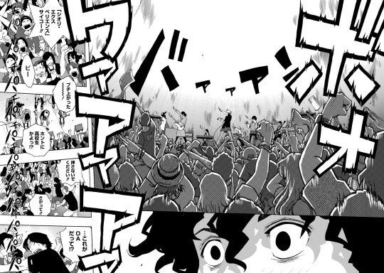
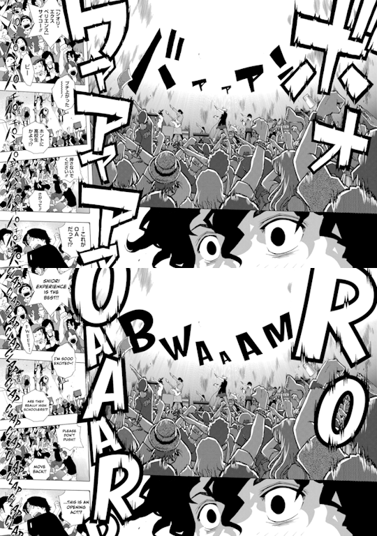
In the background of the first panel is the sound of the band, バアアアン, phonetically translated as "BA-A-A-A-N", localized as “BWAAAM”. In the foreground is the cheering of the crowd, ボオワアアア, "BO-O-WA-A-A-A" phonetically, “ROOAAR” localized. Lastly, along the side of panels 3 through 6 is applause, パチ, "PA-CHI", “CLAP”.
At a glance, this page is overwhelming. The cheering sound effect is huge, with custom text effects conveying the energy of the crowd. Worse is the clapping, which overlays multiple panels with dozens of unique partially obscured faces. This looks like a pain in the ass to redraw, but in the end I decided to do a full replacement instead of a simpler style match. With the number and size of the SFX combined with the visual density of the panels, doing a style match would result in a cluttered unreadable mess. Too much of the original artwork would be covered, and there just isn’t enough space. So, full replacement.
The redrawing process
As I’ve gained more experience, it’s been surprising to learn what constitutes a difficult redraw. You’d expect crowd shots to be the hardest, with lots of unique faces and little details, but they actually aren’t that bad IMO. More detail means more context means less guessing. Definitely a lot of work, but not difficult. Meanwhile, something like a gradient or screentone pattern which looks simple is actually a goddamn nightmare to recreate, as we'll see later.
That’s why I started my redraw for this page with the clapping. Again, this looks like it would be really hard, but looks can be deceiving. There’s a lot of clapping, yes, but the text is thin and spaced out. Whiting out the text reveals just how little artwork is actually hidden by the sound effects.
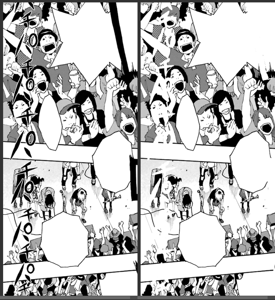
After whiting out the original text, the next step is connecting as many existing lines as I can. I do the panel and bubble borders on a separate layer since they’re simple structural elements. The artwork itself requires a bit more thought. I need to examine the original artwork carefully to avoid connecting lines that shouldn’t be connected. Context can also provide guidance where there are no lines to connect, such as the cheering guy’s hat in the first panel, or the clapping hand in the second panel. Also, when there’s lots of little SFX like this it’s easy to miss a few lines, like the box thing near the bottom of the last panel (don’t worry I catch it later).
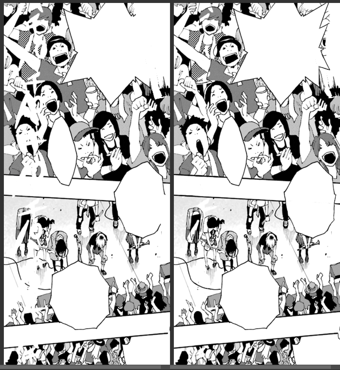
The last step is adding in all the inking and screentones, the pattern templates which fill in the “color” to the line work. I have to go through with the clone stamp tool, collect samples from the image, and extend the pattern to fill the blank areas. This is the most annoying step in the process for me, because it requires a level of precision even beyond what’s required for the line work. Humans are pattern-recognition machines. Our brains are really good at catching tiny discrepancies, like when a section of a pattern doesn’t quite line up with the rest of it. My patch job on this panel wasn’t perfect, and you can see where I couldn’t quite line things up in areas like the guy’s checkered shirt in the first panel.
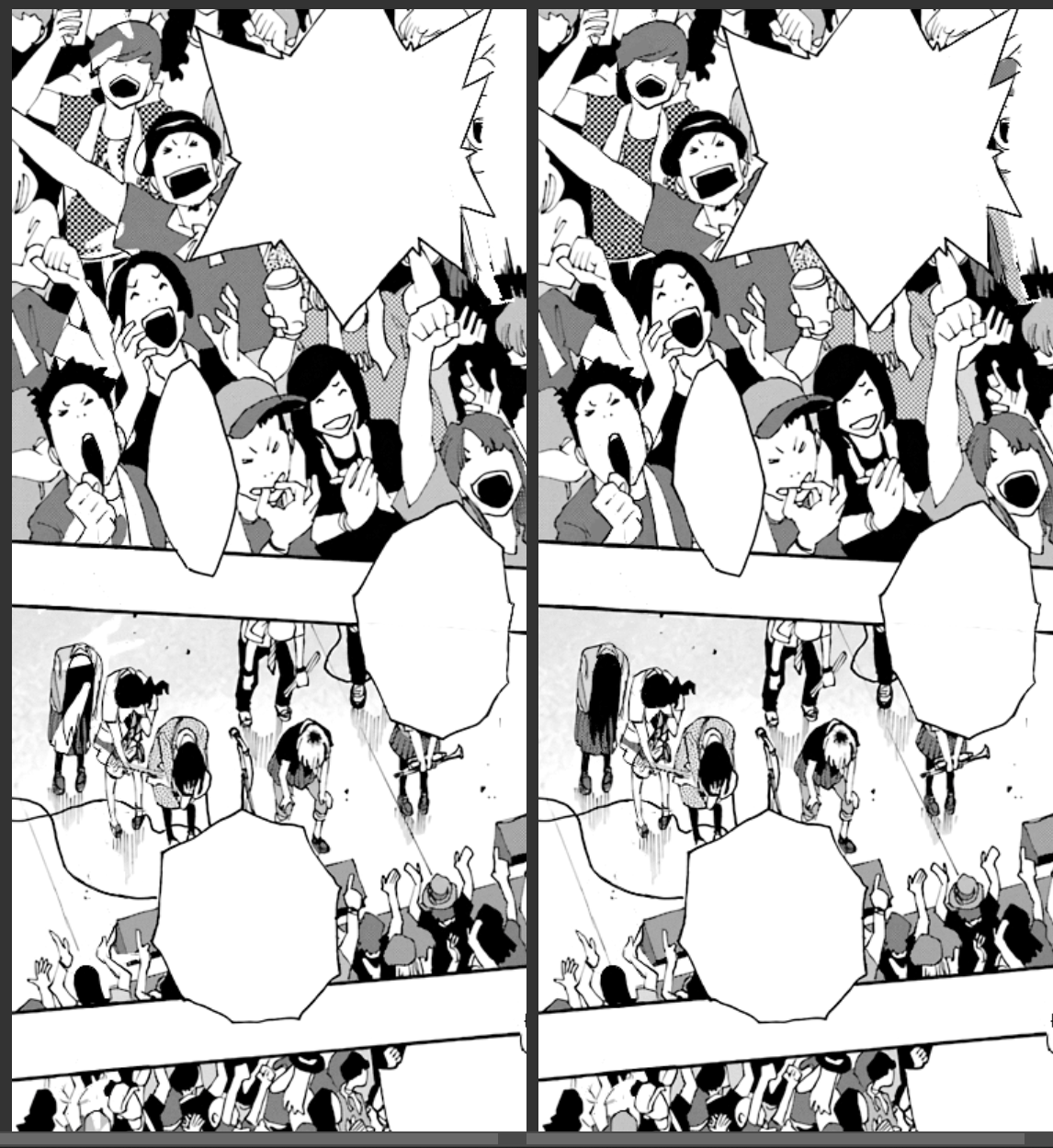
And with that, this redraw is complete! Now it’s time to insert the English translation of the sound effect.
SFX Lettering
The clapping SFX is in that same brush font I pointed out earlier, which we use JollyLodger for. There’s no real perspective things or text effects here, so mimicking the original isn’t difficult. Here’s the before and after.

This approach of fully redrawing the old SFX before inserting the new SFX only works in situations like this, where the text is small and there’s enough detail to reconstruct the image with a high level of confidence. As an SFX gets larger, like the roar of a crowd, the harder it gets to fully replace. This calls for a different approach.
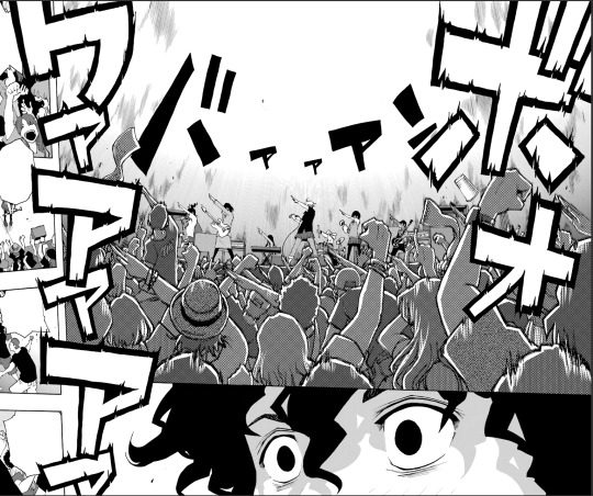
Because of the size and complexity of this sound effect, I decided to do the lettering first. This is the block font I identified earlier, which is replaced by Boogaloo. I do some basic manipulation right away, applying a black outline and distorting the text to create the same perspective effect as the original. The SFX in this series are subtly three-dimensional, and the replacement text needs to be in the same orientation to sell the effect.
I’m also being careful with my placement here, doing my best to align the new text with the old. This will be important later.
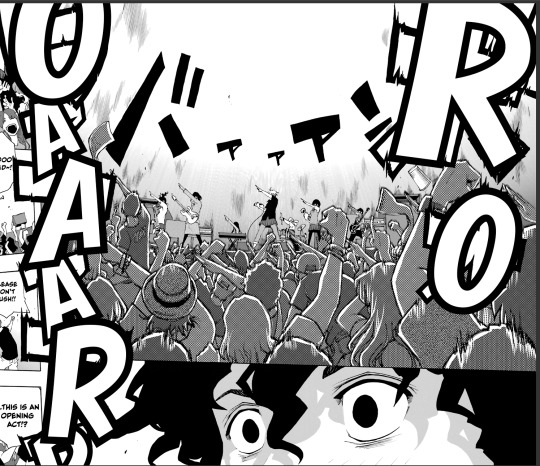
Next we need to recreate the distortion effect. Photoshop has functionality to mimic this kind of effect, but I opted to do it manually. Osada (the mangaka) does all these layouts, SFX and all, on paper. The original effect was hand drawn, so the replacement effect is hand drawn.
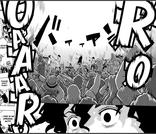
The lettering for this effect is now complete, and we can begin the redraw process. Since we already have the letters in place, we have the advantage of knowing exactly where a redraw is needed, turning what would otherwise have been an enormous replacement into a minor patch job. From here, it’s the same process as the clapping SFX: Raw, Blank, Line, Fill.
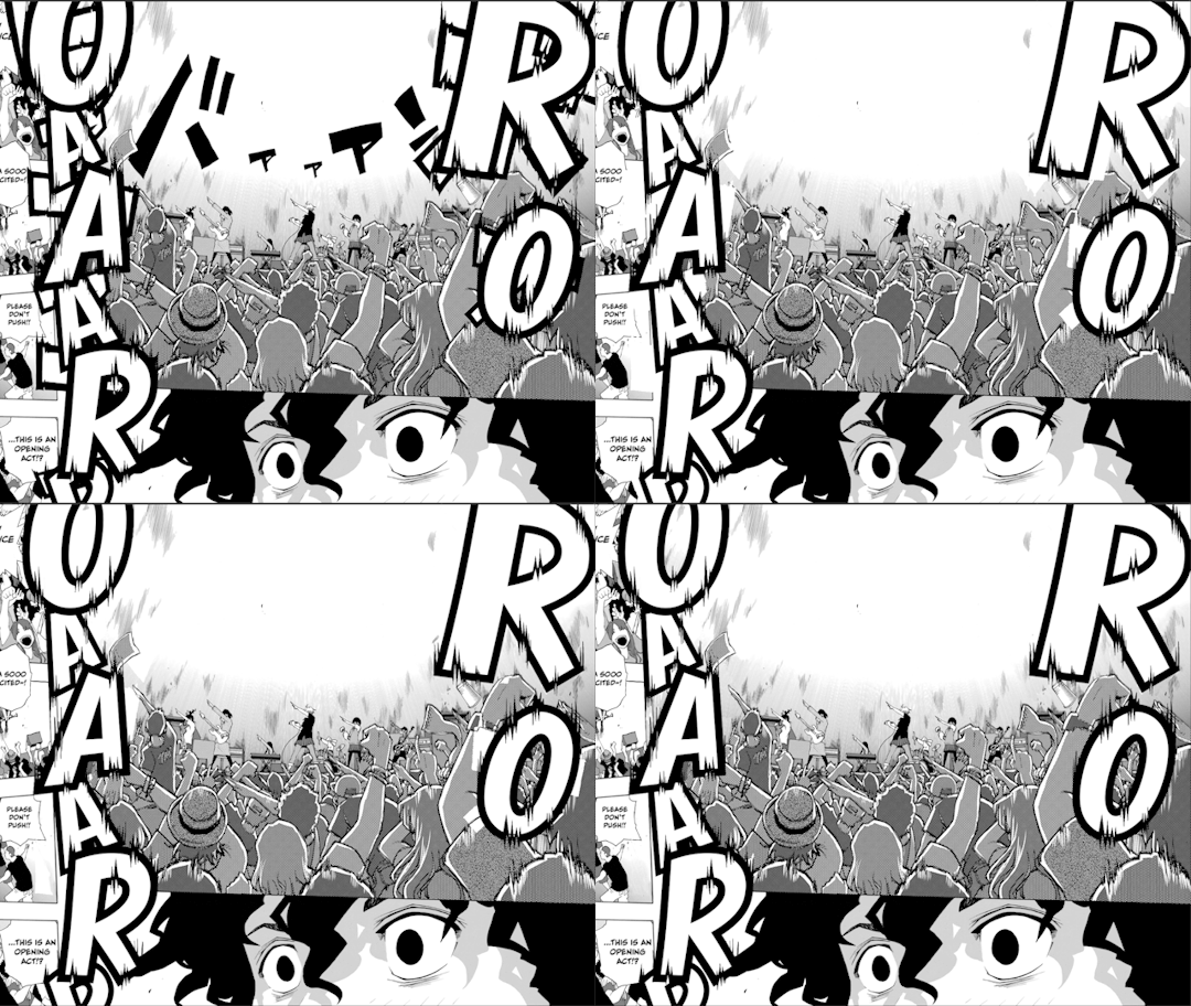
Minor sidebar: translating Japanese sound effects presents an interesting and incredibly niche problem. The katakana symbol オ is translated phonetically as “o”. The problem with that is that when you’re replacing a オ with an O in a sound effect, the hole of the O is positions right on the center of the オ. This makes オ really annoying to redraw. Every O turns into a little window of totally new art, with barely any reference points to draw from. It violates the principle of invisibility, but there’s really no way around it. You can see I got a little lazy here, and clonestamped a different section of the crowd into the hole. As long as I don’t draw attention to it nobody will notice. I hope.
Sidebar over. Just for fun, here’s the before and after for the whole page.
Closing thoughts
So that’s what it takes to do the sound effects for one page of Shiori Experience. This page alone took me multiple days to complete, and it wasn’t even the most complicated page in this chapter. It isn’t why our releases take so long (that can be laid at the feet of staffing and scheduling issues), but hopefully I’ve given you a sense of how much work goes into each new chapter.
This chapter would have taken even longer without the help of Adi and Bangistus, who pitched in on a lot of the smaller SFX. Up until now the lettering of this series has been a solo show, Toast all the way down. Now that Adi and Bang are on the team I’m still keeping most of the big pages for myself, but being able to toss to the others when I get overwhelmed is going to be invaluable. Hopefully I can rely on them in the future as well, there’s some big things coming down the pipe
This series is a labor of love. Sometimes frustrating, often exhausting, but always worth it. I owe this series a lot, and I hope it shows in the work I put into it. I think it would be fun to do more behind the scenes process content like this, so maybe keep an eye out for that in the future.
Lastly, just as a status update, #dropout is not dropping Shiori Experience. We have a temporary translator who’s helping us put together Chapter 65, which will be coming out Eventually™. Not as long as last time, but like always don’t hold your breath. We’re not sure what will happen after 65 drops. We’re still desperately hiring for a main translator, seriously if you know anybody please hit me up.
That’s all from me. Take care y’all.
266 notes
·
View notes
Note
for the artist asks 5 & 7 ^^
Ahhh thanks for the ask :)
So the piece I’m proud of the most tends to switch, but I think my best piece at the moment is either this recent David Gilmour and Rick Wright piece I did

Or this Roger Waters and David Gilmour piece

I’m really proud of them particularly since these pieces are some of my first time drawing artwork that isn’t redraws of photos! They’re all original poses and expressions (with references used of course). I’m also proud of them because I’m really improving my anatomy through drawing more original pieces, as well as backgrounds (which I still suck at)
My biggest influence on my art style has to be Jamie Hewlett’s art from Phase 1/2 of Gorillaz! Mainly with how I draw line art, since I drew a lot of Gorillaz fanart when I was just starting out to draw digitally. And just in general cartoon art styles from my childhood shows, specifically Cartoon Network art styles that use thicker line art (which they technically got from Hanna Barbera cartoons in the 50s), as well as comic book art styles. I also try to be a little inspired by that 60s/70s art style that was used in album covers/old advertisements. Here are some examples!


4 notes
·
View notes
Text
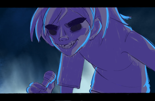
Very very rough WIP of my man 2D for a redraw of a redraw of a screenshot of a virtual live performance. Sharing on here bc I don't want this to get much attention and I wanna gush about him a lil. Old art + screenshot and f/o gushing under the cut.
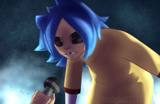
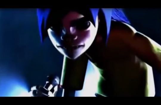
AAAA the improvement from the sketch alone holy cowwww. The drawing is August of 2019, so nearly 4 years ago. Very excited to finish this one, hopefully I can tomorrow.
Anyways-- I wanna talk about my history of listening to Gorillaz and my slowburn crush on 2D. Plus a little of what I've figured out about my S/I.
2D is one of my older F/Os by technicality. I never actively self shipped with him until recently, but I've had that big crush on him since I was a freshman in high school. So around 2016/17. I was vaguely aware of Gorillaz before then, but only because my cousins had shown me two different music videos. One of Clint Eastwood, and the other of Devil Inside by Slipknot. Watching those back-to-back + having a phobia of eyes did not turn out well and for the longest time I was terrified of 2D because my cousins told me he didn't have eyes at all. I later learned from a friend I met in my freshman year that isn't entirely true, his eyes just have eight ball fractures and are drawn to look like they're gone. I had also apparently confused the Slipknot music I had heard for the Clint Eastwood video, so that friend made me watch the video again with them and I realized I actually really like the song lol. From there I fell down the whole rabbit whole for Gorillaz and 2D quickly became one of my favs. Russell is sorta still my fav because I'm biased towards drummers, but Stu is a very close second LOL. I read a bunch of fanfiction, mainly X Readers of him on Wattpad. Fun fact, this is also around the time I started seriously questioning my gender, and started reading/writing male readers to explore those feelings lol.
So then I listened to their music and doodled them occasionaly when I was first starting art in my sophomore year, but I didn't really get involved in the fandom or anything besides reading fanfiction on Wattpad. 2017 was peak for me since they dropped Saturnz Barz after years of silence from Plastic Beach. Despite all the new music I was constantly listening to, my mini-hyperfixation on the bad quickly faded. Two years passed before I realized it, it was suddenly 2019 and I was a fresh high school graduate with a massive hyperfixation on Splatoon. Phase 5 had concluded a few months prior and my brain decided it was a great time to have a little redux of my Gorillaz hyperfixation.
I started drawing them, mainly 2D, more often and got very into the fandom on Insta and Tumblr. Met some pretty chill people, a few of whom I'm still mutuals with on my main :D!! But the entire time, I was still in my "self ship is cringe" phase and kinda ignored anything I was feeling towards 2D. I was still reading and contemplating making my own X Reader fics of him on Wattpad, but that was all irrelevant to me I guess. Eventually that hyperifxation on them passed and I returned to my regularly scheduled Splatoon hyperfix.
Fast forward to another year later in 2020 and into 2021, I finally embraced my cringe and started self shipping again for the first time since I was like 9. First with Erik from Dragon Quest, then several Persona characters (most importantly Adachi lol), then Happy Chaos, and I've been jumping around from crush to crush I've had since I was a kid. Very good for the soul, 10/10 would reccomend reconnecting with childhood F/Os lol. As of a few months ago I starting thinking of 2D as a potential F/O before officially naming him a romantic F/O!!
All this time I've been tossing around different ideas for a self insert, but haven't really explored it until I named him my F/O. I'm still figuring that stuff out, but I at least know they knew each other before D-Day! Not too sure about Phase 1 stuff, but I do know they'll reappear in Stu's life during the band's break between Phases 1 and 2 and maybe they start dating each other by the time Phase 2 does roll around OwO. And then my insert also gets kidnapped by Murdoc and gets shipped off to Plastic Beach with 2D. They become the stand-in drummer for the band while Russ is MIA. Then for Phase 4 and beyond? I have no idea lol.
Sorry for just rambling about this, but I like sharing the origin stories for my F/Os and 2D is one of those that has a very long and somewhat complicated story. I've liked him a lot since I really got into the band's music, but I was so absorbed into cringe culture and avoiding being called cringe that I just ignored any potential story I could tell between us. Plus all the gender dysphoria and less than stellar reactions I got from my friends didn't exactly help matters lol. But I'm no longer an egg, those unsupportive friends are out of my life, and I am cringe and I am free babey!!!
#self ship#my art#my wips#not censoring names bc im too tired aaaa#so if this breaks containment then DO NOT PERCIEVE ME PLEASE#also if this has any spelling or grammar errors i donut care im too tired#💙 Revolving Doors
3 notes
·
View notes
Note
What are some of your favorite drawings you've ever done
Oh wow. That's really hard. Excellent question.
So I went through a bunch of my old art, all the way back to early 2021 (anything older would have no shot at being on the list), and gathered some of what I think are my favorite drawings I've done.
Note that these might not be in chronological order, nor in order of favorites. I don't think I could rank any of these over another (except for one that'll be at the end).
Putting this under the cut because it's really long ♡

Let's start with this one (October 2022). Technically it's two pieces, but they go together. Obviously I like these because they're my header image, but let's get into it a bit. I'm very proud of the coloring on these, especially Chuuya. I think his hair looks really nice. This was back when I actually did colored lineart rather than what I do now (black lineart and set it to overlay), and I matched the colors really well to where it looks almost lineless. I continue to be proud of these almost two years later.

Next up are my GLOOM DIVISION pieces (at least, so far. I plan on doing more~) (May 2024). These are very different from how I normally draw, but they came to me very naturally. I really love the look of these. These pieces are some of the closest I've ever come to matching my visions for pieces, especially with SPKOTHDVL. I honestly find myself going back and looking at them a lot. I'm super proud of these. These are definitely in my favorites.

Next up, this piece from my cosplay redraw project (July 2023). I straight up think this is one of the best pieces I've ever drawn. If I may self-serve for a moment, the shading is immaculate, the posing is really nice, and so are the proportions. I'm extremely proud of this, and I think I'll continue to be for a long time.

Another one of my favorites might be this piece (July 2022). I feel like this piece was a huge milestone for me. It was the first time I did colored lineart, which really jumpstarted my whole "semi realism" style, which led to my art improving a decent amount. The anatomy isn't the greatest, but that's fine. I love the coloring, she looks really pretty, and my art likely wouldn't be what it is now if it weren't for this piece. Thank you red queen Algérie~

This one is another one (November 2023). I really like the shading, the poses, and the anatomy on this. It took me a long time, and it also has sentimental value to me because it's part of an AU that I made and really like.
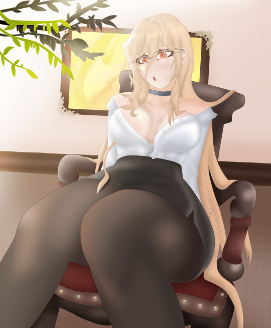
Next, I really like my Implacable pieces (March 2023). I'm really happy with the shading and the anatomy and just generally how they look. I picked this one of her in her teacher skin rather than her in her normal outfit because I think I like this one more. I'm really happy with her pose and her hair and her face and the shading and the background...it goes on. This is one of my favorite Azur Lane works I've done. I feel I did her justice.

Next up, I love this entire Akutagawa project (October 2023). Akutagawa, in my opinion, is not easy to make look really pretty, and I think I succeeded. I specifically pick this piece out of the four because this one is my favorite. I love his pose and his outfit. The glasses look really nice on him.

Next, we've got this lovely piece (January 2024). This is my most recent Azur Lane work and, obviously, one of my favorites. It took ages and a lot of trial and error, but I'm very happy with the result. Both Hindenburg and Kearsarge look gorgeous, and while the background is kinda simple, I feel like it brings more attention to the characters. Also I'm a sucker for bunny suits and everything bunny🐇
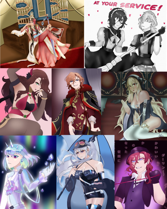
Before we close off, I'd like to share these honorable mentions that weren't quite high up enough to be talked about (and Tumblr also won't let me include any more pictures), but are also up there as some of my favorites. Obviously these span a wide range of time, but they all have their own special charms and elements that make me love them.

Lastly, I'd like to talk about my most recent completed project (July 2024). This right here might be my magnum opus. One of the greatest drawings I have ever done. For those unaware, this is a redraw of a photo of my second favorite musician, Dallon Weekes. It was a bit of a trend to redraw the photo, and I, like many in the I DON'T KNOW HOW BUT THEY FOUND ME community, absolutely adored the photo, and so, while I was very late, I hopped on the bandwagon and made this. It took a month, and because it was so late, that might be why it didn't get as many notes as I might've hoped. But you know what? I don't care. This is my favorite drawing I've done, probably. I think I did an amazing job. I'm incredibly proud of it.
I received this ask and started writing and compiling all of this before I completed this drawing, funnily enough, so I had no idea what my number one might've been. But now, I think I can safely say it's my Manic Project Dallon photo redraw. I know I wasn't asked specifically what my number one was, but I thought you might enjoy knowing.
Thank you for the question! I had a lot of fun thinking about this and answering it~
Anyone who read all of this, thank you. I hope you enjoyed seeing my art, going all the way back to 2021, all the way forward to now. Love you all ♡
1 note
·
View note
Text
JuAli Comic Idea: Pink Rukh (2022)
Ok I'll just put the rest of my rambles under the cut
EN Version

JP Version (Without Furigana)

JP Version (With Furigana)

Text Version

Full Version


Being a Magi, Judar notices the rukh turn pink around Alibaba when he kisses him.
I wrote this in my comic idea dialogue script files before ^^
I'm mainly a visual person so I mainly just wrote the dialogue itself. It's to help guide my future art ideas
Since I've been adding to my JuAli dialogue script ideas lately
My first language is technically Vietnamese (Viet), so excuse the English at times… I try to make my dialogue scripts flow as well as possible
Wdym your cat bf isn't cute~~ /lh
Drew this back in 2022. I think I wanna redraw it again when I'm free (unfortunately I'm not free from assignments yet)
I'm practicing my hand at writing in JP~ If y'all see any typos or mistakes (grammar, etc.) then feel free to tell me! I'll fix them
I recently downloaded manga fonts used in official EN localizations, but I need to download more JP fonts tbh
I think having furigana above kanji is really cool for accessibility and for JP learners like me~ I love how shounen and children's manga typically have it
Thought Rambles
Revamped an old JuAli idea I had (Potential comic idea/dialogue script)
Thought about a JuAli thing (Judar/Alibaba) dialogue script…
I recently added to it. And I did some quick edits
J: Alibaba's accessories have such good contrast with tanned skin in your edits <3
Me: YEAHHH IT HAS SUCH NICE CONTRAST AGAINST HIS HAIR AND ACCESSORIES <3
C: Oh valid
(Magi: Ch. 288 - Ch. 111)
POV: You're Alibaba and you pull back from the guy you were making out with, just to see him looking at you like this


(Magi: Ch. 267)


Me: I imagine Judar just looks at Alibaba all smug like this, until he gets the tables turned back on him.
C: Oh that's cute
LMAO seems right
Me: The smug sense of satisfaction that Judar gets when he realizes that Alibaba's rukh are all pink, and teases him about it… It's so cute. Since Judar's a Magi, he would notice that all the rukh around Alibaba turned pink.
Me: LMAO yeah Judar being annoyed by Alibaba is cute. He gets flustered when Alibaba tries to imply that he likes him back (that he also enjoyed it)
C: Cute :")
C: Aaaa yeah makes sense
C: Aaa cute!!
Me: I forgot where it was, but I think I vaguely remember Aladdin tell Hakuryuu that his rukh was turning pink when he was blushing. I think in some early chapter panel.
C: YEA I THINK YOU'VE MENTIONED THIS
Furigana
Intended meaning is kanji, but the speaker verbally says the furigana out loud.
Furigana = Small symbols alongside or above the original characters, usually written in hiragana or katakana (but sometimes kanji) that denotes the pronunciation of a word
The alternative reading provides the same purpose - you can read them both, since the writer considers them both equivalent and relevant. The reader takes the meaning of the furigana.
They can use a different word to emphasize the speaker's tone (or character), or add a certain nuance to the text.
Furigana (Continued)
Furigana is also widely used in manga, but not all of them have it. From what I've noticed, shounen manga typically has it, because the audience will also include young kids and teens. Which probably explains why it's in the FGO: Shimousa manga. Biggest pro of kids' manga in general is that they have furigana alongside kanji~
I prefer furigana for accessibility reasons (ex. so I don't need to search up a kanji, or it makes it easier to search up a kanji if I don't know a certain word)
I also hate how a lot of animanga LNs (light novels) don't have it. Like I got the KHR LNs and ROTRK LN recently but each KHR LN is like 300 pages, and the same goes for the ROTRK LN. And it doesn't have furigana, bruh (except for a few specific words). I'll read it in the future, but not now.
I just checked the KHR LN previews out of curiosity and no furigana except for specific words (though a bit more than the ROTRK LN), and really… Why do LNs do this to us... It's so much easier to read kanji when there's furigana, man. Shounen manga typically does this.
That's why I'm gonna try to include furigana for all my fan-comics in JP in the future~~
Official Manga Localizations
Also god bruh Viz's way of translating things/prose makes everything sound so samey and generic DKLAKLDSKLDKLS
Like in the above panels? It stands out to me as someone bilingual who can read JP
So I attached the Magi: EN fan-TL as well. Sense Scans was doing a really good job with Magi's EN fan-TL.
I think it's the same fan-TL team all the way through (and they eventually correct character name spellings as the series goes on)
I feel like Viz just makes individual characters' speech styles just sound the same bruh
Though I get they have to shorten the dialogue to make things fit in the speech bubbles, in terms of typesetting
Usually, fan-TLs are almost always more accurate in terms of meaning, but official TLs sound more natural in English. Such a shame that Viz always gets the rights to shounen series.
Viz's Magi official EN TL is decent thankfully. Thank god cuz they botched the EN TLs of my other fave series like KHR, MMBN/EXE, and for my friend, PokeSpe, etc.
I'm a Viz hater cuz they did my beloved KHR soooo dirty. Viz only translated 16/42 volumes of KHR, a quarter of the series, and then tried to hide that they ever translated the series and was super shady about it. But their ROTRK official EN TL is actually really good. I'm surprised
I think I would've hunted Viz (/lh) (/hj) if Magi got a terrible (and incomplete) official localization like KHR did
But I wish Yen Press did the translation. Out of the 3 main manga localizers, Viz, Kodansha, Yen Press, in terms of translation (TL) quality, it goes like this, imo
Yen Press >>>>>>>>> Kodansha >>> Viz
Yen Press did the Kagerou Daze (KagePro) Manga and LNs, Pandora Hearts, Black Butler (Kuroshitsuji), etc. Their TLs are so good and their translation quality tends to be on par with and/or even surpass EN fan-TLs.
Misc Rambles
I first started using CSP in 2016! I've been using it ever since ^^ I like its wide array of brushes, access to 3D models, CSP Assets, etc.
CSP's Text tool was so dog shit for the longest time I'm glad there's finally been improvements to it within the last few years
I like how CSP allows you to input Ruby text. Furigana is a type of Ruby text.
Though I think the tool needs an easier process cuz you have to highlight a kanji, go into the settings, and add the kana characters as furigana, manually. Tedious process tbh... I hope they make it easier someday
Though I'm glad it includes the Ruby text feature


Notion
I love using Notion to type my AU ideas, dialogue scripts, OC documents, and school files in general.
Notion still needs more features (ie. lack of auto correct, lack of different fonts, Notion pages lag with bigger files, etc.) but it's so cool.
I like the pros though like there are unlimited pages, it can embed links/videos directly, can import peoples' templates, and is generally really nice for formatting things. I prefer it over Google Docs for that
#juali#aliju#magi#magi: the labyrinth of magic#judar#judar x alibaba#alibaba saluja#alibaba#alibaba x judar#judal#judal x alibaba#alibaba x judal#sen's ideas#sen's art#judaali#judali#sen's writing#I honestly forget my own tags sometimes
1 note
·
View note
Text
Odd TMNT sketches from high school
Been semi getting back into TMNT stuff & thought it'd be funny to show some weird gijinka sketches I posted to DA March 2014.(The year I graduated high school but I was still a big idiot) I say gijinka but by technicality it's the equivalent of turtle kemonomimis(kill me) so if Splinter & the turtles were more human looking.
I also want to warn you that this was during a time I call "I can't draw heights properly in traditional sketch so everyone has "long legs to keep up with correct height syndrome" & I can't do shit." so it makes everyone look really awkward. Also for some reason I added Venus in cause I found out about her & thought it'd be interesting to add her to stuff.(I did not know much about the show she was from at the time just that she existed & was raised elsewhere, I only saw the Power Rangers in space crossover by chance)
The first pic is just the turtles for a height chart, they're in their underwear(very generic underwear) cause I was going to use this sketch as a base for their other outfits. I also planned to give them more outfits but didn't feel like adding them cause I gave them casual outfits & ninja ones.
I want to mention this is 2003 Turtles but I also add in elements from the 2007 TMNT movie(though given everything it wasn't really needed for this past how Raph & Leo react to each other at times)
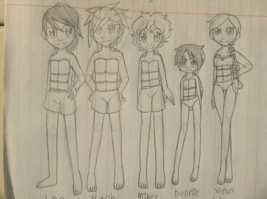
Don't ask why Donnie is so short, for whatever reason I thought it was funny which isn't helped by my inability to understand height & when I draw characters the head takes up a large amount of the height. I think it's also cause he's my favorite & I thought it made him look cute & I apologize for the cringe.
I'm also starting to realize this was back when I drew a heart in place of the dot on "i" & "j" which I have gotten over. On the other hand I still do a loop on the "y" but it's less awkward.
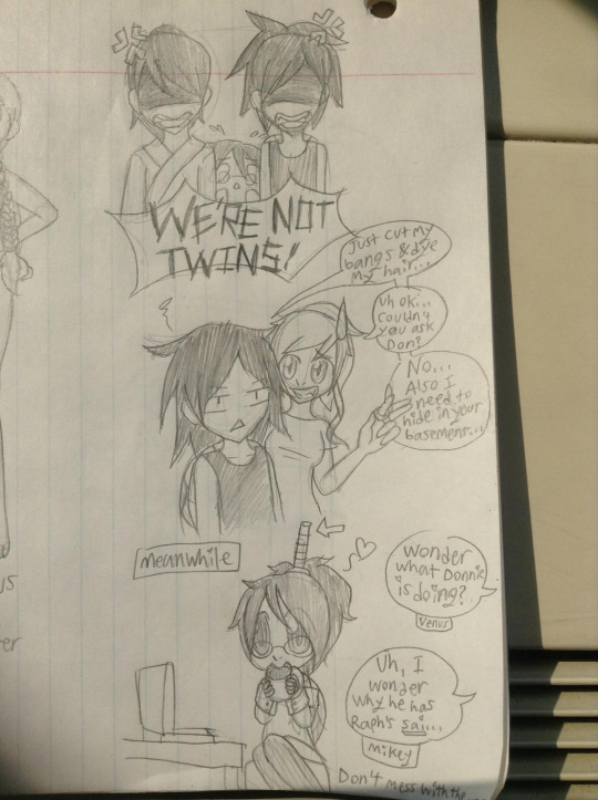
I think this pic was the biggest reason I chose to post my old sketches.(Judging by the thing I took this pic on it was at my high school)
So for context(that I remember of) at the time I thought it'd be funny if Leo & Raph were twins(or at least close enough in looks/age to be seen as twins) but don't like to be seen as twins due to how they butt heads a lot. Raph's hair is dyed red & his haircut is slightly different from Leo's as an attempt to separate them.
Looking around tags I've learned(at least very recently) that people consider Raph & Donnie in 03 as twins which I think is cute as they're my favorite characters. It semi gave me the idea to show my old art for some reason.
So the idea with this sketch is when Raph first started to change his hair. Leo & Raph got annoyed about the twin stuff, Donnie got dragged into this some how & it ends with Raph asking April for help while hiding at her place until Donnie calms down. Meanwhile Donnie is enjoying coffee & holding Raph's sai hostage.
I might redraw these one day just to show how far I've come & also make an updated version cause I think things have changed over time.
1 note
·
View note
Text
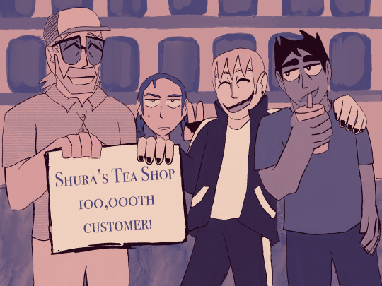
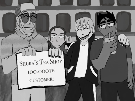


This is technically a redraw? I was trying to think of things to do while in Poland while traveling in December and I was reminded of the old crew drawing I had done in 2021.
I always like drawing group shots, especially if I can show people's characters in them. That's the fun thing about having blorbos.
I also at the time was using it as an excuse to slightly redesign Romek (I removed his typical 3 stripes to just one general band down the arm, was trying to condense his hair, etc).
Romek also had the crew perk in MotW so they were slowly being introduced to flesh him out a bit since he's a recent immigrant. They're not much of a crew that Romek can call upon and assemble but they all know Romek due to him being the kind of guy he is.
There's a lot of words below about the squad, I am planning on some maybe short comics to explore them more as characters.
I also found this colorized version I was working on as well (with some slight edits to line art), but I really hate how I did the layers for painting it. But still, I don't think I ever posted it and also I wanted to show their official colors.
The squad as follows is Shura, a very friendly Russian older man who runs a small tea shop in Little Everywhere (a neighborhood near the community college Romek goes to) which also doubles as an arms shop when needed.
He knows a lot more about the supernatural than you'd think but Romek spends most of his time just wanted to drink tea there and get his ammo rather than dwell on that. He's chatty in a similar way Romek is but there's always a feeling of him holding back more info than he lets on. He's also married and has a small kid off screen but we never got into that lol.
Next to him is his niece Tina, who also works at the tea shop/gun store. Originally she was only mentioned off screen as a reoccuring joke that Shura really wants Romek to meet her as a potential match but I also really wanted more girls lol. I also decided she hates Romek a lot, very barely tolerating his existence. She's very first gen American, so she is very close to my heart.
Tina operates as a courier for the shop as well, she's a motorcyclist and also a gun enthusiast. She's not aware of the supernatural at all despite her uncle's work but eventually finds out. She's done a lot of crime in the past, but has tapered off due to her work with her uncle. She'll run some interference and is a bit of a gun for hire for Romek but only if he's paying well and not getting on her nerves.
I never really got the chance to really put formally why they work together, but I was going to say she's estranged from her family due to coming out to them along with her previous criminal behavior. Shura doesn't know (thought it would be funny), but I also expect he'd be an ally. He's just happy he can support his niece and invite her over for dinner and doesn't push her on why she's not talking with her parents.
I've been trying to figure out her character besides being exasperated with Romek's behavior, so I decided she also really likes American and Canadian cartoons and probably gets into arguments online about Owl House or She-Ra.
Next to Romek is Rafał (or Rafa as Romek calls him but actually it should be Rafalek or Rafcio if we're doing proper Polish dimunitives but I borrowed his name from a friend lol). He's also originally from the same part of Poland Romek is from, but emigrated earlier than Romek to this area. He's slightly older than Romek and been here longer.
He's a mechanic who works out of his trailer near the woods. He street races competitively when he's not working on cars. He's the most direct connection Romek has to Poland besides Romek's sisters back home and Franek lol.
He is also not aware of the supernatural but eventually is brought into the fold by Romek since his car and van keep getting damaged on missions. He is often exasperated by Romek's lackadaisical approach to the conditions of his vehicles but if Romek is paying, he'll do his best. He recently had been hired by Garth's fake business to do mechanic work for their missions.
I was going to figure out how they knew each other from Poland (I originally said, friend of a cousin, which just makes him like a cousin in some ways), but more recently I thought maybe he dated one of Romek's sisters and they broke up (but it's a very much of a "ah, maybe one day again?") He's also of Roma background, but that never really came up in the narrative and I did not want to do a disservice to the community.
Overall, love these little guys. It was great getting a base idea for them and having them fleshed out more during the campaign and then coming up with more ideas for them as time went on.
#oc artwork#oc art#ttrpg oc#motw art#motw character#ttrpg art#romek gryzik#motw#tina#shura#rafal#digital art#digital artwork#redraw#procreate
0 notes
Text
I have just realised that it's new year's eve.
Well, staying up past midnight is easy for me as my sleep scedule's a bit of a wreck. I don't have anything that I'm really thrilled about for 2024 (apart from deltarune chapter 3 and 4 possibly coming out that year) and I'm ending on a really lame year art wise as I still don't have my computer and I don't want to have to reinstall drivers and stuff. At least I have the excuse to make the 2024 drawings folder on my backup USB.

I like having things in chronological order.
Anyway, here's the first and last drawings from each year because why not.
2019:
This one only dates back to the 20th July as this was before I took art seriously as a hobby. I drew this in MS paint for a roblox game I was making.
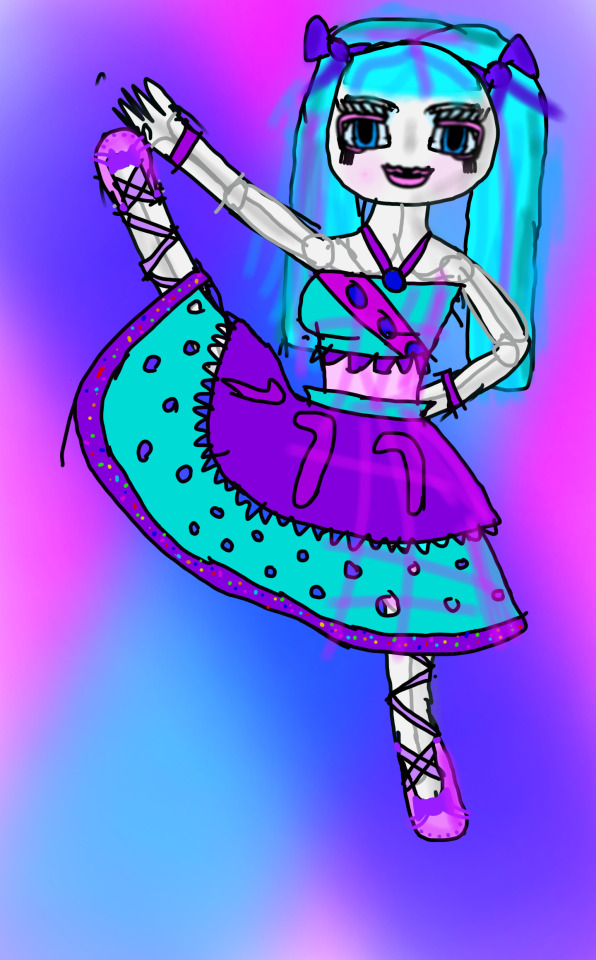
This dates back to the 25th December and I drew this in ibis paint x on my dad's old phone that me and my brothers shared. To play music in the background, I would have youtube as a window at the top and listen to the same 5 songs on loop. This took a considerable amount of time for some reason.
2020:
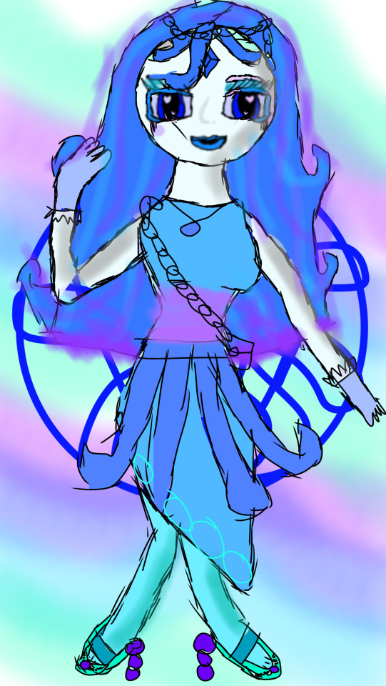
This dates back to the 18th January and I drew this on my phone as I just got it at this point (the same phone that I still have currently). I had no idea what I was doing and it shows.
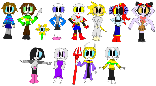
This dates back to the 29th December and it seems like I've discovered undertale. This was when I started using my crappy laptop again and I drew this with the touchscreen it had (it was one of those hybrid laptop-tablet things) with my finger and autodesk sketchbook.
2021:


The first one is technically the first of 2021 as it dates back to the 16th of January, but I've posted that one a lot whenever I redraw it every year so here's the drawing I drew the day after. It was for an animation meme but I saved it into the folder anyway for some reason.
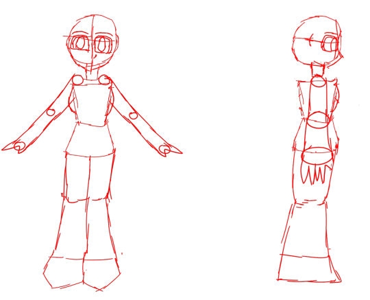

I was trying to model in blender for the first time towards the end of 2021 so the last picture is a boring sketch of anatomy from the 31st December to be used as refrence. The last actual artwork was a day before and at this point I had a little drawing tablet and was posting art on Newgrounds. I also started using medibang paint pro as autodesk sketchbook stopped working.
2022:
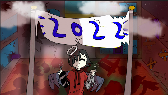
The first drawing I have in my 2022 folder was technically from 10:30 PM on the 31st as I got impatient, but I put it here anyway. It's a gif but I made it into a png so I can put it on a tumblr post. Technically the first one was this drawing I made about 12 hours later on the 1st January. On newgrounds it's regarded as being in 2021 as it's in EST and my time zone is a couple hours ahead.
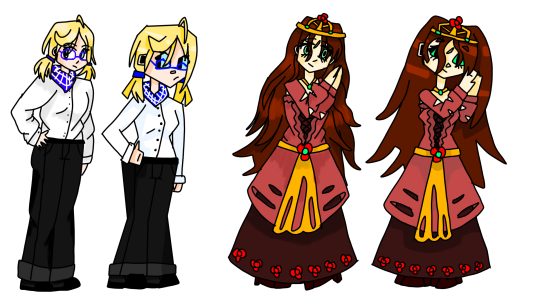
The last drawing I have dates back to the 27th December where I was experimenting with art styles as I had just gotten a new idea for a game (what is now known as Roboska LV).
2023:
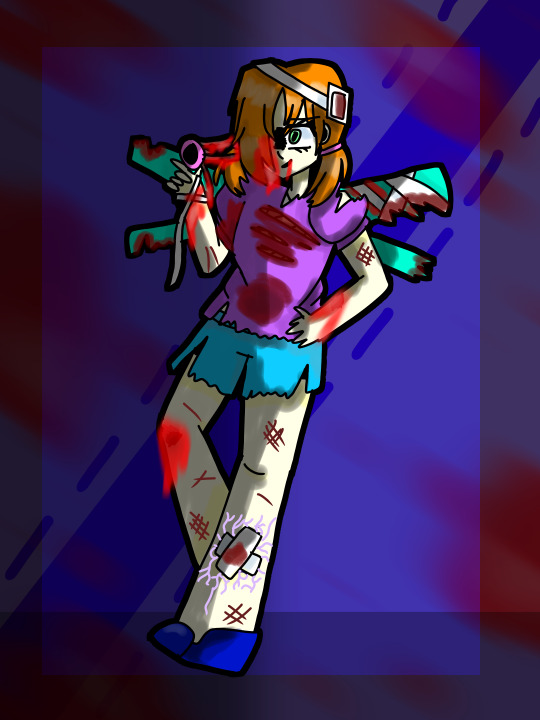
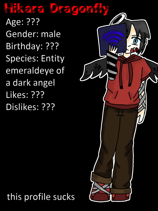
Both of these date back to the 1st January however the seccond one was exported 40 minuites later according to the meta data. The first one is another redraw while the seccond one is a character profile and I just realised there's no shading on the hoodie.
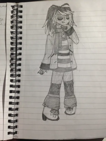
This dates back to the 9th December and I haven't been able to draw anything digitally since my computer's botched surgery on the 16th. I have drawn some stuff in my notebook though, so here's the "final" drawings of 2023 (basically anything in my notebook since the 9th). The dates are in the bottom corners. I didn't bother with fixing the lighting.
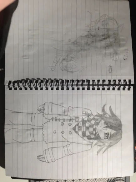
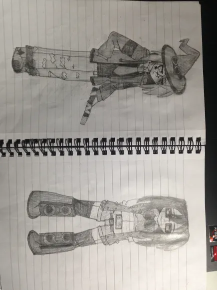
I drew that picture of Kokichi Oma in the dark with only the light of my phone torch as I drew it while a film was playing in my school sports hall with dominos pizza. The last 2 I drew on the last day of school while completly ignoring everyone partying in the form room.
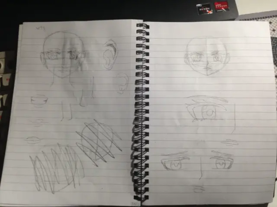
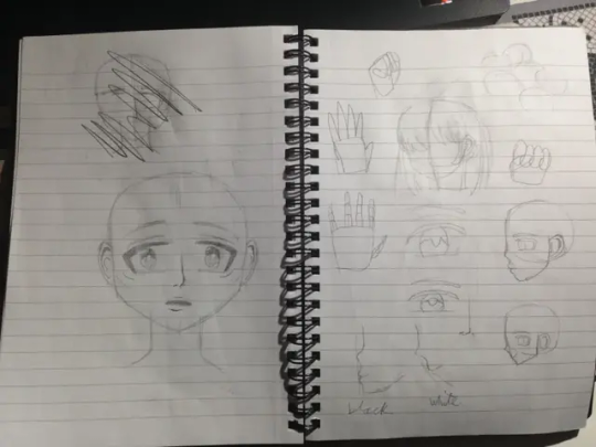
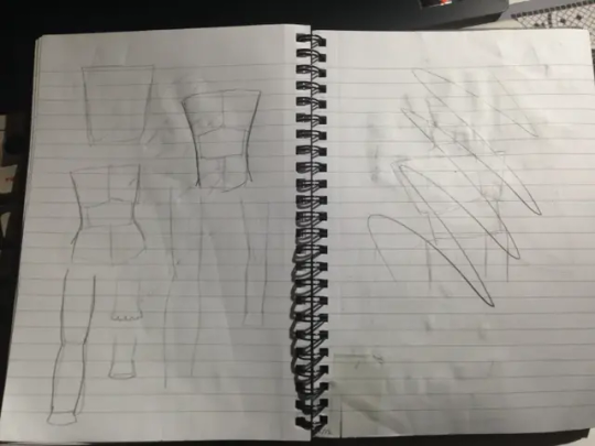
I got a book on how to draw in a manga art style so this is me trying to figure out how to adapt the tips into my artstyle to make it not suck.
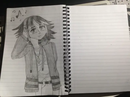
This is technically the last drawing of 2023. I drew it on the 26th. It also featured in the post about my personal best pencil drawings of 2023 too: https://pearlhikara.tumblr.com/post/737810429204643840/best-drawings-of-2023-notebook-12-and-13
Looking back, I don't think my change in art style from 2023 is as stark as the other years. I don't like how my art keeps changing and I want to just keep it at a consistent "very very good" and leave it at that as the little changes annoy me as I like consistency.
In terms of actual new year stuff, I'll probably just rewatch "who framed roger rabbit?" and go downstairs when it's near midnight to watch the fireworks on TV.
#art#digital art#digital drawing#artwork#drawing#digital artwork#illustration#traditional drawing#traditional illustration#traditional art#sketch#digital illustration#new years eve#new year#new year 2024#happy new year 2024#happy new year#featured
0 notes
Text

Got my old art binder out today and decided to add another scootaloo to my page o’ scootaloos. I’m not sure what possessed me to redraw it the first time in 2013, but I’m glad I did. It’s an interesting timeline for my art style and improvement.
I think the biggest improvements happened between 2012 and 2013 and then beginning of 2020 to end of 2020. That was the point when I realized I wasn’t happy with my art style and wanted a change (also couldn’t draw children obviously)
Honestly going into it today, I wasn’t sure I could make an improvement on the one from the end of 2020. And that’s somewhat disheartening since it’s been 2 years. But I think it’s an improvement. Not really in technical skill since it’s not really that that’s changing that much in my art anymore, but in character design, personality, and abstraction/simplification. Even it’s not an improvement, it is a representation of my art style right now, so at least there’s that.
It’s also kind of hilarious and bittersweet that my art now and the first scootaloo have more in common than some of the more realistic ones. (When did I lose the personality of stylized characters?)
Detours, I suppose.
See you in a couple years scootaloo page o7
1 note
·
View note
Text
Arty Art Things ✨
Hellooo!
I've decided to post some of the arty things I've done either recently or in the last few years, well the pieces I'm somewhat proud of at least. All my posts tend to be a lot more wordy than they need to be but hey it's what I do here!
Conchúr White
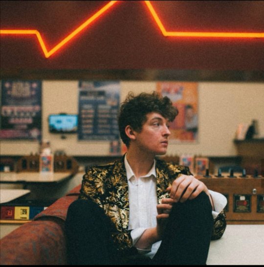
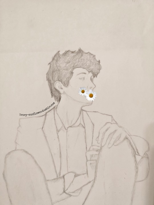
Anyone one who's been on this blog for a bit will have probably have seen me talk about this lovely Irish fella. The pencil drawing is actually a year old as of yesterday, I only know that because screenshots of me flipping out about Conchúr following me on twitter popped up in my memories yesterday. I think I'd sent it to him at about 3 in the morning (I was not in a good head space at that point in time), so probably not what he was expecting to see when he opened his phone in the morning aha
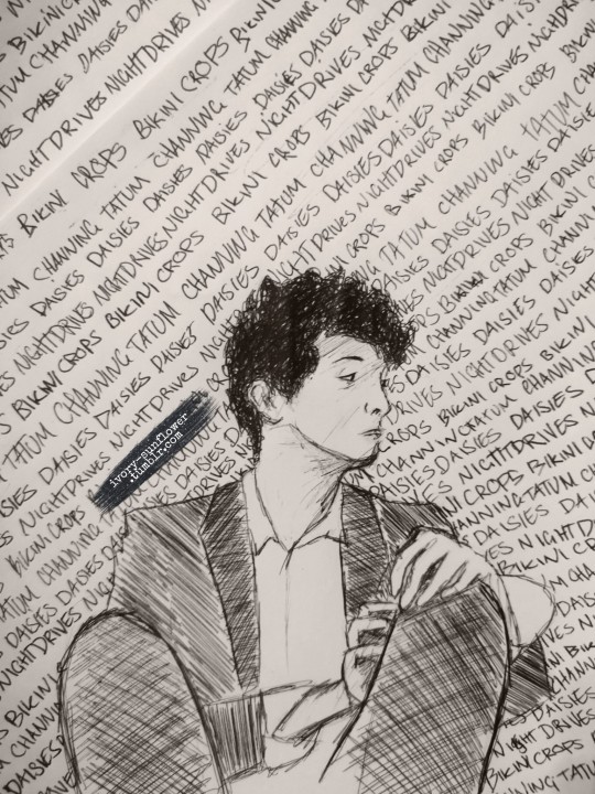
The biro version is much more recent: I got bored while sat at my desk and doing research about university courses, saw a biro, saw my old drawing of Conchúr, had an idea. I revisited my GCSE art techniques and here we are. Again, I put this up on Twitter and now (at the the time I'm writing this) when you google "Conchúr White" it's the third top image of him which is a bit mad really. I think I spent all of about 20 minutes on Conchúr but another 45 minutes on the words behind him. The words are the names of the songs on his EP 'Bikini Crops', he doesn't just really love the idea of Channing Tatum driving him around at night in a daisy print bikini... Well maybe he does but what he does in his spare time is none of my business...
TechDif
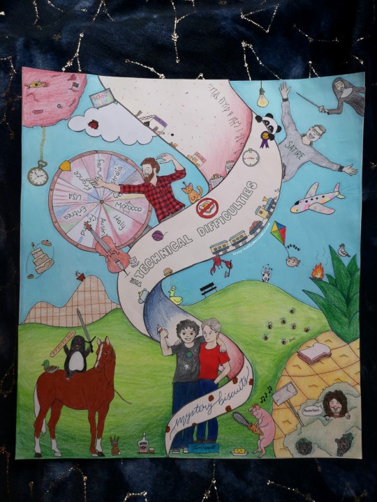
So I mentioned that the pencil drawing of Conchúr came from a rough patch in my mental health and this one is no different! In fact this one came from an even worse circumstance so we love to see it. I had a bad, bad time in July and this started as a way of distracting myself from what was going on in my head. Without it, I can't honestly say I'd still be here so even if the final product of this had been a terrible mess I would still love it for keeping me alive. However, it did not turn out to be a terrible mess!
Now that the origin of this is out the way, where do I start with TechDif? Unlike Conchúr, I haven't really talked about them on here (unless you count one brief post about Citation Needed) before so I guess I'll do it here. The Technical Difficulties are a wonderful group of 4 British fellas who have had their fair share of fun online and even before. They did a radio show at university together, which went on to become their Reverse Trivia Podcast, later moving on to a panel show called 'Citation Needed': and a game called 'Two of These People Are Lying'. All of which I would thoroughly reccomend, they're one of my go to things when I'm having a rough time. All 4 of them are excellent! Tom Scott (red top, blue jeans on the picture) has his own YouTube channel which does content aside from TechDif. If you're quite nerdy and like science, linguistics, computers, or any number of other things you may enjoy Tom's channel. He is probably best described as "The Moderator" of the group, much like a tired teacher he tries desperately to keep everyone on track with what they're meant to be doing, but usually it does not end well for him. Then we have Matt Gray (space top, holding an ice cream) who also has a channel away from TechDif stuff, he does techy electronic things and has a series called 'Will it Soft Serve?' where he puts all kinds of strange things through a soft serve machine. Matt brings a very specific energy to TechDif and I can't fully describe what that vibe is but I love it. Matt and Tom also share a YouTube channel where TOTPAL is posted and they had a series called 'The Park Bench'. Moving on to everybody's favourite Gary Brannan: Gary Brannan (SATIRE hoodie, glasses) and can I just say, what a fella he is! He's just excellent! He is the one that will argue and rip into Tom the most (not in a malicious way) and hilarity ensues. There are some episodes where he is absolutely on it, getting all the points and others where he very clearly has no idea and that's where some of his funniest quotes come from. Given how badly I was doing at the time I made this, his response to it on Twitter was so so lovely. I specifically remember one tweet where he said I'd made him happy and although it was probably a flippant comment, it just made feel alright for a bit. Yeah I might be feeling awful right now, but I've made someone else happy so that's a nice feeling. Then last but certainly not least, we have Chris Joel (buffalo check shirt, beard)! I would be lying if I said he isn’t my favourite... His sense of humor is the one I vibe with most, he can get rather dramatic in parts and can chat bollocks like a champion. He has absolutely no online presence away from TechDif and, like Rens from Temples, I fully believe he’s a cryptid and lives off in a tree somewhere.
The picture took me about 4 days to complete, well 4 nights because I did most of it between the hours of 12 a.m. and 7a.m. - I remember watching the sun come through my window each morning. It’s made up of lots of little pieces, all cut out and stuck on; even the sky and hills are made of separate pieces of paper. Nothing was actually drawn on the piece of paper it’s all stuck on, it’s not how I usually do things but if I messed up one little but I could just redraw it rather than ruining the whole thing. The most tedious parts to make were Chris’ shirt because I had to draw each square individually and then join the as well, and cutting out the ban-hammer in the bottom right was surprisingly hard. Every single detail of the picture is a reference to the podcast/shows, I still have the plan sketch and reference list knocking about somewhere. I listened to a lot of true crime videos while making it to the point that certain parts remind me of different cases: the brandy now reminds me of Peter Tobin, and the big spiral thing reminds me of Tim McLean (very harrowing case) - sorry that fact is a bit morbid but interesting nonetheless.
I did post this for a little bit back in July, but I received some rather awful messages so I took it down. Generally, Tom Scott/TechDif fans are lovely but there’s been a few that have taken a disliking to me for some reason so I’m hoping they don’t resurface again. I’m in a better head space now though, so even if they do I’m more equipped to deal with it this time.
Hozier
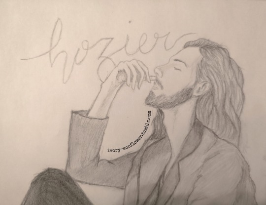
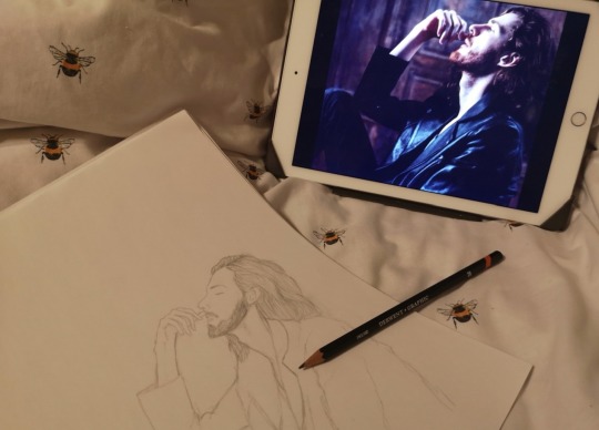
This was a quick sketch I did in April, I was getting bored with lockdown and decided to summon the bog man himself. There’s not really much more backstory than that, no poor mental health story, no fun twitter story - he’s just here. He’s vibing. I will say I’m particularly proud of his nose, I just think it’s one of the best noses I’ve ever drawn. His hand is okay, but I think that the hands on my Conchúr drawings are better. So there is the Hozi-Boi...
The Corpse Bry
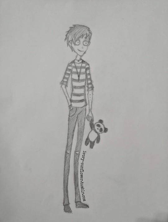
I’ve talked about Bry on here before as well, I love him, he’s excellent, top lad. He is a living Tim Burton character, he’s 6′6, very skinny, and his legs are longer than my will to live. I was watching ‘The Corpse Bride’ a few weeks ago and suddenly had an idea and so ‘The Corpse Bry’ came to be. I gave him a little panda friend because the panda has always been his animal - he used to wear a panda beanie all the time and his album had a panda on the cover. Again, there’s not really a fun story behind this one, I guess it’s somewhat fun because it’s the first art I made after finishing my psychology exams in October so it was nice to actually have the time to draw.
James Bagshaw
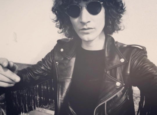
Ginger talking about Temples for the third post in a row? it’s more likely than you think! I did this one last week, I’d had a bit of a wobbly day and had group therapy on Teams in the evening and I just couldn’t concentrate on what was going on and I ended up doodling Mr James E. Bagshaw, the glitter crying fraggle man himself. It’s a bare-bones drawing that I could definitely work into more but I’m happy with it as it is to be honest. I’ll be damned if I’m going to sit and add the individual bits of fringe to his jacket, just thinking about doing that makes me tired. Maybe I’ll get around to drawing the whole band at some point...
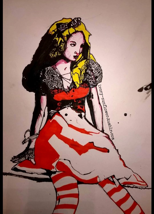
Alice in “Wonderland”
This one is from about 5(?) years ago, it’s not my typical style and was a “study” based on another artists work (basically i just had to copy this fellas work). I’ll be honest, this one has a sketchy backstory that I won’t go in to because it’s not exactly a nice one, and because of that I also won’t say who the artist is that it’s based on. Despite this, I’m still really proud of this one and I’m so sad that I never got this piece back after I got taken out the class. I’ve considered trying this style again, I’ve even joked about doing another Conchúr drawing in this style as a nod to my progression through GCSE art, eventually leading to Conchúr drawn in ink on music manuscript and stained with neon paint and dyes - it would be quite the project!
So this has been quite a lengthy post so apologies about that but life goes on. Similar to the vinyl post, I’ll probably add to this as and when I make more art. Even if no one is reading these posts, I’m enjoying making them so that’s the main thing. It’s just nice to document things and the feelings that go with them. 💕
~ Love Ginger xx
29/11/2020
#personal✨#art✨#conchúr white#Tom Scott#tomscottgo#matt gray#gary brannan#chris joel#techdif#the technical difficulties#hozier#bry#bryontour#bribry#james bagshaw#temples#temples band#templesband#wonderland#cottagecore#ginger#redhead#Aesthetic#faerie
26 notes
·
View notes
Text
Sweet Elite - Chapter 7
I reckon I’ve never done one of my big episode review for SE, so here I am, seat tight because there’s lots to unpack. Thus I’m putting everything under a cut.
Episode 6 left us with the meanest cliffhanger ever: we found out that Tadashi’s father has been arrested for colluding with the yakuza. Now we’re waiting in front of Lady Arlington’s office to learn about Tadashi’s destiny at the academy. When he finally comes out, he tells us that Lady A (unwillingly) asked him to start packing because unless he can prove he has no hand in his father’s illegal business, he has to leave.
Now, this part leaves me confused. First of all, no one not even Tadashi suggested that this might be a mistake and that his father is innocent. Aren’t people innocent until proven guilty? There’s been no trial yet. At the end of the episode we find out that there are many proofs against him and he sounds like a total asshole on the phone, so he is (almost certainly but you never know) guilty, still someone should have at least wondered about his innocence.
Also, Tadashi is a minor, fifteen/sixteen years old, he should not be under any scrutiny. Yes we know that he works with his father, but he’s still technically a kid in the eyes of the world. I understand the whispers and damages to his reputation, but I find it kinda absurd that he gets immediately kicked out of school, even if he’s there under “special circumstances”.
Anyway, we spend the whole episode talking with people about what they think about the situation and thinking about a way to help Tadashi. After talking with everyone, we meet Tadashi who shares with scholar about his situation and reveals that his parents are sort of blackmailing him into testify to his father’s behalf (he has pleaded not guilty). Apparently even though there are toooons of proofs including videos and witnesses, somehow Tadashi’s testimony is the key to his father’s freedom (?) Again, I am confused.
By the end of the episode, it seems that we are part of the Save-Tadashi squad which officially includes scholar, Karolina and Alistar, but Raquel also wants to help and Tegan has kinda been thrown into the mix by his sister, who asked him to hack Nakano’s Corp network (🙄 easy peasy right?)
I have to admit, I am not a big fan of this arc, it seems a little illogical from my point of view. But maybe that’s the point? We are normal people who identify with scholar who is a normal person surrounded by extraordinary people in an extraordinary environment. Maybe we are supposed to feel dumbfounded by everything that’s happening? I want to have faith in the team and believe that this story is going to make sense by the end.
I feel that the game is at a crossroad. I know there have been many changes this past year in the team and I really appreciate how they are all juggling life, school, work while at the same time making this amazing game. I bet it’s draining both mentally and physically.
This kinda reflects in the game, because the past two episodes have felt somehow rushed and not at the same level of the previous ones. Episode 7 is basically one objective: find out what people think about Tadashi’s situation. That’s it. Nothing happens in the plot and you spend your whole time just going back and forward trying to talk to people about what just happened. Considering that this is an otome game, you basically have one conversation with your crush and that’s it. I like talking with all the guys, but having one-on-one with everyone made more sense when we were trying to get to know them. I know that technically it has been just around one month or little more of school in-game, but we players wait months between one episode and the next, to just get one short conversation with the crush. Talking as someone who plays loooooooooots of otome games, I would find much more interesting if I could chose with whom to spend time, and spend the whole episode only with those few selected people, 10 LIs are too many to equally divide time with, you end up spending very little with each.
Now, I don’t want to sound like an ass, the game has these few problems that I think could be easily addressed, but it has also lots of potential.
I loved the previous art but I think they are finding their dimension with these new artists, the first look at the new sprites got me excited and the redraw of episode 6 illustrations and the one from episode 7 are really promising. I think they are all moving in the right direction.
Also, the main reason I play this game is neither the plot nor the art, but the writing. I LOVE how each charater is so different and well-characterised and just the way they talk to each other. The dialogues are funny and engaging and even scholar who is supposed to be a blank canvas, is actually a really cool and smart character and a pleasure to identify with.
So, here is the list of my favourite moments of the episode (which I’ve played twice so far, on Axel and Tegan’s routes):
Cheeky Tyler:

Tyler don’t make me fall for you! I already like your new sprite waaaay too much. Also, I’m already playing 4 routes, I can’t add a fifth!
Savage scholar:

The dude deserved it.
Flirty Raquel:
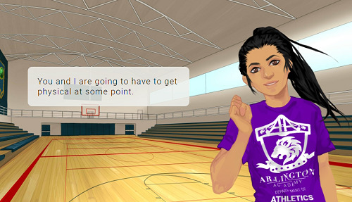
👀👀👀 So much sass... I love this girl!
Axel plagiarizing John Legend:
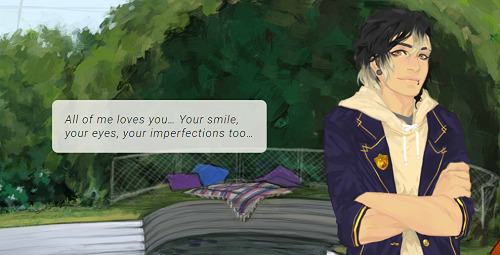
😂😂😂 babe this song already exists, changing a few words is not enough 😂
Scary Ellie:

This girl would be able to stab you with her trusty screwdriver while still sweetly smiling at you. ROLE MODEL.
Holding Alistair’s hands:

You too Alistar... stop acting so swoony, I can’t play anymore routes!
Now, the piece the resistance. What I really loved about this episode, is seeing how the writing changes according to the route you’re on. I love looking for all the little differences and, since I really love this game’s writing, I had a blast during the couple of minutes we got to spend with our crush.
As I said, I played only Axel’s and Tegan’s routes so far (I also play Tadashi’s and Karolina’s but I’m a few episodes behind).
Axel’s scene in the garden is to fall for. First of all, when you correctly guess that he has issues with his family, he simply tells you that he doesn’t have time to talk about it now if you’re not on his route. But if you have high infinity meter he also acts bashful and cute


I LOVE the fact that when he gets embarrassed and shy he also looks mad ❤, it almost seems like he can’t fathom why he’s feeling like this. Too cute! I hope this is going to be preserved in the new sprites.
And then, afterwards, when he complains he has to write a love song (makes me wonder what he’s written about so far) and doesn’t know how, he decide he’s going to look for some couples around the school to stalk/interrogate. But if you have high meter he basically serenades you 💕💕 I’M DEAD! Looks at scholar in the eyes and just starts creating the song on the spot.


I wonder how aware he is about his own feelings. What I would give for a change in POV!
Now... Tegan... my sweet dork... he’s such a sweetheart.
You meet him in the corridor, he’s in a rush and you apologise for being in his way. If you’re not on his route, he simply tells you that he can spare you a few moments. If you have a high meter instead, this is what happens:

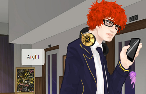
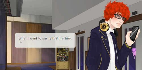
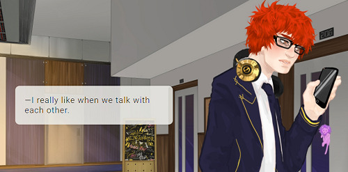
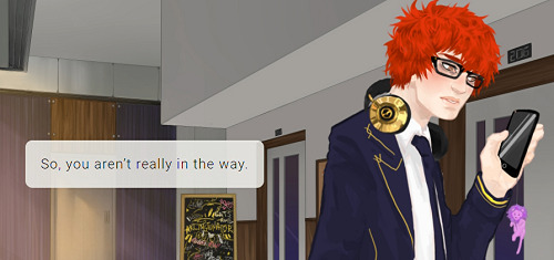

Also, when you afterwards tell him that he is also a great friend, if you have low meter he simply thanks you and leaves. If you have high meter, scholar adds that he is kinda jealous of his friends and he gets flustered.

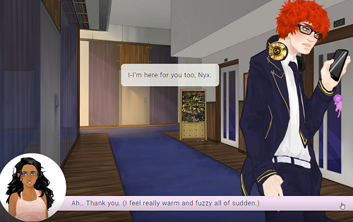

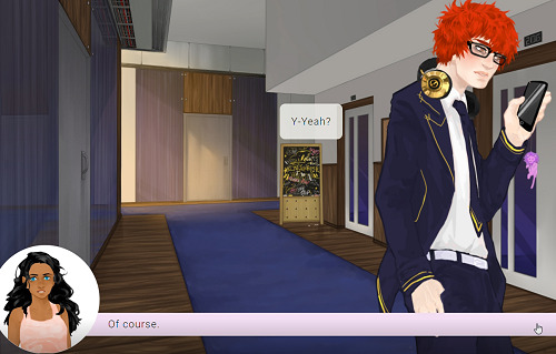
What do I have to do to smooch this cute stupid genius? If scholar doesn’t literally jump on him I bet he’s never going to make a move.
Anyway, these are all my thoughts about the episode. As I said, I have a few issues, but there’s also lots I liked. I trust the team and I’m sure the’re going to do great things in the future.
41 notes
·
View notes
Text
ive been drawing for quite a while. and looking through my old art, i found ive been drawing online for a whole flippin decade. wow.
so here’s 10 drawings ive done over the last 10 years, with commentary. it’s a long one, though, so be careful.
2010:
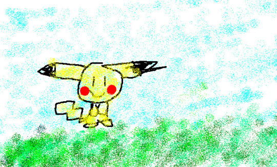
I had to dig through my deviantart for these first two. This pikachu is the first thing i ever posted online! i remember drawing this in ms paint with a mouse. i remember being very proud of this, and in a way, i still think it’s cute. it has a “drawing my kid done that i hung on a fridge’ vibe.
i didn’t do much around this time. i barely knew how the internet worked, and i mainly read instead of drawing. i did some pokemon sprite edits though, for some reason. i remember really liking doing that.
2011:
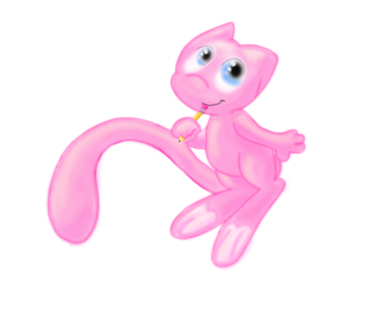
i’m pretty sure i drew this mew in gimp. also with a mouse, because i had no idea tablets existed. ive always been super into pokemon, and around this time i think i was watching a lot of mickey mouse cartoons? it’d explain the weird style.
i’m impressed with the shading, though. i did the best with what i knew, and what i could figure out on my own. not pictured is the hundreds of mickey sketches i did around this time, or the self insert oc i made lol.
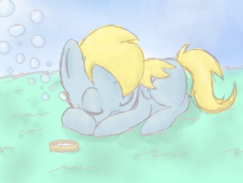
2012: oh no it’s pony time. i spent about 5 years drawing primarily these things. kinda wish i hadn’t in hindsight, but ah well.
i had this program on my ds that i could draw and post my art on, and i was using it a lot around this time. a lot of my art has this sketchy look to it, because of that. i remember i had quite a few followers on it, or at least i think i did. i dunno if that website still exists, or if anyone even uses it anymore.
but anyways, this drawing is super cute. ya can’t go wrong with a sleeping pone. i forgot the cutie mark, tho. i always forget minor important details like that. either that or i drew her as a filly. can’t remember.
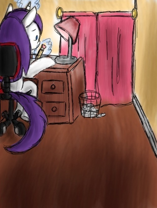
2013: yeah, i think this as vent art? can’t remember, but i drew it on that same program. i put a lot of effort into the perspective. this was based on my room at the time, btw.

2014: i believe this was for a new artist’s training grounds on eqd. i must’ve had a tablet by now, cause i can see tapering in the lineart. it was a big deal for me, and it sucks that i can’t remember what the first ting i drew with it was. i think it was some sketches.
but you can definitely see some improvement by now. i was really getting used to drawing this one thing. but a lot of people following me seemed to like my art back then. it was called cute, and expressive and cartoony.
i think this was around the time i was at my best, as far as notes and interaction goes.
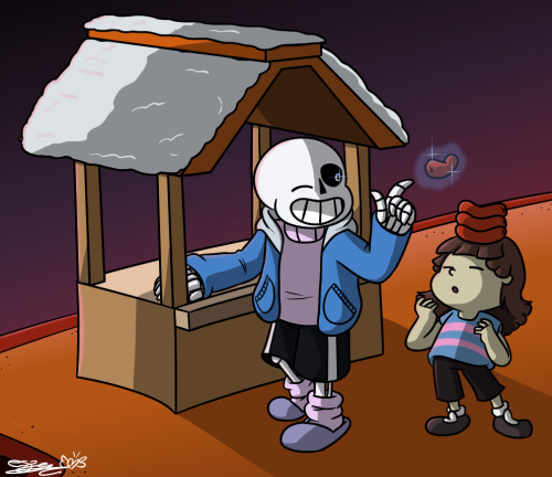
2015: *megalovania intensifies*
i was super into undertale at the time. and 2014-15 was when i started to try and draw other things aside from ponies. you cal tell my poses and anatomy is mega awkward and kinda bad here, but this was a major improvement for me.
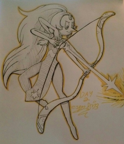
2016: i was a fan of steven universe since it first aired, but i very rarely drew fanart for it. but as i was getting more comfortable with drawing peole, i got more ambitious with the characters i tried to draw.
i also from around this point on tried to get better at traditional art. and i think this was the first inktober i tried, but i don’t think it was the first i finished.
i really liked this drawing. and i may or may not have a wip redraw of this going on right now. wish me luck!
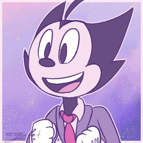
2017: KNOOOOOXXXXX I LOVE YOU, YOU PRECIOUS BOI
this is my favorite drawing. i peaked here and i will never be as good and pure as this single icon i did. it’s purple, he’s happy, it’s PASTEL AND SPARKES!!!!
i also got super into bendy and the ink machine this year, which sparked a renewed interest in trying to improve in drawing, and also led me to create my favorite oc ever.
i think i improved a lot around this time. my shapes and anatomy became cleaner and more consistent. on a technical level, i think this is where i started getting really good as an artist.

2018: i don’t think i improved a lot this year. i honestly feel like ive stagnated since then, and depression hasn’t helped.
it’s a tough choice between this and the hollow knight drawing for best drawing of the year, but this is my personal favorite. sorry, mm, but mickey will always win out in my opinion. i know ya liked the other one though, and it’s also really good.
i like how this turned out, and i’m so glad it’s got the most notes of anything else ive drawn. it’s pretty, and i love the style. this is how i wish i drew all the time.
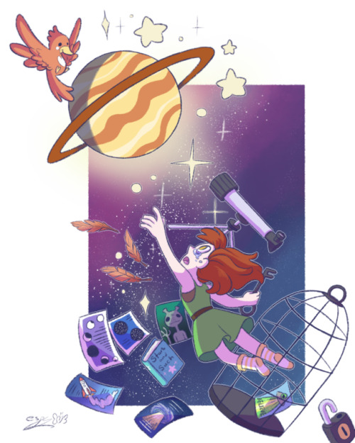
2019: and finally we have this.
i don’t care how poorly this did. i was proud of myself for doing this. it’s cute and pretty and i like it. I created a vague story where she’s a little astronomer who’s like, caged for some reason, but now she’s free.
in hindsight, i think i coulda done a lot better, but i still like it. it’s one of my favorites that ive done this year. i wish i drew more this year, but the last few months ive been super depressed. it’s been hard to want to draw anything, and i feel so uncreative and mediocre.
i’m hoping next year i’ll be better, and i’ll have stuff in my personal life more sorted out, and i won’t feel as bad.
this was nice, though. i’m glad i looked through my old art. maybe i’ll figure out what i’m missing, and get back on track. and maybe i’ll finish these wips i have going on lol. we’ll see.
happy new year, everyone. and may this next decade be even better for us all as creators, and as people.
5 notes
·
View notes
Text
Hello
Hello people from 2019, I am quonit from 2017, March 8, Wednesday. Technically this is my 1,000th post, and so to celebrate, I would make a post post at 2019.
Why 2019 to be exact? Well I don’t know. A while back I saw an expiration date on a jar of olives, and it was on 2019. I started wondering what it would be like at that year. I’d be -------------------------------------------------
I don’t know how many followers I will have at this point and what they think of me, but whoever they are, hi! Sense I haven't blocked you you must not be a porn bot!!!
Well, I know my in 2019 will still draw, but I know that my art style will have changed over the last few years, so here is a few pictures to remember my old style!
----------------------------------------------------------------------------------------------------
My First Landscape

Technically, it’s my second, and it isn’t finished The water doesn’t look like it’s flowing and well... it doesn’t really look like water.
The profile pic I use for everything

A quick 3 minute draw that I ended really liking. Drew it because I got an ask (very uncommon, may be common in the future when this posts) asking if Snowflake loves the snow. I don’t know if older me will do much with snowflake anymore but fun to remember.
A Casual Drawing

Hey remember that crappy Story of the River thing you made? Younger you drew a picture with some Easter eggs related to it. I wonder if 2019 me can draw with thin lines....
----------------------------------------------------------------------------------------------------
Does 2019 me still get mad at anything even close to a stereotype? Do I still fight for fair (NOT EQUAL) rights?
I hope so. Trans people are just as good! Gays/Lesbians are still great! I would name all of the things but this is more or less a quick post...
Oh! How many sideblogs do I have and how are they all doing? Did that “letquobehonest” go well?
Hope you are doing okay :3 Also, happy new years to anybody looking at this post!!!
2,000 post landmark!
8/3/2017
It is honestly shocking that it is only four months till 2018, 2016 was so long, and even though it has been a full year it still feels like August of 2016.
If anybody is wondering I’m -- now.
I guess I should do an art update.
Casual drawing-

I’m started doing more colored line work. Many people seem to enjoy it and even though it takes me a lot longer it helps the overall atheistic of the drawing. I’m still struggling with background though.
Profile picture-
Oddly enough I can’t find the file, I might’ve recycled it my accident. It is a picture of Quo coming out of a purple box. I think I should redraw it but instead with Quo’s summer outfit.
Edit (1/27/2018):

Finished with edit
Most recent detailed picture-

Because I needed to do something for Contestshiping Day becuase I forgot it was Contestshipping day, it makes me wonder what I will draw in the future.
I recently got Zen Writer which helped me decide to start SOTR again, and there is a less promising comic series I started planning for which is Year One and Two.
Wonder how those two will go...
9/30/2017 / 10/1/2017
I hit 3,000 the day before I wrote this so that is why there is two dates.
How do I update this again?
Well I got Ezvid to start working again and I’m making speedpaints. My casual drawing artsyle now has much thinner lines and (I can’t really tell yet) is less squishy... even though I like squishy art.
Example:

(original post)
Thinner lines was a request from blue fox ( @the-fox333 ) and I think it does look better now. I haven't done a detailed art piece recently but here:

(original post + speedpaint)
Much thinner likes and it’s less squishy. I also started playing around with a few different tools in Sketchbook pro so there will probably be many more effects in art.
I also (finally) started being able to draw hugs! Mainly an accomplishment for myself becuase in my old 2015 diary I started wanted to draw a lot more and always reminded myself that whenever I tried to draw hugs they always end up in failure!

(original post)
I also started working on pixle art again.

still alright for pixel art but I need to do a f*cking animation so
I’ve decided to also say my follower count at the end of each update.
85
Anyways that’s it for the update.
11/14/2017 - 4,000
huh, this post keeps having updates closer and closer together the longer it exists.
ANYWAYS
So I think art is still improving :/ Recently I redrew this:

to this:

Better colors, thinner lines, better shading (i didn’t actually shade with the second one but), and different hair. Pretty good improvement.
5000 Posts Update:
Date: 1/27/2018
Followers: 109 (Also I FINALLY befriended AJ)
Profile picture:

Though normally it’s this:

Special Interest: Anything Zarla (more specifically her Left4Dead Respectawoman AU that none of my followers know or care to care about, and I’m not going to force it on them)
Project: Trying to color in a bunch of traditional doodles in digital and finish an animatic by the 31st
Art:


That’s it I think, hopefully this new setup will be able to keep this post more organized.
Thinking of starting a positivity blog.
6000 Posts Update:
Date: 3/5/2018
Followers: 116
Profile Picture: Same as last entree
Special Interest: Still Zarla
Project: Jockey Ghost (though I guess finish the redrawing of multiple March drawing from last year)
Art:

[link]
I like this new setup, it’s really nice.
7000 Posts Update:
Date: 4/9/2018
Followers: 120
Profile Picture: At this point I’m wondering why even change it
Special Interest: I’d say still the ladies
Art: I don’t have the comic done so I’ll look through my stuff and see what I got done.

There we go.
But in all honesty I drew this picture at the end of April Fools in 20 minuets so I recorded myself drawing a bunch to see how long it actually takes me to draw so this picture actually does have something going for it.
But honestly... I can’t find anything I finished that month. only beginning stuff and not being able to finish it because of (one of) the problem(s)...
Edit 4/17
MARCH ME DO NOT BE SAD, I AM HERE TO HELP!

LOOK AT THIS BEAUTIFUL DRAWING YOU MADE THIS IS MARCH AND IT IS BEAUTIFUL
~Extra stuff~
On March 20th my friend made me humiliate myself in spending 30$ on a game about lawyers (Ace Attorney PHOENIX WRIGHT THE ORIGINAL TRILOGY AVAILABLE ON THE NINTENDO 3DS haha). My brother and I are still working on the RPG, today I found out how adorable Sha looks in a dress, and I got back into DnD I guess...
2019 used to seem like this mystical year in the far future but it’s only a few months away now. It just seems normal and I think to myself “I will see this and this is stuff that just seems I’m writing to myself now”.
8000 Posts Update:
Date: 5/31/2018
Followers: 126
Profile Picture: stiiiill Larz
Special Interest: I’m not sure but probably Ace Attorney with all of the time im spending on it.
Art: For April I finished the comic and May is almost over so I’d say the art for may is the “How to Talk to Short People” comic i did for Apollo/Klavier so I’ll put both of them down here.

(dev version here)


(Post for it (also me from the future add in a dev link (got it) ) )
I like them both very much.
~Extra Stuff~
I’m not sad about putting stuff here! Why would I be? I should stop being sad about making things sometimes.
9,000 posts woahhhh
Date: 7/18.2018
Profile picture: CAN YOU BELIEVE IT for pride month i changed it to this and haven't changed it back.

Because of this profile picture Dravid asked me to draw him a new one kinda like this but with a cat and using yellow orange and red.
Special Interest: Steven Universe!
Art: for June I’d say it’s the one i drew for Bardic Feline’s birthday

and for July... well the month hasn’t finished yet but probably the cowboy post!


post link
I like the collab i did with @this-is-a-error but that isn’t entirely mine so i don’t think it counts? idk.
~Extra Stuff~
I’m doing fine right now! The ghost has 24 days before i comes out and AH im scared and happy at the same time. I still need to refine the singing more and finish the singing pose but we’re so close we’re gonna finish this! :D
10,000 Post Update
Well that’s a fuckton
Date: 9/8/2018
Followers: 134
Profile picture: Changed it for August 11th

perfect right?
Special Interest: Ladyverse/DDLC
Art: August is the Jockey Ghost and if not August is... this?

i didnt do much art in august lol. and it’s pretty early in September so i cant say anything for sure. It’ll be the comic i make for bardic but if that doesn’t count who knows what.
~Extra Stuff~
August 11th was GREAT. Lots of things happened and I made a tv show with riot and levi.
Problem: I miss @thefandomnomad! and imma do something about it! Because it’s been 6 months and im not okay! Fun stuff yay 10,000 is fucking huge see you!
11,000 Post Update
It’s been a while.
Date: 11/24/2018
Followers: 144
Profile picture: Hey remember Deltarune came out

Special Interest: Deltarune/Gaynote/Ladyverse
Art: ack uhhh it’s been two months let me see...
For October:


(These seem older than a month old geez...) The second one was a collab with Riot so it may or may not count.
For November:


Both of these are redraws of something Error did, and it’s their reverse outfits.
~Extra Stuff~
I’ve been spending a lot of time on Discord which is why it took me much longer than normal to post. It’s pretty soon till the release of Juan and Sha and I’ve neglected them so I need to finish ;-;. Right now I’m working on the quests for them, and getting error to do dialogue. That’s about it maybe I wont even update this post until After 2019 hits (scary ack)
12,000 Post Final Update
damn
looks like i made it
Date: 12/29/2018
Followers: 160 (I’ve been getting a lot for some reason)
Profile picture: Think it’s still the same
Special Interest: Ace Attorney Frozen AU
Art: look

(im so proud of myself I finally did a good pallet challenge)
~Extra Stuff~
I shouldn’t be here haha.
It’s like... 3 days before this is supposed to post... and dang 2019 used to be so far away... The passage of time a lot of the time seems strange to me. But, I guess it’s cool I’m pretty much there now. And I have enoguh art to made a “2018 art progression” thing, which is cool.
Well, I guess this is a goodbye. The last I’ll be able to edit this post. I’ll start another one- no doubt. I just think it’s weird to abandon this post after so long... haha. Well, bye, I guess.
7 notes
·
View notes
Text
"Mary's 2021 Summary of Art" - Published: Dec 31, 2021
(Warning: This is going to be a wall of text.)
January in January i was asked by a friend "Hey, i wanna learn how to make Live2D models. Wanna join?" At first i thought i couldn't do it, but in the end decided "Why not?". That's the mindset i wanted to carry through the year. Pictured is the result. I've been asked to try and complete said model, so next January will be fun! This month i also took part in a FFXIV tag on twitter, where we made fake screenshots for a dating sim. That's where i decided i wanted to try and work on a visual novel, at least once. It has always been one of my dreams after all!
February ...And so i jumped on the lemmasoft forums to look for work. Found a person making a cute little self-love tale for the Valentines Jam and figured it was a good idea to give it a try. It was so much fun. Took the challenge as far as i could, and i'm still really proud of being part of this! Still not sure if game art is for me, but felt great to finally give my dream a try. If you take anything from this text wall, let it be "Wanna do something new with your art? Try it out!"
March I think it's around this time we started playing our TTRPG game (Asera)? Ok i forget when we started, but this was the month i sat down and designed my little thief (Layla) and my boyfriend's fighter (Daimyorus). Also made designs for Layla's family. It was a rather busy month (character design is time consuming!), but nothing really 'wow' to show off for it.
April This month i drew some memes for Asera, and sketched a bunch of illustration ideas... That are still sitting there, unfinished. You see, this same month i got accepted into my first zine ever, as a merch artist! Trying new things continued to pay off~ I got stickers done from sketch to flat colors around this time.
May Finished the sticker sheet for the zine (pictured), then proceeded to take...around a week on the phone wallpapers. I restarted it so many times before... When the idea finally clicked i stayed up till 4am drawing >>;;; I was terrified I'd miss the deadline, and had an apology letter on the back of my mind the whole time LOL Thankfully, it worked out and they were delivered in time. Sadly had to skip Mermay because i was busy with miscellaneous projects (only drew 1 mermaid for it, which I wanna redraw someday). Started making little chibi faces for my OCs so i could have a catalog... Which is an idea I wanna revisit later. Having a good reference of everyone would be really nice! (...even if i never do anything with them lol)
June Asera bug bit me again, and i spent a while making chibis for our characters. Also made chibis for NPCs. Designed more NPCs. Designed some of our weapons. For work, got commissioned by a VTuber to draw them and their pet (pictured). Technically finished on July3, but worked on it most in this month so eh LOL
July I made an off-hand comment about working on commissions a month or two before, then on July my friend approached me like "Hey, so you said you're doing comms... Can I get one too?" I had! So much fun! This is also the first time i recorded my drawing process (i do have plans on making a youtube channel eventually). It made me realize i... Take a bit too long. This one was 36hs. That's a bit much LOL But hey, i'm proud of it and both friend&his girlfriend like it, so 100% worth!
August Another busy month, drew some twitch screens for a friend, updated an old drawing (xmas chibis), filled some ff14 memes, experimented with a more sketchy style so i can have a faster type of drawing (...why didn't i post it?) Pictured is the bday gift i made for my boyfriend. Still haven't posted it here, but it's on my stash somewhere >>; It's filled with love!! Maybe that's why I'm still proud of it.
September Made the final twitch screen (pictured), and designed more outfits for Asera (fashion design is indeed my passion). Cleaned up twitter and started working on a TOS so i can maybe open commissions soon... Speaking of commissions, this is when i drew the Dauntless illustration. Nature BGs are my favorite thing ever!
October A very busy month. Worked on commissions (all 6 of the characters O_O) + bunny boy for the EW countdown. The original sketch for the commissions was.....interesting....idk how that got approved LOL But the final result is something I'm very proud of! For the rest, drew more sketches and outfit designs for Asera, plus a chibi sketch to commemorate EW's release (bf's wol and mine ON THE MOON)... Having no idea it would be delayed very soon LOL
November Got into a bit of an art block, which was broken by... Asera characters as Animal Crossing villagers!! Why are drawing memes/challenges the best thing ever?? After that, i managed to start working on a commission my sister asked. Drew all of her students and their favorite toys. They're all so friggin adorable ;_; Was stressful, yes, but also a great experience. Also i think this was my first time drawing real people? Well, my first time doing that for a commission at least!
December Sadly another art-block month. Made yet another Asera sketch (bc i don't have enough of these!), and twitch badges/emotes for ADigitalKing (pictured, also sorry for the hideous watermark, but they paid for it ok TT). Currently working on twitch emotes for my friend, but struggling to have them on a quality level i'm comfortable releasing.
---
Phew, what a year! My journey for a year where i have finished art to post on every month continues, but i'm proud of how much closer i got this time. Also got to try so many new things too! Overall, a good year.
Onwards to 2022!
1 note
·
View note
Text
Monday 26th of sept
Today was our first lesson of the new unit. After looking at the film list previously I realised that I would probably go with a series of unfortunate events as my chosen film, just because I loved it as a child and have a lot of personal connection with it, as well as enjoying how beautiful all the sets were. After my meeting with Claire I researched some of the other sets and rewatched the film 12 monkeys. I really enjoyed the dystopian facility sets and considered recreating those but instead I finally decided on the aunts house from a series of unfortunate events because I like the way it shows the house being ripped apart by the hurricane.
Tuesday 27th of sept
Due to being quite unwell to make it into the studio, I decided to complete some more research into the set I chose. I started to collect some screen grabs on a pinterest board and worked on a sketch of the house. I really struggled to get the right screengrabs for my film as there aren't many screenshots of Aunt Josephine's house online and the behind the scenes of the set as all the sets were built in the Paramount studios. Therefore I struggled to guess measurements for heights of certain items.

Wednesday 28th
Today we started to relearn the sketchup software. After struggling with the software in the previous unit I was excited to learn more about it and use it in this unit's final submission. The sketchup software itself had fairly simple features at first and was quite fiddly. We were asked to prepare a homework task which i did after the lesson and through following the guides created a house. A problem I ran into during the task was not being able to get the holes through the windows to fully push in. After receiving some helpful feedback from a fellow classmate I realised this was down to having a gap in the walls geometry somewhere which is how blender and sketchup are similar. Later in Paul's lesson we created concept art for an art deco themed item. I chose to create a forklift as I was obsessed with the film robots as a child which had a lot of art deco themes within the industrial environment which I loved. Therefore I took a lot of inspiration into the robot's character design to inspire my forklift.


Tuesday the 4th october- white card model and corridor
Today's lesson I got to catch up with creating my corridor technical drawing. In a previous lesson I'd missed taking the measurements so this was what I worked on today. I then started to create the basic floorplan for my corridor. I've realised that I tend to struggle with accuracy when it comes to measurement taking and find myself changing measurements i previously noted to fit my idea of what looked right which I stopped doing once I realised my corridor floor plan was wrong and having to redraw. In a later lesson we practised white card model making using a technical drawing. This was a fun process but very fiddly, however I hope I will have this down by my final submission.

Wednesday 5th october - sketchup and modelmaking
I struggled to join the team's meeting so instead I watched the old recording after the meeting to brush up on my understanding of the software. Due to the formative assessment on Tuesday I decided to work on getting overall measurements for my technical drawing for the set I chose. To do this I used an image of the outside of the set to gauge the measurements for the floor plan. This was good in the sense I had a better understanding of the house but bad in the sense that parts of the external house wouldn't match up with the original internal set.

Monday 10th of october-
Today was a day of preparation for Tuesday's presentation. In the morning I worked on creating my technical drawing. This didn't have to be completely accurate and more had to represent my previous measurements that were based on some heights but a lot of assumptions. I then got to photocopy my drawing and make my model outside of class. I struggled more with the modelmaking than I thought I would as I don't think my blades were the right size for the board I was cutting. This meant the edges were rougher and more jagged in my final building so by the final submission I will make sure to buy sharper scalpel blades.

Tuesday- 11th of october- presentation
This morning we had our presentations. It was nice to see what previous classmates were working on and the layouts of their presentations. I realised a lot more classmates had provided previous documentation of work being done inside of the lesson. I was very critical of my final model and floor plan as I realised there were a lot of elements not taken into account which I would have to address before the final submission.
Wednesday 12th oct sketchup staircase- after the mornings online sketchup lesson i read through, I decided to address some of the problems within the original building by altering my measurements and starting to think of the way the roof is laid out within my building. After my presentation me and Claire both realised my ceiling height was off, but I could use this to account for the roof pieces I didn't previously include. Therefore I decided to replan and change all of my measurements for the house, to also account for the steeped walls.

Thursday 13th oct- after receiving my feedback from Claire about my presentation I decided to start a new technical drawing with the scales I felt were right. I used the book provided to help lay everything out more professionally.
Friday- 14th of october- I felt a bit better today and decided to visit the south london gallery to see the simeon barclay exhibition. Simeon specialises in architectural multimedia practice and I was interested in how he would use the space in the south London gallery. His exhibition ‘in the name of the father’ draws themes from his relationship to his father who worked as a tailor and an attempt to understand the relationship between people and place. I personally loved the exhibition as I really like the large scale pieces which essentially acted as props within the giant gallery. He puts a lot of thought into story and placement as the largest piece of art, a giant boulder with a rooster placed almost comically on the tip is all you can see as you walk straight into the gallery, almost like a blockade to the other works.

Wednesday- 19th oct
Today I had the exciting opportunity to be on the set of a face magazine shoot. I got to converse and network with the set builders, stylists and other models during the whole process which was really fun. I had a better understanding of how a professional shoot is set out, the space left for photography equipment and lighting setups. I also got to see the DOP reel, the massive film reels into the camera as the entire thing was shot on film. It was a really enlightening insight into the industry and I made some good connections.

Saturday- due to the presentation on monday, on saturday morning before work i decided to come into uni and work more on my technical drawing, adding details to my walls and even decided to bring the drawing board home so i could work on my technical drawing on sunday when uni wasn't open.
Monday 24th oct- presentation
My presentation was on Monday morning. Albeit there was a lot missing for my final submission and the way that my presentation differed from everyone elses was that most people had a nearly finished technical drawing and had started their sketchup models already. My technical drawing was taking me a lot longer than I thought it would due to the overall large size of the set. I used the rest of the day to work on my technical drawing.
Wednesday 26th- today was spent working on my sketchup submission. I'd left this quite late in the project as I had focused a lot of my time into making my final technical drawing. Claire helped me to start to fully understand the software and by the end I had a sketch of my set. I didn't realise how many problems i would run into while building my model and ended up having a lot of problems i couldn't fix in the end such as my window pieces geometry was broken so i couldn't copy it to the other walls as there were gaps in the windows i couldn't remove. I also got to realise all the problems with my technical drawing that would affect my final submission, such as missing pieces in the roof and sides to account for the steepness in the walls.

0 notes