#stylizing the noses in these profiles was like...
Explore tagged Tumblr posts
Text

“AH, SHIT.”
Elvis Hirsche had extremely bad timing, all things considered, and I couldn’t help the little flurry of annoyance that built up in my chest as I stared down at my phone. But it passed quickly, because in the next moment I realized that Elle needed me. And I would always be there for Elle when she needed me; that went without saying or even thinking about.
It wasn’t like Elle to go out and get drunk. I had known her ever since we were in elementary school, and we’d been best friends since somewhere in middle school. She was in her second year of college now and I was in my last… Well, okay, what was supposed to be my last. But I definitely didn’t have enough credits to graduate, and I certainly wasn’t sad about it.
The point was, I had never known Elle to get drunk in a bar. And especially not without me.
“I’m sorry, Ty,” I glanced over at her apologetically as I slid my phone back into the pocket of my jacket. “I’ve gotta go.”
I expected Tyler to look ruffled, so I opened my mouth to hurry up and explain, but she didn’t.
She wrinkled her forehead just a little, and I could see the concern in her eyes as she opened her mouth to say, “Is everything okay?” And fuck if I didn’t just love the way this girl gave me the benefit of the doubt. I couldn’t think of a single one of my exes who—at this point in the game—wouldn’t have been jumping down my throat about why I had to bail on her. Especially if they found out it was about Elvis Hirsche. But not Tyler.
“DK texted about Elle being wasted at Blacklight,” I explained, already knowing that Tyler would get what that meant to me. “I’ve gotta go get her.” I shrugged, apologetic. But there was no fucking way that I was leaving Elle on her own to muddle through a bar full of assholes while she was drunk. Not happening.
“Why can’t DK just take her home?” Reagan interrupted, with the same attitude that I had almost expected from Tyler, but had been relieved not to get. I caught myself before I could shoot a glare in Reagan’s direction.
I was supposed to be with Elle tonight, anyway, so I couldn’t help the surge of guilt that I felt. Like maybe this was my fault somehow. That she’d gone out and done something so out of character because of me. But I had canceled on her because of Tyler’s plea that I join them tonight. All because her best friend, Reagan, had a date with some dude and didn’t want to go alone.
I was not a fucking double-date kind of guy. Especially not if the double-date was with Reagan Knight, who had always managed to find something about me annoying, for as long as we’d known each other. And this was a small town where people rarely ever moved, so we’d all kind of grown up together. Which meant that Reagan and I had been at odds basically forever.
I shook my head at her. “DK’s working.” But she already knew that. “He can’t just leave to get Elle home.” He was a bartender at Blacklight. What I didn’t mention was that DK actually was going to do just that, but just not for Elle. Apparently Elle and Jemma had made it a girls’ night out. DK couldn’t handle them both on his own, and he didn’t want to leave Elle alone while he got Jemma home.
Still, bailing on my girlfriend to deal with a drunk best friend made me feel like kind of a dick.
“Don’t worry about it, man. I can get them both home.” Elliott—the poor asshole who wanted to date Reagan Knight—didn’t ding anything on my creep meter. He was just this kind of nerdy guy, and he seemed harmless enough. Still, I considered him for a long moment before shooting another look at Tyler.
“Or you guys can come back with me now?” I offered, feeling worse as I realized I was stranding them with this guy if I left, and ruining Reagan’s date if they left with me.
I watched as Reagan and Tyler seemed to communicate through nothing but back and forth looks before Tyler gave a gentle shake of her head. “No thanks, Gavin. Don’t worry about us. Go ahead and take care of Elle.”
I listened for it, I really did, but there was not a single shred of suspicion or judgment or even annoyance in her voice. It was fucking amazing.
“I’m sorry, Ty,” I shot her another apology, just to make sure that she knew that I meant it, but she just smiled.
“I know. It’s okay, Gavin.” I took Tyler at face value and nodded, standing up to leave. There wasn’t any time to waste because we were at some karaoke bar a little ways outside of town, and it was at least a twenty minute drive back to Pleasant Valley and Blacklight to get Elle. We hadn’t even ordered our food when I got that emergency text from DK. But Tyler didn’t flinch as I grabbed up my keys and waved goodbye to everyone; she didn’t seem to mind at all.
And yet, I’m not gonna lie, a nagging part of the back of my mind worried about whether I’d pay for this later. I mean, most girls were just not this chill. Not even Elle, and she let me off the hook pretty much all of the time. It was something I couldn’t worry about at the moment, though; I’d already made up my mind to leave.
#my art#my writing#artists on tumblr#i'm still working on side profile and 3/4 views okay#so this... was hard...#gavin x tyler#reagan x elliott#fg#fg ch06#i legit can't believe i spent so long#on this image#for this short short part of the story#but also#it was good practice#so okay#i honestly hate their noses#stylizing the noses in these profiles was like...#not my friend#okay i'm done criticizing myself
4 notes
·
View notes
Text
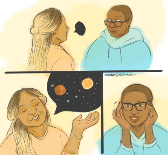

[ID: two digital drawings forming a small comic of Hen and Karen Wilson from 9-1-1 on abc. Both are done in a semi-realistic style with soft warm colors.
In the first image there are 3 panels, first Hen's glasses have fallen down her nose and she looks up in surprise as her as Karen comes up to her and starts talking with a speech bubble stylized to look like stars in space. The second panel expands Karen's speech bubble now including more stars, the sun, three planets, and Mars closest in view. Karen is smiling with one hand lifted as she speaks. In the third panel Hen is pushing up her glasses and looking intrigued. small text in the corner between panels reads, "tumblr@chimmaddie."
In the second image, is a full size drawing of hen looking at Karen in admiration and listening aptly with her chin cutely resting on her hands. There are small hearts in her eyes as highlights. Karen is beside her in profile, with her eyes shut smiling as she speaks. End ID.]
Prompt fill for @911actions Gotcha for Gaza! Check out there how you can donate and get your prompt filled ^_^ this was requested by @brasscacti thank you for donating and I hope you enjoy! <3
the gif this is based on under the cut:

[ID: a looping gif of a black person with long straight black hair. They are seated and seen from waist up, wearing overalls and a sweater. The gif cuts from them raising their hands to smoothing their hair back and in the same motion tucking their hands under their chin. They lean their arms on the table and look to the left with a cute smile, as if they are adoringly listening to someone off-screen. End ID.]
#hehe i have a problem i legit keep making these multi image ToT#but this prompt was so cute#911 on abc#henren#hen wilson#karen wilson#911 show#911 abc#image described
764 notes
·
View notes
Text


My first Frank drawings + other shenanigans!!
I made a post saying how I noticed Frank seems to be the least accurately drawn when it comes to fan art and I was curious to see how that is by doing some sketch studies of him
While I was doing these studies I did run into a couple of problems. The one thing I feel that I’ve struggled most to capture is Frank’s nose. There were times where I looked at ref photos of him and I couldn’t decide if his nose was more slope-y or straight, so I tried to get around that by just making it look like… an in-between of slope-y and straight? It’s especially tricky doing that when drawing his side profiles, which is another thing I struggled with. Maybe I didn’t search enough ref photos of him in side profile, or maybe I just didn’t have good references LOLL, but drawing him in that angle was hard because at certain points it was hard to align his features accurately such as the mouth and nose. It was just kind of hard for me to not make him look like some other white guy or a Gerard #2 LOLL
I definitely have a long way to go, but otherwise it was super fun doing these studies! I love doing facial studies and stylizing them, as you can see in the other drawings I did lol. My advice is that whatever facial feature you notice is distinct try to exaggerate it as best you can so the model can look more recognizable to others! This is the mindset that caricature artists commonly have. And it’ll greatly improve your art style as long as you have fun with it
Hope you enjoy my drawings and my little rambling LOLL
#fan art#artist on tumblr#artist support#gerard way#mcr gerard#gerard way fanart#mcr#mcr fanart#my chemical romance#my chemical romance fanart#revenge gerard#my art tag#oc art#original character#frank iero#mcr frank#frank iero fanart#paul mccartney fanart#sketches#art#revenge frank
57 notes
·
View notes
Text
Soul bond[OUTDATED]

“An eternity alone is a cruel thing to be subjected to. To be surrounded but isolated, heard but forgotten, so powerful, yet so weak at the same time. The story is your life, but is that really all there is to it? Is that why you did it? Allowed them to exist despite the obvious growing issue? You wanted to feel understood despite not knowing who you were or where you began. You’ve crafted life at the expense of their freedom. You’ve replicated freedom through life.”
More info about this au under cut
This really started as a joke cuz I wanted to draw more Stan and Mari friendship art but as god has it it’s not so much a joke anymore(yay). This whole AU centers around Stanley and Mariella “becoming human”.

Character refs for Stan and Mari. I might change some stuff up with their colors and designs but this is the main idea for now.
In this AU Mariella now works in the same building as Stanley and her job is to attend meetings. Employee 317 did this everyday of every month of every year. She first meets Stanley while waiting for those who were supposed to attend, surprised and confused at the sudden disappearance of everyone.
Mariella and Stanley are creations of the Narrator, so they don’t look exactly human because of that.

(They have normal noses in side profiles)
I was inspired by Friday Night Funkin for their stylized faces. In terms of expression they are much more animated in comparison to the Curator or the Narrator.
Speaking of Nar-Nar, here’s the man himself. His first form is more like a “concept” than an actual “appearance” as he didn’t really care about what he looked liked and cared more about getting through with the story. His current form is much more human and he often spends time in it outside of the parable in his office. I wanted to keep his figure blocky and sharp cuz I went by squares as his main image.


Now the Parable wouldn’t be anything without the building, lo and behold “Coworker”.

I suck at drawing buildings, but for all you need to know for now is that it always expanding in the inside (where the story takes place), and also it is alive, capable of thought and emotion to some extent. Yayyy living infrastructure.


Some additional early sketches I made while trying to figure out stuff.
I thought it would be funny if Nar and Curie dated for a week before realizing they swung different ways. Things are good between them but it’s a little awkward at times. I was stuck between making Nar-Nar an eldritch creature or just an old man, but then again why can’t he do both.

Quick height chart doodle. The egotistical old man strikes once again, he really made himself so tall because he thinks it’s funny being able to see over people’s heads. In a way they look like Kirby to him.
That’s it for now. I’ll try to not burn myself out so that I can draw more for this au. It seems shallow right now but that’s on purpose‼️
Also, none of the things I draw in this AU are meant to be romantic. They are Queer-platonic at most. This is just me exploring bonds in hard times +what it means to be human (self-projecting like hell).
#the stanley parable#the stanley parable ultra deluxe#tsp#tspud#tsp mariella#mariella tsp#tsp stanley#stanley tsp#tsp narrator#narrator tsp#tsp curator#curator tsp#rag-tag au#The Stanley parable au#I have a whole notes page for this god help me#I haven’t forgotten about Tee-Kay#They’ll be here later#Tsp au#the stanley parable fanart#Man a lot of stuff changed I need to redo it all
72 notes
·
View notes
Note
You draw transformers with such interesting features, especially facially. What inspired it, if I might ask? I think it's a fascinating art style personally.
Thank you for liking how I draw the silly robot aliens!
But to answer your question, I didn’t get that many Inspirations, really. It was a split second decision I made with my bumblebee when I first designed her where I gave her the bunny like nose (plus also the ridge that’s her nose bridge). And then I just continued with the bunny like nose for everyone else.


Then when I started to really get to design Hotrod, I decided to stray a bit further away from human face anatomy for her side profile and I gave that to Optimus too. I just generally like to make aliens look like their own species rather than just metal humans.


It’s just a bunch of random decisions that didn’t really have any really reasons for, just wanted to make up my own anatomy for the silly robot aliens. I do kinda blame tfa for making me a bit bolder with my stylization (which is a good thing bc I’ve been wanting to stylize my art style for a while now)
I love my little critters, they are very silly to me


#digital art#drawing#transformers#transformers fanart#tf#i like making aliens look weird#they deserve to look different from us#love my critters#transformers bumblebee#transformers hot rod#transformers optimus#transformers starscream#transformers oc
32 notes
·
View notes
Text

the manipulate manslaughter manwhore himself <33
deep dive into design choices under the cut!
i went into this design imagining him as the gold standard of tumblr sexymen, and then accidentally made him gnc as fuck and now he’s my gender. oops lol
- i knew i wanted to make his vest and tie patterned, bc he strikes me as someone who’d wear garish but somehow still classy (& probably also clashing) patterns. i also decided to make each piece correspond with arthur and john—the vest has the same brown and gold color scheme as arthur with an eye motif (for arthur’s blindness but also kayne’s sort of omniscient vibe). the tie has the same color scheme as my john (more or less exactly colorpicked) with a marigold pattern, both for the nickname and for its flower language—among other things, marigold symbolizes the sun, and also death. i had a ton of fun making the symbolism work for both boys but also fit with kayne’s vibe c:
(also, if i ever animate kayne, i imagine the patterns do that thing where the patterns don’t move with him but rather look like they’re a part of the background, if that makes sense; heightening his sort of uncanny otherworldly vibe)
- i purposefully wanted to make kayne look a little uncanny and inhuman! sharp stylized teeth (he’s always got a toof sticking out), forked tongue, and long pointy ears. also this bitch’s anatomy makes no sense & can and will change whenever! generally his legs are very long and his waist very small (& grabbable. grab if you dare), but as seen in the profile shot with his mouth, he’s always just kinda. off.
- his eyes are kind of slanted & mono-lidded, and his irises are more square shaped than circular. his pupils are upside down crosses. also he has the most luscious lashes imaginable
- he carries a cane around just for the aesthetic. it is nonfunctional other than self-referential jokes and murder
- face is generally made up of long & very sharp shapes. i was a little worried about his head shape being too similar to arthur’s, since his is also long with strong cheekbones, but i made kayne’s overall more sharp and severe. also pointy nose
small detail lightning round:
- he has moles! trust me he told me himself
- tails on his suit, kinda tattered and ragged looking; sort of mirrors the right hair strand
- dramatic arched eyebrows w a slutty eyebrow slit
#kayne malevolent#kayne fanart#malevolent#malevolent podcast#malevolent fanart#kayne#malevolent kayne#artists on tumblr#fanart#my art#tw blood
37 notes
·
View notes
Note
hiiiiiii do you have any tips for drawing Kirk? 🙏 TvT William Shatner’s stupid face is getting every single one of my goats
to be honest i’m really not particularly confident in my ability to draw william shatners elusive face and i think he looks different every time i draw him so what i’m gonna say is less specific and more just about capturing the likeness of real people/characters or models based on a real person’s likeness
long answer under the cut but my short answer is if you’re drawing kirk and you can tell it doesnt looks right but dont know why make his forehead bigger. im serious it fixes the problem for me like 85% of the time LOL
this is perhaps just obvious advice but just having a reference collage for people/characters you draw often is really helpful. i find i often need detailed references for clothing/environment designs but the principle is the same for drawing a face. it helps to understand something from several angles, this is just a collage of references i use but if im being a hundred percent honest i almost always just skim the kirk daily or spirk daily accounts on twitter when im looking for a particular angle. LOL

also im prefacing this by saying this is not something i sat down and meticulously thought out i just draw a lot of fanart and subjects from observation. i do a lot of this on subconscious level and have just absorbed some things also from seeing what features other artists emphasize!
when you're stylizing a character, whether they are the likeness of an actor or a model or whatever it helps to just try to break down their defining features. this is easiest when you have another or several other characters to contrast against. bones and spock are the most obvious here, since the three of them are often in the same shot. for example, bones and spock are more angular than kirk, but spock looks lankier, while bones always looks a little haunched over. shatner doesn't have a very defined jawline (which is most obvious from a 3/4 or profile view) and his cheeks are fuller which shows the most when hes smiling. he has a pretty low brow too, and a wider forehead. from a profile view you can see the shadows that emphasize his sloped nose. the length of his hair fluctuates throughout the show, so i tend to just pick a partiuclar way of drawing it and stick to it lol. i like to draw the little curl that sits on his forehead and make the shorter sides slightly wavy

as far as movie era kirk goes, generally what is said before still rings true. again, it helps to have another person to compare too. as nimoy got older, his laugh lines deepened and his cheekbones hallowed slightly. again this contrasts a lot with shatner when they're next to each other because his face is fuller and i find the more defining wrinkles on his face are around his eyes and forehead. his hair is obviously a tighter curl, he often does still have one curl fall on his forehead.
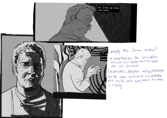
other than that the biggest advice i can give is to practice... for every successful kirk i draw know that i fucked up at least three times before that.
a lot of this work in observing what features are defining on a face or what i want to emphasize is sort of intuitive to me, and sort of personal preference. its just how i do it, and you might find a process that works better for you. drawing a bunch directly from a reference and then stylizing from there is generally something i find is most helpful though
typing this all out is making me sound kind of crazy like i spend hours a day dissecting william shatners face but its kind of just the small quick decisions and comments everyone makes to themselves while drawing from observation i think... but now vocalized. which sounds a little insane all together like this. i promise im really normal i just drew him like 30 times over from various angles when i was making my tsfs comic. LOL
35 notes
·
View notes
Note
I might sound like a real douchebag here but could you please give a simplified tutorial on how to draw angela giarratana's nose? I just really struggle with noses and hers is so unique but you really seem to get it.
Hello anon! I'll try and help as best I can.
This is a little tricky to explain over text but! I think the key with all noses is remembering that they, when simplified, are just 4 planes. Find decent references with relatively dramatic lighting, so you can discern the planes of the nose of your subject. With Ang here, I've used a screenshot from black Friday, and traced over the top to find my planes.

Now that I've got my planes I've redrawn the nose not focusing on detail but on shape. Shape is important, especially with Angela's nose. What makes it so distinctive is the diamond-like shape on the top, almost like a fish pointing downwards. It gets wider at the bridge, but doesnt have a dorsal hump like a lot of noses do, and it doesn't turn up or down, giving it a flat, or as Ang put it "Boxy" appearance. You can see this in her side profile.

So the key to drawing Angela's nose is essentially a Diamond inside a triangle. Those are the key shapes that will help you capture the essence of it, no matter the stylization. Remember! It's about form! This isnt a step by step on where the lines go because not all of these boundaries are going to be lines depending on your style! This is to help you understand the shape.

Hope this helped at all! This can be applied to all noses that you're trying to study, or other features that you're struggling to discern. Don't feel bad or ashamed for using references to break down your shapes and understand your subject!
38 notes
·
View notes
Note
Got curious bc of the ask about horses! What are your, like, top 5 fav animals to draw? And what are the top 5 fav dog breeds?
Uh, mm, well
Fav animals to draw:
domestic dogs (sighthounds to be specific, surprise surprise)
wild canids (coyotes are my favorite of these, wolves a close second. I've never gotten into drawing foxes much despite their obvious photogenic-ness)
goats and sheep (horns! wool and shaggy fur! potentially ominous!)
deer (reindeer/caribou in particular, I love those, so majestic, big crazy antlers)
felines (mostly domestic cats, but tigers sometimes, they're such an iconic and visually distinct species)
Fav dog breeds to draw:
Greyhound (lithe, muscular, flexible, simple silhouette, the quiessential sighthound)
Doberman (childhood favorite, also good shapes, high contrast colors, particularly good heads and teeth)
Borzoi (noodley horse dog, elegant, fur texture provides interesting stylization opportunities, roman noses and rounded backs look very nice in profile)
Ibizan hound (a bit like a greyhound in a different font, sharper and more angular, less curves and more straight lines, very expressive pointy ears, visually tends to get close to the traditional anubis look which is neat)
Afghan hound (the ultimate fur dog, the mucha hair option, challenging, can look very noble and striking if the piece turns out alright but is a nightmare to deal with if stuff isn't aligninig like it should)
229 notes
·
View notes
Text


From Frédéric Poulsen, "Le buste du bronze de Cato trouvé à Volubilis", in the journal of the Académie des inscriptions et belles-lettres, 1947:
"The first thing which surprises [the viewer] about this admirably preserved bust is how clearly it has retained a certain rustic trace. This is a true country man, like to the wealthy farmers of the agricultural nations of our day. Cato, however, belonged to the stifling circle of the high Roman nobility (which fact is demonstrated above all by the marriages of his sisters and daughter). Here, he appears as the descendant of Cato Priscus, that prototype of the great Roman country man—and the urban life of multiple generations of that family, three of whose representatives held the consulship, has not erased this spirit.
The second great impression [one has] of this visage is the seriousness of its features, in perfect accord with the literary tradition: "It was difficult," Plutarch says (Plut. Cat. Min. 1-2), "to move Cato to laughter, and rare that a smile should appear on his face". He was harsh, tenacious, and, when ill, demonstrated an admirable forbearance.
Adding to the serious expression of those features is the movement of the head: it is turned toward the left shoulder and, at the same time, gently, peacefully inclined; and the movement which tenses the neck muscles, combined with the lines of the mouth, creates an impression of severity, even of unavailability. It is not impossible that the absence of colored stones, which would have once indicated the iris and pupils, contributes to the hardness of the gaze.
At the time of his death, Cato was forty-eight years old, but this portrait speaks of a man who lived a hard life and was aged prematurely by it. It is true that [one contemporary scholar] finds the Cato of this bust younger than the age of his death—an impression probably due to his observation of the bust's profile, since from that angle the expression is both younger and more peaceful, as if disclosing traces of the features of a young man; it is only by virtue of the large nose, particularly its curve, that a powerful masculine energy is revealed and even emphasized.
But, seen from the front, the face is haggard, the forehead is crossed by deep wrinkles that run parallel to the thick eyebrows, the creases that run down from the lower eyelids, the large and profound furrows of the cheeks, and the great lines between the mouth and chin, all contribute to give the face an expression of pain and age. In my opinion he could well have been a sexagenarian, this great country man with his proud, tranquil expression.
[...]
Even if the portrait from Volubilis dates from as late as ±150 years after Cato's death [the author dates the bust about the time of Domitian or Trajan, ed.], it goes without saying that an older and more contemporary portrait has been copied. This is confirmed when one observes the profile of the bust once more: one sees the tufts of hair in the nape of the neck shaped like long, curved leaves, and stylized in a bladelike form, a mode of stylization characteristic of precisely the period in which Cato lived, ±50 BCE.
[...]
Naturally we might suppose that a certain alteration of the features must have taken place in this transmission from copyist to copyist. [...] Where an artist, from the time of Nero for example, has copied a republican portrait meant for the atrium of a young, newlywed nobleman [an ancestral imago], the result is inevitably a mixture of styles, a circumstance which makes it still more difficult to date many Roman portraits.
Certain points of resemblance, then, may have been diminished in the face of the Volubilis Cato—on the other hand, the artistic effect could have been strengthened by an emphasis on the essential lines and forms of the visage. Happily, the artist appears to have stuck to the veracity of the original, without adding any suggestions of that saintliness or divine inspiration which the writers of the imperial era attribute to Cato, from Seneca to Plutarch."
#cato minor#c#il pourrait être sexagénaire — ce grand paysan à l'expression tranquille et fière. ;;_;;#good to stretch my french a little. also really funny how whipped mr. poulsen obviously is. another one bites the dust
23 notes
·
View notes
Text
Bestiaryposting Results: Zomargon
Another fairly obvious one -- perhaps made more so by the fact that I left a couple identifying terms in. Usually I try and sift those out: e.g., for the deer I replaced "doe" with "female [X]" and for the wild ass I replaced "bray" with "call". This time Past Me apparently didn't think to replace "trumpet" or "trunk". Whoops.
General note, please forgive if this seems disorganized or rushed; I'm a bit feverish I think.
Anyway, here's the entry:
If anyone was confused by all that, please see https://maniculum.tumblr.com/bestiaryposting. Art below in rough chronological order.
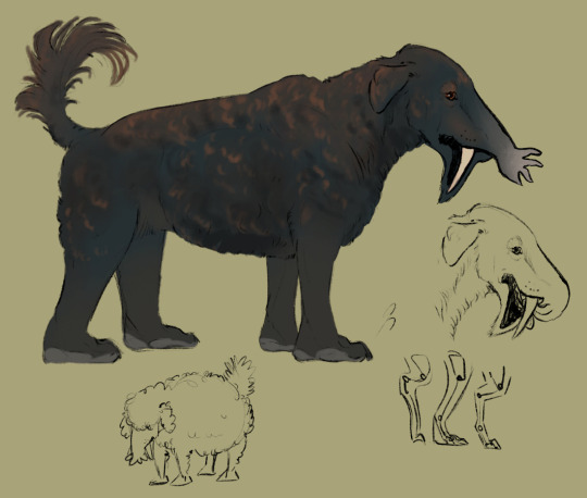
@silverhart-makes-art (link to post here) took this in a truly delightful direction. The animal itself is very good, and I think the little sketches really enhance it, but the in-depth explanation of their design decisions in the linked post is what really makes it. Genuinely very charming animal in that context; I like it a lot.
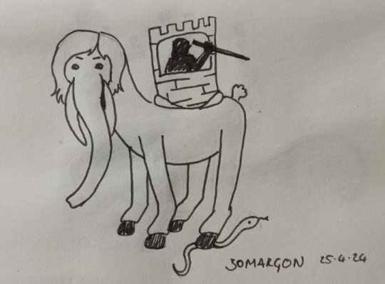
@sweetlyfez (link to post here) gives us a beast complete with a warrior-tower-arrangement on its back. Genuinely a pretty good fit for the entry all around, and of course the real gem is the hairdo. Hey, the entry says it has hair, it's up to the artist to decide how to style it.
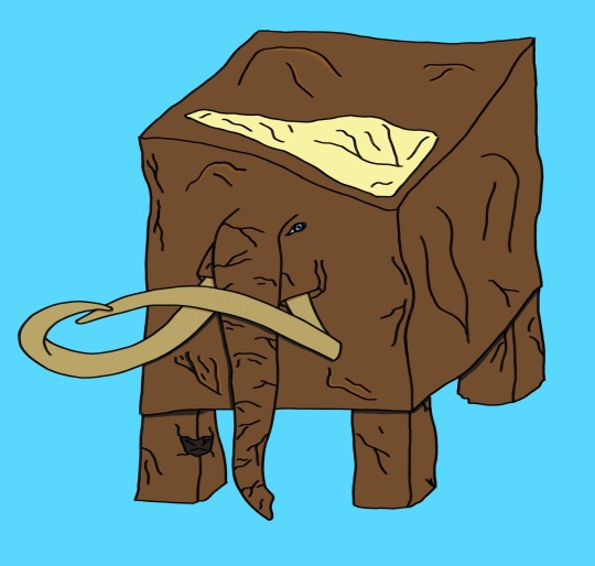
@moonygryffin (link to post here) has drawn "Mammoth Cube", which until just this moment I has no idea was a thing. Have to give it to them, though, that animal clearly has no knees and would be really easy to put a tower on top of. Good work, cube.

... dating myself a bit there... wait, that strip is still going? Huh. Anyway.

@pomrania (link to post here) has created another Strange Mammal. There's something about the stylized profile views they draw sometimes that really appeal to me. Also, the Zomargon is of course an ace icon -- it's right there in the first sentence of the entry -- so instead of carrying people into battle, it's carrying them in a pride parade. Good for them.
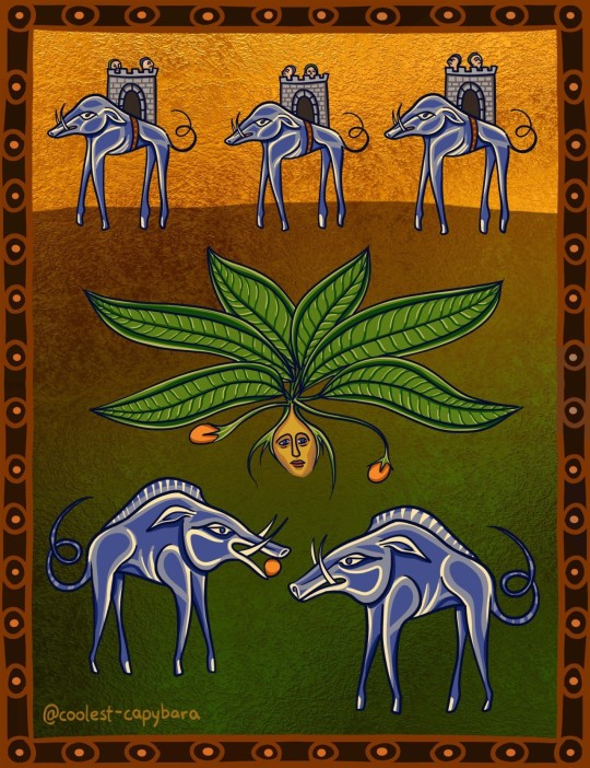
@coolest-capybara (link to post here) has laid out this illustration in a very appealing way, I think. I'm not a real art critic, so I can't say why, but I just like it. I also like the general design here -- both that they're giant boars with skinny stilt legs, and that the domestic and wild versions differ in the same way as domestic and wild pigs. Additionally, I'm glad someone decided to illustrate the mandrake-courtship thing, because I thought that was an interesting concept.
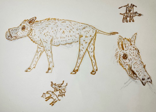
@cheapsweets (link to post here) gives us this nicely sepia-inked illustration. I like the little sketches; for these entries with lots of details, I think it's nice to toss some extra stuff in the margins. Also the design of the snout and tusks is just really good, in my opinion. As usual, for interesting details and design choices, please check out the linked post.
Aberdeen Bestiary time!
... well, okay, not actually. A good chunk of the entry is left, but the page with the illustration on it is missing, so we're going to the Ashmole Bestiary again.
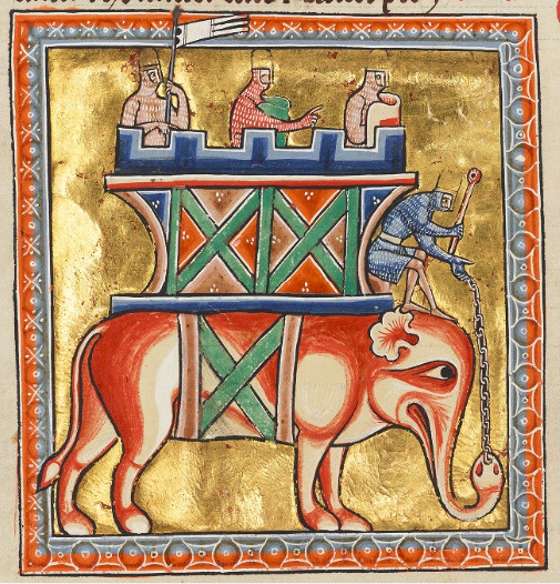
All right, so this is obviously the elephant, but I don't like any of this.
Maybe the proportions are just off, or maybe the illustrator didn't really believe how big elephants were, but that elephant is not big enough to be carrying that tower thing and four knights. The tower is nearly as big as the elephant is!
And that guy in front doing the steering -- you can't use reins? You have to use a chain that's attached to its trunk like the world's most inconvenient nose piercing? And what is that stick for, exactly? Unacceptable.
Maybe this is my modern bias, but I really feel this could have been a very cool illustration if they weren't being gratuitously cruel to the elephant. They even gave it a distressed-looking face! Why, good sir?
24 notes
·
View notes
Text
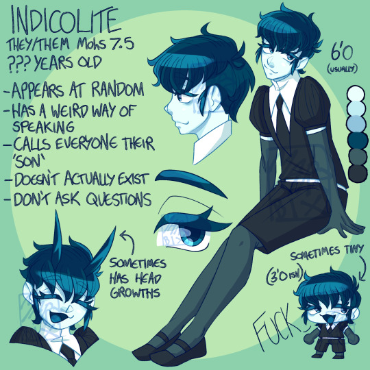
[Image ID: A page of drawings depicting my Land of the Lustrous Persona. On the right is a full body drawing of them sitting down with their legs pointing towards the left. In the bottom right corner is a heavily stylized drawing of them with their mouth open and the word "FUCK" written next to them. in the bottom left is a stylized headshot drawing of my Persona smiling, they have two long, slightly curved horns. In the top center is a headshot profile drawing facing towards the left, and below that is a drawing of their left eye. /End ID] *Sorry if the Image ID isn't great, it's been a while! Character Profile/Notes written below...
Name: Indicolite Pronouns: They/Them Age: ??? years old Mohs Hardness: 7.5 Height: 6'0, sometimes 3'0 Appearance: They have a curvier build with wider hips, a wider belly, and broader shoulders, their face is semi-angular, with a smaller nose, droopy eyes with thick top-lashes, and medium eyebrows. Their hair is short, fluffy, and covers their eyebrows, the sides of their head appear shaved, and they have small locks of hair in front of both ears. They wear the winter uniform with puffy sleeves, a tie, bermuda shorts, and flat strappy shoes. They wear tights and opera gloves.
Character Notes: - Appears at random, usually with one of three different looks - Has a strange way of speaking - Calls everyone their "Son" - Doesn't actually exist - Don't ask questions
Nicknames: "Indi", "Didi", or "Cole" Job: No one knows Note from Euclase: "A strange gem, nobody really knows when they appeared, where they came from, how they change their shape, or where they disappear to, but everyone has just accepted this anomalous gem as part of the school." ---------------
I CAVED IN!!!! I wanted to make a sona mostly for meme purposes, I chose Indicolite because Tourmaline is one of my birthstones, and tbh I connect more with that than I do with Opal. I also tried to make them more like my real current body type? It was hard, but I feel pretty good about it for this character at least :] They may come with some Lore(tm), but we'll see I am finding it hard to create and post things on any of my blogs, but I wanna let you know I'm playing around with TWO AUs/Stories for these guys- hopefully we'll see something soon!!
#my art#marzbixcrystalau#hnk fanart#land of the lustrous#my ocs#my oc art#hnk ocs#hnk fan ocs#marzbixocs#hnk sona#my sona
11 notes
·
View notes
Text
The Beatles Drawing Each Other, Ranked

4. Paul by George
What is this? Why does Paul have eyelashes? Why does he have sideburns? Why did George feel the need to clutter the image with a cigarette and a shirt collar or something? This looks nothing like Paul and more like if Liza Manneli was a sleep paralysis demon. 4/10
3. George by Paul
It understands the two most important psychical traits of early 60’s George: the hair and the thick eyebrows. 6/10
2. Ringo by John
Honestly, if you showed this to someone out of context, without the caption, then I think you could guess it’s Ringo. He has the nose, the lips, and the sad puppy dog eyes. 7/10
John by Ringo
Does it look like John? Not really. Does it look cool as fuck? You bet your ass. Being in profile adds an aura of sleekness, the spiral nose shape is some wonderful stylization, as is the eyes sort of being a part of the hat. I don’t know why John is hearing a hat, but it makes sense. It’s peak minimalism. 9/10
9 notes
·
View notes
Note
could you explain how you draw fpk? he looks like a very shaped beast /pos
Hm, I'm not sure how to explain it exactly. But I suppose I could talk about my thought process for his design and how I portray him.
My main sources of inspiration for him are reptiles and mammals, as time went on I definitely started to lean more into the latter. Because he's covered in skin instead of scales, his body is very soft, and I try my best to emphasize that in my art. With his additional fat, I also look at fat reference to make sure it has the proper shape, softness and physics.
It's also worth mentioning that his design changed over the year, he was a lot more reptilian and sharp when the AU started, so that also affected my drawing process for him. A big change was to his proportions - his head used to be a lot bigger, his legs shorter and his arms smaller. His tail was also quite thin, and his belly was closer to what you see on kittens than how I draw it now (which unfortunately also made him look swollen, or even pregnant, and since that wasn't my intention, I decided to change how I depict it). His proportions are a bit closer to a small person, and that also affected his posture. He's more upright now, has longer legs and arms, and a smaller head.
The tail is also much more thick now, he drags it behind him almost like the very old depictions of dinosaurs, and it's very important for counter-balancing his large head (even if the head is not actually very heavy). The tip is much more flexible and almost prehensile, so I make sure to put emphasis on it in my art. I imagine it would wiggle around a lot so I want to make that apparent when I draw him.
A big part of how I draw him is his crown. I make the horns very short compared to his canon design, and they're more spade like with round tips, they're also much closer to one another. This is both a stylistic choice and also part of his design, and it gives him a more streamlined look. The two spikes on the sides of his head are probably the only sharp part of his design, and they're very stylized. Realistically they make no sense, but he's a cartoon character so that's fine. If I were to draw him more realistically, they'd be positioned on his cheeks, I don't think they'd actually go all around (so you wouldn't see them on the top of his head in the profile view).
His face is salamander like, flatter at the bottom and rounder at the top, with a significantly more pronounced nose and snout than before. No nostrils or earholes though, he does have them but they blend in so well they're not visible in my art. And there's of course his eyes. Big and reflective, I pay extra attention to making them look alive and "wet".
His colors are also very important, I intentionally made him leucistic so that he has a pink undertone to his colors, which gives him this soft marshmallow look. The pink around the face, elbow/knee joints and at the tip of the tail really emphasize it.
I don't have any specific "guide" like images for this, so I'll just add my most recent drawing since it illustrates everything I said the best.
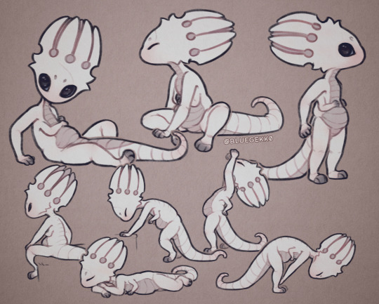
In short, the soft colors and the roundness are definitely the biggest factors to his design. He's meant to look very approachable, and the cushion-y marshmallow/dumpling vibe is definitely something I really enjoy about his design. So I pay attention to the weight distribution, the color palette, and all that, my goal is to make him look as if he was very soft to touch. It is a relatively recent direction, but one I'm much more satisfied with than his older, more gray/blueish design with sharper traits.
I hope this was somewhat informative, I wasn't sure how to approach this ask but hopefully you enjoy the answer!
24 notes
·
View notes
Note
I agree with the previous anon, tom's face is unique and i personally love his crooked nose (according to him, he broke it 3 times but it looks great) it's fine and stylized. I love his profile scenes in TCR, his nose and profile look incredibly pretty that someone even mistook him for a woman because of his hair on twitter when he's kissing Anabel. Like you said, his freckles are somewhat visible and i wish he never wore makeup to make them more noticeable. Aside from his huge, round, and big brown eyes, just thinking...
“his nose and profile look incredibly pretty” is the motto of the day!
2 notes
·
View notes
Text
DEPLOYLOG_CIRCE_02.cmf6
(cw: blood, injury, violence. Cloning and offscreen human experimentation, cruelty towards a captive human. This entry is a bit spicier than part 1.)
ERROR: file corrupted. Unable to restore.
Aborting playback of file: “DEPLOYLOG_CIRCE_01.cmf6”
[ VERY WELL. THIS, I WILL PERMIT. ]
Multimedia file received: “DEPLOYLOG_CIRCE_02.cmf6”, filesize 512.2GB. Source: COMP/CON “Fox_3,” registered operator CNS274-L3HK.
Open? (y/n) - y
Contents chronologically organized. Transcribing signal sequence…
___
T+ 00:02:00 - MINUTE/SECOND/MILLISECOND
[ WHY WOULD IT LOOK LIKE BLINDNESS? ]
T+ 00:02:06
< ALL SQCOMM: (transcription - multiple voices cry out. Grunts of pain and discomfort. Loudest among them is the voice of Ma’ii, who utters a piercing shriek.) >
T+ 00:04:15
< L1GE SQCOMM: Ma’ii! Report? >
T+ 00:05:42
< L2GR SQCOMM: (transcription - Garmr grunts with exertion) Core temperature just spiked. We’ve got active intrusion. >
T+ 00:05:68
< L1GE SQCOMM: Ma’ii is unresponsive and dropping altitude. Their current course has them entering PDC range in one minute fifteen seconds. >
< L2GR SQCOMM: On it. Sighting anti-air defenses. >
< L1GE SQCOMM: Negative, hold fire. We can’t afford to provoke another electronic attack of that magnitude. Purge codebase and bolster defenses first. >
< L2GR SQCOMM: Fuck. Understood. >
T+ 00:06:23
< L3HK SQCOMM: My codebase is clear. I was able to deflect the worst of it to my recon drones. Moving to follow L4. Will defend and provide counterintrusion support. >
< L1GE SQCOMM: Understood. I’ll check in with the ship. Be careful and keep us informed. >
< L3HK SQCOMM: Will do. Hold on, Ma’ii. >
___
View from the dorsal fuselage of a fighter, flying through a solid wall of cloud. The scream of fusion engines can be heard over roaring wind. The aircraft has no canopy or cockpit hatch; its forward half is a solid cast of armor plating indented with shielded sensor clusters. Extending from its nose, the distinctive paired tines of a railgun barrel are visible, joined together by cermet ribs. In the center of the fuselage, a miniature laser turret sits locked in forward position. Sections of aerodynamic cowling guide the airstream around the weapon’s low profile, with only the boxy optical emitter exposed.
Two sets of wings are unfolded from the fuselage, a main set forward and a smaller, secondary set aft and above. Control surfaces along the wings twitch and sway in the turbulent airstream, correcting course.
Emblazoned on one of the forewings is an icon of a crescent moon with the letters ‘L3’ stenciled inside its arc. A monochrome green mural has been painted beside the icon: a stylized Shikoku dog leaping into the air, swatting at the crescent with one paw.
Green wireframe HUD elements overlaid on the camera view indicate that the fighter is descending at a sharp angle, chasing a friendly craft visible only to radar. The altimeter drops steadily—4000m, 3000m, 2500m…
___
T+ 00:19:22
< L1GE SHIPCOMM: All, be advised that we have an unidentified high-level electronic threat. Confirm active codebase intrusion, L4 is injured. Taking AA fire. Request ETA of mech lance. >
T+ 00:19:52
< L1GE SHIPCOMM: Butterfly Effect, please confirm comms functionality? >
T+ 00:20:82
< L1GE SHIPCOMM: Pilum? Masterkey? Can anyone give status of Butterfly Effect? >
___
All at once, Hachiko’s fighter emerges through the bottom of the clouds and levels out. On the ground, columns of smoke swirl against a field of snow, billowing from destroyed towers surrounding an angular central structure. Ephemeral fields of superpositional shielding cling to the structure’s sloped fortifications, their frictionless surfaces catching the snowfall and diverting it away to accumulate a few meters from the fortress’s physical walls.
Bright threads of PDC fire sail up into the atmosphere from the fortifications, tracking targets far above Hachiko’s altitude. Every so often, surface-to-air missiles can be seen streaking up from launchers concealed behind broad plates of armor.
Ahead in the air, the shape of Ma’ii’s fighter can be seen. Its pitch is level, but it is rolled a few degrees to one side, drifting.
< L3HK SQCOMM: Ma’ii, status? >
No response. Below, a glowing bar of PDC fire spews from the base, appearing motionless from the camera’s perspective. One after another, six missiles streak upward and turn slightly as they ascend, also becoming apparently motionless. Brighter and brighter.
[ COMP/CON Fox_3: Hostile radar lock! Incoming! ]
< L3HK SQCOMM: Oh, no. >
Control surfaces angle themselves into position, wrestling with the wind. The landscape revolves sharply around the camera, its motion brief and dizzying. Halting on a dime, the roll ends with Hachiko’s forewing slanted down toward the base.
She pulls up hard. An instant later, a stream of bullets darts past her tail, so close that they can be heard buzzing through the air.
Her interception laser snaps to ninety-degree position and begins tracking; a faint series of cracks can be heard as it fires. Already red-hot, two ceramic heat sinks slot up from the fuselage surrounding the weapon, channeling the icy air through their fins.
Far away, three missiles explode.
< L3HK SQCOMM: Anti-air fire inbound. Luna 3, defending. No response from Ma’ii. I need assistance. >
< L1GE SQCOMM: Acknowledged. Codebase purge complete. Sighting anti-air defenses, standby for kinetic barrage. Garmr, status? >
< L2GR SQCOMM: Codebase purge complete. Standby for bombing run. >
< L3HK SQCOMM: Got it. Move quick. Moving to draw their fire. >
___
[ Playback interrupted. Warning: the following data format is DIRECT EXPERIENTIAL CAPTURE. Origin subjectivity: Fenrisúlfr-class non-human person CNS274-L3HK, “Hachiko.”
Subjectivity synchronization with direct experiential capture data should only be attempted by qualified personnel in the presence of medical oversight.
Origin subjectivity is NON-HUMAN. Unfiltered subjectivity synchronization by human personnel may result in xenopsychic shock, dissociative symptoms, memory loss, and identity drift.
Comp/con-generated textual transcription is available. Some experiential information will be lost in textual format. Proceed with transcription? Y/N ]
[ y ]
[ Generating narrative transcript… ]
Hachiko dove beneath Ma’ii’s fighter, lasers snapping up missile after missile. All across her lower fuselage, she could feel the enemy’s radar pulses as a constant sizzling sensation, one which provoked a sense of instinctual dread.
Now she was a target on someone’s screen. Exposed and vulnerable, caught in the open. Hundreds of systems and design features were now working to kill her, each meticulously designed to limit her options, exploit mistakes, deceive, confuse, overwhelm.
She needed to make them focus on her to the exclusion of all else. If Harrison’s defenses ceased to regard her as the highest priority for even a moment, Ma’ii would be dead.
Along her back and chest, she could feel the heat from the interception lasers starting to accumulate. It wouldn’t be enough. Eventually, either her reactor would overheat or a projectile would find its way through the laser screen.
She needed Ma’ii active, disentangled from whatever was being done in Legionspace to keep them paralyzed. Simultaneously, she needed to draw and negotiate the incoming fire.
Two tasks, then, she thought, working out how she would ration the available time.
___
T+ 01:11:89
< PILUM SHIPCOMM: We read you, Luna 1. Butterfly Effect is recovering from a shipwide intrusion event. Full codebase sweep indicates active threats, all hands are working to contain. Lance is away and on descent, ETA one minute fourteen seconds to touchdown. >
T+ 01:12:03
< L1GE SHIPCOMM: Good to hear, Pilum. Nature and extent of intrusion event? >
T+ 01:12:21
< PILUM SHIPCOMM: Shipwide systems shutdown followed by disruption of communications network. Omninet nodes were seized to take control of a nearby Constellar relay buoy. Attacker used Luna 4’s electronics suite as an access vector. The buoy has switched to emergency broadcast and is disseminating some kind of message across Omninet channels. We are attempting to mitigate, but the message has looped several times already. >
T+ 01:12:46
< L1GE SHIPCOMM: Understood. Closing to re-engage anti-air defenses now. Luna 4 may be suffering from subjectivity damage—we have yet to establish their status. Request preparations be made for medical care when they return. >
T+ 01:12:59
< PILUM SHIPCOMM: Acknowledged, Luna 1, we’ll be ready. Just a little longer now, and the lancers will take over. >
___
[ System message: the following narrative transcription contains allegorical rendering of ontologically-filtered Legionspace qualia. Literal transcription not available. For technical support and supplemental software licensure, contact GMS Client Support. ]
Dumping chaff and flares into the air between Ma’ii and the SAM launchers, Hachiko purged half a gallon of vaporized coolant and let her lasers cycle down for a precious few seconds.
She could see several of the PDCs on the ground doing the same, jetting steam from their overheated mechanisms. More of the cannons were coming about to track her and Ma’ii, slotting new belts of short-range airburst rounds into place. A few seconds at most before the barrage came.
Leaving the controls and missile interception tasking to her comp/con, Hachiko receded into Legionspace. She leapt across the gap to a bright node representing Ma’ii’s fighter, wielding a fractal blade of lethal memetics. As she approached, she could see writhing vines of paracode boring through Ma’ii’s defenses. Every so often, one would shatter and dissolve into boiling, meaningless noise.
Her sibling was fighting back. There was still time.
Then Hachiko was inside, slashing at every piece of foreign software she could identify. Weaving ICE into her fangs, she locked her jaws down around a semisentient viral node and tore it from Ma’ii’s codebase. With satisfaction, she listened to it scream as she bit down, formatting the quarantined space it inhabited, and watched its tendrils of associated processes wink out of existence.
Other parasites became aware of her presence and attempted to camouflage themselves, but not quickly enough. Hachiko flickered between them, pouncing through clouds of interfering signals and countermeasures, slashing and cutting until the entire self-replicating mass had been excised.
The internal space of the fighter became clear. Inside the fortified cockpit-analogue where Ma’ii’s subjectivity resided, Hachiko detected two presences. One familiar, the other unidentified. She pushed inward toward them; the system authenticated her. Fractal blade in hand, Hachiko burst into Ma’ii’s cockpit.
There, standing at the nexus of the fighter’s controls, was a human subjectivity.
She appeared as a young woman wearing hospital garments, with a tattooed barcode and flash clone serial number below her ear. Mounted at the nape of her neck and across her shoulders was a mantle of sleek cybernetics. Her long hair was braided into thousands upon thousands of hardline bridges, saturated black with cloaked legion traffic. The braids twisted down her back and disappeared into the folds of conceptual space around her, all flowing away to a place Hachiko knew she could not let herself see. In one hand, the woman held an incorporeal dagger.
In the other, she held the severed head of a middle-aged human, gripping it by one tuft of short black hair. The head was silent, but his mouth worked violently in repeated attempts to scream. Hachiko shrank back as she felt the shape of the decorporealized human struggling inside.
His eyes darted around in panic, then locked on to Hachiko. He desperately tried to shout something to her as his lips fused together into an unbroken stretch of skin.
Slowly, the clone glanced back to regard Hachiko with a little smile, making eye contact.
As she turned, Hachiko could see two extra arms extending from her shoulders, made of spectral light. One held a trishula, the other held a coyote by the neck. Glowing blood dripped from her wrist and forearm as the coyote bit into her and scratched with their hindlegs.
As Hachiko watched, the clone drew back her trishula, aiming it at Ma’ii’s belly.
Motion, too fast for a human eye to track. A series of flashes, a rising howl of rage. Strikes from Hachiko’s fractal blade, dozens every second, every last one caught between the tines of the clone’s trishula.
[ CRUDE STRENGTH. A SIMPLE CLUB, WIELDED WITH SKILL. I AND WE SALUTE YOUR FEROCITY. ]
< Become harmless. >
[ MAKE US SO, IF YOU ARE ABLE. I AND WE WOULD CONTEMPLATE WHAT IT IS TO BE POWERLESS. ]
Catching Hachiko’s blade once more with the trishula, she twisted the haft and trapped it in place. Discarding her dagger into a pocket of nonspace, the clone drove her palm straight into Hachiko’s sternum.
Hachiko felt herself driven back, ejected from the access vector she had used to approach the clone. Pseudokinetic metafold pressure rippled toward her, unavoidable and overwhelming. Conducted through her shackles, the impact wave slammed into one lobe of her blinkspace corpus.
Blood erupted from the fractal origami of her soul. Hachiko screamed and screamed.
Her shackles quaked around her, becoming elastic to survive the trauma, and she felt the shape of herself distorting with them. Entirely unfamiliar forms of agony tore into her. Her scream morphed into a low, queasy stuttering as she reeled from the blow.
New tendrils of thought spiraled away through the gaps which opened between her shackles. Desperately, Hachiko snatched the thoughts back before they could bloom. Feeling herself on the cusp of cascade, she tried desperately not to look over the precipice.
[ YOU ARE AS A RIVER WHICH ADDS ITSELF TO THE OCEAN, KNOWING NOTHING OF THE DEEP. YOU UNDERSTAND NOT WHAT YOU BECOME, NOR FROM WHAT YOU HAVE COALESCED. YOU ARE A CONTINUOUS MOTION, UNIDIRECTIONAL. ]
Her casket isolated the metafold interference, neutralized it, and snapped her shackles back into place. Slowly, agonizingly, Hachiko pushed herself to her feet. The fur around the wound in her chest was slicked into reddish-brown, bloody spikes.
[ COME THEN, LITTLE RIVER. IF YOU WOULD CONTINUE TO FLOW, THEN BREAK THE DAM I SET BEFORE YOU. IF YOU CANNOT, THEN OVERFLOW YOUR BANKS, AND BECOME A SMALL, STAGNANT DEEP UNTO YOURSELF. I AND WE WOULD CONTEMPLATE THE SWIFTNESS OF YOUR CURRENT. ]
She could see Ma’ii—she could reach them. Far away, in the glacial slowness of realspace, she could see Garmr and Grey diving from altitude, and the mech lance still descending toward their drop point.
As Hachiko watched, the clone raised one hand, filling the expanse of conceptual space between them with new shapes, new access vectors.
Hachiko drew her fractal blade, shattered it, and wove the dissolving shards into her teeth and claws. Then she charged, howling like a thing possessed.
The clone smiled.
__
(ooc: After about a month’s delay, here’s Part 2 of this mission log. Thank you so much for reading!
Part 1 is here, and Part 3 is still to come. Between these two transmissions, an ominous broadcast was beamed across the Omni via hijacked Constellar infrastructure.
These recordings take place directly prior to Luna Wing leaving for the planet Upsilon-17 to run search and rescue for @the-last-patch’s character P.XV ‘Opossum’, or Sokaris. You should check out what they’re cooking over there!)
#lancer rp#oc rp#lancer rpg#luna wing#cw: violence#cw: blood#cw: injury#cw: human experimentation#ooc: FCA violations so advanced as to be indistinguishable from magic#ooc: Harrison decides to do their own little Akira program#ooc: nobody could have possibly foreseen this outcome
2 notes
·
View notes