#still pretty proud of the colors and posing on this one ! may redraw it !
Explore tagged Tumblr posts
Text

Skeletons can get sick too 🫡
#undertale#undertale au#underswap#underswap papyrus#papyrus underswap#papyrus#ive been seeing that people call him stretch instead of the food names shit. glad we evolved as a society <3#anyways thus was something I drew when covid first hit. i didnt post it until a year afterwards on insta.#still pretty proud of the colors and posing on this one ! may redraw it !
26 notes
·
View notes
Text
Vacuan Nights, Like Vacuan Days


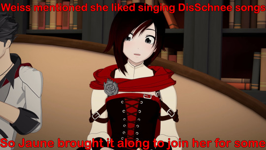
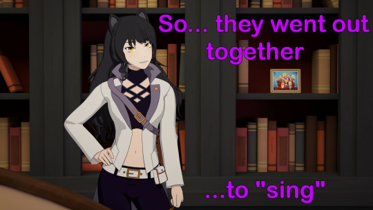


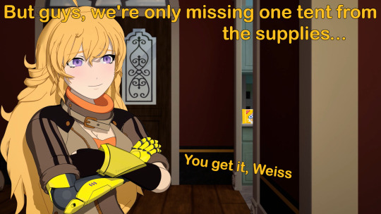

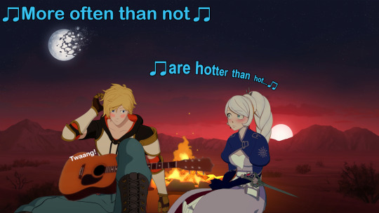


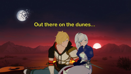


They’re just so great together! I’d love for Jaune and Weiss to get a little downtime in Vacuo to live out a moment like this. They really deserve it, and I’d love to see Jaune’s guitar make a reappearance.
The comic here was inspired by u/Silverstar1243’s excellent piece of art, A Serenade Under the Moonlight. Send some love to them on their twitter, commission some art if you’re willing and able, they’ve made some great stuff.
You folks may have noticed I threw in a couple of references for those in the know; the Golden Oreos behind Yang (double stuffed, I might add) for the trio’s ship, Weiss liking it rough for Mallobaude’s great fic, and of course I made a whole theme around the Arabian Nights Disney song. A song, along with its Aladdin compatriots, which I spent the better part of a day finding covers for just to listen to on repeat while I worked.
This one’s now officially my longest comic project, with 14 panels, two over the past record since I added the White Knight kiss at the end. I’m pretty happy with how it turned out. Not sure I’d say it was more difficult than my Vanity of Vanities post, but for this one I actually knew how to use my editing software going into it (at least somewhat).
Put a lot of work into this one, been working on it on and off since February. Took a few breaks for vacation, to make my memorial post for Rooster Teeth, and another five meme edits or so, but I came back around to it. First half was pretty easy, relatively minor edits inserting characters into scenes and so on. The second half with Jaune and Weiss was tougher though, with color correcting, merging poses, redrawing features, drawing Jaune’s entire head to fix some lighting issues, etc. Really like how the edit to make Jaune strum his guitar turned out.
The time it took to make the whole comic got me down a little, until I did a bit of math. Including my side projects since starting this, all the scripting and editing and all, I’ve been pumping out a panel every two days. That seems pretty good to me, that kind of accomplishment makes me a little proud of myself.
Really need to get around to watching the second part of the Justice League Crossover movies. It’s got a few Vacuo scenes that might make things a little more authentic instead of me just using Saphron’s house and pretending it’s a suite in Vacuo. I do love taking yet more character stills from Jaune and friends experiencing deep trauma and turning it into something positive, been making that a bit of a personal habit. And I’ve got to say, the background for Jaune and Weiss’ scene is really beautiful, pulled it from when Sun and Neptune hear Ruby’s message about Salem. That’s just a really good shot all on its own, I even saved a copy for my computer’s wallpaper after editing out the two.
Posting a big RWBY White Knight edit, watching not one but two RWBY Beyond episodes, and all on the trail of the news that RWBY’s found partners that they’re negotiating with and that the creative team is expected to stay on. And I'm sipping bubble tea. Life is good.
Anyway, pardon the long write up. I’m invested in this one, and am quite pleased with how the comic turned out. I hope you all get a kick out of it as well!
#rwby#jaune arc#weiss schnee#rwby white knight#white knight#rwby whiteknight#whiteknight#jaune arc x weiss schnee#jaune x weiss#yang xiao long#golden oreo#yang x jaune#yang x weiss#yang x jaune x weiss#blake belladonna#ruby rose#qrow branwen#sort of#shipping#comics#rwby memes#memes#greenlightvolume10#rwby volume 10#rwby news#vacuo#jaune's guitar#needs a come back#disney#aladdin
232 notes
·
View notes
Text
A redraw of a redraw of a redraw of a redraw,,,
Ok, sooo small storytime: Back in march 2020 I was deep in my Undertale phase, specifically my Glitchtale phase, and I had also just watched Kill la Kill, so then I listened to that one Betty theme and realized that it was based on Nui Harime's theme, and I was so inspired that I tried to draw both Betty and Nui;;;;

This is one of the first digital drawings I've ever made and the first that I've actually felt proud of!
So that was march 2020, and then in october of that same year I kinda,,, decided to redraw it!

And this was the october 2020 drawing. Was it bad? yes it was. Because I still didn't know how to use my own art style and I was learning, besides the concept of shading was new to me;
so then fast forward to may 2021 and I said "I'm gonna redraw it again!!!!!!!"
And we got this:

The colors were so saturated and the shading is... ew, also the lineart is agh
Buuut I was still proud of this!
So then we get to yesterday, and I remembered all of this because I was cleaning some files and found the folder with the three drawings, and said "new year new redraw"
And... This is the January 2022 redraw, changed pose, shading style, and everything else too!

(Og image weas too big and I had to make a lower quality version,,,)
But... I'm actually pretty proud of this one??? It's not perfect, of course it's not, but I had fun drawing it and I think it shows the progress I've made with my art!
#my art#digital art#digital drawing#glitchtale#kill la kill#bete noire#betty glitchtale#how do I tag something like this#redraw#art progress#?????? how do I tag this?????????#long post#no image id#sorry for not writing image ID's on this one :( /gen#forgot to add#nui harime
38 notes
·
View notes
Text
Any longtime followers of my blog will know that posts centered around sprite art that I create are relatively commonplace, and how could they not be? I am an enthusiast of all things classic, and given that one of my very first posts on this blog was indeed a pair of custom sprites, I've really begun to focus on getting better and better at spriting, and I feel like it would be reasonable to say that the improvement is obvious! For those of you that don't know, my first piece of sprite art that I've uploaded here is this one in particular— custom sprites of Shovel Knight and King Knight that I had created back around February of 2020. I liked making the sprites a whole lot, and eventually decided that I would follow suit and make resprites of the remainder of the Order of No Quarter! Looking back on the sprites, they were indeed pretty sweet for their time, but now that I've been working on improving in terms of spriting, I was convinced that I could do a lot better with a few of the knights... some way more than others. So, around July of last year, I started to create a revised version of my Order of No Quarter resprites, going as far as to respriting some members entirely to better fit their actual designs, and almost a year later...

I finally have everyone completed!
My original plan for going about showcasing each individual knight was to have three versions of each knight's sprite: their original Shovel of Hope sprite, my first remake, and my more recent remake. While it would be a good visual on how far I've come, I felt like it would be a smidge redundant, so I've decided to show each knight's original Shovel of Hope sprite with my most recent remakes, linking to the first remake for each. With that out of the way, let's steel our shovels and dive right in!

Some followers may recognize this resprite of King Knight since I've actually shown it at the end of last year, on King of Cards' first anniversary! Between then and now, there weren't a whole lot of fixes made to King Knight's resprite save for a few shading touchups here or there, but I'm still really proud of this sprite in particular simply because of how better his cape looks compared to how I sprited it in 2020!

Now we're getting to the good stuff! My initial resprite of Specter Knight was a bit all over the place— I found his hood particularly hard to recreate (Plus I wasn't too fond of it at the time, I much preferred how it looks in his campaign's artwork) so I just ended up designing his hood after how it looks in Specter of Torment, which resulted in a serious mismatch in style. Specter Knight was definitely one of the harder knights to revisit, as I was a little nervous that I wouldn't be able to get his hood to look right, but I'm more than happy with what I ended up with— even his scythe looks better!

My biggest goal when remaking Plague Knight's sprite was to pretty much redo their entire head to better fit their artwork, and while I did achieve this to a certain point in my first attempt, my second iteration of Plague Knight was more focused on fixing their hood and making their pose less static (Compared to my first version of the sprite, that is). I remember having a bit of trouble remaking Plague Knight's mask in a way to where it wouldn't be too big, but I do love the fruits of my labor!

Mole Knight is one of the few members of the Order of No Quarter that has more than two resprite iterations; with this most recent version, he has had three; the original resprite, one that fixed a few things, and the one you see above. This new version has a lot of shading fixes, as well as redrawn claws; he's certainly a whole lot shinier! Speaking of knights that had more than two resprite iterations...

Treasure Knight, too, had three resprite iterations, one of them I didn't even post to my blog. It was essentially just the previous resprite but with a redrawn head and shoulderpads, looking a whole lot closer to his Shovel of Hope sprite while being way shorter than my first version. It was just about the final version of my resprite of him, but I ended up redrawing his head again so it would look closer to how it looks in Shovel of Hope's artwork. It took a tiny bit getting used to but I'm particularly proud of Treasure Knight's resprite!

I think Tinker Knight's resprite is the one I'm the most proud of. Not only is it an immense improvement over my original resprite, but I was able to make him look closer to his actual design as well as packing in a WHOLE lot more detail— and he's only a few pixels taller than his OG sprite! You can probably imagine that it took a long while to achieve that level of detail and not have the end result be too big!

Something that always kind of off-put me was how little Propeller Knight looks in his original sprite when he's flying. I think it's unanimously agreed upon by the SK community that he's quite tall, so when I resprited him for the first time, I opted to fix that... and made him a little too tall. As a result, Propeller Knight was redrawn entirely while making sure the height wasn't as ridiculously lanky as my first attempt all while maintaining a fair level of detail and color fixes, and if I may, the end result is, as Propeller himself might say, magnifique!

And finally, Polar Knight. Really, since my first resprite of him, not a whole lot has changed save for a few color fixes and additional details. Since there isn't really a whole lot of official art of Polar Knight that doesn't depict him in a bizarre pose, I couldn't really take any pose liberties and ended up sticking with the original posture; it might look like a bigger version of Polar's SoH sprite, and while it technically is, there's still a great deal of small changes throughout! After all this time, it feels nice to finally be able to upload these new iterations of previous sprite recreations, and while this post was a long time coming, I hope you enjoyed the sprites and the readups for each one because a LOT of effort was put into every pixel of this!
#Shovel Knight#King Knight#Specter Knight#Plague Knight#Mole Knight#Treasure Knight#Tinker Knight#Propeller Knight#Polar Knight#Sprite Art#OC#Long Post#Coolness#No seriously. I could have made this post like last year if I wanted to.#But there were just so many things that I knew that I could do better hence having not actually making this post until now#Really the only reason I hadn't shown these sprites sooner is because of Specter Knight#I thought that I had to redraw him entirely and I wasn't looking forward to redrawing everything under the hood#Though I ended up using the original resprite's body as a base and fixed it up accordingly... then things went smoothly!#Some of these guys have no right to have certain attributes to be so tough to sprite. But I stuck to my goal and achieved it!#I am SO proud of these!!
25 notes
·
View notes
Text
after i criticized my own worst editing choices, @pigeonhome said i should do my favorites too so here we go :’) editing evolution - positive edition:
1. june 2018

i think this was the first post i ever looked at and went “wow i Did That” lmao :’) i remember the in-game lighting being soo dark and blue, so i spent a lot of time making it look warm and cozy. plus, this is the first time i posed more than a few sims at a time, and EVERYTHING went wrong but i kept trying... so considering how old this is, i’m still a little proud of it?
2. july 2018
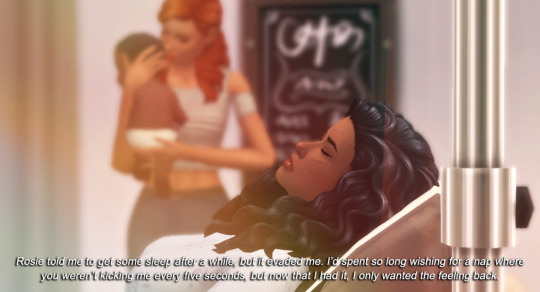
if you remember the “to my sweet daughter” letter you’re a real one skjdjd it was the first time i tried Real Storytelling with a plot and everything. i wanted it to look like a hazy memory with a voice-over, and i honestly still think it looks pretty good!! plus it set up caroline’s entire life story, so it’ll always have a lil space in my heart :’)
3. october 2018
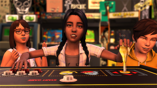
this gave me stranger things vibes and i was really proud fjskjd also this is around the time when i started paying attention to good angles & framing!! thus begins my undying love for parallel lines
4. december 2018

okay this framing is bomb and i stand by that. i was really into the brown/gray grungy tones at the time, but i think the plain colors are pretty fitting. now that i think about it, i’m pretty sure this was my first defined aesthetic?
5. may 2019
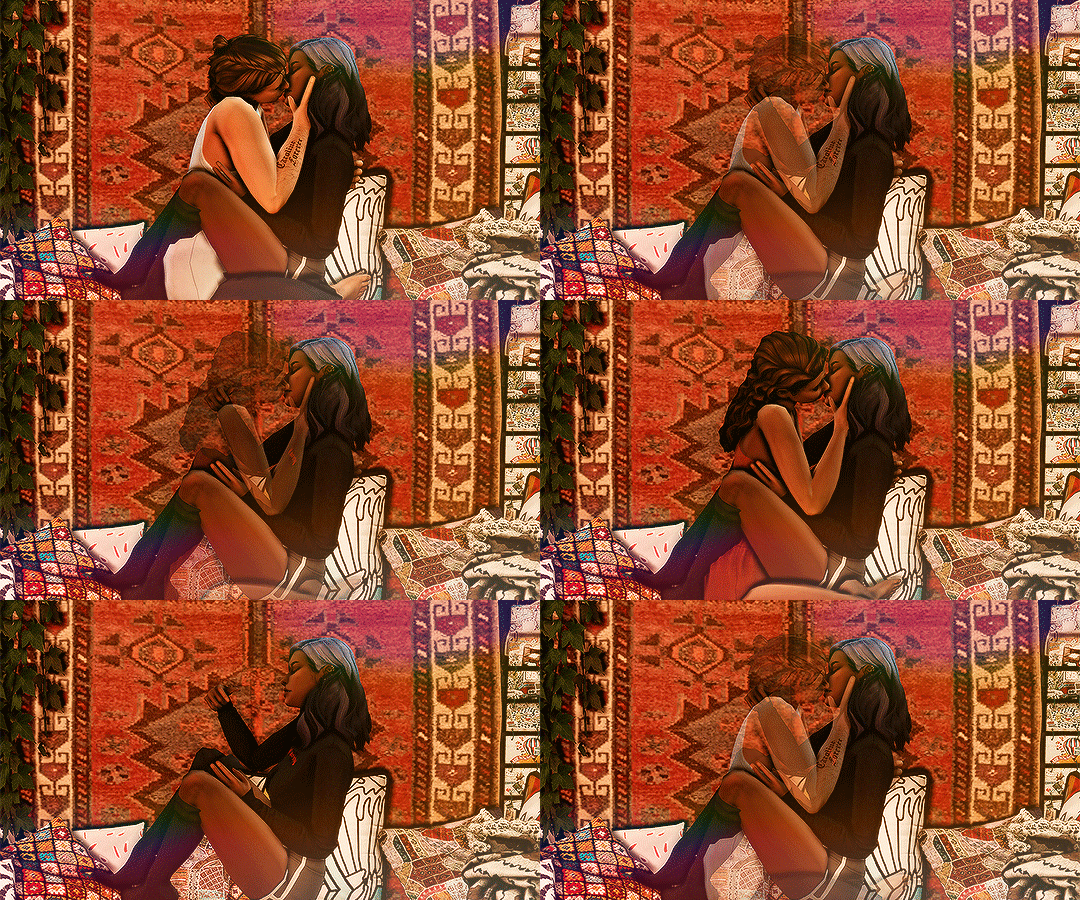
this is the coolest thing i’ve ever done sjdkjs it was the first time i used the saved camera angles, and also this is the crispest gif i’ve ever made.. idk how i pulled that off. but i still love it to this day
6. late may 2019
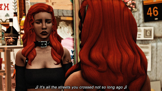
dsv let’s gooooo.... i love this picture because it was the very first time we saw cara after she ran away. she’s looking ROUGH because that’s how she sees herself in the mirror. i made everything in her surroundings look as dirty and sad as i possibly could, and desaturated the colors because her world was literally & figuratively gray. in terms of actual aesthetics, the dsv era was pretty ugly... but it’s hands down my favorite editing choice and i think it served its purpose well!
7. june 2019

my favorite photo set of all time... i wanted it to look like they were literally in heaven ;-; the coloring is a little harsh but i’m still really happy with this post
8. september 2019

this is when i figured out exactly what direction i wanted to take my story, and the kind of aesthetic i wanted to follow. i also think it was a really cute way to show asa growing up, without doing a standard birthday post (i try to avoid those bc they get pretty repetitive)
9. february 2020
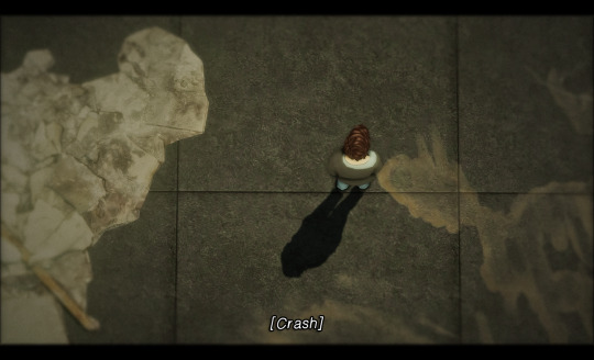
people ripped on this post like none other... but i still really like it. i think it turned out really cinematic and cool, and it was the first time i tried something new like that!! this picture in particular is cool because it shows the immediate aftermath of finn’s angry outburst. it’s like this moment of calm before everything starts closing in and he realizes what he just did.
10. march 2020
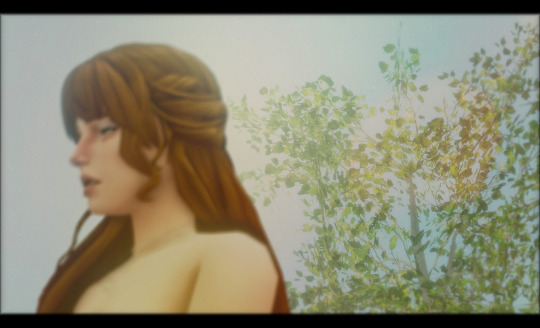
i love this picture so much... i took a picture of [redacted] on a green screen, then took a picture of the trees, and edited them together. i didn’t know if it would look seamless enough but i think it turned out really pretty and soft :’) and i made my own light leaks for this post by blurring pictures of real sunsets that i took irl, i just thought that was a neat personal touch! the only thing i wish i had done was redraw her shoulder, idk why it’s jagged like that lmao but overall i love this one
so yeah!! sorry for yet another mile long post jdksjd but it’s definitely motivating to see how far i’ve come! plus being able to look at old posts and find the good qualities in them is also good imo. they’re basically like the foundation you’re building the rest of your house on lmao and yeah that’s all thanks for reading :’)
#i tried to add a keep reading again but then the format gets all messed up :(#tagged in#pigeonhome#smoking tw#pregnancy tw
124 notes
·
View notes