#spiky collar
Explore tagged Tumblr posts
Text

acht.... why are u like this,,, i wanna put them in a salad spinner
#side order spoilers#side order#dedf1sh#acht splatoon#splatoon 3#splatoon fanart#loafbud#fanart#i knew an acht face reveal was coming#but bruh... i aint think they was gonna be ADORABLE /pos#like... cute omgg#i thought they was gonna look all mysterious n shit#like.... imagine a cute cat but its wearing oversized spiky ass boots and a spiky collar
4K notes
·
View notes
Text
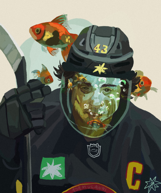
Swimming with the fishes 🎣

Tag list: @st-leclerc @rubywingsracing @saviour-of-lord @three-days-time @the-wall-is-my-goal @albonoooo @ch3rubd0lls @brawngp2009 @korolrezni-nikolai
#FREE HIM#god i hope he still has all his teeth 😔😔😔😔#i love the fishbowl it amplifies his misery#he looks like a dog that’s been muzzled#absolutely sending me#chihuahua with a spiky metal muzzle and cute pink collar#that’s literally him idk.#I love drawing fish I love drawing Quinn Hughes Godbless#quinn hughes#hockeyblr#qh43#quinn hughes 43#vancouver canucks#canucks hockey#canucks#hockey fanart#hockey rpf#hockey art#annie’s art#formulanni#nhl fanart#nhl art#nhl hockey#nhl players#nhl
524 notes
·
View notes
Text
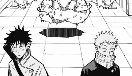
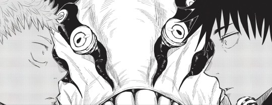
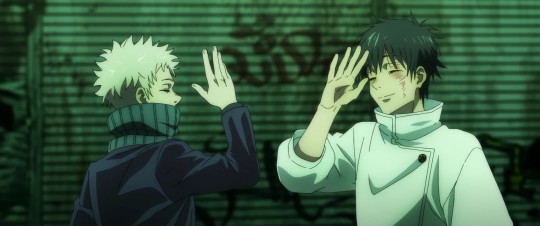
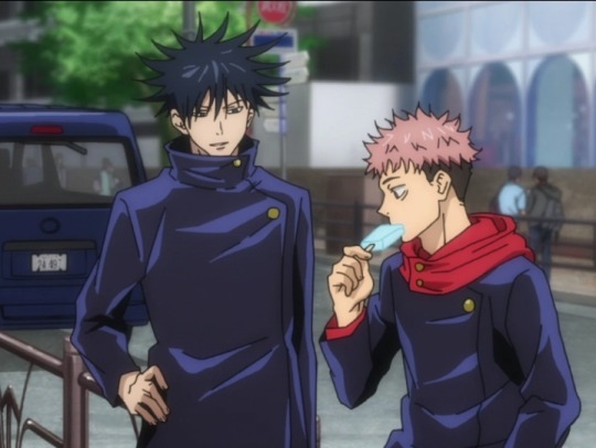
... they even have similar hairstyles and clothing designs...
#yuji and toge - light short spiky hair & hood baggy parts to their uniforms#megumi and yuta - dark spiky hair that's longer and high collars#they're also related to big time clans#meanwhile yuji and toge out here damaging their throats#that didn't sound right... but you know what i mean#just kiya's thoughts#jjk#jujutsu kaisen#jjk 0#jujutsu kaisen 0#itadori yuji#itadori yuuji#fushiguro megumi#inumaki toge#okkotsu yuta#okkotsu yuuta#itafushi#fushiita#inuokko#ottoge#yutainu#meguyuji
793 notes
·
View notes
Text


Caregiver! Flick stimboard
×/×/× ×/× ×/×/×
#text#autismposting#stim#stim toys#agere#stim toy#agere stim#my gifs#fictional caregiver#plushie stim#fake food stim#icecream stim#candy stim#flick#acnh#my special interests#deco pacifier stim#collar stim#body stim#fast tw#body stims#body stimming#sour candy stim#gummy bears stim#sour belts stim#spiky stim#black stim#deco stim#peach stim#coral stim
14 notes
·
View notes
Text


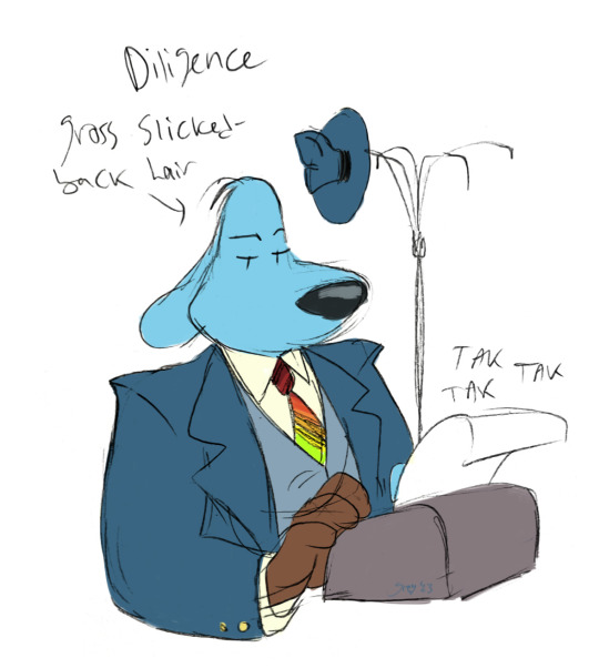


They're done!! also fuck you tumblr how dare you eat ALL THE INFO I JUST PUT IN HERE AAAAAAAAAAAAAAAAAAAAAAA
sigh. Anyhow here they are!! My first stab at drawing the seven heavenly virtues AU, which was actually going to be a set of references for a different drawing of them, but then I ended up coloring these instead. Lmao I'll finish the other drawing another time. All that's missing here is Max drooling over them all fjkdsljgslk;fhsh
Also, my handwriting fuckin' sucks so feel free to check the alt text/image description if you need a translation! Anyhow I'm boutta ramble about them a LOT so the rest is under the cut hehe
I'll be the first to say that color is not my strong suit, or at least that I'm not confident in my color choices, but I'm honestly pretty happy with how most of these turned out! probably my favorites are Chastity, Patience and Kindness, just because they get to be a bit unique (and also because conceptually I like them a lot hehe). I almost feel bad giving my favorite color to Diligence bc he's a loser, but whatever, somebody had to get it and he fit the vibe best lmao. Also, funnily enough, he and Temperance are the only ones who ended up having the same hue as their vice counterparts! Weird, huh? Oh actually there's Humility and pikaflute's Pride, they're both indigo teehee. But yeah, I wanted to match colors with the vibe of each virtue, so it didn't end up being a one to one thing with the vices.
Btw I kinda based Patience on that one episode of the cartoon where Sam passed out for fifteen years and woke up a monk, lol. But also I just reeeeally wanted to put him in that bathrobe, also from the cartoon, because um. Well. um. open bathrobe Sam....I don't even like men but like.......
Also there's a roll of toilet paper behind Humility because he's locked in the bathroom, poor baby. Oh and it didn't come out all that clear but that's a trowel Kindness has in his hand, he's helping with about a million things at once fjkdlsgjdlskh. I'm love him
Oh and tbh while I like most everybody, I really think I need to give sin Sam a more original design. Like, let's be honest, if he had some five o' clock shadow, no hat, and his tie back, then he's just noir Sam. And that's great I guess because we all know noir Sam was hot, but like, I don't wanna just ride his coattails. For that matter, if anybody has ideas for potential redesign elements, I'd be interested in hearing them! Can't promise I'll go with them because I'm horrifically picky but I'd love to hear anyhow hhhhfkdlsjfldshfs
ummm and that's it I can't think of anything else to say and I've kept myself up entirely too late doing this so hope y'all enjoy byeeeeee
#also sin sam absolutely shoplifted that spiky collar from a hot topic lmao. I'm keepin that#oh and temperance probably has a liver-shaped patch on him somewhere I just didn't include it lmaoo#sam and max#sam and max freelance police#freelance husbands#my art#seven heavenly virtues au#oof. I shoulda been asleep ages ago. pray for me at work tomorrow shjgksdlfsh
292 notes
·
View notes
Text
Nico asking Carter if it's cool he bring his dog over the Nome the next time he visits and Carter's just like... Uh. Sure. Imagining a smaller version of Cerberus attached to a spiky collar and leash.
Nico shows up with Jason instead.
#jason grace#wolf!jason#jasico#nico di angelo#carter kane#is jason attached to a spiky collar and leash? who knows - thats for you to decide
151 notes
·
View notes
Text
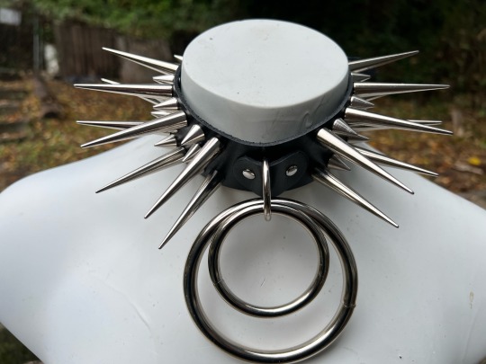
Derivative
#leathercraft#punk fashion#punkstyle#diy punk#i made it#goth fashion#handmade#leatherwork#i made something#gothaccessories#spiked jewelry#spiked collar#spiked choker#spiky#goth choker#goth stuff#alternative goth#altfashion
143 notes
·
View notes
Text


24 notes
·
View notes
Note
i see your mountain in a service dog themed body harness and ask. would any ghoul get stuck in the "nervous" dog vest
I don't think so...but I do think Dew should wear something to indicate he's best approached when Aether is around.
11 notes
·
View notes
Text

19 notes
·
View notes
Text

Daily Dino Doodles: Day 5
He’s a goth punk emo dude (not quite all of those but something along those lines)
Name suggestions are always welcome in reblogs
#dino doodles#daily doodles#daily dino doodle#art#artblr#daily doodle#artists on tumblr#unrealistic art#cute lil guy#cute art#emo#goth#punk#dinosaur drawing#dino art#dinosaur art#spiked collar#spiky hair#blue#blue art#name suggestions
7 notes
·
View notes
Text
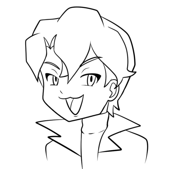
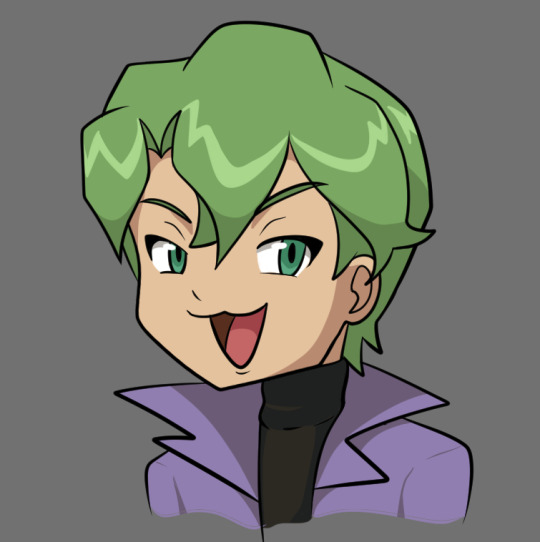
Unreal levels of smarm from this kid...
Done because #3 was the winning result for me on this tweet :3

+ Bonus knife cat meme lol

#ALMOST wanna use it as an icon....maybe just on discord. if I can surround him with more knives...#drew his collar EXCESSIVELY popped and spiky to really add to that asshole vibe sdjfj#my art#i love him...drawing him is like coming home...but I never do it the same way twice whoops#drew pokemon
26 notes
·
View notes
Text
Oh boy! If my Kingdom Hearts takes weren't messy and controversial enough to turn you away, then just you wait for the antiform design I gave Roxas XD
Some may ask "why is he a tiger?" And maybe some would ask "hey, what's with the collar?" But my current question is if I should keep the puffy pants from the original concept I made or if I should instead give him a battle skirt? Like a shogun!
#Runaway City AU#Catstar rambles#yeah I'm not tagging anything else. This is one of those context sensitive things I think#also don't get me wrong I think I really like what I've made? I'm just worried about judgement#and also the fact people might clue in on some... personal aesthetics...#I thought he'd look metal with a spiky collar ok? The tiger thing is entirely self indulgent though XD#Also Roxas gets an antiform in this au for the same reason Sora does so it's ok
4 notes
·
View notes
Note
*cracks knuckles* Get ready for a long ask As an animator/artist myself, I have a lot to say about the character designs. I'm sure you've heard this before, but these characters are not animation friendly. More detail just makes it harder to animate. (While Bee is a notorious example, nearly all of the characters suffer from this) When designing a character for animation, you need to pick and choose the key parts of their design, because you're going to be drawing the same thing over and over. Another thing: The characters have so much freaking red to them. I won't dwell on this for long, but they don't stand out from the background because there's so much freaking red (Another thing that bugs me is that the characters don't look like what the artist wanted them to be like) Ex: Charlie doesn't look like a doll Vaggie barely has a moth resemblance Angel Dust doesn't look like a spider Alastor doesn't look like a deer Niffty doesn't look like a bug or B-movie styled aliens Ozzie doesn't look like a rooster Beelzebub doesn't look like an animal trainer (you would think with all the suits and shit she likes to use, an animal trainer's outfit would be perfect for this)
Another thing: Her characters reuse the same design tropes. Bow ties, suits, fingerless gloves, gold tooth, stick thin figure, top hat, etc I'd excuse it if this was a beginner artist (heck, I used to do this, but eventually learned and grew out of it) but this is a woman in her 30's who graduated art school. TL;DR The designs are bad and hard as heck to animate
Couldn't have said it better myself
I feel like, when Viv sits down to design a new character, her personal preferences come first and everything they're actually supposed to represent second. Sort of tacked onto the final product like "yeah sure that'll do it"
As for the details, if I may add on: not long ago I've studied screencaps of a character from Helluva for redesign purposes. The amount of inconsistencies I came across was surprising! I'm pretty sure he didn't even have an official ref sheet (nor has one been posted to date), but I've heard that even for more prevalent characters the animators only have the most basic turnarounds? Also stuff like Millie's hair and spots tend to be inconsistent. With so much gratuitous/weird detail and apparently lack of proper reference, consistency suffers
Everyone is also very spiky and full of triangles; I'd love a more soft or even square character. Also some different body types... I mean, remember Mimzy from Hazbin? I don't know if Viv does. I wonder if she's still gonna appear at some point. But anyway
On a more positive note, there's a lot of background character designs that I find really cool & enjoyable! Maybe I'll make an appreciation post for them sometime
#confession#you know what also bugs me? somewhat less prevalent than the bow tie. and relatively harmless. but#c h o k e r s#a lot of characters have them. Millie. Loona. Verosika. Angel Dust. Vaggie. Crimini (pretty sure she was retconned but still)#and they're just there... because. no particular reason for it#(except for Loona I suppose. bc spiky dog collar)#it annoyed me because I was gonna give said redesign a choker to symbolize something. but then it felt redundant#also remember when they gave us a green environment for most of the episode where the imps stood out for a change#and then a new character with a wholly green design. and his ass was completely camouflaged for a significant number of scenes#it was almost funny#(but man I sure did NOT enjoy that episode)#helluva boss critical#hazbin hotel critical#helluva critical#hazbin critical#OOPS HAHA FORGOT TO ADD THE TAGS I am silly
38 notes
·
View notes
Text

lapis doin sad girl shit. I'm on kind of on a lapis kick lately, she's just fun to draw.
#my art#sketchy#digital illustration#digital#anime girl#fanart#su lapis#lapis#lapis lazuli#steven universe#su#blue#blue hair#messy hair#spiky hair#messy#braclets#spiked collar#dog collar#tank top#white shirt#band aids#arm sleeve#skinny#thin#smoking#smoke#cigarette#dark eyes#eye bags
28 notes
·
View notes
Text
maan reclusa is such a fun villain if theres one type of character mario rpgs do better than anyone it's Fuckass Jester
#skye's ramblings#honestly his outfit reminds me a little of super dimentio's w the like. whatever you call that spiky frilled collar thing#i know him n dimentio would be insufferable together <- has infact already seen a few people draw them together. they are so correct#but YAH i love his expressions i love his stupid laughs i love how needlessly violent his threats are he is so fucked up and fun#its so funny my friend n i fought him today n i love how below half health he just starts yelling at you to die during all his attacks#'take that!' 'and another!' 'and some more!' 'disappear!!' 'BURN!!' chill thefuck out man i;m trying to play super mario#AND OF COURSE THE MIND PRISON SEGMENT genuinely one of the coolest things in any mario rpg period. i could never forget the mind prison <3
14 notes
·
View notes