#sony ericsson w800i
Explore tagged Tumblr posts
Text


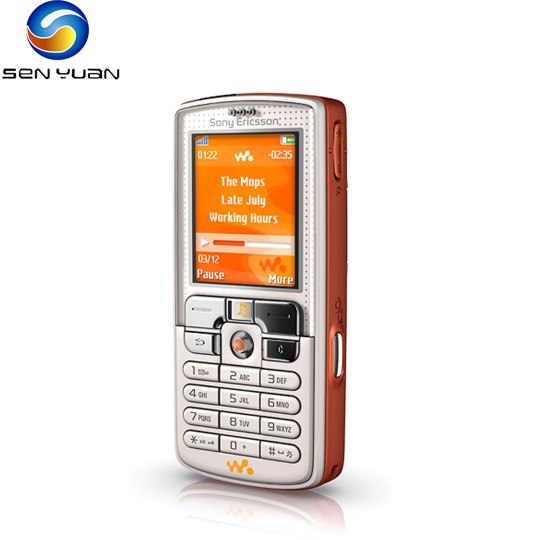

Sony Ericsson W800i (2005)
The w800 is first Walkman phone!
#2005#2000s#05#00s#art#cellphone#design#graphic design#graphics#mobile#orange#phone#white#sony ericsson#sony ericsson w800i#sony walkman#tech#technology2k#technology#walkman#y2kcore#y2kore#y2k aesthetic#y2k design#y2k futurism#y2k graphics#y2k nostalgia#y2k
219 notes
·
View notes
Text
2004 was a bit too early for standardized 3.5mm jack in phones, that would be closer to 2010 when smartphones with large touch screens took hold. 3.5mm jack was simply too big for most phones. Notable exceptions include Nokia N95 (2007) with a whooping 2.6" screen.
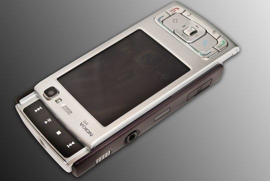
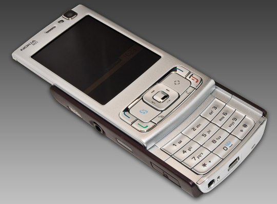
Most phones had a shitty dongle (eww) like for example Sony Ericsson W800i (2005) which was branded "Walkman", clearly in attempt to demonstrate that a phone is capable of having music playing functionality:
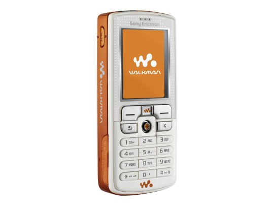
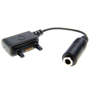
This is analogous to the situation we have right now with the USB-C -> 3.5mm jack dongles except worse because each phone company has its own.
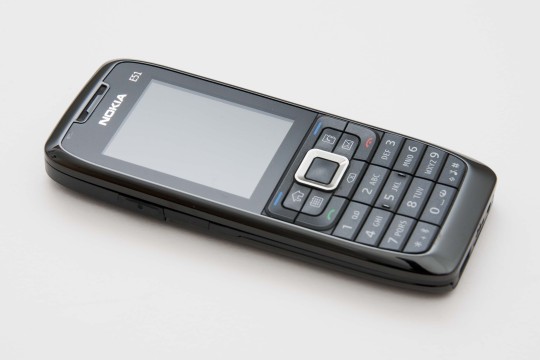
Better phones had a 2.5mm jack which was a simple mechanical converter, like Nokia E51 (2007) I bought in mid-2008 and replaced my MP3 player with. It was fairly annoying and it took me several dongles to find one that I was sort of okay with.
There's also a problem with storage. Nokia 5510 (2001), which, btw, also had a 2.5mm jack, was the first Nokia phone with the capability to play music
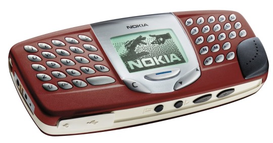

but it only had 64MB with no way of extending it, allowing to store 16-40 songs depending on quality, according to discussions on gsmarena back in 2006.
The aforementioned W800i had Memory Stick Duo as its storage
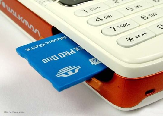
which is notably larger than a microSD card.
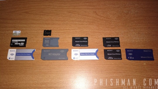
and of course these were the times where the war of different kinds of memory card standards was still waging and was not over until 2010

so Sony Ericsson, which was still insistent on using its own Memory Stick standard, would not be fine with using microSD (2004), but its own Memory Stick Micro (M2) was introduced in 2006 so that W800i from 2005 could not use it.
Both the issue of storage and connectors made phones in 2004 to not be practical yet for purpose of playing music, but it was theoretically possible.
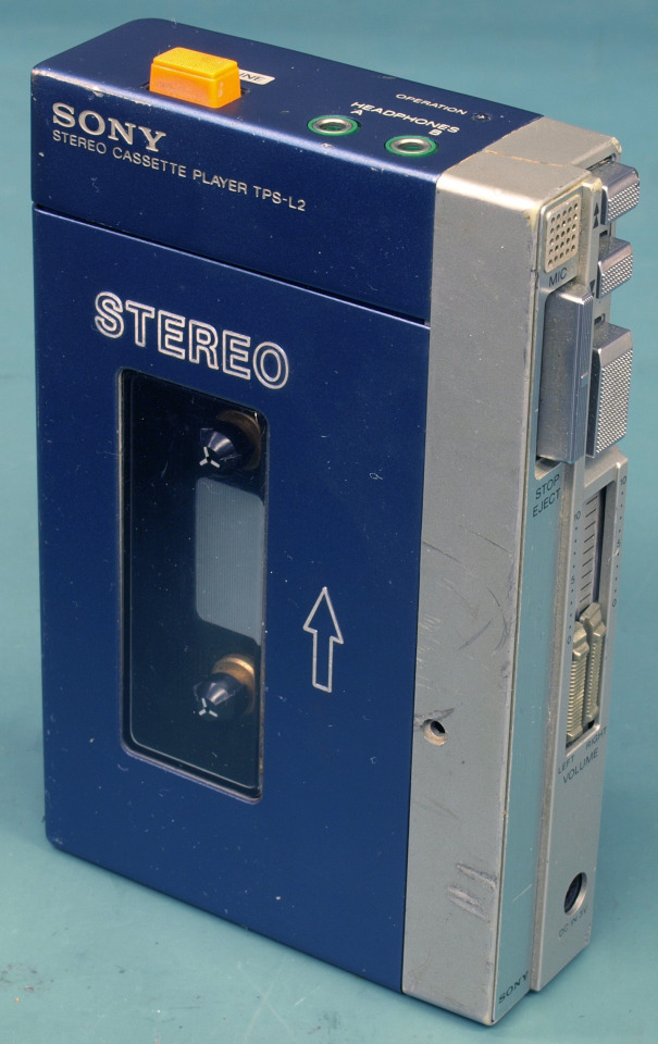
And of course the original post does not mention using 20 year old phones to play music, but merely using the 3.5mm jack to connect to a music playing device, and the 3.5mm jack has been used in this context since way longer than that, most notably, mostly thanks to Sony Walkman TPS-L2 (1979), the first device from the "Walkman" brand that had not only a headphone jack, but two headphone jacks.

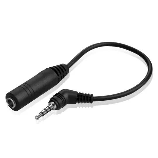
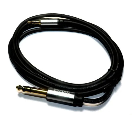
Then there's also the fact that we ended up with 3.5mm jack is also not a given, since 3.5mm jack is itself an improvement on the 6.3mm jack (the following photo demonstrates a 6.3mm jack to 3.5mm jack cable)
Now here for my personal opinion: it's kinda sad we switched from needing the dongle, to not needing the dongle, to needing the dongle again. And yes, bluetooth audio exists, which I even use, but even now it is notoriously unreliable.
Furthermore whoever removed the audio jack from phones should be grilled in front of congress. The fact that I need a dongle to listen to music on a modern telephone while 20 years ago I could have simply plugged a universally standardized cord into the audio jack everyone knew how to use is an anti-human move that should be punished.
81K notes
·
View notes
Note
omgg sony ericsson w800i had such good speakers!! if i recall correctly lol.. damn what a throwback dsjsdjdjs
lmAO YES!! they were advertised as a walkman??? idk man 2006/2007 was weird
2 notes
·
View notes
Video
I had / played with at least 5 of these throughout secondary school! Those Sony Ericsson Walkman phones were incredibly popular! Just like the pink razr before blackberries came on the scene (and provided an alternative to MSN with BB chat). I have had a BlackBerry tho bc the buttons were ridiculously small
Kitchen scruffy drawer phone: Nokia 3310 - always worked, could drop it a million times but still worked once you reassembled the pieces, great for playing snake

School phone I had and used: Nokia 1100. Very squishy foamy keys, great when dropped

Popular girl at school phone: Pink Razr. I didn’t have one but they were cute and could add phone charms to!

Longest reigning higher tech phone: Sony Ericsson W800i (following from the W700 Walkman). Perfect phone! Orange screen, chunky feel, better quality music playback than what was available. Truly a gem

Was delighted when I got a new one and it came in black 🔥 hell yeah

Another used then eventually kitchen drawered phone: Nokia 8310

My mum had this one for a good while: Nokia 6600. Very fun middle toggle to play with !!

Moving into later teens: LG chocolate. Also came in pink and white! Look at those pixels! the sleek design, the light up keys! a treat to use and you didn’t always have to slide it up *chefs kiss*

Late teenagehood phone: Nokia N95! Wasn’t chunky, nice and sleek, good memory, sick COLOUR screen, first real introduction to phones having app-like features !

Those were my teenage major players I’m pretty sure!!
There was another one, made of metal that I had and once threw off a skate ramp in a fit of teenage rage, only to go collect it, reassemble it and carry on using it 👌🏽 obviously this doesn’t account for the dawn of the iPhone but if you were poor you didn’t get an iPhone, you waited until you could get a different mp3 or a secondhand ipod (shuffle or mini or nano, then eventually touch) to use alongside a phone!
So yeah, that’s my round up lmao. It’s been a fun ADHD avoidance task, iykyk 😎
Some phone designs were very interesting from late 90s and early 2000s.
Source
50K notes
·
View notes
Text
What's New with Cellphone Cameras | Best phone to buy
Mobile telephones have actually progressed a lengthy method from their simple starts as the analog "blocks" of the 80's as modern technology has actually provided progressively much more intricate attributes and also choices. Once no more than simply a phone, currently the ordinary brand-new cellphone has more on-board handling power than the mixed computer power used to land males on the moon. Miniaturization, contemporary programming, as well as continuously improving innovation driven on by a hungry market suggests that the cellphones these days are not just a phone, or perhaps an organizer, but instead, they are a central multimedia platform. They use a number of the same sophisticated features as a PERSONAL ORGANIZER, like Bluetooth, blink card compatibility, radio, and totally included integrated digital video cameras. Much like the cams found on PDAs, the digital photography offered by multimedia phones is not brilliant, however rather better suited to casual photography of good friends at appropriate moments. The benefit of having an incorporated cell-camera is that as a phone is something that individuals tend to constantly bring with them, they will always have a camera convenient.
Best phone to buy If premium quality digital photography is what you want, then you're better off buying a smart phone and camera independently. While video camera modern technology is getting there for things like Personal organizers and mobiles, the series of innovative alternatives for a cell phone video camera don't also translate to the conventional collection of attributes for a fundamental digital video camera. A comparison of some noticeable versions on the marketplace today follows, offering consideration to the cost, attribute collection, as well as degree of high quality used by each gadget. The Palm Treo 650 Smartphone runs the Hand OS variation 5.4 on a 312MHz Intel CPU. It has 23MB of individual memory offered, expanding with the enhancement of either an SD or MMC flash cards. The screen is a 320x320 pixel 16-bit shade TFT, as well as it includes a 0.3 MP digital video camera, capable of taking images or catching video clip. Attribute wise, it goes over, however does not evaluate up versus comparable products for the cost. The electronic camera particularly is under-powered for the quantity of processing behind it. A Smart device 650 will certainly establish you back about $550. The Sony Ericsson W800i has 32MB of user memory, as well as comes complimentary with a 512MB Memory Stick Pro flash card. Featuring a display screen resolution of 176x220 pixels, as well as a 2 MP electronic cam, it is rather light on the features, and also would certainly be finest called a basic premium cellphone. The 2MP electronic camera goes some way towards warranting the price, however it doesn't compare to buying an electronic camera separately. The W800i will set you back around $480. The Nokia 7610 is a competitive access on this list, featuring a relatively rich attribute established comparative to the other examples. However, it has just 8MB on-board memory, expandable by means of a MultiMediaCard flash card. It includes a complimentary 64MB MMC, with a 176x208 screen in 16-bit shade. The 1MP electronic camera sustains an extremely vast array of picture layouts, in addition to 2 modes of video in low or moderate resolution. It sustains multiple video layouts, has a 4x digital zoom. The Bluetooth allowed system itself has a web internet browser and also email client. The main issues with this phone are the fairly brief lived battery, and also the small amount of on-board memory. However at just $310, the function established offers this phone serious bang for the dollar. If we compare each of these to a typical electronic camera, it is easy to see why they are not a great selection if you mean to focus on photography. $350 obtains you a Canon SD500 7.1 MP electronic video camera. It includes 3x optical zoom, in addition to 4x electronic zoom, Television AV/out port, proper strobe flash with red-eye reduction, greatly customizable configuration, optional automated lighting conditions compensation, a tripod install factor, full movement video clip tape-recorded at reliable resolution of 0.3 MP. It has an SD card port, and a host of other features also various to call. This is not an elite, expert grade camera, however it outperforms every camera phone noted by at least 3:1. and at a reduced expense as well.
0 notes
Text
Cool Little CSS Grid Tricks for Your Blog
I discovered CSS about a decade ago while trying to modify the look of a blog I had created. Pretty soon, I was able to code cool things with more mathematical and, therefore, easier-to-understand features like transforms. However, other areas of CSS, such as layout, have remained a constant source of pain.
This post is about a problem I encountered about a decade ago and, until recently, did not know how to solve in a smart way. Specifically, it’s about how I found a solution to a long-running problem using a modern CSS grid technique that, in the process, gave me even cooler results than I originally imagined.
That this is not a tutorial on how to best use CSS grid, but more of a walk through my own learning process.
The problem
One of the first things I used to dump on that blog were random photos from the city, so I had this idea about having a grid of thumbnails with a fixed size. For a nicer look, I wanted this grid to be middle-aligned with respect to the paragraphs above and below it, but, at the same time, I wanted the thumbnails on the last row to be left-aligned with respect to the grid. Meanwhile, the width of the post (and the width of the grid within it) would depend on the viewport.
The HTML looks something like this:
<section class='post__content'> <p><!-- some text --></p> <div class='grid--thumbs'> <a href='full-size-image.jpg'> <img src='thumb-image.jpg' alt='image description'/> </a> <!-- more such thumbnails --> </div> <p><!-- some more text --></p> </section>
It may seem simple, but it turned out to be one of the most difficult CSS problems I’ve ever encountered.
Less than ideal solutions
These are things I have tried or seen suggested over the years, but that never really got me anywhere.
Floating impossibility
Floats turned out to be a dead end because I couldn’t figure out how to make the grid be middle aligned this way.
.grid--thumbs { overflow: hidden; } .grid--thumbs a { float: left; }
The demo below shows the float attempt. Resize the embed to see how they behave at different viewport widths.
CodePen Embed Fallback
inline-block madness
At first, this seemed like a better idea:
.grid--thumbs { text-align: center } .grid--thumbs a { display: inline-block }
Except it turned out it wasn’t:
CodePen Embed Fallback
The last row isn’t left aligned in this case.
At a certain point, thanks to an accidental CSS auto-complete on CodePen, I found out about a property called text-align-last, which determines how the last line of a block is aligned.
Unfortunately, setting text-align-last: left on the grid wasn’t the solution I was looking for either:
CodePen Embed Fallback
At this point, I actually considered dropping the idea of a middle aligned grid. Could a combo of text-align: justified and text-align-last: left on the grid produce a better result?
Well, turns out it doesn’t. That is, unless there’s only a thumbnail on the last row and the gaps between the columns aren’t too big. Resize the embed below to see what I mean.
CodePen Embed Fallback
This is pretty where I was at two years ago, after nine years of trying and failing to come up with a solution to this problem.
Messy flexbox hacks
A flexbox solution that seemed like it would work at first was to add an ::after pseudo-element on the grid and set flex: 1 on both the thumbnails and this pseudo-element:
.grid--thumbs { display: flex; flex-wrap: wrap; a, &::after { flex: 1; } img { margin: auto; } &:after { content: 'AFTER'; } }
The demo below shows how this method works. I’ve given the thumbnails and the ::after pseudo-element purple outlines to make it easier to see what is going on.
CodePen Embed Fallback
This is not quite what I wanted because the grid of thumbnails is not middle-aligned. Thats said, it doesn’t look too bad… as long as the last row has exactly one item less image than the others. As soon as that changes, however, the layout breaks if it’s missing more items or none.

Why the ::after hack is not reliable.
That was one hacky idea. Another is to use a pseudo-element again, but add as many empty divs after the thumbnails as there are columns that we’re expecting to have. That number is something we should be able to approximate since the size of the thumbnails is fixed. We probably want to set a maximum width for the post since text that stretches across the width of a full screen can visually exhausting for eyes to read.
The first empty elements will take up the full width of the row that’s not completely filled with thumbnails, while the rest will spill into other rows. But since their height is zero, it won’t matter visually.
CodePen Embed Fallback
This kind of does the trick but, again, it’s hacky and still doesn’t produce the exact result I want since it sometimes ends up with big and kind of ugly-looking gaps between the columns.
A grid solution?
The grid layout has always sounded like the answer, given its name. The problem was that all examples I had seen by then were using a predefined number of columns and that doesn’t work for this particular pattern where the number of columns is determined by the viewport width.
Last year, while coding a collection of one element, pure CSS background patterns, I had the idea of generating a bunch of media queries that would modify a CSS variable, --n, corresponding to the number of columns used to set grid-template-columns.
$w: 13em; $h: 19em; $f: $h/$w; $n: 7; $g: 1em; --h: #{$f*$w}; display: grid; grid-template-columns: repeat(var(--n, #{$n}), var(--w, #{$w})); grid-gap: $g; place-content: center; @for $i from 1 to $n { @media (max-width: ($n - $i + 1)*$w + ($n - $i + 2)*$g) { --n: #{$n - $i} } }
CodePen Embed Fallback
I was actually super proud of this idea at the time, even though I cringe looking back on it now. One media query for every number of columns possible is not exactly ideal, not to mention it doesn’t work so well when the grid width doesn’t equal the viewport width, but is still somewhat flexible and also depends on the width of its siblings.
A magic solution
I finally came across a better solution while working with CSS grid and failing to understand why the repeat() function wasn’t working in a particular situation. It was so frustrating and prompted me to go to MDN, where I happened to notice the auto-fit keyword and, while I didn’t understand the explanation, I had a hunch that it could help with this other problem, so I dropped everything else I was doing and gave it a try.
Here’s what I got:
.grid--thumbs { display: grid; justify-content: center; grid-gap: .25em; grid-template-columns: repeat(auto-fit, 8em); }
CodePen Embed Fallback
I also discovered the minmax() function, which can be used in place of fixed sizes on grid items. I still haven’t been able to understand exactly how minmax() works — and the more I play with it, the less I understand it — but what it looks like it does in this situation is create the grid then stretch its columns equally until they fill all of the available space:
grid-template-columns: repeat(auto-fit, minmax(8em, 1fr));
CodePen Embed Fallback
Another cool thing we can do here is prevent the image from overflowing when it’s wider than the grid element. We can do this by replacing the minimum 8em with min(8em, 100%) That essentially ensures that images will never exceed 100%, but never below 8em. Thanks to Chris for this suggestion!
Note that the min() function doesn’t work in pre-Chromium Edge!
CodePen Embed Fallback
Keep in mind that this only produces a nice result if all of the images have the same aspect ratio — like the square images I’ve used here. For my blog, this was not an issue since all photos were taken with my Sony Ericsson W800i phone, and they all had the same aspect ratio. But if we were to drop images with different aspect ratios, the grid wouldn’t look as good anymore:
CodePen Embed Fallback
We can, of course, set the image height to a fixed value, but that distorts the images… unless we set object-fit to cover, which solves our problem!
CodePen Embed Fallback
Another idea would be to turn the first thumbnail into a sort of banner that spans all grid columns. The one problem is that we don’t know the number of columns because that depends on the viewport. But, there is a solution — we can set grid-column-end to -1!
.grid--thumbs { /* same styles as before */ a:first-child { grid-column: 1/ -1; img { height: 13em } } }
The first image gets a bigger height than all the others.
CodePen Embed Fallback
Of course, if we wanted the image to span all columns except the last, one we’d set it to -2 and so on… negative column indices are a thing!
auto-fill is another grid property keyword I noticed on MDN. The explanations for both are long walls of text without visuals, so I didn’t find them particularly useful. Even worse, replacing auto-fit with auto-fill in any of the grid demos above produces absolutely no difference. How they really work and how they differ still remains a mystery, even after checking out articles or toying with examples.
However, trying out different things and seeing what happens in various scenarios at one point led me to the conclusion that, if we’re using a minmax() column width and not a fixed one (like 8em), then it’s probably better to use auto-fill instead of auto-fit because, the result looks better if we happen to only have a few images, as illustrated by the interactive demo below:
CodePen Embed Fallback
I think what I personally like best is the initial idea of a thumbnail grid that’s middle-aligned and has a mostly fixed column width (but still uses min(100%, 15em) instead of just 15em though). At the end of the day, it’s a matter of personal preference and what can be seen in the demo below just happens to look better to me:
CodePen Embed Fallback
I’m using auto-fit in this demo because it produces the same result as auto-fill and is one character shorter. However, what I didn’t understand when making this is that both keywords produce the same result because there are more items in the gallery than we need to fill a row.
But once that changes, auto-fit and auto-fill produce different results, as illustrated below. You can change the justify-content value and the number of items placed on the grid:
CodePen Embed Fallback
I’m not really sure which is the better choice. I guess this also depends on personal preference. Coupled with justify-content: center, auto-fill seems to be the more logical option, but, at the same time, auto-fit produces a better-looking result.
The post Cool Little CSS Grid Tricks for Your Blog appeared first on CSS-Tricks.
Cool Little CSS Grid Tricks for Your Blog published first on https://deskbysnafu.tumblr.com/
0 notes
Text
Cool Little CSS Grid Tricks for Your Blog
I discovered CSS about a decade ago while trying to modify the look of a blog I had created. Pretty soon, I was able to code cool things with more mathematical and, therefore, easier-to-understand features like transforms. However, other areas of CSS, such as layout, have remained a constant source of pain.
This post is about a problem I encountered about a decade ago and, until recently, did not know how to solve in a smart way. Specifically, it’s about how I found a solution to a long-running problem using a modern CSS grid technique that, in the process, gave me even cooler results than I originally imagined.
That this is not a tutorial on how to best use CSS grid, but more of a walk through my own learning process.
The problem
One of the first things I used to dump on that blog were random photos from the city, so I had this idea about having a grid of thumbnails with a fixed size. For a nicer look, I wanted this grid to be middle-aligned with respect to the paragraphs above and below it, but, at the same time, I wanted the thumbnails on the last row to be left-aligned with respect to the grid. Meanwhile, the width of the post (and the width of the grid within it) would depend on the viewport.
The HTML looks something like this:
<section class='post__content'> <p><!-- some text --></p> <div class='grid--thumbs'> <a href='full-size-image.jpg'> <img src='thumb-image.jpg' alt='image description'/> </a> <!-- more such thumbnails --> </div> <p><!-- some more text --></p> </section>
It may seem simple, but it turned out to be one of the most difficult CSS problems I’ve ever encountered.
Less than ideal solutions
These are things I have tried or seen suggested over the years, but that never really got me anywhere.
Floating impossibility
Floats turned out to be a dead end because I couldn’t figure out how to make the grid be middle aligned this way.
.grid--thumbs { overflow: hidden; } .grid--thumbs a { float: left; }
The demo below shows the float attempt. Resize the embed to see how they behave at different viewport widths.
CodePen Embed Fallback
inline-block madness
At first, this seemed like a better idea:
.grid--thumbs { text-align: center } .grid--thumbs a { display: inline-block }
Except it turned out it wasn’t:
CodePen Embed Fallback
The last row isn’t left aligned in this case.
At a certain point, thanks to an accidental CSS auto-complete on CodePen, I found out about a property called text-align-last, which determines how the last line of a block is aligned.
Unfortunately, setting text-align-last: left on the grid wasn’t the solution I was looking for either:
CodePen Embed Fallback
At this point, I actually considered dropping the idea of a middle aligned grid. Could a combo of text-align: justified and text-align-last: left on the grid produce a better result?
Well, turns out it doesn’t. That is, unless there’s only a thumbnail on the last row and the gaps between the columns aren’t too big. Resize the embed below to see what I mean.
CodePen Embed Fallback
This is pretty where I was at two years ago, after nine years of trying and failing to come up with a solution to this problem.
Messy flexbox hacks
A flexbox solution that seemed like it would work at first was to add an ::after pseudo-element on the grid and set flex: 1 on both the thumbnails and this pseudo-element:
.grid--thumbs { display: flex; flex-wrap: wrap; a, &::after { flex: 1; } img { margin: auto; } &:after { content: 'AFTER'; } }
The demo below shows how this method works. I’ve given the thumbnails and the ::after pseudo-element purple outlines to make it easier to see what is going on.
CodePen Embed Fallback
This is not quite what I wanted because the grid of thumbnails is not middle-aligned. Thats said, it doesn’t look too bad… as long as the last row has exactly one item less image than the others. As soon as that changes, however, the layout breaks if it’s missing more items or none.

Why the ::after hack is not reliable.
That was one hacky idea. Another is to use a pseudo-element again, but add as many empty divs after the thumbnails as there are columns that we’re expecting to have. That number is something we should be able to approximate since the size of the thumbnails is fixed. We probably want to set a maximum width for the post since text that stretches across the width of a full screen can visually exhausting for eyes to read.
The first empty elements will take up the full width of the row that’s not completely filled with thumbnails, while the rest will spill into other rows. But since their height is zero, it won’t matter visually.
CodePen Embed Fallback
This kind of does the trick but, again, it’s hacky and still doesn’t produce the exact result I want since it sometimes ends up with big and kind of ugly-looking gaps between the columns.
A grid solution?
The grid layout has always sounded like the answer, given its name. The problem was that all examples I had seen by then were using a predefined number of columns and that doesn’t work for this particular pattern where the number of columns is determined by the viewport width.
Last year, while coding a collection of one element, pure CSS background patterns, I had the idea of generating a bunch of media queries that would modify a CSS variable, --n, corresponding to the number of columns used to set grid-template-columns.
$w: 13em; $h: 19em; $f: $h/$w; $n: 7; $g: 1em; --h: #{$f*$w}; display: grid; grid-template-columns: repeat(var(--n, #{$n}), var(--w, #{$w})); grid-gap: $g; place-content: center; @for $i from 1 to $n { @media (max-width: ($n - $i + 1)*$w + ($n - $i + 2)*$g) { --n: #{$n - $i} } }
CodePen Embed Fallback
I was actually super proud of this idea at the time, even though I cringe looking back on it now. One media query for every number of columns possible is not exactly ideal, not to mention it doesn’t work so well when the grid width doesn’t equal the viewport width, but is still somewhat flexible and also depends on the width of its siblings.
A magic solution
I finally came across a better solution while working with CSS grid and failing to understand why the repeat() function wasn’t working in a particular situation. It was so frustrating and prompted me to go to MDN, where I happened to notice the auto-fit keyword and, while I didn’t understand the explanation, I had a hunch that it could help with this other problem, so I dropped everything else I was doing and gave it a try.
Here’s what I got:
.grid--thumbs { display: grid; justify-content: center; grid-gap: .25em; grid-template-columns: repeat(auto-fit, 8em); }
CodePen Embed Fallback
I also discovered the minmax() function, which can be used in place of fixed sizes on grid items. I still haven’t been able to understand exactly how minmax() works — and the more I play with it, the less I understand it — but what it looks like it does in this situation is create the grid then stretch its columns equally until they fill all of the available space:
grid-template-columns: repeat(auto-fit, minmax(8em, 1fr));
CodePen Embed Fallback
Another cool thing we can do here is prevent the image from overflowing when it’s wider than the grid element. We can do this by replacing the minimum 8em with min(8em, 100%) That essentially ensures that images will never exceed 100%, but never below 8em. Thanks to Chris for this suggestion!
Note that the min() function doesn’t work in pre-Chromium Edge!
CodePen Embed Fallback
Keep in mind that this only produces a nice result if all of the images have the same aspect ratio — like the square images I’ve used here. For my blog, this was not an issue since all photos were taken with my Sony Ericsson W800i phone, and they all had the same aspect ratio. But if we were to drop images with different aspect ratios, the grid wouldn’t look as good anymore:
CodePen Embed Fallback
We can, of course, set the image height to a fixed value, but that distorts the images… unless we set object-fit to cover, which solves our problem!
CodePen Embed Fallback
Another idea would be to turn the first thumbnail into a sort of banner that spans all grid columns. The one problem is that we don’t know the number of columns because that depends on the viewport. But, there is a solution — we can set grid-column-end to -1!
.grid--thumbs { /* same styles as before */ a:first-child { grid-column: 1/ -1; img { height: 13em } } }
The first image gets a bigger height than all the others.
CodePen Embed Fallback
Of course, if we wanted the image to span all columns except the last, one we’d set it to -2 and so on… negative column indices are a thing!
auto-fill is another grid property keyword I noticed on MDN. The explanations for both are long walls of text without visuals, so I didn’t find them particularly useful. Even worse, replacing auto-fit with auto-fill in any of the grid demos above produces absolutely no difference. How they really work and how they differ still remains a mystery, even after checking out articles or toying with examples.
However, trying out different things and seeing what happens in various scenarios at one point led me to the conclusion that, if we’re using a minmax() column width and not a fixed one (like 8em), then it’s probably better to use auto-fill instead of auto-fit because, the result looks better if we happen to only have a few images, as illustrated by the interactive demo below:
CodePen Embed Fallback
I think what I personally like best is the initial idea of a thumbnail grid that’s middle-aligned and has a mostly fixed column width (but still uses min(100%, 15em) instead of just 15em though). At the end of the day, it’s a matter of personal preference and what can be seen in the demo below just happens to look better to me:
CodePen Embed Fallback
I’m using auto-fit in this demo because it produces the same result as auto-fill and is one character shorter. However, what I didn’t understand when making this is that both keywords produce the same result because there are more items in the gallery than we need to fill a row.
But once that changes, auto-fit and auto-fill produce different results, as illustrated below. You can change the justify-content value and the number of items placed on the grid:
CodePen Embed Fallback
I’m not really sure which is the better choice. I guess this also depends on personal preference. Coupled with justify-content: center, auto-fill seems to be the more logical option, but, at the same time, auto-fit produces a better-looking result.
The post Cool Little CSS Grid Tricks for Your Blog appeared first on CSS-Tricks.
source https://css-tricks.com/cool-little-css-grid-tricks-for-your-blog/
from WordPress https://ift.tt/3cNgDZf via IFTTT
0 notes
Photo

Ностальжи-пост. Верните мне мой 2007. Многоточие выпустили свой последний альбом. У меня не было интернета на компе. Да и компа своего у меня не было. Только Wap. Только Хардкор. Мейл агент был ещё тортом. Я заходил в него, когда папа пускал на часок в интернет. Приходилось выбирать что смотреть - или смертельную битву по стс, или эротику по рен тв. Прости, Шан Цунг, ты проиграл ту битву. Об онлайн порнухе и кинотеатрах вообще никто не знал. Их и не было. Я не умел играть на гитаре. Про пианино вообще молчу. Мне достался от бати Sony Ericsson Walkman w800i. С блютузом. На предыдущем k300i был ик-порт, и целых 11(!) мегабайт памяти. Я писал тонны смс, и разговаривал по домашнему телефону. По три - четыре часа. Было очень сложно выбирать песню (я скачивал по одной на телефон) на каждый день, чтобы собирать толпу школоты вокруг себя. Но у меня получалось. Доктор Хаус не думал заканчиваться. Как и Клиника. Зенит выиграл Чемпионат России 2007 по футболу. А Аршавин не ассоциировался с чипсами. Я был самым крутым голкипером на районе. Меня уважали даже гопники. Я смотрел Клуб по mtv. И мне не было стыдно. А ещё я любил одноклассницу. Невзаимно, конечно. И писал об этом стихи (Завоевал её спустя полгода, ИЗИ). Я тащился от человека-паука в лице Тоби Магваера. Потому что других человеков пауков и не было. Сайлент Хилл и Резидент Евил по настоящему пугали. А Алон ин зе Дарк так просто обосраться. А, ну и халф-лайф 3 был ближе, чем вагина моей бывшей. И все были уверены, что она выйдет. (А моей бывшей на тот момент было 9 лет, да) Работал на даче. Все свободное время. Найк любил футбол. И Настю. И меня. Не было локальных шуток "Не мучай", "Просто строю", и т.д. Зато были "Крокодила дрючили", "Меня зомби подрали", "Ты чё, Фрол?" "Хочу посмотреть дабл этот". Пое��дка в Чернобыль была мечтой. И знал я о нем больше, чем знаю в общем после выхода с Вуза. Оксюморон ассоциировался у меня с ЕГЭ по литре. Рок еще подавал признаки жизни. Гуф был жив. Вечно спать не хотелось. Час игры в компьютерном клубе "Диана" стоил 20 рублей (Но у меня и таких денег тогда не было). Что такое похмелье я не знал. И не знал очень долго. Я мечтал о Плейстейшн 2. Впервые сыграл в Vice City. Эту заразу (диск) еще нужно было по городу искать. Tokio Hotel хотели все школьницы. Я слушал втихаря одну песню. Сейчас слушаю ее врубив наполную, ибо уже Ретро ФМ. Приправа от дошика испепеляла людей. Гарри Поттер - лучшая серия книг. А чем вам запомнился 2007?
#2007#токиохотел#мой2007#многоточие#рок#Бекренёв#рэп#oxxymiron#бывшая#вагинатвоейбывшей#блог#ностальгия#ностальжи
2 notes
·
View notes
Text
Reallokering av høner
En spesiell utfordring jeg har hatt i praksisperioden har vært å manøvrere hønene på gården. Høner brukes på gården til å forbedre jorda slik at den blir klar til planting/setting. De river, raker, spiser og komposterer i et overraskende høyt tempo, noe som gjør jorda mer levende og bearbeidelig. Siden de arbeider så raskt så må de flyttes rundt på jorde med noen ukers mellomrom. Heldigvis er det relativt enkelt; du flytter gjerdet og hengeren som de bor i og hønene følger etter av seg selv.
Hønene må også forbedre jorda inni grønnsakstunnelen, og etter å ha vært der i noen uker vil de anerkjenne tunnelen som deres nye hjem. Dessverre kan ikke tunnelen flyttes, noe som betyr at vi må flytte hønene individuelt. Jeg har vært borti mye slitsom trening, men ingenting kan sammenlignes med å fange instinktive frittgående høner. Med adrenalin og en puls på 180 skal du prøve å få tak i beina til jungeldyr som til vanlig har litt under 30 mål å løpe på, og selv om tunnelen ikke var veldig stor så var dette nærmest umulig.

Bildet ser ut til å ha blitt tatt av en Sony Ericsson W800i, men det er sånt som skjer når du har fotografiferdigheter på linje med et spedbarn. Om forlatelse.
Problemet ble løst ved å danne en sluse ut av tunnelen på den ene siden og sakte men sikkert presse de ut av tunnelen med et hundegårdselement. Hønene lagde nok en god dose med stresshormoner i øyeblikket, noe som helst bør unngås, men det å flytte de til et annet sted på jorde må dessverre gjøres.
Det er kanskje litt rart at den største utfordringen min i praksisperioden på et ernæringsstudie er å reallokere høner på et grønnsaksjorde, men de er virkelig en uunnværlig ressurs når det kommer til økologisk og regenerativ produksjon av grønnsaker, frukt og bær.
0 notes
Text
I miss having my Sony Ericsson w800i so I made this wallpaper for my iPhone 8 | iPhone Wallpapers
I miss having my Sony Ericsson w800i so I made this wallpaper for my iPhone 8 | iPhone Wallpapers
[ad_1]

I miss having my Sony Ericsson w800i so I made this wallpaper for my iPhone 8
[ad_2] View Reddit by newecreator – View Source
View On WordPress
#iphone wallpaper 4k#iphone wallpaper fall#iphone wallpaper hd original#iphone wallpaper high quality#iphone wallpaper pinterest#iphone wallpaper quotes#iphone wallpaper tumblr#iPhone Wallpapers#top iphone wallpapers
0 notes
Text
When reading through the articles and watching the media that was given to me to gather more information and knowledge about this time period and how it shaped our art world today, I could not help but think back to my past and how much technology and arts has changed just during my time here.
Cimabue was considered great because he was a “transitional artist” between the Medieval time period and Renaissance time period. He was a perfectionist, which is why I believe he was such a great artist for his time period. Renaissance was the rebirth of art after the Medieval time period. The “dip” of art during the Medieval time had to improve at some point and Cimabue was the one to do this. He then went on to teach one of the first great Renaissance painters, Giotto. Cimabue was the connecting piece between Medieval art and Renaissance art, and this is what lead me to thinking about my time.
I am twenty years old, meaning I was born in the year 2000 and have seen so much growth in technology that happened around me. When thinking back to the year 2000, the Nokia 3310 was dropped to being the most successful cell phone of it’s time. Then if we jump to 2005 the first cell phone to be used for music was dropped by Sony, the Sony Ericsson W800i. Finally, Steve Jobs dropped the first iPhone in 2007. This was the first successful phone to be touch screen. When I think about this in seven years we went from a phone that was not high tech at all to a phone that is touch screen and jump started the big movement of Apple we know of today. Steve Jobs was the Cimabue of cell phones in my opinion. He started Apple himself to make a turning point in cellphones, computers, and more. He is the reason we have so many more options for cellular devices today. He was Cimabue and Giotto together. He was the turning point and the student to grow and expand on the original idea.
I am trying this on my iPhone 11 currently, after reading and listening to the articles given to me about Cimabue, while researching about the very first cell phones starting in the year 2000. I never thought that when I would be twenty in college about having this ability when I was five years old. I knew technology was constantly improving because I watched my parents go from a flip phone, to a slide phone, to a cell phone. I believe that within the next few years we could have phones that know what we are thinking and do the typing or researching for us. Then I think about if or when I have my own children, are they going to watch technology expand and grow just like I did as a child? Or are they going to watch technology become somewhat stagnant or even dip just like the Medieval time period did with art? I think it is going to be so fascinating, just as my parents thought, to talk about the “good ole days” with our Nintendo DS, CD players, VHS players, and more with my children and students.
1 note
·
View note
Text
Sony Ericsson K510i Review - Mid-Range Candybar Model
Sony Ericsson K510i Review: Released in 2006, this was not too much of an original handset. One of the first phones released in the Sony Ericsson K-Series was the Sony Ericsson K500i – which was then quickly overtaken by the Sony Ericsson K750i (and its Walkman equivalent, the Sony Ericsson W800i) in the next year.
The Sony Ericsson K510i is a refresh of the original phone, but the lines are…
View On WordPress
0 notes
Text
Sony Ericsson W810i: Combine With Music
Another function that you might like is the reality that you can keep a lot of music on the phone due to its high memory. It is possible for you to keep up to 20 complete length CDs on the phone, which is incredibly great compared to other phones!
If music is not truly your thing, you may like the truth that the phone likewise has an electronic camera on the side that has numerous functions. You can have the alternative of 4x digital zoom, sharper images and a camera along with cam light too. It is classified as one of the very best video camera phones readily available, so if you simulate taking images with your phone you will not be dissatisfied with this one.
The Sony Ericsson W810i is among the very best video camera and music phones readily available and, although it has actually been readily available considering that April 2006, it still stays as one of the very best around today.
If you are trying to find a brand name brand-new smart phone, one that you might want to think about is the Sony Ericsson W810i It is essentially an upgraded variation of the extremely popular W800i, which was the very first walkman branded cellphone. Simply what functions does it have?
Functions of the Sony Ericsson W810i.
When comparing this cellphone to its previous design, you can inform that it is somewhat slimmer. This makes it much easier to bring around with you and it can quickly suit your pocket without bulging out. The buttons are likewise a little raised rather than ingrained and the navigation button is likewise much better developed than the W800i joystick.
If you like to rip CDs, you will likewise be pleased to understand that the phone includes software application that enables you to do that. If you like listening to the radio, you will like the truth that there is likewise a FM radio together with the MP3 gamer. It genuinely is a phone that enables you to have the very best music experience possible.
One function that lots of people might enjoy is the truth that the W810i has faster web gain access to. It boasts a much faster information transfer from phone to PC and vice versa. The primary function of this phone, nevertheless, is to offer you with an exceptional music gamer.
0 notes
Text
What's new and exciting in mobile cameras?
What's new and exciting in mobile cameras?
What's new and exciting in mobile cameras
Mobile phones have gone a long way from their humble beginnings as the analog "bricks" of the 80's offered more and more complex features and options by technology. The average new cell phone now has more on-board processing power than the combined computing power used to land men on the moon. Miniaturization, modern programming, and the constant improvement of technology driven by a hungry market means that today's cell phones are not just a phone, or even an organizer, but a centralized multimedia platform. These provide many of the same advanced features as a PDA, such as Wifi, connectivity with flash cards, radio, and fully featured digital cameras. The digital photography provided by mobile devices, much like the cameras used on PDAs, is not amazing, but better suited for informal photographs of friends at the right time. The advantage of having an integrated cell-camera is that they will always have a camera handy as a phone is something people tend to carry with them all the time.
If you're after high-quality digital images, then you're best off purchasing a different mobile phone and lens. While camera technology is getting there for things like PDAs and mobile phones, the range of advanced options for a cell phone camera does not even translate into a basic digital camera's standard set of features. It follows a comparison of some prominent models on the market today, taking into account each device's cost, feature set, and quality level.
The Palm Treo 650 Smartphone runs version 5.4 of the Palm OS on an Intel 312MHz Processor. It has 23 MB of device space free, which can be extended with either an SD or MMC flash card. The monitor is a 16-bit TFT color of 320x320 pixels and includes a digital camera of 0.3MP that can take photos or capture video. Wise feature, it's impressive, but for the price it doesn't weigh against similar products. For the amount of storage behind it, the lens in particular is under-powered. A mobile 650 is about $550 to set you back.
The Sony Ericsson W800i has a user memory of 32 MB and comes with a flash card with a 512 MB Memory Stick Pro. With a 176x220 pixel display resolution and a 2 MP digital camera, the features are relatively light and would best be described as a basic high-end mobile phone. The 2MP digital camera is going some way to justify the cost, but it doesn't compare separately with buying a digital camera. The W800i is about $480 setting you back.
The Nokia 7610 is a competitive entry on this list with a fairly rich feature set compared to the other examples. However, it only has on-board memory of 8 MB, which can be expanded via a flash card from MultiMediaCard. It comes with a free MMC of 64 MB, with a 16-bit display of 176x208. The 1MP digital camera supports a wide variety of image formats and two low-or medium-resolution video modes. It supports multiple types for images, has a digital zoom of 4x. The device allowed by Bluetooth has its own web browser and email client. The main issues with this device are the relatively short battery life and the small amount of on-board space. But the feature set at just $310 gives the buck a serious bang to this phone.
If we compare each of these to a normal digital camera, if you want to focus on photography, it's easy to see why they're not a good choice. A Canon SD500 7.1 MP digital camera is available for $350. It features 3x optical zoom, 4x digital zoom, AV / out TV port, proper red-eye strobe flash, heavily customizable setup, optional automatic lighting compensation, a tripod mount point, full motion video recorded at an effective 0.3MP resolution. It has an SD card slot, and too numerous to name a host of other features. This is not an exceptional, professional grade device, but it performs at least 3:1 over every camera phone mentioned. And also at a lower price.
Cell phones have evolved to a point where they resemble a laptop more closely than anything else, combining a truly impressive array of multimedia technologies into a small device. Displays are rapidly improving, as is modern mobile phones ' degree of compatibility. As they become more popular, such apps will become more and more valuable when large networks of people will begin to take form, all equipped with such flexible tools. Nonetheless, as of now, they remain somewhat fragmented in their capacities, providing a broad range of features, but not implementing any of them in such a manner as to substitute the technologies from which the features emerged. Although camera cell phones may have their benefits, high-quality imaging still does not lend themselves well. A camera phone can be a lot of fun for casual use with friends, or for general use, and while it combines a lot of devices into one convenient package, it does not deliver the high quality level.
source https://www.gyanns.com/2019/12/whats-new-and-exciting-inmobile-cameras.html
0 notes
Text
What's new and exciting in mobile cameras?
What's new and exciting in mobile cameras?
What's new and exciting in mobile cameras
Mobile phones have gone a long way from their humble beginnings as the analog "bricks" of the 80's offered more and more complex features and options by technology. The average new cell phone now has more on-board processing power than the combined computing power used to land men on the moon. Miniaturization, modern programming, and the constant improvement of technology driven by a hungry market means that today's cell phones are not just a phone, or even an organizer, but a centralized multimedia platform. These provide many of the same advanced features as a PDA, such as Wifi, connectivity with flash cards, radio, and fully featured digital cameras. The digital photography provided by mobile devices, much like the cameras used on PDAs, is not amazing, but better suited for informal photographs of friends at the right time. The advantage of having an integrated cell-camera is that they will always have a camera handy as a phone is something people tend to carry with them all the time.
If you're after high-quality digital images, then you're best off purchasing a different mobile phone and lens. While camera technology is getting there for things like PDAs and mobile phones, the range of advanced options for a cell phone camera does not even translate into a basic digital camera's standard set of features. It follows a comparison of some prominent models on the market today, taking into account each device's cost, feature set, and quality level.
The Palm Treo 650 Smartphone runs version 5.4 of the Palm OS on an Intel 312MHz Processor. It has 23 MB of device space free, which can be extended with either an SD or MMC flash card. The monitor is a 16-bit TFT color of 320x320 pixels and includes a digital camera of 0.3MP that can take photos or capture video. Wise feature, it's impressive, but for the price it doesn't weigh against similar products. For the amount of storage behind it, the lens in particular is under-powered. A mobile 650 is about $550 to set you back.
The Sony Ericsson W800i has a user memory of 32 MB and comes with a flash card with a 512 MB Memory Stick Pro. With a 176x220 pixel display resolution and a 2 MP digital camera, the features are relatively light and would best be described as a basic high-end mobile phone. The 2MP digital camera is going some way to justify the cost, but it doesn't compare separately with buying a digital camera. The W800i is about $480 setting you back.
The Nokia 7610 is a competitive entry on this list with a fairly rich feature set compared to the other examples. However, it only has on-board memory of 8 MB, which can be expanded via a flash card from MultiMediaCard. It comes with a free MMC of 64 MB, with a 16-bit display of 176x208. The 1MP digital camera supports a wide variety of image formats and two low-or medium-resolution video modes. It supports multiple types for images, has a digital zoom of 4x. The device allowed by Bluetooth has its own web browser and email client. The main issues with this device are the relatively short battery life and the small amount of on-board space. But the feature set at just $310 gives the buck a serious bang to this phone.
If we compare each of these to a normal digital camera, if you want to focus on photography, it's easy to see why they're not a good choice. A Canon SD500 7.1 MP digital camera is available for $350. It features 3x optical zoom, 4x digital zoom, AV / out TV port, proper red-eye strobe flash, heavily customizable setup, optional automatic lighting compensation, a tripod mount point, full motion video recorded at an effective 0.3MP resolution. It has an SD card slot, and too numerous to name a host of other features. This is not an exceptional, professional grade device, but it performs at least 3:1 over every camera phone mentioned. And also at a lower price.
Cell phones have evolved to a point where they resemble a laptop more closely than anything else, combining a truly impressive array of multimedia technologies into a small device. Displays are rapidly improving, as is modern mobile phones ' degree of compatibility. As they become more popular, such apps will become more and more valuable when large networks of people will begin to take form, all equipped with such flexible tools. Nonetheless, as of now, they remain somewhat fragmented in their capacities, providing a broad range of features, but not implementing any of them in such a manner as to substitute the technologies from which the features emerged. Although camera cell phones may have their benefits, high-quality imaging still does not lend themselves well. A camera phone can be a lot of fun for casual use with friends, or for general use, and while it combines a lot of devices into one convenient package, it does not deliver the high quality level.
0 notes