#something something line weight in sketches making the sketches look better than the lineart
Explore tagged Tumblr posts
Text
Values…………….. *punches a wall*
#my shading is always lighter than it should be#I know this…. and yet………. the cycle continues…………. I keep making art with subtle shading……..#went back to something a made a little while ago to make the shading darker and wow! crazy how it looks better!!#I wanna make some art with shading I’m happy with but first I’d have to draw something 💀#making sketches and line art is my least fav part of making art but I love adding shading and highlights even though I’m kinda bad it 💀#it’s my fav part and yet I’m so sucks at it#I don’t know if anyone’s noticed this#but in my latest art#I just skip making lineart#I just make sketches and clean them up now#and it makes the process faster which means I can get to the parts I enjoy more#and Y’know what??? I think it looks better now because of this#something something line weight in sketches making the sketches look better than the lineart#that’s another thing I’m sucks at#I’m too impatient to go through and adjust the thickness of the brush in order to have nice lineart with variety in the thickness :p#bug thoughts
3 notes
·
View notes
Note
How to draw like you no borax
Good question!
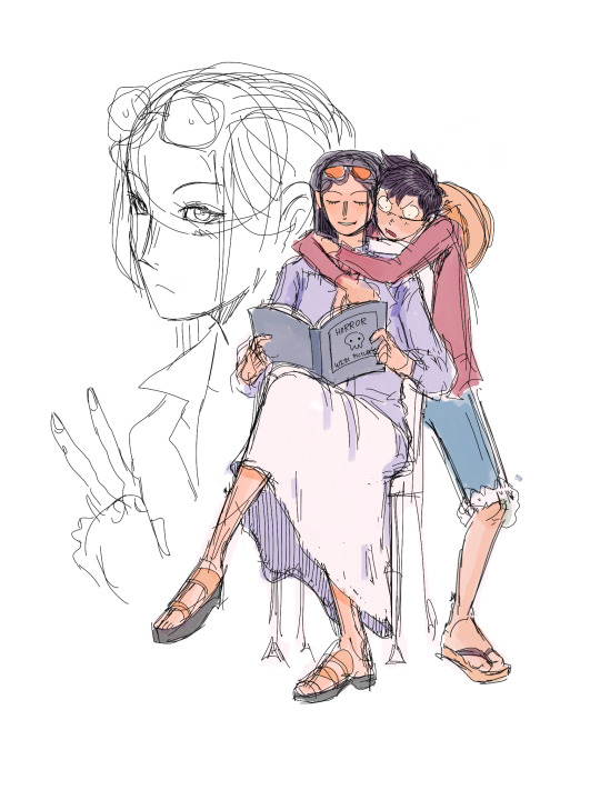
I'd warn against following my process (at least if you want to learn), but I'll be honest and show you, lol. (Heads up: this is just how I do FAN art. When having fun, I generally care less about the fundamentals.)
1. I slap down super rough sketches, jotting lines/expressions like bullet points of my idea. Pretty much stick figures with just enough detail to remember who's who later. Not shown here, I also move, resize, and add details to express the intended composition if I'm planning something larger. You may notice a lot of curved lines / haphazard circles.
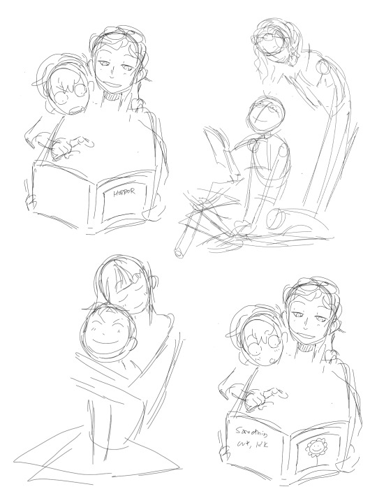
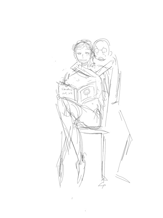
2. I refine the sketch by drawing it with more intention and build structure with slightly blockier shapes. If I'm really struggling with a pose, this is also where I'll find references or look at myself for bits and pieces to fill in the gaps. (When practicing, I would highly recommend using a reference from the start so all your limbs are an appropriate length and you don't need to say things like "that's passable" right before posting. If you're a perfectionist you'll leave that thought with the rough sketch.)
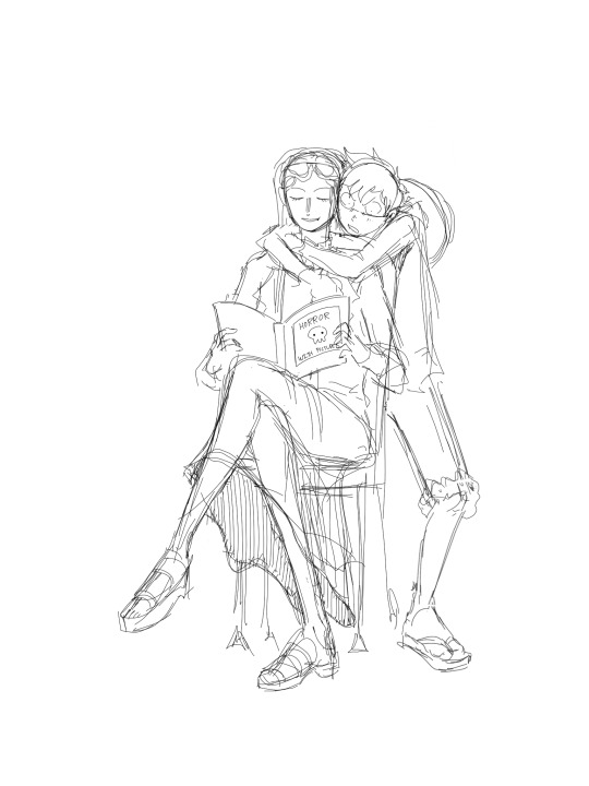
3. I'll decide around here whether or not to leave the sketch as is or commit to lineart (not likely). I guess I'd say I "shape the lines" here by going over some to add thickness/weight, and by adding basic sort-of-shading to break things up a little. Then I'll just fill in space if the page looks empty. (Usually this is where I incorporate the borax, but I hear baking soda works nicely if you're worried.)

4. Onto coloring. I don't feel confident enough to pretend I know what I'm doing here, lol. I just choose my base colors, imagine the general direction of the light source, then add minor gradients to the light and dark layers so they don't look flat. Then I just add some BS highlights and outline them. I've only recently found the motivation to properly practice coloring and just go with the flow tbh.
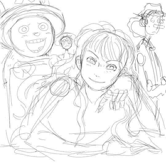
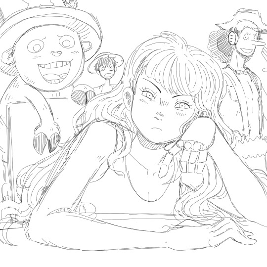
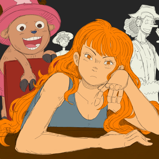

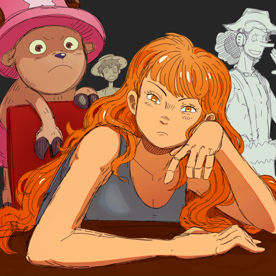
You may notice that Nami's forearm is too long, her hand looks like a pancake and Chopper has no joints! My kind sibling explained to me once that my anatomy is poor, but cohesive enough that nothing stands out too bad, lol. That's why it is important to use references!! And if you're me, practice all parts of anatomy at the same time with full bodies so that even when you're at a loss, your hands aren't that much better than your feet.
All in all, to draw like me, just have a very hedonistic approach to art, ha. Draw what you want, avoid getting burnt out on any single piece (sometimes that happens when you try to perfect drawings one at a time), and follow my personal motto:
Make fun, not masterpieces.
Idk how helpful this was, but there you have it!
487 notes
·
View notes
Note
I just want to say I love how you do your lineart, it looks so good! ahhhhhhhh!!
I'm gathering a lot of advice about the topic of lineart and I just wanna know how you get it to look like that? My line weight is getting better but the drawing itself just comes out a bit.. weird.
Thank you so much! Lineart is probably the thing I've been working hardest on as I am not a lineartist (and still struggle a lot) but it's something I really need to get better at for my job. UM there's honestly so much that could be said on the topic of lineart. Big things for me are:
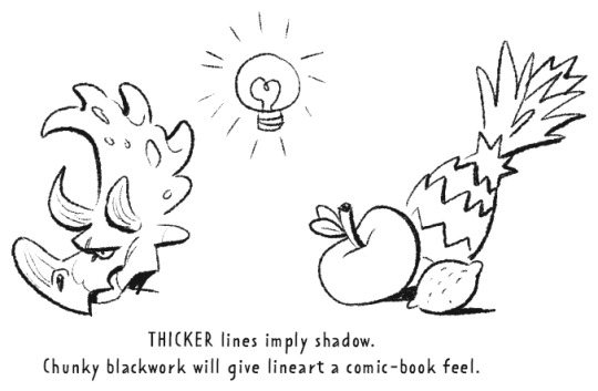
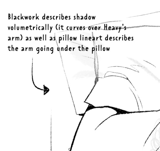
Weight -> Use line weight (aka thickness) to describe form, lighting, contact and scale. Thick lines imply shadow, contact and nearness-to-camera. Thin lines imply tension, recession and light.
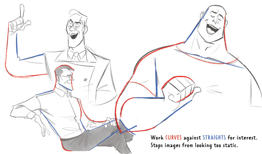
Straights vs Curves -> Use straight lines against curved ones for maximum interest. This is partly a character design thing but as we're using lines to describe our characters it's worth mentioning :)
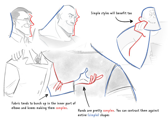
Complex vx Simple -> Use complex lines against simple. Faces are always complex so therefore the backs of heads should always be simple. Chests are quite complex so backs should be simple. Dorsal sides of the arms are complex (Delt, tricep, bicep) whilst the ventral side is more simple (tricep...mainly) etc.
'Think in Ink' -> Lower your sketch layer almost to 0% opacity so you're not getting hung up on how nice/energetic your sketch look and instead are approaching the piece from an ink mindset. BUT it's digital! So if there's something in your sketch that you like just bring it forward (copy and paste) into your ink layer. I sketch and ink with the same brush so I can use this workflow
'Confidence' -> small hesitant feathery lines will look nervous compared to big swooping lines. Less is always more. I'll redraw arms/limbs until I can get the appearance that it was done in one brush stroke. Again it's digital so you can erase to cheat this look : )

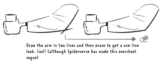
MISC 01: I always hear 'draw from the shoulder'........meh............it's digital so draw from your wrist...it's fine honestly. If we were working at A1 in a life drawing class then we could get some shoulder action going but most of us are hunched over 16inch tablets. I think this advice aims to pull people away from feathery-nervous lineart honestly which you can improve on without relearning how to draw from your shoulder.
MISC 02: For a 'smoother' look do your lineart at a larger canvas size than you need. Once I'm happy with a sketch I usually double the canvas size and do my lineart then.
MISC 03: In PS (at least) anti-aliasing goes funny at any zoom level that isn't in the 5 times table. So try not to look at your canvas when you're zoomed in to 87% or 71.39% or something crazy. Just stick to 25%, 50%, 75% and 100% if possible.
UNFORTUNATE TRUTH: Lineart is incredibly based on raw draughtmanship I've discovered. When you're working with colour you can hide a lot in rendering (shadows, highlights) or post-processing (depth of field) but in lineart all your mistakes are just...there for people to see. There's ways round this...which I use A LOT. 'Flourishes' (I use 'flourishes' to mean over-confident lineart where it veers particuarly thick or particuarly thin in contrast to your approach in the rest of the image) can sort of trick people into thinking you're more confident about an area than you actually are.

As well as leaving 'breathing room' within your lineart instead of actually...resolving the area. I do this the most around the face and hands.
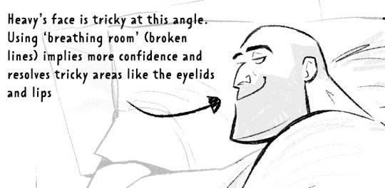
Hopefully some of this helps? Honestly there's a lot of deep dives that could be done into indivudal things and there's also the massive caveat that all of these are 'guidelines' and not strict rules. I also favour a more...concept-arty? animation-y? storyboard-y? look to my lineart which favours flourishes and breathing room for a incomplete/work-in-progress feel which would make methodical colouring (ie: for a comic or something) a pain.
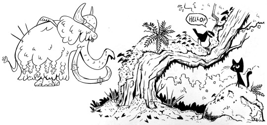
Keep up pratice is the main thing and doing studies of artists who you like that have great lineart - you'll pick up draughtmanship skills along with the lineart studies. Here's some of my lineart from a year or two ago...it varies between very 'standardised' (which makes it difficult to read volumes and to be honest, it's boring) and 'TOO EXCITING' (which...also makes it difficult to read volumes and for the eye to rest).
I'd like to share my brushes at some point as I've found 3 that I really like and use for everything more or less. I discovered that a shocking low amount of people use PS on tumblr (shocking to me I guess as i'm so used to PS being the standard) and everyone seems to use Procreate or Clip Studio Pro...so I want to check that the brushes are Procreate compatible at least before I share!
#sorry if none of this makes sense. im on day TWO of a hangover...kill me now#asks#art tutorial#tutorial
755 notes
·
View notes
Note
Your art is wonderful!!!
A constant inspiration to my own creativity and art work. Could you explain some of your art style to me? I’m interested in looking at a bunch of different ones to try and finally find one for me.
Goodnight!!🌙
Thank you so much! That means the world to me! I’d be happy to share some of my process with you 😄
Keep in mind I’m completely self-taught, so this is just the process of how I make my drawings and not any sort of professional advice 😅 apologies for the long post ahead 😪
Starting with the basics, my biggest influences are Jin Kim and Ami Thompson. Both are amazing character designers and I really admire their stylization and expressions. Whenever I feel stuck on something, I always go back to their drawings for inspiration.
I typically start in Procreate with a canvas size of 3300px x 4200px or 11” x 14” with a DPI of 300.
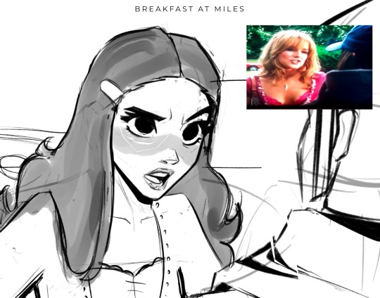
I put my reference in the corner of the canvas (in this case it’s a screenshot from the movie She’s the Man) and I start my rough sketch (emphasis on rough). Sketching is probably the longest part in my drawing process because I’m focusing on expression, composition, proportions, etc. This usually has about two to three passes before I move on.
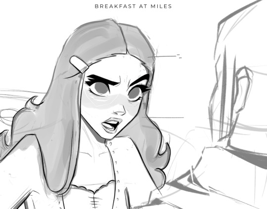
Then I lower the opacity of the sketch and clean it up with some lineart on a new layer. Lineart doesn’t play a huge part in my style, but I still like to play around with line weight. Since I knew this was going to be a fully rendered piece, I didn’t spend much time on lines that I knew were going to be removed later in the process.
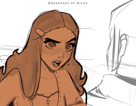
Underneath all of that, I use the skin tone and color the base of the character. I make sure that I color ever so slightly past the lineart, for reasons that will be important later. This part can be tedious, especially because I use a textured brush, so there are a lot of gaps that I fill in later.
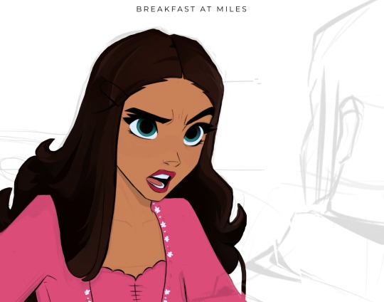
Then using new layers with clipping masks, I start the flat colors. Nothing too crazy here.
I’ve made color palettes for characters and backgrounds that I typically draw, so this way it speeds up the process and maintains style consistency. If I need a color that I don’t normally use, I’ll just play around with the colors until I find something that fits well with everything else.

Next, on a multiply layer, I add some basic shading (with the skin tone color) and blush (with an orange-pink color). I also move onto the background. Some are more complex than others. If I’m going for a more cinematic look, I’ll fill the background in with some basic shapes and blur it slightly. Thankfully the background was pretty simple in this reference.
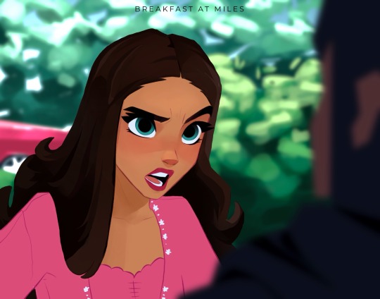
I start checking proportions now that everything has basic colors. Then I duplicate my lineart layer and change it to a pinkish-red and put it on multiply mode and turn down the opacity. This is why the base color layer needs to line up with the lineart, otherwise there’d just be gaps underneath. Instead of erasing my black lineart layer, I put a mask on it and just keep the eyes and eyebrows.

Then I start working on the shading and hair, which is an entire process in itself. Maybe I’ll make a tutorial on that one day 😅
I also use some vivid light and soft light layers and put in some subtle colors for extra pizzazz.

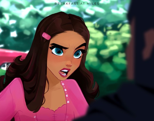
Then I add a hard light layer to the eyes for that glossy look and on a normal layer add some white details just to make some things pop more (like the nose, lips, eyes, sometimes hair, etc.)
I did make an eye tutorial a while back, but my process is still the same!
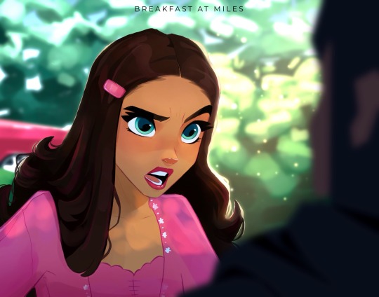
Lastly, I spend a lot of time playing with different blending modes (multiply, add, soft light, vivid light layers) and really focus on the lighting. I used to focus on adding a lot more details and make the coloring more realistic, but I found that the more simplistic coloring was easier for me to do and fit my style better. Sometimes I still tend to go too far with the details and realize that it looks better when I tone it down a bit.
That’s pretty much it! Let me know if you have any questions! Hope this helps. Have fun making art!
#art#digital art#procreate#art process#danny phantom#fanart#danny fenton#my art#paulina sanchez#tutorial
42 notes
·
View notes
Text
yesterday was webcomics day. i am bea and i make "A Ghost Story" - part 4: the art
this part i feel like gets done semi-easy once the rest of the shit is dealt with. yesterday, my knuckles continued to swell and feel like rotten wood so i had to cut it short. this shit happens more frequently than i would prefer. today i need to run to the store and also pick myself up a lil treat (an eighth). for right now tho i have some cbd rich stuff that should help. maybe. while the index finger still hurts, only the middle knuckle is swollen anymore. let's see.
i started with panels 2 and 3 bc they seemed the least immediately labor intensive. ill be copy/pasting the line/flats for panel 3 to edit from there. t...there's going to be a lot of copy/paste this page. its not usually like that. but i usually only copy/paste the lines and flats. i will re-shade things so that they look different
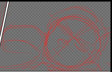
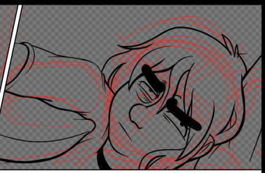
unlike the sketch, the lineart has more "weight" to it. wait thats not how the pillow would deform. hold on.
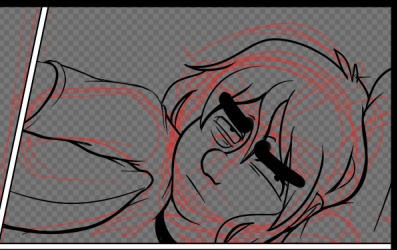
ok that's better. did people even notice that before i changed it. probably not. but it matters to me!!!!! these little things add up and add weight to your world!!!! ive been trying new things with line as as of [looks at watch] last week. so it looks bad right now. like someones vague idea of what good lineart is supposed to look like. practice makes perfect tho....or breeds familiarity or something.
some parts of this look weird. dont worry. we will cover up that shit with speech bubbles. thank you comics for your ways of obfuscating bad art.
flats are easy. select everything that isnt your line art, invert the selection, and dump a base layer. then color that base layer with a mask
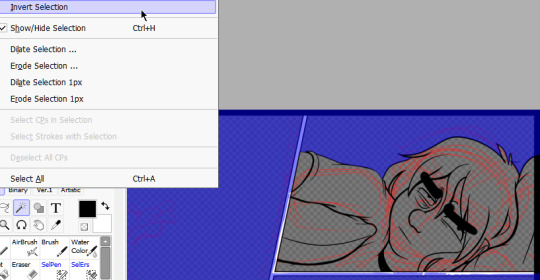
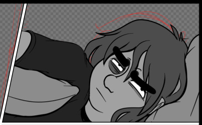
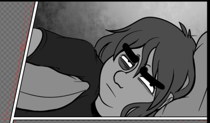
this page will, blessedly, not have any complex backgrounds. i already established the scene previously and can skate on doing my textured backgrounds. the background gradients in the direction the light in the room is being cast, usually.
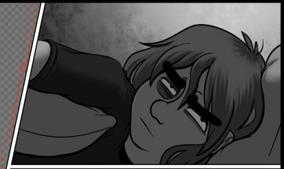
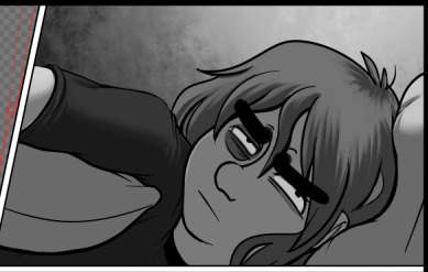
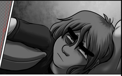
first, a multiply layer at 50%. since she's facing away from the light source, she'll be mostly in shadow. then a white overlay layer at 50%; this is to make the first shadow layer pop and keep from getting too muddy. then a second multiply layer at 50% for the next layer of shadows.
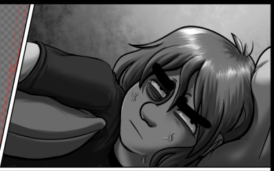
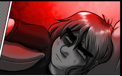
added some sweat beads to make her look more haggard and some shine to her hair, since she's so close to the light. i've started bothering doing this bc it unfortunately looks good. finally i add one more multiply layer at 40% over her eyes to make her look more over this entire thing. and then added the red glow in another overlay layer (100%) where it would land if being cast from above.
completely servicable and theres room for like. a speech bubble later. usually i do text first, but in this case its so secondary to the actions being performed, i want to prioritize one over the other.
looking at it, im not going to be able to copy/paste this after all. she's going to settle in more and her body will rotate too much in the process. i can use this as a base to trace over, though, which will get me started.
but pain is occurring so im going to eat breakfast. what a bitch!
24 notes
·
View notes
Note
um um um I'm back and I decided to analyze your art cause I really admire it :')
Honestly, I've noticed you use the same line width, if not similar line widths throughout the entire piece, which makes the dresses easier to swallow compared to how some artists draw, and I also think it goes perfectly with the overall simplicity of your art! While it is rather simple, it is also rather easy to add details into it to make it much more fun to do and gorgeous to look at.
I also love how you color things, as it is also pretty simple and goes with the line art, but it's also really easy to add details that you can overlook but still add to the drawing! Not even to mention how well the background goes with the outfits, especially in cases like the black hole dress or the white and blue angel dress (which both look amazing and are easily some of my favorite pieces ever)
Anyways once more, your art looks gorgeous and has given me so much inspiration and insight into my own art and how I can better it, as well that keeping things simple can totally help my art a ton!!!
um anyways sorry for the paragraphs but tysm for making the blog, it has cheered me up multiple times before and it probably will do it again countless times <33
This is so freaking cool to read, you absolutely hit the nail on the head with some of these comments :D Hope you don't mind if I add some insight on my part since it's so lovely idk if I could post it without anything to say.
But yeah, my usual choice in brush is literally a default CSP brush with the pen pressure turned off, and it tends to be 6-12px wide? There's nothing particularly special about it other than drawing with a smaller brush size helps me keep my canvas roughly the size I like (since I alter it each drawing), and I'm not a big fan of line weight in general lol. I'm definitely not the kind of person who will swear by a special custom brush or specific settings, I've always been the kind of person who will just make art with whatever the fuck I'm given.
If I can be honest, a lot of the time I just wing it with colours and the background- so you don't see it but there's a lot of me trying to slap a bandaid on a leak I created by not planning ahead. Sometimes things go smoothly, other times it doesn't.. For the record, an artwork will turn out wayyy nicer when you have a complete idea of what it's meant to look like. Do not aim to emulate me 100% I am but a fool in the grand scheme of things.
ANYWAYS, you wanna know something fucked up that might make ppl look at my art differently? This is my process for the latest drawing I did. I took my sketch, I drew it over it digitally and inked it, THEN I overlayed the sketch because I liked how it messed with my colours-


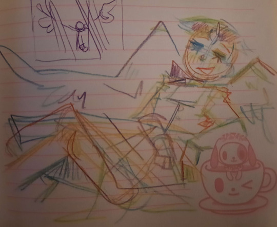
I paint OVER the artwork, realised my sloppy colouring makes the bottom part stand out so I add a shadow trying to adjust for this, decided I needed the artwork to be 100x more vibrant so I upped the contrast a bajillion times..


Then the rest was just shit i painted over:

I didn't even have lineart for the angel dress.. Check out this freak shit:


Have fun guessing what part of my artwork is what now,,,
#asks#ppl dont even know whats happening inside my dark sick and twisted mind.....#and neither do i my process varies a lot#all my art files are FUCKED girlies u dont even kno
9 notes
·
View notes
Text

I’ve moved on to drawing characters’ parents now, because I just want to keep drawing character and shirking what I actually need to do
Okay that’s partially a lie, I am writing a PowerPoint thing with my notes (though so far it hasn’t gone much farther than appearances), but still, I guess I’m doing this now
Oh and also, I switched over to my normal marker pen because the thing I was using for the lineart, my normal sketching pen, gives me no real line weight, and it was bothering me so much. Though I might still switch again, likely over to the syrup pen, at least to try it out
So anyways, first up we have Norma, and now (tentatively) Juliet, Marcus and Julian’s parents
I had already designed their grandpa, might as well draw the parents too
So I don’t really know what Norma and Julius’ original roles were, they probably didn’t have any, but they were around, and Norma was outgoing while Julius more reserved and probably smart. Then I considered having them be dead, which I still might do, but I also don’t know
I am thinking though that the two are archaeologists or something, and that if they’re alive, they’re just out traveling for work, and someone else watches their kids (if Marcus and Julian aren’t adults I guess). In retrospect I’m realizing I could have had Anya be that, but oh well
So I’ve mentioned that Marcus and Julian are supposed to have half markings, half white fur, so basically here Norma has the white fur, while Juliet has the markings, like her dad
I also decided that Norma has some extra hair color at the end, mostly just to give her a bit more spice
One thing you may have also noticed is that originally, Juliet was named Julius, and that yesterday I said Jules had a son that was Marcus and Julian’s dad. Well today while drawing her and giving her long hair, I decided “you know what, screw it, Julius is a woman now”, and so now she is
And also by which I mean, I didn’t just flip her gender, she’s transfem. She eventually realized she was a woman and is much happier living as one with her wife. Not sure if she transitioned before or after their kids, but they’re probably chill with it
Admittedly I’m still working out what her new name would be, and I just slapped on Juliet so that I have a name. I was asking my Cookie Run Discord server for help, since I didn’t know who else to ask, but I didn’t really like the suggestions, so Juliet’s her tentative name right now
But I don’t really like Juliet much either, it really does sound to me like a poorly thought out genderbend name, like Sonic to Sonia or Sonica, you get what I mean. Slap a bow on and they’re now a woman
See the problem is, when I originally named the parents, it was sort of supposed to be like they mashed together their names in some way to make their kids’ names. Marcus and Julian coming (somewhere) from Norma and Julius. Not only that, but as I’ve now decided, the lavender hair side of the family has a naming convention of Jul-, so I wanted to stick with that, hence Juliet. So Juliet here has to somehow fit in with those rules. Honestly I’m thinking of changing Norma’s name alongside Juliet’s, to see if I can think of something better for both
Wait crap, I’ve gotten sidetracked. I still have some more to say about Juliet here, but just know that I don’t really like her name and it will likely change, along with Norma, and let’s move on
One thing I have thought about when it comes to Juliet is that she personally has issues with her own father, Jules. He was distant due to the Striker project and they never really saw eye to eye (Jules did care about her, he just didn’t say it out loud to her). It’s part of the reason she works in archaeology, because in her eyes it’s the antithesis to science, which is looking into the future, while she looks into the past
It’s not really that important, but her feelings and resentment towards her father would probably have some role in the Striker story, especially since Striker’s confusing Julian for Jules
Anyways, on to the last person, Anya
Straight up, she’s just here because I needed a third person to put here, and she’s supposed to be Nina’s mom, so
She was originally dead, but I’ve now decided she’s not, I have too many dead parents, she and Erik are just divorced for reasons. Maybe Erik later realized he was gay or something. Nina lives with Erik most of the time due to wanting to be a doctor like him, but she visits her mom on the holidays. I don’t know
I feel like she and Norma ended up looking similar due to the white fur, but they have white fur for different reasons. Norma has it for her sons’ marking weirdness, and Anya has it because Nina has white fur and I was trying to show that it came from her mom’s side instead of the albino weirdness it originally was (because I didn’t understand albinism at the time). Unfortunately I decided to put them on the same page, so their similarities are incredibly obvious
As I stated earlier, maybe I could make Norma and Anya related, like I don’t know, they’re sisters and Anya looks after Norma’s kids while she’s out. Though that means that Anya and Erik are probably living in the same town. I mean, I guess that can happen with divorced couples, I’m not really familiar with how they work, but to me it feels like they should be living in separate towns or something, I don’t know
Also it again brings the problem of “character who already has cousins on one side now has cousins on another”, just now with Nina instead of the other three. I guess cousins are somewhat common (I wouldn’t know, I don’t have any, at least not first cousins), but I feel like I’m using it too much. Granted, right now it really is only Nina, Mercury, Venus and Saturn that have it, so maybe not
I don’t know, forget about Anya. She’s not important and I didn’t really think about her when making her, I literally just needed a third person because I had made Norma and Juliet
And so yeah, I guess that’s it for today’s characters. Not that great, I need to think more on these characters before I draw them. I think I’ve got too much energy now and I don’t spend enough time thinking on things first, just drawing like crazy
#I’m realizing that Juliet’s design probably could still work as a guy#but screw it I like her being trans#also another note I have decided that gender does not matter to Ralians when it comes to having kids#probably another egg situation#but they probably just come out of the ground or something instead of coming out of them#it makes sense with the world trust me#anyways#original story#original characters#ralia#my art
1 note
·
View note
Note
Hey, I was wondering if you had any tips for getting neater/smoother line art? It's the biggest thing I don't like about my attempts to do digital art.
Tbh I‘m probably the last person to be asked this, and these are all just semi-educated guesses with no guarantee given, but
generally it seems to help when you try to make big, sweeping lines by moving your entire elbow our even shoulder, instead of only doing wrist motions, because that‘s less range and also leads to making a bunch of small overlapping lines that tend to loot a bit messy (chicken scratching). Though it does take a while to get used to/changing the habit.
Warming up a bit might also help in getting better lines, like just making bunch of big strokes for a while? Maybe even as practice?
If you’re normally using the dip pen brush (or a similar one), you could try switching it out for one that stays consistent in shape? As much as I love how dynamic it can be, the shape does not lend itself very well to neatness, so perhaps this could help? (And then if you wanna add line weight go back in manually)
Also colour your sketch in a light color before setting it’s opacity down and drawing over it on a new layer, the contrast helps distinguish the sketch lines from the lineart ones so your brain can’t mush them together and it looks less off when taking the sketch away (<- that’s also why sketches sometimes seem "better“ than lineart, because with the messiness your brain can just round all the different lines into something that seems logical, while with lineart you’re fixed on one way)
Maybe also multiple sketches perhaps, that become clearer with each step? Like, first sketch is SUPER messy, then you put one on top of it that’s still loose but already a bit lineart-y, kinda going step-by-step, cleaning/focusing those lines with each one. That way the jump from sketch to lineart isn’t that jarring either, which fits with the color sketch thing above.
And perhaps play around with the smooth-line-aid feature (I‘m using ibisPaint and toggled it all the way up to 10, but other programs might be less subtle in the changes. Or maybe try turning it off to see if that feels more natural!)
Or you could go a completely different route! Sketchbook is for free and seems to emulate the feel of drawing traditionally pretty close, or at least way better than most programs (except maybe procreate but don’t have it so can’t judge) so that might be nice instead to work closer to how you’re using to!
But again I have. No idea if these tips are actually any good or even counter-productive, so you might wanna just look at works for you (or ask someone whose art you like and normally has very clean lines, if their box is open. Maybe they’ll wanna help! :D)
0 notes
Note
sorry if this has been asked before, but i wanted to ask about your lineart! the weight and line economy are just so nice, i get stars in my eyes looking at your lineart and doodles. could i ask what your approach to lineart is and what tips you might offer?

Wow I love these questions - Line is so interesting!!! It's a really big topic so I feel like any tips I give will be just barely scratching the surface. It's like deceptively simple...any given line drawing is essentially taking all the information we glean from seeing something irl ie light, shadow, dimension, texture, perspective, etc and boiling it down to the simplest possible visual information.
I think most commonly my line is informed by light source so like. thicker more continuous lines face away from the light and thinner more broken lines towards. and a lot of my spot blacks r simply cast shadows.

here's a more extreme example

BUT like everything to do with art there's no hard and fast rules. I use blacks when I think it'll be effective or interesting and I leave them out when I don't need em. umm couple things I find myself doing a lot... using spot blacks to make the separation between characters clearer. I like casting shadow in between characters so its easy to separate and read their silhouettes even when they're mashed together.

u can go even further to purposely create a silhouette like

to draw attention to a finger or tongue LOL. There's some comic book artists who are absolute masters at this type of stylization. Alex toth and his spiritual successor Chris samnee come to mind for me right away.
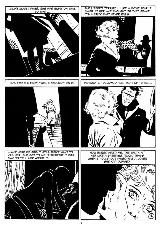
(toth)
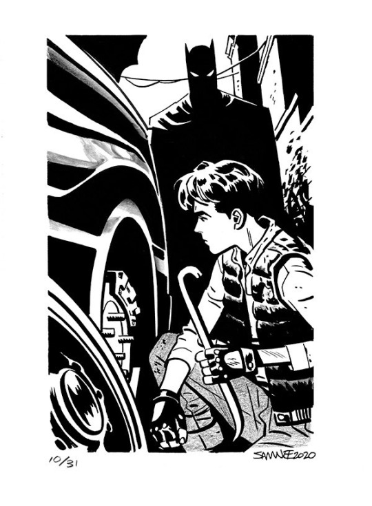
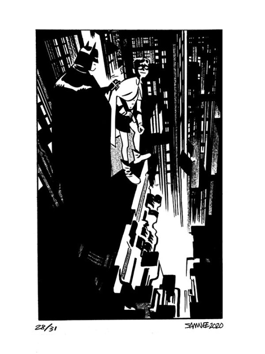
(samnee)
I feel like I'm also often using line weight to separate planes receding in space

im naturally a really heavy handed and scribbly drawer(...?) draftsman. and im nearsighted so when i see things i percieve and break it down into big shapes over thin contours. so stuff like spot blacks and shadows came easy to me, the tricky part was making the rest of the lines lighter when they needed to be so the blacks could actually have impact LOLL. a lot of effective visual communication is about balancing contrasts. like I had to really train myself to press less hard on the pen. I think this is actually really evident if u go back in my archive to older sketches LOL
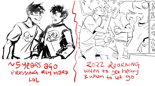


I actually feel like a lot of how I trained my hand to tackle line weights was thru stuff like hand lettering where you rly have to focus on being sensitive to that kind of thing.. contrasting strokes etc.

also exercises like figure drawing will have you flexing those muscles constantly

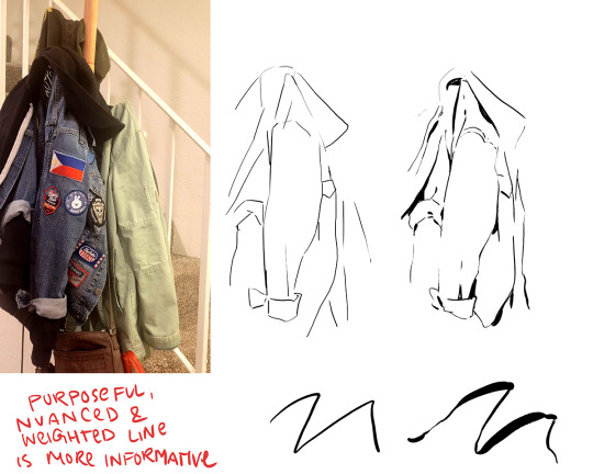
I'm starting to just regurgitate lessons from freshman year of art school so I'll stop here with the demos but yeah...I hope this was helpful!? I love line!!! I want to get even better at line work so I can feel confident posting work that's only line no color or value... I'll leave you with a bunch of artists who I think have particularly expressive and beautiful linework (not including toth and samnee who I already mentioned and who's work I love so much). You can probably learn much more from them than you can from me...!

Charles dana gibson LOL

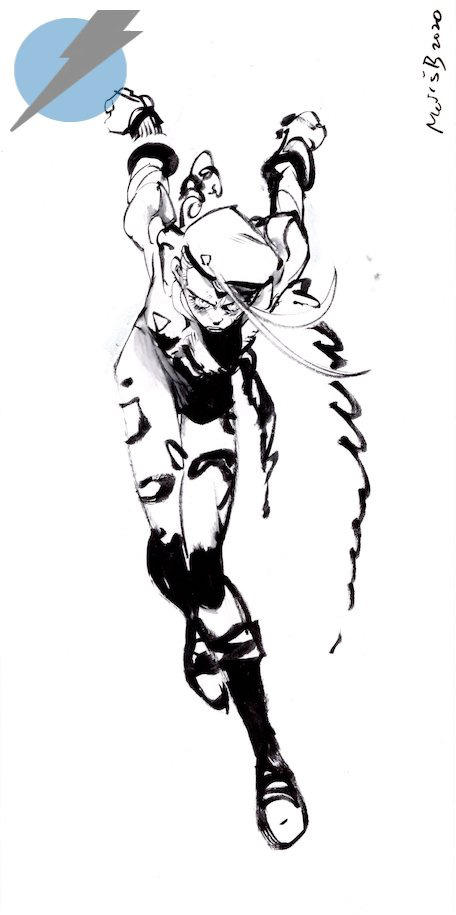

Matias bergara
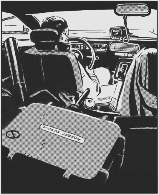
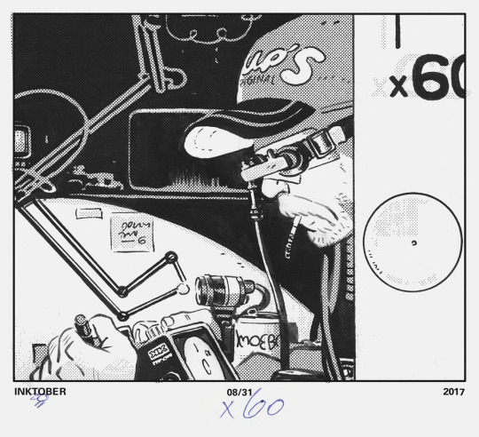
tonci zonjic

naoki urasawa

Daniel warren johnson

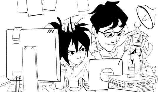


shiyoon kim

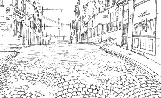
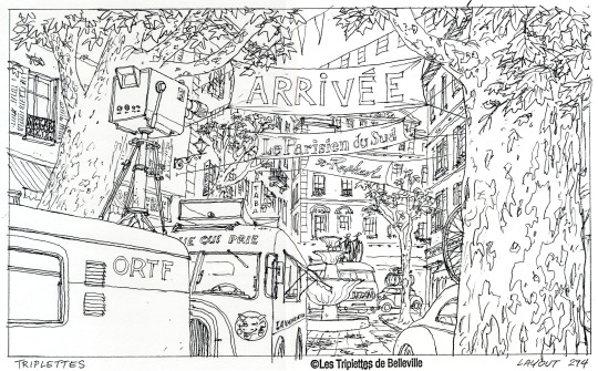
michel breton
also yoji shinkawa, tomer hanuka, leo romero, I feel like I'm gonna post this and think of so many more. there's so many good artists...!
1K notes
·
View notes
Photo
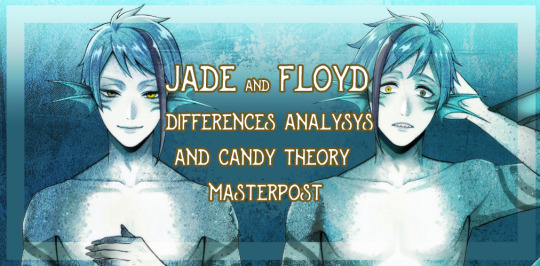
since my only real contribution to this fandom has been thedifferences analysis i did with my friends i think it’s time to separate it from the AU post and make it into a real masterpost, this is gonna be pretty long so be ready for it Disclaimer: models and art are fluctuating so i’m going to highlight only the recurrent stuff and the related evidence for the candy theory, so i’m not claiming this to be the indiscutible canon so take this evidence as you polease, just know it’s there but going forward....it’s time to begin with a few copy and paste from the previous posts with a few corrections along the way What is the candy theory? the Candy theory generates by the names of their alchemy lesson candies, according to it, they highlight their strenghts/charm points so Tail Fin Candy for floyd meaning legs and height and Dorsal Fin Candy for jade focusing more on his torso/back i’ve seen many people comapring sprites to prove this theory on twitter so it’s time to show some examples, i tried to recreate them as best as i could (consider as i said art tend to be a lil less reliable than spites as it heavily depends on the lineart artist who’s assigned to the job)

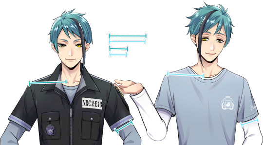

this repeats in pretty much all the versions aside the mermaid sprites that are copy/pasted BUT on that someone call in the octavinelle trailer to support the theory

some also link that to floyd possibly being a late bloomer as we clearly see baby floyd was indeed shorter than baby jade in middle school even without the aid of guiding lines
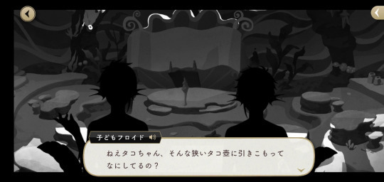
both the tweels are of course still growing, since despite being GIANTS they are afterall still 17 but we heard a detail from floyd unique from what we know about jade, In floyd’s starsending episode translated by Ekala he states that

to adjust the mold of custom made shoes he has probably gotten considerably taller within the year
According to some this means that floyd’s uniforms aren’t short on purpose but are simply his first year ones and hedidn’t change them...but in that case jade wouldn’t have grown much in height... according to these theories then floyd “just started” getting his growth spurt while jade is pretty much settling his height and frame, but considering his apetite i wouldn’t be surprised to see himweighting more than floyd if we wver get an official weight for the boys(as we do know trey weights less than rook etc) but we are swimming too much in headcanon waters let’s proceed with the analysis in the previous posts these were the differences that emerged some of them are based on artwork so i’d take them with a lil caution especially on the topic of the hands that proved to be especially unreliable (floyd even got them changed in one of his sprites cause they looked too soft , sometimes jade has softer hands too) shoulders seem to be fluctuating as well

starting with some artwork analysis in the magic archives we get a view of the eels from the back, and floyd was the only one with sketch underline, this was the result considering jade and azul wearing clothes properly (and even pretty tight in jade’s case as we saw before)

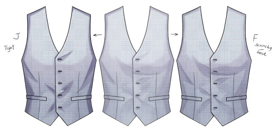
further update to support the theory comes from the Union Birthday model atlases starting with the difference in rendering of their vests that being the same shape have some pretty distinct rendering on the contrary of the usual ( mermaid copy/paste-very similar halloween) as in jade we even find back the return of the button crying for help
another element is the belt as all the models come with a separate belt but i decided to merge it with their hips to give better context as there’s no variation in the legs and as usual floyd’s are slightly thicker but something we never analized surfaces here , and i think there’s not even need to explain this

some relate this to their first bday art too even if their model don’t show significant difference
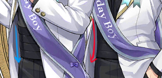


also in mer-form when having the same position you can see another visible difference between jade and floyd

in the masterchef ones we see pretty much we see a similar thing to the birthday boy vests even if shoulders and waist are pretty much the same they still keep a small but consistent difference
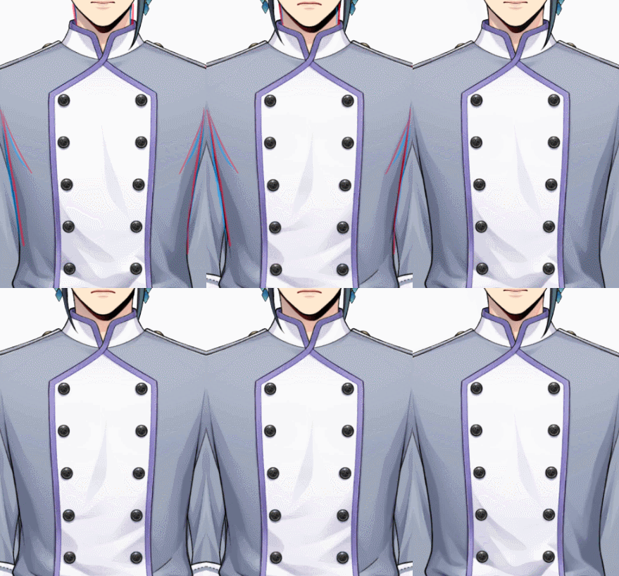
before jumping to the “it’s just the clothes” bandwagon i remind you that once again jade wears skin tight clothing and floyd loose/oversized stuff

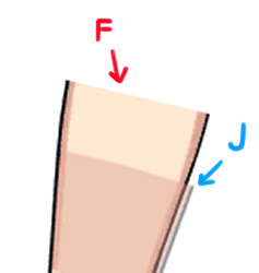
this pic actually leads us to the latest difference found aka the forearms always from the masterchef models
i hope to update this masterpost next month with their proper leg difference with floyd’s basketball club wear coming out to compare with jade’s vargas camp leggies so yes apparently jade’s the titty twin and floyd the ass one, and you may wonder wasn’t jade the ass one? i am afraid to break it to you but his beansday backside is fake af and all thanks to the harness

in conclusion these are the predominant differences it’s also left to dind the difference that rwas mentioned to riddle about the fact that ears are also different but the art is inconsistent on that matter and we didn’t come to a proper solution and it might be something only perceived by the characters
352 notes
·
View notes
Note
Yo! It’s been a while, how have you been??
I was just wondering if you had any art tips and tricks? I’m looking to improve my digital art so I figured I’d ask (no pressure to answer of course)
aaa @edgynoise!! so good to hear from you again! I hope you've been doing well <3
and oh wow, of course! I'm not sure what kind of advice to offer but I'm happy to throw some things out here that might be helpful.
that said; here's some stuff that's personally worked for me
- spend a little time loosening up
this one helps me out a lot. if i go straight into a drawing from the start it's going to turn out stiff as hell for me every time so to combat this I usually spend about 5-10 doodling before getting into the actual meat of any kind of meaningful drawing. really helps wake up the hand meat muscles.
- get your thoughts down first and then tighten them up
i don't know if this would be applicable for everybody but generally I feel it's important to get whole of something down (no matter how busted it looks) before going in to correct certain things or agonize over anatomy. for me, the energy of a piece is it's foundation and that life is what everything else gets built around & up from. I find it much better to draw it messy & broken in the beginning rather than squeek through the whole thing erasing, redrawing & erasing on the same piece.. I feel a piece can just lose too much of it's energy that way. once i have the bare sketch worked out, I just set the sketch to a low opacity & redraw the lines for real-real on another layer over it.

- listen to music!
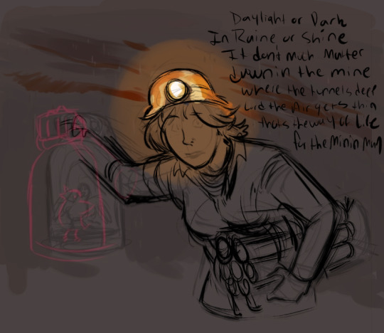
not always for everyone but i find picking music that matches the mood of what i'm working on generally helps me channel the vibe of something. for the mining piece above i listened to a lot of the old coal mining songs this was inspired by. i feel like it really helped me hit what i was going for.
- feel it out
so this may just be a me thing but when i do pieces i generally try to bring a lot of feeling and acting into them with me. if the character is concerned, i make myself feel that emotion while drawing them. If their face is sad or upset or fearful I make those same facial expressions myself in order to channel it into them. and if there's body language involved i'll sometimes even go the extra mile & act things out with my hands, depending. i don't know what it is about this but i find that it can really bring a lot of life to a piece. also just being aware of those facial muscles and how they feel in certain situations can make emphasizing & drawing them easier in general.
- try to vary your lineweight
this one really depends on what style you're going for but I find that, for myself, varying the line weight really helps add a lot of life to things. my lines in tend to run a little thicker overall but the general rule of thumb is broader / thicker lines where there's gravity, weight or in places where you want to emphasize the energy of something. (ex. bottoms of feet, arms, thighs, clothing, jawlines etc.) and then lighter/thinner lines for more detailed / finer areas like say the eyes, facial features, details in fingers etc.

not the best example but hopefully it more or less gets across what I'm stabbing at haha
as for digital / art program tips I'm not sure what I can offer that may be helpful but here's what I got!
- keep everything on different layers. this is a big one. 100% will keep you from wanting to rip all your hair out & setting it on fire. i'm not sure how familiar you are with layers yet but generally I set them up so that the lineart is on the top layer, the flat colors are on the bottom layer & the shading on the character is inbetween.
- when shading, try to avoid using straight black
unless there's a solid reason to shade with black (like say doing a strictly pen & ink piece) I generally try to avoid it. if you need dark colors for shading I find it's always way better to shade with a really deep red/purple or blue instead. even just that hint of color will make the overall colors in a piece far less dull & muddy.
- take advantage of the hue/saturation feature to adjust colors
this one's a huge time saver for me. basically if I have my characters shaded & i'm not really digging the colors or think they're popping off right I will select the layer or color & then use the hue/saturation function to adjust the areas i don't like accordingly until i hit on something that looks more harmonious. This is especially helpful if you're trying to find the right colors you want for something but just aren't sure what's going to look good. it's also super useful on things like your shading layer or if you're working with warm or cool light sources.
- deepen shadows / brighten up light sources
When a piece is near finished for me one of the small after effects I like to add is a light airbrushing in both the lightest & darkest areas. This helps add more contrast and if it's placed over top the linework layer it can sometime help to create ambient mood, depending on what you're going for of course. Anyway, for me this usually means creating a new shadow layer, deepening them up with a hit of darker airbrushing and then setting that layer to multiply & adjusting the opacity according to what looks good. For the light sources it's pretty much the same deal except the layer will be set to 'overlay' or' vivid light' whichever usually looks right to me.
- tie it together with local color
so this is a favorite trick of mine that i enjoy using from time to time & one i find can really help with pulling the colors in a piece together to make it look nice.
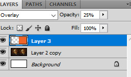
basically if a piece is finished & I just want to make it look more cohesive & tied together i will start by filling an entire layer with a local color (for example if the piece is warm i will make a layer of just straight orange), then i will move that layer to the top of all other layers where it can be king and then proceed to set the entire thing to overlay & lower the opacity to something between 8-25%. how much you lower the opacity depends on what you feel looks good of course but overall i find it can be a useful trick for quickly warming up or cooling down the tones in a piece. Overall it’s just handy for making an illustration look a bit more cohesive color-wise.
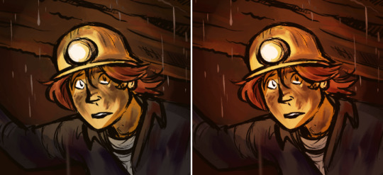
this examples a little on the extreme side but hopefully it can kind've show what i mean in the way of unifying the colors.
- study life
so this sort've falls under generic art advice but you can never go wrong studying from life. And I don't just recommend this in a 'it will get you good at drawing the human body' kind of way. What it will do is get you good at drawing people. Just observing the mannerisms people have, the way they gesture when they feel things, the way certain body types carry their weight, the body language that accompanies both stronger & lesser emotions, how people posture themselves to reflect (or reveal!) what's going on inside. When you really sit down & take the time to study & observe people you'll find that there's so much to take away from it. Everything from the way a person carries themselves to how they move their body can say so much about a person (whether they intend it to or not) and I've found that if you want to pull something really convincing out of a character then body language is where it's at. It's equally as important as facial expressions honestly & a good tip (if you're just looking to get better at body language only) is to draw the face last & force yourself to communicate emotions with the hands, body & posture instead.
- andrew loomis
so fun story back when i was studying art in college - one day my media teacher walked in & straight up told the class that if any of us had to drop out tomorrow we could basically just study creative illustration by andrew loomis & it would be the damn near equivalent of what we were all paying to be taught. To this day I've never forgotten that. And to this day it absolutely holds up. Really can't recommend this guy enough if you're looking to understand the fundamentals of illustration! And what luck! all of his books are free! :)
Fun With a Pencil (Beginner) https://www.alexhays.com/loomis/Andrew%20Loomis%20-%20Fun%20WIth%20a%20Pencil.pdf
Figure Drawing for All It's Worth (Intermediate) https://illustrationage.files.wordpress.com/2013/04/andrew-loomis-figure-drawing-for-all-its-worth.pdf
Creative Illustration (Intermediate-Advanced) https://illustrationage.files.wordpress.com/2013/04/andrew-loomis-creative-illustration.pdf
Drawing the Head & Hands (Intermediate) https://www.alexhays.com/loomis/Andrew%20Loomis%20-%20Drawing%20the%20Head%20and%20Hands.pdf
study other artists!
one of my favorite things to do! if you like what someone makes - study them. I do this near constantly with a lot of different people for a lot of different things. Everything from the way one artist colors, to the way one artists handles lighting, to the way another artist draws hands - if there's something i see that I like in a persons art or their style - I study it. Even if it's outside of my current comfort range (or skill level) I find there's always something to gain by either attempting to emulate it myself or just breaking it down & figuring out what makes it look the way that it does. One thing I find that's really helpful is breaking apart .psd files whenever an artist will offer them. just looking at the way other people handle their layers or add effects to things can really help broaden my perspective & way of doing things.
That said; if it would be helpful you're more than welcome to check out my own .psd file here if you feel it would help you out any!
https://www.dropbox.com/s/yigbm7b9b8eyb0g/run%20with%20us%20-%20full.psd?dl=0
At the moment it's one of the more put together ones I have so hopefully it can offer a better visual insight to some of the things I do. Again, if it's something that you think would help.
Anyway, I guess that's about it. Also wow this was a lot longer than I thought it would be so my bad if I got way too rambly or anything haha. Super excited for your future art endeavors here & think it's really awesome that you're exploring more! I'm so happy & excited for you <3 Feel free to hit me up if there's anything else I can help you out with.
#i hope this helps!#tysm for the ask#it really means a lot#srsly i'm flattered as hell that anyone would come to me for advice on this#i still have so much learning to do myself#hopefully this wasn't too long winded#ask#edgynoise
15 notes
·
View notes
Text
Tutorial/Step-by-step/Tips 4
I will this time mainly talk about how to create coherent Characters Design, break down my thoughts process and give additional general tips
Since it's Concept Art, I won't do a "clean" lineart (I will mainly use my usual comfort textured brush and won't go further than a clean 2nd Sketch) nor add any shadings/effects (to not alter the color palettes)
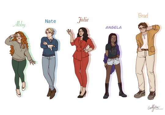
Those characters are my friend pages_of_altaire's OCs, Vlad Masters's employees
I’m not a professional and nothing is “rule”, just an art nerd sharing what they learn in their free time
Long post !
xxx
Step 0: Collect Information
It’s tempting to straightly jump into the drawing but I really don’t recommend it
I usually make a tab with a part including basic information like : Name, Hair color & type, Eyes color, Skin color, Height, Body type And a part with : Cloths, Particular Accessories, Personality
If your characters are good with themselves and not hiding personality traits nor secrets, their personality and what they do in life/where do they live should be reflect in their clothing (however it’s interesting to make contrast if you want to create surprise, like a ruthless evil character with childish traits, or a very kind and sweet muscular tall man)
Pages_of_altaire made me a tab with all the information + mood boards 👌💚
Tip: We artists are often confront to same-face syndrome, but I will add that same body type syndrome is also very common while less talked about (even in the professional world like comics, or mangas) I highly recommend you to try going outside the “perfect standard body type” we usually start our drawing journey with if you want to vary your characters and give more depth to your world & stories (manly to feminine, thick to thin, tall to short, muscular to frail, old to young...) Tip: Like changing eyes types, varying hair is also very interesting to give your characters more personality (long, short, straight, waivy, curly, coily, braided, tied, messy, clean) Tip: Including a little personalized accessories and details really make a character stand up and more “unique” (a ring, a watch, glasses, jewelries, freckles, make up, a printed t-shirt...) Tip: If you don’t have any ideas, searching clothes and fashions references on Google or Pinterest could help
.
Step 1: First sketch
This is just a really rough sketch to choose the eyes types and what poses would reflect each characters’ personality best
Eyes and face are the reflect of the character soul, it’s what we tend to look first and focus on (it’s biologic) so obviously we will have to be careful about the face
If the eyes are the soul, the hands are the spirit Don’t neglect how important hands are in a pose, are they showed ? hided ? crossed ? opened ?... A good pose includes good hands poses
Ask yourself, is your character cheerful ? grumpy ? confident ? cool ? shy ?...
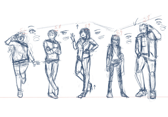
Tip: The spin also shows how confident a character is, they could rise up or bend Tip: To make an interesting character sheets composition don’t sort the characters by height smaller to taller, try to vary and make height “waves”
.
Step 2: Second sketch
I’m usually don’t bother doing a second sketch, unless I really want to have a clean final result But the cleaner your sketch is, the cleaner your final lineart will be
Since I’m still not totally comfortable with my anatomy (still working on my memories library) to make clean final product I generally use 3d models with the free app Easy Pose and adjust my sketch to give them the height & body type I want (changing the hips, busts, shoulders, muscles etc...), correcting the pose if necessary
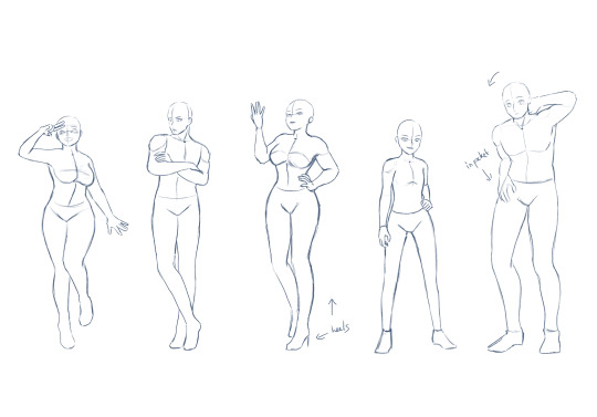
There is nothing wrong with tracing a pose as long as you trace responsibly, it’s really common in industries (like Disney or Ufotable) to use 3d models to speed up the work and make artists’ lives easier Good tutorial and explanations by @pesky-poltergeist under @the-stove-is-on-fire‘s art tutorial => https://pesky-poltergeist.tumblr.com/post/646558144390119425/wing-drawing-hack-trace-a-photo-no-seriously
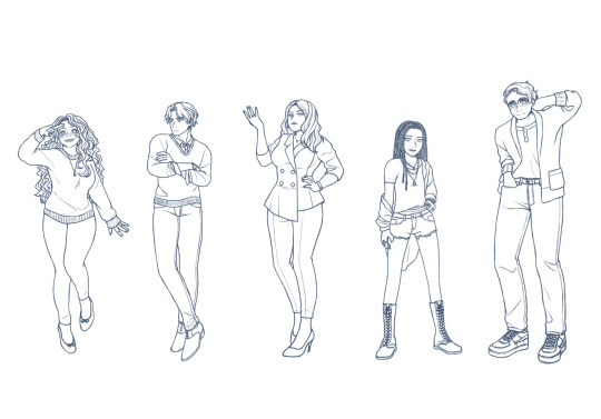
Tip: Use a dark blue instead of pure black to draw to rest your eyes, you will focus better this way and could still change the line color after :) Tip: To make a lively lineart, vary the line weight; thick for separate shapes & intersections, and thin for details & textures Tip: We tend to draw the eyes first, but try to draw the eyes at the very end of your sketch/lineart As said above, us human are social creatures, we are biologically programmed to search eyes and faces, by drawing the eyes first we tend to unconsciously search the eyes of our characters and then are distracted from the whole picture
.
Step 3: Silhouettes
The silhouette help to understand how strong a character design is, iconic characters like Sonic or Cloud have very distinguished figures A silhouette also help to see how confident a character is If the silhouette is still clear the pose is strong and the character confident, on the contrary if the silhouette is more blurry the character is more shy
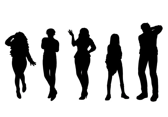
.
Step 4 : Values + Textures (useful for greyscale comics like mangas)
The most important in a drawing is values (brightness), before saturation and color/hue (if you don't know value/saturation/hue, I recommend you to search some tutorials about the color theory on Youtube) I always start with choosing my values before adding any saturation or colors
Values could drastically change the mood of a piece (calm, drama, tension etc...) and for character design, artists use a full range for clarity; from high key to low key
There my example with bad values, as you could see cloths, hair and skin blend together and make the visual difficult to read
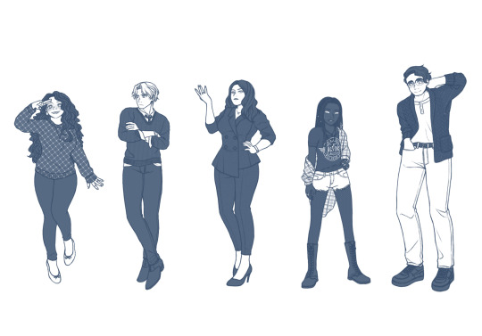
My final values, with define separations between the different parts
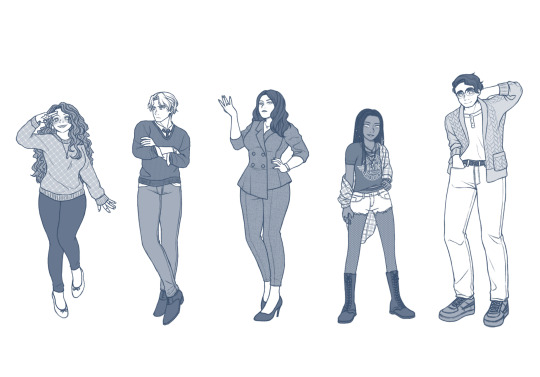
Tip: When you are drawing a group, try to vary where the darker and lighter values are between each characters to make an interesting and harmonious blend Tip: Adding textures/patterns give more life to a flat 2D drawing, especially for clothes or backgrounds; you could hand draw it or use premade brushes
.
Step 5: Values / Hue / Saturation (Finished Concept Arts)
The value “rule” for clarity is still there for a colored drawing, you will just have a bit more values to consider
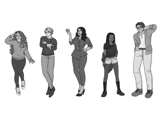
Since I was working on a group, to not clash characters I decided to give each of them a different main color based on their personality
Abby - Green : Youth, Energy, Freshness (bonus: green go well with redheads) Nate - Blue : Serenity, Stability, Wisdom, Reliability Jolie - Red : Passion, Danger, Importance Angel - Purple : Independence, Nobility, Bravery Brad Yellow : Joy, Optimist, Enlightenment
While adjusting my hues I adjust at the same time the saturation to make something harmonious to the eyes, I usually choose to saturate one/two piece(s) of clothes or accessories by character to make it pop, usually the main cloth or the hair

To finish I just blur the line a bit, a bit of blushes, eyes lights and a paper texture on the whole piece Tada it’s done !!
Bonus: Step-By-Step gifs
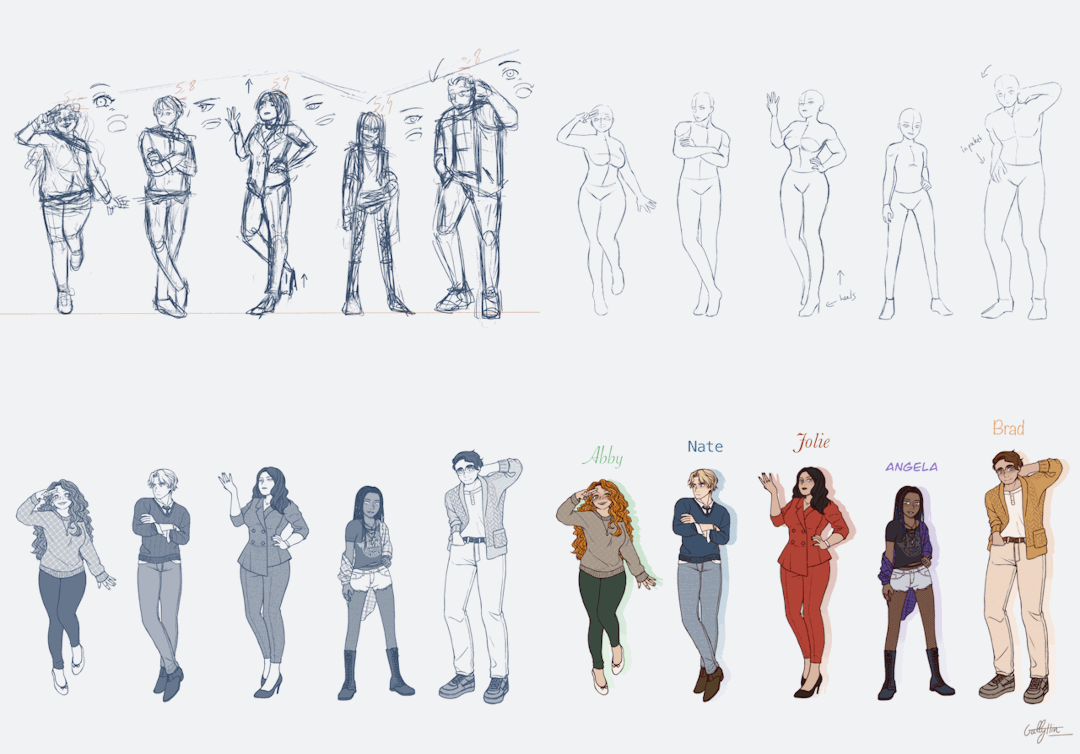
Thank you pages_of_altaire for the character design exercise opportunity
I haven’t draw braids nor curly hair for a while now and it’s good to challenge ourselves a bit sometimes It’s help me go back on art after some rough weeks, and force me to go outside my comfort zone and comfort characters (aka Danny & Dani)
If you have any questions don’t be scared to ask me, I’m not a professional but I like to nerd about art ^^ 💚
24 notes
·
View notes
Note
What's your top 10 drawing tips?
Ohhh!!! Yes okay!!! This is gonna be long. Be prepared lol also keep in mind I'm a traditional artist so these may not work for digital artists!
1. Draw as often as you can. Don't over do it though because you'll burn yourself out and then it'll have the opposite effect and you'll not want to draw anymore. But the only way to get better is to put the time in which is hard because most of us want to be good immediately but it doesn't work that way! And trust me if you put the time in you'll one day look at your work and just go WHOA I IMPROVED HOLY SHIT like it'll slap you in the face and it will make you feel so good about the hard work you put in. Basically my first tip is is keep trying, take breaks, be persistent but don't over do it. never quit art though please! always make art. The world needs it!
2. Use reference pictures!!! Don't be afraid of reference pictures! All artists need reference pictures!! Even the most talented artists need reference and its actually pretty fundamental to learning how to draw. That's why art classes make you draw bowls of fruit! To teach you to draw from life! So find stock photos, take pics of friends and yourself and of objects, google image search and USE DAT REFERENCE!!
3. Try limiting your color pallet. Use a color pallet generator and make an artwork only using like 3, 4, or 5 colors. Limiting your color pallet helps you learn to think about the placement of colors and how to choose the right colors for an artwork. It helps you avoid the mistake that lots of people make where you use too many colors and your art looks like a tacky rainbow mismatchy mess!
4. Try doing ballpoint pen art!! Drawing without an eraser forces you to slow down. It forces you to think about the placement of each line so when you go back to pencil you feel much much much more confident and honestly it helps me sketch in pencil much faster and just makes me a more confident drawer overall. Like if I can make something look decent in ballpoint I'm like damn imagine what I can do with an eraser!!
5. It's okay to take tidbits of other people's style and work it into your art style. Don't outright copy someone but if a particular way they draw like say... eyes or something just really vibes with you then try drawing eyes like that! Everyone's art style is inspired by other art styles like my art style is partially inspired by ben 10 and I ain't about to deny it 😂
6. Try shading skin with lavender/purple. it looks fucking rad as hell try it do it like put the skin color down, shade with purple, then go over the purple again with the skin color. Try it and tell me how it goes
7. When doing lineart, if it fits your style, try outlining the silhouette of the character in a thicker line than the rest of the lineart.. it gives the lineart some cool line weight variation and makes the art look polished and more finished
8. Tracing art is okay and really helpful in learning how to draw! Just make sure that you either don't post it to social media or make sure you have explicit permission from the original artist to trace it and that you credit them
9. Try different mediums! Sometimes you think a medium is the one for you but sometimes you're wrong. Lol I thought I was going to be a digital artist for a long time but dude. Digital and I do not mix. I remember when I one day was like shit let's try these prisma colored pencils fuck it! This was after trying digital for like a year and when I worked with those pencils it was like the sun finally shown down on me and Angel's were singing and damn I haven't touched my tablet in like a year 😂 and that doesn't mean I couldn't get good at digital it just means you should work with the medium that makes you happy! I honestly hate digital now lmaooooo so ya! Try painting try pencils try markers hell try digital! Try it all!! Art is so fun omg I'm getting wild Haha
10. Don't let other people's art make you feel bad about yours. Like this one is hard because its difficult to not compare your art to other people's but I just know from experience that it's better to think "wow they're art is great I need to practice drawing like that style more" rather than like "wow their art is great I'll never be that good I should quit" because that artist was where you are once and the only reason they're at the level they are now is because they didn't quit!!! This is like my first tip lol I just get so heartbroken when people stop drawing. Art is so beautiful and everyone should make art always 💖💖
#art#art tips#artists on tumblr#ask#mars art#THANK YOU FOR TALKING TO ME ABOUT ART IT BRINGS ME SO MUCH JOY
150 notes
·
View notes
Note
YOU'RE POSES LOOK SO GOOD AND YOUR ANATOMY IS GREAT how do you draw them so well???? O.o do you make sketches guidelines or just go with the flow??
:000000 bruh are you foR rEAL now??? THHANK YOU SO MUCH??????
uhhhhh Idk I just start drawing ;-; I haven't used references or guides a single time yet bc I wanna do everything on my own if that's what you asked..? or I misunderstood something.. sorry then 😅
oh!! but I can give you a suggestion based on my own experience: never plan drawings. By that I mean don't start thinking about exact poses et. you want to achieve. My only good drawings are those where I spend least time on bc these are the most spontaneous. I'm talking about the drawings I just randomly start sketching. I also never make, like, "pre-sketches"(?) for a drawing.. Like, I just go straight to "lineart". I know my drawings are messy and sketchy and usually not clean. But I think that they look much better than if I made another layer and drew everything again but more smoothly. If I go straight to lineart, my lines have more weight,more life if I may say, to them, they just look better than actual ACTUAL lineart..... At least for me..
TLDR: no think. just draw.
and thx again :>
4 notes
·
View notes
Note
Do you have any art tips for poses? More specifically complex ones like twisting your body or shooting and arrow from midair?
OOoohhhhh boy. Mostly, TONS of practice/study & TONS of references.
I’ve done a lot of figure studies w/ sketching dancers, gymnasts, fencing, wrestling, football, hockey, ect... the more live games/performances you can do the better because it forces you to sketch as you go and really capture the essence of the Movement rather than going for Precision.
To do Those, you draw a Line of Action (aka where the weight is distributed the most throughout the body- usually follows the spine, but sometimes it gets a little off), I tend to go w/ the head or chest first in defining it, just Real Loose circles, and then sketching in the arms & legs & stuff all in motion as fast as you can. You can get these done in a few seconds if you practice enough.
I usually draw these super tiny and sketch on at least 2-3 pages full of them during one full game/performance. It’s really helpful practice on motion.
when finding references, make sure to use a hodge podge. It’ll give you a clearer picture in your head and you can make it a bit more 3D feeling when you work w/ that. I usually take from at least 10 references for one action. When looking for references to use, don’t settle for plain stock images- dig. find your new favorite pictures. Ask yourself what about the picture drew you in. Maybe draw over your references w/ your framework sketching to get a feel for the pose and the angles- so that when you get to your Actual drawing, you have a bit more of an idea of what goes where and why. (to find your refs for something like drawing an arrow middair- you’ll wanna look up maybe dancer/gymnast poses -depending on what kind of leap you’re looking for- in addition to poses of archers drawing their bows- you’ll maybe also want to look at horseback or moving-target archers because they’re working w/ Movement so maybe their tactic is different (& can you See that) maybe you wanna look at some jumping/falling poses, or parkour. Find poses that match Similarly across most of them that would vaguely mesh into your pose, and a few poses that are specific to what you’re envisioning for A Particular Part, if needed.)
If you’re not super practiced with it yet- Simplify your parts. Make the chest, pelvis, head, thigh, calf, upper arm, and forearm & hands/feet all different Parts- it’ll be easier to think of it that way over anything else when using complex poses.
it’d look kinda like this:

(this is a little bit of an older sketch but it’s the best example of an action pose I could think of I have a good sketch saved for. I go MUCH lighter now- & it’s 10 times better for lineart & adjustments)
Notably- there’s a line of action (that I didn’t follow completely- I changed how I wanted the legs to end up), and I indicated the turn of the torso w/ a cross-line, like you would w/ the head & the directions of the face (which...I didn’t do in this sketch... weirdly enough...?) & It’s messy!! Be messy, change parts of it. add. Erase, redo.
For Very Refined stuff, I also usually make about... 2-5 thumbnail sketches kinda like this but in different angles, various tiny adjustments, ect- any possible way I can think of doing the pose that fits into my plan. Even if I liked my initial sketch. Usually I’ll end up liking one of the last tries More. ....I don’t really do this as much for comics or my simpler sketches because I just don’t have the time/energy for it, but it’s probably a good thing to get into the habit of.
In general, when drawing complex poses especially.... Follow cartoon rules- Clarity First. You should be able to tell what the action is even if it’s a silhouette. If you cant- exaggerate, change the perspective, and/or choose another position that’s clearer.
Specifically- for the poses you’re talking about- for a twist in the body, it’s gonna be defined by the chest (specifically the rib-cage & shoulder line) & the pelvis angles.
For bow & arrow, you’re gonna have a rather broad approach to the chest- it’s gonna be twisted to one direction more than the other- you’ll have an arm pulling back the drawstring, and then the one holding the bow- (and... for some reason, the bow is Always Bigger than you think. Especially longbow. A longbow is generally a little taller than your character, standing, and the string is gonna be taut w/ a fully extended arm & a fully pulled back elbow (hand to the ear). It’s Big. (the above sketch is a bit Smol for a longbow) ... of course- if you’re not using a longbow, look up the kinds of bows & see how they look in relation to an archer. The arm is gonna be parallel to the line of the bow.)
Mid-air? feet are gonna follow whatever leap/jump/fall/ect that your character is in. The rest of the torso should be contorting to help you connect these two positions in the best way possible.
...And yea. That’s the gist of what I can think of for rn. You’re more than welcome to ask me additional questions surrounding it tho! Hope that helps!
83 notes
·
View notes
Note
Oml please teach me your ways, how are you so good at linework?? I can never get my hand to get linework to look nice no matter what settings I use. How are you so good??
OMG
First ofall – thank you! I’m so flattered (and a little surprised because I alwayshave a feeling that I struggle with lineart way too much XD). I’ll try to answerthe best I can.
DISCLAIMER:Everything written below is based only on my personal, amateur experience +various tips and tutorial I’ve seen over the years. I don’t claim this is the“right” way to do lineart, it’s just how I do it and what I find helpful.
Please prepare for a long “Rainhowls tries to explain things” post under the cut.
Ok, let’sbegin.
Tools
I use Wacom Bamboo Pen CTL-470 and Krita software (which is GREAT and FREEand I recommend this program with all my heart).
Here is a legit graphical representation of what makes my lineart.
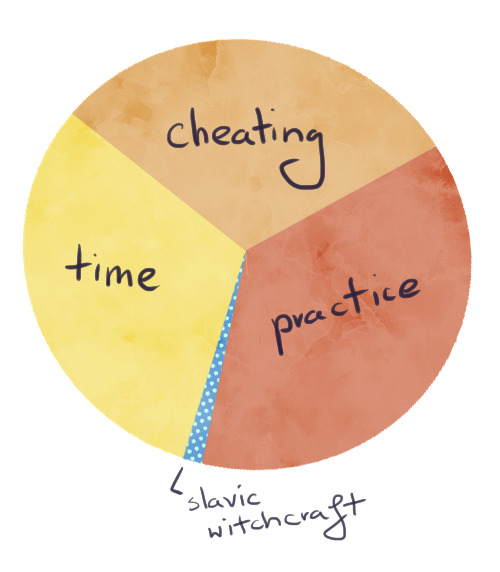
Nice and clear. And now let’s get into details.
1. Cheating
No, I don’tmean paying someone else to do your lineart and claiming it as your own. I meanusing the powers of digital painting for your advantage. So, let’s begin. As amodel, we’ll use Templar kun from the recent lineart I was making.
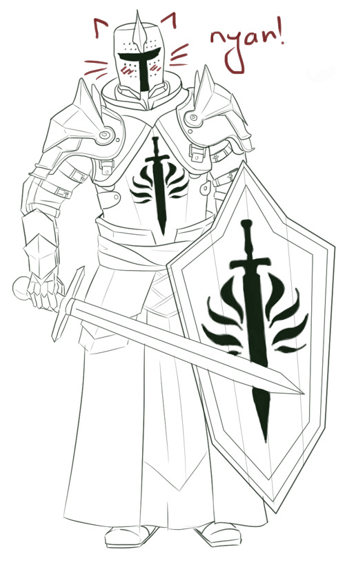
Use the simpleround brush with enabled pressure size but withoutpressure opacity. My two fav brushes for lineart are Ink brush 25 andInk-3G pen. The first one is better to imitate traditional brush and ink butthe second one is slightly easier to control.

Now, lookat the bottom left corner of the screen, where the tools options are – you’llsee the brush smoothing is set to Basic.
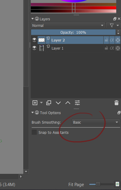
It is a default setting and it works alrightwith most of the short lines and small details (like Templar kun’s beltbuckles). Also good for eyes and other face features – IMO these little messylines make a face more interesting.
Let’schange the settings into Stabilizer.

Stabilizeris great for lineart because it „forgives” the small, unwanted hand movements thatoften make lines messy. You have a lot more control over the line and thissetting is great to draw things like hair and fabric. Templar kun’s helmet androbes were made with Stabilizer.
Butsometimes even the Stabilizer isn’t enough – we want a geometrical shape. Forthat we want to choose Bezier Curve Tool.

Simply byclicking, you show where the edges are and voila! You can also make large, softcurves with that tool (although it’s tricky – I personally prefer Stabilizer).I used Bezier Curve to draw most lines in the pauldrons and the shield.
Important – don’t overuse this tool! If too many of yourlines look perfectly straight it can make your drawing look stiff andunnatural.
- Beforedrawing lineart make your sketch twice as big as you’ve planned in on the finalpicture. It will make small mistakes almost invisible. Templar kun is already abackground character, so let’s use Aveline here.
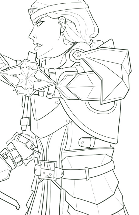
She looksquite ok.
But let’ssee her on 100% size and try not to cringe.
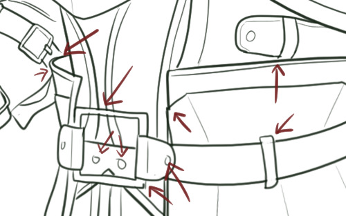
BUT! All thesesmall mistakes are here and I don’t have to care because human eye won’t catchit in a final drawing anyway! :D
- Play withline weight. Objects that are smooth, thin or far away will look good with thinlines, objects on the foreground can have bolder lines.
Templar kunis a background character so I didn’t bother with line weight. But KnightCaptain Cullen is much closer to the viewer and deserves a better treatment.That’s why I’ve tried to make his lines more interesting.

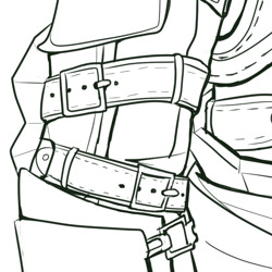
- Don’t work only onone layer when drawing more complicated elements of your lineart. I usuallydraw hair on a different layer than face and small details on different layerthan bigger shapes. It helps when you need to erase something – like parts ofthe face covered by hair – and don’t want to worry about your beautiful, smoothlines. When you are completely satisfied you can merge all the layers into one.
2. Practice
I know,everyone is sick of this advice but, well, it’s kinda true? Draw some lines,circles, get used to the pen pressure, experiment with different settings ofStabilizer to find the one that suits you best.
3. Time
Now, nomatter how good you are, clean lineart requires time and patience. You probablywant to make yourself a coffee and choose a 2 hour long song playlist inadvance.
- Don’tstart your lineart over a messy sketch. Sketching is fun because you usually usemany lines instead of one to convey a certain shape. In lineart, you have toconvey the same effect but with only one line. It’s often hard to find outwhich one would be the best and that’s why we often like our messy sketches alot more that inked final product.
So, let’slook at my first sketch of Templar kun.
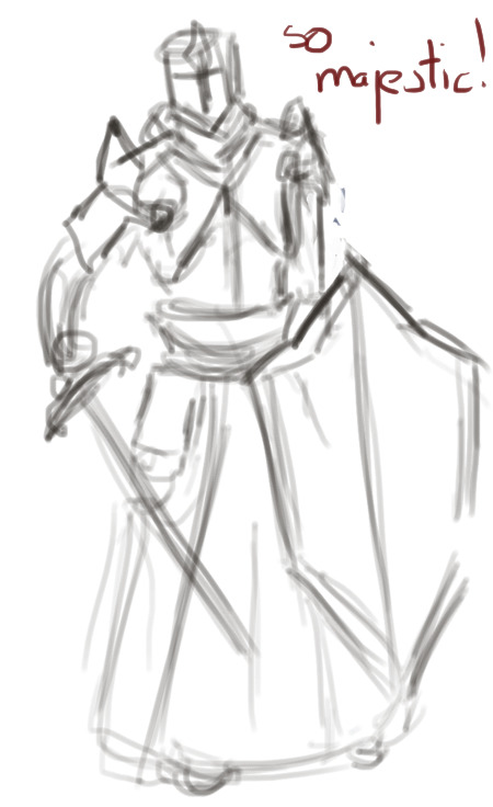
I have apose, I know where the arms are, I know he has a sword and a shield but when itcame to details I was like „meh, it’s just a sketch”.
If I wastrying to put a lineart on this, even with a ton of references under my nose, Iwould be confused as hell. So – I need to draw another sketch. This timewithout a „meh”
Here it is.
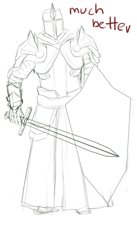
The majorshapes of the armour are here, the lines are quite clear. We still don’t havethings like fabric prints or belt buckles but these minor details can be easilyadded.
Sometimesyou need only two sketches. Sometimes three or more. It will take time to drawthem but in the end it makes your lineart look more deliberate.
- Ctrl+Z isyour friend. Really. You’re going to treat almost all your lines with thosekeys. Several times. At best.
Remember,lines should be drawn in single, quick movements. The tricks I’ve mentionedearlier are useful, especially in simple, large shapes, but they won’t domiracles. You have to keep drawing this one damn perfect line until you’resatisfied.
I’vesketched this little heart and tried to make a lineart in 2 smooth movements.
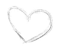
First try.

Ugh.
Second try.
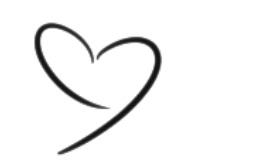
Fuck.
Third try.

Ok I guess.
Basically,smashing Ctrl+Z like a madman also takes time.
4. Slavicwitchcraft
Put warmslippers on your feet, get a bowl of pierogi and play the Witcher 3 OST – themagic will fall on you.
And…that’s all, really. I hope it helps :)
37 notes
·
View notes