#someone tell me how to lineart
Explore tagged Tumblr posts
Text

Garfield fanart of my favorite boy 🧡
I just realized I spelled his name wrong
11 notes
·
View notes
Text


thinking about scars...
#do the scars look 'realistic'? beats me!#atla#atla art#atla fanart#avatar the last airbender#zuko#song atla#was thinking about all the characters in atla w/ visible scars. and there's also aang (his back) and bato (his chest + arm)#but i got lazy and couldn't figure out how bodies work lol so it's just song and zuko for now#first time i've ever drawn zuko. still dunno how i feel about it#but the scar bit was the hardest bc i wanted to do my own interpretation of it and i always figured that baby was Melted#also i copped outta this one idea i had but- while drawing zuko's scar i used reference images (obvs)#and it made me think 'hm. y'know that scar looks roughly the shape of someone's hand. the curve of the palm over the eye mainly'#but i wasn't gonna redo my lineart about it bc i hate doing lineart so i just. sat on the thought of a burning palm pressed against his fac#anyway#i've also never drawn bare feet before. an experience i tell you h'what!#but idk what song's hand is doing. it's just sorta...There? but i'm counting it as a win that i even bothered doing that so!#my art#this isn't ship art btw. song was kind and empathetic and This asshole was like 'i'm gonna steal her ostrich horse'. boo! 2 thumbs down!!
22 notes
·
View notes
Text

You are challenged by Pokémon trainer Red.
#doodle#pokemon#red pokemon#charizard#dragon draws creatures#drawing made with the purpose of making 9 year old me flip her shit#doodle that i probably wont finish tbh so i'm just posting it#this is what i thought my art looked like when i was 10#in another 10 years i might say that about my current art lol#i like drawing pokemon sorta like someone described it as animalistic thats my jam#that being said how tf do you make Charizard's horns work naturally#like i feel like them not being pointy is like to iconic a part of the design to change but like#they are hard to make look like natural anatomy wize#unlike how i can just make like the mouth crocodile-ish or the arms like t rex looking#same with the wing spikes#if u cant tell from the rant i did some lineart that i scrapped because it looked awful so thats why im posting it like this lmao
30 notes
·
View notes
Text
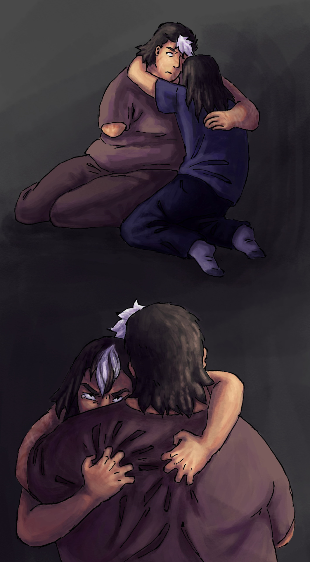
unable to let go
something something both of these fuckers have spent so long depending on each other that they cant function w/o the other guy despite Tashi's continously worsening mental state and unhealthy clinginess and Soup's desire to explore the world and meet new people...
like the thing about soup is that she had never really been a person who does well stuck in one place for too long, but also tashi is her brother. theyve been through hell and back together and she feels immense guilt for even considering having a life outside of their little family, and also she has NOT worked through her gladiator trauma AT ALL and has been just holding everything in and trying to be a perfect caring figure despite all the anger and frustration she experiences on a daily basis...
(tashi is dealing with that too, but hes never been as good as her at hiding it, and also he has the tendency to make this stuff everyones problem - thus sidelining soups problems by accident. i think soup is kind of what tashi desperately WANTS to be, in a way. on the outside shes the 'stoic selfless caregiver' and i think tashi is jealous of that, so much so that he sometimes forgets that soup is just as much a person with her own problems and desires and flaws as everyone else)
soup is frustrated by how shes been having to take more and more responsibilities as time goes on (bc of tashis Whole Thing and buddys fear of assuming any kind of leadership position) and a part of her loathes this life and she wants to leave. i think her and zoras relationship plays a big role in her feeling on the matter bc shes NOT part of the family, shes someone new and diffrent and thats enticing... also over the years soup had built up this calm easygoing persona that zora can see through, zora is very aware of soups violent past and she is not sfraid of it, giving soup a safe space to express those more negative feelings freely for the first time in YEARS
Its very hand in unlovable hand coded but they very much love each other still and thats kinda the problem
Also putting some notes on their younger selves here bc this feels relevant to how these two ended up
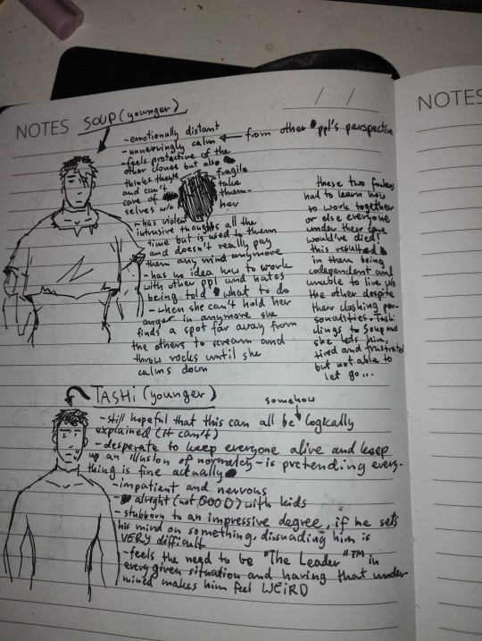
#my art#my funky guys#not very happy w how this thing turned out color- and rendering-wise but the lineart is fine ig#maybe ill rework this sometime#also. felt the need to focus on soup in this little rant bc i often catch myself diluting her character to just 'chill guy who is the sane#one here' and kinda treating her as an afterthought??? which. is not good. and i hate it. it makes me feel like IM tashi... eugh#anyways i wrote this to remind myself that shes got DEPTH and that shes not just an accessory to make the others look more tortured#and so that there is someone to comfort them!!!!!!!!#soup i love youuuuuuu im so sorry..........#i think of her as almost. '''domesticating'''' herself and living in fear of ever showing negative emotions bc thats what being a gladiator#was all about... she views those emotins as Objectively Bad and Violent and shes terrfied of being what haggar made her to be.#also ughh i hatee krita.... every time i draw in krita it comes out weirdly gummy and weird.. i always overdo it.... you can propably tell#but anyway. love these two<3 weird sibling dynamics my beloved..........
10 notes
·
View notes
Text

Is this Danny, Clockwork, or both? I don't know, but I feel like this image has the potential to tell a story
I am SHOCKED how good this turned out considering I challenged myself to draw using the first color palette I saw while riding in a car operated by the worst driver I know on some of the worst roads I know of- I was expecting this to just be squiggles outside all the lines!
Lineart by @occasionally-intelligent! I love the Fenton Creep Stick :)
#HOW DID THIS WORK#I'm surprised but happy about it#all previous attempts at working in the car have gone significantly worse#also if someone has an idea of what's happening in this picture please tell me#the colors combined with the lineart is giving me vague ideas#and I'm curious what other people would do with it :)#danny phantom#dp clockwork#greenwithenvy2023#my coloring#other people's lineart#digital art#events and challenges
102 notes
·
View notes
Text
was watching a process video of an artist i really like trying a style he doesn't usually go for and he's usually got this very flowy, free style but for this one he was doing lineart and he was obviously struggling with it and said something like he really doesn't know how people can comfortably work with solid lineart and that genuinely shocked me into stopping the video and looking at nothing for a little while ngl
#this is for a few very real reasons given that you all probably know my style is ONLY lineart#the first being that somewhere in my brain I'm convinced lineart is Easy#and i don't say this to put down people who can't do it i say this as someone who's convinced lineart is the Cheat Way of doing art#with solid lineart you can minimize your coloring and the drawing still looks somewhat finished yk what i mean#it's like you do a good enough lineart and you just speedran your way through a drawing#but this dude can put down the most amazing coloring in fifteen minutes and then struggle for an hour with lineart and#my brain just got rewired a little#you never know what your fav artists struggle with my dudes maybe you're acing something they lose sleep over!#i can't believe I'm better than him at something i need a week to assimilate that#another reason this sent me into outer space is that#i just spent the past week trying to figure out how to color a bit more like him and turns out!!!!#our basic understanding of what makes a drawing easy are so fundamentally different!!!!!!!!!#that if i don't change my approach to SKETCHING I will never get close to what he makes!!!!!!#without struggling my way through hours of fixing and adjusting!!!!!!!#speechless i tell you#of course if your style is carried by colors your lines are gonna be minimal get a grip fran
6 notes
·
View notes
Text
this drawing is gonna be the end of me oh my god
#i have restarted this drawing bc i didn’t like it that much at first#rn i love how it’s looking but. lineart#for some reason i cant do short repetitive movements because it overwhelms me ????#and i have to do them for the lineart bc i’m just kind of going over the lines many times#and i just keep getting overwhelmed and having to step back from the drawing#aaaghhfjekfkek#i am close to finishing the lineart tho. I CANT WAIT TO GET TO THE COLORING PART#i think i’m gonna leave it on flat colors bc it’s comic style#so yeah… there’s a deadline for this drawing so i better get BACK#BYE!!!!#mars rambles 🪸#not art but art related#digital artist#digital artist struggles#idk if anyone else struggles with this#AND IF SOMEONE DOES PLS TELL ME HOW TO STOP IT 🛐
0 notes
Note
Heya! Person who went/goes over gender swap?? Female version?? Of Ratiorine, or just the way you draw women in general here. I'm an artist (not really but I do draw and paint from time to time) I just wanted to ask, (sorry if this is really silly or inappropriate) How do you draw breasts semi realistically?? Or just draw them the way you do. I honestly don't know how to draw human anatomy at all, I just kinda wing it but breasts, male chest alongside legs and hands are a STRUGGLE for me. (Been slowly getting better) YET BREASTS ARE ALWAYS JUST NOT LOOKING RIGHT AND IT MAKES ME WANT TO SOB They're always very anime looking in a very very bad way (because I grew up watching mostly anime and using old anime drawing tutorial books) No need to respond/answer if you don't want to! Just wanted to ask!
breasts are affected a lot by the angle of the shoulders and the pull of gravity, which are both pretty daunting factors for learning artists
i'd recommend anatomy studying but that's not what you asked for(tell me if anyone's interested), so i'll take the opportunity to draw more fem!ratio
behold, a booba tutorial with veritas ratio. only open if youre interested in boobs
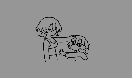
breasts don't really have a fixed form, so they're tricky to make them look natural. as i mentioned, i consider the gravity and angle of the shoulders, as well as clothing when drawing them

i'll go over an easy method to paint them. for demonstration, i unbuttoned ratio's shirt. for educational purposes.

i like to use shaded tones as base color and add light afterwards

with some lassoing and glow layer (overlay/add/anything that works) it already looks fairly alright, but i'm gonna do some blurring to make it look better
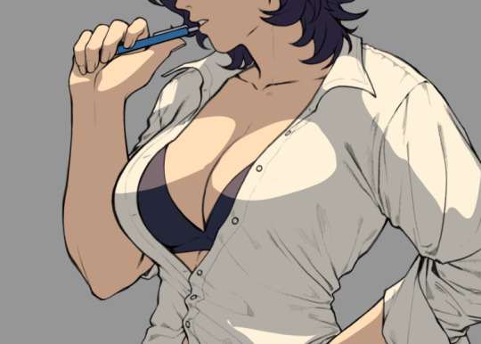
i blurred and erased around the edges to make the light blend in more naturally to the lineart and the shirt

i added a little bit of redness around the edges of the light to make it look more like flesh as well as reflected lights (the blue circles), they'll give clearer indications on where the breast starts and ends
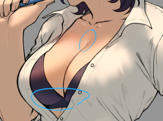
i usually end the details here when i don't feel like going for high quality render
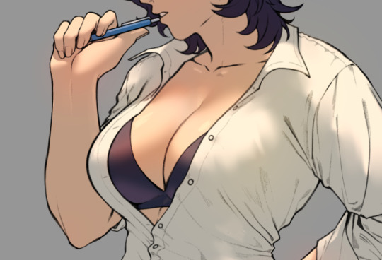
and there it is, a pair of shiny boobs
im not sure how to lay out the higher quality render process, i haven't really figured it out enough to explain it to someone else yet
anyways i like how this one turned out, so i'll try fancying it up tomorrow, i'll post it when im done
1K notes
·
View notes
Text
doodled human designs for a few neutral aus! (pt.1)
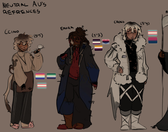
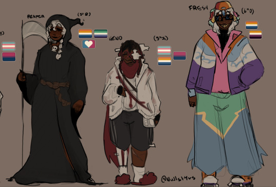

(click for better quality)
can you tell i lost motivation... thank you to chandr for doing the last 3's lineart for me. legit couldn't get freshs colours to fit with the rest. eugh. its the best you're going to get out of us for these guys.
Nightmares gang, star sanses, neu au pt.2, extras
COLOUR, CLASSIC, PAPYRUS, EPIC and ANY REQUESTS will be in the next neu au post 3_^ so please please request me to draw neutral peoples... gonna open general requests in a separate post.
some hcs under the cut!
warning for alot... i mean.. alot of text..
> Ccino (he/they)
indian... ccino... mbghbgb. MAINLY BECAUSE I WAS EATING GULAB JAMUNS AND I WAS LIKE "huh this reminds me of ccino."
trans masc! you should be more surprised if someone wasn't trans at this point
just for individuality, i feel like he'd have cat features. toe beans, tail, but no ears. personal preference.
hopeless romantic. wants to fall in love so bad, like so bad. but doesn't have anyone to fall in love with.
his AU is a neutral where the player killed all bosses. because of this, ink had offered them a pocket AU with just their cafè. ccino still visits their old au from time to time, but otherwise lives in the cafè.
one of the youngest AU's/sanses, only a few hundred years old
> error (he/they/xe)
spanish + colombian
as a divergence from classic, he maintains a similar body shape. also the fact he eats nothing but chocolate.
^ similarly, his eye is covered by a star glitch. xe never equates this to the fact they were geno, and just see it as some weird cool glitch.
rocks an alliance with both NM and dream, so wears both the stars pin and gangs patch. he always choses the side of who benefits him the most in that moment. neither of the groups are happy about it, but see error as too valuable to deny.
has arthritis and bad joints. his strings usually dig into his fingers, causing scaring and pain. (bsp related: he gets taught how to relieve these pains by nms gang because they all have chronic pains of some kind)
taking strings from his eyes is PAINFUL. its basically his unraveled code and magic combined, glitching and stuttering.
illiterate. he cannot read anything but code.
brother of ink. annoying brothers that HATE eachother. but love eachother at the same time.
> cross (they/he)
spanish. it fits him. and its relatively canon.
cross is indecisive. they've jumped between nightmares gang and the stars several times, easily being swayed. as of my AU right now, they're with the stars.
they're colourblind! their AU was monochrome, and thats how they see everything. everything is just a shade of purple. he's never told people about it, but most people catch onto ir.
autism. cross has horrible sensory issues, and gets overwhelmed easily. also bad at social queues.
THIS MAN IS THE DEFINITION OF DOG POETRY. they would go on pinterest daily and cry about it.
is a great artist. ink taught him the basics when they were stuck in the void, so they built on it. they're really self conscious about it, and keep their sketchbook locked away tightly. (in their bedside drawer)
> reaper (he/him)
egytpian. i feel like he'd embody their idea of dying.
bird claws. bird wings. everything bird.
seen as a parental figure to dream and nightmare because of his extensive knowledge of the universe and balance n all that.
(THE GAY FLAG WAS A MISTAKE) he's bi. and loves his wife. (life)
aroace spec! completely ace, and demiromantic.
sorry guys i dont have the best hcs for him 💔
> geno (he/they)
spanish + colombian
needs a portable oxygen tube to breath. he can live without it, but its really painful to not have it.
some parts of his body are decomposed, while others are held together through determination. practically constant agony.
same reasoning as error for body shape.
> fresh (they/it)
parasite. its ass doesn't have a race nor nationality.
not the hotest with a few sanses. dream and nightmare don't like someone demeanour not being affected in the slightest by the amount of pain and agony they're in. error hates how the code overlaps and glitches. and overall they're just a bit crazy.
wears either heelies or rollerskates. refuses to EVER walk anywhere, and always rolls.
i don't got much for him.
eugh. i am so sorry if the hcs are lazy, i am not good hcing with aus im not familiar with. if anyone wants to input please do! i'd love to learn about them. <3 anyways i am sleeping because i need to stop staying up till 4am..
#so sorry for the laziness#i am so sick rn#hate how this turned out but posting it anways#reblogs are appreciated <3#and likes#art#doodles#my art#meow#humanisation#ccino sans#fluffytale#error sans#errortale#cross sans#xtale#reaper sans#reapertale#geno sans#aftertale#fresh sans#refs#headcanons#nullrambles#nightedition#🌕
224 notes
·
View notes
Text
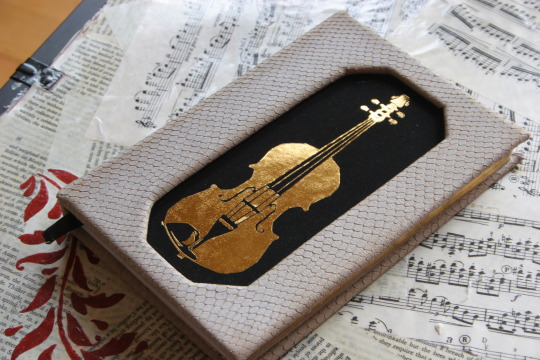
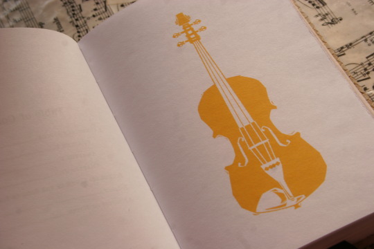
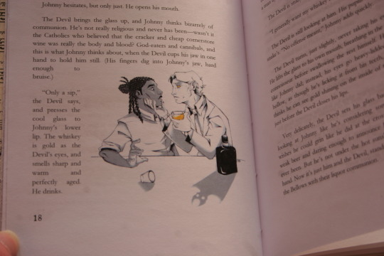
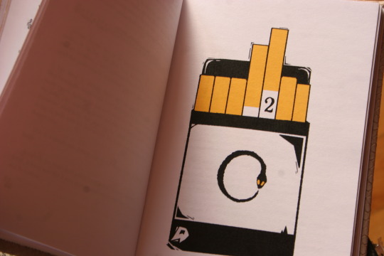
I've now received four (four!!!) different copies of my fic, bound and illustrated by different artists---and there's still a deep, almost reverential feeling I get when I hold them in my hands, lay them out. Ironically for the subject matter, they feel decidedly holy. After all, where else am I going to get proof that I did this---even if "tell a story about music and the devil" is one of the sillier things you can do to occupy your time.
But to be less vague, this is the kind gift of @fleabitebooks / @kettle-bird! They reached out to me a few months ago, saying they wanted to bind my Devil Went Down to Georgia fic, and would I like a copy too? As I would never say no to a gift like that, I gleefully accepted.
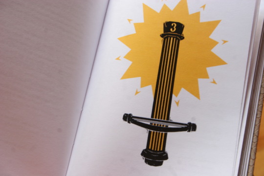
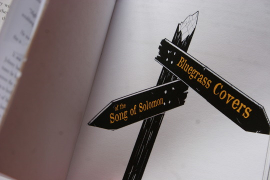
If you've been following me long enough, you've seen their art in my Cornstalk Fiddle tag, and I am pleased to say that the images lose none of their power. I think the choice to stick to a limited color palette works beautifully here---the golden-yellow of the title pages and the larger art almost seeps through the paper. With the crisp lineart and shading, it ends up being both lovely and vaguely ominous, a sign of the eldritch things moving around/beneath the story.
(Also, I realize this is not a major aspect, but....I love how truly awkward-looking the Devil is. He looks like a Southern Gentleman, and I love that touch of weakness in his jaw.)
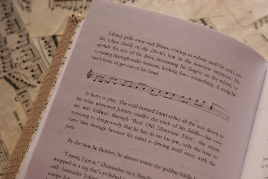
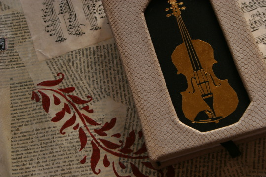
I also deeply adore some of the design choices---chapter 3 starting with the cornstalk fiddle and the triumphant starburst of golden-yellow? The white snakeskin-threaded-with-gold pattern used to bind the book? The way the paragraph breaks and endsheets are music? Amazing. Just amazing.
Maybe I should revise what I said above. Yes, having your silly fic about a country song turned into a physical book is proof that you did it, finished it---but it's also proof that someone else did too. In this case, @kettle-bird sat down with my fic and carefully copied it, played with fonts (oh, those are fantastic too by the way!) and spacings and margins; they drew art, colored it; laced the book together, made and bound the cover, then shipped it off to me.
Which means....if I did this, then I was hardly the only one.
168 notes
·
View notes
Note
Hello! I’m just here bc I’m a little confused on what you meant by Smythe drawing out “each individual asset” when she was making comics? Now, granted, I can see that it made her file ginormous, but me personally as someone who knows nothing about making online comics but is really wanting to get into it (and also as someone who has a ‘too many layers’ problem myself), is there a way to avoid using too many layers?
My current way of making comics has been to draw the panels individually and then format them (which I know is terrible management wise and also messes with the quality) but I honestly have no other idea of how to do it properly, and seeing how stunning Lore Rekindled looks, I don’t know how you would manage to put all that lighting effects and little details on the same layers. (But also I may be thinking of it wrong so I’ll let you talk qwq)
Ah I can actually give you a visual breakdown of what I meant by that!
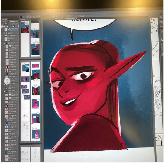
So in this you can see there are a TON of layers, and not even all of them are visible because some of them are stuffed into FOLDERS that have been left closed. BUT if you look REEEEALLY carefully-

^^^ These layers right here? That's specifically Minthe from this panel in Episode 61:

(the unique pose here makes it real easy to tell that this is the corresponding panel, you can see the matching body shape with the dark shading that's clipped to the base layer below it!)
So what this means is that Rachel didn't draw all her characters on one base layer, she drew every single character in every single panel separately. Now of course, she could merge all these layers together as working on separate layers helps make it easier to work on elements that collide separately (like one character being 'underneath' another character like Hades is here) but because she has all of those clipping layers with the shading already added in, she likely didn't merge them afterwards because that would actually create MORE problems (because if she merged the Minthe layer in with Hades, then the shading for Minthe that she painted outside of the lines would show up on Hades and then she'd have to erase it which is just a bunch of extra work).
You can also tell all these characters are on their own layer because the layer thumbnail EXCLUSIVELY shows those characters. A layer will show as much canvas length as it needs to cover what's in that layer, so if the thumbnail is only showing one character, that means there's NOTHING ELSE on that layer. If there were more elements on this layer than just Minthe, the layer thumbnail would look more like this:

Now let's compare it to Rekindled's layers! I'll use a completed page to make it fair as we use a lot of extra layers in the post-production phase where we add the texture effects and glow and all that fun stuff, plus I'll even make it a more complicated page like that big nymph explanation spread from Episode 51:
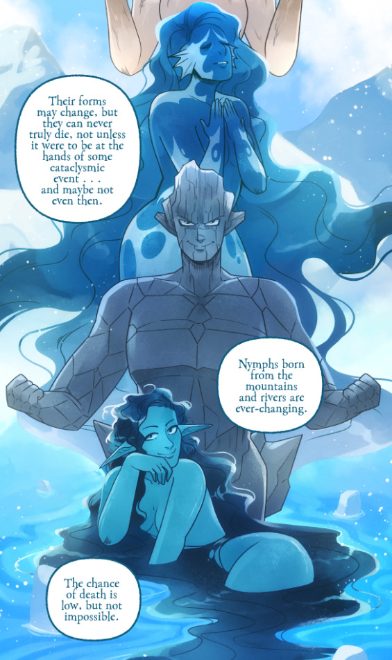
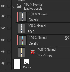
So I'll break it down to make this make more sense:
BG 2 Copy (technically this is supposed to be BG 1) - Basically the panel shapes, what I'll do is mark out the panels with flat blocks and through that we'll add background elements in a clipping layer (usually done by Banshriek). Often times they'll do multiple layers to make the process easier and then merge them all together in the end. With these shapes operating as panels, it means I can just auto select the whole layer, invert the selection, and easily erase whatever's outside of it (such as the lineart and base colors that I put down afterwards). I could just use masking layers like I did in [AFTERBIRTH] but I find this way works better for the process of making Rekindled.
BG 2 - This is where we add objects / foreground elements. So stuff like furniture, interactables, anything that needs to be kept separate from the larger background to make it easier to work with. This can also include "floating" panels that need to be above other panels, such as this:

All of the backgrounds are then nested in a folder for organization purposes (we also sometimes use clipping layers on top of those folders to apply extra effects over anything contained within that folder without affecting other folders, that's a common technique that Banshriek applies)
Then we get into our Characters folder:
BASE - This is where I do the majority of my work, all the characters in every panel on a page are flatted into this layer. Sometimes I do have to create separate layers to, again, make it easier to work with overlapping characters, but usually those layers will be merged before I go into the shading process. I simply shade on a single layer by using the lasso / magic wand tool to select my area for painting, the flat colors make it really easy to do that. Sometimes I need to create a secondary shading layer if I've put down dark colors that start to bleed into the lighter colors, but again, I merge when I'm done into a single shading layer. We also sometimes employ an Add (Glow) layer into the clipping set if we need a glow effect that's exclusive to the characters and doesn't travel outside of their base colors.
There's a (leaves) layer here that I used for the dryad because I needed the leaves to be above the base layer, after that I selected the leaves elements so that I could erase the lineart in the layer above it where needed.
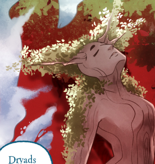
LINEART - It's lineart, enough said haha That said, I do think Rachel actually uses clipping layers for her lineart in places, it seems to be visible in some of her process videos where you can see the lineart present in a clipping layer, and that would explain why there are panels where the lineart suddenly 'cuts off' and doesn't travel outside of the base layer, like so:
GLOW - This is where we do an Add (Glow) layer that isn't restricted to the base layer, it's where we add all the fun lil' glow and sparkle effects over the characters !
The CLOUDS layer is, like the leaves, a background element that needs to be above the base layers rather than constricted to the background.
Above the Characters folder you can see what I mentioned earlier where Banshriek has added more post-production effects that are exclusively clipped to the contents of the Characters folder. This means the effects / blend modes do NOT affect the background layers or anything above it.
The BLUR (Overlay) layer is something we just started doing over the past several episodes, it's a technique I actually picked up from 66 of City of Blank where I merge all the layers into a new visible layer which I then apply a Gaussian Blur to at around 60% and then set to Overlay (and then I adjust the layer opacity until it looks right, usually around 25-35%), it gives it a bit of a softer "dreamier" vibe in the final colors and really helps unify everything!
CANVAS - This is an Overlay layer which is also set to an opacity of 25-35% where I go over the panels with the Add Canvas brush from the Kyle Webster set, unlike the Canvas overlay texture in CSP I can actually choose the colors I want to use which means I can match the canvas texture color to the mood and environment of the scene (ex. I'll use a very light blue for scenes in the Underworld). Not only does it give it that signature texture from S1 of LO, but it also helps balance out the effects of the BLUR layer.
The SKETCH layer sits on top of everything and gets turned off once all the base layers and lineart are down, and ofc the SPEECH folder is just where all the text is kept.
I know everything I just laid out is a LOT but ultimately it's how we operate, it works for us! But it also begs the question of why Rachel operates the way she does because a lot of it seems extremely unnecessary and more likely to bite her in the ass (the more layers there are, the bigger your file size gets, the risk of drawing on the wrong layer increases as well as the risk of posting a panel that's missing elements because the layer was left turned off by mistake, etc.) And it's more so concerning with how she operates with her assistants because if she's still using this many layers when collaborating with other people, hooo boy. Though based on what I've observed of what her assistants contribute, I get a lot more of the sense that she circumvents this by having the artists do the flats separately and then importing them in as separate assets that she then just imports into the page and places them where they need to be. Still not a great workflow IMO because it's what's led to a lot of the issues of characters "floating" rather than feeling like they're actually in the environment-
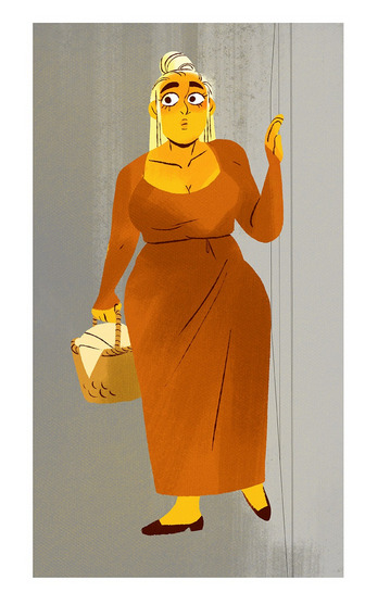
-but that's still an issue that could be solved by Rachel just taking more time to actually flesh out the backgrounds and lighting to give more of an impression of the characters actually existing in the space. Like that Hestia panel could easily be fixed by just giving the background a bit more detail and putting actual shading underneath her (and lighting from whatever direction it's coming from).
Either way, regardless of whether or not Rachel's process is productive or not, I hope that breakdown helps explain how we do it in Rekindled! Learning how to manage layers is definitely a skill that can be tricky to harness, but once it "clicks" there's a lot you can get away with. Ultimately how you do it is up to you, but my best piece of advice to offer is to just be open to other types of workflows because you don't know how much you might be shooting yourself in the foot doing things the hard way when there are often way easier and more efficient ways to get the same job done. That's basically the vibe I get from observing Rachel's workflow, it seems like she's still using methods that she thinks are working for her (and probably did work just fine for her when it was JUST her) but could be vastly improved for her and her team if she'd just get over the initial hump of stepping outside of her comfort zone. Would probably make for a better comic too LOL
I hope that helps! Good luck! ( ´ ∀ `)ノ~ ♡
#ask me anything#ama#anon ama#anon ask me anything#lore olympus critical#anti lore olympus#lo critical#lore rekindled#webcomic advice
154 notes
·
View notes
Text
youtube
"Okay, yeah. If you kill a red name, killed a red name-" "I'll give you a life for that. That's the deal." "We'll be back together like buddies again, Bdubs."
In participation of Extreme Timed Challenge Gift Exchange hosted by @extremetimedchallengeexchange!
[gifs, full storyboard, behind-the-scene rambles under cut]
past 48h animatics: MCYTETC2023, ETC2023
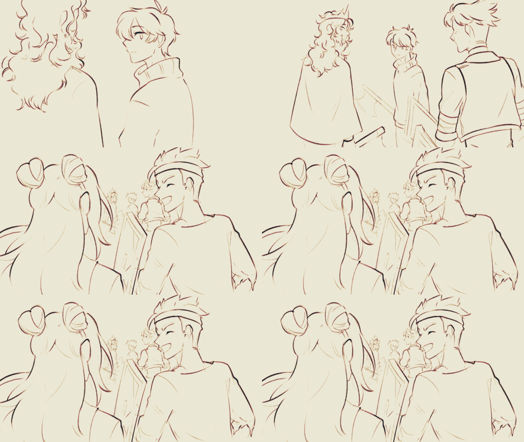
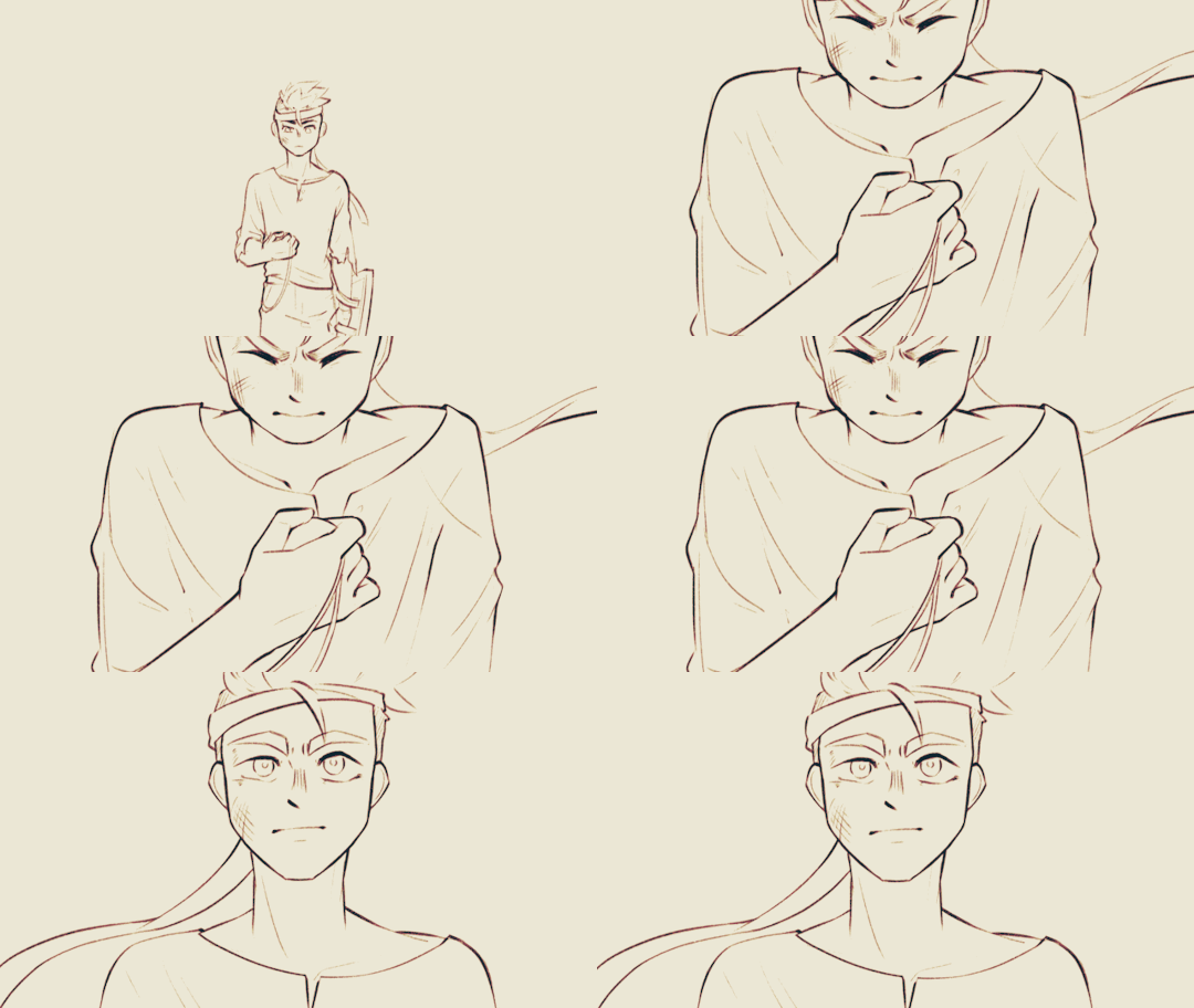
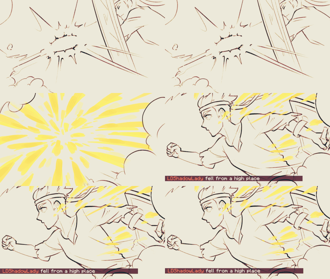
[Red Lives-Suspicion; Prayer-Determination; Fireworks]
Fiddled with gradient maps this time for some additional colors :D I would have colored in the eyes as well, but I didn't have enough energy left when the event hit the 47th hour xD
Also played around with camera movements. Respect to people who do fan edits and other forms of video/ assets editing 'cause keyframes are so 😭
13 hours to draft storyboard this time! Last year I used 16 but with waaay more frames idk how I accomplished that. Probably bc this year I'm drawing more than three(3) characters lmao
Progress Timeline:
[13th hour] finished storyboard/ draft (plany off time...) [25th hour] lineart for the first 10 seconds (wuh oh) [36th hour] lineart for the first 25 seconds (oh shit oh fuck gotta shorten it) [45th hour] finished Bdubs' part (NOOO I DONT HAVE TIME FOR ETHO)
ngl kinda glad i cut it in half rn 'cause i'd have to spend time figuring out shadowDog's design /lh
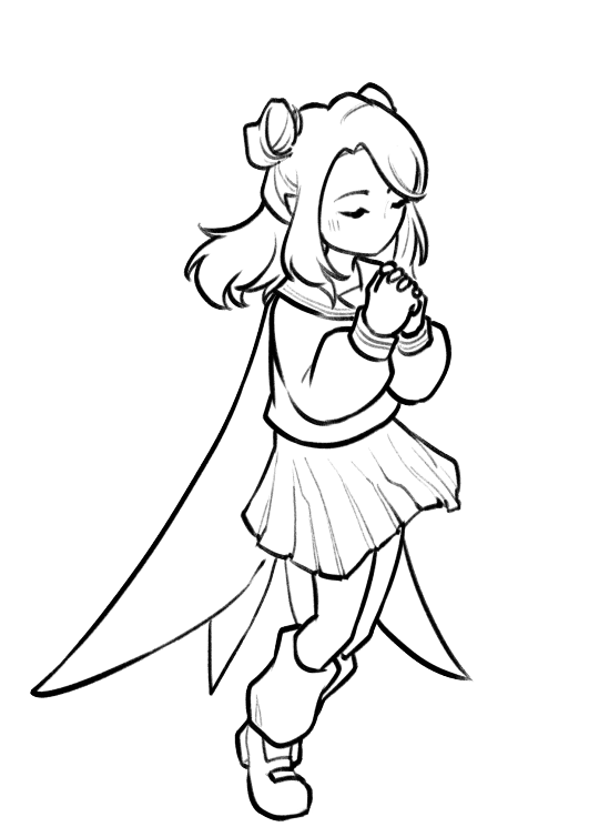
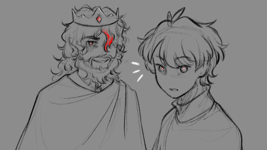
Designs I used for Lizzie and Joel (old art from 2022 and 2021 respectively) (holy shit i've been here for 3 years???)
Joel *shakes fist* i hate u and ur stupid beard
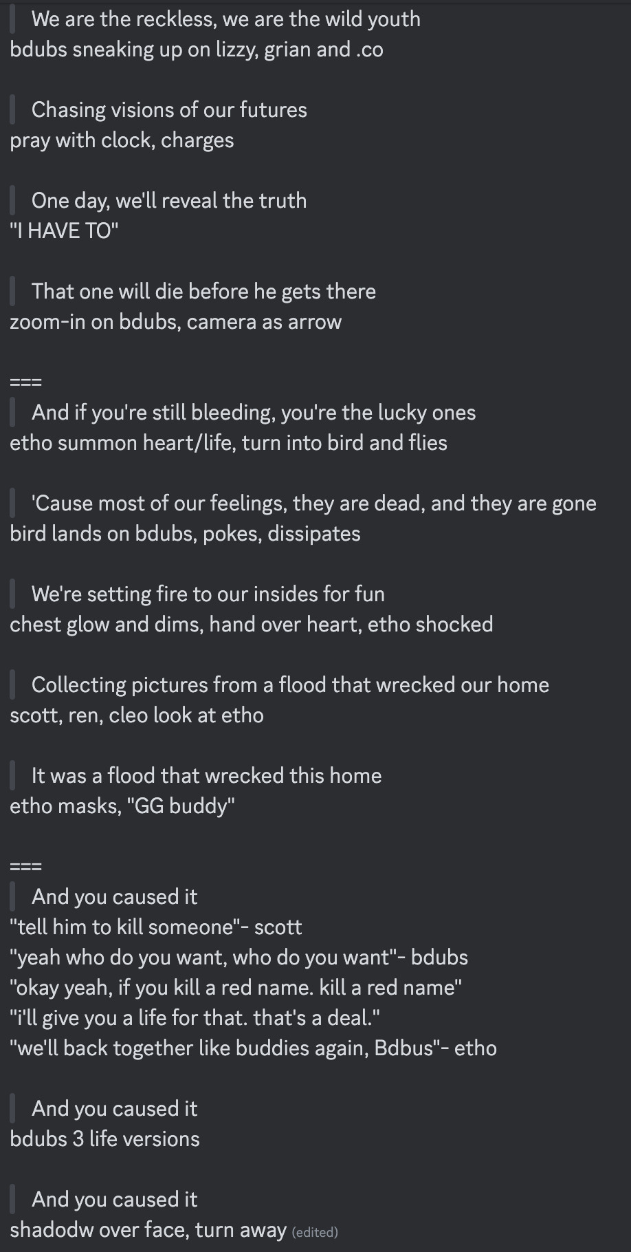
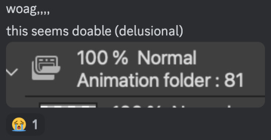
[Lyrics vibe/scene planning; hours before disaster]
I think most of the drawn parts didn't deviate from the initial idea. Mostly timing adjustments and building upon the vibes. The parts that were changed the most was the "And you caused it (×3 combo)".
Went from "vague flashbacks" to "following Etho and co. out of the cave and back to Scott's base while implying who Etho blames with single character focus shots".
The first one is Scott because he suggested the idea. Like, obviously he's to blame. It's not like Etho went along and cemented the deal himself. Scott totally peer-pressured him into it.
The second one is Etho because... well the scene ends up kind of being like. The sight of the Snow Fortress triggering a flashback. (EthosLab the content creator deliberately turned his camera towards the Snow Fortress and holds it there for a second instead of looking at the huge lava pillar right in front of him. What is WRONG with him.)
But also like. Clocks are kind of special to Bdubs right. Whoever gave him a clock basically has his (temporary) loyalty or at the least earned a favor from him. So like. If he hadn't gifted Bdubs the clock, which signifies a closer(?) bond, maybe Bdubs wouldn't be so devoted to him (wrong). Also serves as a call-back/ reference to the "Prayer-Determination" shot ("pray with clock" in the scene planning screenshot). I like to think that Bdubs weighted his options and thought about "if he will kill/ who to kill" a lot while following the other Red Names. And in that scene he's like, convincing/ motivating himself. Remembering who/ what he's doing this for.
(It is also meant to be part of my giftee's other prompt: "an exploration of the doubt one or both of them felt during the heart transfer that didn’t happen after Bdubs killed Lizzie, and the following guilt Etho felt." The Etho section starting from "we're setting fire to our inside for fun" til the end of the animatic is based on that prompt.)
After a brief period of self-blame, it's time to shift it onto someone else! Because you're in denial! If Bdubs hadn't gone red, then Etho wouldn't have to offer the deal. If Bdubs hadn't want to stay as teammates, then he wouldn't agree to the deal. If Bdubs wasn't so devoted to Etho, then he wouldn't have attacked Lizzie and gotten himself killed.
Then the animatic ends with the end of the session :D
...That's longer than I expected but also not that long. If you read through all that, tysm :] Tell me your thoughts! Have a good day/ evening/ night :D
#bdoubleo100#ethoslab#ethubs#bdoubleo100 fanart#ethoslab fanart#last life smp#last life spoilers#traffic smp#trafficblr#Extreme Timed Challenge Exchange#48 Hour Exchange#events#my art#animatic#i sound like i didnt sleep but i DID DO NOT WORRY
90 notes
·
View notes
Note
I love your artstyle!! Do you have any tips for drawing?
thank you so much! i'm really happy you like it!!💗 as for tips, what i would say would change drastically depending on what kind you're looking for, but some very general ones:
draw what you love and want to see most, regardless of whether anyone else wants to see it. if you don't enjoy what you're drawing it'll never come out as good or genuine as something your whole heart and soul is in. i mean you'd think this would be a no-brainer but sometimes i've had to sit back and ask myself 'if no one was ever going to see this except me, would i actually spend time drawing this?' and i was surprised by the answer
that said, it is also completely valid if your motivation for drawing is to draw for other people! there have been plenty of times where i was too artblocked to draw my own ideas but was still able to draw commissions or gifts and enjoyed it simply because making other people happy with my art makes me happy.
don't get too caught up in having a consistent art style. in my experience this 1000% hinders you
having your sense of anatomy degrade over time without you noticing because you keep drawing the same types of characters is a very real thing! if this is a concern to you be sure to draw a variety
follow a billion artists that you like the art of and you will have endless inspiration injected directly into your brain every time you open social media
my favourite practical tip for those who draw at a desk: keep a small mirror next to you at all times. absolute game changer for quickly referencing hands
if you're drawing digitally, make the canvas huge! in my experience this lets you draw messier/faster and you can't tell at all when you zoom out. if you tend to get stuck spending unnecessary amounts of time micromanaging pixels (me💀) keep it zoomed out while drawing
related to the above point, messy drawings can have far more expressiveness in them than neat and polished drawings. nowadays i never do lineart and go straight from 'barebones stickman pose' to 'varying-levels-of-coherent sketch' and use that as my lineart. sweet freedom from the sketch-looks-better-than-the-lineart phenomenon
if your goal is to improve, then you really do have to scrutinize your art, figure out what you're not satisfied with, and commit the time to focusing on it. 'practice makes perfect' kinda rubs me the wrong way because of how much i've seen it interpreted as 'just draw everyday and you'll magically improve' but genuinely it won't get you very far if you don't actively think hard about what you're trying to improve and take the steps to do it. is this a hot take idk. also hand in hand with this, not every artist is trying to improve and you shouldn't feel bad for this! maybe you just wanna make a little headshot doodle of your fave blorbo and that's your only drawing goal ever. awesome. maybe you know your art has flaws but it's passable enough to convey what you want and you're perfectly satisfied with that. (this is the stage i'm usually at). also awesome!
don't hesitate to draw something because you think it's out of your skill level. the worst that can happen if you draw it is that it comes out terribly but you learned something and can always redraw it better in the future. the worst that WILL happen if you don't draw it is that you'll never draw it. and then it will sit in the back of your brain haunting you for years. it's not like i'm speaking from experience or anything aha
look up 'hand stretches for artists' and do them if you draw a lot unless you wish to summon the wrath of the carpal tunnel demons
of course, these may not necessarily work for you, and most importantly(!) these are coming from the perspective of someone who is primarily a hobbyist. some of this won't be practical for people who need to build an audience, maintain a consistent style for work, etc. these are just things that have personally helped me over many years of drawing :)
99 notes
·
View notes
Text
Heyo guys I wanted to say reffering to the Last ask i was answering to that i lost my brush to my line art (that is why my lineart looks so different) because my computer went thought permanent loose of data which includes also data in my CSP and I don't know if i can find the brush again and it will take a bit for me to get used to another one 🥹 if someone know how can i find my brushes please tell me 🥹
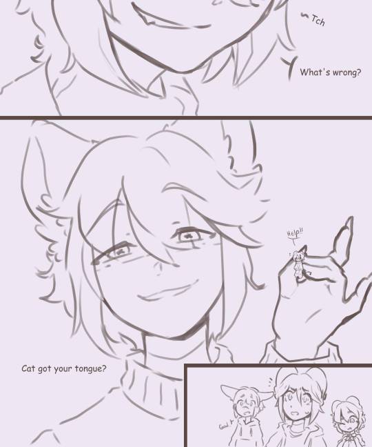

With the old brush vs with the new one
69 notes
·
View notes
Note
I love how you draw lineart firstly and seeing you draw your tav is really cute- question is do they have a name or any lore :eyes:
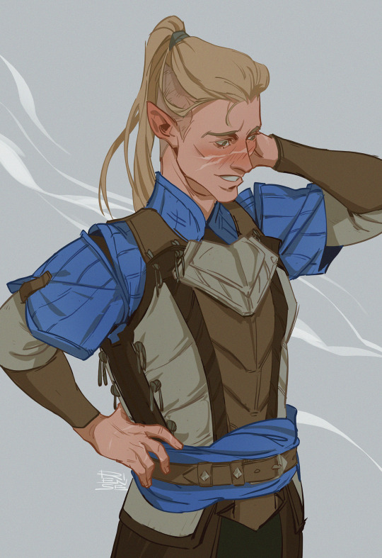
When someone says you are cute :’’>
Hey, I want you to know, Anon, that your message was just on time. This week was…a little rough. And thinking about my Tav (as well as drawing him) was such a great distraction. Thank you!!
And yes, he has a name - Kyran. A lawful good paladin boi and an absolute sunshine for me. As always Im at a loss as to what to tell you about him. This happens to me every time someone asks about my OCs :’’D also i am at that point when I change his lore details few time a day ahahahhh
#didn’t know I am so exhausted until now#sorry Anon I am completely useless atm#but I am very grateful for your ask#you unknowingly inspired me to draw him and this kept me sane for past few days#✨💖✨#replies#bg3 tav#my ocs#my art
233 notes
·
View notes
Note
Hello, this is gonna be a long one and I hope I don't bother you too much with it but you have something great going and and I think maybe some advice for someone like me who wants to do a longer comic and I took heart in that one ask you recently answered were you said you are plenty of pages ahead of the readers to not get paralysed by a deadline which seems like a no-brainer now that I read that with my own two eyes black on white but I had not thought to maybe go about it that way and I needed to have someone spell it out for me apparently. So to my question.. see, I have a skeleton of a story I have key scenes that need to happen and that I want to happen and I am sure in between things will shift and change and grow and a part of me can't wait for it to happen but- How do you start. How do you get going. It is in my head I have some written notes but most is in my head and I do not want it to remain there and rot I want to draw and tell the story I had in mind but I feel.. paralysed on the starting line of this journey and I am unsure how to go from there because my mind gets caught up in estimates of if I post one page a week that is "only" 52 pages. That seems so little. How many years would it take. Can I do this. And then my mind fires up in passion because I am willing to commit I want to do this I need to do this and I have a good idea of how to pace myself and how to go about it. I have the beginning of it on the back of my tongue and the tip of my fingers I can imagine it so vividly I wish I could animate it (if that wouldn't take up even more time and be insane I would) But somehow I still feel stumped on how to start. How to get over this first hurdle. It might be the executional dysfunction playing a huge part in it, maybe I am overthinking to much and stand in my way because of it, but like... How did you start your comic. How did your journey on GS begin? I know this was a bit of word vomit I am sorry but you are an inspiration and you seem to go about things (from what I could gleam from the asks) in a way that feels like it could work for me too and the way my brain functions but I do not know how to start? I dunno if it makes sense I am no english native and my thoughts are hard to put into words.
This ask has been sitting in my inbox for a while because it's such a loaded question. I have plenty of asks in this tag about my comicing process, so check them out maybe. This reply got lengthy! The more I wrote the more I noticed I feel very inadequate trying to give people tips on making comics. It's such a trial and error process.
I've seen plenty of advice for people wanting to start out comics to just start small, come up with a smaller story to get a feel of it before you go big. And I absolutely understand it in hindsight because I would've done many things differently if I had just tried it out first, but it's not what I did. I wanted to make a big comic, and a big comic I made, as my first project.
I don't think about the years these things take, but it'd absolutely ease your worries if you could come up with a simple style and be able to make pages faster. I've stripped my comic of shading and gotten more lenient with myself when it comes to backgrounds. You absolutely need to cut some corners if you want to make more than one story during your lifetime. It's a limited time afterall! Being able to turn your sketch into a lineart without having to redo everything with a careful hand would help a lot already. And colors, they take a lot of time.
This is not how I went about it in the beginning, but I'd love to tell you to write those things in your head down before you start. Leave holes, just write in what you know because you will forget some cool details if you keep them in. Write the starting point, middle and the end, even with just couple of words. Add things that interest you in the middle of those points. Do you want a sad arc for your character at some point? Write it in. Come up with what makes it happen. Weave it into the other scenes. If you know what's to come, you can add foreshadowing to the earlier scenes. Even if you didn't know what would come, you can take something from earlier scenes and make it foreshadowing. Writing is a fluid process. You can jump around and add things, you don't have to approach it by putting one block next to the other. Once you have the elements you want, you just have to tie those things together. It's the hard part. And you will change your mind about many things when you get to draw your characters and see them doing the things you've written.
The start! I always say it's the worst part, but I've started to think it might be the second worst. I think the worst part comes after you've started and worked for several ten pages on fumes and you finally run out of juice. Picking up after that is hard, for me at least. But if you can manage, it should get easier. You know your characters better by now, and they carry some of their own weight.
Make a canvas. Think about the scene you want to start your comic with. Night or day? Calm or busy? Just doodle, BIG and loose. Add some frames by just drawing lines, move things around, resize. What do you want to portray with the first page of your comic? I like to establish some of the world or atmosphere, and only then move on to the characters.

Don't try to be perfect, in fact leave that first canvas completely unpolished and move on to the next one. What should this page tell? Will you show the character? I'd leave the establishing shot of them as the last big panel. The rest of the page should build up to it. The last panel is important, it's a hook to turn the page.
Come back to polish those pages more only after you have a few of them done. The most important thing is to get yourself away from that first page, because the first page is scary. After five pages you can move things around and start adding ears to your spheres. You've started a comic now. You can go back to the first page and make it nice, because you already have opened the path to continue.
IT'S HARD. But it's rewarding. It's not for everyone but it's awesome if you can make it yours.
44 notes
·
View notes