#rn i love how it’s looking but. lineart
Explore tagged Tumblr posts
Text
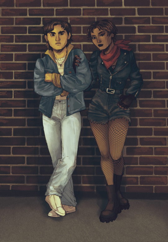
this drawing is gonna be the end of me oh my god
#i have restarted this drawing bc i didn’t like it that much at first#rn i love how it’s looking but. lineart#for some reason i cant do short repetitive movements because it overwhelms me ????#and i have to do them for the lineart bc i’m just kind of going over the lines many times#and i just keep getting overwhelmed and having to step back from the drawing#aaaghhfjekfkek#i am close to finishing the lineart tho. I CANT WAIT TO GET TO THE COLORING PART#i think i’m gonna leave it on flat colors bc it’s comic style#so yeah… there’s a deadline for this drawing so i better get BACK#BYE!!!!#mars rambles 🪸#not art but art related#digital artist#digital artist struggles#idk if anyone else struggles with this#AND IF SOMEONE DOES PLS TELL ME HOW TO STOP IT 🛐
0 notes
Text
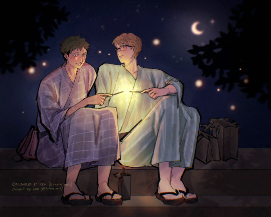
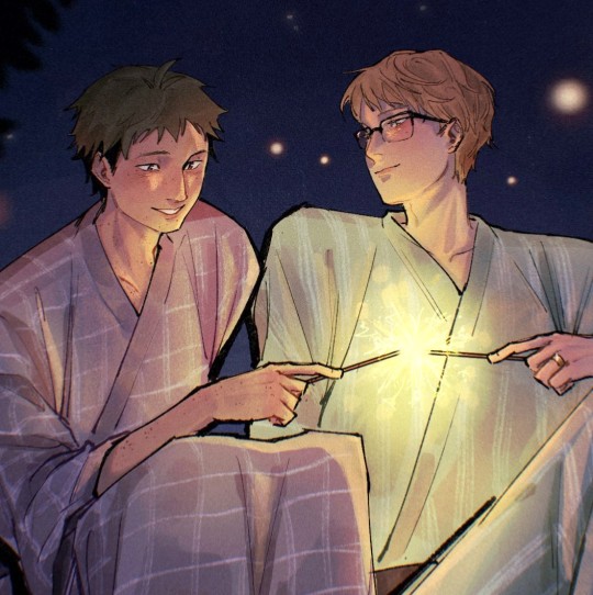
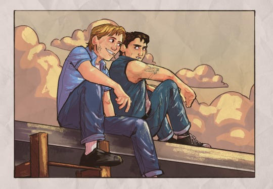
happy tsukkiyama day !! 🌙⛰️✨
art collab with my lovely oomfie @lleann-art <3
#llean-art#my art#WELL HALF OF THIS IS technically..#tskym#tsukkiyama#yamaguchi#tsukishima#guys they're married.... and spending countless festivals together... lighting sparklers and kissing under the moon and stars...#who else crode....#they're so in love my tummy hurts#LEN CEO OF TSUKKI'S PINING LOVING GAZE#BC DO U GUYS SEEEEE HOW HE'S LOOKING AT YAMAGUCHI#AND WHAT IF I DIED !#still so grateful u let me colour ur lineart it's just so good it makes me weep#everyone go follow len rn !!!!!#THANK U FOR LETTING ME POST IT ON TUMBLR ALSO#i might just make this my pc background..#pretend this was posted on 12/11#it was on twitter
117 notes
·
View notes
Text
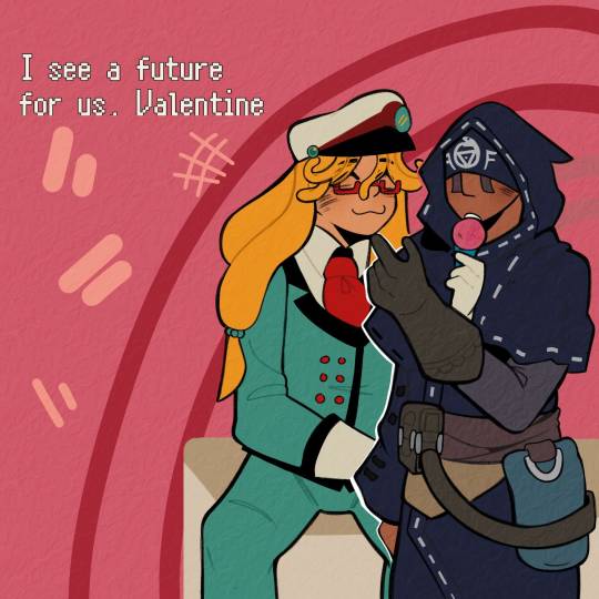
I'M GONNA START CRYING I'M SO ILL RN
#(🚂) *.✧ — Valentine Grantz#(♡) 。.゚— Eli Clark#THANK YOU SO MUCH MY LOVE MY HUNNI FOR THIS OMFG I'M GOING CRAZY RN#I CAN'T STOP LOOKING AT THEM. LEMME. ORGANIZE MY IDEAS#It makes me so hapoy to look at Eli's face. he looks so cute#thanks for making him justice mu love. I'm so crazy rn aougg#I'm OBSESSED with how Eli looks in general#HIS CLOTHES. HIS FACE. HIS NOSE. ALL THE DETAILS YOU PUT IN HIM MAKES ME SO HAPOY#I'M LITERALLY KICKING MY FEET RN#ALSO VALENTINE. HE LOOKS ABSOLUTELY ADORABLE#THE FACE. HE IS SO HAPOY TO BE WITH HIS BOYFRIEND :3#I WANNA GRAB HIS CHEEKS AND KISS THEM MWA MWA#now. let's talk. about#“I see a future for us Valentine”......#no bc. I'm so ill I'm going crazy.#me thinking of how I planned their entire wedding.#man I don't wanna rish things with him but I'm already so in love#I just wanna see them hapoy#AND THEY ARE NOW#those comforting words... aoughhhgjj#I love them so bad I'm gonna cry#THANK YOU SO MUCH AGAIN MY LOVE YOU DID SO GOOD#I LOVE IT I LOVE IT#THE TEXTURE IT'S SO GOOD. IT FEELS SOS GOOD TO THE EYE#AND YOU KNOW HOW MUCH I LOVE THE WAY YOU DO YOUR LINEART#KISSES YOUR HANDS AND MAKES OUT WITH U MWAMWMWMAM#⭐ — Nero!!!#(🔮)*.♡ — Valeli
9 notes
·
View notes
Text
RAAAAAAAAAAAHHHH YOURE GONNA MAKE ME OBSESS OVER THEM AGAIN YOU BETTER STOP AAAAAAAAAAAA <333333
ooooooo Art is SO NICE !!!! 👍👍👍👍👍👍👍👍👍👍👍 mmmmm colros ,,,,,,,, is green,,,,,,,, is good. honk shoo zzzzzzz
honk shoo,snore mimimi,zzzz
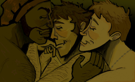
#Seriously JUST like me and my partners teeheehehehehhe#Look at that rendering look at how the lineart and the colors LOOOK LOOK AT IT LOOOOOOOOOOOK#LOOKK AT THOSE NOSES !!!!!!!!!!!!!!!!!! SO COOL SO SWAG#I’m sending all the sniperdemoscout art to my partners rn they will love this#tf2#once again i am rebloging
381 notes
·
View notes
Note
your art is so beautiful i've been drooling over it for days (and only 50% of it is over how handsome young halsin is i promise lmao) i was wondering what brushes/software you use? everything looks so soooft, i'm in love
Thank you so much! I use Clipstudio Paint! The brushes i use for rendering is the basic ones

these! and for sketching/lineart it depends on the day and or vibes but these are my faves

Another thing that affects the "softness" besides adding a rimlight around the stroke (i forgot what its called rn) and color theory, picking light values and making sure they go well with the dark ones also helps!

69 notes
·
View notes
Note
How long does it usually take for you to animate something? :0 I'm in love with the smoothness of them rn.
Mmmm it really depends on the length, on how detailed I want it to be, on how much I want to colour. The more frames, the longer the clip, the more precise the lineart, the more colours, the longer it is.
Something coloured and clean lined like this might take around 2-4 weeks (depending on my motivation) even if it’s only 20 seconds. This one is animated on 10 fps!
But I’m assuming you’re asking about the land duo animation? Actually, I used 8 fps for that one because I wanted to save time yet make it look a bit more detailed. It’s already almost a minute so it’s hard for me to keep motivation if there are too many frames in a long animation. So I’m already saving a lot of time there. It’s also going to have minimal colours so that’s more time saved.
Since it’s starting to be a busy time of the year for me, and also since the animation will probably be around 50 ish seconds, might take me a month-ish. If I were maybeeee on college break, could be 2 weeks? I hope you guys can wait a bit 😆
I won’t be able to finish it anytime soon. It’s why I’ve been focusing more on simple comics in the meantime. But hey! At least I’ll be able to add on more realm smp stuff for the animation :D!
28 notes
·
View notes
Text
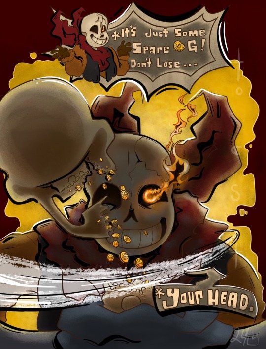
🔆 REASON: 🔆
———————————
After getting in contact with Doobie I received their request. I honestly hadn’t heard of this au before so I did a little research.
Doobie had asked that I drew Negativetale Sans. As his au name suggests he’s more negative. He’s the Bizzaro version of himself you could say. Often pickpocketing for loose G and despising his brother. You couldn’t put it past him to kill his own brother if it benefited him.
So I sketched out a design and confirmed with Doobie that it was what they wanted and got to work.
🪱 TOOLS USED: 🪱
———————————
Cheap sketchbook
Mechanical pencil
Procreate
Procreate pack (colored pencil pack and liner pack)
🎨 PROCESS: ��
————————————
Starting with a sketch on paper I then took a photo and put it in procreate
Then I crop to adjust anything that I might’ve missed or disliked how it looked
After I line everything
Once that’s done I secure the whole image in one color and separate it from the background
Using the lasso tool I block out certain colors on their own later for that color
Using alpha lock on each of those layers I add the shading and coloring
However I deemed that the shading was not enough and that some of the lineart needed to be colored too. So I made sure to add those here and there.
As I looked at it I found the colors to be too bright so I put a black wall and made sure it was see through like sunglasses lenses and used the eraser to make the lighted spots pop out more!
With that all said in done I added black and white line art and highlights to give it a more comic book style.
☎️ TIME: ☎️
——————————
The sketch: 30 mins
The Lineart: 1 hour 30 mins
Blocking: 45 mins
Lighting: 20 mins
Touch Ups: 20 mins
Total: Too much math for me to count rn 🤷♀️
Hope you enjoy the video and photo from my efforts!!!!
Love ya breadcrumbs!
N30
#undertale#undertale au#au undertale#au fanart#undertale au fanart#negativetale#au sans#negative sans#Au sans fanart#au papyrus#sans undertale#sans#sans au#papyrus#papyrus fanart
30 notes
·
View notes
Text
AAAAAAA OH MY GDO IM SCREAMING THANK U SO MUCH ❤💖💕💗💖💝 SHE LOOKS SO GOOD dont thank me i should be thanking YOU she looks so good in ur style i love her THANK YOUUUUU
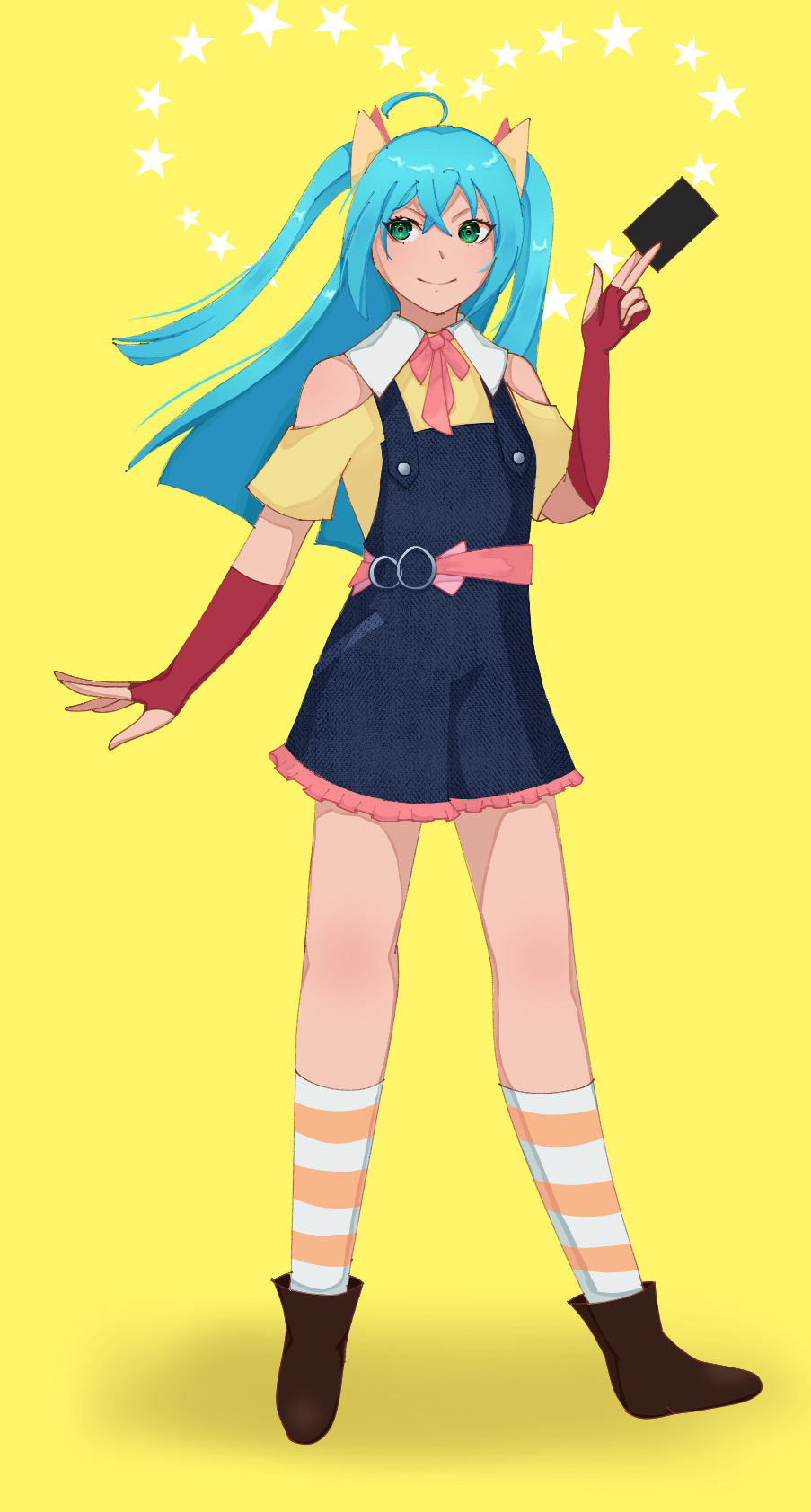
i go without finishing a drawing for months and then i churn out a runo drawing in a day it is what it is
#UR LINEART IS SO CLEAN ANF SMOOTH#the background is so pretty#i love this so much imdcrying ime setting this as my phone wallpaper#im so happy THANK YOU SO MUCH#I DONT KNOW HOW TO CONVEY HOW MUCH I LOVE THIA IM BOTHBSPEECHLESS AND HAVE TOO MANY WORDS I AAAAA#grabs everyone LOOK AT THIS LOOK AT THIS RN#i am incoherent thank u so much she looks so GOOD#I KNWO I JUST KEEP SAYING THANK U BUT I LITERALLY CANNOT THANK U ENOUGH#IM REALLYBGLAD MY ART GOT U OUT OF ART BLOCK TOO i know the struggle so much art block is a pain#AGAIND THSNK U SOSOSOSOSO MUCH ❤💖💕💗💖💝
73 notes
·
View notes
Note
hi broski ummmm what programs do you use for art and what brushes
I use procreate! For lineart/sketching I usually use a slightly modified version of the Shale brush in the default procreate “calligraphy” section- just w/ the streamline feature turned down to zero and more like…size variation? (Idk I modified it a year and a half ago I don’t completely remember what I did lol)
Then for my grayscale comics, like these,

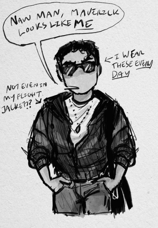
I use this Copic marker brush w/ just straight up black and varying levels of opacity. Usually I don’t use blending brushes in these, but in my most recent one I did.
For my colored stuff tho I use a lotta this pencil brush for everything (shadows, highlights, base flats, etc) and then depending on whether I want something more painterly (like the ocs on the left) or more cell shaded (like stevepop on the right), I either use soft texture brushes or a chalk brush (I cannot for the LIFE of me find where this chalk brush came from?? I’ve been digging but idk I can’t find it outside of my duplicate??) for highlights
Some other brushes/brush sets I use (all of them are free as of rn ���cuz I’m broke):
Habook Brushpack (specifically the rectangle one- it puts down flat colors nice and fast but also doesn’t annoy me the way most “ink” brushes do!)
Laurenillusrated Brushpack- I use these mainly for skin, they’re really nice. (Also, @laurenillustrated is on tumblr- her art is so pretty, it’s like a storybook istg. Check it out if you haven’t it’s AMAZING)
I’ve recently started using @loish’s brushpack too, and I ADORE these brushes. I used them a TON on the Christine poster. You can get them by signing up for Loish's Digital Art School, which is a great collection of art resources as a whole, and it’s totally free. Would absolutely recommend
And finally, for the halftone texture I like to put on everything, I use the Halftone Hospital Basic Tone Kit. All of their brushes are fantastic, definitely check them out if you like the look of traditional art but also like the lower supply cost of digital art lol. Or just in general, ‘cause they’re great
(Then for the paper texture overlays I love so much, I usually use stock photos tbh.)
Anyhow, these are some of my favorites. But I do use others too, and this all came from years of playing around and finding what I like! I had this phase about…1 1/2-2ish years ago where I hated my art style and nothing was coming out right. It pushed me to try a bunch of different brushes- in retrospect I don’t think the brushes were what made it better, I just improved over time, but I had a lot of fun trying out different brushes. So definitely try ‘em out and experiment, because it really is a fun time :))
(As for my workflow, I talk about that here if you wanna know more about how I draw!)
28 notes
·
View notes
Text
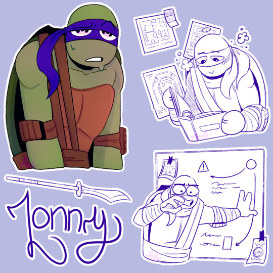
Hey @bluepeachstudios ! How are ya? i should be doing stuff but instead i'm here with your boy Lonny! whose name i always spell Loony first and then correct it :D Ngl to ya, Lonny's sketch is superior that the end result. I blame it on the brush i'm using for the lineart :] I won't change it tho. They need to be a set. I'm already screw.
SO, HC TIME!:
Ok, i don't remember the ask exactly but i remember reading that Lonny makes the more aesthetically pleasing inventions, but also the less efective. So i thought "Oh, he likes design! What kind of design does he like?" and i think he would really love interior design, which i think you may have mention already or something in that topic? So, yeah, Lonny might be an interior designer. (He would be one of those people that plays the sims just to make cool houses AND HE WOULD BE SO GOOD AT IT. Also, in the Animal Crossing game he shares with Leo and Dea, Lonny is the one that makes the Island cute and neat.)
In that topic, you also mentioned that he has a folder. So i thought it would have a lot of interior design ideas inside. Also that it gives him peace to look at it. This is not a big HC… more like a HC detail /hj But it helps with his anxiety.
I had this HC that i thought before chap 11 (and after Dea's drawing) of Dea and his thoughts. I thought being Deangelo might be really tiring because of all the thought in his head, but he's stable because he has a filter/system to them, so he consumes a lot of energy but is stable. I wanted to mention it because i think Lonny also consumes a lot of energy for of all the paths and worries he has, but doesn't have a filter for them yet and because of that he's kind of an unstable fusion. It's obviously not cannon because in chap11 Dea was outside for days without problem. But idk, i like to compare them. They are both sometimes overwhelmed by their thoughts but Lonny is worst at dealing with them (When he appeared the first thing he did was having a crisis SO-).
You know? Indigo is a weird color. Some people thinks Indigo is this purple shade (like Lonny uses) and others a bright-dark blue? Google Indigo, the differences between the colors is so wild! These are two completely different tones and yet both are considered indigo… (This is not a HC. This is just me being "indigo is not that shade!" at Lonny and discovering that Indigo is a fucking lie.)
Lonny is the only fusion with Leo who i think uses just He and plural they. He might be super gay tho /J
Anyway BYE i need to run or i will be late. This is totally worth it tho /hj (no. Really. I'm def gonna be late. I shouldn't be doing this rn)
185 notes
·
View notes
Note
hi uh-
You seem to know how to render so I was wondering if you could possibly give me tips? :'>
Love your art btw it is 🤌🏻🤌🏻🤌🏻🤌🏻
Aaa thank you! Rendering is not something i consider myself particularly good at and i'm still trying to learn, but here's some things i picked up!
Shapes! Edges! Have a balance between smooth, nicely blended areas and really sharp and shaped areas
So imagine you're doing lineart or a sketch. Places where you would put lines (eg. cheekbones, wrinkles etc) are really good places to have some sharp edges. I like to make things smoother and more blended in places where there's more skin.
Undertones!! I color the entire thing in one color (i looove working with green and blue here, but i also play around with different colors as well) and then i build on from that.
DON'T ZOOM IN TOO MUCH. Focus on the big picture. Zoom out and see if the shapes are visible, if your picture is recognizable and doesn't look muddy. It's nice to have distinct light and shadows.
Block things out first and then do details later on. But you don't have to dwell on them too much, it's up to preference really! I usually find that my art looks really weird if i render too many details
Use references, see how light, shadows and colors interact! References are great i love them 10/10 no notes.
If you're rendering a face, know about the planes of the face. This will really help you out, also ties really nicely with the edges and shapes thing. Another thing i love to do is feel it out myself. I just drag my fingers across my face and try to understand how it works, where the bones are, how the skin "wraps" etc!
Don't use too many brushes, it will just look messy and cluttered and out of place.
These are the ones i can think of rn. Most of these are up to preference really and won't apply to every situation or drawing. But yeah! Just experiment, really! Try new things! Have fun with it as well :D
25 notes
·
View notes
Note
Ohhhh! I’ve always loved your art!
Do you have any tips? (Any will do!)
Tysm!!!! I’ll share some tips that have helped me improve over the years!
- USE REFERENCES! Using references are a great way to help you practice and study anatomy! Eventually you’ll be able to imagine a pose with accurate proportions in cool angles bc you understand how the body is shaped!!! (Pintrest is really good for this)
- Try to push yourself. At times it’ll feel like your art is getting stagnant, personally that’s when I find something in my art if feel like could use improvement (rn I’m working on shoes, backgrounds, and lighting!) and then try to do a full piece focusing on those areas. It’ll be refreshing and rewarding in the long run!
- Get involved with a community! Many many MANY times I will look at moots or friends artwork and love their style, or their takes on characters, or little flourishes they add to their art. It’s a great way to get inspiration and it makes your brain think a little bit on how they go about the process, and how you would be able to replicate it!
- YOUTUBE TUTORIALS!!! There are so many channels out there that provide real FREE advice from professional teachers and artists! Utilize them!!! ( Winged Canvas is a great channel that I watch frequently!)
- Switch up your brushes every now and then! You’d be surprised how much a brush can affect the style of a piece, experiment a bit! Here are some of the main brushes I use if you’re curious ^^

- Flip your canvas every now and then! It really helps you to see imperfections more clearly!
- And lastly, Trust the process. Many times for me when I get to lineart or base colors, I feel like the piece isn’t looking too good, and that can be demotivating! Try to stick with it, because usually it will start looking way better once you have some rendering on it. However, if you’ve been messing with a piece for awhile and it still isn’t turning out great, take a step back and comeback to it later, or try to start again. (Usually my second passes are better than my first idea, it’s okay if the first one doesn’t work out!)
8 notes
·
View notes
Note
2, 4, 5, 6, 8, 10, 15, 16, 19 for the artist asks 👍
hi ghost!!! thanks for the ask :D [ask game]
4. Favourite things to draw?
Eyes and noses!!!!! i love drawing eyes and noses!!!!!!!!!!!!!!! my LOVE EYES AND NOSES!!!!!
5. Anything you haven’t drawn yet but want to?
Therése and Harding. I won't lie. They rotate in my mind often yet i don't take action to draw em....... i really should though theyre very cute
6. Which artists inspire you right now?
Obvious answer: my lovely mutuals inspire me a lot. CURRENTLY am having a bit of a love for Vincent van Gogh's painting style because we talked abt him in school again recently... the way he painted is so crunchy. Which! did inspire me to take a shot at painting (which is going FINE so far. my paitings..)
8. What do you like most about your own work?
Answered here! But I also like how I draw character interaction a lot. This is consistently also what people say they like about my art so must be doing something right there!
10. What’s that one thing that inspired you to make drawing your consistant hobby?
Definitely just watching cartoons a lot growing up. When I saw stuff like Teen Titans, ATLA/LOK, Adventure Time and Steven Universe I always went "I WANNA DO THAT!!!!!!" which inspired me to draw like a lot!! Never actually properly animated anything
15. Biggest artist pet peeve?
MMmmm. Maybe when people delete art video tutorials? Like! I understand updating an art tutorial because you learned new things, but I'd argue it's good to keep it to kind of show you improved, how, and maybe incorporating that into the new vid. (can you tell a tutorial i had saved to watch later got removed)
16. What’s the most daunting part of your process? Ex, planning, sketching, lineart, rendering etc
RENDERING. BACKGROUNDS. I DONT LIKE THOSE. I NEED TO GET BETTER AT EM BUT LORD I DONT WANNA!!!!!!!!!
19. Favourite character(s) to draw?
My own OCs mostly LMAO. rn im still using my friend sigrid as a muse. my sigrid!!!!!!!
2. 5 favourites of your own work?
Answered here too! But I'll pull up 5 more
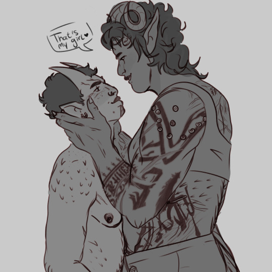
my siglach.... STILL very proud of that karlach hand.

the milf emira drawing i wont lie. look at her
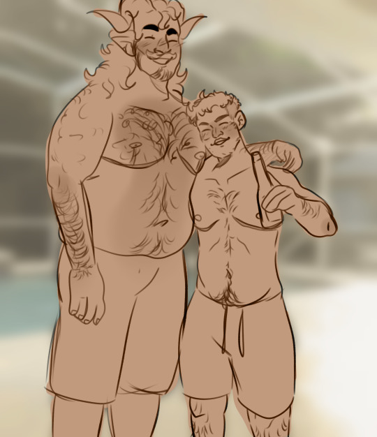
I LIKE THIS KREM AND CHRONOS PIECE A LOT!!!!!!!!!!!!! THEYRE BUDDIES

this ones a bit older but this drawing still means much to me. that's varric's emotional support lesbian DONT touch her

this sig sketch i never finished....... my elegant girl..
#TY AGAIN FOR THE ASK <3<3#i'll share one of my paintings maybe when i finish the one i have planned..#RAGHHHH I LOVE YOU ART I LOVE BEING AN ARTIST#my art#roscoe rambles
5 notes
·
View notes
Note
For the tattoo thing 5 and 6
5. What was the most painful tattoo?
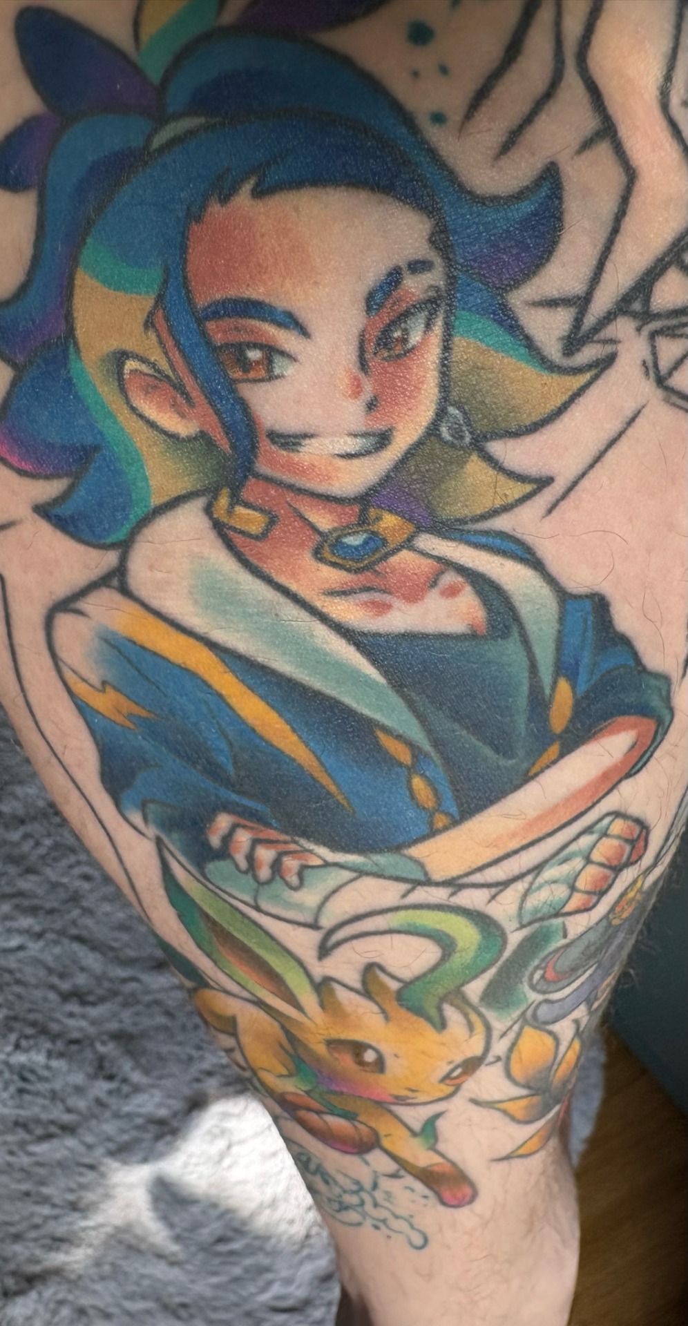
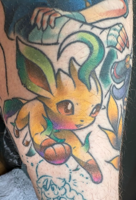
For me it’s the back of the calf/knee area. My Adaman/Dialga/leafeon tattoo really, really hurt. That one and my Arceus tattoo are all in that general area, and so far it’s been the worst place I’ve been tattooed. I’m not someone who thinks tattoos don’t hurt, they absolutely do, but for the most part they’re usually pretty easy to tune out after a while. You may get the odd sharp bit here or there, but usually it’s pretty easy to ignore, but the back of the leg/back of knee area is extremely sharp for the whole tattoo. My Giratina tattoo is on the front of my knee, and I was always told that was one of the worst spots, but I didn’t find that spot very bad at all, especially compared to the back of the knee
The Adaman tattoo is also a pretty major scar cover up, so that may have something to do with why it was so painful. Some parts of the tattoo were completely numb without any feeling what so ever, but right next to that section were spots that were literally the worst tattoo pain I’ve ever had. Nerve damage wild card, I guess lol. Unfortunately the tattoo isn’t completely done yet, and I have a few more colouring sessions before my PLA sleeve is done, so I’ll have to be tattooed in that area a few more times still
Another thing that made the Adaman tattoo suck so bad was that I accidentally booked the linework on the same day I had a gig, so I had to finish this long ass tattoo session, wrap it up, and then rush into the city in time for the show. This was also in the middle of February in Australia, so it was crazy hot and humid. I’d just had the most painful lineart session on the back of my knee, so it was kinda painful to walk, but I pushed on. By the time the show was over I was exhausted, and the tattoo was in desperate need of a bandage change. TMI but I use second skin, and after not resting and pissing it off all night, it had sprung a bit of a leak. I was going to clean it up and change the bandage after I got home, but I found out that my housemate had used the last of my second skin bandages (thanks Moth 😒). So at like 3am I had to drive all the way back to the city, to get to a hospital that had the only 24hr chemist that was open at that hour (that also had them in stock), so that I could finally fix the tattoo up. I’d been awake since like 8am the morning of the tattoo (after only getting 3 hours sleep the night before), and I didn’t make it to sleep until about 6am. It was definitely a day.
Second worse is a tie between Melli and Lord Electrode, who was a huge tattoo done all in one day, and my Skyrim tattoo that I got the day after getting a Covid shot when I felt like shit
6. What was your first ever tattoo and how old were you when you got it?
Technically my first ever tattoo was a dot on the palm of my hand from a pencil when I was 8 lol, but my first real tattoo was a little Mewtwo. It’s held up really well, and I still love it
Also This ask made me realise that I never posted a healed Adaman/Leafeon colour update whoops. I’m alone rn, so it’s a bit hard to get good, undistorted pics of the tattoo by myself, but here’s how they’re looking so far. Next colouring session is next month btw
6 notes
·
View notes
Note
just came across your page and i hope this doesnt sound weird but i NEED to see you do a speedpaint.... i keep looking at your drawings trying to figure out how youre doin stuff, and I just cant figure it out
i love analyzing peoples art because you can always pick up techniques to use in your own but also cause its facinating to see others draw, like what part do you draw first what do you focus on, do you use guidelines everywhere or are you one of the crazy ppl that are past that part, ect ect
hiii hahaha this is actually funny bc im in the middle of making a speedpaint rn !! its of the sigma lineart i shared a few days ago, im struggling with coloring but hopefully im able to finish it
thats really cool!! i dont use guidelines very often unless im feeling patient enough to really play with perspective, most of the time its from vibes 😭 i do have a coloring tutorial (which is kind of like a speedpaint ig?) that you can find here !!
thank you for asking!! if my process helps people achieve the artstyle they want im more than happy to share how i do stuff :D
14 notes
·
View notes
Note
hiii noemie my beloved mutual! i saw your commission prices and i realized i have enough christmas money for a piece from you, which is very exciting because i ADORE your art. with how terrible this year has started off for me and my parents, i deserve to indulge a little bit and treat myself, and since you take payments through Ko-fi i can like, actually pay for it on the spot :) i just have a couple of questions!
question 1: are you willing to do just the lines of a piece so i can color it myself? i really need rendering practice so i'd appreciate being able to use your linework for that (with credit of course) but if not, i'll happily just do the shaded fullbody :)
question 2: have you ever drawn like, a normal snow leopard before? well, 'normal' is relative, my fursona, Chirp, is bigger than a normal snep by quite a bit. but anyway the piece i'm envisioning is Silver wrapped up in a giant cozy blanket, still in bed, with Chirp lying behind him with their head resting on top of his blanket. kind of like a protective guard dog protecting their owner's kid, if that makes sense. but if you're not able to draw Chirp or just don't want to, then don't worry about it! i'd still love to see a very cozy Silver snoozing away!
uwaaahhh rabbit ur so sweet!!!!!!!!! eyes full of tears rn o(╥﹏╥)o
1. i can do both for you! the shaded full body would cost but the linework itself would not. if u want to pay for just the linework a sketch comm would work perfectly, but if u want a shaded full body i can just give u the lineart for free as a extra bonus C:
2. i have never drawn a snow leopard before but what is art if you’re not experimenting . i am more then happy to try ,,, ur sona always looks so silly and fun to draw so im more then happy to play around with them !!!! C:
#curiosity vortex#<- god i swear i never get asks on here i always forget my ask tag . LMAOOO#anyway i hope this answers ur queries <3
5 notes
·
View notes