#someone teach me how to do screencaps and gifs please
Explore tagged Tumblr posts
Text

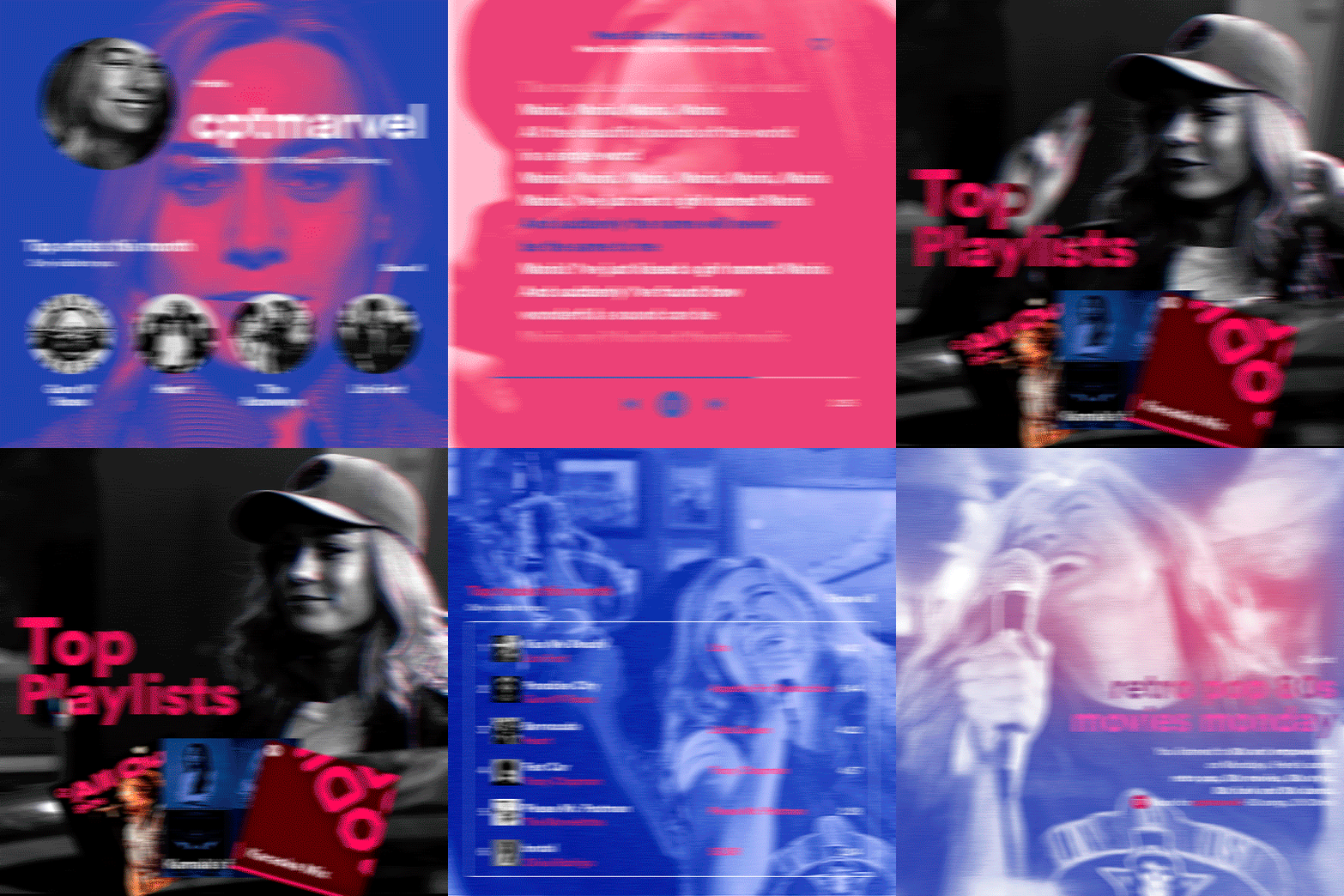
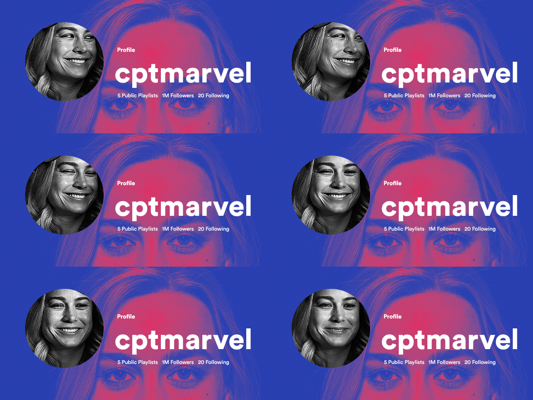
hi! someone requested me to do a tutorial based on this gifset!
this tutorial requires an intermediate knowledge of gifmaking. i won’t teach you how to do gifs from scratch, there are other tutorials for that out there.
[tutorial under the cut]
THE BASICS
AN INTRODUCTION
first off, the gifset in question is based on this gifset by @/eddiediaaz and i got permission from them to explain the process. i won’t be sharing the template because it’s a near replica of theirs (that isn’t shared to the public) and i don’t feel comfortable doing so, but you can recreate it by yourself just like i did!
also, ESL, so please pardon any mistakes.
THE FONT
Circular ST (Medium & Black). download it here & here.
CLIPPING MASKS
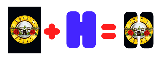
clipping masks are the way i put images and gifs inside of shapes. i used that method in the first and second gif of the Spotify gifset as you can see here. what does a clipping mask do? basically, it links two or more layers together in a way it follows the “shape” of your base layer. ie, everything that is shown follows the “shape” of your main layer and nothing more. your base layer can be anything: a shape, an image, a gif, a text, an adjustment layer, really everything. let’s see an example:
CLIPPING MASKS & SHAPES

the original image (Gun 'n' Roses logo) is intact, as in, it’s not cut like a circle, something that cannot be undone. instead, everything outside the limits of the blue circle is just hidden. if i delete the base layer (the circle layer), the original image will appear as it originally is, as an rectangle. talking about layers, let’s see my layers panel (some things are in Portuguese, but i think you can understand):
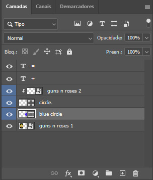
notice the little arrow pointing downwards to the “circle” layer. that is the clipping mask symbol. the base layer always needs to be below what is being clipped. if the base layer is deleted, the chain is broken and every layer clipped will now act independently and have its original shape. you can have as many clipped layers as you want. you can also have multiple chains going on in a .psd, each one with its own base layer. to clip a layer, you just need to press ctrl+alt+G or cmd+option+G while having the layer you want to clip selected (NOT your base layer). or, you can go to LAYER > CREATE CLIPPING MASK.
CLIPPING MASKS & TEXT
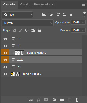
let’s see the same example, but with text instead:
A TIP
because adjustment layers are clippable, you can completely gif by using clipping masks. this is very useful when you have more than one gif inside a canvas and don’t want an adjustment layer to affect everything besides a certain layer/element.
let’s take my first gif of the Spotify gifset as an example.
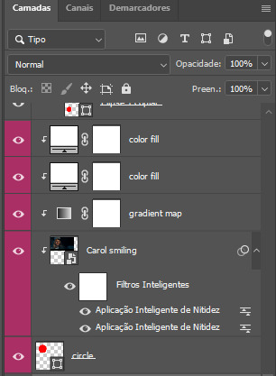
the circle is the base layer. the “Carol smiling” layer is my gif converted to a smart filter. above that “Carol smiling” layer, there is a black and white gradient map and two color fills of white so i can achieve the coloring you see. all those layers are clipping onto the circle layer, making my now b&w gif have the shape of a small circle as well. those layers are in a folder in the .psd of my first gif, so i don’t have multiple files sitting on my PC to assemble just one gif. i could have giffed that small gif separately and pasted it onto my canvas as well, but i like to do this way so i can adjust everything i want in real time instead of redoing a gif over and over every time i want to change something.
HOW TO MAKE EACH GIF
all gifs are 540x540px.
THE FIRST GIF
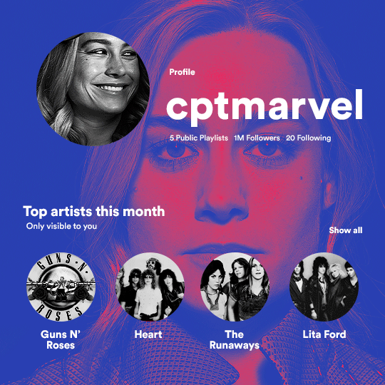
the first gif has 6 elements. the elements are: a big gif serving as a background (a close-up of Carol), a smaller gif inside a circle (a b&w gif of Carol smiling) as a profile picture and four static images for the featured artists. i giffed as i normally do (loaded screencaps, resized the gif, sharpened the gif, etc) for my background gif. to achieve the coloring, i’ve added a gradient map (layer > new adjustment layer > gradient map) purple to pink. to the profile picture, i made a 160x160px circle in the top left corner. the color of it doesn’t matter. the next step is a matter of taste: i giffed the smaller gif in the same .psd thanks to clipping masks that i explained earlier, but you can do it in a separate canvas too. for the featured artists, i made four circles with 98x98px each. for the images, i had to check Spotify for their selected PFPs. after that, i googled “[band/artist] spotify” to find the images. the PFP of bands and artists in the Spotify app are displayed in black and white, so you might have to make them b&w if you happen to find them only in color. to make the artists PFPs pop a bit more, i transformed them into smart filters and added a bit of sharpening to them (intensity 10 x radius 10). you can adjust the colors and the brightness if you want, too. the sizes of the texts in the gif are: 58px (username), 20px (top artists of the month), 15px (name of the artists), 12px (only visible to you + show all + profile) and 11px (following and follower numbers).
SECOND GIF
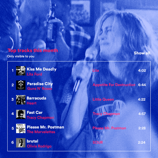
for the chart, i created a black rectangle (490x308px) that i set its blending mode to lighten (thus making it transparent) and i added an internal white stroke. i added the text and the little squares next to the top 6 numbers. the font sizes are: 17px (top tracks this month), 11px (only visible to you), 14px (song title, show all, top 6 numbers), 13px (artist/band, album title, length of the song). i added the album covers — that i made b&w — by clipping images onto 32x32px squares. for the coloring, i added a gradient map (dark purple > light purple).
THIRD GIF
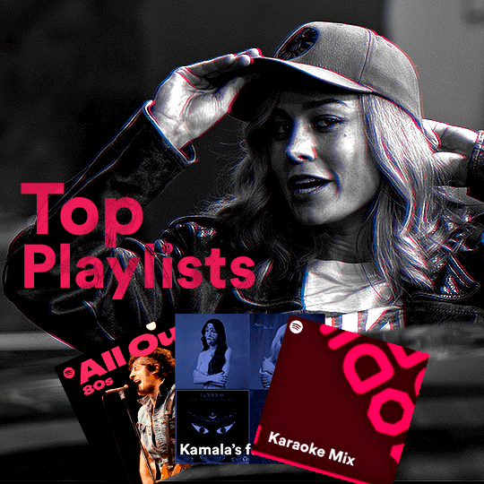
there are three types of playlists in this gif: a Spotify original playlist, a playlist made by a user and a Mix. you don’t have to follow this formula if you don’t want to, but in the case you do, here’s how i did it: browse Spotify for an original playlist of theirs. chances are, if you google the playlist’s name, you can find its cover on Google Images. at least, i found the “All Out 80s” cover that i used in my gifset. you can also create your own. for the user playlist, just pick four songs and find their (album) covers, also on Google. create a square canvas on Photoshop and make four squares, each in one quadrant of the canvas. paste your images onto your canvas and clip the images to each square. then, add a gradient map (black + whatever color you want) to all those images and title your playlist (font size: ). save that collage as a PNG and load to your gif canvas or merge all the layers+transform into a smart filter and drag the smart filter layer onto your gif canvas. now, the trickiest one. while you can invent your own Mix, i wanted to use a real one, but i had no idea on how to find them. thanks to reddit, i discovered that, if you search “made for you” on Spotify, you will find their Mixes! some of them are very whacky and specific! i just picked the Mix that made the most sense for Carol from that (gigantic) list. before doing the next step, i would advise you to google the name of the Mix you picked to see if you are able to find the cover of it with good quality. i wasn’t able to find mine (Karaoke Mix), so i just screenshotted my Spotify app, pasted that screenshot into Photoshop and cut the Mix cover and pasted that onto my canvas. the quality wasn’t great, so i transformed the cover into a smart filter, added a bit of gaussian blur and then sharpened it (intensity 10 x radius 10). the color wasn’t what i wanted either, so i used Hue/Saturation to change the hue. because the original image for the Mix was smaller than i wanted and i stretched it to make it bigger, the quality of the text and the Spotify logo was botched. i painted over the Mix cover and created a text with the font i linked earlier to replace its now pixelated title. i also painted over the little Spotify logo, found a logo in the internet and pasted over the Mix cover about the same size of the original logo. to achieve the “3D effect” of the gif, i made my b&w gif, the base. then, i duplicated all layers and added a gradient map (black > pink) and merged all the layers of that duplicate. i made a second replica of my gif, now with a different gradient map (black > blue). i set both replicas to the ligthen blending mode. you will notice that the replicas will "disappear" and only the original b&w gif will remain. if you move the replicas a bit, that colored border will appear. this doesn't work much in very bright gifs without a lot of dark areas, btw.
FOURTH GIF
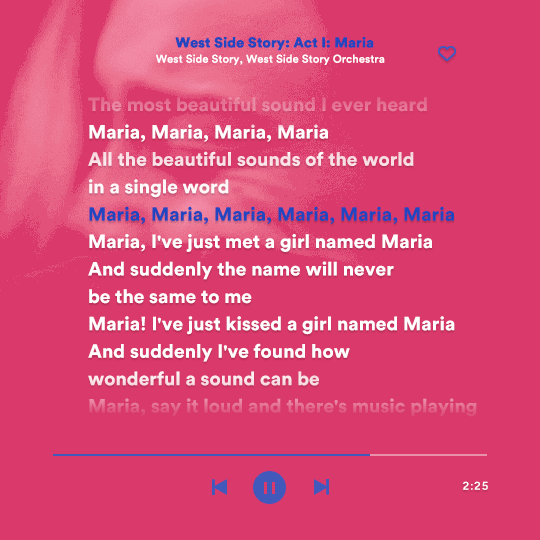
this gif used an altered (by me) version of this template. (i changed the fonts to match the rest of the gifset, too.) for the color text effect, you will have to gif with the timeline bar. take your gif’s length and do the math to find how many frames are ⅓ of it. take your lyrics’ layer and cut it into three equal parts or close to it by using the scissors icon in the timeline panel. in each third, change the color of just one line, line by line. when you play your gif, the colors of the lyrics will change like in Karaoke. you can do the same thing with frames iirc, though. i explained the timeline method because that’s the one i used in this gifset and use in general gif making. for the coloring, i added a gradient map. to make the colors pop a bit more, i add two gradient maps: the first one is in black and white, the other is in color. that adds depth to the blacks and darker colors of the gif.
FIFTH GIF
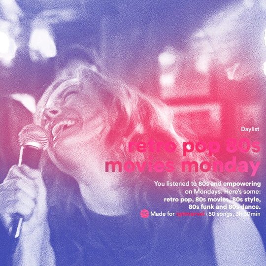
like in the Top Playlists gif, i wanted for my Daylist to be real as well. to achieve that, i listened to my Carol Danvers companion playlist (that you can listen here) for a long time until my Daylist refreshed itself. (Daylists refresh in certain times of the day — don't worry, Spotify will tell you when.) then, i just copied what it told me — the title and the genres i listened to generate such a Daylist, plus the genres i should check it out. you can invent your own Daylist if you want, but because it is generated by AI, i find very difficult to mimic its crazy titles, but you can try! you can also search in the web for other people’s Daylists if you want, but usually people don’t tell you what they listened to to get those playlists and nor what was recommended for them to listen to and i, at least, find that information important for the gifset. be aware that Daylists aren't available for every country yet (like in mine), but i found a way to work around that. the browser Opera GX offers a free "VPN" — not exactly a VPN, but it works close enough — so you can set your location to the US and listen to in-browser Spotify. i recommend not log into Tumblr while using Opera's VPN as there is a myth (that could easily be true!) that Tumblr terminates people's accounts that use a VPN. font sizes: 43px (daylist title), 13px (text), 12px ("daylist" & "made for"). for the flare effect, i searched for flare overlays on YouTube and downloaded one of those videos with 4K Video Downloader, a free software. i loaded the overlay into Photoshop and added a gradient map (purple > pink) over it, thus changing its color. i pasted the overlay onto my b&w gif and set its blending mode to screen. voila!
that's it! i hope you liked it and that i was able to express myself well. if you have any questions, feel free to contact me, i love helping people about their gifmaking questions! 💖
#*#*tutorials#gifmaker tag#dailyresources#usergif#completeresources#alielook#userairi#userhallie#userbess#userrobin#usershreyu#userzaynab#tuserju#tusermalina#tuserheidi#usertina#userabs#userbuckleys#usermagic#userjoeys#antlerqueen#userarrow#flashing gif tw
422 notes
·
View notes
Text
Cyber Security (Elliot Alderson)
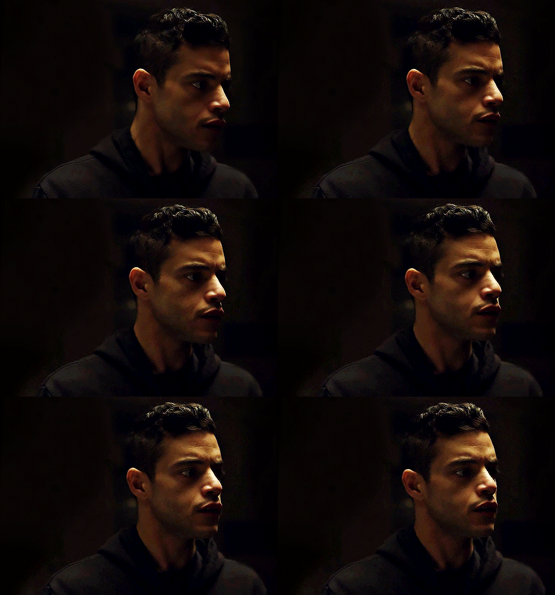
Description: An online ad leads him to you, though in reality he has little interest in your ad. What interests him is how you accidentally doxxed yourself and how oblivious you are to that fact.
Notes: idrk what to say about this one its one of those things that i wrote at midnight after almost falling asleep to a fantasy and then realizing it could work as a fic. like i did this same thing with ‘close your eyes’ that one was also a before-bed-to-get-to-sleep fantasy. this is also not a particularly romantic interaction, though it can be read as such WC: 2.2k
+
Sweat drenched his sheets, bathing him in the cold wind that breezed past his only air conditioner lodged in a nearby window. He stared blankly upwards, half shivering and half overheated, as he once again found himself in a familiar predicament—the practice of sleep.
It was no secret he had trouble calming himself down, and that aspect of himself reached into the evening, as well. He already downed three melatonin pills hours earlier, along with smoking a joint that should’ve put him to bed. Unsurprisingly, that did not work.
“Xanax,” he mumbled to himself, hearing it bounce back from empty walls. “Need to get xanax.”
In the meantime he raised himself to his feet, padding across freezing floors to his computer. With a click of a button the white screen buzzed to life, shining bright onto his sleep-heavy eyes, that did their best to acclimatize to the sudden change.
Hypnotization—strange as it might’ve been—had worked a couple times before. Not all the time, but decently enough to give it a try. He had work in the morning and he didn’t need to be more miserable than usual, especially since he hadn’t slept almost the entire weekend.
sleep hypnosis
The blinker flickered for a moment before his fourth finger slammed down on enter, the last step in calculated movements. What popped up first was a video titled [ SLEEP HYPNOSIS ] 8 Hour Loop with a screencap of a spinning black and white screen. Below that, however, was something he hadn’t seen before—a YouTube video titled exactly what he’d typed, lacking the caps just as he had. The title screen appeared to be some sort of poorly-drawn painting.
Curiosity overcame his hazy, aching head, and he clicked, finding a playlist of videos containing what could be the titles of songs, along with several different poorly-drawn title screens.
The first video began to play before he could realize it. What he first noticed was it was bereft of ads—that meant the publisher made no money off the album.
Sat in the presence of God
whose name means filthy old fraud
Captions had been manually added by, he assumed, you. The author. There were three views on the video, no comments, and no likes, leaving few other options.
Maybe it was the melody—maybe the lyrics, who talked of a world plagued by aristocrats. But he found his eyelids heavy, dropping dark eyelashes in his vision that blurred the screen. By the third song, reciting verses of an Islamic poem, he was slouched in his seat.
He slid down to the floor, crawling his way back to flop onto his bed. The music continued to play till the first ad popped up, at which time he opened his eyes, seeing a music video from Katy Perry, at which time he promptly reached over and unplugged his computer. He wasn’t sure which cord he pulled out, but the screen still went black. With that, he just barely sneaked into his covers, dozing until the morning.
It was far too easy to get information on you. Your full name was stated clearly in your youtube bio, alongside several different social media tags leading to instagram, tumblr, and facebook.
Facebook alone provided him the means to your address, and he didn’t even have to go looking for it. Your most recent post was an ad, searching for someone good with computers to aid you in your recording process, which you noted as ‘dismal’.
Are you fucking kidding me? He thought to himself, reading the ad once more.
Your address, your real, physical address was stated as the place you wanted to meet those interested in helping you. On the internet. You had doxxed yourself after less than a year of being online.
Okay, he thought, clicking on your listed email. Someone needs to be taught a lesson.
Three days later—after about two weeks of listening to your echoing voice every night—you replied, sending a cheerful email detailing when you would be available to meet him. After shooting a short message back, the date was organized.
Two more days and he was standing at your doorstep, his neck craned upwards as he scanned your tall, narrow home squished between two other apartments. He just barely knocked before the black door swung open, revealing a familiar face belonging to a stranger. Elliot was dressed in his black hoodie and jeans, a stark difference to your long, colorful robes, coming out of a sort of fantasy world.
“Hi,” he said, his voice grating with how low and quiet he kept it.
“Hello,” you said with a smile that did not match his hunched posture. “Are you Mr. Alderson?”
“Elliot,” he corrected, his chin just barely raising to meet you. “Elliot Alderson. Elliot works.”
“Alright,” you said, nodding. “Come inside? I was just making tea. Do you like tea? Or do you prefer coffee?”
“I... I’m fine, thanks,” he said softly, scooting past you when you opened the door wide enough for him to enter. He sucked in a breath as his chest brushed yours.
Your home was modern—far fancier than Elliot’s own apartment, with large windows flanked by soft grey curtains. A small, upright piano was in the corner of the living room, set upon a reed mat lined with Korean symbols. The couch was clinical, made of a sort of black plastic leather that matched the grey skies beyond the window panes.
He sat down, shifting his feet closer together as his fingers dug into his palms, continuing to scan the room in its’ entirety until you returned with your own tea.
“What kind of experience do you have? School counts,” you said, setting your cup down on a tiny plate whose decorations matched your teacup.
“I’ve been... experimenting, with computers, since I was around 9,” he said, mumbling the words out as his shoulders hunched awkwardly down. “Have a job at a cyber security firm. Started a while back.”
“You still have that job?”
“Yeah,” he said with a small nod. “Jus’ thought this would be... fun.”
The dead look on his face indicated no humor whatsoever, but you took his word as it was.
“How’d you find the ad I put out?”
“I... I listened to your music,” he answered honestly for once. “Helps me fall asleep.”
“Oh,” you said, clearly taken aback. Your face grew warm as you glanced away with wide eyes. “I’m glad I could help.”
“You’re not very good with technology, though,” he said in his usual low, grating voice.
“Not really,” you chuckled sheepishly. “That’s why I put out the ad -“
“No, not that,” he interrupted you. “You put your physical address on the internet. You doxxed yourself. Do you even know how dangerous that is?”
The lyrics of your songs pointed towards a kind of brilliance, balanced against emotions felt thoroughly on pages and screens. It didn’t match your actions at all.
“What’s doxxing?” You asked.
Elliot had to physically stop himself from sighing and leaving.
“You want everyone to know where you, a minor celebrity, live?”
“I’d hardly call myself a -“
“I could’ve been a murderer,” he said, reaching into his bag.
He looked you in the eye as he pulled out a gun, clicking on the safety before he pointed it at you.
“This is how easy it would be to kill you.”
As expected, you stiffened at the sight of the iron barrel, your fingers withdrawing to your chest. Your lips pursed as you met his gaze once more.
“Please put the gun down,” you whispered, your voice cracking.
He did as you said, resting the gun on the table.
“That’s a hell of a way to start an interview, Mr. Alderson,” you said quietly. “Please get out of my house.”
His heart sank. What had he expected? For you to fall to your knees and sing to him as he desired you to do? He threatened you with a gun to teach you a lesson, and you reacted accordingly. Calmer than others would.
Elliot stood on shaky legs, sliding the pistol into his backpack before he zipped it up. Throwing the pack over his shoulder, he swallowed through a tight throat, shuffling as he delayed his departure.
“Keep safe from people like me,” he said in a strained mumble. “Take that ad down. Meet people from the internet only in inhabited, public areas.”
You tapped your fingernails on the table for a moment, chewing on your bottom lip. Suddenly you stood, tugging on his sweatshirt sleeve to get him to face you, instead of staring at his feet.
“Alright. If you’re really so good at the internet -“
He ignored your incorrect grammar.
“- and... if you actually do want to help me with my songs,” your tone softened, “then you’ll be able to find my real name, not my stage name. If you do.. I’ll hire you.”
“Alright,” he said monotone, knowing the battle was already won.
Even though he knew your name already, he turned away and left to his apartment, immediately going to work on figuring out everything he could about you. If you willingly still offered him the job after that, he knew it would take a lot to scare you off. He could impress you.
It was, after all, the only thing he was good at.
Two days later he showed up at your apartment again, quietly thanking you when you let him in. The clean floors and walls remained unchanged since his last visit, and you led him to the same table, sitting him down on the same seat.
“Your name is (Y/N) (L/N),” he started with. You already appeared to be surprise. “You grew up near LA and you’ve had a chronic illness all your life. At eleven you saw your first therapist.. that must’ve been when you first got diagnosed with depression... and anxiety.”
“Killer duo,” you muttered.
“Your parents split when you were thirteen, which came at the same time as your dog, Penelope, died. Or... sometime that year. When was that... 1997?”
“1999,” you said quietly.
“Your mom homeschooled you,” he continued. “That’s probably why you don’t know how computers work. Rather eclectic, in a.. boring way... an ex-Amish, right?”
You nodded and his heartbeat tripled. Everything was right thus far despite a two year difference in his guesstimate of your life’s timeline.
“Then there was your dad... logger in the Redwood forests. Burly guy. Not a great man, from what I saw,” he said.
“He was fine,” you said with a small shrug as you looked away. “Didn’t ever hurt me, or anything.”
“Abuse isn’t always physical,” he said faster than he could think, dizzied by his own memories playing behind his eyes.
“I know,” you murmured.
You went silent, so he continued, hoping to pry more precious words from you.
“Your favorite color is yellow,” he said, leaning closer to you. “On Valentine’s you get chocolate strawberries, and on easter you get kinder eggs.”
Nothing.
“You studied mythology as a kid, and you made paintings of the forest you lived in with your mom. Santa Cruz mountains, I think.”
“Yeah,” you said. “I miss the forests.”
“I know. You want to visit Ireland again because it’s a land of faeries and moss, it’s a breeding ground for your song lyrics.”
“How did you find all this out?” You finally asked.
“You use the same password on everything,” he said, though that was far from the actual answer. “Your web browser tracks all your movements and you don’t try to stop it, or hide ads, or stay away from sketchy websites. Your parents aren’t much better, either.”
You chuckled, shaking your head as you brought your hand to massage your brow.
“You’re way too smart to be helping me,” you said with soft laughter, blushing with your smile.
“It’s better than working for E Corp,” he said, huffing out a laugh that was hardly humored.
“E corp?”
“My.. uh, place of work,” he brushed off his slip. “My point is... I’d rather work with you and do easy work than work with my current fucking coworkers.”
You laughed, truly and fully this time, curling into a little ball that shook with the force of it. Your feet tucked into your tiny chair, making you even smaller.
“Bad people or just annoying?”
“Stupid,” he chuckled. “Don’t let me wear my sweatshirt.”
“Ooh, now it’s my turn,” you suddenly interrupted him, earning a strange look. “I’ve noticed things about you, too. I couldn’t learn anything off the computer, but you, you have anxiety too. Probably some childhood trauma.. maybe a dissociative disorder of sorts or a form of PTSD. Your jacket is like your home, and... you have sensory issues. Few types of fabric, don’t like to be touched, if I had to guess I’d say you might be autistic.”
“Blunt,” he said after a full minute’s silence.
“Do you mind?” You asked.
“No, not really.”
“Good. Then you’re hired,” you said with a smile, extending your hand for him to shake. “If you still want the job, of course.”
He watched you with evident apprehension, but took your hand after much thought, shaking with a firm grip.
“When do I start?”
199 notes
·
View notes
Text
FRUITS BASKET S3 EPISODE 8 RECAP AKA THE KYORU CHRONICLES PART 2 (plus a quick recap of eps 3-7)
aaaaaaAAAAHHHHHHHHHH!!! I gotta get it out of me otherwise I won't be able to concentrate on work and I will be scrolling through the tag till the day I die. Everything from episode 3 of Season 3 literally hit me like an avalanche - literally cos I marathoned 3-7 over the weekend which I wouldn't advise unless you want an accelerated heartbeat - and I'm starting to realise... maybe I just wasn't ready for season 3. Despite asking for it, haha. Not gonna put as many screencaps for this one cos tumblr editing bay be trippin and I just don't have time nor emotional energy to be fighting with the picture uploads, sorry lol
--------------------------------------------------------------------
Episodes 3 - 7
I spoke before about how (despite my feelings about the characters) the English dub VAs for Akito and Shigure pair up really well audibly. And I think I feel the same way about both Yuki and Machi's English VAs! They both have the same soft spoken yet scratchy element to their voices almost like they are holding slightly back. Although, I'd argue that Yuki has been losing the element of slightly holding back as the anime has gone on which I wonder if the same would be included for Machi's performance?
I really like the presentation of Machi's trauma through her family's expectations to be perfect and how physical it is? How Yuki kind of encourages her to let it out in a healthy way? (Btw the whole chalk breaking scene in the meeting was SO FUCKING SMOOTH. YUKI IS A NERD BUT HE IS SO EFFORTLESSLY COOL A LOT OF THE TIME)
The age gap between Isuzu and Haru for sure isn't the worst age gap in this anime/manga but it's still a bit... hmm...
Episode 4:

In all seriousness, I know Akito deserves some sympathy but it doesn't change the fact that I still see her as a villain. Hurt people hurt people but it doesn't mean they should get away with it, I was honestly pleased Haru got that big confrontation with Akito to tell her WHAT'S WHAT but it was also somewhat... merciful?
Hiro's growth has been so beautiful to see, him realising there are bigger things than him from the event with Rin to his relationship with Kisa to then the birth of his little sister.
Kureno choosing to get his hands a little dirtier and paying the ultimate price for it (as far as we know so far in the anime lol) was great, he is the moon side of Tohru's sunshine.
Shigure... I still don't really get him and Akito's relationship. It's clear he's waiting for Akito to grow the fuck up but at the same time he's not creating an environment for her to grow and develop. He's decided to go with the 'tough love' route which I'm still deciding whether I like it or not tbh. Sometimes it feels necessary, at other times it feels shitty. I respect that he knows he's a scumbag and I don't deny that there are people out there who take revelry in the fact that they are awful but at the same time, him remaining unchanging despite everything feels... unrealistic. But considering throughout this story he doesn't seem affected by trauma, it's understandable, I guess?
Also... that scene where Shigure ponders about whether he should've been with Tohru is THE creepiest creeper shit he's EVER done in this series. No. 🙅🏾♀️
Momiji is best bunny boi regardless of how tall and 'manly' he becomes. 🐰His scene with Akito was so authentically him and he really did that shit. We love him. <3
I love the way that the curse breaking should (on surface) be a happy event considering all the trauma the zodiac went through because of it but it's presented mostly as loss as well as happiness. It's the realness of getting out of a bad relationship
Shigure basically laying it out to Tohru how Kyo means nothing in a very taunting way was an excellently painful scene and I choose violence. It was heartbreaking seeing how worthless they all saw Kyo compared to how Tohru saw him but... by this point I was just living in the pain so 🤷🏾♀️
The story visually showing how Isuzu is more willing to be soft after her whole ordeal through her fashion choices (e.g. the pastels, the cardigans) was really nice. And Haru being happy about Isuzu making friends with Tohru was cute!
It was nice we saw that Kazuma was still wary about whether Tohru loved Kyo for the right reasons, you'd assume after everything Kazuma would love Tohru as a match for Kyo but he's so emotionally intelligent and also just a protective Dad! Yay, good parenting!
Tohru's confession to loving Kyo was amazing however I still adore Kyo's confession a little bit more. Just a bit. Lol. However, if you add the moment later in episode 8 it trumps it completely. Ethereal goddess.
Kyo and Tohru's grandfather having a scene together was great and nice
Now that I think about it, I wish there was more a visual link in the story between Tohru adapting her speech to imitate her Dad and Momiji adopting his Mum's German accent. Albeit for slightly different reasons, it just adds to the unique connection Tohru and Momiji have. In short, I'm seeing this ship with my third eye now. I get it lol
I don't wanna screencap the scene where Kyo is haunted by both his deceased mother and deceased Kyoko and potentially deceased Tohru because it's the stuff of nightmares. But, it was a wonderfully done scene. You definitely understand fully and clearly why Kyo buried all of that trauma under his hatred for Yuki (I CAN'T WAIT FOR EPISODE 9, YOU GUISE!)
If Akito is a villain, Ren is the final boss. Although, with her type of villainy... I feel like I can kind of enjoy a bit more. She reminds me of a Greek God in the ways she master manipulates people and her desperation for control and power (I just read 'Mythos' by Stephen Fry, it's a great read lol)
It lowkey feels like every female character who's comfortable in expressing their sexuality in this story is punished in some way for it... this is an incomplete thought
Shigure as a child feeling like they should all be pitied is so... mature... I feel like I need more of an explanation for why Shigure is the way he is
Akito's ego death with Kureno? Amazing. I loved that she was at least aware enough to realise how Kureno had been coddling her all this time but again... doesn't excuse her crimes
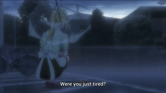

But anyways...
EPISODE 8
Honestly? I really don't have much to say about this episode besides 3-5 points I wanna get out of my head. It's not a bad thing at all, it's just that there's still a lot left to play out from this 'arc' and this season in general that I wanna complete my thoughts on.
But I'll start with this:
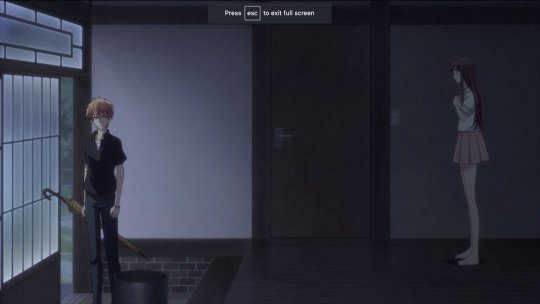
Lol, isn't it funny?! Isn't it heart-wrenchingly funny how the relationship between Kyo and Tohru has kinda reverted back to how they were at the start of the series? The coldness of Kyo at the beginning of this episode (and throughout) was a bit of a gut punch considering all the light and fluffy moments that we've gotten between the two since the True Form arc.
Talking about the True Form arc, I feel like this episode is somewhat a repeat of the same emotions, same trials of the True Form arc. Kyo still 'runs away like he always has' but this time we get him being the most honest and confrontational with his own emotions and trauma than he ever has been during the course of this whole story. While trusting someone (Tohru specifically) for the first time with the whole truth of his story! He always seems to move one step forward and then three steps backwards and while it's a tad bit frustrating, it feels very... real. I'll probably complete my feelings how this arc reflects the True Form arc when we finish this section of the story in future episode(s).
Considering the fact that 80% of this episode is Jerry Jewell monologuing as Kyo and I never got bored really just sells his performance. Kyo was being incredibly cold this episode and yet the range of emotions through his performance made it feel understandable enough for you to empathise with it.
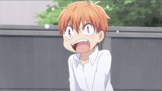
BrattyKid!Kyo to lighten the mood 😹I still wish he and Hiro had more of a relationship, I feel like they could have taught each other a lot. Well... mostly Kyo teaching Hiro tbh
Kyo rejecting Kyoka for her honesty and kindness and then later rejecting Tohru? Oh... kid...
Wow, I felt so good about that whole episode of Kid!Yuki helping Kid!Tohru get home and then it's slightly soured knowing KID!KYO was running about the streets alllll night into the morning?!?! I really did feel Kyo's frustration at not getting that win to actually do something right. And the irony of that being linked to him being unable to save Kyoka from the oncoming car?
Honestly, I don't know what my feelings are on Kyo being unable to save Kyoka. I don't even know what my feelings are on Tohru pretty much pushing that aside in favour of her feelings for Kyo. It's... complicated and I've been mulling it over in my head for the last 10+ years hahah However, if I was in Tohru's position I think I'd eventually come to a point where it feels like it's too late to really do anything about how bad I'd feel about it. Kyo's intentions weren't horrid, if anything he was just being a scared kid and he's allowed to be that. I just wish Tohru had a bit more time to evaluate it but considering she knew her mother well and assumes that wouldn't have been the full scope of what she had said, I don't have much of a problem with it in general
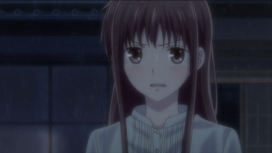
Lol, I love when Tohru gets a 'FUCK YOU, I LOVE YOU' moment with Kyo. 😂Another reflected scene from the True Form arc... only thing is that this time... it doesn't quite work. 😕
(Again, I love how all of these reflections are resolved in later occurences in response to the duality but I'll get to it next week when it shows hopefully)
Laura Bailey only had a few sentences in this episode but she killed it as always. Comparing her performance in 2001 to now is just... growth!
Ok, so Yuki automatically gets Best Boi in this episode for meddling and chasing after KYO of all people. Showing how he's personally done with hating Kyo. Realising Kyo is pretty much the only person who'll make his mother happy. I think he also lowkey wants to understand Kyo? But, we'll get to that next week.
....Oh yeah, Akito is there.
--------------------------------------------------------------
In total, I liked this episode even though it has me anxious for the next one. We finally get the full picture of why Kyo is the way he is! Ahhhh - a weight off all our chests, I'm sure. I kinda don't like that they put the ending theme at the end of these episodes - the joyfulness doesn't really match up with the intense theme? But, that's just a minor gripe. And hey, maybe they just want the audience to know... it's all gonna be okay :)
See you next week!!!
20 notes
·
View notes
Text

I posted 4,028 times in 2022
That's 454 more posts than 2021!
58 posts created (1%)
3,970 posts reblogged (99%)
Blogs I reblogged the most:
@punsbulletsandpointythings
@amemait
@crack--attack
@fishfingersandscarves
@skullscramblies
I tagged 1,053 of my posts in 2022
#ofmd - 132 posts
#ofmd spoilers - 86 posts
#blackbonnet - 63 posts
#fashion - 39 posts
#laces art - 24 posts
#arcane - 24 posts
#gentlebeard - 22 posts
#nandermo - 19 posts
#edward teach - 19 posts
#wwdits - 17 posts
Longest Tag: 140 characters
#dude if you go to thrift stores in the high end places of vegas like summerlin or henderson you can come out with so much designed shit on t
My Top Posts in 2022:
#5

I spent an hour looking at a screencap I took from Act of Grace and figured I should draw it for many hours instead. My first time trying to work with his beard I’m fairly pleased with it. *marge voice* I just think he’s neat.
HIS FACE IN THIS SCENE. THE PANIC SETTING IN AT THE THOUGHT OF STEDE DYING. THE DESPERATION
164 notes - Posted April 9, 2022
#4
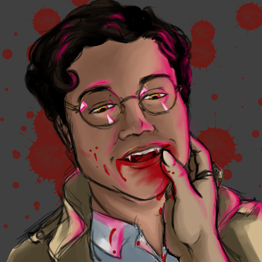
just worked my a** off on this because there isn’t enough art of Vampire Guillermo for me HE DESERVES IT! Also it’s so nice that I can just choose whatever light color I want in this fandom! Can you tell it’s Nandor’s hand? I tried to put his giant ring on there
192 notes - Posted January 4, 2022
#3
OFMD drabble- On some level I think I always understood
Inspired by @fishfingersandscarves‘s animatic when I watched it for like the twelfth time. Might have a part 2 at some point?
-
Stede’s breath hitches, the blade is sunk deep in his stomach, the right side, and he’s quite sure that Ed meant to do that. How many times had he been stabbed now? Ed’s face… beautiful, precious face, was rapidly changing from fury to panic. Stede couldn’t have that. He touches his face, hissing when the blade drives a little deeper at the movement. But he wouldn’t let it stop him. He’d rehearsed it so many times, but when he opens his mouth, something entirely different comes spilling out.
“It’s okay… really. On some level I’ve always understood that I was… wrong… That there was something wrong with me.” Stede breathes through the pain. His mouth tastes like copper, that can’t be good. “I never knew quite what it was. But everyone saw it. The other boys in school… My father, My wife, children.. Even the crew. Did I tell you they were going to mutiny and kill me just a few weeks before we met? It doesn’t matter. They could all see it. The Wrong.
The only person that never saw it… Was you, Edward. You looked at me and all you saw was, well me. You saw me and I didn’t annoy or disgust you. You seemed delighted.” A smile spreads across his face. He wipes at tears that are dripping down Ed’s face, smearing the kohl. “No one’s ever…” he coughs a little. “No one’s ever done that for me. If I die like this… don’t worry. You’ve already given me the greatest gift I could ever ask for, just by seeing me. I love you so much, Ed. I’m so sorry… I was so afraid I could spread my Wrongness to you, weigh you down, an anchor… But what a self-centered thought; I couldn’t do that. You’re perfect.” He says fervently. His own tears are falling, hot as the blood spilling from the wound.
He watches as Ed’s face twists, His eyes close tightly for a moment and when they open anger is back, but it’s different. Determined.
“You will live, Stede Bonnet. No one dies on this ship unless I say so.” Ed abruptly lets go of the sword but doesn’t pull it out yet. He puts both hands on Stede’s face, holding on tight. “You selfish fucker. You don’t get to die.” He eases Stede to the deck and Stede is certain he’s never been handled so gently.
“I’ll do my best.” he says, but he can feel consciousness rapidly slipping from his grasp. But then Ed’s hands are still on his face and now shaking him, calling for a surgeon, snarling at someone (Izzy? Stede can’t focus on anything but Ed and the pain) when they try to object.
“You don’t get to leave me again.” Edward insists and there’s something vicious in his voice and Stede deserves that, but it also feels good, to be wanted…
“Well then I promise.” He says and he suddenly brings up his numb hand to try to stem the bloodflow, the other has fallen to Ed’s shoulder. “I like the new look by the way. Very fierce.”
Edward actually laughs, though it looks like it pains him. It’s the most beautiful thing Stede’s ever seen. “You’re insane.” He tells him and then Stede is kissed for the second time in his life by someone he loves. “I’m still pissed at you.”
“That’s fair.” Stede agrees, but he can’t stop smiling.
317 notes - Posted April 21, 2022
#2


biig Blackbeard project I’ve been working on, based on that one Taika picture, you know the one. Bearded Ed has a teacup representing the Kraken. And Kraken!Blackbeard has a teacup representing the lighthouse, because this fandom is nothing without a healthy dose of symbolism.
lol I worked so hard on this. maybe I should make prints?
>>Prints are now available in my shop!<<
389 notes - Posted April 19, 2022
My #1 post of 2022
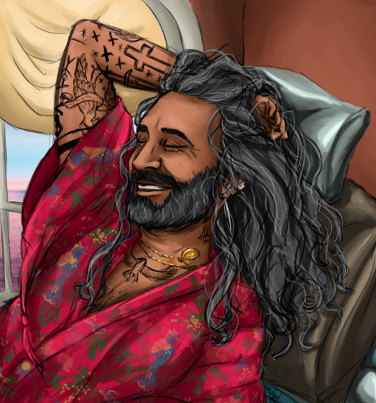
I just saw one picture of Taika smiling and looking gorgeous and then this happened. (look real close at his neck and you can see his Stede Bonnet tattoo based on Stede’s signature on the act of grace!)
credit to @lonicera-caprifolium for the robe pattern again lol I’m far too lazy to paint all that myself
682 notes - Posted July 15, 2022
Get your Tumblr 2022 Year in Review →
#tumblr2022#year in review#my 2022 tumblr year in review#your tumblr year in review#wow I did enough art that my art tag ended up in the most#that's just shocking#woof that guillermo painting is a MESS but I'm so glad everyone liked it#I should really make prints of my smiling Ed in the depression robe
1 note
·
View note
Photo


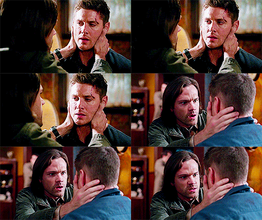

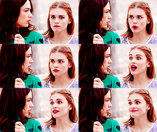

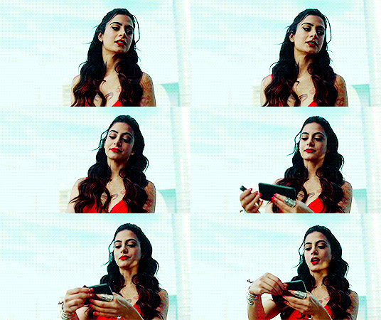


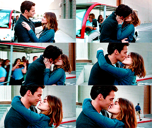
- ̗̀ How to Make Gifs with Photoshop and KMPlayer (Very Detailed) by quirkyresources © ̖́-
♡ All my tutorials ♡
Hi! I'm no expert, but I've been making gifs for at least like four or five years, and over that time I've learned a lot, so I want to share that stuff :) Also, someone requested that I teach them how to gif. I hope this helps!
This tutorial will teach you how to create simple but quality gifs, like the ones in the gifset above! Those gifs are all from TV shows, but it should apply to giffing almost anything. I’ll be using KMPlayer and Photoshop.
This is the gif I’ll be showing how to create, as an example:
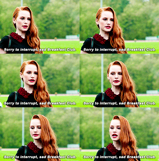
If you have any questions at all, please feel free to message me here :) And I’m somewhat new to writing tutorials, so if you notice that I got something wrong, please let me know. Thanks!
Please like/reblog if this is at all useful to you. Thank you so much if you do!
You need:
KMPlayer (link below)
Photoshop (I'm using CC 2017, but I think any version with the timeline should work)
A video to gif (recommended source below)
A sharpening action (recommendations below)
A PSD / or to know how to color gifs (recommendations & tips below)
I'll go over:
How to buy/download PS, download KMPlayer, and download a video!
Taking screencaps in KMPlayer
Importing the screencaps into Photoshop
Cropping and timing the gif, organizing layers, etc.
Adding a PSD or tips for coloring it yourself
Adding subtitles & learning font settings
Saving for web
Posting to Tumblr
Various tips along the way!
The tutorial is under the cut. Have fun and good luck! ♥
[Note: If a photo looks too small, right click it and choose "open in new tab"]
Step 1: getting Photoshop, KMPlayer, and quality videos
Get Photoshop: I was able to buy my Photoshop, so I don’t have any free downloads to recommend, I’m sorry! But there are plenty of other Photoshop blogs on tumblr that can help with this stuff :) And there are some deals from adobe that might help you afford it if you want to buy it instead. They had a great one for college students that totally helped me. Anyways, if you can get it somewhere/somehow, here are the next steps...
Download KMPlayer: Here's the link (it's free!): kmplayer.com You can use it to watch videos, but in this case we use it to take screencaps of them to use for gifs.
Get your video: If you’re going to download a movie or show, I recommend getting torrents from thepiratebay.org and using μTorrent to download them. (Here's a tutorial for how to download stuff with it.) Be careful with viruses and stuff, though! When you look for a video, try to get one that's as HD as you can find, meaning one that is 720p or 1080p! That tells you what the height of the frames will be, in pixels. They are usually big files, but should be much better quality than others. Also, try to find videos that do NOT have network logos or ads on them!! They can make gifs look pretty bad, and it takes some serious cropping to get rid of them, which then makes it look even less quality.
Step 2: taking your screencaps Open your video in KMPlayer. (Open KMPlayer and press CTRL O.) Get to the exact scene/clip you want to gif. (Tip: it's hard to find the exact place you're looking for, so I recommend using your right/left arrow keys to skip through a little at a time.)
Once you're at the part of the video you want to gif, press CTRL G. This brings up the "frame extraction" window. This is where, as you can probably guess, you extract the frames for your gifs! Here are the settings I use:

I use these exact settings almost every time, except for the image format section. I go between JPEG and PNG. I use JPEG if I'm making a smaller gif (like 268px width or less) and I use a PNG if I'm making a larger gif (like 540px width.) This is because (or at least I've heard) PNGs are the highest quality option, JPEGs are the middle, and bitmaps are the lowest (don't use them!!) The only downside is that the higher the quality, the higher the screencap's file size. So use PNGs sparingly if that matters to you.
You can also change the "prefix" of the screencap filenames.
After figuring out all of these settings, click "start"! Then press play on the video, play until the end of what you're giffing, and press "stop" and pause it.
Then, in the frame extraction window, click the "open" button that’s to the far right of the "extract to" bar. This will open up the folder location of your new screencaps.
Step 2.5: organizing your screencaps What you'll want to do now is organize the screencaps into separate folders for each individual gif. This is something that's good to do whether it's all from one scene or you're doing a compilation of different clips. This is because, when you upload the screencaps into PS, it's best to have them in their own little folders!
(Tip: Personally I use 75 frames or less in each gif. This is because that’s the limit on the sharpening action I use, but I also think it's a good amount to stop at.)
Step 3: importing your screencaps into Photoshop
Next, we're finally going to move the screencaps you took into Photoshop. Yay!
Open file > scripts > load files into stacks. (Tip: Sometimes this function doesn't work on certain Photoshop downloads. If this is the case for you, here's a tutorial on how to get around that!) This brings up this window:

Click "browse" and find the folder with the screencaps you want for your gif. Select all of them and click "open". Then click "ok" and wait for them to load. Each screencap will load as its own layer in the layers panel, which is what you want to start with.
Step 4: changing the screencaps from layers into frames in the timeline
Once they're all loaded as layers, go to window > timeline. This brings up the timeline!
At this point, things should look something like this:

Now we can start using the timeline! In this method we convert the layers into frames that live inside the timeline, which we’ll use to make the gif move.
First click on the button in the middle of the timeline panel that says "create frame animation" right here:

Then click on the little three bars icon on the top right corner of the timeline. Click "make frames from layers" on the thing that pops up .
It depends, but you might need to reverse the frames (if it imports them in backwards). So just click on that three bars icon again and click "reverse frames".
Step 5: cropping the gif
It's really important to know the Tumblr dimensions! If you have a gif that doesn't fit the dimensions most Tumblr users view it at it can get distorted.
So the width dimensions you should use are:
A row of just one: 540px wide
A row of two: 268px wide each
A row of three: 177px & 178px & 177px
A super helpful explanation of good dimensions to use is this one made by karazorel. It's very close to the way I do it.
So to crop it, go to the crop tool (duh, sorry) and enter in the dimensions you want into the area I highlighted here:
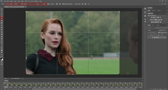
Here's what the gif looks like so far:
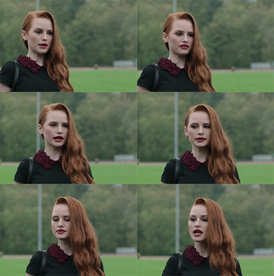
You'll probably notice it moves really fast and stops moving after playing once. That's because we haven't gotten to the step to fix that yet. But that's next!
Step 6: timing, looping, etc.
Timing: Select all of the frames. You can do this by selecting the first frame, holding shift, and clicking on the last frame. Now click the little arrow next to where it says "0 secs." under any of the frame previews right here:

Click on "Other..." and type "0.14" into the text field. That represents the number of seconds, or usually the fraction of a second, that each frame will play for. (It's "0.14" in this case because of the way we entered the settings in KMPlayer in the "Frames to Extract" section. The number depends on what you enter there.) Press enter/okay.
Looping: Next change the looping setting from "once" to "forever". Here's where I'm talking about:

Step 7: sharpening the gif frames
This step can either be done at this point (before coloring it) or later (right after coloring it.) I go back and forth on which is better, and different people say different things. So just play around with it!
I use this sharpening action. It can sharpen up to 75 frames, which is a really good amount in my opinion.
Once you have a sharpening action downloaded, go back to Photoshop and go to window > actions. Click this little menu button, then click "Load Actions...".
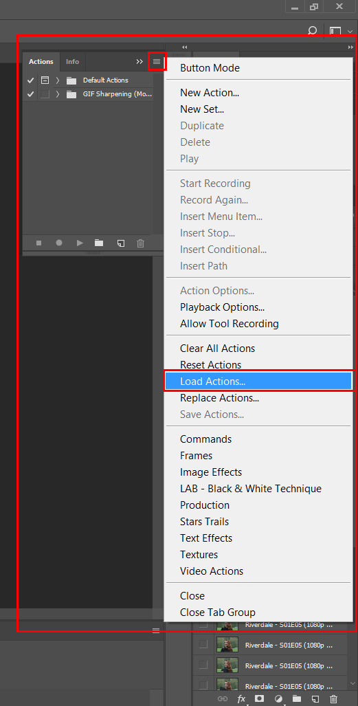
In the window that pops up, choose whatever sharpening action you downloaded and open it. This will load it into your actions panel!
Next, click the menu button on the upper right corner of the timeline panel and click "Flatten Frames Into Layers". Now there will be a new set of layers that are labeled Frame 1, Frame 2, Frame 3, etc. Keep those, and then you can delete the OLD set of layers. (That can significantly lower the file size, and it doesn’t mess anything up if you do it right!)
Now select the very first frame in the timeline, labeled "1", and select the corresponding layer, labeled "Frame 1".
Then open the sharpening action's folder within the actions panel and select the folder labeled with the number of frames you have in your gif. For example, I have 18 frames in my gif, so I selected the folder labeled "18 frames". Or at least that's the way they labeled things in the action I'm using. You may have to explore yours to figure it out.
Then click the play button on the actions panel:

Now that should have sharpened all of your frames/layers! Woohoo! Here's what the gif should look like by now, all cropped, timed, looped, and sharpened:

If this way of sharpening doesn't work for you, here are some other gif sharpening tutorials:
How to use sharpening actions in Photoshop CC by peacelovegifs
Gif sharpening tutorial by manofsteel.co.vu
Sharpening for Photoshop CC by completeresources
Sharpening all gif frames at once by thosetutorials
Sharpening masterpost by itsphotoshop
Gif sharpening action tutorial + download by themazerunnrs
Step 7.5: grouping your layers (a baby step!) A bonus step that I recommend you do is to put all your layers into a group to keep things neat. Just select all of them and press CTRL G.
Step 8: adding a PSD and/or coloring it yourself!!
Here's the fun part! Now you can let out your creativeness with the coloring. It takes a LOT of practice to get good at this, trust me. I've been doing this for YEARS and I still hate my results sometimes. But if that happens to you, too, don't let that stop you from trying again! (God, I sound like a motivational speaker or something, sorry!)
Here’s some background on PSDs for beginners, but you can totally skip this bit...
"PSD" stands for "Photoshop document", meaning a file you make or edit in Photoshop (sorry, kind of self explanatory). On Tumblr, when people talk about PSDs, they're usually referring to a document with layers that add effects (mostly adjustment layers) to a gif/photo/graphic, etc. Also referred to as a "coloring". They usually include things like brightness/contrast, vibrance, curves, selective color, etc. People post these so you can download them and use them for your own work! (Just don't repost and claim as your own. Not cool, man.)
All you have to do is download the file, open it in Photoshop, make sure you have the layers panel open (windows > layers), and drag the PSD file's window on top of your file's window, but keep them separate so you see both at once. Then drag the PSD file's group of layers (but not the background!) over to your file.

(Then you can close the PSD window.) Then on YOUR file, mess around with the adjustment layers and stuff to change it to whatever you want it to look like. I usually edit mine like crazy!
Anyways, here are what your options are.
Finding a PSD (and then I recommend editing it to however you like it)
Here are places to find some great PSDs on Tumblr! (FYI, some are tag pages with sections for PSDs, with different types to choose from. So look around.)
QuirkyResources (Navigation) (Yup, shameless self-promo!)
QuirkyResources (My PSDs)
CompleteResources
ItsPhotoshop
ChaoticResources
YeahPS
DrunkandColoring
AresColoring
That's just a few of my favorite sources, so message me if you want more recs! :)
Coloring it yourself
I'm not going to do a full-on coloring tutorial right now, but here is my tag for those made by other people!
Basically you should learn how to use the most important adjustment layers: curves, brightness/contrast, selective color, color balance, hue/saturation, vibrance, levels, exposure, and gradient maps. At least those are the ones that I use the most and find super useful. Many of the tutorials in that coloring tutorial tag I just linked go over how to use those. So check them out!
In this case, I used my current fave PSD by dracoharry. (I’ve noticed it works on most shows I gif, so it’s super useful! I actually used it for all of the gifs in the gifset I made for this post.)
Here are the layers I kept hidden/showing:

FYI, I changed the layers' settings and whatnot a bunch.
And here’s what my result was:

Step 9: adding text & learning font settings (optional)
This is usually when I add text to the gif, if relevant.
There are various fonts and settings you can use for this, but to make things easier, here's a font PSD by adorkablelena. It’s for subtitles/quotes. I recently started using it. It's really cute! If you're not into it though, here's my tag for other font PSDs you can check out.
When you find a font PSD you like, open it and drag it into your document the same way you would with a regular PSD.
Select the text tool and replace the text with your quote. (Tip: Try not to misquote or misspell things if you can help it! I've done it and it sucks when that happens. Ugh.)
As far as colors go... For the primary quote I make the text white, and the secondary quote I usually make it yellow (#ffde00). And if there is a third I'll use some shade of orange, and anything after that I just use whatever I can make look the best. The stroke color I use varies sometimes, but I usually use black (#000000).
Finally, select the move tool (V) and make sure "smart guides" are turned on. To check this, go to view > show > smart guides, and make sure it's checked. Now when you drag around the text (select its layer first), you can see little purple vertical/horizontal guides pop up when you drag the text to the center of either direction. For the subtitle we're making, we want it to be centered horizontally and close to the bottom of the gif, but not too close. Also, if you have more than one line of text, just press enter somewhere in the text that splits it into similar-sized lines. Here's an example of all of this stuff put together:

Step 10: saving for web
There are a lot of settings to remember and play around with when saving for web, and specifically for Tumblr.
First, go to file > export > save for web (legacy).
Here you'll see a lot of settings to choose from, but they're not as intimidating as they may look!
Here are my usual settings:

Red highlight: There are multiple options in the top drop down list in the area I highlighted that are good to use. I usually use “Adaptive”, but “Perceptual” and “Selective” are good options too. In my experience, the rest make your gif look pretty gross. For the drop down list under that I choose "Pattern". This arranges the pixels in a pattern, and I like the look of that more than the two other viable options, ”Diffusion” and “Noise”.
Orange highlight: This is where you choose the number of color shades that are in the gif. I use the top amount allowed, 256, because this achieves the highest quality possible! If you need to make the gif's file size smaller, you can lower this amount, but I don't recommend it. If it's a B&W gif you can sometimes get away with using less and have it still look just as quality.
Yellow highlight: Looping options: Forever. Very important! Like I showed earlier, you can also set this setting before you get to the "save for web" option. Either way, this makes it so the gif loops forever.
Green highlight: Gif size! As I mentioned earlier, there is a limit for Tumblr. This example is a pretty small gif (592.9K) and the current file size limit on Tumblr is 3MB. Tumblr seems to change this limit a lot though, so you may want to look that up once in awhile to stay up to date.
Turquoise highlight: Always check the box next to “Convert to sRGB”. I just learned that this setting is important. It basically keeps the vibrance intact when you take it from Photoshop to Tumblr. Read a much better explanation here! :)
Then just click "Save...", choose the file location, and press "Save" again.
Step 11: uploading/posting to Tumblr
Now, last but not least, it's time to upload it to Tumblr! I probably don’t need to explain this, but I’m going to anyways. It's super-duper easy. Just go to your dashboard and click on this button:

Then the post creation window pops up, and just go on from there. Upload your images/gifs, drag them around to arrange them however you like, and add a caption if you want.
(Tip: Don't forget to add tags! It's super important to add tags if you want people to actually find your post. Only the first 5 tags show up in the main Tumblr tag-search results (ugh wtf, right?) but sometimes the other ones you add will show up on the general search page. I don't really get how to explain it or how it works tbh, sorry! But I do know that many fandoms have developed their own tagging-language to find people's posts more easily (and avoid spam) which is very useful once you figure it out. For example, if I was posting a gifset of Cheryl Blossom from Riverdale, I'd tag it with things like "riverdaleedit" and "cherylblossomedit" and maybe "madelainepetschedit". So basically the name of the show/character/actor/ship plus "edit", no spaces. Or an abbreviation of any of those, like "spnedit" or "dwinchesteredit". I hope that at least makes a little sense? As far as the amount of tags that will show up on individual blogs, I'm not positive, but I believe you can use up to 30. After that the post won't appear on the tag's page. Grrr.)
Then, of course, just post it! I recommend saving it as a draft and then posting it at a time when a lot of people are likely to be on Tumblr. (There's research done on this timing!)
THE END! :D
I really hope that was at least somewhat helpful. Sorry if it was annoying that I went into sooo much detail, I just thought I should explain everything so it would make sense to most people, especially total beginners. Again, if anyone has any questions at all, you can absolutely ask me here! Or let me know if you think I got anything wrong, I would definitely want to fix it! Thanks for reading, and please like/reblog ♥ I’d really appretiate it!
#photoshop tutorial#completeresources#itsphotoshop#chaoticresources#yeahps#tutorials#gif tutorials#gif making#how to make gifs#gif making tutorial#mine#mine: tutorials#peachresources#riverdale#riverdaleedit#coloring tutorial#sharpening tutorial#photoshop tips#ps tips#photoshop 101#ps 101#500
634 notes
·
View notes