#so this vs my last post is a two year difference drawing from the same reference
Explore tagged Tumblr posts
Text
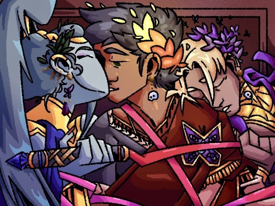
🌟 new house contractor wares! 🌟
Painting, The Lovers
Depicts the lovers of the Prince of the Underworld in a rare moment where their busy schedules align
reference under cut

#hades#hades game#hades supergiant#thanatos hades#Thanatos#megaera#megaera hades#zagreus supergiant#zagreus hades#zagreus#emilyyart#old art#this is from Feb 2022#so this vs my last post is a two year difference drawing from the same reference
278 notes
·
View notes
Text
A breakdown of my quirrel!nosk comic from last year (original post here) since I like doing breakdowns and talking about my process, and I know at least some people like reading those things. :)
First of all, a little background. I made that comic in an evening with just a pencil, a black marker, two grey markers, and a yellow-orange marker. (All markers had a thick tip and a thin tip, and all were water-based markers, so they don't blend like alcohol markers, but they can still be layered to affect the values) I had a text post from @g0at0ad saved in my drafts that said "gotta say. massive missed opportunity to not have nosk mimic quirrel to lure the knight into its lair." and finally, I had an idea for how to illustrate the reveal and felt I had a decent idea for the nosk's design.
I wanted to follow the same encounter order as the game provides, and by happy coincidence, I realized that the route from first sighting to nosk den includes the hot spring, so it made perfect sense for that location and the real Quirrel to appear in the comic.
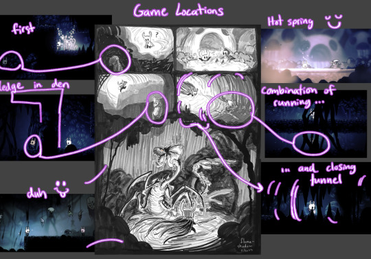
Ghost spots a Quirrel-like figure in the darkness in the first panel, and then as the path continues and drops into the hot spring, there's (real) Quirrel, so clearly that's who Ghost saw a minute ago. Yay, friend! And since Quirrel explores around, it's not strange that Ghost would spot him again in an area not so far away, though it's odd how he got ahead of them. Perhaps a different tunnel? And it seems like Quirrel wants to lead the way to something, so Ghost follows, until- That's not Quirrel.
In addition to the potential of a reader already knowing the game's locations and recognizing the path to the nosk's den, there are other visual clues that subtly communicate that something might not be right. I made it so every panel but the hot spring one has black silhouettes encroaching on the space within.
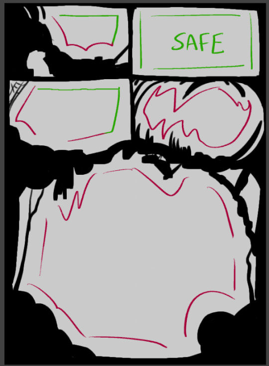
The third panel is the mildest one being encroached upon because Ghost doesn't yet feel like something is off (still reassured from seeing Quirrel in the safe hot spring) but the trap is coming together. The existence of the spider web in the corner is a nod to the trap because it's a common visual symbol for being trapped.
Also note how both the first and third panels have some safety via straight panel edges. Contrasted with the fourth and fifth panels which have no straight edges as Ghost cannot escape and there is no safety.
Another subtle reinforcement of danger vs safety is how the use of black is very limited in the hot spring panel. It's a brighter room mechanically, yes, but it's also a Safe Room. The only black is Ghost's void parts and a thin outline around Quirrel (and also a bit of shading on his arm that I did out of habit before remembering that I wasn't going to use black to shade him here, oops!)
And, note that in the only panel with Real Quirrel, he isn't framed against a darker shape in the background.
Okay, and finally, I will share a bit about the nosk reveal panel and its design...
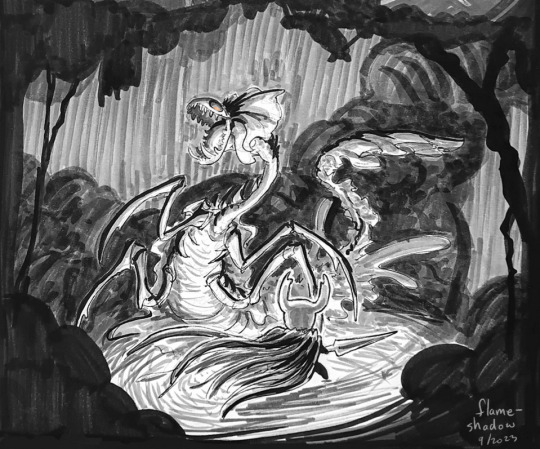
This pose and angle are dramatic and all, but they're The Worst for showcasing the actual design of the nosk! Just a complete mistake on my part that I did my best to roll with, since I didn't realize until too late how I'd messed myself up.
Which happens! I don't always get it right, and especially when I'm working traditionally, there's a point where I can't go back, so I just have to make do with what I gave myself. :) I don't hate what I have here, but I have been dissatisfied with it ever since I drew the lineart.
A thought I have had since then was that maybe I should've drawn it larger, to be more threatening? Maybe a different pose to show off the side-body frills? I explored a couple ideas below, but honestly, I think the whole panel would have to be reworked to get it right.
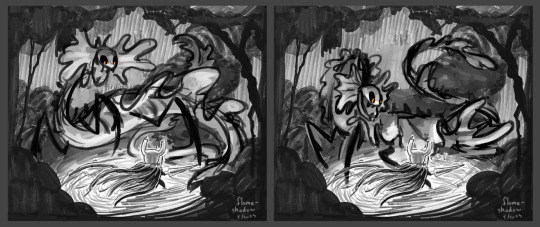
Making sure that the background frames the nosk effectively would be one of the main things I'd redo, but I'm getting tired and don't feel like drawing more, so I'll just leave it at the nosk replacement sketches.
And since I don't think I did a good job with displaying the nosk's design effectively, I quickly sketched some of the features to maybe show them off a bit better.
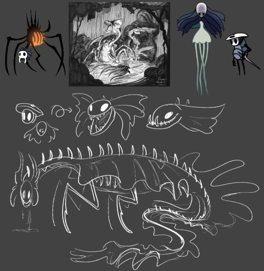
I like the gimmick of the nosk turning its head, so I pretty much always maintain that with my nosk designs. This one is no exception. Quirrel's head and face become the cranium and upper jaw while Monomon's mask becomes the lower jaw - the extra length causes an underbite. I've always been a fan of when people add a veil hanging from Monomon's mask while Quirrel is wearing it, so that's where the frills come from. ("Why didn't you include the veil in your Quirrel drawings, then?" I hear you ask. And honestly..... I don't know! That could've been an oversight or it could've been deliberate and I just don't remember my justification. That happens sometimes XD)
Anyway uhhh yeah! I think that's it. I like making comics. I like thinking about nosk. Tadaa~
#hollow knight#nosk#quirrel#comic breakdown#flameshadowart#long post#id in alt#this took longer than intended lol but it's done now~#i like doing analyses like this both to show where i do cool things and consider where things could be improved
81 notes
·
View notes
Text
Worried About Plagiarizing Narrative Style
Anonymous asked: I've been sitting on this book for years now, stuck due to writer's block, but even though I've gotten out of that space and am writing more, I'm ready to write my draft and just can't. I'm struggling to draw a line between inspiration and plagiarism. I want to write a fantasy book that jumps between characters in the present telling the story of the past, but I recently started watching the Interview with the Vampire series, which uses that same format. Now I can't decide if I'm stealing the idea or not. Even if not, it'll seem that way because my story is similar to that story.
[Ask edited for length]
Multi-POV (jumping between different characters' points-of-view) and non-linear narrative (such as jumping back and forth between the present and the past) are widely used narrative techniques, even in combination. Interview with the Vampire wasn't the first to use these techniques (even in combination), and isn't the last, so no... you're not stealing an idea if you use one or both of these techniques.
You say your story is similar to IwtV, but although I didn't include your story summary here, I read it and it's only similar in very distant, general ways. In no way is your story similar enough that anyone would think it was plagiarism, even if you used the same narrative techniques as IwtV. In fact, I promise there are other stories about actual vampires that use those two narrative techniques in combination, and those aren't plagiarism, either, as long as the actual characters and stories are different enough.
So, go ahead and use these techniques if you want to use them and don't worry about similarities. Even if you intentionally borrowed one or two elements from IwtV, that's fine. Writers are inspired by other stories all the time. What matters is that when they do borrow things from other stories, they make them different and make them their own.
Here are some previous posts that go into more detail about the differences between similarities and plagiarism:
Similarities vs Plagiarism Plagiarism vs Reference vs Inspiration Taking Inspiration from Another Story’s Premise Afraid of Plagiarism Accusation
•••••••••••••••••••••••••••••••••
I’ve been writing seriously for over 30 years and love to share what I’ve learned. Have a writing question? My inbox is always open!
♦ Questions that violate my ask policies will be deleted! ♦ Please see my master list of top posts before asking ♦ Learn more about WQA here
52 notes
·
View notes
Text

that's a wrap on art posts for 2024!
like what you see? all the art I posted this year is visible on my art tag!
wanted to try something different after last year's formatting disaster, so this is less of a summary and more of an everything-I-made-and-liked collage. as in that's what it is that's what you're looking at
this was a big year for me (I started university and lived away from my parents for the first time, yayyy) and I think you can see that in how my art style evolved in the past 12 months. I'm really happy with where it is now!
last year I picked one piece from each month to talk about, so I'll be doing that again for this year below the cut
january

this is the still version of an after effects animation I did for a design class in my last year of high school. I initially wanted to post this as a gif, but I knew nothing about how gifs worked at the time and it came out both massive and heavily artifacted. I can't even post the gif on tumblr, but the animated version is up in an mp4 format (that does have more colour correction and generally looks better)
february
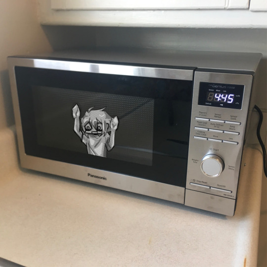
this is a weird pick to represent february (it wasn't even on the collage image) but this... thing does represent that month to me lol. this doodle took me all of 20 minutes and represents the most important battle of 2024... shaman king flowers stream vs frost's microwave
march
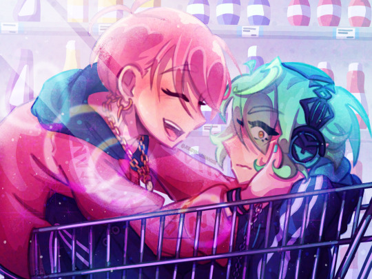
kentareo happened (in earnest, they've been here since the end of january)
april
I don't like anything I drew in april enough to put here
may
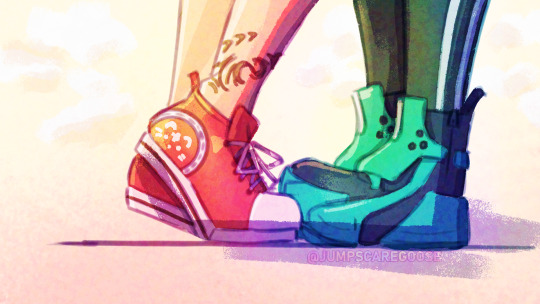
march-may was my flop era this year and I blame these two. at the start of the year I was using a LOT of heavy colour overlays to hide my inability to colour good and those really showed their weaknesses when it comes to pieces with strong complementary colour palettes. this one's nice though, I hated drawing kenta's shoes
june
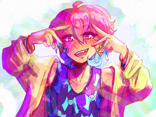
big month for tss news! I really love the colours I got with my tss art from june, you can tell the overlay technique can work when you're not shackled by the kentareo colour palette
july
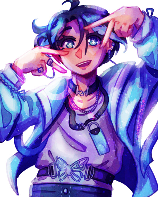
(wow this is really the same pose again. I promise I drew more things in between)
my first month out of high school! had a lot of fun going into the outfit details with this one
august
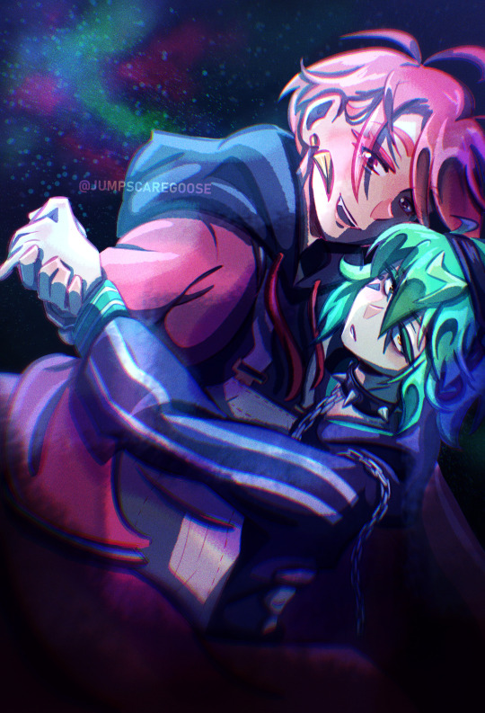
the most important change as far as this list goes- I switched programs to clip studio paint! I'd used adobe fresco for almost all of my digital art career, but I got a pc in august and finally made the switch. it took a while to adjust, mostly because my fresco process had emerged basically via natural selection under the program (and hardware) limitations I was working under. a lot of things (like the heavy texture) I had to relearn in csp with more intention (the august piece is a bit smooth, isn't it?)
september
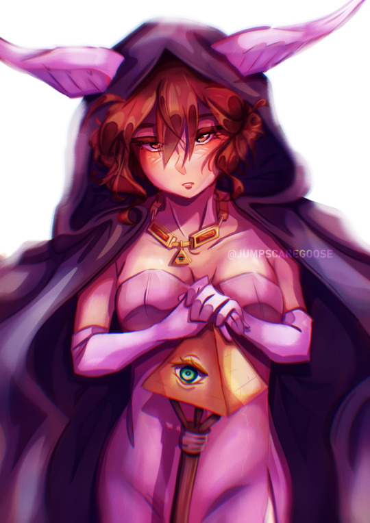
I moved into uni and spent most of the month adjusting to the major life change. I spent most of my drawing time on this piece, trying to figure out techniques and download brushes to get the kind of texture I wanted. this one took absolutely ages
october
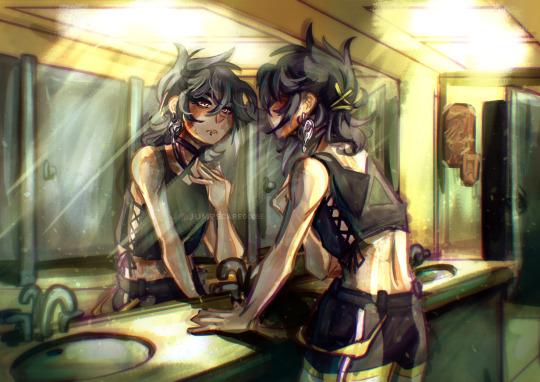
clip studio finally clicked for me. I figured out how to speed up the parts of my workflow that sucked (flat colours) and embraced a more paint-heavy, brushstrokey rendering style. the speed increases also meant I suddenly had the energy for backgrounds!
november
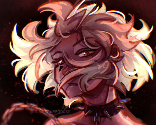
I drew the most this month out of any in the year. I also stopped needing the overlays to make my colours look nice, and so the palettes in my art got more diverse. this piece I remember drawing in about an hour at midnight when I had to wake up at 6:45 the next morning for work, and being so happy I finally captured this specific glowing hair effect
december
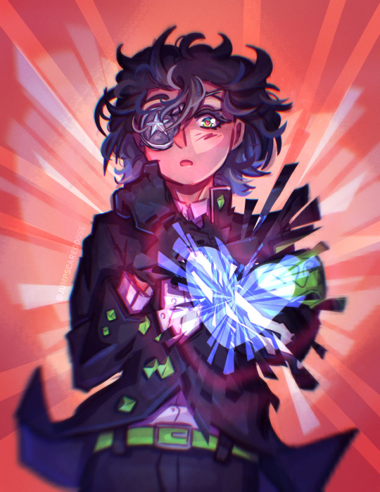
I drew so many full background pieces this month, but I want to shout out this non-background one for the shattering effect I got with the selection tool
and that's the end! many more things coming in the new year (some I've already drawn, actually)
#goose draws#artists on tumblr#digital art#one year later and I still can't tag these#this is my once annual art yapping post okay
7 notes
·
View notes
Text
How I got fooled twice by purists of Japan, plus what was like being a purist (this time of America, but is also true for Japan too.
Episode 1 - Fooled by purist of Japan
I started to get seriously interested in anime stuffs when i was 11 years old. I grew up watching both Japanese, American and Italian cartoons (yes, back then Italy did cartoons too. Aosth and Sonic SatAM are Italian/American. Topo Gigio is Italian/Japanese), but I shifted comletely toward Japanese cartoon when I was 11 years old.
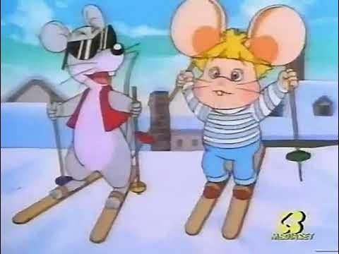
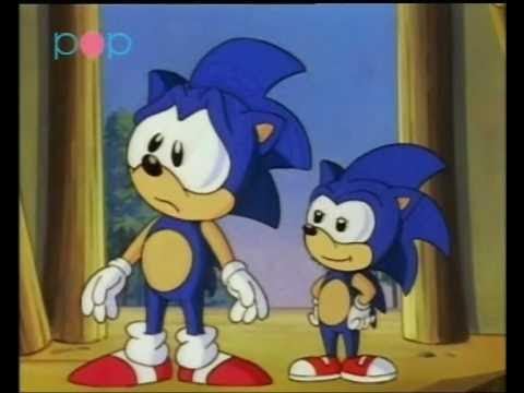
Some Sonic Generations vibes, uh?
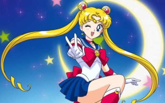
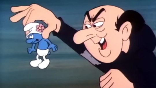
Unfortunately, I had to wait to be 15 before getting more serious into anime.
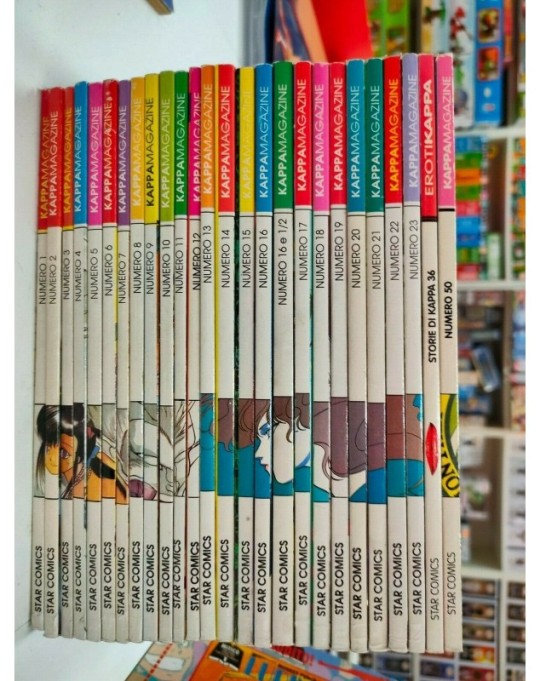
I used to read Kappa Magazine (I discovered the serie 'Genzo', recommended as itself, not from KM). There was all I wanted, comics and curious fact about anime, including those I saw in Italy. And once there was one that caught my attention. It was about the last episode of Sailor Moon (episode 200, I think). It describled the censorship and the localization. There were also few pictures, but nothing to compare by my own, unfortunately.

Sorry for the censorship. but I don't want this blog getting the same treatment of my main blog, where I can't even have an avatar.
I stopped to read Kappa magazine when it shifted to 18+.
Years later I could finally watch the episode 200 of Sailor Moon the way it was. Yes it was censored. But a good part about localization was a lie.
Fooled once!
Part 2 - Choose to be a purist of America.
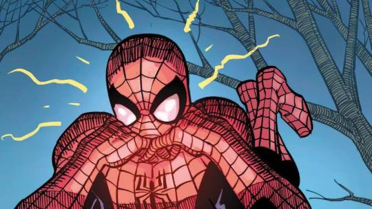
As purist of Japan, I must say I was tame. I was not like the one who call all American enternaiment estimators 'bunch of idots who lack of sense of aestetic and good product'. There are far worse purists around.
But as purist of America I was fierce, even obnoxious. At the point of bordering the troll territory (I trolled with other three purists once and I got banned). All what was outside the circle was shit. I also fought against miself to purge myself from all japanese influcences i had, especially in drawing style
It was fun at first, but after a while it becomes stale, the standards get impossible. This is what a purist feel. At certain point you start to hate your own fandom, I moved from being a purist of Japan to be a purist of America because of this.
Then I chose to be neither. Just liking what I like, regardless. Fuck elithism.

A panel of my original manga. I already stopped to be a purist for a while when I drew this. Usually I don't share my drawing, they're not worth. Do you recognize the place?
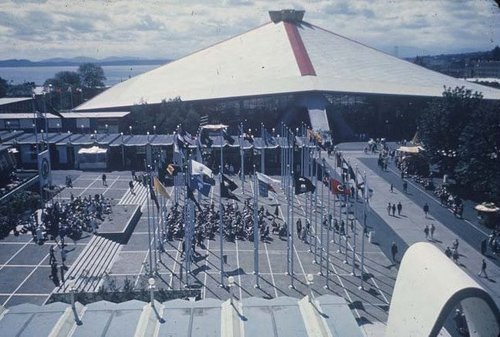
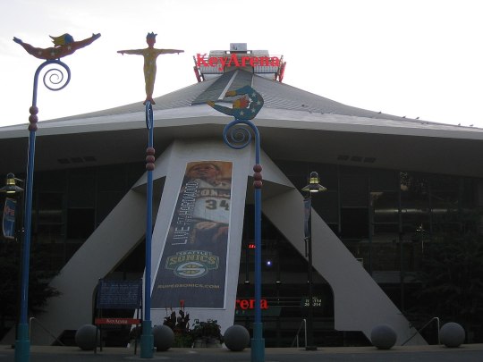

The story takes place in 2001, so Key Arena is.
3 - Fooled by a purist of Japan for the second time.
About 2 years ago I came back to Sonic fandom for the third time. I started to follow a blog of a Sonic fan on Tumblr, I still hadn't open Sonic Just Beacuse blog.
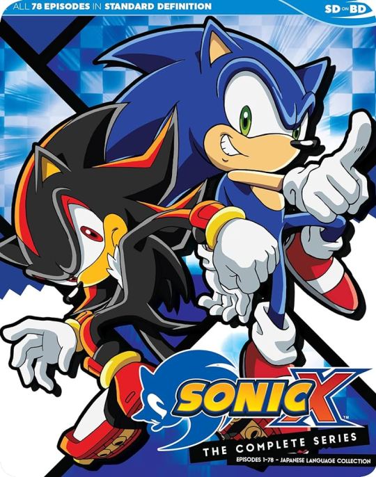
This person seemed an expert. She wasn't so extreme at the start. She mostly talked about Sonic's personality, about what she enjoyed, mostly light hearted. She showed her collection of Sonic merchandising, including Archies and IDW comics.
But one day everything changed. 'This blog is Japanese only'. 'SoA Evil!' 'Ian Flynn evil' 'Takashi Iizuka the only god' 'Don't call me SoJ purist, U RaSSists!' (of course not near this level of stupidity, just to show the kind of mentality. The racist one was truly explictily said, though).
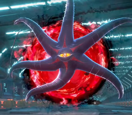
Ian Flynn according to SoJ purist
The blog had became a collection of boring repeated posts against Sonic Prime (five times a day, for two week straight), suicidal though because of a umpteenth disappointing Sonic product (maybe even written by her dear Iizuka - it was getting messy), against Ian Flynn (this was damaging, because of her I learned to mistrust Ian Flynn abilities as a writer for a while, she share all the bad examples. I had to go through both his good and bad stories to make my opinion and clean the idea of him I had. This was the worst disservice).
Also, she showed the differences between some lines in Japanese VS English (it was mostly the wording, like Cheers/Thanx/Thank you), completely removed from their context, deliberately missing part, it was close to a scam. And for the racism part, she (like many SoJ purists) describled the SoA members like the tyrannic black arms and the SoJ members like many little confused amnesiac Shadows who can't still properly defend theriselves and are forced to succumb against the tirannical black arms). Half way between paternalism and conspiracy theorist.
I can't picture, for example, Iizuka like that. I'm not a fan of the guy and his views but one thing I learned he certainly is not somebody you can bury or trample. Also SoJ and SoA work togheter for two decades or more nowadays, way before Iizuka. They're not enemies.
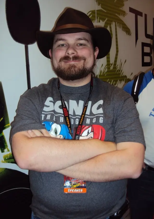
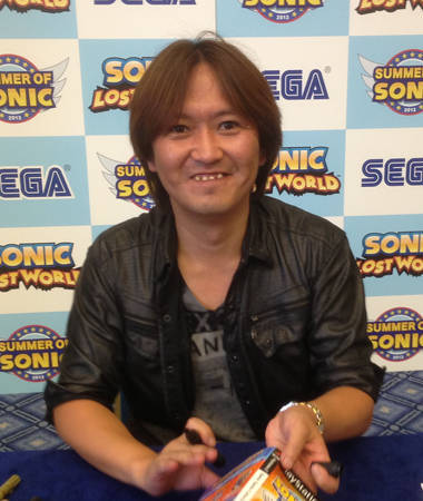
Like it or not, they are not enemies!
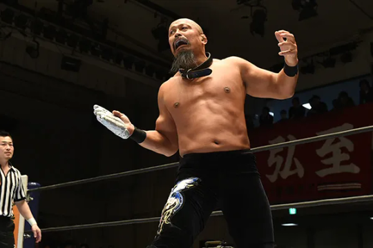
But if you like, this is also named Takashi Iizuka, and this one will break your bones.
How this ended? This person had a discussion with another Sonic Fan on YT. One who watch Sonic as a whole, Japanese, English, IDW comics, Sonic Prime, everything. One who definitely is not a purist. And contraddicted her vision, using Japanese material no less. At the start she answered to him, the discussion seemed fine, no insults, no trolling, it was mostly like two adults talking about two different point of view. But in the end she first erased all the discussion she had with him. Later she denied the possibility to comment to her post. And finally, after few days, she erased all her blogs, accounts, everything, retreating. Is 6 months and she can't bee seen nowhere. Not really trustworthy, but what I can't truly forgive her is making me hate Ian Flynn when I still had no cleal idea about his writings.
Fooled twice!
No love no hate, Ian has his high and lows, certainly I prefer him other writers, boyth American and Japanese. The one I like most was Shiro Maekawa, but Ian gives lots of satisfactions too. There are downsides but is worth.
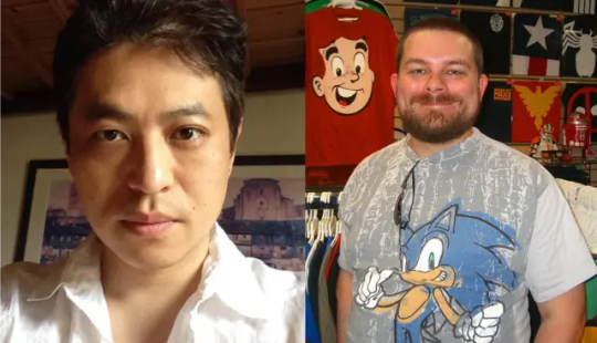
A dream team but the picture is not mine.
Conclusions:
Do I still follow SoJ purists? Actually some people i follow are purists. I avoid those that focus only on analysis, but there are a couple of people I follow because they do really cute and enjoyable creative stuffs and they care for the quality. But I don't trust their opinion anymore. I take them as what they are. Opinions.
#shadow the hedgehog#sonic the hedgehog#sonic#shadow#shiro maekawa#takashi iizuka#ian flynn#tails#knuckles#amy#amy rose#knuckles the echidna#miles tails prowler#tails the fox#sonic prime#IDW sonic#Sonic adventure 2#Sonic x Shadow Generation#purists#Sega of japan#Sega of america
15 notes
·
View notes
Text
since i posted screenshots of that one sb fanfic (if you've seen that post, i'm so sorry 💀), the thought has lingered in my head to share some fics that are actually enjoyable to read:
(unfinished)
when i first saw this ff, i thought it wasn't really going to be all that good but BOY WAS I WRONG
it was really fun to read and it felt like an episode of sb but extended and not in the typical sb formula! the last update was from april of last year, sadly...
oh... and the kids get kidnapped x
(finished (?))
one of the fanfics that i would read again and again is definitely this one! this also felt like an episode of sb too (if you minus the shipping stuff but i don't mind it). i won't blurt out too much information about this one, though... ^^"
(the ff is also on fanfiction .net as well)
the ezekiel ff - finished
the two lilith ffs - active, has slow updates
(edit: i'm so sorry but i forgot to say that the ezekiel fanfic has themes of bullying and s*xual harassment so if you're sensitive with these themes and the depiction of them, then i'd advise you to not read it. the author does leave warnings for their work, though it's best for you to read those first before you get on w/ the ff)
these three ffs are from the same person! the concept of them was really unique in the sense that they'd also include drawings too so it felt like reading a webtoon rather than your typical ff on wattpad
all two (or three in this case) are from the author's vision of what a future season 6 would be like. compared to the canon reimagined episodes, it includes even more mature themes and the kids are now in their late teens!
(the last one is a continuation of the second ff, if you were wondering)
(finished)
this could possibly be the oldest sb ff there is since it's from 2009. this time, it's not based off reimagined, but classic instead (given the fact that reim. didn't officially release its first season until 2011)
(finished)
gizmo, would you stop taking pictures of yourself? your owner's going to jail /ref
(just kidding, giz doesn't actually appear in the fic)
but i'm not joking when i say that chris gets arrested in this ff. there's also a homophobic woman that got chris arrested in the first place and joy gets ptsd yayyy 🎉 /hj
the only part i wasn't keen on was when the two animals came in but that's abt it /spoiler (?)
(there's also two pages, if you're wondering)
(unfinished)
this one was pretty great too! you'd probably realise that most of the fics regarding the kids also age them up to be teenagers
the ff is a continuation of the actual series, but the kids are now in high school and basically, chris gets withdrawal symptoms bc joy moved to another state
(the reason why i started this on the 2nd chapter is bc that's when the fanfiction actually starts)
(finished)
as you might've noticed, the ff is in russian. you might have to turn on translate so you get a rough understanding of what's going on
basically chris and joy are now celestial beings and they take care of these two children who they've known through the children's parents
#(i'm so sorry that most of these are just joris fanfics 😭)#(they're pretty much the only good ones so you're gonna have to bear with that)
7 notes
·
View notes
Text

Three Cheers for Harmonic Revenge (+ Time Lapse!)
________ This is what happens when you're a fan of both Winx Club and My Chemical Romance, apparently! 😂 Truly a labor of love—I started on this for an MCR album anniversary on June 8th. I so missed the date, but I had to see it through!
⭐️ AND I've got a Time Lapse of the art coming together, featuring my very rough attempt at a matchup of MCR's Helena and the Winx Club Harmonix song as backing music! It's a wild ride! ⭐️ (...There's also an unlisted version with "normal" music just in case my less-than-amateur audio editing skills are too much for anyone. 😅)
youtube
Anyway, to make a very long story a little bit shorter, a few weeks ago I ended up down a bit of a rabbit hole trying to identify likely sources of inspiration for the thing to come out of Winx Club Season 5 that the fandom at large actually kind of loves: Harmonix. I went in thinking Ballet, and despite my best efforts came out with that opinion pretty much unchanged.
Not long after, but for the entirely unrelated reason of Being An MCR Fan on The Internet, I ended up looking at some screenshots from their��Helena music video. [I think this was prompted by a Reddit post asking about the dress for cosplay purposes, I'm not sure.]
It was then I had the thought, so simple and off-handed: "I don't see how you can look at a ballet outfit like this and not think Harmonix was ballet-inspired."
If you've ever seen a TV show or cartoon where a character says something, and then only after the words leave their mouth do they realize the implications/meaning of what they just said, that was me in that moment. 😱
On the one hand, I want to say "I can't believe I didn't see the similarities before," but on the other...Well, I can believe it, actually. Comparing Winx and MCR in almost any capacity is not a natural thing to do, even with a Ballet connection in each. The fact that I finally did notice came largely down to the serendipity of being a fan of both and just happening upon the Helena pictures not long after spending an abnormal amount of time looking for clothes that look like Harmonix. I think there are many points leading up to that moment where if just a couple of things had gone differently, I still wouldn't have noticed.
Either way, once the connection was made in my brain it took all of about 10 seconds for "Helena as a Harmonix Fairy" to follow. 🤩
At the time, I didn't have immediate plans to act on it. It was just an idea to be filed away on the little shelf in my brain where I keep "Things that would be fun to draw eventually." [That shelf is super full and in danger of collapse, for what it's worth. 😉]
Earlier this month, that changed when I remembered June 8th is the Anniversary for Three Cheers for Sweet Revenge, the album that Helena comes from, and I had yet to come up with any other plans or ideas to commemorate it this year.
Now, clearly I ended up missing that deadline, and two others I set for myself afterward. Things have just been very chaotic around my house for last 3-ish months or so, and June has been no different. Other IRL things just had to take priority. 😔
In my defense, the art itself was finished on June 12th. This description here and the Time Lapse Video (mostly the video) were what really set me back, even aside from household chaos. But it was really important to me to get a video done for this piece, so getting that done vs. getting the art out faster was the trade I made.
But part of the reason I bring this up to underline that originally, I thought I was on a fairly tight deadline. As a result, during the planning stage I didn't really have time to tinker with refining the base design or debating details like I normally would. So I drew from the Winx's own Harmonix designs as much as possible—picking out pieces that naturally resembled the structure of Helena's dress.
If I'd had more time to noodle around...the structure probably would've been largely the same, but the details most likely would have changed to help it feel more original, and I may have gotten crazy enough to try and find a happy [lighter] grey medium between Harmonix's pastel palettes and Helena's stark black and red.
As it stands though, I'm not unhappy with how that all turned out, I just think it's worth noting how the visual concept may have changed if I'd had more time to toy with it. [Especially for when Future Me ends up referring back to this description; Hi there Future Mystic 👋]
Since my process for making the art can both be seen in the Time Lapse and is something you've all seen/heard me describe before by now [I think I have finally nailed down a fairly standard "Winx Art Process" over the last few months in large part thanks to Winxsona Winter—which yes, I do still intend to eventually finish], instead of taking you through the general stuff again, I'm going to do a bullet-point list similar to one I did for Sirenix.
The main difference is this time, it's more focused my observations for what similarities exist between Harmonix and Helena's costume, as opposed to just a list of Harmonix traits and how I handled them. [Though there will still some of that too, naturally.]
Most notably, both feature "fluffy" layered skirts. Harmonix skirts don't really look like the same fabric texture, but that could be either a stylistic/animation choice or could be chalked up to there also probably being some Wedding Dress inspiration in the designs alongside the Ballet elements. Also, at first I didn't think the train on the Harmonix skirts was a similarity, but upon a closer look at the Helena music video...Helena's skirt is definitely longer and train-like in the back, so...Cool, I was wrong! 😄 And: As it turns out, Bloom's Harmonix skirt actually does have a small section that's ruffled a bit differently from the rest—It's just really hard to tell because on her, it's all the same pastel blue color. But as you can see, referencing that part of her skirt here to incorporate the Red underlayer that peaks through on Helena's skirt worked a treat! 😊 P.S. Wow I really hated drawing a lot of really tightly-confined ruffles like this. 😤 And trying to shade them was even worse! 🙃
Both feature form-fitting tops with minimal or no straps. I more specifically saw Helena similarities in Stella's Harmonix top [with the frills over the bust and structure lines below], and later I realized the top-most portion of Musa's has an even more similar kind of frill. To that end, Helena's is once again definitely supposed to be something transparent like tulle, but since there really aren't any transparent fabric portions of Harmonix, I chose instead to use a slightly lighter near-black to give it a similar effect without breaking that Harmonix "rule." Also, the bodice portion is a true jet black with no shading. I tried the more typical near-black grey that could be shaded at first, but it just wasn't doing it for me. I tried this on a whim and decided it looked good enough to keep.
Most of the Harmonix designs have a kind of "belt" that connects the bodice to the skirt; Perfect match for Helena's red one! Similarly, most of those same Harmonix designs have a "belt"/ribbon just under the bust as well. Helena does not, as far as I can tell. But I chose to add a read one here for a little extra variety and helping break up all that black.
The Harmonix shoes are almost entirely ribbons winding up the legs; Helena wears black ballet slippers with, you guessed it, black strings/ribbons that wind around her feet and ankles. Now, maybe I could have gotten away with all-black ribbons and black for the heel portion of the shoes, but 1. The Harmonix designs all use 2 colors for the ribbons and the heel is usually in the "contrasting" color. 2. I knew from the beginning that the skirt train [a mandatory aspect of Harmonix] was going to either be black or a very dark grey, and even during the Concept phase before I had a specific pose in mind, I had a feeling the ribbon tails were going to overlap with said train. So I used a dark red. Originally, it was about as bright as her sash and belt, but then I realized Bloom and Musa's pink ribbons were darker than the pink used in the bodices, a darker red would be closer to the original black anyway, and that would yet again add just a tiny bit more visual variety. One last note about the shoes: I did my best to match the original winding of Helena's shoe ribbon, except for the very first ribbon across where the toes connect to the rest of the foot. That strap was specifically added as a nod to how Helena's proper ballet slippers outright cover the toe.
About the train: Similar to the bodice, I started out with the train in one color, the color you currently see for the skirt itself and the very top of the train. It was fine but I was itching for some more variety, so after reassuring myself "Layla/Aisha's train has a few different shades of green instead of being solid so it's fine," I used the different tiers [taken from Flora's train] to create a little bit of a gradient from the black to a charcoal grey. It kinda works as a hint toward Harmonix's more pastel palette. Sort of.
Aside from Tecna, all the girls' hair is at least partially pulled back in Harmonix. This sorta works out because it appears the front "bang" sections of Helena's hair are pulled back. [In my brain I call this "Doll Hair" because I personally have seen that kind of look way more often on dolls than on real people.] It's similar to the front of Bloom's Enchantix hair. The rest of Helena's hair appears pretty thick and a little wild, so I tried to incorporate a bit of that here, but I couldn't push it too far without "breaking" the Winx Style. And while I'm here: I did choose to make Helena's hair a very dark brown. In the video, most of the time it does just look plain black, but there are moments where my eyes pick up on a "warmth" to the color, which makes me think maybe it really is that super-dark brown hair that just looks black. Even if it isn't, I stand by my choice as slightly more fitting for the Winx style, since Winx almost never does truly black hair anyway.
All of the Harmonix designs feature some sort of small head accessory, usually a tiara. Helena's costume very prominently features netting over the face...And there appears to be something going on towards the back of her head, presumably whatever is holding the netting in place. I've seen fan interpretations of whatever that is being flowers [usually black roses], and since Tecna has a few flower-ish pieces as part of her Harmonix tiara, that seemed like a fair choice here. As for the netting...You'll see very briefly in the Time Lapse that during the concept phase, I really did want to include that, but it was too hard to ignore how out of place it felt. Winx rarely does anything with netting in the first place [though a couple of rare examples do exist], and considering certain parts of Harmonix feel like it was designed to be fairly simple [but look complex at first glance, which it does]...I just couldn't do it. So instead, I...Well, it ended up being almost a copy of Layla's Harmonix tiara, but I really truly did not realize how similar what I was doing was to hers until after the full-color version was pretty much done. 😅 I thought I was doing more of an upside-down version of Musa's, and my entire goal was to just do something that came down over the forehead like the netting did.
Speaking of Musa, if those wings look familiar, they kinda should. Remember before that I mentioned I was originally working on a pretty tight timeline for this piece?
One of the things that has proven to take me the longest with original Winx designs since I picked up making them semi-regularly again is undoubtedly the wings. I got to really learn that the hard way with Believix at the beginning of this year.
Because of the very limited time I thought I had and my sluggish pace with wings, when while collecting Harmonix screenshots for reference I noticed "Hey, Musa's wings would still work pretty well if they were flipped upside down..." A little bit of a lightbulb went off.
I don't even know why exactly that thought occurred to me before I'd even really considered the wings. The best I can figure is a little hangover in my subconscious—At one point I remember reading one of the Winx's Sirenix wings are apparently upside down at the end of her transformation sequence. That stuck out to me at the time because I don't really understand how you could tell if Sirenix wings are upside down or not because of how they're shaped. 🤨
Anyway. So I found a screenshot with a fairly clear shot of one of Musa's wings, flipped it around, and really just traced right over it.
I did make a few small tweaks, and most notably I added some..."Lines of Tears?" like Layla and Flora's have, but at the end of the day they are still really Musa's wings.
Normally, I wouldn't have done that and instead would've just taken heavy inspiration from Musa's wings, but again, I thought I had a lot less time than I really did. And to be fair, plenty of other Winx fans re-color or otherwise re-purpose the Canon Girls' wings for their OCs and/or Fan Transformations on a regular basis anyway, so it's not like this is a totally unheard-of idea or anything. 🤷♀️
Much later, I also figured in a way it fits; Musa is a fairy of Music, this artwork is largely based around a specific piece of music/the band that made it; I even opted to add music note shapes like Musa's wings produce [all the Harmonix wings produce specific shapes in that way] when they move to deepen that connection after I thought of it.
Other things worth noting [and this is again a • bullet point list because, frankly, at the moment I'm just too lazy to make this all flow together in more story-like paragraphs]:
I did my best to match Helena's skin and eyes, but her lips and eye makeup were a little trickier. Her lips ended up a bit pinker and not as close to her skin tone in the spirit of Winx, and I had to compromise and use greyish reds shaped like the Trix's eyeshadow to get a similar effect. The eyeshadow still really isn't perfect for Helena or Winx, but I was short on other ideas so, "close enough is good enough."
The shape of the mouth isn't quite what I wanted, either. You'll see in the time-lapse that I already changed it pretty drastically from the first sketch I had. I definitely wanted something open, because while Helena's mouth is not open for the entire music video or anything, it is more open at certain points and this shot in particular is pretty iconic. But I also didn't want anything too crazy because, y'know, Winx Club. The bared teeth and lack of upturn for a smile was my compromise. Either the mouth itself needed some more tweaking, or the eyebrows did. The whole expression is okay, I just don't think I pushed it far enough. 🤷♀️
There isn't really one specific pose that represents Helena more than the others [...at least not standing up/dancing], so I picked mostly from a general feeling from the music video. I did reference some official stock arts of the Winx in Ballet attire [mostly this one of Flora], but the feet had to be changed pretty notably to fit the shoes, and overall I had to make some tweaks in the anatomy where the stock art and show style differ. [These differences seem to increase from Season 5 onward, too.]
The background was mostly inspired by Layla's Harmonix, and it might be my favorite part of the whole piece, actually! Upon closer studying for this project, I was surprised by how much "junk" is in some of the Harmonix backgrounds. There's tons of texture in all of them and a fair bit of color variation in most...It's pretty interesting compared to past transformations and even Harmonix itself. The backgrounds end up being a lot more intense than the solid and gentle pastel dresses. [Wouldn't surprise me if that was intentional!] I had a little more work cut out for me since I couldn't just slap bright colors all over the place. I did consider just sticking with blacks/greys/white and maybe some red, but I thought it might help my version of Helena here pop a little better if I was able to change up the palette just a bit. And, of course, the warmth of the background helps add more variety and liven the whole image up. Much more to my delight though, I was able to create the background without having to download any new Procreate brushes! 🥳 Between a couple of default ones, the ocean-themed brushes I already had from previous projects, and a couple I just happened to pick up along the way [mostly as monthly freebies from brush makers who normally charge for their work], I had all the brushes I needed already right there, it just took a little experimenting.
I will reiterate that while it still took time, making the art itself really wasn't so bad or difficult. And it helps that this ridiculous crossover idea was something I really wanted to make—Because if I didn't, who else would, right? 🤪
It's not perfect, sure. But it's here and it still came out pretty good overall, I think. So I'm happy. 😊
Now I would also like to take a moment to explain part of why putting the Time Lapse together for this piece ended up taking longer than it probably should have, because I really didn't have room to talk about it in the video itself...though it does sorta get a mention right at the beginning: The audio.
To once again make a very long story short(er):
I, in my infinite wisdom, decided instead of the usual royalty-free music stock, to try and create a mash-up of Helena and the Harmonix song for this video. That was more or less the visual premise for the art, so why not go all-out with the theming?
For once, I cannot take you through the full nitty-gritty because, at least to my inexperienced brain, audio editing is a pretty nebulous process. But I can tell you that aside from inexperience, the other thing that probably held me back was my choice of program to handle the task.
I did not have the patience nor motivation to try and teach myself how to use an audio program for this one silly project, and I semi-accidentally learned at the beginning of last year that DaVinci Resolve has an entire section dedicated to just editing the audio for videos. Since I was able to fumble my way around in there for the light audio editing I wanted to do at that time, I figured that was a slightly safer bet here. It may not have saved me a ton of time, but it was at least vaguely familiar, and for me, familiarity goes a long way in making me comfortable with a program even if I still don't really know what the heck I'm doing.
This isn't really what DaVinci is supposed to be for—as far as I can tell it doesn't even have an "audio only" export option, which did complicate things a bit—and even if it was, I'm sure any true audiophile will still probably cringe a lot at what I managed to create.😅 I did my best to make it "tolerable" for a listen or two, but I know my ears are inherently biased since I know and enjoy both songs quite a bit already. But I did manage to get feedback from two persons that know notably more about audio than I do, and they weren't horrifically appalled, so I don't feel like I'm committing a crime against music by putting it out there, at least.
Aside from that, the video did also have to wait on me to finish this description [to a certain extent, anyway]. For smaller projects, I can usually write the on-screen notes for the video first and worry about the description later, but most of the time for a big project like this, I need the bulk of this written description done first so I have a baseline of all the things I want to mention and can pare down from there.
I can do a fair bit of the video editing up until the point I need those notes, but once I hit that wall there's really no way around it. And in this case, I did actually use all that other video editing as a form of procrastinating on the description. 😅
Most likely because I knew there was going to be a lot to cover, I really put off like 70% of this description as long as possible. 🫣 The other 30% I actually did relatively soon after the art was ready. The plan was to go ahead and get most of it out of the way, but clearly I lost my writing mojo partway through and had to come back to it later...and I was still a little lazy with certain aspects.
But hey, the description isn't the art, it's just meant to describe the art, so whatever works, yeah?
In any case, I think that's everything I wanted to mention about this particular process. It's been quite a ride, and I'm glad it's over. Mostly so I can go back to working on some other projects I already had cooking before this one came up, but also...I am just glad this is one of those ideas that, as I said much earlier, originally got put on an "eventually" shelf in my brain and actually got to come to fruition fairly quickly after the fact.
Kinda gives me more hope than I previously had for some of those other "eventually" projects, which is nice. 🙂
Similarly: I don't know if I'll find a way to revisit Winx Club x MCR ever again, but I'm thrilled I I found a way to do it at least once! Doubly so that I'm happy with how it turned out! 😊 With that in mind, you never know. It's possible I'll figure out another way to do it again someday.
In the meantime, I leave you Sparklers to enjoy this one and the time lapse [whether you're brave enough for the mash-up version or opt for the "easy listening" one instead]. 😉 s usual, I'm off to those other projects I mentioned shortly ago...
_______
Artwork © me, MysticSparkleWings Winx Club © Rainbow S.p.A.
Three Cheers for Sweet Revenge and associated concepts © My Chemical Romance
#winx club#fan art friday#fanart#winx fanart#mychemicalromance#my chemical romance fanart#mcrmy#mcrart#mcr helena#Helena#three cheers for sweet revenge#revenge#mcr revenge era#crossover fanart#crossover#Harmonix#winx edit#ballet#procreate#digitalart#illustration#xxmysticwingsxx#mysticsparklewings#mcr#weirdstuffnooneaskedfor#Youtube
32 notes
·
View notes
Text
Writing/Art Update 10.16.2024
I keep meaning to do these on Tuesdays and they keep leaking over onto Wednesdays. Oh well. I'm going to keep striving for Tuesdays because I really don't want them leaking onto Thursdays.
Anyway, Bleach Returns! Week is over and I'm pretty happy with how I did. I got 4 artworks and two fanfics done: you can see all of my contributions here. I do have a little bit of Bonus Content to one of them that I am still hoping to finish up, but we'll see. I sort of lost my momentum entirely the minute I finished up that last fanfic, so if I don't get back to it, it won't be the end of the world for me.
I'm spending this week trying to get caught back up on stuff, both irl and online. I'm working on my ao3 inbox, which got woefully behind again, for which I am very sorry. My Tumblr drafts are also...substantial...again, but that's no one's problem but my own.
I am finally ready to actually get ready to work on a little in love again. I even looked at my notes and outline! The outline was a lot more filled in than I remembered it being, but I also somehow expected to get through act iv in 9 chapters which seems a little...spare to me. I took a break from reading Pride and Prejudice because my hold on The Goblin Emperor came in at the library, but it was worth it because I loved it and it was also Relevant to The Vibe. I keep trying to convince myself that I don't really need to re-read the first three acts of alil, but I am pretty sure that I do. I think I should finish up P&P about the same time I get the inbox taken care of, so that ought to line up pretty well.
I currently have about 8500 words from the last time I tried to work on this story, in various states of ready-for-primetime-ness. Sometime between now and next week, I hope to get sort of a baseline established so that I can start doing wordcounts again.
Oh, yeah, wordcounts. I have a spreadsheet where I keep track of how much actual writing I do (vs posting, which is what ao3 tracks and often isn't actually indicative of when I did the work). For the last two years, I have written about 110k per year, and I thought I had been doing pretty good this year, but it turns out I am only at 90k at the moment, so I would really like it if I could get at least another 20k by the end of the year. That seems pretty doable except for the fact that my Decembers are always shit, but maybe this one will be different! lolololol
I am really proud of how much drawing I have done recently, because I hadn't really done very at all this year. I'd like to try and keep that momentum, even if it's just doing a bit of a scribble every day from my art club prompts. Who knows, we'll see. I always found the banners for a little in love to be incredibly fun to do, and I'm looking forward to the possibility of making a couple of new ones.
6 notes
·
View notes
Text
Shy and Superhero Anime
One topic I talked about on this blog a few years ago is how as someone who was an American Comic Book Nerd for ages before Anime took over my brain, the Anime that to me have a similar appeal to my favorite DC Universe stories are the not the ones explicitly drawing on American Superhero aesthetics like My Hero Academia and One Punch Man but rather shows like Code Geass, the Raildex franchise, Detective Conan/Case Closed, and I’d now add Durarara! which I watched this year, twice now.
However starting with the Fall of last year a new Superhero Anime has entered the fray, Shy who’s second season is currently airing.
While HeroAca and OPM put the aesthetic trapping of American Comic Book Superheroes onto a show that is essentially a conventional Battle Shonen, with Shy it is the Magical Girl Warrior subgenre putting on Western Superhero clothing. That actually works far better because the Magical Genre has its origins in part in western Superhero influences.
Naoko Takeuchi has admitted to being partly inspired by Wonder Woman in creating Sailor Moon, something the recently re-adapted final arc makes more obvious with the Bracelets plot point. But there’s also the additional indirect influence from how the Transforming Tokusatsu Superhero genre was inspired by Shazam and the 60s Batman show and so forth.
So Shy kind of winds up feeling the Genre returning to its roots in some ways.
90s Magical Girl Warriors like the Sailor Scouts and Wedding Peach wear costumes that fit in with how we typically think of American Superhero Costumes from the Golden, Silver and Bronze ages in that it would not feel inaccurate to describe them as some form of “tights”.
Today however your default parody of a standard Magical Girl is more likely to be wearing a frilly or fluffy dress of some kind and that is a largely the influence of Pretty Cure which in Japan has long surpassed Sailor Moon as the most popular Magical Girl franchise, (but it's Anthology nature means no single team has had as many canonical adventures as the Senshi).
And so Shy wearing a Western Superhero style costume coincidentally looks more like a 90s Magical Girl then any new Magical Girl franchise we’ve seen in 20 years.
But Shy is not completely removed from the history of the Magical Girl, it definitely shows some influence from the Post Madoka era of the genre, with what the villains are doing reminding me of Daybreak Illusion more than anything else.
The main difference between Shy and other Magical Girl shows, in fact the main reason it’s probably not officially going to be considered one is that there are Male Superheroes. Of course the Nanoha franchise also had males who had essentially the same abilities. The British Superhero keeps reminding me of the antagonist of Superman Vs The Elite for some reason.
All of this kind of makes Shy the antithesis of how I’ve been thinking about the 2008 OVA School Days: Magical heart Kokoro-Chan.
As one of the very few American Otaku who loves School Days both unironically and not because I view it as some kind of “deconstruction” I was very curious to see what it’s take on the turn the little sister character into a Magical Girl spin off trend would be. And what I got kind of confused me.
First it starts off by also having a sort of Sentai parody, which would be cool enough. But then we get to this classroom scene where everyone starts talking about Superheroes. And Makoto and Sekai started saying things that sound like J. Jonah Jamenson, in my head I was like “I dedicated one of the most overly long posts on my blog to defending you two and this is how you repay me?”. Then Setsuna starts talking and I think “finally my Waifu will bring some sense to this” and then she starts spouting a “Superheros cause Villains” monologue.
Basically this Magical Girl Parody decided to have the metatextual commentary of a Western Superhero Comic. In Magical Girls shows and Super Sentai the villains come first and the heroes are a reaction to them, the exact opposite of what Setsuna just said.
#Shy#Shy Season 2#Magical Girl Anime#Superherooes#Durarara#School Days#Magical Heart Kokoro-Chan#Kokoro Katsura#Katsura Kokoro#Setsuna Kiyoura#Sailor Moon#Sailor Moon Cosmos#Wedding Peach
2 notes
·
View notes
Text
2024 July Monthly Update - Artfight
Another July gone by, another Artfight draws to a close. This month's update post will be primary looking at what I've made for Artfight, but first some personal updates:
I mentioned in my last post I was dealing with wrist pain but it was getting better. It got worse. The last few weeks of July I spent not moving my hands as much as I possibly could because both hands were feeling so bad. Luckily I managed to figure out the cause (I bought myself a wheeled bag to take stain off my back when grocery shopping, turns out wheeled bag + cobblestone streets = wrist destroying vibrations) and once I eliminated it my wrists started actually healing. They're feeling much better now, not fully healed but well on the way :) I'm just glad art wasn't the cause. With any luck this'll be the last monthly update this year with a 'personal circumstances' blurb at the start and I can get fully back to just making and talking about art ✨
Artfight
This year was my 8th year participating, which is kind of wild to think about. My first year was Sun vs Moon, on team moon and I drew 34 total art pieces. I don't think I've ever beat the number but I certainly got close this year having drawn 30 attacks!
I didn't have a specific plan going into artfight this year, I usually don't other than maybe a list of people I'd like to draw for. I treat artfight as a super low pressure way to experiment and draw fun designs. Not every piece comes out exactly how I want it but that's part of the fun and every year at least one artfight drawing makes it's way to my fav art that year.

At the end of June I'd just made a template for doing these chibi icons and I was having so much fun with them I started off artfight doing a bunch of them for attacks:

I think they turned out super cute but they look a little awkward side by side due to the different dimensions of each one. I've yet to find a good way to display batches of them 😔
The first bigger drawing I did was of a character I found in my bookmarks and I love how it turned out:

It was the perfect piece to break the last shackles of my artblock away and drawing it felt smooth as butter. I didn't really do anything similar the rest of the month but there's several points on how I lined and colored this one that I'm keeping in mind to experiment more with in the future.

After the first piece I was feeling in a more environmental mood and freehanded these two attacks featuring characters in funky landscapes.

My wrists were still feeling pretty iffy at this point so the lines for both of these were a very loose first pass over a rough sketch but to be honest I don't think anyone would notice unless I pointed it out.

I really thought I'd do more in this style but 🤷♂️ it ended up not happening. Maybe I'll do something with some ocs soon
The last three attacks I got out before my wrists got too bad to draw I did all in the same day

These two characters were exactly my type & I love to draw chibis on some kind of environmental base or prop so I wanted to do something with that this artfight as well. I think they turned out pretty cute!

Another one with a base, this time more like a character standee that I love to give dnd characters. Physical character models moving around on a map is one of my favorite tactile experiences of tabletop games.

The last one I did before I had to take a couple week pause - I wanted to experiment around with linework specifically and while there's a lot I like about this drawing there's several things I had to rush or simplify because of my wrists and overall it didn't end up being the strongest piece. Ah well, that's how it sometimes.
The day after I did these I went grochery shopping again and then my wrists really gave out. I didn't draw anything for artfight from the 12th until the 29th when my hands were finally starting to feel good enough to try and do just a few last drawings before the end.

I started off simple with some blocky chibis with saturated lineart. I'd played with colorful lines in the past but I never ended up liking because having all the lineart be one bright color always felt too much and too distracting. However, earlier this month I saw this gorgeous attack by ebelcities which made my realize the extremely pointless arbitrary restriction I'd been putting on myself: you don't need to have ALL the lineart be a bright saturated color, of course you don't! How trivial! And yet this was a huge breakthrough. I have to thank ebelcities for having such beautiful art 🥰 Seeing her work is always sooo inspiring.

I still didn't want to push my hands too much so my next attack was done mostly using the lasso tool, with a few textures added on top. This attack received the least attention on social media out of all of them but personally I'm pretty proud of it 🤍
In the last two days my hands were feeling MUCH better and I took advantage of that to try and reach my initial goal I had at the start of the month - 30 attacks to fill up a whole page on my all attacks section with attacks from this year.
I had 7 left to do - and I did it!

I wanted to keep them simple both of the sake of my hands (drinking game for this post - take a shot anytime I mentioned my wrists) and to actually finish 7 drawings in 2 days. But I also didn't want to just give people rough sketches, especially since most of these were revenges for some really lovely art I'd gotten. So I came up with the idea of A) a border template and B) using tones!
I've been really into dot tones recently but I've not really been using them as is the traditional method - it was a bit of a challenge doing them in these! Picking tones, getting a range of values, matching textures, getting the size of the dots right... so many decisions to make. I'll have to keep experimenting with them, maybe for some actual comics in the future :)
And that's it for this year's artfight. We'll be hearing the results soon but even before hearing them I think seafoam has probably lost haha, we've been lagging behind all month and I had a feeling this would happen when I saw the team numbers but I still love seafoam regardless <3 I'm looking forward to seeing what the teams will be next year!
#artfight#monthly updates#this is a long one folks!#I hope people will find my thoughts interesting to read :)
5 notes
·
View notes
Text
Hello! I've been doing some long, hard thinking about my current commission offerings.
TL;DR:
I am doing away with my "standard" menu (headshot/halfbody/fullbody/etc.) in favor of more experimental work.
Effective June 1, my commissions will close completely, including the waitlist.
If you want any of my current offerings, please let me know before then. You will be added to a final waitlist queue, with payment only required once I get to you.
If you're currently on my waitlist, or are interested in what's next, please see the bottom of this post. Once the final orders are complete, I will focus on relaunching.
Below is a more elaborate explainer of why I'm doing this, and what I'll be doing next.
Introduction
Essentially, commissions have worn on me more and more as time goes on (which may be tangible if you ordered one recently and it took months). Part of me wondered if I was burned out on art in general, or it was just becoming less of a hobby for me, but that sentiment didn't feel quite right. After all, I could still get grabbed by a picture idea every now and again, which I would then crank out in one evening.
Was there some sort of difference between the pictures I could hammer out quickly vs. the ones I couldn't? Well, I wouldn't make a post about an investigation without already having a prime suspect.
My Art Style
When I first started drawing aliased, it was to quickly crank out panels for my forum adventures, mostly because I was using GIMP and didn't know anything about brush settings. I was way too frustrated with anti-aliased lines and how little I could make them look how I liked, so I retreated into something completely different.
It worked for a while, but as I became more comfortable with the style, I developed bad, perfectionistic habits (something I've already mentioned being A Problem I Have). I would tweak lineart at the pixel level, just because some stray bump or two bugged the hell out of me. I consider this one of the reasons my art output has slowed down.
Trying to embrace a "perfectly inconsistent," or "consistently imperfect" look as "my style" just created its own irony. For example, I will deliberately draw patterns and textures by hand, because it sticks out too strongly otherwise if I just paste it in. You can bump into this quickly enough by scrolling through my various character references.
I would love a world where all my OC references feel "current," but as it stands, I'm finding it increasingly hard to work on the remaining characters I want to draw while commissions are also an obligation. Taking a break from aliased character art commissions in order to work on aliased character art references is...just doing more of the same? It isn't a break.
In order to create breaks that actually feel like breaks, I have to compromise. ONE of these has to go home and change. My personal art gets priority here, and I still very much want my OCs to look consistent in their reference art, so...I need to find a more efficient way to draw for money that keeps my dysfunctional brain entertained.
The Long, Slow Realization
Back when I used GIMP, I tried the chalk brush on a whim and ended up quite liking it. The rough look helped me ignore what I would consider "imperfections" otherwise. However, perhaps because I had a comic or character references I wanted to keep consistent, I mostly considered it a fun oddity and nothing more.
More falling dominoes that would eventually lead to this post were my experimental style offerings that I introduced last year (at the time, I just offered it because I thought people may be interested in art that looked relatively unique), Art Fight (having to agonizingly obey "finished not perfect" because of the event deadline), and other gift art I did around this time (the reasoning being, it's gift art, they wouldn't mind if I used it to experiment).
Now that I use CSP and am no longer bound by webcomic obligations, I've been experimenting more with brush settings. Wouldn't you know it, most of my modern art of my original stories is no longer aliased. I go "off-model" deliberately, fuck around with layer settings and effects, and enjoy creating pieces just because I saw a cool tutorial, brush, or program I wanted to try. These are the types of pictures I mentioned I could crank out in one evening. Maybe they're not "formal," but I feel like they're the most "me."
With all this new experience swirling around in my head, I finally realized: Why am I not selling art I actually find fun to draw?!
The New Offerings
Currently, I'm leaning toward one style of illustration only, cheaper than the experimental style I offer presently, and "rougher" as a result. I want something equivalent to my '22 Art Fight output; something flashy, unique, and most importantly, quick to do.
The specifics are what I intend to figure out while I work through the queue. Here are some thoughts already rotating around in my brain:
Should I offer price "tiers" that roughly equate a level of "polish" (equivalent to sketch/flats/shading) or just go with one-price-fits-all?
Should I still offer sketches as a cheap alternative, or is that too confusing with my Ko-fi already sort of being that?
Should I offer specific pricing for bust/halfbody/fullbody/etc., or was that another symptom of why I had commission burnout before, and should be avoided?
Should I eschew all of the above and just offer one thing at one price (e.g. "give me $50 and I'll draw your OC" with no other choices for the buyer), or is that too intimidating?
And so on. The last option is currently what I'm vibing with the most, but it's definitely the most daring idea of the bunch, too. (& If you have any thoughts on this, let me know! I have so much more thinking to do.)
The Old Offerings (But New)
When I reopen, I would like to have as few options as possible. However, I have considered the possibility that an old offering would speak to me and I would add it to the new menu again. Here are some thoughts on those:
Icons have a pretty high chance of coming back.
I've always liked drawing faces and headshots the most. If I decide not to bring back headshot sketches, I could just roll it back into "icons" and instead offer colored sketchy headshots. This would be similar to the headshots I did for Art Fight, but...with colors.
Half/fullbodies would depend on how the new style goes.
This is elaborating on what I said in the previous section. While I'm sure my core audience (i.e., you) will be fine with a potentially spontaneous angle to my commissions, buyers I'm less familiar with might not be. I want to try "one price fits all," but if someone gives me shit about me drawing a bust when they were anticipating a fullbody, I might have to add options to specify this.
Regardless, the style would still be "experimental" either way--the composition is what's important about it (which is also why I feel like I can get away with one single price). If anything, I feel like forcing myself into the little boxes of "halfbody" and "fullbody" was partially what was stifling me. Like, when do I ever consciously decide to draw a halfbody of an OC? I don't. It feels very arbitrary, and I'd like to distance from it.
MOST IMPORTANTLY: Character design is NEVER coming back!
I deeply appreciate those that did want a brand spanking new OC from me, but I've never considered myself to have a terribly strong design sense. They just kind of ended up being extra nervewracking to do because I had to design a character on top of drawing a fullbody. I will still take the final requests for these, but this is your absolute last chance for a Jovian Twelve™ Brand Original the Character.
What if I'm Already on Your Waitlist?
You don't have to do anything! I will get to you when I get to you. After June 1, I will close the waitlist, and whoever is on there will be able to have one of my old commission types, as promised. You can change your request anytime as long as I'm not currently drawing it!
Reminder that my waitlist is NOT "first come, first served;" I order it based on the complexity of what's wanted. Because of my slow pace, I didn't want to keep someone waiting forever when all they want is three sketch headshots, you know? This is a heads up that if you change your request, your position in the list may change as well.
I have no ETA when the current waitlist will be completed, given that currently, fullbodies are taking me months. Sorry :( Just another reason I'm making this post!!
What if I Want the NEW Style?
I will accept up to five (5) waitlist slots that want to "test drive" the potential new commission style, placed after the "traditional" queue is all cleared out. (So, you'd be waiting extra long.) If you're interested in this, get in touch! I will offer them to you at a lower rate than what I'm expecting to charge for the real deal, as thanks.
If you're already on the waitlist for something else, and want to test the new style instead, let me know! Just be aware this would bring you to the bottom of the queue as described above (but it WOULD give me one less commission I'd have to go through to get to the new stuff, WINK).
In the chance I get no takers the entire time it takes me to go through the waitlist, then the first five commissions I do in the new style will just have to be "test slots" instead.
Final Word
I know these long posts might not be terribly interesting to anyone that's not me, but I find it therapeutic to scrawl my thoughts out in text. Additionally, I'm over 30 years old and conclusions are still the hardest part in writing an essay. I can feel my writing style begin to devolve the closer I am to the end...
Uhhh.
Thanks for reading, and understanding?! See you soon, maybe?! Get in touch if you want to discuss Commissions From Me?? 💃 Cool.
#text#commission#why do i type huge essays like this? what's wrong with me#at least that's off my chest now I GUESS
20 notes
·
View notes
Text
Y'know I know ask games are for people to, y'know, send in asks. But I don't see people often just. Fill it all out themselves. Fuck it I'll help out the shy people.
SO ASK GAME BELOW 'READMORE' LET'S GO
1. Art programs you have but don't use: MS Paint, Blender, I used to have WAY more like this one painting [like actual paint] program.
2. Is it easier to draw someone facing left or right (or forward even): Left is easiest, Right is in the middle, and forward is the hardest of those three for me.
3. What ideas come from when you were little: I was fascinated by G/T from like. 3 years old. I blame Super Mario Land 2 LMAO
4. Fav character/subject that's a bitch to draw: Handheld, perspective, monsters/creatures, and massive scale
5. Estimate of how much of your art you post online vs. the art you keep for yourself: Uhhh probably about 50/50? A lot of things I draw are spoilers, shitposts, and other study art I don't bother sharing.
6. Anything that might inspire you subconsciously (i.e. this horse wasn't supposed to look like the Last Unicorn but I see it): Not that I can think of? My art doesn't get analyzed super often. I think people think I study anime more than I do.
7. A medium of art you don't work in but appreciate: Charcoal, watercolors, sculpture, oil pastels, acrylic, copic markers
8. What's an old project idea that you've lost interest in: Originally I was going to make an AMV with my two characters, Nonny and Felicia, to the song 'shut up and dance with me'. These two aren't active OCs anymore, and the project was WAY too ambitious for my skill level 9 years ago lmao.
9. What are your file name conventions: 1: Name of song I listened to on loop while drawing. 2: An inside joke. 3: Literal rep of what's on the canvas like 'Hema doodles Aug 2023'.
10. Favorite piece of clothing to draw: Body suits, capes, scarves
11. Do you listen to anything while drawing? If so, what: TONS. My fave lyrical music, videogame soundtracks, sometimes just ambiance if I'm overwhelmed. Usually tho it's the same song on loop till I get the inspired piece out of my system.
12. Easiest part of body to draw: Eyes!
13. A creator who you admire but whose work isn't your thing: A lot of NSFW artists who I won't list here LMAO. I don't go to that school, but their art skills are top-notch.
14. Any favorite motifs: Mirrors, doppelgangers, leaving 1 eye absent for emotional effect, feathers/wings, falling, sinking into water, eyes, dark palettes with bright accents/light sources, glowing eyes, flowing hair, size difference/scale, fucked up version of self vs real version
15. *Where* do you draw (don't drop your ip address this just means do you doodle at a park or smth): Starbucks, home, parks if I'm feelin spicy, anywhere I take my tablet for the day.
16. Something you are good at but don't really have fun doing: A lot of my niche/kink stuff tends to get pretty dredge-y for me. I may be good at it, but it's not where my passion lies. That's in animation, fantasy, dramatic stuff, storytelling, etc.
17. Do you eat/drink when drawing? if so, what: Water or Snapple for the drink, milk if it's bedtime so I can settle down, and then usually the snacks are just whatever my lunch is for the day since we don't have a table.
18. An estimate of how much art supplies you've broken: Not many! Less than $100 I'd say. I'm very careful with my supplies, and I don't believe I've ever broken a tablet. The worst I've done was I busted 1 or 2 cheap tablet pens with stupidity.
19. Favorite inanimate objects to draw (food, nature, etc.): Definitely nature. Tree trunks and swirls therein, flowers, grass.
20. Something everyone else finds hard to draw but you enjoy: Humans! Not that it's an 'everyone' thing, I just run in some furry circles where human artists are a rarity. Eyes, too. Some people find expressions rly hard.
21. Art styles nothing like your own but you like anyways: Uhhh man damn, I don't follow a lot of art styles that aren't something I took inspo from? But I guess Wolf Walkers is my biggest one.
22. What physical exercises do you do before drawing, if any: Sooometimes I stretch, but I don't do it nearly often enough.
23. Do you use different layer modes: Yep! My most common ones are Multiply, Glow Dodge, Add, Add Glow, Overlay, Pin Light, and Color.
24. Do your references include stock images: Absolutely! Reference is important.
25. Something your art has been compared to that you were NOT inspired by: Not much! Most of my inspirations are pretty clear-cut and strong. Avatar, SU, Disney, Dreamworks, FMA, some Warner Brothers' movies, etc.
26. What's a piece that got a wildly different interpretation from what you intended: God, so, the G/T gif of mine that makes the rounds a lot? The one where VT finds someone small and it's their POV and he helps them and puts them in his shirt pocket??? Most people were completely normal about that post. But then there's one chuckle-head who was calling it pocket-vore, and I wanted to scream. I even chastised them like 'hey uh, no. That's not what this is.' and they argued back with 'well it's up to the eye of the beholder more than your opinion.' and I was like 'UH NO. I MADE THIS. MY OPINION IS MORE IMPORTANT THAN YOUR WEIRD ONE???' I've also RAAARELY had people call my characters underaged when they're all well over 21, so those are always gross/wild LMAO.
27. Do you warm up before getting to the good stuff? If so, what is it you draw to warm up with: Sometimes! I usually do an anatomy study, brush stroke warm-ups, or just doodle something personal first.
28. Any art events you have participated in the past (like zines): I think Multi Animator Projects [MAPS] would count here! I was part of Starclan's Chosen, Change Your Mind [Brambleclaw], Levitating, Family of Me [fallenleaves], Goosebumps Warriors MAP, Pay No Mind MEP, LA Devotee [never finished], White Rabbit, and Fear Garden! Among others :>
29. Media you love, but doesn't inspire you artistically: Not much! Pretty much everything I love inspires me artistically. I guess some anime styles?
30. What piece of yours do you think is underrated: Pretty much any of my animations. But I only feel that way cuz they take THE MOST dedication and work time. Also kiiiinda my writing? But a lot of people have trouble getting people to respond to literature, so.
2 notes
·
View notes
Text
Welcome to...
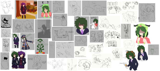
Rad's enormous pile of abandoned MetaWare WIPs/things that ARE finished but I didn't like them/WIPs that I might come back to/other stuff!
Below the "keep reading" button will be a detailing of all of these images! Please be aware that this WILL be an extremely long post, so... Just a warning. There'll be a second post after this that will also contain the rest of the art that I wasn't able to squeeze in here. (Even 30 pics per Tumblr post isn't enough for this...)
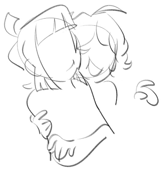
Let's start off with the most recently abandoned WIP!
I started drawing this about two weeks after Chris' birthday (her bday is January 4th) and I was really happy with it, but then I had NO idea how to pose Izzy. It's a bummer since I liked how Chris' hair came out, but alas! (Happy belated birthday, Chris!)
Possibility of finishing?: Yeah, maybe. Prob will have to change Izzy's pose if I really want to finish it though.

Oh hey, I posted this a few months ago on my other blog!
Really wish I finished it, but now that I'm looking back on it, there's definitely some improvement to be had here. I don't like whatever's going on with her face. You can tell that I gave up while trying to make the background as well. Poor Hope!
Possibility of finishing?: I'll have to completely redraw this if I plan on finishing it, but I've definitely got a feeling that I'll come back to this someday.
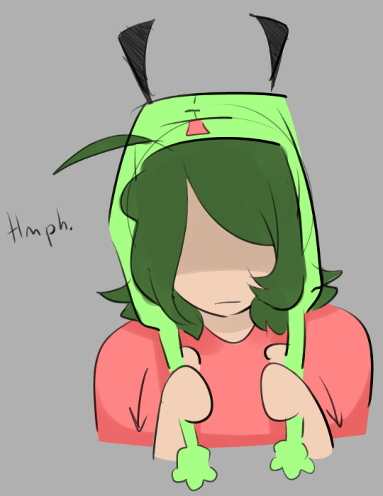
Hmph!
This one's actually pretty finished, I've just never posted it anywhere before because it's such a small little doodle. I like it though! Nari in a Gir tassel hat is always welcome.
Possibility of finishing?: It's already done. Don't plan on editing it!
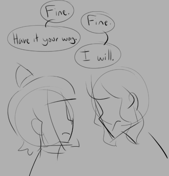
(This happens on the rude route!)
It's basically just a proof of concept, and a VERY minimal one at that, but I think it's got some merit! Not enough people talk about that Chris Vs Aspen scene, honestly.
Possibility of finishing?: Sometime this year maybe...??? I don't plan on abandoning this forever, I just don't really know when I'll get around to it.
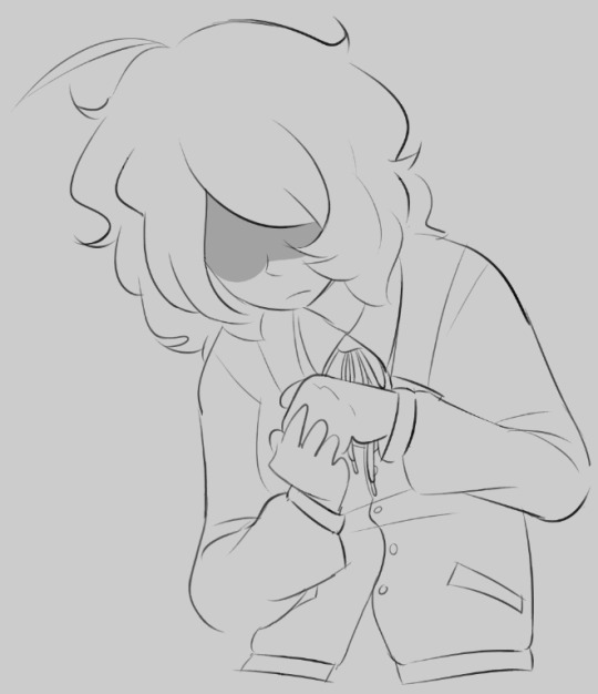
AUTISM BLAST PT. 1
Hey, remember that art I had pinned on my other blog for a while? I was planning on redrawing it, but I only ever managed to complete one part of it until I forgot about it... It's definitely an upgrade from the original version, though I can do better than this nowadays.
Possibility of finishing?: I'm DEFINITELY going to redraw this someday. I need a new pinned post, damn it!

Thx ^]
Okay, here's some context for these two. I got an anonymous ask on my other account saying that they liked my MetaWare PFP and I thought that it would be a great idea if I responded to it with some art and also turn that same post into an announcement for my MetaWare sideblog (this one!), but that of course did not actually happen.
Possibility of finishing?: NO.

Nari looks so... "off" in this picture.
I like how I drew Hope, but ergh... that is NOT Nari. I don't know how I managed to make her look like a completely different character in this one, but I do NOT like it.
Possibility of finishing?: Nah, I think I'm done with this pic.
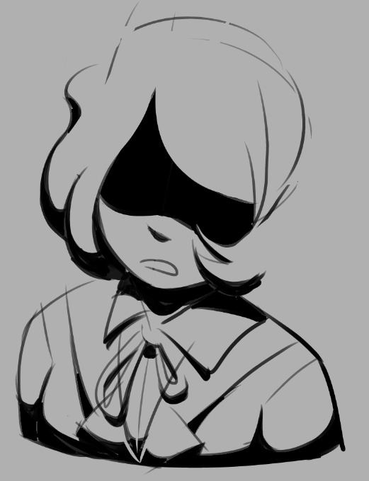
Woah, scary!
I actually touched this one up a bit before sending it here. It used to look MUCH more incomplete, but it's basically done now besides from the hair being missing 'n all.
Possibility of finishing?: I might draw more MetaWare stuff with drastic lighting in the future, but I don't plan on revisiting this specifically.

Le miaow miaows.
I worked on Hope before sending this because she looked kinda off, but I think she looks OK now. You can see that this isn't really what my usual art style looks like. I was trying to mix together the original MetaWare sprite art style and the style SparkBag used in the polaroid anniversary art he made, and I think I did just fine.
Possibility of finishing?: It's basically already done! Coloring it would probably make it cooler, but I don't think I'll ever do that.

This won't be the last time I try to use eyes symbolically.
I still REALLY want to revisit this again. It's great! It's magnificent! I just did NOT have the ability to execute it properly back when I made it a ton of months ago, so I just didn't do it. Still don't know if I do now, but it's worth a shot. (This was basically just another proof of concept, by the way.)
Possibility of finishing?: Absolutely! I'll try to get to this sometime soon this year.

GRILLING START ! ! !
Yep, this was based off of Papyrus' "Dating Start!" minigame! Just another proof of concept or... Okay I don't know what else to call these. Like, they're definitely NOT finished nor are they actual fleshed out sketches, what else am I supposed to call them???? I think it's cool though.
Possibility of finishing?: Don't think I'll be ditching this idea anytime soon. Seems kinda simple to draw too, I'll get to it sometime.
Lookin' pretty cute!!
Context for this one: It was gonna be a 3 part comic or something with Hope drawing Nari's bear fursona. Never actually made the comic though, but I DID make her fursona!!! It's the one right below this one, actually.
Possibility of finishing?: Nope.
BEAR NARI BARI LET'S GO
Personally, I think this is adorable. When drawing people's fursonas I always kinda make them more animal than anthropomorphic, but I think it leads to pretty cute art!
Possibility of finishing?: It's already done!

I was just testing out a brush with this one, I think.
It's a cute little doodle, don't have much to say about it though! I WILL say that the bear plushie was a bit inspired by my own plush I have at home, though this one is much smaller than mine.
Possibility of finishing?: Nah, it's just a little doodle.

Ingo Nari... Ingri... Angry!?!
iiii really think I made the hat too big. Like... WAY too big. Don't really like how her face came out, but the body itself is pretty OK. I based it too much on Ingo's original pose though, kinda looks like I just put Nari's head on his head LMAO
Possibility of finishing?: This is basically already finished, though I might draw Nari cosplaying as Ingo again. Why not?
(Bonus Ingri!)
Nari in a hoodie!
Don't exactly remember what this was for. Either it was for an AU of mine or someone else's AU. Her front hair's kinda too far down though, I had a bit of a habit making her face REALLY small compared to her hair in my old art.
Possibility of finishing?: Nay!

Wow, Nari with an eye AND eyebrows! Who woulda thunk it.
Her hair is much puffier than previous versions in this one. Why? Dunno. She looks pretty cool AND cute in this though!
Possibility of finishing?: It's already complete.
My polar bear plush makes a cameo in this one! Say hi!
I had to edit this one a SHIT ton before sending this final picture. I wish I had a pin that said "I HATE DRAWING METAWARE STYLE NOSES" because I loathe them. There were other reasons why I didn't like the original version, but I was annoyed with the nose the most. Really happy how this came out though!
Possibility of finishing?: I just finished it right now. (I'll probably be posting this on its own sometime soon)
Some original characters...!? Unthinkable!
This features Lumi (Metolefrul-indus' fan character) and an old version of Rowan (my fan character)! I changed Rowan's design and personality soon after this, so I don't think this interaction with Lumi and Rowan will actually ever happen... Sorry Lumi! 'Twas just a little doodle.
Possibility of finishing?: NEVER.

Last but not least (for this post, anyway), is this Chris and Izzy sketch!
Some pals requested this during a stream and this was all I managed to make of it... I'm so sorry!!!!!!! They were good prompts!!! I'll finish it one day I swear!!!!
Possibility of finishing?: Soon!
PHEW WE'RE DONE FOR THIS POST. We have 20 more to go in the next one! Might post it next week because this is tiring holy hell. Glad to show these WIPs off to the world though!
P.S. I'm going to skip a few images seen in the huge pic at the beginning! Some were already completed and I'll just post those on their own orrrr I just don't want to review 'em.
7 notes
·
View notes
Text
Different types of light
Going on from my idea with the triptych showing the same composition in different conditions, I realise that I would not be able to capture my area in different seasons due to the time constraints of the project and the fact it is now fully winter. I had the idea of capturing the area in different types of lighting.
I got the idea from my last post and seeing how differently the trees outside my window looked when being lit with the additional lighting from the flashguns when compared to during the day, so I wanted to see how other parts of my area differ in different lighting and show this clearly to the viewer.
Daylight vs Infrared Light
I have my own canon 40D that has been converted to infrared and have used it for many years so know that shooting infrared creates a higher level of contrast in resulting images, especially on the sky and natural things like trees, especially on a sunny day. So I thought I would see how this differs with a part of my area in daylight as well.
Daylight Image


I chose this particular composition with the tree in the background as it is a natural object so it should show up better in infrared, therefore it should make the difference between the types of light more evident to the viewer. I also made it black and white as the infrared will be in black and white so the higher contrast can be seen.
Infrared Image


Resulting Print

Although there is a somewhat difference between the two black and white versions it is not stark enough a difference to really draw in a viewer which is what I am going for.

Merging the two images together with a split down the middle is a bit of an improvement (daylight on left, infrared on right) as you can see the difference a bit clearer, especially in the sky. However, I don't think infrared light is going to work for what I want to achieve, so I will try again with a different type of light.
0 notes
Note
Summary of everything we’re allowed to know about the separated au 👉👈?
Also what is Leo’s relationship with Hueso and how does it differ from the series? What about Hueso jr 👀?
Ok so this post is gonna be long it’s basically: really brief summary, second half of the ask, then a more in depth summary with no spoilers.
First Question: The boys are separated after Lou rescues them from Draxum’s lab, found by Hueso, April, the Foot and Big Mama. They’re all raised apart and end up meeting. Splinter agrees to help them defeat the Shredder. They beat him, become a little crime fighting team, then the Krang stuff happens.
Second Question: Leo sees Hueso as his father and Hueso sees Leo as his son. Honestly their banter is very punny vs dry humor like in canon, but everything else I am actively making up as I go. Just know that they are father and son and Hueso would die for Leo. Hueso Jr is now Piel’s son who does not have a name, but is Leo’s cousin.
Long Summary time-
Draxum kidnaps Lou Jitsu, who was previously in the Battle Nexus as Big Mama’s champion. The turtles get mutated with his DNA like usual, Raph gets dropped first just outside Draxum’s now exploded lab, and on his way out of the Hidden City Lou drops Leo. Mikey gets dropped just outside of where he exits, but Lou is barely able to pay attention now as he is very painfully being turned into a rat. Donnie is the last one to be dropped, near the O’Neil’s apartment complex. Lou ends up retreating to the sewers with a few other mutants Draxum was experimenting on, most notably my version of Leatherhead.
Donatello “Donnie” Franklin O’Neil is 14 when the au starts. Donnie is the first to actually be found, despite being the last to be dropped. April finds him on a walk outside and begs her parents to let her keep him. He’s raised alongside April as her brother once they realize he can speak and is growing at the same rate if not faster than April. He goes to school like a normal kid, they just tell everyone he’s got a skin disease and that’s why he is green. He’s not able to make all of his tech, and isn’t trained at all like the other three, which leaves him vulnerable.
Galileo “Leo” Hueso is 14 when the au starts. Leo is the next to be found by Hueso (who is named Eric in this after his VA, full name Eric Hueso) who takes him back to his pirate ship. He’s part of a crew with his brother and a few others. They all work together to raise Leo, but Leo is closest with Eric and they have a father-son bond. Leo’s first few years- about until he is 11- are spent on the pirate ship. Once his dad becomes an outlaw in the Hidden City they move to the surface and open Run of the Mill Pizza, which caters to both yokai and humans. I can elaborate on this if anyone wants. Leo becomes a vigilante in his free time.
“Big” Red aka Raphael Hamato is 15 when the au takes place. He’s found by Big Mama’s right hand who was sent to retrieve Lou Jitsu. Instead, they find Red and bring him back to Big Mama. Insert plot device so she’s aware Lou Jitsu’s DNA is in Red and she starts raising him as her and Lou’s son. Raph is the only one aware Splinter is their dad. He starts training for the Battle Nexus when he’s 10, first fight at 12 where he gets his scar and nickname, remains the Nexus Champion until [spoilers].
Michael “Mikey” Angelo Jones is 13 at the start of the au. Mikey is the last to be found by his uncles, Rob and Maurice, who are having troubles training their next recruits. They start training Mikey in the mindset of him being their weapon, but as soon as they adopt Casey as well they start treating the two more like family. Mikey isn’t super devoted to the Foot, as he feels a bit of disconnect from them. He’s unlocked his nimpo, but his family just think it’s something mutant related.
I can’t explain anything further into the plot because I really want to draw this stuff, but the Shredder, Big Mama and the Krang will be their biggest problems. Draxum is against them briefly, but far less than in the show.
217 notes
·
View notes
Text
Thoughts On The Depp vs Heard Case From A Survivor
So, to give a little backstory and apologies in advance for the essay, I am a survivor of SA and abuse. Now, I was never in a relationship and abused; my story is much different. I will briefly mention p*dophila, so if that might trigger you, I’d stop reading after this paragraph.
I was sexually abused from the ages of about 7-10. I was abused by a family friend who was also emotionally and verbally abusive and one who had many issues with alcoholism. He never hit me, though he was physically abusive to my brother. I grew up afraid of my own shadow, and I have a large chunk of my life and childhood erased. I was diagnosed with PTSD sometime last year when memories of the events reappeared in full force. I have zero proof, and I am far past the statute of limitations. I can’t give them any actual details, and I can’t talk or think about it for very long without dissociating or relieving that awful time. There is no way to receive justice, and I’ve come to peace with that. It’s shitty, but that’s life. I think a big part of me would be too afraid to anyway. I’ve never been able to have a relationship, and I have trust issues and walls so thick a wrecking ball couldn’t even tap them.
To address Elaine’s frankly despicable interview, many survivors support Johnny. I can’t explain it to anyone, but we recognise our own. There’s something in the way we talk about the event(s); it’s harrowing. It sits on your shoulders and recounting it feels like choking. So many of us cut ourselves off from the event(s) and try desperately to distract others by making jokes to draw attention away from the conversation. You could see that with Johnny, not with Amber. The way Amber behaved caused the jury to rule against her; she showed her true self on that stand. She was aggressive, recalled “everything” with crystal clear clarity, and got caught in lies multiple times. A biased judge also oversaw the UK case that she kept referring towards; (quick correction here because I was given the wrong information) his son was an editor for The Sun, so he wouldn’t rule against them, let’s be honest. The judge should’ve recused himself, but chose not to. The same man who owns The Sun also has claims in The New York Post and Vogue, two companies vocally against Johnny. Wonder why…
I strongly dislike how Amber Heard painted herself as a martyr; she does not represent us. We have overcome so much, and to have a liar spit in our face by appropriating our daily struggles is so beyond wrong. To claim the verdict is the jury saying, “Oh, we don’t believe you if you don’t have evidence”, is highly inappropriate for a lawyer, especially one “chasing her fifteen minutes of fame”, as she likes to say. Also, accusing the jury, that was holed up in a hotel room with no phone or internet access, of bias is bloody ridiculous.
She continues with this whole, “Oh, it’s a step back for women”, but it’s not. It’s a step forward for male victims, men are finally feeling comfortable enough to speak out, and that’s beautiful. We know women have been used and abused since the beginning of time, but we never talk about men. Men aren’t just abused by their Boy Scout leaders, priest, or boyfriends. They are also abused by women, a fact they are told to be silent about. I remember explaining to my fifteen-year-old employee that his first sexual experience being with his friend’s mother was not ok. He couldn’t get my point, even when I showed him how the role reversal would seem. It had been trained into him by toxic culture and media that women could not be predatory, women couldn’t be abusive. Any sane person will know that’s false.
I’ve connected with many male survivors during this case, a topic I’ve been passionate about since my youth. My abuser was abused; it’s an unfortunate cycle. Men are not given coping tools, just told to “be a man about it”, especially by women who believe men can’t be abused. Yes, I was as shocked as you might be that there are women mad enough to think that only one gender can be abused. They defend Amber purely in the name of “feminism”, which is entirely fake. I can only hope this case lets men know they aren’t alone; they can be heard. Women can’t be allowed to get away with abuse purely based on gender. We also need to stop believing every word that comes out of people’s mouths without any questions. People can’t just accuse others of heinous crimes, especially public figures if they can’t be honest about what happened.
If you’ve made it to the end here, I commend you; I’m very well known for my speeches- blame debate class 😅. All in all, survivors are pissed significantly because so many believed Amber. Those who didn’t were told that they were just in love with Johnny, which is just plainly untrue. Every Amber stan reflects their idol; aggressive behaviour, insults, demeaning survivors, and calling us liars. It’s tiring, it’s upsetting, and we can’t escape from it. I mean, it’s everywhere; there isn’t anywhere this topic hasn’t touched. I’m constantly hit by flashbacks from trauma that keep getting dredged up, and being open about it gets more complicated when civil conversations turn into personal attacks. Elaine and her team were incredibly unprepared and were extremely unprofessional. Johnny scored a rockstar roster and deserved every inch of his win. The message that needs to get across is that no matter what gender, race, or sexuality you are, you aren’t alone. There are millions of us worldwide that are proud of you. Proud of you for pushing through, being brave enough to tell your story, and for being strong enough to fight for the truth. We are not alone, we are a strong community, and we need to support those who go unheard. Victims come in all shapes and sizes, with different coping mechanisms and different personalities. Of course, there's no “perfect victim”, but Amber Heard has proved herself to be nothing but a narcissistic abuser who thought Johnny would never speak up. He has, and we have heard him. None of us should live unheard; no human being should be shunned for speaking their truth.
#tw: abuse#tw: molestation#johnny depp#justice for johnny depp#personal rant#amber heard#amber heard is an abuser#amber heard is a liar#me too#men too#support survivors#respect male survivors
51 notes
·
View notes