#so so much easier and better than trying to freehand it
Explore tagged Tumblr posts
Text
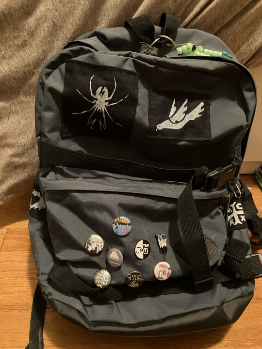
first day of school is tomorrow (today, technically) and i just finished sewing the patches onto my backpack :) i made all of the patches and none of the pins
#another year of having the worst music taste of anyone i know! let’s goooo#mcr patch off to the right has been there since last year but the rest are all new#i have learned it’s remarkably easy to make stencils and patches. it’s all tracing and patience. printer paper worked just fine as a stenci#so so much easier and better than trying to freehand it#<]:)
10 notes
·
View notes
Text
Whattup people who read my Batman posts! Brainrot's still rotting, I just had junk to do, so I didn't draw for a while! Anyhoodle, time for another character, Duke Thomas, a.k.a The Signal (and also Robin depending on how you're counting it!)
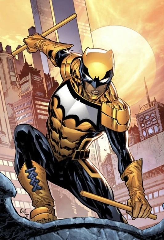
You know the drill by now, initial trace with my lazy backdrop! I liked drawing Duke, but BOY HOWDY HEY, he was hard. Like, I'm just gonna come out and say it, I am BAD at drawing armor and buildings and machines and anything non-organic. Which means Signal is probably one of the hardest costumes to get right. This was just the trace, so it wasn't too bad, but trying to understand how his costume worked was quite the game for this whole process. I will say, he's got one of my favorite color schemes out of any of the Batfamily. The light dark contrast works really well in a way that is only seen elsewhere on the Robin cape, and the fact that this is actually the Signal's whole costume makes it feel more cohesive and effective than that. And, you know, it's also really cool thematically, considering light is kinda Duke's whole thing.
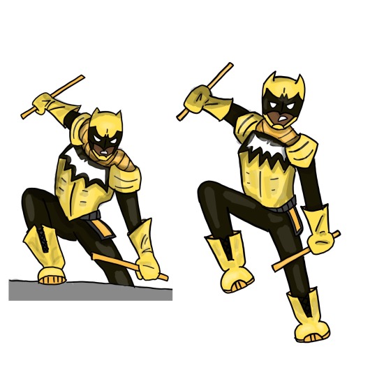
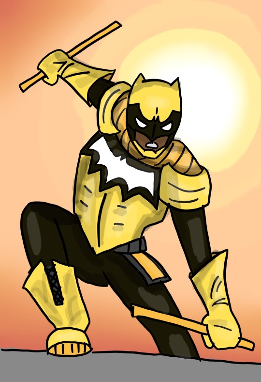
Freehanded drawing with referenced trace! This was a ROUGH time. I had to redraw Duke three separate times before I got a result I was satisfied with.
So, remember how I said that I struggled to understand how his costume actually works? Yeah, that's because I have a decent grasp how armor is actually supposed to work, and this ain't it fellas. Like, not knocking the design, it looks cool and is certainly easier to draw once you get the hang of it, but it makes less intuitive sense to me. What is happening on his neck? Is that like pure metal molded to his skin or something? That's not how physics work. Why are his pauldrons not actually covering his shoulders, and also where and how exactly are the attached to anything? It was confusing, but definitely a good exercise for me.
Again, the stuff they did was actually pretty smart, since it's comic books and they don't have to move realistically, and this makes it easier to pose his head, chest, and shoulders. It was just difficult for me to wrap my head around. Ignoring all the physics defying stuff,
Signal probably has one of the smartest/most practical costumes of the Batfam too. For one, he actually has a helmet and protects his head. Two, he has armored all of his vital organs like his lungs and heart and stuff. Three, he doesn't have a cape, which means he can't be grabbed or snagged as easily, and doesn't have to fight working around that. This is sad for me though, because I love drawing capes : (
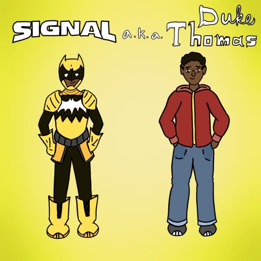
Pose for characterization. I'mma be straight with ya'll, I don't know much about Duke. Like, I've read all of the We Are Robin/Robin Wars comics, but that doesn't actually give me much of a handle on Duke as a person, or how he behaves because it has to split the focus between so many protagonists, and also because there's a bunch of other stuff happening, so Duke doesn't get as much focus as you'd suspect. I haven't read anything else where he appears (except for Wayne Family Adventures, but I don't think that counts).
The general vibe I got from We Are Robin and from other comic readers is that Duke is probably the most approachable member of the Batfamily. He wasn't raised as an assassin from birth, he hasn't been Robin since he was like 9, he didn't die and come back to life---his life experience, while far from normal, is still much closer to the average human being, so he can relate and react better. (The only other member who really gets close is Steph, but she's been around longer and has had time to get into more whacky life or death scenarios, so she's a bit nuttier. Duke'll get there in time, I'm sure).
I tried to convey this approachability by giving him an open expression and more relaxed body language, even though he is a pretty mistrusting and high strung person. Comes with the territory of being a vigilante I guess.
As always, the text for his hero name is traced off a comics cover. To indicate the duality of Duke being both a pretty chill kid and also absolutely insane, I felt the need to put his civilian name in two fonts. I also tried to make his civvies call back to his We Are Robin uniform without being an exact one to one. I'm positive that Duke'll take any excuse to wear Robin colors, even after the ban was lifted, just because it pisses off the cops.
Can you guys guess who comes next based off the order so far? (You won't, it only makes sense to me).
Other Batfamily Members:
Nightwing Edition
Red Hood Edition
Robin (Carrie Kelley) Edition
Red Robin Edition
Spoiler Edition
Robin (Damian Wayne) Edition
#I'll read Batman and The Signal eventually#I promise#But I have to get through No Man's Land and YJ98 and probably War Games first#So it'll take a while#Sorry Duke#I love you I swear#For reference#He's like the same height as Tim but he's stockier#duke thomas#the signal#signal dc#signal fanart#character study#art study#character art study#dc comics#dc comics fanart#dcu#comic books#comic book fanart#batfam#batfam fandom#batfam fanart#batman fandom#batman and the signal#digital art#my art#Abby's Batshit
23 notes
·
View notes
Note
Hi, your art is stunning. May I ask what program you use to draw digitally, and if you have any tips on how to get the forms and colors as incredibly accurate as you do?
Aw, thank you! I still feel like very much an amateur at this; my first digital painting of this type was this one, a month ago, and I don't really know what I'm doing, so take my advice with a grain of salt.
I use Clip Studio Paint currently, though an older version from when it was a one-time purchase instead of a subscription. (Why is everything subscriptions these days.) In the past, I've used Krita, which was free, but I haven't used it for this kind of painting per se.
For these paintings I've been using the default "Dense watercolor" brush for laying out blobs of color and the "Transparent watercolor" brush for subtler shading and smoothing. I expect these are not the ideal tools for this or anything, just sort of the brushes I've gotten most used to working with in coloring in CSP, which I stumbled into kind of randomly while messing around.
To get the forms right: something I started doing for my Good, the Bad and the Ugly kick early when I'd started on that in September was to do a rough sketch with the screenshot on the canvas at the same size and every now and then drag the sketch layer over the screenshot to check myself off - see if I'd made some feature too small or positioned it weirdly, etc. This felt a little like cheating but it did also just kind of help give me a better sense for it and for the ways in which my initial eyeballing tends to be off so I can adjust for it, and then once I had the very rough sketch of where everything is, I could detail freehand on a second sketch layer from there which feels a lot less like cheating.
However, for the last three paintings I did, instead of doing that I have been using a trick I saw my dad using when doing traditional oil painting, namely using a grid: enable the grid option in the CSP view settings, line the reference up with the grid, and then focus on each individual 'tile' of the grid. While working on this latest one, my canvas looked like this, for example:

So when sketching and while working on it from there, I could look at the individual square on the grid that I was working on and try to match it to that individual bit of the reference, which is a lot easier than trying to eyeball the whole thing at once.
As you may be able to tell, the colors don't feel super accurate to me when I'm working on it and actually looking at the screenshot beside it; it's all a little off and less detailed, but then it looks a lot nicer once you crop the reference out of the canvas. For this one I actually experimented with using the color picker tool to pick out some of the extremes of the colors I worked with for each given area - some of the brightest highlights on the face, a nice midtone, some of the deepest shadow - but this isn't all that helpful because film grain means the overall impression of the color is different, and there are a lot of nuances. Something I did do, also for some of the previous paintings where I specifically didn't use the color picker as a challenge to myself, is try painting a brush stroke on top of the area in the screenshot whose color I'm trying to replicate and keep adjusting until it feels like it just about blends in. But even then color is very hard. There are so many subtle nuances and shades and it's hard to adjust the exact shade of some color I've already put down other than by just painting over it again and then redoing the details - unless, of course, I just put another layer on top and set it to Hue or something. I did that a little with the barbed wire around his neck on this one, to make it less blue after I'd first put it down.
Buuuut mainly I think the key to making these sorts of things look good, as far as I've felt, is just to be willing to spend a whole lot of time noodling on them. There's always more you can do with it to make it better.
I found the checking myself off by dragging the sketch on top of the screenshot trick very helpful, even if it does feel like cheating, just by virtue of the fact it makes the outcome look better, which makes me less likely to ultimately go "ugh, this isn't right" and just want to stop working on it and move on. And that's very helpful, at least to me.
Finally there's the general just draw a lot, etc. I have been posting art daily on this blog since the beginning of 2016, and it's been a slow journey of my very intermittent efforts at human portraits getting slightly, slightly, slightly better each time. Just these feel like a pretty massive level up in the space of a couple of months, though, and I think that's largely just because I got obsessed enough with a movie to want to spend the time to draw one million cowboys instead of doodling Pokémon, and also allowed myself to use whatever neat tricks would help me make them come out well enough to stay motivated on it.
7 notes
·
View notes
Text
I decided to try to make a keldeo paper phone case graphic on impulse and I succeeded!! For fun here’s how I did it
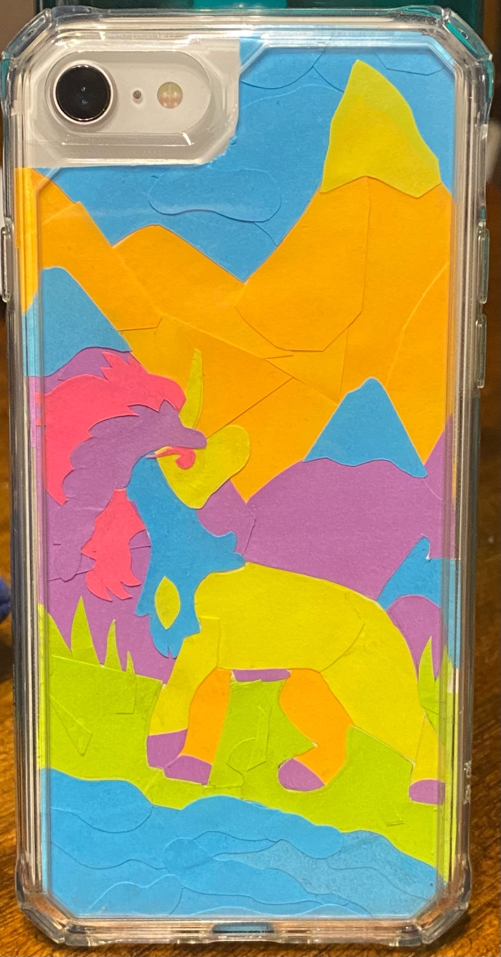
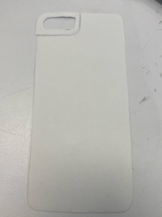
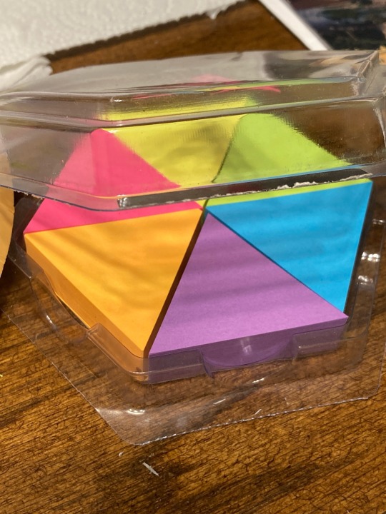
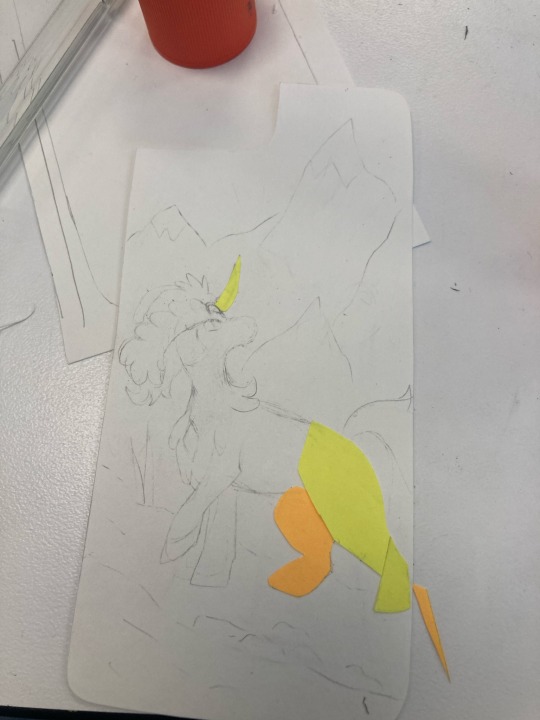
Materials- A clear phone case, any sort of paper, scissors (preferably smaller ones), sticky notes, glue stick, pencil, some container to hold scraps (optional, but recommended)
I started by simply tracing out the shape of my phone, and cutting it out. I should have taken the case off for this, but I didn’t, so my initial shape was too big to fit on the inside of the case. Nevertheless, it is probably better for this first shape to be too large than too small, as you can trim uniformly along the edges of your shape until you can slip it into the case. Initially, I tried to cut a little window in for the camera and flash, but it was too difficult to do so neatly, so I opted to just cut a notch in for that section.
I then sketched down the design I wanted, trying to keep in mind where I’d put the colors. I used sticky notes of 6 colors (yellow, blue, green, orange, pink and purple), so I wanted to make the design work with these colors and have it be readable. It probably would have been best to do the background first, but I jumped impulsively right into doing keldeo.
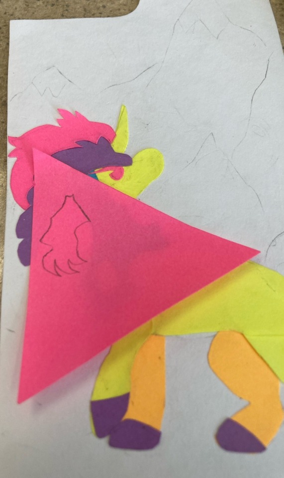
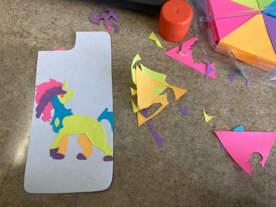
For thinner / more translucent sticky notes, I found you could see through them to the pencil sketch fairly easily, so I had to erase as I went. This also, however, made it somewhat easier to trace out the shapes I needed. For several of the shapes, I turned my phone’s flashlight on and used it as a sort of light table so I could trace certain shapes so they could be sure to not overlap existing pieces. I glued using an Elmer’s glue stick
From there, I used a mix of freehand scraps (for example, the water and skyto give it a sort of wavy look), carefully traced shapes (such as the grass around the legs), and relifting previously glued pieces to slide new ones underneath (purple mountains are slid under Keldeo’s blue neck fluff and pink mane) to form the background. It could get super tedious and frustrating, especially when it’s all unplanned. It’s definitely easier to slide pieces under other pieces when they are finely detailed; I could never have cut a purple piece to fit around keldeo’s little pink ponytail without details being lost (believe me, I tried!). I used an old little plastic clay carving tool with a small, pointed but non sharp shovel-shaped edge to gently pry up pieces so I could glue new ones under. You do need to be careful that the pieces you do this with aren’t too much darker than the pieces on top, or else they may be visible in the final, such as the small bit of purple poking under keldeo’s lifted front shoulder. I also needed to glue the edges of pieces down repeatedly when they’d lift up over time. For this, I also used the carving tool, but you could likely use any small slightly sharp object for this, like the end of a toothpick. Simply scoop up a small bit of glue and glide it under the lifted piece before reattaching. Repeat until the madness is over.
Very important warning: be careful of the glue you get on your fingers when doing this!! If you get glue on sketched on pencil and later try to erase it, it can leave a dark smudge, and it can even generally just leave dark smudges when left to dry (you can see some of this on the water). Try to scrape off any excess glue as quickly as possible with a toothpick or other small tool!!
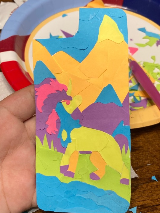
While I’m not sure what good it would do, I did sort of ‘laminate’ this piece before I put it into my phone. I didn’t want to use permanently sealing laminating sheets, as this would both be permanent and likely make the piece too large to fit in the case, so I instead cut up a clear sheet protector you’d use to hold notes in a binder. I placed the piece in the corner and cut the protector down to size, then trimmed until it could fit within the case. I had to cut down one sealing edge, meaning it only holds the piece between two bits of plastic held together with one hinge. However, this did give me some peace of mind knowing I didn’t shove a straight up sheet of paper covered with sticky notes in there
Anyway !! This actually only took two days total, so while meticulous and tedious, it isn’t extremely hard. Especially considering I just sorta jumped right in hoping it’d work out with 0 knowledge if it would!! It’s such a special invigorating feeling to see the final project on your phone and know you have a special little work of art following you around!
nobody can say I’m not keldeo’s #1 fan now
#I’m still giddy over this I can’t believe this worked#Pokémon#pokemon#Pokémon fanart#pokemon fanart#keldeo#diamondvic art#my art#paper art#papercraft#paper craft#I have no idea what to tag this
10 notes
·
View notes
Text
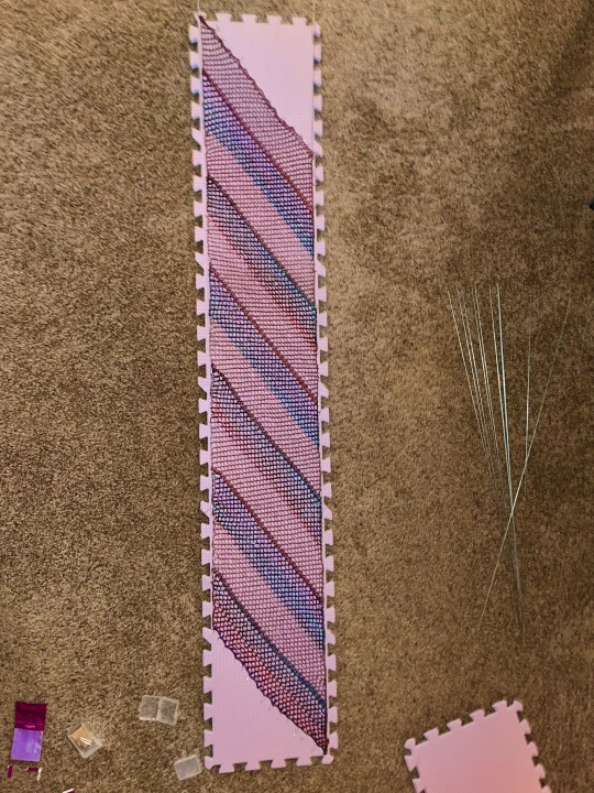
I’ve blocked out this scarf and I can’t get the diagonal ends quite straight but it feels nice to do. The problem with the fishnet pattern is because it’s essentially a grid it’s painfully obvious where I messed up stitches, and the other problem with the project in general is I didn’t realize that the two yarns I used had different elasticity. I would have liked to make it longer but it was hard to gauge length and how it might differ given what yarn im using vs what the pattern used.
But! We live and learn, and next time we’ll make sure to use the same type of yarn. So I’ve learned to pay attention to yarn when I’m using more than one yarn.
The other thing I learned is that god having wires for blocking makes things so much easier. I can’t believe I haven’t tried this before. Or using foam blocking boards instead of cardboard scraps. Sure it cost more but in the long run I’ll get way better results with wires and mats than trying to do my best freehand with cardboard.
I’ll get some better picks once it’s done blocking.y crafting area is in the basement where there’s not much light.
#eldritch it speaks#do I have a textile tag? I can’t remember#hm#Eldritch IT Fiber Art#you ever get dicked so good you summon the energy to block your knitting
28 notes
·
View notes
Text
The Grey, WIP: 7/7/23
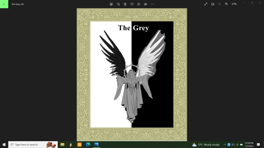
Well, I wish I had realized yesterday that by painting the base coats of the wings and then just fading out the references over the top of them, I could have saved myself some time and trouble. Now all I have to do is erase around the white wing and it'll be mostly done...save for some highlights I might want to put in.
This was a single image, then a doubled one because my graphics program has a tendency to merge all layers prematurely once in a while. A glitch that I'm not at happy about. I was just able to remove the bulk of the reference picture today. Look so much better without it there.
I was going to do a half gold and half silver halo, but with all that black and white, there's need for more splashes of color. So, the halo will be solid gold and have red jewels set into it. The flames will also add some color as well as the lady's skin. A nice brown. Her hair will be black.
References for the bits I need to see are still there, just invisible at the moment. Except for the frame design. I'm doing my best to eliminate anything I copied from online as fast as possible. Except for the wings of course. I need those.
I will lighten the hue of the cloak; I usually start dark and work lighter then darker again in spots as I go along. I even have brushes that will do fabric textures. I think I might try that. In spite of the need for more color, I still insist that the cloak be grey. Maybe I can add some patterning or something. I'll think about it.
Anyway, I never meant this drawing to look like a playing card. In fact, the main elements of the drawing just showed up randomly in my head when I wasn't really thinking of anything particular. But I liked what I saw, so I'm drawing it.
Yes, I know I'm cheating a lot. This is because sometimes I have trouble translating what's in my mind onto canvas. I can draw the human figure but haven't had a lot of practice at it. Nor do I have a lot of practice drawing clothing. It was just easier to find what I needed online to help me out this time. I don't know who all the artists are who put out all these free resources for me to use. Though angelic figures are common, I can say with confidence that this idea is uniquely mine. Just for the fun of it I did a general search image for a moment and found lots of angels, but nothing exactly like mine. So, there's that.
I can and to draw freehand. I'd do it more often than I have been lately if I had more time. My time off is sporadic at best/worst. Given the choice, I'd spend more time doing everything in my head. Taking a few hours a day just to draw. I can do a solid three hour session of drawing before my brain gets tired and I have to take a break. I rarely get that time lately.
Ugh. This is devolving into a bitch session. I won't do that here. Anyway, when this is completed, people who are into games like Dungeons and Dragons or similar games may use this character as part of your game. Just ask me first because I want to know about it. Give me credit for the design. No, you may not sell it. I need the profits far worse than you do.
I came to think of The Grey as a kind of judge for contests and legal issues...and maybe other things. She knows there's more than one facet to every story, there isn't just pure evil and pure good. There's always those shades of grey. And she's an excellent and fair judge. A living personification of justice and a powerful force for the good side. My mind had to work on this for a while as I drew her "card." Because originally, she had no story, no meaning. I'm still inviting people to have an open interpretation of her character however.
I can also see this as a big poster over someone's bed simply because it looks cool. It would be a nice decoration, especially if it turns out as nice as I want it to.
I'd appreciate it if no one used my idea until it was completed. I might make some changes along the way that I won't know about until I get there. Not that I think anyone will really. Every offer of free resources I put out gets ignored. I don't know why.
I will also post this on Redbubble when it's done and send a link. I can't seem to completely let my optimism go even though I'm aware that no one wants to buy my artwork. I don't know why.
#cherokeegal1975#digital art#wip#work in progreess#original character#original D&D character#free resouce
0 notes
Note
jk haha. here's some tips:
1. identify what's making you draw so slow. can't figure out pose/anatomy? too perfectionist about inking? getting caught up in details? indecisive coloring?
2. timed gesture studies. draw a loose figure w photo reference in 10 minutes. do that a bunch of times. then 5 minutes, 3 minutes, 1 minute. train yourself to omit as much detail as possible while keeping the figure recognizable.
3. the dot/line exercise, sometimes called the "target practice" warmup. draw two dots, then a line connecting them. keep moving the dots farther apart while drawing the line as fast as you can while keeping it STRAIGHT (not wobbly!) and hitting the second dot. the line is ONE stroke. it's harder than it sounds. this should help you get an idea of how fast you can make a controlled stroke
4. look up tutorials on coloring more quickly in whatever art program you're using if you do digital art. chances are there's a tool or setting that can make it easier to fill in shapes. i almost never color by hand, i fill bucket everything
5. free yourself of "clean line art"... 9 times outta 10 people think sketchy lines are more visually appealing anyway. it's faster and they have more life. in my opinion at least
6. use lots of references. spending hours on a complicated pose from memory instead of just looking at photo/3D model reference isn't impressive it's just stupid and unnecessary
7. study with intent. if you struggle with leg anatomy for example, do lots of studies from photos (eyeballing and tracing), then try it freehand/from memory, rinse and repeat 9000 times until it's not something you get stuck on when it comes time to do an illustration/comic page
8. less detail. simplify. you can have ultra detailed art or you can draw fast. pick which is more important to you
9. bullshit it... draw ugly and bad but do it fast. done is always better than perfect
10. thumbnail. it's not just for comics. do a teeny tiny sketch of your drawing beforehand with colors. then use it as reference. helps to finish the actual piece faster when it's planned out
bonus: be impatient and easily bored. i rarely spend more than 2-3 hrs on any one drawing, including comic pages. i got other shit to do!!!! like nap
Do u have any advice for artists who draw ridiculously slow???
draw faster
14K notes
·
View notes
Text
There was a post earlier about a trans guy excited by the prospect of growing a beard. I can't find it now to reply, so I'm just gonna throw this to the wind and trust in the gods of the internet to get it where it needs to go.
How to Beard:
Advice for anyone growing out facial hair for the first time.
Patience. Every beard sucks at first. Every beard also itches at first.
Dealing with the itch. Moisturizer can help, often in the form of various beardcare products, but ultimately, the only way out is through. The itching only lasts about a week, and once you get through it, you'll be fine.
Patches. Everyone's first beard is a little patchy. Generally, a few months is enough for it to fill out. If you're going to try to clip the longer bits to match the shorter bits, use clippers with a guard. Don't try to freehand it.
The Yeard. The one-year-beard is a way to figure out how, exactly, your beard wants to grow. It's obviously a bit of a time investment, but committing to not cutting or trimming your beard for a year will show you exactly what you have to work with.
Beardcare. There's a lot of products on the market, and while beardcare is essential, most products aren't. You'll want something like an oil, balm, creme, etc, and a good brush or comb. Anything beyond that has an increasing likelihood of being snake oil.
Product. The best products have jojoba oil, which is a kickass moisturizer. Healthy skin makes for healthy hair. Oil is just oil, with a minimum of other stuff, so a little goes a long way. Balm contains bee's wax, and has a little holding power if you want to style it. Creme is just goop, no holding power, but its easier to work with than oil for some beards.
Combs and brushes. When choosing between a comb or a brush, be aware that the brushes tend to have soft bristles, not hard bristles like hairbrushes. Also, many beard combs are way too goddamn thick, and are like trying to comb with a phone book.
Shampoo and conditioner. The regular stuff works fine. You dont actually need the stuff specifically made for beards, and it costs like 10 times as much. The longer your beard gets, the more important conditioner becomes.
Style. Not every kind of facial hair works for every kind of face. Imagine Captain Jack Sparrow with a lumberjack beard, or Tormund Giantsbane with a goatee. You'll need to find the style that works for your face, bone structure, general style, etc.
The Fluff. Beards physically make your face bigger. They stick out from your skin and change the shape of your head. If you find it looks too wide, something as simple as trimming the sideburns can make your face look narrower again.
Minimalism. More is not always better. A swashbuckler stache might be perfect for you, and takes a lot less time to grow out. It's a great first step, and worth trying.
Neckbeards. Shave your neck, but not necessarily the underside of your jaw. Some people try to grow a full beard but shave right up to the edge of the jawbone. Don't do that. It looks weird, like a monk's tonsure but upside-down.
Beer. Kristofer Hivju swears by it, both drinking it and pouring one over your face every day, and I accept him as an authority on the subject.
5 notes
·
View notes
Text
Week 10
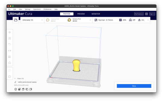
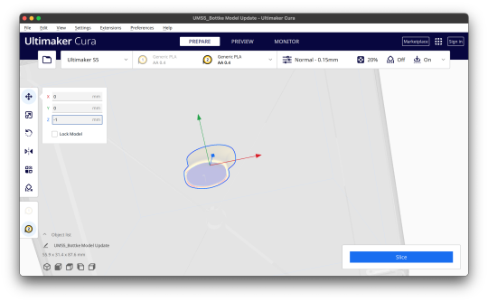
This whole course we have been learning how to create physical sketches, physical sketch models and digital models. This has provided many different opportunities to learn new skills and improve on old skills that can be used for future course as well as during full time work.
The first few week of the course, we learnt how to use engineering tools to create a variety of different types of sketches such as orthogonal, auxiliary and perspective sketches. I have quite a bit of experience sketching orthographic views in high school so relearning how to do them was not that hard. However, I definitely think I have improved from my high school days as I have learnt how to format my page better, add additional relevant information to the title block and used fineliners with different line weights to create a crisp sketch. Auxiliary views took a bit of time to wrap my head around, but once I understood its purpose and how it was drawn, it was quite easy to sketch. These first few weeks for the first assessment were relatively fun and interesting. Next time I will try to improve on my speed since the drawings did take some time but also would like to make less mistakes when I create the sketch such as misplaced lines and measurements. This can be remedied through continuing the practice doing more and more sketches.
For the next assessment we learnt how to do create perspective sketches, free hand sketches and digital rendering. Perspective drawings were definitely much harder than learning auxiliary sketches but I slowly got the hang of it. It was challenging to figure out how to draw some of the detailed areas of different objects accurately. But the more perspective sketches I did, the easier it became and the quicker I could do them. We also learnt how to free hand sketched different designs of a perfume bottle and use many drawing techniques to create something realistic. I was never really good at drawing and the decent drawings I create take me a long time. However some of these drawing techniques were able to assist me to make cleaner sketches. However I struggled quite a bit when creating a perspective sketch for the perfume bottle since there was so much more detail compared to the previous perspective sketches I made. It took a while but in the end I was satisfied with my result. Digital rendering was quite intimidating to me because I have virtually never used photoshop before. Because of this, I chose bottles that looked similar in size and didn’t have super complex shapes. In the end I was pretty happy with how it turned out. Overall this assessment was definitely a step up for me but I think I was able to manage relatively well. I enjoyed the perspective sketching but not so much the freehand sketches and digital renders.
For the final few weeks we learnt to create physical models and use a 3 dimensional modelling program to create models and clean up digital scans. Creating the physical model wasn’t too hard. Because I love creating craft at home and have had 5 years of experience in wood working at school, I didn’t find it too difficult to create a foam model. The only setback was that I had very little experience with foam so I was definitely a lot more cautious than usual and took a lot more time and care. This was worth it because I’m quite pleased with my end result. However, when I began using 3ds max it was quite a roller coaster. I have little to no experience using autodesk apps and 3ds max was a completely new experience. I followed the videos for tutorials and it took a bit of time to understand but was not super difficult. But when I tried making my own model in the program, I was not sure where to start. I found it hard to think of what functions I should use to make any object. I eventually figure out how to do it but it definitely wasn’t the best model and quite a painful experience. We then learnt how to prepare a 3d scan in rhino and 3ds max so that it can later be 3d printed. Considering my last encounter with 3ds max I was quite intimidated but in the end I didn’t find it that difficult. It was honestly quite interesting how we could modify a scan of a physical model digitally and then create digital iterations to be later 3d printed so we could have physical iterations. After that we learnt how to put it into the 3d printing software to be printed at any time. These final few weeks I found were equally as challenging as the previous three. This assessment had its ups and downs but overall was helpful for future projects.
All in all, this course has definitely been helpful and useful. Not everything was that enjoyable but most things were definitely informative and helpful. It was definitely useful to look at my peer’s work to share our knowledge and advise with each other to improve on both our strengths and weaknesses. I look for to be using these skills I’ve picked up sometime in the future.
6 notes
·
View notes
Text
Idk, as a predominately fiber artist, there isn't much pressure to go 'off-script', as it were. That's usually seen as extremely advanced, as far as I can tell. Even just making small changes to an already existing pattern is viewed as like, kind of revolutionary oftentimes.
All forms of art are inspired by what came before. You have such a distinctive style already - does working from reference really take away from that? Or does it just make the mechanics of creating art that you actually like easier?
I use a pattern when I make sweaters because I don't want to spend my precious time figuring out how to make my sweater fit correctly. I'd rather play with the pretty colors. Maybe I'll do a remix and change the sleeves (using another pattern!). I'm still getting better at my craft doing this, and it creates a result that I like, so is there any reason to feel bad about that?
Sometimes people in fiber arts fall down a rabbit hole, like 'i have to use real wool', or 'it needs to be historically accurate'. If I buy the yarn from a big box hobby store, rather than shearing the sheep and dying and spinning the wool myself, am I a hack? Am I stifling my craft? No, of course not.
Doesn't mean it's not fun to go off the deep end sometimes and try spinning your own wool, or go completely freehand. But all this to say, there's no morally incorrect way to create art. You aren't stifling yourself by following a pattern, or using a ref, you're smoothing the runway to making what you actually want to make.
Fellow artists/creative folk/writers: Do you ever get to the point where you've been working so much from reference that it's stifled your creative mind??
The little voice in my head says it must be perfect so I must use a reference for EVERYTHING but-- then you go to doodle or just be creative freely and its like...sheesh where do I start.
11 notes
·
View notes
Text
Welcome back to "this idiot has a sleep schedule that's burning in a ditch somewhere, so she's succumbing to the brainrot and drawing all the Batfam members instead!" (Previous Installments linked below) Today, my very specific but mildly nonsensical order has finally gotten me to one of the ones who's been around the longest: Barbara Gordon, the baddest b**** in town!
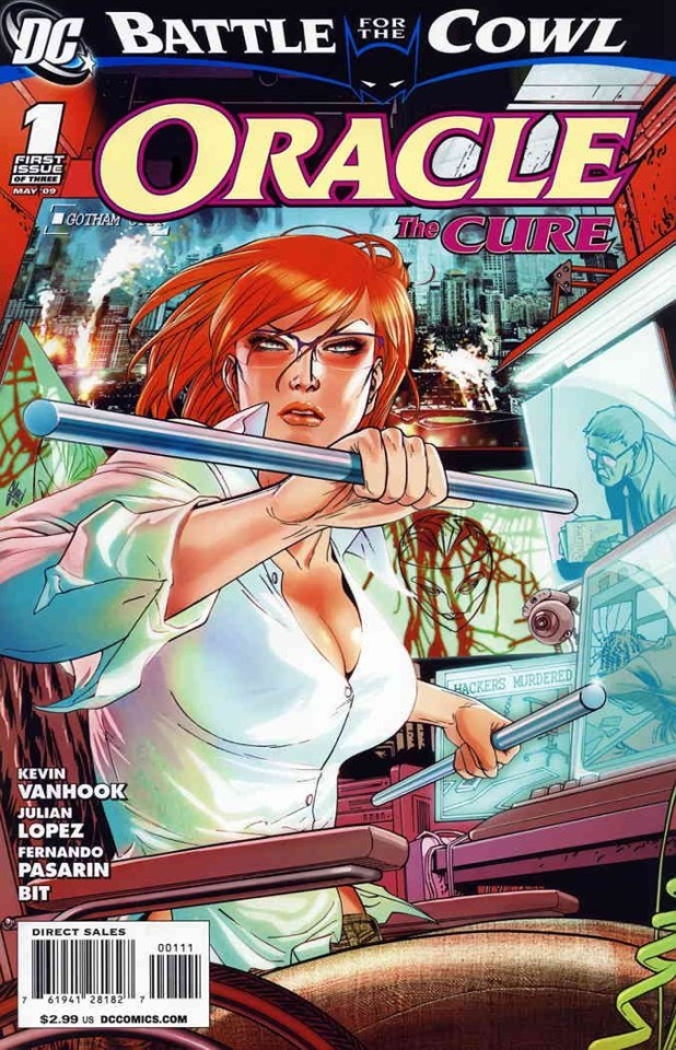
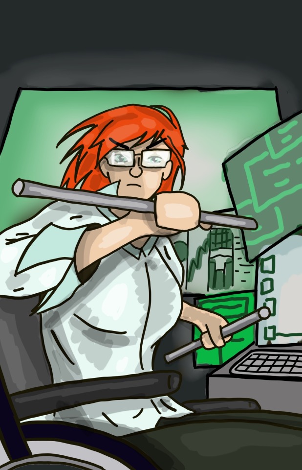
Initial trace where I stylize some and do a kinda half-baked background. I put a lot more effort into this backdrop than normal since computers are kinda Barbara's whole thing, so I really needed the screens in there. Also, before anybody comes at me: Babs can wear a low cut shirt if she wants. Comic books can draw in her a low cut shirt if they want. YOU can draw in her a low cut shirt if you want. I just didn't want to draw her in a low cut shirt, so I didn't! We clear? Moving on:
I drew her as Oracle. I know mainline DC comics has her back to being Batgirl again, but she's always Oracle in my head. As sexist and poorly planned as The Killing Joke may have been, I think her being in a wheelchair and being a super cool kick-butt hero anyway is very important to her character and gave her a lot of growth and development. And there are a bunch of other characters that could gain a lot from being Batgirl and/or are better suited to the Batgirl role at this point. Also, the Batfamily is a disorganized mess, they need someone like her around.
Favorite thing about drawing Oracle is definitely her glasses. I love drawing them mostly filled in so she looks extra scary!
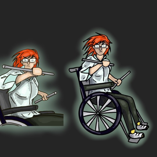
Freehanded version where I stylize using my trace as a reference. And yeah, I put this one on a dark background cuz I could! Babs breaks all the rules of conventional heroism, and she's breaking all the conventions of this art series! This whole project was a very good exercise for me in learning to draw a wheelchair and a character sitting in a wheelchair. I actually really really liked doing it. I had to google pictures of wheelchairs a few times, but this was much easier than most of the mechanical and non-organic stuff I try to draw. I need to draw more disabled characters, cuz this was really fun, and I would love to experiment with different models of wheelchairs and other types of mobility aids!
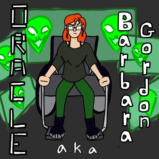
Characterization pose! Whoa, this is different from the rest of my Batfam drawings! A backdrop? In MY completely freehanded drawing? Yeah, like I said, Babs requires breaking all the rules. Since Oracle isn't a field hero and dresses the same as a civilian, I took a different approach than normal, and decided to draw her doing the things that make her Oracle: working with computers and being the scariest member of the Batfamily. I also drew my version of her "icon" that she uses if she needs to have some sort of face to communicate with people.
You can't tell cuz her clothes are loose, but I drew her super buff because she works a lot on both her arms and her legs to keep herself in shape and to keep her muscles from atrophying. Also, Barbara has like 6 different hairstyles that get jumped between with absolutely no regard for how that should work, so I took creative liberties. I mixed and matched, using her waves and relative length from Batgirl, the little side strands from one of the ponytail styles, and the bangs from the style pictured in my reference photo.
For once, the hero text isn't traced because every comics cover I could easily find has missed the opportunity to use the digital clock font for Oracle's name and I had to correct this absolute travesty.
Other Batfamily Members:
Nightwing Edition
Red Hood Edition
Robin (Carrie Kelley) Edition
Red Robin Edition
Spoiler Edition
Robin (Damian Wayne) Edition
Signal Edition
See ya in the next one, and see if you can guess who's next!
#Barbara Gordon is the scariest member of the Batfamily but only when she is Oracle#I will die on this hill and you cannot convince me otherwise#barbara gordon#oracle#dc oracle#batgirl#but she's not batgirl here and I'm not really sorry about that#oracle fanart#barbara gordon fanart#batgirl fanart#sorta#character study#character art study#dc comics#dc comics fanart#dcu#comic books#comic book fanart#batfam#batfam fandom#batman fandom#batfam fanart#fanart#digital art#my art#Abby's Batshit
25 notes
·
View notes
Text
Art Advice #3 - Drawing tips!
Hi everyone!
As you may know, every week or so I’m writing blog posts with art advice hints and tips for artists of any skill level in the hopes of helping some people out a bit! The tag is here so feel free to check out some of my other posts!
This week’s post is going to be some drawing tips I’ve picked up over the years that could hopefully be useful for beginner artists!
(this is about 1800 words altogether btw)
Drawings tips!
I’m going to split this post up into little sections which will hopefully make it easier for you to scroll to find certain advice you’re particularly interested in!
Part 1 - How to get started?
I’m a firm believer that anyone can be an artist, regardless of what materials or equipment they have. So when it comes to my advice on what kind of materials I recommend for beginner artists, I’d mainly say ‘whatever you have’.
But if that’s a bit vague, I’d essentially recommend you have a set of pencils which you can usually get relatively inexpensive online or in craft/art shops which range from 6B all the way to 6H (’B’ being for softer, darker pencils, often good for shading, and ‘H’ for the harder pencil leads which are best for much lighter shading or if you want a really faint sketch. Something important to note about ‘H’ pencils is not to press too hard with them since they’re a lot more likely to leave indents in the paper than ‘B’ pencils! For general sketching I personally use 2B or 3B pencils since they have the perfect balance of soft & hardness in my opinion!)
Of course, you can just draw with whatever pens or pencils you already have, so definitely don’t feel you have to go out of your way to buy something new or expensive just because your favourite artists use a particular brand of pencil or pen... Of course, often higher quality pens or pencils (especially colouring pencils) will have better pigment payoff than the cheaper alternatives, but as someone who’s been using the same WHSmith pencils they got when they were a child, I definitely think that as long as you have something to draw with, you’re all set to produce masterpieces of your own!
A lot of my art education got us using charcoal for a lot of our drawing practise. It’s not a medium I’m particularly fond of personally, but it is a great way to practise being a lot quicker and expressive with drawing, so definitely if you’re up for the challenge you can try some charcoal stuff! Only piece of advice is that I wouldn’t really recommend those ‘charcoal pencils’ you can buy in some shops, since they mostly just break apart every time you try and sharpen them... Regular charcoal is messy, though, and smudges very easily, so if you are interested in using it I’d say to do a little bit of research before hand!
(Or feel free to send me an ask if you want any further advice on using it!)
If you’re wanting to get into digital art, I’m planning on making a post discussing my tips for beginners to digital so... keep an eye out for that in the near future lol!
~
Part 2 - Getting over ‘Drawing Anxiety’
Drawing can be a daunting thing, particularly when artists who are already pretty good at it can seemingly produce a perfectly proportioned face out of thin air. But these artists weren’t magically born with this skill, of course, so with practise and some perseverance, I can assure you that you’ll be at that stage one day!
So my first piece of advice here is to be patient with yourself. Don’t expect yourself to be perfect straight away.
Second piece of advice is to sketch constantly!! I notice a lot of people who haven’t been drawing long are really careful about how they draw, almost like they’re afraid to be rough with the pencil. So I’d really recommend just starting to sketch a lot: be rough, be messy, draw things you can see and things from your imagination!
Observational drawing is another thing I think is crucial in improving your drawing skills (and I’ll go into more detail with this in a bit), but honestly just sketching things you like is such a great way to help you grow as an artist! And yes this includes drawing anime fanart or drawings of your original characters!
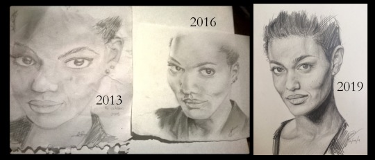
Below is some comparisons of my attempts at drawing Freema Agyeman from 2013 to 2019... Is the latest version of this perfect? Of course not. But I just want to show what constant practise can achieve!
~
Part 3 - Observational drawing
I honestly think that observational drawing was one of the most important things I learnt in my years of art education.
Observational drawing can take on many meanings. Perhaps it’s drawing a still life of a fruit bowl, or a life drawing class with a naked dude in front of you, or even drawing from a photo. The point of observational drawing is to improve how you translate the world around you onto a 2D surface, essentially.
And you don’t need anything fancy to do observational drawing either! Just placing an array of things in front of you and trying to sketch them (try and focus on a mix of textures and surfaces for the objects. So, for example, including a cup along side a woolly hat will help you get a handle on how to create texture with your drawing, and drawing anything with a reflective surface like cutlery is both challenging and interesting to do! Basically just use what you have around you!)
If you’re lucky (or unlucky, depending on how fond you are of seeing naked people lol) enough to have the chance to do life drawing, I would honestly recommend it! Often the final results aren’t great, but it’s a really good way of practising your observational skills! And even if you don’t have the opportunity, just trying to sketch a friend or family member from across a room, for example, is something that can really help you improve!
Top tip: a teacher once told me that when you’re drawing something like a face, for example, a way to improve how you draw is to see the face not as a ‘face’, but instead as a collections of shapes. Because our brains have a preconceived idea of what a face looks like that we end up drawing what we think we can see rather than what we can actually see!
There’s a lot of art snobs who believe that drawing from reference images is ‘cheating’ in comparison to life drawing, Of course, this is bs, and I’d say I’ve learnt just as much from using reference photos for the basis of my art as I have from drawing from ‘real life’. For more information about my thoughts on references and how to use them, see This post!
~
Part 4 - Drawing from references: Tracing, Grids and Freehand (which is best?)
Tracing in the world of art is a ... Contentious subject to say the least. And I’m not really interested in getting into the ‘moral’ implications of whether it is ‘cheating’ or not.
Instead I want to focus on the pros of using something like tracing when you’re starting out. I think particularly if you’re trying to improve how you shade things, colour things or how to get better at blending, then I do think that tracing can be a useful tool! Even I used tracing in the very start of my delve into digital art, but soon found that tracing wasn’t really something that was helping me in the long run so moved onto freehand stuff.
Overall, I think tracing is good as a starting point when you’re still learning about art, and also if you’re not too comfortable with your freehand drawing skills yet. I’d also recommend you mention if you have traced a piece if you share art to social media. Of course, no one is obligated to do this though!
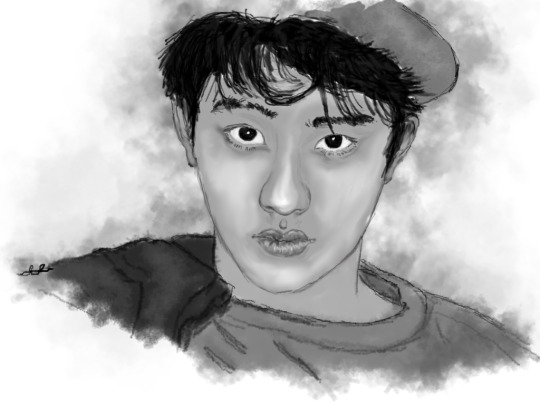
This is an example of an artwork that I traced (it’s from 2013, hence why it looks... like That lol)
But if you’re someone who perhaps has used tracing in the past and found it doesn’t really work for you, or if you don’t want to start with tracing at all, then a good ‘next step’ I’ve seen other artists get into is using grids.
Now I have to admit, I’m not the best person to talk about grids since I’ve actually never used them lol... But I know a lot of artists who do, particularly people who do a lot of traditional work, since it makes it a lot easier to translate the reference image to your piece of paper or canvas.
And in a way I would recommend grids more for people starting out in drawing than tracing, and this is mainly due to the fact grids force you to use a lot more observational drawing skills than tracing! If you’re interested in getting into using grids I’d recommend doing a bit of research yourself!
The final technique of drawing from references I want to talk about is freehand! Now this is the one I’ve been doing for the majority of my art ‘career’ and honestly is probably the most ‘difficult’ to do of the three techniques.
But I find freehand drawing particularly rewarding with the ways it can make you reimagine an artwork in ways you never intended! Like what I mentioned in my Reference advice post, I have found that making ‘mistakes’ in freehand drawing can actually lead to more interesting and unique works of art than tracing or grid work could ever do!
I also think that freehand allows you to create your own characters or concepts in a much more free way. For example, my Spirit of Somerset piece was something I created from a variety of references (I seem to remember I used Isak from SKAM’s mouth as a basis for the girls’ mouth?) and the dragon was based on a real mishmash of references, which is something that I I feel I couldn’t have done if I’d have been using grids or tracing!
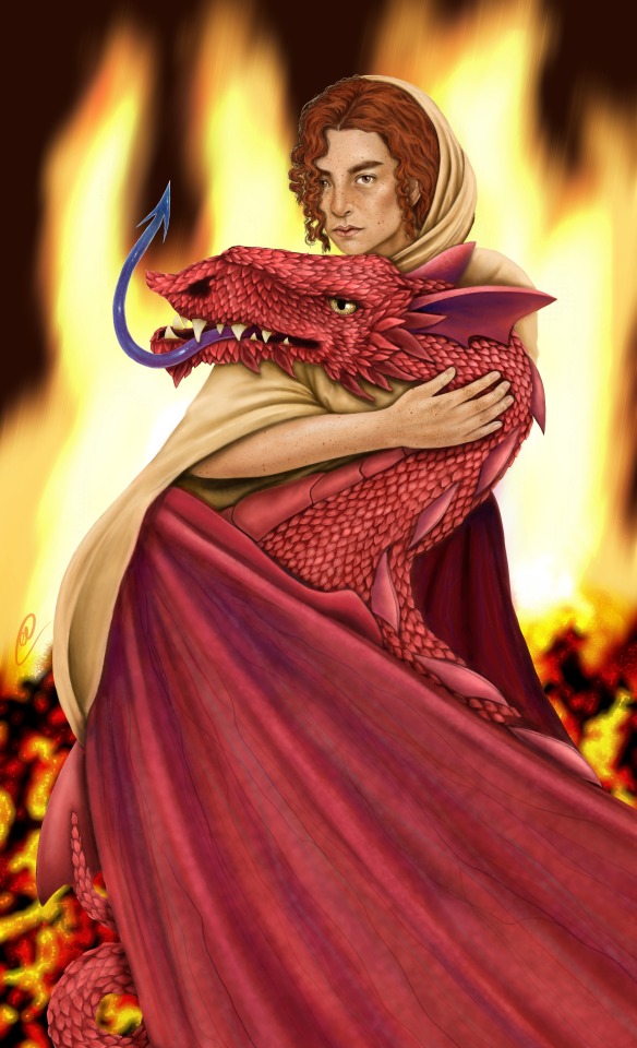
With this I’m not trying to say that freehand is the ‘best’ way of drawing, it is just the one that I personally have found to fit me the best, which is the entire point of this post! All of my advice is just pointers I think could be useful for new artists, it is up to you to find which ‘path’ in art suits you best!
And of course, I’ve phrased these techniques as separate purely for the sake of explaining them easier, but the fact of the matter is that you can use a combination of these in your art if you wish!
If you struggle with drawing the outlines of hands, perhaps use tracing as a way to get a handle of the shape and then maybe use freehand to fill in the colour of them! Use a grid to draw a tree but freehand the leaves and bench below it!
Remember that your art is your art, and no one can tell you how to draw things!
~
I think I’ll leave this here for now! But I may do a part two at some point in the future! & my ask box is always open for anyone who wants any specific advice!
I really hope you found this at least moderately helpful, and a massive thank you to everyone for the constant support of these posts and my art!
#art advice#drawing#drawing tips#art advice for beginners#drawing advice#artists on tumblr#art#i SWEAR i am trying not to ramble in these i just... have a lot to say lol
54 notes
·
View notes
Text
Q&A: The Difficulties of Recording High-Speed Video
There have been a couple of posts about film cameras losing frames when really good martial artists do their awesome. Do you know if anyone has ever used one of those extreme high speed cameras to capture one of them, then slowed it down so that you could actually see everything? Not immediately finding anything, but your search!fu is probably better than mine on this subject…
phantomjedi1
The footage exists, you find some on YouTube with a little searching. Usually, what you’re looking for is going to be labeled as, “slow motion,” or something similar. Most of this stuff doesn’t get much above 300fps, but that is more than enough to track the motions, especially when it’s slowed down so that you have the time to really watch what’s happening.
The footage isn’t extremely common because high speed video is kind of a pain to record. This is a moment when I’ll have to admit, I have not spent a lot of time with digital photography, especially on the high-end of the spectrum, so it’s possible this is easier today than it was twenty years ago with film cameras. This is going to seem like a strange tangent, but bare with me.
Taking a photo is about balancing two resources, Light, and Time. Time is measured in fractions of a second, and light is measured and managed with the lens’s aperture. Undeveloped film is extremely sensitive to light, and the entire technology behind cameras was based around that.
To capture an image, film needs to be exposed to light for a very precise amount of time. If you don’t get enough light on the film, the result will be underexposed, and too dark. If you get too much light, the image will be overexposed and blown out.
As a quick aside, some minor exposure errors can be fixed during development of the photo. This is easier with black and white film as you can salvage B&W negatives that would have been completely wrecked if you were using color film.
Now, here’s a problem. When you’re out in the world, you can’t control how much light is present. If you’re in natural daylight, or on a city street, the light that’s there can’t be removed. You might be able to add more to a specific object, but you can’t (practically) make the entire street brighter. What you can do is change how much light the camera admits to the film, OR you can adjust how long the film is exposed. An SLR camera (which used to be the standard for analog photos) allows the user to adjust the exposure length. These will range from 1/32nd of a second up to a full second, with a “hold,” or, “bulb” option that will simply expose the film until you release the shutter control.
The advantage of a shorter exposure is that it will better capture movement. If you’re trying to take a photo of a bird in flight, or a car driving down the street, you want that short exposure time. If you attempt a longer exposure, and the subject moves during that time, the result will be a blur. The film recorded the object in multiple placed and none of those points resulted in a clear image. (Also, longer exposure times are more difficult to use freehand, because any camera shake will be recorded by the entire image.)
For example, if you wanted to take a photo of a parked car in dim light, the answer would be to keep your aperture fairly small (I’ll explain why in a moment), and have a long exposure. (Possible even up to the full second, depending on how much light is available.) If it was an especially long exposure, you’d probably want to mount the camera on a tripod to stabilize it.
So, I said time and light, and I’ve been explaining how you can extend the time, but I also said you can’t change the amount of light, which isn’t entirely true. You can’t change how much light is in the environment, but you can change how much light gets onto the film by adjusting the aperture.
A camera’s aperture is, literally, how much the shutter closes down while taking a photo. The smaller the aperture the less light is admitted through it onto the film. The wider the aperture, the more light hits the film. There’s a side effect, your aperture also affects depth of field.
Depth of field is the plane in front of the camera that is in sharp focus. With a very low F-stop (so, a very open shutter), you can take photos that will put one specific point of an object into focus, while letting the rest of the world dissolve into an indistinct blur around it. This also has the advantage of being a very short exposure time, because a lot of light will be hitting the film.
A high F-Stop (so a very tight shutter) will have a large depth of field. This is ideal if you wanted to take a photo of a street, and keep as much of it in focus as possible. The weakness is that these will result in much longer exposures.
Looking back at the car example, this is why, you probably want the entire car in focus, so depending on how much light, you’d want a higher F-Stop to get the car in focus, and because it’s not going to move, you can extend the exposure to compensate.
There is one last part that affects both of these; the film itself. Not all film is created equal. Film has an ISO rating, which correlates to how light sensitive it is. The problem is, high ISO film, which requires less light, results in grainy images. So, you’re trading the speed you can take the photo at for the quality of the resulting image.
(There’s also three different kinds of color film, Daylight, Tungsten, and Fluorescent, these are color balanced for use under those light sources, and using one under a different light source will color shift the image.)
The reason I’m going through all of this is because still photography and cinematography operate off the same principles, with one key difference. A video camera has a fixed exposure length that cannot be changed because the camera has to capture the next image on schedule.
So, it used to be when you wanted to get very high speed footage, you needed to do a couple things. In addition to a specialized camera that supported the higher feed rate for the film (and shorter exposure times), you also needed to absolutely bathe the environment in light, and you needed very light sensitive film which would produce less than ideal images.
So, the high speed camera is expensive, the film you’re burning through is expensive, and the light rig is also expensive. Meaning, this isn’t cheap. You might see this employed occasion in film or advertising, but in most cases, historically TV was shot and broadcast at 30 frames per second, and film was shot at 24 frames per second. You might record at a higher rate specifically to produce a slow motion effect, but there wasn’t any point to going above this because the images couldn’t display.
So, that’s the past. Where we are now, digital cameras have become the norm, and it is much cheaper to record high speed video today than it was twenty years ago. Most modern TVs can refresh at 60fps without issue (and some support much higher refresh rates, even if broadcasting hasn’t caught up to those standards.)
Depending on your digital camera, you may be able to adjust the ISO rating on the fly depending on the sensor’s capabilities. Once you have a digital camera, you’re good to go. Hardware that would have set you back more than $10k 20 years ago, can now be replicated for less then $300.
This is a long way to say that when Bruce Lee was appearing on TV, the technology either didn’t exist yet or was prohibitively expensive. Today, it’s not that difficult to get slow motion videos of martial artists demonstrating techniques at 300fps, slowed down to something you can examine in detail. If you ramp that video back up to normal speed (by dropping frames from the playback, rather than just having an absurdly high refresh rate on your monitor), you’ll have the same experience.
A YouTube channel called The Slow Mo Guys shot high speed video (1,000fps) of the Kukkiwon Taekwondo Demo Team in 2019. High speed video is their area of expertise, and the resulting video is the most professional I was able to find on short notice.
-Starke
This blog is supported through Patreon. If you enjoy our content, please consider becoming a Patron. Every contribution helps keep us online, and writing. If you already are a Patron, thank you.
Q&A: The Difficulties of Recording High-Speed Video was originally published on How to Fight Write.
68 notes
·
View notes
Text
This is just a little something of Mac & Riley being all domestic. We got a little taste of it in the quarantine episode so I couldn’t help myself. This isn’t a drabble nor is it a one shot. I don’t know what to call it.
Mac and Riley have only been dating for three months. When they’re not at the Phoenix Foundation or on a dangerous mission they’re lying the couch at Mac’s place just being with each other. As Riley’s playing Mario Kart her head is in Mac’s lap. He can’t help but smile as he watches her get all focused on the game. He can’t help but think of how much better his life is because she’s in it. “Move in with me.” Mac whispers as he intwines his hand with her freehand.
“Wait what did you just say?” Riley stops in the middle of her second lap of Mario Kart so she could sit up get a better read of his facial expressions. She can see that he’s serious.
“Riles, I know you heard me. Move in with me.” He smiles and looks at her trying to figure out what she was thinking.
Riley just takes a second to come to terms with what he said. She gets up and starts rambling, “we’ve only been together for a few months. I still have 6 months left on my lease.”
Mac gets up to stop her from going further into her rant. “I realize that we haven’t been together long but we’ve already lived together once before. You’re practically over here all the time anyways. I just thought that it would be easier if you moved in. You and I have known each other for quite some time, so I don’t think much would change, Riley.” Mac said as he takes her hands in hers.
“I can see your point but if I moved in, it would be different from before. I wouldn’t just be your roommate this time. Not to mention I’d be sleeping in your bed instead of the guest room. We could end up hating each other which would in fact lead to us breaking up. I don’t know what I would do if I lost you because we rushed moving in together.”
“You’re the best roommate I’ve ever had. Don’t tell Bozer. I’d never hear the end of it. You’re already sleeping in my bed that wouldn’t nothing change. I just thought that it would be easier for you if you moved back in. I could never hate you. You and I breaking up is never an option. Yes, it took me forever to get to this point. I’m not about to let you go that easy. I can’t imagine not having you in my life. I’m a better man and that’s all because of you. In the meantime I’ll be here waiting if you’re ever ready to move in.”
“I appreciate the offer. You being in my life has been the best thing to ever happen to me. I still remember the day we met as if it was yesterday. I was in prison and you freed me with nothing but a paperclip. My mind was blown away. I love you more than I’ve ever loved anyone but I’m not ready to rush it. We need to be smart about things. I promise that once my lease is up in 6 months and if you still want me to move in then we can come back to this conversation.” Riley sighs as she looks into Mac’s blue eyes.
“That’s alright. I remember that day. I remember not even knowing you for all of two seconds but I was fascinated by you. You asked me what I did and I said something cheesy like, ‘You hack computers and I hack everything else’. We’ve made quite the team from day one. So we’ll revisit this in 6 months. I have all the time in the world. You’re worth the wait, Ms. Davis.” Mac smiles as pulls her into an embrace kissing the top of her head.
“I love you, Mac.”
“I love you too, Riles. Now come on, let’s go to bed.” Mac said as he turned off the TV and the lights as he took her hand in his leading her to his bed—their bed— where he’d hold her as they slept.
34 notes
·
View notes
Text
Week 6 - Digital Sketching
During the non-teaching week, we were tasked with creating digital sketches, developing the skills taught during week 5's content.
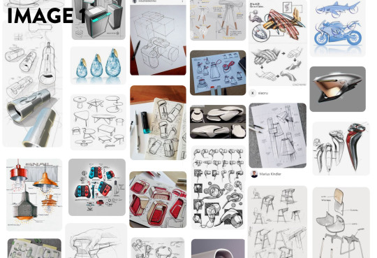
Before any sketching and drawing took place, we were tasked with gathering reference for our pieces on Pinterest. I found that Pinterest managed to curate images much better than google images, Flickr and other image search engines I have used before. I really wasn't aware how powerful it was at creating themed moodboards (Image 1). I am absolutely certain that I will use it for future projects, because I gained lots of insight into different styles and design trends; and it even linked me to some really interesting tutorials.
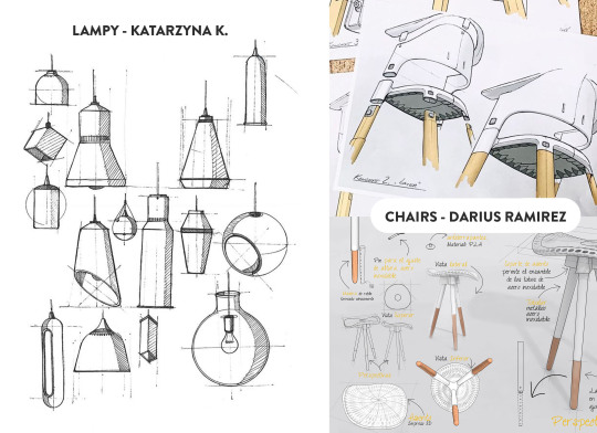
I selected a few images that I really liked and appreciated; the first being LAMPY by Katarzyna K. I really liked the clean linework and hatching in this piece. Even though it was hand drawn, the shapes and forms are legible, clean and convey the necessary information in as few lines as possible. The linework skill is something I definitely aspire to achieve with more practise.
The next set of images I gained insight from were the chair drawings by Darius Ramirez. This image set really resonated with me because of the clean marker renderings, and the composition of the pieces. I enjoyed that there were overlapping features and lines, but the overall composition remained clean and not too overwhelming. The marker renderings were colourful and sharp, and the minimal palette really worked well with the simple forms. Both these artists produced wonderful works; and I would love to emulate the skills and techniques required to make them. I will definitely continue to look for inspiring designers and skills that will improve my own works.
For the tutorial itself, I started with the online video tutorials from Rob. Even though I feel like I have a lot of experience with Photoshop, it was really interesting to see the workflow of someone with more experience than myself. I found that it was less the technical information like the use of layer masks and clipping masks, but more the process, and artistic design choices where I gained the most insight from these tutorials. Using a digital medium like photoshop, there are many ways to speed up or improve workflow compared to traditional sketching. One of the most important methods from the tutorial was the use of masking and copying (Image 3). Using the initial block-out as the boundaries, applying shadows and highlights is a much faster process as it reduces the clean-up at the end. Another method I used during the blocking out stage was the symmetry tool in Photoshop to create even and symmetrical sides. I found that this allowed me to see the form faster, and iterate through ideas at a quicker rate.
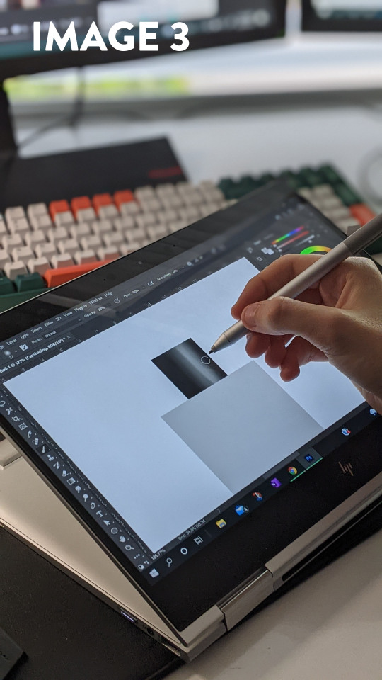
I really liked Rob's use of the Gaussian Blur filter to soften the edges. It allowed me to block in the hard edges and shapes. I found that it was much easier to be conscious of the shadow shapes and highlights when they had hard edges; and softening them out was a simple one click process after the fact. Before seeing this method in practise, I would either have used a soft brush with high opacity, or the smudge tool, which often results in muddy and inconsistent shading. Something I struggled with in this tutorial was the consistency of my linework. The laptop screen was slippery compared to paper, and this led to losing control of the pen - creating a line which was way off the desired trajectory. This was the main reason I was glad to have an undo button and layers to delete. In a way, having the security of redoing a stroke gave me more confidence in my linework.
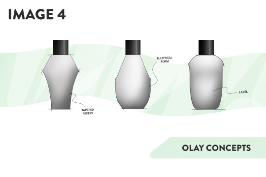
I added a slight amount of smoothing to the brush to counteract the glassy screen. Going slower meant that I had more control over the curvature. In the end I was happy with how this exercise went. I gained a lot of insight into product design sketching with photoshop, and was eventually able to produce a piece I was happy with (Image 4). I would definitely experiment with different styles and shapes if I were to redo this activity.
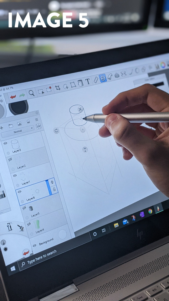
I decided that I wanted to try another program as well, so I opened up Sketchbook Pro on my laptop. Sketchbook Pro has a plethora of tools designed specifically to speed up the process of perspective drawing, and I wanted to try them out. The perspective grid tool was extremely powerful, and it allowed me to block out the bounding box of the bottle in under a minute. From the bounding box, I created a freehand sketch of the bottle on a new layer, and when I had created something I was happy with, Reducing the opacity of that layer and using the built-in drawing tools helped create the final linework. I liked this process because it allowed me to work methodically and in stages. I don't think I have full control over Sketchbook as of yet - the perspective was still a bit off due to the fact that I neglected the initial linework and misjudged where to place the ellipses. I found the process of creating a drawing in Sketchbook enjoyable, and the built in Copic marker set made it feel like it was built for Industrial Design.
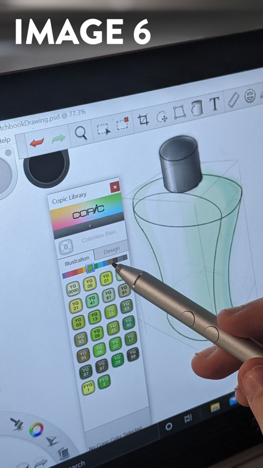
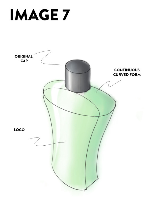
Even though I am happy with the final product, I would say that my drawings are still not where I would like them to be. I think that my linework could be refined and confident; and my application of colours and lighting are not always appropriate. I would like to continue to complete these exercises on a semi-frequent basis, and use it as a benchmark to track my progress - focusing on my linework and colouring. Overall, I feel like I have already made a lot of improvement in my drawing abilities over the past 6 weeks, and I look forward to evolving them further.
9 notes
·
View notes
Text
Clicking
Summary: Office AU, where Steve is your IT guy and he’s got his eyes on you.
Request: IT ex-boyfriend Steve completely obsessed with you
Kinktober prompts: (Did day 1) Spanking
Warnings: Non-con (please do not read if this offends you) (also, turns into dubcon), spanking, smut, light degradation (very minor name-calling/teasing).
Words: 2100

Could your day get any worse? You clicked at the mouse multiple times. Nothing. Computers were never your strong suit. You pushed away from your desk and walked out of your office.
Lunch break. Nobody was here. That meant one thing. Putting in a ticket with the Information Technology department.
“Ughhh…” You groaned at the thought. Those people were trolls. Always acting superior.
You pulled out your cell phone. Maybe you could work the rest of the day on the smaller gadget. It would be better than dealing with them. There was no way that was an option, so like ripping off a Band-Aid you went to your company’s website and wrote a quick request for IT help.
When you put the phone down you walked back into your office and plopped down at your chair. Your company was huge, there was no way they would send him. Still, you cringed hoping anyone but your ex showed up.
“Knock, knock.” The voice made the pit in your stomach drop.
“Steve.” You stood up. “How have you been?”
“Oh, you mean since you ghosted on me?” He shut the door behind him and walked around to your computer as you pushed away from the desk.
“Ghosted? We went on three dates; I didn’t think that merited a break-up.” You knew he deserved some explanation instead of zero response. “We weren’t clicking.”
“That’s your opinion.” Steve picked up your mouse and popped out the back.
He was handsome maybe you were too hard on him. He did make you laugh a few times. Steve fiddled with the thing and started moving the cursor around the screen, clicking on a few icons to test them.
“Trouble double-clicking your mouse. Why am I not surprised?” He turned around with a big grin on his face. “All you needed was a new battery dummy.
That was it. The reason you didn’t call again. Like most IT guys he had that ‘I’m smarter than everyone’s outlook. Plus you didn’t appreciate the innuendo
“Right. Thanks.” You folded your arms.
“This mouse clicks now.” Steve mimicked your stance. “Maybe I could help you with the other one? Dinner tonight?”
“I don’t think so.” You sighed. “Thanks for coming down, but I should get back to work.”
“Right.” Steve pressed his lips into a fake smile and stepped away. “Wouldn’t want to distract you with a life.”
“Excuse me?” You scoffed at him.
“You backed off because you actually liked me.” He stepped forward. “But that would mean not working eighty hours a week. Being something other than frigid from time to time?”
“I backed off because you throw around insults like candy at a parade.” You signaled for him to move. “So if you don’t mind, this frigid dummy has important business to take care of.”
“That’s genius Doll. You not liking insults? I bet your pussy got a little wet hearing them just now. Strong, powerful woman being put in her place? Yeah, that’s what you need.” He grinned at you.
Your mouth hung open in shock. Those few sentences alone were enough to get him fired.
“That’s right. Keep those lips parted. I can slide my cock between them easier that way.” Steve reached out and grabbed your chin, pulling it down.
“Are you insane?” You went to slap him, but he caught your wrist. “I could have you fired, you arrogant asshole!”
“But you won’t.” Steve squeezed down on your wrist and chin, holding your mouth open. “Because I’m right. You are wet. Aren’t you Doll?”
You tried to say no, but all that came out was a mumble. Instead, you shook your head.
“Wow. Not only are you a dummy and frigid.” Steve twisted your arm and dropped your chin. “You’re also a liar.”
You cried out as he manipulated your body so it was against his chest, your arm pressed between the two of you painfully.
“Let go of me or I’ll scream.” You tried to claw at him with your freehand, but he hoisted your wrist higher and pushed forward, making your chest go flat on your desk as he kicked your ankles apart.
“No, you won’t.” Steve’s other hand ran over the curve of your ass, squeezing your cheek. “First off, nobody is here. Second, they’d open the door to see you bent over, vulnerable, filled with lust.”
Before you could respond Steve started to bunch your skirt over your hips.
“NO!” You tried to stand back up, but he pushed you down against the desk.
“Quit lying.” SLAP! Steve’s palm came down hard on your ass.
You let out a little squeal as your cheek stung. CRACK! It came down again.
“STOP!” You tried to wiggle away, but there was nowhere to go.
“Wow, you are being loud.” SMACK! The burn spread. “Is that what you want? Everyone at the office to see the frigid dummy liar getting spanked like the naughty girl she is? Maybe smelling your cunt? Because this little room already reeks of sex.”
He was right, you had to bite your lip to stay quiet. WHACK! SLAP! SPANK! SMACK!
“I really like you.” Steve rubbed the burn on your behind. “You’re lucky I’m willing to put up with your shit, even after not hearing from you for weeks.”
“Please stop.” You tried to stand again, ignore the flame.
“I will when you stop lying.” He pushed you down with ease.
CRACK! SLAP! WHOOSH! Each stroke made your rear explode with pain. You were trying to stifle back all noises, biting your lip so hard it started to bleed by the time tears started to pool at your eyes.
“Don’t lie.” Steve rubbed his hand against your burning behind, almost soothing it. “Are you wet?”
You opened your mouth and shook as your brain told you to shake your head no.
“I’ll stop if you tell the truth.” Steve’s fingertips dug into your pained flesh.
“Yes.” You shut your eyes, shame-filled you. “Yes. I’m wet. Now let me go!”
“Why would I do that?” Steve’s hand went up to the band of your panties and pulled them down. “You were finally good. Shouldn’t you get a reward?”
“No!” You pulled at the desk to get away, but Steve pushed you harder against the wood.
“Shhhh.” Your panties went down your thighs. “None of that now. This is the fun part, well honestly I’m sure all of this has been fun for you.”
His hand cupped your sex.
“Wow, you’re not wet.” Fingers ran over your slit. “You’re soaked. When was the last time you got laid?”
You buried your face in your hand. Humiliation at the question and your physical response flooding in.
“No wonder you’re so frigid.” The pads of his fingers pressed on your clit, eliciting a moan from your body. “You know I could’ve helped you with that on the first date right? I’ve been obsessed with you since the moment I spotted you.”
He began rubbing in a circle. The human touch, the interaction. You had missed it. Your body stilled under his touch, the way he was pressing, giving your clit the attention it needed. Another moan came out.
“As much as I want to hear those noises, now isn’t the place Doll.” Steve leaned down, his mouth next to your ear. “Keep them up and I’ll shove your panties in your mouth. Or would you like that? Tasting how sweet you are? I bet it’s better than you smell.”
You tried your hardest to stifle the whine. Steve rose back up with a chuckle and dropped your wrist. He knew that your objections were slinking away. Your body too pleased with his motions to put up any fight.
He started to rub harder and faster. You found yourself bucking against him, grinding your clit against his fingers as your stomach started to coil.
“When was the last time you came?” He picked up speed. You clawed at the desk as your body ignited. You needed this. “Answer the question.”
“I….I….” Your head was swimming.
“That’s not an answer.” Steve slowed down, lessened the pressure.
“I don’t remember!” You gasped and tried to rock against him. “Please don’t stop!”
“Wow, first it’s please stop and now it’s please don’t stop?” His hand left your body and frustration started to fill you. “No wonder you’re so on edge. If you’ve waited this long, I think you can wait a few more minutes.”
The sound of his belt coming undone was unmistakable. You lifted your head to look around.
“What are you doing?” You pushed yourself off the desk as Steve sat in the chair, his cock yanked out of his pants, standing at attention.
“Giving you a place to cum.” He put his arms on the rests. “You want to finish don’t you?”
“I….I’m not having sex with you!” You stood up, your skirt still around your waist.
“Quit pretending.” Steve rolled his eyes and leaned forward, yanking your panties down further with one hand as he wrapped the other around your waist. “We went on three dates. I think that’s plenty. “You have thirty seconds to decide. Do you want to be the frigid bitch or the strong woman who takes what she wants?”
“And you think I want you?” The frustration was started to turn to anger.
“I know you want me.” He swiped his fingers over your pussy making you fall forward with a squeak. “Your body knows you want me. Quit lying. Take what’s yours.”
Steve pressed down hard on your clit again. A moan started to come forward, your lip was already swollen, you needed something to bite down on and without thinking you moved forward, even more, opting for his shoulder.
“Ahhh.” He brought his other hand to the back of your thigh, helping you straddle him on the chair. “Bite me all you like baby.”
You didn’t lift your head. His hands moved, one to his cock the other to the small of your back. His tip ran down your slit before stopping at your entrance. He put pressure on your back and you gasped as his cock split you.
“Fuck. Fuck. Fuck.” It had been so long, there was a slight pain as you lowered yourself. “You’re so big.”
“And you’re so tight.” Steve pushed you harder. “Fuck baby. You’re not a dummy or frigid, or a liar, when you’re like this you’re the fucking queen.”
He pulled your head hard against your shoulder as he flexed his hips and pushed your back. Impaling you on his cock. You cried out against his body as yours started to shake.
“A queen who can take whatever she likes. Whatever she demands.” Steve’s hands moved to your hips. “I’m nothing but her loyal subject.”
You were on top, but he was in control. His fingers guided you as you bounced on his cock, your clit brushing against his body with each movement. He was so large; you were so filled. You moaned into his chest as you tried to follow his lead, the heat, and desire for release returning.
“Please, Steve.” You were starting to lose control. “Please, I need to cum.”
“Then cum.” Steve nipped at your neck. “Nobody is stopping you. Take it.”
Your body shook as you pushed yourself, trying to take the lead from him. Moan in his shoulder as your hands dug into the chair. Rolling and rocking your body.
“Are you the Queen?” Steve flexed his ass, poking the tip of his cock against your cervix.
“No.” You weren’t going fast enough, chasing the need to finish. You needed his help. “You’re the King.”
You looked up at him with glassy eyes. A smile spread across his face. In a swift movement, he hoisted you in the air and set you on your back on the desk.
“Fuck yeah I am.” His hands dug into your thighs as he started to pound into you without mercy.
You brought your hands to your mouth to bite down, but Steve swatted them away.
“I don’t care anymore. Let them hear you. Let everyone know you’re getting fucked. I want them to hear you.” He didn’t slow up, his threats and demands sending more pleasure through your body. “Cum now. Do It. NOW.”
That was all it took. You started to explode around him, creaming yourself as his cock railed into you. Your head floated away, and you didn’t hold back the moans as your body went limp from the euphoria.
Steve bottomed out one last time before pulling away. He reached for something and pressed it against his cock. His face contorted from the release as he joined you in the release.
You tried to steady your breathing as Steve's hands grabbed your ankles. He was sliding your panties back into place. You looked down to see his seamen against the fabric.
“Don’t even think about taking these off.” He lifted your ass and his cum pressed against your pussy. “I’ll pick you up at seven for dinner.”
You didn’t think before nodding in agreement. Steve leaned down and kissed your forehead before tucking himself away. You didn’t even get off your desk before he left the office whistling, door wide open.
#Steve x reader#steve rogers x reader#marvel fanfic#fanfic#fanfiction#steve rogers#captain america#marvel au#marvel#captain america x reader
1K notes
·
View notes