#so it makes her recognizable
Explore tagged Tumblr posts
Text


...at least that's what I imagine they usually do
version without censorship (yes i had to cover her tits for the visibility of the post) and without text under the cut
more of my minoan art: click


im crying about his little feet
#minoan#minoan snake goddess#snake goddess#bronze age aegean#nehebkau#egyptian mythology#ancient crete#minoan mythology#ancient egypt#snakes#kurjdraws#art#artists on tumblr#my minoan art#okay now listen to me i hate the hat and the cat which arent even original but i included them because#people know this goddess from the figurine#so it makes her recognizable#i wish shed lose the damn hat with the damn cat though#okay i cried about hats to an actual archeologist today i think its enough#panakisnkywalkr#i am cringe but i am free
98 notes
·
View notes
Text
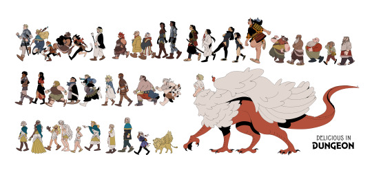
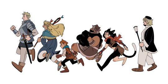
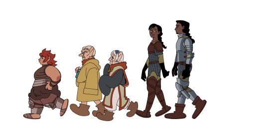
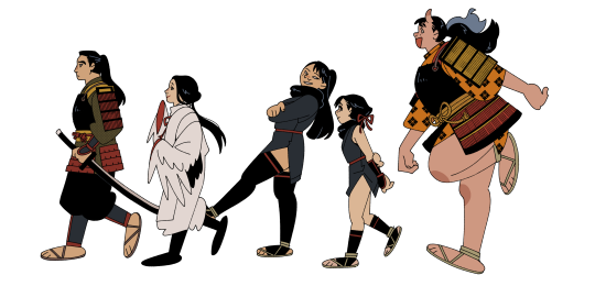
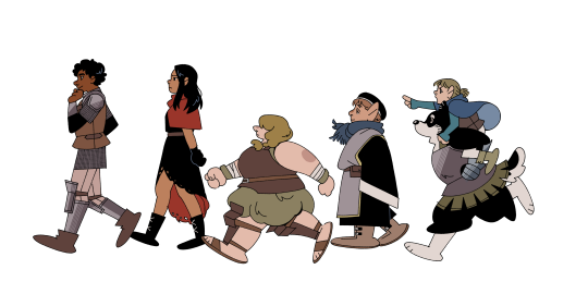

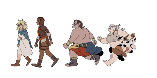
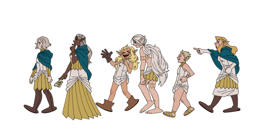


I started this around September 2023 anticipating to finish it for dunmeshi's finale! But things got hectic! Here is the finished product to celebrate anime airing day; 2024 is truly the year of dunmeshi!
#tumblr try not to crunch up my pictures challenge failed!!!!#ryoko kui's character design is so good#i've been wanting to do a big shapely lineup for a while and her designs are so recognizable and unique it was perfect for this#posting the 'smaller' version of the full thing bc its 30 x 13 in and I think it might never load#mayhaps i will revive my inprnt and make this a print#anyway!!#dunmeshi day!!!#year of the dragon -> falin year#dungeon meshi#delicious in dungeon#dunmeshi#my art#illustration#fanart#FORGOT TO TAG FOR SPOILERS#dungeon meshi spoilers#dunmeshi spoilers
5K notes
·
View notes
Text

Cooking up an older Clervie outfit design so I don't have to keep drawing her looking like her child self but Long
#genshin impact#clervie#ngl i have so many thoughts about an older clrv's design but at the same time artistically im not that creative </3#mostly tried to make her look more like a direct contrast to arlecchino's design (which was already present but we ignore that)#cause arle's design is mostly very sharp and angular while i'd imagine clervie's being much more rounded out and softer#like they are the round vs pointy cat meme in human form#the hair was really tricky cause on one hand much like everyone else we dont really keep the same hairstyle our entire lives#butttttt at the same time idk i feel like her long hair flowing down (and her headband) are very recognizable parts of her#so i decided to not change much (also cause i dont trust myself making multiple drastic changes without changing their identity too much)#also halfways through coloring I realized she's kinda giving crucabena outfit wise but we ignore that </3#anyways clervie would def be a support/healer character if actually playable (leaning more towards buffer support imo)#ITS A MASSIVE 50/50 IF SHE WOULD BE A HYDRO OR ANEMO USER but i decided hydro for the time being cause it compliments HOTH's dpses more#aka Arlecchino Lyney and partially Freminet since if i remember correctly he's more physical based but cryo nonetheless#i just really like the idea of Clervie's passive being along the lines of boosting stats/dmg if there's HOTH members present in a team#anyways sorry for the text wall I just really need to be kicked out of the kitchen#i am UNDERCOOKING the food#character design is not my passion </3
2K notes
·
View notes
Text
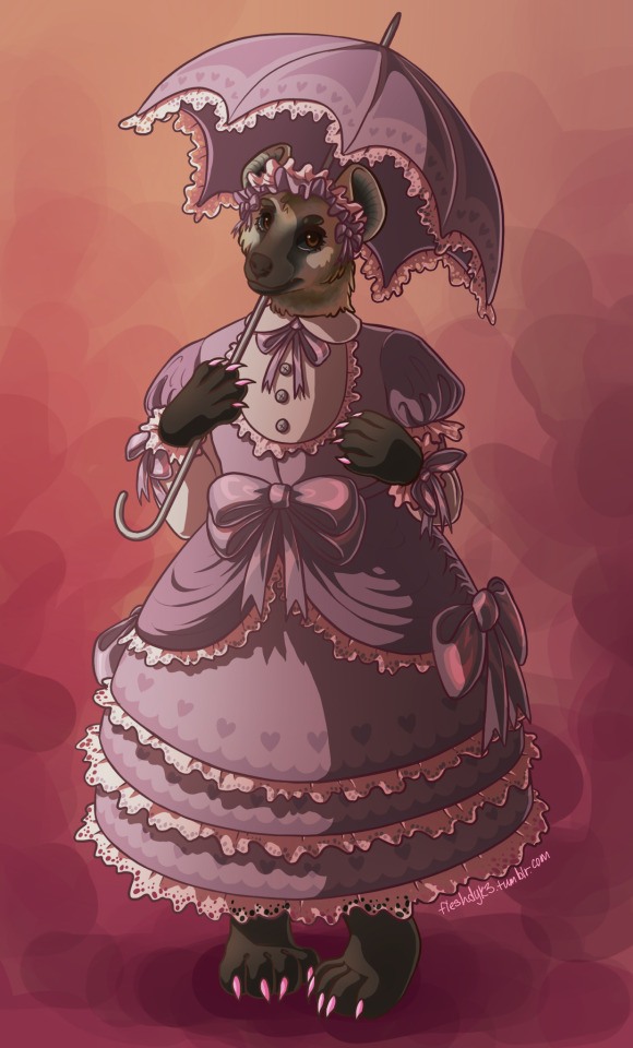
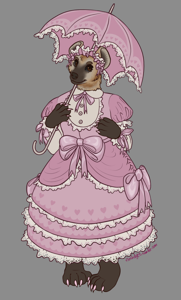
lolita hyena 👍
#sorry if theres like specific styles of lolita dress that i totally fucked up i have no idea what im doing i just took inspo from a bunch of#pics on pinterest lol#as we all know i love making alt butch furry women but like hyenas are so typecast as evil gross masculine etc etc. which is wonderful i lov#i love evil gross masculine women. but i want some beautiful feminine ones too ykwim#pretty happy with her though. first time ive actually drawn a hyena in furry style. and lolita clothes lol#rambles#my art#furry#also i love the other hyenas i loved striped hyenas i love aardwolves but spotted just felt right for this one idk#usually i dont go with the most popular/recognizable species of a group or category but i think spotted was the best choice for her
329 notes
·
View notes
Text


I needed references for Earthspark Elita, and honestly in doing so, I’m realizing how much I like her design in this show
Like genuinely, I just think it’s a banger, and I like how blocky it is. Also, she gets to be a car here, unlike Transformers One
#if only Optimus was allowed to look this good in this show#I don’t know if his design is really that bad but his face just brings it down so much#but back to Elita this design rocks#I don’t know how to properly describe my thoughts on it#I like how her design isn’t overly feminine while still being recognizable as a woman and similar to her original#and making her kind of weird original head into something cohesive#also I like how she looks tough#like yeah I believe she’s an elite soldier and Optimus’ second in command#also the pinks yellow and black all come together for a really nice color scheme#I don’t know I just really appreciate it looking at it again#this show may miss on some designs but others are bangers#transformers#transformers earthspark#elita one#character design#random stuff
139 notes
·
View notes
Photo

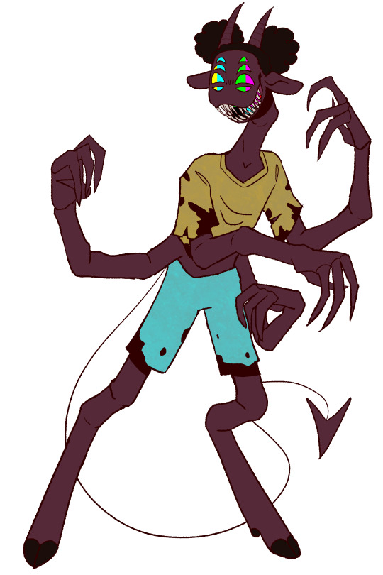
I have no idea whats going on in Amanda the Adventurer lore wise but I keep seeing her monster design in thumbnails and its so bad it pisses me off so have some foeart about it (like fanart but angry) + some process doodles
#As I said I have no clue whats going on story wise so for all I know its great#no hate to anyone who likes this game#but her monster design..... why.....#amanda the adventurer#redesign#doodles#theres so much they could have done with her but she's just so generic!!! why!!#it looks like they slapped human hair onto a rat. and she does look like a weird rat#they have so much sheep themeing they could have incorperated at least some of that#not to mention they ditched her entire color pallet?? there are ways to make a character look sickly without making them stark white#the way they did the eyes makes it look like she has rocks on her face. they dont even read as eyes because they didn't give her pupils#wont try to claim this is necessarily a better design but at least its recognizable as Amanda
2K notes
·
View notes
Text
Halloween dress-up, let's go!!!

Assignment: "Dress up as ghosts".
Status: Yes. They're ghosts. Just really different types of ghosts
#fanart#danny fenton/m'gann m'orzz#spearmint ship#i love them so much#yes M'gann is a White Lady#and before anyone hypothetically comes at me saying that White Lady should be all just white/have black hair but i have my reasons#in universe is: they decided to dress up “normal way” and it turned out that M'gann as a Martian was allergic to most make-up products#and in the end she threw some flour on her face and called it a day#and the meta reason is: I haven't drew Megan enough to believe she'd be recognizable with different hairstyle and without her color pallette#anyway#i love White Lady ghosts#like i can't even express how much i love them like aesthetically#and from the backstory standpoint#they're just neat imo#they're also really popular in Poland (my beloved motherland *patriotic sounding eagle noise because eagle is National Emblem of Poland :D*)#like you can trip on them#nearly every caslte has either White Lady or some cursed knight or *both*#and we have a lot of castles (though not a lot with original decor because fucking Red Army; sorry it makes me emotional)#but like to emphasise how many White Ladies we have#my uni's main building has one and it's not even a castle anymore#her story is really cool too#it involves Iron Maiden patricide and in some versions a lovestory#it also won't derail this post but I'd love to share it if someone is interested#halloween#happy halloween#dpxdc#dp x dc#dc x dp#wandixx arts#have a nice day dear stranger who got to this part
122 notes
·
View notes
Text
It’s so funny to me that victra has like…a normal job. Everyone else is either military or military adjacent, but she’s literally just the ceo of a huge shipping company, she’s not even in politics. Like sure, she’s former military, but she hasn’t been doing that in years until the war comes back to mars. Like imagine turning on the tv and you see footage of Jeff bezos beheading an enemy general. That’s what the citizens of mars were experiencing during the battle of Phobos.
#red rising#light bringer#light bringer spoilers#victra au julii#victra au barca#<-I feel bad every time I tag her as julii because I know it makes sevro sensitive but it’s my organizational system#anyway I love her I’m so glad she got to go apeshit on Ajax it’s what she deserves#I just think it’s funny that she was like…meeting with union organizers in her business two books ago#do you think those union members are watching that and going like…oh man glad she’s a progressive that could have been us#also sorry to compare you to bezos babygirl I just needed a recognizable ceo
553 notes
·
View notes
Text
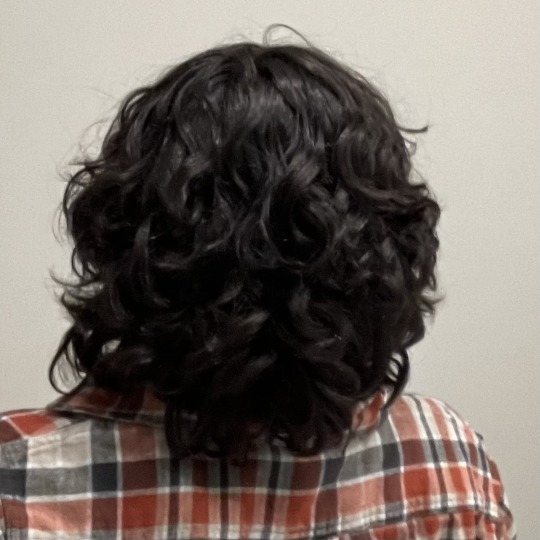
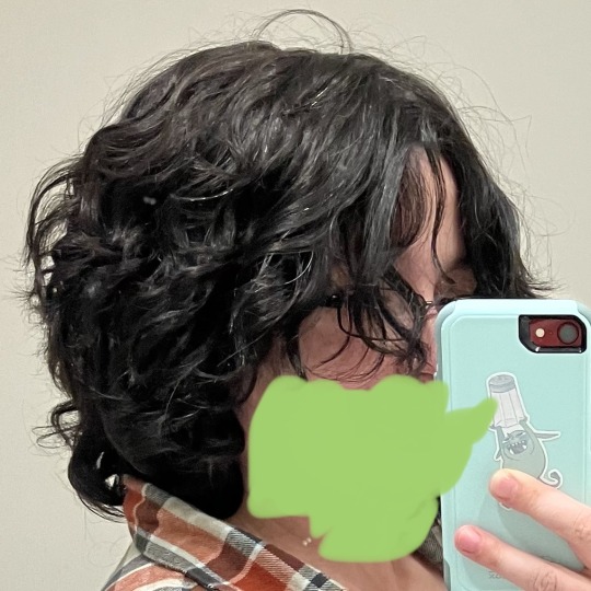
Curly hair update! I think I got past the slightly awkward hair length where it was like hitting my shoulders and negating the curl a bit, and I absolutely love the way my white hairs look in the curls (not much of my hair is white or gray yet but I think it’s going to end up very dramatically salt and pepper and it delights me)
Also I couldn’t figure out how to get a photo that showed the white hairs without also showing my entire face so I just scribbled over it lol
#the person behind the yarn#figuring out how to take care of curly hair to keep it curly is still an ongoing process for me#but my mom lent me some of her curl defining hair product stuff to try#(I had not tried it yet in this photo)#and it makes me so happy to see my hair looking like this it’s exactly what I wanted it to look like as a teenager#also re: the photo thing idk if I mentioned this here#but I discovered recently talking to friends I am maybe a little bit faceblind?#and I genuinely do not know how much of a face is a recognizable amount of face#so I am erring on the side of caution#though to be fair the phone case is also probably pretty distinctive#oh well too late now y’all know about the salt goblin#and yes part of the reason I am so excited about having salt and pepper hair is for the pun potential#I am so sodium georg even my hair wants to be salt lol
45 notes
·
View notes
Text

Sommie for @senchousan, drawn for FE Art Scuffle 💙
#🖼️┋art#❤️┋fanart#fire emblem#fire emblem engage#fe engage#sommie#fire emblem sommie#fe art scuffle#I love sommie so much I made this my very first attack xD#the event started on my birthday so it was like making a little present to myself...and also somebody else LOL#they had asked for Chloe as well so the hands holding Sommie are technically hers#shame she doesn't have anything clearly recognizable on her hands in her casual outfit... ^^'
83 notes
·
View notes
Text

I wanted to solidify my idea of how Kamila was affected by Alma's death in the canon timeline—AND how she changes as a result in the new timeline of the epilogue. Probably this is how she's going to end up in Ten Years To Go!
Text from image:
OLD TIMELINE:
Never changed her childhood haircut. Long bangs to hide her face behind.
Inherited Alma's jewelry. The red brooch and yellow ribbon are part of daily wear.
White jacket was a gift from Cabanela. She thinks it's a bribe to make up for the fact that he's not around much anymore. She still wears it.
Blue dress that Lynne helped her pick out, because Lynne remembered it was her favorite color.
Still kinda dresses like a little kid.
Doesn't make stuff herself anymore.
NEW TIMELINE
Growing out her hair (doesn't have PTSD about Alma's long hair this time). Also copying Lynne's face-framing bits. No longer hiding behind bangs.
Mimics her ribbon style she doesn't remember with a half ponytail (and lil cat clip).
Has earrings; Alma took her to get them pierced when she turned 13 like Alma always promised to.
Picks out her own clothes and experiments more with her personal style.
Wears the detective's bravery badge that her dad gave her.
Kamila with a toolbox. What crimes will she commit.
#ghost trick#spoilers#ghost trick spoilers#my art#tytg#i love her little face so much#it never comes out as well in the lineart as in the sketch#but she's cute anyway! we win no matter what!#poor kamila had a rough time. but making the bow and brooch alma's takes away a lot of her instant recognizability if i don't establish#her 'new look'
45 notes
·
View notes
Text

playing around with als demon form (and clothing). i rant a bit about character design under the cut
its a little difficult to land on a design i like for alastor in particular because its so difficult to make him look like "himself" if i dont include key elements like the very shape of his silhouette. characters like velvette or charlie can get by with hairstyle changes or clothing swaps but with alastor, i find that its nigh impossible to have him look like himself if i switch out any elements of his silhouette. that and his eyes, as theyre so expressive and basically show how he's feeling where his expression cant i feel like its impossible to change anything about his eyes and make him still feel like *alastor*, at least at my skill level (if i oneday manage to make a version of alastor with a mustache and not immediately after want to kill him and myself i will be able to die happy) also i could take out the monocle but tbh even though it doesnt fit his time period it honestly makes him look better so im making him keep that on.
when i go to redesign things and change them around to my liking theres only a few things i can do: ex, i have to focus more on adding details that should be there instead of trying to subtract ones that shouldn't be (and yeah that includes the wackass bob). i also kind of have my hands tied when it comes to like, trying to actually connect back to both his deer and radio motifs because i swear to god vivziepop was not fucking thinking when she decided to make him the radio demon. his base design has literally NOTHING to do with the radio so i have to be super careful with how i approach all of it when im trying to redesign and work details in otherwise i end up veering off course and creating a whole new guy.
so for this, theres a few things i tampered with. for one, the suit he's wearing is monochromatic and boring (and i wont take shit about it being animation because if lucifer can have 10000 tiny annoying details and his stupid fucking tophat then alastor should be able to wear more than one fucking colour with his clothes) so the first step is to get some more colour in there. red with gold trimmings fits well with the appearance of old cathedral radios, and as a plus, it makes him look like he has a more cohesive outfit (as well as one that fits for the job!) instead of a colour scheme and clothes combo nearly as horrific as denim on denim. and of course the radio in the chest can replace the atrocious attempt at complexity in his outfit (is that a harness or a shirt pattern? who knows, not me!) . pants are a lot simpler but i dont really want to tackle the lower body just yet because i dont really know how i want to approach the animalistic vs non animalistic features sort of thing for his design. oh and i put in a ribcage corset because its a banger idea and it makes him look better honestly
#got the green eyed alastor idea from someone on twitter and its honestly a really good look i think ill probably keep it#anyway it's frustrating to me that despite the fact that viv has a clear problem with same face and body syndrome her characters are so uni#uely recognizable that if i change even one detail too many it becomes obvious theres something 'off' about them#sigh. whatever. ill keep making his teeth yellower and yellower instead of doing anything to correct his haircut#🌗 art tag#hazbin hotel#hazbin alastor#alastor hazbin hotel
50 notes
·
View notes
Text
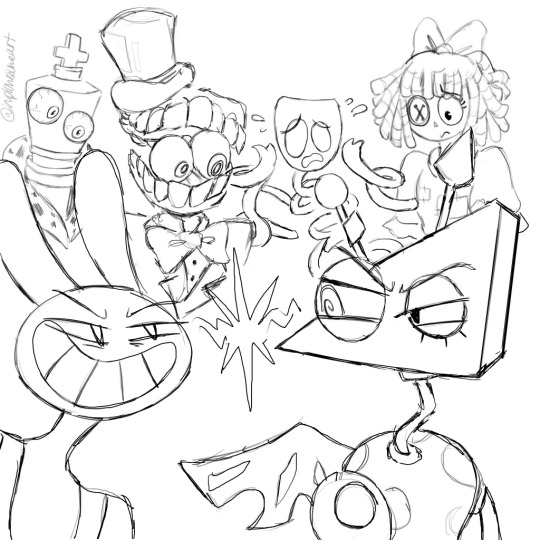
Whoops hand slipped here’s some TADC character fanart. Apologies for the severe lack of Pomni in this one idk where she went off to…maybe she got lost on her way to find the exit. The lines are incredibly choppy & rushed, I know, but it was still fun art practice! I don’t draw these guys nearly enough anyways so this is a nice change of pace. Support indie animation :3
#you wanna know a secret? don’t like how I draw Ragatha I wish I could do her better 😔#like I don’t know if I make her hair straight or if it’s kinda wavy?? and her eye too idk how to draw it in a satisfying way :((#but that’s a normal dilemma when I’m trying to blend my artstyle with the shows artstyle#keeping the characters on model/recognizable and consistent but also my own style ya know?#making those adjustments takes time and usually I need to draw a character 7+ times before it looks good#JAX ON THE OTHER HAND—OH BOY GOODIE HE IS SO COMICALLY EASY TO DRAW HALLELUJAH LOL#I think the Puzzle toothy grin & toon eyes just automatically agree with me#then Kinger I also struggle with personally#Gangle’s mask shape is confusing at first but then you adjust fairly quickly#Caine is neutral party to me—I know how his design is but I’m not confident without reference material#and then the artstyle translation is another hurdle to juggle <<#his top hat especially like HOW U DRAW 😭 I can manage Puzzles bowler hat just fine but NOT top hats man#Zooble is lovely Zooble peace and love they did nothing wrong just pleasant to draw uwu#Jax & Zooble conflict oh noooo the bitches are fighting /j#Actually this initially started only with Caine & Zooble but I just kept adding others lol#Ragatha & Kinger we’re the very last additions#hplonesome art#tadc characters#the amazing digital circus characters#NOT GONNA PUT ANYMORE TAGS BECAUSE THEN IT’LL GET SWEPT UP AND PEOPLE WILL ASSUME I DRAW THEM ALL THE TIME 🥲#I can’t be held liable for serving TADC fanart content because that isn’t me right now sorry
25 notes
·
View notes
Text
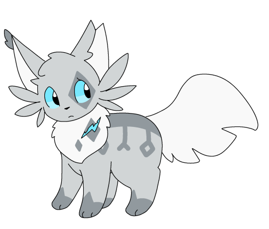

frostpaw and whistlepaw… perhaps if we believe hard enough sapphic cats will be real (<- coping)
#wanted to make a design for whistlepaw and ended up doing frostpaw too since I hadn’t drawn her in a while#anyway I think frostpaw should be short and stout and whistlepaw long and lanky. cause of being from riverclan and windclan respectively.#frostpaw#whistlepaw#warrior cats#anyway I like making wc because I think it’s a fun exercise in trying to make distinct silhouettes and features so they stand out despite#like. all being cats.#like they need to recognizable at a glance. idk how recognizable I have whistlepaw tbh but it seems there isn’t much typical#fandom design conventions for her. though even if they were idk if I’d follow them#(considering I am one of the few people who doesn’t draw frostpaw as a color point lol)
52 notes
·
View notes
Text

I made a Deirdre Fire Emblem Discord emote! She’s free to use in your server, but I do request that you reblog this post if you do 💜💜💜.
(Hopefully Tumblr won’t screw up this transparent lol)
[Image Description: Drawing of Deirdre from Fire emblem genealogy of the holy war. Shes drawn from her head to just under her shoulders, She’s wearing a light silvery purple off the shoulder dress with gold accessories at the top of the sleeves. Her skin is medium brown, and her eyes and hair are also light silvery purple. She is smiling and winking at the viewer. Next to her closed eye are gold and silver sparkles. End Image Description]
#fire emblem#FE4#deirdre (fire emblem)#It was fun to try and get out of my stylistic comfort zone and try something even more cutesy and cartoonish#I tried to make this a combination of how I design her and her official art so she’s easily recognizable#Smitha can draw
15 notes
·
View notes
Text
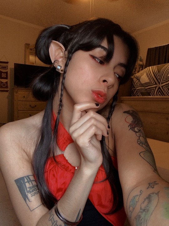

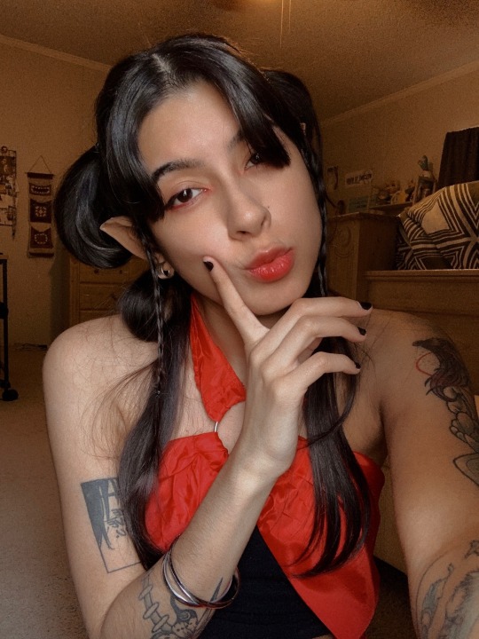
girl who did nothing wrong ever
#sha hualing#svsss#scum villian self saving system#mxtx svsss#cosplay#but anyways!!!! can anyone tell me if it’d be alright for me to draw on her demon mark/huadian?#i’m not sure so i skipped out when taking pics and i’ll probably skip out for the con too if i don’t get an answer which is fine!#just wondering since i think it helps make her a little recognizable but i don’t wanna do anything questionable so#either way!! i’m pretty happy with how she came out considering i threw it together with stuff i had at home#+ i’ve never styled my hair so elaborately lmao#limited edition post
31 notes
·
View notes