#skillsharing
Explore tagged Tumblr posts
Text
Using Our Talents and Skills to Inspire and Uplift Others
Using our talents and skills can inspire and uplift others, sparking positive change in our communities and workplaces. By leading by example and sharing our knowledge, we can create a meaningful impact and foster growth.
Every individual has unique talents and skills that, when harnessed, can significantly impact and inspire those around them. By using our abilities to uplift others, we can spark positive change in our communities and workplaces. Here’s how to leverage your skills and talents to create a ripple effect of positivity and inspiration. Recognizing and Valuing Your Talents The first step in using…
#AdvocateForChange#CelebrateSuccess#Collaboration#CommunityBuilding#EmpowerOthers#EncourageGrowth#FosterInclusion#InspireOthers#LeadByExample#LifelongLearning#MakeADifference#Mentorship#PersonalGrowth#PositiveImpact#ProfessionalDevelopment#RoleModel#ShareYourSkills#SkillSharing#UpliftCommunities#VolunteerYourTime
0 notes
Text
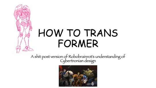
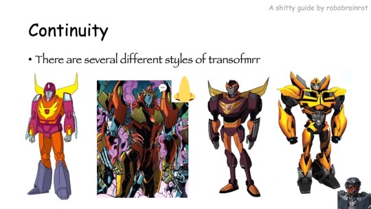
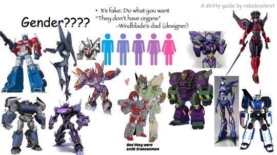
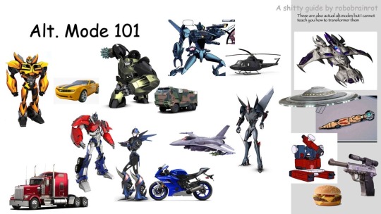
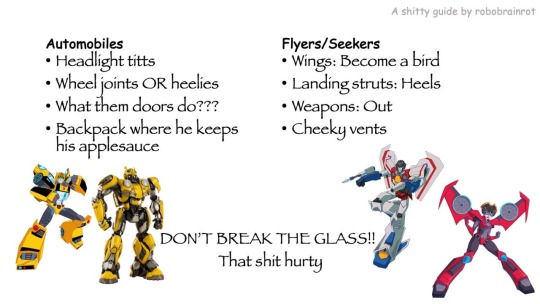
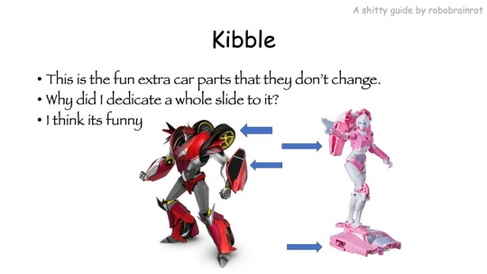
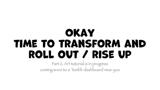
HOW TO TRANSFORMER: Part 1
Trust me, I'm a professional designer :)
Artist, please feel free to add your favorite details that I missed. I'm working on an illustrated/art tutorial version.
PART 2 UP NOW!!
#skillshare#transformers#maccadam#how to transformer#tutorial#kind of#might just be an#infodump#crapguide
1K notes
·
View notes
Text
I forgot to cancel my annual subscription to skillshare and I've been charged another $100... What classes should I take so I can take full advantage of the annual subscription before it runs out on February 8th 2026? I want to get better at writing and art and game development and music composition. Can I do all that in a year?
#skillshare#learning#writing#art#game development#music composition#online learning#skillshare classes
34 notes
·
View notes
Text
COMMISSIONS OPEN AGAIN!

This time I have the options of filling out a google form
Or you may apply through my Vgen here!
There's more info in both links but these are the basic prices~

Feel free to ask me any questions either here or my email [email protected] !
Thank you ♥️
#can you tell graphic design is definitely my passion#I should really take some design courses on skillshare or something ahdaskhdas#I appreciate everyone who can reblog the post <3#commission#commission open#fanart#dmc#devil may cry
79 notes
·
View notes
Text

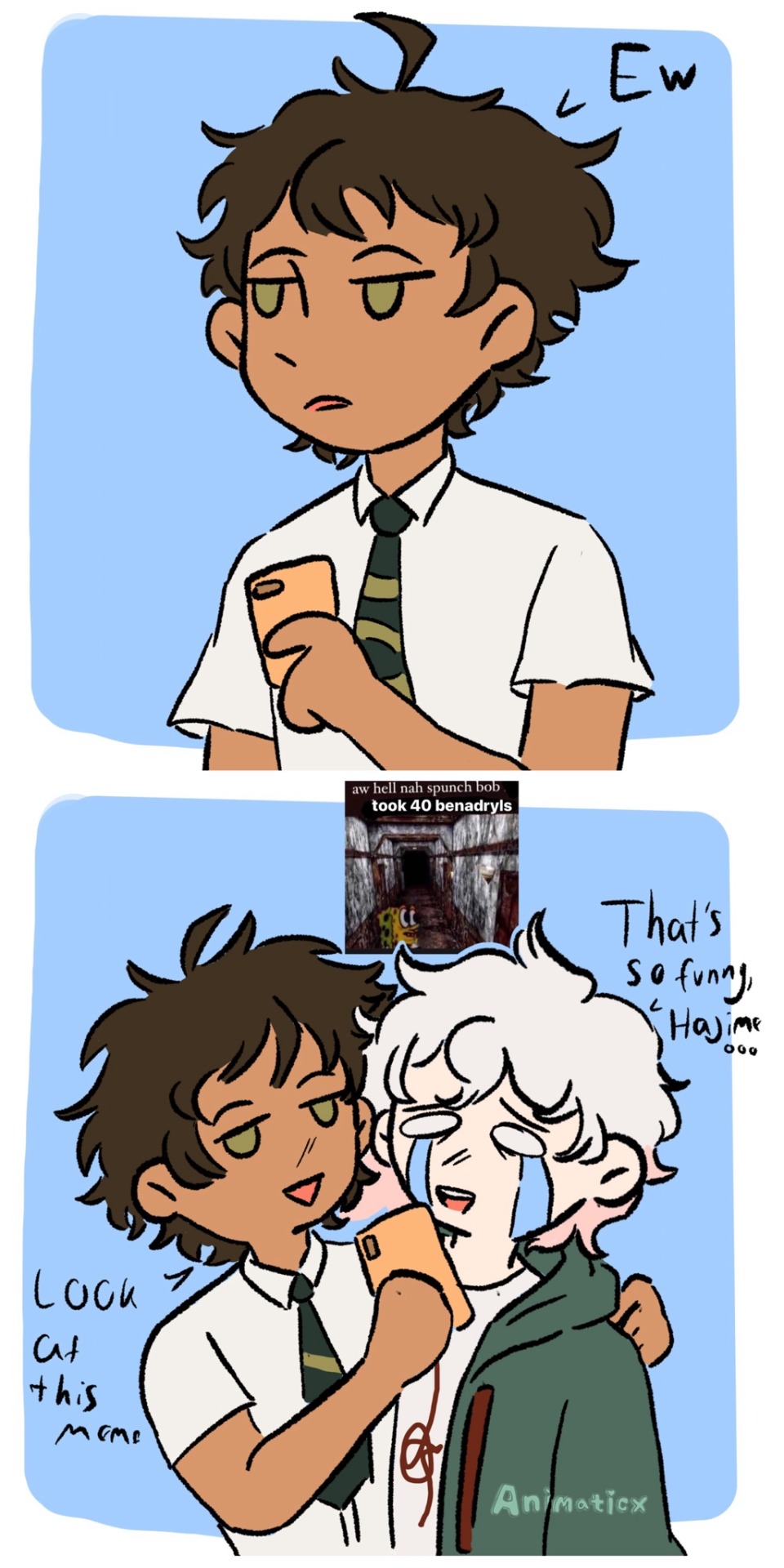
What if Hajime didn’t give af?
Another komahina comic inspired by a convo with my bestie
#danganronpa#hajime hinata#nagito komaeda#I made this comic for Skillshare#komahina#super danganronpa 2
62 notes
·
View notes
Text
My dream is literally just to have enough time and energy to share my skills with other people.
I long to invite someone over and show them how to bake my favourite cake recipe. How great would it be to show someone how to tie a bowline knot in a way they'll remember? Yes, I would actuallt love for you to come over to my house and learn stained glass with all my supplies, it would make my year. Oh your parents never taught you how to use an electric drill or how to change the oil filter on your car? Don't work luv I'll walk you through it. Here don't forget your eye protection.
#I hate that the monetization of skillsharing is the norm#i hate that so many of us are forced to monetize every little thing just to survive#and no i don't mean I wanna make online tutorials and whatever. no. thats not what I'm talking about.#im talking about skillsharing in person#casually. no teacher-student heirarchy. just people sharing things with other people.#sharing the way THEY do things. no perfectionism or “one right way.”#i want you to teach me to make jam the way your gran taught you
41 notes
·
View notes
Text
We Need This Skill If We're Gonna Make It Through the Next 4 Years
youtube
Y'all, I learned this one the hard way. Her method is better than mine. And immediately applicable!
I aver and affirm that I use this skill and it works to help keep me sane(r).
#people helping people#skillshare#emotional skills#building resilience#self care#please watch this#Youtube
14 notes
·
View notes
Text
wait wait wait wait I just saw someone say that the us tiktok people should go to tumblr wait a fucking minute just wait
#I think no#please imagine someone putting a link to their amazon storefront#sponsored posts#unmarked bloom partner posts#my next fic is going to be sponsor by skillshare and betterhelp fr#kms
13 notes
·
View notes
Text
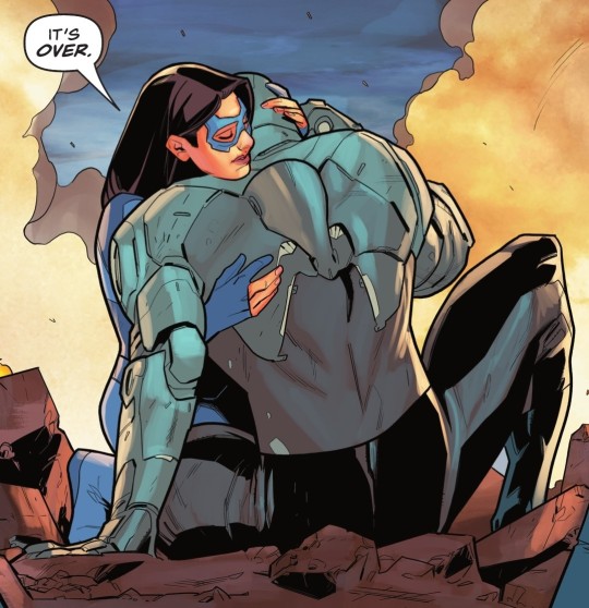

superman: son of kal-el #15 / absolute power: ground zero #1
#nia nal#jay nakamura#dreamer#gossamer#tuesday spoilers#guys i don't think nia is having fun being a superhero#and i don't think she is good at it either#eh you live you learn#i'm sure there's a skillshare course she could take lol#tbh i expected more from this issue#like more story i mean#more pages#i liked the story we got#but i want moooooooore
33 notes
·
View notes
Text
watched a skillshare course about freewriting last Saturday and I think I will try to make this a daily routine just for funsies, just to see how it goes. I'm already writing more in my journal that I used to, which is good, but I'd also like to get back into fiction and this seems like a way to ease back into it. I'm starting with 6 minutes a day because making it doable is better than making it grandiose (and once I start I don't wanna stop anyway)
#if you have skillshare it's 'creative writing corner' by niamh prior#have you ever tried it?#apparently it's like...a warm up excercise for writers that's followed by many#and here i am not even knowing there were warming up excercises for writers 👍🏼😂#it's nice to learn stuff#rambles#freewriting
26 notes
·
View notes
Text
Virtual Fibercrafts Skillshare THIS SATURDAY!
From our Climate Action Youth Advocate and General Volunteers:
BFP’s first Skillshare will be on Saturday 1/27 at 7:00 pm EST! Stop by if you want to learn how to make warm clothing to donate to your local community!
Here are the supplies you will need: Fibercrafts require very little to get started. For crocheting, you will need yarn (in this demonstration we will be using #4 worsted weight yarn, but other weights can be used, you just have to adjust the gauge), and a crochet hook (we will be demonstrating on a H/8 or 5 mm hook. Others will work, and if using yarn of a different size, be sure to check the standard gauges for your yarn).
For sewing, you will need fabric that is stiff enough to work with (fleece, flannel, and cotton will work,) sewing needles, some sewing pins, and thread.
A note on materials: cotton yarn is best for beginners as it is stiffer, harder to break, and doesn’t fray as easily, while aluminum hooks are best for beginners as they withstand pressure. Dollar stores and Walmart sell sewing kits cheaply, which are acceptable for beginner projects. You may have to buy extra thread, or pins separately. Nylon and polyester threads tend to be the easiest to work with. Some beginners also prefer double-sided sewing tape in place of pins.
#announcement#reaux speaks#fiber crafts#fiber art#crochet#craftblr#crocheting#sewing#diy#arts and crafts#fiber arts#discord server#skillshare#skills#learning#how to#tutorial#art tips#art tutorials#art resources#art help#warm clothes#donations#donate#donation#winter#cold weather
53 notes
·
View notes
Text
watched timothy bob dylan movie dont have any solid takes like it was whatever 7/10 they did a pretty good job with most things in it ultimately a pointless movie that kinda said nothing but it passed thae time. However im here to say smth else which is. Its fucking crazy to watch a movie or listen to a song or read a book or whatever from the last century as a person in their 20s in the 2020s and just be like. oh until very recently people did not have the rock solid 100% certainty that everything is fucked forever the world is going to end we are just walking ghosts living out whatever borrowed life we can on a planet that is quite literally on the brink of extinction. Like obv theres always been bad things happening and people feeling discouraged about them or whatever but the genuine pure proven certainty (that humanity is doomed political action is pointless bc the “people” are definitely too surveilled and atomized and disparity in power and esp armament is cartoonish and overwhelming) is like. an extremely new thing in history. in a world where the concept of “history” is distributed in drops of “everything is cyclical and tje more things change they more they stay the same” type truisms its always mind boggling to contemplate that in fact something can always happen for the first time. Anyway. And its crazy to sit there in a movie theater watching timmy chalamet doing his best impression of an autistic loner on amphetamines singing his heart out about come mothers come fathers throughout the land. while literally being in evil world where everything is over. its like looking into a portal to a bizarre alternate reality
#Tbh ultimately this is why i cant listen to bob dylan and adjacent music at least not since i stopped being a freewheelin#flower child of a 14 year old. Its not meant on a commentary on its quality#when i say this bc obv they couldnt have known but it just rings so false and tbh corny today#Like yeah brother you took to the streets and showed it to the man. fast forward 60 years where i come from and now#every single possible thing is worse and also if you wanna stick it to the man now you gotta#post on the man’s app get that hashtag engagement to hashtag spread your message then when your message finally#spreads you can partner with skillshare for a sponsorship.
14 notes
·
View notes
Text

#peter o���toole#peter otoole#procreate#lawrence of arabia#artists on tumblr#mine#i did riso chan’s course on skillshare and this was the final project!#it was a fun course
39 notes
·
View notes
Text
Setting Up a Zine Layout for Print (with Affinity Publisher)
Listen up shits spoons
Heyo back with another guide for folks new to art and layout! In this one I'm gonna talk about setting up your zine for print with a commercial printer (Like Mixam). If you wanna look at my other guides you can see them here (as of the time of this one I've done one other guide, but I enjoy doing these so I'll probably do more as time permits)
I'm specifically gonna be talking about using Affinity Publisher 2 because its what I do all my professional work in, but the ideas should hold solid for other programs like Adobe InDesign, Publisher 1, or others! I'm also gonna talk specifically with Mixam measurements since they're my printer of choice.
I'm going to get real into the basics of this one, so if you've done a good bit of layout already this is probably all old hat for you. I'm specifically skipping around the topic of Color Management, but I talk about it a LITTLE.
This is a lot of text, so if folks would like I can probably record the setup some time in the future if that would generally be helpful? Lemme know what we want haha
Okay lets dive in though
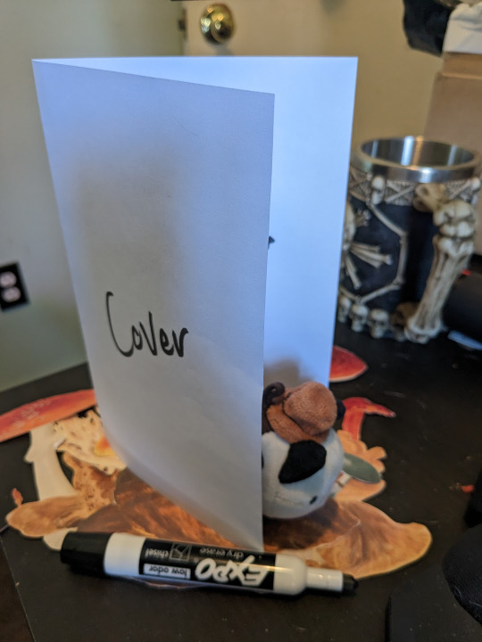
So lets start at the very beginning which is choosing a page size. I'm going to assume we are working with Letter sized paper because that's what most folks in the US do, which means we want to set the pages up to be half letter. This is gonna give us a zine that folds like this just for clarity.
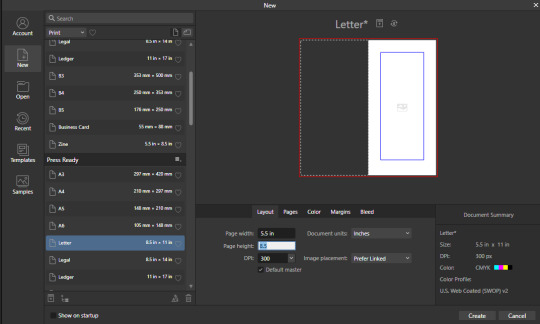
So lets hit File->New... up top, and you'll get a screen that looks like this. We are going to change our measurements to be Page Width 5.5 and Page Height 8.5 which is our measurements all folded and whatnot. We want to set our DPI to 300 so the printer has plenty to work with and we don't end up with pixely shit on the pages.
Under the Pages tabs things should default correctly, but we want Facing Pages to make layout a little easier, and we want to start on the Right with a single page. This tab should look like this
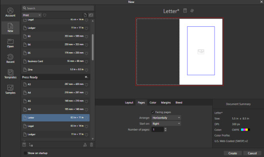
Next we are gonna hop on over to the Color Tag the long of the short of this is we want to work in CMYK/8. I'm specifically working with the color space used by Mixam within CMYK/8, but your computers default should be fine here, so just set your Color Format to CMYK8, and let it choose the default for Color Profile.
I don't personally set Transparent Backgrounds because I think they're a fucking eyesore, but that's dealer's choice and if you prefer them what's wrong with you good for you.
Color Management is really a pretty complex topic I'm not really good at talking about because I don't have the knowledge I should on it (I've largely worked in Black and White!), but here is a really solid primer on why we want to work in CMYK over RGB, and why that's so important for printing.

Hopping over to the Margins and Bleed tags, we are gonna do some minor changes to the default. If you're laying out something over say 60 pages I'd look at editing the inner margins here a bit.
I'm gonna go off the Mixam Full Bleed Print guidelines, and give myself some extra space for safety, but if your printer has other thoughts you should follow those instead. I've found that generally these guidelines work for most projects so you're usually safe to follow this bit as is. If you don't know what Margins or bleed are, I'd just read through the full bleed print guidelines linked above because it's a great primer. If you don't care or already know, keep reading.
For Margins we are gonna include margins and set our inner margins to 1 inch, and our outer/top/bottom margins to .5 inches
For Bleed we are gonna set everything to .25 inches for safety, Mixam only needs .125 inches.

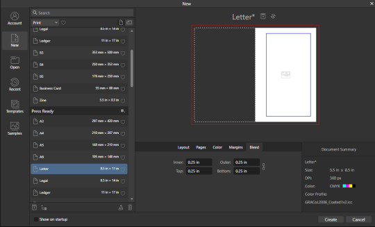
Finally, so we don't have to go through this every single time, we are going to save this setup by clicking the button up top (next to where it says Letter* on my screen). I'm calling mine Mixam Half Letter Zine so I can remember it next time.


FINALLY you can click Create at the bottom right of the popup, and if you've done it right you should be greeted with a screen that looks somewhat like this
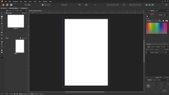
Now we're gonna set up some Master pages, font and paragraph styles, baseline grids, and guides to get the best looking zine possible.
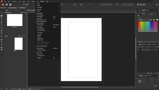
At the top of the screen we wanna go to View->Preview mode, and make sure its unselected. This is gonna make sure we can see all the setup we are doing now, you can unselect it at any time (by hitting the toggle or Ctrl+shift+w) to see what the zine looks like without our guidelines on once we get them setup. Also on the view menu we want to turn on basically everything except Grid in the top bit. Here's what your menu should look like, and what your page will look like if things are setup right!
Okay so lets start with Masters! Setting up a good flexible master page or two is a great way to make sure your Zine keeps a consistent look throughout, and it carries your setup across pages! Look to the top left of the working space, and lets go work on Master A by double clicking on it.
I'm going to setup a quick set of guides just so I can lay things out a bit easier! While on Master A hit View->Guides and under Column Guides we are gonna add in 2 Columns and 3 Rows with a Gutter of .125 inches. The margins should be correct, and we want the Spread to be at x:0 y:0 which it should by default. In a lot of circles you will hear this called The Grid, but my friend Clayton did a great guide on this already so I'm linking that here. I also like to set some Horizontal and Vertical guides just so I know where the exact center of the working area is, so I'm going to make 2 Vertical Guides at 2.5 and 8.5, and a Horizontal Guide at 4.25 inches. The long of the short here is this gives us a lot of room to snap things to in the future. I set my Column Guide to pink to make it stand out a little more, but when you export this it'll disappear so just set it to whatever color works best for you.

With the master set, click back over to Page 1, and you should see it now has a series of guidelines based on this master. Hell yeah.
Lets move on to text styles now! These are going to save you a lot of hassle in the future with making sure everything matches, and works how you like. Double check that you're off the Master, and then lets make a text box using the Frame Text Tool, and lets get ourselves a text box somewhere on this page. The placement doesn't SUPER matter here because we are just going to erase it at the end.
Toss a few lines of text into this box, I usually use Title, Header, Body Text, and then 3 lines of Bullet Text
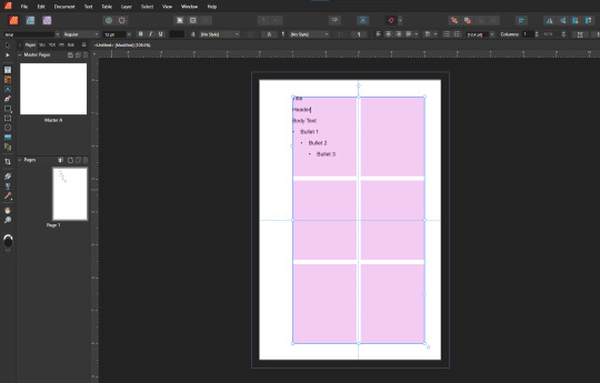
Now we are gonna hop into the Text Styles menu. I keep mine pinned on screen, but if it isn't visible, you can find it under Windows->Text->Text Styles

Now highlight each of these lines of text, and double click the appropriate text style from this menu (ie we are gonna set Title to Header 1, Header to Header 2, etc). It'll look something like this when you're done

Now we're gonna change each of these lines of text to look how we want! For the example I'm making my titles and headers in Bellybeans FG, and setting the rest of the text to Open Dyslexic and resizing them so they look good.
My page looks like this now
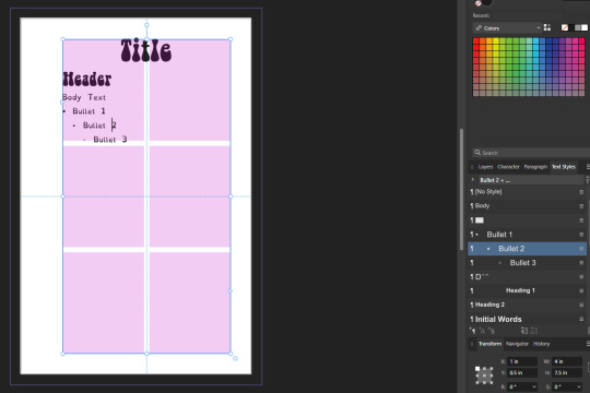
Now's a great time to mention that there is a difference between Rich and True black, and it's confusing and it fucks a lot of folks up. The link up above (the primer on CMYK above RGB) talks some about your blacks, and links to a follow up article about them! You can skip reading any of that for now (but like you should), because the tldr here is going to be make SURE that if you are using Black you have the color set to c:0 y:0 m:0 k:100 if you don't wanna have issues later!
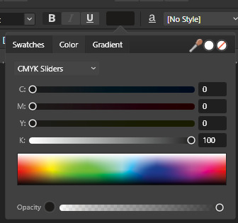
Now we want to update our font styles to match! To do this we are going to go back and individually highlight each line of text, and then right click the matching Text Style, and hit Update. The screens should look like this.

Next we are gonna set up a baseline grid! This makes it so that text on one side of a spread is gonna line up correctly with text on the opposite side of the page, and just helps with making pages look good and even! We want to set the grid Relative to the Top Margin, and then set the spacing to whatever you feel is correct in your heart of hearts. These are the settings I've used, but do whatever looks good here, there are probably some hard and fast rules for how to do this well, but I do not know them.

On my specific example you can see my Bullets are really spread out, and I don't like that, but the Body Text lays out much nicer. Lets deal with some spacing issues!
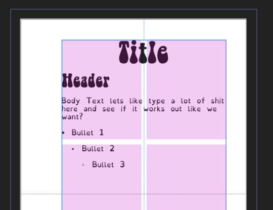
We are gonna hop on over to the Paragraph tab now, for me this is another tab on the Text Styles Window, but if you don't have it visible Windows->Text->Paragraph should bring it up.
So for me personally I want all my bullets to be on the following line, and not skip a whole line between them. I'm going to highlight all my text, and in this menu I'm going to go to Spacing > Space After Paragraph and set the amount to 0 pts.
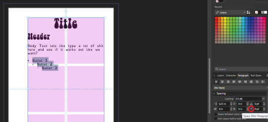
You can also go further into this tab to change some more rules about what your bullets look like (things like how big your tabstops are, what the bullets look like, etc) but I'm not getting into that here!
After all this I'm gonna hop back into text styles, highlight each line of bullets, and Right Click->Update style on each of them (Just like we did previously!)
It's really tempting to skip this section of setting up your zine, but it enables a lot that can really help you out a ton in the long run. Having standardized Headers allows easy updating of headers and titles across the document, easy setup of Table of Contents for folks using them, and also on export is going to auto-bookmark the pdf for folks using PDF formats. It really pays to take time and set things like this up correctly the first time. After you're happy that this all looks good, you can go ahead and erase this text box.
Now we can break into zine layout proper, but if you just wanted basics you can stop here! Whatever you do from here is gonna print pretty decently.
If you'd like to stick around I'm going to set up some slightly nicer master pages, talk about why I use multiple masters, set up page numbers, and get us a table of contents!
So from hereon I'm just gonna work on laying out a basic Zine. So let's hop back into our Master Pages, and start setting up some flexible masters. I know I want at least two masters, one where I have text on both pages, and one where I only have text on the rightmost page. For right now we are going to just work on the spread with text on both pages, so I'm going to create a text box on both pages within the spread that fills the entirety of that guide we set up earlier. On the leftmost page, I'm going to right click the text box with the Frame Text Tool selected, and I'm going to choose to Insert Filler Text so I can see how everything looks.

Make sure this text is in your Body Text Style, and then click the little triangle on the text box
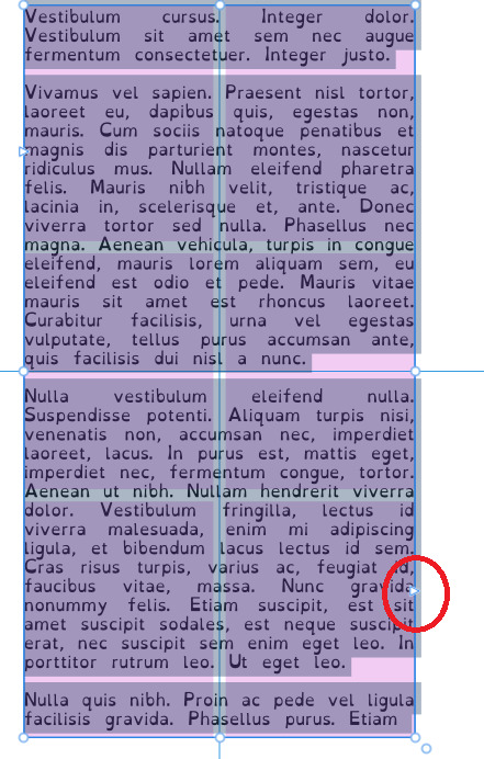
I'm now gonna select the textbox on the rightmost of the spread. If you did it properly, your page should look somewhat like this.
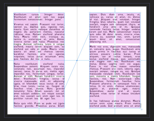
After I'm happy with this page, I'm going to erase the text in both boxes. I wanna add in some page numbers now. They aren't going to fit in the boxes here, but if you remember correctly I left myself a little bit of wiggle room when I set up the margins! Mixam needs .25 in clear, but my boxes are all .5 inches from the edges of the page. To make sure I don't egress the space too badly here, I'm going to set up a new horizontal guide from the View->Guides page we used previously, and I'm going to set this guide at 8.25 in which is the true bottom edge of our workable space.
I'm going to create new text boxes for our page numbers that line up with the outer edges of our guides, and the new true-bottom line I just set up.
It looks like this, but there's an eye icon which means no text in this box is going to be visible!
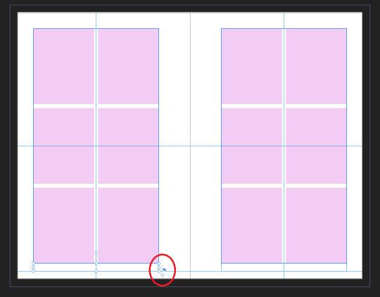
No worries this is because our baseline grid isn't playing nicely here, we are gonna break it in a moment, but for the mean time lets right click this text box, and select Insert Fields->Page Number

On the left page I'm also going to Bold and Left Align this box, but otherwise keep it in my Body Text Style. With the text all highlighted, I'm going to hop into the Paragraph window again, and scroll down to Baseline Grid->Align to Baseline Grid, and turn that option off.
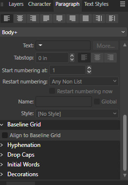
My page now correctly shows a single # in the spot I'd want my page numbers to be. When this master is used, that number will automatically update to be correct! I'm going to duplicate this text box, and drag it onto the right page of the spread, and set the alignment to Right. I'm going to refill the textboxes with Filler Text for a moment, and turn Preview Mode on so I can make sure I like the page. For me this master now looks like this
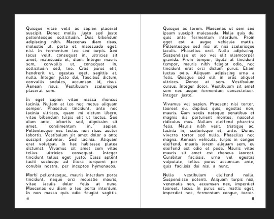
I'm going to duplicate this master now, and on the left page of the spread I'm going to remove both text boxes. I like to name my masters so I know what they are at a quick glance. This is going to leave me a second master that looks like this.

You can get really involved on your master pages generally! I'm not doing anything fancy with this one, but previous projects have that heavily used masters might have pages that look more intense and include things like photo boxes, more complicated sets of text boxes, and even some text to use as a guide as I go.
Lets hop back to Page 1 of our doc, and leave the masters behind
Page 1 is going to be the title page for the book, but it likely now has a bunch of details now that you don't particularly need. If you have a master you don't want on a page, you can right click the page, and click Clear Masters.
I'm almost out of images on this post so I am gonna go mostly imageless from hereout. I'm gonna toss some text on pages, and then make a table of contents, and get my page numbers fixed up since most people don't actually want to count the Cover as Page 1 as far as page numbering goes.
With the project laid out, and the pages where I want them, the actual "Page 1" is going to start on Page 5 for me. Looking at the pages on the left side, I'm going to right click Page 5, and click Start New Section. On this new section I'm going to fill it out so the new section starts on page 5, and restarts the numbering at 1. Here's what it looks like for me.

On page 3 I want to include a Table of contents so if the ToC window isn't visible I'm gonna hit Window->References->Table of Contents, and then in this window I'm going to hit the insert button. You can really dial in a lot of settings here, but as long as you've been using those Text Styles I mentioned previously, it should be pretty easy! Since I've been using only Heading 2 to start chapters, I'm going to unselect Heading 1 since it is effectively only being used on the ToC page and the cover, and I don't think folks need help finding those. This ToC feature rocks and as long as your page numbers are correct, and you use your text styles it should auto-update! If it doesn't there's a refresh ToC button on this window as well. Regardless (and perfectly using my 30th image) this is what it looks like for me now.
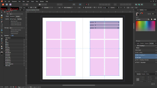
You'll also note I updated the text styles here as well! Anyway this is a real overview of zine layout for print, there's probably more things I should cover, but I'm out of images and tired so I'm leaving it here. If this was helpful I'm gonna put this template up on my itch after I clean it up some down the line.
I'm gonna have to come back with a Part 2 that talks about exporting and whatnot, but this is all I can realistically fit in a post for now.
If you get any use out of this and wanna throw a few bucks my way you can do that here
and if you have any questions I'll answer what I can! Just shoot me an ask on here, or like annoy me on my discord (its in my pinned post)
okay thanks bye
#skillshare#this one is gonna need a followup and I will make it one day but I ran out of images#I keep threatening to stream this so if thats something folks want I actually will I s2g
194 notes
·
View notes
Text
so desperately want to draw the mouse men as mice but I have no experience drawing anthros so there's a LOT of workshopping to do
#i also need to dogboy casper so bad#nonsense tag#furries come through wheres the anthro 101 skillshare course tbh#and the eternal dilemma of to keep human ears or not#the day i get good at anthros it is fucking over for u guys
9 notes
·
View notes
Text
hello potential employer my name is liss and i am about to convince myself this job is the only thing i care about over the course of this cover letter which you probably wont even read and ghost me about.
#applied to a teacher's assistant job at a preschool#which i would like!!!!!#i really want some early childhood education experience to see how i feel about it before possibly going back to school for art ed#bc i still think about how much i liked teaching at [alma mater] and how much art like. saved me. this past year#and i love to see people grow and help them grow and see things in new ways!!!!#i guess i don't have to go to school for that i could do like. skillshare. whatever else there is#but#idk#anyway#wish me luck i do need a job SOMEWHERE haha
4 notes
·
View notes