#sigilyph is way more detailed than i first thought *.*
Explore tagged Tumblr posts
Note
hangon actually I JUST realized you already reviewed scraggy line, would love to hear your thoughts on sigilyph or cryogonal instead!

I've always been a big fan of Sigilyph. It's just so weird, having one eye (and two false eyes), a bunch of abstract "wings", and just floating everywhere. It reminds me a bit of Unown, especially because both are based on Nazca lines, to the point where it almost feels like this could works as a Unown evolution if they really tried.
Design-wise, it works really well despite the amount of details in it, mostly thanks to the repetition of the patterning and using the contrast of the black to highlight the most important parts of the body, such as the eyes. This complex patterning also harkens back to the aforementioned Nazca line thing, as well as various types of ancient pottery.
My only complaints about it visually are pretty nitpicky. First, the spikes under the body feel kind of random. They might have been aiming to make a sixth set of something to match the wings, but I feel like it would be better just to drop the spikes and put the vertical lines in the green part like it has up top.
And secondly, color-wise, I feel like the red on the wings could've been green, or the green should've been red, just to reduce the amount of excess accent colors. This doesn't bother me as much as it usually would however, as pottery and other ancient art tends to be very colorful and it's still pretty cohesive despite this.
So yeah, overall, this is a very cool, very abstract Pokemon with a mysterious vibe to it that really stands out visually. Love it.
Also side note, I love the mention of how these things continue to patrol the area where their city used to be, almost like ghosts.


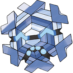
Cryogonal is interesting, but I'll admit, I never was able to really get into this Pokemon for whatever reason. There's some really interesting stuff going on with it, like how it's a carnivore that can turn into steam and revert back in warm temperatures:

But it doesn't leave that much of an impression beyond that. I think the first reason is that it looks weirdly inorganic, and not in a good way like Sigilyph up there. It naturally occurs in nature, yet it looks almost like a Pokemon version of Sinistar or something; except I can't really say "Pokemon version" because it doesn't even look that much like a Pokemon due to how visually busy it is, with lots of details due to the number of rings/layers in the middle of it.
The other reason I think it doesn't stick is that it doesn't have a really clear concept. It's a snowflake, sure, but what makes it unique? It's, uh, very robotic looking, and very... geometric? Like, I'm not sure what they were really going with with the design, which makes it stand out less than if it had a clear direction.
And finally, monotone colors; it's all shades of blue. Even just making the orbs red/yellow or something would've helped to break up the design a bit. In fact, they actually did this with the shiny, raising the question of why they didn't make this the default and the all-blue the shiny:

Also, maybe have some darker color towards the inside and lighter towards the outside (or vice versa) instead of rotating colors with each ring. That would help it read much clearer and faster, as there wouldn't be so many details to get caught up in.
Aside from all that, the mouth also looks weird to me. It should just be a single downward ^ shape, yet it has two extra angles in there. And unlike the eyes, there are too many orbs in the mouth and they don't fit with the shape, so it just doesn't read that well.
If anyone's curious, one of the artists for the New 151 project did an alternate take on Cryogonal that I really like, with a more Pokemon-like feel, a simpler design, and better colors:
So as a whole, I can definitely give Cryogonal points for being interesting and at least unique, but it's too busy visually and has too little focus from a conceptual standpoint to really work for me.
72 notes
·
View notes
Note
I have a problem, i have a bag full of marshmallows and no fire to roast them, wanna share the bag

You came to the right place! Thank you for sharing with Reshi ^^
#daily pokemon#reshiram#sigilyph#ask#daily-siggy-stardust#sigilyph is way more detailed than i first thought *.*
98 notes
·
View notes