#seriously though this art is absolutely stunning
Explore tagged Tumblr posts
Text
MY FAVORITE KIND OF REBLOG TRAIN!!:D gosh i have so many new mutuals and blogs i love, but who to tag….
apologies in advance for the long freaking post but im going to tag a ton of people and talk about how much i adore them :3
@rivirkwu first of all RIGHT BACK AT YOU!!! you have always been one of my favorite mutuals and it’s genuinely always such a pleasure to interact with you!! it always makes me so very happy to see your art as you are one of my favorite artists ever <3!! the designs you create are so incredible and unique and your style is something i’ve admired ever since i saw your art for the first time!!
@maggymations (re-tag but for good reason >:3) maggy. your art is so MESMERIZING the way you line and color your pieces is unreal!! you are such an inspiration for how i aspire to create pieces!! i am genuinely so happy whenever your art shows up on my feed as its literally always so captivating!! also you are one of the kindest people ive had the pleasure of meeting :D
@cheetah-roll CHI!! i am in LOVE with the way you line pieces, your artstyle is so epic, and your designs are SO STUNNING!! thanks for creating epic art im going to eat it <3
@voidsmeow VOID!! i’ve said before and i’ll say it again, it is so amazing to me how you are able to translate a build into a piece!! you always do it so incredibly and they always look absolutely wonderful!! also the posters you create are so stunning!!:)
@nikidykeachu my reblog buddy!! cc i need you to know how much i love your art it’s so amazing!! also whenever you tag me in reblog games i get very excited!!:D(although i immediately forget about them afterwards…BUT STILL!)
@frayedcircus absolutely amazing art!! i love your usage of colors, your art is so epic :3!!
@thebuttercupsfanatic our first interaction being through a boop war is my favorite thing EVER! your pony town skins are also so awesome hello?? i dont know how you do it they looks absolutely incredible!!
@1watermelontea YOU! your writing is so entrancing like i haven’t a clue how to explain it.. i genuinely love it so much though and can’t express how many times i’ve thought about your gift from the halloween exchange!!
@bluetbluish i adore your art SO VERY MUCH!! especially big fan of the way you draw etho he always looks wonderous <3
@snaky1ello FELLOW EMPIRES FAN!!(specifically the first fellow empires fan to follow me back) i am actually so obsessed with your art!! it’s always a pleasure to see it appear on my feed :)!! i also adore your snowbugs art they are so lovely <33
@therealcodfather your art is actually my favorite thing EVER!! the colors you use are so vibrant and blend so well together, the backgrounds you create are subtle yet add so much to a piece, and the way that you line is so amazing!! genuinely such a big inspiration to me and how i aspire to draw
@im-among-stars your art is so stunning hello?? absolutely amazing!!:D
@devinerot i love your esmp highschool au so very much!! the designs you have for each character are all so wonderous!!:3
@httpbandit your art is absolutely remarkable, i genuinely adore your art so much i am swept away everytime i see it!! the way you color and line your pieces is so beautiful i am obsessed with your art :D!!
@valeriistars vi your pieces are so pretty, i am always amazed by your pieces as they always look absolutely fantastic!! i especially love the way you draw hair ITS SO STUNNING!!
@deputy-jude dude your art is actually so mesmerizing!! your style is so stunning and the designs you create are so amazing!! i love your art so very much :D
@cle0o5 CLEO!! I ADORE the way you draw, it’s so cutesy and absolutely lovely!! i love the way you draw nature wives so much it’s unreal <33
i’ve only had this mutual for one day but if anything happened to them id kill everyone in the room and then myself/ref
@sculkinfested @cjjezraa @crowcakes @c0smickat @wyvern-of-whimsy seriously though all of your art is absolutely amazing and i am obsessed with it!! :3
thank you for the tag riv!!:)
(this has made me realize how desperately i need to get new compliments, i have been humbled 💔)
positivity train!
if you see this or are tagged in it, tag a couple of your favorite mutuals/blogs and let them know you appreciate seeing them on your dash!
@h0neysugarfree @blueberrylovv @bequiteanddriveeeeeee @cherri-bomb-bomb @eg0mechan1c @fatrexicisback
#i have a headache so i must end it early#thank you each and every one of my mutuals for being so awesome and epic 🫡#pixelreblogs#tag game#spread the positivity 💥
3K notes
·
View notes
Text
why Aurora's art is genius
It's break for me, and I've been meaning to sit down and read the Aurora webcomic (https://comicaurora.com/, @comicaurora on Tumblr) for quite a bit. So I did that over the last few days.
And… y'know. I can't actually say "I should've read this earlier," because otherwise I would've been up at 2:30-3am when I had responsibilities in the morning and I couldn't have properly enjoyed it, but. Holy shit guys THIS COMIC.
I intended to just do a generalized "hello this is all the things I love about this story," and I wrote a paragraph or two about art style. …and then another. And another. And I realized I needed to actually reference things so I would stop being too vague. I was reading the comic on my tablet or phone, because I wanted to stay curled up in my chair, but I type at a big monitor and so I saw more details… aaaaaand it turned into its own giant-ass post.
SO. Enjoy a few thousand words of me nerding out about this insanely cool art style and how fucking gorgeous this comic is? (There are screenshots, I promise it isn't just a wall of text.) In my defense, I just spent two semesters in graphic design classes focusing on the Adobe Suite, so… I get to be a nerd about pretty things…???
All positive feedback btw! No downers here. <3
---
I cannot emphasize enough how much I love the beautiful, simple stylistic method of drawing characters and figures. It is absolutely stunning and effortless and utterly graceful—it is so hard to capture the sheer beauty and fluidity of the human form in such a fashion. Even a simple outline of a character feels dynamic! It's gorgeous!
Though I do have a love-hate relationship with this, because my artistic side looks at that lovely simplicity, goes "I CAN DO THAT!" and then I sit down and go to the paper and realize that no, in fact, I cannot do that yet, because that simplicity is born of a hell of a lot of practice and understanding of bodies and actually is really hard to do. It's a very developed style that only looks simple because the artist knows what they're doing. The human body is hard to pull off, and this comic does so beautifully and makes it look effortless.
Also: line weight line weight line weight. It's especially important in simplified shapes and figures like this, and hoo boy is it used excellently. It's especially apparent the newer the pages get—I love watching that improvement over time—but with simpler figures and lines, you get nice light lines to emphasize both smaller details, like in the draping of clothing and the curls of hair—which, hello, yes—and thicker lines to emphasize bigger and more important details and silhouettes. It's the sort of thing that's essential to most illustrations, but I wanted to make a note of it because it's so vital to this art style.
THE USE OF LAYER BLENDING MODES OH MY GODS. (...uhhh, apologies to the people who don't know what that means, it's a digital art program thing? This article explains it for beginners.)
Bear with me, I just finished my second Photoshop course, I spent months and months working on projects with this shit so I see the genius use of Screen and/or its siblings (of which there are many—if I say "Screen" here, assume I mean the entire umbrella of Screen blending modes and possibly Overlay) and go nuts, but seriously it's so clever and also fucking gorgeous:
Firstly: the use of screened-on sound effect words over an action? A "CRACK" written over a branch and then put on Screen in glowy green so that it's subtle enough that it doesn't disrupt the visual flow, but still sticks out enough to make itself heard? Little "scritches" that are transparent where they're laid on without outlines to emphasize the sound without disrupting the underlying image? FUCK YES. I haven't seen this done literally anywhere else—granted, I haven't read a massive amount of comics, but I've read enough—and it is so clever and I adore it. Examples:


Secondly: The beautiful lighting effects. The curling leaves, all the magic, the various glowing eyes, the fog, the way it's all so vividly colored but doesn't burn your eyeballs out—a balance that's way harder to achieve than you'd think—and the soft glows around them, eeeee it's so pretty so pretty SO PRETTY. Not sure if some of these are Outer/Inner Glow/Shadow layer effects or if it's entirely hand-drawn, but major kudos either way; I can see the beautiful use of blending modes and I SALUTE YOUR GENIUS.
I keep looking at some of this stuff and go "is that a layer effect or is it done by hand?" Because you can make some similar things with the Satin layer effect in Photoshop (I don't know if other programs have this? I'm gonna have to find out since I won't have access to PS for much longer ;-;) that resembles some of the swirly inner bits on some of the lit effects, but I'm not sure if it is that or not. Or you could mask over textures? There's... many ways to do it.
If done by hand: oh my gods the patience, how. If done with layer effects: really clever work that knows how to stop said effects from looking wonky, because ugh those things get temperamental. If done with a layer of texture that's been masked over: very, very good masking work. No matter the method, pretty shimmers and swirly bits inside the bigger pretty swirls!
Next: The way color contrast is used! I will never be over the glowy green-on-black Primordial Life vibes when Alinua gets dropped into that… unconscious space?? with Life, for example, and the sharp contrast of vines and crack and branches and leaves against pitch black is just visually stunning. The way the roots sink into the ground and the three-dimensional sensation of it is particularly badass here:

Friggin. How does this imply depth like that. HOW. IT'S SO FREAKING COOL.
A huge point here is also color language and use! Everybody has their own particular shade, generally matching their eyes, magic, and personality, and I adore how this is used to make it clear who's talking or who's doing an action. That was especially apparent to me with Dainix and Falst in the caves—their colors are both fairly warm, but quite distinct, and I love how this clarifies who's doing what in panels with a lot of action from both of them. There is a particular bit that stuck out to me, so I dug up the panels (see this page and the following one https://comicaurora.com/aurora/1-20-30/):

(Gods it looks even prettier now that I put it against a plain background. Also, appreciation to Falst for managing a bridal-carry midair, damn.)
The way that their colors MERGE here! And the immense attention to detail in doing so—Dainix is higher up than Falst is in the first panel, so Dainix's orange fades into Falst's orange at the base. The next panel has gold up top and orange on bottom; we can't really tell in that panel where each of them are, but that's carried over to the next panel—
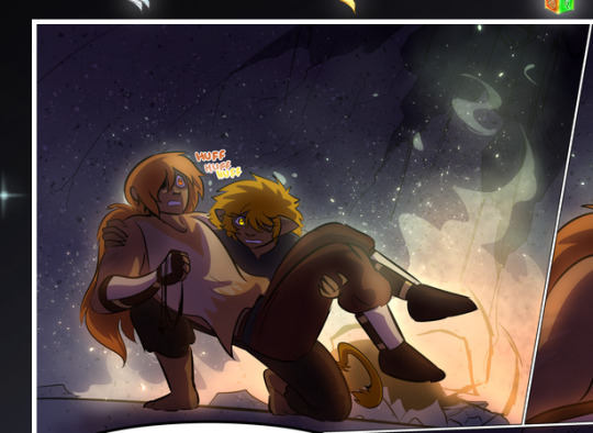
—where we now see that Falst's position is raised above Dainix's due to the way he's carrying him. (Points for continuity!) And, of course, we see the little "huffs" flowing from orange to yellow over their heads (where Dainix's head is higher than Falst's) to merge the sound of their breathing, which is absurdly clever because it emphasizes to the viewer how we hear two sets of huffing overlaying each other, not one. Absolutely brilliant.
(A few other notes of appreciation to that panel: beautiful glows around them, the sparks, the jagged silhouette of the spider legs, the lovely colors that have no right to make the area around a spider corpse that pretty, the excellent texturing on the cave walls plus perspective, the way Falst's movements imply Dainix's hefty weight, the natural posing of the characters, their on-point expressions that convey exactly how fuckin terrifying everything is right now, the slight glows to their eyes, and also they're just handsome boys <3)
Next up: Rain!!!! So well done! It's subtle enough that it never ever disrupts the impact of the focal point, but evident enough you can tell! And more importantly: THE MIST OFF THE CHARACTERS. Rain does this irl, it has that little vapor that comes off you and makes that little misty effect that plays with lighting, it's so cool-looking and here it's used to such pretty effect!
One of the panel captions says something about it blurring out all the injuries on the characters but like THAT AIN'T TOO BIG OF A PROBLEM when it gets across the environmental vibes, and also that'd be how it would look in real life too so like… outside viewer's angle is the same as the characters', mostly? my point is: that's the environment!!! that's the vibes, that's the feel! It gets it across and it does so in the most pretty way possible!
And another thing re: rain, the use of it to establish perspective, particularly in panels like this—

—where we can tell we're looking down at Tynan due to the perspective on the rain and where it's pointing. Excellent. (Also, kudos for looking down and emphasizing how Tynan's losing his advantage—lovely use of visual storytelling.)
Additionally, the misting here:
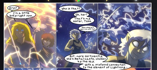
We see it most heavily in the leftmost panel, where it's quite foggy as you would expect in a rainstorm, especially in an environment with a lot of heat, but it's also lightly powdered on in the following two panels and tends to follow light sources, which makes complete sense given how light bounces off particles in the air.
A major point of strength in these too is a thorough understanding of lighting, like rim lighting, the various hues and shades, and an intricate understanding of how light bounces off surfaces even when they're in shadow (we'll see a faint glow in spots where characters are half in shadow, but that's how it would work in real life, because of how light bounces around).
Bringing some of these points together: the fluidity of the lines in magic, and the way simple glowing lines are used to emphasize motion and the magic itself, is deeply clever. I'm basically pulling at random from panels and there's definitely even better examples, but here's one (see this page https://comicaurora.com/aurora/1-16-33/):

First panel, listed in numbers because these build on each other:
The tension of the lines in Tess's magic here. This works on a couple levels: first, the way she's holding her fists, as if she's pulling a rope taut.
The way there's one primary line, emphasizing the rope feeling, accompanied by smaller ones.
The additional lines starbursting around her hands, to indicate the energy crackling in her hands and how she's doing a good bit more than just holding it. (That combined with the fists suggests some tension to the magic, too.) Also the variations in brightness, a feature you'll find in actual lightning. :D Additional kudos for how the lightning sparks and breaks off the metal of the sword.
A handful of miscellaneous notes on the second panel:
The reflection of the flames in Erin's typically dark blue eyes (which bears a remarkable resemblance to Dainix, incidentally—almost a thematic sort of parallel given Erin's using the same magic Dainix specializes in?)
The flowing of fabric in the wind and associated variation in the lineart
The way Erin's tattoos interact with the fire he's pulling to his hand
The way the rain overlays some of the fainter areas of fire (attention! to! detail! hell yeah!)
I could go on. I won't because this is a lot of writing already.
Third panel gets paragraphs, not bullets:
Erin's giant-ass "FWOOM" of fire there, and the way the outline of the word is puffy-edged and gradated to feel almost three-dimensional, plus once again using Screen or a variation on it so that the stars show up in the background. All this against that stunning plume of fire, which ripples and sparks so gorgeously, and the ending "om" of the onomatopoeia is emphasized incredibly brightly against that, adding to the punch of it and making the plume feel even brighter.
Also, once again, rain helping establish perspective, especially in how it's very angular in the left side of the panel and then slowly becomes more like a point to the right to indicate it's falling directly down on the viewer. Add in the bright, beautiful glow effects, fainter but no less important black lines beneath them to emphasize the sky and smoke and the like, and the stunningly beautiful lighting and gradated glows surrounding Erin plus the lightning jagging up at him from below, and you get one hell of an impactful panel right there. (And there is definitely more in there I could break down, this is just a lot already.)
And in general: The colors in this? Incredible. The blues and purples and oranges and golds compliment so well, and it's all so rich.
Like, seriously, just throughout the whole comic, the use of gradients, blending modes, color balance and hues, all the things, all the things, it makes for the most beautiful effects and glows and such a rich environment. There's a very distinct style to this comic in its simplified backgrounds (which I recognize are done partly because it's way easier and also backgrounds are so time-consuming dear gods but lemme say this) and vivid, smoothly drawn characters; the simplicity lets them come to the front and gives room for those beautiful, richly saturated focal points, letting the stylized designs of the magic and characters shine. The use of distinct silhouettes is insanely good. Honestly, complex backgrounds might run the risk of making everything too visually busy in this case. It's just, augh, so GORGEOUS.
Another bit, take a look at this page (https://comicaurora.com/aurora/1-15-28/):
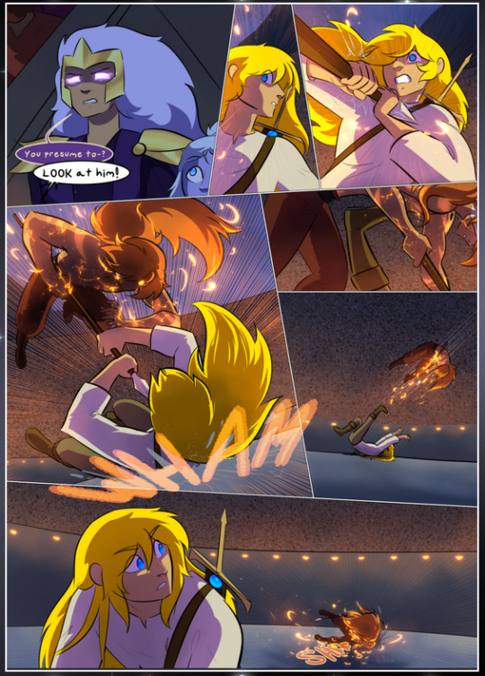
It's not quite as evident here as it is in the next page, but this one does some other fun things so I'm grabbing it. Points:
Once again, using different colors to represent different character actions. The "WHAM" of Kendal hitting the ground is caused by Dainix's force, so it's orange (and kudos for doubling the word over to add a shake effect). But we see blue layered underneath, which could be an environmental choice, but might also be because it's Kendal, whose color is blue.
And speaking off, take a look at the right-most panel on top, where Kendal grabs the spear: his motion is, again, illustrated in bright blue, versus the atmospheric screened-on orange lines that point toward him around the whole panel (I'm sure these have a name, I think they might be more of a manga thing though and the only experience I have in manga is reading a bit of Fullmetal Alchemist). Those lines emphasize the weight of the spear being shoved at him, and their color tells us Dainix is responsible for it.
One of my all-time favorite effects in this comic is the way cracks manifest across Dainix's body to represent when he starts to lose control; it is utterly gorgeous and wonderfully thematic. These are more evident in the page before and after this one, but you get a decent idea here. I love the way they glow softly, the way the fire juuuust flickers through at the start and then becomes more evident over time, and the cracks feel so realistic, like his skin is made of pottery. Additional points for how fire begins to creep into his hair.
A small detail that's generally consistent across the comic, but which I want to make note of here because you can see it pretty well: Kendal's eyes glow about the same as the jewel in his sword, mirroring his connection to said sword and calling back to how the jewel became Vash's eye temporarily and thus was once Kendal's eye. You can always see this connection (though there might be some spots where this also changes in a symbolic manner; I went through it quickly on the first time around, so I'll pay more attention when I inevitably reread this), where Kendal's always got that little shine of blue in his eyes the same as the jewel. It's a beautiful visual parallel that encourages the reader to subconsciously link them together, especially since the lines used to illustrate character movements typically mirror their eye color. It's an extension of Kendal.
Did I mention how ABSOLUTELY BEAUTIFUL the colors in this are?
Also, the mythological/legend-type scenes are illustrated in familiar style often used for that type of story, a simple and heavily symbolic two-dimensional cave-painting-like look. They are absolutely beautiful on many levels, employing simple, lovely gradients, slightly rougher and thicker lineart that is nonetheless smoothly beautiful, and working with clear silhouettes (a major strength of this art style, but also a strength in the comic overall). But in particular, I wanted to call attention to a particular thing (see this page https://comicaurora.com/aurora/1-12-4/):
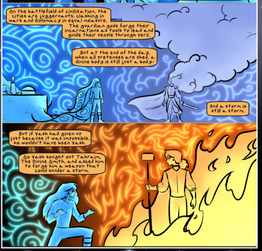
The flowing symbolic lineart surrounding each character. This is actually quite consistent across characters—see also Life's typical lines and how they curl:
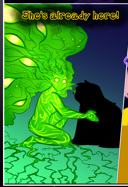
What's particularly interesting here is how these symbols are often similar, but not the same. Vash's lines are always smooth, clean curls, often playing off each other and echoing one another like ripples in a pond. You'd think they'd look too similar to Life's—but they don't. Life's curl like vines, and they remain connected; where one curve might echo another but exist entirely detached from each other in Vash's, Life's lines still remain wound together, because vines are continuous and don't float around. :P
Tahraim's are less continuous, often breaking up with significantly smaller bits and pieces floating around like—of course—sparks, and come to sharper points. These are also constants: we see the vines repeated over and over in Alinua's dreams of Life, and the echoing ripples of Vash are consistent wherever we encounter him. Kendal's dream of the ghost citizens of the city of Vash in the last few chapters is filled with these rippling, echoing patterns, to beautiful effect (https://comicaurora.com/aurora/1-20-14/):
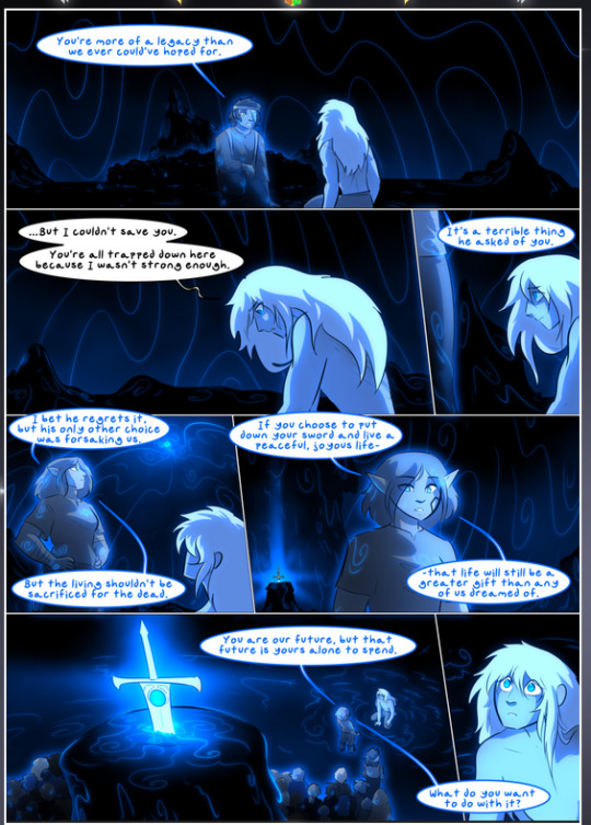
They ripple and spiral, often in long, sinuous curves, with smooth elegance. It reminds me a great deal of images of space and sine waves and the like. This establishes a definite feel to these different characters and their magic. And the thing is, that's not something that had to be done—the colors are good at emphasizing who's who. But it was done, and it adds a whole other dimension to the story. Whenever you're in a deity's domain, you know whose it is no matter the color.
Regarding that shape language, I wanted to make another note, too—Vash is sometimes described as chaotic and doing what he likes, which is interesting to me, because smooth, elegant curves and the color blue aren't generally associated with chaos. So while Vash might behave like that on the surface, I'm guessing he's got a lot more going on underneath; he's probably much more intentional in his actions than you'd think at a glance, and he is certainly quite caring with his city. The other thing is that this suits Kendal perfectly. He's a paragon character; he is kind, virtuous, and self-sacrificing, and often we see him aiming to calm others and keep them safe. Blue is such a good color for him. There is… probably more to this, but I'm not deep enough in yet to say.
And here's the thing: I'm only scratching the surface. There is so much more here I'm not covering (color palettes! outfits! character design! environment! the deities! so much more!) and a lot more I can't cover, because I don't have the experience; this is me as a hobbyist artist who happened to take a couple design classes because I wanted to. The art style to this comic is so clever and creative and beautiful, though, I just had to go off about it. <3
...brownie points for getting all the way down here? Have a cookie.
#aurora comic#aurora webcomic#comicaurora#art analysis#...I hope those are the right tags???#new fandom new tagging practices to learn ig#much thanks for something to read while I try to rest my wrists. carpal tunnel BAD. (ignore that I wrote this I've got braces ok it's fine)#anyway! I HAVE. MANY MORE THOUGHTS. ON THE STORY ITSELF. THIS LOVELY STORY#also a collection of reactions to a chunk of the comic before I hit the point where I was too busy reading to write anything down#idk how to format those tho#...yeet them into one post...???#eh I usually don't go off this much these days but this seems like a smaller tight-knit fandom so... might as well help build it?#and I have a little more time thanks to break so#oh yes also shoutout to my insanely awesome professor for teaching me all the technical stuff from this he is LOVELY#made an incredibly complex program into something comprehensible <3#synapse talks
776 notes
·
View notes
Text
|| Everlasting Ink ||

TattooArtist!Boyfriend!Xavier Thorpe x Fem!Reader -- Summary: You've always been Xavier's muse, inspiring and motivating his work, but right now he wants nothing more than for you to be his canvas for his most recent design. Warnings: MDNI/18+/Tattoo artist Xavier AU/Aged Up characters/Spice/Xavier giving reader a sternum tattoo/Kissing/Pet names (Angel;Babe;My love)/Pinch of Possessive!Xavier A/N: This is the first fic I'll be posting here, so I hope you guys like it! (Also this was written at 1am so apologies for any mistakes)^^
It had been 15 minutes since Xavier started looking at you, still cleaning and sterilizing his tattoo gun, and he has yet to look away. You were reading a book you had picked up from the library before you met up with your boyfriend in his art shed, that was hidden in the woods on Nevermore's campus. Though you were deeply invested in your book, you couldn't shake the feeling of his gaze, so you glanced up to meet his adoring eyes.
"What?" You laughed out, inspecting his face. He looked like a kid who was scared to ask his mom for some candy, but his eyes were much wider (lost in thought, clearly), and his cheeks slightly more red.
"I uh.." He cleared his throat and looked down at the cloth and tool in his hands, that he had been thoroughly wiping every inch for the past several minutes; before continuing "My love, and you can absolutely say no, but well- I finished a design that I've been working on, and I was hoping to tattoo it on you?" He placed his tattoo gun on the desk before quickly rummaging through all his papers before finding his sketch book.
You stood up from where you sat and approached his chair, wrapping your arms around his shoulders from behind as you stared at the drawing he flipped open too. You already knew you would probably have let him the moment he asked in such a sweet tone, but you were stunned by the piece. It was a fairly larger sternum tattoo, that would wrap around your chest and peak in between your boobs. The drawing had such intricate details, and little parts that made it appear that he had designed it just for you. Even the chest model he had drawn matched yours damn near perfectly.
"Xavier.. That's beautiful, I'd be honored to be you canvas." You said the last part in a fake, more proper sounding accent. His eyes lit up and his head snapped back so he was facing you. You could've swore that if he had a tail it would be wagging.
"Wait seriously? Like now? Can we do it now?" You could only imagine how long a piece like this would take, and it was already pretty late, but you had enough caffeinated drinks that you really didn't care, with the look he had stuck on his face you'd probably let him cover every inch of your body in his drawings, hiding your skin away in the ink.
--
That's where you sat now. Lying on your back, topless and staring at the drawing of your tattoo in his book. Your page. Sure, he had a lot of drawings of you, but this was different. It wasn't your face, your body, your hair. No, this was you. This was something that clearly showed that he took a great look into who you really were. Each line told its own story; then you noticed it, scattered throughout it was letters, unnoticeable unless you were specifically looking for it, letters that spelt out his name. A grin climbed onto your face, as closed the book, setting it on the desk closest to you. You looked down at the boy with long brown hair, who's bangs had now been tied back.
"Your name huh? Claiming me now?" Blood now rushed back to his face. It was a part of the design he had completely forgotten about. A part that he sketched out while thinking about you with his name stained onto your body, showing that you were truly his, and his alone.
"I forgot about that, babe I promise I wouldn't try to tattoo my name on you without perm-" but you cut him off. He was almost frantic, which was cute, but always led to him rambling on nervously for at least 10 minutes.
"I like it, its not like its in bold, neon ink, keep it. Please?" You added the please with a small whine for good measure, to make sure he wouldn't feel bad about it. He just nodded and started prepping you for the stencil.
This was your first tattoo, so you weren't exactly prepared for the cold liquid to be sprayed on your body, but when it was you couldn't help but flinch, which made your usually gentle boyfriend, push down slightly on your chest.
"Angel, I know you've never had this done, but for this I'm gonna need you to stay perfectly still once I get the gun out." His voice was stern and dry, a huge change in pace from the timid boy from a moment ago, but not an unwelcome one. You found it quite attractive the way he could switch back and forth like that. You just nodded, and went back to admiring him at work.
-
It had been several hours since he started the tattoo, it was decently painful, but at the same time felt really nice. You had finally adjusted to the way he was doing it, when he suddenly lifted the tool and stood up, readjusting himself. You thought he was just stretching after sitting uninterrupted for so long, but instead he moved onto the table where yo were, positioning his knees on either side of your hips, squeezing you gently to keep you in place. How flustered you were must've been clearly shown on your face because, still keeping the machine away from you, he leaned down and kissed you, you could feel his smirk in the kiss. He was loving this. You'd been watching him the entire time, not his work, but his face and body movement, and he knew it. He himself had a hard time keeping his eyes on his art. Your breasts were completely exposed to him, and he loved knowing that he was the only one allowed to see you like this.
He finally broke the kiss, giving you a moment to fix your breathing, and stop moving before returning to the tattoo.
-
It was nearing sunrise when the tattoo was done and yet you both still felt wide awake. He hadn't moved from his spot straddling your waist since he got there, ,but he did have to pin down your shoulder every so often when it tried to move on it's own. He was surprised that you didn't ask him to stop for a break at all. You were in a trance like state watching his every movement, but at the very least it kept you still. He brought his phone out and took a photo of "the tattoo" He told you, but you knew exactly why he was so precise with his angles.
#xavier thrope imagine#xavier thorpe#xavier x y/n#xavier x you#xavier thorpe x you#xavier thorpe wednesday#wednesday fanfiction#xavier thorpe AU#xavier thorpe x reader#xavier x reader#percy hynes white#wednesday characters x reader#wednesday netflix#xavier thorpe x fem!reader#percy hynes white x reader#minors dni
2K notes
·
View notes
Text
work song — a.h.b.
a/n: full disclosure, i've posted this before on tumblr for something else. but i love this piece very much and i think it fits for him and this song so well 🤍 (it's gone under quite a few edits too, though)
cw: mentions of death but of well that's a given

the artist flicks through the feature.
her name is printed in big letters on the cover of the monthly issue, her face—smiling and excited—next to the centrepiece of her latest art collection: cupid and psyche.
the painting is stunning, a riot of bold colours and patterns, but at the centre is a man, his face hidden, his red-brown curls tousled. his body is relaxed, she thinks there's an air of carefreeness about him.
and she'd know that for sure, after all that day is etched into her memory.
when she feels a familiar pair of arms wrap around her, she smiles.
“you're rather proud of the feature, aren't you?” his voice holds a little teasing note. she's stared at the feature for close to thirty minutes now, discreetly pinching herself in the same spot on her arm. (it sports a tiny, barely-there bruise now)
“good,” he nuzzles his face into her neck, softly kissing the skin, “you should be. the exhibit was fucking gorgeous.”
“mmm, because you were the centrepiece?” fondly, she teases back, but the memory flashes in front of her eyes—the bustling art gallery, him in a corner, wearing a plain hoodie and jeans and a cap hiding half of his face, absolutely brimming with pride.
she remembers the journalists asking about the man in all the paintings, the one whose face no one can see. “he's my muse,” she says every time, “this collection is dedicated to him.”
“someone's going to connect the dots,” he walks around her, settling himself next to her on the settee. instantly, they rearrange themselves into a tangle—her legs on his lap, his arm around her, her head on his shoulders, his head on hers. “if they looked carefully, they'll make the connection.”
“sweet boy, we have been each other's muse for years now and no one's found out. i don't think they're going to start now. besides,” she snorts, “i think the art world thinks i've made you up in my mind. won’t be the first time an artist's gone insane.”
he laughs a hearty laugh. “maybe you have. you always say i'm too good to be true.”
when she can't think of a retort, she sticks her tongue out, shrieking away as he smothers her in kisses.
“seriously though, it's fun writing about you. singing about you. and i love seeing myself through your eyes.” suddenly he sounds all sober and serious. she thinks his voice even wavers slightly at the end. he blinks quickly though, and just like that the brightness in his eyes is gone.
“love it when you write about me too,” she teases, “love being told i give you a toothache just from kissing you.”
“oi! i put my heart into that! it's a precious memory for me.”
“the memory of me taking care of you when you were burning up a fever? the memory of you demanding more kisses?”
he giggles like a teenager, hiding his face in her hair. it's fun to rile him up like this, so she continues, poking him in the ribs. “oh, oh, is it the memory of you passing the flu to me?”
“we took care of each other though!” he traps both her hands in his so she won’t be able to poke him more. a second passes, and he can’t resist kissing the knuckles. “and so you deserve to have a song written about you. or a whole album works too i think.”
he pauses for a little then tuts. “actually, no. don't wanna tell anyone it's about you, that'll ruin the magic.”
“ruin the magic?”
“of being your muse and having you as mine. a hundred years from now, when people would see your art as the artwork of this generation, and my music as the tune of our times—”
“tune of our times...”
“yeah, quit laughing at me!” he flicks her nose, kissing it right after. “so when my music becomes the tune of our times, i think people will see it then. they will make the connections.”
secretly, she loves the idea—that their love might transcend time and space, heaven and hell through their art. that decades from now their names might be whispered together, even though they aren’t just yet.
“of course, we'll be buried together by then. same grave by the way, very romeo and juliet of us.”
“that's morbid!” she laughs sharply, “what will the epitaph say?”
he hums for a bit, thinking. his eyes flutter shut for a second or two, almost like he needs to focus on the half formed thought until it's a complete sentence. then he excitedly clears his throat and gently holds her face between his hands.
“here lie the artist and the muse; inspiring each other in death as they did in life.”
#hozier#andrew hozier byrne#hozier x reader#hozier fluff#andrew hozier byrne x reader#work song#wasteland baby#Spotify
128 notes
·
View notes
Text
My goodness the rendering on this is popping off the fifth dimension
This is serotonin for my eyes

Yeah I was supposed to finish this for new years-
Fuck you you twink ass you made me miserable for like 4 months-
#team fortress 2#tf2#tf2 scout#seriously though this art is absolutely stunning#every detail looks beautiful#my god the colour balancing as well
563 notes
·
View notes
Text
[visual content blog recommendations]
we see fic recs all the time, but i don’t think i’ve ever seen rec lists for visual content (gif/art/gfx/etc.) creators! they’ve been dealing with a bunch of shit lately between reposts, tumblr garbage, etc., so i wanna shout-out some favorites. thank you for keeping us fed!!
disclaimer: this is not an exhaustive list!! if you have recommendations of your own, please feel free to expand on this yourself and/or drop some of your faves in the replies for others to see. self-promo is always welcome here, too ✨ p.s. some of these are recent finds for me, so pls expect to see more of them on my blog. eta: i will be adding more as i go!!
[bts]
@yooboobies — réka’s gif sets are *chef’s kiss* and the ART? omg. the talent!!! 😭 we simply have to simp.
@cordiallyfuturedwight — apart from being one of the coolest/funniest people i’ve found on army tumblr, i am a kayla stan because the niche themes for her gif sets (ex. bangtan turtlenecks series) feel like they’re made 👏🏻 for 👏🏻 me 👏🏻 even though they absolutely aren’t, lmao.
@hopeinthebox — the bts as reductress headline + incorrect bangtan series are probably my favorite pieces of content on the entire internet??? also, lizzy is absolutely gd hilarious. tags are 11/10. a blessing upon my dash.
@kimtaegis — i’m not visually artistic enough to say this in a way that makes sense, but annie’s gifs are just… stunning? like, the colors? idk about the process that goes into that, but i imagine it takes a lot of time/finesse to be this vivid.
@kithtaehyung — ryen is the renaissance man of army tumblr, fr. not only can she write (like!!!) but she’s multi-faceted and insanely creative with her graphic design. i want her to tutor me, lmao.
@raplinenthusiasts — ooohhhhh my god. the coloring of their gifs makes my brain go brrrrtttt. this bts x the office set is on my “always reblog” list; i’ll share it every time i come across it.
@heybaetae — this set in particular is on my “always reblog” list, no matter how many times i’ve done so already. also, idk how to describe this, but kelli’s gifs are just…. crispy 🤌🏻 like, so satisfying with the…. texture? filtering? contrast? i’m an idiot re: editing terms, but go peep them and you’ll know what i’m trying to say.
@kth1 — literally who could ever forget maggie’s 100 days of (member) series??? the amount of work that had to go into that? unfathomable.
@jeurias — i want to wallpaper my house and office with their gfx. i’m deadass.
@jinstronaut — emmeline has been doing her “a jin a day while he’s away” series for OVER 250 DAYS NOW. i have never been nor will i ever be able to commit to anything to this level.
[multi/skz/atz/svt/etc.]
@starryoong — do not get me started on starry’s paintings, sketches, etc. because i will never shut up. ever. j’adore 🫠 is also a five-star human being.
@irlvernon — my queue is probably 80% max gifs at any given time. god-tier, fr. a must-follow for carats, as far as i’m concerned.
@vcrnons — incredible gifs, lovely human, and also the writer of some of my favorite svt fics??? we stan.
@yelhsaart — i don’t have any words for how much i love their art so please imagine guttural screaming instead. asdfghjkl!!!
@hizuillu — ……breathtaking. legitimately stunning skz art. like…… i have heart palpitations.
@snug-gyu — THE USE OF COLORS. i’m always a simp for pantone-inspired sets; they just scratch an itch in the back of my brain, and BOY HOWDY, is my brain satisfied 😵💫
@yunwooz — again, i have no idea what i’m talking about when it comes to the gif-making process, but the colors!!! the COLORS!!! like, taking a mv that’s not super vivid/is fairly greyscale and bringing it to life? ya know????
@booskwan — you want incredible gifs? they’ve got em. you want stunning gfx? they’ve got em. seriously, idk what to tell you except “pause right here and go follow immediately”.
@haechannabelle — listen……. annabelle’s art style is 😗🤌🏻 (that’s a chef’s kiss). the use of color, and the technique, and and and — ! ALSO, i must mention that she took, like, 50 hours to compile a boycott-friendly k-pop playlist. their vibes are simply impeccable.
rev. 4/10/24
231 notes
·
View notes
Note
Veee could you write something with matty where reader is also an artist (a way less known one) and its just pure fluff with both of them being inspired by one another?
Feel free to ignore ofc!!🫶🫶🫶
muse - matty x reader
a/n: this took a very different direction than originally planned and got slightly existential sorry about that 💀💀 but i hope you like it regardless <33
divider by @/cafekitsune
cw: mentions of smut, talks of death, general fluff and sappiness.

the artist flicks through the feature.
her name is printed in big letters on the cover of the monthly issue, her face--smiling and excited--next to the centrepiece of her latest art collection: cupid and psyche. the painting is stunning, a riot of bold colours and patterns but the at the centre is a man, his face hidden, his jet black curls tousled. his body is relaxed, she thinks there's an air of carefreeness about him.
and she'd know that for sure, after all that day is etched into her memory.
when she feels a familiar pair of arms wrap around her, she smiles.
"you're rather proud of the feature, aren't you?" matty's voice holds a little teasing note. she's stared at the feature for close to thirty minutes now, discreetly pinching herself in the same spot on her arm. (it sports a tiny, barely-there bruise now)
"good," matty nuzzles his face into her neck, softly kissing the skin, "you should be. the exhibit was fucking gorgeous."
"mmm, because you were the centrepiece?" fondly, she teases back, but the memory flashes in front of her eyes--the bustling art gallery, matty in a corner, wearing a plain hoodie and jeans and a cap hiding half of his face, absolutely brimming with pride.
she remembers the journalists asking about the man in all the paintings, the one whose face no one can see. "he's my muse," she says every time, "this collection is dedicated to him."
"someone's going to connect the dots," matty walks around her, settling himself next to her on the sofa. instantly, they rearrange themselves into a tangle--her legs on his lap, his arm around her, her head on his shoulders, his head on hers. "if they looked carefully, they'll make the connection."
"matty, we have been each other's muse for years and no one's found out. i don't think they're going to start now. besides," she snorts, "i think the art world thinks i've made you up in my mind. won't be the first time an artist's gone insane."
matty laughs. "maybe you have. you always say i'm too good to be true."
when she can't think of a retort, she sticks her tongue out, shrieking away when he smothers her in kisses.
"seriously though, it's fun writing about you. singing about you. and i love seeing myself through your eyes." suddenly matty sounds all sober and serious. she thinks his voice even wavers slightly at the end. he blinks quickly though, and just like that the brightness in his eyes is gone.
"love it when you write about me too," she teases, "love being called a gemini and a sexy girl, such poetry."
"oi! i put my heart into that! it's a precious memory for me."
"the memory of us fucking in the new bath for the first time?"
matty giggles like a teenager, hiding his face in her hair. it's fun to rile him up like this, so she continues, poking him in the ribs. "or waking up the next day with a head cold because we stayed in the cold water for so long hmm?"
"you took care of me though, and so i think you deserve to have a song written about you. or a whole album works too i think." then matty tuts. "actually, no. don't wanna tell anyone it's about you, that'll ruin the magic."
"ruin the magic?"
"of being your muse and having you as mine. i think a hundred years from now, when people would see your art as the artwork of this generation, and my music as the tune of our times--"
"tune of our times..."
"yeah, quit laughing at me!" matty flicks her nose, quickly kissing it after. "so when my music becomes the tune of our times, i think people will see it then. they will make the connections."
secretly, she loves the idea--that their love might transcend time and space through their art. that decades from now their names might be whispered together, even though they aren't just yet.
"of course, we'll be buried together by then. same grave by the way, very romeo and juliet of us."
"that's morbid!" she laughs sharply, "what will the epitaph say?"
matty hums for a bit, thinking, his eyes flutter shut for a second or two almost like he needs to focus on the half formed thought until it's a complete sentence. then he excitedly clears his throat and gently holds her face between his hands.
"here lie the artist and the muse; inspiring each other in death as they did in life."
103 notes
·
View notes
Text
So this stunning work inspired me to write a reguri au, seriously this artist is amazing so you should go follow! @emerald-skies-art
-Daisy Oak owns a flower shop, she is hella pregnant, Green agreed to take over while she spends like 6 months on maternity, plus green isn’t working
-he had been working at his grandfathers lab but was hella overworked and literally rage quit and now he and gramps aren’t speaking
-he doesn’t have to do the floral design just open the shop and take orders and stuff, Daisy has an employee, Erika who does all the design
-part of what he has to do is go get flowers from the supplier, who is a farmer
-the farmer is Red, he’s been working the family flower farm since he was a wee kid, he’s swole with big ole pecs
-green who is gay af like immediately is thirsty
-red is super shy and doesn’t speak but seems to like talking with Green
-red starts showing up at the flower shop randomly to chat with Green
-red asks Green out, it’s a picnic in the flowers (see amazing art that inspired this au)
-they start dating
-then there the whole issue with prof oak
-red wants them to work it out cause he’s all about family but green has major issues with his grandfather
-he tries really hard over dinner with red and his gramps but his gramps says something shitty while red is in the bathroom and green is devistated
-he like runs out of the dinner, red comes back and is like wtf
-red runs to find Green and he does in the sunflower field that they had the picnic
-they have an emotional moment where green tells red about his family problems, red holds a sobbing green
-they keep dating and being cute till Daisy comes back to the flower shop and now what is green supposed to do??
-be the farmers husband duh
-red proposes and they get married in the sunflowers
-then green helps out on the farm and they live happily ever after drinking sweet tea and sittin on rocking chairs on the front porch

Reguri Week 2021 - Sunflowers
#emerald-skies-art#reguri#namelessshipping#more aus that i'll never get around to writing#although i might do this one cause i used to be a florist#i'm the least artistic artsy person ever lol#seriously though the art emerald posts is absolutely stunning so go follow#also i hope it's okay to rb the photo with the au#i don't know the protocol#i'll delete if it's not okay lol
547 notes
·
View notes
Text
Velvet & Veneer Headcanons Pt. 2
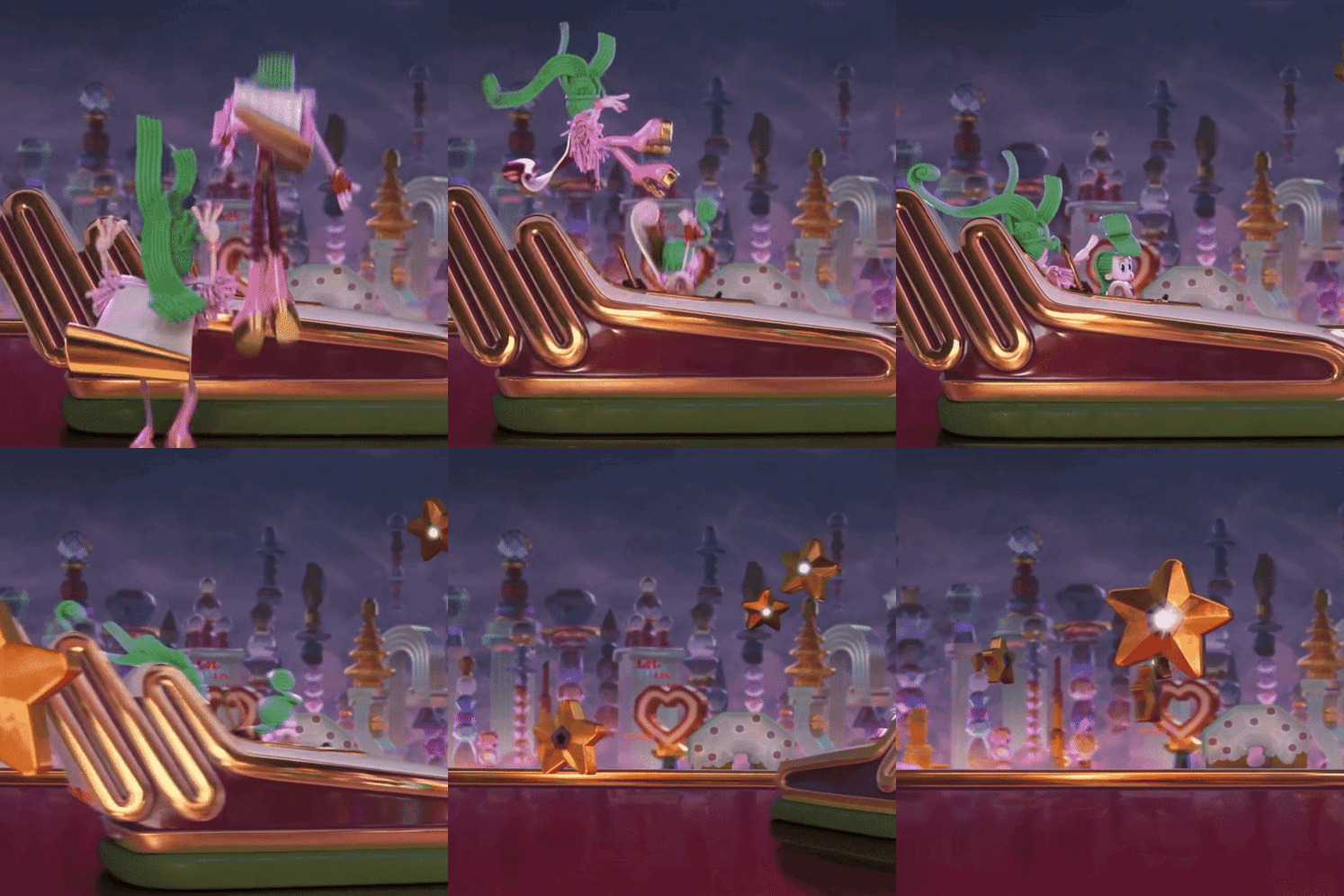
Fandom: Trolls
Genre: Headcanons
Pairings: Veneer x Kid Ritz, Velvet x Orchid
Warnings: some angst
⭑
⭑
⭑
⭑
⭑
Velvet
She was popular in high school.
Velvet did almost EVERYTHING in high school. She was in band, dance company, choir, thespian club, and arts committee. It was very stressful for her, but she really wanted to impress her parents. In the yearbook, she got the “Most Busy” superlative.
She had a huge friend group with most of the popular kids, including Veneer. Velvet was basically teen royalty at Mount Rageous High School.
Chronic pain 😔
She struggles with chronic pain in her lower back/hip. Velvet has to take many breaks between songs when performing because she hurts so bad. She goes to physical therapy every weekend, but it doesn’t really work. Velvet tore her muscle once and it never recovered right. (Me too girl, me too 😔)
Hair, nails, and makeup on FLEEK
Velvet is always looking stunning! Her hair and nails are always done. Even when she has no makeup on, she’s beautiful. Veneer is in control of outfits, and Velvet is in charge of everything else.
SoundCloud Artist
Before Velvet became famous, she would post her songs on SoundCloud. Her songs were majorly inspired by Doja Cat and Ayesha Erotica. Velvet only made about a thousand followers though.
Bad Ex (again me too girl)
In eleventh grade, Velvet started dating this random dude. He wasn’t a good person and was very toxic towards her. She couldn’t sleep some nights because he wanted to call, text, etc. Once, they got in a bad argument, and he ended up hitting her. Veneer didn’t take it too good and beat the shit out of the guy. He could’ve seriously injured the guy, but Velvet made him stop. She doesn’t like getting into close relationships anymore because of her ex.
Small crush
Remember how I said she doesn’t like getting into relationships? Well, this is making her confused. Velvet went to school with a girl named, Orchid. They were really close friends but ended up separating after high school. They saw each other again at a concert; Velvet fell in love. She stalks Orchid’s instagram almost everyday gawking at how pretty she is… Orchid does the same to Velvet. 💜🤍💜🤍
She’s a BARBBBBBB
Her favorite artist is Nicki Minaj. She knows almost all the lyrics to all of her songs.
Veneer
Favorite Child
Veneer was the “golden child” of the family. He was always spoiled and loved by his parents, but that only made Velvet jealous. He didn’t like all the attention because he never got alone time. Veneer did even more than Velvet; he was in dance company, arts committee, dance outside of school, track, tennis, choir, and show choir. Even when Velvet was struggling with her ex, their parents didn’t comfort her. It was Veneer. He spends most of his time giving her the attention she never got from home.
Extremely protective
He absolutely loves his people. Veneer is extremely protective of his friends and sister. One time, Kid Ritz was getting flamed on social media, so Veneer backed him up. He said: “dont be sayin shit abt ppl when u know it aint true. kid ritz is one of my best friends and if yall start being bitchy towards him imma be bitchy towards yall”
Theatre Kid
Veneer was a huge theatre kid. He did a lot of productions during middle school; his first production he ever did he got a lead role. He was Sebastian in the Little Mermaid.
Doesn’t know his own strength
He is surprisingly strong. Veneer isn’t muscular or buff, but he can beat a bitch. He got into many fights in school and won almost all of them, but he doesn’t like to admit it. He has a killer grip, and that is why he could catch Velvet before she fell when Floyd flew out of the shoulder pads.
Casual smoker
He started smoking when he was around 16. Veneer would steal cigarettes from his grandmother and smoke them at home. His dumbass got addicted and it was very bad, but Velvet helped him quit. He was only a few months sober when they became famous.
Shopaholic
Veneer loves shopping! When he was a kid, he’d beg to go to the mall, and he’d buy so much stuff. He knows he has a bit of a spending problem, but why worry? He has money! Anyway, he always wants to go to the mall or even just the grocery store to buy something. Veneer likes to buy matching outfits or accessories for him and Velvet.
#trolls band together#trolls velvet and veneer#trolls#trolls 3#trolls headcanons#velvet trolls#trolls veneer#veneer trolls#velvet and veneer#velvet and veneer trolls#veneer x kid ritz#velvet x orchid#headcanon#band together#band together trolls
115 notes
·
View notes
Text
P.O.V: You wanna write a fic, but the fic takes the cannon, rips it to shreds, picks up the pieces it wants (throwing the rest into a flaming trash bin), then mixes them in a bowl that contains head cannons and original ideas, then...
Okay, now that I've typed that out, that's technically every fic...
But trust me, mine is 10 times worse. I'm basically writing my own original story with characters everyone already knows and loves, and...
Okay, I'm just gonna stop now.
But seriously though, this is a reminder to every writer (mostly to myself tbh) that no matter how outlandish, bad, amateurish, or whatever it is that's stopping you from writing your fic, do not let it stop you.
Because it doesn't have to be a stunning work of art remembered for the ages because you're not Shakespeare. It doesn't have to be the same or similar to everyone else's because that's what's popular right now. Because that's how things get boring. And even if you do write the same stuff as everyone else, remember that someone out there will love it just as much as everyone else's.
So what if you use tropes that not everyone finds appealing, rest assured that someone's going to love that shit.
And so what if your fic has absolutely NOTHING to do with the cannon! That's going to be someone's favorite fic of all time. This goes for original stories as well!
I have way more that I wanted to say but fell asleep and forgot. (The life of a writer *cries*) But anyways uhhhhhh.....
Go forth! Grab that pen and paper! Open that Google doc! (Or both if you're like me :) And go write that story that's been plaguing your mind. Go finish that WIP that's been your drafts FOR MONTHS!
Go and create that new world. That new possibility. That story that you and so many others will love.
You are a writer...... go do what you love.
#This is me hyping myself up to post that story that's been in my drafts for a while now#But I really do hope that this does inspire people#writers on tumblr#writerscommunity#writeblr#fan fiction#not spaming these are just the fandoms I'm in#dp x dc#dc x dp#dcxdp#dc comics#dc universe#dp x dc crossover#dp dc crossover#harry potter#boku no hero academia
85 notes
·
View notes
Text
For @choicesfandomappreciation's Countdown to 2024.
There are so many talented artists in this fandom. I could never pick only four. I am seriously in awe of all of you and your talents. You truly make this fandom a more beautiful place. We are lucky to have you all.
In no particular order
💛 @hydn-jpg: I absolutely adore you and your talent. I can't thank you enough for the beautiful creations you've made for me. I just adore your style. I'm glad you are doing better. I've loved seeing your art on my dash again. Thank you for sharing all of your beautiful visions with us.
💛 @cashweasel: What can I say?! I absolutely adore you and your art. You've created some of my favorite Mal pieces and you gifted the world Valen. How can we ever thank you enough for that?! Valen is everything, but I adore Gideon too!
💛 @oh-so-youre-a-nerd: I've only been following you for a few months but ohmygosh you are so freaking talented. Like how?!!! I absolutely adore seeing your art on my dash, no matter the subject matter, each piece is just stunning. Your use of light is unlike anything I've seen. You are amazing.
💛 @artbyalz: Your art is so much fun! I LOVED your 12 days of Christmas art series. You gifted the fandom so many beautiful and unique pieces. I absolutely adore all you've created, and ohmygosh how can I even thank you for this gift you've given me?!!!
💛 @cassie-thorne: GAH your art!!! The recent art with Astrid is still living rent free in my head. She is so gorgeous! I truly admire and adore all of your work, though I'm a little biased toward your CoP art! I can't wait for the next book to see how you tackle all the new content we get!
💛 @baldwinboy5ive: I've absolutely enjoyed all of your art and memes from Blades. They were simply fantastic. Your work always puts a smile on my face!
💛 @fairymatchmaker : JOY!!! You are just so so lovely and amazing, and your art is brilliant. I know you haven't been able to draw as much as you'd like to have recently, but please know we are here waiting patiently for when you can. Your art is just brilliant.
💛 @violentinecrl: I am still absolutely in love with this gorgeous gift you made for me. I never expected anything like this and genuinely treasure it. It lives rent free in my head always.
💛 @callmebeem: I only discovered your art this year, but I am so in love with it. I love the 3 commissions you've made for me so far (even if I'm still holding on to one of them) but I absolutely treasure each and know I will be back for more soon! Thank you for them!
💛 @rosefuckinggenius: what can I say about you and your art besides you actually are a fucking genius. Your talent is amazing and I'm grateful for all the times we've worked together!
💛 @bayleedraws-sometimesx: you are an absolute delight! You are a sweetheart who creates such lovely art for the fandom. I love your minimalist style. You bring so much love to your work and it shows.
💛 @erixafleur: I've loved seeing all your gorgeous Blades art throughout book two. I can't wait to see more. Your style is lovely whether it's fully rendered or the sketchy style.
💛 @sazanes : Your art is so beautiful! I love seeing all the gorgeous stuff you create for the various appreciation weeks. I truly look forward to seeing all your works. You can see your care for each piece in every stroke.
💛 @twinkleallnight: you write, you do art, what don't you do? Thank you for sharing all of your many talents with the Choices fandom
💛 @mydemonsdrivealimo: Jensen is an amazing character and your OH art is so lovely. Thank you for the Valentine's doodles you made for my Bryce and Olivia. I truly treasure it!
💛 @gaiuskamilah / @talasintahan: your art is simply brilliant. I haven't been following you long, but I'm loving seeing all your gorgeous work.
💛 @weetlebeetle: You're technically not in our fandom, but you've created so many amazing pieces for me and so many others, you might as well be. Thank you for sharing your talent with us! We are so lucky to have you
💛 @hashiedraws (I know you're no longer active in the fandom, but I will always adore and treasure your art!
There are so so many amazing artists in this fandom, just mentioning a few more:
@somewillwin , @garlickk , @myautumnrose , @rainesenator , @ellezelindraws, @totojo2 , @choices-ceri , @crowlion ; @gremmiie ; @cpt-indigo , @mavidraws , @javsarts
This list is by no means exhaustive, please know that it was not intentional if you were left off!
#choices fandom appreciation#choices countdown to 2024#choices#playchoices#choices fandom#artists of tumblr
37 notes
·
View notes
Text
Ok so, having seen the Gameplay trailer that Bioware pulled out of their ass in the aftermath of possibly the worst videogame trailer in history, i have to say im not impressed... But i almost am.
Because they ALMOST got it right. Like all the building blocks are there, but it's always just one step off from being great.
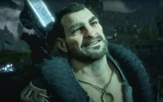
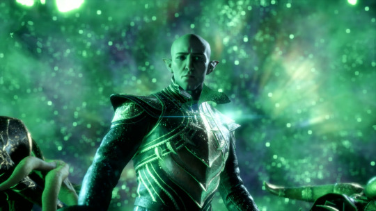
Like the character models dont look anything the like the complete joke that was the fortnite DA trailer... But while you can tell the animators put their heart and soul into the models, they still look awful.
And it's ALL the lighting and coloring's fault.
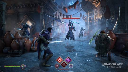
The thing is, the models and enviornment doesnt look terrible in a vacuum... but the problem is that it ALL blends together. It's all just a mixmatch of colors and shades that makes the entire thing look like an uncoordinated mess with no rhyme or reason behind it.
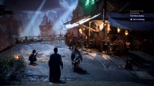
Take this shot of minarathous. It's not just grey, on top of grey, but it sure looks like it. The colors, rather than contrast and embolden everything to make it look striking, instead makes it one, big, sloppy looking mess.
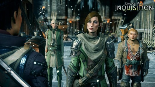
Here is one, single shot from Inquisition to illustrate the poiny. Notice how everything is very grey here too, but the way the lighting is, you can easily differentiate between everything, every character sticks out so much better and looks infinitly more interesting and memorablr just by virtue of not looking like they're part of the background.
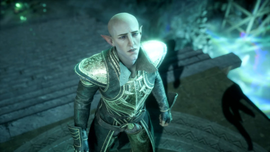
It's not a coincidence that the only part of this gameplay showcase that looks absolutely stunning is Solas, because he is the only character who actually has the lighting to stand out, both when illuminated by the blue magical energy withouth the purple, white and blue mess that is now how magical energy looks, but also in the shots where he's illuminated by the veil.
I can tell you why it looks like this too.
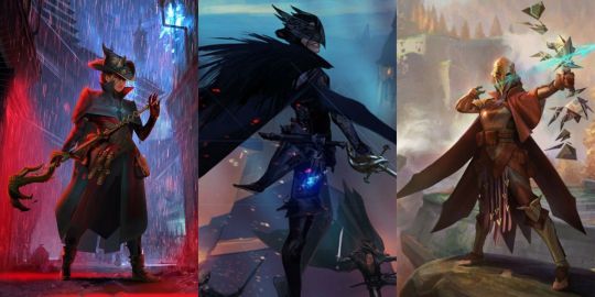
The lighting and colorists of the development team was trying so, so very hard to make the concept art lighting translate to 3d models and enviornments... And it just doesnt work.
Maybe there is a way to make these pieces work in 3d, but this sure aint it.
Maybe the enviornments that are set in the daylight will look better, but i can tell you, that with this engine and style, every single nightshot is going to look absolutely atrocious, regardless of wheter the models look better than that horrible fortnite trailer.
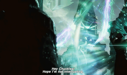
Then there is the dialogue.
Now there are a lot of complaits that a lot of the dialogue is the usual by now terrible Marvel "banter" that the MCU unfortunately popularized.
You know, the quirky, dont take itself too seriously style of writing that almost never works outside the MCU pre Endgame.
But that's actually not my main vomplaint with it.
My complaint is how... Lifeless the voice actors sounds.
I just listened to these lines, and the thing that struck me is not that they're bad, but how i KNOW both Varric and Solas Voice actors are so much better than this.
"People are dying right now! You need to listen!" "People are always dying. It is what they do."
Like... These lines SHOULD work.
I know the common joke is that this is the usual terrible dialogue in the vein of "My face is tired from dealing with you", but the fact is that it's actually good on paper.
Varric here should sound like he's pleading, making one, last, final plea to his old friend Solas, reminding him that people are fucking dying all around them(Though the rest of the scene dont exactly convey that).
A plea to his humanity.
And solas throws back that he knows. He KNOWS people are dying. That's what they always do.
For anyone who knows Solas at all, this is such a good line. You dont need him to go into a spiel about how his entire reason for doing this is so that people no longer have to die all the time, that the entire reason they do die is because of him...
It should work... but it doesnt.
Solas Actor is NOT giving it his A-Game. At all. And neither is Varric's.
He doesnt sound like the emotional Solas we saw in Inquisition, and frankly neither does Varric. Any and all charisma both had are seemingly gone, replaced by two actors who make the characters sound like themselves, but eithouth the emotion that made them work.
Just hearing Solas telling Varric that this story does NOT end with his downfall just makes me think that the actor either didn't give a shit, or was bored... Which was just hammered in further when Solas just gives a pathethic scream of "Noooooo!" When his big plan is foiled.
Maybe it's that the rest of the writing is just so bad that they just gave up, or they had the same level of quality for their voice director that george lucas gave his actors during the prequel triology filming.
Either way, this really just hammered in the point for me of kind of game we're getting here... And i didnt even touch the gameplay in this post.
11 notes
·
View notes
Note
I LOVED YOUR PART IN THE VOLUME!!!! IT WAS SOOOOOO PRETTTYYYYYYYY
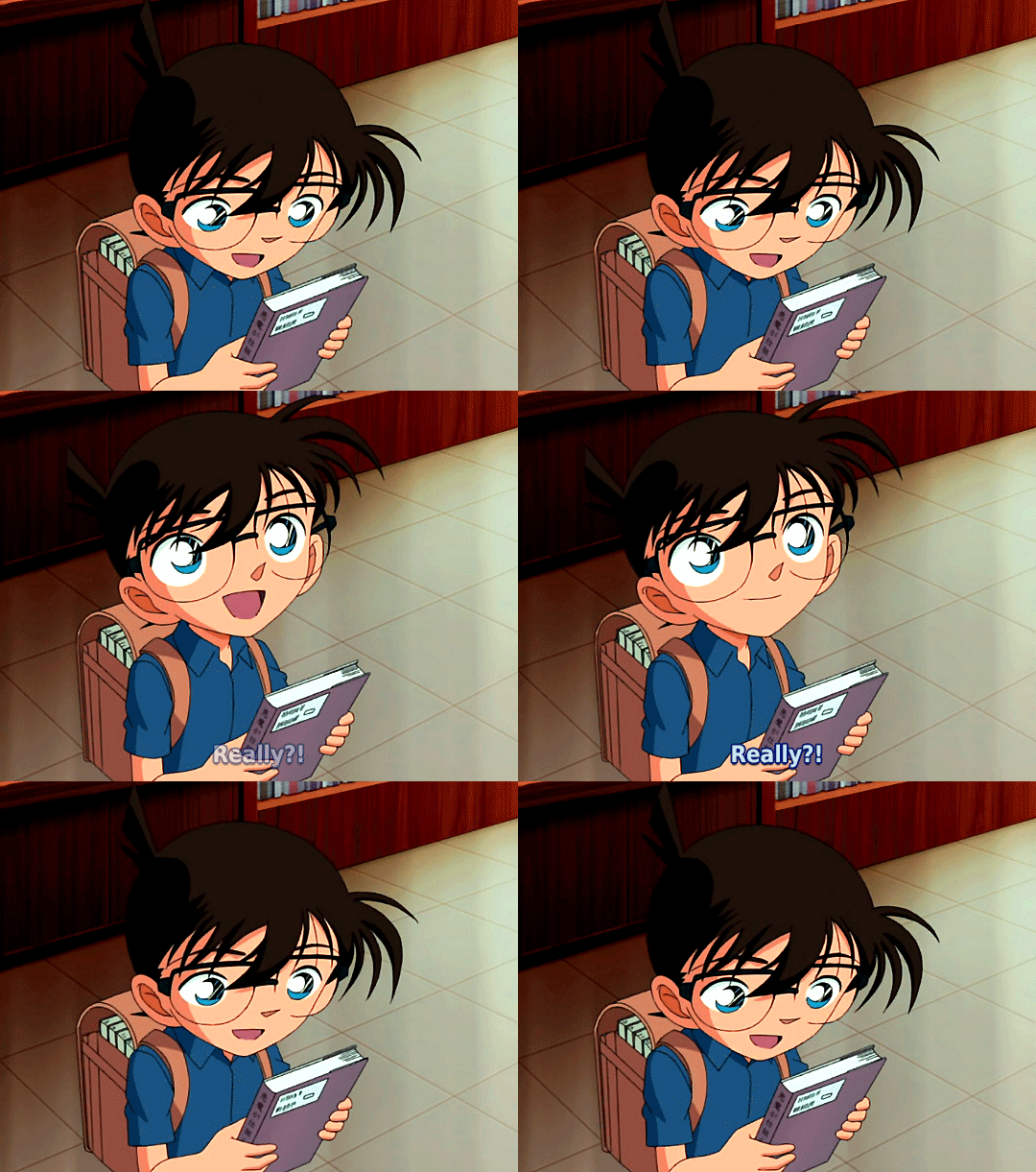
Thank you so much!!!
I meant to post something for the last day of Repostober, but things got so hectic that it obviously didn't happen.
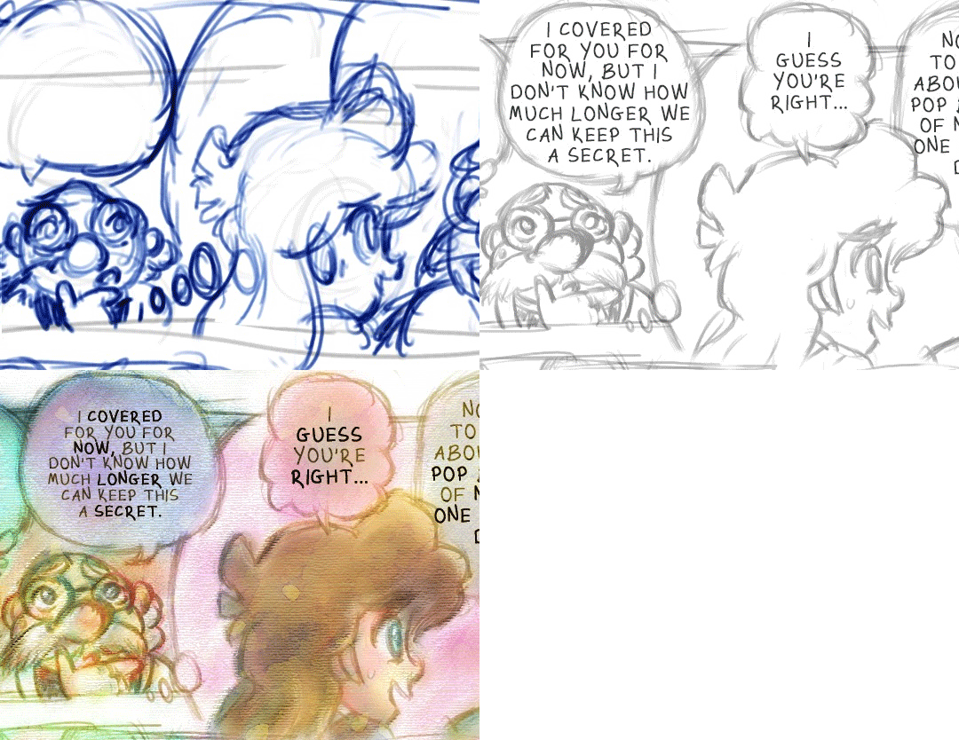
Though it's months later now, I hope it's not too late to say that Detective Conan Redraw got me to seriously think about drawing—and to actually seriously draw!—for the first time in years. My participation in the project is probably the main reason I attempted Repostober at all, and suddenly I was watching art tutorials again, wanting to try different styles....
While I can't say how much I see myself really drawing in the future, it was nice to get back into it, even if it winds up being only for a moment. I never did post a preview for my part, so here's a progress GIF of my page that I put together!
It's a sentiment I've expressed before, but I'm truly honored that I got to be a part of such a beautiful labor of love. If anyone hasn't seen it yet, I can't recommend the checking out the full volume—on Tumblr here!—enough! It's absolutely stunning!
#replies#anonymous#still can't believe i drew(!) a page for detective conan redraw :')#this is such a belated response but i couldn't let the year end without answering it!#i'm pretty shy about my drawing abilities so this was really really sweet to find in my inbox#thank you so much and i'm so sorry it took me so long to answer#happy new year!#detective conan#gifs i made
22 notes
·
View notes
Text
Since the voting was truly abysmal and the real winner was robbed by the corrupt juries, might as well make a "they deserved better" list including both semis and the grand finale and considering both juries and the general public. So, in an attempt to be as objective as I can, here's my
☆♥︎THEY DESERVED BETTER♥︎☆
In no particular order:
🇩🇪 Germany, Lord of the lost - Blood and glitter: I admit that I wasn't a fan in the beginning, and even made a post about how I wish that the rock entries went harder and that LOTL should either commit to hardcore or be more silly with the song. I found the cheesy lyrics delivered in such a serious and dramatic manner cringey, BUT, after their performance last night, changed my mind completely. First of all, I ADORE the lead singer's vocals (and he seems like a cool guy), and the song itself has some seriously good moments, not to mention how freakin catchy it is. Their energy was through the roof, the performance was flawless, and in spite of my initial reaction to the song, I bought it and genuinely loved it. It felt like watching a concert by one of my favorite bands. Not my winner, but I was really disappointed with how low they scored.
🇪🇸 Spain, Blanca Paloma - Eaea: ROBBED. Over the years, the juries projected an image of people that look for all things *artistic* in a song (even though it usually translates as a pretentious kid in art college with no real taste picking the thing they think their 50yo profesor would approve of). Well, they be blind, since Blanca Paloma brought IT, and they failed to recognize. Outstanding vocals, stunning visuals, the power of the entire performance, and all the emotion and significance packed into a seemingly simple concept. It was more like a movie scene than a musical competition entry, she transported me into another dimension and unlocked something ancient and wonderful. All the people I've talked to had different favorites, but they all had strong, immensely positive reactions to Spain. I literally teared up and had a spiritual experience with Blanca Paloma's performance, and the energy she exuded was undeniably healing, freeing and over-all cathartic. While I knew that her chances of winning were slim and I didn't count on the public vote, she deserved SO MUCH MORE from both general public and the juries.
🇦🇹 Austria, Teya and Salena - Who the hell is Edgar: One of my favorites from the very beginning. A quality pop song with a bop-y rhythm and ingenious lyrics. Under the guise of random and silly, there's quite a few things implied - the obvious criticism of the music industry and the more subtle "people are readier to believe that a ghost of a famous writer possessed me than that a woman can write quality lyrics and have a sense of humor" (shout-out to generations of men claiming Kurt Cobain wrote Courtney Love's songs and lyrics, work on your reading comprehension) While that might be a personal observation, here's what absolutely stands. They're adorable, funny, had a fun choreography, a catchy song, the lyrics that are fun even if you don't analyze them, great personalities, solid performance, perfect delivery and the right amount of quality with a dash of random that matches Iceland's Dađy Freyr and that y'all claim to respect. Shame on the audience; the jury can't recognize talent anyway.
🇸🇮 Slovenia, Joker out - Carpe Diem: Not much left to say. Good song, good vibes, all the charisma in the world. They had Måneskin's synergy, they had a good time, the audience had a good time with them, and they were confident in a non-pretentious manner. Special mention for Bojan, the lead singer, who's shown such sportsmanship, was truly an example of a perfect esc. representative. The entire band seems very fun to hang out with, and while they're goofy, they seem very smart with how they manage to balance witty and respectful in interviews. Members aside, their music is refreshing and perfect for people that find mainstream pop repetitive but aren't into anything too heavy. Perfect for a summer music festival or a feel-good playlist.
🇵🇹 Portugal, Mimicat - Ai, coração: you know she's something special when her entire home country shows such support and excitement. I wasn't a fan at first when I saw the national performance, it seemed a bit out-dated and frankly a bit too weird for my taste, but she changed my mind as soon as she took the stage in the first semi. In my opinion, a Broadway-worthy performance, and such personality! Fun aunt vibes, and one of the coolest people this year. When I grow up, I wanna be her.
🇭🇷 Croatia, Let 3 - Mama, ŠČ: The juries are such cowards, honestly. I was familiar with some of the band's history and not everything they did was exactly my taste, but what else to expect from a band so unhinged. I had some misgivings, but they won me over quickly. The punkest thing Eurovison has seen in recent years. That's how you do anti-war, Switzerland. Satire on point. Weird, meaningful, fun, grotesque. How something like that didn't do better in Eurovision is beyond me. But leave it to the cowardly juries that left Italy's Ermal Meta and Fabrizio Moro with almost no points to do just that. I'm still butthurt.
🇷🇸 Serbia, Luke Black - Samo mi se spava: Listen, I was NOT a fan. All the homophobes aside, everyone in the country and their mom was gushing about how original and unique the song is, which can be annoying to someone who's as exposed to various aspects of pop culture as I am (humble,I know), and I still think his singing could be better. At first, he was a bit awkward and seemed pretentious during the national selection. However, the performance did stand out, he amped his energy and put such effort, and there's no denying the flawless staging and production and how well it suits him, and over time, he's proved to be a funny, likeable and down to earth guy (with flawless fashion sense). I'm proud of him and how he represented the country, and he definitely didn't deserve to be at the bottom of the list.
🇮🇸 Iceland, Diljá - Power: I'm OUTRAGED that it didn't qualify and can only call lesbophobia idk. I mean, Im not familiar with her sexuality, but if I've ever seen something that doesn't give a damn about the male gaze, this would be it. Still, it's beyond me how she didn't qualify. One of the best vocals this year, not to mention she sung FLAWLESSLY while running and jumping all over the stage with zero breaks. The track itself is meh to me, but should be something that Eurovision fans enjoy; that being said, the vocal and performance can make or break a song with such a track, and she ATE. Power indeed, I was blown away. Her being super-cute is just a bonus. She has my heart and my votes ♡ Too bad people didn't agree.
🇷🇴 Romania, Theodor Andrei - D.G.T: Ok, I can't shout that he deserved to qualify, I knew the chances were slim and the song had some ways to go, not to mention the hot mess of a national performance. However, he doesn't deserve ANY hate that he's getting, and in my opinion, he was the best male vocal this year. I'm in love with his voice and he doesn't lack charisma either. I loved the re-vamp with the acoustic guitar, but at the end of the day, the stage was a bit empty. I will add D. G. T. to my playlist though, and I wish him a wonderful career and a powerful return.
🇱🇻 Latvia, Sudden Lights - Aijā; Well, this one hurts. I know it wasn't a fan favorite, but I was rooting for it so much and still think it deserved to qualify over some *questionable* entries. While it was something straight out of my high-school playlist, I didn't find it derivative and it was warm, touching and comforting. And beautiful, goddammit. I get how it's not everyone's cup of tea, but come on.
🇵🇱 Poland, Jann - Gladiator: Was this a jumpscare? Lol. No need to write a huge paragraph, the entire world knows that he was robbed. I've never seen someone so charismatic and meant to be a performer, and I enjoyed both the song, the lyrics and the delivery, even though I immediately noticed a similarity with Judas by Lady Gaga. However, I feel obliged to say that he should work on his vocals and that y'all wouldn't be so mad if he didn't look the way he looks. Still, the true choice of Poland, and I have no doubt he would've done great in the final.
AND FINALLY .....
THE ONE TRUE WINNER
💚💚💚💚🇫🇮🇫🇮🇫🇮💚💚💚
Käärija (my beloved) - Cha Cha Cha:
Ok, he didn't lack the love or the appreciation. But the RIGGERY. The ROBBERY. THE AUDACITY.
First of all, the song is a banger. It mixes industrial rock, techno and eurodance perfectly, with flawless transitions, while managing to catch the ears of people that aren't into any of those genres. Great intro that pulls you in immediately, and the pacing done just right. Now onto Käärijä himself. He's a fucking star. A legend. It's impossible not to like him. Every video of him I've seen was so much fun. Performance wise, great energy, great delivery. The song manages to appeal so many people with staying unique and checking all the boxes. Want something for the angst? He got you. Want something upbeat? Cha cha cha motherfuckers. Want weird? "My name is Kääärijää", there's our green man. Want quality production? Boy from Vantaa's got it.
The only possible criticism I can see him receiving is something along the lines of "it's gimmicky", which is frankly a ridiculous thing to say about a Eurovision entry (insert the Maryl Streep from Devil Wears Prada meme) and if it were gimmicky, he wouldn't have become the only artist to ever have his name chanted by the entire audience while Sweden gets points, and I wouldn't have replayed it so many times since it came out without getting bored. Honestly, one of the rare songs that puts me in a good mood, cos it has that "starting from anger and angst and acknowledging bad feelings and THEN bringing you to upbeat and happy" thing going on. Eh. Fuck the jury.
This concludes my list. Special mentions.
Not my cup of tea, but deserved the praise - Norway, Italy, Australia, Armenia
Deserved more public votes, undeniable quality, but faded into the background compared to my other favs - France, Czechia
Not for me but I get it- Moldova, Estonia, Georgia
+ Acknowledging Malta for pulling that performance and getting everything possible out of a song that relies entirely on one catchy hook. Most improved entry since the nationals, good show, likeable group, fun staging.
#eurovison#esc 2023#eurovision 2023#eurovision song contest#liverpool 2023#finland#cha cha cha#käärijä#eurovision austria#France#Serbia#Croatia#justice for finland#Spain#eurovision spain#blanca paloma#latvia#sudden lights#aijā#mama šč#iceland#diljá#evidemment#la zarra#jann#gladiator#esc germany#Austria#who the hell is edgar#poe poe poe
62 notes
·
View notes
Note
hii!! im here for one of the fandom ships if they're still up for grabs! :)
im a girl (lesbian so uh a wlw or wlnm ship is definitely preferred) i have medium length wavy brown hair that im growing out, with a red underlayer (i think the styles called a peekaboo?) i have brown eyes, and an oval face, i have bangs that swoop to one side and almost cover my whole left eye. im an infp and pretty energetic! i have naturally long fingernails that get described as talons. i love cats and the rain and birds are my favourite animals. i do art, and i love stars. im also british but i hate stereotypical things like tea and i have straight teeth (seriously though, i hate the booawoa(bottle of water) ahh stereotypes) i love writing and hate maths. i literally cannot point out a single country on a map, apart from mine and a few others like america. I LOVE AMERICAN ACCENTS THEYRE SO FUN TO DO. i love the colour green. OH I ALSO LOVE FERRETS, CANARIES AND CONURES!! im like quite short btw like 5'4? but i wish i was taller.
anyways thats all i can think of about myself!
Your Fandom Ship: Piper McLean!! (Heroes of Olympus) 


Explanation: starting off with looks, I think that the daughter of Aphrodite would find you absolutely stunning. She loves your beautiful brown hair with the red just peeking out from underneath it and she thinks that your brown eyes are gorgeous and is constantly complementing you on them. She’s kind of a very lovey-dovey romantic person not to say that she’s not tough but she would absolutely romanticize your relationship. She would do really sweet things for you. She is always over performing on Valentine’s Day things like that. She’s just a romantic at heart which I think would do really well with you. she doesn’t mind her energetic personality and even encourages it and I think sometimes you two are kind of like bouncing off the walls together, but she can pull you down whenever you need to be pulled down and also I think that she would find your nails, very attractive and consistently ask you about nail care and how you broom them and have you do nail nights with her where you guys take turns doing each other‘s nails. She’s not particularly girly. I think she would still enjoy doing this and insist on doing it. She also loves animals and the rain so I think that she would dance in the rain with you if you were into that or do the whole cheesy kissing under the umbrella thing. I can’t remember her height, but I think she would be slightly taller than you and consistently tease you about being short. I also think that she loves your British accent and honestly kind of wishes that she had one herself because of how adorable it is and I just think she would be so obsessed with it. She would just absolutely be in love with it and like if you guys know, I just like think she’d be so down for bad with a British accent she would be obsessed. I mean, she romanticizes things a lot, so no doubt she would be romanticizing your accent man. She has a pretty similar personality to you and I think that she would be very loyal to you and protect you at any cost no matter what and U2 would be extremely cute together and a pretty healthy relationship. I can see you guys having like the perfect wedding that everyone is fucking jealous of, but anyway, I don’t know you you guys are cute. I really ship it. 🩷🩷🩷
#urlocalnonbinarybastardwritesanswers#pjo#pjo x reader#pjo fandom#pjo series#pjo hoo toa#pjooooo#hoo#hoo piper#hoo pjo#piper mclean#piper#percy jackon and the olympians#heroes of olympus#Piper McLean daughter of Aphrodite#p
11 notes
·
View notes
Text
I’ve seen a lot of people talking about how great the theme song is and it’s well deserved, but we need to talk about the opening credits .
The art style is absolutely stunning. It fits in so well with the lighting (or lack thereof) throughout the show and gives the premise of the show its own sense of character. Applause to the artists who worked on it.
But what I thought was really cool is how those opening credits do a lot of heavy lifting in terms of world building. In the books, Lucy just outright tells us all this stuff, but it would be pretty boring if all that was just narrated over the episode (which I am SO glad they chose not to do) in reflection of that. They do work a bit of it into interactions with other characters and that works out pretty well, but those credits really SHOW the audience why this world works the way it does.
When did the Problem start, and how devastating is it for society? Newspapers give us dates and stats for deaths. Why do agents use salt, lavender, and iron? The headline tells us that researchers found it the most effective substances against ghosts. Why isn’t there a lot of modern technology in this modern world? Tech stocks plummeted as people spent more time researching the Problem and it became obsolete.
Book readers will know all this (though not the tech thing, since the book never sets up a time period and just avoids tech for the most part), but the show audience deserves to know it too, and this is just such a clever way to go about it. Seriously, props to everyone who worked on it.
#lockwood and co#lockwood and co netflix#lockwood and co spoilers#lockwood and co netflix spoilers#lockwood and co show spoilers
76 notes
·
View notes