#save me airbrush save me
Explore tagged Tumblr posts
Text
I love auto desk sketchbook but holy shit the lack of an actual blur tool drives me mad
0 notes
Photo
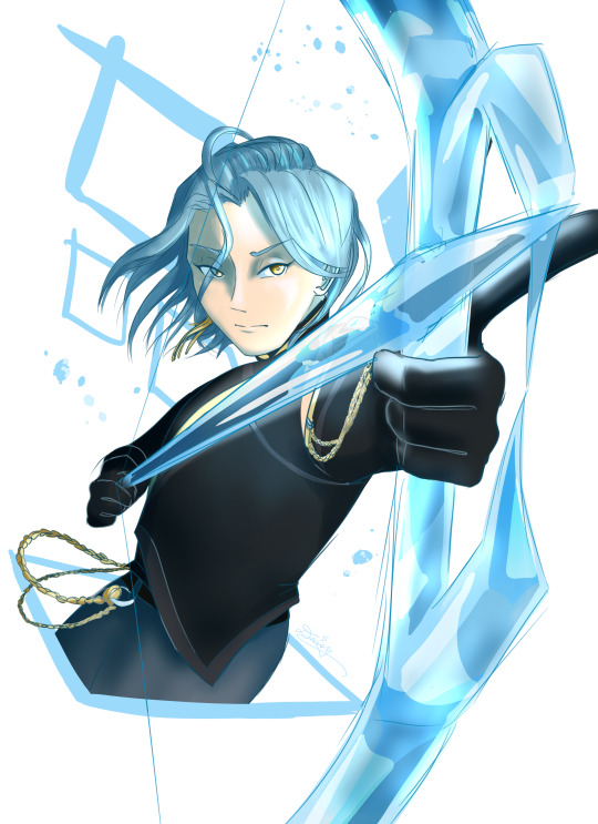
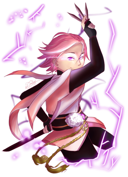
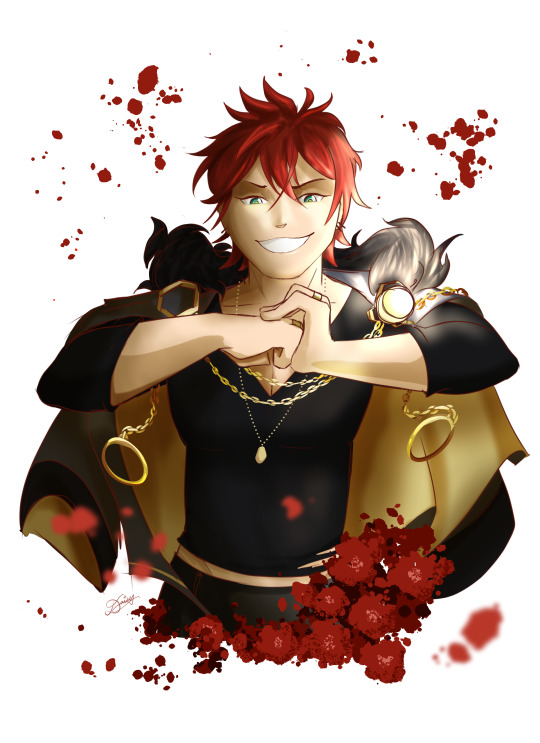
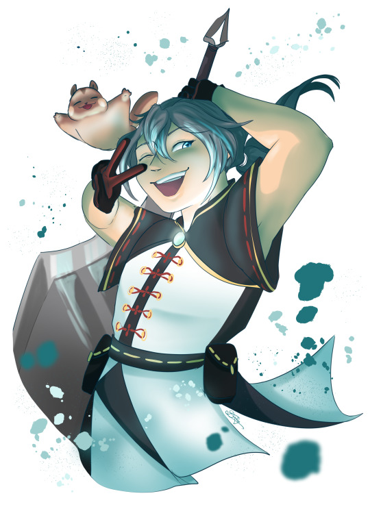
I saw @flcarius ‘s element assignments for the bees and I just. I had to
#enstars#crazy:b#himeru#kohaku oukawa#rinne amagi#niki shiina#genshin#i just wanted to draw meru and then it ended up being. all of them#i didn't change the outfits much i was just focused on posing and stuff#if anything i actually might've accidentally left out a detail here and there--#also i'm calling niki's lil squirrel friend mogu#like the chewing sound#also i accidentally made meru's bow look like glass rather than ice whoops#shoutout to csp's droplet airbrush for being my saving grace on these (especially the rinne flowers.)#also shoutout to neptune who likely saw this coming kjdhfkjasdf#i put all the main tags first but i doubt it's gonna show 'cause FOR SOME REASON my art posts are still not showing up in the enstars tag#i think kohaku's eyes would glow when he does his zippy thing#and rinne's pupils would be green when he beats the hell out of you with plant power (pls correct me if i'm wrong op)#one of niki's death lines would probably be a weak nahaha... before he flops onto the ground
125 notes
·
View notes
Text


WIP is no longer a WIP! Enjoy me actually knowing what I'm doing for once
#Again! Lineart was traced from the show cause I was focusing on colors and understanding brushes and layers#And thank god for the selection tool and the soft airbrush saved my life❤️#my art#Rottmnt#I'm trying a background of my own next! I'll use a picture I particularly like me think#I made this and now I dream of being a background artist/colorist in an animation studio tf
144 notes
·
View notes
Text
Thinking about that Catly game announced at the game awards and wondering who it's even for. The commitment to AAA realism seems like it's a huge and unnecessary expense for something that's trying to appeal to the virtual pet niche, where we kickstart new projects for well under a million dollars and our pets are 200px square PNGs.
#catly#WHO IS THIS PRODUCT FOR#I'm not convinced it's AI generated but it absolutely has the same aesthetic that AI has trained its whole life to copy#and that sleek semi-realistic airbrushed quality is rendered cheap and uninteresting by association#buddy your virtual pets do not need more than 500 polygons#you know what it looks like? a Metaverse project. the cats look like NFTs#which! yeah! 3D virtual worlds are doing the metaverse better than the Metaverse ever could#and it's billing itself as an MMO#with a name like CATLY? buddy that sounds like a venture capital startup mobile app for pet surveillance!#I mean I guess the dreamy rounded retrofuturist architecture is cute but I don't see the point outside of like. concept art?#because it's clearly not a slick surrealist sci-fi setting that's for sure#yeah now that I think about it it's probably trying to recoup costs on a failed metaverse plan that didn't release before the bubble burst#fragrance point save me. save me fragrance point. (apparently that's coming out next year so that's exciting)
2 notes
·
View notes
Text

Elster and Ariane from Signalis! I accidentally closed the project file without saving the final touches (luckily it was only some colour correcting layers and very minor detailing on Elster that was lost.) Nonetheless, it's nice and warm looking and it makes me happy. I love seeing art of these two so I thought I'd do my part I think I'm going to ban myself from using any airbrush and airbrush-like tools and see what happens. I deeply fear making everything look too soft with those things.
( This descrition is old. )
195 notes
·
View notes
Note
Oh uh forgot to ask in the previous ask (the one with the digital piece of candy and scurrying and stuff)
How do you draw art so good
Like
Is there a method you use or is that just the style you've gotten over time?
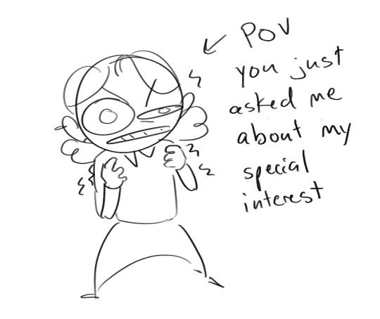
you've activated my trap card
I'm just gonna preface that this tutorial is from someone who was not professionally trained and didn't have a lot of free time for art, so a lot of the tips I have is short cuts I use to get the best results quickly
If you genuinely want to get better at art then please look at references and practice that is always the best
However if you are like me and only really do art for fun but want to go faster then these are for you pfppt
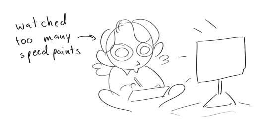
Overall I'd say my style is influenced by speedpaints I would watch when I was younger, I like analyzing how people do things and what makes something look "good" to me
I always recommend watching them because they will often have techniques you've never seen before or do things a certain way that you can try out yourself
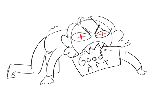
I consume good art, it feeds me
but seriously it can be super helpful when developing your own methodology, or just generally trying something new
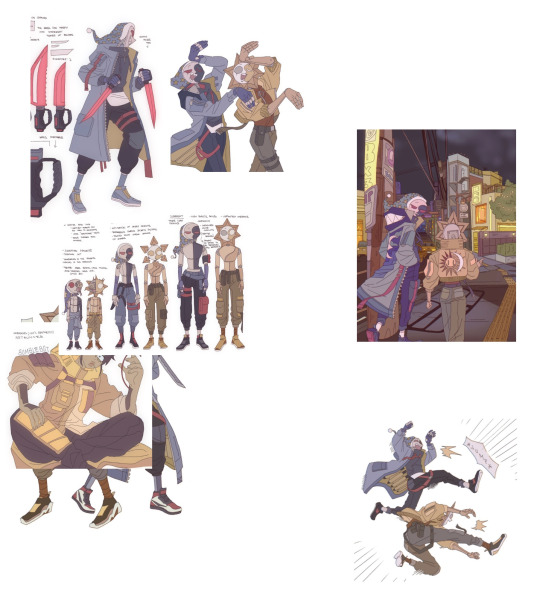
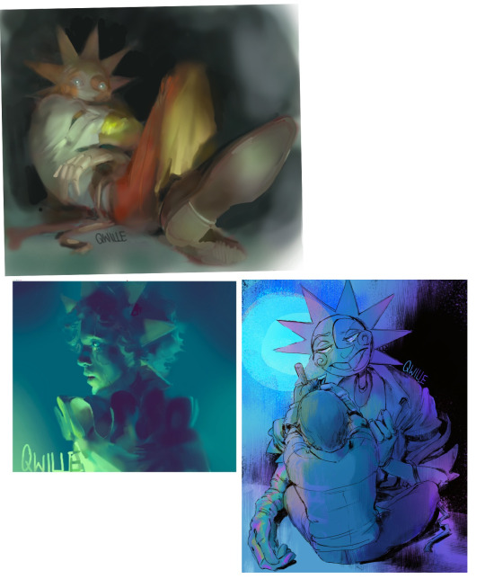
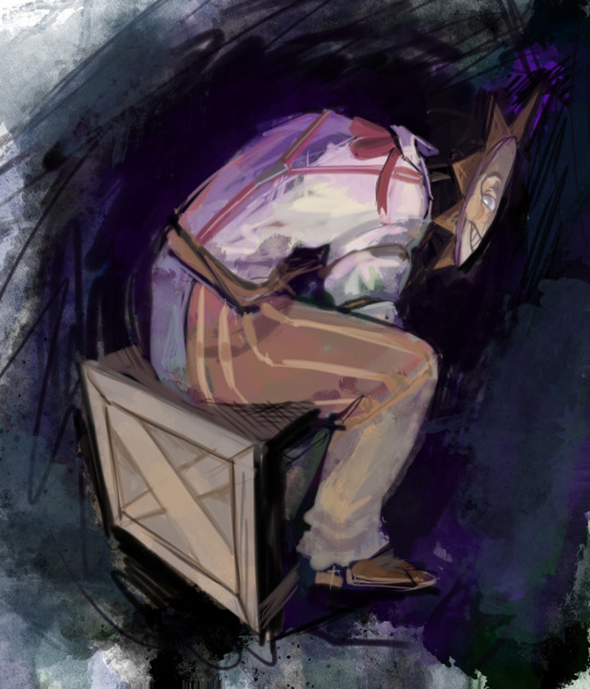
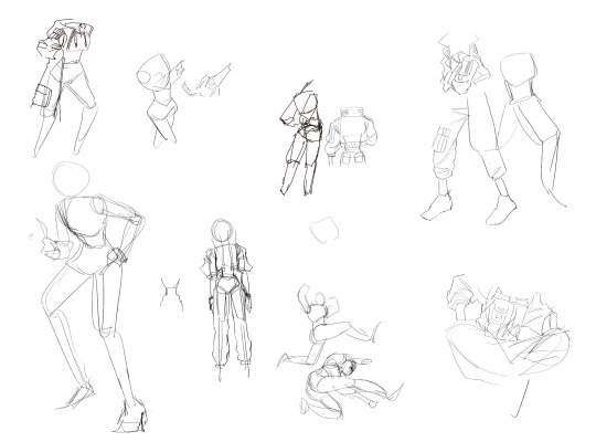
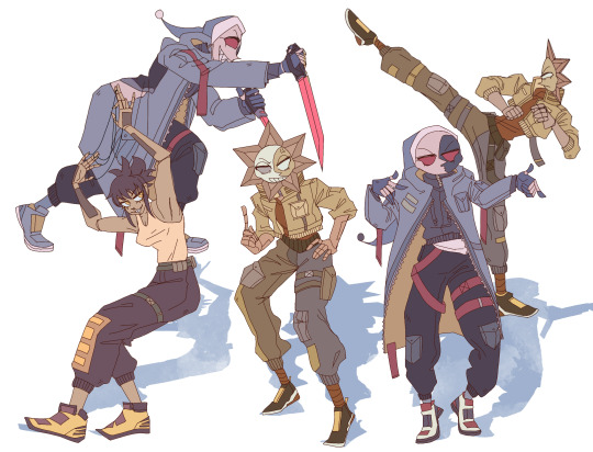
Usually it starts with me pulling some references from artists I really admire and sort of sketching out how they do the things I like
For example 8um8le has like super good anatomy and poses so I focused on trying to replicate how they do that
venemous-qwille is super good at color and pulling focus so that's what I focused on in my study of them
In general I'd say my process is sketch -> silhouette -> color -> shading -> render
I really don't like doing lineart lol

I'd say for the sketch the most important part is using references and just kind of fudging it until it looks correct anatomically/physically
General rule of thumb is spend time on areas of interest, and keep non important areas light (like the stitching on his pants)
I don't do lineart because I think its unnecessary for most paintings I do
I naturally tend to put more time and focus on areas of interest (like hands and feet) and if you use a brush with opacity for the sketch, those areas are naturally going to be darker in the final sketch
Of course this is gonna be different for everyone but it's what works for me
Sometimes I do a really really sketchy layer underneath my sketch/lineart, just so I know where everything is going
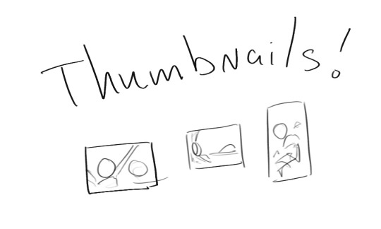
Use thumbnails! They are great to help figure out the general layout of things and what pose I wanna do
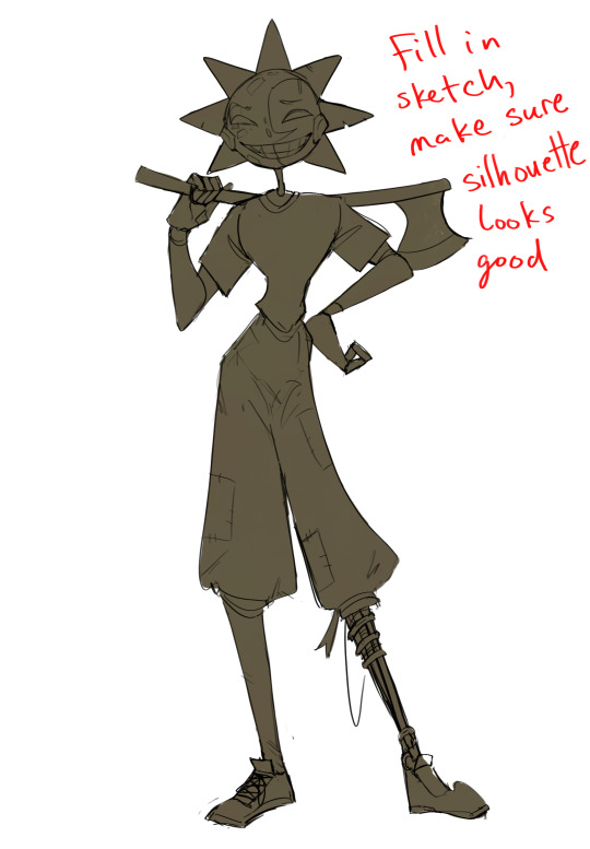
Next is what I call the "silhouette" layer
This is super important for me cause it helps me refine the figure and make sure the pose/anatomy looks correct, also depending on what color I choose for the silhouette helps guide what colors I'm going to use on top
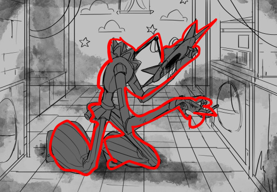
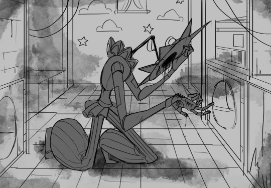
This piece is a good example of how it works. The silhouette shows me how the figure interacts with the background, how the pose looks and if its any good
The silhouette layer doesn't have to be super clean, as long as it follows the sketch decently well and shows where the figure is then its fine
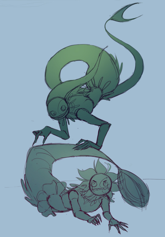
I also sometimes make the silhouette layer multiple colors to help guide shading and vibe
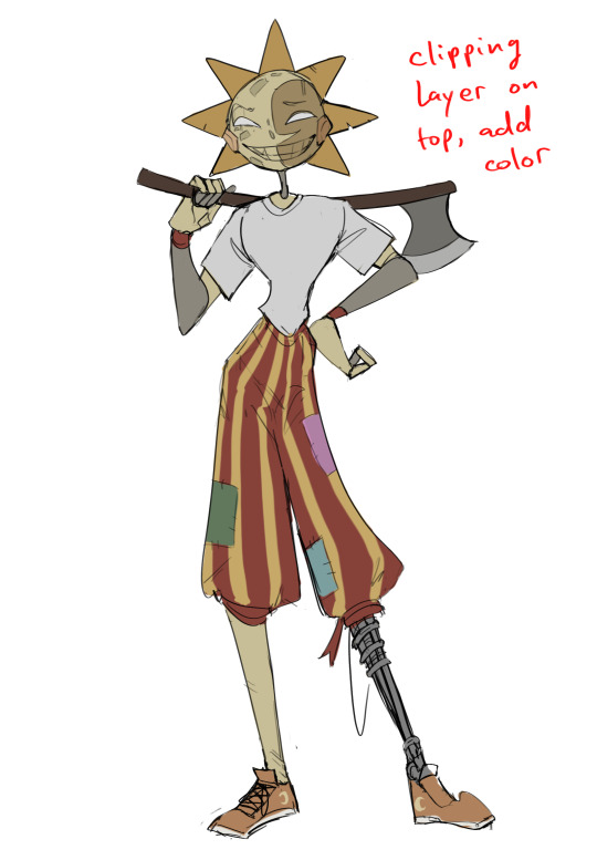
Next is the coloring layer. I usually make this a clipping layer on top of the silhouette layer, or I change the silhouette layer to alpha lock, either way it saves me time on coloring everything in

Sometimes I am super rough with the coloring too, using like an airbrush or my fav watercolor brush just to generically block in color where I want it
Works out cause most objects have like a bounce light to them from surrounding objects, so this is sort of a cheat I use to get that effect without all the work lol
Also don't be afraid to have the lower silhouette layer shining through, having multiple colors sort of subtly shining through the piece helps lots
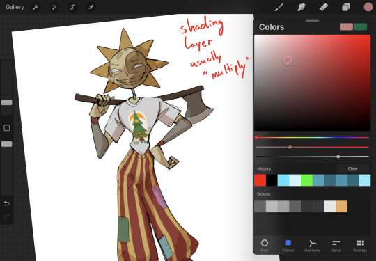
Next is the shading layer, this is usually another clipping layer, usually set to "multiply"
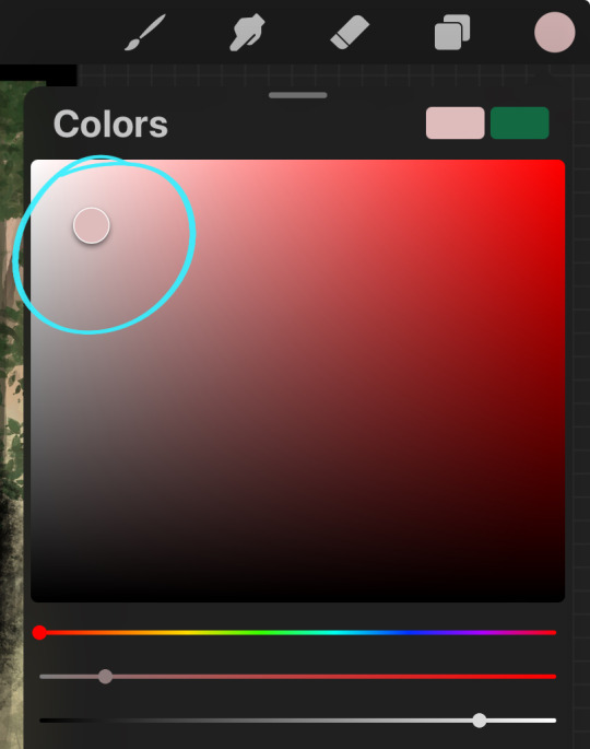
The colors I pick here is usually within this range, any color works, just depends on the piece and vibes.
Since this piece is set in a sunset forest I choose a more desaturated orange for the shading layer
I know there's a whole thing about multiply layer being a crutch (and it kind of it) but it is a useful tool when you just want some darker values across the piece but don't want to go through the process of color picking every single darker shade
Also in my opinion it looks better than picking a darker color and setting it to a lower opacity, idk I just think the color has more "depth"
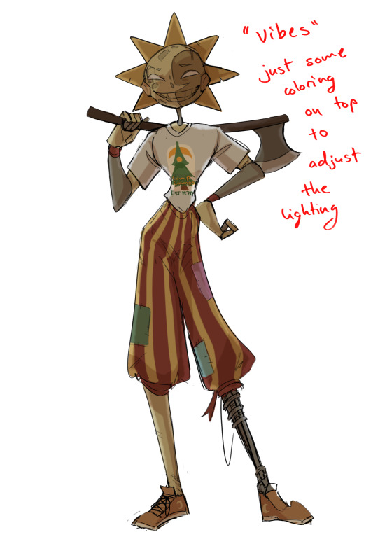
Next is the hardest to explain, sort of the vibes layer
Usually its just a layer of more concentrated color on top of the normal color and I fudge with the settings and values until I get a result I like
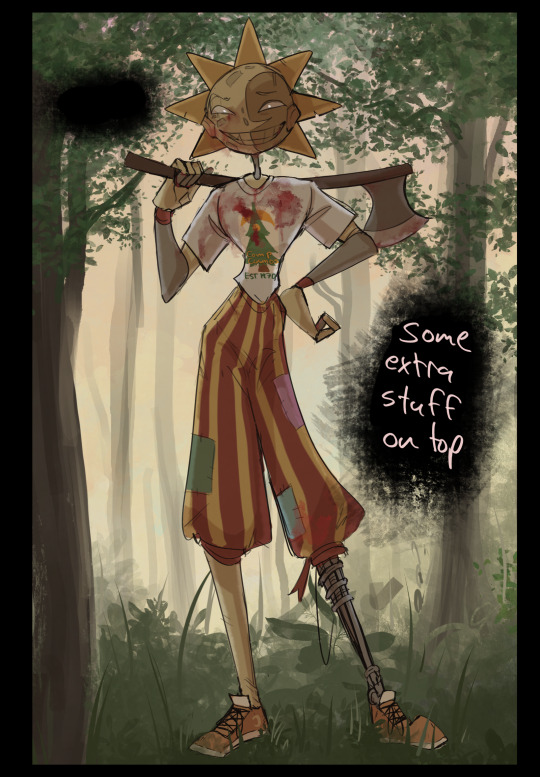
Next is the longest step, is the "extra" or the render stage.
Usually I add a background before this step so that if I need to merge the figure better with the background I can
If I render with a white background but he's supposed to be in a dark forest, its going to mess with the lighting severely
Also this is when I add more "vibe" layers on top to get the figure to match the background better
Backgrounds in general I recommend checking out @/derekdomnicdsouza on instagram he's got lots of great tutorials for breaking down backgrounds simply

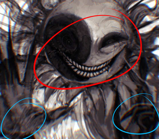
I'd say general rule for the rendering layer is to focus on the areas of interest and spend less time on areas you don't care about
I even blur stuff out on the edges I don't want people to see, partially to save time on fixing mistakes in areas I dont care about (oop), but mainly to help draw the eye to the areas I do want people to focus on

Theoretically parts of the background should like mesh with the characters, parrallel lines are a no no unless they are directing a viewer to look somewhere, things that are perpendicular help bring things together
tbh I'm still not the best at layout and probably need more practice, but overall this is what I like doing
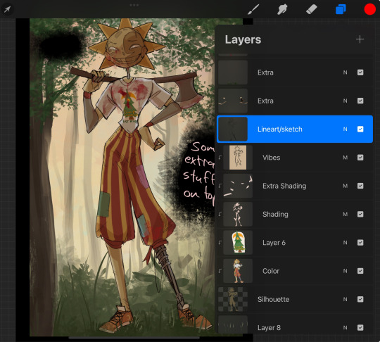
Overall this is what my layer set up ends up being
Sort of a sandwich with the lineart/sketch as the "meat" lol
Color and basic shading below the sketch, clean-up and rendering on top
I like this method cause it's super flexible if I ever want to try something different or try to replicate someone's style
I can make each step less or more messy depending on the end result and can add a lineart layer if need be. Also if there's a part that is straight up not working or needs to be removed its super easy to do cause I can just paint over it on the "extras" layer, color picking from the surrounding area to get the same vibe
Generally rule of thumb for my style is: get the initial layout of colors, form and shading to look good, then the rendering should be smooth sailing
Really the best advice I can give to get better at art is to enjoy what you're doing and become very very obsessed with drawing a silly little guy
You'll eventually get very good at drawing them pfptpf
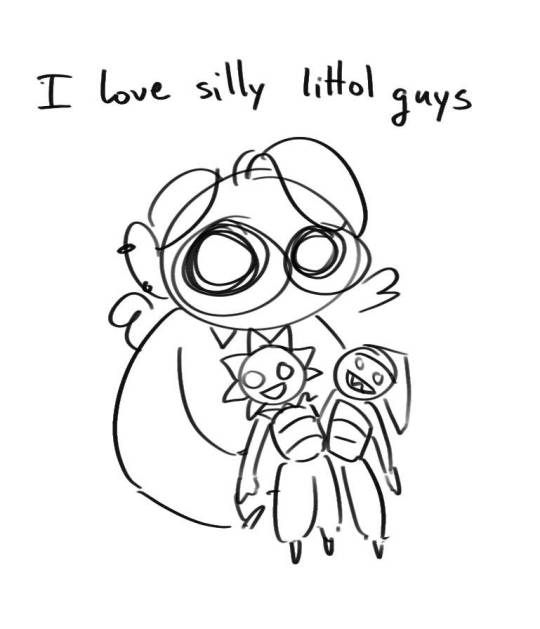
#sundrop#moondrop#long post#art tutorial#fnaf sun#fnaf moon#I draw them way too much holy guac#ask#this is for you asker#idk if anyone else is interested in this kind of stuff#i apologize for ranting lol#also me struggling to spell silhouette like 15 times
114 notes
·
View notes
Text
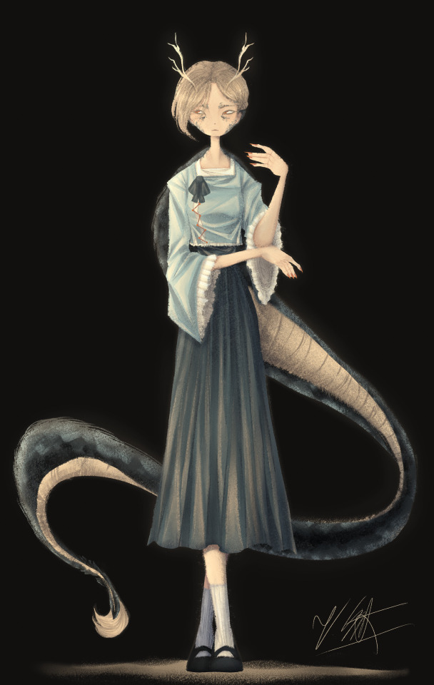
[Click for better quality]
Ok so as a sort of followup to that Yachie drawing, I did one of Yachie as well. I already had a pretty solid idea in mind (though tbh drawing her wasn't as fun as drawing Saki) but I'm overall pretty happy with this drawing.
Artist's Notes;
So I knew that I would never forgive myself if I completely missed the oppurtunity to give Yachie face scales, which is something that I haven't really seen many people do yet. I do feel like I could've pushed it a lot more, but I'm liking the direction my take on her is going.
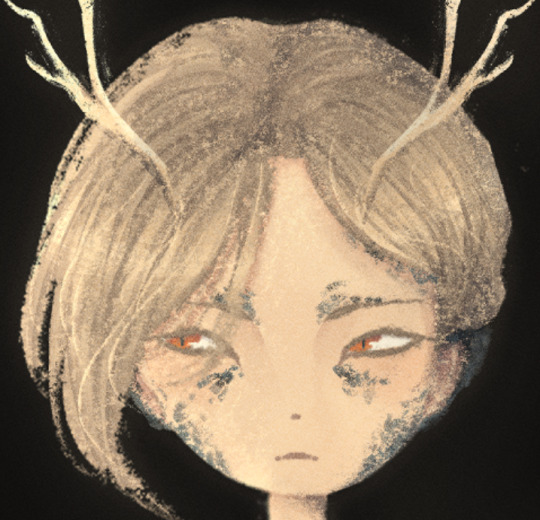
I also wanted to take this opportunity to talk about some of my headcannons for how Hell's fashion works since I've had this on my mind for a while. So ever since I refined my own design for Zanmu, I really liked the idea of having there be some connection between her and Satori in their clothes because they're both the defacto "leaders" of their respective Hells, and then I had the idea of having Hell's fashion trends mimic real life history where it mimics whatever the upperclassman are wearing in someway? I've always been really fascinated with the idea of how Modern Hell works as a society and also how Old Hell was impacted by it's abandonment, and while I am aware that the animal realm isn't exactly Hell and is moreso it's own thing right next to it, I imagine that there would be some overlap in the fashion and culture due to their close proximity to each other. Of course, I still kept a lot of elements in from Yachie's original design, the only thing I really added to the outfit was the jazzed up sleeves and the bottom of her shirt as well as those cool triangle things ZUN added to her shirt in 19. I also have her some nice and sharp nails since I thought they fit her. I also tried adding some scales onto the tips of her ears though tbh IDK how well they read. Her colour palette also ended up becoming a lot more teal than I had anticipated, but I honestly like it as I love it whenever people make Yachie's colour palette and design a lot more teal. I also wanted to try and differentiate her face from Saki's, though I do plan on experimenting more on how to avoid same face syndrome, as it's a problem that haunts me in my dreams. There's not really much I can say here aside from "hee hee clothing rendering go brrrrrr" and how the Clip Studio Paint charcoal brush is really all you need for any given piece and it is literally the only brush I use aside from the occasional airbrush for lighting (sometimes) and the blend tools. I've been doing a lot more simple character art recently and I've just been waiting for a cool enough idea for a full blown piece.
Though now that I've talked about some of my headcannons about how Modern Hell works, I really just want a Touhou manga spinoff about Modern Hell. Like, please ZUN I'm begging you, just do it, it would be so fucking cool because Touhou 17 is literally the only time in modern Touhou when we've been to Hell proper, does modern Hell have any settlements of Oni and other Youkai? Does it have cities? Towns? Villages? What's the technological level of Hell? How do they keep sinners from pulling a Touhou 17 and summoning a fucking god to save them? Where do all the characters associated with Hell as of right now fit into everything? You can't just drop a character like Zanmu who is stated to essentially be the king of fucking Hell and then not elaborate further on how she fits into the general framework of Hell! Is she officially the king or is this more of a "true mastermind using the official king/ruler as a puppet" type deal? How does the Animal Realm fit into all of this? Did Hecatia purposefully create Hell so it would be right next to the Animal realm? Did it just appear there on it's own once Buddhism started popping off on Earth or was it established once Zanmu established Modern Hell? How long was Keiki a problem for, and how did that affect the rest of Hell? Seriously there are so many unanswered questions here and I don't know if I just need to read an interview Zun had where he was asked these same questions and if so please tell me because these questions have all been stirring in my brain for quite some time and I really wished we'd just get a new fucking manga instead of going over the same settings in Gensokyo over and over and over and over again dear god. Like, I get that there's still a lot to explore with what we already do have, but it would just be really nice to see the Animal Realm get a little more explanation as to how it fits into the overall grand scheme of Gensokyo's worldbuilding because that would just make such an already interesting idea for a setting in Gensokyo so much better.
I'm hoping to get the drawing for Keiki done before Touhou 17's 5 year anniversary, though I am willing to postpone that and take my time on it and I also have something coming up where I won't have access to my main drawing tablet for a while so it might be a while until I post again, maybe, who knows, consistent posting schedule? Who are they, I've never heard of them. I do fully intend on talking about my thoughts on Touhou 17 though, even if it's a day or two late, it's Touhou 17's birthday month so it still counts! Also because out of all the Touhou game anniversaries, this is the one I care about the most because Touhou 17 was the first Touhou game I played and 1CC'd(???) on normal, and even though it has plenty of flaws (i.e. the many missed opportunities for it's gameplay, how unbalanced the mechanics are and also screen visibility), I'm always going to have a bit of a soft spot for it and I think that the game's strengths make up for some of it's weaknesses in my opinion.
147 notes
·
View notes
Text
NOW THATS WHAT I CALL TECHNOBLADE—techno head part 3!
it cannot be understated how much airbrushing saved this project and saved me from insanity.


one of the design elements i was really interested in including was golden scarring. the first thing i’m wearing him for is actually for a butcher army shoot in february, and the headcanon of techno having scars from the anvil and them being gold because of the totem magic has always been super appealing to me—so of course I included them here!
i sketched them out beforehand, and shaved them in with my literal pet hair shaver to give the scars some dimension.
next up came starting to airbrush! i started out focusing on the actual rut of the scar, using a couple different browns and pinks to create depth, which i then used to accentuate all of the fun wrinkles and nooks and crannies on his face.

this little bit of dimension absolutely did WONDERS for making him look finished, realistic, and saved me from losing my shit about him looking bad or weird.
unfortunately that could not save me from my own clumsiness.


at this point i knocked over a cup of watered down airbrush paint onto the back of the head. luckily it was on the back, because that made the successive removal and replacement of the fur panels that much easier. it was definitely tedious and time consuming, but frankly it could have been so so so much worse, if it was even on the front of the head instead of the back.


still, we persevere. i finished airbrushing the face and brows, and added gold into the scar. i later add a brighter gold than is pictured here to make it pop even just a little bit more.
i also added in those finished tusks, now with jewelry made from foam clay—which is just a clay like substance that dries down into a texture like eva foam! it’s super super nifty and is definitely a material i anticipate using a LOT once I get to working on the armor. maybe.
altogether, despite some bumps, i’m INSANELY happy with how well the head turned out, and this isn’t even anywhere near all the accessories he gets eventually. i think those are next, and after that we’ll take a look at his paws hooves!! :D
41 notes
·
View notes
Text
IGNIS WOOO IDIA WOOOO SHROUD BROS WOOOOO I'm gonna draw them with Ortho as Isha next meow meow ARCANE GET OUT OF MY HEAD ARCANE GET AURGJEJE GET OUT OF MY HEADDFQIKSUWHWJSBS


+ a SUPER OLD edit of the Shroud bros together bcs I think they are silly (I'm so gonna have to remake this soon but this time with Ortho in the middle WOOOO)
NOTE: I **HEAVILYYYY** referenced the Arcane poster, the liquify tool saved me sm + I only used the felt tip pen + airbrush for this yippeee I'M NOT TOO SATISFIED BCS U CAN TELL THAT I GOT LAZY 😭
#twisted wonderland#disney twst#twst wonderland#twst#twst oc#shroud brothers#ignis shroud#twst ignis#twisted wonderland ignis#idia fanart#twst idia#twisted wonderland idia#idia shroud#twisted wonderland fanart#twst fanart#arcane#disney twisted wonderland#twst oc art#twst original character#twst ignihyde#ignihyde
25 notes
·
View notes
Note
Yo! Do you have any notes/tips for your coloring process? I've always had trouble with that part of drawings looking good lmao and I really like yours! If not for your specific style, do you have any tips with that in general?
Iv gotten a few asks about how I color but iv always avoided answering because
A) I am absolutely awful at explaining things, and
B) I am a very Very lazy artist you should probably Not do the things that I do
BUT i feel bad gatekeeping(?) my horrible technique if it helps anybody ig ill try and explain so
✨✨✨Welcome to Reegis’ Probably Not Reputable (But Very Long Winded) Art Advice✨✨✨✨


line art of a random character for the example, just pic whatever colors you have in mind for your base colors, you can try using palette generators or basing it off of existing palettes/characters/whatever I have absolutely no idea how color theory works (& this is why you shouldnt listen to me) so im solely going off of vibes. but it is Rough so onto step 2 & 3
(edit to add i usually start off with the skin hair & clothes on separate clipping layers and merge them together towards the end.. i think i forgot to say that at all here oops)
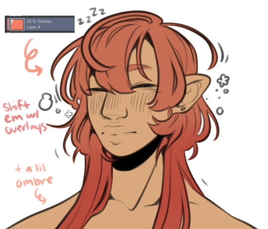

I abuse the hellll out of layer blending modes. overlay, saturation & multiply mainly, but also difference, brightness & screen. (just doodle something & try all of em out to get a feel for them honestly ik theres a Lot and they can be intimidating) for this i just wanted a more cohesive warmer tone to start with so i added a peachy overlay & a slight ombré to the hair to add a bit more interest to the character.
then just the most basic of rendering, some blush & highlights just wherever i think theyd go.


Another thing they tell you Not to do, my next step is to block out all my shading in a vaguely purpleish multiply layer!!! i cant be assed to do it any other way im sorry…. once i have the basic shading down, i lock the layer & go in with air brush eraser & also airbrush in other colors wherever I think the purple is maybe too harsh/clashing
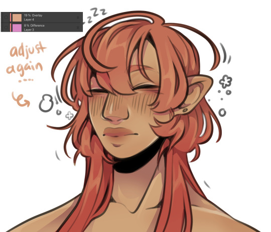
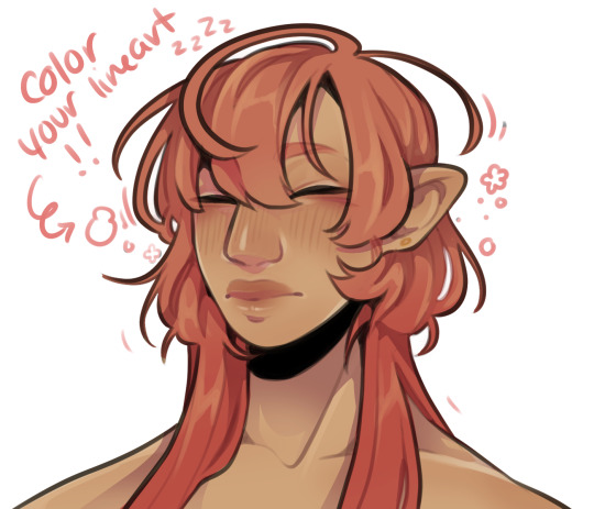
still wasnt 100% happy with the colors so messed around with some more layer filter/modes/whatever you call them then colored in my line art! i think this is honestly the saving grace for all of my art shshsdhhf color your lines people. doesnt have to be all (i dont, i like the contrast) but it usually helps to make some at least a little less harsh
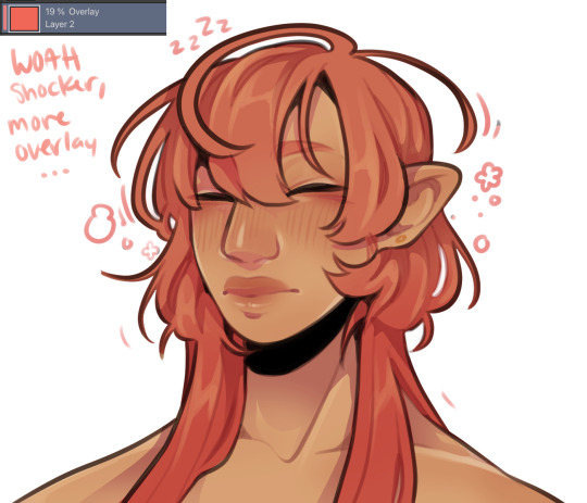
then with a little more color tweaking im done! one random sleepy dude, fully colored (by my standards)
and then if a piece needs more dramatic lighting you justttt
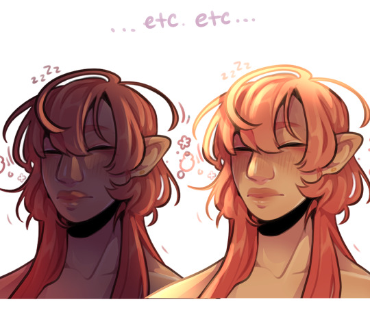
im so serious play around with layer settings! these are just basic multiply & add(glow), there as so many others you can abuse the shit out of & nobody will know or care in your finished piece.
was this?? in any way helpful???? I hope so.
#THIS IS A BELATED ANSWER FOR ALL OF U MY B#scrolled back to find the earliest one i could bc i mean… you asked first#if this was in Any way helpful…. im glad#and also sorry. probably dont do these things#hmu if youd like me to clarify anything ill… do my best#asks#my art
118 notes
·
View notes
Text
Long Post Abt World Eaters

Working on some World Eaters now. This guy is ready for oils and enamels. I did the armour by stippling with an old brush I have cut specifically for stippling. I did a grey primer and then stippled Celestra Grey, Celestra Grey/white, and then white in limited areas. Then I glazed some blue in the shadows to make the white more vibrant and strictly on the cool spectrum (more colour information is usually more interesting). Difficulty with this method is making sure moisture of brush is removed after thinned paint is applied to brush.
This recipe only took maybe 30 or so minutes to do a majority of the work. Usually my airbrush hits the executive dysfunction part of my brain and makes actually completing a miniature difficult. Taking it from airbrush station back to painting station back to airbrush for varnish back to painting station for oils. Well I've been using oils without varnishes and fine so far.
If I were to do a warm white I'd do less steps on the basecoat and really more on Burnt Umber oil wash. I wonder if I can do something similar with Paynes Grey. Could be an experiment.

This is the same mix but done with drybrushing. It's alright. Not sure which I like better. This one looks more like typical drybrushed crap texture so maybe I'll try tapping the actual brush on a damp sponge.
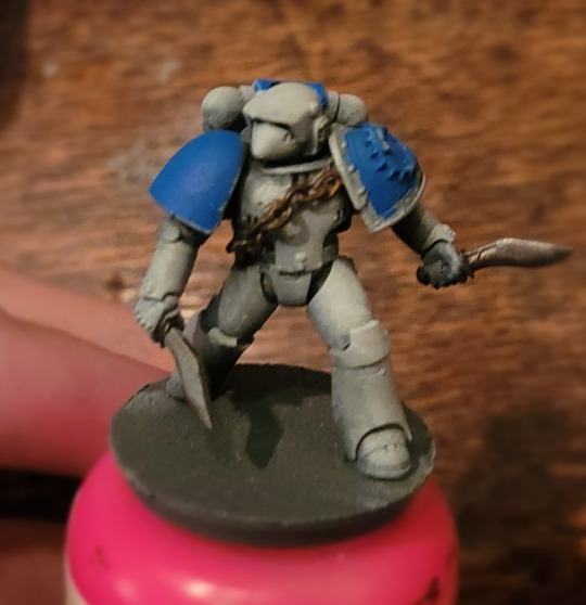
This is what it looks like as a wip, that horrible texture is less apparent. Still gave trim and blue glazing to do.
Both these look better than my older stippled WE imo
The one on the left is stippled. There is a big contrast in the shadows to the light areas. Just a diffe4ent look that I don't prefer. The one on the right is done with the airbrush.
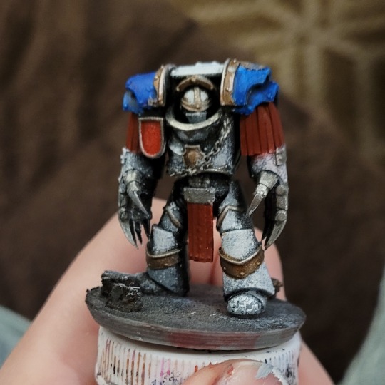
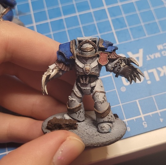
Looking back a lot of those World Eaters I did don't spark too much joy. Maybe it's just the place in my life I was in at the time. Just bad feelings about them. Learned a lot about painting white though. And hey that Cataphractii on the right above is quite good imo and one of the only Cataphractii I've done that looks good. Those models are not fun to paint for me. They give me the ick. Don't like their shapes. Not friendly to my autism.
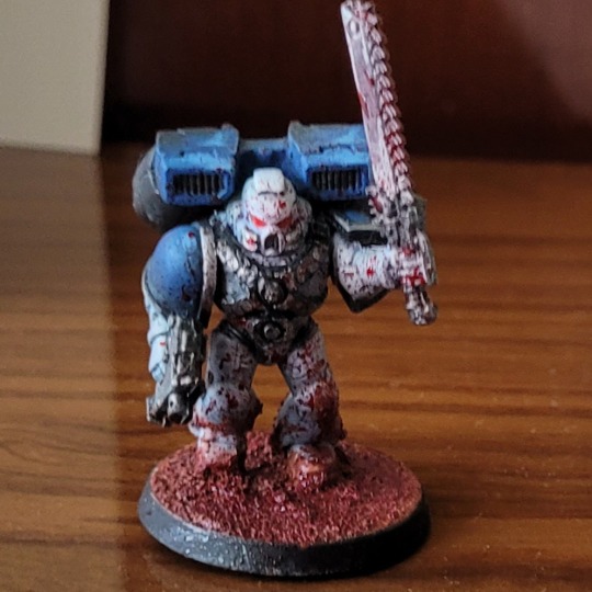
As a throwback here is my test model for my World Eaters, the first one I did ever as well as the first model where white was the main colour. The second model I did was greatly improved and was a gift for the girl I just started dating at the time and ofc us being still together I credit to my amazing skill in painting.
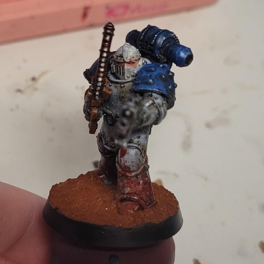
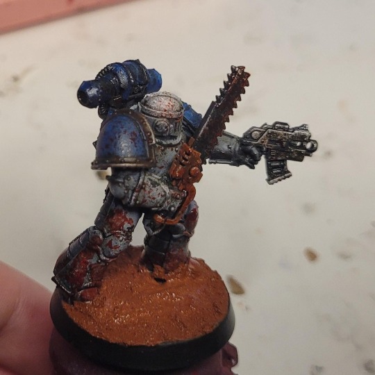
This of course in an amazing way fits the grimdark styling of 30k and I quite like it overall. I used a burnt umber/lamp black oil wash and learned the lesson of just how much an oil wash can darken a colour of a piece and progressively over many minis learned to push the white highlights higher and higher to fit my preferences. The Chainsaw is orange because of Chainsaw Man.
I think I'll start posting more of my old minis and projects and such. I have many pictures saved up.
I've been in a good groove with my hobby lately. Time away from painting has given me space away from my habits and a new perspective, learning to detach from old ways and learn new ones.
#warhammer#warhammer 30k#kitbash#horus heresy#3d printing#3d model#model painting#mini#tabletop miniatures#miniature painting#mini painting#miniart#my crafts#world eaters
29 notes
·
View notes
Text
Dioramas - John Price x GN!Reader
NSFW at the end, minors & ageless blogs dni cw: brief smut at the end, implied hand kink (Price has one, fight me) | that's it, i think
Thinking about Price and his diorama-building S/O. He has an entire bookshelf in his office on base that is dedicated to the miniatures you make. You’ve made mystical woodlands inside gutted old books and underwater horror scenes suspended in small resin cubes. You often do your work in the second bedroom of the house which had been converted into your art studio. It was too small to house the many tables and tools you’d need to build bigger dioramas, especially the ones that required a 3D printer, a fume hood, a place to airbrush and spray paint, and so on.
It doesn’t escape John’s notice that you’ve been itching to work on bigger projects. When you’re restless at night, you turn on resin-casting and diorama videos to fall asleep to. It creeps him out that the videos with the suspenseful music and horror elements are the ones that put you to sleep fastest but at least you manage to get some sleep.
Being the acts of service man that he is, John starts saving up money to add onto the house or to build a comfortable, livable shed out back for your art studio. He’s hiring the guys to help with the building (he ‘hires’ them by promising good food and says he'll cover their paperwork for two months). Everything you need is put into place: fume hood, windows that promote good circulation, bright lights that can be dimmed, their temperature changed to ward off headaches or strain. He finds the most trustworthy 3D printer, airbrush set-up, and sander and buffer he can and helps you set everything up.
You try desperately to teach him how to use the 3D printer, but he gets too frustrated and tells you he’ll stick with sanding and buffing whatever you need him to. He asks for videos and pictures of your most recent projects when he’s deployed or when he’s staying late at the office (bonus points if your hands are shown, he's a fiend for your hands).
He loves your mind, your creativity, the ability you have to look at something—pictures or drawings for instance—and bring the scenes to suspended life. There’s a science behind mixing the resins, letting it set, picking the tools best for the job, measuring everything perfectly…
He can’t think about it for too long or he gets aching hard and desperate to pin you down on your worktable so he can fuck you while you babble on about your newest project and the progress you've been making.
[This was all purely indulgent. I need to learn how to use resin and get my hands on it, I wanna make so many things!]
#john price x reader#john price x you#john price x gn!reader#price x gn!reader#captain john price#price x reader#john price cod#price cod#mars' writing#john 🤝 me -> turned on by hands and skill and a sprinkle of science
20 notes
·
View notes
Text

Gotta Be Somebody-Part 11
Angel Reyes X Reader
*~*~*~*~*~*~*~*~*~*~*~*~
Once I was finally dressed, I walked out to see Coco leaning against my kitchen counter, a shit eating grin on his face as he shoved bacon in his mouth.
“What’s so important dad needs me there so damn early?”
“You’ll find out soon enough, Chica. Now let’s go.”
“Do you know anything about this?” I asked Angel, pointing a finger at him. He quickly shook his head no.
I groaned and grabbed my backpack from beside the door. I made sure everything I needed was in it and slung it on my back.
“I’m riding with Angel.”
“I know. I’m just here to make sure you get there.” Coco said walking out the door.
I rolled my eyes and locked the door behind us. Once downstairs, I climbed on Angel’s bike, putting my helmet on. The three of us headed off towards the clubhouse. I smiled as we passed all the shops. It was good to be home. We stopped at the light and I looked over to my right.
“Hola Filipe!” I yelled and waved.
He looked up and smiled. “Hola, hermana!” He waved back, flipping his paper down he was reading.
We took off again and before long we were rolling up to the entrance of the clubhouse yard. Manny nodded with a smirk and opened the gate. What was inside made me gasp.
Every member of the Mayans was inside. The lot couldn’t fit another bike. Standing on the porch was Marcus and my dad and the other guys. Angel backed his bike in and we got off, him slinging his arm over my shoulder as we walked.
“Okay, what’s going on? Everyone is here. Not that I’m not happy to see them.” I asked dad and Marcus.
“We wanted everyone to be here to welcome you home. Besides, the guys wanted to thank you for what you’ve done.” Dad said, wrapping me in his arms and kissing my head.
“There’s also something we need to discuss.” Marcus said. I turned my attention to him.
”(Y/N), you done something for us that we cannot ever repay. You saved each of us. You risked your life to take out the leader of the Los Olvidados, and for that, we’re grateful. What we have with Galindo is our way of life. So, as as thank you for what you have done. We have decided the only thing to do.”
Angel left my side to walk up next to dad as they walked to Marcus. They turned around and brought forward a leather vest. Angel held the vest out to me. I gave them all a questioning look.
“As our way of saying thank you, prima, it has been decided by every charter of the Mayans that you become an honorary Mayan. This means you get to wear a kutte and ride with us.”
Dad placed patches on top of the kutte. I was given the Mayans patch for my back and an “Honorary” patch to put at the top. I was also given smaller patches for what home charter I was a part of and one that said ‘Hija de Dios’ and ‘Protector de la Vida’. (Daughter of God & Protector of Life)
“En serio?” I asked, tears in my eyes.
“Si. You’ve earned your place, prima.” Marcus stepped down and hugged me.
The girls took my kutte and patches and began to sew them on for me.
“Oh, there’s one more thing.” Dad said. He nodded to Gilly who nodded back and disappeared.
As soon as he and Coco come around the corner I gasped. “You’ve got to be fucking kidding me!” I ran over to them. “Is this my girl?”
“Yeap. Me and Coco here gave her the paint job you wanted from your blueprint drawings. We fixed all the minor things and she runs like a champ. No one has rode her yet. She’s been waiting on you.” Gilly explained.
You ran your hand over the (Y/F/C) paint and the new leather on the seat and saddle bag. Stiched into the side was a Mayan emblem. As you walked around you found “Little Losa” airbrushed on the tank. The intricate detailing of your favorite flower hand drawn down the side.
You grabbed both of them into a hug. “Thank you guys!”
“No problem, chica. Besides, Angel over there made sure it was in tip top shape for you. He wouldn’t let anyone tinker with it but him.” Coco whispered.
I stepped away from them and turned to my family. I was full on ugly crying at this point but I didn’t care. These men have seen me grow up.
“Mi amor.” Angel said behind me. He held out my kutte, ready with patches. I nodded and he helped me slip it on. I looked to my dad and Marcus.
“I will wear this kutte with pride and honor. It will never touch the floor unless circumstances arise. It will always hang beside my front door, ready to be worn any time I ride. I am honored to wear our family crest and name.”
“(Y/N) Losa, welcome to the Mayans, kid.” Dad said, a smile gracing his face. Everyone cheered and hollered. “Let’s take her out for a ride on the town!”
I nodded and smiled. Everyone gathered on their bikes and cranked up. When I sat on mine, I felt at home. I cranked her up and she purred. I gave her a couple of revs before noticing something.
“Coco! You’re a funny fucker! Putting adjustable handlebars on my girl!” I flipped him off as he laughed and rode out.
I looked at Angel. “Montemos a mi rey.” (Let’s ride my king)
He gave me a sexy smirk back. “Después de ti mi reina.” (After you my queen.)
We rode out side by side. Our Santo Padre charter rode through town for a few hours and back to the clubhouse. Once back, the other charters had the pits going with food and the ring set up.
“Are we having a party?” I asked, excitedly.
“For you, hija. And that ring over there, it’s set up for you to get back at Nestor for what he had to do to you before you went under.” Dad said, lighting a cigarette.
My eyes widened and I smirked. “Oh yeah. I told him I’d beat his ass for that. I’ve got to go get ready.”
He chuckled. “Be back soon. Don’t leave us waiting.”
I nodded. I turned to Angel.
“I’ll be here when you get back. I’ve got to help set everything up for you, corazón.” He pulled me in and kissed me.
“Okay. I’ll be back soon. Te amo Angel.”
He gave me that sexy smirk. “Te amo, amor.”
*~*~*~*~*~*~*~*~*~*~*~*~
🤭we’re almost to the end! Just a couple more I have planned! The next one is my biggest planned one yet!! 🤭
@ravennaortiz
@spnaquakindgdom
@meera10
#mayans mc#angel reyes#mayans x reader#angel reyes x reader#mayans imagine#angel reyes x you#angel reyes fanfic#angel reyes fic#angel reyes fanfiction
14 notes
·
View notes
Text
Restyling G3 Lagoona: A Saga
I like Lagoona's makeup and theming in G3, but boy do I hate the shade of pink chosen for her. So I've been on a year-long journey to customize her to my liking: trying to cover up the pink as much as possible, and make her fit my style. (If I had the skills to airbrush her blue and repaint her face, I would -- but I definitely do not have those skills.)
This is my first Goona; she's Skulltimate Secrets series 1. I really liked her octopus shoes, jacket and shorts. Gave her a fish hook lip piercing, painted more scales on her face (using a toothpick and acrylic paint), and dressed her in an OMG fishnet bodysuit.

The fish hook piercing may be the single best idea I've ever had.
[cut for length]
Then the Monster Ball line came out and I fell in love with her dark makeup and OTT 80s vibe. So I got Monster Ball Goona, sold Skulltimate Secrets, and did some more customizing. Of course she got a pierced lip. I tried out a different method to make the scales (acrylic paint over mesh), but I don't like how how it turned out. She looks okay irl, but in photos she just looks kinda grimy.

I kept dressing her in purple, sea-themed things, based on the Monster Ball accessories. I don't hate this 'fit -- in fact, I quite like the purple -- but it wasn't wowing me.
I was gifted Clawdeen clothes, so I tried Goona in a moon shirt, gave her some more jewelry, and put her hair back up. I also scrubbed off some of the silver paint, and it's still not great but I think slightly improved.

Once her hair was in the side ponytail, I realized we needed to lean into the 80s, while still keeping her leg fins and sea monster accessories.
So I spent the day leaning ALL the way in on restyling.
First attempt:

I like the animal print bodysuit, denim jacket, and shoes; don't like the shape of the skirt (though I do like the color). Based on my light research, she needs more layers and accessories, and preferably some lace, fishnets, and bows.
And finally here she is, in her hair metal/Cindy Lauper inspired look!

Miss Fish cannot look at the camera to save her life.


Not only does she have a better 'fit now, I was also able to use pieces that I hadn't been able to style. Putting Lagoona in red was definitely not what I would have picked first (or second, or third, based on my many restyling attempts), but it works!
Outfit details, top to bottom: Accessories Hair bow is OMG Rocker Boi's scarf Earrings are G1 MH Kala Mer'ri (they fit perfectly) Pink choker is ?? Shark tooth necklace is Skulltimate 1 Lagoona Belt is OMG Ferocious Metal bracelet is Barbie Fashionista #146 Bubble bracelet is her own Clothes Jacket is OMG Melrose Bodysuit is OMG Ferocious Dress is OMG Alt Grrrl Socks are OMG Punk Grrrl Shoes are SH Uma Gloves are SH Moral of the story: don't be afraid to try a random pile of clothes and accessories on your dolls.
12 notes
·
View notes
Text


Next model slated for repainting is this guy! I wanted to get some good "before" pics, since I forgot to do that with my last Lord conversion repaint.
Not gonna lie, I'm actually pretty proud of the paint job I did all those years ago. I really don't hate this model and I love the little conversions I've done. This will be a little tricky...
Like the Lokhust Destroyers I just finished, I definitely want to keep the coolers the same, but make them look less flat with the airbrush. As you can see, I actually tried to add some texture to the flat purple area by making it look like wailing souls... I'm not sure what my intent was there, but it was 15 years ago and I was trying something new.
The guardsman he's about to skewer? 🍡 That guy I'm probably just going to mask off and save as is. The more I look at him, the less I think I'll gain from repainting him.
The base will most likely be switched out as well. B as much as I love the bisected guard under him, the base doesn't fit my other bases, so I'll be swapping it out for this one that I did a while ago :

It fits the rest of the army, it still features a dead enemy, and it's coincidentally the same size.
Let me know what you guys think!
27 notes
·
View notes
Text

OCtober 2024 day 26: community
We're ending my mad drawing speedrun with @melonchanverse's Kaguya in assassin gear! I'm a major sucker for the assassin's creed asthetic and I always wanted to draw it, so I yoinked Kaguya for a bit since she's from an assassin family. I hope I did her justice 🫡
reference
Finding a reference for this was kind of a typical Lix fail because I was looking and searching and despairing because I couldn't find anything that matched the vibe I wanted on pinterest. Only to check my saved pins on accident TO FIND THE PERFECT REFERENCE THAT WAS LITERALLY THE LAST PIN I SAVED!
*major facepalm*
Well, at least I found it again because it allowed me to actually draw the vision. Because I still need references for fullbody or near fullbody drawings otherwise I will fuck up the proportions.
Anyways, I decided to completely switch my lineart to that new brush I'm using because I really like the inking effect so much and this piece was kind of an experiment if it would look okay together with my usual colouring style. And it does! So I will use it even if i don't do gradient airbrush colouring. Honestly I really didn't do much here for shading and highlights too I just used the airbrush on the flat colours because I was lazy but it still turned out great, so I'm satisified with this.
Surprisingly I didn't despair as much over the colours in this one compared to Apple's dress even though I needed to juggle a lot more colours with the assassin outfit. It probably says something about me that I can colour the murder outfit better than the pretty dress lmao.
18 notes
·
View notes