#sans-serif font characters
Explore tagged Tumblr posts
Visit Tumblr Blog
Explore Tumblr blogs with no restrictions, modern design and the best experience.
Last Seen Tumblr Blogs


Fun Fact
Mobile US users spent an average of 115.8 minutes on Tumblr app monthly.
Text

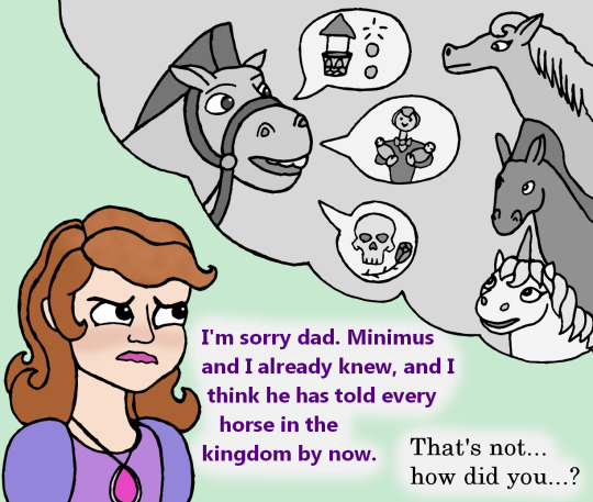


This was originally meant to be a 100% goofy funny comic, but somehow it turned into angst halfway through. I still think it's funny that Minimus canonically learns the truth before Amber and James though.
(And thanks to @ograndebatata for helping me rewrite the script to be more fitting).
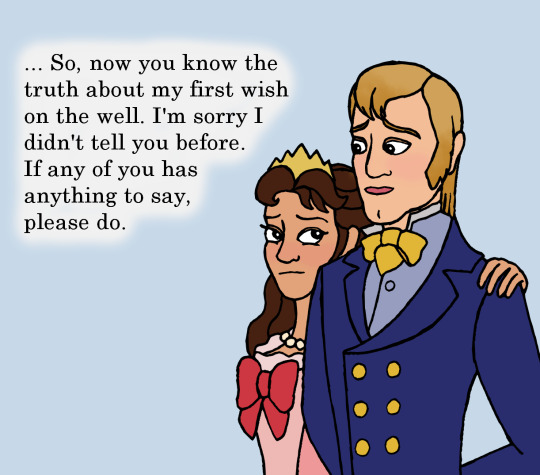
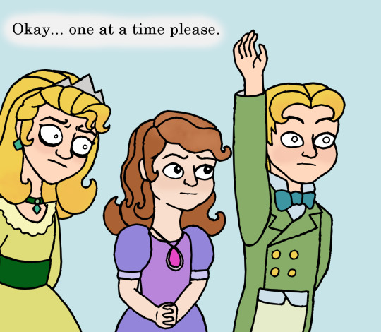
Comic Script: Roland: … So, now you know the truth about my first wish on the well. I'm sorry I didn't tell you before. If any of you has anything to say, please do. Roland: Okay… one at a time please. James: Does this mean I'm half-wishing well? If someone put a coin in my mouth could I grant their wishes? Roland: WHAT?! NO! Absolutely not! Sofia: I'm sorry dad. Minimus and I already knew, and I think he has told every horse in the kingdom by now. Roland: That's not… how did you…? Amber: Daddy… does that mean I could have killed Sofia when I turned her into a cat? Would she be dead because of me? Roland: No Amber. That wouldn't have happened. Don't worry, no one got hurt. Amber: But Sofia almost was! Roland: But she wasn't. She's alright. All of you are. I'm sorry I only told you now. but please remember we both love you all very much. And we'll all get through this together.
#Sofia the First#sofia the fandom#king roland#Queen Miranda#princess sofia#Princess Amber#Prince James#wish granting water feature#Minimus#stf#a-lilacsong art#my art#digital art#My Comic#king roland ii#sofia the first spoilers#Writing a comic is the hardest part of making a comic so I typed all the words instead#which made re-visioning far easier#I also decided to give everyone a different font to speak in because I thought that would be neat#if you were wondering the fonts are all bold and are as follows#Roland II: Century#Amber: Times New Roman#James: MS reference sans serif#Sofia: Ebrima#I just think it would be so in character for Sofia to be worried about horses knowing a secret that they shouldn't know#meanwhile Roland just would not see that as a problem at all he would definitely tell her that it's actually fine#also the next time James meets up with his friends he's going to get them all to test out whether he can grant wishes or not
90 notes
·
View notes
Text


I had some screenshots saved from when I played this game back when this route came out and I realized the small changes they made since then (Left: taken in 2018 Right: taken a few minutes ago)
#prince's gaming tag#im mainly talking about the text box and font choice here and I do think they improved it#the serif font is too small and hard to read compared to the sans serif font#also the text box isnt just a semi transparent black color it matches its semi transparent character color now#some changes are bc i played on a different sized phone back then so the screen isnt as big#but the text box is at the bottom instead of hovering an inch off the bottom#kinda miss that bc ill miss the characters expressions sometimes bc i was too busy reading and cant see them from my peripheral#tho I think they did change where the character stands on the screen i dont think that was just bc of a screen difference#you know i think i was missing the expressions anyway when the box was hovering so having it at the bottom was for the best#bc it does look a bit awkward like that
2 notes
·
View notes
Text
so i have a story
ok, ive finally made up my mind and I'm gonna post. If it kills me.
So I have this story.
Set in a faraway land.
A desert land, a plains land, her people much beloved by the gods.
And, 100 years before the start of our story, there was a king of a desert land, the bridge between mortals and gods. He was much beloved, and loved much.... perhaps too much.
When his beloved was murdered, he despaired, and decided he could no longer bear the weight of living, and cut himself from the Land of Life, inadvertently destroying the link between the Godsrealm and the Mortal realm.
Now, there were many gods, that loved the mortals, and in the tradition of this country, they chose the leader from among their prophets, but now that they could no longer reach the mortals, and so the country languished. Bereft of both spiritual and political guidance.
The priests heard not their gods, and the Dreamers Dreamed no Dreams, and the Prophets saw not the future.
Into this gap, stepped a council of elders to be a regent until perhaps the elder gods could reforge the links
And so lived the country for several generations until not one remembered the Gifts of the Deathless Prophet-Kings, save in songs
Until a boy suddenly began to Dream.
#teasers#spills the tea#writing#original story#tentatively titled#Serif#OH NOOOOOOO#I JUST REALIZED I NAMED A CHARACTER AND MY BOOK AFTER A STUPID FONT#i guess im legally mandated to write this stupid thing in sans serif now
4 notes
·
View notes
Photo

made this little demon guy :0
#his name is zerif#because the impact font is sans serif#idk man hes a weird little guy i love him so dearly#character design#digital doodle#jup attempts to queue things#digital art
3 notes
·
View notes
Text


Description and a bit more info under the cut.
A series of green, blue, and red graphics using a nice sans serif font and a Zelda display serif font with white and gold as accents.
First picture. 2024 Linked Universe Fandom AO3 Wrapped, presented by Mina, @zarvasace. (That's me!)
As a fandom, we wrote 2,273 fics in 2024
That's over 6 a day every day this year!
In smaller text below: Counting only fics tagged with “Linked Universe (Legend of Zelda)” on AO3. Counting all fics last updated from Jan 1, 2024 to Dec 31, 2024. Data pulled by hand on Jan 1, 2024 at ~2:00 AM GMT-7.
Next picture. Our favorite tags this year were:
1, Hurt/Comfort with 432 tags
2, Fluff with 352 tags
3, Angst with 335 tags
4, Not Beta Read with 260 tags. Here there is also a brief exchange in two handwriting styles. One arrow points to this tag with the remark, “perfectionists, much?” Another cursive hand replies “Be nice.” to which the first says, “no”
5, Legend-centric with 251 tags
At the bottom of this image is a piece of parchment. The scratchier handwriting says, “Ha, I'm the favorite. Take that.” and the curlier handwriting replies “Not so fast, Ledge… we aren't done yet.”
Next picture. Favorite tags continued:
6, Blood and Injury with 230 tags
7, Wild-centric with 204 tags
8, Whump with 215 tags
9, Emotional Hurt/Comfort with 181 tags
10, Good Older Sibling Warriors with 163 tags. Legend's handwriting says “Din give me strength—” to that.
Section break, and a bit more: An average of 7.46% fics every month were tagged Whump. Except October, which saw a spike to 29.5%.
Next picture. Our favorite Links. This info is presented in a table, with names on the left and number of tags on the right, organized from most to least.
Warriors, 1408 (his handwriting says: HA!! I won something!)
Legend, 1398 (his handwriting says: BY TEN.)
Twilight, 1371
Time, 1323
Wild, 1217
Hyrule, 1151
Wind, 1143
Sky, 1137
Four, 1027
At the bottom is another piece of parchment. Legend says: “JUST TEN.” Warriors says: “Jealous?” Legend replies: “I don't know if being the favorite is a good thing.”
Next picture. Our favorite secondary characters were Malon (176 tags) and Racio (160 tags)
Section break. and the most popular pairings were Malon/Time (161 tags), Legend/Racio (89 tags*), Sky/Sun (66 tags).
At the bottom is the asterisk footnote: it's no secret that our fandom tags are a little wonky sometimes. This number adds together the works tagged “Legend (Linked Universe)/Ravio” and “Link/Ravio” where the work was also tagged “Linked Universe,” assuming that people would only tag one.
Next picture. 2024’s longest fic was: This is an Adjuration by @not-freyja (linked below).
Editor’s note: linked here!
With a total of 312,547 words. That's almost 971 a day!
Began July 14, 2023, Finished May 30, 2024.
Screenshot of the tag summary from AO3, showing a Mature rating, Gen, an archive warning, and complete.
Significant tags: Time Travel, the Chain as Family, Time Loop, Multiversal Time Travel, Temporal War Crimes, Chain Meets Chain, Chronically Ill Sky, Four Splits Into the Colors, Fairy Hyrule, Hyrule Has a Blood Curse.
At the bottom, Legend’s writing says: “That sounds like a lot of time travel…”
Next four pictures are a set titled Fandom Trends by month. Each month has, in order, a Popular Link, Popular Duos, Popular Genre, and Unique Tags, along with occasional handwritten commentary.
January: Twilight. Twilight & Wild. Hurt/Comfort. Crack, Soft Legend. Commentary: Warriors says “aww.” and Legend responds “I'm going to poison your milk.”
February: Warriors. Twilight & Wild, Twilight & Warriors, Legend & Warriors. Angst. Febuwhump 2024.
March: Twilight. Twilight & Wild, Time & Twilight. Fluff. One Shot, Linked Universe Discord Server’s 5th Birthday Gift Exchange.
April: Legend. Twilight & Wild, Twilight and Warriors. (Commentary from Legend: “wow Twi”) Fluff. Humor, Canon-Typical Violence.
May: Twilight, Warriors. Hyrule & Legend, Twilight & Wild. (Commentary from Legend, circling Hyrule’s name: “Finally some good taste.”) Fluff. Other Additional Tags to be Added.
June: Twilight. Twilight & Wild, Time & Warriors. Hurt/Comfort. June of Doom 2024, Sky-centric, Twilight-centric. (Commentary from Warriors: “Wait, doom?! Oh, there's Sky”)
Editor's note: congratulations to @somer-writes who singlehandedly got June of Doom in the top 10 tags of June. :)
July: Warriors. Hyrule & Legend, Time & Twilight. Hurt/Comfort. Twilight-centric. (Commentary from Legend: “leave some for the rest of us”)
August: Legend. Hyrule & Legend, Legend & Warriors, Time & Twilight. Hurt/Comfort. Crack, Fluff and Angst. (Commentary from Warriors: “I'm concerned.”)
September: Legend. Time & Twilight, Twilight & Wild. Hurt/Comfort. Sicktember 2024, Legend Has a Bad Time. (Commentary from Legend: “Excuse me?!” Warriors says: “I suppose your immune system is awful now.” Legend responds with: “ha ha.”)
October: Warriors. Time & Twilight, Time & Warriors. Hurt/Comfort. Whumptober 2024, Warriors Has a Bad Time. (Commentary from Warriors: “oh no…” To which Legend responds: “HAHAHAHAH”)
November: Warriors. Time & Warriors, Hyrule & Legend. Fluff. Crack, Good Older Sibling Warriors.
December: Legend. Hyrule & Legend, Twilight & Wild, Warriors & Wind. Hurt/Comfort. Families of Choice.
Parchment at the bottom has Warriors saying, “That's a nice note to end on.” Legend responds, “Not so bad I guess.”
Thanks for coming along with me on this fun stats journey! It's been a privilege to add to this fandom.
I thought about adding a section for ratings or prevalence of Gen fics, but I think you can guess that we’re a Gen- and Teen-heavy fandom. You can see my raw data and some more charts over on the Google sheet right at this link. Ha, link. :)
#linked universe#my art#sorta#ao3#linkeduniverse#Lu#fandom meta#fanfiction#lu fanfiction#Lu fandom#lu fandom ao3 wrapped#archive of our own#I stayed up too late making this#long post
877 notes
·
View notes
Text
My promised GF Au comic typography rambling 📝✍️
Mabel's Font
Her font is purposely very close to comic sans. The font is also bold with low lettering space to portray her childlike manner of speaking. She's also the main character in my AU so she gets a simple readable style.

Dipper's Font
His is similar to Mabel's by being bold and with less spacing. But with a serif style of font. Not only is it similar to Mabel's but it's very similar to Fiddlefords. This may seem like a more random connection, why not have his mirror Ford’s font. Because Dipper could've ended up like Fiddleford if he did take Ford's apprenticeship and I find that parallel super compelling.

Fiddleford's Font
Now I already explained the Dipper connection but the reason I gave him a typewriter style is because Fidds loves computers and tech. His is in contrast to Ford's cursive, Ford being more traditionalist with his journals and handwritten notes. Fidd’s because of his inventions and laptop.

Ford's Font
Now Ford's is a mirror to Stan's, a way to connect the two even through their differences. Both are a very handwritten style, Ford's cursive and Stans is normal script. Ford's is directly based on the font in the official journal 3. Plus we all know this dork speaks in cursive!

Stan's Font
Stans is very simple, his obviously mirror Ford's but is also connected to Mabel's. Both have a lighthearted feel and are very easily ready, portraying both are great communicators.

Bill's Font/effect
Bills is round and far more odd in comparison to all the others. He also has a rainbow/glitch effect on his text, it also affects Ford's text when possessed! His font is really just to show how supernatural and inhuman he is and to visualize his voice glitch from the show.
(Also bonus fact only Bill and the Time Tape have any color in the comic, it's to make it visually obvious when magic/science stuff is happening lol)(did I overthink this little comic? haha)


Thank you for coming to my unhinged typography TedTalk!
#arson ramble#mabel pines#dipper pines#fiddleford mcgucket#ford pines#stanford pines#stan pines#stanley pines#bill cipher#every little detail is mostly thought through in my comic#gravity falls#gravity falls au#timestuck au
178 notes
·
View notes
Text
Some Typographic Vocabulary
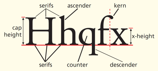
A limited terminology exists to describe the many kinds of typeface and typesetting in regular use. Among the important terms are the following:
Ascender - A part of a letter which extends above the height of the letter x, as in d and h. It contrasts with a descender, a part of a letter which extends below the foot of the letter x, as in y or p.
Bold - A type with very thick strokes, as seen in boldface.
Fount - The set of characters of the one size of the same typeface, including capitals, lower-case, punctuation marks, and numerals; also spelled font.
Italic - Characters that slope to the right, as in italic.
Justification - The arrangement of lines of text so that there are even margins. Left-justified setting is standard practice. In right-justified setting, the last character of each line is made to reach the right-hand margin at the same point (by adjusting the spaces between the letters and words). Unjustified setting has a ‘ragged edge’ right-hand margin (as in this column).
Kern - The part of a letter which overhangs the body of the type, as in the top part of f.
Leading - /ˈledIƞ/ The spacing between lines of type. The term derives from the former printing practice of separating lines of metal type by inserting strips of lead between them.
Ligature - Two or more letters joined together as a single character, as in æ and ff.
Lower-case - Small letters, as opposed to any kind of capital letters (upper-case). (The ‘cases’ were originally two containers placed one above the other in a printing house: the type for capital letters came from the higher container; the small letters from the lower.) Upper-case letters are divided into large capitals and small capitals (B vs b). Small capitals are similar in weight and height to a lowercase x. Large capitals are the height of an ascender.
Serif - A small terminal stroke at the end of the main stroke of a letter. A serif typeface is used in the main text on the facing page. A typeface with no serifs is called sans serif.
Sort - A single character of type. A special sort is one which the typesetter does not have routinely available in a fount, and which must be formed specially, such as a phonetic character.
Superscript - A small letter or figure set beside and above the top of a full-size character, as in x2; also called a superior. It contrasts with subscript, a small letter or figure set beside and below the foot of a full-size character, as in 3n; also called an inferior.
X height - The height of the printing surface of a small letter x.
These features would all form part of a graphetic analysis of printed language.
J. Butcher, 1992 ⚜ Source ⚜ More: Word Lists ⚜ Notes & References
#terminology#typography#writing reference#writeblr#dark academia#spilled ink#literature#writers on tumblr#writing prompt#poets on tumblr#poetry#creative writing#fiction#light academia#lit#writing inspiration#words#writing resources
161 notes
·
View notes
Text

ao3 skin that i made!! (copy code under "keep reading")
it's a messy combination of pieces of code from other people's skins and my own changes
the header image is NOT MINE! it is "Pattern Galaxy Space Planets Vibrant Linear Universe" by Arncil on Redbubble, which i just used as an example for an image you could use!
here are some of the skins that i can remember using as part of this, but i've been building it for years so forgive me if i forget some:
Shortening long tag fields by Xparrot (on ao3)
Slim Shaded by AO3 (on ao3)
Lily Garden by tealtiam (on Tumblr)
AO3 Tag category coloring! by ao3css (on Tumblr)
come back here to my tips or leave a comment if you need some help customizing the code!
Background color: #26303C
Text color: #CBC6C3
Header color: #46626D
Accent color: #993F33
steps to create a new skin using this code:
log into ao3 account
go to dashboard >> skins
click "create site skin"
make sure TYPE is "site skin"
add a unique title
copy all code below
paste into field 'CSS'
click on "use wizard" at the top
copy and paste the four colors written above into their corresponding boxes
click SUBMIT
click USE
how to customize this skin:
FONT SIZE: at the very top of the code, change the "90%" to be bigger or smaller to change the font size within a fic
MAIN COLORS: to change the main colors, select "use wizard" when editing the skin and replace any of the four hex codes under "Background color:", "Text color:", "Header color:", and "Accent color:"
SECONDARY COLORS: find all hex codes within the code and change those numbers as you like! i changed all colors to match with the color palette of the header photo that i chose to make it feel cohesive
TAG COLORS: towards the end, the "relationship", "character", and "freeform" tags alternate three colors to make them easy to separate. in this skin they are all very similar, so you can change those to be whatever colors you like!
HEADER PHOTO: find the link towards the end of the code right before the warning tags and replace it with a link to any photo you like! it loops, so you don't have to worry about sizing or anything
FONT: i'm unsure how exactly to do this, but the in-fic font is currently set to Georgia Serif, so i suppose just go find that and replace it with your preferred font!
BORDER STYLES: wherever you see the code "border-style:", replace the word that comes after it with one of these options: none, solid, dashed, dotted, double, groove, ridge, inset, outset, or hidden
WARNING TAGS: at the very end of the code is a list of words or phrases that, when they appear in the tags of a fic, are highlighted in a contrasting color so that they are easy to avoid if necessary. you can add or remove those tags however you like, or change the warning color!
COPY AND PASTE ALL CODE BELOW
#workskin { font-size: 90%; } li.blurb .tags { max-height: 7.5em; overflow-y: auto; } #header { min-height: 0; } #header a, #header fieldset, #header ul.primary, #header ul.primary .current { border: 0; background: 0; } h1 a img { height: 50px; border: 0; } #header .landmark { clear: none; } #header ul.primary { background: rgba(0,0,0,0.65); border-bottom: 1px solid rgba(0,0,0,0.75); } #header ul.primary, #header ul.primary .current, ul.primary.actions a, #header ul.primary .current { color: #CBC6C3; } #header ul.primary .current, #header #search input, #header #search input:focus { background: rgba(0,0,0,0.25); color: #CBC6C3; box-shadow: inset 0 0 3px #131A2A; border-color: #131A2A; } .actions, .actions input { text-transform: lowercase; } blockquote.userstuff { font-family: "Mido", "AUdimat", "Ostrich Sans Rounded","Lucida Grande", sans-serif !important; position: relative; background: rgba(0,0,0,0.1); padding: 2%; border: 1px solid rgba(0,0,0,0.15); box-shadow: 0 0 2px rgba(0,0,0,0.4); } blockquote.userstuff:after { content: "\201D"; right: 0; top: auto; left: auto; } body, .userstuff { font-family: Mido, Georgia, serif; } .heading, .userstuff h3, .userstuff h4 { font-family: "CabinSketch", Georgia,serif; } #main .heading { color: #CBC6C3; } #inner .group, #inner .heading, fieldset, .verbose legend, table, table th, col.name, span.unread, span.replied { outline: none; background: transparent; border-color: #131A2A; border-style: double; box-shadow: none; border-radius: 2em; border-bottom-right-radius: 0; border-top-left-radius: 0; } #inner .group .group .group, col.name { border-style: double; border-color: #CBC6C3; box-shadow: 0 0 2px #000; } #inner .bookmark .user.module, #inner .wrapper { border: 0; border-radius: 0; border-top: 3px double #bbb; box-shadow: none; } .filters { font-size: 90%; } .toggled form, .dynamic form, .secondary, .dropdown { background: #fff url("/images/skins/textures/tiles/white-handmade-paper.jpg"); } a.tag, a.tag:visited, a.tag:link { display: inline-block; padding: 1px 3px; margin: 2px 0px; border: 2px solid #46626D; border-radius: 5px; } .commas li:after { content: ""; } h5.fandoms.heading { color: transparent; } .favorite a.tag { border: none; } .tags li.relationships:nth-of-type(3n+1) a.tag { background-color: #1d3954; } .tags li.relationships:nth-of-type(3n+2) a.tag { background-color: #264663; } .tags li.relationships:nth-of-type(3n+3) a.tag { background-color: #305475; } .tags li.characters:nth-of-type(3n+1) a.tag { background-color: #214154; } .tags li.characters:nth-of-type(3n+2) a.tag { background-color: #294c61; } .tags li.characters:nth-of-type(3n+3) a.tag { background-color: #31576e; } .tags li.freeforms:nth-of-type(3n+1) a.tag { background-color: #234e54; } .tags li.freeforms:nth-of-type(3n+2) a.tag { background-color: #2a585e; } .tags li.freeforms:nth-of-type(3n+3) a.tag { background-color: #316269; } .tags li.freeforms a.tag:hover, .tags li.characters a.tag:hover, .tags li.relationships a.tag:hover { background-color: #26303C; color: white; } #header .logo { display: none; } #header ul.primary { box-shadow: none; padding-top: 30px; padding-bottom: 30px; background: #FCC191 url(https://i.pinimg.com/564x/8c/bc/ae/8cbcae1760dc88ae8730566337a5d2eb.jpg); background-attachment: fixed; } li.blurb a.tag[href*="suicid"], [href*="suicide"], [href*="Suicide"], [href*="rape"], [href*="Rape"], [href*="consentual"], [href*="Consentual"], [href*="non-con"], [href*="consent issues"], [href*="Kidnapping"], [href*="kidnapping"], [href*="Canibalism"], [href*="cannibalism"], [href*="Cannibalism"], [href*="Dove"], [href*="dead dove do not eat"], [href*="murder"], [href*="Murder"], [href*="harm"], [href*="self harm"], [href*="Harm"], [href*="Torture"], [href*="abduction"], [href*="asphyxiation"], [href*="blood"], [href*="Blood"], [href*="death"], [href*="Death"], [href*="gore"], [href*="Gore"], [href*="incest"], [href*="Incest"], [href*="trauma"], [href*="Trauma"], [href*="torture"] { color: #000000; font-weight: bold; background-color: #993F33; }
926 notes
·
View notes
Note
What are the 6 subtypes of skeletons? What traits do they have?-🍀


(Feel free to make your own skeletons based on this if you want. I think I'm gonna accept this as canon to the Skeletwins series too.)
More about the six types below!
Sans-serifs, the most common type, are the Average Joes of the skeleton population. The everymen, the majority, the crowd that sings in the background of the opening number of a musical or providing backing vocals to the protagonist's "I Want" song. The background characters, the NPCs, the- Oh, you get the point. They aren't white, but a more accurate bone-cream colour, and they're slightly fuzzy, but not that fuzzy.
Serifs are seen as the higher class. They are known for being business oriented, regal, formal and sophisticated. They are easily identified by the marks on their bones resembling full body tattoos. The colour of those marks depends on the colour of their magic, and their patterns depend on the font. For example, a Times New Roman would have a different pattern to a Garamond. They work really hard to make a better society for everyone, but can be quite snooty.
Slabs are the smallest subtype and arguably the cutest. They are very thin and very small, and are very good at fitting into tight spaces and working around there. Because of this, a lot of Slabs go into engineering and inventing. They are on the same level as the Sans-serifs, but they at least stand out a little more.
Impacts are the exact opposite of Slabs body-wise. They are large, tough, and the physically strongest subtype. Because of their build, they are often pressured into careers like wrestling, sports or being a guard, despite the fact that they are more likely to want to pursue a goal that isn't defined by their body type.
Moderns are the rarest type, and also the newest. They are very sleek and modern, of course. They are easily recognised by their almost metallic appearance. Since they often enjoy renovating and creating something new, they are likely to be the ones who could develop skeleton society the most. They are often pressured to make a name for themselves, and are often the gifted kids in school.
Scripts are adorable, snow-white, and the fuzziest subtype. Like Sans said, Scripts are the creative socialites of skele-society. A lot of times, they want to pursue creative jobs that range from painting to stand up comedy and everything in-between. They are also the most open-minded and affectionate subtype, and are quite likely to be pretty touchy. Sans and Papyrus are both Scripts.
Anyway, that's my AU LORREEEE. Remember, this only applies to the Skeletwins series, I don't think of this as canon to actual Undertale.
33 notes
·
View notes
Text
Red, White & Royal Blue Rebind


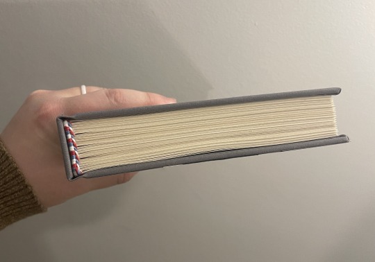
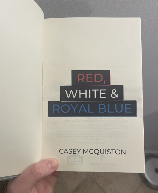


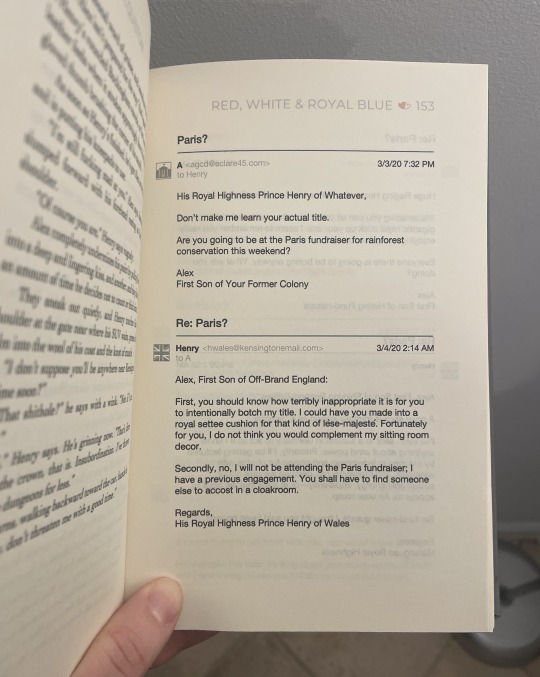

[ID: Eight pictures of a hand-bound rebind of the book "Red, White & Royal Blue." The first shows the cover, which has been bound in light gray bookcloth and is decorated to look like a suit with a union jack tie. There are two cardstock buttons, one that says "Vote Claremont" and the other that says "History, huh?" On the right side, the title "Red, White and Royal Blue" is painted on in red, white, and blue paint respectively. On the left side, the author name "Casey McQuiston" is painted on in white paint. The second shows the spine, covered also in gray bookcloth. It has the title "Red, White and Royal Blue" painted on in red, white, and blue paint respectively and the author name "Casey McQuiston" painted on in white paint. The third shows the book from the top so the headbands, sewn with red, white, and blue thread, can be seen. The fourth shows the title page of the book, which has the title "Red, White and Royal Blue" in red, white, and blue ink respectively, as well as the author name "Casey McQuiston" beneath it. The fifth shows the colophon page (left) and dedication page (right). The colophon has details about the book, as well as the binder logo for Blue Skies Books (a bluejay) and the logo for Renegade Publishing (a bookpress). The dedication page says, "For the weirdos and the dreamers" in a sans serif font above a black and white drawing of a reflective lake with pine trees around it. The sixth shows a chapter header page, which has a gray skyline that merges the skylines of DC and London across the top of it. The word "One" is in all caps in white on the lefthand side of the skyline, and body text is beneath it in a serif font. The seventh shows the inside of the book, drawing attention to the formatting of the emails throughout the book. The emails include icons for both Henry and Alex, email addresses, timestamps, and subjects. The eighth shows the inside of the book, drawing attention to the red, white, and blue heart page divider and the handwriting fonts used within the regular body text for certain words. /End ID]
When the Red, White and Royal Blue movie came out last year, I rediscovered my love for this book and these characters and just had to do a rebind of it! This is a full rebind, so I've done the typeset myself as well as the cover. I had a delightful time coming up with the cover design (I imagine this is modeled after a theoretical Alex suit, though it could be Henry's as well!), and I had an especially fun time doing the typeset. There are so many fun formatting elements in this story, and it was great getting to put my own spin on them.
Logistics-wise, this bind uses Lumeiere fabric paint and a Silhouette-cut stencil for the words, Silhouette-cut cardstock for the decorative elements, handmade cotton bookcloth for the cover, cotton embroidery thread for the endbands, and regular Hammermill cream paper for the textblock. (Once I've saved up for it, I'm looking forward to getting some short-grain textblock paper! This is still long grain.) The body font is Cochin and the title font is Montserrat.
And finally: my bind versus my trade paperback copy!
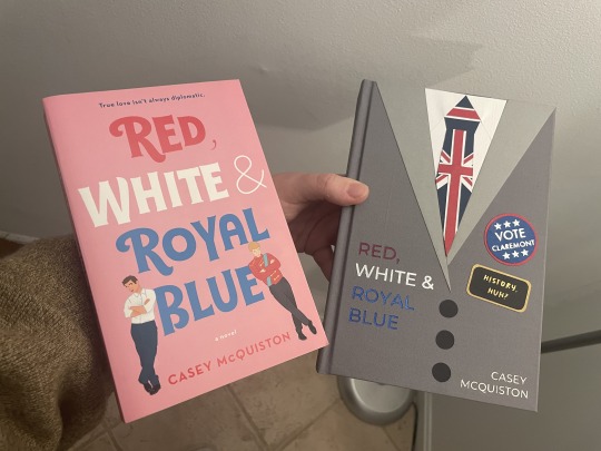
[ID: A picture of the hand-bound version of "Red, White and Royal Blue" from above held next to the mass-produced paperback version of the same book. They are made in different styles with different color schemes, but both have a fun and slightly whimsical appearance to them. /End ID]
181 notes
·
View notes
Text
I've been a little stymied and thus somewhat putting off work on the new novel, Simon's chef novel, not so much because I'm blocked but more because I wanted to get Royals/Ramblers put to bed and also I was struggling a little to determine the love interest for the story.
While I often tell the Shivadh stories from dual points of view, there's usually a character I think of as the protagonist and one as the love interest -- like in Infinite Jes we knew Michaelis but I had to build Jes (my initial conception of Jes was a trans woman but I had to shift that a bit for various reasons). I've been talking to you guys about this story for a while so I had a bit of market research I guess, which started fitting things into place, but last night was the first time I sat down and just kind of thought about it for a while, so I think I'm finally starting to get her built.
Someone had mentioned they'd love to see what I believe they phrased as "a salt-and-pepper butch" which I liked, and I've been meaning to introduce more characters of color, but I also knew I wanted her to be native Shivadh, so mostly I needed to work out how to navigate her heritage. I'm going to do a bit more research as I write, but I think I've established her as a Sephardic Jew of African heritage, her family having immigrated from Tangier sometime in the 19th century and still having familial links back to Morocco. She's a chef specializing in Moroccan-Sephardic cuisine opening a restaurant on the Promenade, a she/her butch around Simon's age (mid-fifties) who has basically worked in restaurants her entire life and is now finally getting to open her own. I really like the idea of her using fem pronouns but a male name, so I've been doing some research and I think it's going to be either Jacob or Elias -- I like Elias better but there's already Eddie and Ephraim, and I'm trying not to use the same letters for names over and over (M, G, and C are ruled out, too many of them already). I suppose I could go with the unorthodox spelling Ilias, but that looks odd especially with a sans-serif font.
Anyway, now the research fun begins! Time to come up with an appropriate name for her restaurant and then get cracking on the Meet Ugly (they meet when he accosts her for her ricotta and she tells him to get bent).
120 notes
·
View notes
Note
https://www.tumblr.com/museaway/746766290005508096?source=share
2,3,4,7,8,9,10,14,16,17,19,22,24,25,26,28
-🤔
[Warning: This is stupid long. Yikes.]
2. Character’s POV being explored:
Oops. My Incorrect Quotes don’t really have a POV. 😅 I think at most, I’ve explicitly removed a character from the end of a couple, to emphasize the joke through only the remaining character’s dialogue.
3. Feelings about current WIP:
I’m not happy with the end, so it might just sit there for a few more days until I figure it out.
4. Unwritten story idea:
I have a very rough outline of an actual fic! Future Wenclair, post college. It’s… super dark. Just a torrid angst spiral from Enid’s POV, where she begins to unwittingly choose her work and social life over her wolf and Wednesday, with terrible consequences.
I put it together last year, before I actually started writing anything. It’s unlikely to see the light of day, because I honestly don’t have the energy, attention span, and sequential periods of uninterrupted free time to try writing anything in long format. 😢 Maybe someday!
7. Preferred writing font:
Something san serif. I’d prefer one with a bit more letter spacing, but I’m stuck with Tumblr’s default font, Favorit-Tumblr.
8. If I had to sequel one:
Probably this old one, about Wednesday and her pet blog. I have ideas about reblogs and blog reproductive cycles.
9. Elapsed time for the last one:
Today’s took maybe 10-15 minutes from start to posting. I needed something short since I wanted to do my daily post before answering this Ask. My notes only read “Hard to swallow” and it basically wrote itself. It took just as long to find the right animated gif as it did to write it out. 😅
10. Longest rest for a draft before completion:
Intentional rest? I guess this one at 5-ish days, where the gang takes turns answering the question: What’s the best thing about dead bodies? I just wasn’t feeling the gang’s banter, so put off fiddling with it until it felt interesting again.
There’s normally scant delay between writing and posting. If I’m lucky, I might have 1 or 2 completed IQs waiting to be posted. I try to post at least 2 per day and I’m terrible at not posting one the moment it’s completed, so… yup. 😒
14. Inspiration source:
Primarily the fandom! I wouldn’t be able to write these if I hadn’t first read so many Wenclair fics that parodying the characters became possible. I really do rely on the community-created tropes and personalities to act as the skeleton upon which meaty puns are anchored.
16. Favorite place to write:
In my home office during work hours, where I can go mostly undisturbed, have a super comfy Steelcase Leap to relax in, music, and a tablet at the ready.
Yes, work hours. I tend to do my job quickly and well, but nothing gets those creative juices going better than having something else you should be doing. 😅
17. Writing and editing process:
Idea? Jot it down. Keep a list. Time to write? Check ideas. Pick one that looks fun. Write it. Nothing interesting? Uh. Do one of the following:
Look through animated gifs of dogs doing derpy things for wolf Enid (tedious AF)
Search idioms based on words that Wednesday can take too literally
Wonder what would piss off Bianca > Yoko > Weems > other character (ordered by favorite)
Think up a bad joke for Enid to tell Wednesday so she gets mortifyingly aroused
Find slang for Wednesday to misinterpret
If all else fails, dive into that gutter humor 😬
Etc?
With an idea in hand, I just start writing it out straight in the Tumblr app. Totally rawwolfing it. When it’s done, I review and check for (and fail to find) errors. Sometimes I’ll run it by my SO, who isn’t a Wenclair fan, but can confirm if a joke makes sense.
After that, I tag and release the thing into the wild, so it may derp free of my fragile little skull.
19. Most interesting fic-related research topic:
The historical material composition of hanging nooses and the strength differences between traditional hemp and modern Manila hemp, which is actually made from a specific Filipino banana tree as opposed to Cannabis plants.
All that for a joke about thread count. 😗
22. Worries about public reaction and how to get past it:
It hasn’t really come up. Honestly, I’m just happy that people read my stuff and can enjoy a laugh. It helps that I haven’t received much criticism, but I’ve also worked for years in a graphic design-related field that forced me to be able to produce (often dumb) fruit even when in an inhospitable environment near barren of sincere appreciation and/or constructive criticism. 😬 Kinda like a creative extremophile.
For advice to get past it? Keep at it. Find your audience(s) if you care to and focus on them. Keep in mind what you enjoy about the hobby and nurture that sucker. Learning how to shrug off negativity takes experience, but when in doubt, take a break! It’s a hobby, and even if it may at times feel otherwise, remember that it does not define you.
24. Recharge method when not creative:
Reading Wenclair fics and listening to audiobooks. I always have a book queued up and jump between fantasy, urban fantasy, lit rpg, cozy fantasy, sci-fi, bio-terrorism thrillers, queer romance, queer horror, and queer coming-of-age. 😅
25. Hobbies other than writing:
Drawing and semi-regular D&D. There’s other stuff I haven’t had time to enjoy lately, like computer games, clay sculpting, mask making, dancing, juggling, fire spinning, etc.
26. Writing around others:
I am always around others outside of work, so I make do. It’s usually fine, unless said others are those who are prone to toddling. Trying to write around one of them is often a lost cause. 😭
28. Least favorite part of the writing process:
For me, it’s transcribing posts from Tumblr to AO3. Particularly posts with a lot of styling, like small text and Chat. Not everything copy/pastes 1-to-1 and some chapters have to be manually edited as html, which is stupendously tedious doing on the phone. And if it has an image? Uuughghghh. 😖
OMG I’m done! I’m free! FREE! FR—

#wenclair#my fics#my fanfic writing#ao3 fanfic#ao3 writer#writer thoughts#writing struggles#answered asks#asks answered#asks#not an incorrect quote
19 notes
·
View notes
Text
I think I found the Japanese equivalent to Comic Sans.
So I've always had trouble reading Japanese on the default windows font, because it was made for a much different kind of monitor where it doesn't look shit. After stealing some shady code off the internet and searching for hours for the perfect font, I chose Zen Kurenaido. It's one of those fonts that roud up everything so there's no sharp edges. I chose it thinking it would cause the same effect as san serif fonts do in the Latin alphabet.
Serif fonts, like this, are ideal for print, because they add sharp edges that do not smudge as easily, meaning it's easier to read. On your display, however, it looks busy and tires the eye, which is why in digital we usually use sans serif, which is rounder and easier to process.
My idea was that I would be able to read Japanese faster if I got rid of the edges and abstracted the characters to their base shape.
It works. However, there is a catch.
It looks godawful.

It looks condescending. It's like it's looking down to me. Moreover, it reminds me of this:

There is absolutely nothing wrong with the font, it is objectively very good. It just doesn't feel right. And the problem is, it actually does what I wanted it to do. I can absolutely read Japanese faster and more comfortably now. It is improving my life, it is helping me so much. It just looks so damn goofy.
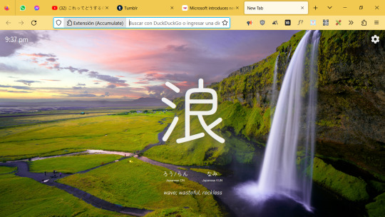
I can't even respect my kanji of the day extension anymore. It looks like a street sign you hang at the airport so the foreign tourists don't feel intimidated by the language.
But man, subtitles are on easy mode now.

I can actually catch up with the auto captions now. I've never been able to do that before, I just assumed my kanji knowledge was bad, but no, it was just the damn edges making it hard to read. And now I have to live with the fact that this goofy ass font is objectively the best way to read Japanese digitally. I can't ever change it back. I made this hell for myself.
493 notes
·
View notes
Note
i've seen that in certain tlt comics you assign certain fonts to certain characters. do you have a list of each one? the only ones i could really guess at would be courier new for palamedes and arial for pyrrha, but i could be totally wrong. if you have any thoughts on why certain fonts were chosen i'd love to see that too!
(im assuming youre referencing this comic) i dont have a list of fonts to use for characters, sorry to disappoint </3 i used different fonts for this comic specifically to distinguish camilla and palamedes. for ooctlt i use bahnschrift semilight semicondensed because i like the way it looks in both sentence case and all caps.
just to entertain you though i used to like casual calligraphy, so heres the handwritings i would try to mimic with fonts (with transcript):


transcript:
I think necromancers have messy handwritings so Palamedes would have a doctor's scrawl that gets worse the more he is panicked/rushing.
Font: Times New Roman. I don’t want to pick fonts that match the illegibility of their handwriting, but instead something that is readable and gets the spirit across. If he would type he would choose something meant for academia. Note that this isn’t consistent with the comic I drew – it’s because I don’t think this far ahead.
Harrow's is even worse. She writes cramped and sometimes blende in cursive with her lettering for ease of writing. Sometimes she will overlay her words on top of each other
Font: Daytona condensed. Clean, but tall and squished.
Gideon’s handwriting only looks neat but she writes very loosely and doesn't join her h,n,m,ps. SOMETIMES SHE WRITES IN ALL CAPS BECAUSE IT'S EASIER.
Font: Corbel. Strange spacing but not too bad to look at.
Camilla's handwriting is clean and crisp, although she might switch how she writes her 'a's and forgets to dot her 'i's. Hold on im not good at clean handwriting okay she would write like this. [scribbled out signature] yeah i cant do this one she's too good for me
Font: Microsoft Sans Serif. The classic.
36 notes
·
View notes
Text
Fonts: Body Fonts
I had some free time, and I thought, what could be more fun, than putting together a post of some of my thoughts on my favorite fonts? Certainly not going outside or any activity involving moving from my chair, so font talk, here we come! (Links to where to get the fonts for free included in this post). So of course first up we have the majestic Comic Sans..........I kid! <insert baaing goat gif> While it is surely a most iconic font, I will unfortunately not be covering Sir Comic of the Sans in all his glory. See below the break for the full actual post on my favorite fonts to work with.

Note, my interest in fonts is entirely enthusiastically non-professional. Thus, if there's a technical aspect I called 'the tippy bits' instead of tapers or what have you, uh, my amateur ass doth apologizes.
Body Fonts
Body fonts are the all the main parts of a text. The good ol' torso that carries the headers and stands above the footers. They're the font you see the most of and spend the most time with. They're the part of the text that hugs the eyes, to use an entirely weird metaphor. *** My favorite body fonts are the IM FELL series. Especially IM Fell English.

Look at that pretty serif. It's got a great classic appearance to it that reminds me of old paperbacks. There's a grittiness and unevenness to it that gives a more 'natural' look, and is reminiscent of text from a typewriter. The imperfections of this font (like the uneven tippy bits of that lower case y) are my favorite parts, and they add a lot of character to a text while still being legible. I know some folks may not be as fond of the italicized version of IM FELL, but personally I've never had trouble reading it, and enjoy how fancy it looks. IM FELL English is a font that could work as a letter from a gentleman's daughter to the arrogant, handsome heir visiting town, or as the carefully kept diary of a mad scientist detailing the experiment that would eventually rise up and try to kill him. Fun things like that. *** Next font is Crimson Text (there's a Crimson Pro as well, but I like the Text version better for it's fancier capitals).

Just take a look at that w. Sharp enough to cut through digital paper. And the capital W is even better. The angles, the triple Vs...whew, that letter's a work of art! It looks like it should be walking down the runway at a european fashion show and stared down by an unsmiling stone cold magazine editor.

Crimson Text is a very clean, crisp font. It's got those little sharp tippy bits at the end of letters that look like they could prick you if you tried to pick them up. Crimson Text lends itself well to more modern, artistic text. I tend to personally use Crimson Text sparingly, because while it is a very aesthetically pleasing text, it can be a bit harsh for my tastes, and difficult to work with when pairing with other fonts/design elements. Crimson Text is a font that I feel like is for a special occasion, and that occasion is hard to pinpoint, but when it arrives, it makes the most striking appearance. *** Following that, we have EB Garamond, which is probably the second most used font in my personal typesets.

Garamond is a classic. You see it a lot, in one version or another, in published works. For me, it feels very familiar and comforting to read text in EB Garamond. It's like an old, worn blanket that's still perfectly soft and plush. It's the kind of thing that'd get past down generations in the back of a closet, brought out whenever there was a need. Simple, straightforward, and timeless. The only caveat with EB Garamond is the 'e' in it's italicized form is a bit of an exhibitionist that likes to inappropriately protrude it's bottom bits out into it's neighbor. It's a quick fix to teach that 'e' some modesty if you're on Affinity. Just turn off the final forms for the font by going into Text Style Editior -> Variants -> uncheck Final Forms. And now you're prudently dressed for a night of font formatting. *** The last I'm going to talk about in this post is Baskervville. This is, as per the about page on google fonts, a 'revival of Jacob’s revival of Baskerville’s typeface'. I'm not familiar with the original Baskerville, but hey, an extra letter thrown in has to be extra lucky, right?

The thing that really sticks out for me with Baskervville is the 'o's, and the 'o' shape you can see with the 'e's and 'b's and 'd's and such. It's a very...circular, and pronounced font. Round. Rotund. Orbital. There's a flow and balance to this font that stands out, and makes it unique against other fonts on this list. Conversely, the lines of this font as much thinner and sharper than, say, the lines in the Libre Baskerville version. I like that contrast, though it is a bit of a strange one. Like having long stick thin arms and legs and a really round torso. Like one of those mascots for M&Ms (controversial footwear unspecified). Anyway, Baskervville kind of hovers between classic and modern. It's a font you see a lot of (in one version or another) in published works. It's 'family' has been around a long time, and this latest version is like the youngest son of an old, rich, prestigious family. It's got a lot of potential, and can be applied in new, exciting ways, or it can easily fall into a traditional role and live off of it's trust fund. Recently, I used Baskervville for a Pride and Prejudice modern day high school au, and it really felt like the font blended together the two worlds and two time periods well. It's kind of like a hipster that manages to pull off the fedora (a fine hat, I might say. Hats need a bigger comeback, in my opinion). *** That brings us to the end of this post. You'll have noticed that all these fonts were serif fonts. I just like serif fonts best for body fonts. They're the most commonly used in published books, and so they're the ones I've grown most comfortable with. However, a good sans serif can work well in the right setting. For my own work, though, sans serif are usually kept to titles or headers. If there's interest, I'd like to do similar posts on Drop Caps fonts, Title fonts, etc.
#fonts#font recs#body fonts#typesetting#typesetting tips#typography#these are just my thoughts#there's good in all fonts#even comic sans
29 notes
·
View notes
Text
What I look for in a tabletop role-playing game
Just my thoughts on what makes a game interesting. Not necessarily good or bad, just what I would like to see in a game.
First off, I want my games to be all in one book. All you need to get started playing is just a single rulebook. I prefer physical books but I’ll take both physical and digital. I want the book to include a brief intro about the game, have the next section go over the game rules, then go over the setting, and the final part of the book will go over character creation. Referee options, like challenges or bestiaries, can either be with the game rules or in a section after character creation. I have yet to find a book that puts things in this order, but hopefully with my large collection of books I’ll finally find the order.
The reason I want the book organized like this is that you need to understand the game mechanics in order to know how you want to build your character. You also need to know the game setting to come up with a story for your character. Finally, in most systems, character building takes up the majority of the book. Especially in more complicated games with lots of character options. Having the book organized this way will also increase the likelihood of players actually READING THE DAMN RULES.
Last thing about the game book. Hardcover, paperback, pdf I don’t care. But make your books easy to read and navigate! Have a key on the fore-edge of the book in different colors so if you know the colors you can jump to that section. Also an index! Have an index please so you can find which pages talk about your special game mechanics. Use colors and font size to define both hierarchy and sections in your layout, please don’t just have a white page with black text. Finally, please use sans-serif fonts! They’re so much easier to read than Times New Roman or Baskerville.
I also like looking for safety tools in my game books. People who regularly play ttrpgs tend to know about lines, veils, surveys, and x-cards. But not everyone does! If a new player picks up your game and you don’t have a safety section you as a designer are depriving them of an important resource. Also sometimes game designers think up new ones or have an interesting take so I like to learn.
I don’t care how complex or simple the game system is, I just want it to be interesting and work. I started with 3.5 and Pathfinder 1st edition so I do have a preference for more complicated games with lots of character options but only if they’re interesting or established. I also like my systems to be loose enough that you can easily homebrew additional mechanics, change mechanics, or make new in game material. I like to homebrew, it’s fun.
#ttrpg#tabletop#game design#ttrpg community#tabletop rpgs#roleplaying games#gaming#dungeons and dragons#pathfinder#starfinder#call of cthulhu#cairn#pbta#powered by the apocalypse
15 notes
·
View notes