#sans serif typography
Explore tagged Tumblr posts
Visit Tumblr Blog
Explore Tumblr blogs with no restrictions, modern design and the best experience.
Last Seen Tumblr Blogs


Fun Fact
Tumblr’s reach among the 26-to-35-year-olds in the US is 11%.
Text


created all of these types this week.
#typography#logodesign#logos#logotype#type design#typeface#fonts#70s#80s#90s#y2k#branding#design#graphic design#corporate#serif font#sans serif#cursive#illustrator
105 notes
·
View notes
Text


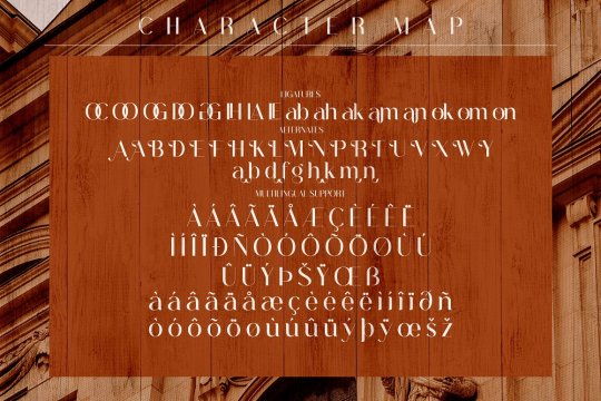
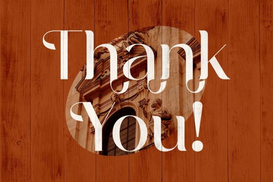
Masserini Font Family by Sundance Tipografia
Download here.
Follow WE AND THE COLOR on Facebook I Twitter I Pinterest I YouTube I Instagram I Reddit I ChatGPT I Podcast
#design#graphic design#font#fonts#best fonts#retro font#vintage font#sans serif#creative market#myfonts#download#typography
12 notes
·
View notes
Text
#poll blog#random polls#silly polls#stupid polls#polls#silly poll#tumblr polls#poll#pick one#this or that#daily polls#fonts#sans serif#serif#serif font#serif fonts#sans serif fonts#typography#writer polls#writers poll#reading poll#bookblr#writing poll#times new roman#helvetica#comic sans#typeface#typewriter#design poll#aesthetic poll
37 notes
·
View notes
Text


Agrokiz - Modern Font
Download Here: https://www.behance.net/gallery/185781885/Agrokiz
Agrokiz is a typeface designed for display and design needs that require large text such as magazine headlines, banners, etc. With its modern form, this typeface is quite applicable for various media and design styles. Agrokiz is equipped with uppercase, lowercase, symbols, numbers and multilingual.
#modern font#sans serif font#font#graphic design#Design#Graphic Design#Illustration#Art#Typography#Creative#Digital Art#Designer#Artwork#Inspiration#Modern Design#Visual Art#Creative Process#Design Inspiration#Design Trends#Design Community#Art Direction#Minimal Design#Design Portfolio#Design Ideas#Design Studio#Digital Design#Print Design#Web Design#Brand Identity#Logo Design
12 notes
·
View notes
Text


Edward Johnston / London Underground / Railway Alphabet / 1916 / Piccadilly Circus
12 notes
·
View notes
Text

ALET
#ALET#agency#design#creative#production#studio#Copenhagen#Denmark#portfolio#typography#type#typeface#font#Work Sans#Silk Serif#2024#Week 14#website#web design#inspire#inspiration#happywebdesign
13 notes
·
View notes
Text
17 notes
·
View notes
Text
12 notes
·
View notes
Photo


Abigate Desgo font designed by Storytype Studio
#sans serif#sansserif#fonts#typography#design#web design#webdesign#font#lettering#type#typeface#book cover#book cover design#magazine cover#magazine cover design#wedding fonts#wedding invites#wedding invitations#ttf#otf#woff
48 notes
·
View notes
Text

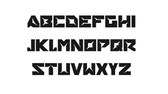
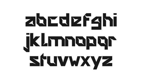
Geometrica
Typefaces made in Glyphs - Typography assignment
6 notes
·
View notes
Photo
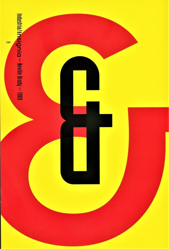

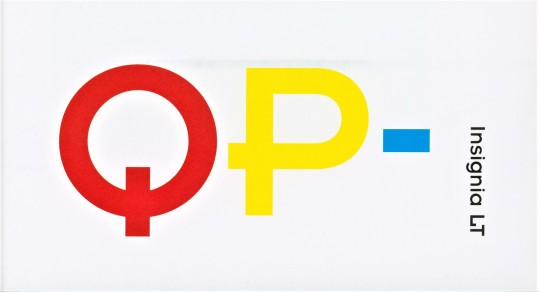


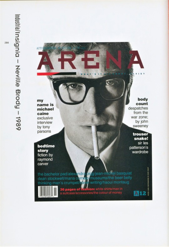
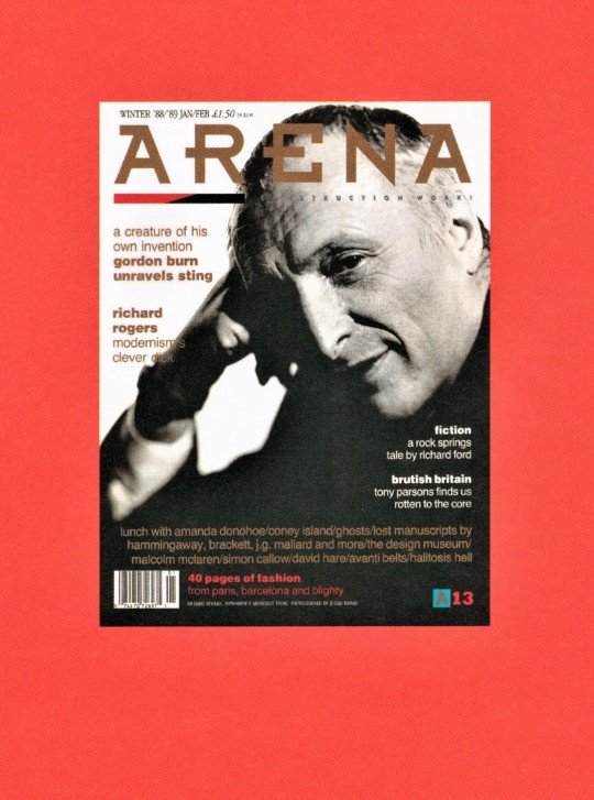
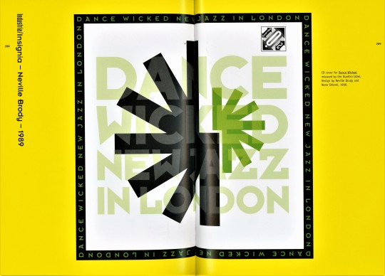
Typography Tuesday
NEVILLE BRODY -- Industria and Insignia
English graphic designer and typographer Neville Brody (b. 1957) is noted for his record cover designs and for his work for the culture magazine The Face, the men’s magazine Arena, and the London magazine City Limits. Brody’s typographic style uses aesthetic elements from Art Deco and non-European influences. His graphic language has become an international model for computer-oriented design. Among his earliest fonts are Industria and Insignia.
Industria was originally designed for The Face in 1984 and released as a font by Linotype in 1989. Industria is a condensed san serif face with abbreviated, essential forms. It has a systematized mechanical structure of straight stroke with rounded outer corners and rectangular counter-spaces. It’s possible that you might recognize the font as it was used for the logo of The X-Files and is currently used for the logotype of the Oklahoma City Thunder basketball team.
Insignia was originally designed as a headline face for Arena magazine in 1986 and released as a font by Linotype in 1989. It has the basic forms of constructed Grotesque fonts and was influenced by the New Typography of the Bauhaus from the 1930s.
These images come from the 2005 book Creative Type: A Sourcebook of Classic and Contemporary Letterforms by Cees W. de Jong, Alston W. Purvis, and Friedrich Friedl, and published by Thames & Hudson.
View another post from Creative Type.
View our other Typography Tuesday posts.
#Typography Tuesday#typetuesday#Typography Tuesday#type designers#Neville Brody#Industria type#Insignia type#Linotype#san serif type#Grotesque type#Creative Type#Thames & Hudson
23 notes
·
View notes
Text

FBS Machro Font by Febspace Studio
Download here.
Follow WE AND THE COLOR on Facebook I Twitter I Pinterest I YouTube I Instagram I Reddit I ChatGPT I Podcast
#font#fonts#typeface#typefaces#typography#sans serif#download#creative market#myfonts#youworkforthem
10 notes
·
View notes
Text

Baltem Font by Agung Syaifudin
Purchase
6 notes
·
View notes
Text


Lokanova Bold Font 🔥
Download here: https://www.behance.net/gallery/179579691/Lokanova-Free-Font
Lokanova is a display font with a sans serif type designed in a bold and unique style to give the impression of a firm but still playful design. Lokanova is available with uppercase, lowercase, number, symbol and multilingual
#sans serif font#display font#bold font#graphic design#design#Design#Graphic Design#Illustration#Art#Typography#Creative#Digital Art#Designer#Artwork#Inspiration#Modern Design#Visual Art#Creative Process#Design Inspiration#Design Trends#Design Community#Art Direction#Minimal Design#Design Portfolio#Design Ideas#Design Studio#Digital Design#Print Design#Web Design#Brand Identity
8 notes
·
View notes
Text
5 notes
·
View notes
Text
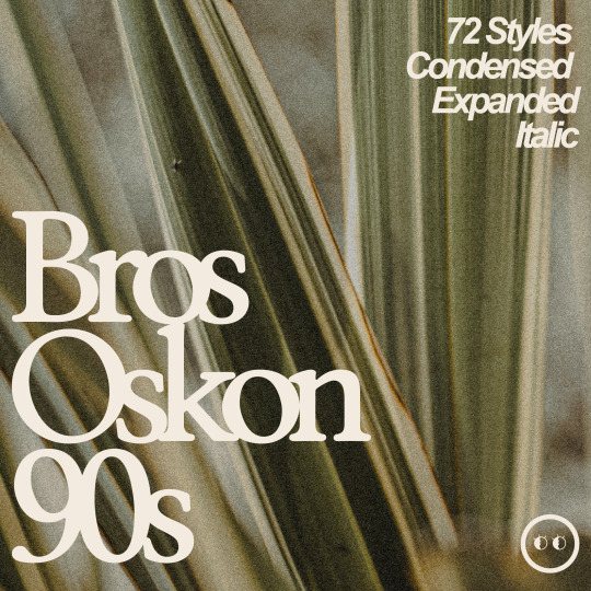
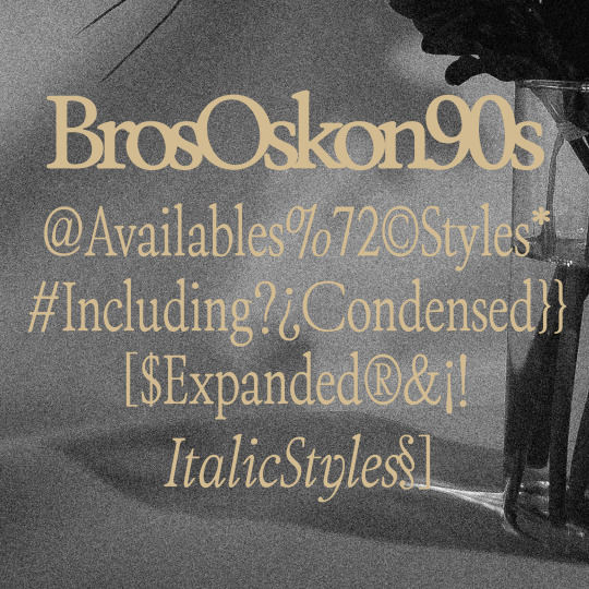
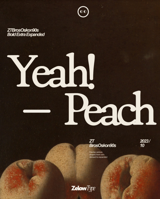

ZT Bros Oskon 90s is a captivating typographic creation that seamlessly blends the aesthetic charm of the 1990s retro era with a modern touch. With unmatched serif elegance and a unique 90s style, this font offers 72 variations, including sharp Condensed forms, graceful Expanded, and captivating italic styles.
5 notes
·
View notes