#resize image online free
Explore tagged Tumblr posts
Text
Luletools: A Reduced Web-Based Color Selector
Understand the features of Luletools, your go-to resource for a quick and easy Online Color Picker from Image. Select and identify colors with comfort, helping you to use your creativity and improve your design process. Luletools offers smooth color extraction and customization capabilities that will improve your creations.
2 notes
·
View notes
Text
Resize Images Without Losing Quality - Luletools
Resize images without losing quality using Luletools' advanced online resizing tool. Perfect for web optimization and more. Resize images seamlessly without compromising their quality with Luletools' cutting-edge online resizing tool. Whether you're a professional photographer or a website owner, maintaining image quality is crucial when resizing images. With Luletools, you can resize images effortlessly while preserving their original clarity and sharpness. Our advanced algorithms ensure that your images look their best, regardless of the dimensions you choose. Say goodbye to pixelation and distortion - Luletools guarantees professional-grade results every time. Whether you're resizing images for web optimization, social media posts, or personal projects, our platform offers the perfect solution. Join the ranks of satisfied users who trust Luletools for their image resizing needs. Experience the difference today and take your digital content to new heights with Luletools!
0 notes
Text
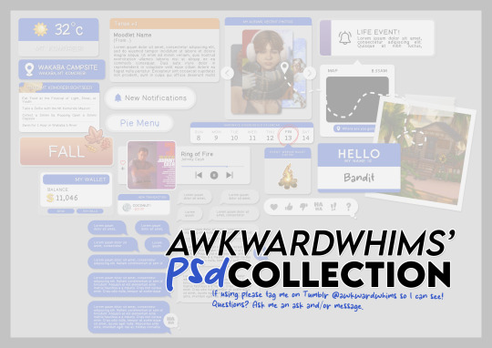
In celebration of reaching 900 followers!
Ever since I started playing the Globetrotter challenge by @moonfi; I've been creating a collection of UI Widget style templates. This collection includes 20(ish) different templates for you to use in your gameplay screenshots. I'm hoping I did my best to make this as user-friendly as possible; but if you have any questions or notice something off - don't hesitate to message me or send an ask!
[Terms of Use] Do: Use & edit as much as you want and/or know how to. Don't: Reupload & claim as your own. Do: Link back to this post if asked where they're from.
[You Need] Fonts: April | Lemonmilk | Kids Handmade TS4 Icons: deathbypufferfish | w-sims | TheSimKid (I've had L'Universims' icons before they were hacked but as far as I know they've moved to a new website so download from there at your own risk.)
DOWNLOAD (SFS) 66.3mb **FIXED** (Missing moodlet)
ALT DOWNLOAD (Mediafire)
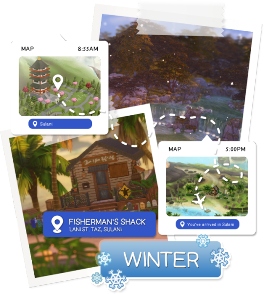
[Tips & Hints]
Open the awkwardwhims psd collection file in Photoshop, then drag & drop the folder or group of templates onto your image.
The photo album template was inspired by @folkbreeze (definitely check out their resources, they're all so nice!) & other various examples I saw online.
Resize the template by selecting the folder as a whole; resizing individual layers may makes things unaligned.
Feel free to change background colors/fonts/etc as much as you want.
The text message template has 3 styles: sender, green receiver & blue receiver. There are also reaction icons & a separate reaction bar.
For the to-do list template I didn't include every aspiration icon (I was trying to keep this file as small as possible) but you can download this pack by @deathbypufferfish that has all the aspiration icons you'll need. However, it may be missing some of the newer aspiratons.
When adding photos (album cover/recent photos/etc) use a clipping mask.
The weather template includes all the different weather icons, so be sure to hide/unhide the one that applies.
For the new transaction template, make sure to only change the number of the price otherwise the Simoleon symbol will get changed to Times New Roman.
The notification message template is for life events, bad events & default game notifications (ie: legacy player, etc).
DOWNLOAD (SFS) 66.3mb **FIXED** (Missing moodlet)
ALT DOWNLOAD (Mediafire)
@alwaysfreecc @maxismatchccworld
2K notes
·
View notes
Text

This has been a long time coming, I've been wanting to make something like this for ages and I finally had some time over the weekend to get it done - I dunno how useful this will be for anyone else, but hopefully at least a few other people might find this template handy!
Here's a full size picture of what the blank template looks like:

I made a couple examples of what it can look like edited over screenshots - as you can see you can just resize the boxes & text as you like to get the ideal final product:


Instructions for use:
This is a .psd file, and as such it needs to be opened in an editing tool that allows that file format - I personally use photopea which is a free online alternative to adobe photoshop - Disclaimer: I haven't tried using it any other editing software like photoshop / gimp but it'll probably work in there too, if you have any problems in those apps lmk and I'll try and fix it!
Each section of the template is separated into folders, open these up and you can edit the text / image elements for each section, you'll need to hide and unhide layers to be able to do this (the little eye icon next to a layer toggles it to be hidden / unhidden)
If you need to resize the boxes, make sure to hold down the shift-key so that you're able to do it more precisley
I have included icons for every career in the sims 3 including all of the expansion packs, however I have not included the skill images you might need as that would be a bit too extensive
For the skill images, I recommend downloading this ultimate icon collection from ModTheSims, as it'll almost definetly have everything you could possibly need to use :)
Terms of Use:
Please don’t claim as your own or reupload without my permission, I’d love to see you use them in your game if you do choose to tag me - but that's totally optional :) Alter and customize the templates literally however you want, but if you’re gonna reupload a downloadable variation of them I’d appreciate a link back to my blog
Download Here (Simfileshare, .psd file)
The font used for this template is DM Sans, it can be found in all variations here - I only used 'bold' & 'bold italic'
Credits: Heavily inspired by the gorgeous Clean UI created by JustMiha, as well as these promotion templates for TS4 by CupidJuice - and thanks to TheSpiritRealm on MTS for compiling all the icons I used - and total credit goes to EA / Maxis for the icon designs as well I did not make those lol
131 notes
·
View notes
Text
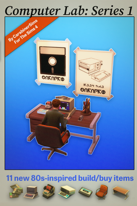
Computer Lab Series 1
This set is inspired by: early 80s computers, my dad’s office when he taught electrical engineering, and VHS tape artifacts. Many of the pieces in here are stylized versions of real-life things, which I’ve included more info about under the cut.
This set contains 11 new meshes and features 2 retro computers, a desk chair, a desk, and lots of retro clutter items.
Download link (SFS): Separate packages or ZIP of the whole thing.
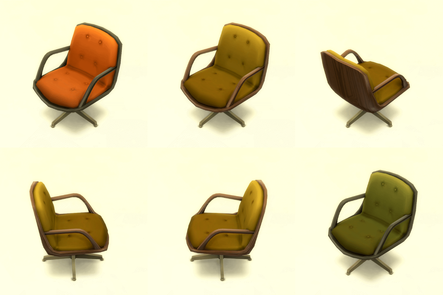

Here's some fancy promo GIFs!
Set contents:
Electronics:
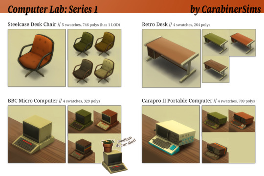
Carapro II Portable Computer: Based on the Kaypro II Portable Computer (1982) // 4 swatches (including wood grain/rainbow!), 789 polys
BBC Micro Computer: Based on the BBC Micro Computer (1981) // 4 swatches (including wood grain/rainbow!), 329 polys
Furniture:
Steelcase Desk Chair // 5 swatches, 746 polys - has 1 LOD
Retro Desk // 4 swatches, 264 polys
Clutter/decor:
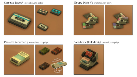
Floppy Disks // 2 swatches, 734 polys
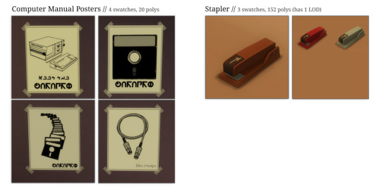
Stapler // 3 swatches, 152 polys (has 1 LOD)
Caradex V (Rolodex) // 1 swatch, 834 polys (has 1 LOD)
Desk Caddy // 2 swatches, 1580 polys (has 1 LOD)
Computer Manual Posters // 4 swatches, 20 polys (resized EA soccer poster mesh)
Cassette Recorder // 4 swatches (including wood grain/rainbow!), 212 polys
Cassette Tape // 4 swatches, 202 polys
Here's everything you get:
-------------------------------------------------
Credits:
Images for the poster set are taken from the manuals for the Kaypro and BBC Micro; thank you to folks who upload these online!
Fonts used in the textures are Nootrasim, Uni(versity) Llama, and Simlish Crayon.
-------------------------------------------------
Technical notes/known issues:
Sims’ hands slightly clip into the computers with angled keyboards; this is not something I can fix due to how the animations are set up.
The computers don’t have mice (they wouldn’t have had them at the time), so the Sims will move their hands around as if they were using an invisible mouse.
The BBC Micro computer has a medium decor slot on top -- perfect for cute plants, books, clutter, etc. In testing, I noticed that if you place something there that trails down the sides, Sims will not want to use the computer (you have to make them sit in the chair and then interact with it). Most items don’t seem to do this so I’m leaving the slot in - just know if you put trailing stuff on top, this might happen.
The cassette recorder has a decor slot in the perfect place to actually put the cassette tape in it, and I love it! I’d recommend picking the cassette tape you want before putting it in; once it’s in the recorder, I couldn’t figure out an easy way to get it out again. You can always delete the whole thing and re-place a cassette recorder.
-------------------------------------------------
Other notes:
TOU: Don't upload to paid sites or claim you made these. If you do recolor, you can include the mesh if you link back to me.
This is my first larger set and I'm kinda nervous! If you encounter any issues please message me on here and let me know.
I've also created a companion "further reading" post here, which goes into more detail about the research and references I used for these
⭐ Like my stuff? It's all free but it does take me time -- if you want to, feel free to leave a tip on Ko-fi. ⭐
@mmfinds @maxismatchccworld @simbfinds @adoring-ccfinds @mmoutfitters @public-ccfinds
#ts4#ts4mm#ts4mmcc#ts4cc#ts4 cc#retro#kaypro portable computer#kaypro ii portable computer#retrotech#bbc micro#vintage computers#retro computers
3K notes
·
View notes
Note
i hope this hasn't been asked before. what size do you make your canvas? and do you crop it to fit other socials (like Instagram for example)? i hear that 300 dpi is standard. i never know if it's good to make my canvas big or not.
hi i think this ask is like at least 4 months old but i was scanning my sketchbooks from last year and i abruptly remembered i had gotten this ask because i had made a little chart in my sketchbook trying to figure out how to answer it
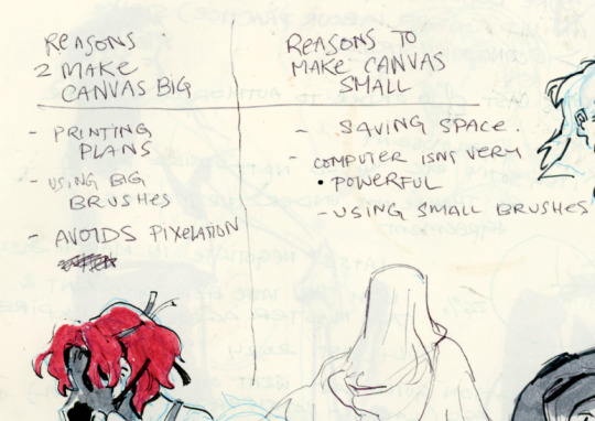
anyways theres pros and cons. and the size of your canvas is really going to depend on personal needs + preference. how good ur computer is, how complicated ur art style, how comfortable drawing feels, how much disk space you have to spare, what youre gonna end up using the art for in the end...300dpi is standard for PRINTING specifically, if you only plan to ever post things online then 72dpi works great and will save you space (fun fact a lot of professional animation files i deal with are 72dpi. and those eventually go on your tv screen). but personally i make everything i draw 300dpi because i am always printing stuff for cons, zines, etc and its nice to have the option even if i dont end up printing.
when I was a teen I used to draw on a rly shitty laptop and i made everything 800x800px 300dpi because big canvases would cause a lot of lag and also the resolution on this laptop was pretty small so 800px was a lot of the screen already. now i have a slightly better laptop with a bigger resolution and i sketch on giant 10000px-40000px canvases with the hard round brush and no shape dynamics or transfer whatsoever to minimize lag. when it comes to making a final illustration when i know ill be using a bunch of layer effects/blending modes/colors/mixing brushes etc etc ill generally crop the canvas down to the 6000px range. most illustrations i try to make sure are comfortably printable on tabloid size paper so thats pretty much anything hovering around or above 3000x5000px w 300dpi (so 11x17in). HOPE THIS HELPS?
EDIT: OH ALSO re: socials. i always ALWAYS size down my art to post on the internet. i think its crazy when other artists dont. because why would i ever let the internet have my hi-res file for free. also in general i think it looks better if you do the resizing yourself because if you don't then many social media sites will compress your file for you! a lot of people will post a hi-res file to twitter and then go "Wow twitter killed the quality of this img!!!" UH YEAH because they have an automatic image compressor. because they need to save space too lol and they dont want your image to take 248263895 years to load. same with instagram and to a lesser extent tumblr. when i post anything on social media i resize it down to 1200px-1600px on the longest side... its a little arbitrary but im kind of basing it on the smallest resolution of widely available screens. mostly because i think it looks stupid when u open up an image file fullsize and u have to scroll to see the whole thing... also iirc instagram only takes images up to 1080px before it resizes them? granted if you upload something smaller than that itll also resize it up which will look worse so I think bumping the numbers just over 1080px is pretty safe.
I should really be bringing the dpi down to 72 too when i post online but often im too lazy to do that. but it will technically help ur image load faster and stuff. and make it less likely for people to yoink it off the web and print it themselves.
149 notes
·
View notes
Text
A Party To Die For Templates: SFS
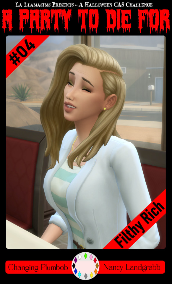
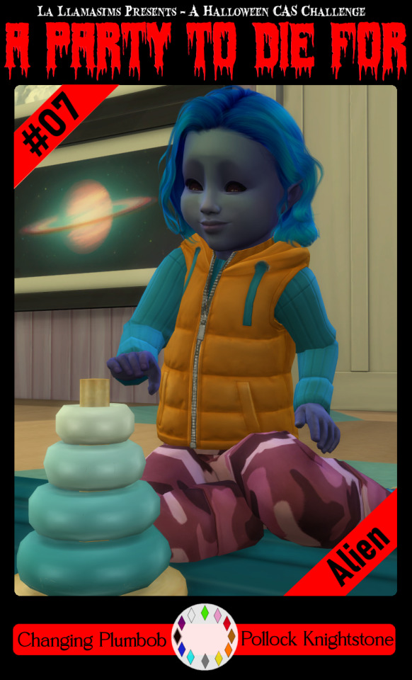
So I may have got a tad overexcited about the Halloween CAS Challenge created by @la-llama-sims, and I made templates for every prompt. I wanted to share them on the off chance someone wanted to also do the challenge but maybe didn't have time to do much other than screenshots.
Tutorial below on how to make your own cards using the templates if you are unfamiliar with photo software, all you need is the template and a screenshot of your sim! Very little technical skill required to so feel free to jump in for Simblreen (the month of October on simblr). Remember to go to the original creator post to check out the prompts and the hashtag given for creations is #LLPTDF. Hope to see some of your creations next month, keep them for the spooky season 🎃👻🦇
Strap in and follow along as I make Glenn here (he won't do the spellcaster prompt for Simblreen, it's dress up after all, but it makes sense for a demo)
Step one: Grab the zipped folder of templates on SFS HERE. Unzip the folder and put it somewhere easy to find in your documents, I have a tumblr specific folder my templates are normally sorted in.
Step two: Open your photo editing program of choice. I use paint.net which is old but for this demonstration I will use Photopea, the online free alternative to adobe. You will see the screen below
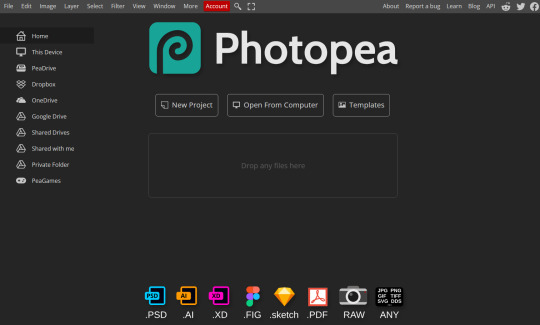
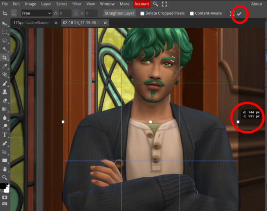
Step three: Click "Open From Computer" right in the middle under the main title. Find the screenshot you have taken that you would like to use and open it. Now the hole in my template is 744x991 but you can make it slightly bigger if you don't want to fuss as much with lining things up exactly. To resize image from the top bar (Image -> Image Size) We're going to use the crop tool when we have our picture.
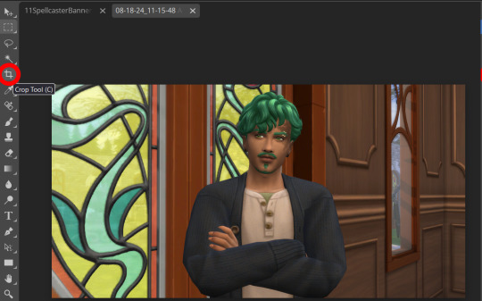
Step four: Pull on the squares at the edges to change the size. If you need click View in the top bar and you can zoom in to allow finer selecting. When you have the right size click the tick and copy the image. Keyboard shortcuts are Ctrl+A to select all, then Ctrl+C to copy.
Step five: Open the template you want to use (File -> Open, from the top bar). Add a new layer using either the top bar (Layer -> New -> Layer) or the icons on the bottom right.
Step six: With the new layer selected paste the image, Ctrl+V.
Step seven: On the right of the screen you'll be able to see layer order. Drag the layer with your sim underneath the background layer. This is what will let you slot in your picture.
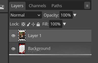
Step eight: Finishing touches! Unless you are super duper lucky your sim won't appear in the exact right place, you'll have to move them around using the move tool. For precision you'll need to zoom in and move your field of vision using the hand tool.

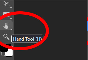
You'll know it's in the right place when you can no longer see any of the negative space behind it. I like to check both corners to make sure I've got it. This is where having a sim image slightly larger will make it easier.
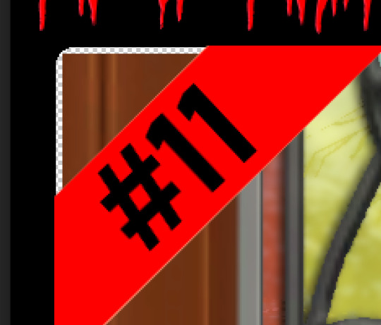
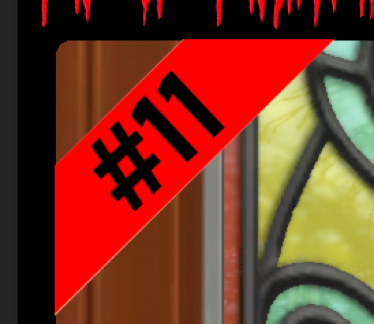
If you like you can finish now. From the top bar File -> Export as -> PNG or JPG. The picture will save to your downloads folder. If you want to add your own text, keep reading, as I've left space at the bottom for your username, the sim name, and a profile pic or other logo. Or go ahead and crop it out, who needs extra hassle when there are cute CAS looks to be made?
Step nine: From the bar on the right select the large T to add some text, it will automatically spawn in a new layer. Scroll through text options and find one you like (the text style I used isn't in photopea so we will find another). Depending on the type of text you will likely need to play around with the size as well.
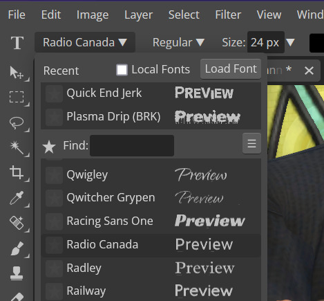
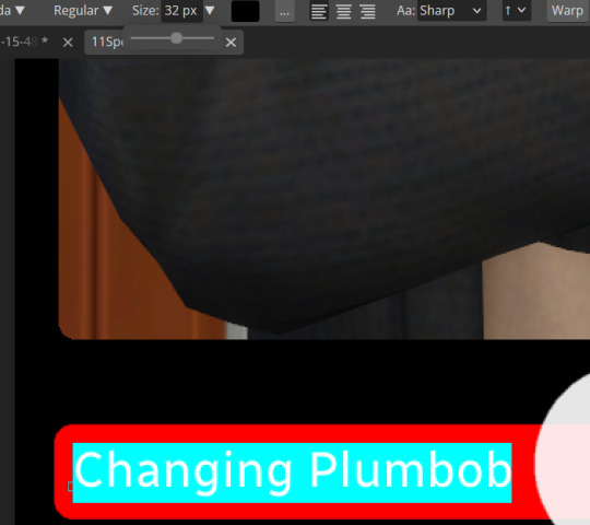
Step ten: Start typing. When you're done you can highlight what you have written and use that size box to adjust how big the text is. Select the move tool from the right to move your text where you want it. Repeat step nine if you want text on the other side. I've chosen to put my username on one side, and my sim's name on the other.
Step eleven: Logo time. Open a pre shrunk logo (I scaled my pride plumbobs down to 125x125) and copy. Back on the template add a new layer then paste your image (for some reason I had to copy twice before it would do the right thing, I don't have an explanation sorry). Then using the move tool and the hand tool get your image where you want it.
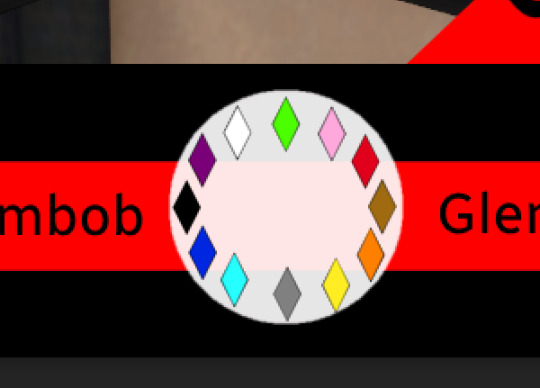
From the top bar File -> Export as -> PNG or JPG. Again it will have saved to your downloads folder.
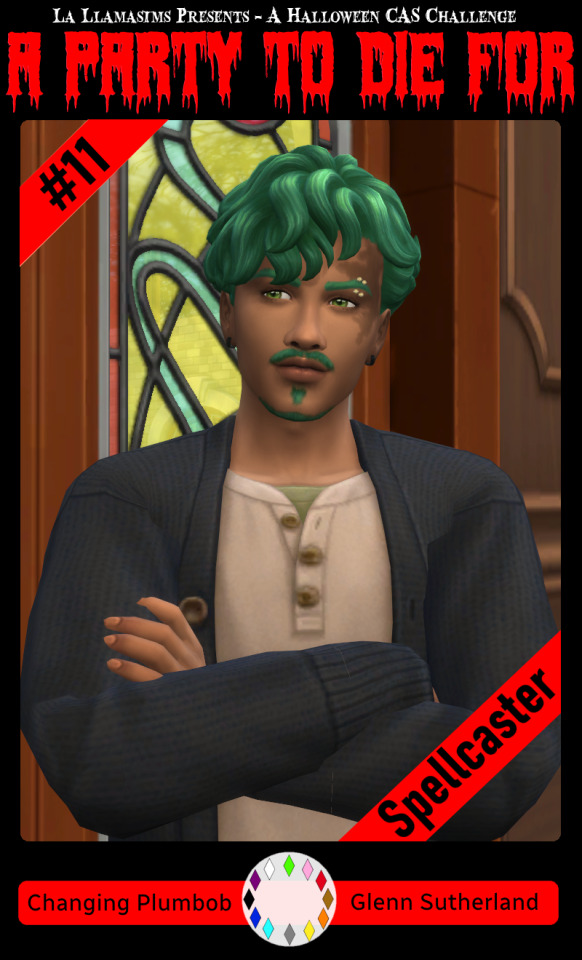
Voila, we have a Glenn card! Hopefully you have a your sim card. I spent hours doing up all the templates so feel free to fill them with your sims for the challenge. All I ask is that you don't claim templates as your own work or shove them behind a paywall because rude and the whole premise of Simblreen is free treats! Obviously you do NOT need the templates to participate in the challenge, the cards are just how I'll be presenting mine. Like CAS challenges the possibilities are most often only limited by your imagination.
#sims 4#the sims#simblr#my sims#ts4#active simblr#Enjoy my friends#I wanted all of us to be able to do Simblreen#Even if we don't have prior skills
54 notes
·
View notes
Text
Welcome to Our Image Compression Tool
Effortlessly compress and resize your images while maintaining high quality. Optimize your images for faster load times, reduced bandwidth, and better user experience. Our tool is easy to use and completely free!
Our Image Compression Tool is designed to simplify the process of optimizing images for various purposes. Whether you're a web developer aiming for faster load times or a designer looking to conserve bandwidth without compromising quality, our tool offers a seamless solution. With just a few clicks, you can compress and resize your images while ensuring they retain their visual appeal. Explore the features below to see how our tool can enhance your digital projects.
76 notes
·
View notes
Text

i had to put this fella in one of those sketchy free online image resizers cuz he packed too many pixels for tumblr
#undertale#utdr#grillby#art#artists on tumblr#artists on crack#still need that lethal injection#i made this drawing for my friend ryb#ryb if you see this HAIIII!!!!!!!!!!!!!!!!!!!!!!!!!!!#also umm. dont look at the bottle in the bottom right if you have amongusphobia. im so sorry guys#fire#digital art#he is holding a hot chocolate if you look really closely#also i gave him cufflinks with nobody's permission#HEY!! WHERE'S THAT LETHAL INJECTION!!! I REQUESTED IT LIKE 2 YEARS AGO WHAT'S GOING ON
47 notes
·
View notes
Text

i made some cute food themed mouse cursors! read more if you want them for yourself
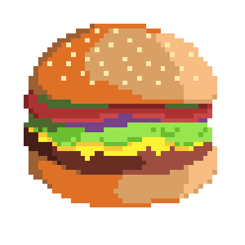
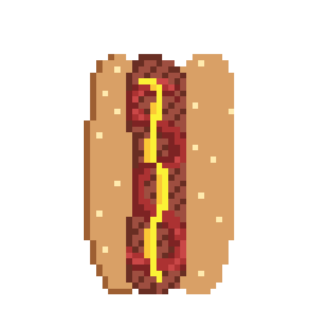
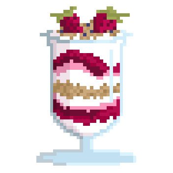
you guys can use these for anything btww idgaf also feel free to request more and i may get around 2 them eventually
[*NOTE: the pixel art above has been resized and is NOT the same as the .cur files, you have to download and use those. Link below.]
cursor file download (WeTransfer) (dm me if link expires)
Cursor replacement tutorial for a Windows PC (sorry mac users):
Open the Start Menu or press the Windows button
Type "Mouse" and hit enter
Click "Additional Mouse Options"
In the pop-up, go to the tab labeled "Pointers"
Download the .cur files (Cursor files) from the link above ^
Select which pointer you want to replace, and click "Browse..."
Find where you downloaded the .cur files
Select them, and hit "Apply"
and boom, you're done! If you don't like them you can re-select the ones you want to change, and hit "Use Default" To revert back to your computer's original settings.
How to make your own:
If you would like to make your own cursors, you can download any small .png image (has to be .png because .jpg doesn't support transparency). You can also use any image editing websites or software to shrink/tweak larger images - I use Aseprite for my pixel art, and I highly recommend it for no compression or pixel loss when resizing images, but I'm sure there are free alternatives out there.
After you somehow acquire a small transparent image you can convert them using this handy online tool. Convert it to .CUR for image cursors, or .ANI for animated/gif cursors.
Have fun! Thanks for reading <3
26 notes
·
View notes
Text
Picmix resources!
Ive been compiling for a while on a google doc with a friend so i figured id share them here.
im literally copy pasting so the formatting looks fucked.
Canva
Cool text generator
Glitterfy.com | Customize Glitter Graphics, Glitter Text, Glitter Photos, Flipbooks
Free Online Image Editor
Mosh-Lite
Blinkies.cafe
Pixilart
Burning Text Logo Generator
PesterQuest Asset Rip MASTERPOST – @riphiveswap on Tumblr
PC / Computer - Pesterquest - The Spriters Resource
Sprite Resources! : r/homestuck
Kaomoji GIFS - Animated Emoticons & Emojis
Blinkie Makers!
https://plasticdino.neocities.org/blinkie/blinkies -
BLINKIES
FreeBlinkiesArena.com
Graphics!
Graphics!

8 notes
·
View notes
Note
Hi! I feel bad asking you this but would you consider your custom scripts for your screenshot edits? :)
I assume you meant sharing them? No problem! But keep in mind these actions will only work in Paint Shop Pro 8 (maybe other close versions of PSP but I really have no idea?). I'm fairly certain they wouldn't work in any other type of graphics editing program (Photoshop, Gimp etc).
I think PSP8 is basically abandonware at this point though and easily findable, I think I downloaded mine somewhere online years ago and today it tells me I'm on day 20,089 of my free 60 day trial!
There are two scripts I use - Screenshot Edits and Screenshot Edits Darker. They're the same but obviously, one results in a darker finished image. Both adjust curves for brightness/contrast, adjust saturation up a little (more about that below) and then apply the bloom effect I talked about and showed here.
I use the "darker" script for shots that only need a slight bit of brightening because they're already fairly bright and would become overexposed, or for dark shots that should stay relatively dark (like nighttime shots). I also tweak the saturation enhancement settings per image depending on its needs. Sometimes the "default" settings on the script are just right, but sometimes it will desaturate or oversaturate, so it sometimes needs a tweak. There's only a few variables to play with in that screen so you get a feel for it pretty easily.
These scripts don't include cropping or resizing, I do that manually.
Hope this helps! :) These scripts for me were in this folder path: D:\My PSP8 Files\Scripts-Trusted
But there is also a folder path on my computer called: C:\Program Files (x86)\Jasc Software Inc\Paint Shop Pro 8\Scripts-Trusted
So presumably either would work?? Not sure what the difference is! But just FYI!
Download (SFS) | Download (MF)
8 notes
·
View notes
Note
HELLOO uhh how do u make ur stamps.. im really bad at making them
oh my god im so sorry i didnt answer the last time you asked :( i never check my inbox
ill try my best to explain it
___________________________________________________________
GO TO EZGIF (its free and u dont have to sign in or anything like that)
click on crop
put any image you want in there and turn it into the rectangle shape a stamp is and then click the crop button to crop it
THEN GO TO THE RESIZE BUTTON THAT IS RIGHT ABOVE YOUR NOW CROPPED IMAGE OR GIF
MAKE THE WIDTH 91 AND THE HEIGHT 47
RESIZE IT AND THEN GO TO DEVIANTART AND SEARCH FOR AND STAMP OUTLINE
(this is the average one most people use)
THEN GO BACK TO EZGIF AND CLICK ON OVERLAY AND CLICK THE BUTTON THAT SAYS EXTEND CANVAS SIZE ADD THE STAMP BORDER YOU DOWNLOADED AND click generate image
change "left" to 40 and "top" to 19
generate that and then click crop and then just crop out the extra blank stuff around the border
TELL ME IF U STILL NEED HELP
YOU CAN DO THIS ALL ON MOBILE BTW
5 notes
·
View notes
Text
Resizing Human Patterns for BJDs (DoA 2012)
DenofAngels Thread by EilonwyG Transferring here for newer hobbyists. I am concerned that DoA will eventually become a dead forum result in link rot of a TON of useful and important information. Photobucket's purge has already done massive damage to the information that had been shared on DoA before 2015-ish.
All images from the original thread are gone.
Original post date: Apr 19, 2012 https://denofangels.com/threads/resizing-human-patterns-tutorial.513354/ I've had people questioning me for a while now as to how I've resized human patterns. There is a rather detailed tutorial that Dale Rae did on her web site - http://dalerae.com/enlargepattern06.htm It is well done, but requires waaaay too much math. I did try to use this tutorial, but decided there had to be an easier way. Through experimentation, I came up with this method. The beginning of the tutorial follows Dale Rae's instructions.
Steps
Take out the pattern instruction sheet, the first section if there are more than one in the packet. We'll be dealing with the section where they have the pictures of the pattern pieces.
You'll need to scan the pattern pieces into the computer. (They mean the images like this from patterns, I remember seeing this thread back in the day.)

Dale Rae's instructions call for scanning the patterns in at 125% to make it easier to work with. I've done the same, even though we won't be working with the pattern the same way she does.
Once you've scanned the picture in, you'll want to open it in a picture editing program. I use a program called Xnview. It's a free program you can find and download online. Personally I swear by it, but you can use any program that allows you to resize, cut and edit pictures.
If you haven't already increased the size of the patterns 125%, do that in the picture program.
Save the new size. Then cut each pattern into their own separate picture file and save it in its own folder.
There are a few pattern booklets where the instruction sheet has the pattern pieces at a much larger size than usual. If it appears that the patterns are on the large side, you can skip the increase of 125% step, as essentially, the pattern makers have done that for you.
This [125% pattern] will give you a basic size for a MSD scale 1/4. You will need to tailor the patterns to the appropriate body, as it is not exact for Minifee, Kid Delf, Bobobie mini, Dream of Child, JID, or whatever mini doll. It just gives you the basic size to start from. [BJDs tend to have longer arms/legs. Take some measurements and add to the length and such!]
Once the mini size has been made, from there you create all other sizes you need.
Scaling for other sizes:
SD Scale 1/3 or larger (+125% of the MSD size)
SD is 125% larger than mini (percentage found on another resizing thread on DoA about resizing existing doll patterns for other sizes). As for those dolls over 60cm, use SD patterns and add length to arms and legs were needed, as most are not that far off in chest size for a complete resizing of patterns to be necessary.
YoSD scale 1/6 (58%)
Again from the mini size, resize the pattern 58% to get a Yo-sized pattern for Volks Yo, LTF, Bambicrony, Teenie Gems or other similar sized dolls.
Pukifee / Tinies (15cm) scale
From mini size, resize down to 35% for all Pukifee sized tinies. For Cherishdoll Faith dolls (as I have two of them), resize to 52%. (They're a little smaller and thinner than yo dolls.)
I have not yet come up with resizing for Puki size or other in between sizes. For some, like Minoru world minis and Customhouse Petite Juniors, I would suggest starting with a yo pattern and adding in the length of arms and legs needed, as generally they can fit Yo clothes but are a bit tall for them. Same with 5star yos.
One thing I cannot stress enough is tailoring. As I said, this method will give you the approximate values for the pattern. Once you print the patterns out, I suggest cutting out a mock pattern piece in paper towels (the Viva paper towels are fantastic for this as they're much softer and closer to material) so you can then drape the patterns over the doll, figuring out where material may need to be subtracted or added to get the right fit. This way you won't waste valuable material on an outfit that may not end up fitting correctly. (This is something I did not do on my first outfit when I started sewing for the dolls.)
I would like to also stress that the instruction sheet patterns do not have any of the sewing markers that are generally on the actual pattern piece. You will either need to gauge the general area where these marks are located, or you'll need to consult the original pattern piece.
I have a variety of dolls and sizes in my collection and feel fairly confident that this tutorial covers most of the doll bodies out there. However, I do not own a doll from every company and there may be a few sizes I have overlooked. As I add to my collection, if I end up with a new type of doll body, rest assured I will come up with new numbers for resizing for that doll.
If you see any size not on this list that you would like to resize for, let me know and I can at least see if I have a friend who owns that type or similar for me to borrow and create a size for.
Examples from the thread:


3 notes
·
View notes
Text
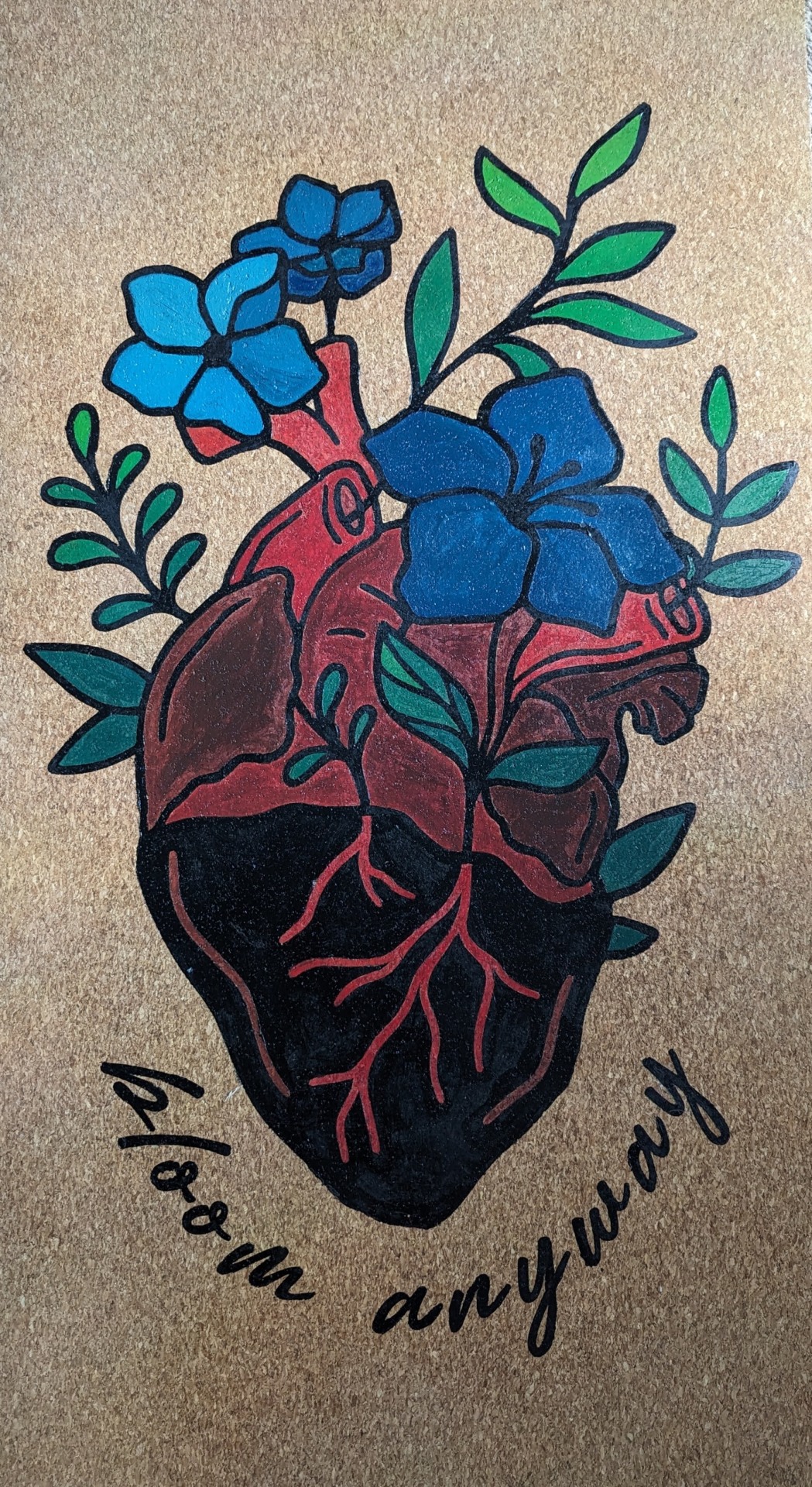
So I painted my yoga mat... I'm including the process and credits below the cut.
So, I have been wanting a cork yoga mat for a while. Do I need one? No. Will I pick up yoga again for a month and then quit? Hopefully not, but likely yes.
Every time I get back into yoga, I start looking at cork yoga mats because they're grippier and also very very pretty. The only problem is... they are friggin' expensive.

I first was attracted to cork yoga mats because of some of the really amazing designs, but I can't afford this shit. Instead, I settled for a cheaper cork yoga mat that is plain, and I thought that if I saved up enough money and still cared about yoga enough to buy a fancy one, I would.
But then I got to thinking... could I paint my yoga mat? And the answer is yes, yes I can.
I originally got the idea when I read online of other people doing this to their rubber and PVC mats, so you do not need a cork mat to do this!
Buying the Mat
Even an inexpensive cork yoga mat is still far more than I've ever spent on one before, so I had to choose wisely. I ended up choosing the Gaiman cork yoga mat, which is about 5mm in thickness. It's roughly 68 x 24 inches. One thing I had read is that cork mats can get quite heavy, but this one is pretty lightweight while still being cushy. I was really tempted to use it right away, but I didn't want it to get dirty or oily before I painted it.
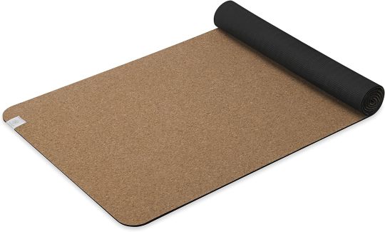
The Design
I am not an artist. I cannot draw well enough to freehand something confidently. What I do have is a Cricut Maker. If you don't know what a Cricut Maker is, it's an ill-advised purchase that I got secondhand and is actively ruining my budget. Depending on the model, it can cut out designs on a variety of materials, such as vinyl or infusible ink and can even tool leather. I used cardstock for this project to cut out stencils.
There are many free SVG templates out there as well as images created by other Cricut Makers that are only .99 each. There are many, many other places where you can purchase designs as well, or you can create your own! I am not talented enough to create my own design.
I tried several free SVGs, didn't like them, and then stumbled on this on Design Space, the Circut Maker program/shop. To quote Macklemore, "But shit, it was 99 cents!"
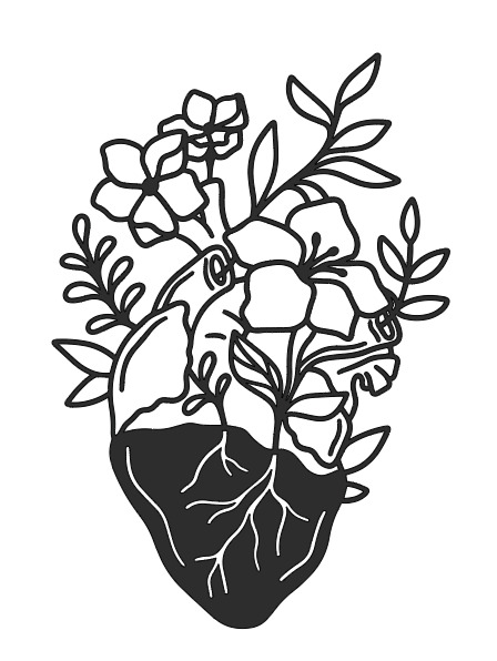
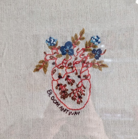
The image was designed by GlamSVG by Emylia and the inspiration came from an embroidery pattern by Emily June, which you can find HERE. I went through an embroidery phase during quarantine, and I have mine hung on the wall. I look at it daily.
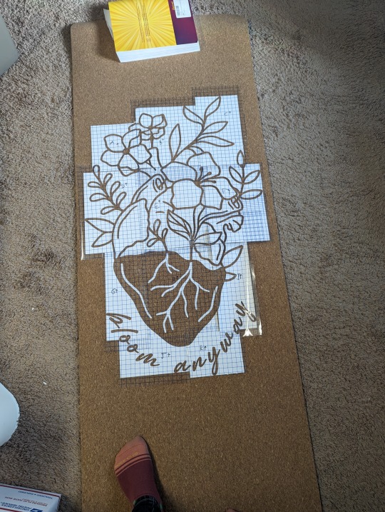
I had to resize this image to fit my yoga mat, which ended up being 24 x 36". Because I cut the stencil out of cardstock, I had to segment everything into 8.5x11 pieces, cut, weed, and then piece it all back together on the mat. Once I had all the pieces, I stuck them to transfer paper to keep the floating segments in place. I organized and labeled everything so I could put it back together again easily. It looked like this:
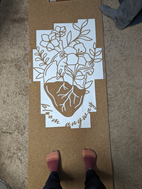
Once it was assembled, I sprayed the backs with temporary adhesive so the stencils would stay down. I removed the transfer paper and began painting the outline. I did end up losing a couple of the floating pieces (see the letter O and the leaf on the far right side), so I had to freehand some of it. Overall, the stencil turned out great!
I had a variety of success with the temporary adhesive. Because I bought a more inexpensive mat, I soon discovered how not durable it is. The 'temporary' adhesive pulled up small pieces of cork after I removed the stencil. This was partially my fault, since I didn't pull up the stencil as I went. Still, there were pieces that were going to lift anyway. This revealed that the cork is only one layer, but fortunately, each piece of cork that lifted was quite small and unnoticeable, and the thread behind it matched in color. It wasn't ideal, but I could live with it.
Some of the cardstock became permanent fixtures on the mat, which I then had to paint over. Also, some of the stencil didn't stick at all, so I had minor bleed through. Problems all around! But it still turned out nicely!
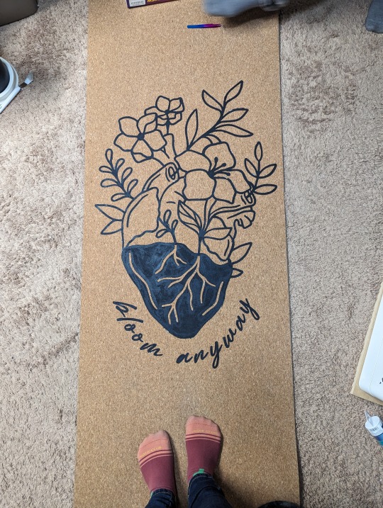
I need to preface that I have never painted anything before. Well, that's a lie. I've painted a wall, and six years ago I had a Bob Ross themed birthday party. The SO, however, is the son of an artist and taught me about mixing acrylic. His first tip was to test out colors. I used Paint.Net and came up with this mock-up:
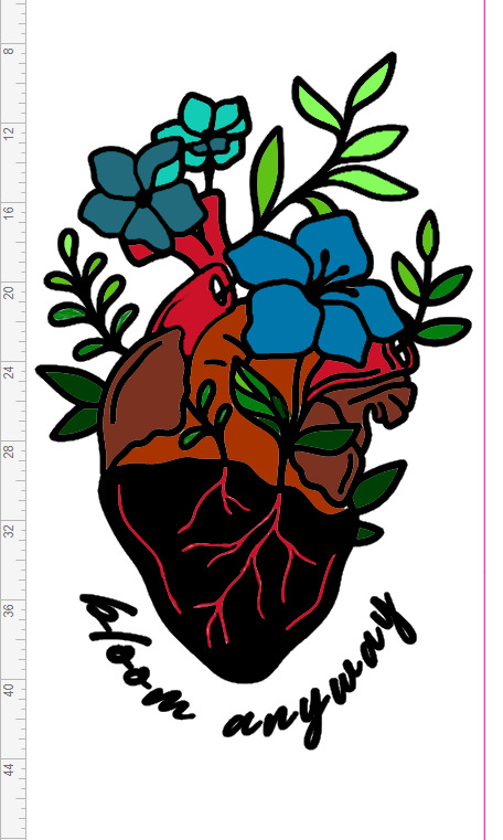
I knew I wanted the heart anatomy to be shades of red, so that was easy. The flowers were harder. I tried my favorite colors, like yellow and purple, but it didn't sit right visually. I turned to Canva Color Wheel to help me find complementary colors to the shades of red I wanted to use. That's how I came up with the pretty blues. To mix the colors, I used ColorHexa to show me the percentage of CYMK I needed.
Here are some progress shots:
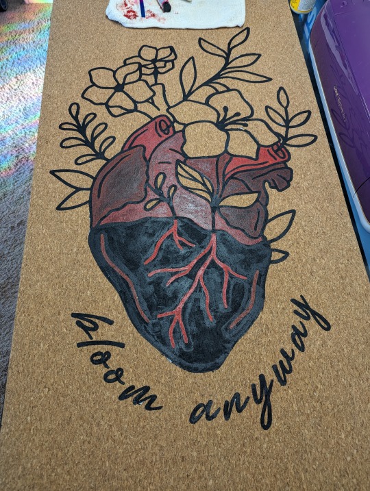
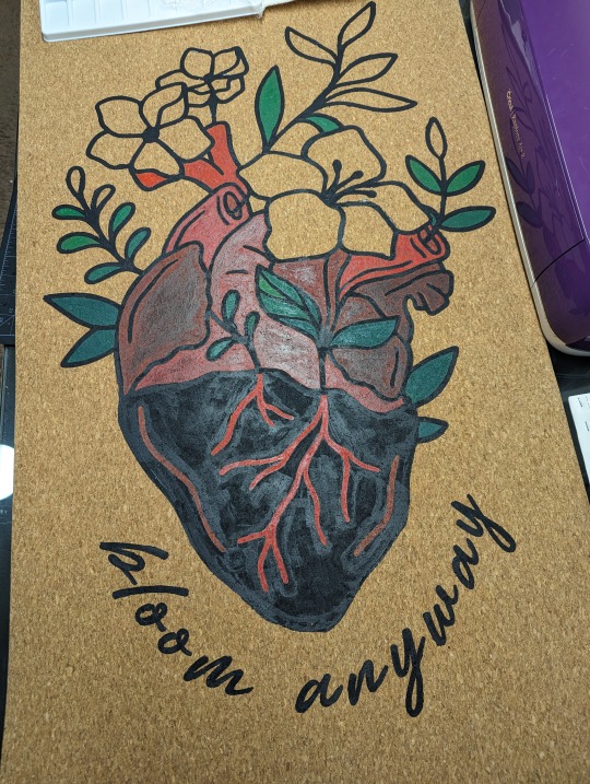
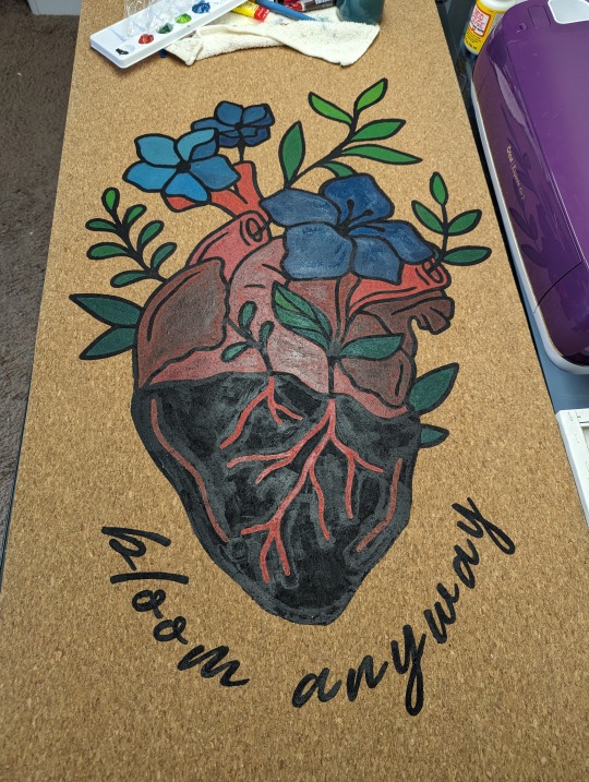
I'm super happy with how it turned out! My color mixing didn't turn out exactly like the mock up, but I love the results. The last step was to let it dry for at least 48 hours. Then I set it with Mod Podge Acrylic Sealer.
I chose Mod Podge since it's non-toxic, and I will be putting my face on it. Also, my dogs walk on it while I do yoga. They think it belongs to them. :) Knowing now that there is only 1 layer of cork, I do worry how it'll hold up to dog nails over time.
Lastly, the real test was to see if it would roll, and it does! So now I just need a yoga strap, and I'm good to go!
17 notes
·
View notes
Note
(How do you make your icons? Do you have any tips for beginners? What program do you use?)
@honkai-star-fun
First off hello! For once I can put my icon knowledge to use lol. But my icon process on how I do them is probably a bit more time consuming than it needs to be just from the sheer amount of steps there are but I'm too set in my ways to change.
First I'll take crops from the actual caps of whatever I want to make icons of, then I use a free program called Photoscape to resize the icons down to the standard 100x100 size that all my icons are (I know that I'm able to do that step in Photoshop but I never learned how and again too stubborn to change my work process lol). Then I go over to Photoshop to clean up all the icons (things like sharpening the image, cleaning up any backgrounds, tweaking lighting to the icon is more visible, things like that. Then the final step for me is actually putting my PSD over the icon I'm making (if it's not an icon for someone else that may or may not be edited with a border or overlay on top).
I premake all my borders ahead of time so when it comes time for the editing process I just slap them right on top of the icon and adjust the image as necessary so it's centered and make sure everything looks good. You can find pirated versions of Photoshop out there if you look enough I'm sure, but I personally just pay for an Adobe subscription every month so the software gets updates and I just do any icon work I can to justify the cost, whether it's just making a bunch for myself or making icons for friends who ask me to. But there's also free online alternatives to Photoshop that I've had to use in a pinch in the past. For me they're not the greatest for doing icons in bulk simply because I don't think you can mass upload files like you could on a legit version of Photoshop, but if you're really desperate it can get the job done. You'd just have to Google search like 'free online photoshop' or something along those lines to find a webpage for one.
As for the caps themselves that I use, a friend of mine does all my capping for me in exchange for me making icons for her own use because I've never been able to get the hang of using capping software, but if you search around on Tumblr and Google for caps blogs you can find a lot of free to use caps to make icons and graphics from or find people that do commissions for caps. It's also possible to find free to use premade icons if you search around Google enough (search things like 'Honkai rp icons' and you'll often find Tumblr posts that have free to use icons for the general public, or you'll find people that have some available for purchase through a commission like I do.
My biggest tip for a beginner is there's no shame in using free for public use icons if you just don't have the time to make your own from scratch. Do what you have time to do. I personally have been making my own rp icons from scratch for over 10 years now, but that's purely a personal preference of wanting complete control over how they're cropped and how they look and I'm willing to put in the time to make them look exactly how I want. Icon making can be really time consuming if you're making a lot of them or are icon'ing a character that shows up in a lot of their source material, so it's totally fine to do what you can to try and get through the process faster. And if you think just commissioning someone for icons to save yourself stress is a better way to go, it's totally fine to just spend a bit of money if you have the disposable income.
Anyway hope all that helped and if you have any more questions don't hesitate to ask!
#ooc#I still take icon commissions sometimes when they come in#usually from returning customers who know I do them in the first place#I just don't openly advertise doing them anymore bc I don't want to do manga icons anymore LOL#but I've seen plenty of icon commissioners around the rp sphere before
4 notes
·
View notes