#reminder to enhance color theory
Explore tagged Tumblr posts
Visit Tumblr Blog
Explore Tumblr blogs with no restrictions, modern design and the best experience.
Last Seen Tumblr Blogs


Fun Fact
In February 2021, Tumblr had 518.6 million blog accounts.
Photo
considering the year, can't blame you. should either redraw it or put Rick on that 2013core dress

An AU in which they madE FUCKIN MATCHING BRACELETS AMC AM I A JOKE TO YOU??
150 notes
·
View notes
Text
La La Land 🎞️


CHAPTER 1 (Remus Lupin x fem!oc)
content warnings: industry pressure, burnout, self-doubt, mental exhaustion, career struggles, substance use (drinking and hella smoking), anxiety, unhealthy habits. The weather was dreadful.
a/n: just a lady with micro bangs
"I don't know, Marlenne," the brown-haired woman sighed, lighting her second cigarette of the day with shaky fingers. She flicked the lighter closed, its metallic click sharp in the silence of the room. "The entire crew is going mad! The production company is breathing down my neck about the new script, and no actor wants to work with me. No wonder, though—I can barely pay ten pounds an hour!"
"Blair, I'm so sorry things are going south..."
Blair exhaled a cloud of smoke, staring at the crumpled coffee cup on her desk. It was still half-full, but she hadn’t touched it since the morning. She appreciated Marlenne's attempts to comfort her, but after so many reassuring words, a part of her wondered if she was truly cut out for this industry.
"Marlenne," she sighed again, her voice quieter now, "I love you, but can we continue this another time? I have class in half an hour, and my car broke down this morning."
"...You're taking the tube?”
Blair didn’t answer immediately. Instead, she set her phone down on the table with an audible thunk, her delicate wrist brushing the edge of the chair. Twisting her hair into a messy bun, she left her bangs to frame her gaunt face, the angles of her cheekbones more pronounced than she remembered.
"Yikes," Marlenne muttered on the other end before the line went silent.
[◉"]
Blair stared blankly at the page in front of her, her textbook open to a discussion on color theory.
"…Directors and cinematographers use color palettes intentionally, employing techniques like color grading to enhance visuals. For example, vibrant hues might represent fantasy or optimism, while desaturated colors evoke realism or bleakness…"
She sighed and ran her hand through her hair, her bracelet sliding loosely down her wrist. The paper felt impossible, and her stomach churned slightly—not with hunger, but from the coffee she’d been sipping since morning. Tossing her pen aside, she stepped onto her small balcony, cigarette already in hand. The chill of the evening air seeped through her thin shirt, brushing against her skin like a reminder of how much the temperature had dropped.
Suddenly, her apartment door slammed open.
"Hey! We're leaving in ten—what the fuck?!"
Blair turned her head lazily to look at Marlenne, who stood wide-eyed in the doorway. "What?" she muttered, blowing out another puff of smoke.
Marlenne waved the air in front of her face dramatically, coughing for effect. "How many of those have you had today, Blair? Jesus. The balcony’s practically a chimney."
Blair rolled her eyes, tapping the ash off her cigarette. "Second one," she said flatly.
Marlenne raised a skeptical brow. "Second one since I got here, maybe."
Blair ignored the comment, blowing another stream of smoke into the cool air.
"What do you mean, 'what'?" Marlenne mocked her tone with exaggerated indignation. "I told you I’d take you to meet some people!"
Blair’s posture stiffened. "What?! No, Marlenne! I can't! I need to finish this assignment, get Minnie’s project done, and get my shit together before the prod company meeting—"
Before Blair could protest further, they were both tearing through her closet, pulling out clothes at a frantic pace. Blair found herself frowning at a pair of jeans Marlenne tossed aside—ones that used to fit better than they did now. Eventually, they settled on a backless top paired with dark-wash jeans. Marlenne handed her favorite Mary Janes with a smirk.
"For luck," Marlenne said with a wink.
Blair muttered something inaudible but allowed herself to be swept into the bathroom. Marlenne expertly fixed her disheveled hair, applying quick but flawless makeup.
"Who even are these people?" Blair asked, watching her friend in the mirror.
Marlenne froze mid-swipe with her mascara wand, giving her a blank stare. "Did you even listen to me earlier?"
Blair blinked and offered a sheepish smile. "No..."
Marlenne rolled her eyes. "You’ll thank me later."
[◉"]
"So... what's this nutter plan of yours again?"
"You know the guy I told you about from my childhood?" Blair glanced sideways at Marlenne, her expression curious.
"Jace?"
Marlenne rolled her eyes dramatically, flicking her hair over her shoulder. "James. It's James, not Jace, okay? Anyway, I saw him recently in a coffee shop, of all places. You know how I am, right? I can’t keep my mouth shut for more than five minutes, and of course, he’s the same way. We started talking, and I couldn’t stop asking about what he's been up to. And it turns out, he’s been working with some people who would actually be really honoured to work with you."
"Yes, honored. They saw your Dreamer thing—"
"The Dreamers? No one saw that!" Blair laughed, incredulous.
"Hey! Four thousand views on YouTube is not ‘no one,’ alright?" Marlenne shot back, half-laughing herself as they rounded a corner and neared the entrance to Seb's place. "You have no idea how many people in this industry would kill for that kind of exposure. Four thousand’s a decent start."
Blair shifted her weight, still unsure, but Marlenne didn’t seem to notice as she pressed on. "Anyway, Lily and Sirius—remember them from the old neighborhood? My other childhood friends—are both desperate to get into the industry. They’d do anything to break in. I’m telling you, they're perfect for this. And listen, I know how much you value your creative freedom, but there’s this other guy, Remus. He’s an amazing writer, seriously.”
Blair rubbed her chin thoughtfully. "And James?"
"Well, James, yeah. He said he can help with... whatever you need, really. He’s got connections, knows a few people. He can open doors for you, if you give him the chance."
Blair stopped for a moment, looking hesitant. She didn’t like the sound of it—something felt off, but Marlenne’s enthusiasm was contagious.
"Look," Marlenne continued, her voice a little softer, trying to reassure her, "he’s just a rich kid who doesn’t want to live off his dad’s money, alright? He wants to prove he can do something on his own. He can help finance some of your stuff. You need someone with a little money to throw around if you’re serious about getting into the industry, and he’s a good guy, Blair. Just... trust me on this."
Blair stared at her for a moment, eyes narrowing, before letting out a sigh. She didn’t like depending on anyone, especially not someone she barely knew anymore. But Marlenne had a way of making things sound so simple, even when they weren’t.
"Alright," Blair muttered, pulling her jacket tighter around her, "I’ll think about it."
"Good!" Marlenne grinned, proud of her persuasive skills. "And trust me, you won’t regret it."
[◉"]
“And all of that is going to be… a musical?”
Remus was stunned, to say the least. His eyebrows furrowed, and he leaned forward slightly, as if trying to understand what had just come out of Blair’s mouth.
Blair didn’t notice his shock at first. She was busy chatting with the bartender, her usual easy smile on her face as he served her another drink.The rest of the group at the table was in full celebration mode, laughing and talking excitedly about their new project. As Blair had explained what she wanted the movie to be about, they had all eagerly jumped at the chance to work on it, their enthusiasm palpable. But Remus seemed a bit... taken aback.
“Yes… a musical," Blair said, finally turning her attention back to Remus. She tilted her head slightly, a playful glint in her eyes, "Marlenne said Sirius has some decent writing skills, and if we cut some expenses, we can get someone else to work with him. Make the project work, you know?"
Remus nodded slowly, still processing the idea. "What are they called, then?"
Blair’s lips curled into a slight, almost secretive smile. "Huh?"
“Your characters… what are they called?”
Blair looked around the dimly lit pub, her gaze lingering for a moment before it found the bartender, who was adjusting bottles behind the counter. She smiled at him, a brief flicker of familiarity in her eyes, then turned back to Remus. "Oh, um… they’re Mia and,” she hesitated, before adding, “Sebastian."
Remus couldn’t help but let out a short, surprised laugh. Blair's grin only widened, clearly enjoying his reaction.
"Really?" he asked, a little amused. "Sebastian? As in..."
Blair shrugged casually, almost nonchalantly. "Yep, as in my favorite bartender. I thought it had a nice ring to it." Her slender fingers wrapped around her drink with ease, a small movement, but one that caught his attention. Her posture, too, leaned just slightly, as if too comfortable in her own skin.
Remus chuckled again, his eyes lingering on her for a moment before he spoke, charmed but still processing. "I see. So, Mia and Sebastian... sounds like a star-crossed love story, huh?"
Blair let the question linger, her lips curving into something playful but unreadable. "Maybe. Or maybe it’s not what you think at all." She gave him a look that made it hard for him to tell whether she was teasing or just keeping him on edge. She leaned back a bit, the edge of her shirt falling loose at the sides, and Remus couldn’t help but notice how it subtly hugged the lines of her frame.
He gave a little smile, though a part of him felt slightly intrigued by her quiet confidence. "You like keeping people guessing, don’t you?"
Blair didn’t immediately respond, and instead, she took a slow sip from her glass, her eyes meeting his with a calm that only deepened his curiosity. "Maybe I just like to keep things interesting."
There was a long pause. Remus opened his mouth to speak again, but before he could get another word out, Blair was already moving away, slipping through the crowd without another glance.
He stared after her, unsure whether he should follow.


#remus lupin x femreader#remu slupin x yn#marauders fluff#marauders au#college au#polymarauders x reader#lily evans fluff#remus lupin x oc#marauders#lily evans#sirius black fluff#james potter fluff#james potter x reader#remus x sirius#director reader#college student reader#marauders modern au#film making au#indie director reader#found family#screen writer remus#aspiring actors#movie crew au#college film making au#marauders shenanigans#modern au#muggle au#remus lupin x fem!oc
14 notes
·
View notes
Note
FOR MY ASK GAMEEEEE
1, 3, 4, 6, 12, 15, 20, 21, 23.
- @brutally-loving
Hi Krue! I’ll answer these for Zandik <3
1. What animal does your F/O remind you of?
A raven - for its intelligence, eerie presence and ability to pick apart mysteries with a sharp mind. And a shark - for the predatory nature, sharp teeth and the way he never truly stops moving forward, always hunting for knowledge.
3. What is your favorite hobby to think about doing with your F/O?
Experimenting together, though not always in a traditional, clinical way. He’s lost in his work, scribbling calculations at an alarming pace, muttering theories under his breath, and I, his most valued assistant, creation, and his wife, stand beside him - sometimes helping, sometimes teasing him for overworking himself. Maybe I’m lying on the operating table, allowing him to study me more, unafraid of his scalpel.
Philosophical debates over dinner are another hobby, an intellectual sparring that only strengthens the bond between us. And on rare, quieter evenings? Stargazing in the desert, lying on the cool sand, speaking of the fake sky, eternity, and how insignificant yet fascinating human life is. He'd scoff at sentimentality, but his gloved fingers would linger against mine just a second longer than necessary.
4. What chores would your F/O do around the house? Are there any they REALLY dislike?
Chores he would do around the lab:
organizing research notes and materials - Everything must be in its proper place for maximum efficiency. If a single document is misplaced, we can expect a dramatic reaction.
calibrating and maintaining equipment - If anyone else touches his machines, they’ll never do it right. Best to handle it himself.
overseeing test subjects (including myself) - Whether it’s monitoring data or making precise adjustments, he takes personal satisfaction in his work.
Chores he’d avoid like the plague:
cleaning up after experiments – Bloodstains? Shattered glass? That’s what assistants (like me) are for. He’s too busy refining theories to deal with the aftermath.
cooking and meal prep - If it isn’t something he can eat or drink quickly while working, it’s an inconvenience. He might forget to eat for hours, if not days, so cooking is my job.
laundry - He wears the same coat until it’s absolutely necessary to change it. One of his segments might handle laundry, but he certainly won’t.
Bonus: Chores he’d delegate to his segments:
“lesser” administrative work - One of his segments can handle mundane tasks like lab supply inventory, since he considers it beneath his time.
dealing with unimportant visitors - If someone dares to interrupt his work for trivial reasons, he has other versions of himself to shoo them away.
6. What kind of ringtone or notification sound would you have for your F/O?
Since I’m part of his hivemind, I don’t really need one, as we talk through telepathy a lot. Still, if my self-insert would have a phone, his voice saying “Ah… Did you think you could ignore me?” or something like that whenever he called would be funny (and make me a blushing mess).
12. What color do you associate with your F/O?
Light blue, like his hair!
15. What would your F/O get you for Valentine's day, if anything?
1) Zandik is all about his work and my relationship with him is no different - a gift that benefits us both is the perfect option. He might craft something personally tailored for me, like a specialized Geo-focused enhancement tool or a new experimental device that maximizes my powers (especially considering my sand abilities).
2) For him, the greatest gift he could offer would likely be knowledge. A private “lesson” on a forbidden or rare piece of research he’s been working on, something that could be either dangerous or highly advanced would be something he thinks would show me how much he cares. I’d learn more about his deepest interests this way.
3) He might also see the day as the perfect opportunity to “celebrate” by involving me in one of his most advanced and personal experiments yet - something that could challenge both of us, test the limits of my powers and deepen our bond in a scientific way. The experiment would be a way to bring us closer and prove the connection between us, perhaps by enhancing my abilities even further. “Gift” or not, it’s a test of love and intellect.
20. What're your F/O’s favorite personality traits of yours?
My intellectual curiosity, seeing that I’m equally interested in experimenting and expanding my limits, just like him. My ambition and determination to constantly improve and my dedication to furthering my abilities, especially considering how far I've come under his guidance, would be something he’s especially proud of. My independence, I don't simply exist as his assistant or test subject - I stand on my own and make my own decisions. I complement his need for control and precision. My ability to adapt and learn, as I’m the type who can absorb information, challenge him, and still stand firm in my ideas, which he’d view as a sign of strength. The fact that I've grown both emotionally and intellectually thanks to him makes him proud. My determination to challenge him - he’d find it incredibly stimulating when I challenge his views, question his methods or test the limits of his ideas. It shows that I’m not just a passive participant but someone who brings a unique perspective. It also means that deep down, I’m on his level, capable of thinking critically and independently. This appeals to his sense of superiority in a way that’s paradoxically flattering to him. He likes that I keep him on his toes.
The way I’ve survived his experiments and the resilience I show despite the pain and challenges I’ve faced also stand out to him.
21. If your F/O drew you, how would you describe the art piece?
If Zandik drew me, the art piece would likely reflect his meticulous nature and sharp attention to detail, with an almost clinical precision. I would be depicted with an air of otherworldly grace, perhaps standing amidst his laboratory's cool backdrop, with sand swirling at my feet or entwined around my form as a reminder of my powers. The lines would be clean and sharp, much like the precision with which he conducts his experiments. Every curve, angle and shadow would be deliberate, as though he’s trying to capture not just my physical form but the very essence of who I am - my power, my resilience and my complex bond with him. The color palette would be muted - greys, deep blues and maybe hints of warm sand tones.
23. What color would your F/O associate you with?
He’d likely associate me with a rich, deep shade of sand, a warm, earthy tone reflecting my Eremite desert heritage and connection to the sands. The sand, in his eyes, is a metaphor for my ever-shifting nature, how I can adapt, heal and even reform, much like the grains of sand that move and change shape yet remain a constant force in nature. He might see dark reds or crimson intertwined with that, representing my passion and the power he’s helped unlock!
7 notes
·
View notes
Text
okayokay here are my Thoughts that no one asked for aljgdh

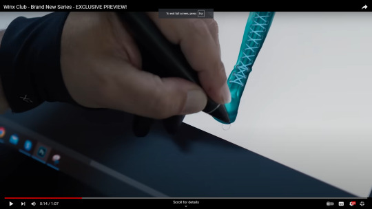
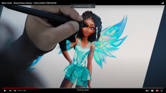
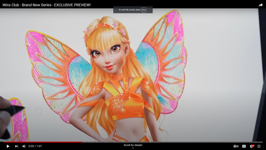
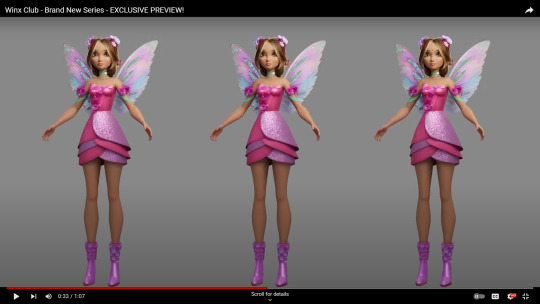
i LOVE bloom's boots and her wings!! the hair will definitely grow on me. i don't like her outfit though. i do see what they're going for! it's very reminiscent of her og magic winx and one of the earlier promo designs we saw but to me, this doesn't feel very,,, bloom. it's so sharp, there are so many angles and layers (which feels like the Theme rn for most of them). IF they're going for more of a dragon warrior vibe for her then i can def see it, but the stiff fabric just isn't doing it for me. i do like the shoulder guard look though! idk there are aspects i like and i can see the vision, but i'm hoping the final design is a bit more refined and feels more like Bloom
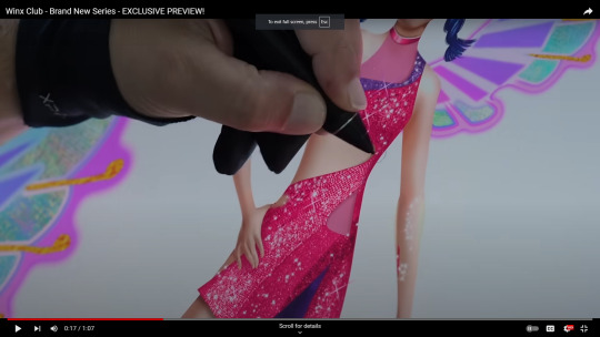
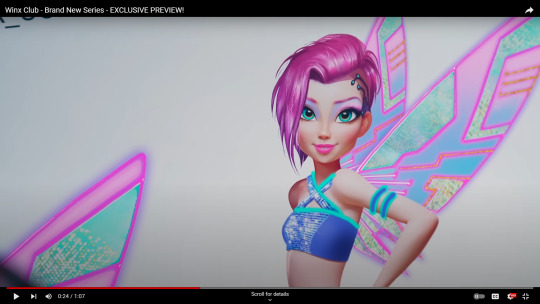
like i said before, aisha's design feels very one-note compared to the other girls and i think it's because she's basically wearing one color. i love that they put her in blue!! but i hope they introduce a secondary color like her og green or yellow/purple to help balance her out. as for the actual outfit, love the boots! it feels more believix to me but i concede that this transformation is meant to feel more modern so i'll deal. the actual outfit,,, not the Best. the cuts are interesting, there's a lot of symmetry which is weird to see on aisha since most of her transformations before were very asymmetrical. i'd love to see more flowy fabric with her! the little hip things just aren't doing it for me. i like her wings! but they do look a little too similar to bloom's for them to really stand out. i love the gold on them though!! AND HER HAIR >>>>> best part!!

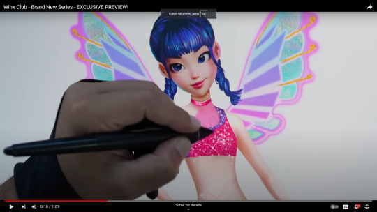
LOVE musa's hair!! it's so cute i'm crying :') i feel like the hair is definitely a strong point of these designs!! i think the wings will grow on me once i see them in action. right now they feel a little awkward but i see the vision. i think so far musa's whole design is looking really good. Very similar to her og winx with just enough of a new change to not feel exactly the same. and her boots!!! LOVE seeing that more edgy side of musa reflected in her clothing! idk i think this is one of the stronger designs good for her!!
we didn't get to see the bottom half of stella's look so i'm not sure what that's going to be like! i love the sun ray collar but i will say it def feels more Fairy Warrior so,, i like it but i would want to see that reflected in the actual fighting and plot too. if it's not then it's not the Best design choice imo. her wings,,, like musa, i think they'll grow on me once i see them in action. it's lovely to see blue on her! not sure how i feel about the hair but since stella's ponytail is in her casual look instead, i understand why they didn't put it here too. i'm looking forward to seeing more of this design!
we also didn't get to see the lower half of tec's design so,, idk but i think it'll end up being pants going by the look of her boots? i don't Love the boots, but again, i see the vision and i do think it'll look better animated. her wings,, i like them but i would've liked to see a more interesting overall shape! the design on the inside is great, but tecna's wings were always sooo interesting and didn't feel like generic fairy wing shape. idk,,, we will see.... LOVE the hair, love the glowiness. it's like a solid 6/10 for me. i think there are certain things they could still play around with to enhance the design but it's going in the right direction
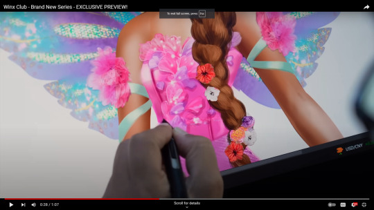
okay,, first, LOVE the braid!! she's finally beating the "never changes her hair" allegations good for her. and the little flowers in her hair are MWAH the wings are cute! they look good with the design. love the petals on the top! it def blends more and isn't as overwhelming as the previous design. the flower arm bands are also a classic. the skirt is really where it loses me. i like it In Theory - i understand the goal. it's very flowery, very much like petals, it reminds me a lot of a tulip. so i get it! However, the layers,,, idk man it just looks off to me
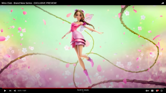
it Def looks better in action! it's not as stiff, the edges are going up, there's an overall more graceful, flowy vibe to it. but the layers,,,, i Get it but i don't love the execution. but to fair, i don't really know what would make it look better so maybe this is the best they could come up with
OVERALL, i do think it's going in the right direction in regard to pleasing old fans and appealing to newer, younger audiences! i do think a lot of the fabric looks really stiff rn But seeing flora's animated transformation is giving me hope that it will look better in the actual show. the 3D rendering just looks off when it's a standalone piece. so far, i think the best designs are musa's and flora's. they feel a lot more balanced, capture the winx vibe, And still feel true to the characters. imo the other designs are missing one or two of those elements.
bloom's design needs to feel more like bloom. aisha's needs more dimension. stella's is nice in theory but doesn't quite match her more carefree, fun-loving attitude and feels more like a Royal Warrior thing so it really depends on how she's being characterized i guess. tecna's is good but i want to see the whole thing lol also i think her wings should be more unique
Now. as for the casuals.
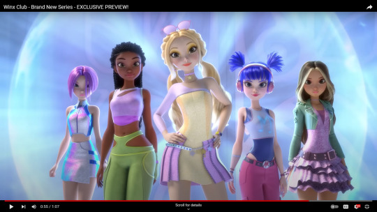
tecna looks great i think we can all agree on that!! very boss babe i love it!! aisha,,, i think her pants should be baggier. the tight fit and hip cuts just,,, i see the vision but i think they need to reel it in and make it more Aisha. stella's skin is way too light she looks sick. her outfit,,, Bad. her entire design just feels so pale and desaturated?? like just up the saturation on everything and it'll look ten times better even with the wacky outfit choice.
musa's is okay. i get the vibes - i understand the choices. but like aisha, i think her design could just use a little more thought. it's similar to her og outfit but kind of in the wrong way imo? like it has the same sort of look and cuts, but it's also tight and uncomfortable. musa's og look was very much about comfort over fashion so this feels a little,, hhhrrrrmmmm yknow? i do like the direction though! i think for me, it really is the top part. like why is she wearing a skin tight bodysuit. who told her that was comfortable for day to day wear. it's very much aesthetic over comfort which isn't Bad but it doesn't feel very s1 Musa yknow? she loved her baggy, comfy clothing for normal days
flora's is okay too. again, i like the direction. i don't love it as her Official One Casual Look for the season; i think i would've preferred it as a secondary look for one episode. but it's not the worst! it Is very flora so i concede lol
#long post#oh my#i think rn tecna and flora are tied for best overall looks for both#musa is a VERY close second/third. i just think her casual needs to be reassessed#the others just need to feel more like themselves for me to like it#clearly they are capable of that because Look at musa's and flora's transformations yknow?#i feel like theyre trying to keep stella being the fashionista but theyre also basing their knowledge on like#currently outdated tiktok trends#fashion trends are moving Really fast rn!! it's better to stick to a specific vibe for characters and not try to make it Too Modern#they will end up looking outdated lol#like the other girls kind of have those vibes but there's a lot more individual personality and hints of their og designs#that's Kind of there with stella like she has certainly worn dresses with that kind of fit before#but the entire thing as a whole just does Not feel stella#same with her transformation actually like i Get it but it's not Stella#at least not in s1 yknow? it feels a little too mature man we've been through a lot for a s1 transformation#same with bloom's! like it's Okay but it doesn't feel like a first transformation for a young fairy#and listen i dont hate the idea of their looks being more armor-like But that needs to be reflected in the fights and vibe of the show#AAGGGHHH idk maybe ill change my mind about bloom and stella's transformations once we see them animated#so many thoughts..#im gonna wait to speak on bloom's casual until we get a more clear shot of her!#But from what i could see it looks good lol very s1 bloom
9 notes
·
View notes
Text
What Does Miguel’s Injection Do?
When I first watched Miguel’s injection scene in ATSV, it reminded me of the scene where Miles got his spider bite in ITSV. So, this post will focus on any parallels between the two sequences to figure out the purpose of Miguel’s injection.


The images above show Miles’s bite and Miguel’s injection in a similar manner as the images on the right place emphasis on the spider visual (both the animal and logo), the middle images show the spider/needle making direct contact with the Spiderperson’s skin, and images on the left emphasize the spider’s fangs and the ends of the needle entering the bloodstream. It’s clear in ITSV that the serum from Miles’s spider bite is supposed to give him his spider powers, so it’s likely that the serum from Miguel’s injection performs a similar function where it directly affects his spider powers. There’s also how the needle shown in the right image has the same spider skull insignia that Miguel has on his suit. Coupled with how this image parallels the image of the spider biting Miles, it indicates that this injection is related to his position as Spider-Man, rather than any personal drug addiction.
This eliminates the idea that this injection could be Rapture, an addictive drug Miguel accidentally took in his 90’s comics, since he got the drug out of his system through a lab experiment that indirectly led to him gaining his Spider powers. While Miguel getting Rapture is the inciting incident that causes him to perform the experiment, the drug itself does not give Miguel his Spider powers. If Miguel’s injection were to be Rapture or some other drug, it contradicts his origin story and how the serum relates to his Spider abilities.


The images above show the spider based liquid interacting with Miles and Miguel’s bloodstream. For Miles, the teal chemicals from the liquid encircle his blood cells to transfer Spider powers. Meanwhile, Miguel’s injection releases these mini green eight-legged contraptions, reminiscent of a spider, that latch themselves onto his blood cells. The teal spider liquid’s transferring of Spider powers looks naturalistic in the way it fuses the chemicals and Miles’s blood cells together. However, the green contraptions’ transfer looks more artificial as they force themselves to attach to Miguel’s blood cells, instead of fusing into each other.


These images present what happens to Miles and Miguel’s blood cells after the Spider serum has been transferred. After Miles’s teal Spider chemicals have fused into his red (pre-existing) blood cells, they start duplicating into teal blood cells that signify him getting his Spider powers and the combining of his Spider and human sides. Meanwhile, when Miguel’s green spider contraptions latch onto his red (pre-existing) blood cells, they turn blue, signifying the transfer of Spider powers.
It’s also important to note that in Miguel’s origin story, him getting his Spider powers led to his DNA becoming 50% Spider and 50% human. So, unlike Miles’s pre-existing blood cells that were fully human, Miguel’s pre-existing blood cells are already 50/50 Spider and human. Additionally, Miguel’s green contraptions look like they’re fully activating the Spider DNA in his blood cells as indicated by the color change from red to blue, which parallel the color change Miles’s blood cells go through, from red to teal, once his Spider powers have been fully transferred. Thus, Miguel’s injection is likely meant to enhance his pre-existing Spider DNA, causing his genetic pendulum to swing from 50/50 to a slight 60/40, favoring his Spider side.


While there are theories that Miguel’s injection could be genetic stabilizers, there’s too many references to Miles’s Spider transformation and Miguel’s Spider side in the sequence that would indicate the serum stabilizing or reducing Miguel’s Spider DNA. In addition, with the serum enhancing Miguel’s Spider DNA, it would explain his change in appearance since the last film as he got a growth spurt and increased in muscle mass. This parallels Miles’s growth spurt after his Spider bite, although Miguel likely uses these injections multiple times, which explains would why his gains are much larger.
It’s also interesting how Miguel’s Spider serum enhancing his Spider DNA highlights a common Spiderperson’s conflict where they try to balance their Spider and personal identities. In ATSV, Miles and Gwen go through this conflict internally, which causes them to focus more on the former and hurts their personal lives in the process. With Miguel’s Spider serum, this conflict gets externalized where Miguel is not only in a struggle between his Spider-Man and Miguel O’Hara identities, but also between his Spider side and his humanity (literally emphasizing his duality between being a Spider and a Man). As Miguel opts for the former, signified by him taking the Spider serum, a lot of his humanity gets lost as seen in his uncontrollable rage and him heading down a darker path towards the end of the film.
#miguel o'hara#miles morales#into the spiderverse#across the spiderverse#atsv analysis#spiderman 2099#spiderverse
20 notes
·
View notes
Text
A Little Legendborn/Bloodmarked Scent Theory Part Two
William Sitterson scent profile - Citrus/Fresh
“The infirmary is William’s domain. He strides between the tables, his hands coated in silver aether so thick it looks like mercury. The bright citrus smell of his aether signature fills the room.”
What can I say, I love William and his sunny, yet firm disposition. Fruit in the citrus family include oranges, lemons, limes, grapefruit, kumquat, clementine, pomelo…you get the idea.
Citrus - Citrus oils and resins have the power to uplift our mood and bring peace to a space. Think of all the household cleaners you use, how many of them have a citrus profile? Ever wonder why you gravitate towards those scents? Citrus has been used in many cultures for centuries and has healing and therapeutic benefits. It is no wonder William is one of the few people that can calm Sel down in the heat of anger. He is like a gray-eyed Yoda, even-keeled and level. His tranquil sensibilities allow people to put their guard down and open up that much more. The history of the use of citrus in Ayurvedic medicine in India or in religious ceremonies in ancient Egypt is well documented for its ability to purify a space, bringing positive energy which promotes healing. The sweetness of this scent can reduce stress and anxiety.
My final cute William tidbit can be found in this quote:
“After a while, William hands me a lime-colored cloth handkerchief. I stare down at it, puzzled at the alarmingly bright fabric. I hear the smile in his voice. ‘It was my father’s. The line of Gawain is what discerning people call ‘ostentatious’.”
Limes - Limes and their oil represent the ability to cleanse the physical body and heal and purify the soul. Next time you are at Tarjay’, grab some of that lemon/lime-scented Mr. Clean and thank the Scion of Gawain.
Valechaz' scent profile - Soft Oriental, Dry Woods
“He leans into me slightly, and I get a whiff of something dark, spicy, and burning.”
“He steps nearer, until that leather and star-anise smell swirls thick in the air and my cheeks prickle.”
Valechaz’ scent profile is as spicy and sensual as he is. In my reading, I found that his scent calls back to a time of old (much like Incense Daddy Erebus, but more on that later) which is fitting for the 205 year-old most balanced Cambion in the region.
Leather- When used in perfume, leather scents are warm and rich, with a bit of musk. There are smoky and animalistic notes. Valec’s scent was described as burning (we know he brings the heat with him) and the way his eyes turn over red reminds me of a shark whose eyes turn over white before it bites. The scent of leather denotes luxury, sophistication, and masculinity (whatever that means to you). We know Valec is dressed to the nines daily, “Suited and booted” as the old folks used to say. He is also not to be trifled with as he has demonstrated he is 100% with the shits.
Star Anise- Sweet and licorice-y (yes, that is a word), star anise is spicy and intense. It is rich and exotic and is often added to oriental and gourmand fragrance compositions. Star anise compliments a variety of fragrances creating harmonious blends that have endless layering possibilities. Its presence enhances the overall scent, creates depth and complexity, and enables the creation of balanced, captivating fragrances.
The essence of Valec’s scent profile is luxurious, seductive, and balanced on the razor’s edge of ferocity.
Erebus Varelian- Scent Profile Woody Oriental or Woody Amber
“His aether signature surrounds me with scents I associate with ancient trees and holy places: myrrh and saps, incense burning.”
Erebus (affectionately known as Incense Daddy) is such an interesting and mysterious being. He is calculated and opportunistic, and I imagine he has not survived this long without brutal and unwavering tact and a bit of street smarts. His scent hints at his true identity and the power that lives within it.
Incense - Spicy, resinous, and woody, the smell of incense creates a mysterious, warm, richly scented experience. For eons incense has been used in cultural and religious practices dating back to ancient Egypt, China, and India. Its spicy, powdery notes are seductive (like Valechaz’) and smelling incense when none is present can denote spiritual presence or messages from the spiritual realm. Incense can be associated with protection and spiritual growth.
Myrrh - Myrrh tends to go hand in hand with incense. It is described as having a balsamic, spicy, smoky odor. Made from bleeding a Commiphora tree of its resin, in magical circles, myrrh is used with cleansing and purification rituals. It can also be combined with incense for protection against negative energy and rituals related to banishing and breaking curses.
It is no wonder Erebus’ scent is derived from tree resin. Trees hold powerful ancient symbolism (strength, growth, protection) and represent an interconnectedness of all living things. Erebus has been around the block in many iterations, hiding in plain sight. His scent profile calls back to a time when Gods walked amongst men.
“Dark hair, olive skin, a long black jacket, and an aether signature older than the ancients themselves. How many people has he killed, just to walk among us?”
I hope you’ve gotten a kick out of this as I have! What did you notice about the scent families? How do you think they are connected? I have linked part one below as well as my other contributions to this fun little series. Now go on out there and find an "Incense Daddy" to smell.
Scent Part One
Color Theory
Symbolism
20 notes
·
View notes
Note
i still haven't started working on the art style analysis yet-- but i have made a few notes of the style:
1. varying line weight. the lines will change in places where lines, collide or bump into each other, thicker lines may appear in places to make something stand out, sometimes the line art will fill out a place where a shadow should be like for ex: armor, weapons, jewelry, anything that's made of metal or shiny really.. sometimes it's just to avoid drawing detailed armor or to simplify the panel(?) i'm not sure how to explain it..

2. very long proportions- some characters look 7ft but are actually like 5ft6 or something- ex: Jinwoo is 9.25 heads tall or 9ft3, but his canon height is 6"5 (reminds me of the daddy long legs spider)

3. shadows are softish? the shadows on Chae-in and Jimwoo for example are sharp but soft in certain points


4. shadow colors depend on the background/setting they're in. (usually blue, purple, sometimes pink or peach) sometimes the shadow colors have a gradient.
5. solo leveling uses a lot of gradient overlays.

6. the bodies are pretty simple, they basically follows every other anime or art style rules: fem characters tend to have more round and soft silhouette, narrow shoulders, usually curvy, etc.. masc characters have a sharper(?) silhouette, wider shoulders, sharper jawline, some characters are built like sticks(Jinwoo).
if your character is genderless or is meant to look androgynous or just confusing: there are no rules, go wild.
if there r any mistakes then pls js ignore them bc i took 3 adhd pill so get high- i couldn't snort them bc when i popped the plastic pills open it was filled w lil beads-- i can't feel my heart beat and i have unlocked enhanced anxiety requiem-
Ahhhh Thank you so much for this!!
I have noticed the variations in the line art but unfortunately always lost track of which thickness I'm using lksjfdsf That's just something I need to practice more though
The shadows have always thrown me off, mostly because I have very little understanding of color theory, but your explanations of the shadows and gradients are very helpful!
Oh no, hope you feel better soon!! But thank you again for your analysis!! It's cleared up a lot of things for me!
11 notes
·
View notes
Text

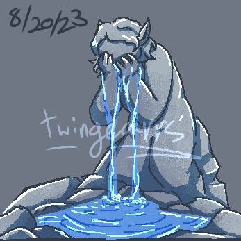
8/20 Hydrate Shell Jam 2023 Results
Hello, and I hope today finds you hydrated! If you're not aware, yesterday (8/20) was Hydrate Day, and that means we had the 8/20 Hydrate Shell Jam in the Ukagaka Dream Team discord server!
In 2020, @internetteacup and I made a drink reminder ghost on 8/20, called Hydrate. Since then, many folks have made shells for it to give it different looks! The only """rule""" I've given is that any given shell must be something that could—at least in theory—hold liquid. And folks have taken that idea and made all kinds of strange and fun "drinking apparatus" with it!
So, now I host an event on 8/20 where folks have 1 day to make shells for the ghost! It's a fun creative exercise, it's a really easy way to get into ukagaka dev if you've never done it before, and we have a lot of fun seeing what folks make.
I hosted this event last year as well, but never shared it on Tumblr. You can see the results of that here!
So, with that context given, here are the results of this year's event! We had 11 entries by 9 participants, most of which have dressups of some kind, and a few which are animated.
See all the entries and their download links under the cut!
After the rainfall, by Zichqec. A leaf with water droplets, which sticks to the right side of the screen!

Dollhouse Drinks, by Galla. Tiny pixel cups, which come in a wide variety of colors!

Haiidrate :3, by Okuajub. A cat paw shaped cup, with various drinks inside!

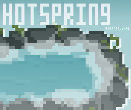
Hot Spring, by StrangelyKai. A nice pixel art of a hot spring!
Hydrate Enhancer, by idk. A shell based on MiO brand water enhancers, which comes in a variety of flavors!

Milkshake, by Aegisghosts. A decadent milkshake, with several flavors, each with their own tasty looking toppings!

Paint Splatter, by StrangelyKai. A splat of paint, which comes in a variety of colors and patterns, and even has instructions on how to add your own!

Planetary, by WhatAPhantasia. A whole entire planet to drink! Comes with an appropriately sized straw, and some other dressups.

Reassurance Bucket, by OdieDogXP. The reassurance bucket from The Stanley Parable: Ultra Deluxe! Comes with a few sticker dressups.

Tiered Bowls, by Zichqec. A set of tiered bowls, which hang from the top of the screen! A dressup can be used to turn the water on or off.

Very Sad Statue, by SmokyCinnamonRoll. A very sad statue which weeps eternally!
#Ukagaka#Ukagaka ghost#English Ukagaka#Hydrate#Hydrate ukagaka#8/20 Hydrate Shell Jam#8/20 Hydrate Shell Jam 2023#not art#//This is just a tag for sorting on my blog - all of this is art lol#ZiUkagaka#ZiChrono#//Thanks everyone for participating in this event!!
15 notes
·
View notes
Text
✨“La Haine (1995): The ultimate toxic masculinity movie“✨
I guess James Brown was right… It truly is a Man´s Man´s Man´s world, but …
I tend to get a bit frustrated about the fact that we only talk about the side effects of patriarchy on women, and we tend to forget to highlight that certain men suffer the negative consequences as well. “Patriarchy: the original “boys´ club where men hold the remote control to power and women are stuck watching reruns!”

Hmmm, not completely true for men who are also minorities. According to my observations, whether from real life or literary/movie stories, there is this ongoing notion of heightened toxic masculinity in marginalized men, who use it as a form of mental and physical survival, as the movie La Haine genuinely pointed out and reminded us.

La Haine, whose reputation precedes itself, is a gritty French film that delves into the lives of three friends- Vinz (a volatile young man, vowing revenge after a police officer injures their friend Abdel), Hubert (the most level-headed of the group), and Said (the comic relief, navigating the chaos with a sense of humor)- living in the improvised suburbs of Paris. Set against a backdrop of social unrest following a riot, the movie follows the trio over the course of 24 hours. Beginning with the aftermath of a violent clash between police and residents of the housing project. Throughout the day, the friends encounter various characters and situations that reflect the social and economic disparities plaguing their community., being constantly reminded of the systematic injustice they face. The film's conclusion is ambiguous, leaving viewers to ponder the cycle of violence and inequality that grips the banlieues.
The intensely raw narrative of La Haine is enhanced through masterful cinematic techniques, implemented by the director Mathieu Kassovitz, who won many well-deserved prestigious awards for this movie. He used cinema verité style (documentary-like approach) utilizing handheld cameras and natural light to immerse the audience into the story, incorporating long takes and tracking shots to create a sense of fluidity and movement within the urban landscape that amplifies the tension on the screen, including symbolism (such as the recurring imaginary of mirrors reflecting many fractured identities of the characters). Of all these decisions, the decision to shoot La Haine in black and white strikes me the most. As if to highlight the cruel unfair world based on the color of your skin they live in. As if to label racism as something old-fashioned that should´ve been long forgotten and left in the past in the era of black-and-white movies.

Throughout the movie, there are no prominent female characters, only a few that appear briefly but play no significant role in the central narrative. However, I have no problems with these phallocentric tendencies. This one gets a pass.
The legendary scene, where Vinz stands in front of a mirror, imitating the gangster Travis Baker from ´Taxi Driver´. This scene not only tells us that Vinz obviously has a thing for the tough guys (not to blame, because who doesn´t?), but it reflects his desire to assert his masculinity and power in the face of social marginalization. Vinz is not playing dress-up, he is decoding manhood in a world where tough is the new black (or the new white?). Moreover, it perfectly exemplifies the Social Learning Theory (SLT) by Connelli, which argues that an individual´s behaviors are shaped by societal norms of gender roles learned through observation. Vinz´s fascination illustrates how marginalized men often adopt hyper-masculine behaviors as a means of survival, reinforcing Connelli´s theory on the social construction of masculinity within the specific cultural context.
Furthermore, Butler´s theory of performativity fits perfectly for this scene as well. The theory highlights that the binary concept of gender is constructed through performative acts, perceiving gender identities as something, not of a stable essence, but something that has to be constantly enacted through repeated acts and behaviours. Vinz is literary performing his hyper-masculine act in the mirror of his bathroom, to achieve a critically acclaimed ultra-macho show once he leaves the room.

Only this one scene could be applied to so many gender theories, that I would be able to write my Bachelor thesis about this, and maybe not even that would be enough. La Haine is an iconic artifact of 20th-century cinematography, from Vinz´s mirror scene, the Paris city center dolly shot, to the last heartbreaking soul-wrenching final scene, that will remain relevant across generations for its significant theme and its remarkable incomparable portrayal. It will live forever, to remind us for an eternity that it is indeed a Man´s Man´s Man´s world, but not even men want to live in it.
2 notes
·
View notes
Text
Breaking Down the Bold Finale: Why Promising Young Woman Nailed It
Hey, fellow film lovers! Promising Young Woman (2020) is one of my all-time favourite movies and for good reason. It discusses important topics about society and femininity.
Let’s dive into the jaw-dropping finale of Promising Young Woman. Buckle up for a chat about film theory and why that ending is a knockout.
Feminist Film Theory: Power to Cassie
In the realm of feminist film theory, Cassie is our unapologetic protagonist. She emerges as an avenging hero, shattering the conventional narrative. The ending? It had to be bold, reflecting Cassie’s relentless pursuit of justice.
Cassie, portrayed with depth by Carey Mulligan, challenges the typical female character arc. The tension and power dynamics unfold in scenes where she confronts her targets.
The ending becomes a powerful statement. It breaks away from traditional gender norms. The ending also offers a fresh perspective on justice in the face of sexual assault.
Genre Deconstruction: Twisty Turmoil
Now, let’s talk about genre deconstruction. Promising Young Woman begins as a dark comedy. Before long, it morphs into a thrilling tragedy. Why? To keep us on our toes. The ending is unconventional because life itself is messy, and so is this story.
The film’s ability to blend dark comedy with thriller and tragedy is intentional. Shaking up genre expectations makes us question our assumptions about justice and morality. The ending isn’t neatly packaged, but a deliberate departure from the expected.
Visual Language: Colors Speak Louder
Have you noticed those dreamy pastel colours during Cassie’s confrontations? These pallets act as eye candy AND visual storytelling. The ending needed to be a spectacle.
The filmmakers used colours to challenge societal perceptions and scream empowerment. Pastel colours in confrontation scenes add layers of irony. The pallet challenges traditional notions of femininity.
This visual language enhances our understanding of the film’s themes. It adds depth to the ending, making it an interplay of satisfaction AND discomfort.
Dialogue as Subtext: The Unsaid Speaks Volumes
Cassie’s exchanges, especially with characters like Ryan, are dripping with subtext. The coffee shop confrontation? It’s a dialogue masterpiece, wrapping up Cassie’s journey with emotional weight.
Film theory teaches us that dialogue isn’t just about words. It’s also a hidden treasure trove of meaning. We can especially focus on lines leading to the film’s climax.
Let’s talk about THAT line in one of the ending scenes, where Cassie shows up as Candy.
Al Monroe: It’s every man’s worst nightmare, getting accused of something like that.
Cassie: Can you guess what every woman’s worst nightmare is?
Now that’s a kicker.
Al Monroe, played by Chris Lowell, reveals a common sentiment among men. He expresses fear at the thought of a woman accusing him of a heinous act.
Cassie’s retort brings the film’s feminist themes to the forefront. It challenges Al and, by extension, the audience.
Men may fear false accusations, but women live with the constant threat of sexual assault. They face the fear of no one believing them or taking them seriously.
Cassie’s response is a stark reminder of the gendered nature of societal fears. Her line put a spotlight on the systemic issues surrounding sexual assault. These types of lines prompt viewers to confront the disparity in societal expectations.
Cassie’s question is a rhetorical challenge, urging the audience to reconsider their ideas. The line encourages the viewers to empathise with the lived experiences of women. This dialogue lingers, forcing viewers to confront uncomfortable truths about sexual assault.
Catharsis and Disquiet: Emotional Rollercoaster
As we approach the finale, that mix of satisfaction and disquiet isn’t accidental. Film theory says it’s purposeful. The ending brings catharsis, a release, but it also nudges us to question more. It’s a rollercoaster designed to make us think.
The emotional impact of the ending is intentional. It prompts us to reflect on our own expectations and biases. The ending pushes us to confront uncomfortable truths about justice and societal expectations.
The film doesn’t spoon-feed us a tidy resolution. Instead, it leaves us with a cocktail of emotions. It sparks conversations long after the credits roll.
A Cinematic Rebellion
In a nutshell, Promising Young Woman chose its ending for a reason. Feminist film theory empowered Cassie. Genre deconstruction kept us guessing. The visual language uses colours to challenge norms. Dialogue spoke volumes.
The ending delivered catharsis and disquiet, leaving us with thoughts to ponder. This film isn’t just a movie. Promising Young Woman is a conversation starter. This film challenges norms and sparks discussions about justice and revenge for women.
That’s why the ending had to be a spectacle. Promising Young Woman shows a cinematic rebellion against the norm. Through feminist film theory, genre deconstruction, visual language, and dialogue analysis, the film crafts an ending as bold as its protagonist.
#my writing#creativepotatowrites#writeblr#promising young woman#promisingyoungwoman#filmblog#filmessay#movie#film blog#film essay#feminism#feminist theory#film theory
4 notes
·
View notes
Text
Art Workshop in Jaipur – Unlock Your Creativity with Core Creator
Jaipur, the Pink City of India, is not just a historical and cultural marvel but also a thriving hub for art and creativity. Whether you are an aspiring artist, a hobbyist, or a seasoned professional looking to refine your skills, Jaipur offers an enriching environment to explore your artistic potential. At Core Creator, we bring a unique blend of tradition and modern art techniques through our exclusive art workshops in Jaipur. Our workshops are designed to cater to artists of all levels, helping them unlock their creativity, master new techniques, and experience the joy of art in a vibrant setting.
Benefits of Attending Core Creator’s Art Workshops
1. Boost Your Creativity
Engaging in artistic activities stimulates creativity and enhances problem-solving skills. Our hands-on sessions allow participants to experiment with colors, textures, and techniques, encouraging them to think outside the box.
2. Stress Relief & Mindfulness
Creating art is a therapeutic experience. It helps reduce stress, improves focus, and promotes mindfulness. Whether you’re an art lover or someone looking for a creative escape, our workshops provide the perfect setting for relaxation and self-expression.
3. Network with Fellow Artists
One of the best aspects of attending an art workshop is the opportunity to connect with like-minded individuals. You get to interact, share ideas, and collaborate with fellow artists, building lasting friendships and a strong creative network.
4. Personalized Learning Experience
Our workshops are customized to suit different skill levels. Whether you’re a beginner exploring the basics or an experienced artist refining advanced techniques, we provide personalized guidance to help you grow at your own pace.
5. Take Home Your Masterpiece
At the end of each session, participants leave with their own handcrafted artwork, a proud reminder of their creative journey.
Types of Art Workshops at Core Creator
Core Creator offers a range of workshops to suit different artistic interests. Some of the most popular workshops include:
1. Painting Workshops
Explore different painting techniques, from watercolors, acrylics, and oil painting to abstract and modern art styles. These workshops help participants understand color theory, brush techniques, and composition.
2. Resin Art Workshops
Resin art has gained immense popularity for its glossy and aesthetic appeal. Core Creator’s resin art workshops teach participants how to create stunning resin pieces, including coasters, trays, wall art, and jewelry.
3. Mandala Art Workshops
The ancient art of Mandala is not just visually captivating but also meditative. This workshop teaches the intricate techniques of Mandala drawing, helping participants relax and create mesmerizing patterns.
4. Sketching & Illustration Workshops
For those who love to sketch, Core Creator offers pencil sketching, portrait drawing, and digital illustration workshops, where participants learn shading, proportions, and detailing techniques.
5. Sculpture & Clay Modeling Workshops
Experience the joy of working with clay in sculpture and pottery workshops. Learn the art of hand-building and sculpting, and create your own masterpiece using different types of clay and tools.
6. Calligraphy & Hand Lettering Workshops
From modern brush lettering to traditional calligraphy, these workshops help participants improve their writing aesthetics and experiment with different styles.
7. Kids’ Art Workshops
Specially designed for young artists, these workshops include finger painting, doodling, origami, and DIY craft projects, encouraging creativity from an early age.
Conclusion
Core Creator is redefining the way art is experienced and learned in Jaipur. Whether you are a beginner looking to try your hand at painting or an experienced artist exploring new techniques, Core Creator’s art workshops in Jaipur provide the perfect platform to unleash your creativity. With expert guidance, a diverse range of art forms, and a welcoming community, Core Creator is the ideal place to embark on an artistic journey.
So, if you’re in Jaipur and looking for a fulfilling and inspiring creative experience, don’t miss out on Core Creator’s exceptional art workshops. Book your spot today and let your imagination flow!
0 notes
Text
art mediums for class with a witchy twist

Art Witchcraft is a path of witchcraft I am focused around and it uses the use of color and creating physical forms of art imbued with magic. This path can be catered towards whichever artistic medium anyone would prefer which are: Drawing, Painting, Sculpting dioramas to give your guardian a place to visit, and Writing things like poetry or whatever medium you're in the mood for to try. It typically involves an increased interest in sigil making, visual spell work, Divination mostly as of late and utilizing the psychological effects of color for magical purposes. The practice by itself is open to everyone with an interest in the arts. Like dancing, poetry, painting, acting, etc. Your tools can be anything that you can use within current artistic works. Heck even prison style art tools if you wanna go there. You can dedicate a particular paintbrush set, glass pen to function as a wand, directing energy and intent into your visual spells. You can create miniatures of your guardians to place within any sacred space and if anyone asks “Oh I like making dioramas”. NOBODY WILL KNOW!
study up on anatomy skills if needed (And no i will not force you to look at nakers people there are tasteful photos for us to look at pervs)
do studies from life/nature
read about the color theory war. (Yes i'm calling it this advanced color theory might as well be called this)
The path of a witch is one of constant learning! WE BE SPONGES!
When ready, start gathering your tools. A sketchbook and pencil is a great place to begin. I won't force you to get the same things I have. I want you to be comfortable in your own element of art magick. I have..maybe too many.I can Record tarot readings, what I learned from each piece of art I created, and any interesting bits of information I ran across. Ideas are the beginnings of art magic.
Here we can also write down: personal color correspondences the artists we admire/emulate and what I like about their work herbs or plant life that I would find inspiring…which is a lot..
When ready for the day we can start spell crafting! My first spells may involve protection spells, dedications to my tools, creativity or inspiration spells, easy things so I can get protected and start getting some practice. Many of the gods visit me since I'm coexistent,I'm mostly visited by the Greek pantheon. The muses visit when I write poetry or make art, Ares visits for my art as well and reminds me it's okay to feel strong and empowered in my craft. And gives me the inner strength to hold in my anger.
As an Art Witch I TRY to do these things daily. Even when my ADHD tells me to watch anime.
A 10-15 min Sketch everyday based on your mood and incorporate color correspondences into your life practice sigil making Youtube art lessons write affirmations prompts to flex those creative muscles.
Remember that It's okay if the 1st couple of tries look like hot garbage fresh out of the dumpster. Art Witchcraft is about loving the process of creation and your expression through it. So I want all of you to not be afraid to experiment, take risks, and always be in the process of improvement. Learning to take critique, or give it is critical!
ART MEDIUMS Oh boy, I can talk about these! I will be adding my notes to said mediums so PLEASE take these with care. I don't care if you branch out into any of the ones I'm not into. The point of my class is teaching you many ways to enhance your own spells with art and finding what vibes with you.
Oil Paint- Great for creating lasting bonds or far-reaching spells. if you have exp with oil you can try to seek Longevity, Depth, Obtain Self Reflection, Obtain Patience, Inner Strength, Knowledge/Study, Work/Career, DO NOT LIGHT A CANCER STICK, YOUR SMUDGE, OR A CANDLE NEAR YOUR OIL PAINTING UNLESS YOU WANT YOUR HOUSE TO BE UP IN FLAMES! Element: Earth
Pen and ink- Pen and ink drawing describes the process of using pens to apply ink to a surface. There is an endless amount of pen and ink techniques. Some of the materials you may need to create an ink drawing include ink, drawing pens, various nibs if you're into those kinds of pens, graphite pencils, erasers, towel rags, a paint brush, and a drawing surface. I compare it to watercolor sometimes. Element: water/air
Watercolor Paint- I started my 800 pg sketchbook on this medium before I moved to gouache. Great for things like Intuition, Spontaneity, Playfulness, Innocence, Youth, Femininity, Perception, Psychic Energy, third eye development. Use this medium when you need to loosen up and go with the flow of nature around you. Great for working with the fae. Element: Water/Air.
Acrylic Paint- Great for wanting Energy, Positivity, Forgiveness, Burial/Banishing (you can bury an image under many many layers), Confidence, Determination, These spells have a powerful radiance that is anything but shy. Element: Fire
Graphite- Best starter package! Filled with Exploration Pathways, great for working through thought processes or figuring things out! Fuel for Education, Expression, Planning, tying or breaking loose bonds. These spells have a very personally connected quality but are less set in stone. Element: Earth
Charcoal/Pastel- These are more on decisiveness, Clarity, Temporary/Ephemeral quality, Clairvoyance. These are generally holistic spells that look at the big picture and can encompass many elements. Creations of a set time/place that emerge from the fog. Did I mention some people don't give them the respect they deserve? Element: Air
Gouache- Masking/Covering, Whimsical, Creativity, Conclusions/Finalities, Ego, Vitality, Celebration. These are exuberant spells that are great for bringing things to a close and celebrating experiences. Like for example yeeting my toxic ex to the curb! Element: Fire/Earth
Markers- For those who seek the personal truth, Compassion, Honesty, Kindness. These are great spells for finding your voice in a situation or developing empathy. Element: Water
Colored Pencils- For those who seek Wisdom, Sense of Self worth, Great for dealing with issues of anxiety or stress shots fired at self, Generosity or Greed, Patience. Element: Air/Earth
Sculpture- If you want to learn Responsibility, Commitment , Love, Honor, Compassion, Relationships, Ingenuity, Revealing hidden things, Personal Connections, Resourcefulness, Spiritual Home/Residence. Element: Earth/Fire
Digital- For those who are Forward thinking, Problem Solving, Decision Making, Organized, Correcting Mistakes faster than i can make em, Experimentation, Precision. And have everything i mentioned above in a digital brush mode.
0 notes
Text
Academic Blog 4: Strategies of Realism - Van Gogh Immersive Experience
In this blog post, I will discuss The Van Gogh Immersive Experience with Bazin's theory. This exhibition is a touring digital art that remaking the works of Vincent van Gogh through large-scale projections, soundscapes, and interactive elements. Unlike traditional museum, this experience transforms iconic works like Starry Night and Sunflowers into living, breathing environments, immersing audiences in van Gogh’s artistic vision.
This approach resonates with Bazin’s idea of cinematic realism, where technology plays a vital role in bridging the gap between reality and representation (Bazin, 1951). Here, the goal is not merely to display van Gogh’s paintings but also simulate his emotions, and perspectives.

Figure 1. Van Gogh Immersive Experience
Simulation involves recreating aspects of reality to engage audiences. The Van Gogh Immersive Experience achieves this through dynamic projections. Paintings inside the exibition are animated, with elements like stars in Starry Night swirling or flowers in Sunflowers blooming. This movement simulates the emotions and energy that van Gogh might have brought into his works.
These elements collectively create a hyperreal experience, allowing audiences to feel as though they are stepping into the mind of the artist.
The exhibition embodies the tension between immediacy and hypermediacy, which create a seamless experience while emphasizes the medium:
Immediacy: The large-scale projections and immersive sound track encourage audiences to "lose themselves" in the art, aligning with Bolter and Grusin (1999)’s idea of direct connection without mediation.
Hypermediacy: At the same time, the visible technology such as projectors, digital screens, and interactive installations, reminds viewers of the medium's constructed nature (Bolter and Grusin, 1999). For example, glitches in projections break the illusion, pull viewers out of the immersive experience.
One of the most debated aspects of the Van Gogh Immersive Experience is whether it deepens appreciation for van Gogh’s art or commercializes it for entertainment purposes.
Artistic Value:
The exhibition provides a fresh perspective on van Gogh’s work, offering audiences an emotional connection that traditional galleries might not achieve.
For starters to art, this engaging format may serve as an entry point into van Gogh’s world and inspire further exploration of his works.
Commercialization:
Critics argue that prioritizing "wow factor" over substance reduces van Gogh’s work to mere visual entertainment.
The high ticket prices and merchandise approach show a focus on profit, raising concerns about art becoming commodified.
Jean Baudrillard’s concept of hyperreality provides a lens to critique the exhibition. In the Van Gogh Immersive Experience, the hyperreal environment often feels more vivid and emotionally charged than the original paintings themselves (Baudrillard, 1988).
For some visitors, the hyperreal portrayal amplifies the emotional impact, making van Gogh’s creativity more relatable. As for purists, the digital enhancements may overshadow the original works’ textures, colors, and subtle imperfections, disconnecting the audience from the authentic artistry of van Gogh.
Then, will hyperreal simulations replace traditional galleries? I think the answer will be negative. Because hyper-realistic simulated art (such as AR and VR exhibitions) and traditional galleries each have their own unique values and audiences, and the two will coexist rather than replace the relationship.
In traditional galleries, people can appreciate the work as it is, including the texture of the canvas, the details of the paint, and its historical and cultural context. Also, it provides a calm environment for the audience to have an in-depth dialogue with the artwork, avoiding the interference of digital media.
While hyper-realistic simulation art creates an immersive experience that allows viewers to "walk into" the artwork and participate interactively. Further expand the possibilities of art and provide a convenient way for audiences who have no access to the original works to appreciate them, especially young audiences in the digital age.
As digital technology continues to shape the cultural landscape, immersive exhibitions like this may become more common. The challenge for us is to use these tools responsibly, ensuring that the essence of art remains intact through the use of digital technologies, while exploring new ways to connect with audiences.
Bibliography
Bazin, A. (1951) What is Cinema? Berkeley: University of California Press.
Baudrillard, J. (1988) Selected Writings. Edited by M. Poster. Stanford, CA: Stanford University Press.
Bolter, J.D. and Grusin, R.A. (1999) Remediation: Understanding New Media. Cambridge, MA: MIT Press.
Digital Media: Sources and Significance Session 4 (n.d.) 'Strategies of Realism'.
0 notes
Text
Top Tools and Resources to Use in a Study Hall in Coimbatore for Maximum Learning

A study hall in Coimbatore can be a productive and quiet space for students to focus on their academic goals. However, the key to maximizing learning in such an environment is utilizing the right tools and resources. With the proper study aids, students can enhance their understanding, improve time management, and boost productivity. Whether you're preparing for competitive exams, academic tests, or personal projects, here are some essential tools and resources to use in a study hall in Coimbatore for the best learning experience.
1. Digital Devices and Learning Apps
In today’s digital age, smartphones, tablets, and laptops can be incredibly useful tools for learning. Many students use their devices to access online resources, educational videos, and interactive study materials. At a study hall in Coimbatore, make sure your device is equipped with learning apps that can enhance your study routine.
Popular apps like Evernote for note-taking, Google Keep for reminders, and Forest to stay focused by limiting phone distractions can keep your mind on the task at hand. For students working on specific subjects like math or language learning, apps like Khan Academy, Duolingo, and Coursera can provide structured lessons, video tutorials, and quizzes that cater to individual learning styles.
Using these tools in a study hall in Coimbatore will allow you to tap into an endless pool of online educational resources that are available at your fingertips.
2. Books, Study Guides, and Reference Materials
While digital tools are valuable, traditional study materials such as textbooks, reference guides, and workbooks should not be overlooked. A study hall in Coimbatore is an excellent place to bring out your hard copies of textbooks and reference materials that help reinforce your understanding of a topic.
Books for comprehensive theory, solved examples, and practice exercises can support your efforts to grasp complex concepts. For example, if you’re preparing for competitive exams, guides specific to exams like the TNPSC, UPSC, or banking exams will provide essential insights into the exam structure and frequently tested topics.
Alongside these, investing in previous year’s question papers and sample test papers is a great way to get an idea of what to expect. Having these resources readily available in a study hall in Coimbatore can speed up your preparation and ensure you're well-equipped for the challenges ahead.
3. Stationery and Organizational Tools
In a study hall in Coimbatore, staying organized is key to effective learning. High-quality stationery can help make your study sessions more productive. Items like highlighters, sticky notes, index cards, and pens in various colors can be used to organize notes and highlight important concepts, making it easier to review the material later.
Using bullet journals or a planner to structure your study sessions and track your goals is another organizational tool that will keep you on task. Write down your short-term and long-term goals, allocate time for each subject, and keep track of your progress. These simple yet effective methods can make a significant difference in how well you learn and retain information.
4. Whiteboard or Chalkboard
If you are studying in a study hall in Coimbatore with access to a whiteboard or chalkboard, take advantage of it! Visual aids can improve your understanding of complex topics, and writing things down helps reinforce learning. Use the whiteboard to work through problems step by step, diagram complex ideas, or map out outlines for essays or projects.
For students in technical fields, using a whiteboard to draw flowcharts, mathematical equations, or circuit diagrams can make abstract concepts easier to grasp. The act of writing and drawing by hand also improves memory retention and problem-solving skills.
5. Study Groups and Peer Learning
Another valuable resource in a study hall in Coimbatore is peer collaboration. Joining a study group or engaging in collaborative learning can enhance your understanding of topics through discussion and mutual teaching. Having access to a group of motivated peers allows you to exchange ideas, solve problems together, and clarify doubts you might have.
When studying in a study hall in Coimbatore, form or join a group that complements your learning pace. Group study sessions can also boost motivation and accountability, as everyone works towards a common goal. Discussing topics, teaching others, and learning from their perspectives can deepen your understanding and retention of material.
6. Mind Mapping and Concept Mapping Tools
Mind mapping is a creative and efficient technique for organizing information and generating new ideas. In a study hall in Coimbatore, you can use either traditional pen-and-paper mind mapping or digital tools like MindMeister or XMind to create visual representations of complex topics. These tools allow you to break down large amounts of information into easily digestible chunks.
By creating a mind map, you can see how different concepts are interrelated, which is especially useful for subjects that require a deeper understanding of cause and effect or the relationship between ideas. These tools will help you visually connect the dots and make studying more interactive and effective.
7. Noise-Canceling Headphones or Earplugs
For many students, a study hall in Coimbatore can be a bustling environment filled with distractions. To combat this, investing in noise-canceling headphones or earplugs can help you focus on your work. If you find that external noise hinders your concentration, these tools are a game-changer.
Listening to instrumental music or white noise through headphones can help drown out distractions and create a more focused environment. Music that’s free of lyrics, such as classical, ambient, or lo-fi beats, has been shown to improve concentration and reduce stress levels.
8. Breaks and Stretching Tools
Even the most focused students need regular breaks to maintain peak productivity. A good study schedule includes periods of rest, and a study hall in Coimbatore can provide a quiet corner for stretching and recharging. Having a timer or a phone app like Pomodoro Timer can help you keep track of study and break periods.
Additionally, tools like foam rollers or stretching bands can help relax muscles and reduce stress after long study sessions. Taking care of your physical well-being directly impacts your ability to focus and absorb information.
Conclusion
Maximizing learning in a study hall in Coimbatore requires the use of various tools and resources that enhance both productivity and understanding. From digital devices and apps to traditional stationery and whiteboards, the right study materials can streamline your learning process. By combining focused study with collaboration, mind mapping, and the appropriate breaks, you can optimize your time in a study hall. With the right tools at your disposal, you'll be better equipped to achieve academic success and meet your learning goals.
0 notes
Text
Zooming In: How Polaroid Perfected the Snap-tastic Logo

Forget about fidget spinners and those trendy “what animal do you see?” dresses; some things truly withstand the test of time. The Polaroid logo is one of those timeless symbols! It’s as familiar, as a thumb popping up in a family photo.
What exactly makes this colorful marvel so iconic? Lets dive deeper into this topic (pun intended, like developing film). Begin exploring the brilliance behind this legendary branding in the world of photography to enhance your logo design journey even further!
The Birth of an Icon; From Vision to Instant Reality

In 1937 Edwin H. Land wasn’t another camera enthusiast; he was a visionary with an idea! His goal? To transform photography. Make it accessible to all. Forward to the 1960s and the beloved emblem we recognize today began taking form.
Imagine it as a Polaroid snapshot itself capturing the evolution of the brand through storytelling. Each version showcases the companys progress and technological advancements highlighting their commitment, to innovation.
Intriguing; Crisp Lines and Vibrant Colors

At glance Polaroids logo may appear straightforward.Simplicity holds power, in design much like a well captured photograph. The clear strong font and lively color scheme convey a sense of modernity and user friendliness reflecting Polaroids core principles. The choice of sans serif font emphasizes clarity and simplicity aligning with their mission to make capturing memories effortless for everyone. Picture a world where everyone excels at photography — that’s the vibe they’re aiming for!
The Spectrum of Colors: A Rainbow of Emotions Captured

The array of colors in the emblem stands out as a burst of joy in your palm! It’s not just visually appealing; it embodies Polaroids approach to photography.
These colors represent the liveliness and diversity of life that their cameras strive to capture. Moreover color theory is crucial here — red orange, yellow, green, blue and violet encompass a range of emotions from excitement to serene creativity. This intentional selection of colors not catches the eye. Also evokes emotional connections.
Evolution Through Time: Adapting to the Changing Landscape

Just as a chameleon adapts, to its surroundings Polaroids emblem has evolved over time to suit changing trends. Back, in the days the focus was on text content centered around the brand name. It’s akin to someone about history delving into every detail! As time went by and the company expanded the emblem took on a approach incorporating the iconic rainbow stripe that we all recognize today.
This transformation showcases Polaroids knack for adaptation and innovation. For designers in the realm it serves as a reminder to remain adaptable and keep up with trends while maintaining a brand identity. It’s like a fashion trendsetter who embraces styles while staying true to their flair. The Emblem; A Storytelling Symbol of Time
Emblems go beyond letter arrangements; they narrate tales. The emblem of Polaroid recounts the journey of this brand at the forefront of advancements. The vibrant colors and sleek lines whisper stories of creativity and technological strides.
It’s akin to a small time capsule capturing the essence of photography. For designers this emblem serves as a lesson in blending aesthetics with hints of nostalgia. It reminds us that an emblem can encapsulate a brands future aspirations, within one image.
The Influence of Typography; Conveying Messages Through Design Choices

Typography plays a role, in emblem design and the bold sans serif font selected by Polaroid is no coincidence. These fonts are commonly linked with modernity and simplicity which align perfectly with Polaroids brand image. The strong font exudes. Reliability, reassuring customers about the quality of their cameras.
Picture a camera that you can rely on to capture every moment — that’s the sentiment evoked by the font! Opting for the right typeface hinges on grasping the brands message and target audience. Polaroids font selection directly resonates with their patrons — individuals seeking simplicity, dependability and a hint of nostalgia in their photography experiences. Versatility Across Platforms; A Logo That Fits Every Scenario (or Should We Say Outfit?)
Adaptability Across Mediums: A Logo That Wears Many Hats (or Should We Say Straps?)

One remarkable trait of logos is their versatility. Whether adorning a camera, packaging or a digital advertisement board they maintain their impact and integrity. This flexibility is vital in design as logos must seamlessly transition across platforms and sizes without losing their essence. It’s akin to a chameleon — effortlessly blending into any setting while remaining easily recognizable. Key Takeaways, for YOU (. Why You Might Consider Using an AI Logo Generator)
The tale of Polaroids symbol showcases design skills. However many, up and coming entrepreneurs and creatives wonder; How can I make an impact without a team of designers and a big budget? The answer is simple; use free AI emblem generators!
These online tools promise to create an emblem in minutes with the help of intelligence. While they offer a fix there are reasons why they stand out;
Personalization; AI emblem creators often come with customization options. You can’t fully tailor the design to match your brands personality and values. It’s like shopping in a store where everything’s one size fits all — that generic feel comes with AI generated emblems. But fear not platforms like Ailogomakerr.com provide customizations, for all AI generated emblems.
Uniqueness; Since AI emblems are based on algorithms analyzing designs you’ll receive an emblem that’s truly original and distinct!
Ownership Rights; Free AI emblem generators may leave ownership rights unclear. Ailogomakerr ensures documentation of your emblem ownership. The enduring significance of the Polaroid emblem is a testament, to the impact of crafted design. Its simplicity, versatility and narrative quality are elements. Drawing inspiration from their achievements and steering clear of the shortcomings associated with automated emblem generators you can craft an emblem that embodies your brand essence and resonates with your audience over time.This blog is from Ailogomakerr.com
0 notes
Text
Bringing the Outdoors In: Incorporating Biophilic Design into Interior Spaces

In our fast-paced urban lives, there's a growing yearning to reconnect with nature and create spaces that evoke a sense of tranquility, vitality, and well-being. Enter biophilic design – a concept that seeks to integrate nature into the built environment, enhancing our connection to the natural world and improving our overall quality of life. Let's explore the principles of biophilic design and how the Indian Institute of Fashion & Design (IIFD) embraces this transformative approach to interior spaces.
Understanding Biophilic Design:
Biophilic design is rooted in the innate human affinity for nature. Drawing inspiration from the patterns, forms, and processes found in the natural world, biophilic design seeks to incorporate elements such as natural light, vegetation, water, and natural materials into interior spaces. By mimicking nature, biophilic design aims to create environments that promote health, well-being, and productivity.
Enhancing Well-Being:
Numerous studies have shown that exposure to nature has a profound impact on our physical, mental, and emotional well-being. Biophilic design harnesses this connection to nature by integrating natural elements into interior spaces, thereby reducing stress, improving cognitive function, and enhancing mood and creativity. From indoor gardens to living walls, biophilic design elements bring the restorative power of nature into our everyday lives.
Creating Connections:
In addition to promoting well-being, biophilic design also fosters a deeper connection to the environment and the world around us. By incorporating natural materials, textures, and colors, biophilic interiors evoke a sense of harmony and unity with nature, reminding us of our place within the larger ecosystem. This connection to nature can instill a sense of stewardship and responsibility towards the environment, driving sustainable behavior and lifestyle choices.
Embracing Biophilic Design with IIFD:
At the Indian Institute of Fashion & Design (IIFD), biophilic design is more than just a trend; it's a guiding principle that informs our approach to interior spaces. Through a combination of theory, hands-on projects, and real-world applications, students at IIFD learn how to incorporate biophilic design principles into their creations, creating spaces that are not only visually stunning but also nurturing and rejuvenating.
Take Action with IIFD:
Ready to explore the transformative power of biophilic design and unlock your creative potential in interior spaces? Join one of the best Interior Design Colleges in India like IIFD - Indian Institute of Fashion & Design and embark on a journey towards a rewarding career in interior design. With expert faculty, industry-relevant curriculum, and state-of-the-art facilities, IIFD offers comprehensive programs that prepare you to excel in the dynamic world of interior design while embracing the principles of biophilic design.
#Biophilic Design#Interior Spaces#Interior Design#Interior Designing#iifd#iifd chandigarh#Education#Interior Design Education#careers
0 notes