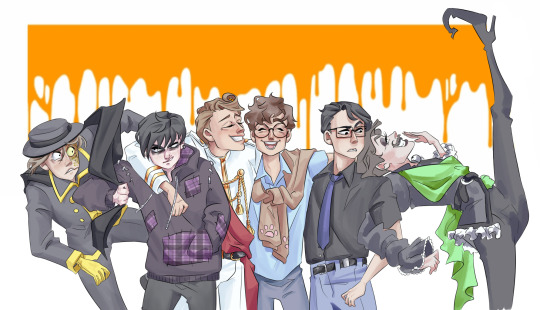
#redraw of that REALLY REALLY old thing. if you know you know
Explore tagged Tumblr posts
Text

teammate
#dont know how bright it is on mobile so turn ur brightness up if u dont see all of them#jester#bracken#masked#lethal company#epitaph#redraw of that REALLY REALLY old thing. if you know you know
122 notes
·
View notes
Text
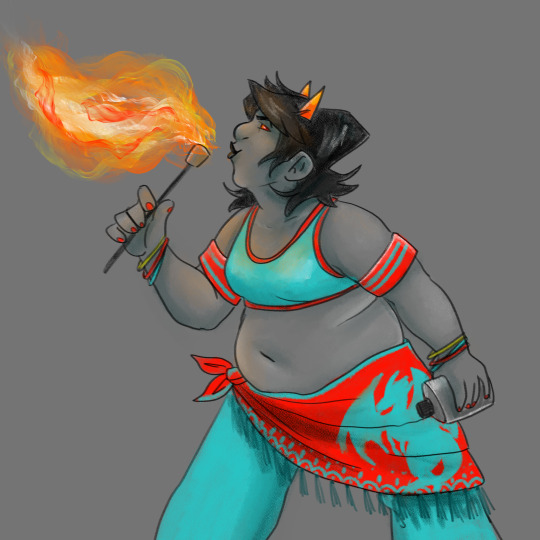
day 39
a redraw from a couple years back that was originally a redraw from 2014 so thats a FULL DECADE OF PROGRESS, BABEY!!
#day 39#year 5#terezi pyrope#homestuck#the thing about the image description project. and going through the backlog.#is that it really incentivizes me to do a lot of redraws because then i can reuse large portions of the descriptions for Old Art#making minor tweaks to account for the differences#as opposed to writing. just so much alt text#heres the thing about writing image descriptions for my OWN art: it makes me think way more about like.#what parts of the piece are vital and which parts aren't#because obviously you wanna give as complete a description as possible#but you also dont want to take up a whole bunch of a persons time rattling on about shit they dont care about. like.#idk! it's an interesting exercise and im still getting a handle on that balance i think#once again let me know if im not hitting the mark
288 notes
·
View notes
Text
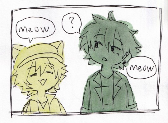
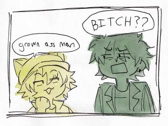
#art#traditional art#watercolour#fanart#virvox project#shirakami kotarou#kurono takehiro#vocal synth#voicevox#another one based off the memories of some post i saw a while back. i was like possessed. to redraw vsynth characters in popular posts#also low key this was what it was like being 22 in university classes full of 18-19 year olds for a bit there LHJSKHJFSDAjdfs#THEY WERE nicer about it. but sometimes they would find out my age and i could see the 'grown ass' flicker across their eyes#especially when they topic of discussion was shit like sororities and me not knowing shit about it. in my defence i was 1) confused about#'greek life' for a while because i am mixed race and kind of ambiguous irl so i just assumed it was a like a cultural based society thing#(we have a lot of those in my school its very multicultural) and they made an incorrect guess about my ethnicity again and 2) when I DID#finally figure out what the hell 'greek life' was supposed to be i signed up cause a friend asked me to but i missed the first day of#orientation cause i was sick and then the sororities started sending really passive agressive emails to me so i got scared off LOL#random sorority sidetrack aside. it was really funny when i was like yeah i dont really understand the whole deal#and a classmate was like oh well yeah i guess you wouldnt have the experience how old are you again like 18?#and i was like........................................................i turned 23 a month ago <:3c#and her face journey as she realized i was like 3-4 years older than her.... my apologies my dearest classmate#sowwy for being in my early 20s. it wont happen again <3
10 notes
·
View notes
Text

the rose :) unedited sketches under the cut


#this started out a redraw of some really old art but then suddenly it turned into amy. you know how it is lol#amy rose#gijinka#sth#sonic#my art <3#not happy with this at all but sometimes we just have to accept things
70 notes
·
View notes
Text
twitter is entering their "rts > likes" phase now that likes are private after they spent years calling us ungrateful for being demotivated by ratios lmao
#man fuck yall just support artists you enjoy#dont attack people who dont rb/rt your art (hell they might even have it scheduled) but also dont constantly demand ''content'' from people#ESPECIALLY without telling them that you appreciate the effort they put in to show you cool things they made for free#you should've been rt'ing/rb'ing from the START 😒 just show people you care!#im just waiting to scroll through post after post of ppl calling out ''entitled artists'' lmao#btw my opinion on the whole thing is painfully neutral if you couldnt tell#i dont think you should care that much about numbers and ppl take it wayyyyyy too far#throwback to that one guy who personally @ everyone who didnt reblog their art that was CRAZY. i would straight up report you KJFGHKG#i also understand and have personally experienced how much engagement can change your mood#a simple ''i love this!'' can make someone's day. it's not hard to understand why ppl like engagement#when they make post after post without so much as a little tag they dont care about sharing anymore#the fact that people call that ''entitlement'' is also crazy#i have a lot of drawings i havent posted or just left nonrebloggable bc it really doesnt make a difference lmao#the only ones i leave rebloggable are the ones that i Know will do well and get attention. like the little pig redraw#if it's cute or funny it gets positive attention. anything else is shit on here lmao#it's just not as fun to share. it either leads to no engagement or negative engagement#would rather have nothing than something rude so whatever#some ppl say it's always been like this but no it absolutely was not always like this#idk what exactly caused the change. probably a lot of factors#could even just be the fandoms i hang around in! but considering i've seen the same sentiment from a bunch of ppl i doubt it's that#the best solution to no engagement is to just make friends and have fun#but 90% of the internet is hostile and negative and rude for no fucking reason#when i unfollowed someone on my old public twitter and they @ me over it. damn i dont know why but NOW i know why 😭#this post has gone way off course im just ranting at this point. i havent talked in a while hi how have you guys been#work was a lot yesterday and today is too slow (im not at work im just going crazy in my house)#(and i cant leave my house bc there's construction blocking the road someone save me)#chat
13 notes
·
View notes
Text
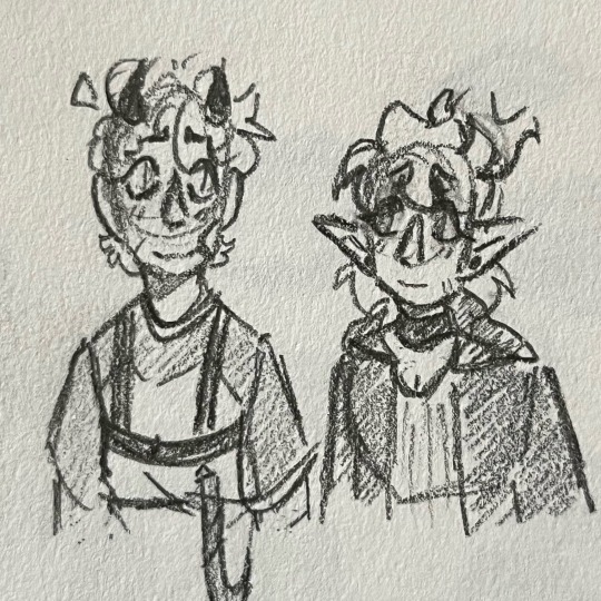
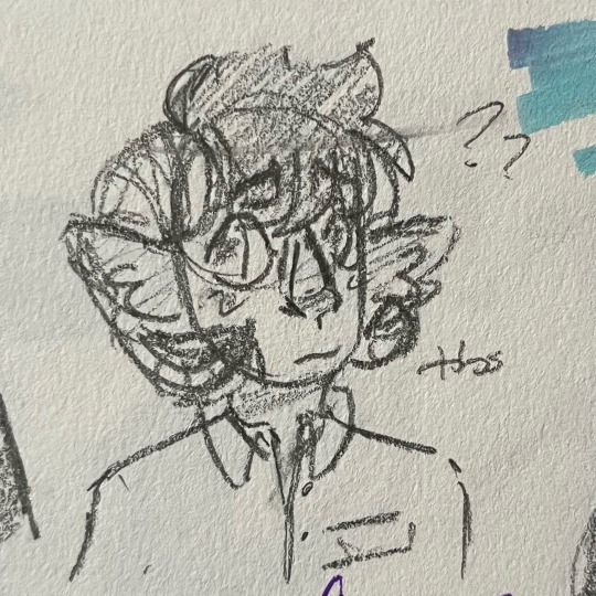
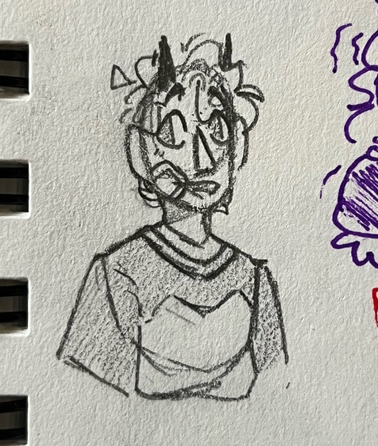
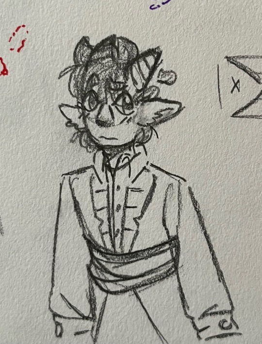

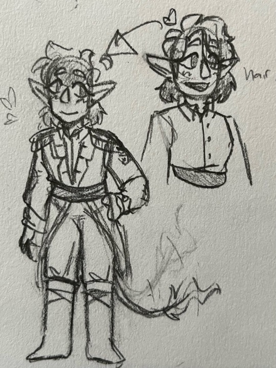
I don’t know how, but recently I started thinking about ye old early dsmp and L’Manburg and all that good stuff so here’s a doodle dump
I know some people really hate dsmp, or think it’s cringe, or whatever else. But it’s honestly what got me through most of the pandemic. Not to mention the mutuals I met on here through it!! So no matter what, it holds a little special place in my heart :]]
#I am really tired today#but the grind never stops (I love making and posting art :3)#maybe I show redraw some old things from 2020#I think I’ve improved a lot since then#so it would be pretty cool to see!!#anyways hope this isn’t too cringe for you guys#I may be cringe but I am free!!!!!!! motto for life!!!!!!!#dsmp#dsmp fanart#lmanburg#uhhhhh what are the fuckin tags again#c!tommy#<- would they still be like this??? idk I hope so#let me know if I’m wrong#c!tubbo#c!niki#Crab Doodles#also don’t mind how long it took me to actually search up niki to figure out her hair -_-#I’m just a little lazy sometimes but I figured it out in the end!!
14 notes
·
View notes
Text
oh boy
#sophomore year of hs i miss you…#sorry im oooking thru old wp smb chapters rn (was on my ipad trying to figure out what to draw to get used to the program and was like oh#redrawing old digital art that i made on my computer way then sounds like a good place to start and that’s where i have most of it stored)#*way back then#and wound up reading old comments and threads and. god i really had so much love in my heart for those people. SO so much. i miss them and#miss who i was with them and i miss having that connection w Anyone online or irl i miss having people to just completely goof off with and#create stories with and i miss having the time to do those things. and i talked abt band so much i miss how much i genuinely adored it#college marching band just isn’t the same environment#i especially miss two people in particular and knowing whatever i revealed abt myself they would just love me all the more for it and vice#versa. and so on and so forth. :/#personal
2 notes
·
View notes
Text


Vampire au- thinking about the hoax and shadow catching a look at the future really really bad . Oughhh.... The existential of it all, fighting against something that's inevitable
Also the goofier parts like
"shadow u don't know maybe they're just friends !"
"do friends make out sloppy style in public."
also rlly obsessed with the idea that like, hoax being a pretty neutral guy on most things dealing with shadow is . Not Fucking Chillin about this . Side eye of the century at himself
What the fuck do you mean hes tied down . To THAT GUY.
Also little redraw of a 3 year old sketch fhfnfnfn
473 notes
·
View notes
Text
This thing had been rotting in my files for a year (minus three weeks but that's basically a year). It was a redraw of one of my first ever pieces for this fandom, and I still find it quite okay if a little stiff in places, so I thought I might as well share it since I don't draw that much anymore.
And then I had second thoughts, which obviously led to me posting it anyway, as you can see, but I realized I've almost made it a point not to draw anything related to Sasi anymore. As in at all. I can't, and I don't want to, and even sharing old art feels a bit 'meh'. It's too directly linked to my long going art block.
What I mean by that is that if I took all the followers I have out there and asked them what they know me or initially followed me for, you might have a fair amount of Lis 2 and the occasional Desert Bluffs afficionados, but you'd get an overwhelming majority of Sanders Sides. Sanders Sides fashion posts even. I was by no means famous for it or anything, but at my small artist scale, it was the biggest success I had.
And it makes it much harder to go back to it at all now. One, because I don't give a damn about the show anymore. Two, because I haven't been properly obsessing over anything in a while (there was a series early this year but given the actual emotional distress I get thinking about it I'm ruling it out). I haven't had real engagement from my own brain, nor real engagement from a broad audience -which makes sense, I'm not posting for anything that will reach a broad audience. But it takes its toll regardless.
Even when I finally finished writing a long fic, I couldn't help but feel 'all this for what ? Ten people or so and two hundreds have dropped it ?'. Which is a bad way to think about stuff you write for your own enjoyment but, you know, the brain gets happy with external validation even if you pretend really hard you don't care.
And so it feels tempting to go back to the golden goose just the time to get the creative juice pumping back, and I try, and I always end up frustrated and angry and feeling even less like making art that before. I'm not having fun with Sasi. Like an old friend you have nothing to say to and yet you have so much to say otherwise, so you get a bit frustrated, you know ? Not sure I'm making much sense, but that's how it feels. I want to have something like that again, but it won't be with Sanders Sides, and I somehow just want if off my radar.
It was left hanging, then lost its spark, and then I stopped caring altogether and I most likely won't even watch the finale when it does come out. I'm over it. I wish I wasn't though, because it does feel like the artistic spark won't come back all on its own this time, and the buzzing community made it so much easier to bounce back and do shit when your brain got wired all wrong.
It sounds like I'm just bawling after love and likes and stuff, and I guess that's part of it, in a way ? Like I'm in no place to do things for myself, and seeing the one thing I used to use to get back in the flow giving me a bored sense of dread doesn't feel too great.
Yet this drawing is still good ! I find it good ! I don't remember everything, but I can tell from the looks of it that I spent a while on it ! It's nice ! I should celebrate that. So I'm sharing it. I think it will be the last piece of Sasi I ever share, though. I'm not watching the finale when it comes out. I don't care about it. I'll just keep doodling my OCs and characters from cool books every once in a while. I'll write little things.
I just really, really need to stop trying to go back to it when it's clearly not working and not even for good reasons. It was a fun ride though ! So yeah. Basically. A whole ass rant for a one year old piece of art. I'm in my bi-annual depresso mood, nothing too surprising there.
#I don't know how to put it into smart words really#it's just. yeah it's like that.#there's a lack of sharing for me I guess#bouncing off people's ideas and all#I consume quite a bit still#but it's not the same#Sasi was my golden age in that matter and it's been years#end result I lowkey hate it now#sanders sides#you can reblog it btw the rant isn't the most personal thing#it's more of a thing about sharing and art and community and engagement I guess
157 notes
·
View notes
Text
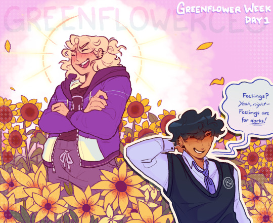
hii im suuper late to my own week ik (i'll post the rest of the days from time to time, college applications were a pain </3 but i've got most of it down
This piece is a redraw of my very first post ! This has been a wip since the start of the year so my art style unsurprisingly changed a bunch as i tweaked the lines and colors. it's not the best but it's looking as good as it can be!
as for the zine, people are free to draw up pieces for the week up until the end of september and we can compile it all together! it's not really the usual zine format but who knows.. we can maybe try to figure out a way to formally start a more structured zine project for these two
Anyway! I've decided to dedicate my greenflower week posts to my headcanons I've made up for them from the past 4 years.. I figured you guys could take a peek into my brain since I haven't really been good at that unless you catch me in a vc :") there's a buncha hcs and old ass art i never posted finally unearthing under the cut if you wanna take a peek
So, first thing: Body headcanons..
i took super long getting what i want with this waay back when I started posting cause I was still figuring out a lot with my art. i couldn't get in good details/features that would properly differentiate them or make them fun to draw. I wasn't striving to be really innovative with the designs or anything, I just wanted them to feel like characters I like looking at and thinking about
finally, i'm somewhat able to settle on these as of right now! It will most likely update as the time passes and my art changes, but this is what I got!
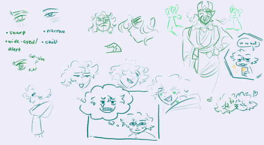

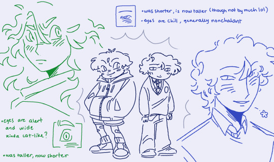
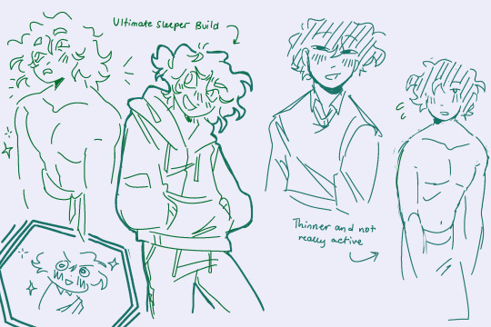

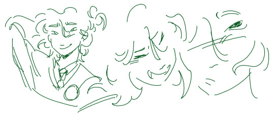
basically the main idea is that i wanted Lloyd to be bulkier but sharper. grew up fast and has all these edges, but then you get to know him and he's just a big ol dork. Mostly wears loose-fitting clothes that hides his figure, but he's quite built underneath


Brad's a lil taller and pretty lanky. my art style may not be able to show that properly but lloyd can snap him in half <3 he also seems hella chill but that's probably cause he got balls of steel after living through a million ninjago invasions


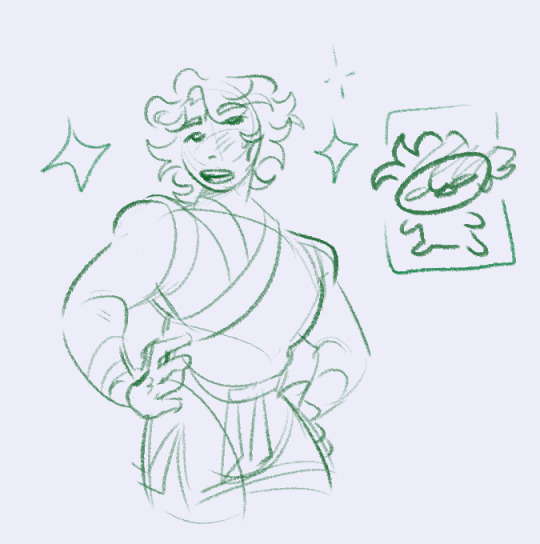
This thing below is an old outfit concept I have for a project that I've been working on. does not reflect my current headcanons with his physical appearance but i do like his clothes
I think he loves his role as the green ninja, saving the world and such. it came with lots of baggage and reflection but i do promise that he enjoys it for the most part. I think him wearing green is kind of like wearing work clothes so he tends to avoid it on days when he's free to keep from being too ready to jump into ninja mode

i do tend to keep him in green though cause the fandom sure does love their color-coded ninja
anyway .. that's about most of what i've got for this that looks good enough to post, so here's a bunch of other doodles/sketches, both old and new ToT


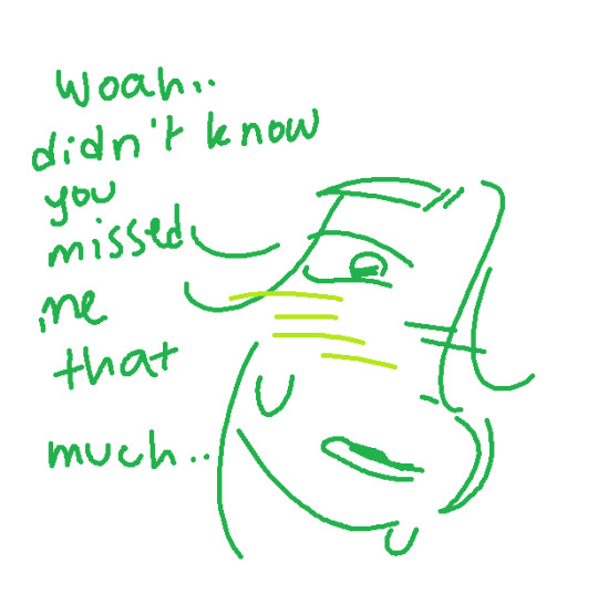
oh and a quick comic too cause why not




one more: bonus greenflower yuri

thanks for coming to read this far :) there'll be more soon
#ninjago#lloyd garmadon#ninjago lloyd#brad tudabone#ninjago brad#lloyd x brad#ninjago greenflower#greenflowershipping#forgivenshipping#forgivenship#evan's art!#evan rambles!
261 notes
·
View notes
Text
How to Create Paper Cut-Out Reliefs: Tips and Techniques for Beginners
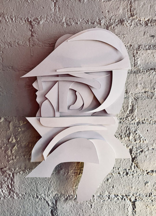
Back again with another lil' series of 2D wall relief paper cut-out forms. Both of the pieces below follow the same process and technique. Im really happy with the process and outcomes. Im working on animating them as we speak. I'll add them to this post later. My paintings inspire my drawings, and my drawings are inspired by those same forms found in my paintings. It makes sense that every so often I want to make those forms "pop out" and off the surface of a flat plane. Alas, it all starts with a quick sketch. See below, just a series of light loose free flowing lines take the lead, forward ->
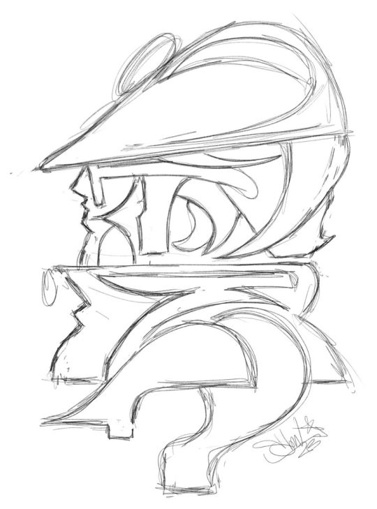
Here we have a dude posing for a profile style portrait. Most likely, this is inspired by the NYC B-Boys from the years 1983 - 87ish. Either way, it's nostalgia for me. Once the sketch feels good, I'll break out the paper and x-acto knife. I keep telling myself that one day Ill work with another material other than paper for these works, perhaps wood or metal.. It will happen, I can foresee it for sure, hang in there. Im using a white bristol paper for the cut outs, I believe it is the vellum type and not the glossy, but either or will work just fine. I love to cut paper and the whole medium of paper art in general.
Paper cut-outs, also known as paper cutting or Kirigami, is a traditional art form that involves cutting shapes and designs out of paper. The history of paper cutting can be traced back to ancient China and Japan, where it was practiced as a folk art. The Chinese and Japanese would create intricate designs, often featuring animals, plants, and mythical creatures, and use them as decorations for festivals and special occasions. I always loved it and have felt inspired by these pieces.
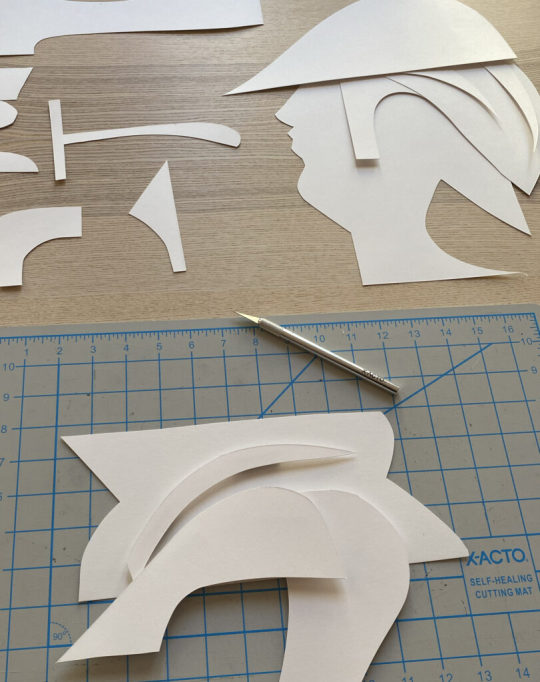
Using the sketch above, I apply the "map" of the shapes and forms that I see. Sometimes I redraw those forms on the paper that I will cut out, and sometimes I just "draw" with the x-acto knife to recreate the forms. Sometimes, it's a combination of both of those techniques. There is also a series of "out-take / byproduct" cut outs that do not make the final piece, those can be saved and used for the next piece, obviously!
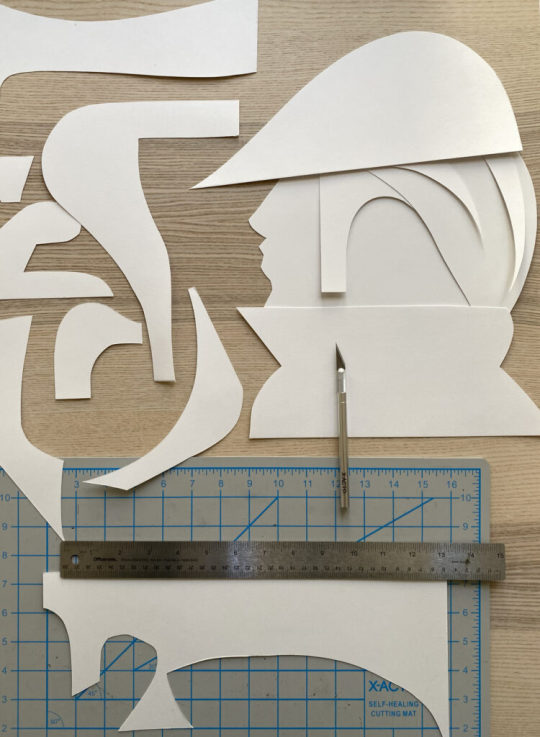
I layer the forms on top of each other to compose the arrangement as a whole, its fun to watch it all come together, in the next phase, you will need some kind of durable tape or you can make little paper forms that can be pasted to both sides of the forms as they stack, this will create the gauge and depth of the piece once it is placed onto the wall.
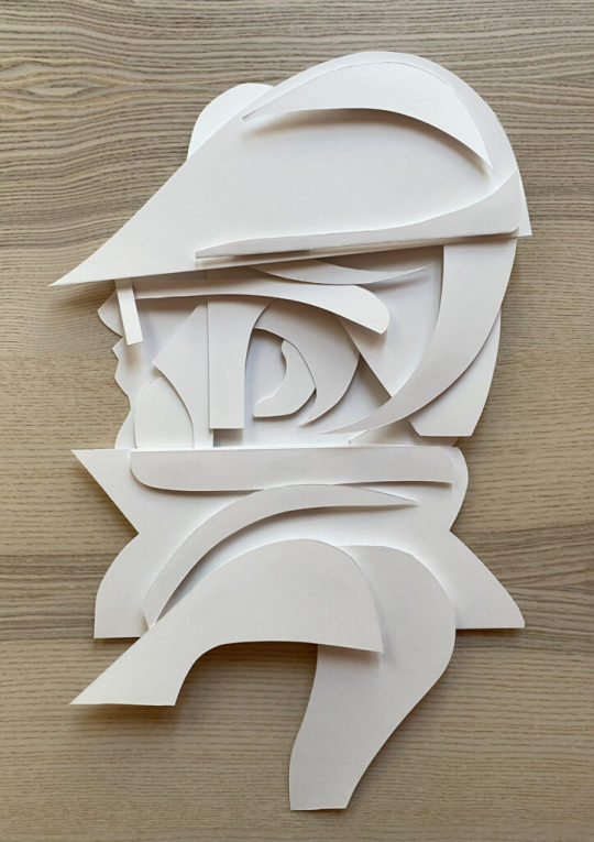
This is the final composition above, I love it! I used a roll of duct tape to make small cylinder forms that connect the pieces together, the piece as a whole comes "off of the surface of the wall" by about 1.5 - 2" inches - you can play with this a bit but keep in mind, the tape makes the piece heavier and it will want to comply with gravity :)

I hung the piece (also temporarily adhered via the same duct tape) for the photoshoot and to also get a good look at how it will function on the wall. I have an old painted fire place in my studio that is a great surface for hanging things, I love the contrast of textures between the bricks and the paper, as you know, the shadows will be super cool to see too.
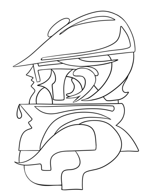
Once I had the whole piece constructed I took a few pictures of it. I immediately wanted a clean vector line drawing of the whole character. I brought the photo into adobe Fresco and used a vector brush to draw this lovely variation. This is how my brain works, I switch paths because I know they are really pipelines to the "next thing" that I will push this to, so forward we go.
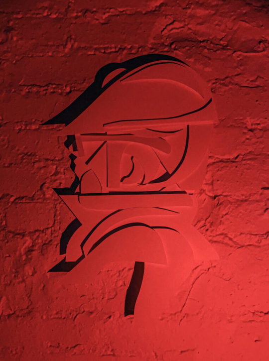
Then, it was light source and photo shoot time. Im not really happy with these picture as traditional "photographs" as I know I can do a much better job, but, as a series of "sketches" for a planned photo shoot, these will really help to make those plans a reality. I love neon colored lights. I have a bunch of them from various places and spaces that I found on the internet. Amazon has a great selection of flashlights with various colored light options. Get a few and play around with how the light can effect your work and the shadows that it creates. This is where the depth and gauge of your pieces play a role. The photos below are also a part of the same session, which all took place over a few days.
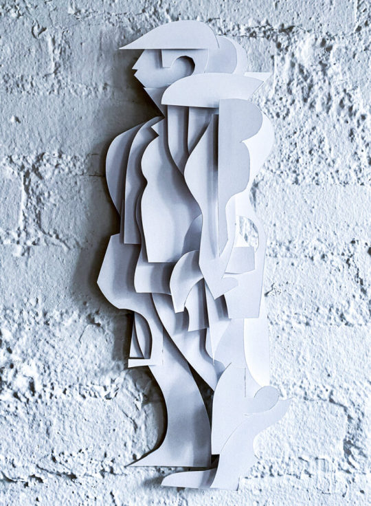
Here is another variation with a different character.. What do you think? Shall I make more?
#art#ryan seslow#ryanseslow#paper cut out#paper#paper art#2D design#2D#portrait#character design#graffiti#bboy#nyc#sculpture#paper sculpture
237 notes
·
View notes
Note


Part of me is just going "....did she forget the context of this panel in the redraw or...?" Like the original looked like Persephone is nervous and in the redraw, she looks like she's....not nervous?? Am I remembering the comic wrong?? I haven't read the comic in ages. Also jesus christ, Hades is going to poke someone's eye out with that nose in the redraw-
I think what bums me out the most about this redraw (besides what you mentioned here) is that it really shows how much Rachel committed to the "old man winter" thing. Which is wild considering this is meant to be the scene from when they first met each other prior to the time skip. I know he's always had white hair and she just chose to make it all blue in the original drawing, but something about that haircut with the color and the wider body just ain't beating those "robbing the cradle" allegations 💀 (and I'm usually a sucker for silver foxes u.u)
#ask me anything#ama#anon ama#anon ask me anything#lore olympus critical#anti lore olympus#lo critical
338 notes
·
View notes
Note
Hi there! I apologize for taking up your time, I am just so curious: When you tackle a comic, what does the process behind it look like?
Asking because I found myself scrolling through your blog once again and couldn't help but marvel at all the beautiful effects you use, at how flawlessly the structure guides the viewer's eye across each page, how the graphic weight seems to always be in just the right places…, and wonder how you learned doing this. Everything you put out looks incredibly professional and I aspire to reach your level of skill 😌❤️
Thank you Finz!! You're no bother at all, I'm an open book. This is such high praise for a guy that really doesn't have a set process, I feel like a hack. Ha. Rest assured my style is still developing. Besides the referencing of the linework and composition of official comic books, (practicing by redrawing panels for fun), explaining the process makes me feel like a serial killer but I will do my best.


(WIP Riddler panel, scrapped Scarecrow composition)
My comics usually stem from a single panel or concept — I like to focus on/emphasise particular panels of my pages, the heavy hitters, the main piece that catches your eye. I know I'm not a profoundly technically proficient artist so I prefer visually interesting elements and formatting, i.e. drawing characters outside their frames, negative space, notation, perspectives etc.

(Kung Fu Panda 4 sketch god I hate Kung Fu Panda 4)
I like to establish 'main focus' panels, the bits of the comic that really, well. make people want to chew on it. This is where the technical effort is concentrated, really, and the rest of the comic is generally build around these concepts.


('Restaurant Balthazar' focus panels)
Textures and effects are done on individual panels first, then the entire page as a whole to even out the unity. Generally, blocking in shadows, hatching for visual interest + middle tones, then textures/half-tones, then highlights.

(Script excerpt WIP)
I'm not a writer per se, but having a vague 'script' in your pages helps with pacing and direction. Comics are a versatile story-telling medium. I only really do scripts for comics longer than 2 pages. An optional but recommended strat is to send your script to a friend for a second opinion.

(Script excerpt — 'Restaurant Balthazar', annotated by @vincepti0n I don't know why he drew a face in the middle)
With the script crudely slapped together, I rough out the thumbnails and composition with the text, prioritising coherence and clean integration of previously mentioned 'main focus' panels.
Settling on a composition sucks the hardest. Drawing is fun, thinking makes brain hurty. Variety is good! Close-ups, wide shots, visual metaphors. Every panel is its own artwork.
The text bubbles are usually added in post, yes, but I'm just one guy and I don't have a writer to call me a good boy for doing things correctly. Bite me.


(Early 'Restaurant Balthazar' drafts)
In addition, keeping the text graphics in mind help create a sounder composition wherein even if the panels don't read cleanly left to right + top to bottom, the text can stagger and create the same reading order effect.


Panels and concepts are constantly tweaked, and my comic process is still highly experimental. A lot of industry standard comics aren't illustrated to their full potential due to deadlines and such — I strive for visual epiphany by treating each panel as its own artwork, and every page as a a bit of a mural.


(Old art hurts the soul)
Constantly experimenting allows you the insight of looking at your current art in comparison to your older works. In more recent works, I've been blocking in more shadows wiht lineart with thinner lines and more line weight, and learned to integrate the subject characters with less plain, abstract backgrounds.
TLDR: I have no idea
#creaman-answer-sheet.pdf#art process#vinegarclown#creaman#fanart#digital illustration#jonathan crane#riddler#wip#comic process#creaman talks to drywall
183 notes
·
View notes
Text
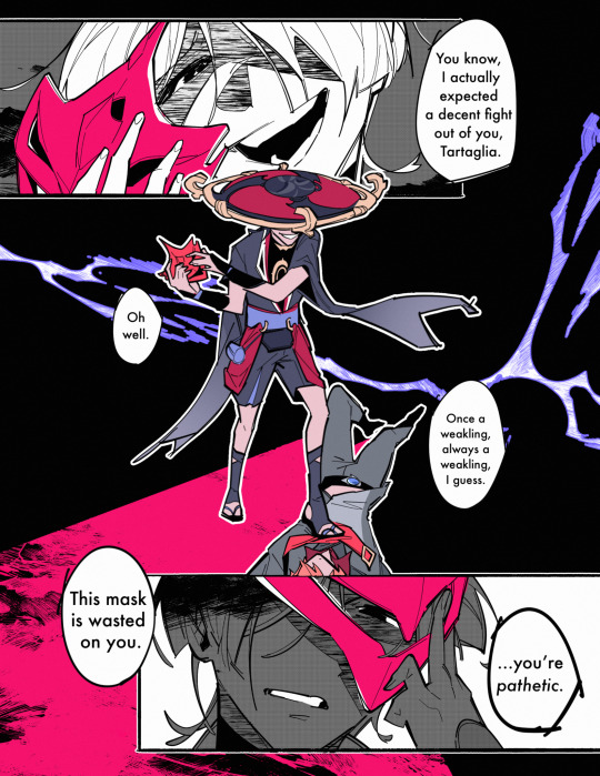


redrawing my very first chiscara comic/art i ever did for chscr day!!
old comic under the cut!!

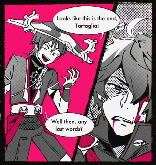
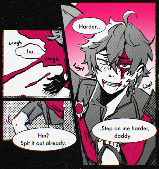
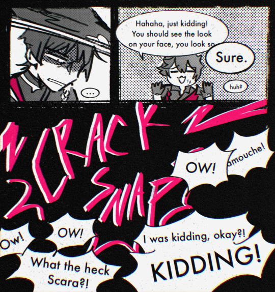
lol a bunch of sappy semi serious stuff below bc i cant help but be a bit genuine about this ship today :’3
i cant possibly put into words how important this silly little ship and its community mean to me haha,,,, this comic was made in 2021 but i didnt really get serious about chscr until late 2022 after a bunch of pretty bad interpersonal stuff happened and i needed an outlet,, COINCIDENTALLY a certain someone was announced to be playable around then and i was already thought chscr was Pretty Neat™️ so i ended up diving headfirst into the ship. it also gave me a good excuse to work on more comics too!! i’d done a pretty big zhongven comic earlier that year in the summer, but in terms of lore there was only so much i could have worked with at the moment.
childe and scaramouche have that perfect combination of silliness and angst and violence that could be explored or expanded in so many ways and i love love love seeing other people’s interpretations of their dynamic and relationship. they’re so complex,,,,they’re narrative foils,,,they’re narrative parallels,,,they’re trans allegories,,,they’re flies in the spiderweb of the games lore,,,they’re my stupid little meow meows,,, they’re just two losers i want to see make out,,,
in a nutshell, they’re everything to me. well, i hope i get that kind of sentiment across in my own comics,,,,
and i cant get started on all the people ive met through chiscara or the way that having something i can call “my thing”, as in, the thing that i like and that i will spend a lot of time and effort (and money, but lets not talk about that) to surround myself with because it makes me smile. its stupid to say, but being a nerd about these two stupid guys who have never had a single canon onscreen interaction in some random game has made me a much happier and confident person that i could have ever imagined back in my freshman year of college,,, when i say i dont know who i’d be if i hadnt gotten into chiscara, i really do mean it lol
i’m actually surprised i’m making it to over a full year of regular-ishly making art, especially for the same game and ship! thats never happened before and my art has improved so much over this past year!! more than anything else, i’m happy! i get to be excited talking about these characters with my friends and i love to see art of them pop up on the tl. i make stickers of them and decorate my phonecase with them and have little figures of them in my room that i look at when im up late at night working on schoolwork. sometimes just the thought of finishing a comic or daydreaming about a scenario or seeing what my mutuals are up to are some of the few things getting me through a tough day.
,,,,so believe me when i say, to both childe and scara and to everyone else as obsessed with these pathic losers as i am, thank you! i’m having a lot of fun!!!
(also i just found out tumblrs copy/paste doesnt work on my ipad??? idk if this ends up legible i may or may not have deleted smth by accident and im not in a mood to proofread haha)
#genshin impact#childe#tartaglia#scaramouche#chiscara#scarachilde#my art#comic#no super long rant in the tags this time bc i already made a chscr rant haha#happy chiscara day everybody!!
808 notes
·
View notes
Text
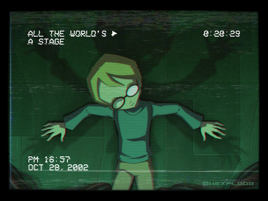
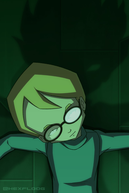
i am sooo thematically consistent actually lmfao
My final contribution to Repostober 2024 :) Loose "redraw" of this sketch that I posted last year. Scan and words below the break.
I know the phrase "rewired my brain" gets thrown around a lot in fandom but I honest-to-God think Ghost Channel really did it. If it's not THE formative thing in my taste for horror, it imprinted pretty damn hard on my little babby brain. To this day, the memory of watching it for the first time stands out as my earliest experience where I've needed to pick my jaw off the floor and then marinate for a bit.
For those not in the know, Ghost Channel is an episode late into season one of Code: Lyoko. It is freely available to watch online, but if you're even a little interested in watching it, I highly recommend watching it in sequence, despite the episodic nature of S1.
Original scan, from 2009ish:
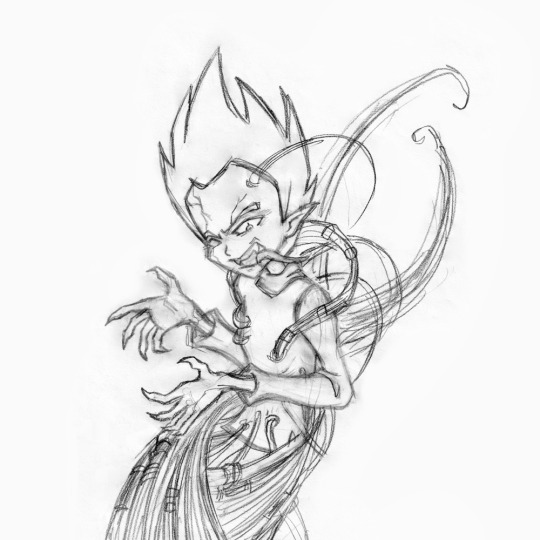
I'm sure I've mentioned it, but before I realized the importance of archiving my art I threw away virtually everything I had relating to CL >___< Later, I thought it might be fun to redraw some pillars from my childhood fandoms and this sketch happened. I've posted a few things for Repostober so far that were products of this same effort.
Reinterpreting this in 2024 was a challenge. My taste in horror hasn't changed much over the years, but the way I enjoy it definitely has. The 2009 scan reads as an in-your-face tribute to the episode (to me, at least), but these days I'm a much, MUCH bigger fan of subtlety and the power of implication. Redrawing it 1:1 bugged me a little since I didn't feel it'd meet my current standards or do the episode justice. I'm a firm believer in "less is more" so I spent a loootttt of time grappling with a good 'redraw' that 2024 me would accept while still passing as... well... a redraw xD I suppose it is still conceptually the same.
Jeremie is easily my favorite in the CL gang which definitely has nothing to do with the fact that I seem to have a proven history of latching onto the prodigal child with glasses and I've always found it crazy poetic that one of the only (or maybe the only?) big bad's true manifestations in the show is in his image. Something something thematic parallels, you love to see it >:) CL already has this habit of depicting shit that I would normally attribute to the modus operandi of a supernatural, demonic force so of COURSE I was gonna get in on this LMAO
Unfortunately, unless I find a hidden stash of old CL fanart somewhere... or enough time passes for me to draw this again... this is probably my last CL art for a while </3
On a more technical note for as much time as I gave myself for this I really popped off, especially on the background o___o Code Lyoko BG art goes super hard in general though, I don't think I would have settled for anything less. Had tons of fun with the VHS effects, learned lots of new little tricks to distort images for future projects.
Also this piece is called "ENDKAMPF" in my files lol
#art#code lyoko#jeremie belpois#jeremy belpois#ghost channel#repostober#repostober 2024#redraw#draw this again#queue
93 notes
·
View notes
Note
Hey what were you trying to say in your “it gets good at page 1001” post
Was it more of a comment directed at yourself ( self degradation), is it satire about perfectionism,
Is it supposed to be inspirational for Beginners webcomic creators, or we’re you just in a bad mood?
More of a warning against self-sabotage, because I see it so much. Sometimes it's tied to perfectionism, sometimes it's the opposite - people surrendering to imperfection when they don't really have to.
Creator chat incoming. I'll put it under the deelybob for anyone who wants to read it 👇
I've been in the webcomic sphere for several years now and I've seen so many people introduce their comic with 'I know it's very long and not easy to read, and I won't be going back and changing anything about what I've already made - but please critique it so I can make the rest of the pages better and attract a bigger audience from now on.'
And that's a hard thing to respond to. If a reader can't get through all those existing pages without being confused or bored, then how can they get to the good stuff that lies past them?
So much of gaining an audience is about actively making it easy to 'fall into' a work. Without that easy entry point, it's always going to be an uphill battle to build an audience, no matter how good the later chapters get. There are outliers, but most webcomics won't be those outliers, especially with thousands of them available nowadays. Some people love the grind, but most people will jump to a new tab and try to find something less frustrating.
And webcomic creation is particularly cursed by its very nature. Creators are hesitant to go back and edit pages, even once they've figured out more details about their craft or story structure. It's mostly because of the seeming permanence of it all - the art takes ages and the words feel unchangeable if even one other person has read them. To go back and edit is to publicly admit your failings, right? That's how it feels. What do you MEAN you didn't get it right the first time? You were supposed to do it live, and do it PERFECTLY!
But ideally it shouldn't be any different than prose writing, which is ALL ABOUT finding the story in those edits. And because your story is digital, you can go back and change things whenever you feel like it. A webcomic is fluid.
And if you're thinking 'I should just redraw my whole first chapter' - NO! Hell no, old art can be a part of the appeal! It's far more about finding little tricks to convey your story/characters more clearly. I have read some first chapters with janky art that made me fall completely in love with the story and cast. It's not about the art - as with all things comic-related, it's about conveyance.
Examples I've seen and some I've used myself: A single extra page with a meaningful interaction can solidify the theme of a character's arc. One additional 5-to-10-page scene can help add visual context for an offscreen event where there was none before. Adding a map can tell people where the characters currently are. Changing a character design can help if they get often confused with another character. Redoing your lettering to make it more legible is a huge one too.
In the end, I just don't want people to be afraid of small edits. When I got feedback about the bad clarity of my own work, I knew it would take some time to fix those problems. It wasn't fun to think about or to do, but I'm glad I did it in the end - because it would have limited my audience tremendously. With just a bit of extra effort, I opened a door that wasn't there before, and it now leads more people even more easily to 'the good stuff.'
tl;dr You started your webcomic for a reason, and you're learning more things about its characters, story, and craft every day. Don't be afraid to go back to old pages and inject some of that wisdom through editing. Even a little can go a long way.
***Caveat: If your goal is to just create chaotically, with no goal of gaining an audience, you are a wild and free little thing, and I am in awe of you. This whole rant doesn't apply to you, and you are stronger than me.
106 notes
·
View notes