#recycling symbols on plastics
Explore tagged Tumblr posts
Visit Tumblr Blog
Explore Tumblr blogs with no restrictions, modern design and the best experience.
Last Seen Tumblr Blogs


Fun Fact
Tumblr was created by web developers David Karp and Marco Arment.
Text
Best Tips on How to Store Sculpey Clay for Long-Lasting Usability
#10 things to know about air drying clay#how to clean clay when stik at plastics#how to condition pardo polymer clay#how to make money on etsy#how to recycle air dry clay easy#how to sell on etsy#how to sell on etsy for beginners#how to sell on etsy successfully#introduction to sculpey#learn to use liquid sculpey#liquid sculpey#michaels stores#new to sculpey#recycling symbols on plastics#sculpey#sculpey clay softener#sculpey tips
0 notes
Note
Recycle your plastics or the phantom will get you

You’ll never take me alive!
#ask brodoroki#happy recycle your plastics day everyone#dual destinies#dd spoilers#aa5 spoilers#bobby fulbright#I think this is the first time I’ve drawn him full body lmao#also I drew the recycle symbol from memory so it might be fucked
46 notes
·
View notes
Text
more frequently than i expect, i will meet a grown ass adult who does not know how to properly recycle
#i always feel like the xkcd comic bc like#i’m aware the average person doesn’t check the limits of their local facility#and i know i cannot talk to most people about how broken the system is or it’ll sound like im anti environmental even tho thats the opposite#of what i’m trying to say#listen man. i know im Deep In It bc this is a topic ive cared about for forever#but i’ve seen both ‘idk what’s recyclable so i don’t try’#and ‘everything plastic is recyclable right. i’m just gonna put everything in there’#bro we have got to figure out how to get PSAs out to people now that no one watches actual tv#(frequently. just because something has the symbol on it doesn’t guarantee anything. usually only PET is actually recycled#the number is just to indicate that someone somewhere has figured out how to recycle it#but most facilities find it cost prohibitive :)) so it tends to get thrown out#or shipped overseas to go to a landfill/get incinerated there)#(there is also a difference between the chasing arrows symbol and a solid triangle with a number#and environmentalists have tried to hold plastic companies accountable for that#and they just went umm it’s not misleading just get better eyes)#(and the how2recycle infographics are again. just a hypothetical#you should always check what your local facility actually accepts)#(and people rarely rinse their shit our first)#(in general tho you should be ok to put anything with the symbol in the bin. you cannot just throw trash in there#if the lot is too contaminated with non recyclables they will unfortunately just throw everything away!)#mine
3 notes
·
View notes
Text
This is a small thing, but I find it so interesting that the lyctors wear iridescent white robes. The text describes them as being the color of an oily sheen on water, and there's symbolism there of course, but a thing I've discovered (while trying to do a TLT cosplay) is that white iridescent fabric is always polyester. Plastic-based, terrible-for-the-environment, beloved-of-fast-fashion polyester. It doesn't breathe. Every time you wash it, it leaves behind microplastics in the water (which is maybe something to be examined about the Mithraeum's water recycling system). It's a major product of the oil industry, an industry which is heavily contributing to, if not spearheading, climate change.
And I think it's just so incredibly in character that John - the man who was given the power to save the Earth but instead started WWIII, trapped Her soul in the body of a Barbie, and has used Her as his personal power source for a myriad without a care for what She wants - picked a polyester fabric as the symbol of the First House.
Likely, he didn't even think about it.
#TLT meta#if anyone else has looked into this pls let me know#I just have BrainRot about the Locked Tomb and fabrics#john gaius#tlt#tlt spoilers#lyctorhood#lyctoralsaints#the locked tomb
369 notes
·
View notes
Text
Hey Fanguins! Want to Help Real Life Penguins? :D

Why Now?
5 out of the 18 penguin species are listed as endangered
That’s approximately 28% that are endangered, not including those under the “vulnerable” or “near threatened” statuses.
These endangered species include:
The Yellow-eyed Penguin
Northern Rockhopper Penguin
Galapagos Penguin
Erect-Crested Penguin
African Penguin

Cute little guys like these African penguins are predicted to go EXTINCT by 2035.
Biggest Threats to Penguins:
Overfishing
Plastic Pollution
Oil Spills
Habitat Disruption
Invasive Species
Climate Change
So… What can We Do?
I know sometimes it seems hopeless when there are major corporations having extensive negative impacts on the environment.
But there are small, everyday changes you may be able to make to contribute for the better (at least a little).
Small actions can add up over time.
Shop Consciously
Overfishing and unregulated fishing are big contributors to penguin populations decreasing.
Less available prey means penguins have to spend longer time at sea to feed their chicks and themselves. This could force them to abandon their chicks, reach the point of exhaustion and pass away as a result, or return to emaciated chicks.
Seafood Watch is a wonderful resource to ensure the seafood you’re buying has been caught sustainably. https://www.seafoodwatch.org/recommendations/download-consumer-guides

Swap for More Sustainable Options
Aside from seafood, you might be able to make many swaps to reusable products.
Reusable grocery bags/tote bags can actually make transporting groceries easier while reducing plastic usage.
If you have access to clean water, a water filter pitcher or a reusable water bottle are also great options when available! 😊
Swapping plastic containers for aluminum cans or cartons (these are easier to recycle)
Swap balloons for other party favors (many released balloons end up in our oceans). Penguins and other sea animals can choke on or get tangled in these while swimming.
Conscious Pet Ownership
Choose pets responsibly and never abandon a pet if you can no longer take care of it. This could lead to the rise of invasive species.
Keep pets on a leash when outside even when you do not see local wildlife.
Penguins, especially those whose habits are around human populations, are regularly attacked and lethally injured by unattended dogs or cats. These include feral or stray animals that have become invasive.

Learn More Directly from Non-Profits:
SANCCOB is an internationally renowned rehabilitation center for South African seabirds (including African penguins) leading conservation efforts for this species. https://sanccob.co.za/about-sanccob/
The Yellow-Eyed Penguin Trust is another great non-profit located in New Zealand that tracks behavior and nesting patterns of the Yellow-eyed penguins. They also remove invasive predators to ensure Yellow-eyed penguins have a chance at repopulating to sustainable levels. https://www.yellow-eyedpenguin.org.nz/yellow-eyed-penguin-trust/about-the-trust/
Penguins International is a nonprofit that educates about penguins and penguin conservation efforts. https://www.penguinsinternational.org/about-us/
Any AZA-accredited zoos and aquariums that support conservation efforts

Advocate:
Sign petitions encouraging legislation change that aims to reduce climate change or regulate fishing
Write to/email legislators when penguin species are at risk
Donate (if you can/would like):
Both Penguins International and SANCCOB do symbolic penguin adoptions to support penguin conservation.
On SANCCOB’s website, you can choose an egg, hatchling, rehabilitated penguin, or long-term penguin resident to symbolically adopt/sponsor. You even get to give your adopted penguin a name!
The Yellow-Eyed Penguin Trust also accepts donations of various amounts.
I figured since if you follow this blog, penguins have inspired media and art that means a lot to you or that has at least brightened your day. If you’re as amazed as I am about the real life species, please consider taking steps to help or learn more about real penguins. I figured sharing this information, while trying to make these changes myself, are the least I could do to honor these amazing creatures!
Thank you for reading! 😁
(Lol I’ll get off my soapbox now 😉)
youtube
Maybe Tom McGrath can explain it better 😉 (skip to 3:16 to hear him talk about how amazing penguins are! 😊)
#penguins of madgascar#the penguins of madagscar#skipper#kowalski#rico#private#penguin conservation#penguin#penguins#Youtube#Tom McGrath
94 notes
·
View notes
Text

Recycled bottle cap buttons part 3 :)
The pride ones aren't done yet
Also I've found that the really thick plastic bottle caps are easier to turn into buttons if you cut out little circles out of scrap cardboard and seal them inside with hot glue, like this

Looks a bit messy but that's okay 💚
[Image ID: six plastic bottle cap buttons. The first one is painted orange with a yellow sun. The second one is a bigger one painted to look like a yin yang symbol. The third one is a transgender flag, and the fourth one is a bisexual flag. The fifth one is painted dark blue with a black spiral, and the last one is painted green with white lettering that says "eat the rich".
The second image shows the back of one of the buttons. It shows that the buttons are filled with a layer of cardboard to fill out the empty space and sealed in with hot glue, and then a safety pin looped inside a soda tab is glued to the back of that. End ID]
#solarpunk#hopepunk#punk#punk fashion#solarpunk fashion#punk diy#diy#recycling#sustainability#sustainable fashion#hatchet makes stuff
330 notes
·
View notes
Text


---------------------------------------------- THE SMILER YOZO ---------------------------------------------- ITEM INFORMATION: Year sold/Introduced: 2014 - possibly into the 2015 season as well. Original price: £15.00 Price i paid: As of right now i am unsure but if i manage to remember i will update. However i don't remember it being over £20. Unsure if purchased off Ebay as my purchase history has no record. (it is a mystery!) Area sold: Towers Trading and BUY THE SMILER. Comes attached to a smaller cardboard piece after taking out of box and is attached to the smaller cardboard with a plastic tag you will need to cut. Items box was damaged when it arrived, i have done my best to fix up parts of the box but i am still working to restore and have it more secure. Regardless of this, finding them in original packaging that isn't damaged is very rare but not impossible so keep an eye out. ------------------------------------------------- BACK OF BOX INFORMATION: THE SMILER YOZO Features: .Sound activated .Crazy bouncing .5 unique Yozo sounds .Sleep mode .Batteries included --- Remove insulator tab to activate
--- Contents:
1x The Smiler Yozo Instruction manuel inside (unfortunately i am pretty sure my Yozo ate them because i did have the instructions but they have mysteriously vanished and i have definitely not thrown them away.) Battery requirements: Requires 3 x 1.5V "AA" Batteries (included) -- © & THE MERLIN ENTERTAINMENTS GROUP 2014 Imported by 50 Fifty Gifts (UK) Ltd. (SW18 1PE) on behalf of Merlin Entertainments Group Made In China. -- Manufactured by: 50 Fifty (HK) Ltd. RM 907 chinachem Golden Plaza TST East. Hong Kong [email protected] -- ITEM NO: 71409122 -- Barcode: 5060224475393 THE SMILER YOZO BLACK. --------------- FRONT OF BOX: THE SMILER YOZO 1. TRY ME Press my head to wake me up! (remove insulator tab) 2. Clap your hands to make me go crazy! For age 3+ Batteries Included Sound activated (When awake) -- BOTTOM OF BOX: Recycle product symbol CE symbol For age 3+ ----------------------------------------------- To activate the Yozo all you have to do is pull out the insulator tab and push the top of the ball, the yozo will then activate unless it did when you pulled the tab out and start going beserk and bouncing around. I have also yet to find out the other laugh sounds but i will do my best to figure out the smozo. To switch off the yozo as it has no official off switch is to just press down the very top of the yozo for a short period of time and it should turn off (keyword being should) ------------------------------------------------- I have included a video as to what the yozo ball sounds like when switched on and how to switch it off. (Small shout out to CablesTwisted as well as i'm pretty sure on his Tumblr page he has a video showcasing the inside of the mechanism so worth a look to see what the inside of this item looks like inside. )
#alton towers#the smiler#the smiler merchive#collection#merchandise#merchive#smerchive#the smiler merchandise#pretty sure it's alive#ate my intructions so they like paper#imagine if someone ever did one of those 4000 wats videos with it and it bounced so hard it went into orbit#mine is in a contaiment box but some have breached their own containment#probably about 1 million of these things hidden in the moj facilities#what was most likely in the briefcases at the smiler takeover#smozo vs smopper friday night at 4
58 notes
·
View notes
Text
I was thinking about the concept of object "gore". Not like, flesh and blood gore, but like, "gore" based on the material of that object. Tattered fabric, scrap metal, spilled juice, shattered glass, etc.
When you think of it as a cartoony thing, yeah, it's funny! Like seeing Lightbulb/OJ from II shattering, Woody burning to death, etc etc, it's just a silly lil' gag! But imagine it from the perspective of an Object.
First off, how would objects react to "gore"? I mean, it's rather hard to differentiate between shredded fabric from a random shirt versus one from an Actual Sentient Object.
Imagine seeing a crime scene, a bedroom, completely torn apart. Cuts and slashes, an assortment of fabric and stuffing scattered everywhere. How do you tell torn blankets apart from the deceased Pillow?
Imagine being an electronic Object, walking in a lab/warehouse/factory, and seeing bits and pieces of wires, metal, chips, and plastic shells strewn around the place. Other Objects might not think much about it, it's just random scraps. But to the poor electronic Object, they might as well just be a pig in a slaughterhouse.
What's even more horrifying is the thought of seeing materials where they don't belong. Fallen leaves, twigs, and wooden splinters in a forest? That's normal! Seeing those in the living room? Unless you had a door open during a storm, that's definitely not normal. Doesn't help that you haven't seen your best friend Oak in a while. Could this be what's left of them?
What about ways to deal with the bodies? To hide an Object's body, you could just. "Modify" them. Wood? Carve them into something else. Paper? Tear them apart and just the wind scatter the remains! Plastic? Reuse, reduce, recycle. There's no blood to worry about!
Anyways, the thing that lead me to this entire idea in the first place is splatter movies (aka, those movies with a TON of gore). How would it work in an Object setting? For humans, you can just easily paint something red and call it a day, but Objects don't have that (unless they do in your setting, then uh. Ignore this).
Would they just throw a bunch of scraps into the scene and call it a day (like how most splatter movies tend to have WAYYYY more blood than what a normal human being should have)? Or would there be a more universal symbol of The Body?
Anyways, that's all I have in my mind ✌
#pink posts#osc#object show community#object oc ideas#<-- not really an “oc” idea but yeah. sticking with that tag#was thinking way too much about object anatomy and splatter movies. and tma as well#feel free to ask me to tag stuff! since i'm not sure if i needed to tag anything here#object worldbuilding
390 notes
·
View notes
Text
Hedge’s Official Ranking of the 24/25 WSL Kits That Literally Nobody Asked For - Home Edition
please please tell me your thoughts in the reblogs or tags!!! i love hearing other people’s critiques. this is the one time the woso community can all come together and complain about the same thing!
1.Liverpool
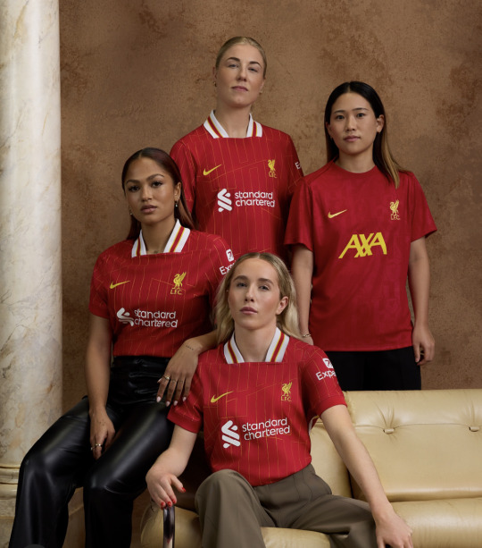
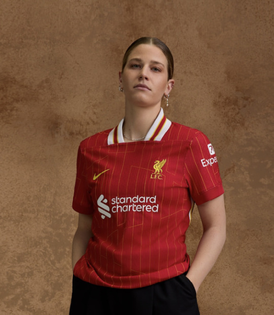
potentially a controversial opinion but this is Nice As Hell! i know a lot of people said the collars are ugly but like idk it’s kinda giving if you ask me. it’s bold, it’s a statement. i love retro. this is just a good kit. it’s doing bits without doing too much. simple, tasteful, plus a little subtle pizzazz with those jaunty ass stripes - werk it ladies!
plus this kit is made from recycled plastic bottles, nice job! save those turtles liverpool!
apparently the pattern spells out ynwa, which i’m totally Not seeing (maybe i misunderstood this). i’m getting a Y, and then like an H in there maybe? and then i’m just lost, so not sure you hit the mark with that one, but love you for trying! it’s a cool pattern regardless, so i’d maybe just ditch the whole symbolism jargon and stick with that. overall nice job guys - 9/10
bonus points for that prematch shirt, love the detailing on it very sexy top marks
2. Arsenal
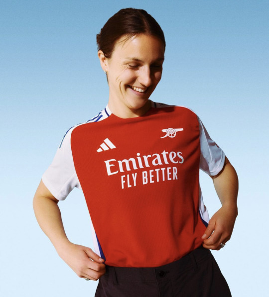

sorry arsenal fans, this shit is ugly as fuckkkkk - i’m not even being biased or trying to start fights (for once) it’s just like so hideous. i didn’t really like last season’s but compared to this that was a masterpiece. it’s so PLAIN! the weird red splodge is like not flattering at all and the blue? what’s that all about? also i fucking hate the back it looks like a used period pad, so hopefully the numbers fix that.
praying for your sakes you get a nice third kit or something bc this is ass.
also i’m a HATER for minimalist badge designs. this cannon logo makes the shirt look like a uniform for a museum volunteer. don’t get me wrong - arsenal is not the only culprit. what has a good old crest ever done to you? why do we hate maximalism? why do we hate fun? - 4/10
3. Manchester City
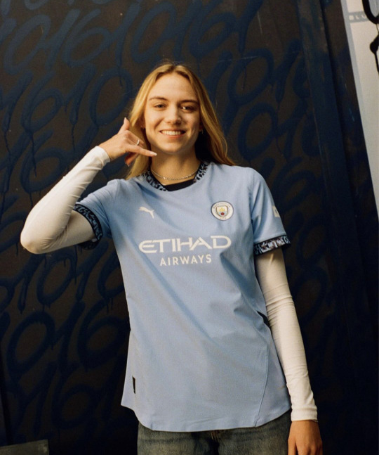
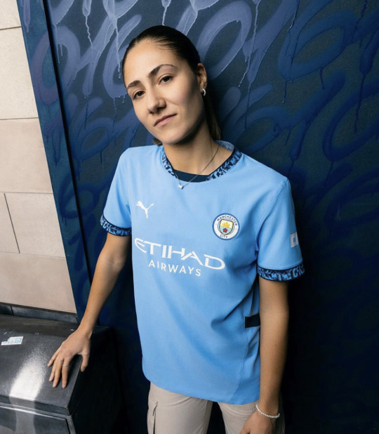
now this is fine. it’s just fine. it’s objectively nice, but it’s also objectively boring! as! fuck! the solid blue is clean but a little too flat. something looks off. it’s missing something. idk it’s nice ig, but it also seems identical to last season? if i saw these pics with no context i’d literally think it was from this year, but that’s the case with most top tier clubs it seems. have some fun guys! push the boat out! where’s the whimsy? but yeah anyway it’s alright.
at least they tried with the sleeves. allegedly they have the manchester dialling code 0161 on them but i mean - do they? do they really? because it looks like a bus seat to me. city fans decide for yourself i guess, because i for one won’t be getting close enough to a city shirt to look
it’s also made from recycled waste textiles so yay again! probably made from all the city shirts people threw out after they all but fucked the title 🤭 - 7/10
4. Tottenham Hotspur

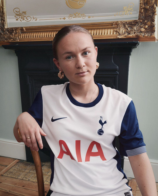
wow spurs this is nice. it’s just so clean, so crisp. my normal issue with spurs kits is their absolute undying commitment to being plain as fuck. they picked one colour, white - arguably the most boring colour of all, arguably even the total absence of colour - and stuck to it. this however? it’s simplicity done well. it’s still plain and simple, but in a gorgeous sexy way. those navy retro colourblock sleeves? stunning! the crispest white you’ve ever seen? stunning! the tiniest of sleeve embellishments? stunning! simplicity done well. it’s just so crispy. pleases my eye.
also huge respect to them for not jumping of the band wagon with the whole ‘every shirt must have ugly details with symbolic meaning we grasped at straws to come up with in order to do something new and edgy’. spurs said no! they said ‘oh this? yeah this is a football shirt. what does it mean? it means football shirt.’ thanks spurs, good job - 9.5/10
5. Crystal Palace
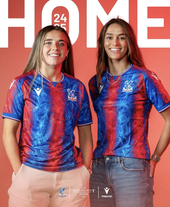

ummmm. now. hmm. uhh. what? this is, um, what? give me a second to get my thoughts in order. i don’t know what is happening here and i’m at a loss for words.
right. crystal palace. inaugural season in the wsl. making a statement. making a splash. right. here’s the thing. i’m always saying wsl kits are too boring. i’m always saying we want fun patterns and whimsy. i’m looking at this in genuine confusion because i actually do not know what is going on here. do i like it? not sure? do i hate it? also not sure?
i think i kind of like it? but i also kind of hate it? it’s insanely busy, it’s probably the most garish kit i’ve ever seen in my life. i think part of the problem is that the club doesn’t have a great colour palette to work from. it’s very bright. i do love the pattern of the eagle crest in the blue, that’s a huge win from me. it’s just those spray paint red splatters that’s throwing me off. it looks like they spent ages making a lovely blue eagle pattern and then remembered they needed red in there so just used the funky spray tools on microsoft paint to draw over the top. it’s giving shit cgi blood splatter in a low budget zombie film. it’s like the barcelona shirts if they were designed by a gcse art student on an acid trip.
the more i’m looking at it however, i’m kind of loving it? kinda camp i guess. this one could be a grower. i’m still confused. at least they’ll make a splash in the wsl - 6/10
6. Manchester United
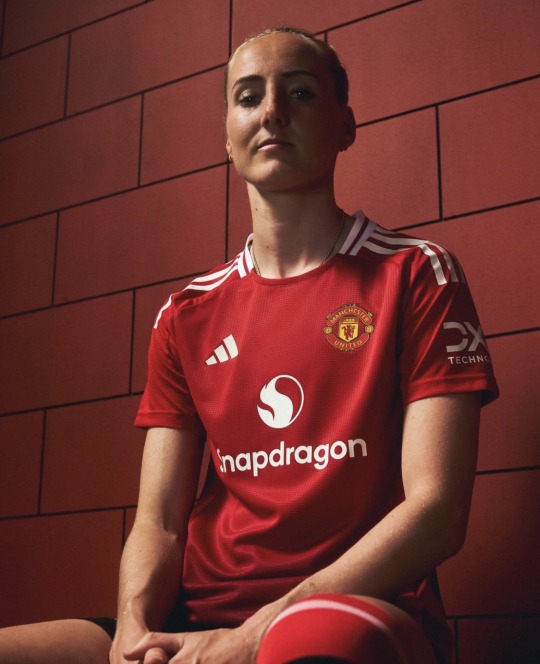
you’d think by now that i would have learnt to not get my hopes up with this club. remember the long long list of disappointments from yanited this season that i never shut up about? yeah, add this kit to that list.
listen it’s not awful. it’s not ugly, it’s not an eyesore. at the very least, it’s classic united. but it’s just so! bloody! dull! i’m literally falling asleep looking at it. it’s a t-shirt. its literally just a t-shirt. the problem is they set the bar too high last year, with that beautiful pattern and beautiful shade of red. and now, in proper united style, we’re straight back to mediocrity.
let’s talk details. oh wait, they aren’t ANY. there is nothing to say about this kit because there is nothing going ON with this kit. i like the white stripes. that’s it. theres the ombré red at the bottom, which is like- it’s okay. problem is - there’s like four too many shades of red on this shirt, and none of them are that nice. it needs a pattern or something! a pop! a little pizzazz! not a fan of the curved back panel, but it does look a whole lot better than arsenal’s at least.
this is absolutely nothing groundbreaking but it’s fine. it’s just so fucking plain. i know my girls will still serve in it, but i hoped for more. of course, in true united fashion: it’s the hope that kills you - 6/10
7. Chelsea


the tagline for this release is 'we burn blue', because 'the hottest part of the flame burns blue'. congrats on passing year seven chemistry guys. anyway, with that in mind, this kit is, naturally of course, patterned with a mystery blue LIQUID. im not seeing flames in any part of this kit. literally how is this meant to look like fire. this tagline is pure bollocks. it literally could not look more like water if it tried. aka, the opposite of fire.
the kit itself, i'm honestly struggling to form an opinion. i dont think i hate it, but i dont love it either. it may have been easier to figure out if i could actually SEE the kit in any of the release photos, instead of some stupid fucking slow motion blur effect. this pic makes mayra look like she's undergoing mitosis. poor girl's been through enough. it says a lot that in your official kit release you're actively preventing me from looking at the kit.
its not awful? i'm not a fan of these kind of realistic graphics on kits, just makes it look fake and cheap, but like, idk its kinda cool ig. the more i look the more i'm down with it. the colours are nice. its shiny. i'm glad we've gone for originality at least. patterns are fun. - 7.5/10
8. Brighton


i missed this release bc i saw the pictures and genuinely did not realise it was a different kit oops. i do feel bad for clubs who have committed to a striped kit because honestly there’s not really many ways you can play with that. but also that’s kind of their own fault. there’s really not much you can say about this. the sleeves are white this time… okay… there’s a faint pinstripe down each stripe… okayyy… yep that’s kind of it really.
it’s clean, it’s classic brighton, it’s a decent kit. there’s just genuinely nothing new about this. it’s fine. they just clearly couldn’t be bothered and i respect that. - 6/10
9. West Ham


okay we’re doing turtlenecks now apparently!! interesting choice!! i think it kinda looks fuckass silly but also i kind of like it actually. bit of fun innit. good stripes.
the rest of the kit is pretty mid. plainer than a toast sandwich. except for the sleeves! because this year, not only are they bringing in turtlenecks, west ham have decided to also bring in milkmaid sleeves! why is it like that? like is it just a weird bad fit or have they put a fucking elasticated band on? who’s idea was that? what is going on! also am i having a stroke or has the badge changed colour. because it looks fucking hideous. what did they do that for.
i do love the fact they did this shoot in a pub though. very funny. and the kit isn’t too bad. i like the stripes - 6/10
10. Leicester


this is the plainest most boring kit i have ever seen with my own two eyes. that is literally all i can say about this. boring. much like the city of leicester itself.
however - the women have a different kit sponsor to the men and i respect that so you can have one bonus point - 4/10
11. Everton


i’ll be totally honest - i wasn’t expecting everton to give me like the best kit of the bunch. this is the kit for me. i like this one a lot. castore may be mega shit quality but at least they don’t just copy paste all their kits.
i fucking love the pattern here. it’s subtle but it’s nice! and it’s different! we’re not doing any mad shit like chelsea, we’re not doing absolutely nothing at all like leicester. the perfect middle ground of the blue kits. the sponsor is hideous but i’m ignoring that. this is just lovely to look at. stylish, sleek. it’s giving high quality bus seats. this is no stagecoach, this is private hire only. i just love it. and then to top it all off, just the perfect amount of collar detailing. i would be a happy toffee if i was wearing this. gorgeous. loses half a point because the badge fell off during the game which is hysterical.- 9.5/10
12. Aston Villa

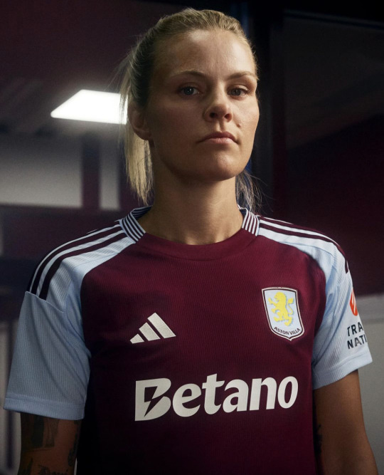
this is just the west ham kit if west ham were normal. it’s nothing to write home about, but i do like it. i like the block sleeves and the stripe colour. i like the subtle stripes down the side. i like the simplicity. i like the collar stripes. i even like the flat badge. also i’m assuming this is a betting sponsor which sucks but i do have to say that the sponsor looks great with this kit. it blends in, which is rare. this is a clean, classic kit, and i’m glad that at least one team could be normal. i don’t like that there’s pretty much nothing i can make fun of here. unfortunate for me, good for villa. good job - 8/10
note - all this was written as soon as each club released their kit, so some of my opinions have changed, and a lot have grown on me (looking at you united), but i’ve left the review untouched so you can get purely my honest first impression.
away, third and goalkeeper ratings are currently in progress so expect them once they've all been released! these posts literally never get any notes but i absolutely love doing them so i'm doing it anyway, but if you did wanna encourage me with some nice comments that wouldn't go amiss ;) xx
#hedge rates kits#awfc#cfcw#muwfc#avwfc#everton#manchester united#lwfc#lcwfc#whwfc#cpwfc#mcwfc#tottenham hotspur#thwfc#spurs women#rachel daly#maya le tissier#millie turner#mayra ramirez#anouk denton#alessia russo#lotte wubben moy#courtney nevin#saori takarada#beth england#jorelyn carabali#vicky losada#matilda vinberg#barclays wsl#wsl 24/25
33 notes
·
View notes
Text
i am not in japan or the united states =(
are gashapon capsules recyclable. what am I supposed to do with these
#aw man.... i cant hold onto these i already have enough junk#hmm yea im seeing some of them with a recycling symbol and プラ but that only tells me theyre recyclable in japan tbh#its a hard plastic.... hmmmmmmmm#thank u tho!
13 notes
·
View notes
Text


Miss Earth Namibia 2023 National Costume
The leaves are made of silk organza which is a sustainable fabric, and recycled tulle fabric and green plastic leaves from recycled plastic bags. As for the glitter beaded part, these are recycled beads that have been hand glued onto mesh net. The hat is made of cardboard and covered by the beaded fabric. Now, the aloe plant, with its ability to thrive in harsh conditions of the Namibian climate, embodies the spirit of survival and adaptation that is deeply rooted in our culture. It stands tall in the face of adversity, just as the people of Namibia have for generations. When everything seems barren and desolate, the aloe blooms with vibrant, healing properties, mirroring the optimism and potential for growth that resides within us all. Aloes are not only emblematic of hope; they are also a source of sustenance and healing. For centuries, our people have turned to the aloe for its medicinal properties. Its gel, extracted from the fleshy leaves, soothes and heals, providing a remedy for the ailments of both body and soul. It symbolizes our ancestral knowledge, our respect for nature's gifts, and our commitment to sustainable living in harmony with the Earth. Choosing the Aloe Plant as a representation of Namibia is a testament to our connection with the environment, a reminder that we are the stewards of this remarkable land.
80 notes
·
View notes
Text
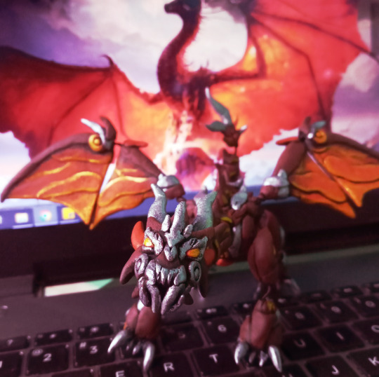

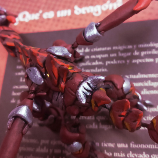
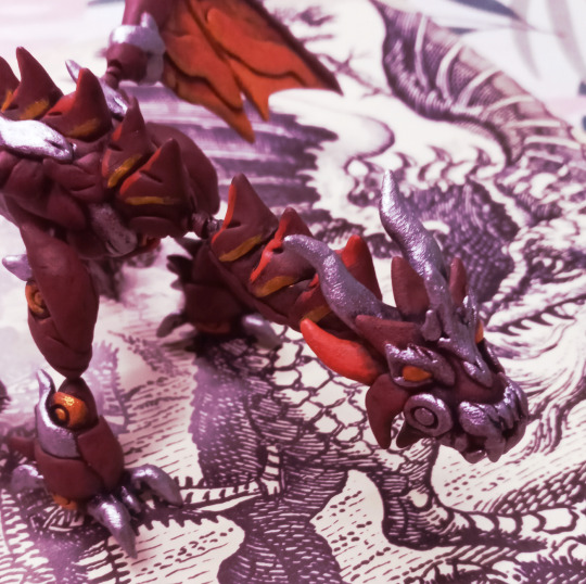


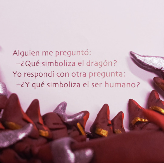
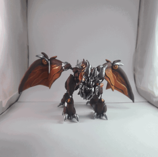
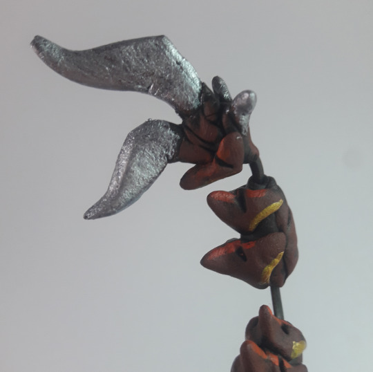
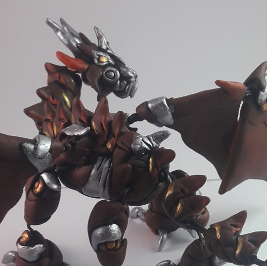
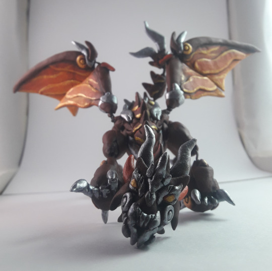
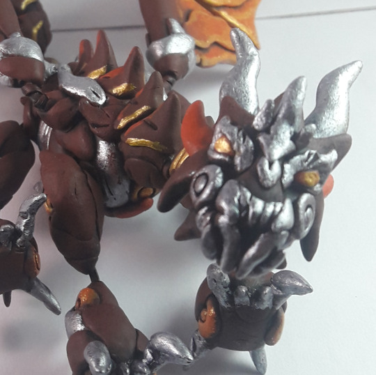
"Someone asked me: - What does the dragon symbolize? I replied with another question: - And what does the human being symbolize?"
Nice and aesthetic shots of my Predaking poseable figurine! The most ambitious sculpture project I have done so far (was from Sep-Oct 2022). This isn't my first time doing a poseable character in cold porcelain but I wasn't prepared to struggle with how heavy each piece I added to it debilitated the wire I used for the articulations (recycled plastic coated wire from leftover packaging) so I ended up with double wiring too late in the process… at times it sags a bit when posing. Still, I loved the final result, especially how I managed to capture those gorgeous fiery wings and veiny details in gold.
Under the cut, I will share the rest of the photos for the ones curious!
As always I like showing the size of my sculpted project while holding them gently AAA He is quite the biggest I did too!

A quick comparison to the more early poseable figurines I did before that year (yesss! There's a tiny Skylynx too) and an older one (the Skully creature) that I used as a basis for the wiring structure.

(Sorry for the wonky background setting, I still need to get a camera tripod)
Yes I didn't paint the wings on the back side, bear with meee. But look at all those details!

In the original plan I wanted to make his maw poseable too but by how heavy the head got already, discarded the idea.


And even with those flaws, he is imposing AAA
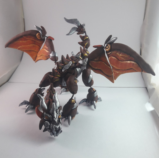
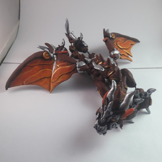
The funniest thing, all started with a plain black so all the coats of pretty colors were painted by hand!

So much work... but was worth it!
#myart#tactile realities#windydrawallday sculptures#transformers fanart#transformers prime predaking#tfp predaking#predaking#hand crafted#cold porcelain#poseable art doll#poseable figurine#figurine#dragon#art doll#maccadam
56 notes
·
View notes
Text
You know that universal experience of having a plastic bag full of plastic bags? And then eventually you have too many so you throw it out because they aren't normally recyclable?
Well guess what? They are!! If you have plastic bags or other plastic bag like products look for this symbol

Notice that "store drop off" in the middle? What you are supposed to do is store up a lot of bags and then bring them all into a grocery store or stores like Target and Walmart. The special recycle bins are usually in the front of the store. Here's what it looks like in Target.

All you have to do is drop off your plastic bags at your local store and they won't be clogging up landfills anymore!!
45 notes
·
View notes
Text
tldr: WASH YOUR RECYCLABLES AND IF YOU DON’T KNOW IF IT CAN BE RECYCLED, DON’T PUT IT IN RECYCLING
hey guys! just gonna quick talk about something that i don’t think is discussed enough regarding recycling!
so you know when you finish a pizza and the box says “recycle me!”? well a lot of people are never told that recycling plants cannot recycle dirty cardboard. cardboard cannot be properly cleaned so when it is stained with food grease, the recycling plant will simply send it to the dump! typically, though, food stained cardboard CAN be put in ORGANICS!!!
now you may be thinking “why does it matter who sends it to the dump?”
WRONG!!! recycling plants (where i live, and in many other places) actually have a government mandated QUOTA of what percent of the things that they receive actually get recycled. for example, where i’m from the quota is around 14%. this means that if less than 14% of things sent to recycling plants actually end up being recycled, the government will CUT THEIR FUNDING.
this means that every non-recyclable that we throw in our recycling bins is bringing us further from the quota. if their funding gets cut we either:
1: wont have recycling as an option anymore (bad for the environment)
or
2: will have higher taxes to compensate for the extra money that it takes to fund recycling plants (bad for the people)
so you may be wondering, “woobiz, what *can* i put in my recycling bin?”
the answer is a lot of things! just make sure they are clean (this means rinsing them with water, not necessarily soap, just a good rinse should be enough for most things, should be visibly clean).
- metal cans and foils (foils should be cleaned and bunched into a ball)
- plastics with the numbers 1, 2, and 5 (should show with the recycling symbol)
- clean cardboard and paper
- glass (bottles, containers, etc)
now let’s talk about what CAN’T be recycled!
- anything dirty
- certain plastics (thinner plastics like bags, if you’re not sure, look it up or trash it)
- closed bags (if you have, say, an opaque trash bag full of recyclables and tied closed, the plant will most likely trash it because cutting it open can be a safety hazard if they do not know what is inside)
recyclables should be separated (don’t put plastic inside of a cardboard box or cans inside of a glass container, etc) because the scanners at the recycling plants will have a much harder time identifying the recyclable. you can put them all in the same recycling bin, just make sure they’re empty and separate for the machines.
recycling is great for the environment but it can’t help us to its full potential without education on what can and can’t be recycled. if you’ve read this through, thank you and i hope you learned something about recycling! if you have anything to add, feel free!!!
11 notes
·
View notes
Text
‘Recycling’ Makes Plastic Pollution Worse
by Stark Realities with Brian McGlinchey | Feb 10, 2025
If you’re like many people, you’ve always thought a numbered-triangle symbol on the bottom of a plastic container tells you it’s recyclable—giving you peace of mind that when you toss it into a blue bin, it will be turned into something else.
That’s not true. Those symbols are Resin Identification Codes (RICs). Numbered 1 through 7, they only identify the kind of plastic an item is made of. Far from giving a sweeping assurance that RIC-stamped items are recyclable, the symbol frequently indicates a particular item absolutely cannot be recycled.
Reluctant to burden citizens with figuring out which plastics are recyclable—a chore that could dampen participation and cause confusion as recyclability of various plastics changes over time—many municipal recycling programs simply encourage people to toss all their RIC-stamped plastics in the bin and let the recyclers sort it out.
Which ones do recyclers actually want? The most-recycled plastic in America is stamped with a “1,” identifying the item as polyethylene terephthalate (PET). You’ll find it on beverage bottles, cooking oil containers, and many other liquid-containing bottles. A “2” tells you it’s high-density polyethylene (HDPE). Another generally recycling-suitable plastic, it’s used for milk jugs and laundry detergent jugs, and spray-cleaner bottles.
It’s all downhill from there. Chances are your bin has plenty of #5—polypropylene (PP)—which is frequently used for single-serve coffee-maker pods; yogurt, butter, prescription pill and soft tofu containers; and the lids on paperboard raisin cartons. Unfortunately, while there’s been a modest recent uptick in recyclers’ interest, polypropylene generally isn’t being recycled in the United States.
As for the rest of the RIC spectrum, feel free to make pointed inquiries with your city government, but chances are extremely slim that any #3, #4, #6 or #7 items you throw in your curbside blue bin will be made into anything else. That heap includes lots of packaging, such as non-cardboard egg cartons, fast-food clamshells, styrofoam cups and to-go containers, flexible 6-pack rings and bread bags.
Feeling a little demoralized? Brace yourself: This blue-bin buzzkill is just getting started.
3 notes
·
View notes
Text
Since its emergence as a symbol of Remembrance after the First World War, poppies have taken on various shapes and sizes.
From handmade silk and cotton poppies to wartime poppies, 2023 sees the biggest change in the poppy’s design for a generation.
Made entirely from paper, the new plastic-free poppy is available alongside stock of the existing poppy to reduce waste and can be recycled in ordinary paper recycling collections.
As we approach Remembrance Sunday, please wear a poppy to show the Armed Forces community you care and help us raise vital funds to support Serving personnel, veterans, and their families all year round.
#Remembrance Sunday#Remembrance#Field of Remembrance#Remembrance Sunday 2023#World War I#World War II#poppies#Armed Forces#military#military families#veterans#Royal British Legion#British Royal Family#plastic-free poppy#reduce waste#recycling
41 notes
·
View notes