#rectangles with stripes? done.
Explore tagged Tumblr posts
Text

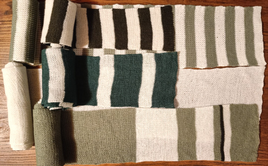
I have been stuck in Knitting Jail for most of this year, slowly working on making just a bunch of basic ass scarves to give out on Crimbus
They are wonky, they're frankly put downright laughable, but they're usable and extremely soft and that's what really matters
#Yarncraft Diary#Moon posting#Somehow fucked up the color balancing on the second photo so they look really red in that one but I can't be bothered to fix that#No I did not bother with rolling them all out because. They're just wonky ass scarves man. They're not that interesting#One is just a plain white scrf and three have like even striping patterns on them#Really the only ''interesting'' one is the bottom one on the second photo since the middle section of it is green#So there's only stripes on the ends of it#But yeah. They're just rectangles. Extremely wonky rectangles#Yes I did block them you can even see it on the slightly pointy sides of the scarves lmao#Tbh the wonkiness kinda looks worse when they're just rolled out on a flat surface like this#Like if you were actually wearing them the wonkiness wouldn't be that noticable (probably)#Also to be fair I probably could've finished these sooner had I not taken breaks to do other projects between scarves but like.#Knitting scarves is not interesting. I was losing my fucking mind. I needed breaks desperately#So I did other shit from time to thime#But it's fine now 'cause these fuckers are DONE and I am FREE from Knitting Jail and can return to Crochet My Beloved
6 notes
·
View notes
Text
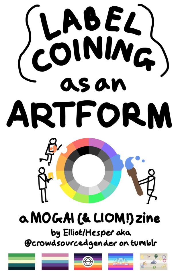
My zine, 'Label Coining as an Artform', is finally done! Transcript/Image ID underneath (warning: it's long). Printed version in a reblog.

[Image ID: A series of pages in a zine. The text is handwritten, and all figures described are simplified stick figures.
Page 1: ‘LABEL COINING as an ARTFORM in large text. Below is the multicolored MOGAI wheel, with three figures taking pieces of the colors and using them for art: sculpting, cutting a piece of paper, and painting. Below is ‘a MOGAI (& LIOM!) zine by Elliot/Hesper aka @ crowdsourcedgender on tumblr. Under the text are five pride flags: aro-spec, veldian, alterhuman, xenoman, and schooldoodlic.
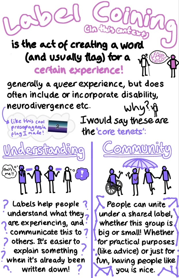
Page 2: ‘Label Coining’ in large pink text. ‘(in this context) is the act of creating a word (and usually flag) for a certain experience!’. Next to this text is a figure filled in with pink with a speech bubble full of pink shapes, talking to someone using a cane holding out a hand and expressing a question mark. Below reads ‘generally a queer experience, but does often include or incorporate disability, neurodivergence etc.’ A figure asks ‘Why?’ and the text reads ‘I would say these are the ‘core tenets’:’. In a cloud next to this text is a blue and purple pride flag with purple text reading: ‘like this cool prosopagnosia flag I made!’.
The bottom half of the page is split into two columns: ‘Understanding’ and ‘Community’. The first column has a purple arm amputee explaining a purple rectangle to another purple person who is thinking ‘that’s me!!’. Next to them another purple person is explaining the same rectangle to a blank person, who has a purple-filled thought bubble with a white exclamation mark. Underneath the drawing is text surrounded by question marks: ‘Labels help people understand what they are experiencing, and communicate this to others. It’s easier to explain something when it’s already been written down!” The second column has a purple person holding a purple umbrella. They are waving to a purple person in a wheelchair. A purple person is leading another one to the group. Underneath the drawing is text surrounded by connected dots: ‘People can unite under a shared label whether this group is big or small! Whether for practical purposes (like advice) or just for fun, having people like you is nice.
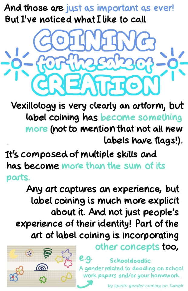
Page 3: ‘And these are just as important as ever! But I’ve noticed what I like to call COINING for the sake of CREATION’. This last phrase is in large, dark and light blue text. Two sun symbols are on either side. Below is the text: ‘Vexillology is very clearly an artform, but label coining has become something more (not to mention that not all new labels have flags!). It’s composed of multiple skills has become more than the sum of its parts. Any art captures an experience, but label coining is much more explicit about it. And not just people’s experience of their identity! Part of the art of label coining is incorporating other concepts too, e.g. Schooldoodlic A gender related to doodling on school work papers and/or your homework. By spirits-gender-coining on Tumblr.’ The text about Schooldoodlic is small and light teal. Next to the text is its flag.
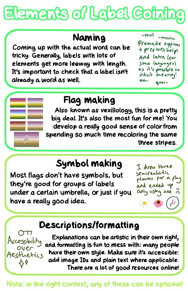
Page 4: ‘Elements of Label Coining’. The text on this page is separated into four green boxes.
‘Naming: Coming up with the actual word can be tricky. Generally, labels with lots of elements get more leeway with length. It’s important to check that a label isn’t already a word as well.’ Next to this text is more rough, dark green text reading ‘Premade suffixes + prefixes help! And latin (for some languages) as it’s possible to intuit meaning!’ Around the text is a few examples: ‘-vesil’ ‘-musica’ ‘an-’ ‘quoi-’
‘Flag making: Also known as vexillology, this is a pretty big deal. It’s also the most fun for me! You develop a really good sense of color from spending so much recoloring the same three stripes.’ Next to the text is 6 versions of the same pride flag, each with slightly different colors, with a 7th final version with a symbol.
‘Symbol making: Most flags don’t have symbols, but they’re good for groups of labels under a certain umbrella, or just if you have a really good idea.’ Next to this is rough, dark green text reading: ‘I drew three semirealistic flowers for a flag and ended up only using one’ with sad face. Under it is a drawing of a daisy, a pink coneflower, and lavender, which is circled.
‘Descriptions/formatting: Explanations can be artistic in their own right, and formatting is fun to mess with: many people have their own style. Make sure it’s accessible: add image IDs and plain text where applicable. There are a lot of good resources online!’ In dark green text is the phrase ‘Accessibility over Aesthetics’ with an image of a key on top and sparkles below.
Underneath the boxes in light green text is ‘Note: in the right context, any of these can be optional!’
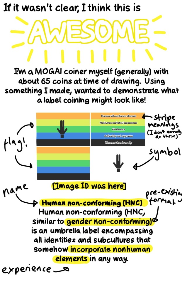
Page 5: ‘If it wasn’t clear, I think this is AWESOME’. Awesome is in large text with yellow radiating lines. Underneath is ‘I’m a MOGAI coiner myself (generally) with about 65 coins at time of drawing. Using something I made, I wanted to demonstrate what a label coining might look like!’ Underneath is four versions of the same pride flag as well as a description, with ‘flag!’ ‘stripe meanings (I don’t normally do these)’ ‘symbol’ ‘name’ ‘pre-existing format’ and ‘experience’ labelled. The description reads ‘[Image ID was here] Human non-conforming (HNC). Human non-conforming (HNC, similar to gender non-conforming) is an umbrella label encompassing all identities and subcultures that somehow incorporate nonhuman elements in any way.’
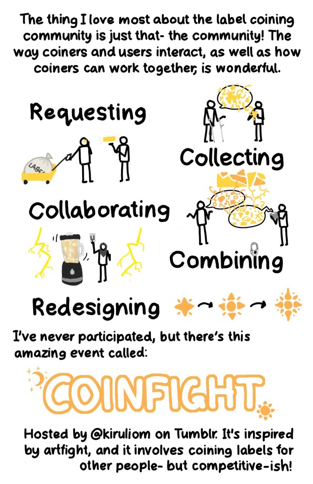
Page 6: ‘The thing I love most about the label coining community is just that- the community! The way coiners and users interact, as well as how coiners can work together, is wonderful. There are 5 large words each with an associated doodle.
‘Requesting’: A figure leaning on forearm crutches has a speech bubble with yellow shapes exploding out of it. Another figure is taking shapes down from the bubble and forming it into a ball.
‘Collecting’: A figure is pulling a yellow cart with a large cloth bag labelled ‘LABELS’. They have stars in their eyes, and are looking at another person who is gesturing to a yellow rectangle.
‘Collaborating’: Two figures, one with orange speech and one with yellow speech and an AAC tablet are discussing, with many shapes and lines intermingling to make a fragmented rectangle.
‘Combining’: A figure in a grey hijab pulls down a lever. They are standing next to a large blender mixing orange and yellow liquids. On either side is bright yellow lightning.
‘Redesiging’: A small star with four radial lines coming out of it becomes more and more complex, indicated by black arrows.
Under the words is the text: ‘I’ve never participated, but there’s this amazing event called: COINFIGHT. Hosted by @ kiruliom on Tumblr. It’s inspired by artfight, and it involves coining labels for other people- but competitive-ish!’ Coinfight is in large, text with a crescent moon with stars at the top right corner, and a star at the bottom left.
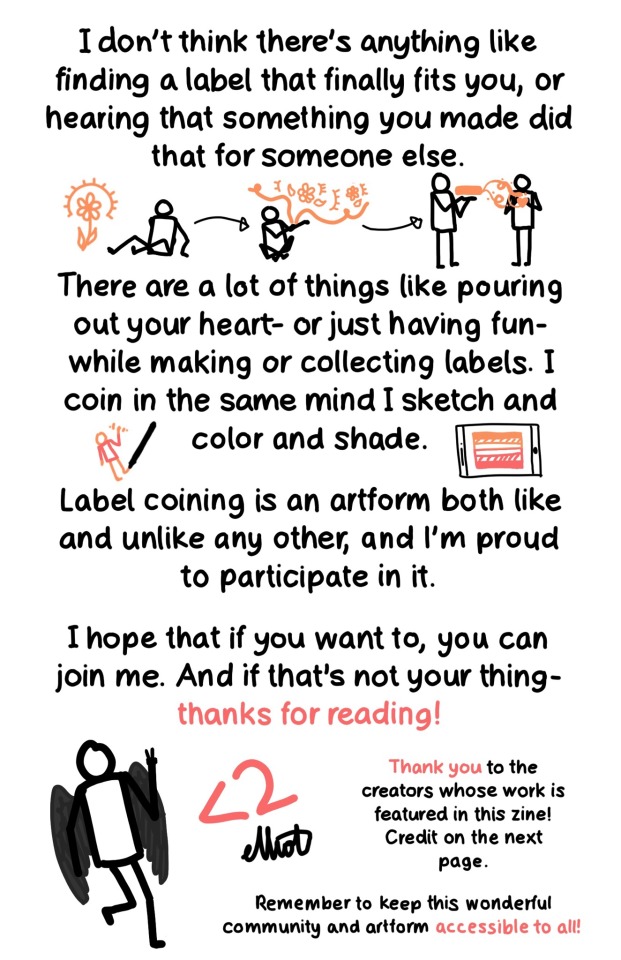
Page 7: ‘I don’t think there’s anything like finding a label that finally fits you, or hearing that something you made did that for someone else.’ Under is a figure looking at an orange flower with light lines, then forming elements of the flower into a bubble, then showing an orange rectangle to another figure, with orange tendrils reaching towards them, forming the shape of a heart. Below is the text ‘There are a lot of things like pouring out your heart- or just having fun- while making or collecting label. I coin in the same mind I sketch and color and shade.’ On each side is a pen drawing an orange figure with a red shirt, and a tablet with an orange and red flag. Under this is ‘Label coining is an artform both like and unlike any other, and I’m proud to participate in it. I hope that if you want to, you can join me. And if that’s not your thing- thanks for reading!’ There is a drawing of a figure with dark grey wings holding up two fingers. Next is a ‘<2’ heart and ‘elliot’ as a signature. In smaller text next to these is ‘Thank you to the creators whose work is featured in this zine! Credit on the next page. Remember to keep this wonderful community and artform accessible to all!’
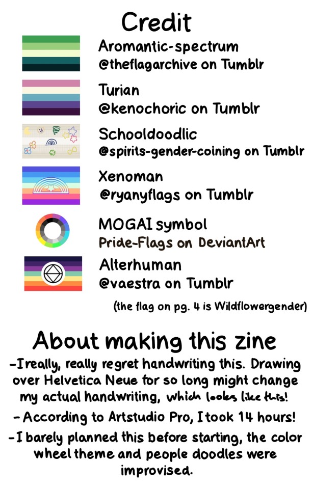
Page 8: ‘Credit’: This section has a pride flag next to each label. ‘Aromantic-spectum, @ theflagarchive on Tumblr. Turian, @ kenochoric on Tumblr. Schooldoodlic, @ spirits-gender-coining on Tumblr. Xenoman, @ ryanyflags on Tumblr. MOGAI symbol, Pride-Flags on DeviantArt. Alterhuman, @ vaestra on Tumblr. (the flag on pg. 4 is Wildflowergender). ‘About making this zine’: ‘I really, really regret handwriting this. Drawing over Helvetica Neue for so long might change my actual handwriting, [more rough:] which looks like this! According to Artstudio Pro, I took 14 hours! I barely planned this before starting, the color wheel theme and the people doodles. /End ID]
#mogai#microlabels#mogai coining#lgbtq#lgbtqia#zine#art zine#lgbtq zine#queer zine#label coining#queer vexillology#queer#queer community#long post#described#image described#image id#not coining
613 notes
·
View notes
Text
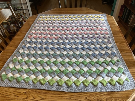
Since knitting was apparently trending yesterday (?), this is the baby blanket I finished while watching the 2007 BBC Persuasion. It’s for my cousin’s new baby. I still need to weave in the ends and block, but it’s basically done.
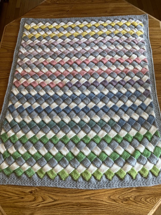
The yarn is one skein Lion Brand Mandala Baby in the Neverland color way, two skeins of Bernat Softee Baby in Flannel, and two different white baby yarns that I already had because I ran out of the first one four white stripes from the end. (Technically, this was all yarn that I already had, but only because during the first wave of Covid I knew so many people who had just had babies or were expecting that I panic-bought baby yarn the first day nonessentials businesses reopened so that I’d have enough if we went back into full lockdown. I’m still working through the stash).
People who know entrelac knitting are looking at the pictures going, “How did you get it so that every row has one side triangle instead of alternating rows that have triangles on each side with rows of only rectangles?” And the answer is that I read the instructions wrong and had a wonky base triangle at the very beginning, but I hid it in the crocheted border
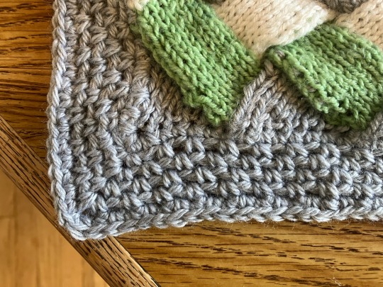
No one will ever know.
1K notes
·
View notes
Text
Flag Making Tutorial
This will be a more technical step-by-step tutorial on how I make my flags (also a long post because I wanted to be thorough, plus I love flags lol).
The program I use is Inkscape, a free vector (.svg) editor program for pc.
I have templates set up, so the actual flag making process is pretty easy/quick.

Hotkeys/Locations/Other Reference
I'll be mentioning these options, so I thought to put them here all in one list. (They list the keyboard shortcuts first)
Snapping: magnet symbol (top right of screen), or under the adjacent arrow ◀️ symbol.
Document properties: shift+ctrl+D, or under the file menu (top left corner of screen). Display (1st tab) Guides (2nd tab) Grids (3rd tab)
Fill and Stroke: shift+ctrl+F, or under object (top of screen).
Layers and Objects: ctrl+shift+L, or under object (top of screen).
Align and Distribute: ctrl+shift+A, or under object (top of screen).
Import (Images): ctrl+i, under the file menu, or by dragging into the Inkscape window.
Save As: ctrl+shift+S, or under the file menu.
Export: shift+ctrl+E, or under the file menu.
Selector Tool: S, or cursor symbol (left side of screen). Click, or click and drag around the objects, to select them.
Locking a selection: lock symbol between the width and height boxes at the top of the screen.
Transform Selections: the width/height and x y position can be changed by typing in the X,Y,W,H boxes (near top middle of screen), or by dragging the corners/edges (resize) and inside the object (move).
Duplicate: ctrl+D.
Delete: delete key, or right click on the object.
Node Tool: N, or below the selector tool (left side of screen).
Rectangle Tool: R, or square symbol (left side of screen).
Pen Tool: B, or pen symbol (left side of screen).
Gradient Tool: G, gradient square symbol (left side of screen).
Mesh Tool: swirly square symbol (left side of screen).
Dropper Tool: D, or dropper symbol (left side of screen).
Undo: ctrl+Z.
Redo: ctrl+Y.

Creating the Template
Download Inkscape and open it, under the Time to Draw tab, click New Document.
First, snapping needs to be enabled, and under advanced mode enable grids and guide lines snapping. (This is crucial for making the stripes equally sized, spaced, and the overall flag in the right ratio.)
I'll be making a template with a 2:3 flag ratio.
Open document properties. (I like to move these types of windows to the right side.)
Under display, set the width to 42px and height to 28px.
Under guides, just click create guides around the current page.
Under grids, make sure rectangular grid is selected, and click new. (Grid units should be in px.) For the major grid line every option, change it to 2. (I also prefer to change the minor grid line color to be transparent.)
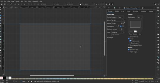
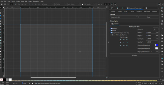
That's pretty much it, your template is done :D ! Just save it wherever you want. I like putting it in an easy-to-access flag folder, as it is needed to open it every time to make new flags.

You can use a different width / height / grid size / flag ratio if you want, these are just the numbers I'm comfortable with / used to.
Also, since this is a vector, the image can be infinitely big or small without any quality loss, so the small dimensions above don't actually translate to a low res image.

Creating the Flag
(I'll be using the rainbow flag to demonstrate.)
Start by having the template open.
You can import images (like .png/.jpg files) to color pick / reference if you want. Said images can be transformed (resized/moved) by selecting and transforming them using the options mentioned in reference. (This is optional, they should just be off to the side so they don't get in the way.)
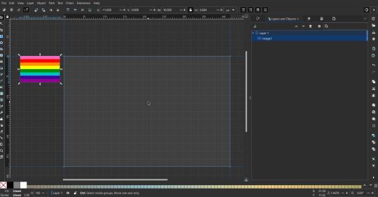
To create the stripes, use the rectangle tool. Click and drag from one grid corner, to a lower grid corner.
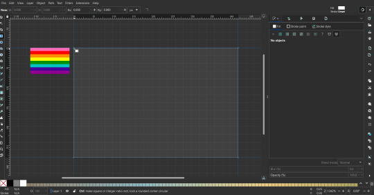
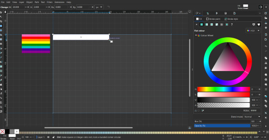
While the rectangle is selected, use the dropper tool to pick a color from a imported image. You can also use the fill and stroke (shown on right) tab to create your own colors / edit colors / etc.
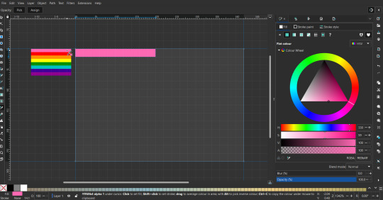
You can make these stripes however you want, they just need to all be equally sized. (They don't have to all have the same height, if you intentionally want that (like the demisexual flag for example).)
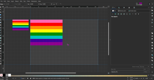
Then select all the stripes and transform them so that they fit the page.
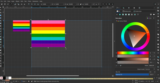
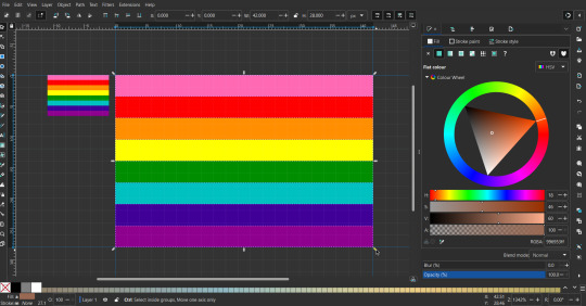
All that's left is to save/export it.
To export it, use the export tab, under single file, page, adjust the width and height (in px) to however high res you want your image to be. (I usually do 3000 by 2000.)
Type in the desired file name in the box next to the folder symbol, use the folder symbol to choose its export location (which can also be used to determine the file name and save/export it), the adjacent drop-down-menu to select what to save it as (,png, .jpg, .svg, etc.), and the gear symbol to adjust other settings (I leave it as default, with antialias turned off (set to 0)).
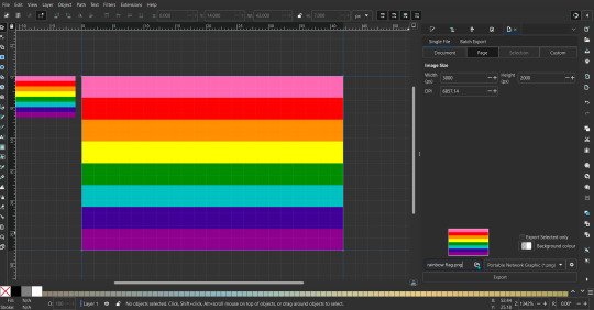
And done, you've made a flag :D 🏳️🌈

Extra Notes
Layers and Objects: a menu that can be used to manage objects. Like their layering position (whether they are above or below another object), and other options can also be done here instead of with keyboard shortcuts.
Vertically striped flags: it's very similar to above. You would just make the rectangles taller rather than wider.
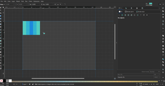
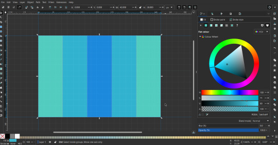
Wavy stripes: first use the pen tool to create zigzags. (The pen tool works like a outline, so just click along the grid corners, and join the line at the end. The fill and stroke menu can be used to make it a solid colored shape, and remove/add outlines). The steepness/frequency of the zigzags is up to personal preference, they just need to extend off the page a bit. To create equally sized wavy stripes, have the all side lengths (highlighted in red) be equal except (depending on how you draw your zigzags) the first or last wave, which should have half the side length of the others.

Select everything, and with the node tool, select all the zigzag nodes (the corners don't need to be selected), and click make selected nodes smooth (half circle with point in middle symbol, at top of screen). (It'll likely look like it has weird lines in-between the waves, see glitch section at the end for how to fix that.)
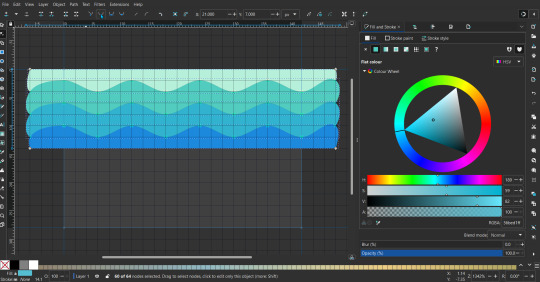
Then resize it all to the height of the canvas. And done :)
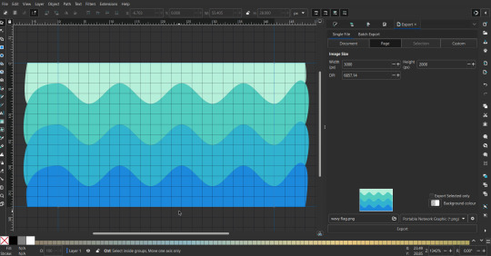
This can of course be vertical too.
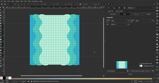
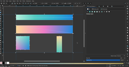
Gradients: You can use the fill and stroke dialogue, gradient tool, or mesh tool to do this.
To create the gradient, select the object, click the linear gradient symbol (gradient box) under fill and stroke. Or dragging / double clicking with the gradient/mesh tools. (The mesh tool is what I used to create the square gradient.)
To change the colors, click on the arrows or circles under fill and stroke, or by clicking the points on the shape, to select the nodes. Then use fill and stroke to change the colors.
To create new colors/stops, click on the plus+ symbol under stops (under fill and stroke), or double click on the gradient. Edit the new colors in fill and stroke again.
To change the location of stops, use stop offset under fill and stroke, or drag the nodes on the gradient. You can also move the end points on the object to make the gradient slanted or vertical.

Symbols: I make my own when I can (like the demi- triangle can be drawn with the pen tool, and resized to the correct proportions). When the symbol is too complicated, I import a .svg of it. Wikimedia commons is a great resource, and the popular twemoji comes in .svg format too. You could also edit it on over the .png in a rastor program if need be.
The align and distribute tab can be used to center symbols (or any other selected object). Select page for the relative to option, and use the symbols underneath to center/align it however you want. (You can also use different relative to options, like last selected, if you want to align it to an object instead.)
Deleting imported reference images: you can do this before saving it as a .svg, if you don't want to keep them / want to clean up the .svg file.
Antialiasing: an option that blurs things basically. A image with antialiasing off will be sharp pixels, while a image with antialiasing on will have transition colors between the main colors.
Below is an example. The left side is without antialiasing, and the right side is with antialiasing.

I can see why it might be preferable to have it on (like for diagonal shapes), but antialiasing can make recoloring .png (not .svg) files hard. The extra different colors messes with fill tools. I also think it looks cleaner without, so I prefer it off.
Exporting glitch: sometimes an exported image will have a thin line between the stripes, despite the fact the stripes are perfectly next to each other. (This seems to not just be a problem with Inkscape, but with vectors in general.)
Below is a zoomed in example of what it'd look like. The left side shows the stripes are all next to each other, but the right image has a transparent line in-between the stripes.
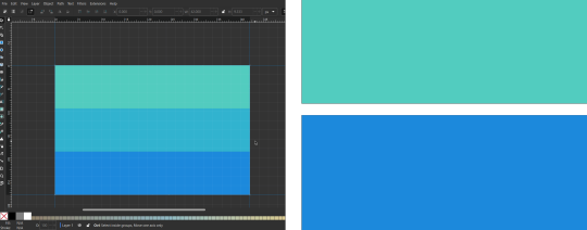
This can be fixed a number of ways.
You could select all the objects, and duplicate them twice.
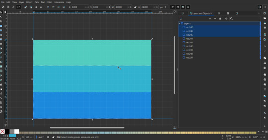
Or overlap them. The stripes will still be the same size when overlapped, but they will technically be behind each other, so there will be no gap.
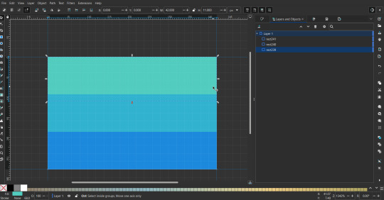

With all the different stuff mentioned, you can basically think of them as building blocks with the grid as reference. They can all be mixed and matched together.
I didn't mention all the options, just because there's that many different things you can do in Inkscape. I'd encourage you to play around with all the different options/tools yourself.
There's also some great Inkscape guides on YouTube, it's where I learned how to do a lot of this from (even if they're not for flags specifically, the concepts in those videos can be applied to flags).

Here's an overly elaborate flag I made, just to demonstrate some (but not all) of the things that can be done.
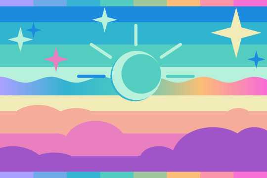
Anyways what a long post haha. But maybe this will be helpful for anyone interested in making (pride) flags.
209 notes
·
View notes
Text
Unlike the waves of the Suminoe
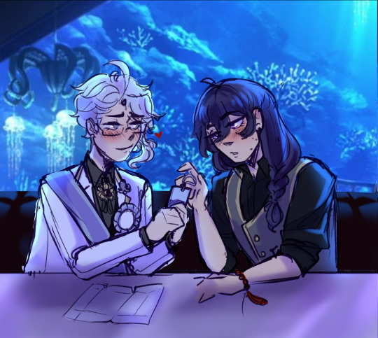
Word count: 2,793
Summary: It's Azul's birthday, and despite Azul's policies about gifts, Yuu insists on giving his crush a birthday present.
Pairings: Azul Ashengrotto x Yuu Fujisaki (implied)
A/N: Happy birthday to my bestest boy mwah💕
Companion/continuation fic can be found here! Also I will add the companion art tmrw im so tired fr
Taglist: @kazumify @the-trinket-witch @yavya
~
"I know you don't usually accept these, but... happy birthday." Against his better judgment, Yuu extended the carefully gift-wrapped package to Azul. His eyes glued to the floor as a sudden bashfulness filled his body. For once, he was grateful that Vil had forced him to wear that full-coverage foundation.
Somehow, someway, Yuu had been roped into being Azul's interview host for his birthday party, whatever that was supposed to entail.
It was a long-standing tradition in Night Raven College to make these grandiose celebrations for students; The entire dorm would be decorated to its max splendor and the birthday boy would be awarded all sorts of gifts; even receiving a specially tailored suit that fit the year's theme. Is that where the budget to fix Ramshackle dorm went? Either way, Yuu couldn't really complain. After all, he was awarded the same luxuries when his own birthday came along. Kalim and Vil made sure of that.
The festive atmosphere that engulfed the Octavinelle dorm was also a welcome change of pace. With the VDC approaching, practice was getting more and more intense. So when the opportunity arose to finally relax and pig out on junk food and sweet treats, practically everyone jumped at the chance— even if the birthday boy wasn't particularly well-liked by most members of the NRC Tribe.
It also was exciting to be able to candidly ask Azul about himself for once. Whenever they met up, they seldom talked about each other, often their conversations being engulfed by work or contracts rather than other, more casual topics one would normally talk about with friends. Yet, as host, Yuu was allowed the rare opportunity to run an honest-to-goodness interview without running the risk of being blackmailed by the octomer, something he couldn't just pass by.
It was pleasant to hear about Azul's birthday memories first-hand, and he even got to learn about his family traditions. He spoke plainly and happily about his parents, the ristorante they had back at the coral sea, and his own thought processes behind his management of the lounge. Yuu reveled in that moment of subtle vulnerability. It was nice not having to read between words for once.
Now that the interview was over, though, Azul went back to his all-business persona as he cheerfully greeted guests and accepted well-wishes, often recommending dishes in-between or proposing deals. It was only until the very end of the party that Yuu could catch his attention again and pull him aside to an empty table.
The wrapping paper crinkled as he clutched the gift harder and slightly bowed— his body moving on its own before he could even think. Despite being in Twisted Wonderland for more than a semester now, he still couldn't shake up some of the rigid mannerisms from back home.
Perfect, now he looked more like a fool.
"Ah. I think you've wished me happy birthday... three times already?" Azul's laugh ringed on Yuu's ears. Melodious and sweet. Genuine even, compared to his usual tone. "But if you know my rules, then you should've known already I can't take it." Despite his statement, Azul tentatively took the package and examined it.
It didn't look like anything special. A flat, hand-sized rectangle that was wrapped in modest striped lavender paper from Sam's shop. Yuu had done this intentionally. He thought if the gift looked inconspicuous enough, Azul would accept it without protesting, but it seemed he had underestimated his crush's stubbornness.
"It's a dumb rule." Yuu quickly retorted. "I don't need or want anything in return, Azul. It's literally your birthday." He finally found the courage to look up. As his eyes were met with Azul's smile, he couldn't help but return it with his own, his only hope being that it wasn't too dopey or lovesick. "And honestly, you're already allowing me the joy of giving. Isn't that enough payback?"
"If you word it like that, I suppose that's enough." He laughed again, and Yuu's heart did a flip. "What is it?"
"You'll have to open it to find out."
"Can't you just tell me?"
"That's not how this works, come on—" Yuu let himself laugh as he finally sat beside him and averted his gaze towards the cutlery on the table. Maybe if he didn't have to look him directly in the face, his anxiety would fade slightly.
He nudged the present closer and held his breath as Azul unwrapped the package, careful not to rip the paper. If he were from earth, Yuu thought, Azul would be the type of person that would save them to wrap other gifts.
"A bookmark?" He held the wooden charm up. The delicately carved slab was decorated at the bottom corner with a wave pattern— the closest Yuu could guide Rook to paint on with his limited artistic talent to reflect the ones he'd seen at home. At the top, a braided satin tassel was looped through a small hole, tied into a rope.
"I- I'm not good with crafts like these, so I commissioned Epel and Rook to help me out with some—... I wanted to give you something you could use." Yuu tried his best not to trip over his words as he explained. Why was he even explaining himself, though? His plan was to just give him the package and dip, but instead, Yuu was now hunched forward, one finger pointing at the details he wanted Azul to take notice of.
"Thank you. It is indeed quite a useful gift." Azul's voice softened, but Yuu couldn't really gauge what he truly thought about the gift without looking at him— something he refused to do. "Is this design common where you come from?"
"Yes, the pattern here is called a seigaiha. It's meant to represent ocean waves. Though Rook did take some artistic liberties on his interpretation."
"And this?" Azul's hand slid to the complex knot at the top. His curiosity slightly encouraging Yuu.
"It doesn't mean anything specifically, but I wanted to mimic an omamori— a good luck charm." He answered before averting his eyes again in embarrassment. "That's the only part I contributed with manually."
"It's still very intricate. Though I'm a bit insulted that you think I need a lucky charm." He felt Azul's weight shift beside him as he leaned on him for a few seconds. He knew it was a friendly nudge, but that still didn't help Yuu feel any less flustered.
"Everyone needs a little luck every once in a while, besides—" Yuu guided Azul's hand and flipped the bookmark to its backside, which had a small, white rectangle painted at its center. "It doesn't have the spell that makes it lucky written on it."
"So there is magic in your world." Azul's voice gained a smug tone, that one he used so often whenever he wanted to tease Yuu. Usually, he would just laugh along and reciprocate with a quip of his own, but his brain was already working overtime with just maintaining his composure. Thankfully, Azul didn't seem to notice as he continued. "Then, shouldn't you write something? It's your gift, after all."
"I am magicless, remember? It wouldn't work. Besides, my handwriting's kind of ugly. I didn't want to ruin it."
"I don't think— nevermind." He felt Azul's posture falter for a second. "What I meant is that... It'd be nice to get a message from you. But if you say so, I suppose it's for the best then."
Yuu's eyes darted up. Did Azul sound... disappointed? If he did, he didn't show it. His expression was as inscrutable as always, his lips curled into that all-business smile as his delicate fingers ran through the blank slate.
God, he was gorgeous.
And it was getting very difficult to keep denying him, especially on his birthday.
"I may... know something I could write on."
"Oh?" Azul turned to him, head tilting in curiosity. "What do you have in mind?"
"I don't want it to be something menial like a 'happy birthday' or a regular well-wishes message. That'd be a disservice to Rook and Epel's work. So instead, I thought.... I know a certain poem I could write instead."
"You're writing me a poem?" Azul's smile widened, and he crinkled his eyes smugly, having found the perfect opportunity to tease Yuu. "I didn't take you for a romantic. Or a writer for that matter."
"And I didn't take you for an insufferable tease, and yet here we are." He flicked a finger to Azul's temple, Azul flinching in return. "I'm not writing you a poem. I'm writing a poem. Pragmatics, 'Zul-kun."
"But it is directed at me, no? So you are writing it for me." The boy chuckled as he moved a hand to his forehead, rubbing the spot where Yuu flicked at him. "Shame I won't be getting an original. It would skyrocket the bookmark's value."
"You can't afford me." Yuu retorts, returning Azul's smug and cheeky smile with one of his own.
"I doubt that. What are your rates?"
"I'll discuss with my associates and get back to you."
The two let out a low chuckle as the conversation naturally veers back to their usual dynamic. And Yuu gives himself the luxury to lightly nudge Azul, extending their contact for just a little precious second longer. "Now I'm curious, though. What poem are you going to write for me?"
"It's just a short thing. Back from a collection of poems that are pretty famous back home." Yuu explains, not truly wanting to get into the thick of it just yet. If only to make their conversation longer.
"And?" Azul leans closer, not buying Yuu's humble description. They have known one another for long enough that Yuu wouldn't just bring it up if it was that trivial.
"And, it's also become a kind of card game because of its fame. It's called Hyakunin Isshu karuta."
"A hundred people, a hundred poems, huh?" Azul perks up, leaning forward and placing his palms on his chin. "Must be quite a challenge to memorize all of them."
"Oh, not really." Yuu smiles in spite of himself, and he sees Azul frown in return. He quickly wipes the smile off his face and coughs. "I mean- they are quite short. Just 5 verses each, split in two. So they're not that hard to memorize. Much like a couple of songs or an album by your favorite artist..."
"I get it. A simple game of memorization." Azul's interest seemed to have returned. "So what you're telling me is that if I memorize all 100 poems, I could win this game?"
"Well, yes. But you also have to be quick enough. Some competitive players can spot the matching card to a poem in seconds."
Azul hums, straightening back on his seat. "That's an interesting premise. You must come to the board game club one day and explain in more detail, I wouldn't mind investing in creating a deck for us to play."
"Maybe I'll buy you a set for your next birthday." Yuu smiles to himself at the tacit promise of celebrating another year with Azul by his side, even if it's just as friends.
"I'll hold you to that." Azul taps his finger on the table, then leans closer to him. "Now, about this mystery poem..." He trails off, urging Yuu to start writing.
A soft light emerges from his right hand and his signature fishbone quill materializes, shimmering that bright golden hue that illuminated part of the table.
Yuu carefully takes it. The last time he'd used it was when he signed those dreaded contracts in what seemed forever ago. He never expected he would've become so close with Ashengrotto when he was presented with the deals, much less catch feelings for him.
"Since you're being so annoying, maybe I'll just write half of it."
"So you're giving me half a gift? How stingy of you. Since when did you become such a cheapskate?"
"Shush." Yuu turns to Azul, placing a finger on his own lips. "The bookmark is the gift. The poem's just an add on you insisted on." He says, then places the tip of the quill atop the slate, slowly and meticulously starting with the first line. "Besides, think of it as a challenge; I'm giving you three fifths of a full poem. Can you guess what the last two lines are before next year?"
"That's terribly unfair." Azul stifles a giggle, his eyes following each and every one of Yuu's movements as he writes. "How will I be able to know?"
"Oh, I'm sure you'll come up with something..." Yuu hums, tracing the line of a kanji until he's sufficiently satisfied with its thickness. "You're smart like that."
Azul only hums back in agreement, then chimes in once more "What is a 'Suminoe'? You have to at least explain to me the foreign terms."
"It's the name of a beach. I thought it'd be fitting given the bookmark's pattern." Yuu answers, mentally measuring the length of the third and final line. "All poems of this type have something relating to nature."
"And so, you thought of an ocean themed poem."
"Correct." Yuu nods, flicking the nib to finish his last stroke.
He couldn't quite discern from just Azul's tone if the comment was condescending, interested, disappointed, or entirely neutral about the poem's subject. Azul's voice already had a melodic and dramatic tilt to it when he talked. And the cadence of his words were so meticulously controlled to give so much information about his mood, they were a puzzle in itself.
"... I think I'm done." Yuu hands his finished message to Azul, who adjusts his glasses as he carefully inspects the writing on the slab.
As he reads the few lines repeatedly, Yuu watches his eyebrows pinch and his lips purse, and his heart skips a beat when Azul's expression slowly turns into a disappointed grimace.
"... I don't get it." He sighs, dejected, and places the bookmark down on the table
That was a risk Yuu always had to account for; that his references or sayings would be misunderstood or flew over people's heads. Especially when he'd just chosen to write half a tanka, famously known to need those last two lines to bring out the full context of the message. Usually, Yuu wouldn't even bother to say anything that could incur the confusion of others, but, with Azul, there was a benefit to being cryptic; It kept him interested.
Azul was so curious, so hungry for knowledge, he would eat up any and all information Yuu gave him. And whatever he didn't understand, he was eager to make it so he would the next time it was mentioned. At some point, Yuu started to intentionally include some of Earth's locations and slang, just to have the pleasure to explain to Azul anything that would pique his interest. It was nice to have an excuse to talk about home... especially when the listener was so eager to learn.
"It's incomplete. You're supposed to find the words to make it make sense to you." Yuu chuckles, handing Azul the quill back and leaning his cheek to rest on his fist. "I think it'd be interesting to see what meaning you extract from those words, then later see how closely it matches the authors." He smiles, but Azul only returns his gesture with a pout.
"Fine. I suppose it would be interesting to try out." He sighs and makes the quill disappear with a snap of his fingers. "But I would've rather had a full poem to think about."
"You're no fun."
"Perhaps I am not. But you'll still try to complete the poem?"
"Of course I will. That is, if I can't manage to pry those last verses from you."
"Over my dead body."
Azul chuckles once more, and, as he is called over by one of the employees of the lounge, Yuu watches him leave the table and bids his goodbyes, taking the gift from the table and putting it in his coat pocket.
Success.
He stays there seated for a while, watching as Azul weaves through the crowds and stops at some instances to entertain the guests. No rhythm or pattern, he just melded into the crowd seamlessly only to pop up once again somewhere else.
In a way, Yuu compared it to a delicate dance. A push and pull of socialization and taking times for himself to recharge. A beautiful view in his eyes.
Maybe that's why he chose that poem. Something that reminds him of Azul's nature of hiding, camouflaging, a figure so ethereal he felt it could only be seen from afar.
Unlike the waves that come up to the shore of Suminoe, in the gathered night.
#azul ashengrotto#twisted wonderland#yuu fujisaki#twst oc#twst yuu#twst azul#ghost drabbles#ghost fics#azuyuu#yuuazu#azul x yuu#yuu x azul#azul x oc#azul x mc#twst#writing stuff
62 notes
·
View notes
Text
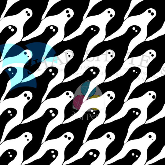
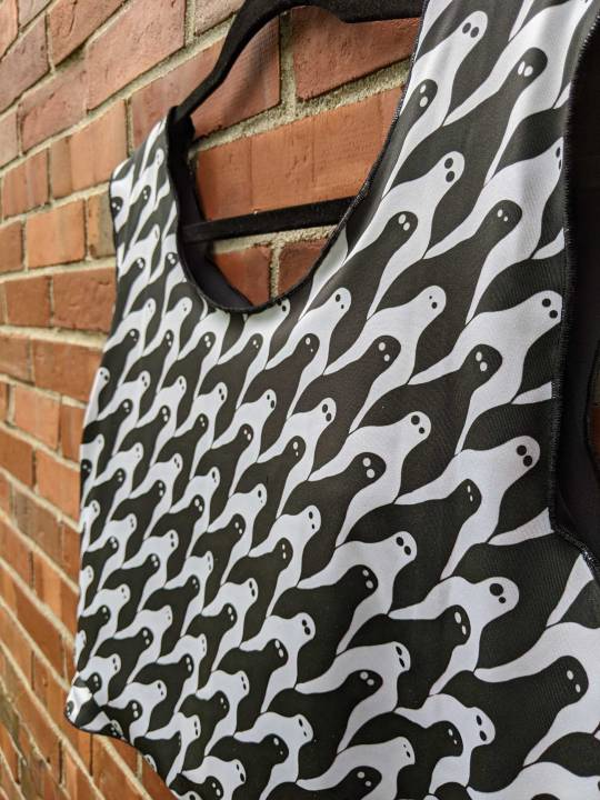
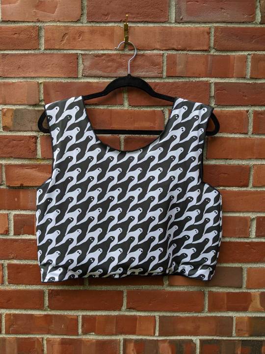
Fresno Nightcrawler Houndstooth // Fabric Design for @shapeshiftersvt and The Cryptid Collection
Remember way back a few weeks ago when I posted the Squonk poster and I said that once I'd designed the fabric to go along with it I'd start posting the fabric designs here? Well guess what! It's time!
For those who don't remember or who didn't know, I am the co-owner, site manager, and graphic designer for @shapeshiftersvt. 2024 marks our 10th anniversary and we wanted to do something big and special and new to mark the occasion and my partner, co-owner, head tailor, fashion designer, and founder, Eli, pitched a fashion line themed around cryptids. We call it The Cryptid Collection and it features six of our and the internet's favorite cryptids: The Fresno Nightcrawler, Mothman, the Jackalope, the Jersey Devil, Champ, and the Squonk.
My parts of the collection were designing the posters, and creating fabric designs for our very own, truly Shapeshifters designed chest binders and sports bras. But since we utilized Spoonflower to have those fabrics printed, they're also available through the Spoonflower marketplace for anyone to buy for their own sewing projects.
And now that all of the fabric designs are done and uploaded and proofed and listed, I, as promised, am posting them here to talk a bit more in-depth about them, the thoughts and inspirations behind them, and the design process.
Starting with the Fresno Nightcrawler.
Part of the reason I'm starting with the Fresno Nightcrawler is because this was the very first design that I finished. When we were planning out the fabrics, it was the most solid design concept I had that wasn't just adapting the poster design to fabric (mostly because ... I hadn't done the poster yet). It was the first one I really came up with, the one I was most excited about, and the one that pretty much stayed the same from concept to execution.
I love houndstooth. Which is weird to say when I don't think I've ever owned a single garment or accessory in with a houndstooth pattern? But I do, I love it. I love the teeny tiny classic version of the pattern; I love a blown-up graphic version of the pattern; I love plays and variations on it. So when I was trying to brainstorm what kind of fabric pattern I could make inspired by a creature with such a simple shape whose only colors were white and black, the idea came pretty quickly: A houndstooth. Or a Nightcrawlertooth, if you will. It was a trick, though, and a real learning experience, especially with this being my first design.
Getting a pattern to repeat smoothly is a skill unto itself. Basically you have what's called a tile, and the tile contains the part of the pattern that you want to repeat. Then, when your pattern is created, the original tile just gets essentially copy-pasted over and over so 1) you don't have to draw the whole yard of fabric, and 2)all of the repeated parts of the design are identical. But by doing it this way, you have seams you need to take into consideration. If you think of putting the pattern together, it's sort of like making a basic quilt: You start with one square (or rectangle), then attach four more squares to each side, and then just keep doing that. Each one of those seams (top, bottom, left, right) is a place where the pattern might not match up, which means when it's applied to a yard of fabric, it's not going to look like a smooth, seamless pattern.
Of course there's ways to avoid this altogether. If you're doing a simple stripe, using the line tool in your drawing software will keep your stripe a consistent thickness, and holding SHIFT while you draw it will keep the line straight. Or, even easier, you can create a pattern where the part that repeats doesn't straddle a seam; like a polkadot pattern, where the dot(s) can be centered on the tile and seams only cut through a solid background.
The trouble with a houndstooth, though, is that not only does the tile need to repeat, it's made up of repeating figures that interlock. I can't just center the white Nightcrawler on the tile and call it a day, because then the black Nightcrawler straddles the seam. On top of that, they needed to be shaped in such a way that the negative space between the white Nightcrawlers left a shape that was also recognizable as a Nightcrawler and similar enough to the white one that the pattern is mostly seamless.
I fully admit that I was not able to do this on my own. Enter: Eli. Eli is, among other things, a math nerd who enjoys an excuse to break out the graph paper. They found a tutorial online and got to graphing and shaping and, in just a couple of hours, had gotten the shapes down. I took that tile, illustrated it, cleaned up the seams (shoutout to Eli for also finding an easier way to do this than just manually copy-pasting), and voila! A Fresno Nightcrawler houndstooth.
Now, you might look at that image up there and say, "Well that's all well and good, Pents, but they're kind of blobby and the lines are wobbly and it's all a little uneven." To which I say ... yeah, that's true. It's also kind of intentional. Like, I'm not gonna sit here and claim I got the basic pattern done and wasn't exhausted. But also I could've left it and come back to it the next day to clean up the lines and shapes a bit more, make everything really smooth and even. But, like. Look at this guy.
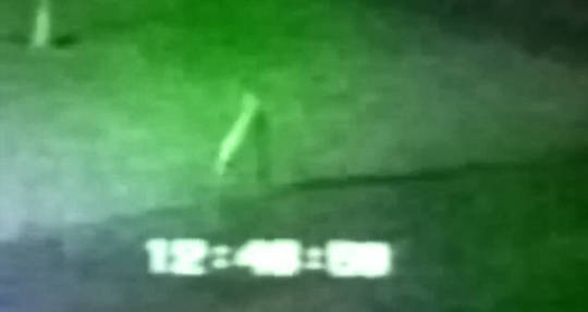
He's just a weird kinda blobby little dude. So I left the pattern kinda weird and blobby.
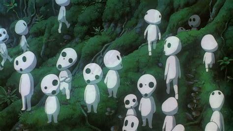
Even if I'd cleaned it, it's such a blobby little shape that's so at odds with the classic houndstooth that's all straight lines and sharp angles. So I made a deliberate choice to not polish it up. To kind of lean into the kodama vibes:
I am really so so proud of and pleased with this design. It came out almost exactly how I pictured it; it was really the most true design collaboration between Eli and I; and I'm just so pleased, after a lifetime of being a houndstooth lover, to now also have designed a houndstooth.
If you'd like a custom-sized, handmade, made-to-order binder or sports bra in this houndstooth like the one in the photos, you can find those listings (as well as the poster listing) here, on the Shapeshifters website. There are three pattern size options, the classic teeny tiny version; a somewhat bigger medium size; and a super graphic large size. Our binders are the most comfortable and effective on the market thanks to our finely graded internal sizing system. Because we're a small operation that makes every garment to order, both our binders and sports bras are highly customizable, and can be made to ALL measurements with flat pricing across sizes.
If you'd like to purchase the fabric yourself for your own sewing projects, you can order it through our Spoonflower shop, where we have it listed in the same three pattern sizes.
#cryptids#fresno nightcrawler#california#fabric design#fabric pattern#the cryptid collection#shapeshifters#spoonflower
34 notes
·
View notes
Text
Loki Cosplay Part 8
Previously on Loki Cosplay: https://www.tumblr.com/dailyshowchica/761376032329777152/loki-cosplay-part-7?source=share
So with Halloween rapidly approaching, I have been working on the detail work for Loki's trousers, tunic, and coat. I am not done yet, but I am making progress.
First, the trousers. These were the easiest to do, since all I had to do was cut out a bunch of small rectangles out of metallic silver craft foam.
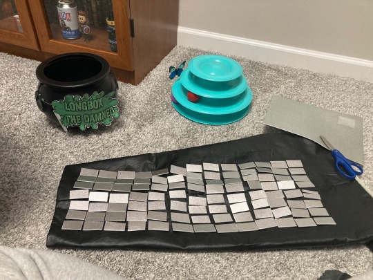
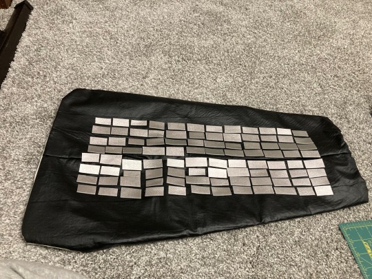
One of these I used E6000, and the other, I used a hot glue gun. The E6000 discolored some of the squares. Since E6000 doesn't dry right away, I covered my work with a plastic bag and weighted it down with a few large books overnight. In pulling away the plastic, I lost some silver.
I also used a lot more adhesive than I thought I would, so for the other leg, I used hot glue. That dries almost instantly, but I'm not sure it's as secure. It'll be fine for pictures, but if I were to wear this to a con, I might want to use E6000 just be to sure it stays together. It worked perfectly for my sister's dance costumes, after all.
Next up, the tunic. That is two pieces that I'll snap on, a chest piece, and a stomach/skirt piece.
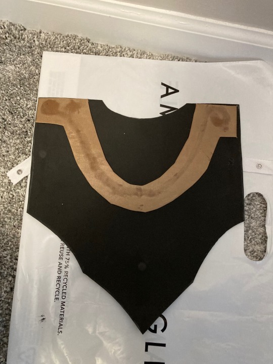
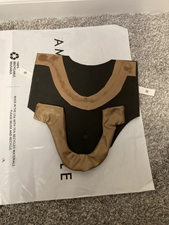
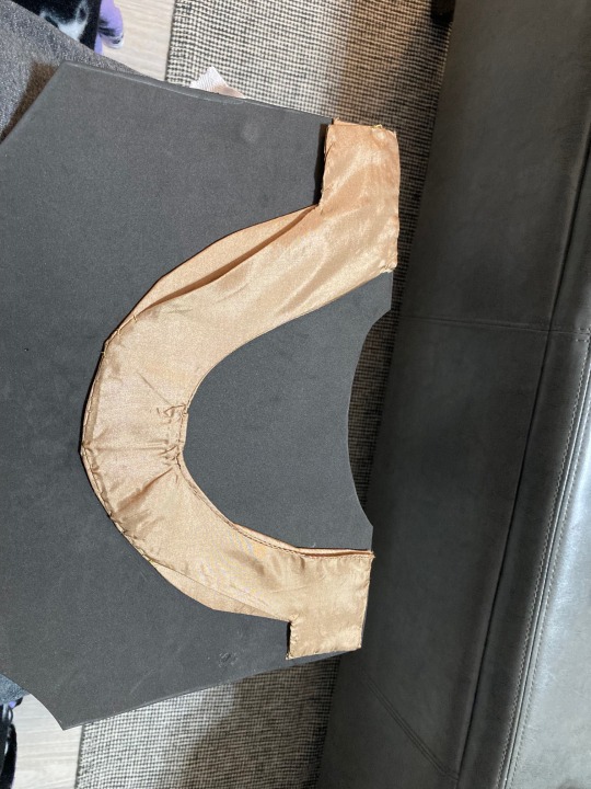
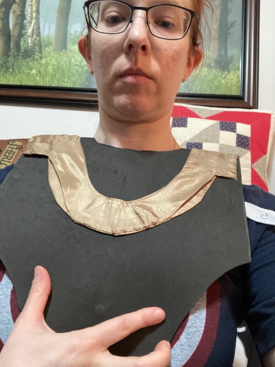
I had to think for awhile about how to make the chest piece. In the end, I went with craft foam, and the gold lining fabric I had gotten for the skirt jacket. I cut out the fabric and glued it to a heavy paper template. But as you can see, the E6000 bled through. So, I made another necklet out of fabric. This was double-layered and treated like a ribbon, or waist tie, with finished edges. This fabric frays like crazy, so the edges had to be sewn. Then I sewed the all-fabric necklet in place. I lost more than I expected to in seam allowance, so it's not a perfect match. But it covers the glue stains, and looks pretty good. And Pretty Good is Good Enough. Time to move on.
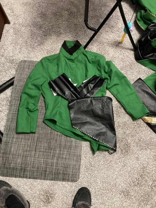
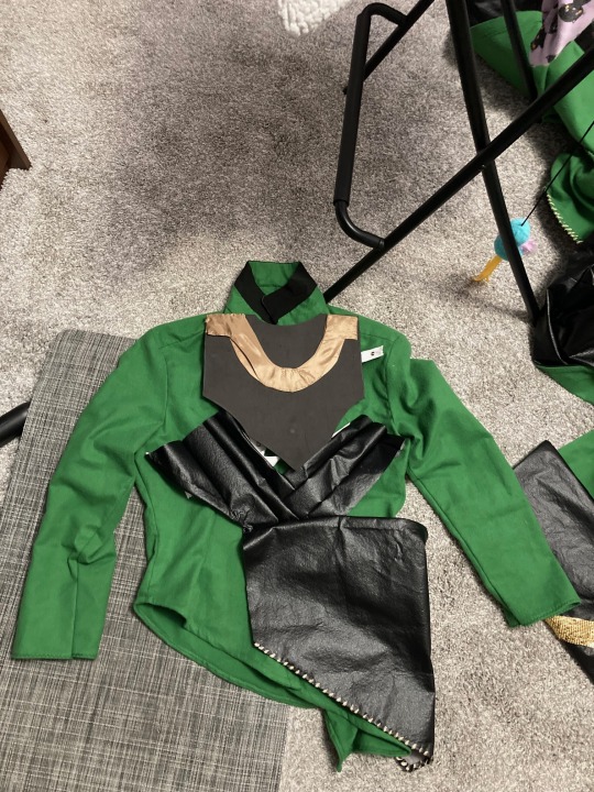
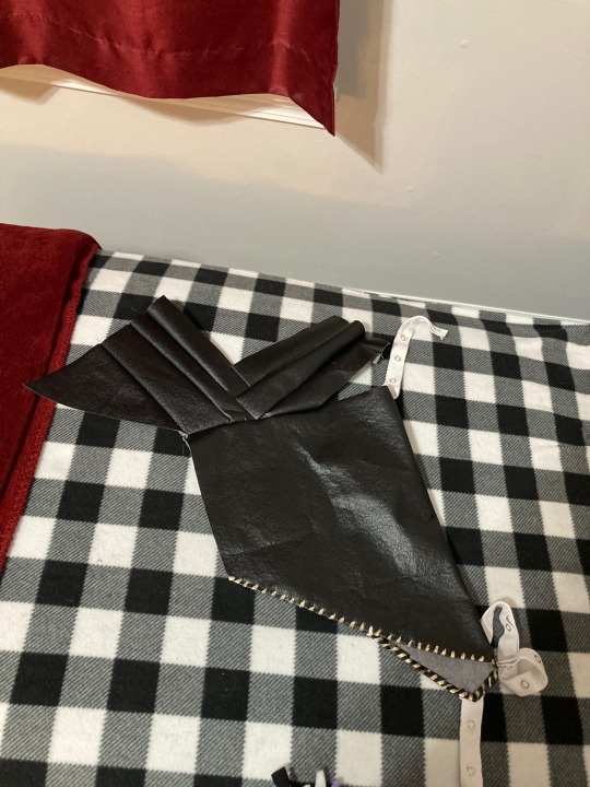
This is where the scrap pieces of the black vinyl/faux leather came in handy. I looked at pictures of Loki and copied the shapes as best as I could. The vinyl doesn't fray, but I've tried to finish these edges anyway, if only for a bit more security. Plus, the skirt part of the tunic has matching trim to the coat. While the original may have metal trim, I'm just using gold ribbon in a decorative stitch at the edge.
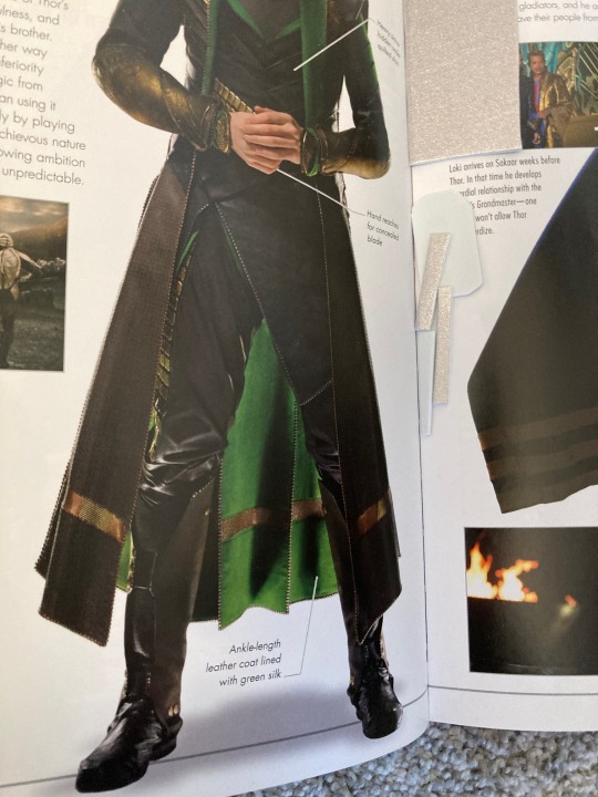
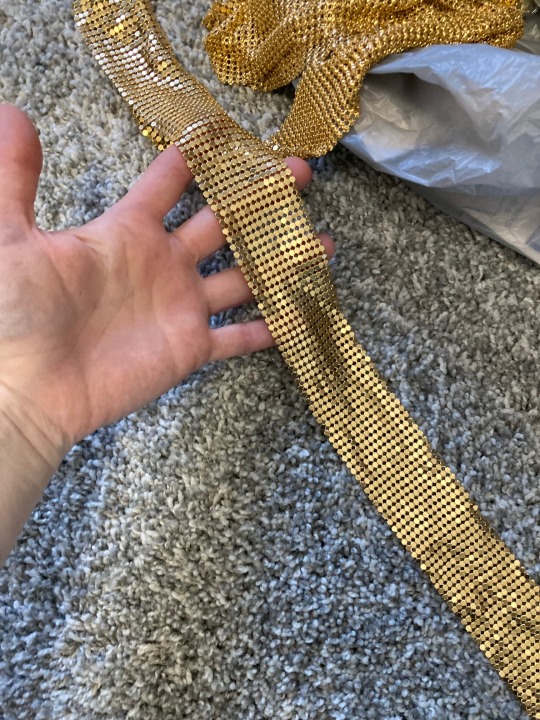
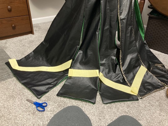
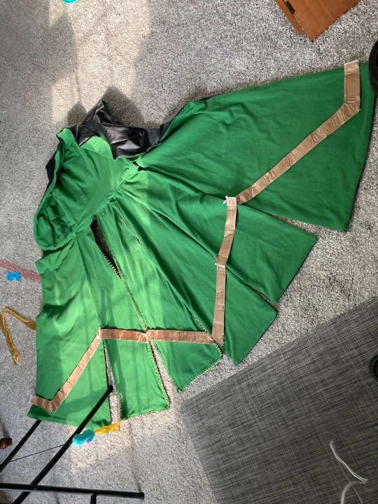
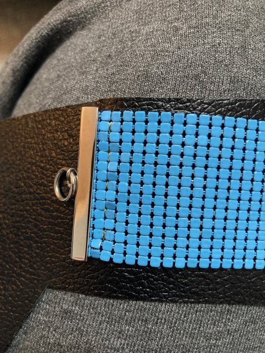
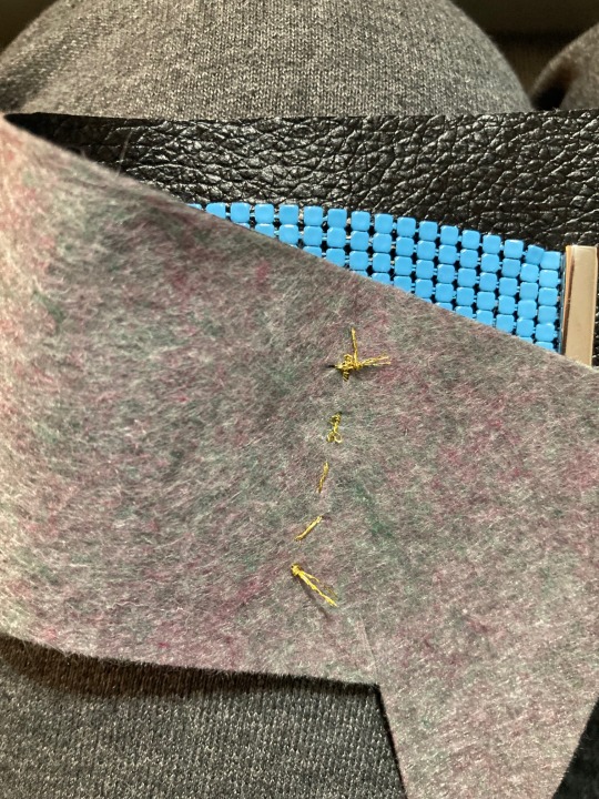
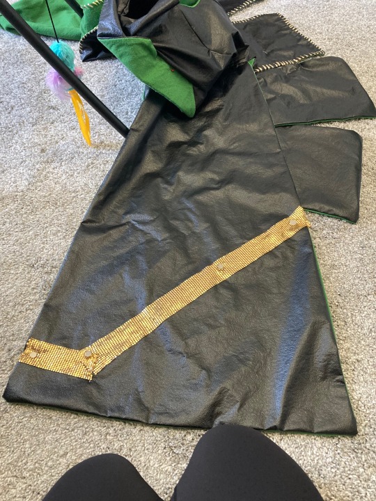
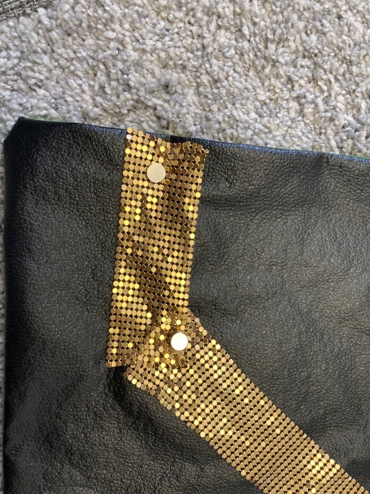
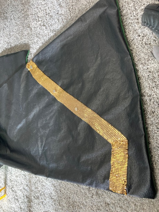
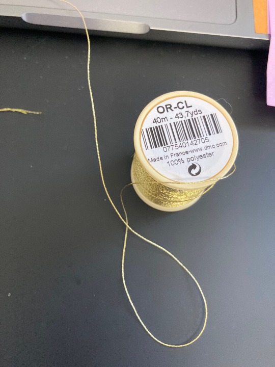
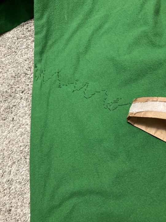
The coat trim is the most work by volume, and work that has to be done by hand. From the Marvel Studios Visual Dictionary, I was able to see the metallic trim on the inside and outside of Loki's coat. And I luckily had SOME of that material handy- it was also thee scarf/tie Crowley used in his Heavenly disguise in Good Omens Season 2. But I don't have a lot of it. Also, this stuff can snag on other fabrics if you're not careful, so I decided it was only going on the outside. The inside trim was a gold-colored fabric remnant I found at Joann fabrics.
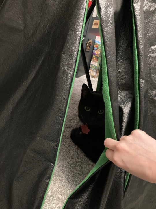
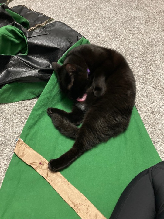
Using legal paper, I determined the positioning of the trim stripes. And as I was working, Ruthie cat came to supervise. She loves a good tent, and the coat, hanging on a tall chair with the skirt panels spread out, makes a pretty good tent.
I made the inner trim by cutting the strips maybe half an inch wider than needed, ironed nonwoven fusible interfacing to the back, and rolled back the edges. As I said above, this fabric frays like crazy, so I was very careful yo make sure there were no raw edges.
I have a bracelet of that same chainmail material in blue, so I used that and a scrap of the vinyl fabric to test sewing the mail in place. It works, but given how small the holes in the mail are, I have to move the needle straight up and down, which means there's going to be visible stitching on the inside. Not too big a problem, but it does mean the outer trim has to go on first. Then I can cover the stitching with the inner trim.
I also can't really pin the outer trim in place. Luckily for me, my mom worked for a magnet company for a few years, and I have lots of small, very strong magnets. Those work very well to hold the mail in place as I sew.
The gold embroidery thread was something I bought for my God of Stories costume, but it's too fine for what I had planned. So, to use it up, I'm using it to sew the inner trim in place- it's too thick/prone to snagging to be used on the outer trim.
I opted to sew in a zigzag pattern when attaching the trim. That way it's secure along the whole length and at the edges without me needing to go all the way around, as I will need to with the inner trim. But I can use invisible hem stitching on the inner hem, so it all evens out.
But then Ruthie decided I had worked long enough. But I've got the path mapped out, and sooner or later, I'll get it finished.
See ya next time!
#halloween#cosplay#marvel#the avengers#loki (avengers)#sewing#crafting#just making it up as i go#tom hiddleston#black cat
8 notes
·
View notes
Note
Why are "Crabs" and "Brazil" different flag categories? Arent they both "some image centered in the middle of a maybe-patterned-maybe-not field"? What's the difference and why's it enough to split the categories? Also would Mexico be a Crabs or a Brazil
so, to explain crabs:
The way VGAPride works is that it has a simple vector drawing language which is used to compose almost all the flags. so, like, a simple pride flag like the pansexual pride flag, which is just three stripes, will be coded like this:
static GraphicsCommand pansexual_pride_flag_commands[]={ GraphicsCommand(Rectangle,Left(h_3_0),Right(h_3_1),RGB(255, 33,140)), GraphicsCommand(Rectangle,Left(h_3_1),Right(h_3_2),RGB(255,216, 0)), GraphicsCommand(Rectangle,Left(h_3_2),Right(h_3_3),RGB( 33,177,255)), GraphicsCommand(EndCommandList) };
It's basically just "draw a rectangle from here in this color", then another two stripes done the same way. Nearly every flag is done this way.
Now, the crab pride flags, are way more complicated. They are pixel art, technically: they needed manual dithering to fit into the right number of colors. That was tricky and involved a lot of me zoomed way in on an image, redrawing individual pixels and shit.
So instead of doing it like this with the vector commands, they're instead compressed as just pixels, but separated into multiple planes (because EGA is... weird) and then compressed with the LZ4 algorithm. So to display them, instead of doing a lot of vector shit, it just decompresses it into VRAM, job done. But they are in separate files because the "source code" for them is automatically generated by a python script, and I don't want it stomping on the manually defined vector commands.
And Brazil... Brazil is still a vector-defined flag. But it's one that's SO COMPLICATED compared to EVERY OTHER FLAG that I had to put it in a separate file to keep Borland Turbo C++ 3.0 from crashing trying to compile it.

Just about every other flag is some stripes and maybe a triangle or two. the Gay flag of Brazil is 6 stripes and a big diamond and a circle and a bunch of stars of different sizes and a white ribbon and some text. It's just SO COMPLICATED compared to everything else.
The second biggest pride flag is the Intersex-inclusive Progress Pride Flag:
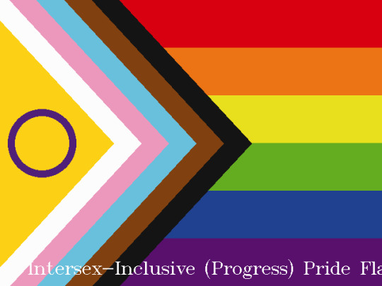
(which I just realized the title doesn't fit on screen. Whoops. Gotta fix that!)
That complicated flag with all the stripes and chevrons and circles is an amazing 21 commands!
Brazil is FIFTY SEVEN commands. (I even added a "Star" command to the vector language just to make it simpler!)
The second biggest and third biggest pride flags could fit inside the brazil pride flag WITH ROOM TO SPARE.
Anyway, the real question: Mexico: Crabs or Brazil?
Given the complexity of the mexican flag, if I had to add a mexican gay-pride flag, it'd probably be a crab.
124 notes
·
View notes
Note
You ask for imodna prompts you shall receive.
Imodna at a pride parade perhaps 🤭
thanks for the prompt! this one was a lot of fun
also on AO3
----
“How do you make it look so easy?”
Imogen glares at Laudna’s reflection in the mirror. They both are leaning over the counter of their shared bathroom, each with a small makeup brush in hand. Laudna finishes a blue stripe, then stands upright and meets Imogen’s gaze in the mirror.
Imogen's eyes flick back to her own reflection, mentally comparing the perfect rectangle of pink, purple, and blue on Laudna’s cheek to the mess of pink and orange on her own.
“You’re using too much, darling,” Laudna says as a droplet of the white face paint drips down Imogen’s cheek, clinging to her jaw. Imogen sighs and reaches for the hand towel that’s already stained with her previous attempts that went just about as well as this one. “Would you like me to do yours?”
Imogen would be lying if she said that wasn’t what she had been wanting to ask this entire time. She nods.
“Alright, come here then.” Laudna leans forward and tugs on Imogen’s hand, pulling her to stand directly in front of her.
Laudna’s gaze moves from Imogen to the counter, eyes scanning for whatever she is looking for, and she grabs a pack of makeup wipes and the paints Imogen was using.
“Can you turn your head, darling?” Laudna requests, accompanied by a gentle nudge on Imogen’s jaw. Imogen obliges.
The cloth is cold as it wipes away the smudged remnants of the paint, followed by the rougher texture of the towel to dry her skin. Then there’s a hand cradling the side of her face, a thumb at her jaw and fingers just grazing her ear.
The brush tickles at her cheek as Laudna works her magic. Imogen’s not sure what to do with her hands as she stands there, going between fidgeting with the hem of her tank top and tapping at her shorts. After a minute, she feels her phone vibrate in her back pocket and pulls it out.
What’s taking you guys so long?
“Ashton is gettin’ impatient,” Imogen says to the wall.
“No talking, you’re going to mess it up.”
Imogen has to swallow the “sorry” that automatically rises in her throat. She also has to fight back a smile when Laudna starts softly humming, a tune that sounds oddly similar to a song Imogen recently made her listen to.
“Alright, all done,” Laudna says half a minute later, releasing her grip on the side of Imogen’s face. “What do you think?”
Imogen turns to look in the mirror. On her cheek is a small heart, filled with stripes of pink, orange, and white. Her reflection smiles back at her.
“I love it,” she says, leaning up on her tiptoes to place a quick kiss on Laudna’s mouth before stepping around her into their bedroom.
“Is that all the thanks I get? I made it even nicer than mine,” Laudna pouts.
“I would not put it past Ashton to leave without us, so I think it’s in our best interests to get a move on,” Imogen replies, looking for her fanny pack that she could have sworn she left on top of the dresser. (She didn’t).
As if on cue, Laudna’s phone chimes with a text message. “If you two make us late because you couldn’t keep it in your pants,” Laudna reads off, “then I will–. Oh. I’m not going to read the rest aloud. You’re right, we should go.”
“Do you know where my bag is?” Imogen asks, her search now taking her to the living room, lifting pillows and blankets off the couch, crouching down to look under the table.
“Right here, darling.” Laudna emerges from their room, bag in hand.
“What would I do without you?” Imogen says as she takes it and loops it around her shoulder, stealing another kiss as she does.
“Based on the last five minutes, I’m not sure you would survive at all.”
Imogen scoffs and gently shoves her in the shoulder. She’s saved from having to make a comeback (because even though she’s joking, Laudna is right) when another ding comes from Laudna’s phone.
“We really should go,” Laudna says without bothering to take her phone out to read the message.
“Ashton’s just upset they have to be the fifth wheel since Fearne is out of town,” Imogen counters, looping her arms around Laudna’s neck and fiddling with the yarn that’s tied at the base of it. “They can wait.”
Several minutes later, the two of them emerge from the front door of their apartment building to find Ashton leaning against their car with their arms crossed. They level the two of them with a glare, but Imogen can’t find it in herself to feel apologetic.
“Nice lipstick, Imogen. Did you borrow it from Laudna?” Ashton says as they approach, an eyebrow raised. Imogen stops, touches a finger to her lips. She didn’t put on any lipstick.
“Sorry, darling,” Laudna says, reaching into her purse and pulling out a makeup wipe that she hands to Imogen.
“I should have left without you,” Ashton grumbles, shaking their head and pushing off the car to stand upright.
“Oh, please, you love us,” Imogen says.
“Just get in the damn car,” Ashton calls as they walk around to the driver’s side. “Orym and Dorian are probably already there waiting for us.”
“Those punctual motherfuckers.”
Imogen hops in the backseat while Laudna takes shotgun, Ashton sliding into the driver’s seat. Imogen scoots into the middle, leaning forward with her elbows propped on both front seats. “We’re not even runnin’ that late,” she comments after a glance at the clock.
“Have you ever tried finding parking in downtown Jrusar on an event day? Oh, that’s right, you don’t have a car.”
Imogen leans further over the middle console. “How long until Fearne is back?”
“Too long.”
—
To say the streets of Jrusar are crowded would be an understatement. Imogen doesn’t think she’s ever seen this many people out and about in Jrusar before, but it’s a spectacular sight.
It’s also slightly overwhelming.
Are you sure this is okay? We can go home whenever you want, just say the word.
Imogen smiles down at the text from Laudna as Ashton drives around in search of a parking spot. Honestly, she’s not sure how she’ll feel once they go out into the crowd. But she’s been making progress, so she’s willing to try.
I’m alright. Promise to let you know if that changes.
It doesn’t take much longer to find a parking spot. Once they’re out on the sidewalk, Laudna takes Imogen’s hand in hers, interlacing their fingers. Imogen focuses on the feeling of Laudna’s hand, letting it ground her, as they approach the more crowded streets.
“Orym said they’re right by the Spire by Fire,” Ashton tells them, putting his phone away.
An unfamiliar feeling flows through Imogen as they weave through the crowded sidewalk towards the tavern. Usually, in crowds, she gets overcome with the feeling that everyone’s eyes are on her, watching her, judging her, berating her. In this crowd, she still gets the feeling that people are looking at her. Just… not in a bad way.
Unsure what else to do with this feeling, she looks up at Laudna and squeezes her hand. Once their eyes meet, Imogen can’t help the wide grin that spreads across her face. “I love you,” she mouths.
Laudna’s eyes soften, looking into Imogen’s like she’s the only thing in the world that matters. “I love you,” she mouths back.
“Will you lovebirds stop eye fucking each other and look for Orym, please?” Ashton calls from behind them. Oops.
“Sorry,” they both mumble, looking away from each other and towards the crowd.
It’s Laudna who spots them first, exactly where they said they’d be in front of the Spire by Fire.
“I was starting to think you guys wouldn’t make it in time!” Dorian says, wrapping Laudna in a hug.
“Blame these two,” Ashton grumbles as it’s Imogen’s turn to be embraced by Dorian.
“Oh, I’m sure,” Orym laughs. “I’ve started lying to them about when things start so that they’ll get there on time.”
And, well. Maybe they have been getting carried away lately.
Loud music starts playing in the distance, marking the beginning of the parade. “Oh! Here, I almost forgot,” Dorian exclaims, pulling around his backpack and taking out three rainbow flags and handing them out. “Someone was handing these out earlier.”
“Well, thank you, Dorian,” Laudna says, waving hers back and forth. Imogen can’t help but smile at the sight.
They start looking for a less crowded spot that’s near the barricade, and Laudna touches Imogen’s elbow, pulling them back from the group. “Good?” she whispers.
Imogen is no stranger to lying about how she’s feeling, especially in circumstances like this.
“Better than good. There isn’t anywhere else I’d rather be right now.”
And it’s not even a lie.
33 notes
·
View notes
Text
made a hood. It's literally just a long rectangle and then you close the back. The camera really did not want to capture the color of this yarn, it's a dark red-purple.


[ID: Three photos of a crochet hood made of dark red-purple yarn with two white stripes, one at the front, and another towards the back. The hood is first held up in front of a wall, showing it is simpley a rectangle folded in half. The second shows it worn on a person from the side, pointed in the back, and hanging down in the front. The third shows it being worn from an angle, the face inside colored in black to hide it. End ID.]
scribble I made beforehand and then just put the measurements in now:

[ID: A digital scribbled drawing of a rectangle folded in half, with a red spiral scribble on one side representing it being stitched together. Inside the rectangle is a scribbled head and face, looking out the open side. The top part of the rectangle for the width is marked 11 inches, the long side is marked 30. End ID.]
Length is 30 inches, or 72 centimeters. I just made a base chain until I got as long as I thought would work.
Width is 11 inches, or 28 centimeters.
All done in double crochet. Would probably look even cooler in other stitches.
7 notes
·
View notes
Text
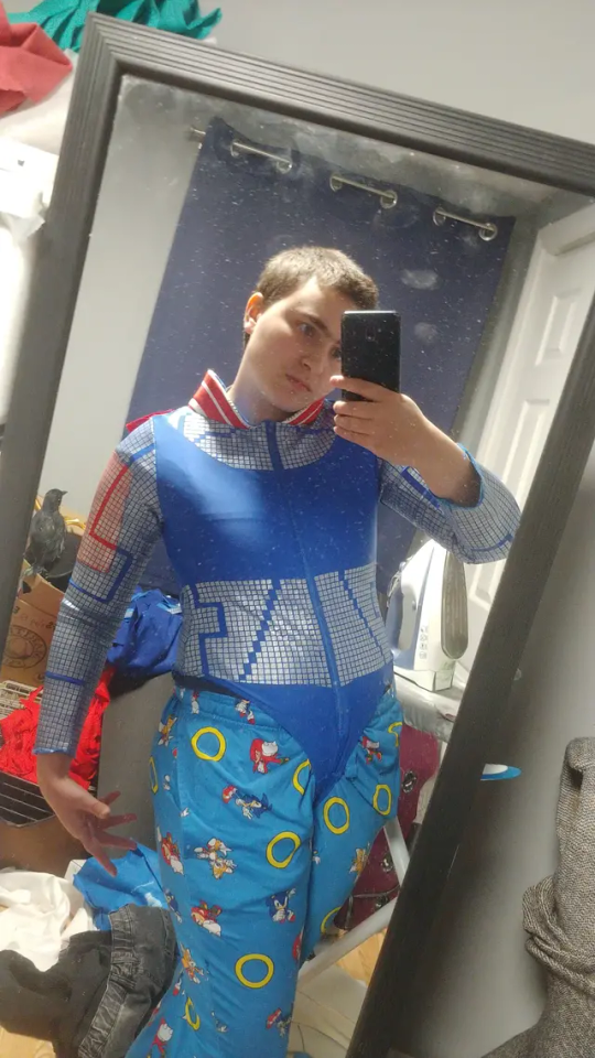
Have not been on here nearly as much as I used to-outside of my job I've been working very hard on my next cosplay build: Electra from starlight express
This is the most complex costume I've ever made, but I'm very pleased with what I have so far!
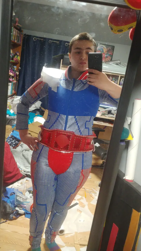
Still have a lot of ways left to go! But it's been extremely rewarding seeing things piece together so nicely
Write-up and WIP photos under cut
The very first thing I started with this costume was the bodysuit, it is the foundation that everything will sit upon so it should be out of the way first, and it would be easier to pattern my armour once I know how it will sit in relation to the rest of the costume
I also knew I would be wearing this to a convention and would want to have easy access for the washroom, so I actually turned a full bodysuit pattern into separate leggings and a leotard with a snap crotch closure
Did the leggings first-at first I wanted to be as accurate as possible with a silver chrome foil HTV that I cut on my Cricut machine with the circuit pattern cut out- but I found out after ironing that despite there being all these spaces between the squares that the fabric did not stretch enough to be able to fit(I had made mock-ups for my clothing pieces and those did fit correctly)
Red sections of clothing is turned edge applique done with water soluble stabilizer so it could stretch after throwing it in the wash
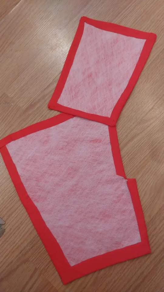
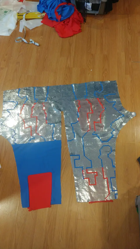
So after that didn't pan out I switched to a stretch HTV, just using the same design files, and widened the legs a bit, it helped a bit but the HTV not only did not stretch enough, but does not like the lycra I was using and in areas with the most stretch the squares were peeling and in some places even falling off
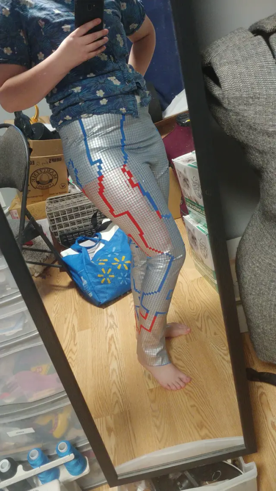
At this point I had spent almost an entire month on just my leggings-clearly I had to try something else because the HTV was just not going to work
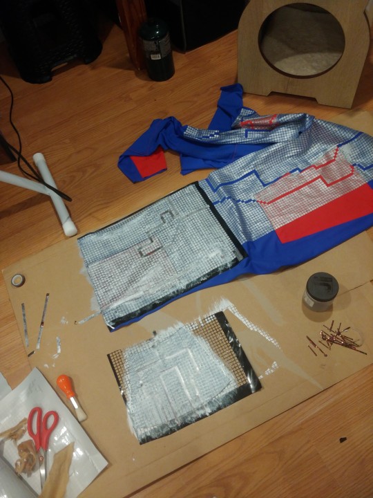
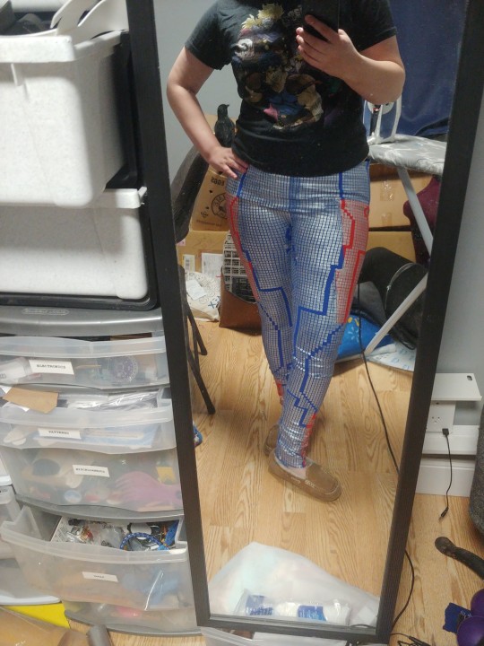
I got jacquard lumiere fabric paint in silver-it's okay if I could go back I'd probably just have gotten angelus leather paint I find it has much nicer stretch and softer feel
I also widened the spaces between my squares to give them a little more stretch, and cut just a full grid of adhesive vinyl to use as a stencil and kept the wider pants pattern from my second pair
I did have to mask off the circuit pattern this way but it came out very nicely and finally had a method that gave me a wearable garment
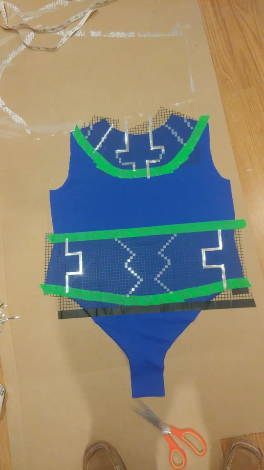
So I moved onto my leotard next with significantly less headaches- though my arms did not stretch enough after being painted but that was easily remedied with a gusset on the underarm
Collar is interfaced with flexfoam
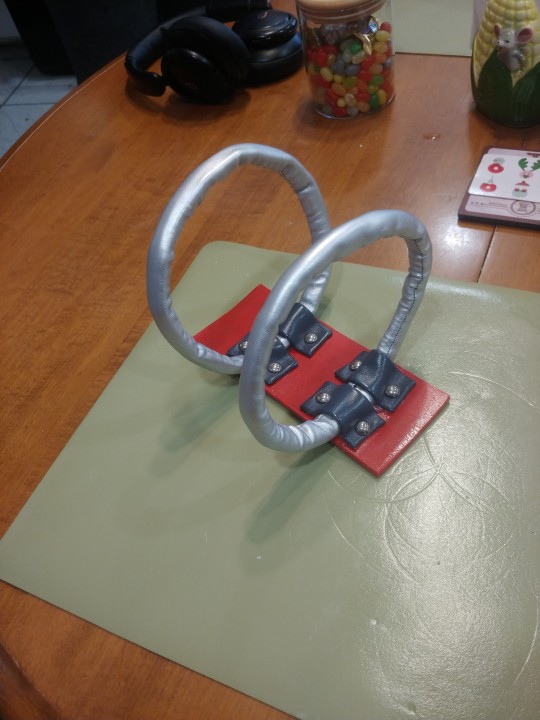
Since my thigh armour will attach to the belt that was next, honestly pretty easy, mostly rectangles, used real studs and then permanent vinyl for the red and silver bits
Couplers are flexfoam inside a tube of silver pleather, physical belting straps is a thick interfacing covered with the same silver, had to use grommets for the belt holes because it was very frayed when I punched them open
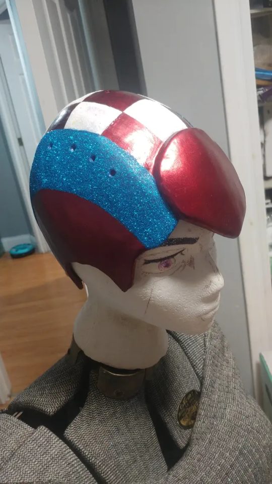
Tumblr mobile won't let me add more than 10 photos on mobile but for my helmet I duct tape patterned my head and then used 2mm foam covered in worbla, used wood filler and sanded that as much as I could, then covered in a few layers of flexbond and then wet sanded that
Painted with automotive paint to get those little silver flecks, and then painted the colour blocks and covered them with glitter
Still have to add the stripes and chinstrap, and going to be using magnet snaps to attach the Mohawk to the helmet
That's essentially what I have so far!
I 3D modeled the little arrow thing that goes on the front of the belt and elbows, my brother's going to 3D print them for me 🤭
Started foam patterning this week, my original goal was to have this done by November 7th(leaving for the con I'm taking them to) but again-i did have almost an entire month of setbacks so I'm going to try to not take it too hard if I don't
8 notes
·
View notes
Text
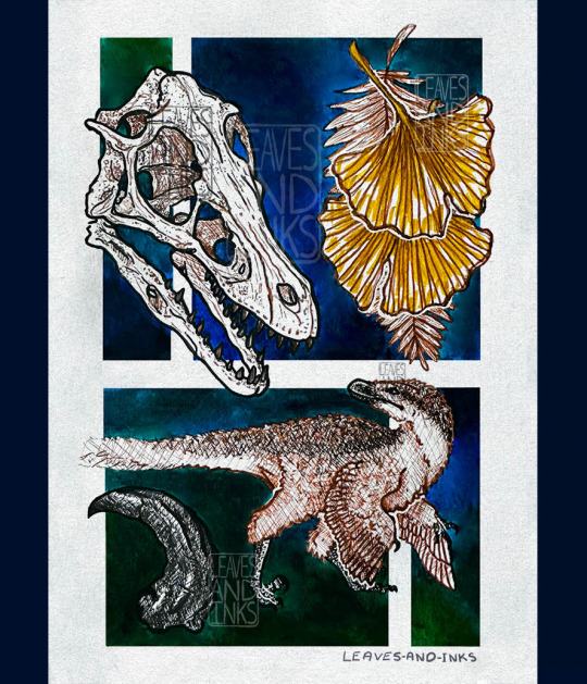
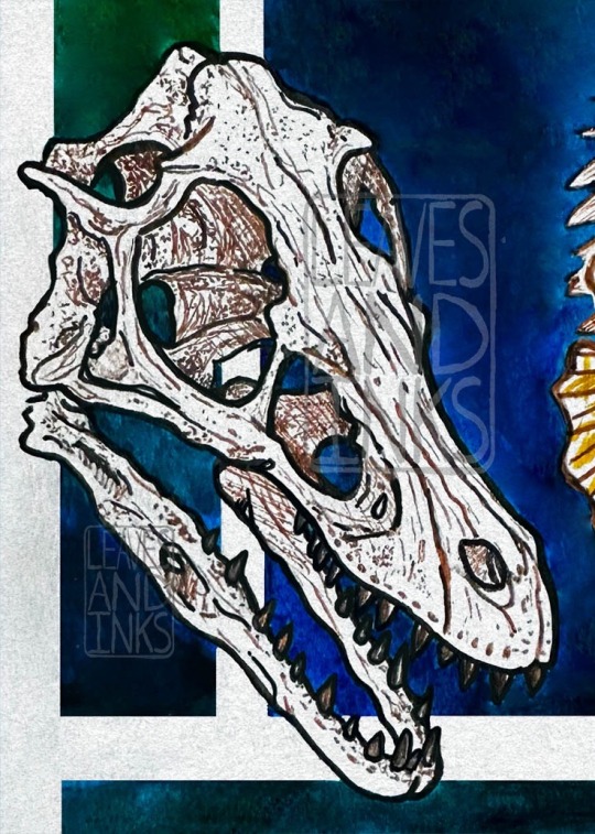
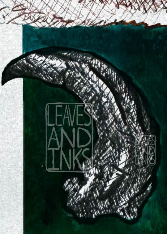
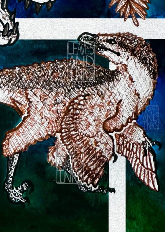
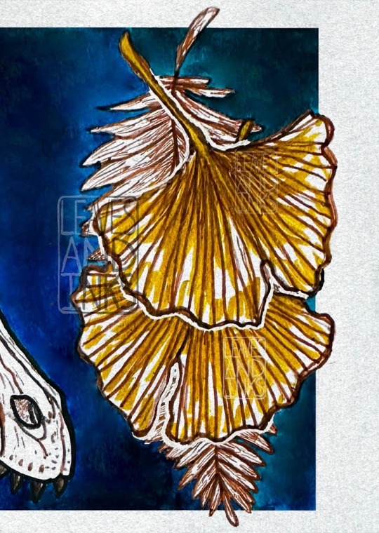
🌿 Old Bones, Old Souls 🌿
The world of velociraptor is buried deep, deep in time. There is so much we’ve learned about it, yet so much we don’t know, and may never know about this ancient animal.
Hi everyone! It feels good to finally post this!! I’ve been rather swamped, but updating my tumblr is one thing I can check off the list!! This piece has been done for a little while, but I’ve only just had time now to format it. I remember doing the rough sketch of this back in the fall and not being too thrilled, but I can now say that I’m really happy with how it came out! This piece also is next to the dragon “Emerald Mist” and I feel they pair really well together :)
This is the last piece to catch up to my other social media, so things will slow down again after this!! I have some plans in the works for the future, but unfortunately I don’t have much of a time scale on it because it depends on my health and my school work. Regardless of when exactly, I am excited to make some new work!! :D
[ID: Sketchbook page with digital alterations featuring a velociraptor skull, ginkgo and fern leaves, a fossilized velociraptor claw, and a feathered velociraptor. The page is done in various colors of ink, the subjects being in black and sepia liners, while the background is made up of blue and green squares and rectangles, overlapping behind the subjects. In the top right is a velociraptor skull, facing 3/4 right and down. It is made mostly out of black lines, but with shading and details done in sepia ink. Its mouth is slightly open, and it is missing some teeth. It is also missing it bony eye supports. it overlaps the background shapes on the top left of the skull, along with the lower jaw, and bridges the gap between the two top shapes in the middle of the skull. Next to it on the righthand side is the gingko leaves and fern leaf. It is laid out vertically, the fern leaf, drawn in sepia ink and behind the two gingko leaves. The top gingko leaf overlaps the bottom one, pointing in slightly different directions. The leaves are also done in sepia ink, having white outlines to better differentiate them, along with sketchy yellow ink coloring. The leaves break the shape on the top, right side, and bottom, and only overlaps the one square. In the bottom left corner is a shaded study of a velociraptor claw fossil. It is completely done in black in, white a thick black outline. It only overlaps the lower square at its tip, which points left. The final drawing is a mostly full body sketch of a feathered velociraptor, cropped only at its tail, which fades out to the left side of the page. It its a side view of the raptor, who faces right. However, it looks over its shoulder to the left of the page. It is slightly hunched over, its arms lowered. The left arm reaches slightly more out than the right one, and it also steps forward with the left leg. It is mostly drawn in sepia ink, however non feathered areas (mouth, legs) are done with black ink. It also has a back and sepia brindle pattern on its back, along with a black stripe that starts at its eye and goes to its tail. Its body overlaps on top of the two bottom shapes. The sketch and background shapes are on an off-white, paper textured background.
Image 2: Crop featuring the velociraptor skull. It gets the whole skull in the crop, along with the leftmost side of the gingko leaves and fern.
Image 3: Crop focusing on the fossilized velociraptor claw. The whole claw is in frame, along with a portion of the bottom half of the tail.
Image 4: Crop focusing on the feathered velociraptor. It gets its whole body in the frame, minus the tail. In the top left corner, the ends of the upper and lower jaw of the skeleton are visible, along with the end of the fern in the top right.
Image 5: Crop focusing on the gingko leaves and fern. They are entirely in frame, along with a portion if the upper jaw, just after the nostrils. /end ID]
#leaves and inks#art#illustration#drawing#animal study#vulture culture#sketchbook#sketchbook study#paleoblr#paleontology#paleoart#velociraptor#dromaeosaur#theropod#feathered dino#dino#dino art#dinosaur#dinosaur art#ginkgo#plants#plant study#skull#animal skull#fossil#fossils#q
105 notes
·
View notes
Note
turning the question back to you: what are some things about space you are particularly fond of? :DD
SO MANY THINGS !! (Like u said haha)
God okay where do I start
I loooove galaxies so much, especially ones that are either interacting so they have distorted shapes like Arp 273 (left), or just overall look absolutely gorgeous like the Black Eye Galaxy (right)


Nebulae like you said in your response are fantastic as well <33 Some of my favs are the Orion Nebula, the Crab Nebula, the Trifid Nebula and the Red Rectangle Nebula <3
Also not necessarily object themselves, but the Voyager 2 and Cassini missions are my two all time favorites. Voyager 2 because it saw so many amazing things and is still our only close up views of Uranus and Neptune. And then Cassini just sent back so many incredible pictures of Saturn that just boggle my mind. I've shared this before but this is one of my all time favorite space pictures:

Saturn and it's tiny moon Mimas in the upper right with the rings at the bottom and the shadows through them on Saturn with the blue and the bright stripe that reminds me of blue jay feathers and the sense of scale and god I love this image so much
And then of course, you really can't compare anything to the Pale Blue Dot

The fact that that tiny little blue speck in a sunbeam is everything we've ever seen, lived, done, all of it just on our tiny home in space. Carl Sagan's speech about this image leaves me floored every time I read it. <33
4 notes
·
View notes
Text
DIY Notebook Lunchbag
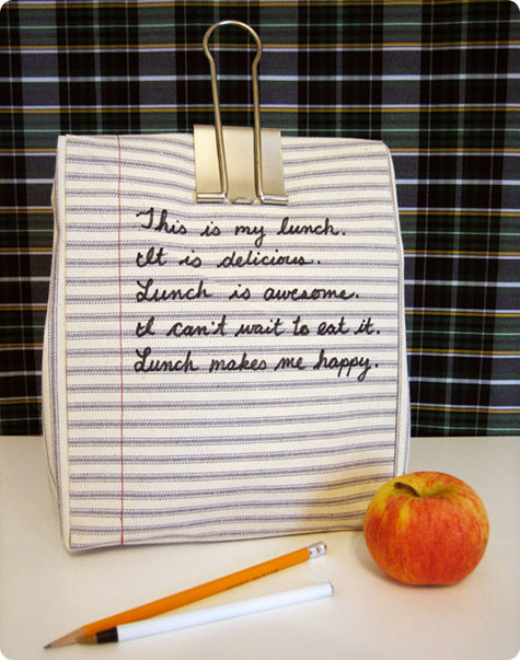
Project by Kate Pruitt:
oh i love this time of year. this month’s theme is definitely going to be back to school, because who can help but be at least a little excited about the start of fall and a new year for students everywhere. send your favorite student to school (or work) with this notebook lunchbag! this is completed in a jiffy and is very inexpensive. much like that pristine first page of a new notebook, the hardest part is deciding what to write on it. have fun! –kate
materials:
1. striped canvas fabric (1 yard) 2. sewing machine 3. red and cream thread 4. black fabric marker 5. ruler 6. scissors
instructions:
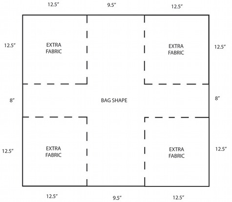
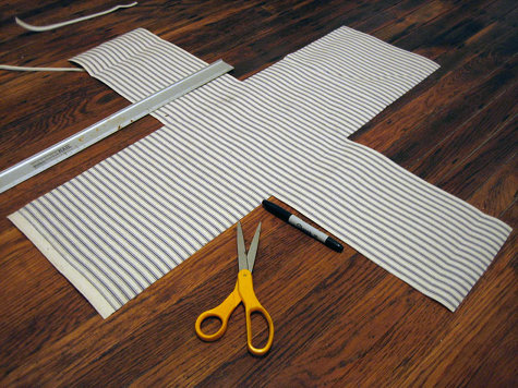
1. take your fabric and lay it on a flat surface. measure and cut out a large rectangle that is 34.5 x 33 (the 34.5 should be cut parallel to/along with the stripes, and the 33 should be cut perpendicular/through the stripes). this will be for a bag that is 8.5″ x 11″ (of course!) and 7″ deep. actually, the bag is really 12″ tall so that when you fold over the top and clip it shut you still have a 8.5″ x 11″ writing surface on the front.
2. cut out four 12.5″ squares from each corner of the rectangle. this leave you with a cross shape that is the shape of your bag with .5″ seam allowance on all sides.
3. using cream thread, hem the top of each flap by folding down .5″ into the inside lining of the bag.
4. draw a light vertical pencil line 2″ from the right edge on both the front and back of your bag, on the side of the fabric faces out (the outside of your bag). sew a line of red thread down this pencil line from the very top of the fabric to the bottom of the flap that makes that side of the bag. this is the guideline of your “notebook” paper.
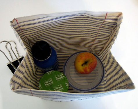
5. now turn your fabric so the inside of the bag is facing out and sew each flap to the flap next to it, sewing in .5″ in from the edge (you can use cream or red thread for this, i used red). when you are finished snip the excess thread and flip inside out.
6. you now have your bag complete!! you can write whatever you want however you want with your black fabric pen. if you want to write it first with a light pencil and then go over it to ensure good penmanship, feel free!
YOU’RE DONE!!
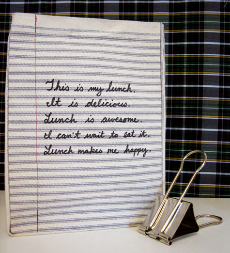
20 notes
·
View notes
Text
Thire with a Droid Popper
Thanks so much to @anstarwar for the gorgeous art of Thire! This is for Chapter 4 of my story, “How a Handful of Droid Poppers Save the Galaxy.” It’s the end of the Republic, Order 66 has just been announced, and Thire is on a mission.
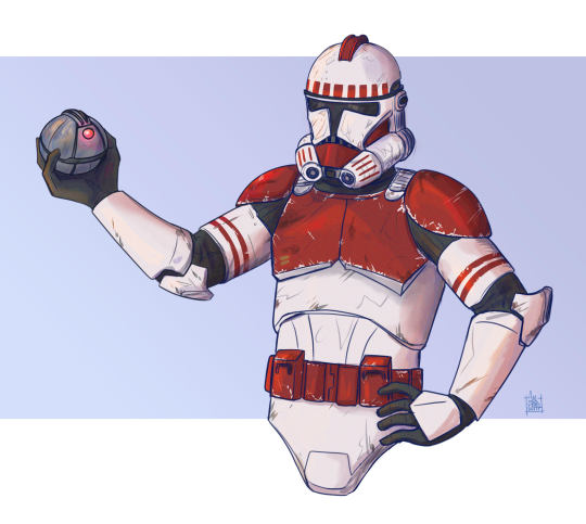
[Image ID: A picture of Thire from the waist up. He's in Phase 2 Shocktrooper armor, with red paint on his upper chest, shoulders, and belt, and thin red stripes encircling his upper arms. He's also wearing his helmet, which is painted red along the top crest and has additional red rectangles and stripes around the forehead and front. All of his armor has scrapes and scuffs. Thire is looking slightly down and to the right. He has his right arm raised with a droid popper (a small metallic ball with a glowing red light) poised to throw. His left arm is resting on his hip. The background is light blue.]
The other awesome art @anstarwar has done for my stories:
Mutiny
The Garden
94 notes
·
View notes
Text
Building a better hi-viz vest:
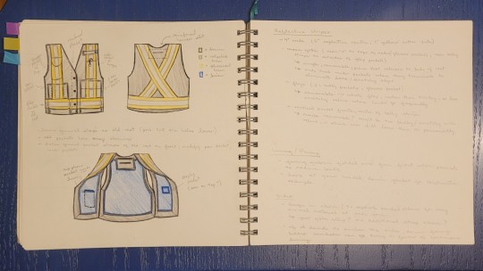
I wear a hi-viz vest 5 days a week for something like 4 months every year. They're mandatory for the entirety of the Bard on the Beach build and strike, which means I live in the thing through rainy early spring, hot late spring/early summer, and the rapid shift from warm and dry September to rainy and cold October.
My first Bard season, I had a cheap mesh one. It was cool on hot days, but otherwise sucked. The two pockets were as perforated as the rest of it and barely usable because any weight in them stretched the whole vest uncomfortably. When I left it in my cubby with a snack wrapper in the pocket and a mouse chewed right through the fabric, I didn't even bother patching the hole. It wasn't worth the effort.
This past season, I picked up a sturdier surveyor's vest with a ton of pockets.
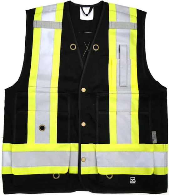
I loved the general layout, and having a heavier garment that could handle carrying a good amount of snacks, tools, and other essentials without becoming uncomfortable was worth sacrificing ventilation. I was really happy for the first month, and still liked it well enough by late fall.
Minor annoyances piled up over the season: the velcro in the small chest pockets scraped my hands raw if I had to reach into them too often; the radio pocket's strap was bulky and loose; the pen pocket had poorly-sized slots and I dropped things every time I leaned forward; the cheap, sloppy construction failed to hold up to hundreds of hours of outdoor wear. It was clear that this vest was a decent facsimile of a well-designed, well-made work vest, but what I actually wanted was the real thing.
So I've started making my own. I'm using the almost-good-enough surveyor's vest as a starting point, redesigning the features that don't work, and building the whole thing out of much better materials, with better techniques.
This is my first time self-drafting a pattern. I'm glad I started with an incredibly simple garment and an existing shape I could copy. It's been challenging and fun just getting the patterning done.
I started by copying the surveyor's vest's two main shapes (rear panel and front panel) onto some kraft paper I'd saved from a parcel.
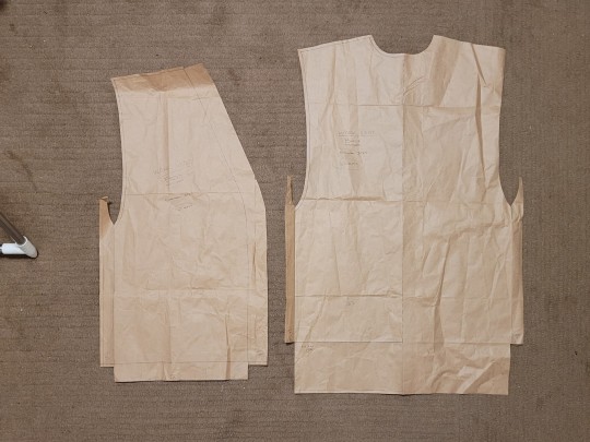
The weird tabs on the side and the extra rectangles on the bottom are fold-over lining segments I'd planned to use to reinforce high-wear areas of the interior with the heavier exterior fabric. I'm currently leaning towards cutting them off and sewing them to the lining before sandwiching the layers together, as I suspect the cleaner fold-over seams aren't worth all the extra work. We'll see how they make it into the final product.
For fabric, I grabbed:
Black bull denim for the exterior (this is a new-to-me weave that uses a heavier 3-to-1 twill weave than regular denim, and is dyed a uniform colour instead of having a dyed warp and white weft)
Blue linen for the lining (I splurged on a 100% flax handkerchief linen, since at least some of the lining will be sitting against bare skin on really hot days)
Fluorescent yellow waterproof nylon for the fluorescent component of the hi-viz stripes (I don't care about the waterproofing, but this type of nylon is what you get in work rain pants and jackets, and it's generally easy to keep clean and has good abrasion resistance)
2" wide Iron-on 3M reflective striping for the retroreflective component of the hi-viz stripes
This is also the first time I've had to follow federal safety regulations while designing a project. I'm using this guide to make sure I'm getting the hi-viz components right:
I'm also generally sticking to the design on the original surveyor's vest, since I know it conforms to the relevant standards.
While I was buying fabric, I found a bunch of gridded freezer paper in the sale bin for $1/dozen sheets. I grabbed it after a cursory google turned up a bunch of folks talking about how great it is for pattern-making.
I transferred my original rough patterns from the kraft paper to the freezer paper, using the grid to tidy things up and make them symmetrical.
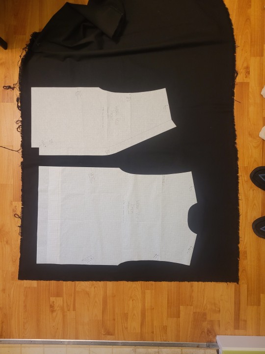
The cool thing about freezer paper (and butcher paper, which I'm pretty sure is the same thing) is that it has a plastic coating on one side. You can draw on the other side, cut out a pattern, and then place it plastic-side-down on your fabric and iron over it. The heat melts the plastic just enough to have it stick gently to your fabric.
This makes it much easier to cut pattern pieces out of the fabric, because the pattern can't shift around and you don't get the distortion that can come with pinning. I switched to using a rotary cutter to cut out patttern shapes earlier this year (thanks, quilting!), and that plays very well with the freezer paper because my quilting ruler lays flat over it without being thrown off my pins.
I was able to measure and cut a clean and even seam allowance all around the pattern and then peel off the freezer paper without leaving any residue behind. It's reusable (I've already used the front panel piece twice), and honestly feels like a magic trick.
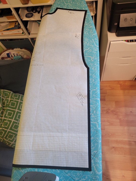
I'm now using it to pattern all of the pockets for the two front panels.
That's the next big chunk of the project, with a planned 4 pockets on the left side and 3 on the right. I'll be lining all of them for comfort and durability, and incorporating the fluorescent and reflective stripes directly into their construction.
So far, this is a fun and challenging off-season project. I'm really glad I don't actually need to use it until mid-March. The lack of deadline means that I can let myself get fully absorbed in the process and all of the things I'm experimenting with as I slowly pull it together.
2 notes
·
View notes