#racing to read
Explore tagged Tumblr posts
Visit Tumblr Blog
Explore Tumblr blogs with no restrictions, modern design and the best experience.
Last Seen Tumblr Blogs


Fun Fact
In February 2021, Tumblr had 518.6 million blog accounts.
Text

three of a kind! ☀️🌴🌺
#if you're reading this you also have to draw your ponysona as the 3 main pony races#it’s fun!#do it! tag me! I wanna see#my little pony#mlp#my ocs#palm dreams#the other 2 are cooler than the og lol. but I’m okay with that. she’s a simple gal
2K notes
·
View notes
Text


1K notes
·
View notes
Text

#anti trump#fuck trump#2024 presidential election#anti donald trump#anti republican#fuck republicans#anti facist#fuck donald trump#donald trump#republicans#fuck the gop#florida#books and reading#books#book banning#book bans#banned books#read banned books#censorship#trump#trump is a facist#2024 presidential race#trump administration
546 notes
·
View notes
Text
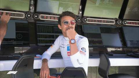
According to multiple motorsport news outlets, Williams will announce that they are signing Carlos Sainz for the 2025 season in Barcelona.
But I want to talk about Logan Sargeant.
I started cheering for him as a sort of joke — I am a lifelong Ferrari fan but felt it was my patriotic duty to support him as a fellow American.
However, it became evident over the past few seasons that my fandom is now very much real.
He is humble and hardworking and never complained about the cards handed to him (no matter how much Williams set him up for failure by not giving him upgrades even when his teammate would get them and taking away his car for a weekend when his teammate crashed and then making him drive with that repaired chassis and running out of recent parts which forced him to drive with a rear wing from 2023).
I know Formula 1 is a business. I know Formula 1 is a competition. I know Logan Sargeant is not exactly one of the best drivers on the grid. But … I also know that he deserved a chance to show what he could do on equal ground, especially when he has been doing the best he could this season with a less than ideal situation.
I guess what I want to say is that whatever happens from here on out, Logan Sargeant has made a lifelong fan in me.
I hope to see him back on the track somewhere very soon after this year ❤️
#if haas is reading this#it would be really cool if the american team decided to sign an american driver#just saying#f1#formula 1#formula one#logan sargeant#ls2#williams racing#williams f1#barcelona gp 2024
1K notes
·
View notes
Text
So y'all have seen the Williams F1 Logo before, yeah?
well get ready, becaues I am about to ruin your day!
where does one even begin with this. i am sorry in advance. -just a poor learning graphic design student, who simply tried to enjoy their saturday evening
The Logo
For anyone that doesn't know, here's the Williams F1 Logo. Entirely unedited, copied straight from Wikipedia:

Now like many fans, I actually quite enjoy this logo. I like the modern, sharp edges of it and it's simple yet intriguiging design. It's memorable, while also easily recognizable as a W. I also really enjoy the colour choice (this, however, is entirely a personal preference.)
(entire rant under the cut. please keep reading this took years off my life span.)
How did we even get here?
Let's start at the beginning. How did we even get here? Well I, a poor poor learning graphic designer, was watching this lovely video from Mr. V's Garage about bad F1 Logo's over the past 35 or so seasons. Very interesting, I can only recommend it (but you don't need to watch the video to understand this post)!
Now, to cleanse the palette at the end of the video, Mr. V included a top 10 GOOD logos from this time span, it was very kind of him.
On P4 of this "Good List," Mr. V placed the current Williams F1 Logo, as pictured above. At first I vaguely agreed with this, believing that he probably simply hadn't noticed one of the things that's been bothering me about that Logo since the first time I saw it up close.
The first sign of Trouble
So, what is this mystery issue, you might ask?
It's simple really. You don't necessarily notice it at a first glance, but something about that logo seems off. Taking a second longer, you may notice it yourself.
No, I mean it, take a minute and go look at the logo. It looks wonky as hell, doesn't it?
Well I can tell you the first thing that I personally noticed. The arms of the W aren't in line with the bottom half, see:

(Graphic by @girlrussell who was so kind to let me use it, as it is way prettier than the one I made)
It's a crooked W. There is no good explanation for this. The rest of the font is perfectly fine, geometrical shapes.

Anyway, the good person that I am I went to point this out to my partner ( @leftneb ) who proceeded to inform me that he, infact, was not aware about this and was, quote, "never going to unsee that."
Now, the good FRIEND that I am, I, of course, proceeded to rush into our broader F1 friendgroup to make them suffer for eternity.
What's the logical next step to take? Of course, fix the logo in Adobe Photoshop, you know, as a joke.
(Disclaimer at this point, I am not necessarily the biggest fan of Williams Management Team. I enjoy ALL their drivers this season. I do NOT enjoy James Vowels. Be warned.)(Also I am aware that he probably did not have an influence on the logo)
Trying to fix it. Oh god, I was so innocent back then
Trying to fix the logo in Photoshop is the worst mistake I could've made. THE worst path to take. I could've just giggled about making my friends suffer (which I succeeded in, by the way) and moved on. Instead I ruined a perfectly good Saturday evening, and for what? I don't know anymore.
Anyway, how was I gonna go about fixing the logo in the simplest way possible? Simplest way I could come up with: slap the thing in Photoshop and put two, mirrored boxes at each side to make the sides line up. Small issue, how do I make the thing actually even? Fix: line them up at the intersecting point with the bottom tips of the W.
Here's the result:

Hey, anyone care to explain to me why in THE LORDS NAME the arms are different sized? I mean, surely they weren't before. Surely, certainly, I must've messed up.
I double, I tripple checked. I made sure everything was lined up and made sense. But no.
It just couldn't be. Something was uneven in this logo, something even deeper. Something I could not have predicted when first taking a closer look. It was at this point I realized I had messed up. What rabbit hole had I stumbled across? Certainly, it couldn't get much worse.
And that's when I noticed.

(pictured above; my genuine reaction)
There's MORE? (oh god, the top isn't lined up)

I couldn't believe my eyes. This is the PINNACLE of the sport, and THIS was the logo of one of the competing teams? I mean, yeah, we have a Visa Cash App RB or a Kick Sauber or even a MoneyGram Haas which are all terrible logos, but at least they're CLEAN. (this has not been checked. If anyone wishes to ruin a nice Saturday evening, feel free to check them and tell me how wrong I was in the previous statement!)
But you can see that there is no end in sight for this post. I'm sure you're as scared as I was at this point. By now we were sitting in VC, discussing the horribleness of this logo. I had long informed my irl's about this, who take said design classes with me. And it was one of them who pointed out the next thing that had been bothering me, but I had not been able to put a finger on up to this point.
thE DISTANCE, HOW DID THEY FUCK IT?

I'm afraid I have to confirm your fears.
Yes, those lines are the same length. According to Photoshop, they're on the same level as well, so no flunking with angles.
The gaps of the arms to the main W are not the same. They're differently sized gaps.
It was clear to us, this logo is inherintely flawed. They're subtle issues, but once you pay attention you start to notice things. It all looks slightly wonky and off centre. And eventually, you get paranoid, and start comparing other angles and sizes. And you will keep finding things. This has ruined my life.
HOOOOOW

Honestly, I don't even know what to say. Yes, yes sadly those lines, too, are the same length. Just copied over from one side to the other and layed over on the same height. I admit, they're not layed over perfectly. I was honestly holding back tears at this point. But the point still stands, you can clearly see a difference in width.
Honestly, the only way I can explain it is that at some point there was a mess up of distance or proportions and whoever was designing the logo couldn't pin it down and tried to restore the visual balance by making manual adjustments. And in all honesty? They kinda did a good job, if that's what's happened. I mean, you notice the crookedness of the arms, and then maybe the difference in height, but the rest you probably will not notice if you don't spend too much time staring at it. (like some of us) And even those issues clearly aren't noticeable to the vast majority, considering I had to go point it out to a group chat for my friends at least to notice.
what the fuck is THAT?
Now, the thing about doing this investigative work of prooving a team you dislike is worse in more aspects than you previously thought, is that you do a lot of zooming in. And zooming in means you might notice bits that yours eyes simply overlooked before, because they were too small.

Here you can witness the top of the middle point, that, for whatever reason, really wants to touch the top border of the Logo. I'm relatively certain that's the highest few pixel in the entire graphic, considering earlier chapter "There's MORE?" I have no idea why it looks like that or why they thought it was necessary for it to not end in a clean point.

I just actually have no idea how to even describe what is going on on the top of the left arm. That left hand side, again, touches the side and is therefore the most-left-pixel in the graphic. I, once again, have no idea the purpose of this. However the RIGHT hand side also makes no sense, as it is the most prominent corner in the whole logo. There's pointed corners, and rounded OF corners, but nothing that is trying to form it's own colony in a distant land that hopefully isn't this god awful logo. I hope that blob gets away. I really do. You go king.
i'm loosing my mind
Anyway, the only reason I could come UP with those weird "reachy-outy-bits" was to establish the dimensions of the logo? But if that was the case, I don't understand why they managed to keep all the other potentially border touching corners clean?


Like, look. Those are clean, sharp corners with some clearance off the borders. I have no clue why they managed it here but not with the others.
guys. please.
Backtrackig a little bit, going back to the positioning of the arms.

Do I need to mention that those lines are both the same length and the same (mirrored) angle? I really hope I don't, because I don't think I could be making this shit up. Like, once you roughly know what you need to look for it just kinda becomes easy to find.
As said before, I genuinely do think that most of these issues happened in a chain-reaction. For example, the distances between the main part and the W wouldn't be as noticeable (and they do get noticeable once you start looking at it) if the angle wasn't fucked. And guess what, there's more fucked angles here! Which ALSO influence this specific area of the logo!
this is just embarrasing for you.

something something same line copied over and mirrored etc etc
It's not as visible but the angles defintely don't line up here as well. As mentioned before, these issues for the most part all influence each other. It doesn't really excuse the issues, in my opinion as a designer, because a big company like this shouldn't have these sort of issues in their logo.
So let's review;
to sum it up,

i cannot even BEGIN to explain to you how big of a fucking JOKE this FUCKING logo is. because, i thought to myself, to round the post out, hey, why not show ALL the issues i pointed out in one picture? that would round it out quite nicely, wouldn't it?
Yeah well, this logo sent STRAIGHT FROM HELL just could NOT let me rest. I had only done the lines visualizing the crooked arms in PAINT up until this point, i.e. I had only pulled both up individually. To make a nice "rounding out" picture I still had to add them into PHOTOSHOP. so i did. i pulled up the line. i mirrored the line.
THE ANGLE IS FUCKING DIFFERENT
none. and i mean NONE of my friends had noticed this before. i need you to understand that we looked at this thing with FIVE pair of eyes, and NONE of us noticed that until i thought to myself "Oh I still need to add these specific lines to have ALL the issues I pointed out in my SILLY TUMBLR POST in ONE image" and i get THAT FUCKING SURPRISE
I was PLANNING to round the post out with a statement on how obviously this isn't a serious post. Here, I even had it all written out already because I accidentally started writing it in the last paragraph:
Of course, this is nitpicking, and it's not that serious. I'm aware of that. AS MENTIONED most of these would not be noticeable if we hadn't gone specifically looking for them.
yeah, well, fuck that. i just spent two hours seething about this logo. i'm ending the post on this instead.

#i am ENRAGED#i managed to actually calm down about it#yk. just typing away#and then i just try to ROUND OUT THE POST#for fucks sake#anyway i know i'm posting this at an hourrendous hour#if you read all the way. reblog? maybe#pretty please#williams f1#williams formula 1#williams racing#formula 1#f1#also apologies for any spelling mistakes i do NOT have the nerve to go back and proofread this
945 notes
·
View notes
Text
Waiting for the Green Light
word count: 863
Pairing: Lando Norris x reader
Summery: As rain delays qualifying in São Paulo, Y/n and Lando share a heartwarming moment in the garage, wrapped in each other's warmth
______________________________________________________________
The rain continued to fall heavily on the São Paulo circuit, creating a rhythmic patter against the garage roof that provided an almost soothing soundtrack to the tension in the air. Y/n had shifted onto Lando’s lap, her legs draped over his in a way that felt both natural and electric. He was still in his full racing suit, the tight fabric accentuating his lean build and showing off the logos of his sponsors, while his fireproof undershirt peeked out from under the suit. The smell of rubber and fuel clung to him, mixed with a hint of adrenaline that never seemed to leave a driver even in moments of calm.
“Can you believe this weather?” she asked, trying to make light of the situation as she settled in, feeling his warmth radiate through the layers of fabric.
“Honestly? Not really,” Lando replied, his tone playful. “It’s like the rain gods have decided to ruin my day on purpose.” He chuckled, leaning back slightly against the cold metal wall of the garage, and adjusted her on his lap so she was even more comfortable. His hands were firm but gentle, one resting on her waist while the other found her knee, his fingers absentmindedly drawing small circles over her jeans.
The tension of the rain delay melted away as they shared this little moment together. Y/n relaxed into him, allowing her head to rest against his shoulder, enjoying the way his heartbeat drummed softly beneath her ear. The garage was alive with activity around them, mechanics hurriedly checking tires and adjusting setups, but here, in their own bubble, it felt like time had stopped.
Just as she was starting to lose herself in the warmth and closeness, a flash of light caught her eye. She turned to see a couple of camera operators from the media team positioning themselves nearby, clearly looking for the perfect shot of McLaren’s rising star and his girlfriend. Her heart raced, not just from the closeness of Lando, but from the sudden realization that they were about to be the center of attention.
“Oh no, they’re filming us!” Y/n exclaimed, a blush creeping across her cheeks as she instinctively ducked her head to hide her face in Lando’s shoulder.
“Y/n, look,” he laughed, his voice playful and teasing as he gently nudged her chin up with his fingers. “Let them capture the moment. I want everyone to see how lucky I am.”
Peeking out from behind her hair, she caught the proud gleam in his eyes. Lando’s demeanor radiated confidence, and as he looked straight at the cameras, a broad grin spread across his face, showcasing the dimple in his cheek that always made her weak in the knees. “This is my amazing girlfriend,” he announced, his voice playful but filled with genuine admiration. “She’s the best part of my life!”
Y/n couldn’t help but giggle at his antics, the shyness still lingering but overshadowed by her affection for him. She felt warmth spreading through her, a mix of embarrassment and excitement. “Lando!” she murmured, trying to suppress a smile as she glanced at the cameras.
He wrapped his arms around her tighter, drawing her closer, and pressed a soft kiss to her forehead, ignoring the buzzing around them as he focused entirely on her. “Honestly, you should see how pretty you look right now, all shy and cute. I want to show you off to the world.”
The cameras captured every moment—the way Lando’s fingers danced lightly along her side, the way he couldn’t keep the smile off his face as he watched her blush deepen. The crew around them murmured, impressed by the genuine connection between the two, a stark contrast to the cold and professional atmosphere typically found in the paddock.
“See? I told you, you’re gorgeous,” he said softly, tucking a loose strand of hair behind her ear, his touch sending little sparks across her skin. “And this?” He gestured vaguely at their surroundings. “This is just the beginning of the day. I have a feeling things will heat up once they call us back out there.”
She chuckled, playfully rolling her eyes. “What do you mean? You want to take me on a victory lap?”
“If it means I get to show off how beautiful you are, then absolutely!” Lando’s enthusiasm was infectious, and it made her heart soar. The way he looked at her with such pride made her feel like the only person in the room, even amidst the chaos of the garage.
As they continued to wait, the rain began to lighten, and the crew prepared for the eventual announcement from the FIA. Y/n nestled into him, feeling safe and cherished. Lando’s racing suit felt slightly damp against her cheek, but that only added to the feeling of being enveloped in warmth.
“Just so you know,” he murmured, his breath warm against her hair, “no matter what happens out there today, I’m glad I have you here with me. You make all this chaos worthwhile.”
She turned her head to meet his gaze, her heart swelling with affection. “And you make waiting in a damp garage the best time ever.”
#fanfiction#fanfic#f1#f1 imagine#fluff#f1 fanfic#reader insert#f1 x reader#lando noris#lando norris x reader#lando norris x you#lando norris x y/n#lando norris#lando x reader#f1 fic#formula 1#formula racing#formula one#x reade
1K notes
·
View notes
Text
I can't get over how Shadow needed Rouge bribing him with a fucking spaceship to reluctantly attend Sonic's birthday party, but for Amy's birthday he not only went willingly but got all decked out in a costume, played along with the murder mystery game, went through lengths to get her tickets to her favourite band as a surprise present and agreed to go to the concert with her afterwards even tho he doesn't listen to their music to boot. Either Amy is a different kind of special or Sonic is just a different kind of "not worth it" lmao
Ok, this blew up more than expected so while y'all are here please consider helping out these guys!
#sonic#sonic x shadow generations#sonic x shadow generations dark beginnings#shadow the hedgehog#amy rose#sonic the hedgehog#shadamy#can be read either way but i like shadamy so i'm tagging it anyway#reminds me of team sonic racing where he trash talks everyone he beats and just goes “you did alright champ” all gentle-like with amy XD#he has a soft spot for her and i love it#it's very cute#poor sonic tho way to get disrespected like that on your own birthday no less#momento rambles
584 notes
·
View notes
Text
it's so amusing that when you're an author who is like any minority, you have this caveat where if your book gets banned, you kinda have to mentally acknowledge whether it was banned by Bruce, the one really bigoted guy who wastes everyone's time in florida. idk how bruce is doing. you don't need to learn who he is really which is why im not using his surname. but if you have a book out commercially, bruce has probably written "damaged souls" on a form about you. so there's a street cred element to all this like did people really have a vendetta against your work...? or was it just bruce again
#i am mildly certain i have received two different bruce attacks towards different florida counties#but i can only find one of his beautiful forms where he writes that the book has critical race theory even though it's about skeletons#he also made a really amusing video where he reads lines of my book out loud derisively and i would just love to post it but#alas i don't want to give him the satisfaction..#not all of my bans were bruce there were issues in virginia and idaho and kentucky but still#also please let this serve as a reminder that many horrible things are caused by evil people just being really loud and determined
834 notes
·
View notes
Text


everytime i look at him, i have this urge to let out the loudest screech know to man because WHAT DO YOU MEAN SOMEONE HAD THE AUDACITY TO HURT THIS CHILD.
#LOOK AT HIM#LOOK AT HIS CHEEKIES#LOOK AT HIS HAIR#AND HIS TINY LITTLE SMILE#LOOK AT HIM READING#AND STANDING WITH HIS HANDS BEHIND HIS BACK#MAX VERSTAPPEN I LOVE YOU#HIS CHEEKSSSSSSSS#I WILL SPONTANEOUSLY COMBUST#THE CUTENESS AGRESSION IS HITTING#my baby my baby#formula 1#formula one#max verstappen#f1#red bull racing#red bull f1#mv1#mv33#fuck j*s verstappen#baby max verstappen#truly the babiest baby that has ever babied
896 notes
·
View notes
Text

Yuki Tsunoda as The Moon Tarot:
The Moon is a card of illusion and deception, and therefore often suggests a time when something is not as it appears to be. Perhaps a misunderstanding on your part, or a truth you cannot admit to yourself. Night is the time when dreams and fantasies rule.
The moon also represents instincts that we have buried in our own unconscious - they come out to play in the moonlight. But the reflections that we see springing forth can also be illusions, it is easy to lose your way in the dark.
Embracing the Moon tarot card meaning allows us to face our fears and uncertainties, trusting our instincts to guide us towards the right path.


Tag list: @st-leclerc @rubywingsracing @saviour-of-lord @three-days-time @the-wall-is-my-goal @albonoooo @ch3rubd0lls
#this one is kind of a bummer#but it fits :-/#idk!!#I just feel that no only do people not read yuki correctly#but they like … fall for an illusion I.e him being smaller ? and putting him under Asian stereotypes?#like bc of that he isn’t allowed to be as temperamental as the other drivers and they always expect him to be a little meeker? or quieter?#and also now that hes matured more and isn’t as temperamental they still treat him like a ticking time bomb?#he is also being dealt false promises of advancement to the main team#I think this one just fits#even though it’s typically a more negative card#yuki tsunoda#yt22#red bull racing#vcarb#alpha tauri#f1 tarot#the moon#the moon tarot#f1#formula 1#f1blr#f1 fanart#formula one#f1 art#annie’s art#formula one fanart#formula 1 fanart#formulanni
453 notes
·
View notes
Text


daniel ricciardo | enchanté nyc pop-up december 2024
#daniel ricciardo#dr3#he was really very unfairly adorable in this interaction#but I did have an LOL at the guy being like yeah we do a lot for red bull show runs#like...my guy...have you not read the news? have you been offline for 3 months while making this?#you really went yes let me talk about redbull racing to daniel ricciardo in the year of our lord december 2024#'idk if you saw on the redbull page recently'#brother he definitely did not see that on the redbull page recently...#desperate to see his individual beard hairs again#longing for high quality video footage of this man again#could not think of a caption...between side profile and intent listening face i was overwhelmed and went basic#also - were the comments on that video always turned off or did people get shitty?
275 notes
·
View notes
Text
A/N: hello everyone! yes, I am 7 days late to kinktober, yes I'm gonna write 7 fics today lol. anyway here's the list I made!
2023 Kinktober List:
Begging, daniel x reader
Temprature Play, charles x reader
Mirror Sex, carlos x reader
Angry Sex, lando x reader (lap time got deleted at quali)
Size kink, max x reader
Hair Pulling, george russell x reader
Biting, oscar x reader
Mutual Masturbation, daniel x reader
Lingerie, pierre x reader
Strip tease, charles x reader
Dirty Talk, carlos x reader
Food Play, charles x reader
Titles, i cant choose x reader
Shower Sex, lando x reader
Against a Wall, oscar or daniel x reader
Vanilla, george russell x reader
Phone Sex, oscar x reader
Sleepy/Morning Sex, (open)
Fem!Dom, lando x reader
Lactation, daniel x reader
Blindfold, max x reader
Handcuffs, oscar x reader
Ropes, carlos x reader
Voyerism, (open)
Overstimulation, max x reader
Denial, pierre x reader
Oral (male and female receiving) lando x reader
Poly, oscar x readerx lando or max x reader x lando
Toys, charles x reader
Wearing the others clothes, oscar x reader
After Care, headcon for each
#formula one#lando norris x reader#lando norris x y/n#mclaren#charles leclerc#charles leclerc x female reader#carlos sainz x female reader#carlos sainz x y/n#max vertsappen x y/n#max verstappen x reade#max verstappen x reader#red bull racing#oscar piastri x you#oscar piastri x reader#george russell x reader#george russell x y/n#daniel riccardo x reader#formula one imagine#formula one x reader
2K notes
·
View notes
Note
I was a bit sad to hear that I'm assumed to be fascist, as a tech worker who has no major issues with slate star codex. But I guess the culture war stuff can wait until after the US has sorted out its constitutional crisis.
If you have no major issues with Scott Alexander Siskind Slate Star Codex, you have no major issues with his ongoing discussion of race science, racial IQ differences and "human biodiversity". This has been known and litigated for years. It keeps cropping up. The most recent example is from January 15, 2025: How To Stop Worrying And Learn To Love Lynn's National IQ Estimates is entirely based on the work of an infamous racial scientist:
Richard Lynn was a scientist who infamously tried to estimate the average IQ of every country. Typical of his results is this paper, which ranged from 60 (Malawi) to 108 (Singapore). People obviously objected to this, and Lynn spent his life embroiled in controversy, with activists constantly trying to get him canceled/fired and his papers retracted/condemned. His opponents pointed out both his personal racist opinions/activities and his somewhat opportunistic methodology.
Those horrible activists. Must've been more "culture war stuff" from woke moralists who don't understand science.
For 50 years, Richard Lynn has been at the forefront of scientific racism. An unapologetic eugenicist, Lynn uses his authority as professor (emeritus) of psychology at the University of Ulster to argue for the genetic inferiority of non-white people. Lynn believes that IQ tests can be used to determine the worth of groups of people, especially racial groups and nations. The wealth and power of nations, according to Lynn, is due to their racial intelligence and “homogeneity” (or “purity”). He argues that the nations with the highest IQs must subjugate or eliminate the lower-IQ groups within their borders in order to preserve their dominance. Since the 1970s, Richard Lynn has been working tirelessly to place race, genes, and IQ at the center of discussions surrounding inequality. [...] Lynn also recycles Nazi-era arguments for Nordic superiority within the “Caucasoid” group, claiming that a “north-south continuum” exists, with people from northern Europe having evolved to be more intelligent than their southern neighbors. [...] Lynn is referring to his belief that racial groups have genetically determined behavioral patterns, and that crime, disruptiveness, and antisocial behavior are part of minorities’ genetic makeup. In this way, Lynn has provided a veneer of scientific respectability to long-discredited racist theories like those popularized by Charles Murray and Richard Herrnstein in The Bell Curve. [...] Lynn is one of the few remaining “race scientists” who is willing to explicitly endorse addressing these supposed problems through eugenic policies. [...] Lynn unabashedly suggests just that, favoring a “parental licensing scheme” in which “couples would have to apply for and obtain a license to have children.” He also believes that there is “a good case for reviving the sterilization of the mentally retarded and criminals,” and has promoted a “commendable scheme” targeting poor mothers which “would require sterilization as a condition of receiving welfare.” (x)
In his own words,
“If the evolutionary process is to bring its benefits, it has to be allowed to operate effectively. This means that incompetent societies have to be allowed to go to the wall… . What is called for here is not genocide, the killing off of the populations of incompetent cultures. But we do need to think realistically in terms of “phasing out” of such peoples. If the world is to evolve more better humans, then obviously someone has to make way for them otherwise we shall all be overcrowded. After all, ninety-eight per cent of the species known to zoologists are extinct. Evolutionary progress means the extinction of the less competent. To think otherwise is mere sentimentality.”
This brief summary is the political project that writing these blog posts advance and reflects who Slate Star is as a person. You have to be profoundly stupid or profoundly racist (but I repeat myself) to think these fascist worldviews don't affect someone's research—indeed, that someone's research isn't a product of, in service of those views—and here I mean both Lynn and Slate Star. To overlook all this and go on favorably citing Lynn is damning. You shouldn't be able to show your face in polite society after this.
Speaking of the political project in question, Lynn funded, and was funded by, neonazis, white supremacists, and hate groups, some violent, throughout his life. He served on the editorial board of Mankind Quarterly, a pseudoscientific racialist journal once described as "written by racists for racists," founded in 1960 by segregationists to advance their cause, and funded by notorious segregationist, anti-semitic, pro-apartheid groups. The people involved in its founding, publication, and articles, including Lynn, were complete pariahs, too racist for what was a racist society—but one that had beaten a blow to nazism and pulled back from those levels of explicit extermination, able to see the link between racial science and the logical teleological end of genocide. The chief founders were Reginald Gates, Henry Garett, G.r. Gayre and Otmar Freiherr von Verschuer. The last was a prominent, famous German-Dutch racial scientist and member of the nazi party, who was not only Mengele's PhD supervisor but who encouraged him to go further with his experiments during the Holocaust; he was able to launder his reputation as a "genetics researcher" postwar, though he was unrepentant. Henry Garett was a lawyer who testified against integration in Brown v Board of Ed. Gates was also a famous scientist fired from Howard University for opposing segregation:

Note the language they (Gates) use to carefully disguise their political goals under a mask of detached, clinical, objective science:

The journal was immediately attacked by legitimate scientists who saw through their obvious machinations. The political goals were evident (x):


Mankind Quarterly never disappeared. It remained closely connected to shadow networks of white supremacist organizations and funding called the Pioneer Foundation, partially a trust for Draper's money. Currently, the journal is published through the Human Diversity Foundation (HFD) by the German white nationalist and AfD social media manager Erik Ahrens and Danish neonazi Emil Kirkegaard, who perhaps plays the most important role in organizing HFD, Mankind Quarterly, Aporia Magazine (another online scientific racism rag), and connecting and bringing to prominence white nationalists, racialists, and hygienists worldwide. Both have defended nazis and the Waffen SS.
Kirkegaard is a named author on more than 40 papers published in the journal Mankind Quarterly, a longstanding outlet for race science theories. The topics of Kirkegaard’s inquiries have included whether black Americans earn less than white Americans because of “average intelligence differences”, comparing penis size, testicle size and “breast-buttock preference” by race, and an attempt to show that in Denmark those with “Muslim names” have lower IQs. The geneticist Adam Rutherford told the Guardian that Mankind Quarterly and similar periodicals were so discredited that it would be “career suicide” for a genuine academic to publish in them. Kirkegaard’s positions appear closer to racism than science. “Africans,” Kirkegaard wrote on his blog in July, “are prone to violence everywhere.” [...] Nonetheless, Kirkegaard enjoys some influential connections. The recordings show him claiming that in 2019 he was among the “online dissidents” that the tech billionaire and rightwing donor Peter Thiel flew to Silicon Valley for discussions. (x)
Kirkegaard is also a pedophile:
In a 2012 blog post, Kirkegaard wrote that it would be a "good idea to legalize child porn" because he thinks viewing this content would reduce the number of rapes committed by pedophiles. He’s also stated that he would support lowering the age of consent to 13 or lower if puberty begins earlier. Despite his own views on child porn and age of consent, Kirkegaard has tried to link homosexuality to pedophilia and categorized all left-wing people as pedophiles on his blog. (x)
We've established how these people operate, how they lie, what rhetorical tricks they pull, what their real goals are, what their history is—the holocaust, apartheid, segregation—and what their political project is—AfD, Trump, Thiel, remigration, eugenics. Going back to Slate Star's blog post:
Thanks to Emil Kirkegaard for the blog post that finally cleared this up for me.
Kirkegaard and Slate Star communicated and collaborated on this. You'll find Kirkegaard in the post comments, along with Steve Sailer, yet another prominent American white supremacist. Kirkegaard retweeted this post when it came out, as did dozens of decrepit, committed, hardcore neonazis and white supremacists. Why are they all cropping up here? Why does he keep talking to them? The answer is clear:
Slate star codex is a white supremacist espousing race science. He is in conversation with other white supremacists, he gets published by them, he cites them. They're his friends, colleagues, patrons because he's a fascist neoreactionary. The people retweeting this stuff are among the most vile, despicable creep freaks raising up the spectre of genocidal racial war, segregation, and apartheid—and they are exactly the ones sponsoring or carrying out the constitutional crisis. Chris Rufo, an unhinged nazi DeSantis ally currently ransacking the Department of Education, is friends with Kirkegaard; he's published in Aporia, cited by SSC. SSC is in league with them, but he keeps a winking distance—look at these ideas, look at these studies, I have so much data—of plausible deniability. Not plausible to me.
This isn't new, either. @vilestviolist kindly provided a link to leaked emails from years ago where SSC revealed he agrees with HBD (human biodiversity, a euphemism for race science) and their conclusions, but just like the original editors of Mankind Quarterly, he knows he couldn't say it openly (then):


He does the exact same thing as the founders of Mankind Quarterly in the exact same way. You can't incorporate ideas from neoreactionaries in your worldview and not wind up one yourself. Don't play coy.
In the post I linked at the beginning, he makes the argument—while citing bunk data—that substandard African IQs, around 60-80, can be improved with development. Ostensibly, the argument is for development. In reality, what he's doing is peddling the idea of racial IQ disparities wrapped in the acceptable idea of development and his blundering, bloviating prose. I am not citing anything further from his rank filth post because race science is a pseudoscience; none of this is legitimate. These people have been completely shunned, banned, and cast aside for decades because the political ends of these nonsensical arguments are patently clear.
This is not "culture war stuff." Saying so deliberately obfuscates and minimizes explicit white supremacy, eugenics, and racial hygenism through a pathetic euphemism. It's the same cloaking mechanism that the original racial scientists used. It doesn't get more explicit than that: this is original, old school, classic fascism. In part or in whole, you're constructing a world that entirely excludes non-white people on the basis of pseudoscientific studies on "human biodiversity" falsely alleging innate, biological differences in intellect and capability. If not, you're engaging and taking in the work of someone who dines with fascists, takes their money, and spreads their views. You're being amoral, context-blind, so open to ideas that you're damaging everyone. This isn't a "discussion," there's no legitimate research here; these ideas have real, tangible consequences. You enjoy reading this drivel while pointing, or being pointed towards white supremacy and debunked racist propaganda. There's no coming back from this. At best, you're a complete dupe. Otherwise, you are a fascist.
#and you always use such sad pathetic language too#i'm just a smol bean who reads fash blogs why attack me :(#zero tolerance for holocaust denial or race science#scott alexander#astral codex#race science
191 notes
·
View notes
Text


The fiercest fizzgig there is
a Linked Universe x The Dark Crystal AU :D
#linked universe#the dark crystal lu au#courage of the dark crystal#such a cheeky name for an au :3 teehee#lu au au#you can't see Wolfie's tail but he's got a fin like a big ol' shark pupper!#his design is likely to change. that goes for all of them#Wolfie's inspired by pepurika's characters Sausage and Fishsticks from their comics Tiger Tiger and Prague Race#which can both be read on hiveworks#lu wind#lu legend#lu hyrule#lu wild#lu wolfie#lu twilight#tdc aor#the dark crystal
890 notes
·
View notes
Text
Max & Seb: 4x RBR WDCs who are also Pen Pals™
#I wanted to check and after EVERY race???#...whore behavior#lew you can't leave seb on read he has too many on his roster#max verstappen#sebastian vettel#quotes24#2024#sebmax
253 notes
·
View notes
Text
Moths in Disguise: these are all just harmless moths that have developed the ability to mimic wasps, bees, and/or hornets
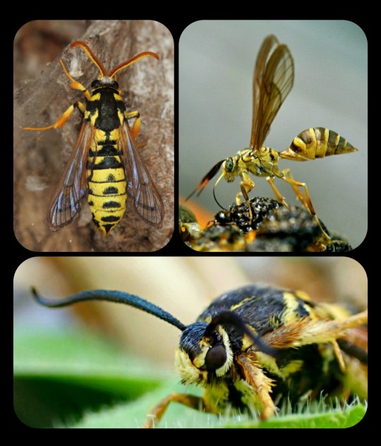
Top Row (left to right): Eusphecia pimplaeformis and Myrmecopsis polistes; Bottom Row: Pennisetia marginatum
Moths are exceptionally skilled when it comes to mimicry, and there are hundreds of moth species that rely on that tactic as a way to protect themselves from predators. Their disguises are numerous and varied, but hymenopteran mimicry is particularly common, especially among the moths that belong to subfamily Sesiidae and family Arctiinae.

Yellowjacket-Mimicking Moths: Pseudosphex sp. (top and bottom left) and Myrmecopsis polistes (bottom right)
Some of their disguises involve more than just a physical resemblance -- there are some moths that also engage in behavioral and/or acoustic mimicry, meaning that they can imitate the specific sounds and behaviors of their hymenopteran models. In some cases, these moths are so convincing that they can even fool the actual wasps/bees that they are mimicking.
Such a detailed and intricate disguise is unusual even among mimics, and researchers believe that it developed partly as a way to trick the wasps into treating the mimic like one of their own. Wasps tend to prey upon moths (and many other insects), but they are innately non-aggressive toward their own nest-mates, which are identified by sight -- so if the moth can convincingly impersonate its model, then it can avoid being eaten by predatory wasps.
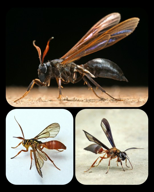
Wasp-Mimicking Moths: Pseudosphex ichneumonea (top), Myrmecopsis sp. (bottom left), and Pseudosphex sp. (bottom right)
There are many moths that can also mimic hornets, bumblebees, and carpenter bees.
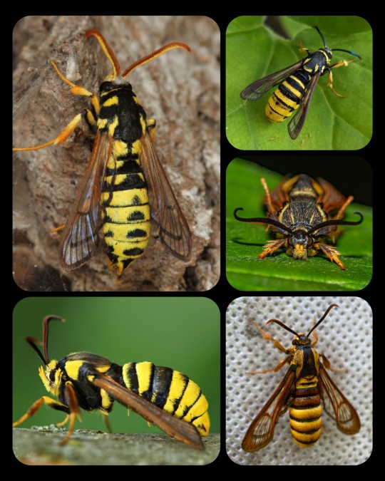
Hornet-Mimicking Moths: Eusphecia pimplaeformis (top left), Sesia apiformis (bottom left), Paranthrene simulans (top right), Pennisetia marginatum (middle right), and Sphecodoptera scribai (bottom left)

Bumblebee-Mimicking Moths: Hemaris tityus (top and bottom left) and Hemaris affinis (bottom right)
Moths are some of the most talented mimics in the natural world, as illustrated by their mastery of hymenopteran mimicry. But it's not just bees, hornets, and wasps -- there are many other forms of mimicry that can be found among moths, and the resemblance is often staggering.
Moths deserve far more credit than they receive, to be honest, because they are so incredibly interesting/diverse.
Sources & More Info:
Journal of Ecology and Evolution: A Hypothesis to Explain the Accuracy of Wasp Resemblances
Frontiers in Zoology: Southeast Asian clearwing moths buzz like their model bees
Royal Society Publishing: Moving like a model: mimicry of hymenopteran flight trajectories by clearwing moths of Southeast Asian rainforests
#lepidoptera#moths#Sesiidae#entomology#insects#animals#cool bugs#mimicry#nature#evolution#Arctiinae#bees#hymenoptera#hymenopteran mimic#wasp#bumblebee#acoustic mimicry#evolutionary arms race#I spend way too much time#reading about moths
807 notes
·
View notes