#quickview
Explore tagged Tumblr posts
Text

When the nigh has come
43 notes
·
View notes
Text
Single? Player?
refactored player area to use QuickView panel
loaded sentinels play areas from scenario data
display all sentinels in a tabbed container (temporary, I want shrinking to the quickview to flip to the next one, and opening the quickview to give focus)
got autosizing text to work (need to work that into card titles)
Video Description: screen recording of Prime War in development. This highlights the new tabbed display of all sentinels in the scenario, as well as their quick-view panels. the quick view panels have the character's name, active abilities, defense, focus count, and current health. end description.
Since day one way back in 2017, we wanted to subtly discourage 1 player with multiple characters, but (at least for testing), I have it working now!
2 notes
·
View notes
Note

hi sorry it looks like this for me on my macbook which is pretty similar to the app?
Hi dear,
Oh that's because that's not my full blog. You're on the quick view feature tumblr launched recently. You need to be on my tumblr blog page, not the dashboard quickview.
If you look at the url bar you'll see this:

That's the quickview address. It's essentially a preview window.
If you look at the screenshot you sent me, you'll see that right in the center it shows my tumblr's full web address, that's my actual blog!

So you can click on that or type it on your browser, and then you'll see my blog!
https://daisiesonafield-blog.tumblr.com/
6 notes
·
View notes
Text
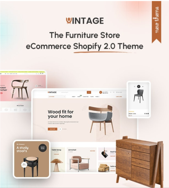
Vintage - The Furniture Store eCommerce Shopify 2.0 Theme

Vintage is combination of modern & creative design premium shopify theme which is best for industry like furniture store, home decor shop, shop lights & handmade, interior, wooden shop, ergocraft, teapoy, supermarket, grocery, furniture shop, healthcare, jewellery shop, beauty, cosmetics any eCommerce store. Vintage is a bootstrap-based Shopify theme featuring a fully responsive design that supports RTL. Vintage has every features which need to built any eCommerce mid level & small level online store.
Vintage has inlcuded features like vegamenu, header & footer flexiblity, drag & drop, multicurrency, RTL support, wishlist, mini cart drawer, ajax search, advanced swatches, ajax cart, deal timers, mobile slider configuration, multi-device compatibility, product video & 3D model, SEO Optimization, mobile first, stock information, web fonts, clean, unique header & footer, mobile bottom menu, top notifications, differentials product pages and many more.
List of Features
5+ Unique Homepages
Header & Footer Flexibility
Responsive Design
Easy to Use
RTL supported
Drag & Drop Section
Mobile Slider Configuration
Vega menu Integrated
Multiple Megamenu Integrated
Product Grid & List
Quickview Shop
Multicurrency
Product Video & 3D Model
Product Swatch & Dropdown
Stock Notification
Deal & Countdown Timer
Stock Countdown
Quick View Popup
Image Gallery with Video + Zoom Effect in Product
Animations
Flexible Newsletter Popup
Mobile Bottom Menu
Social Sharing
Product Filters
Newsletter Popup
Product Wishlist
Product Custom Tabs
Live Search
Various Blog & Article Pages
Product Sales Badges
Top Notification
Sticky Header
Bootstrap 5.x
Google Web fonts
Well Documented
RTL Supported
SEO Optimization
Life Time Free Update
Top Rated support
Instagram Feed
404 Page
Blog Details Page
0 notes
Text

MYTHIQUE LE MONDE
#Rene Mouris#Rene Mouris Watch Review#Watch L’Emporter#Women's Luxury Watch Guide#French Watch#Orion Automatic Watch#Stainless Steel Watch Straps#Noblesse Watch#Stylish French Watches#La Fleur Watch#Papillon Watch#Vitesse Watch#Coeur D’ Amour#Prowler Watch#French Automatic Watches#Stainless Steel Straps And Bands#FR Watches#Rene Watch#Prowler Band#Orion Automatic#L’ Emporter#montre acier inoxydable#leon lafleur montre#montre inoxydable#MYTHIQUE LE MONDE
0 notes
Text
Tumblr Basics for Cafe Dot
Please keep in mind that just like any social media site Tumblr will change and in consequence this advice is ever evolving.
What is Tumblr?
To put it simply Tumblr is a microblogging site that leans toward image sharing, but is also very generous to music & video links as well as text posts. The site itself has been around since 2007 and since then has had it's ups and downs but for the most part it has remained steady and boasts around 50 million visitors a month. As of March 2023 Tumblr hosts more than 572 million blogs. Tumblr does not lean hard into any algorithm and there is no verification process, if a celebrity is on Tumblr they're using the same tools you are. Some quick facts about the site:
48% of Tumblr users are Gen Z
It is the third most popular blogging platform on the internet
70% of users are satisfied with Tumblr's functionality - this puts them only below Pinterest and Youtube for customer satisfaction
The majority of Tumblr users are US based followed by Canada, and the United Kingdom.
The user base is nearly split 50/50 for identifying male (58%) or female (41%)
How do you set up a Tumblr blog?
First and foremost I recommend reading Tumblr's own guide for using their site here: TUMBLR GUIDE
This question is relatively loaded because Tumblr, unlike other social media sites, allows you to highly customize your profile/blog. To some this is fantastic, especially those that have a grasp of basic html editing. To others this task alone can seem daunting and an astronomical height to traverse over. Thankfully Tumblr provides some premade themes that you can lightly customize if spending hours on your blog theme isn't in the stars for you. If you'd like to learn how to create a custom HTML theme click here. You can also find plenty of free premade themes by other blog enthusiasts, they all tend to have set up instructions. Just google it :) After you create an account if you click on your profile picture it will take you to a quickview of your "blog" that most people will see if they hover over your icon. You can edit this minimally. If you click on "Blog Settings" It will navigate you to a page that allows you to edit your Username, Address (your tumblr blog address), Description, PFP, etc. If you'd like to use a custom theme please be sure to enable custom themes on this page, doing so enables you to have a full tumblr page and edit your theme. If you enable this - the edits you make on your main theme will reflect in your quickview.
Basics of Tumblr
Tumblr like Twitter keeps track of your likes, has a Following tab, and a For You tab. Unlike Twitter it defaults to your Following tab on the dashboard. It also has a Your Tags tab which are hashtags you have decided to follow and a Management Tab which gives you access to something called Tumblr Labs. Tumblr Labs has to be enabled as it's just experimental features that you can try out: Popular Reblogs Tab, Trending Tab, Favs Tab, etc. You can at any time toggle these on and off and each provide a description of what they are and do. If you do decide to turn on Tumblr Labs the staff wants you to provide feedback, so please do!
Dashboard: This is your Tumblr landing zone - from here you can view your feed (you will only see posts from blogs you follow, no one else, unless they appear on radar), settings, overall account management, and create posts.
Tumblr Feed: this is the live feed of the most recent posts or reblogs from the users you follow.
Reblog: Effectively the same thing as a Retweet on Twitter, the difference is you can Reblog your own post infinite times and no algorithm is going to knock it out visually from your followers. They WILL see it. Keep that in mind and don't overuse it too frequently.
Tumblr Radar: this is a spotlight section that is curated by Tumblr staff and boosts artwork (4 different pieces per day). You can be randomly chosen if a staff comes across your piece or you can also submit your original work and it will go through a submission process and potentially be spotlighted. Read more about Tumblr Radar and how it works here.
Queues: In my opinion queues on Tumblr are probably the single most utilized version of queues on any social media site. A LOT of users queue their posts to spread them out over several hours or days, it's just something that has always been ingrained in the community to do. You can easily set up a draft to queue from the same area you would create the draft.
Hashtags: These are the bread and butter of Tumblr, ranging from categorizing to telling entire life stories in them (not a joke). Tags are highly visible and can even be seen in notifications of reblogs, they are sometimes used as ways for the reblogger to communicate with the OP, whether they ask a question or give you a compliment, if you filter through your reblog notifications you're bound to see some interesting ones. When it comes to using hashtags for searchability make sure they're relevant to your art/music/story etc. i.e Pixelart, Painting, Digital Art, Sky, Trees, Fantasy, Fantasy Art, Blue Art, Pastel, Pastel Aesthetic, and so on. It's also worth noting that categorizing via hashtags is very powerful on Tumblr, you can utilize your own hashtags to create pages or portfolios on your blog that can be easily navigated to. Example, I've posted 3 images to this blog tagged #matchaexample and created a link to the tagged page connected to this blog called "Example Gallery" if you click it you will notice that the only posts the page shows are the 3 images sans this text post. You can do this with any tag to highlight specific things about your blog. If you want an FAQ section create a post, tag it FAQ or whatever you'd like and create a page to link to from the main page of your blog. This is super handy for creating your own versions of a master link post to your shops, other websites etc. You'll notice the discord link does in fact take you to the invite for the cafe dot server :)
Asks: On Tumblr people are able to send you messages via asks that can be anonymous or attached to their own accounts (you can toggle the settings for asks by clicking your pfp and scrolling down to the Asks section). You can choose to answer these privately or answer them publicly which posts the asks in a format to your blog. You can add tags to asks and like mentioned above create an entire page dedicated to them if you so choose.
FAQs
When is the right time to post on Tumblr for visibility? Since the majority of Tumblr users are based in the US the best time to post is between 5pm and 1am (EST or Eastern Standard Time). Convert your timezone here. This is not an exact science, there's plenty of examples of people posting outside of what is perceived as the peak time for visibility and doing just fine. Also keep in mind you can reblog your post if you feel you missed a prime time in posting! What is the daily post limit? 250
Where can I find premade themes that are easy to install? Here :) How do I edit my theme? This depends on how you've set up your blog. You can either do minimal editing by clicking on your pfp or you can enable custom themes which allows you more customizations from your main blog page. This is the page that is [yourusername].tumblr.com. On there you'll notice 4 symbols in the top right hand corner. From left to right these are quick links to your dashboard (house), blog quickview (eye), theme edit appearance (paint palette), and settings (cog). Click the paint palette symbol to open more customizations for your theme.
How do I block Tumblrs? Click on your pfp navigate down to the Blocked Tumblrs section, from here you can add whoever you choose.
Can I pin a post? Yes! You can pin a post to your blog by clicking on the 3 dots in the top right corner of it and selecting the pin option
THIS IS A WIP POST- things will be added
1 note
·
View note
Photo

I was out photographing graffiti when a young guy behind me says “ please don’t photograph my car” I turn around and he’s loading belongings into it with his wife or girlfriend who were obviously living in their car so I told them I wouldn’t photograph their car but I felt bad at how young and desperate they were so when I returned to my studio and started to draw them my wife called and I needed to go home in 20 minutes so I went into hyper speed so it’s why this is rough #urbansurrealism #lifeonthestreet #expressionism #quickview #lowbrowpopsurrealists #pdxartist #portlandartist #gregoryhergert (at Southeast Portland, Portland) https://www.instagram.com/p/CLGPSlenmyP/?igshid=my0tv5b24284
#urbansurrealism#lifeonthestreet#expressionism#quickview#lowbrowpopsurrealists#pdxartist#portlandartist#gregoryhergert
1 note
·
View note
Link
New Video up on Youtube!
A quick “Review” for Red Dead Redemption 2 on PS4 Pro!
#Quickview#quick#view#red dead redemption 2#red#dead#redemption#RDR2#Review#5 min#Youtube#video#game#gaming#gaming girl#gaming boy#gamer#ps4#ps4 pro#xbox#xbox one#pc#west#western#gun#gunplay#action#horse#Rockstar#Red dead redemption
2 notes
·
View notes
Text
added adversary defense to the quick view after reveal
cleared quickview defense for player areas on meanwhile
0 notes
Text
Etro - The Electronics & Gadgets Shopify 2.0 Theme

Etro is a current design trend premium Shopify theme which is mainly suitable for electronics stores, gadgets shops, headphones, earbuds, supermarkets, grocery, fashion shops, furniture shops, interior stores, healthcare, jewelry shops, beauty, computer & accessories, smart tv, trimmer & eCommerce store. Etro is a cutting-edge bootstrap-based Shopify theme with a fully responsive design supporting RTL. Etro has every feature needed to build any eCommerce mid-level & small-level online store.
Etro has stunning features like drag & drop, advanced mega menus, multicurrency, ajax cart, RTL support, wishlist, mini cart drawer, ajax search, advanced swatches, deal timers, mobile slider configuration, multi-device compatibility, product video & 3D model, SEO Optimization, stock information, unique header & footer, top notifications, differentials product pages, mobile bottom menu and many more.
List of Features
Unique Homepages
Responsive Design
RTL supported
Drag & Drop Section
Mobile Slider Configuration
Multiple Megamenu Integrated
East to use
Product Grid & List
Quickview Shop
Multicurrency
Product Video & 3D Model
Product Swatch & Dropdown
Stock Notification
Deal & Countdown Timer
Stock Countdown
Quick View Popup
Image Gallery with Video + Zoom Effect in Product
Animations
Flexible Newsletter Popup
Mobile Bottom Menu
Social Sharing
Product Filters
Newsletter Popup
Product Wishlist
Product Custom Tabs
Live Search
Various Blog & Article Pages
Product Sales Badges
Top Notification
Sticky Header
Bootstrap 5.x
Google Web fonts
Well Documented
RTL Supported
SEO Optimization
Life Time Free Update
Top Rated support
Instagram Feed
404 Page
Blog Details Page
0 notes
Text
Perfume: The Story of a Murderer - Quickview
Perfume: The Story of a Murderer – Quickview
Scents, bodies and murders.
This movie is twelve years old.
Twelve. It’s been a long time and I had not even heard about it. And if you haven’t either, I suggest you go and watch it.
I am not a big fan or art movies or indie movies or drama movies, for that matter (more on that in the future), but this? This is great. This is amazingly beautiful and hypnotizing.
On movie nights at home we share…
View On WordPress
#18th century#2006#alan rickman#beautiful#ben whishaw#drama#dustin hoffman#flowers#france#movie#murder#perfume#quickview#scent
2 notes
·
View notes
Text

MYTHIQUE LE MONDE
#Rene Mouris#Rene Mouris Watch Review#Watch L’Emporter#Women's Luxury Watch Guide#French Watch#Orion Automatic Watch#Stainless Steel Watch Straps#Noblesse Watch#Stylish French Watches#La Fleur Watch#Papillon Watch#Vitesse Watch#Coeur D’ Amour#Prowler Watch#French Automatic Watches#Stainless Steel Straps And Bands#FR Watches#Rene Watch#Prowler Band#Orion Automatic#L’ Emporter#montre acier inoxydable#leon lafleur montre#montre inoxydable#MYTHIQUE LE MONDE
0 notes
Text
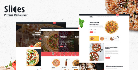
Download Now Slices - Pizza Restaurant WordPress Theme - WPCroc.com
Download Now Slices – Pizza Restaurant WordPress Theme – WPCroc.com
[ad_1] DOWNLOAD FOR FREE
LIVE PREVIEWBUY FOR $29

Slices – Elementor-based pizza restaurant WordPress theme. Slices is a clean, premium and modern WordPress theme that can be used to create any site for multiple scenarios. Some of the sites that Slices can be used for are: Restaurant blogs, restaurant websites, pizzeria and much more Slices comes with all the files you need to create your…
View On WordPress
#fast food#food delivery#food truck#nutrition info#order hours#pizza#pizzeria#product addons#quick buy#quickview#restaurant#street food#sushi#taco#wordpress#wordpress plugins#wordpress themes
0 notes
Photo

quick view of hair of different inches 🥳💍 Only tell me which color you want, I will make you satisfied with your choice 💁♀️ 👉🏻 100% human hair, no synthetic inside 👉🏻 100% remy hair, no tangle, no shedding, one side from top to bottom 👉🏻 Very shiny, silky and soft 👉🏻 Various shade color to choose 👉🏻 High standard quality with wholesale cheap price ---------------------------------------------------------------------------- 🎺 For more information and better price, please contact me WhatsApp/iMessage:+8613569459523,,.Text +13609727856 .. #quickview #differentinches #blondehair #613wig #viyacatalina #viyahair #wig4sale #wigonhand #wigonsales #dontmissout‼️ #straighthairstyles #bodywavehairextensions #healthyhair #nucequality #nicequality #goodhairday #goodhaircuts #magicofhairoiling https://www.instagram.com/p/CEzNOH3HOFU/?igshid=1un6re2u97x91
#quickview#differentinches#blondehair#613wig#viyacatalina#viyahair#wig4sale#wigonhand#wigonsales#dontmissout‼️#straighthairstyles#bodywavehairextensions#healthyhair#nucequality#nicequality#goodhairday#goodhaircuts#magicofhairoiling
0 notes
Video
Marvel Legends Black Panther/ Infinity War/ Quick View!!
#blackpanther#T-Chala#InfinitWar#Avengers#Vengadores#MarvelLegends#quickview#daknockoffzone#Endgame#thanos
0 notes
