#pyrrole
Explore tagged Tumblr posts
Text
1H-Pyrrole
-- formula: C4 H4 NH
-- heterocyclic
-- aromatic
-- aromaticity leads to partial bonds through the 5-carbon ring
-- colorless
-- liquid at room temperature
-- darkens upon exposure to air
-- purified by distillation
-- volatile
-- has a nutty odor
-- weakly basic
-- weakly acidic at the NH position
-- has a dipole
-- also called -- pyrrole -- azole -- imidole
#organic chemistry#ochem#o-chem#o chem#ochem 1#ochem 2#organic chemistry 1#organic chemistry 2#mcat organic chemistry#orgo#reactions#orgo reactions#chemical reactions#orgo mcat#mcat orgo#ochem reactions#studyblr#pyrrole#azole#imidole#1h-pyrrole#1-pyrrole#1h pyrrole#1 pyrrole#aromatic chemicals#organic chemicals
5 notes
·
View notes
Text
In furan, one unshared pair of electrons of the heteroatom lies in the unhybridised 2p orbital and is a part of the π system (figure 16.35).

"Chemistry" 2e - Blackman, A., Bottle, S., Schmid, S., Mocerino, M., Wille, U.
#book quotes#chemistry#nonfiction#textbook#furan#electrons#heteroatom#hydrocarbons#pyrrole#aromatic#benzene
0 notes
Text
ok i've been thinking about how to answer The Color Asks for so long now. Once I start talking about colors I never stop, it seems. This is just me attempting to explain my personal thought process and not any universal rules or anything like that.
None of this is going to look very realistic at all. You need to exaggerate a little. That being said, having fundamental knowledge on how shadows and ligh tsources work is very useful. Know the rules before breaking them and all that.
Boiled down to its basics, what I think of is: if a lightsource is cold toned, make the highlight bright blue. if a light source is warm, make the highlight bright orange. Then contrast the light with a complementary shadow color that does not compete for dominance with the light. Or alternatively make the light source more neutral with a complimentary tone for the shaded areas and then add a highly saturated color in the deepest shadows. Having both a highly saturated light source and a shadow color will compete with each other, instead choose one to be the dominant and one to be the um. submissive i suppose.
Just using a random doodle from my sketchbook for the purpose of throwing some color on:
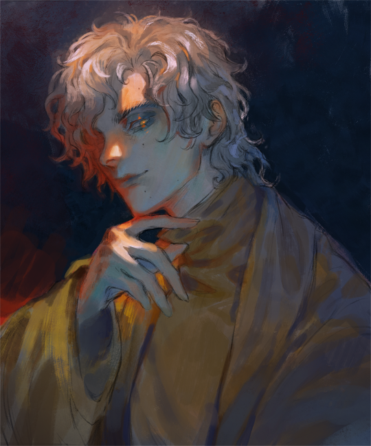
^^^ Here the midtones and the areas in the shade are predominantly of a low saturated cool blueish tone, while the highlight is stark and warm with orange and red light bouncing off. The orange and red hues you often see in skin that is lit by a strong light is called subsurface scattering (sss), one of the most important concepts in art IMO. It livens things up so much.

^^^Opposite from image 1, here the shaded area is a saturated golden color while the light source is a dull blue with hints of more vivid blue throughout. the blue balances the strong yellows and browns. Since the shaded area is bigger than the highlighted area, the subject matter could look quite monochromatic without the blue hints.
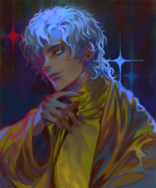
^^^Get wild with it. Lets say your highlight is blue toned: instead of just using a blue, introduce purple, teal, turquoise, ultramarine, cyan, etc around where the light is hitting. Add several light sources in different colors, make it not make sense, get crazy.
Though what is important above all else is that the image reads clearly. Unless you're doing abstract art then you'd probably want the audience to understand what they're looking at. That's where values come in, probably the number one cause of confusing pieces of art. If you can turn the painting black and white and still see the subject matter clearly then the values are good.
I find that i love using colors that most people find garish, especially when they're on their own, for small highlights and points of interest. When paired with other more neutral colors, a bright orange or a chartreuse etc can really brighten up a painting. And colors are never what they seem, the human eye will interpret colors differently depending on what color they are next to. Make full use of this.
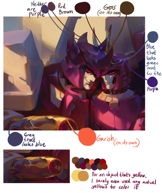
Hope this long ass post helps anyone who is struggling with color, I know I used to struggle severely myself xoxo
#my art#long post#recovering from playing dark souls 2 for like 20 hours the past few days#i hate bitches who are like 'colorpick from my fursona ref if u want to draw her! do not get her colors wrong!'#maybe that would work if the fursona is always going to be standing in a white void but environments are going to change the colors#i also hate bitches who want to say that there is an objective worst color#there isnt. green gold/chartreuse/raw umber/pyrrol orange etc has done more for society than colorhaters ever will
344 notes
·
View notes
Text

photography is hard actually | watercolor sketch, 5.5 x 8.5” pigments py110 po73 pr101 pb60 on my favorite shitty paper. inspired by my vrchat photography but not referenced
#mx kit chimera#furry art#watercolor sketch#anthro art#vrchat inspired art#very next post after Cool Gamut Forever is me breaking out the iron and pyrrol but thats a kit chimera ig
6 notes
·
View notes
Text
(deepest sigh imaginable) I bought more watercolours
#But hey I'll finally have a more neutral red#so I don't have to mix Pyrrol Orange and Alizarin Crimson every single time#it was a long time coming#also got some cool metallic copper paint#since my gansai set may have some silver and gold but it doesn't have a copper#and I think I'd like to try incorporating it#also got a new kneaded eraser since I left mine at Domi's place#Domi if you're reading this you can keep the eraser it's still mostly fine and you need a new one#I'll just take back the little case it came in if you don't mind#since they don't have them atm >:(
2 notes
·
View notes
Text
REVIEW: DANIEL SMITH Extra Fine Gouache Primary Mixing Set
REVIEW: DANIEL SMITH Extra Fine Gouache Primary Mixing Set - #doodlewash #WorldWatercolorGroup #gouache @DANIELSMITH_ART
Did you know DANIEL SMITH now makes gouache? I was thrilled to receive the DANIEL SMITH Extra Fine Gouache Primary Mixing Set, which includes Hansa Yellow Medium, Pyrrol Red, Ultramarine Blue, and a bonus tube of Titanium White. Do you have a desert island palette? You know, those colors that you’d definitely need if you were ever stranded on a desert island. I have a wide range of watercolors,…

View On WordPress
#Daniel Smith#featured#gouache#Gouache set#Hansa Yellow Medium#Lamp Black#Life Imitates Doodles#Primary Mixing Set#Pyrrol Red#Sandra Strait#Ultramarine Blue#watercolor#watercolour
2 notes
·
View notes
Text


Compounds :)
#my post#lab crimes#first one is a (very impure) pyrrole#that's why it is such a pretty color after purification it was a kind of white paste#the second one is an indole :)#i like indoles :) they're present in tyrian purple according to my teacher#okay just looked it up to check if i was remembering right#and apparently you might be able to synthesize tyrian purple with e. coli??? hello???#many tags sorry#i've been meaning to make a sideblog to talk about this stuff at length but oh well
1 note
·
View note
Note
I wonder what Dee is up to.
Right now he's trying to convince Pyrrole to go to sleep in her basket, but she's throwing one of her usual tantrums. Sometimes feels like I have a toddler and not a Toxel… and I have to compliment Dee for the patience he's showing with her.
I usually give up after a few minutes and let her keep playing for another hour or so, or I put her on my lap since she usually falls asleep when cuddling against me. But I can't always "spoil" her by letting her do what she wants and she should start to get used to sleeping alone...
Anyway, I'll go check on them in a bit just to make sure everything is alright.
#prof-oleander#oleander answers#oleander's pokemons#Dee the Audino#Pyrrole the Toxel#pokeblog#pokemon ask blog#pokemon professor#pokemon oc#pokemon
0 notes
Note
Hi Nic!! What's the thing you most look forward to doing when you're drawing/painting? I've never touched a paintbrush in my life, sorry if that's a super broad question. But say, your eye watercolours- is it trying to reproduce the tones with a limited (at least to a digital artist) palette? The initial drawing stage? Painting in the wispy lashes and brows? It all seems like magic to me!!! 😍
Hello I apologise for the late reply! Race week was busy, and I wanted to give your lovely message the care it deserves (& also I just love talking about watercolours)
That's a hard question! I really enjoy the process as a whole (except when I am complaining about it, which is an important part of the process), especially my eye paintings because they're so intuitive to me by now.
But, a few parts I really enjoy are:
1. Choosing the palette — both the actual paint palette I'll be using (I have so many), and the palette of usually 2-6 actual paint colours I'll be mixing my colours from. I'm a bit of a pigment nerd, so figuring out which paints are gonna have the perfect properties (granulation, staining etc) and mix the colours I want very enjoyable
2. The first wet wash, normally working wet-in-wet (applying diluted paint to already wet paper), where the goal is to simply place your colours in the approximate areas they should be, and let the watercolour work its magic.
Here's a couple WIP shots of my Yuki eye, in both that initial stage and the one I'm about to describe below:
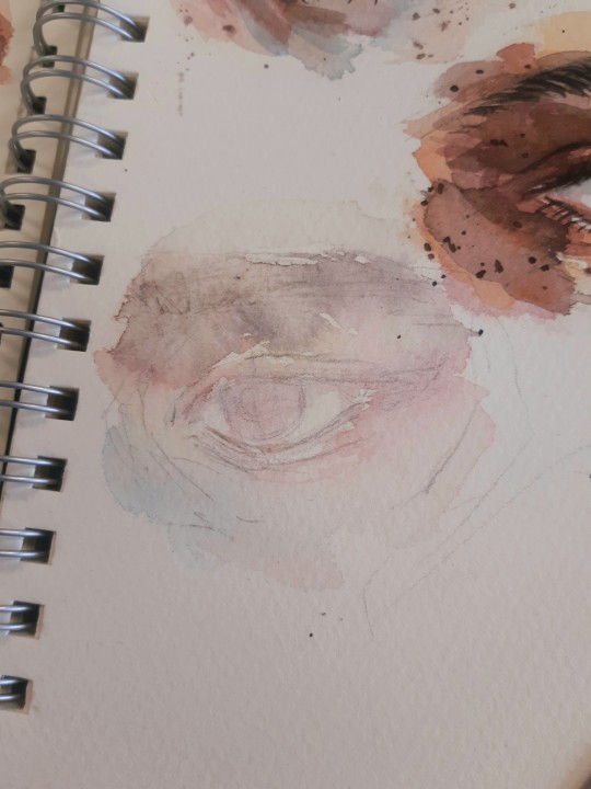
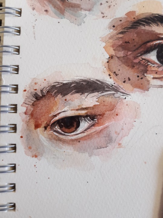
3. Getting the darkest darks in, and all of a sudden, just like magic, it becomes an eye! This is normally the third layer out of an approximate 4, and whilst I try to save the individual brow hairs and lashes until that final stage, I'll often mostly block them in here. An artist I follow on youtube, Arleebean, says often that if you feel your painting is going through the Ugly Stage, you've probably lost your values and need to get the (relatively) darkest darks in to bring it back to balance. It's a rule I live by, and that's what this stage is to me. I also get any freckles/spots/splatters in at this point, which is very fun to do too!
I hosted a watercolour workshop on eye paintings back in 2022 (and have another planned for this year), and here's a step-by-step I made of the first four stages (sketch, wet wash, mid tones, darks) in preparation for that. The final step after that would be, as you mentioned, any fine eyebrow hairs and eyelashes, which I think you can tell it's missing here

4. And possibly the stage I get most excited about, from about the middle of the painting onwards if it seems to be going my way, is posting it in the group chat or on here and watching my fandom friends and mutuals yell about it :)) Big fan of that, even if I am usually terrible at replying to nice comments :')
Here's a selection of older eyes I painted again as workshop examples, all using a limited palette of four colours (quin gold hue, pyrrol red, ultramarine, burnt umber)
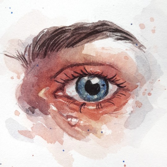
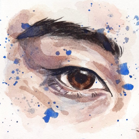
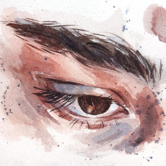
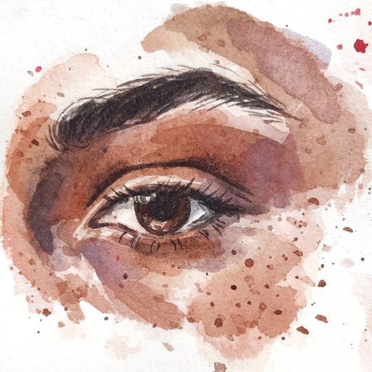
+ a selection of more recent eyes:
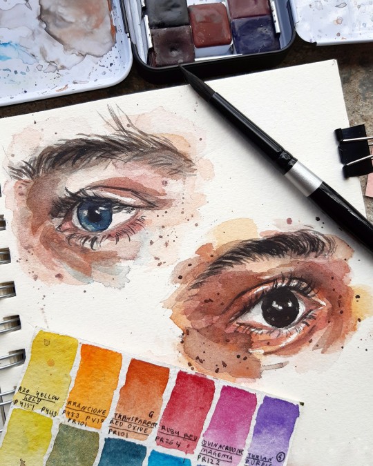
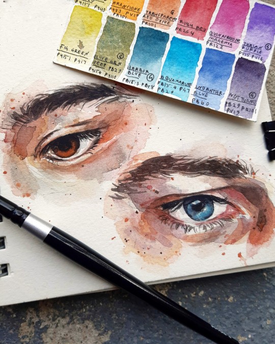
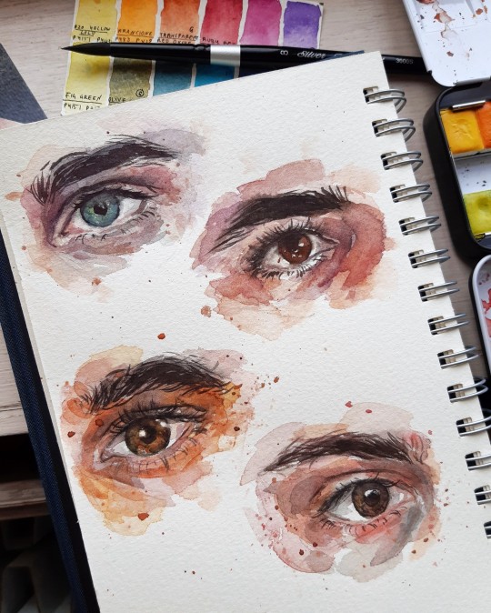
Thank you so much for the lovely message! I adore your art (& seriously, if you're ever in the mood for an art collab or something, you know where to find me), so I'm glad you enjoy mine too ☀
44 notes
·
View notes
Note
what are your favorite colors?
As a painter I can only answer this in the most pretentious way possible sorry
Pink: quinacridone magenta. That color fucks
Red: love me an ochre or natural red earth pigment, OR, pyrrole red
Orange: big fan of quinacridone nickel azo gold (rip)
Yellow: I'm partial to a school bus yellow, any kind of rich warm yellow (but I also love a cool, lemony yellow sometimes)
Green: every green is beautiful but my favorite is the color of a Pacific green tree frog
Teal: I'm putting this as it's own color because it feels like it deserves it. the direct halfway point between blue and green is my wife
Blue: anthraquinone blue (a dark warm navy) or Payne's grey (not that grey, more like the deepest bluish color of a thunderhead)
Purple: dioxazine purple. This bitch is so dark it's basically black, a dominant purple, it's pigments turn anything purple, Mommy Purple
57 notes
·
View notes
Note
what are porphyrins?
WELL.
They're heterocyclic (ring compound with at least two different elements in the ring), macrocyclic (ring compound with =/>15 atoms in the ring), organic (has carbon) compounds that are made of four modified pyrrole subunits, of course! They look like this:

And they're the reason why plants are green, why your blood is red, and why they're both able to transfer, process, and use oxygen!
7 notes
·
View notes
Text

Applying green chemistry principles to iron catalysis
At the Leibniz Institute for Catalysis in Rostock, Dr. Johannes Fessler has developed new methods for the synthesis of drug precursors using catalysts made of iron, manganese and cobalt. Each of these three chemical elements has the potential to replace a number of noble metals that are commonly used in organic chemistry to catalyze fine chemicals. Platinum and palladium, for example, are expensive due to their rare occurrence, their extraction is costly and they release large quantities of the greenhouse gas CO2. One of the goals of "green" chemistry is therefore to dispense with such noble metals in organometallic catalysis in the future. Johannes Fessler gained his findings as part of his dissertation, which he defended in January. He has reported on it in Chemical Science, together with his doctoral supervisor Prof Dr. Matthias Beller and his research group leader Dr. Kathrin Junge. For example, you can read how a complex active ingredient candidate based on pyrrole, a common drug precursor, is created from "simple starting materials" with the help of an acid-tolerant homogeneous iron catalyst and at room temperature.
Read more.
24 notes
·
View notes
Text
Plein Air #4. Nisqually Wildlife Refuge 01. Nisqually Wildlife Refuge, Washington. Gouache. October 11, 2024.
Tried out my new Plein Air set up. Made popular by James Gurney, this one was made by TaylorSeamountShop (Etsy); it’s the only version I’ve found with a removable back support for larger paintings. This worked great! Loved it.

One up: The set-up worked great. Built-in magnets kept the pallet (metal pencil case) and water cup (small tin can) in place. Easy and functional.
One improve: Ok on the painting, also first time trying to paint like this. Spent way too much time putzing on the block-in. Half the painting is in low tide, the other high tide (and I didn’t even notice till posting it).
Colors: titanium white, yellow ochre, burnt umber, cadmium yellow light, pyrrole red, ultramarine blue.
2 notes
·
View notes
Text

As soon as the temperatures rise above 25 degrees, I get the urge to paint cacti 🌵🕊 And I have to say I'm absolutely in love with how this turned out 🥰💙
Once again, I only used my Van Gogh paints (Pyrrole Orange & Dusk Pink for the flowers, Davy's Grey & Dusk Green for the main cacti & Prussian Blue & Pyrrole Orange for the background) & will probably forever be impressed with how much you can do with just a few colours 😬🙃
#watercolor#painting#drawing#cactus#cacti#nature#summer#art#artist#artists on tumblr#artblr#art blog#traditional art#watercolour art#artwork
15 notes
·
View notes
Text

-Epicycles- 2023
I was attracted to this composition by the way the sparse regular wave circles were overlaid with lower amplitude oscillations as the wave rolled along the irregular shore. And here we are reminded of the coastline paradox, which becomes infinitely long with the closer you approach it.
But really the only point of this piece was to use up the remnants of pyrrole orange on the palette. Wet-in-wet practice is always good, too.
#Watercolor, 23x31 cm
3 notes
·
View notes
Text
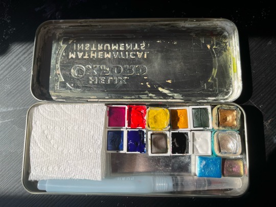
i don’t think i’ve posted much art here but my reorganized watercolour palette makes me so happy :)
(l-r: winsor and newton quinacridone opera gouache, holbein pyrrole red, beam paints fall poplar yellow (hansa), etchr just yellow (cadmium), etchr green that is gross (seriously etchr paints are not worth it I got these for free), beam paints gold, etchr cobalt blue, holbein phthalo blue red shade, etchr burnt ochre, holbein peach black, holbein titanium white, beam paints shell (i bought it when it was called pearl), stoneground hudson’s bay blue, and a little quarter pan I got as a gift from an Etsy store i can’t remember the name of for the life of me but the paint is called scheherazade, + koi water tank brush)
#june.txt#artists on tumblr#seriously the etchr green is actually really gross looking idk why#i LOVE peach black. also beam has such lovely paints#I’ve had that gold for YEARSSSSS#they’ve also switched to paper paint pans to be a lil more sustainable than beeswax#love them#anyway
9 notes
·
View notes