#production code
Explore tagged Tumblr posts
Text
Excerpt from a 1972 interview with Joan Blondell done on the set of Banyon (1972-1973). Taken from Conversations with Classic Film Stars: interviews from Hollywood's golden era (2016) by James Bawden and Ron Miller.


#joan blondell#james cagney#jimmy cagney#broadway#hollywood#old hollywood#classic hollywood#1930s#warner brothers#warner bros#1931#roy del ruth#Blonde Crazy#hays code#production code#censors#improv#ad lib#friendship#love#comfortable
117 notes
·
View notes
Text
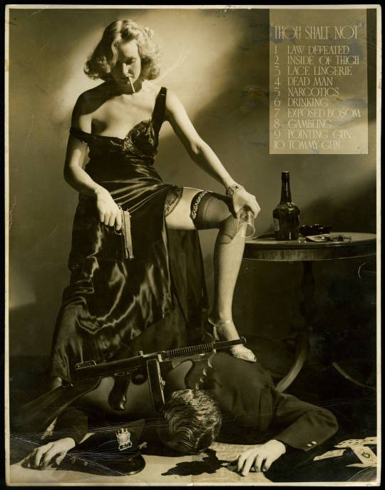
Thou Shalt Not,
photograph created by Whitey Schafer (1902/3–1951) in 1940 to protest the Hays Code.


#the Hays Code.#hollywood#old hollywood#pre code#code#film#films#movies#classic films#photo#photography#production code#censorship
3 notes
·
View notes
Photo
Although the Production Code (aka the Hays Code) was adopted in 1930, it was largely ignored by the studios. The code was amended in 1934 and required all films released on or after July 1st of that year to obtain a certificate of approval from the Production Code Administration before they could be publicly screened.
Wonder Bar was released 31st March 1934, three months before the enforcement of the code.
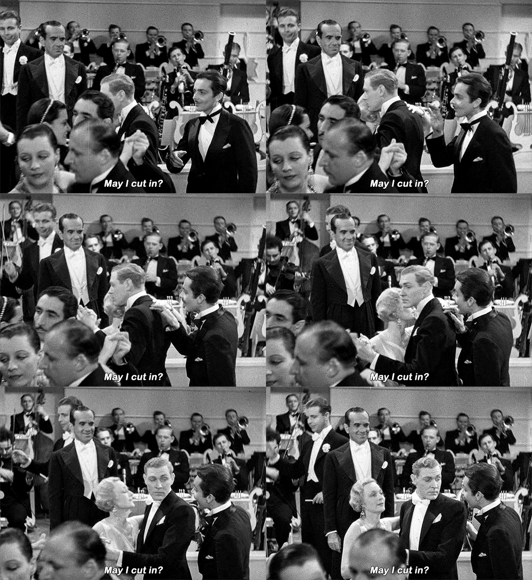


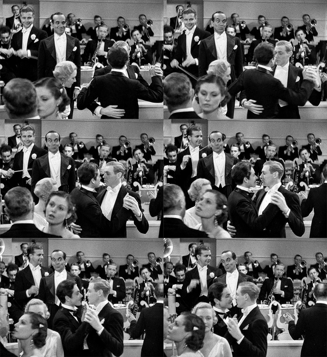
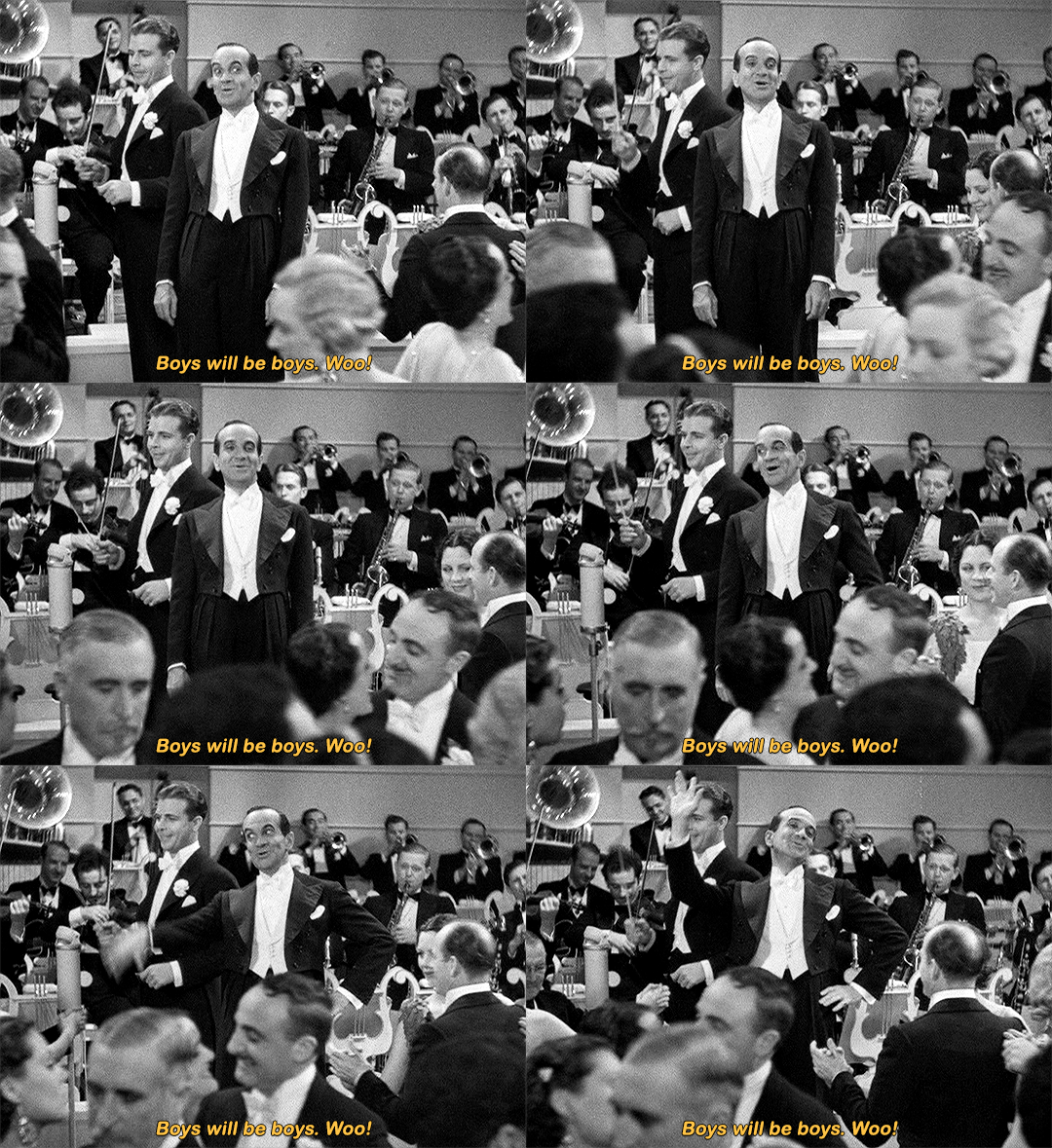
WONDER BAR (1934) | dir. Lloyd Bacon
“The other [scene that stands out above the rest] involved a handsome man, asking a dancing couple if he could cut in. The female partner, expecting his attention, agrees, only to see him dance with her male partner. Jolson then flaps his wrist and says, “Boys will be boys. Woo!”. This scene almost caused the Production Code to reject the film, and was featured in the opening scenes of the documentary film The Celluloid Closet (1996).”
78K notes
·
View notes
Text
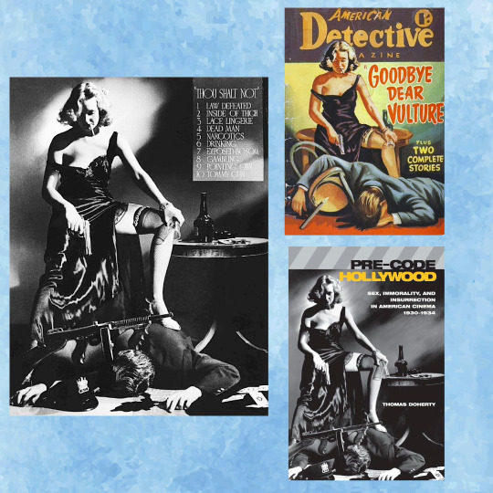
Swipe File 22: "Movie Dos and Don'ts"
The Production Code Administration's new movie content restrictions were parodied by Hollywood photographer A.L "Whitey" Schafer in his famous "Thou Shalt Not" (various cited as 1934 or 1940 -- it also appeared in "Life" magazine October 28, 1946). An unidentified artist recreated this for the cover of "American Detective Magazine" (Australia, 1952), and the cover of Thomas Doherty's 1999 book "Pre-Code Hollywood" re-used the original image.
0 notes
Text

best summary of this film ive ever read
#if you watch it & can't understand what their conflict is if theyre both so super-hot. the reason is in the above tweet#elizabeth taylor#paul newman#cat on a hot tin roof#queer#gay#lgbt#queer characters#hays code#classic movies#old hollywood#classic hollywood#1950s#vintage#photography#production still#richard brooks#tweet#queer media#book adaptation
2K notes
·
View notes
Text
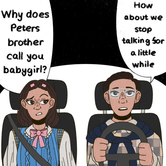
I am not immune to funny crackships.
+ Bonus
#*falsettos your chasitys*#this started out as a ‘aha yea they fucked once in highschool’ joke for me how did I end up here#it went from ‘Teddy: yea man it doesn’t count if your socks are on’ to queer teen situationship in the 90s angst with religious overtones#I would like to blame everyone who has made holybastard fanart/fanfics for converting me#I don’t see them as a long term relationship but more on an active affair between two old high school ‘friends’#I drew these while listening to The Last Dinner Party ans now I can’t stop thinking about holy bastard to some of their songs#‘picture me in bed- under your crucifix- under your long black hair- I’ll see you on Sunday’ are actual lyrics how can I not-#I just impor you to listen (there only 5 songs as of now) and do the same- ESPECIALLY SINNER ITS SUCH A MARK CODED SONG#who would have figured the queer ex religious person would be a sucker for queer relationships with religious themes#grace chasity#peter spankoffski#pete spankoffski#mark chasity#holy bastard#starkid#team starkid#starkid productions#starkid fanart#starkid animation#npmd#nerdy prudes must die#nerdy prudes must die fanart#npmd fanart#npmd starkid#hatchetfield#hatchetverse#hatchetfield universe#fanart#my art#my animation
1K notes
·
View notes
Text


12/100 days of productivity!
I've got to remind myself to not lose hope...however difficult that might be :)
Log:16/12/24
#review_7
#get LCA Material
#read 30_1st thing in the morning
#CEEMDAN _mechanics
#substack post
#studyblr#100 days of productivity#stem academia#study space#women in stem#study motivation#study blog#programming#studyspo#coding#study inspiration#study desk#study aesthetic#studying#study notes#university student#student#studyabroad#realistic studyblr#stemblr#grad student#post grad life#gradblr#graduate school#grad school#engineering#self care#self love#december#digital declutter
221 notes
·
View notes
Text

noth1ng crazy has happ3ned
[alt version under the cut]
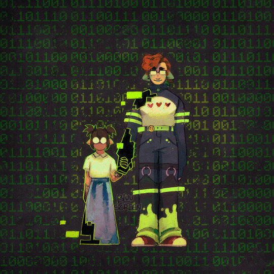
ended up liking the blank background more buuut this is also cool
#.png#qsmp#juanaflippa#codeflippa#qsmp slime#charlie slimecicle#fanart#the binary text in the alt version translates to:#‘everything is normal everything is fine. i worry about nothing because nothing’s on my mind.’#it’s from m.arble hornets i just like that quote#also tried to make it more clear this time that the black and green scales are just what juana normally looks like#not a product of the code
1K notes
·
View notes
Text

I don't know the source of this image, but it was posted in a MLP Facebook group and appears to be early material in designing G3 MLPs, specifically their colors.
It's interesting to see what changed! For example, on this chart Minty's hair is still green, like in her early prototype image. Applejack was at one point going to be spring green with white and pink hair! Some of the names were changed or never used, too. Sunny Daze was originally Sundance!
The codes like 245c are Pantone color codes which you can look up here. I think 'pearl' refers to the ponies' bodies being pearlescent.
Eight numbers are circled, and they coincide with the original eight G3 ponies. Although others of these ponies would appear in the toyline later.
190 notes
·
View notes
Text
“turns out i have a thematic which is tight relationships between brothers with an unstated homoerotic subtext” - eric kripke
“boy meets girl, boy loses girl, boy gets girl back. it was that.” - bob singer (on sam and dean’s breakup in 1.11 scarecrow)
“i sometimes say it’s the epic love story of sam and dean” - sera gamble
they really said spn is the wincest show
#also i love how the writers always hint that sam is a woman#once again reminding that it was done on purpose and female coded sam isn’t a product of samgirls’ imagination#sam winchester#dean winchester#wincest#samdean#spn#anti destiel
316 notes
·
View notes
Text


Silver Screen magazine, April 1938
#hays code#hays office#production code#1930s#1938#irene dunne#douglas fairbanks jr#joy of loving#joy of living#hollywood#old hollywood#classic hollywood#vintage hollywood#silver scren#silver screen magazine#movie magazine#gosssip column#magazine#bts#behind the scenes
10 notes
·
View notes
Text


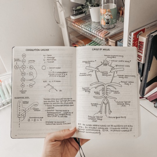
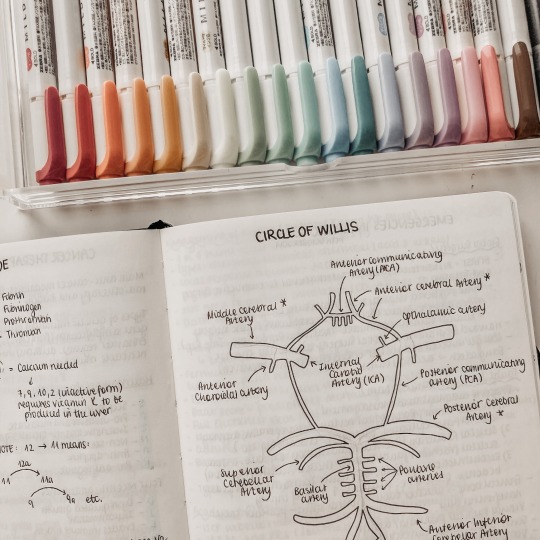
16.12.2023 // day 2/100 of productivity - I completely forgot about doing this 100 day challenge (oops) so I'm starting it again now since my exams are coming up in just a few months! I spent the day working through some of the harder topics and drew out some diagrams to help me understand them.
#mine#studykween#study#notes#studyspo#medicine#studying#studyblr#studygram#photo diary#100 days#challenge#100 days of productivity#100 days challenge#100 days of studying#100 days of code#100#days#challenges
624 notes
·
View notes
Text

Why does my desk always get so messy when I'm doing computer networks lab work lol
#dailyfoxposts#studyblr#codeblr#studyspo#study#note taking#compblr#coding#comp sci#productivity#chaotic academia
116 notes
·
View notes
Text
“We want more morally grey female characters” motherfucker you couldn’t even handle Teresa
#m!Teresa betrayed everyone she loves and resigned herself to a life of loneliness for a chance to save everyone including one of her friends#b!Teresa made Thomas feel sad so the people who literally indoctrinated her into their beliefs since she was five wouldn’t kill him#excuse her for for being a product of her environment 🙄#teresa agnes#the maze runner#the scorch trials#the death cure#the kill order#the fever code#tmr teresa#teresa tmr#tmr#maze runner#shut up sparky#TERESA DEFENDER UNTIL I DIE
602 notes
·
View notes
Text
Favorite Visual Storytelling of 2024: Cdrama Edition

Although I spent the better part of 2024 complaining about the state of Chinese dramas, one thing I did appreciate seeing in this year's lineup was all the lovely cinematography and production design on display. Not only did these visuals look great, but they were meaningful to the story.
In no particular order, here are my top picks of the year...
Favorite Use of Color: The Double

Evocative and theatrical, The Double's cinematography definitely caught people's attention, splitting viewers into those who liked it and those who thought it was too much.
But what always struck me as refreshingly unique about the drama was its careful use of color . Check out how the following scenes have a completely different feeling because of their color palettes:


Whether it's the fairytale romanticism of a white blossom forest or the queasy yellow and pink of a brothel, the show's colors always give us a sense of mood (and character) without needing much exposition. Really efficient storytelling!
Favorite Production Design #1: Fangs of Fortune


If I included screenshots of all my favorite sets and costumes from my next pick, we'd be here all day.
I've always loved the energy and symbolism of Director Guo Jingming's visual storytelling, but his production design team in Fangs of Fortune really outdid themselves. The scale, shapes, and most importantly texture of each set gives the show a sweepingly escapist quality that we rarely seen in Cdramas. It is true high fantasy come to life, asking us to reflect on what it means to be human through the eyes of those who are otherworldly.
Favorite Use of Production Design #2: To the Wonder


I was uncomfortable with the tacit political messaging of To the Wonder but the amount of care and detail that went into its production design is undeniable. People seem to mostly praise the drama for its idyllic on-location shots but I think it's the prop design and interiors that really sing because they provide insight into lives we rarely see represented on screen.
Favorite Use of Light: Love in a Dream


When I see dramas like Love in a Dream, it makes me wish the industry would just throw money at all the talented and creative visual directors in the short drama circuit. A masterclass in contrast, this drama is absolutely gorgeous, and its dramatic use of chiaroscuro lighting makes it look like a cross between a Renaissance painting and shadow puppet show.
Was I always able to follow the plot? No, but who cares when every other scene looks like art.
Favorite Use of Camera Language #1: Tender Light


Tender Light is a great example of using cinematography to establish the right tone for a story.
The story follows a woman being accused of murdering her abusive husband and the camera language actually mimics the social fallout of his death. Look at how it uses dirty framing, overhead shots, tracking, etc. to give the story a voyeuristic and surveillant feeling. It's like we (the audience) are being forced to invade the privacy of these characters, and in doing so, the show implicates us in the nasty gossip that surrounds our FL as much as the local townspeople spreading it.
Favorite Use of Camera Language #2: Regeneration

From the opening shot of Regeneration , we learn that this is a world where it's difficult to distinguish reality from its equally compelling reflection. The drama is all about the stories people weave and the show plays with subjective cinematography to make us question what we perceive as the truth.
Runners-Up

I dropped Blossom before I could get a sense of its visual storytelling, but the drama has Director Zeng Qingjie's signature dreamy, romantic visuals . Bonus: Li Yunrui looking hot in his gray wig.

Riverside Code at Qingming Festival didn't quite work for me as a case-breaking story but the amount of research they put in the costuming and prop design is incredible. I hope Director Yang Fan gets more opportunities to direct big budget period dramas because his attention to detail is immaculate .
--
And that's a wrap!
What was everyone else's favorite Cdrama visuals of 2024?
#cdrama#end of year wrapup#cinematography#production design#meta#the double#fangs of fortune#to the wonder#love in a dream#tender light#regeneration#blossom#riverside code at qingming festival
62 notes
·
View notes
Text


25/100 days of productivity!
To all the people who didn't go home for the holidays and walking around an empty campus or library... I see u... we exist and its totally ok... sending love
Log: 29.12.24 🎧Yung kai_blue #organize all my notes #go outside #proofread DP #Link all databases #Fix an appointment #gather new material
#studyblr#100 days of productivity#stem academia#study space#study motivation#women in stem#study blog#studyspo#programming#coding#study hard#study tips#student life#studying#student#realistic studyblr#stem student#stemblr#study aesthetic#study desk#study inspiration#study notes#study with me#studyblr community#studygram#studyinspo#university student#stemblog#stem#engineering student
175 notes
·
View notes