#product illustration
Explore tagged Tumblr posts
Visit Tumblr Blog
Explore Tumblr blogs with no restrictions, modern design and the best experience.
Last Seen Tumblr Blogs


Fun Fact
130K people were victims of a chain letter scam that affected Tumblr in May 2011.
Text
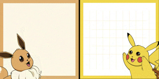
For archiving reasons ~ I'm just sharing a couple pics from my Eevee & Pikachu blocknote designs for EgyCon and artist alleys.
--
The blocknote is a double-design of 40 sheets. Created in Affinity Designer which I HIGHLY RECOMMEND as an Adobe Illustrator alternative.
Before cutting:
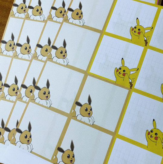
Tester sample to make sure the blocknote is sturdy and usable. Cutting still needs to be a bit cleaner:

Prototype packaging:

This blocknote took a ridiculously long time to create, though - so I gotta streamline my process somehow.
#pokemon#anime convention#pikachu#eevee#fanart#artist alley#product design#blocknote#stationery design#product illustration#by the way#I'm gonna do my best to glaze as much of my art and sketches as possible before uploading#so from now on#if you see artefacts and weird textures in my work#that's because I'm protecting it from data scraping#in print it will always look much cleaner
4 notes
·
View notes
Text


Eco Tote Bag-Buddha.
There is nothing more cool than being environmentally friendly! Wear this organic cotton bag with the motive of Buddha, this bag has the ideal size to help your everyday shopping, carry your books and everything you need!
Recently, I designed this Eco Tote Bag-Buddha. If you are interested, it is available in my online shop. https://pedromoyaglez.bigcartel.com
#totebag#buddha#handbag#design#product illustration#illustration#sketch#drawing#art#artists on tumblr#mockup#onlineshop#fashion#printful#bigcartel#shopping#shop
3 notes
·
View notes
Text

Fenty
#drawing#procreate#illustration#art#digital drawing#artists on tumblr#beauty products#product illustration#make up illustration#make up drawing#make up brands#fenty beauty#fenty#Rihanna#brand art#my art#paint#digital painting#foundation#blush#highlighter#lip gloss drawing
1 note
·
View note
Photo
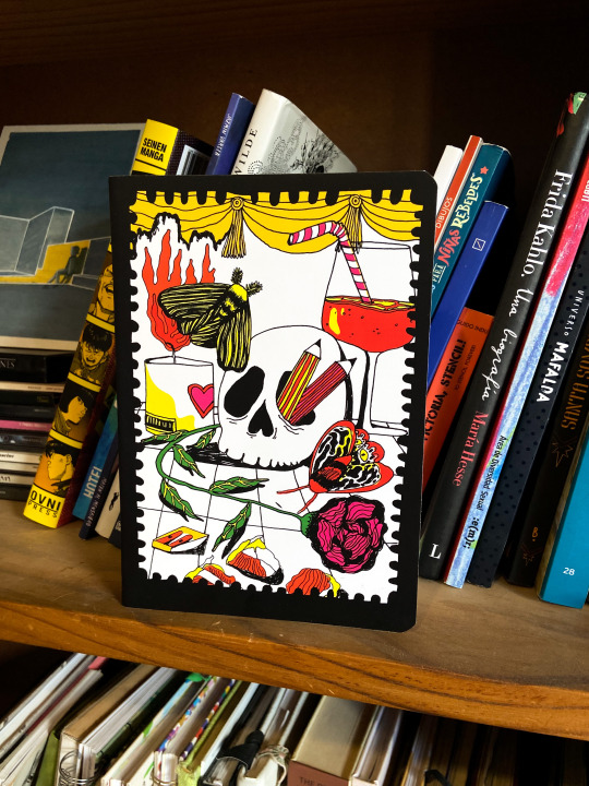

some notebook designs I made :) // algunos diseños de cuaderno en los que estuve trabajando
4 notes
·
View notes
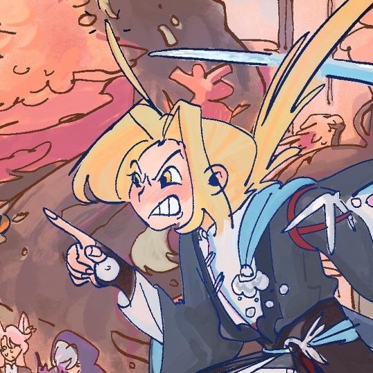
Text

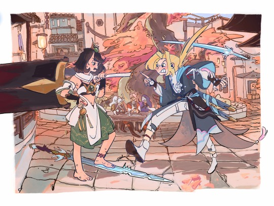
Knights of guinevere teaser is out!!
Can’t wait to see what’s in store, enjoy a crew drawing from me!
4K notes
·
View notes
Text

slept for 15 hours today and im mad about it !!!!!
#doodle#eggsdoodz#sketchbook#cute art#illustrators on tumblr#art#doodles#pencil drawing#pencil doodles#healingjourney#rest is productive#rest is important
4K notes
·
View notes
Text

Burning Bridges Matches, 2022
What do you do when you have old grudges to talk about? Write them in invisible ink and turn them into a book, of course!
This project was done in my Bookmaking course in grad school. Turned this print into a little match book, fit with striker and matches, and placed inside all my little cards of grudges. Unforgettable things people have done to me, written in invisible, heat-activated ink. I made 3 total, only burning through 2.
Colors reminiscent of risograph printing. All drawn digitally, then hand-assembled.
#illustration#illustrator#artistsoninstagram#procreate#kallieanka#art#artist#illustrationlettering#illustrationartists#matchbook#product design#product#product illustration#product art
1 note
·
View note
Text
They r goin on a date
you guys have no idea how relieved i was when episode 8 had a happy ending and now i can draw slice of life not just as a coping mechanism 🥺
#murder drones#murder drones art#glitch productions#digital art#my art#character art#md uzi doorman#md khan#md uzi#md n#serial designation n#khan doorman#artists on tumblr#illustration#comic#art#uzi doorman#md nori#nori doorman#character illustration#mour-art
3K notes
·
View notes
Text
(Sorry for long delay, second year of my third course has started so I'm busy)
Third project of my third course focuses more on designing an illustration for product: Designing a label for a beer can.
We had three 'flavours'/brands to chose from: 'Pip Squeeker', 'Rhubard and Custard' and 'West Coast IPA'. I personally chose 'Pip Squeeker' due to having better base ideas for it.
I first sketched out some basic ideas then explored more with those ideas as I experimented with media and colour options.

During the time for idea generation where we learnt about applying different thickness to linework drawn in Adobe Illustrator. I used some basic concept drawings for this experimentation.

Three ideas that I liked the most from the idea generation were refined which I explored with media. I then explored with type face that I could use and applied them to these ideas as mock ups.


I gained feedback from those around me and was able to decide on which design and type face I was going to use. I was given further feedback to fill areas of space as the chosen design has mostly white space in the background.
New concept ideas were generated before a newer design was selected to use as a base for redrawing digitally.

To redraw the final piece digitally, I used Adobe Illustrator to redraw the linework, apply colour and the text to the piece. Although I worked on the colour palette beforehand so I knew what colours I was going to be using. The design was then placed on a template mock-up that would display all relevant information.

Earlier we were shown how to add the design to a can mock-up to see how it would look on a product. I did this where I had the design be placed in specific areas to show the design at different angles.

I did get some advice where I was told that the type face I had chosen did not properly reflect what the product was so I was shown a better type face to use as well as two new layout ideas.

The two ideas were placed onto the template and I compared the two to see which idea I liked the most.
I eventually chose the second idea since I liked the placement of the text more on that one.

After finalising this improved design, I had the design be placed on the can mock-up to see how they would look.

With that being said, the improved design and the can mock-ups were the final pieces of this project.
That's all for now.
If you have any questions don't be afraid to ask.
0 notes
Text

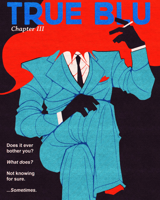

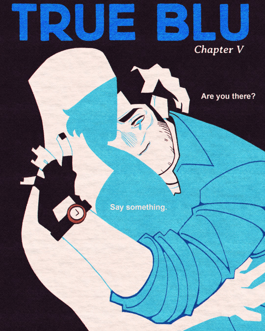
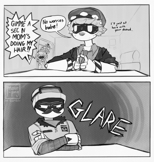
TRUE BLU - CHAPTER ART ii.-v.
the complete collection of the weekly chapter art i did for my fic true blu ꒰ᐢ. .ᐢ꒱₊˚⊹ also, idk if it was obvious before this post, but...
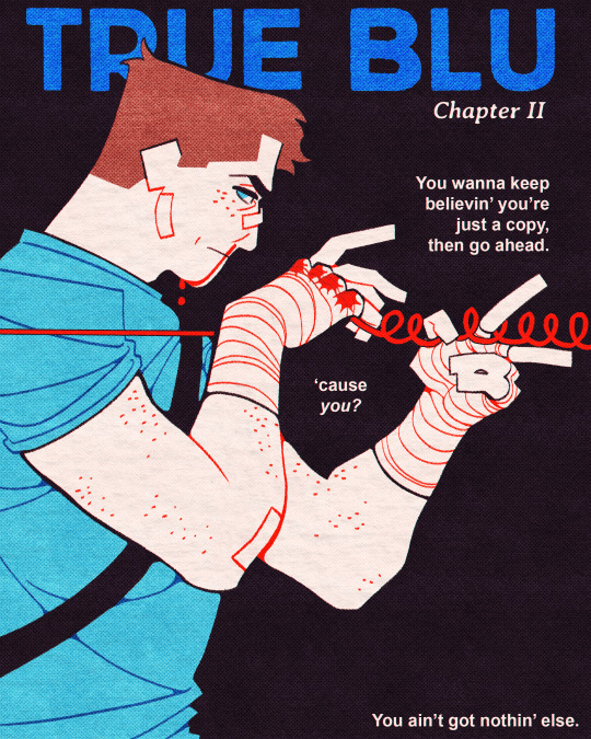
...each piece that has red in it lines up with the next ^_^ if you somehow noticed this before i pointed it out, congrats! you get a billion funny monies
#tf2#team fortress 2#tf2 sniper#tf2 scout#tf2 spy#spy tf2#scout tf2#sniper tf2#illustration#digital art#vintage#blu spy#blu sniper#blu scout#blu team#fanfiction#fanfic#artists on tumblr#mine#my writing#my art#true blu#gehehehhehehe#i hope the symbolism drives you insane. BY THE WAY#BC IT GAVE ME THE SHITS!!!!!!!!!!!#anyway production notes to come soon :3 or maybe even before this idk#im queuing this up a week in advance#merry christmas btw!!
2K notes
·
View notes
Text

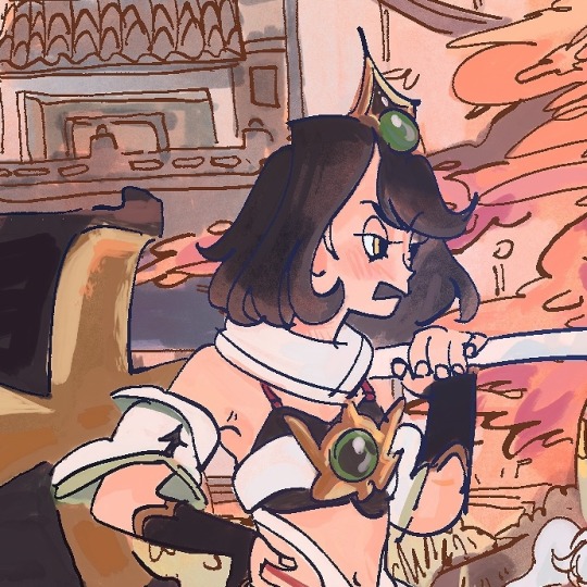
oh to be a pretty princess whos also horrors beyond human comprehension
#knights of guinevere#fanart#glitch productions#my art#artwork#art#illustration#digital art#my stuff#artists on tumblr#drawing
1K notes
·
View notes
Text
Available NOW at Howdy’s Place!
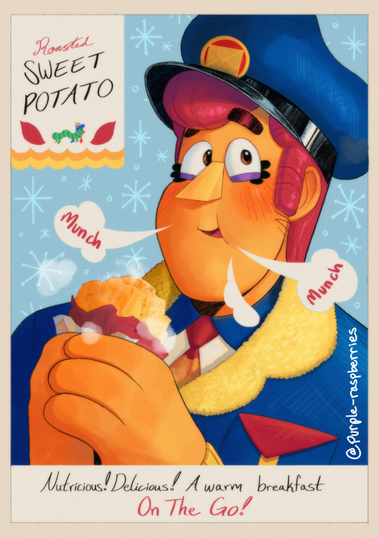
[click for better quality]
Available now as an early-morning special at Howdy’s Place! Don’t miss it!
Howdy’s Freshly Roasted Sweet Potatoes are sold only through the Winter seasons! So come down and try our mailman’s new favorite Morning breakfast!
Buy one and get one free topping (extra toppings available for purchase)!
——————————
[general time to complete: 8h 48min across 1 week]
Unedited and alt below vvvv


#Eddie is a sweet potato to me now#you can’t convince me otherwise!#this was so fun to make!#I tell you#it’s HARD to find good 1970-1980s product ads that look how I want#so I went with a more vintage look mixed with a Kellogg’s cereal look#my art#welcome home#welcome home arg#fanart#drawing#welcome home fanart#eddie dear#sweet potato#digital illustration#the gallery
1K notes
·
View notes
Photo
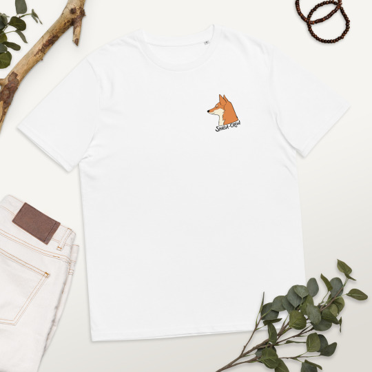
Are you a Shiba lover? If so, I designed a t-shirt for Shiba Inu lovers, be part of the Shiba -Crew and wear this unisex organic cotton t-shirt! Available in my shop🦊💚https://pedromoyaglez.bigcartel.com
#shiba inu#shiba#tshirt#design#Illustration#illustrator#t-shirt#onlineshop#logo#cartoon#doglover#shibacrew#mockup#product illustration#artwork#art
2 notes
·
View notes
Text

Cinderella gazes at her ball gown's reflection ✵ animation drawing by Marc Davis
#disney#cindrella#marc davis#animation drawing#concept art#animation#disney animation#disney concept art#animation art#art#artwork#illustration#vintage disney#production art
2K notes
·
View notes
Text
on first loves yunqing lol they are silly that's it that's the prompt anyways i think this is like the first thing i've posted here that has an actual background which is kind of insane. i think you can tell i don't draw backgrounds very often. anyways yunqing is so ponytail puller annoying each other even though they've realized they like each other core and it's satisfying my peepaw heart
bg only/closeups under keep reading
#artwork#digital art#art#hsr fanart#hsr#honkai star rail#illustration#yanqing#hsr yanqing#yunli#hsr yunli#yunqing#yunli x yanqing#yanqing x yunli#jing yuan#jiaoqiu#moze#huaiyan#big sword little sword dynamic#they are so little kids being mean to their crushes core#in the words of keebs “the perfect enemies to lovers”#i think it's so funny how the moment boomer jiaoqiu steps in they both turn to gank him because they're in the old people are uncool phase#ig they're more rivals to lovers than enemies to lovers#but i think their duel makes them enough of enemies that it counts#probably i think#anyways i actually slaved over this (it only took like 6 hours max i am exaggerating)#drawing is more productive than playing games though ig#i've actually been rotting away this summer#i'm gonna have to get back in the grindset in art school#yeah i'm going to art school that's funny huh
2K notes
·
View notes
Text

Dentists HATE him 🧑⚕️😡🔥
#my art#art#illustration#artists on tumblr#illustrators on tumblr#original art#sketch#procreate#character design#fanart#the amazing digital circus art#the amazing digital circus#tadc art#tadc#tadc fanart#tadc Caine#the amazing digital circus caine#Caine#gooseworx#glitch productions
2K notes
·
View notes