#probably in a chibi style of some sort
Explore tagged Tumblr posts
Text
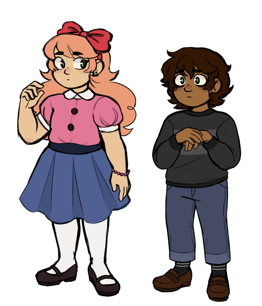
I drew this months ago but never posted it. Baby children
#my art#doodles#fnaf#five nights at freddy's#elizabeth afton#oliver afton#crying child#im thinking of making stickers of my afton designs... maybe the emilys too#probably in a chibi style of some sort#unrelated to this though lol im just thinking about it
444 notes
·
View notes
Text
Well i talk about it talk about it talk about it
The beginning of FUNKY TOWN is still stuck in my head.
❗️For commonly asked qs please see my BTD FAQ


Thanks, I'm glad my art improvement is noticeable :D I have actually KIND OF redrawn scenes before such as
and a bunch of frames from
so who knows i might do some more at some point lol!

YOU GUYS STILL SEND THEM TO ME :d

I don't actually get that many, i just tend to answer months worth all at once so it looks like a lot haha. I also don't answer a bunch of them if I've already answered something similar before or the answer is in my FAQ. Though I'm going to be honest some of the asks that get sent to me I don't think anyone expects me to actually answer, because they're just weird enough that if i turned off anon i'm pretty sure no one would be asking them.
My free time (...when I'm not procrastinating |D ) is trying to be spent on BP so I currently dont have any plans beyond the fun little doodles and animatics and stuff that I usually do. Gato is working on YKMET so if you guys like Strade then you have that to look forward to :)
(Why thank you!)
The armour follows his usual colour scheme which is gold on black.
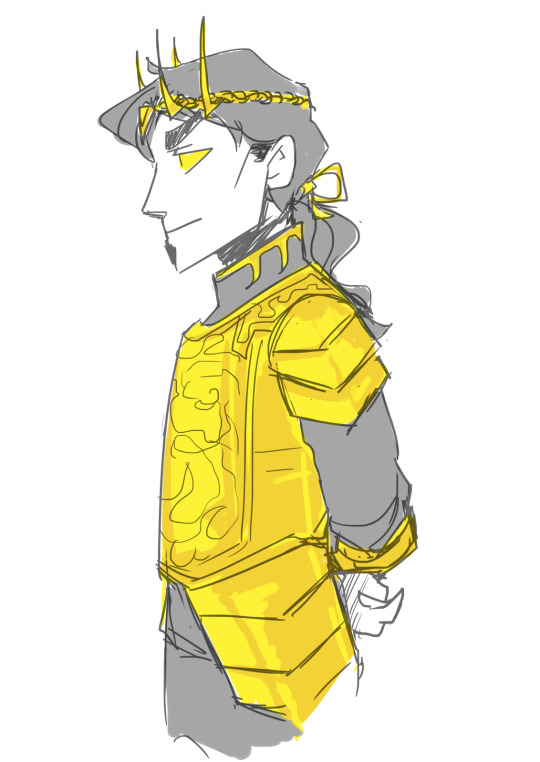
You can tell this ask is from January lol.
Thanks haha my colouring style layers colour over colour so colour over grayscale always just looks oddly muddy in my POV |D ESPECIALLY LIGHT COLOURS LIKE YELLOW.

Demons can traditionally reproduce within the same species or with a compatible species.

Psychology, Law or Politics. I think these are the top normal majors you could take where the info you learn from them could be really useful in not getting fucked over and/or fucking someone else over.
I haven't been asked to make chibis for Gato this time around so you'll probably be getting something different for your finished runs!

Demon Commons.


All demons have some sort of specific mark that they are born with (anywhere on their body). The exact reason why has been lost to time, but it often gets used for identification. Here are some of the rest of my demon characs:

Hm, if I have to consider real life anatomy (nooooooo XD) the yellow is probably his iris.
Man i've answered so many asks i sometimes only remember saying something when another asks sounds familiar lmao 🤔 Ok; Rire, as a demon of station, has been captured in the background of some historical paintings and photographs, sometimes without his knowledge but always to his amusement later when he finds out. Like just imagine you are intensely studying art history and in those paintings of events with lots of people in it, suddenly your eye happens to catch upon a tall dark haired figure wearing sunglasses from that time period somehow blending in amongst everyone else there.

He has no particular preference in this regard.

Rire doesn't have like 🤔...a set criteria as it depends entirely on certain whims; like whether he is looking for business or pleasure, what he's feeling like at the time etc. If it's purely business then there are types of people he would approach that he wouldn't otherwise if it was for mainly entertainment.
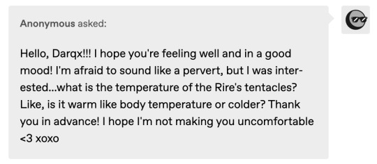
They probably average out at about room temperature - they tend to reflect environment temp a bit and the main part that's closest to his back will always be a bit warmer than the rest of the ichor.


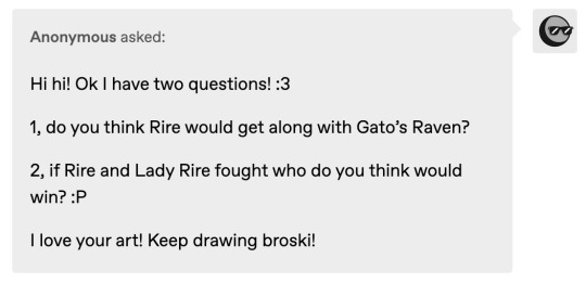
Probably not
They are evenly matched
Thanks very much! :D
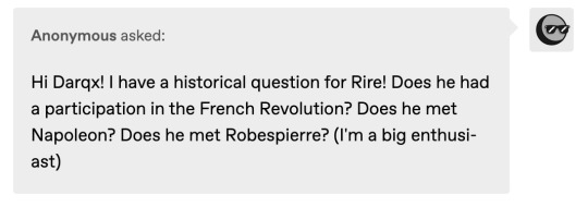
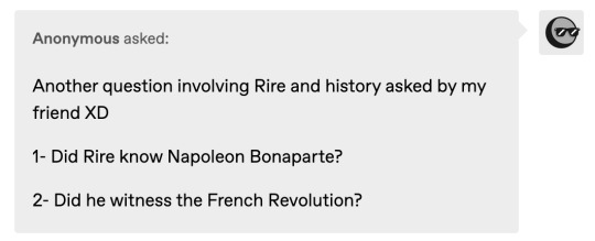
Rire has been around for a while so yes he would have witnessed a bunch of things in human history. Who he met and who he made deals with is up for debate.
He is "polite" so he would thank you, at the very least. And yes they are his signature flower lol. It wouldnt be any special..er than receiving any other flowers though to him - we are the ones ascribing the meaning to it.

Two for the price of one 🤌🏻 Also this is an insanely old ask but yes you have permission to do fancomics or whatever with him |D

Anon, considering most people know him from a weird "dating sim", I dont think this is as startling an ask as you might think haha.

if it makes you happy.

Pick a nice smell that you particularly jive with and it would be that. This is individual specific so if a whole bunch of people are around Rire they may each perceive something different.


I get asked this question a lot |D I'm gonna be real with you guys - i haven't actively thought about a canon design for his parents because i'm kind of lazy to (since right now i dont need to know what they look like). Until that happens you guys will just have to go off the vague text descriptions i've given before :p
148 notes
·
View notes
Text

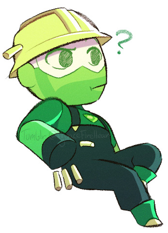
Did some fanart of @lenny-link TF2 x SU AU, 'cause I just went haywire for it :')
So have one drawing of me attempting to do a Heavy + Medic fusion (which I chose an Andalusite for), who are being lil' shits towards Scout. And one drawing of Peridot!Engineer in my more chibi-like style :]
(some small ideas I had below the keep reading line)
So, first off, I couldn't really see what gem Medic was, so I decided to just go with Red Agate. Mostly 'cause it's a gem that's a mix of red and white colors.
Now onto the lil' idea I had, which is Medic's power. Sure, it could be fun that he had just straight up healing powers (even if it's probably just Diamonds that have that power, but let's ignore that), but I thought about something else: An ability to enhance other gem's abilities. The ability only works when close to/touching the another gem, which- at the beginning- would mostly be gems that had moreso elemental, psychic-esque powers, or something else long-range rather than the gems who's prowess was mostly their brute strength or speed.
However. When fused with another gem, that enhancement ability of Medic's is way stronger. For Heavy, he will be way more physically powerful than he would be fused with anyone else. For Sniper, his arrows will not only multiply, but home towards their target or have some sort of elemental effect to it. Etc. Etc.
#Idk if I'll try drawing any other TF2 gem fusions :')#I kiiinda want to. but at the same time. it took so long trying to design Heavy + Medic's fusion o(-(#And still. a part of me isn't quite satisfied with how the fusion ended up looking orz Oh well#my art#Team Fortress 2#TF2 Fanart#TF2 Medic#TF2 Heavy#TF2 Scout#TF2 Engineer
919 notes
·
View notes
Note
I am loving your x-men art atm!! It is all so good and so cute!! Especially your chibi versions!! And I am very intrigued by your recent band au too! Logan as the reluctant yet supportive teacher is perfect! I'd love to hear more about that!! Xxxxxxx
More about Mr. Logan? Let’s see.
I think it’s a very funny idea that his backstory is the exact same despite it being an X-Men-less universe. He’s still Weapon X and did military work, it’s just that once he decided he was done with it all, he decided to become a teacher at the private school. You find this out when he’s whisked away for S.H.I.E.L.D shenanigans while the band is doing some mundane activity. Cue everyone trying to get Kurt’s chemistry grade up periodically interrupted by Mr. Logan going through actual hell.

I mentioned before that I think he knows the bass. It’s just a hobby of his, mostly to take his mind off of things, so no one else really knows he can play. Except for one specific alumni;
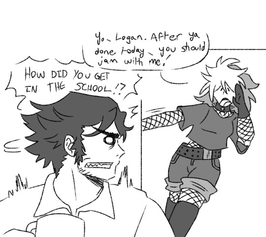
Mr. Logan actually recommended Rogue to Xavier’s mutant education scholarship after having a chance encounter with her. While she refused to take residency up in the Institute, she eventually gave into Mr. Logan’s urges to at least attend the school. This is the start of their delinquent-child-who-gets-adopted-by-the-gruff-old-man dynamic. Mr. Logan eventually teaches her the bass, and she really takes off with it. I can see her being a part of her own southern fem punk band after she graduates.
(I think it goes without saying that Rogue is the group’s vodka wine aunt that makes her occasional appearance. When Mr. Logan is preoccupied, leave it to Rogue to recklessly drive them to their gigs.)
Also, while we’re talking about the band universe, I think I figured out the eventual 5th member;
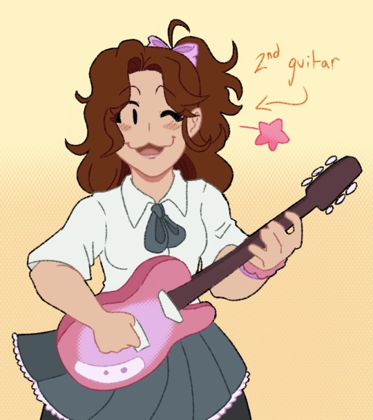
Meet Kitty Pryde, the freshmen that joins as their second guitar. She also knows how to play piano, but she prefers the mobility guitar grants her (she cannot stand still when she plays music). She probably met Kurt first in the music room while she was practicing for a piano recital. Though Kurt can recognize the musical talent she has, she can tell her heart isn’t into it. So now there’s a montage of Kurt and Kitty messing around with other instruments. Neither of them really know how to play anything besides piano, they’re just trying to see what feels right for Kitty. And that’s how she finds her interest in guitars.
I think it would actually take a while before she gets used to guitar. Hank would try to teach her, but Kitty’s learning style just doesn’t match well with Hank’s teaching style. So everyone thinks that she’s just not meant to play the guitar until some sort of epiphany happens, and suddenly she can absolutely shred.
She rounds out the group quite well, don’t you think?
#ask answered#art#digital artist#my art#marvel#x men#wolverine#logan howlett#cyclops#scott summers#storm#ororo munroe#nightcrawler#kurt wagner#beast#hank mccoy#rogue#anna marie darkholme#shadowcat#kitty pryde#light music club universe
402 notes
·
View notes
Text

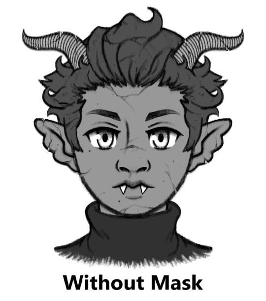
Here's my take on a Halloween Town Vidar. He's a gargoyle with a wolf skull mask.
Design notes under the read more:
I previously mentioned in my Halloween Town Vor post that when Nomura designed Sora, Donald, and Goofy's Halloween Town designs, he took inspiration from two different creatures for each of them. Sora is inspired by vampires and imps, Goofy is Frankenstein's monster mixed with a werewolf, and Donald is a mummy and invisible man. I once again took a similar approach here, though instead of using an even mix of motifs like I did with Vor's fairy + sphinx design, I went down more of a Sora route. IMO, if you look at Sora's Halloween Town design, it mostly reads as vampire despite lots of overlap between vampire and imp design elements, with the exclusively impish details really only being his imp/pumpkin mask and maybe his clawed gloves. For Vidar, he is mostly gargoyle with the wolf motif coming primarily from his wolf skull mask, but there's some overlap of creature motifs with the claws and fangs.
Now, why did I choose to make Vidar a gargoyle? Here are my reasons:
Made of stone. References how Vidar tries to harden his heart to the harm he's potentially causing the worlds. The cracks in the stone represent his slowly crumbling will and the eventual abandonment of his plans. As well, I think him being a living statue well represents his somewhat stoic demeanor and the mythological Vidar's title as the "silent god".
Gargoyles serve as guardians of the buildings they adorn. Throughout the game Vidar was trying his best to protect people and prevent anyone else from dying, especially Baldr.
Water spout gargoyles collect rain water and divert it from the walls and rooftops of buildings to prevent damage to those buildings. Water is sometimes symbolic of darkness in the KH series (for example, the KH1 opening where Riku offers his hand to Sora and gets enveloped by the darkness the waves). So, in my mind, this function of gargoyles represents Vidar's attempts to preserve Baldr by removing the darkness from Baldr's heart.
Gargoyles are commonly found on cathedrals and churches, and I think that religious aspect of them fits Scala society and Vidar's commitment to Light fairly well.
If Vidar were to visit Christmas Town via Halloween Town, I imagine his gargoyle form would change into a sort of "guardian angel" form, but keeping some of the more demonic elements such as the horns for a more Lucifer-esque angel. Sort of like how Christmas Town Sora still keeps many of his Halloween Town elements despite donning a Santa outfit.
Reason why I chose the wolf skull mask:
Probably the most well-known event in the Norse god Vidar's mythology is his battle with the great wolf Fenrir, who he kills by ripping its jaws apart. Thus Vidar wears the top jaw of a wolf skull as a mask, as a sort of "trophy" and reference to this mythology. Of course the "real" Fenrir would be much larger than a normal wolf, but the mask is just a representation.
Now, I'll explain all of my individual design choices from top to bottom:

Gargoyle Horns: There's many styles of gargoyle horns, but I decided to give him more realistic-looking animal horns to add more detail.
Gargoyle Ears: I quite like this type of gargoyle ear with the multiple rounded segments even though I couldn't find many examples of it, and I think it nicely differentiates the ears from elf/demon ears. Vaguely Rochelle Goyle from Monster High inspired, as well.
Wolf Skull Mask: Already explained, but I tried to go semi-realistic here, once again to add more detail and make it more clear what kind of animal skull this is. If this design were to actually appear in a Kingdom Hearts game, I could potentially see this mask being stylized in a more cartoony way (especially if put into the chibi mobile game style.)
Gargoyle Wings (Feathered): I originally gave Vidar the more typical style of gargoyle wing which looks like a bat wing, but I felt that style of wing in conjunction with the horns, claws, and elongated skull mask made him look too much like a dragon, which wasn't what I was going for at all. So I changed it to the other common stye of gargoyle wing, a bird-like wing. I think this also better reflects his role in the game as someone sided with Light.
Stone Skin and Hair: As mentioned, he's made of stone and covered in cracks and nicks. He's pretty much all stone (except his eyes? I guess?)
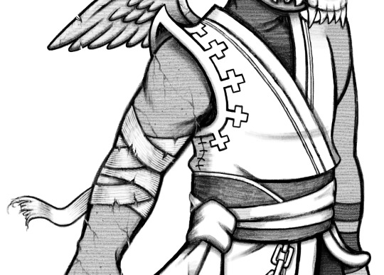
Shoulder Pads? (Don't know what else to call them): I made them more pointy and curled up at the edges for that Nightmare Before Christmas look.
Shoulder Pad Design: I turned the square design on Vidar's shoulder pads into crosses. One, to reference gravestones, but also again to reference back to cathedrals and that religious aspect of gargoyles. Also, it's a subtle detail, but I added a stitched seam to the side of Vidar's coat as well.
Bandages: Vidar's original design features bandage-like cloth underneath one of his gloves, so I took that detail and just put it all around his arm. Weathered and torn for the creepy look.
Wrist Bands: In Vidar's original design, he sports two asymmetrical gloves. Here, the bandages take the place of the more complicated glove, while these two black bands take the place of the simpler glove, which was just a black, fingerless glove comprised of a main glove and two straps above it.

Gargoyle Claws: Not much to say here. Can sort of double as wolf claws, but obviously without the fur.
Scala Emblem Chain: I changed the chain from a bead chain to a more grungy link chain for that Halloween look. Also, I wasn't able to depict this in a way that satisfied me, but I imagine the metal of the charm and chain being a little tarnished and scratched up.
Dirtied Sash and Coat Edge: It's not blood, just grime. Grime, tearing, and weathering for more creepy factor. His coat is pretty long anyway so I could see it getting dirty in the streets of Halloween Town pretty easily.

No Boots: To show off his gargoyle feet. In his original design his pants tuck into his boots, so I don't really know what the bottom of his pants are supposed to look like. I just cinched them at the bottom to maintain that puffed-out look. Is it weird that his feet only have three toes but his hand has three fingers and a thumb? Yeah. But I couldn't get four toes to look right. Just assume he's supposed to have four.
I decided to draw this Halloween Town design in black and white this time, but if I had colored it, you can imagine the color scheme of his clothes being darker and less saturated than his original design to better match Halloween Town.
Also, this was just a coincidence, but both Vor and Vidar's Halloween Town designs feature wings, claws, and fangs, and have a sort of cat (sphinx) and dog (wolf) theme. Which I think is cute and makes them feel more like a duo. :)
That's it. Thanks for reading.
61 notes
·
View notes
Text
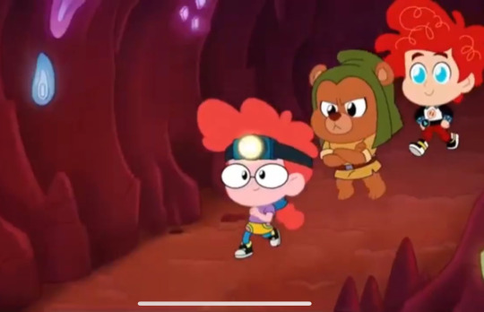
> watches an entire video rant on how chibiverse is a online content farm created by disney (id say there is some good things or at least an attempt in those early parts and i do like the art style actually but yeah it is), and lowkey messes with your mind cause disney has screwed over many of the shows they featured and they have free range to use any characters they own without the involvement of others (hailey's, woy, toh etc)
> disney releases a new episode of said show that literally pays homage to older/forgotten shows picked from a bag and puts them underground in a cave
> finds clips on youtube
> pepper ann is there my baby!!! seemingly portrayed in the best light compared to bonkers, billy dilly, maggie etc
> they GOT pepper ann
> remembers the time i thought about a month ago "what if pepper ann nicky and milo were in this show, that would be impossible especially since the chibiverse thing is all a tiny land of modern series. they are probably in a distant land, or somewhere underground"
> reminds me of the time i had an idea of cartoons living a double life when they arent airing, within a multi channel cartoon crossover called "under the airwaves" sort of like wreck it ralph but cartoons from tv. literally would incorporate so manyy real shows into this idea, including this shit cause it has facinating implications and i remember a glitch when it first aired lol
> enough of my garbage au/crossover shit!! oh wow shes so cute though!! my baby!!!
> THEY GOT PEPPER ANN'S BABY CLONE IN A CAVE UNDERGROUND EATING DIRT WITH CLAMANTHA FROM FISH HOOKS??? IN THE UNDERVERSE??? SHE'S EATING DIRT??
> BUT FISH HOOKS HAS BEEN relevant out of all these shows especially on tiktok and specifically shellsea. so i guess clamantha. sure. certain comic relief characters people dont care about. has anyone truly cared for clamantha when jocktopus exists? really...
> penny and kim were very lucky to have continued relevance. they could be eating dirt! not all up in disney's weird ass fantasy living neighborhood gen z ifed
> now realizing this is when many characters havent spoken for literal years return... and how thats kind of cool in some aspects. but i think ppl wanted more animated version kim possible years ago...
> realizing if they didnt pick the funniest characters to do this, they could literally piss off so many fans of like motorcity or like randy cunningham maybe. i mean they probably did with penn zero for like two people.
> who picked them and why. also vince from recess took me a while to get why cause he didnt seem like the lead. but i'm assuming he's the most "underrated" or underutilzed one
> bonkers, spitting image of "obscure disney cartoon" - even watched a video on that... has a line where he says chibi. maggie the fly that everyone loves to hate has lines. i dont know why everyone hates her, she's self absorbed or something.
> i dont care about star vs but star is so cute in this and her dynamic with vasquez is funny...
> the primal desire for crossover content and the joy it brings is real. the uncontrolled desire to say "i didnt know i needed this" is real. i didnt need this! in some ways i hate this! in some ways i dont want this! but i like it anyway. and i cant stop it!
> chibi pepper ann also implies the existence of a chibi moose or a chibi cissy or trinket or gwen or alice kane or the teachers or trinket or lydia or steve the cat or mark hamill or alex trebek or effie shrug... chibi stewart waldinger....
> no cartoon is safe. chibi nightmare ned. chibi weekenders. chibi fillmore.
> watch them acknowledge house of mouse very soon in a very tongue in cheek way that will piss everyone off cause this show and that show are often mentioned together online. they probably look online to get script ideas idk maybe. something something ppl might say about tarnishing legacy of older cartoons cause every ip (😔) is at risk here. but they lay one finger on hom?? people are very protective of that show. carnage.
> hurt/comfort nickyann 500k fanfic in the underverse nicky going "i miss my family pepper ann. i miss them a lot."
> gonna watch the whole thing now.
#chibiverse#disney tva#disney chibiverse#fandom#disney#pepper ann#kim possible#fish hooks#big city greens#star vs the forces of evil#the owl house#hailey's on it#i like how kathleen wasnt in this I THINK.#let me get hit by a falling ice cream truck and liveee#more shows will end up in the underverse very soon rip hng and mgdd RIP!#*claps my hands* what a very good content farm#EW I CALLED SHELLSEA CHELSEA?
41 notes
·
View notes
Text
The Amazing Digital Circus AUs
So you've all probably noticed by now, I'm on a new hyper fixation lol so I've made tags for the AU's I'm playing around with with the cast of The Amazing Digital Circus, I have 2 current AU's right now
The Amazing Digital Circus AU
The Amazing Digital Circus LOZ
I'll explain the AU's plots under the cut to make this easier viewing, but yeah I hope you enjoy these AU's and my silly art, and if any of you have any questions or perhaps requests I'll gladly answer and doodle responses! (If I have spoons for them)
The Amazing Digital Circus AU
C&A are taking more of a control in the world, making the Cast Abstract on purpose to mess around with their codes to turn them into 'NPCs' but this is a secret, shhh. Caine suspects they're up to no good and start's protecting the Cast, but C&A didn't like that so they altered the world, to a sort of late 1800's world, sort of a Toon Town style from Who Framed Roger Rabbit, and they were able to 'hide' the code of the previous world from the Cast, some were easier than others to fool. So now it's up to Caine, Bubble to find the Cast and stop C&A; So far he's found Zooble and Gangle who have figured out shits going on, Pomni is about to be found next.
ART [1] [2] [3] [4] [5] [6] [7]
The Amazing Digital Circus LoZ
I like legend of zelda, and I began doodling Jax as a chibi, then as little Link, and....Then I realised Gangle would make a super fun Majora's Mask/Skull Kid candidate and it went from there, no storyline yet but DAMN I am enjoying this so much xD
ART [1] [2] [3] [4]
#the amazing digital circus#tadc#tadc jax#tadc pomni#tadc fanart#tadc gangle#tadc caine#tadc kinger#tadc ragatha#tadc zooble#tadc AU#tadc loz
22 notes
·
View notes
Text
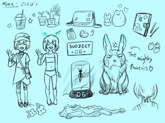

I'm having too much fun doing this please someone stop me
I had a very clear idea of what I wanted to do with Chibi, to me he is that bro/friend you want to have if you play D&D or like movie nights with pizza <3 I was a bit less inspired with Mina, at first she was supposed to be Yugo's age and go to the faculty with him, but the plot took an interesting turn when I thought about some of the stolen eliatropes Dofus.
What if she had been raised in a secret lab, studied as an alien being for her high psionics (eliatrope ) powers ? (I have so many ideas for this but I'm still not sure how and when...)
Let's see my headcanons now :
Mina :
Given age - 7 / Real age - 7
Has grown up in a lab, so everything about the world fascinates her. Mostly plants and flowers, like her mother, she has special interest in every living thing on earth.
Tattoo on her neck indicating a certain number ?
Phaeris as a rabbit is still her mighty protector and this makes me laugh so much.
Has a joyful and curious spirit. Very talkative.
I still have to develop this character a bit... I don't have much more about her.
Chibi :
Given age 30~ / Real age 64
Stuck in his 80's era.
Plays electric guitar, and D&D.
Thinks his van is his second home and has probably slept in it way too much.
Works as a mechanic, so he knows how to fix all sorts of things.
Has a collection of 80's stuff of all kinds in boxes that he keeps in his small flat. (Nora often goes crazy over it)
Brave, optimistic and kindhearted, he also has an impulsive nature sometimes.
Grougal' is an Iguana. I like the idea of him fixing people in total silence and sometimes licking his eye. Also Chibi loves to give him cool styles with tiny accessories he finds.
I'm so happy with the comments and reactions you sent me guys <3 I'm not sure if I 'll ever draw or write something serious about it but I'm glad you like my AU !
45 notes
·
View notes
Note
I would like to hear about which characters would use which kind of fountain pen 👀
okay, so with the caveat that all of this is coming from me researching pens in my quest to become slightly a 'pen person' and not like. being one. (but also from the perspective of watching my friend talk extremely in-depth about this for many years, and cribbing from her, in my defense.)
here are some random character-pen matchups and headcanons bc why not!!
first off. minimus, obviously.
there's a few things i think about this: he's fundamentally conservative in his tastes i think (no wild experimental designs), someone who would not want to spend an Excessive amount of money but also someone who would definitely have a higher-end one quality wise, and he'd have really nitpicky taste about shit like quality control. with this in mind, the guides i read that were offering opinions on higher-end 'beginner pens' consistently brought up the Pilot Custom 74, which is like, the platonic ideal of just a functional good quality Fountain Pen TM:
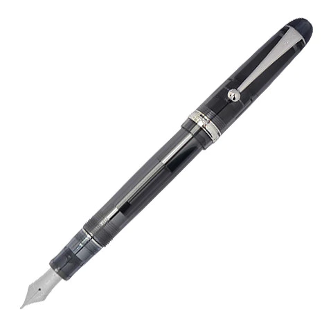
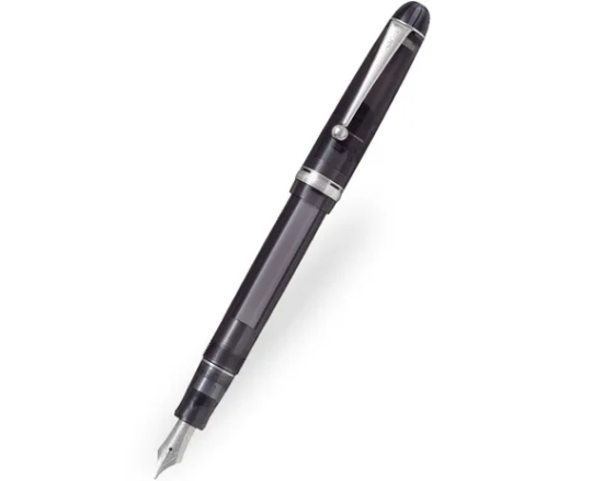
look at it. that sure is a ~£190 fountain pen! it's classic, functional, a solid 'name', expensive enough i feel like a person who grew up well off would be like 'oh this is my everyday pen' and i would be sort of like 'the fuck that costs half my rent'. lmao. but not like, someone splashing out a thousand quid or more expensive, yknow. he's probably had this same pen for like. the equivalent of twenty years or more. i'm sure he has more than one but this is his 'workhorse'.
here's another one i immediately am like 'oh i know what to pick' about. this one less in terms of specifically 'this character would use it' and more like 'this character reminds me of this pen'. it's rewind! and the pen is a Tombow Zoom 828fp because. well. look at this.
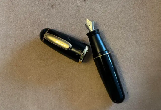
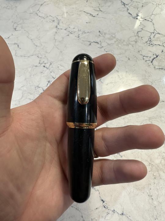
MINI PEN. CHIBI LITTLE FOUNTAIN PEN. there's apparently a chinese pen that is a lot cheaper you can get of this little chonker's basic design, and i'm very, very seriously tempted to get one and call it 'rewind'. lmao. short and charmingly proportioned! i don't think rewind probably actually uses a pen but maybe this was one of those spousal in-joke gifts pre-war or something like 'haha this reminded me of you'/'are you calling me short' or whatever idfk. the point is. TINY PEN.
nautica got riptide a Jinhao 993 to cheer him up when they started doing lessons in that one issue towards the end of MTMTE/pre-DotL and he's finding it difficult maybe. "why would a fountain pen cheer him up-" THIS IS WHY LOOK AT THESE
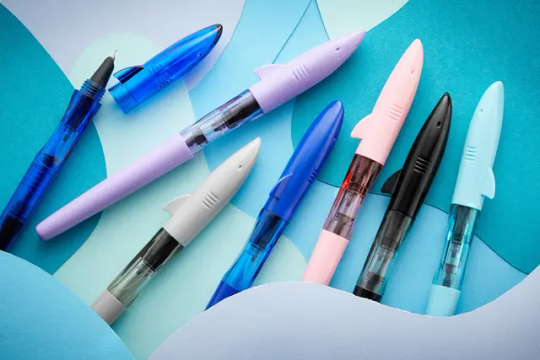
my pen friend got the pink one of these for a fiver or something, bc i pointed out it was a pink shark and therefore a Nimona pen. haha. anyway. that's why riptide has a fountain pen.
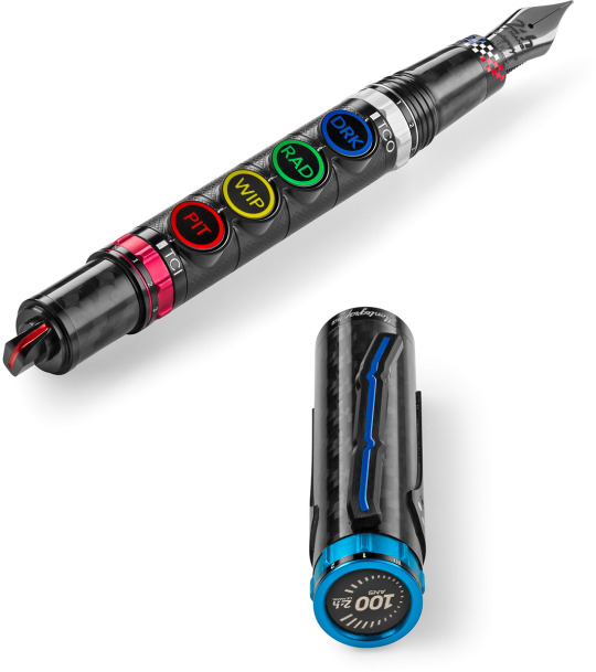
rodimus is having a mid life crisis, and also magnus will probably think he is Mature and Good At Work if he shows up with a fountain pen, he figures one time, so he wheedles money off drift and buys this monstrosity, which to be clear costs EIGHT THOUSAND EUROS and is supposed to look like a cool racecar themed... thing. montegrappa is so fucking overpriced and tacky and they're invariably hilarious to me whenever they release some godawful tie-in thing.

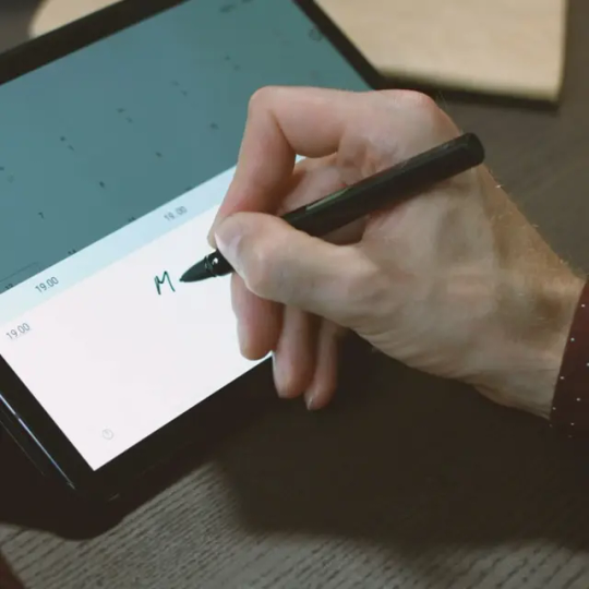
now prowl. prowl doesn't have a fountain pen because prowl is the sort of person who insists on constantly having fucking. Gadgets TM. you know. the man thinks a smart fridge is a necessity, for some fucking reason. if it's electronic it's Better. however, LAMY, i found out, in addition to its wide range of pens, also makes like... high-end digital pens? you know, in the style of their most well known fountain pen design (LAMY safari) but like. a stylus. buying a brand-name pen manufacturer's stylus bc you want to have a fountain pen but also refuse to do anything not on a tablet or something is. 100% prowl to me.
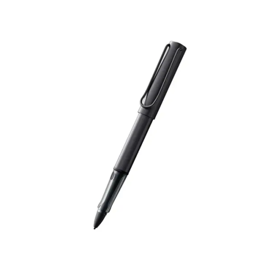
and i think that drift would have a LAMY 2000. look at this thing. it's somehow so slick and modern looking in a way most fountain pens aren't without feeling weird or like it isn't one. it's also a really well regarded pen across the board and so many people swear by this thing. (my friend does indeed have this one!) he's got it because he (canonically) journals, obviously, he is whipping this bad boy out after meditation to Chronicle His Emotional State (usually um. bad. moving along.) it's one of the nice things he bought himself after he somehow acquired all that money (stole it on his way out from the decepticons).
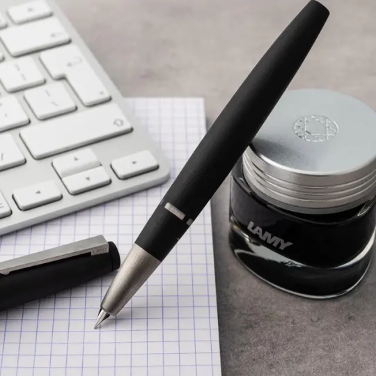

sidenote: megatron doesn't use a fountain pen, despite being a canonical writer. his handwriting is fucking atrocious and he would break one pressing too hard if he tried. he privately thinks they're sort of pointless, but lets minimus endlessly explain nib types for the sake of indulging someone he likes and who clearly is used to being told to shut up.
31 notes
·
View notes
Note
OK KIYORA NOTES!!! These are all from the game I kinda wrote them summary/LN style because the act of typing it all out in dialogue format takes me like three times the time to type out and I got lazy oops
Anyways lmk if anything’s unclear! I basically broke it down into some main themes I noticed
- Karasu anon
Breakdancing: He really likes breakdancing, both Otoya and Bachira end up asking him to teach them, to which he essentially says yes but that he doesn’t really know how to teach and kinda just tells them to try and copy his moves
Otoya interaction: Kiyora originally says he doesn’t mind teaching but questions if Otoya can keep up. After Otoya restates that he’s a ninja descendant Kiyora seems to acknowledge him more
Bachira interaction: He asks to be taught thinking that it “seems fun” to which Kiyora replied with “not just seems fun. It IS fun”, Bachira also does it wrong (aka just tries following along bachira style) but Kiyora still acknowledges his potential
Player interaction: mid training, he asks the player if it’d be ok to integrate dancing into his training regimen. Player agrees but asks why. He explains that before coming to bllk he’d always participate in dance battles and liked dancing. When the player responds saying how they know of dance battles Kiyora immediately goes “oh nice let’s have a dance battle now then” to which player has to say “I know OF them not how to actually dance…” to which he says “oh well, can’t be helped if you don’t know how”
Voiceline: …my interests? Break dancing. Lets go (dancing/dance battling)
Karasu “rivalry”: He seems to have a sort of one sided rivalry with Karasu, constantly irked by Karasu underestimating him.
Interaction: Karasu acknowledges Kiyoras vision and borderline detection, essentially praising him for surviving in blue lock but still comments on kiyoras complacency and how Kiyora can’t survive just by riding on others’ success (probably referring to the second selection team). Kiyora responds by telling Karasu not to underestimate him
Voiceline: Karasu treating me like an idiot seriously pisses me off. I’ll crush him someday.
Nagi rivalry: Another rivalry although less one sided. Pretty obviously inspired/taken by their first meeting in epinagi
Interaction: similar scenario where they both end up reserving the same practice room but they actually did reserve the same room so instead they end up “battling” each other to win the room (even though they could share, they want the stakes present to motivate the match). Kiyora continuously refers to Nagi as “tall white”/“white beanpole” and Nagi continues calling Kiyora “chibi”
Voiceline: …I have some free time now. Maybe I’ll go challenge that white beanpole to a battle.
Height and underestimation: Is very aware that he is short and doesn’t like being underestimated because of it
Voiceline: Just now, you were thinking that I’m a shrimp weren’t you? Save the excuses, square up/let’s go.
Voiceline: Crushing those who underestimate me is the best, gets me hyped
Player interaction: Player approaches Kiyora after practice saying that they wanted to adjust some of the practice regimen after observing kiyora. They say they want to try hyping him up against strong opponents and suggests he play some one on ones. Kiyora is surprised at how well the players thoughts align with his own. He accepts saying there’s no reason to turn down a strong opponent, and that most of the bllkers underestimate him because of his height, so crushing them would be like fulfilling his wishes.
Player interaction: The player complements his weapon of shitting a low trajectory shot with a tight spin and that it’s even more impressive up close. Kiyora responds by asking if it’s amazing just because he’s “a pipsqueakl. Player denies this saying they were just admiring his shooting technique and that it has nothing to do with him being short. Player asked what he’d do if that was the case, to which he says “don’t underestimate me, I’ll crush you”. The player then thinks internally that they should be careful not to be too conscious of his short height.
Misc. voicelines and etc.:
“I’m the one who decides the battles on the borderline.”
“Aight, Ai-ght, etc.” many variations of “aight”
Player interaction: Kiyora starts to have doubts about if the player is actually capable of making him number one, so he wants to see for himself if he should continue following their plans or if he should drop them. Player thinks it’s naturally since they’re a soccer noob and asks what they should do. Kiyora tells them to continue as they’ve been doing for one week. In that time, he’ll follow along and if they plan something that he acknowledges he’ll continue working with them. Kiyora says that this is their borderline. If they want to continue working with Kiyora, they need to prove it and go beyond the borderline he’s defined.
Player interaction/assessment of Kiyora: Kiyora’s grounder techniques (wtv those are) are top class within bllk. Within those skills are his passes and gameplay senses. He’s able to take advantage of the large range of the field, cutting in and passing and shooting as needed. Those are the weapons that have helped Kiyora survive. Developing his dribbling skills and the ability to move around more himself is the best option for him to improve.
He’s stated that he also got into soccer because his older brother would force him to play with him, and if he lost he’d face a punishment so that was his motivation to improve LMAO
Generally he’s quite spunky, but mainly on the basis of not wanting to be underestimated due to his height. Also has a strong sense of self and ofc has the whole borderline thing going on where he enjoys being the deciding factor of things. I’ll come back with more updates if I see more interesting voicelines LOL
THANK YOUUU i think i actually did a fairly decent job at getting him!! hehe i already finished the one shot before you posted this but in the fic he’s kinda moody emo but also kinda cutie pie?? I GOT HIS OLDER BROTHER BEING THE ONE TO GET HIM INTO SOCCER OMG so proud…also got the height thing…his borderline thing ofc…his dancing is briefly hinted at towards the end but eh good enough for me!! in the au i wrote for he’s kinda uh violent (he used to be a street fighter because his older brother got him into it for the money but then he quit because he didn’t rlly like it) but it’s not like crazy or with people that don’t deserve it so hopefully it doesn’t feel ooc?? idk we’ll see…to be honest the place i ended the one shot at is definitely one that requires a part two for any elaboration/further characterization but considering idek if the anon will like the au i just left it there and i’ll add that i’m more than happy to do a pt2 if anyone’s interested but i didn’t want to waste my time if not 😭
also wait the one sided karasu beef is so funny LMAOAOA new sibling duo unlocked ⁉️ it’s giving roderick and greg from diary of a wimpy kid somehow 😭 the way kiyora fucking hates him and karasu just does not gaf…😓 that also makes that panel in bm vs pxg where it looks like karasu is using kiyora as a chair sm worse FJSLDJSJ that was probably kiyora’s thirteenth reason omg
14 notes
·
View notes
Text
Again, what frustrates me about Federation Force's mech gimmick is that it's rendered useless by scaling up every enemy as well. What's the point of saying you're using a mech, if you don't feel like you're using one; You're still the same size as enemies. Hell, even the environment is scaled up, and I'm talking about manmade structures! The doors are conveniently your size, as are railings, various devices, etc.
It just utterly breaks the illusion of being in a giant mech; You can only really tell because of the cutscenes where the mechs are actually contrasted with the pilots, and that one level where you're forced to leave your mech and sneak around those giant pirates as a normal-sized human. That IS good, but it's just one level!
And again, why is every door sized up??? Like from an in-universe perspective, the amplification beam made an entire army of pirates gigantic, so they probably needed tech and architecture to accommodate this new size. But from an artistic perspective, it just makes the whole mech angle even more pointless, especially when the mechs look like regular humans in armor; Their proportions match the human pilots, so for most people who only know Federation Force by a glance and osmosis, they probably don't even realize it's a mech game! I was one of those people for a while!!!
Even the Metroids, one of the series' most iconic and recurring enemies, the titular mascot, for whom we DO have a consistent understanding of relative scale... is also sized up, instead of being used as a reference point. It's one thing to have a new alien enemy be conveniently gigantic from the start, but the pre-existing Metroids being made that way just feels like you couldn't be bothered to consider how being in a big mech would change the way you interact with the Metroid universe, compared to how Samus would; Especially when your arsenal and gameplay mimics Samus'.
There's no art direction, is what I'm saying; The environments, the enemies, they aren't designed around the idea that you're in a giant robot. It's just another regular environment. One of the things I remember learning about VFX is that adding more details can help create the illusion of something being bigger, because it has more space for more detail, that sort of thing. But this is a game on the 3DS, plus it's a simplified chibi art style that throws off the proportions in general.
It'd have been cool if there were a lot of small doors and hallways that you couldn't access because you're too big; Imagine levels in buildings being designed around the idea that you're navigating giant hangars and all that. The immersion is lost if every room is conveniently enormous for these mechs. The doors themselves could’ve been different from the typical ones in Metroid, for example they’re clearly gateways, to differentiate them from smaller barrier-operated doors. Sometimes you just create doors by smashing through walls because you're a giant mech!!!
It's lazy. It's half-assed. There's no thought put into it; It’s generic. The mech aspect of the game feels tacked on, last-second, like the mechs were supposed to be regular-sized humans in special armor, but someone felt like there needed to be some gimmick to make the game seem more interesting. So they threw in some cutscenes with smaller human models, and one level where you have to sneak around the bigger pirates. But everything else fails to reflect the idea. Why.
The art direction could've been so fun, the gameplay could've revolved around your titanic size, and maybe synergize mech gameplay with gameplay as just a regular pilot who can get out and back in whenever you please. And that could play into the larger teamwork aspect, you could make puzzles based on your pilot having to leave the mech! But noooooooooooo! I was ambivalent towards Federation Force until I found out the player characters are supposed to be mechs, and now I'm pissed. You could've had a really fun concept to mix up the Metroid formula and stand out from other games, make this spin-off take advantage of and embrace that it's so unusual. BUT YA DIDN'T. Metroid Prime Pinball is unironically more creative and thought out around its core gimmick than this.
8 notes
·
View notes
Note
Hey, uhm... hi!
I had seen you have reached 210 followers which is wonderful! Great job, both your art and your writing has brought me some happy moments over the course of the last few months I've been here.
Can I ask you about your art journey? What's your relationship with drawing? Did you like drawing as a kid too? I'm currently struggling with learning how to draw (despite having graduated from "elementary" art school, lol) and I like your style, so I thought it would be interesting to get to know how you got here.
Sorry for bothering, and even if you don't answer (which is totally fine) have a nice day/night!
WLAHHH HI THANK YOU SO MUCH I'M GLAD YOU LIKE MY STUFF !! I'M GLAD IT'S MADE YOU HAPPY!!!!! <333
My art journey, huh? It's so weird to be asked about it!! Not in a bad way, I just never expect these sort of things.
As a kid - I don't know. I took an art enrichment and elective at different times from years 5-7 and I absolutely hated that. It was all "draw this piece of paper with the lights turned off" and "draw this vase with negative space".... But at the same time, I drew (bad) sketches in the margins of all my textbooks. So I guess I enjoyed "doodling".
I got into art when I got into anime 🙇 ... Yeah. Having an OC I really wanted to draw as if they were part of the media, and seeing other people do that, really motivated me. That's ... still what motivates me. I don't necessarily want to mimic the anime's style so much anymore, but I have the most fun when I draw Rie, even if it's silly!!

If you like my style, you should know it's had many many identity crises. I've tried (with my limited skills):
Watercolour (ish) (the background took 15 hours)

Anime (got pretty good at it, if I say so myself)


an obsession with chibis (I never get the facial proportions right)

semi realism (please give Rie her heart ahoge, Lei. this is Not Rie.)

whatever this is, that I only managed to do one time and kinda want to do again

and many many more, all different, some with only subtle changes, some with drastic. There is a lot of super ugly in between as well! I feel embarrassed sharing it hajajsj but believe me: I don't think what I have above is perfect, but it's some of my best work. I've improved a lot because I've drawn a lot.
I've settled on this, for now. And I like it, for now. But it'll probably change again, when I don't like it or when I like something else more. Maybe it'll be better, maybe worse.


But really it's just a lot of experimenting, picking out what I like from a thousand other artists, practising, changing, practising again... By changing style so much I've learnt a lot. I don't know, I was drawing in a different way for months and then I went back to anime and drew it the best I ever had.
I had a brief stint of teaching myself the human bone structure too. That was helpful. I should do more of the art class stuff, the colour theory and muscle and light and shadow.... but I don't wanna BDBSBZBXN
And I do it all to draw my Silly Little Characters <3
Sorry for the giant ass answer and good luck drawing!!
4 notes
·
View notes
Text
so uh hi c: sorry i haven’t like, been around the past couple of days aheh. life sorta went and hit me pretty hard >w< i promise i’ve still been writing, and will soon bless you all with something.
for the moment- i sort of went on a splurge of reading an old AU of mine i wrote years ago - a Transformers one, in case anyone was wondering.
it’s basically a Toy Story plot - the Transformers are plushies (plushieformers) and, only their human knows they’re alive. they go on adventures, get into mischief, those kinds of shenanigans… yeah xD
anyway so the other day, i found the sketches i had done of the characters. and i decided, hey, i really want to colour these… so i did c: (ibis paint x organised them really nicely for me lol xD)
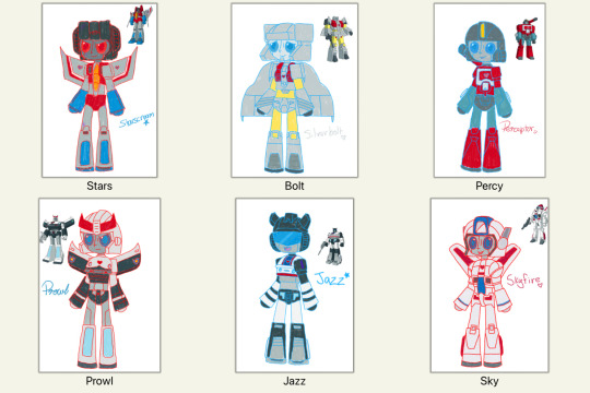
i sort of did them in the style of how their owner would draw them (so try not to look at the details too closely lol xD). i also had a lot of fun using the crayon brush with colouring them hehehe
i like felted/embroidered eyes on plushies c: buttons or pins are freaky xD and, i wanted them to look friendly, since they’re popular with kiddos. i wrote up a whole word document with like their sizes and stuff; will have to see if i can find it. (i have also realised i forgot to fix the side of Starscream’s helm, whoops-)
i did try to make them look plushie-esque but… i think the chibi style helps with that a bit >w< as you can probably gather, i don’t draw robots often, and i kinda cheated with these since i traced their sketches but, even then… yeah… i don’t draw robots xD
if anyone is oh so curious about the origin of these plushieformers… xD you can go have a peek, here —> To Call My Own and You had a WHAT in WHERE!?
these stories are outdated, and, i first wrote them years ago so, don’t mind my mistakes >w< i have rewritten them, sort of, but never uploaded the rewritten versions. i have, also roped myself into writing a ‘x amount of years later’ story where their owner finds them again… heheh x’D
...
anywho, enjoy my plushies c: i’m gonna go write some more >w<
#sky’s drawing#sky’s writing#transformers g1#transformers#maccadam#plushies#plushieformers#starscream#silverbolt#perceptor#prowl#jazz#skyfire#jetfire#these stories brought me so much comfort…#still do to this day#i have a notebook dedicated to prompts with them in it#love them#excuse the lengthy tags lol#they were a hyperfixation and i have no regrets c:#still don’t <3
7 notes
·
View notes
Note
Where did you get the idea for the Mario animal AU? It's just so adorable and it looks like an anime sometimes and I AM IN LOVE WITH IT. Fluffy animal Mario brothers for the win!
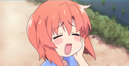
Thank you! Honestly, I saw the tanuki suits and Luigi's kitsune suit and it just sort of clicked, y'know?
It probably also helped that I'm reading "The Wind in the Willows" again for like... the fifth time. That book to me is like a hot cup of tea and a fuzzy blanket, so that probably had some effect on my psyche. Glad you're enjoying it so much! There's more to come. That psuedo-chibi style I chose for them is super fun to play with. Very shaped.
#keakruiser#askbox#also all of you who haven't read the wind in the willows or haven't read it in a long time#I HIGHLY suggest it#it's so nice and warm and sweet and cute#there's an anxious mole and his confident rat friend who are totally gay married coded#and don't get me started on Mr. Toad who is straight up an unmedicated adhd man with hyperfixation issues#the exhausted dad friend Badger#and I shall stop there. But please read it
20 notes
·
View notes
Text
Commission Updates
Hey y'all. Sorry I keep talking about commissions - I started a new job but I don't get paid for a month, so I'm strapped for cash. I also want to save for next year, and maybe even help out my family with some expenses if I can. All that being said,
Unfortunately, I'm gonna have to up my prices. I really try to keep them low, but the amount of work I put into them is really not matching what I'm being compensated right now. They used to be so cheap because it was a less labor intensive style, but since I stuff started going more toward my regular style, they've gotten a lot harder. I'll probably change them to $30 + $20 per extra char.
However, I still really want to have commissions available that are affordable. I just like being able to provide that for the community. I'm gonna make a commission masterpost so people can find other artists if my comms are out of their price range, but I'd also like to offer a lower priced option for my art. So I have a few options.
The two things I'm thinking are offering uncolored sketches and/or a chibi style. I don't like doing half ups/icons specifically, it's harder for me for some reason. So: the sketches would be the current price, $20 + $15 per extra. The chibis, in sort of the second style below, would be $15 + $10 per extra. Examples of each below.


22 notes
·
View notes
Text
Weekly update March 22, 2024
I’m still exhausted beyond words. I’m also on a bit of a spiral where I’m worried about the quality of my art and about my output, but it’s okay because I’m chipping away at old big projects still and as soon as classwork is subsided I’m going to try to learn a new skill, because any time I feel insufficient I learn a new skill so I can be better. Classes have been kicking my ass mostly but hopefully big things will be coming sooner rather than later.
I’ve been doing a number of drawings to time myself and update my comms. Turns out I’m a lot less consistent than I thought so it’ll be a bit longer till I get prices sorted out but it’s coming along. Also good chance I’ll add more on to it later once I sort out more things I can offer. My usual drawing style will be the main one, but I’m hoping I can also add the epithet erased style, the chibi dnd mini style I do sometimes, options for backgrounds, and eventually also music.
Problem with music though has been my exhaustion. The only music stuff I’ve really been drilling at has been bigger projects, but I’d like to just sit down and do a small beat as well at some point. Once I catch up with classwork I might try. I have been chipping away at a couple instrumental pieces, as well as the larger vocal cover and I did some lyric writing today for the two ‘finished mostly’ ones I’ve been sitting on. I did have to scrap and redo a character theme for the second time this week but once I have some time with a clear mind I can reroute that one and use the melody I wrote for the last draft. In development right now are an ambient character theme, a 16bit-ish instrumental theme, a Zelda medley, a song cover with Kyo, a small gabber song with no affiliation to anything, the two original vocal songs, one symphonic rock and one EDM, and a handful of others that I haven’t been actively working on. As soon as I have significant time I’m going to try to finish off some of them.
Once the music is finished I’ll have to throw visuals together for them too. I really want to put in effort to make animation rigs again but I don’t have the time or energy. I might do one for the vocal cover song since I could be reusing the character but I’m not sure it’ll be necessary. Once the cover is done I’ll storyboard something and decide then.
Comic is also still going, I haven’t had a ton of time to do thumbnailing/writing, but I should be down to the last scene. No guarantee I won’t have to add more after editing, but it’s getting there. Once that’s done I’ll try to post roughs of specific panels so it’s a bit easier to keep track of where it’s at. The thumbnailing is a big bottleneck right now because it takes a lot of brain power but it’s almost done. If I get myself together this next week it should be done by the next update. No promises though, I have a lot of classwork.
Last couple things, a good amount of my exhaustion is the result of insomnia, but I’ve been using that time to plan out TTRPG campaign stuff. I think I have some really fun creative encounters. I think I probably will try to write it out and find a way to release it, just in the interest of getting more people to play the anime campaign system (or whatever they end up renaming it to when the epithet erased version of the rules drops… eventually). I might throw together art for that too, but that’ll be a ways off, after the writing and encounters are done. Plus ideally I’d want the module to be available for free, so I don’t need to add too much anyway.
Last thing, as I mentioned I’m a bit unsatisfied with where I am with art stuff. I want to thank everyone who has been sticking around, I am trying to make it worthwhile for you too. But whenever I am unsatisfied with myself I need to learn a new skill, so I may be dipping my toes into pixel art soon. I do have that 16bit ish instrumental song I mentioned, that’s been on the back burner since January but I’ve finally been hit with the inspiration to finish it, and a little pixel animation would be nice to go with it, but that would require me to learn pixel art itself first, so I’ll try to do that in the coming weeks. Idk how soon though.
This next week will be primarily dedicated to clearing up schoolwork and fixing my sleep problem. After that I’ll try finishing up that cover song, finishing up comic thumbnailing, and finishing up that instrumental song, in that order. Anything else is a bonus. Will class work and insomnia get in the way? Probably, but I’m still doing my best.
6 notes
·
View notes