#practice for drawing all the characters in my less realistic style so that i can draw my ideas faster
Explore tagged Tumblr posts
Visit Tumblr Blog
Explore Tumblr blogs with no restrictions, modern design and the best experience.
Last Seen Tumblr Blogs


Fun Fact
The “We are the 99%” Tumblr blog became the slogan for the Occupy Wall Street movement.
Note
can i ask your process for drawing people that are so FUCKING CHONKY
like your artstyle has some unique sort of flair that triggers the “sink my face/teeth into the soft parts” response in my brain. how do you do it???
Uhh soo i have 2 decades of internalized anatomy and style studies that have more or less become muscle memory because my particular blend of audhud has made actual progress kinda difficult. That being said i think my style would be relatively easy to replicate if you appreciate the same things i do.
First tip? Make a slime oc and draw them a lot, or draw a lot of slimes either way it seems consistent that people who "get it" have a slime character they love to draw. Many goofy and fun opportunities await.
Figure out how fat bodies work, make sure you have a decent grasp of drawing objects with depth. Do not try to over simplify things if the design doesnt work on a fat body redesign it. this is essential for higher fidelity applications because if you follow this next step you will simply make oddly flat chewtoys.
Now, fundamentally, all im doing is this

Its all circles, circles to the very core, ive had enough practice that i can make squares thick as well but its all an illusion. Life is fundamentally a curve. Simulated weight, liquid physics, cloth with real weight? Its all curves.
And what i mostly avoid at all costs is this

Realistic proportions? Space for the ribcage? Triangles?? Fuck no
I dont need these things, moved past them ages ago.
Uhh remember that an artists style is generally just visual shorthand for things they care about and often can neglect certain aspects or material due to personal skill set or taste.
Remember to do your wrist stretches or you'll die!

120 notes
·
View notes
Note
How do you draw with rebornicas artstyle?
And how did you became rebornicas artstyle?
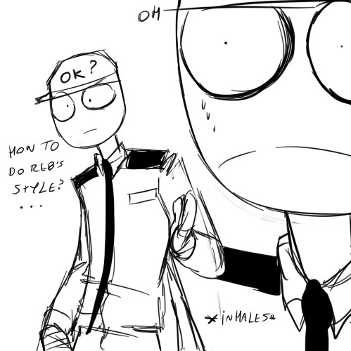
Well... LET'S SEE ... (i'm suffering, THIS AIN'T FOR THE WEAK/J btw english isnt my first language so excuse any mistakes :c) Ill tell you some things about the style but keep in mind, i've been drawing realistic stuff for years and also been drawing cartoons for about 2-3 years when i was a teen so keep that in mind, you gotta study other things too that i can't explain on a simple tutorial soo......
Ladies, gentleman and gay autistic aliens... I present to you...
MY REBORNICA TUTORIAL... SMALL... TUTORIAL.
(I ain't no professional on this, i'm a beginner on this style yet)
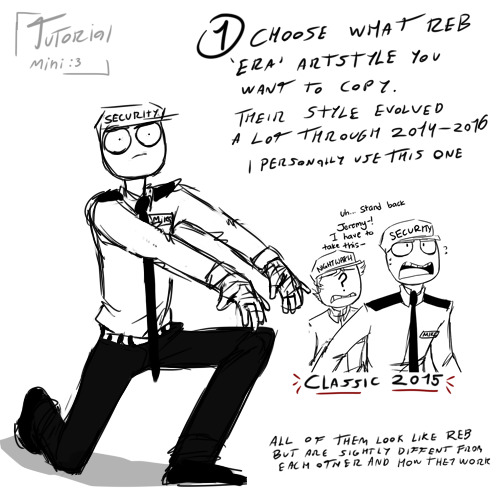
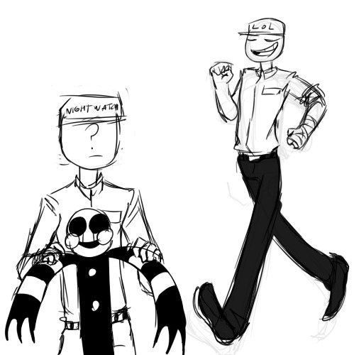
i think most of us try to go for the classic era but you can also go for the first one from fnaf 1 (You also gotta use the correct Mike uniform since the one where he has his tie on it's when he's working at the day shift because Jeremy took his shift instead :3)
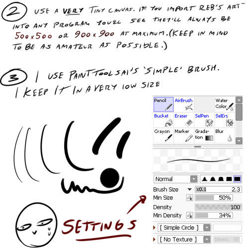
When i was a kid and even this year i asked myself why all Rebornica's art was so fcking pixelated and thEN... I IMPORTED THEIR ART INTO MY ART PROGRAM AND DAMN DUDE, WHAT WAS THAT TINY AAAH CANVAS?!
Also, i personally use a very soft sensitivity for my wacom, the less you press the better(?)
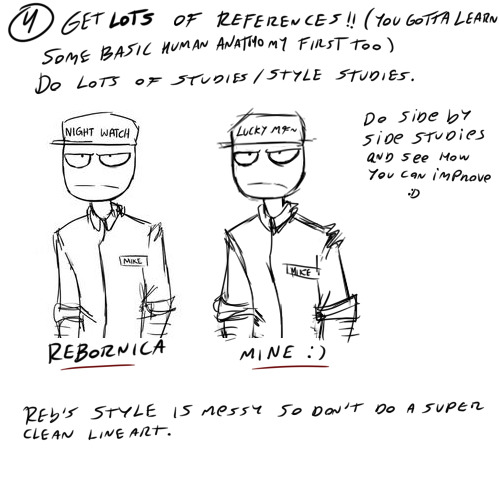
There's a lot of detailed tutorials on how to study art from other artist, you can search it as "master studies" too i think. OBVIOUSLY studies are something you gotta credit ALWAYS, since it's a direct copy. Use references a loooot, i have a lot of references for these guys. ALSO, i recommend to study Mike at first since he's like the base of all the other characters!
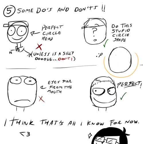
I wish i could have made more of those Do's and Don'ts but i couldn't think of a way to teach some of them in a very simple way. But the most important thing to keep in mind is to not really try to correct much of Rebornica's old anathomy mistakes if you want it to be more authentic etc. :)
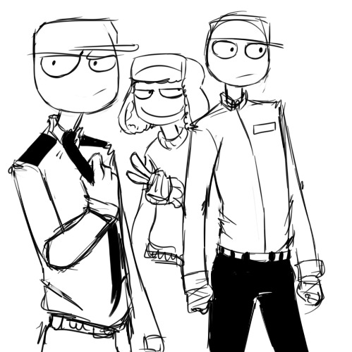
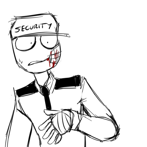
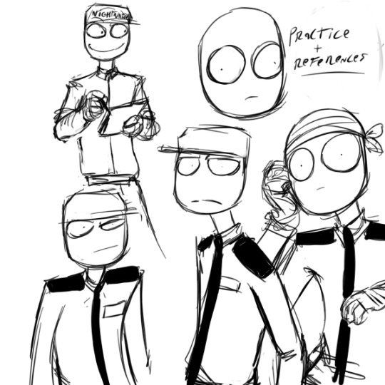
Here's some practice i did today before the tutorial and some from some days ago, I been drawing in this style since august approximately :D
Hope this helps even just a little bit, this can work with any style, you gotta learn how to study anything tbh!
Note: i might continue the tutorial later (reblogging this post) with some info about the body and stuff like that but you gotta know that at least for me (and other ex mutuals) faces/heads are the hardest in this style IDK WHY 😭
#fnaf#rebornica#fnaf rebornica#my art#fanart#fnaf au#digital art#fnaf fanart#artist on tumblr#small artist#art practice#sketch#art tutorial#style tutorial#fnaf mike schmidt#mike schmidt#fnaf jeremy fitzgerald#jeremy fitzgerald#diary post#five nights at freddy's art#five nights at freddy's#i aint no professional help meeee#just havin fun bruh#fnof#five nights of flirting#purple guy#phone guy#fnaf phone guy#fnaf purple guy#fritz smith
95 notes
·
View notes
Note
Hi!!! I'm absolutely obsessed with your art and, though I did kind of bury a question in a comment on your most recent comic pages, I just remembered asks are a thing (I've never done this before so apologies if there's a format or something that I'm breaking by rambling lol).
So, my question is - do you have any tips for capturing the likeness of the characters in Dead Boy Detectives? (you're amazing at likeness, and Edwin specifically always trips me up, so the way you've got his likeness down so incredibly has me in awe)
Also, your art style is absolutely aspirational for me as a self-taught artist-in-progress, and I was wondering if you could tell me a bit about your art process (do you use references, how do you come up with compositions, what methods do you use etc.)?
Bonus question: how did you learn how to do art so well?
Apologies if I'm asking you to explain too much (ofc you don't have to answer all, or any of my questions), and even if you don't get round to answering this, I just wanted to express how much I adore your work and how amazingly talented I think you are!!!!
Wishing you much inspiration and a lovely day :D 💛❤️💛❤️💛
Hi! So sorry I always forget that asks are a thing. I'm afraid that the boring but true answer is a lot of practice. I know. Almost all the answers to any broad "how do you do/get better at?" questions are either "practice" or "look at more art". With regard to faces in particular, remember that our eyes/nose/lips are not more important to likeness than everything in between them. The shape that the shadow on a cheek or on the upper lip makes is just as important.
References: You should absolutely use references if you want to develop a realistic or semi realistic style. The only time you should not use a reference is if you have drawn that thing so many thousands of times that it is burned into your brain. One of the easiest ways to get a reference for figures is frankly to take a selfie lol. But there are also a lot of awesome people who create stock figure photos with both free options and very inexpensive options.
Composition: there's too much to be said about composition to put here, but I'm sure there are a lot of education materials about building a composition online. Broadly, I can say that I try to compose to keep the eye moving around the "page", and for the negative space to not be too static, though with fanart I'm less worried about that than my original art. Personally, I am working on getting my bodies more dynamic and less static.
Methods: I'm guessing you are referring to mediums? I work both traditionally and digitally, though almost all my fanart is digital and almost all my original is traditional.
How did I learn: Tons of practice. And looking at lots of art. I went to a liberal arts college and graduated with a BFA in painting. Honestly, the art education was not amazing there, but I got so much practice that I learned a ton anyway. (Side note. I don't really recommend art school for the vast majority of artists. It's not a necessary step for learning and it's expensive).
I have a list of painters I deeply admire whose work I return to regularly for inspiration and to ask myself "How did they do that? Why does this work? What about this makes me love it? How did they arrive at that seemingly bizarre but ultimately perfect color choice?!"
I'll say that mastering traditional mediums made me a better digital artist. i don't know if that's true for everyone, but it absolutely is in my case. I can definitely say that looking at art from all mediums makes me a better artist in all *my* mediums. Drawing from life does too.
Finally, thank you so much!!! I love talking about art even if the broad advice I can give will never be that satisfying 🤣
32 notes
·
View notes
Note
I'm in love with how you draw characters (especially when you draw sniperscout and demoman in general), I'm unsure if you've answered a question like this before, but how do you figure out what to do with face shapes? It's hard to explain but the way you over-exaggerate certain features to make their design pop is so cool to me and I've never been able to do it for myself. That, and making faces look like.. well, faces.
thank you so much!!! hopefully i'm understanding you right...
Regarding the face shapes in TF2...we're all standing on the shoulders of the (excellent) design work already done and laid out. The characters have really nice distinct face shapes with some general overlap before you even consider that a lot of them have facial accessories which you can pick and choose from to help push facial silhouettes and peel apart characters that are a little similar.

Naff threshold filter heads to show silhouettes lol In order to exaggerate them - it's mainly about pushing and pulling the existing proportions and ratios of their faces IE: Making Medic's/Soldier's/Heavy's stupid large-chins even longer but sacrificing some of their forehead or eye-region. Varied proportions have a lot of 'rhythm' or 'appeal' and typically the human face can break down into the forehead (+ hair), eyes (I like to do a Batman style mask but people will often use the nose to form a triangle too) and then....everything else (chin, cheek etc).

Soldier, Heavy and Sniper all have REALLY similar proportional ratios but their silhouettes are really different (in both the x and z). When you add in that the 'default' way to view Soldier and Sniper is with their accessories they're all really nice and different. Funnily enough Sniper's 'eye mask' is teeny tiny with his visors off but this relationship changes with his sunglasses on. Kinda interesting... I sometimes like to think of visual vibe-based 'archetypes' when i'm drawing the tf2 guys. I don't have one for everyone yet but Heavy is sort of like 'handsome caveman' to me. Archetypally, cavemen are drawn with thick brows, small low foreheads and big chins. The 'handsome'-ness comes in when you apply a delicate approach to eyes, cheekbones, lips and with careful posing. Having this kind of visual-archetype in mind informs how I view the character as a whole and thus how i depict them! HOPEFULLY even if I drift away from how they actually look because the vibes are right...it feels right you know? There's also a sliding scale to me as to HOW you represent them. If the character is doing something goofy/stupid, drawing them less handsome and toonier can add levity. Obviouslyyyy you can have your handsome depictions making a dick joke (and that's its own sort of visual gag) but you'll notice in a lot of my images the straight-man gets drawn a little more...realistic? on-model? than the butt of the joke. It just feels more appropriate to me haha I'm using 'toonier' here to mean not only am I drawing fewer details but also exaggerating those ratios between areas of the face away from their 'default' ratio. like with most drawing-y things it's practice AND experimentation! i draw these guys differently depending on my mood and how generous i'm feeling towards their looks lol if you wanted tips on the construction of faces I really recommend checking out Griz and Norm's 'Tuesday Tips'. They're incredibly clear, concise and very approachable (and cover a variety of subjects!) Hopefully this link works? but if you search them on Pinterest and grab a cuppa, there's some AMAZING tips to be had here: https://www.pinterest.co.uk/search/pins/?q=griz%20and%20norm&rs=typed
#asks#sorry i waffled too much and probably didn't answer your question#corner of shame#posting a full link like an old person <- me#tutorial
104 notes
·
View notes
Note
how do your builds make more realistic builds?
I could probably do a whole TED talk on this but I’ll leave you with a few tips that I use when building. I will say there is no right or wrong way to build. The more exposure (speed builds/practicing/reference pics) you have to it the better you get!
1. Less over head lighting- how many homes have you been in have 17291038 saucer lights? Not many. So cut out the over head lighting and throw in actual light fixtures (lamps, wall lights, fairy lights, etc)
2. Change the hue of your lighting. I normally go with a warm white color to get that cozy effect
3. Do a little research- go on Pinterest or floor plan sites and find someone that connects with you. Or if you’re like me rely on your memories. I grew up in a neighborhood of mostly 1970 midcentury homes. So I tend to draw a lot of inspiration from my old childhood friends homes! I also take pictures of homes I see while driving out and about (not in a creepy way).
4. Watch speed builds- yes they can be a little… generic at times. But another simmer might do something so small that changes the whole feel of build!
5. Less is more***- I go through phases of the maximalist clutter style builds. Right now I’m in my ea minimalist era of building. Mainly because it helps me enjoy my game better. When there’s too much stuff I just get overwhelmed and it’s no bueno for me. That is totally up to YOUR style though. I’ve seen some beautifully over cluttered builds that tell such a beautiful story of a sim. My pc just can’t handle it.
6. Repeat floors, tiles, and wallpapers. Not many homes have a mixture of different wooden floors, tiles, and wallpaper. Keep it simple and just reuse the flooring/walls because it makes the house look more like a stand alone structure than a very stylized renovation.
7. Landscape- now I am no Fern Gully (90s babies where you at). So when I land space I keep it simple. But it does add so much to a build and can give a home some character/story. If you have a family with lots of kids they might have toys out in the yard and their lawn might not be picture perfect all the time. Versus retired couple who’s got nothing but time on their hands. Or you might have a sim that literally doesn’t touch the lawn at all and it’s all over grown!!
8. If possible get a second opinion. Most of builds are seen by my husband who always tells me things I should do that I wouldn’t ever think of. He literally has no idea what the sims is so it always helps to have a fresh pair of eyes!
44 notes
·
View notes
Note
Do you have any tips on character designs
So many! Character design is my favourite thing and something I've learned is that there is beauty in simplicity. Simple shapes repeated (loosely, usually) throughout a character tend to lead to more cohesive designs; in reference to my Beetlejuice design he's shaped roughly like a pineapple chunk, head and body. And simple colours, palettes of 3-7 colours, work best; one colour that takes up most of the character, two supporting colours, and then (if desired) small amounts of any additional colours. Keeping colours close together on the colour wheel makes them look more unified and then I like to toss in a colour from somewhere on the opposite side for contrast. After choosing colours you can use a colour balance option for digital pieces to "slide" the colours closer together and to a more preferable base hue i.e. make them all redder, bluer, or greener. You can also use pre-chosen palettes from a palette picker site. Also remember pointy vs round. Usually a friendly character will be round and a mean character is pointy, but you can also use that to subvert expectations and do the opposite. Another big thing is consistency vs inconsistency; something great that I was taught is that you don't have to design/render your characters in the same way. To start a character draw them as many times as many ways as possible. Everytime you draw them again take the things from the version you liked and change the things you don't until you settle somewhere. From then on try to draw them as on-model as possible. But, with all that in mind, you don't have to draw two characters from the same universe with the same levels of "realism"; once again regarding my Beetlejuice and Lydia designs, Beej has perfectly round eyes, mostly separated teeth, and implied claws while Lydia has oval and more realistically shaped eyes, solid-line teeth, and actual fingernails. I could have drawn Beej with actual claws, but I preferred the look of the implied claws because it uncluttered the design of his hands, which leads back into the fact that sometimes less is more, and simplicity can look better. And lastly, diversify. It can be really hard to try new things, and even harder to not immediately think it looks bad because you've never done it before, but recently I redesigned some of my childhood ocs and I couldn't help but think that they all looked awful because they all looked the same. Post redesigns they're all so different and it feels like character design I can actually be proud of. Same face syndrome is a curse and try not to get yourself stuck in the rut of drawing the same style of individual and/or the same pose everytime. And, to anyone who sees this, if it does come out bad just remember that all new art is growth, you're never obligated to show anyone anything you don't want to, and you'll never get better if you don't practice, so keep at it. People say there's no such thing as bad art, and, personally, I don't think that's true. Everybody has to be bad at something before they're good at it, but that doesn't make it worth less. And hopefully these tips can help others improve the way they helped me.
#art advice#character design#art tips#character design tips#shape language#colour palette#repetition
19 notes
·
View notes
Note
Love your art! I was super inspired by your Gillion design specially. He's so squishable (positive).
Do you have a specific process for designing characters? Be it original or reimagining canon designs of fandom
thank you!! :D
hmm, well, i don't remember the last time i properly designed an original character, so nothing on that front. for reimagining designs... i don't have a step by step way i do it, it varies from character to character, but i can point out some of the things i do that might be helpful?
i largely base my designs on the vibes the character gives me: their manner of speech, their actions, their story and personality. and also the world and environment around them if it affects the character. it sounds pretty obvious but like, duh.
im gonna try and explain on gillion's example since its the one you mentioned. he's a himbo, a swimmer and a paladin, so he's gonna be buff or at least a little thicker. he's a triton, so he's short. he's also short for the reason that he is in an unfamiliar for him world and he might feel small in it. he's also short because it makes him look almost child like, connecting it to his trauma and lack of childhood that manifests in his behavior now. gillion is kind or at least trying to be, so his features will be softer and rounder. but sometimes he's chaotic or harsh, so he has some sharp features too. though they're secondary, the softness is still the main focus.
i also really like to think and overthink the designs while drawing. i try to keep everything simpler and less detailed, showing personality with shapes rather than uhh presence(?), but that means that details i do include have a lot of thought behind them.
one of my favorite things is practically. i love to think about what a character would realistically wear in the climate they're in, which clothing would be comfortable for their anatomy and field of work. would certain things get in the way or would they be helpful? how would they style their hair, do they need it tied back or do they not care? would they wear make up, why yes or why not? etc etc etc. i like asking myself questions and answering them in the design.
continuing with the gillion example. he's constantly wet because he's a triton (again, yes), so it would be more comfortable for him to wear a wetsuit. other clothes may stick to him and be uncomfortable, or get stuck on his fins, etc. he doesn't have any piercings, there's no way he would've gotten them in the undersea, and on the surface i don't think there was anything meaningful enough to promt him to get it. plus fin ears. he doesn't have his hair styled in a complicated way because of the coral on his head. doesn't wear a lot of jewelry because he jumps in the water a lot and it'll easily get lost. no belts or flowy bits because they constrict the movement and might get in the way.
and then like. all the personal headcanons and preferences and little bits and things. there's a lot of elements that i draw just because i like how they look. or because that's a comfortable thing for me, or because it's cute or hot or sad or whatever. or because i saw it while looking for inspiration and i really liked it. just bullshitting with the design and making it my own, yknow?
for gillion. gave him a cool long tail and lots of fins everywhere because i like it when inhuman characters are openly and visibly inhuman and have distinct features. and gillion is VERY much not human, part of his personality is being confused about humans. big ol yellow eyes with slits — look cool, also doubles as an inhuman feature, also makes him look curious about the world. small black stripes all over his body — make him look more fishy, plus because there's a lot of them and they're all the same they form a pattern that looks more like a natural anatomical feature and draw less attention. coral that goes around his head and not only the front like a tiara— makes it feel more three dimensional and looks cool in perspective (also i kinda just drew it wrong and never fixed it). coral and fins are pink — adds some much needed color variation and contrast, plus pink is one of the more natural colors which again make him look animalistic and not magical, plus ties in with pretzel. his skin is closer to green than blue — removes blue from the color pallet (especially with his eyes being yellow instead of blue), making the design more coherent and pleasing, allows me to properly introduce reds and purples without it looking like a mess of colors (although it still does sometimes). sharp teeth — fish, cute. yellowish underbelly — supports the yellow for the eyes and makes it stand out less, plus again, animalistic feature. little to no details on the clothing — creates good negative space that lets the eyes rest and focus the attention on everything else. his fringe and hair are floating around and don't follow the laws of physics — personal headcanon that it always looks like he's under water, plus adds roundness to the design because of the waves and curls.
ookay haha sorry didn't mean to write down literally every design decision here-- kind of derailed the post again.
basically yeah, for me designing is like a dialog with myself where i ask and answer questions. also something that wasn't mentioned are references and inspiration. if i don't have a good idea when i start, i usually scroll through my gallery or pinterest for some time to get ideas and figure out the general direction i want to take the design, maybe also find some fun stuff to include, etc.
hopefully this long ramble was at least somewhat helpful or gave you insight on my progress. i wanted to draw some things to also visually explain the design decisions for gill, but i think I'll do it later and in a separate post, and maybe include chip and jay too...
umm good luck 👍👍
92 notes
·
View notes
Note
I love your young!Rose design with the braids & hair beads, it reminds me of the Black girls i knew in elementary school (2005-2011), so its deffo “period accurate” and also a delightful choice. The way you draw the human kids in general is really nice, youre really good at conveying specific features with minimal lines (like her & Mom’s nose shape). Do you have any tips for how you draw faces to make them not same-face or repetitively “white” features, especially when drawing in a less “realistic” style (i dont wanna say your style is cartoony but idk what i would call it tbh)? I took a life drawing class back in 2019 but we mostly drew the same two models or our classmates, and it was both a limited pool of features plus feels hard to translate into art that isnt attempting to be 100% realistic.
Sorry if this is rambly. Congrats on 10k. Love ur new icon, tho i miss the Horb. Do you take commissions? I think i asked this before but i forgetful af.
thank you for the ask :)!! i'm really flattered that you think i'm good at avoiding same-face syndrome because i am VERY LAZY when it comes to drawing and i could definitely be doing a better job ;^^ i'm also not the best at drawing people diversely(?), it's just something i have to get better at. there are people way more qualified than me to give advice about this... but i can try giving some tips
the first is that, like with anything, if i'm not confident that i can accurately portray something or a specific feature i will usually look up a reference. i like paying attention to things like the position of the browbone, height of the cheekbones, shape of the chin, shape of the eyes, length/width of the face, width of the nostrils, shape/position of the bridge of the nose, roundness of the cheeks, etc. when i draw characters (specifically the homestuck characters i like, because i think about them a lot) i have an idea in my head of how they look and how they differ from one another. for example i see jade with a longer diamond-shaped face while rose has a shorter heart-shaped face, so i do my best to depict that in my drawings
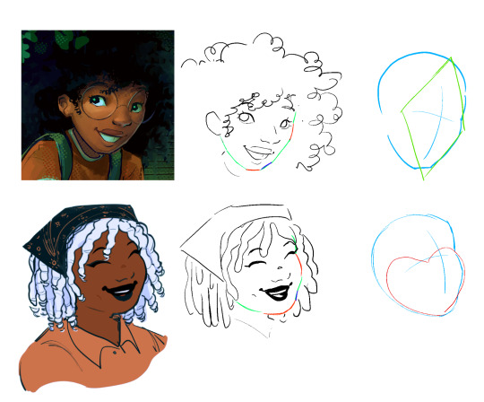
(idk if this illustration makes ANY SENSE bc like i said i think that i also struggle with pushing myself in regards to this and i think i still have more to learn/practice)
i think it comes down to paying attention to the proportions/types of specific facial features and adjusting them each to create a unique face
that said when it comes to stylizing what you see from photographic references, i understand that it can be tricky to simplify it. i really don't have any advice for this.... i just play around with it until it looks good while also being recognizable as the specific thing i'm trying to draw.......... so in that case i think it helps to use other people's art as a reference too! i don't really care about sticking to one "style" so i don't mind drawing in a slightly different way if i want to do something another artist is also doing. so for example if you're struggling with drawing 4c hair i recommend looking at other people's drawings of characters with 4c hair that you like and playing around with if you can incorporate their techniques into your own art.
i hope this all made sense ;^^ there are definitely a lot of tutorials out there that are way more informative than this one
also, to answer your last question, i plan to open up a few commission slots next week! (as long as i have enough time to that is)
54 notes
·
View notes
Text
Some OC news in case any of you care.
There's actually quite a bit of future updates I feel like sharing with you when it comes to my characters, my art, etc. So, I would like to talk about it here.
OC News
Firstly, apparently, I've been drawing my Cookiesona, Mallow Cake Cookie's front hair (except the bangs) incorrectly, meaning I haven't been drawing it the way I've been aiming for. (The 'Bobin' on the second slide of this but with a more frosting-like look to it. I suspect the link is not the original work, and if you know where the original art is, please tell me so I can give proper credit.) As a result, I will be fixing her design a bit to make it look more realistic to the Cookie Run style, and have her hair live up to expectations.
On the note of Mallow Cake Cookie, I'm thinking of changing the hair clip as well, specifically the color. This is because of the hair clip contrasting with the simple color palette. Plus, my dumb ass also remembered that the blood and strawberry moons exist. Other than that, though, there's not really gonna be any significant changes on Mallow Cake Cookie, but I'm still forming up her story and personality. I'm looking forward to you all seeing the nature of the Littlest Beast. ^^
Next, a group of OCs I made in 2022 will be getting redesigns, as they will be getting a bigger role in my artworks in the future. I'm still trying to figure out who their leader is, or if they work for themselves. We shall see.
Also, three new Super Mario OCs are in the works. First and second out of the three, the designs that are almost done, are a set of Duplighost twins, Castor and Mimosa. Castor is the happier of the two; a mischievous jester of a Duplighost who loves to perform and play tricks on others. His sister Mimosa on the other hand is on the more negative side, having a sappy face and a soulless disposition; but she finds herself at comfort with her dolls that she always holds. All I need to do left is their colors, and I'll be ready to show them off. (They've been in the works since JULY, and they NEED to be finished.) The third of the OCs is pretty simple. A Queen Peepa. No more needs to be said. I love Peepas, and I need to remember they exist. lol
Back to Cookie Run, I will be making a protege for Mallow Cake Cookie, named Orchid Moth Cookie. I have a lot of things in mind for them, and I'd like you to help me with some. Again, I still need to figure out a couple of things with Mallow Cake, before I work on Orchid Moth. But I will tell you this; they are very close and are willing to go all out for each other. And yeah, Mallow Cake's pretty much Red Velvet's morality level, but I'll get to that in the future.
I'm saving probably the most controversial for next to last, as I feel that it's more than necessary for me to do it. My Pokesona, Kitty will be getting yet ANOTHER redesign. Not even an "I'll think about it" anymore. This is confirmed. Not even the last redesign, Kitty's design didn't feel like me. I went from basic to overly complicated (because of the stupid mood bow) in seconds, and I'm nowhere near happy about it. Hell, the design to me now might scream Clefairy or Clefable or whatever, and I've been having anxiety about that. I will be making Kitty feel more like things I like, while also making her feel truly like a Gengar. To make things fairer, Callie, Bunny, and Pretty will be getting redesigns as well. On top of that, I will be making a new and improved watermark for my digital pieces. A less complex watermark than the original for sure.
And finally (for the OC part), I will be making myself a truesona because yes. I'm having quite a bit of fun making her design, and I'm very excited for you to meet her! ^^
Art
As many of you know, I have been making less art. Also, I plan to be making more changes of it, as to contradict the pressure I put onto myself on DA.
I plan to be drawing more for myself, prepare designs, practice, and whatnot. Hell, I might even be self-indulgent and feed my stupid, fucking, overcomplicated macrophilia. (SFW as always of course; plus, G/t's a comfort thing for me, and anyone who actively shames this will be mercilessly blocked.)
So, to sum this shit up, art's going to be more of a hobby for me on social media. I will still be trying to involve art of some fashion in my future career though, as it is something I enjoy doing.
Two New Sites!
As a means to store my characters at least, I have made an ArtFight account (which I plan to start filling up this Spring) and an UnVale account. I might have to temporarily reactivate my account so I can get most of my OCs settled there. (I say most because there's some that aren't the greatest.)
That's all I have to share! Thank you for coming to my Ted Talk. lol
-Kitty/Stelle/Mallow
5 notes
·
View notes
Text
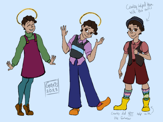
Muriel appreciation post! No part of me could have predicted how much I would end up loving them. I went into season 2 very wary of them; I was convinced they would be one of those characters that feel shoehorned in for a sequel/second season without really feeling like they belong in the narrative. I kind of expected them to be a flimsy replacement for season 1 Aziraphale's optimism toward heaven. You know how the plot of "The Force Awakens" is basically the same as "A New Hope" but they had to bring in new characters because you can't just throw the old characters into the same plot again? Kind of like that. But I love this optimistic, naive little disaster child with all my heart and I love how Aziraphale and Crowley both pretty much instantly clocked them as someone with no ill intentions and kind of took them under their wing, so to speak.
I see people draw Muriel in whites and beiges for their earth wardrobe quite often, but I don't think that fits them at all. All of the clothes we see them in in season 2 are heaven-influenced, but their utter excitement at all things human in their short time on earth makes me think they'll be the type to get super excited about colors and start taking every opportunity they get to wear every color possible, all at once. I see them as favoring comfy, colorful clothes with no concern for whether or not their outfits are "fashionable," and yeah, maybe I'm projecting a bit of my own tastes onto them and designing outfits I would wear if I was a little less socially anxious, but I digress. The sketch with the outfit ideas was just me kind of playing around with some ideas for them.
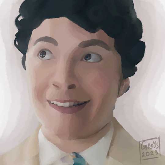
The semi-realistic painting is a paintover of a screenshot; as you can most likely tell, my typical art style is not particularly realistic, but I do like to practice that kind of thing from time to time. This one was meant largely as a color study; I was color picking from the original screenshot for my colors, and any time I do that, it blows my mind how far the colors I end up picking are from what I perceived them as/would have selected without the eyedropper. This painting in particular was redder than I would have anticipated.
7 notes
·
View notes
Text
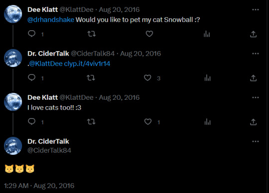
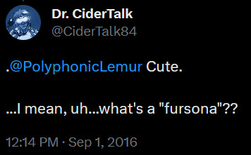
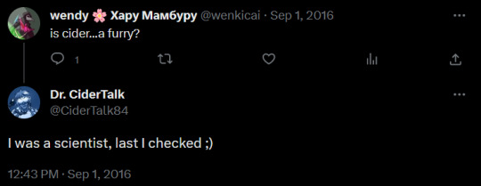
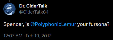
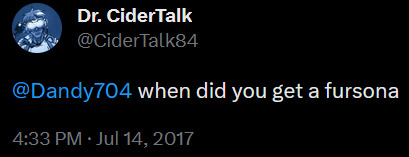
Serval Cider. Cider being more or less canonically a furry is my favorite unnecessary plot detail in Chipspeech. I am a furry and I like to think about what different characters' fursonas might be and now I have been given an actual reason to do so.. yippee. I've been looking around to see if other people have made potential Cider fursonas and I found one on twitter from almost four years ago (it is a mouse/rat). Someone tell me if there are any others (or even any ideas floating around) because I am curious.
Furry time below the cut :3
Interestingly enough I had a decently hard time trying to figure out what Cider's fursona might be. This is probably because of my affinity for anthropomorphizations of weird creatures, which don't tend to frequently show up as fursonas (arise my Cambrian brethren). I have not ruled out the possibility of Cider being a weird creature but I could not think of one that fit him well enough. I went with a serval because he honestly kind of looks like one? I do not mean this in a bad way, I really like servals (same kind of cat as Sogga). He just has that vibe. Also he canonically likes cats so I don't think he'd object to it.
Now it's time for me to be boring. The reason I am such a fan of Cider being a furry is (predictably) the whole idea that furries run the tech industry. Afaik the evidence to back up this claim is almost entirely anecdotal, though that one survey from Furscience in 2011 said that around a quarter of all furries surveyed have a degree in tech (plus another ~quarter in other STEM fields) so there's at least one statistic out there. (Generally speaking the Furscience survey is pretty interesting to read through if you're interested in both statistics and anthro animals.) Honestly though the anecdotes seem to be enough to prove that, at the very least, a sizeable percentage of important individuals in tech that are furries given how prevalent they are. In short out of all of the fictional characters I know of the funniest one to make a furry is Cider. A fair amount of furry fandom history is also pretty Cider-adjacent. The way everything lines up is so nice. Fiction does not have to adhere to real world logic but I find it so much more fun when it does. My mind looks like one of those conspiracy boards with all the string connecting different scientific studies and Wikipedia articles I've read to the funni little blorbos. This is definitely normal I promise.
Behold some furry Cider tweets because they are funni (plus him saying he likes cats, that clyp was deleted but it can be inferred). "I was a scientist, last I checked ;)" lmao
Oughh I cannot draw in That Furry Style so I have broken out the chibi(?) style I rarely use because it fits the subject material (furries) better than my normal one? I'm so glad his eyes aren't visible because I can't draw eyes that match this style. The only character I regularly draw in this style is my own fursona but they don't count because their eyes are oversimplified to make up for all of the cephalon details that need outlines. I say this as if anyone knows what I'm talking about. Things I should practice but never do. Oh well. Also the headphones are placed relative to the ear canal at the base of the outer ear. I put them as high up as seemed realistically wearable. And look at the little apple it has ears. Kitty apple :3
Is this entire post going to read like word salad to everyone except me. Hopefully not. I really hope.
#TELL ME WHAT YOU THINK CIDER'S FURSONA IS >:3#bonus points if it's a weird creature hehehehehe#the idea of a character that is canonically a furry (without any plot relevance) is just so funny to me in general#anyways imagine part of the reason Otto dislikes cats is because he somehow found out about Cider's feline fursona.. would be funni#canonically it's because cats are hard to control but I'm just thinking about him finding Cider in a fursuit and going “oh wtf”#chipspeech#cidertalk'84#cidertalk84#furry#furry art#posts by the bug
12 notes
·
View notes
Text
Peter Pan and Wendy: a review
Directorial decisions, backlash, and final result
I don't usually seek out reviews, and even less so write them, but I had been waiting for this new Peter Pan adaptation ever since it's been announced (2016!), and as such, was anxious to see what people had to say about it.
And, well, considering the vitriolic reviews this film has gotten, I wanted to balance the negative critics out a little. I didn't hate the film -- although there are things that could have been managed better (but those are not what you would expect). More under the cut.
On directorial vision:
David Lowery's style is extremely subdued, for lack of a better term. You can go through one of his films and expect a big climax, only to realise at the end that all changes happened gradually, so much so that the story has displayed its meaning without you noticing.
His films are mostly focused on the "within", with a huge focus on personal turmoil rather than big events.
For Peter Pan and Wendy, this approach remains: he took the original story from the book, and apparently drew out the elements which mattered to him the most (the fear of growing up/the bitterness of aging) and translated them into a very personal vision (which extends to the visual aspect of the film: its green hue, the worn-out aspect of the costumes...). So rather than present the story as an epic series of adventures, he rerouted the narrative to tell one singular story (my first thought, finishing the film, was actually "It holds up quite well!"). It tells a simple story, with a definite beginning leading to a definite end -- but as such, can feel rushed and uneven.
On the pacing of the film:
Lowery has one main issue, and it's his obsession for perfectionnism. As a former video editor, he's liable to cut, re-cut, and re-edit up until he's told to stop (see how plenty of the material from the first Green Knight trailer hasn't made it to the finished product). I believe it's the same with this film: especially with the Covid-19 hiatus and the interception from Disney studios (because they surely veto a lot of things in these kinds of productions).
The director and screenwriters had a story to tell, but spent so much time on it that they lost track of the smaller details for the sake of the bigger picture. It's quite visible considering the repartition of the main acts of the film, which are as follow:
Introduction of the Darlings and flight to Neverland
First introductory adventure with the pirates
Meeting the Lost Boys and Skull Rock adventure
Break at the Lost Boys hide out and "death" of Peter Pan
Climax (fight on the Jolly Roger)
Conclusion.
What's obviously lacking here is a middle adventure: we've barely become accustomed to Neverland that the climax is already reached. We should have had another scene, not only to give the viewer a chance to breathe, but also to better introduce secondary characters (the underdevelopped Tiger Lily, for instance).
This seems to be the result of over-editing: a middle adventure wouldn't have been necessary to understand the story, so off it went. But as such, it causes pacing issues. This is really my main problem with the film.
On the realistic aspect of the film:
I've seen people take out of a context a quote about Tinkerbell's lack of glow ad nauseam, and while it's typical Tumblr 'Chinese whispers', it needs to be addressed because I don't want people hating on the film for wrong reasons.
The question on how Tinkerbell should glow concerns practical rendition of an animated version. When you have to translate effects which were easily done with drawings, you need to ask yourself how it would be done practically (like, how to make the Beast look realistic in a Beauty and the Beast live action?). The quote does not mean Lowery hates on fantasy elements...
The film does have a realistic, down-to-earth look, though. That's obviously pointed out by Wendy, realizing that Neverland is "a different kind of real". But that ties up with Lowery's style, as mentionned before. He's not making an over-the-top, theatrical epic: he chose to translate the story in his style, and that's fine. We don't need another 2003 Peter Pan, because there already is a 2003 Peter Pan. As much as I love this previous adaptation, I am, for one, glad of the change. There's a Peter Pan for everyone, and maybe this one could be yours, if you look past the first knee-jerk critics and give it a chance.
I'd like to conclude on what @not-wholly-unheroic said about the film, because it sums things up quite nicely:
"I think the problem is largely that the audience was expecting an epic adventure and got a tearjerker instead. In a lot of ways, this version of the story was more for the adults than the kids… but those adults largely have a nostalgia for the adventure story they grew up with and wanted something closer to that than what they got."
There's much more that could be said about the film, but for the time being, I only wanted to counteract the overwhelming, and sometimes undeserved, negativity surrounding the film. I am not for Disney live actions at all, but I consider Peter Pan and Wendy as a David Lowery project first and foremost. Perhaps, if it had been produced by another studio, it would have been actually more imaginative and personal. It did a great job in producing an original retelling of a well-known story while taking liberties, but keeping true to a certain spirit from the original book. Barrie's Peter Pan feels very personal to each reader, and this is a personal film as well. I hope it will be revisited in time by children who have grown older, just like the adults of today keep on returning to their own favorite version of the story.
#peter pan and wendy#peter pan 2023#david lowery#disney live action#live action remake#peter pan#tinkerbell
8 notes
·
View notes
Text
hello! i am starting this blog mainly for art- i predict about 90% of it will be reblogged art, usually of animals or video game stuff. i'll also be sharing my own art and talking about video game stuff occasionally, mainly my genshin impact challenge runs. yes runs plural. i have 3 currently, alongside my main account. more about them under the cut further below.
my current art style is just space with planets. mildly cartoony i think? def not realistic, but i think it's pretty (im a sucker for space, though i'd be terrified to actually go up in a space ship or anything- im content to admire from afar lol).
planning to share art on a MWF schedule- i can make the space art p quick and easily, so i need some sort of limiter so i don't burn myself out, while also practicing sticking to a schedule and also just doing art more frequently- im extremely rusty atm. hoping getting into the habit of drawing more often will shake off the rust and bolster my confidence.
i also like to use free stock photos as a sort of cut-out guide to make animal shapes out of space. it's fun and pretty painless- im used to spending hours getting angry at myself for not being able to free-hand anatomy, to the extent i stopped drawing for i think about two years now? cause i just hated everything i tried to make. rn i just wanna get used to drawing again without getting so angry with myself, and then slowly work on free-handing again.
oh, and! if you're doing a genshin challenge run, feel free to ramble to me about it! i love genshin challenge runs- i've got several im keeping tabs of on yt, and several more i wanna catch up on. aand question- what's your pulling plans for this upcoming patch?
on my main, im at i think 53 pity on 50/50, gonna try to pull xianyun. my most hoped for result- lose 50/50 to tighnari (or jean, ill take jean too), then spend a few 10 pull to get xianyun while getting faruzan and noelle to c6. overly hopeful maybe! i'd also be happy to win 50/50 too, of course. not getting the 4 stars c6 would sting a little, but it's more primos for future banners (already have nahida so once i get xianyun im done pulling).
challenge run #1 is a standard banner only account. it's the furthest along by a long shot, having been started several months ago, but bc it's a more casual account, im thinking it'll get overtaken fast. currently post act 1 of inazuma, with level 60 characters, almost ready to upgrade them to 70.
originally planned to not pull at all til i got all the free characters up to 90 and fully built, and then had a realization that was kinda incompatible with how i was playing- there just keep being more and more free characters, and it's a slow paced account that im mostly using to replay story stuff when i feel like. so now i just do pulls whenever.
i feel like the game mildly punished me for that decision, bc out of 200+ pulls, i got. 3 5 star weapons and a diluc (who im not really interested in playing atm, though i DID get wolf's gravestone. so im on the fence). and then a little while ago, i got qiqi. i had been really, really hoping for tighnari, or at least. pretty much anyone else? keqing, jean, and dehya i'd have been fine with. don't really want mona, so i'll probably end up getting her next. or another weapon :P
next is dark hair only, where yeah. i only play characters with dark hair. i just started less than a week ago now, so very young account. i judge who has dark hair using medibang's color picker on the character' hair in their icon (ignoring shadows and highlights), since it's neutral lighting. any character who stays generally at or under 100 value counts as dark haired.
some characters were hard to judge bc gradients- shout-out to mona for being a weird edgecase- the purples in her hair are definitely too light, and most of her roots are in shadow or covered, so it's hard to get a good read. i'm thinking she will count though- if for no other reason than, there's literally only 13 other characters that count currently.
all who are currently allowed in dark hair only- amber (this one caught me off-guard ngl), beidou, dehya, kaeya, mona, tighnari, venti, wanderer, wriothesley, xiao, xinyan, yelan, yun jin, and zhongli. surprisingly, raiden shogun, xiangling, and kujou sara don't actually make the cut-off- they're all generally just a little bit above 100.
xianyun and gaming's icons aren't officially released yet, so while i expect they'll make the cut-off, im still not gonna count them quite yet.
last account, which i finally got going yesterday, is signature weapons only. simple enough for most of the limited 5 stars- and with xiao coming up, this is the best time to start, since PJWS is also a standard banner weapon. ganyu's also a must-pull for this account for similar reasons.
as far as four stars and five stars without signature weapons, my first thought was "whichever weapon they used in their character miscellany". and then i actually checked, and dear mercy, there is. 0 synergy with the weapons they chose for so many of them. i still haven't gotten over EM layla. it would be a severe power discrepency- 5 stars get a weapon that bolsters their abilities, while 4 stars often get a stat stick at best.
so im kinda at square one with them now. my next thought is just, scrub through the character miscellany, record all the weapons a given character uses, and then those are the weapons available to that character. repeat for the next character. which could give them much more flexibility. that's gonna take hours though, so ive been putting it off lol.
could also just keep it simple and say, if a character has a signature they HAVE to use it, if not, then whatever. or put a rule that i have to pick 1 weapon per 4 star, and they can't be shared (ie yun jin and yaoyao can't both have fav spear), with shuffling allowed when new weapons come. dunno, ill think on it some more while exploring new region on my main ;P
oh, and general rule for all accounts- trial characters and traveler are allowed for solving puzzles, if necessary, just not for combat. will try to avoid when possible of course.
#intro post#my posts#standard banner only#dark hair only#signature weapon only#genshin impact#feels wrong to just tag genshin and not any art stuff but like#there's no art here it's mostly just me rambling about genshin lol#ill post some art later while game is updating#for now i think i'll just go reblog a bunch ive had sitting in my likes bc ive been too shy to post til now
1 note
·
View note
Note
Hi! Hope you're doing well!
I'm trying to learn how to properly draw people. I'm fairly decent at drawing objects, but people? Nope, that's out of question. So, do you have any tips for a beginner? Like what should I focus on, any YT channels, etc.?
(If you see this ask on other pages as well, it's because I'm sending this to my favorite artists on this site <3)
hullo!! I have a few tips and tricks that might help!
make a pinterest board… or something similar. save a lot of images of people, doing different things from different angles who all look different… THEN DRAW THEM ALL!! (or at least practice with a few) if you want to draw people, then you gotta see the people. if you want you can also save tips and tricks and inspiration to your swaggy pinterest board
learn real anatomy! even if you’re drawing in a style other than realistic, learning the proportions of humans will help a lot. for example, the eyes should be one eye-length apart! once you get familiar with anatomy, it’ll be easier to draw people in general
copy other people (don’t worry, it’s not cheating) of course, don’t steal art or anything, but copying others is a great way to learn. my own style developed from a specific artist I loved in one of my old fandoms, I just copied their drawings until I could do it on my own
draw the people around you >:) I have so many loose leaf pages with drawings of people in my classes, in youtube videos, literally anywhere. those people are real and usually in action!! it’s like a bunch of free reference pictures and you can usually get different angles from where you’re sitting
get a wee lil sketchbook >_< or a bigger one, but make sure you can bring it with you basically anywhere. if you ever EVER feel like drawing, DO IT. it’s easier when you’re not forcing yourself
HAVE FUN >:((( I AM SERIOUS!! get yourself a couple of fun characters/people you love and draw them doing whatever you like. if you love doing it, then it’ll feel less like work and more like fun :D
I hope this helps!!! I hate getting drawing advice that’s “just practice!” so I tried to be specific. that being said practice is very important. and spite. get yourself a lot of spite and then all your drawings will prove the haters wrong >:)))
0 notes
Text
i need someone to smack my hand with a ruler every time i inch a little too close to my tablet pen for the next 2 days
#drawing ideas im rotating in my mind until my drawing break is over:#nadja & laszlo in drag together#gay wine aunts baronsire#several more ideas about ssilvia the slayer#rejoice transgenderism be upon you (aka my wwdits trans hcs)#more vampire guillermo.#practice for drawing all the characters in my less realistic style so that i can draw my ideas faster#nandermo animatic OR lasdja animatic.#or both!!#some kinda animatic i miss making those#more amongus but just doodles i will keep to myself#krav talks
20 notes
·
View notes
Note
Hello, this may seem a bit off, or rather something unexpected but I have been wondering how you design characters. I have always drawn not exactly realistic, but I have never drawn cartoon like. I love the cartoon and realistic style, but the ideas of having a cartoon like ideas like teh way you draw your astrotrain, or your evil villain mixmaster, I don’t know how to do this. I was wondering if you had any tips, I’ve been wanting to try a cartoonist style or a style similar to yours, I want to be less detail in my drawing but I don’t know how to start. If you do answer this, thank you even if you don’t have an answer or a way to explain.


Lots of text in those images, so I'll summarize that and give more thoughts!
But if your ability to design and stylize is what you're wanting to work on, I think this process will help you! Character design is a super broad topic, so it's hard to dive into how I consider every aspect of it in one post. Though I'd love to dig into different character design ideas in the future. Maybe streams or video essays? I dunno at this moment.
This process is more about learning what you want from your work and evolving it since it seems like where you're stuck is what you want from your art. So I recommend my "draw, reflect, exercise, redraw, repeat" way of practicing. My methods of practice aren't perfect or an exact science, but they have helped me a lot. And the idea of them is more about finding what you like and how to do it.
Step one is to draw. A design or illustration. Whatever you're wanting to make! Step two is to look at what you've made and ask yourself how you could make it closer to what you want it to be. "What do I want to change about this design?", "What art skills could I study up on that would help me make those changes?", and "What artists do I like that do those skills well that I can learn from by viewing their work and trying to apply the things I like about theirs in my own way?" are all really helpful to ask yourself! And the nice thing is, the answers to these will basically tell you what to study next. It'll give you skills to research techniques for and artists to look through for inspiration. And then you just redraw and apply what you've practiced. And you do that again. "Your art will look off to you until it doesn't look off anymore" is something I like to remember.
Art to me is finding your own solutions to problems with endless answers. I feel like I see a ton of art tutorials like "THIS is the RIGHT way to draw". And not that all those videos have unhelpful exercises or advice if they teach you the way you want to draw. But I think it's a more healthy relationship to have with your work to just figure out what you want from it and nurture it that way than to be determined to fit a specific mold that you might not necessarily enjoy. I have a basic understanding of perspective, but I still bend or break perspective "rules" for my transformers art. Having the basic understanding helps a lot in making it still look nice while I break the rules, so I studied up on perspective for a while with some basic exercises so I could apply it the way I wanted. And you can do that with pretty much any art skill.
That's my overview on ways of developing your work more where you want it to go, and I hope it helps. Always feel free to ask more art stuff if you like! I like to chat about my process, and if it helps others, than heck yeah I will talk about it XD Thank you for the kind words and stay cool out there!
121 notes
·
View notes