#pr101
Explore tagged Tumblr posts
Note
please tell me about the pigments i would love nothing more than to hear you talk about that one shade of red you like and the process it took too recreate it
... oh, op. you have no idea what you've unleashed.
alright. here we go.
OKAY SO THE RED PIGMENT. pr206. my beloved. my dearest friend. it was an absolute bastard to find because there are so many of these. however many you think there are, there are MORE, and that's only if you don't count the many many scenarios where colors are known to be multi-pigment mixes, usually varying in tone/shade/intensity depending on the brand and manufacturing style. some colors are more consistent than others, but there are situations where a color can be named the same and contain the same pigments and STILL look wildly different depending on the ratio, binder, and paper you use. and that's not accounting for the way the pigment is processed. some pigments (like pv19 for example) can come in so many shades it's frankly kind of ridiculous.
anyway, my quest begins when i am, admittedly, in an edgier phase. i want a blood red, but not specifically because of that—no, i want it because it is THE IDEAL COLOR (to me) for a perfect, warm, slightly muted but still intense shade to add to a muted autumn watercolor palette. and... if you look at my whole theme, you probably know how much i love warm colors. i want to paint mushrooms. i want to dim down some of the brighter greens to make them autumnal. i want the perfect red to put as an undertone.
the search starts in earnest.
the immediate issue is this: reds (and purples and pinks) have horrifically bad lightfastness. not all of them, mind, but many are NOTORIOUS for fading under uv light, which means they will also fade if exposed to sunlight even in passing should it happen often enough. and—in especially bad cases where they're essentially working with dye and not pigment—they can even fade inside your notebook. inside of a drawer.
so not only are we working with an unfortunate pigment base (i'm simplifying here, there's way more nuance to this but shh) but we are working with one that skews heavily toward floral pinks or oranges. the red i'm searching for is warm, but not orange. dries dark but not brown. is transparent, not opaque. that last part is agonizing, because i also desperately do not want a color that will fade on me or generally destabilize, and most of the stable dark red pigments are EARTH pigments like red ochre (pr101) or the like. which, while fascinating because of their historical usage in things like pottery and even cave paintings that last to the modern day, are VERY OPAQUE. this is an issue with my preferred style of watercolor painting specifically, because opaque pigments tend to lift easier off the page and limit layering.
the search continues. pigment after pigment breaks my heart for one reason or another, drying too close to the cooler purpleish-red tint of wine at best. i think i find it in perylene maroon, but the drying shift (the difference between how a color looks wet vs after it dries on the paper) is so extreme that it loses the luminosity AND it's more opaque than most. i languish.
for a while my search turns to creation. i try and mix as many of my single pigment colors as i can into something that vaguely resembles what i'm looking for—so i take quinacridones and mix them with napthols, with nickel azos, with dashes of ultramarines and burnt sienna. everything turns out either just a bit too opaque, just a bit too muddy (that happens with multi-pigment mixtures, and is why so many people swear by single pigment colors. it's personal preference, really, great art can be made either way.)
still, nothing works. failure haunts me. i sit before a pile of used up watercolor paper that is literally covered edge to edge in nothing but similar red squares with various gradients and blooms as evidence of when i tried and failed to convince myself my efforts were close enough. i admit defeat.
in the meantime i shift my focus. i try and appreciate different color palettes and profiles, experimenting with things like fully transparent palettes (personal favroite) to fully opaque ones that function more like gouache. but despite finding appreciation for it, i still think about the damn red that i could never recreate. it kills me.
and then one day, a youtube video. a pigment is being discontinued, and the watercolor community is distressed. this happens a lot, because pigments are actually not always popular because of artists—sometimes beloved colors are put out of production because larger markets like car companies no longer find them popular enough to invest in. this time, the casualty is pr206, aka brown madder, aka quinacridone burnt scarlet.
let me tell you a little about quinacridones. they are genuinely remarkable colors. they have their own cult followings because of how bright and abnormally stable they are under uv light. they're transparent. they're luminous. they come in mostly shades of red and pink and purple, though there are a couple oranges and yellows in there. (there are no quinacridone blues, as far as i'm aware, but the phthalo blues have that category covered.) they also rewet beautifully, so you can put them on your palette and let them dry and not worry about it turning into a useless little rock of color that you can't get any pigment from anymore.
quinacridone magenta (pr122) is probably the most popular of these, the most often used besides maybe quinacridone violet (pv19). a few years prior we suffered the loss of quinacridone gold (po49) and since then people have been On Alert when it comes to losing these colors. i am one of them, because i never got the chance to even see po49 in person, and now the tubes are so stupid expensive that even the student grade versions go for Ridiculously High Prices on ebay, and the professional brands are being hoarded like (ironically) gold by anyone lucky enough to have a tube left over.
but back to our main character. not me, the pigment. pr206. i have legitimately never heard of this one, which to be fair is probably because i try to limit the random colors i fixate on since the hobby can easily get VERY expensive if you aren't careful. but it's a quinacridone, and that catches my eye.
i open the video.
now, i'm sure any artist out there will be familiar with the fact that screens don't display color consistently. it depends on your device, but most can agree that something that looks cooler on one may be warmer on the other, it's just what happens. but i see this color being swatched, and my brain implodes.
it's almost a perfect match.
it could work. it could. years of thinking that same thought have left me bereft and mistrustful of this specific quest marker, but the thought refuses to leave me. probably because the 'discontinued' label flashes like a neon sign.
i resist for about six months, and then i cave. at this point i have genuinely been trying and failing to find this color for upwards of five years. i am desperate, and the color might not be available anymore soon anyway, and apparently i am weak to sales pitches. (note: the color IS now unavailable in some brands, but others bought a decent supply and should have it available for at least a little while, alongside po48 which is quinacridone burnt orange, a favorite of mine and probably one of the only oranges i use regularly. both are discontinued officially, but they'll still be on sale till those supplies run dry.)
the color arrives. i grab my favorite brush. i pull out my stash of paper that i save for special occasions.
it's almost perfect.
i mix it with quinacridone burnt orange.
the result is, i swear, a perfect match for what i have been searching for.
it's warm. it dries dark but not dark enough to look brown. it keeps its luminosity (thank you quinacridones). it's fully transparent (thank you quinacridones). i genuinely feel the urge to weep, but i don't because i am clinging at last to the dredges of my sanity and also salt makes watercolor pigments behave differently and i will not risk this glorious moment. finally, after all these years, bill cipher has a gun i found the goddamn COLOR.
i mix it with warm yellows and with my favorite blues. with the pinks, just to laugh. life is beautiful and i am painting its sunsets, and i do not care if they look ridiculously messy. i have won.
the moral of the story is to never give up. or maybe it's to remember you never actually know everything about even the fields you love the most, because this color totally blindsided me despite being much more common than i expected. or maybe it's that i seriously needed to chill out for a while.
but yes. that is the tale of one (1) of the colors that has taken up residence in my soul. i hope you don't regret asking now lmao.
#ney's art tips (art questions)#ney's chatter (ask answers)#so also i said that a good alternative to pr206 is pr175#but i'm actually not totally sure about that because i've never tried it myself#watercolor is an expensive hobby and that's part of why i swapped to digital orz#BUT! from comparisons i've seen they are at least similar enough to scratch the itch#ironically i think i still USE po48 more than i do pr206#but that one is also In Discontinued Limbo where you can buy it but supply is indeterminately limited lmao#still a gorgeous color though.#... wow. this was incredibly niche and probably barely coherent i am so sorry LMAO#but thank you for indulging my color madness. it was the only hobby i had for *ages*.#long post#very very long post#good god is this my longest text post? aside from maybe a hive story?
21 notes
·
View notes
Text

boar - watercolor sketch w/ pigments PB36, PY3, PR101 (I think, haha)
while cleaning, I found this palette I made a couple of years ago; so I used it on a sketch of Azalea.
19 notes
·
View notes
Photo
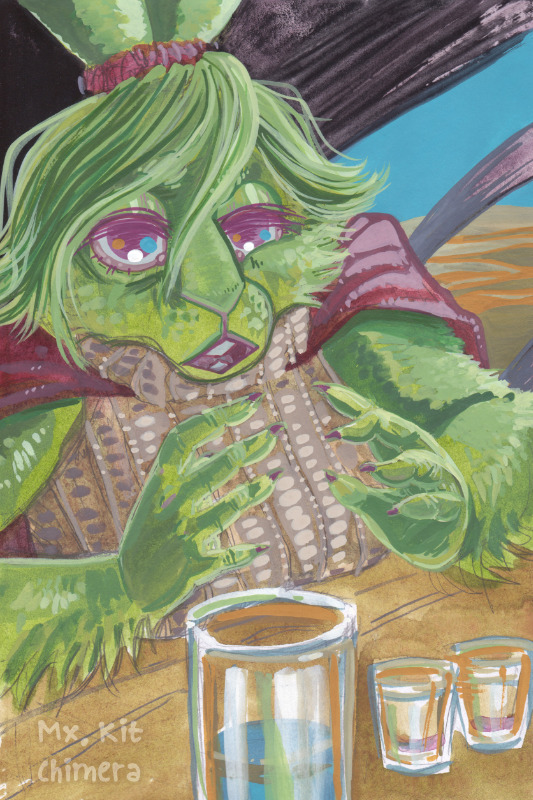
Umbra fit test 2
palette: PV55 PR101 AG* PBk11 PY129 PY43 PW6. I was trying to build a watercolor/gouache palette to match the landscape concept art on the Furality site for Umbra/2024, so I sketched Jexica in an outfit vaguely inspired by Amelia from SLARPG for testing the color mixes. *AG - Winsor&Newton Aqua Green hasn't been assigned a pigment code (yet?).
Posted using PostyBirb
4 notes
·
View notes
Note
Everyone should keep in mind that the actors strike is a very real possibility and if it happens on Wednesday then the industry will literally grind to a halt. Zendaya and Tom's teams know what they're doing trying to ramp up all these "appearances" because they're running on borrowed time for both of them and not just from the contract being on its last legs. I know T*mdayas want to believe it's a sign that Z and Tom are endgame but it's literally just PR101 lmao
^^^
9 notes
·
View notes
Note
What are the most important colours in a watercolour case? (Feel free to infodump beyond this question, please)
Hello, that all depends on your subject matter and how you like to paint! Are you going to be painting portraits so need some easy ways to mix a wide range of skin tones? Are you a landscape painter who enjoys having a few convenience greens and browns on their palette? Do you like your paints to granulate, or be easily liftable, or be excellent at glazing/staining? And when will you be using the palette - is it a small travel-sized one where you've got to be quite economical with the paints you choose, or is it a larger palette for use at the studio or at home? Is lightfastness a concern for you?
When I'm building a palette though, I base it around a split-primary palette — so a warm and cool version of each colour. This plus at least one earth colour (burnt sienna or burnt umber) and one convenience neutral (paynes gray or neutral tint) are probably the most important things to have in your watercolour collection in my opinion, especially if you're wanting to focus on colour mixing!
So my basic 8-colour palette would be something like:
cool (greenish) yellow: maybe hansa yellow light, or if like me you're not a big fan of regular yellows, a PY129 (often called green gold or rich green gold) is almost green in masstone but diluted to a lovely and functional cool yellow
warm (orangey) yellow: my favourite would be a quinacridone gold hue - either Schmincke (PR101 + PY150) or Daniel Smith or Roman Szmal (both PY150 + PO48) since they're a slightly earthier but vibrant orangey-yellow, but any warm yellow will do! Other common alternatives are new gamboge, hansa yellow medium, etc
warm (orangey) red: my absolute favourite currently is a PR255 (Daniel Smith pyrrol scarlet or Schmincke vermillion), but other common alternatives include cadmium red light (or cad red light hue), or any slightly orange-leaning red you can get your hands on
cool (purpley) red: a common choice here is a quinacridone rose PR122 or PV19, particularly if you'd be doing botanical painting, but my favourite is a PR254 pyrrol red - a postbox or fire engine red, so not particularly cool, but I really enjoy it with the quin gold in skintone mixes. Another option could be to have a middle red such as this AND a cool pinky-red on your palette.
warm (purpley) blue: the obvious choice for this one is an ultramarine PB29, a colour I think pretty much every watercolourist owns. This is a granulating pigment, but some brands such as Schmincke also offer a less-granulating version (Schmincke ultramarine finest) if you're wanting a smoother colour, or a French ultramarine for heavy granulation. I have both on my palette for different purposes.
cool (greenish) blue: the most common choice is a phthalo blue green shade PB15:3, but I much prefer the slightly cooler phthalo turquoise PB16 (Schmincke helio turquoise) - partly because I enjoy the colour and partly because it neutralises with my warm red PR255 beautifully. If you've gone for a cadmium red light as your warm red, try a cerulean as your cool blue to neutralise and match the cadmium's softness.
brown earth colour: I use this to neutralise with ultramarine and make a beautiful soft black, so my choice would be burnt umber, but burnt sienna works just as well (and is possibly more versatile)! Try and get either of these as a PBr7 pigment if you haven't already, as they tend to have the richest colours and cleanest mixes. Other options could be a quinacridone burnt orange PO48 (which I also have on my palette) , or an Indian/Venetian/English Red PR101, but see which neutralises best with your warm blue. A brown earth is also very useful for mixing darker skin tones, so bear that in mind when choosing.
neutral colour: this is a convenience (multiple-pigment, ready mixed) dark neutral colour that can be used to darken other mixes and in place of black. It's also great for monochromatic studies! Sure you can mix your own with ultramarine and burnt sienna/umber, but I get through a Lot of it so it makes sense for me to have a ready mixed version. Common options are paynes grey (a blue-leaning dark grey), or neutral tint (more neutral of course), but on my main palette I just mixed ultramarine finest and burnt umber together in one well to get my own custom mix. A thing to decide here is if you'd like your neutral dark colour to granulate or not!
These are my personal palette essentials, but everyone is different, so the best thing is to test things out and see what works.
Other resources:
I have a short (but continually growing) YouTube playlist on palette building that could be useful too, and Kim Crick has a great feature on essential colours on her pigment database here which I find very useful.
I hope this is of at least a little use!
#long post#art tips#watercolour tips#not art#ask#supplies#thank you for asking! this is only scratching the surface tbh
16 notes
·
View notes
Note
Honestly it's naive to think that they had no idea this was going on. He was doing it for 6 years and the investigation started in June of this year, them unfollowing him now is pr101 and is in no way an indication or evidence that these men did not k ow anything. Mind u most of them are still friends with Lucas. Nctzens are being very naive right now, just think logically. At the end if the day we di not k ow these men, 2 sex offenders in nct and people still belive that those who are 'innocent' had no idea as if these are not all privileged men in their 20s.
I know i know this is all true. I’m also thinking that all of them unfollowing him was just a ‘oh shit I can’t be associated with him’ type thing. Like no way these men would cut off a friend like that theyre all probably gross. I hate when kpop fans talk about their idols being all innocent and they dont know a single thing as if theyre not a grown ass adult.
1 note
·
View note
Note
She made herself a laughing stock the white feminists would rather die than admit holivia was beyond planned and calculated. And it start w the called pap on set to take exclusive and scriped photos only of them. it's so funny we were pointing out everything when used to be a hot topic it was like a pr101 textbook😂 it's 2024 y'all
I think Florence also hating her makes her look even worse
0 notes
Text
レーキ化実験をしてきました②-三本ロールミル&座学編
20223/2/23(木)、クサカベさんのイベント、「西洋茜のレーキ化と三本ロールミルの操作体験」に行ってきました!
前半、レーキ化実験編はこちら。
漉したレーキを乾燥させてる間、三本ロールミルを体験させていただきました。 そして、省いた座学&濃度高めの雑談?編。
1.座学編
顔料と染料の違い、レーキ化とは何か? 何故退色するのか?などを学んできました。 が、話を聞くのはめちゃくちゃ楽しいのですが、雰囲気でしか理解できない自分の脳みそ。 某特撮もののジャンルで言うところの「だいたいわかった」的なあれ。
(1)染料と顔料の違い
この記事を見に来る人はきっと、染料と顔料の違いはなんとなくわかってると思うので割愛(←ひどい)
そして、レーキ顔料は、染料と顔料のいいとこ取り、みたいな印象もあるかもしれませんが、��ながちそうとも言えなくて。 染料のような鮮やかはあるものの、耐光性は染料同様、とても弱いです。 とはいえ、太陽に当たりにくく、耐光性が重視されない雑誌などには向いている、ということで、要は使い分け大事、というわけですな。 (↑わかったような言い方をしているがふんわりとしか理解してない)

ブリード現象というものを表した?資料。 耐光性だけじゃなくて、そもそもやっぱり絵には向いていないんだなぁと思わざるを得なかったです。
ブリード現象については、Tシャツのプリント部分に色が移っちゃうっていう説明のサイトを見つけたのでそちらをどうぞ(丸投げ)。
(2)レーキ化とは
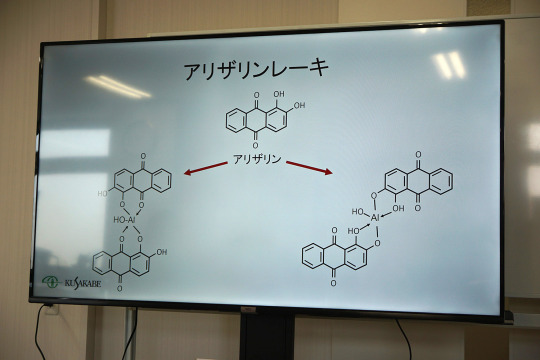
レーキ化とは、を表した図式。 うん、わからん。 とりあえず、アルミニウムと結合することでうんちゃらかんちゃらということだけはわかった。 (↑それはわかったと言えるのだろうか……?)
↓今度はPR48:1で表した図式。(写真が暗くてすまそ)
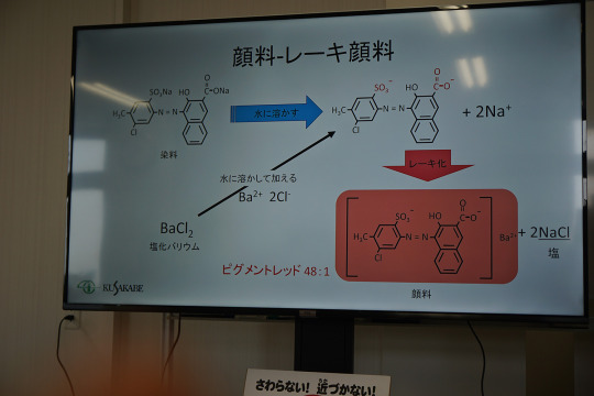
で。 この名前はわからん赤い染料、水に溶けることで、2つのNaの結合が溶けちゃう?かなんかで消えてしまう。(曖昧) で、塩化バリウム溶液を加えることで、水に消えた2つ��Naが塩化バリウムの2Clとくっついて2NaClになってなんちゃらかんちゃら………… (これ以上は記憶が…………orz)
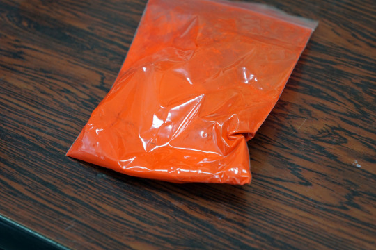
なお顔料だとこの色。 PR48:1、製品で見た限りでは、SHINHANの油絵の具にあるようです。
2.実験中のお話
実験室も楽しいし、実験中の小話も面白いので、煮出してる時間や、濾過してる時間もあっという間でした。
(1)色々顔料
実験中はいろいろなお話や超絶貴重な顔料を見せていただきました。
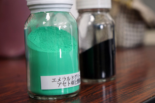
ハイ、エメラルドグリーン! ハイ、名前憶えてないけど黒すぎる黒!
そのほか、廃番になった顔料PB33や、忘れたけど、前に話題になった廃番になった顔料とか。 (みな勘違いしているかもしれないのでここで主張しておくと、当アカウントは、PB27、PB28、PB29、PB35、PB60、PB66、PY3、PR101、PR102、PW4、PW6くらいしか憶えてません。これ以上のキャパシティはありません)
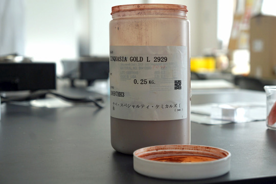
(2)実験の小話
①実験ではアンモニアを使用しましたが、アルカリ性ならできるようですが、アンモニアの方が良い色が出るようです。
②ミョウバンにくっついた量が顔料の量になるようです。
③コチニールも今回と同様の手順で作れるようですが、藍のレーキ化は別の方法になるようです。 奥が深すぎる!!!
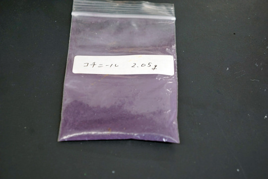
なお、クサカベさんが以前作ったコチニール顔料。 PH値の問題で色が紫色になったようです。 市販で売ってるコチニール顔料は真っ赤だから、むしろレア! ※コチニールでレーキ化するときは、泡と臭いがすごいとのこと。 おうちでもやってみようと思ってホーロー鍋買ってみたけど、大丈夫かなぁ……
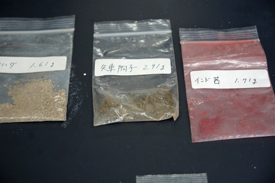
他の染料でも色々レーキ化実験を行っていたようです。
3.三本ロールミル体験
アンモニアを入れた後の濾過~乾燥の時間に行いました。
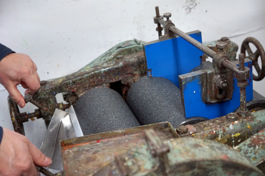
(1)三本ロールミルを動かそう

↑今回体験する三本ロールミル。 実際に絵具を製造する際に使っているものはもっと大型です。
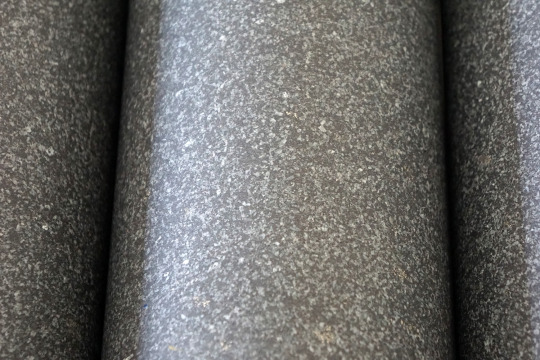
この写真だとほぼ見えないですが、このロールミルの間の隙間を調整していく体験をします。
先ずは、器具をとりつけ、絵具を投入。 空で動かすと、石同士がこすり合わされて劣化してしまうので、空回し禁止!
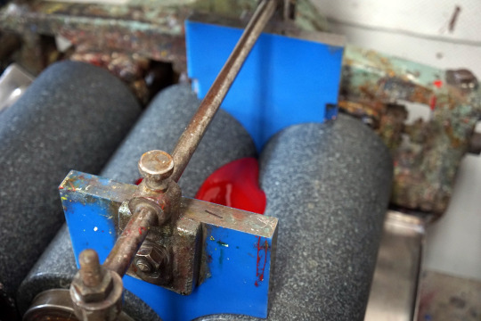
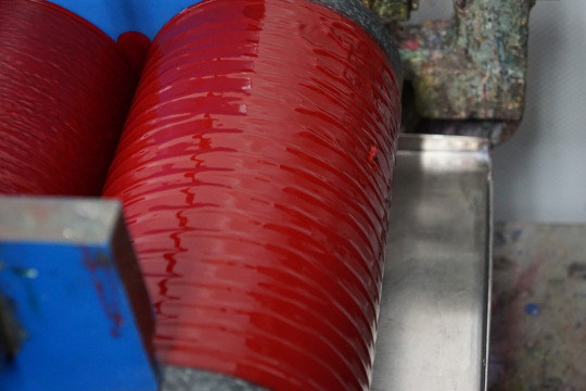
↑駄目な例。
左右、バランス良く綺麗に幅を調整するのが難しい! これができるようになるまでに1年はかかるそうです。 まさに職人技!
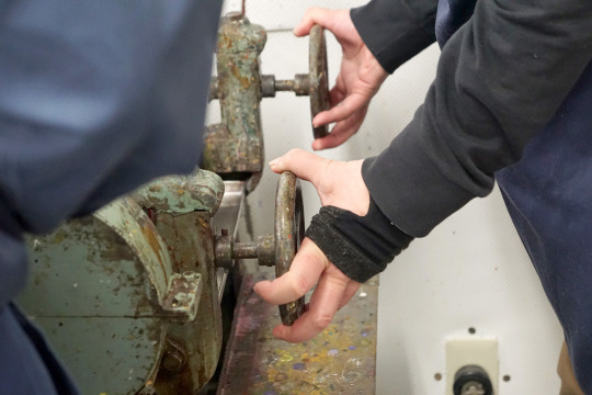
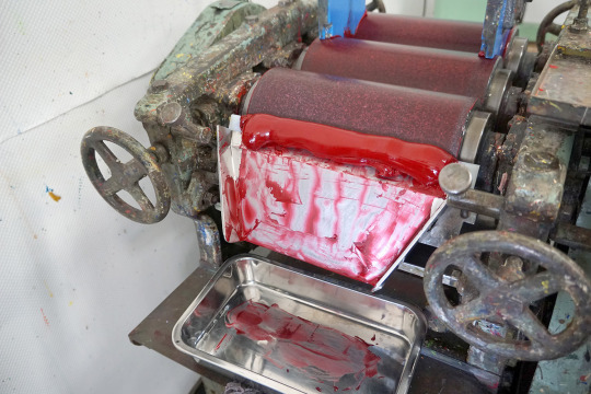
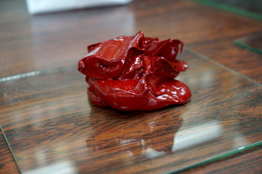
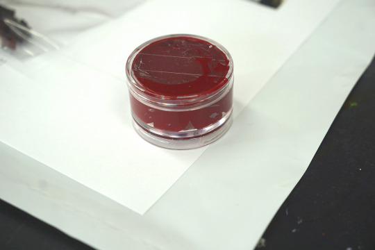
そうしてできたものがこちら。 油絵の具か!?という大量の水彩絵具をパレットナイフでごっそり取って容器に詰めるというなんか豪快な体験ができました。
(2)後片付け
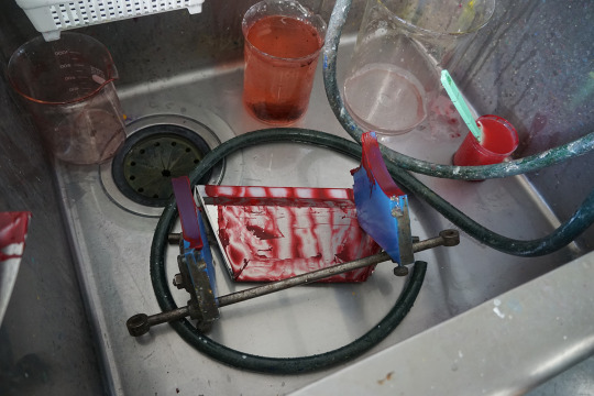
上に取り付けた器具を取りは牛、こちらは洗い場で洗います。
肝心のミルは、中々大変そうでした。(写真がないので詳細は割愛) 少しでも色が残っていたら、次に作る絵具に多大なる影響を与えてしまうので、洗浄作業もとても大事!
毎日あの大きなロールミルを掃除していると思うと、本当に大変だ……
4.最後の質疑応答など
最後はいろいろな絵具の原料などを見せていただきました。
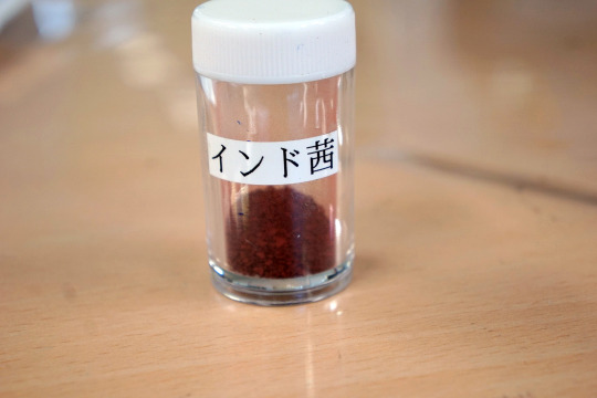
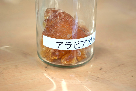
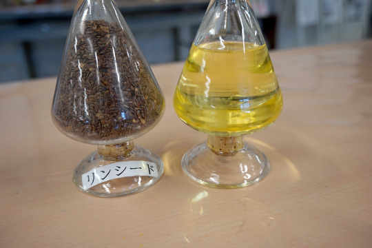
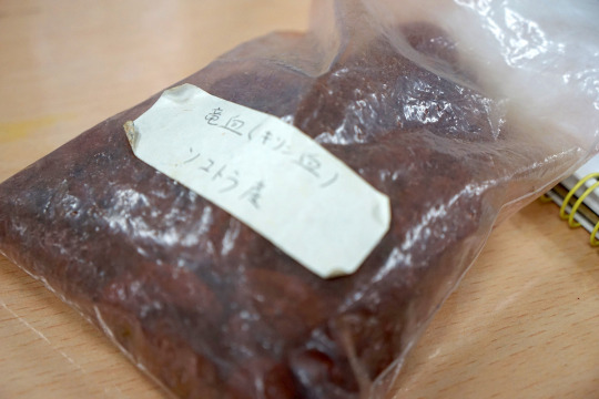
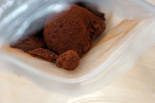
↑ドラゴンズブラッド。 龍血樹という木から取れるようです。根っこではなく葉っぱから水分を取る変わった木のようです。 バイオリンにも使われているのは初耳!
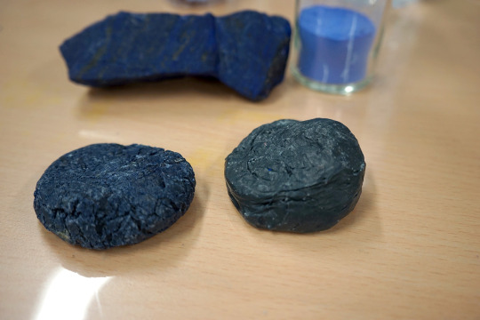
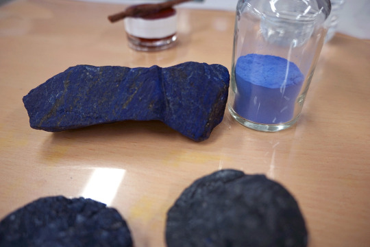
↑こちらはみんな大好きラピスラズリ。 下の丸っこい塊はチェンニーニの作り方ででてくるやつ(←曖昧)で、ミツロウとかなんちゃらとか松ヤニとかを混ぜてなんちゃらするなんちゃら(←なんちゃらが多すぎる)
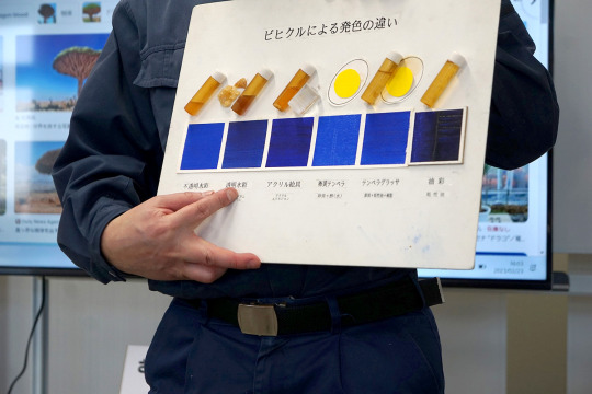
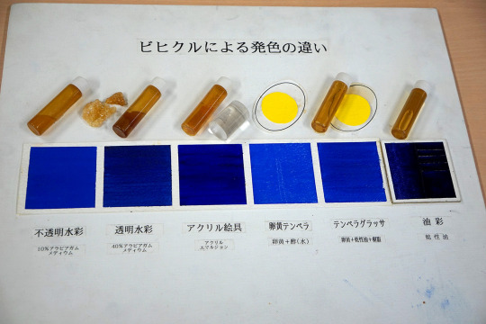
最後、面白かった質問は、バインダーによって色がどれだけ変わるか、というもの。
こう見るとかなり違う!特に油絵の具! 不透明水彩・卵黄テンペラが一番顔料に近いようです。
というわけで、この後は恒例(?)お買い物タイム。 いろんな顔料が超安い! オーレオリンとかいっぱいあったけど、ちょっと諦めた。
以上、レポートでした。
なお、最初は参加者6名だけは少なすぎる(>_<)って思ってましたが、作業をしていると、6名が限度なんだな、と実感しました…。
なお、今回は参加費6,000円でしたが、休日の開催で、6名しか参加できないうえ、内容盛りだくさんで、お財布へのダメージは確かにあるものの、この内容の濃さからすると安すぎる……という印象でした。
最初から最後まで、本当に色々盛りだくさんであっという間でした。 休日の中開催していただいて、本当にありがとうございました!!
0 notes
Note
I take this back. I feel for her mental health problems, but that doesn’t give her any excuse to be a mean girl and a bully. Not with her infinite resources for help.
Either this is her pr101 again when she has promo for her album and needs to revive the Jelena drama, or she is genuinely this obsessed and a bully. She always does this when she gets exposed as a mean girl, suddenly get out when she already started the flames that makes her fans feel justified for bullying.
Selena Gomez always give me pick me girl, seriously I used to love her but she is the type would insult herself just so people call her the opposite , and would Always always always play the victim
I think Selena is problematic and a professional victim, but I feel that’s reaching a bit with the tiktok.
#this is the last straw#stop making us feel sorry for Hailey#she’s just a bully at this point#girl sometimes it’s not social media#you’re the problem
2 notes
·
View notes
Text
Just to clarify some things: Yes, there were 2 test screenings for Deadpool 2 and No, There was NO rejection. Both screenings achieved 90% of acceptance, however, there is a quite heavy / dirty scene (that I'm not allowed to say which), but that's literally just it, nothing else happened.
49 notes
·
View notes
Photo

👉Get outta here with your $500!!! 👉Are you kidding me??? 👉You ARE NOT ready to work with a publicist 👉Get outta the line!!! 👉You’re blocking my blessing!!! #KnowYourValue #DoNotSettle #REPOST Read this again! . . . . #publicist #publicrelationsagency #mediarelations #pragency #publicrelations #prlife #mediaagency #advertisingagency #digitaladvertising #marketingagency #marketingtips #brandingagency #brandingtips #prgirlsdoitbetter #womeninpr #pr101 #publicrelationsfirm #lifeofapublicist #womeninmarketing #prpowerhouse #prtips #digitalmarketingagency #digitalagency #digitalbranding #brandingstrategy #creativemarketing https://www.instagram.com/p/CSrPlVyL2Z3/?utm_medium=tumblr
#knowyourvalue#donotsettle#repost#publicist#publicrelationsagency#mediarelations#pragency#publicrelations#prlife#mediaagency#advertisingagency#digitaladvertising#marketingagency#marketingtips#brandingagency#brandingtips#prgirlsdoitbetter#womeninpr#pr101#publicrelationsfirm#lifeofapublicist#womeninmarketing#prpowerhouse#prtips#digitalmarketingagency#digitalagency#digitalbranding#brandingstrategy#creativemarketing
0 notes
Text

“1992” palette test on coloring page. watercolor. pigments PG7, PY151, PR122, PR101, PB15
sometimes I want to just test colors and not think too hard about it—so I printed a coloring page I bought a couple years ago (coloring page artist’s work now available here )
trying some new things simultaneously
-using cyan
-adding a bit of gouache in my pans to reduce shine in bronzing colors (but maintain transparency in masstone)
PG7: winsor green bs x winsor green gouache
PY151: m graham azo yellow
PR122: mission gold quin perm magenta x holbein primary magenta gouache
PR101: m graham trans red iron oxide x daniel smith lunar red rock
PB15: holbein manganese blue nova, holbein peacock blue (pg15 x pg7)
2 notes
·
View notes
Photo

something like a river rock
transparent + opaque watercolor on a slice of shipping box. 8 x 10". pigments: PR101 x PB60 x PY129 x PW6. a painting I made to self-soothe.
Posted using PostyBirb
3 notes
·
View notes
Photo


(wink)deep hugs
#wannaone#wanna one#wannaone bae jinyoung#bae jinyoung#park jihoon#wannaone park jihoon#winkboy#winkdeep#kpop#produce101#pr101#produce 101
118 notes
·
View notes
Photo

2wenty7 Inc. Get The Best PR Service in Delhi
If you are startup owner and start a new business so you must heard that PR agency is best-helping tool to grow your startup or brand. 2wenty7 Inc is best PR agency in India. We are specialist in startup PR and provide best PR service in Delhi. https://goo.gl/1gvHYa
#pr agencies#pr agency#pr company#pr firm#branding#media relation#public relation agency#prlife#pr101#pr best pr agency#pr services#business#startup
1 note
·
View note
