#poorly made lineart
Explore tagged Tumblr posts
Visit Tumblr Blog
Explore Tumblr blogs with no restrictions, modern design and the best experience.
Last Seen Tumblr Blogs


Fun Fact
Tumblr is available in 18 languages.
Text

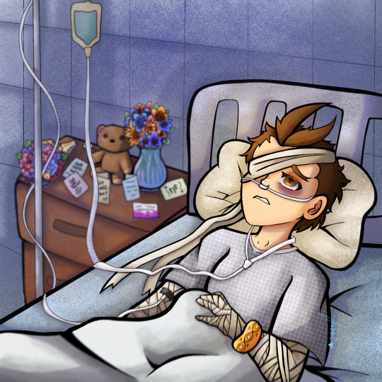
Director of the False Last Act
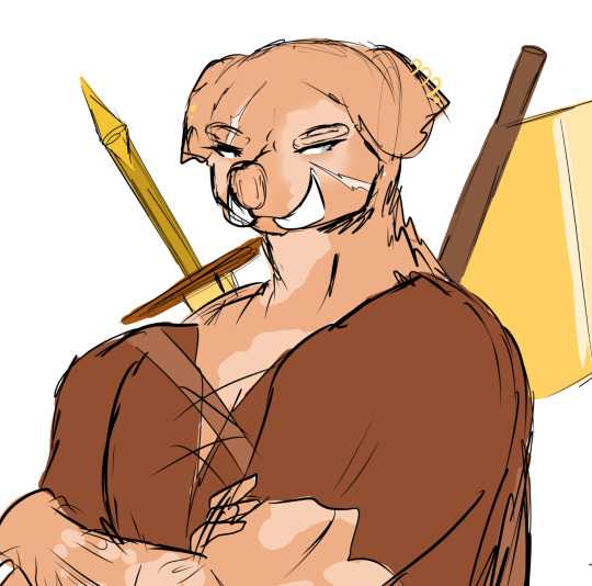
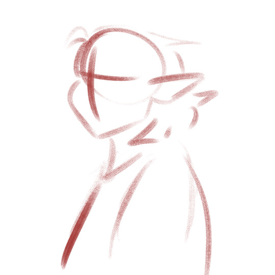
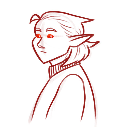
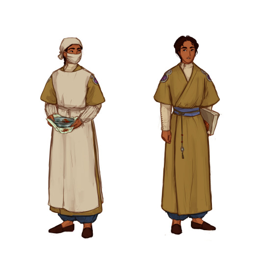
#orv#omniscient reader's viewpoint#orv spoilers#han sooyoung#art i made#another of the drawings i fished out of my drafts that i completely forgot id started#if the face doesnt look like how i usually draw hsy uh. i apparently did the lineart like 4 months ago#and the way i used to draw her was WAY different#like i had to redo the face cuz i was like man this aint my girl wtf#oh yeah the sort of. watsonian reason why the title of the book shes holding is scrubbed out is bc it could either be twsa or orv i guess#the doylist reason is i couldnt decide between twsa or orv so now its neither LOL#side note but like. intellectually i know the thousand hand guan yin is like an actual thing in buddhism but my familiarity with it is#mostly from the dance move#so like as i was colouring this i was just imagining hsy like creating this pose in universe w the avatars which. one hell of an image#only two of the hands are supposed to represent like specific points in the story the rest are just. symbolic...?#the lemon candy one is obvious and the knife one is meant to be from when she stabs 49!kdj in the epilogue#also holy god im so bad at coming up with backgrounds for this kind of art#the original background i had i think i was trying to make it look like some kind of. book cover...? hence the borders#whatever it was it wasnt working#now i have no idea what its supposed to be 👍 like its giving. poorly designed tarot card
377 notes
·
View notes
Note
A bit of a strange question, but if there were any of your videos you were to "remake" today for any reason (ex: you feel like you misrepresented the original text or spread misinformation), which would it be and why? None of them is a perfectly valid answer
Again: bit of a strange question, but I've been thinking about my own creations and how I could have done so much better with some of them, but I also know that is a sign of my growth and constantly chasing "what if I did this instead" isn't always healthy for nurturing a creative mindset, and I was wondering what your opinion might be as a Creator of Things with a bit more experience than I
There's been a few trope talks where I've thought later of other angles I could've explored that might warrant sequels or part 2s, but I don't dislike any of the summaries enough to justify a rework.
I always find "I could've done this better if I made it now" to be a bit of a fallacy. I'm only better at making things now because I made all those earlier things. If I knew everything I'd learn from making a project before I started the project, it wouldn't come out the same.
I think when it comes to the "rework remake perfect" instinct, it helps to zero in on what the impulse is really grounded in. In my experience, more often than not, it's not actually about making the art better, except incidentally. It's usually about showing that you are better. It's demonstrating your competence and your higher standards and your skills, and more importantly it's overwriting the proof that you were once less than perfect. If people look at your old work and think that's all you're capable of, they'll be judging you poorly!
If that's the motivator, it's a very unhelpful one. You can't control for being harshly or incorrectly judged. It's a fruitless effort to stave off potentially upsetting outdated criticism, and it's not even going to work. Fear of critique is an unreliable and untrustworthy motivator.
If it really is about making the art itself better, perfecting your magnum opus with your newly leveled-up skills, that's a little more solid. But from where I'm standing, it's always better to use those skills to make something new instead of polishing something old. The older, unpolished work has already acquired its audience that finds it appealing for reasons that might never occur to you. Trying to bury or overwrite it just deprives that audience of the thing they like, and maybe makes them feel bad for having liked it in the first place. Also, usually when you look back on the older work, you'll conclude that the problem is everything and it'll need to be torn down and started from scratch. I know when I revisited the first three chapters of the comic, when I let my critic brain spin up, it wasn't shading or lineart I wanted to fix - it was panel composition, overall pacing, the entire structure of the chapters as a whole. I would've had to make them all over again to be happy with them, and they wouldn't be the same story by the end.
I've been thinking a lot about the Discworld through this lens lately. It ended up over 40 books long, but everyone agrees that the first two are not what you should start with, because they're the worst ones. They're entirely parodic, purely referential of at-the-time major fantasy series, and borderline mean-spirited in places. If you haven't read Fafhrd and the Gray Mouser and Dragonriders of Pern, you're not gonna understand like a full 50% of The Colour Of Magic.
It's clear that when he started in on them, Pratchett was entirely focused on taking the piss out of a genre he found mostly shallow and unimpressive. But the Discworld wouldn't leave his head, and everything he made fun of he clearly eventually found himself overthinking. He'd make little one-off jokes in the early books about Dwarves having no women and a hundred words for gold, and then twenty books later he'd have a Dwarf gender revolution make waves across the Disc, and then he'd write Thud!, a book that delves deeper into the nuances of Dwarf societal structure than Tolkien ever did.
If you look for them, there are continuity errors everywhere in Discworld. In his introductory book, Carrot defused a dwarf bar full of rowdy brawlers by guilting them all into writing to their poor lonely mothers back home. Shortly thereafter, Carrot will be outraged at the mere concept of an openly female dwarf. Pratchett even eventually wrote Thief of Time, a book that loosely explains that the Disc makes no sense because history has been broken and put back together incorrectly twice, and therefore any continuity errors are because of that.
He's the writer. He could've gone back and fixed it, edited the reprints to be less disruptively discontinuous with the later books. Instead he continuously moved forward and allowed the world he made to grow without cutting it off from its roots. And because he didn't bury his older, far worse work, we have the privilege of following the Disc's evolution from the very start, and seeing how this shallow, stock fantasy world parody became something incredibly rich and complex without ever pretending like its early installments never happened.
Anyway, that's why I think it's better to move forward. You make more good stuff that way.
505 notes
·
View notes
Text
This is the third time I've had to repost this pls pls workk


Pls leave a like they worked really hard on their drawing 😢😢😢
little creature versions of my favs.... Lesbian quartet ™️. Ig LMAO... They're just comfort versions I can draw on a whim cuz they're simple... I'm not scared to post them on the tags anymore.. they'll all get poorly sewn plushies too eventually grahhh
I got. Three hours to work on this in class instead of my norm two. So I took extra time into just. Having fun with it! And no rushing...
Process under the. Read more!
I LOVE MY PROCESS ITS SO FUN G4AHHH
First of all. Ms paint doodle I made before I even decided I was gonna make something . I ended up using this as a reference for how I'd draw all of them ...

Then I just hop into lineart! My sketch is my line art. It's more fun this way lmao. I don't worry about my art being wonky or perfect

I didn't like how Tisha was looking, decided it was better to have her cuddle like the rest of them, so I changed that

Then I just. I start rendering!! I didnt do too much of that on this piece but the process is still the same. I do this without color first because I just find it easier to understand and work with! I make adjustments as my brain seems fit at this stage as well.

And last I use blending modes to add all that lovely color!! I don't use one layer I use like. FOUR so that I can get a nice variety of shades n such... I don't color pic either I just slap colors I think fit... I usually merge everything at the end and draw on top on a normal layer to add finishing touches!
And that's pretty much it!!!
#percy's art#percy's rambles#art#dandys world#dandys world fanart#dw shelly#dw bassie#dw tisha#dw vee#polyamory#the lesbian quartet ™️#LMAO#squishy designs#sorry i rendered individual toes on tisha#it will happen again#this was the kast thing im ever drawing !! in my intro to media arts class!!!#computer number three and drawing tablet 31... i will miss you dearly...#im excited thiugh im taking graphic design classws next year!!! i didnt get my Photoshop certification this year cuz we ran out of time but#ill try ro get ir next semester!!#shelvin
77 notes
·
View notes
Note
hi! i love your stuff a lot, and i was wondering how you decide on colors for your pieces / designs? im doing an art analysis on your stuff and its getting hard when it comes to your colors. your art is really really appealing and just generally good to look at!! thankyu :p
I really like rainbows and bright colors so I tend to gravitate towards those. I tend to use the same general palette for rainbows in all of my pieces, I like replacing red with pink or in a more complex gradient-ish rainbow putting pink before red. Sometimes indigo can be omitted for a 6-color rainbow (fact:there was gonna be a indigo-hued diary in the "does this just keep going forever" drawing but I was reaching the point where it wasn't fun to work on anymore and I just wanted to finish it so I omitted it..)

i made this very poorly/sloppily on my phone but here's 2 rainbows I really enjoy and a shading technique I try to employ in almost all of my art. basically if something is pink then I should shade it purple instead of darker pink. (pink is one of those colors where I don't always like using the nearest color [red or orange] for highlights and I just pick a lighter pink instead, and sometimes make it warmer/cooler. but it depends!! I like to mix it up if possible)
I dont always do shading on my art but I also like to pick lineart colors this way as well
as for just picking colors in general: I will be real and say that sometimes the colors I pick don't end up looking perfect so I add filter layers or gradient maps at the end. but when i pick colors normally I tend to gravitate towards higher saturation ones.
these are really the only "rules " i set for myself when picking colors. the rest is just...fuck around and find out. Sorry if this isn't exactly the answer you were hoping for? I'm no professional and I'm bad at explaining things LOL 😭
26 notes
·
View notes
Note
Ignoring the fact that ibis had the ai paint feature a couple years before this whole ai fiasco, after seeing your post, I decided to try it out to see if it really held up. I already knew what you said made no sense, as even stuff like ai painting requires heavy human input that isn't just someone typing a prompt in a thing and looking through thousands of images and somehow still calling it 'art'. Really, it's just some weird advanced bucket.
The ibis ai paint... really sucks. I'm pretty sure it hasn't even been touched since it was added. No matter what I did, I got random colours and whatever colours I had put there looked like it were from a filter, not to mention how my lineart bled everywhere like it was blurred out.
Ibis isn't problematic for adding that feature as not only was it added ages ago, but it was also just a gimmick only added because a few more popular paid programs added them, like Clip Studio Paint. I highly doubt even the company took it seriously considering how poorly built it is. This is actually the one time I'm glad some feature in an app sucks so much.
Another reason why ibis isn't problematic by the mere feature alone is that, when you look at the artists making content during the time of that update, it was received with humour. It was something fun to try, but ultimately dismissed for actual artwork, as nobody would use it to fully paint their works. Nowadays we see something slapped with the words 'ai' and think that it's instantly bad due to the latest issues with it and big corperations/ certain production companies but it isn't. It's just a lot of people abusing what was previously some fun gimmick, which it can still be, and for certain apps, still is. Nobody throws pitchforks at character ai, after all.
You can tell just by the size of this that I'm procrastinating on something. Ima go and let this rot away in your askbox now lol
You really thought this would fade away in my ask box, mwahahaha /j
I wanna start off by saying thank you for holding me accountable, I will admit that I got buzzworded pretty hard in this situation lmao
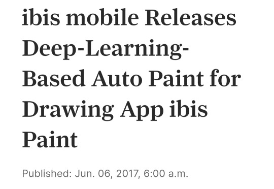
This information came as a surprise to me-- I was seeing posts pop up within the past week complaining about the ai feature on ibis, so I assumed it was recent. As it turns out, after reading your ask, I discovered that I got a few wires crossed! Because yes, the auto paint feature I referred to in my post has been around for years now, and was never taken seriously anyways
So that was my bad (and yea ur right it's completely unusable, lmao)
But as it turns out, the feature that people have been complaining about DID come out recently. It was called the AI Example feature, I think the idea was that you make a simple drawing and the AI adds 99% of the detail and color, which I've seen a bunch of other programs do.
...and then it was immediately removed due to some pretty major backlash, which, duh
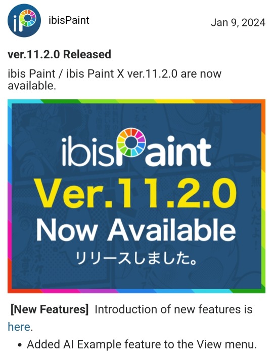
^ This is the only evidence I can find of the 11.2.0 update that included the AI feature on the actual site; their update history stops at 11.1.0. But there's also the news page about the removal of the update, so it's not like they're trying to pretend it never happened.
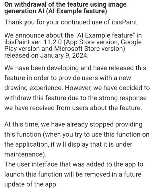
So tl;dr, I jumped on the hate train a little too quickly and never did enough research to figure out what the actual update was, and that it's been removed by now anyway (which I couldn't have known until today, ofc, but i did kinda post that thing about ibis today so it's still a pretty major oopsie)
I think I can say with confidence now that I agree, ibis paint isn't problematic to use-- they made a mistake with this update, but they actually listened to their users and removed it LITERALLY the next day. So, thanks for letting me know! I'll also edit my last post to prevent any misinformation, just in case people make the same mistake I did :]
#its a big relief that i dont have to learn how to use an entirely new art program anyway#so this ask came as a pleasant surprise#asks open#ibispaintx#now i just gotta hope i didnt get anything else wrong about the update
94 notes
·
View notes
Text
i made a really good sketch of patches but i feel like it wouldn't look good if i did a clean lineart so i just poorly colored it
10 notes
·
View notes
Text
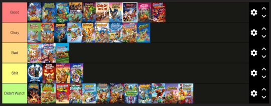
The current tierlist of direct to video scooby doo movies my friend and i have made
didn't watch: these are movies we haven't watched yet, but will in the future.
these include (so far): camp scare, legend of the phantosaur, music of the vampire, big top, mask of the blue falcon, stage fright, frankencreepy, the mystery map, moon monster madness, haunted hollywood, shaggy's showdown, and blowout beach bash.
additional statements: we're not going at these with a specific order most of the time, we kind of jumped around in time a lot. this started as a halloween movie get together and spiraled from there. but now we're out here making tier lists.
so now that that tier example is out of the way, let's get onto the actual contents (under the cut)
i don't have additional statements for every movie in a tier, but i encourage you to ask if you're curious about one i didn't address.
edit: we also watched the original 2 live action movies and they're both in okay tier.
good tier: these movies are good in several respects, although obviously not flawless. they're fun/funny, or charming, or have good animation, or good character writing, or some combination of all of those.
these include (so far): zombie island, witch's ghost, goblin king, kiss: rock and roll mystery, curse of the 13th ghost, krypto too, batman the brave & the bold, gourmet ghost, trick or treat, and abracadabra-doo
additional statements: the ending of 13th ghost is very obviously rushed and if you care about the series it's ostensibly a finale to you probably don't like it; we, however, do not care much about the 13 ghosts of scooby doo. i was just as surprised as anyone else to find out that the bobby flay movie was good. and the guess who era of scooby doo movies needs to continue i swear to god.
okay tier: these movies are still enjoyable, usually if you don't think about them too hard. most of them have glaring details that don't make sense, or that sour the better parts of the movie and keep it from being in "good" tier. they're mediocre.
these include (so far): cyber chase, legend of the vampire, loch ness monster, aloha, where's my mummy, pirates ahoy, chill out, samurai sword, and alien invaders
additional statements: samurai sword had some shockingly racist moments that i did not remember at all going into the rewatch; all i remembered were the cool fight scenes. alien invaders has mediocre music and big pacing issues, to the point where we almost had to make it a separate tier between bad and shit called "what????" because they stopped the villain exposition in the middle to cut to another scene and THEN continue the explanation. and where's my mummy had me complaining about not being able to see the city of cairo the entire time because i cannot stress enough that it is right there. except it wasn't.
bad tier: there are massive issues with these movies that are either unaddressed, or addressed badly; they're still entertaining, but you have the "bad" hanging over your head in every enjoyable moment.
these include (so far): monster of mexico, wrestlemania mystery, and curse of the speed demon
additional statements: monster of mexico is kind of a shitshow with how much it gets wrong or does badly; for one thing, the chupacabra is not a bigfoot, goddamnit, and they got a lot of things wrong with day of the dead. and a minor thing, but i feel like they had layering issues with the lineart in this movie because it's all slightly transparent. meanwhile, the WWE movies are mostly shit because they have vince mcmahon in them. yknow, the shitty businessman who treated his performers poorly and trapped them in unfair contracts with shitty healthcare. oh, would you look at that, the antagonist of the first movie is a former wrestler who never got to make it big due to a career ending injury that causes him chronic pain! hm! and the second one could've absolutely had vince as the villain, but it feels like it went through a last minute rewrite. it was at least entertaining right up until the reveal, which made no goddamn sense.
shit tier: these movies are so bad they made us angry/drained our will to live while watching.
these include (so far): return to zombie island, happy halloween, straight outta nowhere, and the sword and the scoob
additional statements: return to zombie island just pisses in the face of what it's supposed to be a sequel to and is insulting to the audience. happy halloween has so many glaring and nonsensical issues that no matter how batshit insane you think a scooby doo movie involving elvira, bill nye, and johnathan crane/scarecrow from batman, written by maxwell atoms is, do not watch it. it just makes me fucking angry. straight outta nowhere is wasted potential with some of the most bizarre (in a bad way) creative choices i've ever seen. if you watch any of the shit tier movies, i actually recommend this one, because it's at least funny-bad. and the sword and the scoob was so incredibly grating, audience alienating, and just plain mean that i had to actually convince my friend to keep watching several times because it was just that bad. this one was also written by maxwell atoms. mr atoms, what the fuck is your problem.
#fae talks#scooby doo#scooby doo on zombie island#scooby doo and the witch's ghost#scooby doo and the alien invaders#scooby doo and the cyber chase#scooby doo and the legend of the vampire#scooby doo and the monster of mexico#scooby doo and the loch ness monster#scooby doo in where's my mummy#scooby doo pirates ahoy#chill out scooby doo#scooby doo and the goblin king#scooby doo and the samurai sword#scooby doo abracadabra doo#scooby doo wrestlemania mystery#scooby doo and kiss rock and roll mystery#scooby doo and the wwe curse of the speed demon#scooby doo & batman the brave and the bold#scooby doo and the gourmet ghost#scooby doo and the curse of the 13th ghost#scooby doo return to zombie island#happy halloween scooby doo#scooby doo the sword and the scoob#straight outta nowhere scooby doo meets courage the cowardly dog#trick or treat scooby doo#scooby doo and krypto too#thats a lot of tags
5 notes
·
View notes
Text

Holy shit I was working on this since late October, and I'm the most proud I've ever been of a picture I've drawn?
Details and graffiti transcriptions below the cut! 'Cause I worked on that shit for like three entire days, and I'll be damned if I don't show off some environmental storytelling word crimes.


So, first we have a couple closer looks of Sasha! Their outfit was pretty fun. I haven't done modern outfits in... probably ever, and it was nice having a lot more references to work off of.
Their sefirot necklace was fun to draw because I have one almost exactly like it. The flannel was the first time trying to do plaid by hand with a new little technique (Base colors+Multiply layer for dark stripes+Overlay layer for light stripes) but it went way faster than the god damn quilt?
All in all, my favorite detail was doing cosmetics, because I got to do little chips missing in the nail polish, and that's probably the first time I've drawn eyeshadow and willingly shown the result! : D


Next we have the little rat family in the background, with the wall-dwelling Rat King peeking through the wall, which is where I did dipped into tracing a couple photos instead of just looking at references.
Generally my process has been doing anatomy lines over a reference, then working off of those for about... three to four layers for body->clothes->hair->Full sketch, then another with whatever brush I wanna do the lineart with (usually a watercolor detail brush from one of two sets on Krita), but I'll note where I skipped that process and committed some art crimes.
The two background rats (Pestis and Mortar) are from a pair of stock photos from Getty, while the one in the foreground (Yersinia) is a mix of a pic that pops up in meme dumps from time to time of a smoking rat and a few bits that weren't in the original image. (Jewelry, the legs that were covered by an ash tray in the original pics, the "Buns and Roses" lighter she clearly stole from Sasha.)
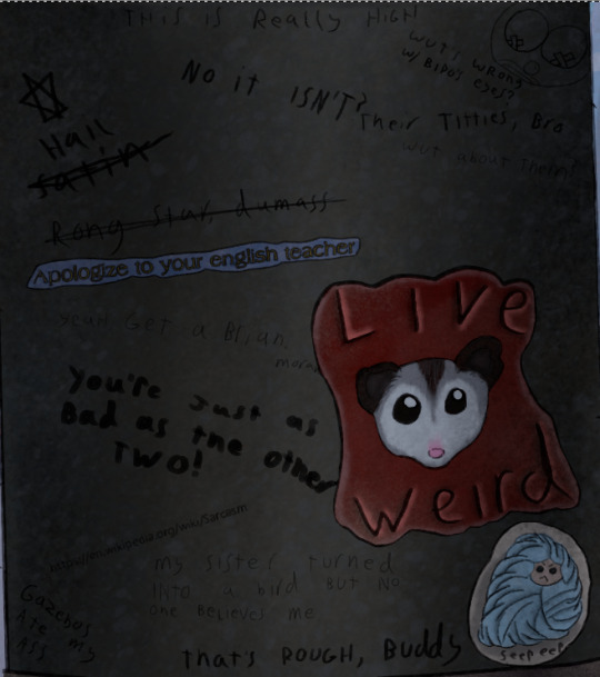
Time for some graffiti transcriptions! Most of the variation in the graffiti came from switching the size of my brush and trying to mix up my handwriting, but there's a few segments where I use a font, then outlined the font with a 2px across brush to make it fit more into the art. Mostly, this was through screenshotting google docs, but some of the fancier fonts are from cooltext.com.
Top:
This is really high
No it's not?
Top Right:
A drawing of a clown that clearly used to be titties
"What's wrong with Bipo's eyes?" (Referring to the tape over the nipples)
"Their titties, bro"
"What about them?"
Top Left going down:
"Hail Satin" written next to a six pointed star
"Rong star, dumass"
A sticker reading "Apologize to your English teacher"
"Yeah, get a brian, morans!"
"You're just as bad as the other two!"
<The URL for the Wikipedia page on sarcasm>
Bottom Left:
Gazebos ate my ass
Bottom center:
"My sister turned into a bird but no one believes me."
"That's rough, buddy."
Bottom right:
A sticker of a possum with "Live Weird" written on it.
A sticker of a more poorly drawn character wrapped in blankets with "Seep eeps" written on it.

...So I made up a fake BDSM club for this one and named the majority of the bands dirty jokes, but I will die on the hill that there should be an all-trans metal band called "The Book of Dead Names."
CHOKE POINT
PRESENTS
LIVE MUSIC
THIS SUNDAY
CUNT MUNCHIES
THE BOOK OF DEAD NAMES
SOME GUY NAMED STEVE
FIST FUCK DUMP TRUCK
WOLFGANGBANG
THE PENIS MIGHTIER

A sticker with a set of vampire fangs that says "Got Blood?"
"Parasitic fucks"
"U got beef w/ Count Chocula?"
"Bro, vamps suck."
"Duh"
"So does your mum.
A sticker of a cross made out of a bunch of interlocking parts with some mirrored Hebrew in the middle. (I'm really proud of making this shape up on the spot. I had an idea for a religious monster hunter group named after the Watchers from Enoch, but I've got no idea if this story will ever happen.)
"Your Hebrew is backwards, you twatwaffle"
A sticker reading "Deus Vult"
"I fucking love Powerwolf"
"VULT DEUS NUTS, GOTTEM!
A cut off poster telling people to vote for, I presume, their favorite chainsmoking rat, clearly.

A sticker of the Autism Creature
"Rizz 'em w' the Tism" with the last S being the one everyone draws in school, but also backwards.
"It's like if Kirby was a centaur"
"I will never unsee that."
"It looks nothing like my vaccuum"
A paper with "Missing Printer" and a cut off phone number written in sharpie.
A meme of a bear in a suit (Partially a trace of the actual meme template) with "You have seasonal affective disorder because you need Vitamin D. I have seasonal affective disorder because one of my ancestors fucked a bear. We are not the same"
"Is that how it happens?"
"Oh, sure, this dude's ancestor fucks a bear, he gets a meme, BUT WHEN I-"
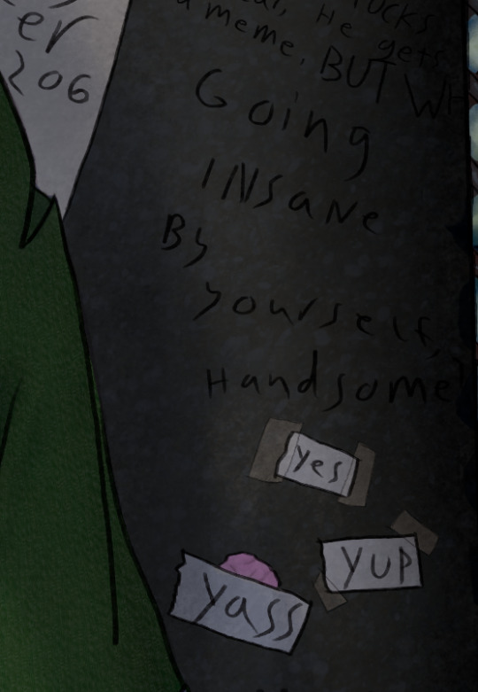
"Going insane by yourself, handsome?"
Three pieces of paper with "Yes" "Yup" and "Yass" written on them, two stuck on with tape, while the third is stuck to a wad of chewing gum.

"You guys seriously pay to print out memes just to vandalize shit?"
"No, I stole the printer, too."
"YOU"

"Paulie never died"
A sticker of the Mothman
"TAX FRAUD"

A large printout with a dramatic portrait of Mitch McConnell with "ARE YA BREEDING YET?" written below it. Several tear off strips are missing, but the remainder all say different variations of "Yes"
A cut off sticker of a smiley face
A sticker of a machete
"BURGLE TURTS"

A sticker of a crying laughing emoji.
A sticker of a pot leaf
A sticker with a picture of bigfoot with pasties on her boobs walking up to a stripper pole with "I want to believe" written in the X-Files font
"Whoever gave Bigfoot tits will never enter the Kingdom of God"
Three notes pointing to the previous message with "Noticed the tits first" "Weirdo" and "Your preoccupation with cryptid mammaries betrays your discomfort with your own sexuality. Consider meditation, therapy, or possibly fucking yourself!"
"Weirdo" pointing to the previous paragraph before being crossed out and replaced with "BASED"
"K, but y tho?"
"No one insults the Bigfoot big naturals on my watch"
(She has them in the Patterson-Gimli footage, too)
"BIGFOOT BIG NATURALS" "NOW LORE ACCURATE"
A swastika being covered up by a peace sign
"Degenerates should be purged" "AMEN" "U FIRST."
A drawing of a penis that's been turned into a weasel in a familiar pose with "Dick weasel" and "Had to do it to 'em" written next to it
A sticker of a stalk of corn labeled "CORN"
"See? Iowa is with us!"
And, finally, "Does reading this hurt your back, too?" which was the last thing I added because I literally spent two days just doing graffiti for this shit.


So, the map behind Sasha is made up on the spot, with some inspiration from a map of the Seattle Bay. Kinda proud of just how dirty this fucking place is, but the final, and greatest achievment in making this picture look grimy...
THE RUST


I didn't exactly nail the perspective on some of these (The sketchy layer for the floor grating was done once, then dragged into place and warped with the perspective... and then completely fucked that up) but god DAMN do I love texturing the fuck out of things!
There's like six Multiply layers scattered about because it turned out it's a phenomenal way to make the shading of multiple textures make sense without losing that texture, and I feel so god damn powerful!

Oh, right, the posters.
Not much to say about them. The righthand one was 95% traced from a mafia stock photo, while the hands in the left came from another stock photo.
Honestly, I drew the frames, then had no idea what to put in them. There was briefly gonna be a pic referencing a cosplay photo I have of myself, but eh...
The rats and the guy in the wall were originally referencing a Vampire the Masquerade character I had named Pretty Paulie, who was a mafioso turned nosferatu who dubbed his crew the Rat Pack. I figured if there was some kind of dramatic, Scarface-esque movie about him, he'd definitely find a way to keep the poster nearby, and I wanted to slap in one of those "Give blood!" posters from the Red Cross except... not from the red cross.
I don't really feel like I put in much effort into these (compared to the Graffiti-a-thon with several subplots), but hey... they covered the tile, which before shading was boring and very flat, so they did their job.


I'll leave you with some zoomed in textures, because I do feel proud about those! I make them via a combo of oil paint and watercolor brushes, usually with a whole lot of different coats of varying opacity until it looks like the thing it's supposed to be. :)
I've only just started drawing again this year (I've been editing a looooot longer) so there's a lot of spaces where I have hiccups, but I'm figuring out the areas I do well in.
...Also sweet Jesus this started as me trying to figure out what a character looked like. It says 3 full days worth of editing was done in Krita on this file, and I don't think it's counting the idle time.
#character art#original character#digital art#digital drawing#oc art#nonbinary character#trans artist
11 notes
·
View notes
Note
This is perhaps a strange question, but do you have the sketch/lineart/framework/whatever the heck it's called that you use when you draw Tango? I decided I want to learn to draw, and my thought process was, "Ah yes, the easiest way is to try and copy my favourite Tangos cause I know how they look," and it is going... poorly xD.
Alternatively, do you have any advice on how to learn and develop a style, or how to get/keep going?
I do! My tango sketches are NOT a good example of how I usually draw so I’m gonna show a few different examples lol
So the first picture is how most of my sketches of tango look then I just do lineart right over it because I kinda have his shapes memorized after drawing him so many times X’D
I have a timelapse of me drawing tango but it’s just the lineart not the sketch
This is usually how most of my sketches look before lineart. If I’m drawing smth I haven’t drawn before or smth a bit more difficult *cough* hands *cough* then I might make a more detailed sketch of it? Idk if any of this makes sense I’m kinda just rambling 👍
Sometimes I do more than one sketch layer before lineart like this but usually I’m too impatient to do that lol. Some advice that helped me with drawing is to not worry too much about making the sketch super neat, I used to focus so much on having a really nice sketch that when it was time to do lineart I was already tired so idk maybe don’t do that XD
I’m still kinda figuring out my artstyle but what I like to do is look at a bunch of different art/artstyles i enjoy and pick out what I like about them. If i like how a person draws hair, clothes, noses, etc I save a few pieces of their art and trace over them until i figure out how they drew them if that makes sense?? I know a lot of people say not to trace other’s art but if you’re doing it to practice and not posting it it’s really a great way to learn how to draw, same with drawing over photos and other references (tracing over random sports pictures is my favorite way to practice anatomy lol). My artstyle right now is literally just a bunch of things I liked about other people’s styles and copied XD (my tango design is like that too I could make a whole separate post of all the little things that inspired my tango lol). BUT ALSO I would say focusing on finding Your Artstyle right away isn’t necessarily the best thing to do when you’re starting, it’s better to practice and learn the basics and eventually you’ll start to notice your artstyle developing as you do that.
I really hope at least a little bit of that made sense XD
7 notes
·
View notes
Note
wow looking at your rat king thing, you improved SO MUCH in the last two years. what did you feel helped you improve?
There’s a handful of things I would say but the main one was switching from a screenless tablet to an iPad!! Obviously iPads are kinda pricey so I can’t recommend it for everyone, but I genuinely feel like switching from a screenless tablet (I used to use Huion) to screened one REALLY helped me get a better grasp of everything, along with procreate just having an easier layout to use compared to the other programs I used (SAI and CSP) which made me less afraid to mess around with brushes and other fun things like halftone textures and chromatic abbreviations, ect ect . Definitely play around with brushes!! While a different brush won’t suddenly make you the Best Artist Ever, finding a brush that works well with your style/art process can help a TON (almost all my brushes are from @/thedawner brush packs, I highly recommend their brushes!! Lots of free packs too, I use the bonobo chalk as my main painting brush)
The other big thing is references!! I rarely used any references until like last year, I’ve been taking my own pose/expression/ect references (yes that means looking at a weird picture of you for like an hour to get the pose right but you get used to it) and going on walks to get nice landscape shots for my work (all my giant ass floating fish drawings are based on images I personally took), but if you don’t wanna do that websites like unsplash, Pexels, and pixabay are great for royalty free (VERY IMPORTANT, I have seen LOTS of artists end up in legal battles because they just used a random photo they got off Google that ended up being copyrighted) pictures and vectors to help get ya started.
The last major big thing is my drawing process in general!! I was hardwired to believe you HAD to do art in the steps of sketch, lineart, color, then shading all on separate layers. Don’t be afraid to use what process works for you! When I threw lineart out the window and started painting all on one layer it became WAY easier for me to block out shapes (highly recommend doing greyscale paint studies, it helps SOO much with more coherent color pallets and lighting) and really helps the entire work fell connected rather than a character that feels poorly overlaid on a separately drawn background.
Don’t be afraid to fuck around! Its art! It’s supposed to be messy and weird! Merge your layers! Use 30 different brushes because you feel like it!! Have fun and mess around with the process and see where it takes you!!!
#there’s two other attributes which was finally getting art classes that were more geared towards developing my style rather than the basics#and my brain fully developing at 25. I wish this was a lie but I feel like my brain can just suddenly understand anatomy better#ask#long post#behold my text wall
21 notes
·
View notes
Text
So, I've decided to work on an au project on my own for MLP. I absolutely adore the show, and I want to mess around with my favorite characters. One of those ways in which I know I'd have fun are ship kids!
My absolute favorite two characters are Starlight and Sunburst, who I've been shipping since I was 13. Before anyone asks, I'll give a quick rundown of my views on the other ships I've seen them in-
Starlight x Trixie- Honestly? I can't get behind the dynamic, despite them having really good chemistry in the show, and very clearly being bi/lesbian coded for eachother. I find their fights to be easily avoidable, they're awful at communication, and overall I'd need to see them go to therapy before I'd even be happy at seeing it in cannon
Starlight x Twilight- I genuinely see them more as mentor and student figures, especially since in my rewrite, I've made Starlight a good decade younger than Twilight. Of course that isn't actually the case in cannon, but their dynamic and power imbalance definitely would make me rethink the idea of it
Sunburst x Twilight- I actually think these two are adorable together, and could make for a great pairing, I just don't personally want to see them together in my own au. Albeit, I absolutely love Sunburst and Twilight's dynamic. They're such silly nerds, and they honestly should've been shown way more together in the show
Sunburst x Moondancer- Once again, these two would be an excellent pairing. Both socially awkward, bookworm nerds, pretty much the whole package deal. Though, once again, I'd prefer to explore the ship I've been wanting to for the past many years, and I have something else planned for Moondancer in this au.
Sunburst x Thorax- Once again, adorable potential, with personalities which I think would mesh together well. The only thing stopping me from doing this one is, once again, my desire to explore his relationship with Starlight
So now, I'll get into the reasons why I find the idea of Starlight and Sunburst compelling.
First off, they were friends since childhood, seemingly in a childhood where Starlight experienced extreme amounts of isolation, and control. She was emotionally abused by her father, and that's made clear if you've read up on psychology enough
Sunburst's mother was similarly abusive, stripping him away at a young age due to wanting to push her idea of "success" onto him, thus ultimately causing them both to fall into lives they never truly wanted.
Ignoring Starlight being a villain for most of her adult life, both her and Sunburst hate themselves for being "failures," and struggle to rekindle after so many years because the writers handled it poorly. They needed to communicate and learn to come to terms with their pasts so they could move on, and get to know each other as the people they are now. I also personally believe that the show misunderstood Starlight a bit, and made them have way less in common than they honestly should've.
Anyway, so now that I'm done going on by far the largest rant I ever have on here, here's my redesigns of them :} -

Here's their child in this au-
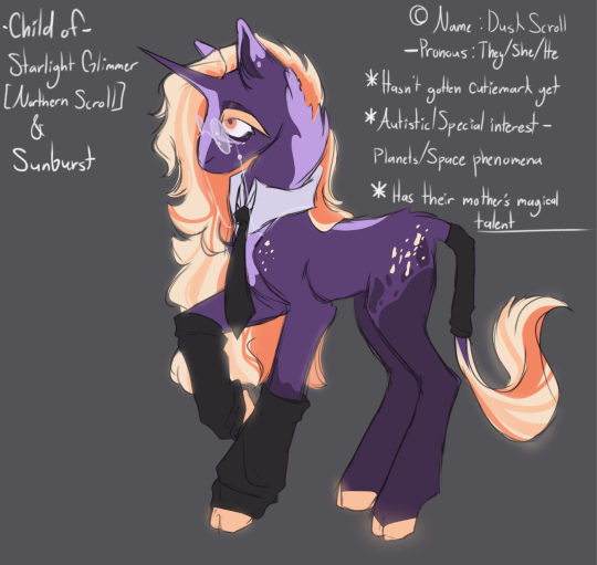
To explain a little- The reason my art is so sketchy is because I haven't had the energy to do lineart, so I've started to just clean up the sketch and color it that way. It isn't the best looking, but it does allow me to actually create, which is nice. I do have depression, so getting the motivation to actually make stuff can be incredibly challenging, let alone finishing it.
Anyway, that's it. Much appreciated if you managed to read through this whole thing ^^'
If you didn't, no worries! I'm just glad you saw the art
#mlp g4#mlp art#mlp oc#mlp fim#mlp redesign#mlp starlight glimmer#mlp sunburst#mlp starlight glimmer redesign#mlp starlight redesign#mlp sunburst redesign#mlp rewrite#mlp shipping#mlp ship art#mlp ship kid#mlp#accidental rant#mlp rant#mlp redraw#mlp au art#new mlp au
12 notes
·
View notes
Text
1/16/24
hey if i ever die can you guys promise to make sure somebody goes through my "She-Ra Shit" folder and just like. mass uploads everything? like obviously i'd prefer it be tagged and transcribed and maybe annotated and color-corrected, i'm working on it, but sometimes i'm like oh fuck what if i get hit by a car truck bus* and i'm the only idiot crazy enough to have downloaded this poorly photographed lineart for a Fantastic Fashion outfit that was never released from a website section which technically went down like at least five years ago, you know?
they never made her. who was she
*nobody's hit me with a bus yet, maybe it's the only vehicle i'm not impervious to. we just don't know
EDIT: addenda. the folder named "Z" is just shit i already uploaded, i named it that so it'd come last in alphabetical order. and "personal art" isn't my personal art it's from the crew so like, make sure they're credited appropriately or i'll haunt you, i guess. their names are in the file names it's not rocket science. and there is some she-ra stuff in the MOTU folder but it's only like, the 2016 SDCC one and Adora's cameo in Origins (ugh) except for the Vintage POP folder. god i really have a folder problem huh. um. the commercials in the Filmation materials folder were actually animated by Duck Soup i just put them in there bc animation shit yk? i feel like a parent going on their first post-child outing leaving instructions for a babysitter. ummmm the 'manip catra concept' isn't finished yet i was trying to clean up some of the jpeg artifacts by hand but like that's a matter of interpretation and i keep getting distracted by googling art restoration shit like some kind of nerd or something, the raw image is in that same folder. look it's 1:50 i gotta go to sleep. promise me you guys
4 notes
·
View notes
Text
EEEE this looks like so much fun!!!
Initially I only really read Gwynriel but then I was very hungry for a lil mlm so I found Cazriel which is delish n all but there was a severe lack of, so I eventually stumbled on Azris and it was like cumming home i swear. I will DIEEE for this damn ship.
I haven't written/drew a lawt of Azris but I think I always end up make Azriel extremely sorta submissive for Eris. I always liked the idea of them having a sort of reverence for each other. I love it when they LOVE each other. Also I like Azzy getting his back blown out in 9 different ways lol.
My favourite fic has got to be my very first fic lmfao Clerical Errors In Love which is a modern Au where Eris is a rival lawyer and Azriel is a clerk. It is very poorly written in all honesty but the amazing feedback I got from it made me sososoooo happy and I do just wanna thank everyone who encouraged me, I've made many friends who I hold very dear to me...omg corny lemme shaddup now. My favourite Azris art piece might have to be my piece of Azzy riding his High Lord hehehe
With writing I usually handwrite all of my ideas and stuff then jump on a doc and mumble jumble scenes untill i have a bunch then sort them out into something coherent then throw it at the poor soul who had kindly gave into my begging offered to beta 💕. With my art its a similar process i suppose. I traditionally sketch out any ideas, collect a bunch of references then spend a ridiculously long time doing a sketch lineart and render lol
My favourite Azriel headcanon is that he had a stutter/speech impediment when he was younger 😖 God I love angst ehheheh. My fav Eris headcanon is that he has freckles EVERYWHERE despite me never ever writing this and barely drawing it lol I just thing he's so pretty and he deserves to have constellations all over his body. My favourite Azris headcanon is that they always like to be touching. Not always sexual, just hands smoothing over the small of the other back, playing footsie under the table, leaning into each other when they're sat, sleeping naked so they can feel the bond flowing between them when they cuddle AHHJHH.
Yes.
No.
My british school au is something I've been raving over for a while because A) I'm making the bat boys Bengali like MEE and B) I'm a sucker for coming of age/Academic romances. Also I miss secondary/sixth form lmfao lololol. I'm also excited about my merman au where both Az and Eris are trans so that'll be super fun eeeee
@jules-writes-stories, @makinglongwordsslutty @g00seg1rl @the-darkestminds @chunkypossum and @greenvelvetcouture are definitely some of my biggest influences when it comes to my art and writing, they're truly such amazing authors!!! I take a lot of inspiration from my music as well, I don't have a dedicated Azris playlist because I find them so malleable, I can just shove them in a situation and manipulate it enough that it fits em gahh. Though when writing Clerical Errors in Love I exclusively listened to Badlands by Halsey despite it being a breakup album lol.
If you're running out of steam when writing then take a break from it!! Distract yourself with some guilty pleasure writing!! No point turning something thats meant to be enjoyable into a chore.
Azris Week 2025 Self-Spotlight
Only five more days until the main event! To continue fostering more community between Azris creators, instead of having user-submitted writers or artists answer some questions, creators can interview themselves!
Pretend you can see my jazz hands.
These questions are for ALL Azris creators - writers, mood board creators, artists, you get the idea! At the end of Azris Week, anyone who has filled out the below interview will get added to a master list so that everyone can see your thoughts. Feel free to add your own questions at the bottom, if you think of anything else you’d like to say about your Azris Week creations.
If you aren’t doing anything for Azris Week 2025 but want to participate anyway, go ahead! No one will stop you and you’ll still be included in the master list.
Questions
1. What drew you to Azris?
2. What themes do you explore most often in your fics? Do you have a favorite image or location that you return to again and again?
3. What is your favorite fic/art that you’ve made? Why?
4. What is your writing/drawing/painting setup? Do you have a routine that you follow?
5. Give a favorite headcanon about Azriel and Eris, separately, and Azriel and Eris, together.
6. Have you worn wigs?
7. Will you wear wigs?
8. What upcoming projects are you excited about?
9. Name some influences on your writing or art style - could be fellow writers, poets, singers, nature, etc.
10. What encouragement would you give someone who is just beginning a project? Someone who is stalled on a project? Someone losing steam/interest?
#azris#eris vanserra#azriel shadowsinger#azriel x eris#azrisweek2025#azris intensifies#eris x azriel#azrisweek2025 countdown
89 notes
·
View notes
Text
It's funny to me, I saw this post at the beginning of highschool and I was like "Omg!! I'm starting highschool so I'll use a pic from begining of Jr. High lol!" And I'm finally a senior in highschool now, officially able to do this correctly and oh boy is there improvement
This was the drawing from the middle school one. Done on Paint shop Pro because I was too scared to download an actual art program or spend money on one. I didn't have a tablet at the time and my sister gave me her hold Wacom drawing pad. Btw, the Psp version I used was literally from the 80's. My mom had it installed and told me that it was the Same as photoshop. Shading is horrible, I used the smudge tool but did not blend it out properly lol, and it also smudged the lineart because I couldn't comprehend layers (´°̥̥̥̥̥̥̥̥ω°̥̥̥̥̥̥̥̥`). Hand is like.. huh??? And anatomy is questionable at best lol. I'm actually surprised I used a different sized pen in this though, I used to hell-bent on using only one size of pen, but I went WAYYY to small and the facial details are so pixelated with the small brush. I also didn't know how to draw backgrounds, so it was again, poorly smudged colors next to eachother.
This was the drawing I made my freshman year. Certainly a little better!!! I learned how to draw smooth lines at least lol. Anatomy's a little better too, and I learned how to somewhat draw hands. However, I did not know proper size proportions and the feet are uneven and the hands are so small. No sense of posing, I used to just wing it back then lol, no references, all from my head. I think the eye style here is pretty interesting, they look upside down!!! Meaningless shading, still. And the shading overall just looks bad, I used the eyedropper tool and desaturated the color, then proceeded to use the smudge tool everywhere. I also only used thin lines because I hated how thick lines looked at the time. I heard so many people talk about line weight and depth and I just refused to listen, telling myself that you could only use one size of pen, and all the lines have to stay consistent in size. Oh! I also had a tablet at this point and used Autodesk sketchbook because it was free lol. I actually kind of started grasping backgrounds?? Most of the time it was just clouds but it was better than nothing lol.
And finally, my art now. There's uh.. definitely a huge difference. Learned line depth and absolutely adore using thick lines lol. Switched programs again !! I now use procreate. I actually learned how to draw hands somewhat, sometimes hands just don't wanna hand, but I can at least make them look decent. I know how to pose characters and use references all the time now. I've also started drawing backgrounds and settings rather than just standalone characters with no personality or depth.
#ace attorney#art#digitial art#fanart#improvement#art improvement#omg why was it so bad back then#i mean... I had to start somewhere I guess??#kind of cringy that it was Undertale too#undertale#guess I should probably tag that#middle is an OC#ship child#in fact#from hxh#hxh#hunter x hunter#ugh feels weird to tag that too
1 note
·
View note
Note
Hi I want to know more about Endres, what are his inspirations? Both the character itself/story and design.
oh this is a long one, he changed so much and it's not quite clear-cut ^^;
initially, he was just from a 2-part sketch I did in high school while dipping my toe into the realm of Gay FeelingsTM for the first time. I felt it was safer to explore it through portraying men because I'm a girl! so looking at two good-looking men and being into it wasn't weird! although the thing that I was really into was the intimacy and same-gender attraction (I mean I'm bi so I still do enjoy a nice man when I see one).
(only found the 1st one of the sketches)
doing these sketches, he was mostly inspired by an even older somewhat antagonist from a story I scrapped, who in turn was highkey inspired by Jeoffrey Baratheon from Game of Thrones (and latently queer-coded because baby Inky didn't know why she found those villains so alluring). so you may not see it with his personality now but Jeoffrey was one of the reasons he exists!
a few years later, I didn't know what to draw so a girl loves recycling and did a redraw of above sketch but I just felt like switching it up. I was kinda bored of lieges just taking whatever and whoever they wanted, instead I just found a slightly hesitant prince who had a crush on his guard a bit more intriguing.
that redraw was choke-full of happy little accidents, like Endres getting his two moles under his right eye (it was just poorly erased lineart but it's endearing to me so it stayed), longer hair because I just love that in a man, darker complexion because it's just beautiful.
he obviously still changed a bit from that, like how his hair got considerably much longer, or his eyebrows thicker, but I think a lot of his design choices were just because they're beautiful. the idea of looking at a man and just thinking 'he's beautiful' because we rarely think of men like that.
he didn't really start out with a story in mind, it was just "a prince and his soldier" harking back to courtly love and similar romances. but he (and Caspar, his soldier) kept rotating in my brain and I was wondering a lot about their circumstances and whatnot, and I started to spin their story and characters.
aaaaand it got kinda out of hand.
Endres is the first male protagonist outside of fanfics that I wrote, and a lot of his themes are about subverting the tropes he is made of. he lost his parents to a political coup, yet he doesn't swear revenge but instead tries to get behind why it happened. he has a lot of respect for his sister who is now the queen as the eldest child, and he doesn't question her claim to the throne unless it were to question the institution of monarchy itself. how teens and preteens still are no adults and expecting them to step up when adults fail builds immense pressure upon them.
then also he has major themes of trauma and grief and recovery, maybe it's a little too much therapeutic writing, but who cares? the struggle of regaining your personhood afterwards with his violently cut hair slowly regrowing, the relapse of cutting his own hair to the point of bleeding. not knowing how your family reacts to a reunion after almost a decade of no contact. grieving the youth you could've had but someone took from you.
in his design, you'll notice a lot of blue, turquoise, greens and golds, akin of peacocks, another frequent motif for him, for one a symbol of royalty but also male beauty and sexuality that wants to please and be looked at, which usually is considered rather feminine. he is beautiful but undeniably still a man. he's there to be confusing to others. if he presents a bisexual crisis, that's the goal. and he'll be confident about it.
this type of design for him when he's in his early to mid-20s is a semi-casual court attire heavily influenced from Goryeo and Joseon period hanbok, Song Dynasty hanfu, and Edwardian period blouses/lingerie dresses with other influences by the Safavid period and Indian patterns/motifs. he loves to dress up but it's still tasteful and not overtly showing wealth, it's casual, leasurely, pretty much like his fairly hedonistic lifestyle at that time, though he still wouldn't dress vulgarly, he's properly buttoned up and wears his sigils with the chest chains, his tassles, and the jewelry. as adult but not the head of his family he wears his hair in a half-updo if he is off-duty, and while it's styled orderly, it's not rigid as he has some free-falling strands framing his face.
compare that to his 17/18-year-old self where he wears his apprentice uniform absolutely properly, with his hair almost completely braided out of his face and one long braid in the back as most minors wear it. he gives himself much less leeway and hasn't come into himself quite yet. while his family isn't poor, they also don't come from money, so his clothes tend to be much plainer and less full in volume. this also makes him, while still handsome, much more plain-looking and more of a crowd character, also by design.
I probably could write a whole ass doctor thesis on him but I hope this will do for now, I've been trying to answer this ask for way too long already XD
you unlocked my ramble mode! so thank you/congrats :D
#tell it inky#endres#httc#heirs to the crown#inky rambles#idk i feel like i could ramble on forever im sorry#idek if that even answers your question remotely but at least i tried
0 notes
Photo
24 notes
·
View notes