#poor writing but u get the gist maybe
Explore tagged Tumblr posts
Visit Tumblr Blog
Explore Tumblr blogs with no restrictions, modern design and the best experience.
Last Seen Tumblr Blogs


Fun Fact
Tumblr.com is the 103rd most visited website in the world.
Text
hc tht simmons was left handed and developed ambidexterity while he improved function w his cyborg parts but still favours his left.
n he'd frequently get grif's hair caught in the little bolts and sockets which ofc pissed him off
so whenever grif senses tht simmons is abt to try and run his hand thru his hair when they 👨❤️💋👨 he takes hold of his hand instead and laces their fingers
n its like symbolic or whatever bc cyborg hand and the grafted hand w simmons' skin
#rvb#red vs blue#grif rvb#simmons rvb#grimmons#dexter grif#dick simmons#poor writing but u get the gist maybe#hc theyre making out and simmon's heart short circuits or his hand gets red hot
76 notes
·
View notes
Note
Hello!! I saw in the tags of a post that youd like more asks, which made me brave enough to send one
Would u mind rambling a bit about your rengiyuu fic(s)? I get excited when I hear that you're working on them but I don't know if you've published any/ any chapters yet?
I hope you're having a nice day!! 🌻
hI THANK YOU SO MUCH FOR ASKING AND I AM SO SORRY _(:3 」∠)_
So it AAALLL started with my overlong post-Entertainment District Coping fic I wrote the majority of between episodes 10 and 11 of Entertainment District, trying to find a way for Tanj and the bois to survive the. yknow. Gigantic Poison Explosion.
I wrote Giyuu and Shinobu heading there with an antidote, and Giyuu having to dig around through the rubble to find Tanjiro, half dead. In that I draw comparisons between his relationship with Tanjiro and his relationship with the now-deceased Kyojuro, very different but all leading into the same conclusion: He can't stand to lose anyone else who is as special and just sunshine incarnate as Kyo was. It's told interspersed between Giyuu trying to find/save Tanjiro and my headcanon for Giyuu and Kyo's first meeting, in which Giyuu became a Hashira AFTER Kyo and Kyo was his mentor throughout. Never finished or published it because most of it didn't make sense in canon after Ep 11 came out.
Then I moved onto my Demon!Rengoku bullshit. In this fic that takes place any time post Entertainment District, Rengoku has been posthumously turned into a demon by Douma in an attempt to get close to/kill Tanjiro. Waking up with no memory, no awareness that he's a demon, and nowhere else to go, Kyo wanders to Giyuu's house. Giyuu tries to just end him right then and there but can't work up the nerve, even when Kyo attacks him. Haven't gotten too far, but the gist is that he and Kyo have to team up (with Akaza?? [obviously he'd be fucking PISSED that Douma managed to turn Kyo when he couldn't, so maybe some enemy of my enemy is my friend?]) to figure out who turned him and how to turn him back. Probably my spiciest fic? Demons sexy what can I say. I think I'm pretty good at writing smut but I can literally never work up the nerve so. yknow.
I ALSO have a much more fluffy fic based on the idea of Giyuu being injured in battle, waking up in the butterfly mansion with Kyo having thought he died. Kyo tries to confess that he's realized his love for him but panics last minute and ends up saying he's realized Giyuu never met his brother. Giyuu accepts and they end up on a date that neither really realizes is a date except poor Senjuro, who now kind of has to play matchmaker! Very fluffy and silly and a good break from the darker fics I had been working on.
Annnnd another less overtly Rengiyuu fic as part of my Modern AU in which Giyuu (Kyo's roommate[and they were ROOMMATES]) and Sanemi (over at their apartment because he was bored) find themselves embroiled in the Rengoku family drama after Senjuro and Kyo appear at their apartment, Kyo with a black eye from their father. Explores Giyuu and Sanemi's shared past (dead siblings), Sanemi's relationship with his own father, and my personal thoughts for how Shinjuro and Kyojuro's relationship would have played out A.) If Kyo never died and B.) in a modern setting.
That was interrupted by As the World Caves In (read it here!) and will likely be interrupted by some Everybody Lives AU Secret Relationship bullshit in the future.
*Takes a huge deep breath*
So yeah anyway i loooove being Normal! For real though thank you for asking, I will die on this Ship and will always welcome the opportunity to ramble incoherently about it !!

#anon#THANK YOU FOR ASKING SKLJFLKD#kny#rengiyuu#rose's rambles#my GOD am i normal#i just have such a thing for the silent protagonist silent communication thing#kyo being the only one who can understand his quietness paradoxically (because he's so loud) is just sooooooooo . oompgh#also just. pure mental illness from both of them in different directions#rengiyuu wednesday lives in my mind rent free#in fact I pay rent to rengiyuu wednesday in the form of my various diseases spat out onto google docs and tumblr posts
13 notes
·
View notes
Text
i tried to headcanon about sex and ended up with 1.5k words of commentfic
warning: nsfw discussion. also warning: i like to discuss my headcanons in writing even if no one cares.
as you know (and if not, seriously, what r u even doing here) i am obsessed with the boys' first summer. and once i started envisioning the delightful awkward chaos that are their first times, i also tried to make sense of their sexual development timeline.
THE FACTS:
huddle 3 (spoiler!) contains an anal scene that apparently takes place at providence during their first summer
bitty only visited providence once that summer
for no more than a week
after having seen jack in person only once (1) since the graduation kiss.
so obviously, i told myself -- here are the two options: a) huddles are not canon, and ngozi inserted that scene during the summer for no particular reason [but then why mention its timing at all?]. or, b) the boys moved far faster than i would otherwise headcanon for them.
but, ALSO FACTS:
bitty has no sexual or romantic experience
jack's sexual experience with men is limited at worst and just a really long time ago at best
they're both disgusting hopeless romantics who are exactly the type of couple to be into shit like candlelight and rose petals and freakin' elvis crooning in the background (can you tell i'm not a romantic person in my personal sex life? do people still listen to elvis?)
and, just to push this post further into the nsfw category, MORE FACTS:
anal sex is such a delicate, elaborate process
i am a sucker for the realistic!sex trope
it's like totally not exaggerated to have sex three or four times a day the first week you're in a relationship. especially if you've been waiting to be alone together for two months. and are young and horny.
so this leaves us with heacanon A (huddle is not canon compliant) and heacanon B (huddle is canon).
HEADCANON A:
they 'kiss a bunch and shit' in madison (thanks lardo!). they also tentatively make it to third base (i mean, i did say they were horny). i covered this bit in fic.
i personally do not believe in the skype sex headcanon pre-year 3 because i think they'd be too awkward for it before actually having had enough sex (it is, in fact, pretty awkward), but more power to anyone who does. i definitely believe there was some suggestive texting between july 4th and providence. both boys blushed like tomatoes during this.
i'd say providence started from where they left off (frottage and handjobs) and slowly developed into a lot of oral from both parties (their love for this act also features in huddle 3). if this was a typical college first relationship i'd say they lingered at this stage for longer, but because they had a week straight of private time and also knew they'd be doing long distance, there was probably a bit of really tentative fingering thrown there towards the end of the week. maybe intercrural, although i wonder which one of them would think of it at that stage.
ha, now i'm thinking about bitty waking jack up on his 25th birthday and throwing out some super cheesy line about giving him a birthday present, red-faced but determined, and then trying to go down on him for the first time. i'm now also thinking about it being a total flawed mess. i'm sorry, i can't help the realistic kink!!!
anyway. then there's year 3. i kinda feel like they were securely intimate before thanksgiving and coming out to smh, so they probably tried anal sometime between august and november during one of bitty's visits. maybe even relatively early on (again, horny and doing long distance). mid-september, maybe? the french flashcards weekend was september 13rd, that totally checks out.
personally, i always headcanon it as a complete disaster. to get more detailed, i think bitty would insist on bottoming the first time (lbh, bitty comes from a pretty biased background and probably didn't have a lot of in depth conversations about 'roles' in gay sex before, and also probably feels like he's got something to 'prove' as a gay man), but he's a nervous wreck and just the stretching hurts a lot more than he thought it would because he can't relax, and it hurting means he definitely can't relax, and jack's shaking because, well, bitty, but also because bitty doesn't seem to be enjoying himself and this wasn't what jack wanted -- but bitty's insisting he doesn't want to stop. anyway, jack tries to do it but just the first penetration hurts bitty too much and they break it off and then there's, like, three hours of cuddling and petting and really honest, intense conversation and some super intimate mutual handjobs at the end. but no anal. they'll get there.
if we're even more detailed, i think they get there first with jack bottoming. he's (probably) done it before, knows what to expect, is a lot calmer with bitty being in control of the pace. it goes great. there are candles and rose petals and elvis and they stare meaningfully into each other's eyes. you get the gist.
next time (a few weeks later? bitty's next visit?) they try bitty bottoming again. they go a lot slower. there's a lot more laughter and the fingering part takes, like, an hour and a half. bitty's having a great time. jack is having a great time (taking care! of bitty! who's enjoying himself! it's the best). the sex itself is a little stop and go but ultimately great.
then there's skype sex. poor chowder across the hall. i hope they've got good soundproofing.
'but!' you say, if any of you read all the way to this part, 'what about huddle 3???'. well --
HEADCANON B
everything goes pretty much the same except a lot faster, and so a lot more awkwardly and with a lot more talking thrown in (these boys talk. a lot. and if they want to get from zero sex ever to anal in a week, they'll have to be very very open and honest. also, the sex itself is probably a little less technically good than headcanon A because they don't really know each other's bodies, but it's just as intimate and emotional and fun).
so let's say they have five days together (august 2-6). first day is making out against the front door (they missed each other, okay?) and the frottage and handjobs as previously mentioned. multiple times, probably. when bitty gets there; after dinner; before sleep (plus, first blowjob - jack takes his time worshipping bitty); in the middle of the night (bitty wakes up and jack is pressed up against him and --).
second day is jack's birthday and bitty's first time giving a blowjob, as detailed in A4. they probably do birthday stuff around town during the day and bitty attempts oral once again sometime in the evening (this time it's much smoother). when they go to bed that night bitty takes a deep breath and tells jack that he wants to try 'full sex'. it's a little because it's jack's birthday and bitty thinks it'd be romantic, and a lot because he's unsure of when they'll see each other next and wants to try it before school and the hockey season fill their calendars. jack is wide-eyed and fumbly and tries to simultaneously say that any sex is full sex (thanks shitty!) and that they don't have to go so fast and also convey that he totally, totally wants to do that with bitty but he just wants it to be really good. most of it comes out as: "ah... uhhh???" and a lot of blinking.
but they do try it. it goes as detailed above in A6, i.e. not well. afterwards, there's the same amount of cuddling and talking deep into the night and they both emerge from that experience a lot more confident in each other and in their bodies around each other.
on the third day jack wakes up before bitty and lies there staring at the ceiling and thinking, and when bitty wakes up groggy and cute jack says, in his best hockey captain voice, "we should try it the other way around", less like he's suggesting a sexual act and more like he's thinking of a hockey strategy. good thing bitty really likes him just the way he is. they do that, and it goes as described in A7, i.e. pretty damn well. it makes them feel super clingy and in love for the rest of the day and there's more frottage against the kitchen counter after bitty feeds jack pie and that night bitty tries bottoming again. we've established that it goes much better that time.
and, finally, on the fourth day they have the huddle 3 sex scene (it includes rimming). its tone would have to shift a little to fit in this timeline but i really did my best here.
on the fifth day there's sleepy morning groping and then oral in the shower and then the drive back to samwell. they're happy. they're in love. they're gonna get married (not now, but i just felt like mentioning it). they're gonna get much better at the whole sex thing that year.
the skype sex still takes awhile. and it’s definitely bitty’s idea. that boy knows his way around a camera.
:)
#zimbits#omgcp#omgcheckplease#man i'm starting to think it's weird that i've been writing fic for eight years and i've never written smut until a few months ago.#apparently i have a lot to say about sex????#pavfics#maybe???#headcanon#text#check please!
51 notes
·
View notes
Note
can I get hcs of kenma and tendou with a quiet and reserved S/O but she’s secretly really pervy? Nsfw maybe 👉👈 I love your writing!! (*^▽^*)
Thank youuu😘
You may! I‘m writing Kenma’s separately because my posts are too long so look out for pt. 2 later! Ps. Idk if it’s spelled ‘tendo’ or ‘Tendou’ so I might swap from time to time lol.
I literally love this one shot!
———————————
Tendou Satori x “Timid Girl by Day: Naughty Girl by Night” S/O
(Slight NSFW)
————————————————-
“I was in the chess club, too Y/N. State champ, 1984!” Exclaimed Tendou’s father loudly. His mother, who was sitting across from him at the restaurant dinner table beamed at him.
“She’s a keeper, Tendou. You better not do anything to lose her!” Satori’s mom reached over to hold onto your hand and you gave her a sweet smile, happy that you had won your boyfriends family over.
“I was state champ last year,” you mumbled to his family quietly and they practically gushed to death.
“How did our strange Tendou get you?” Questioned his mother rather rudely.
she shoulda kept that in the drafts
You shrugged, feeling the need to defend your love. “Tendou is the kindest, most gentle, honest boy I’ve ever met. I’m lucky to have him. Right, Ten?”
Your boyfriend Tendou had been staying out of yours and his parents conversation for the majority of the night, a little because his parents didn’t need any help in counting his faults but moreso because his girlfriend......had her foot pleasurably kneeding his crotch under the table. Very pleasurably, considering the man had a mild foot fetish. You were softly running the underside of your foot along his length that has hardened fully due to your ministrations. You used your foot to nudge his thighs apart and fondled his balls.
“Right, Ten?” You repeated.
Tendou looked at you across the table when you evilly invited him into the conversation, knowing that he wasn’t listening a damn.
“S-sorry w-what?” He pretended to cough quickly in order to cover his moan when you fondled his balls. You were literally going to make him cum and you haven’t even stuttered once when talking with his parents.
“Aren’t you listening?” His mother snapped.
“He never listens.” His dad muttered.
“Your parents were just saying how lucky you are to have me because of how quiet and reserved I am.” You gave him a sexy smirk and slowly grazed the length of his his member from top to bottom. Tendou had to increase the force of his coughing and look away because his eyes wanted to roll to the back of his head.
“Sweetheart, drink some water will you?” His mother waves the server over and points to the water pitcher.
“And Ten, I was telling your parents how you are the best boyfriend in the world because you......”
Tendou couldn’t listen to you when his thoughts were so consumed by lust. It wasn’t his fault that he hadn’t any more blood in his brain because it had all migrated south. He was so turned on by not only your movements, but the fact that everyone who knew you, including him, thought you’d be the last girl to be doing what you’re doing right now.
He fell in love with the shy girl in school—because you were so pretty and quiet and you spent all your lunches in the library like he used to do before Ushijima invited him to start joining him for lunch. You were very reserved, never choosing to roll your school skirt to make it shorter like all the other girls in school and Tendou saw that as endearing.
And you were nice to him. When he built up the courage to sit next to you and start a conversation, you were quiet but the nicest person he’s ever met..... Even though his personality should have scared you like it did everybody else.
you two started dating and you never changed from being mousy and reserved
That is.....until it came to anything sexual
Something intimate had only happened between you two once before and you had been interrupted by Tendou’s parents, but he caught a glimpse of your very strong naughty side
But even that brief moment was nothing compared to this
Touching him under the table while his parents were right there....this was one for the books
But what can you say? Your perversion came out like a bat of a hell when you saw Tendou so nervous introducing you to his family, looking so cute in his green tux. You’d never seen him so reserved but you knew it was because his parents weren’t his favourite people in the world. You don’t know why but seeing him like this made you want to make him orgasm, and he was rendered powerless to stop you
“Ten, are you not feeling okay honey? You haven’t been answering us.” You asked your redhead sweetly as you agonizingly-slowly removed your foot off of him and slipped it back in your flats. You gave him an innocent bat of your eyelashes.
Tendou held back his whine from your removal.
His parents asked Tendou if he needed to go see a doctor again due to his strange behaviour that he used to exhibit when he was young.
Satori only needed to see the doctor if they could give his gf a prescription of what to do with a bf’s serious case of blue balls.
Nevertheless, Ten tried to explain himself to his parents because the threat of seeing his childhood doctors was an absolute no.
“N-no I mean s-sorry! Y/N, parents, I-I’m fine, trust me—“
You interrupted him. “No, I don’t think you’re fine, Ten.”
“Yes I am—“
Irritated with him, you turned to grin at the older couple. “Mr. & Mrs. Tendō, your doctors are very unnecessary. I know just how to help your son,”
Tendou watched how you brought a glass to your lips after you spoke. You had asked the server for a straw earlier, which was pretty odd in a five star restaurant, but now Tendo knew why. With your eyes innocent and with his parents eyes on their son in worry, you took a sip of the water. Then, you slipped the straw further into your mouth suggestively. You circled your tongue around it for your boyfriend’s hungry eyes only. Tendou’s dick twitched under the table.
You rendered the sexy clown speechless momentarily. lets all applaud
“Son, I thought you got over that awful odd phase you’d been in because you got to Shiratorizawa....”
Your bf rushed to defend himself even though he barely heard his father. “Dad! I promise I have and that I’m fine! I don’t need any more help—“
“It’s nothing like that, Mr Tendo. But you do look like you’re a little under the weather, Ten. Maybe you need to leave early?” When your boyfriend’s eyes flicked back to you, you flicked the tip of your straw with your tongue— the same way you wanted to do to certain other tip.
How can your eyes remain so innocent as you do this?! Satori thought. Horny, annoyed with his parents, and confused, Tendou shook his head at his dad. “No! I’m okay, reall—“
You kicked him under the table. The idiot was not getting it! “No YOU’RE not, Ten. I think you’re feeling sick. With JUST a cold. And I think you need me to take you back to my house so I can nurse you back to health, correct?” You spoke slowly hoping your boy would finally get the gist.
Finally, that lightbulb turned on. 💡
Our cherryhead baby was like:

Bruh.
His eyes lighting up because the sexy redhead FINALLY understood your sexual innuendo, he nodded. His mind ran with thoughts of you and him in your bed: hopefully naked. Keeping up your impeccable sweeter than though charade that his parents ate right up, you turned to his parents. “I recently got my acceptance letter into the nursing program at Kyoto University.”
“What?!” Mrs. Tendō’s jaw dropped. She grabbed her husbands hand and squeezed it excitedly. “But that’s one of the top 2 Universities in Japan!”
You smiled, blushing shyly. Your boyfriend was shocked at how you are truthfully so insanely bashful and that it wasn’t an act with his parents. He couldn’t think about that for long though, because in that moment your foot unexpectedly grazed his erection again and it felt sooooooooooo good that he had to let out a strangled cough to cover his moan again.
You were happy with his reaction. “See, the poor thing is still coughing. Would you two mind if I took him home to help him? I promise he’ll be back to normal after.”
“Go ahead, chess champion, Kyoto U student!!!! Please keep our son and be a good influence on him!”
Satori couldn’t help but think, ‘Good influence?!’ As he bit back a moan of sexual frustration when you removed your foot again. He was embarrassed by how close he was.
“Great!” You smiled. “Let’s go, Ten sweetheart. The sooner we get home the sooner I can make you feel better.” You got up, straightening your humble dress and rounded the table so you were standing behind your sitting boyfriend. His parents began busying themselves with collecting their things.
From behind, you leaned over and whispered in your man’s ear,
“When we get to my house, I’m going to make you cum so hard that you’ll make a riddle about me, too.”
Your boyfriends eyes rolled back and his leg started tapping on its own like a dog wagging its tail.
Tendou’s parents were busy with the cheque.
“Our valet just pulled up so we are going to go now, but Thank you so much for joining us for dinner, Y/N.” finished his parents approvingly. “You are without a doubt the kindest, sweetest, most modest scholar we’ve ever met. And by some miracle you are dating our son! I hope you get out of that timid shell one day, Y/N, because you deserve all the praise.”
You blushed, giggling like a school girl as you hugged your boyfriend, just enough so that he could feel your boobs pressed to his back. He wagged his tail more.
“Thank you, Mr. & Mrs. Tendou. I promise that I shall work on my timidity and modesty.” On your son’s dick, that is, You thought to yourself, smirking because you were only a 10-minute drive to your house.
—————————-
Baby Kenma in part 2 later lol
#tendou satori#sexy haikyuu#haikyu requests#haikyuu boys#haikyuu!!#haikyuu scenarios#tendou x you#tendou x y/n#tendou x reader
118 notes
·
View notes
Text
Atla modern/yt au: no one except toph knows that Aang is the avatar
Things I didn’t need to do: spend four hours world building a whole modern/atla fusion au for a yt au
Things I did do: take a guess
Anyway I need to get out some Context b4 I explain the “only toph knows that aang is the avatar” thing
- basically I wanted to make a atla yt au w/ bending, but like an idiot I can’t just leave things alone so I made a whole modern world/atla world fusion
- I have another post focusing more on the yt aspect, this post is more focused on world building, including how aang affects the world by not being the avatar until much later
- so in this world the 100 yr war never happened. Roku defeated Sozin and the war + the air nomad genocide never happened. Someone else was the avatar after Roku, and aang wasn’t born (yet)
- instead Aang’s born a couple thousand yrs later in the equivalent of modern times in the avatar world, as is like everyone else for obvious reasons
- but in the time between a lot of different + important things happen
- for one a very parinoid Roku pulls up mountain ranges all around the edges of the earth kingdom cus he’s very worried about the fire nation attacking.
- And then lowkey disappears into the woods for fifty years
- at first ppl are kinda tense and thankful but over time and under a new fire lord ppl chill out. They start to realize that maybe being completely cut off from each other isn’t very good for them??
- a ton of earthbenders get together to level out this one massive area near the fire nation and northern water tribe. So they at least have room for one port instead of zero. over time a few other spaces are opened up but they’re small and not as well placed.
- The first port grows into a massive city that becomes a sort of combination of the four nations. There are different areas that have specifically fire, water or earth architecture/aesthetics, and a lot of areas where those different aesthetics are combined in different ways. There’s definite air nation influence but it’s the smallest in comparison to the other nations
- as this is going on Roku is just chilling in the woods going a little bit crazy?? Though he lives a mostly peaceful and happy life until he passes away when he’s nearly 200
- the next avatar (an air bender who is not aang) is kinda annoyed by what Roku did?? They’re mad about the whole separating the nations thing and set out to fix it
- they end up doing 2 major things. 1) removing a lot of the mountains Roku made and 2) basically setting up a universal education/apprenticeship system
- it gets expanded on a lot over the years, but the gist of it by the time the GAang are born is this:
1) u can sign up any age from 6-14, and advance as u pass classes. Ur required to sign up b4 age 14. (Aka why the gaang are all freind’s dispite being dif ages, they’re in the same ish classes)
2) the school teaches basic skills like reading, writing, math, etc to make sure everyone knows it but ur fam can teach u before hand if that’s what they want
3) everyone who goes is required to learn the basics and ideology behind all 4 bending styles. Even if ur a non bender. The point is to like keep everyone connected and build understanding between cultures
4) the school does provide free lessons with bending masters but students are allowed to seek out someone else if they wish. Or they don’t even need to learn past the basics if they don’t wanna
- anyway the avatar after Roku basically sets up the base of that whole system, plus a way for ppl to become certified as master benders. This post is getting real long tho so I’ll save that explanation for a different post
- the only other important thing that happens that I need to mention is the construction of the Central Air Temple
- the central air temple is built right near the port/city. it’s built kinda in 2 parts, the more private/religious area as well as a more public area where others can come to learn about air nomad culture, more reformed air Nomads might live, and where some businesses are set up. There’s plenty of both open and mountainous land in the area so there’s plenty of room to care for sky bison
- aang is born and grows up in the central temple. He (like a lot of air nomad children) doesn’t go to school until a lot later than children from other nations, around age 11-12
- he goes to school in the city and ofc meets the rest of the gaang who have moved to the city for various reasons, as well as others like teo and Haru
- also side note- in this Teo’s mother was a less religious air nomad and he grew up in the more modern lower half of the central air temple 
-ANYWAY the reason I needed to explain all that was bc a) I spent too much time on it not to share and b) u need to understand it to understand why aang has no clue he’s the avatar. (This poor stupid babey I love him)
- basically after the school system was implemented, they stopped testing to find the Avatar. It wasn’t needed if everyone was going to be learning the basics of all four elements! The avatar would obviously figure it out from that
- except uhhh,,,, whenever they’re doing that training they do it in big groups. And aang has awful adhd
- so yeah. He’s actually like.... bending water and fire and stuff but he doesn’t realize cus he’s not really trying too?? And there are a ton of other benders here! It must be from one of them, right?
- like, yeah when he does the fire bending poses he bends smoke, but obviously he’s accidentally bending zuko’s! Air and fire are similar enough. And yeah Sokka ends up mysteriously soaked, but Katara never admits when she does it, so it was obviously her
- and since he has the attention span of a elephant koi and no one else is paying attention it basically flies under every one’s radar
- everyone except toph, who thinks it’s fucking hilarious and refuses to say shit
- anyway they don’t figure it out until they’re in their mid 20s and everyone is like aang babe wtf
85 notes
·
View notes
Text
💤 Trying Too Hard (Hiryuu Rin)
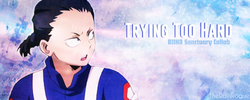
Genre: Angst, Fluff, Slice of Life
Word Count: 1,562
Pairing: Reader x Rin
World: Boku no Hero Academia
Prompt: [….] is concerned because Y/N isn’t sleeping.
Author’s Note: This was written for the BNHA Sanctuary SFW Collab! Make sure you check out the original post to find a list of everyone’s fics. Happy reading~ Also, xīngān is a chinese term of endearment. According to this site:
“…literally means ‘heart and liver.’ While that might sound a bit too bloody for Westerners, the term is used to recognize the most important person, without whom you cannot live without.”
━━━━━━༻🌧️༺━━━━━━
Being in the hero course could be pretty stressful at times, even more so in class A because everyone had their eyes on them. Even more stressful, however, was getting partnered up with the foul-mouthed, hot-headed Bakugo Katsuki. As if one assignment wasn’t bad enough, you had been paired up with him on two different assignments. Your friends made sure to offer their condolences for your bad luck, but you really wanted to try and make this work.
The first assignment was to write a short play in English and, being half-American and spending your childhood in America, this came easy to you. Bakugo himself wasn’t fluent in English, but knew enough to properly understand. There was a small argument about what the subject would be, but you conceded in order to placate his growing temper.
The play was going to be about the number one hero, LordXplosionMurder, and how he overthrew all of his enemies in order to reach the top.
The second assignment was a bit more complicated for you. Because heroes often have to work together, the assignment was to find a way where your quirks complimented one another, combining them to form a super move. The problem was that Bakugo was far superior in both physical combat and quirk control and he didn’t work well with others. He forced you into following his training regimen, threatening to beat your ass if you fell too far behind.
You had gone through a lot of training in order to successfully enter the hero course, but his regimen was just ridiculous and you were seriously struggling. Determined to keep up with the ash-blonde, thus proving yourself worthy and not getting your ass kicked by him, you decided it would be a good idea to forfeit sleep so you could dedicate more time to the training program he had given you. At first, your muscles just felt super sore and your body tired, but as the days slowly passed by, you really started to feel the effects.
The biggest change was how forgetful you were becoming, not remembering to do simple tasks that you were used to doing. You became moody, snapping at the smallest of provocations only to immediately apologize with teary eyes. You even fell down a couple of times, your tired brain unable to react in time to keep your balance.
To say that your friends were worried would be a massive understatement, but they knew how stubborn you could be and how badly you wanted to prove yourself to the ash-blonde, so they did they only thing they could think of that would help.
They told your boyfriend.
━━━━━━༻🌧️༺━━━━━━
You sat at the desk in your dorm room, staring down at the Hero Law textbook as you read the first paragraph again for the hundredth time, but your brain was simply incapable of processing a single word. You felt so sluggish, body in a state where you were so tired, you would be far too tired to actually sleep even if you tried. So, you could only sit and stare at the paragraph, hoping that the words would magically register in your brain.
You wanted nothing more than to stop looking at that damn paragraph, but your grades had begun to slip and Aizawa was not happy about it, so you had to force yourself to study, even if it wasn’t actually doing anything for you. At least you’re trying.
“Xīngān?” A concerned voice reached your ears and you felt a cool hand rest on your shoulder.
Your eyes widened in surprise, snapping up to meet his. You hadn’t even heard the door being opened. Did he knock? Why was he in class A’s dorm? They were off limits to anyone outside of the class and if Aizawa found out, he’d be pretty angry. “H-Hiryuu…?” The throbbing in your temple was getting worse, making your face tense up as you tried to suppress a wince of pain.
Rin huffed, hands moving to his hips as his dark eyes shimmered with concern. “What are you doing to yourself, xīngān? Why haven’t you been sleeping? Do you know how dangerous that is?”
Your shoulders sagged at his scolding tone, tears pricking at your eyes. Because the two of you were in different classes and had different schedules, you didn’t get to see each other nearly as much as you’d like to and yet… he still found out about your poor life choices. He was upset with you, rightfully so, and that filled you with guilt because you hated it when he was upset. “I’m so-sorry,” you cried, desperately trying to wipe away the tears but they kept falling.
Rin’s expression softened and he didn’t hesitate to pull you into his arms, fingers combing through your hair as he whispered sweet nothings to you in Chinese, something he had learned early on to be a comfort to you. You clutched onto his shirt for dear life, stuffing your face into his chest. His heartbeat against your forehead was a major comfort to you, even if it was beating a bit faster than normal.
He shifted so he could bring his arms under your body, lifting you against his chest before bringing you over to the bed. It felt exceptionally soft beneath your exhausted body. After settling down beside you, keeping you protectively caged within his arms, he softly questioned you. “Will you tell me why you have stopped sleeping?”
Taking a shaky breath, you began to express how you were feeling and, once the words started to tumble from your lips, they refused to stop, falling quickly and without pause. Mixing this with your hiccups made it difficult for him to process, but he got the gist of it – Bakugo was the cause, pushing you way too far past your limits. Anger coursed throughout his body, but it wasn’t just aimed toward the ash-blonde. Part of the blame, he decided, fell on himself.
You were his partner, the person he loved more than life itself, but he hadn’t noticed how much you had been struggling the past week. Granted, he had only been able to see you once and that was only in passing during lunch, but he should have made more of an effort to check in on you. He wouldn’t make that mistake anymore.
His arms tightened around your body, feeling you slowly start to relax against him. His thumb gently brushed away the leftover tears beneath your eye, his skin cool against your own heated skin.
“I’m sorry…” you mumbled, eyes heavy as you struggled against the sleep that was rapidly claiming you.
“Rest now, xīngān. We can talk more in the morning, okay?” His lips were soft against the top of your head and, for the first time in a week, the smile that came to your lips was genuine.
“I love you,” you whispered before sleep finally claimed you, your breathing evening out as the tension left your body.
Rin’s heart soared at the declaration, unable to stop the wide grin spreading across his face. He leaned down, his lips brushing the shell of your ear, hoping that his words would reach you within your dreams. “Wǒ ài nǐ, forever and always, Y/N.”
━━━━━━༻B O N U S༺━━━━━━
Bakugo’s vermilion eyes shifted over when Rin approached him before class, standing beside the ash-blonde’s desk with a determined expression upon his face. The other students exchanged worried looks, their bodies tensed as they prepared to intervene if necessary.
“The fuck do you -”
“Stop being so damn hard on Y/N.” Rin ordered, not missing the anger that flashed through his eyes. While he was prepared to defend himself if necessary, he didn’t come here to fight with Bakugo. “They are doing their absolute best to please you because they’re scared of you!”
Something indistinguishable flashed through his eyes, but it was gone as quick as it came. “It’s not my damn fault they’re so weak!”
“Weak?” Rin echoed in disbelief. “Just because someone isn’t as strong as you does not make them weak! Y/N is very strong and they work their ass off with both their training and studies! Not only that, but they are kind and humble. Maybe you should takes notes from them.”
“What did you just say, you damned extra?!” Bakugo jumped to his feet, small explosions going off in his palm – an intimidation tactic that was lost on Rin.
“I said -”
“Hiryuu?” You appeared in the doorway, glancing between the two tense males with a frown. “What’s going on?”
Rin shot the ash-blonde a warning look before turning on his heel and closing the distance with a soft smile. “I was just thanking your classmates for looking after you when I’m not around.” His cool hands rested on your upper arms. “Are you sure you’re up to class? If you need more rest, I am sure Aizawa-sensei will understand.”
His concern made your heart flutter and you smiled happily. “I’ll take it easy today, I promise.”
“You better,” he mumbled teasingly, pressing a gentle kiss to your lips just as the warning bell chimed throughout the school. “I’ll come pick you up at lunch, xīngān.”
“Okay~” You chirped happily, leaning closer to take one more soft kiss from his lips before he headed to his own class down the hall.
━━━━━━༻🌧️༺━━━━━━
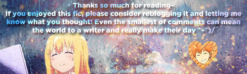
📜 Read more by checking out my masterlist 📜
#bnhasanctuarycollab#rin hiryuu#hiryuu rin#Boku no hero academia#my hero academia#anime#writing#creative writing#writeblr#scenario#scenarios#anime scenarios#anime scenario#fanfiction#fanfic#fanfics#anime fanfic#anime fanfics#reader insert#reader-insert#reader#bnha#mha#one shot#angst#fluff#slice of life#collab
21 notes
·
View notes
Text
Soulmate AU: Jacob Frye x Reader 2/3
Soulmate au Chibi clone: basically when you’ve cross paths with with your soulmate a small chibi of them appears to you, it’s about the size of a guinea pig and won’t leave your side the longer you’re in denial of your feelings or until you’ve met your soulmate again, after which they disappear.
-=-=-=
Jacobs's side of the story
Jacob was grouchy, cold and tired when he finally got back to the hideout all he wanted to do was get out of his clothes and crawl into bed and sleep for like a year! He moaned relief to be off his feet and was about to take his boots off... when he saw something scurry out of sight behind a sweet jar... did the train have a rodent infestation?
No, they would've noticed until now. standing up Jacob started lifting up jars and other knickknacks nothing...He hummed confused wondering if he just imagined the whole thing due to exhaustion? Then he noticed his top-hat on the floor was slowly making it's way around the room, it turned as if realizing he could see it!
Whatever was making it move squeaked and started running, Jacob immediately started chasing it unfortunately whatever had his hat couldn't see what was in front of it and they slammed right into the side Jacob's ottoman hard seemly knocking it out.
Jacob pick the hat up and nearly passed out himself when he pulled a little person out of his hat! he staring a the tiny y/nat thing trying to figure what the hell it was? then he recalled seeing what looked like a tiny Henry running around his sister's room. (no, matter how many times she denied it...) He then thought back to when his grandmother told them about a tiny being called a fairy that would appear resembling your soulmate and follow you around until you encountered them again...
Jacob was stunned that it was true! then he looked down at the little knocked out fae in his hands. He?? at least he thinks it's a male was cute, he won't lie about that! and wondered why people were so private about these faeries? probably a society thing! the rich don't want to be bound by the poor?
He hummed using the back of his index finger to rub the passed out fae's cheek; they woke up and grumbled swatting his finger away...his lips twitched decided to show Evie.. she should still be awake, maybe she can give him a more detailed explanation?
Evie said that there really wasn't much to explain, her brother surprisingly got the gist of it. these fairies were basically fractured manifestations of your bonded one's soul, their supposed is to guide you back to your soulmate should you want to pursue them. "So what I just let him r -" Evie cut him off. "Her." Jacob's brows shot up as he looked at his sister bemused.
"Her? how do you know?" His sister cocked a brow and pointed to the counter where he set the fae down; he glanced over and did a double take when he saw mini-Henry blushing and covering his eyes!
Jacob's fae was now in only a white button-up shirt her y/hc was now down to y/hl and the button's on the shirt were down just enough to show small bust, and that they were indeed female, Henry’s fae immediately tossed a handkerchief over the compromised female who looked around tired and confused.
All while Jacob was in awe at the sudden wardrobe change. "When the hell did she change into that?!" he looked at his sister who shrugged. "I haven't the slightest Idea how they change clothes ...it just happens." Evie sighed tiredly really wanting this meeting to end so she could go to sleep.
"Now is that all you wanted to know, or did you have anything else you'd like to share?" she slurred trying to hold back a yawn her brother shook his head and got up and carefully picked up the little lady off the counter she yelped surprised by the sudden motion and looked up at Jacob clearly wary of him.
The hazel eyed assassin took notice of this and made a point of gaining her trust before convincing her to help him find the woman with his fae double, who the real Jacob might add is one lucky little bastard to sleeping next to the real... his face dropped It just occurred to him has no idea what his soulmates name is! that detail sort escaped him in the excitement. "Oi." the the fae in his hand tensed up at looked at him.
"You don't have to be afraid me, you gotta name?" he asked gently as the y/hc color fae tilted her head Jacob frowned wondering if she could understand English? and winced trying to remember those french lessons his father tried to teach him. "urm...q-Quel est votre nom?" he stammered hoping that was right! Again the fae just stared before making a gesture like she was writing.
Jacob’s eyes widened and set her down on his bed and looked around for her to use be for settling on some ink and paper, he watched the little y/sc woman dip her hand in the ink and used her hand to write, while he got ready for bed. while taking his shirt off he heard her chirp and looked over to see what she'd wrote down.
[Y-O-U-R-N-A-M-E ...L-A-S-T-N-A-M-E] Jacob repeated the name a few times it's was kind of odd... but hey! If that's her name then that's her name! He asked where she lived [Whitechapel.] he frowned knowing exactly what goes on in Whitechapel and though Y/n didn't seem the type to sell her body, looks can be ...He was brought out by Y/n huffing and puffing while stomping her foot; her face was red with embarrassment. [I'M NOT A PROSTITUTE!] was messily slathered on to the paper.
Jacob blanched started apologizing as the tiny woman crossed her arms and humph'd at him. Jacob on the other hand mentally sighed relieved that his soulmate wasn't being used in some brothel. "Well what exactly is your profession?" The assassin pressed the y/hl fae eyed him before writing down [Lampworking.] Jacob cocked his head to the side intrigued that's a word he's never heard before.
"You work on lamps or make lamps?" He asked perplexed as he tried to imagine a woman welding a light-post together or making house lamps... the tiny fae chirped and he looked back the paper [It's Glass smithing for beads, marbles, paperweights...] the hazel eyed assassin hummed impressed marbles have their own blacksmiths?... Huh, go figure.
He took a small box he had stored under his bed it had little gifts and bobbles the children had given him as thanks for saving them, and took a small purple marble out of it this was a test; he had to see this for himself.
"Can you tell me what this is?" He handed Y/n the marble which was the size of a football to her, she scrutinized it giving a serious though as she brought it up to the light letting it shine through the glass as if looking for cracks or impurities and wrote.
[A puple Purie* with an ash-gold swirl, nicely made but not by my shop!] She handed it back to him and Jacob hand her a broken black glass bead with half golden bird on it, the y/hc fae examined it for a few moments and looked stunned the up at him excitedly [I know this, I made this!] Jacob blinked taken aback. "Are you sure?" she nodded pointed at the broken bird.
[See the rook? that's my signature.] the hazel eyed assassin took a breath to process what she had said and almost burst out laughing at coincidence, seriously what are the chances they'd both pick a rook as a symbol? the y/ec fae seem to pick up on his giddiness and wanted to be let in on the joke?
[What's so funny?] She raised an inquisitive brow at him. "Tell me lass have you heard of a gang called the Rooks?.." She shook her head a smirk appeared on Jacob's face oh boy was the little fairy in for wake up call, by the time Jacob had given y/n the run about the Rooks, Blighters and Templars the tiny fae had passed out exhausted.
Jacob carefully cleaned her hands and let her use his cap as a bed, He settled down for night somewhat somber as he stared at the tiny fae knowing he can't out right peruse the real at Y/n at the moment... it was too dangerous right now! and if the Blighters or Starrick figured out he had a soulmate they'd kill her or use her to get to him, Jacob can't let that happen, For both their sakes!
He reached over and carefully readjusted the handkerchief she was using as a blanket then caress her cheek with the back of his index finger then rolled over and drifted off to sleep.
Y/n's side
The following weeks were relatively normal for Y/n would go to the glass-smith she used to take Mini-Jacob/M.J with her (as long as he stayed hidden), however he'd get all jealous and stand offish towards her when one of her friendlier co-workers approached her, particularly the sales girl up in the jewelry store upfront, It was obvious the blond haired woman fancied Y/n.. or rather YM/n act and the other male worker knew this and would often tell their younger co-worker to 'Go for it' despite the Y/n's protests and obvious disinterest towards the woman.
This caused a bit of hostility towards her males started getting ideas that YM/n wasn't interested in women...and was more interested in one of them, Luckily the boss shot them down pretty quickly noticing the fae the y/hc woman had snuck in.
He grabbed him much to M.J's distress and wrapped a rag around him making it look like a dress, then snapped. "Look here ya lazy sods!" they looked over at the old man as he held the protesting fae, luckily it was dark enough in the forge that they couldn't get a good look at the little guy.
"The lad's obviously not interested because he's lookin' for his other half, So butt out!" he huffed as the men stared in awe at for a tick before breaking down into snickering and congratulating Y/n who let out a sigh of relief! That could've ended badly, she nodded at her boss who grunted back at her.
Needless to say that was the last time she brought the fae with her! He'd thrown a fit when she left him at home, but it was for the best! the last thing she wanted was being ganged up on due to a misunderstanding...
It's was another slow day it felt oddly cold despite the forge being on, which should've tipped Y/n off that today wasn't going to end well... But she shrugged it off to just waking up earlier then usual Jacob was oddly excitable this morning she couldn't figure out why?
The fae was literally jumping off her walls with so much energy, it was like a squirrel on caffeine! It also took her a while to realize that he was wearing different clothes! large coat, a green vest and a top-hat! She'd be lying if she said he didn't look good in it, It made him seem more mysterious if anything.
She could hear M.J. squeaking and playing around with that Rook bead he's seems oddly attached to it, maybe she should turn it into a necklace or bracelet? He'd probably like that! The Y/nat woman finished getting dressed and put her jacket and hat on before turning to M.J.. "I'll be back at around noon to check on you alright?" the fae hummed before gesturing for her to come closer.
The y/ht woman blinked and complied and was surprised when the Hazel eyed fae gave her a kiss on the cheek! Y/n's eyes widened her face felt hot/looked like a cherry as she gawked M.J. who gave her cheeky grin as she stammered out a goodbye! and ran across the road!
Unbeknownst to Y/n the story of YM/n finding his soulmate had reached the salesgirl's ears and went crying to her older brother who was a Blighter, she spun him a tale of a shameless womanizer who broke her heart and humiliated her! of course the girl's brother ate it up without hesitation, And decided some revenge was in order, He snuck passed the rooks patrolling the area and into the shop he using his sisters directions he found and sabotaged one of the stations; YM/n's station. of course Y/n didn't know that
...All she remembered was lighting her forge than a flash going off! Her boss later told her how he heard a huge explosion! she was sent flying out of the building and into the back alley adjacent to the shop!
when he got to her she was bleeding pretty heavily from her left eye at least he thinks it was her eye?��and holding her right arm while attempting to get up before letting out this god awful wheeze and went slack! he though she was dead! Apparently so did salesgirl saw the whole thing who being dragged away bystanders.
Started screaming and crying hysterically "I just wanted to scare him! I never wanted This!" Whatever else she was screaming was soon drowned out by the police and rescuers showing up showing up to control the crowed and Y/n was whisked away to a doctor.
All in sight of Jacob's fae who didn't notice he was crying as he dropped his bead...
[A purie is a cheap clear glass colored marble, they come in various colors and names like Blood Rubies, deep sea blues, green ghosts.]
#assassin's creed x reader#assassin's creed syndicate#jacob frye x reader#soulmate au#chibi! Jacob Frye#Chibi! Reader
67 notes
·
View notes
Text
// How I run my blog

SPEED: there are two modes that will get me to reply quickly: excitement and guilt. yes, “rp at your own pace. self-care is important,” yes. BUT. sometimes I feel big guilty of taking “too long” anyway. i also lack self-discipline as a default. it be that poor time management. on a very, very transparent note, I will always give special treatment to kit and sian.
REPLIES: matching length is something I grew out of, it’s called character development. my goal is to provide some sort of pay off for the new info/scene my partner introduced, and then move the scene forward. sometimes you can do all that with fewer words or sometimes you’re in a mental block. which is fine too bc shit happens
STARTERS: since I use this blog more as a “free-form 1x1″ than a true indie, I haven’t really made open starters. maybe I will at some point, don’t ask me to commit to anything. in general, I don’t mind writing the starter for a thread
INBOX: big fan of askbox memes, feel free to send messages IC. spontaneity keeps things spicy. the OOC positivity and “get to know you” asks are cute too
SELECTIVITY: i’m a virgo and I have standards..... but it’s in the vein of “do I think I will have chemistry with you as a writer and with your characters?” to each their own!
WISHLIST: I have a page of rp wishlist stuff on a page if the bulletjournal that I barely use correctly. but the gist is.... demons, ghosts, spoopy! there’s rarely (never?) a time where i’ll turn that down. science-fiction is also a big yes. are we in space? are we made of circuitry? all sexy ideas. historical fantasy??? YEAH. SIGN ME UP. not like.. not like white history or the world war type...
HONEST NOTE: idk how to read and intentionally misuse “sexy.” i’m just here for a gay ol’ time
TAGGED BY: the ever amazing @armsdealing TAGGING: @shcnebrights @writtenarcana
6 notes
·
View notes
Text
a veeeery long list of reactions for ffxiii reminiscence
hope u enjoy @springagainafter lol
Ch 6
noel is the best cat
noel just has to look cool everytime he pops up, jumping from balconies and shit i love him
i like the weird contrast of the way noel and yeul are sitting maybe bc yeul still thinks about her past lives and duties that go along with that
update noel is best cat and best dog
its so sad thinking that even after leaving the old world, noel still feels guilty for killing the goddess — killing many people over that century of waiting for the new world
i require more snow appreciation honestly noel does an excellent job with that — even when he said he didn’t exactly like the guy
why is snow so cool to me now howd i get here
wait why in the fuck does bhunivelze need all the other researchers?? he already got hope. is it cuz this puny god is afraid of another hope rising from one of these researchers?
yeul continues to be great with either life i love all of her
wait so with caius, does that mean he works almost like Etro, where he allows souls to be reborn or? just eternal afterlife
im so glad yeul is living a better life now
Ch 7
im blanking out but what was that connection between serah and vanille? was it just that vanille felt she was responsible for turning serah into a L’Cie?
im glad hope winded up saving vanille and fang honestly
gOD VANILLE WHAT DID WE DO TO DESERVE YOU
G O D BOTH VANILLE AND LIGHTNING — WHAT WONDERFUL WOMEN I LOVE THEM
Ch 8
even before reading, i started internally screaming THIS IS IT
you know what, let me just take time to appreciate every character in this game they’re all so wonderful
coughs aggressively as i continue reading bc i wrote some vent writing that reminded me of this
i’m seriously amazed that hope somehow put up such a front for mankind. hes so strong
i feel really bad for hope seeing he felt like he was lying to humanity — i need to give this man a hug
proceeds to scream when i see the word “rose-colored phantom”
about the rose-colored phantom: well fuck
angry grumble fuckin bhunivelze … really, poor hope
wait so was the manmade cocoon where the ark was or…
also hope’s desperation to just follow the illusion, despite it not being light, makes me really really sad
FUCK ;; EVEN WHEN HE WAS TAKEN AWAY BY BHUNIVELZE HE TRIED TO TELL EVERYONE ABOUT LIGHT’S RETURN THIS GUY
also this brings up a question during lightning returns, so all that time it wasnt actually hope interacting with light then?
i wonder where hope’s conscious went during that time then…. like was he just watching everything behind Bhunivelze, unable to do anything?
Ch 9
honestly, i’m surprised how well written ch 9 is. its really good and kind of thought-provoking.
it also pretty much summarizes the gist of the entire series. in a way. having to fight fate to create your own destiny.
Ch 10
i really wish we could see more of light being open with everyone. i know she does wind up being like that but… i want
god im sobbing over aoede’s wish for light at the end bc same girl…
3 notes
·
View notes
Text
This Place
Mary Maxfield Brave
I’ve changed dramatically because of this place that never insisted I change. This place where it didn’t matter how—or even if—I was sexual gave me sexuality as something I could live. Sex became something I could know about, talk about, do, enjoy and choose. My body became livable. Imagine that.
Sex is not something you talk about. Sex is not something you do. Guys want sex. Guys want sex with girls. Guys do sex to girls, and this sex is called rape. Girls avoid sex, unless they are bad girls. Bad girls are sexy; sexy girls are bad. Girls want guys, but only to kiss them, to hold their hands, to buy them Valentine’s. Girls do not want girls. Girls do not want sex. Girls do not want, period.
Messages like these haunted my head. They lived in my body. I’d known them my whole life, but put into language, they sound strange. I did not hear these words; I felt them, clearly stated in a language of looks. The look when my shirt fell low or my jeans fit tight, when I sang along with a song that talked cherries or fucks. The burning focus, the raised eyebrows, the unstated question: are you asking for it? Are you that girl? I changed the radio station, I pressed my arms over my chest. No, of course not. I only wore this because it’s hot outside. I didn’t realize.
Eyes on me, after, even as they wandered. Dissonance. My dad turning to my brother to talk about the waitress’ legs. The waitress my age. My mom painting larger-than-life canvases of women’s naked bodies, insisting my Tootsie Pop tee (“How many licks does it take?”) was too risqué. Make sense of this. My mind could not. My body found a different language: tensed muscles, desires not just unnamed but unknown.
When I found Scarleteen, I had found my way through if I want girls, does that make me a boy and if I want girls like a boy, does that make me a rapist? – a journey every bit as tortured as it sounds. I had come out as gay, dyed my hair blue, and bought a silver double-woman pendant. Out, I felt lucky. My parents were supportive, mostly. More than many. My dad: relieved he’d never have to meet a boy intent on fucking me. My mom: convinced women were the source of all things good. Me: gay and out and still somehow at a loss. Hair blue and cheeks plum-red.
I dated no one. I crushed on straight girls, from obscene distance. Sex felt like a word in a foreign language, if a foreign language made you want to vomit or self-harm.
At school, I was the face of the LGBTQ organization, advocating for our community on-campus. At meetings, my prudishness was a common joke. You just need to get laid. Sex was something that it seems would happen to me, even here.
My senior year, I got tendonitis in my hand. Two girls, a couple not yet out, approached me in the dining hall, smirking at the sight of my brace. Hurt your hand? they asked, eyebrows raised. Nothing serious, I said. Probably too much texting or something. Sure, they said. Texting. Sex was assumed, incorrectly. We were mismatched from our lives. They were gay and not out and making each other groan with pleasure in their dorm rooms. I was the poster-child of the queer student org, and I had tendonitis from texting. No euphemism needed.
I started to question if I was ace. I told my therapist and he said, I think you have poor self-image. I told my sister and she said, I think you were just raised by our parents. I flashed back to a friend in high school, miming brain surgery on my head: we just need to turn on something called the pituitary gland…
We just need to get you laid.
I felt broken and weird, an oddity among the straights and queers alike. I didn’t know who I was or who to be. I didn’t have poor body image, per se. I had a sense of my body as not my own. It wasn’t better, but it was a different challenge.
There’s a version of this story where I end up being ace, and that’s that. Sexuality is fluid, but it doesn’t have to be. Asexuality is valid. The version of this story that I lived, the one that’s mine, is difficult to tell when it seems like it might undermine that fact. I thought I might be asexual; I’m not. Other people think they might be asexual; they are. If this were a choose your own adventure, asexuality would be a valid ending. My story just took a different turn.
I spend a summer in San Francisco. An ace friend invites me to an event at the Center for Sex and Culture, a celebration of Scarleteen’s ten-year anniversary. I’m a queer activist and gender studies minor, standing in front of a display of vibrators across time. I am equal parts fascinated and overwhelmed. But I attend.
We lounge in overstuffed chairs. People chat; I eavesdrop. Carol Queen is sitting across from me wearing a bondage.com t-shirt. This is an actual thing that happens. My friend introduces himself. People talk about asexuality, and people talk about sex. I watch. I listen.
Carol introduces Heather (the founder of Scarleteen), and says a little about Scarleteen. We all applaud. Heather gives a Q&A about the site, and the difficulties of providing comprehensive, compassionate sex ed to a population people prefer stay uninformed. They joke that sex ed is the only profession where field experience works against you. I could help with that, offers my ace friend, who has no field experience. We all laugh, but Heather’s game. You’d be great at this, they tell him.
Afterward, we stand around chatting. My friend and Heather brainstorm possibilities for ace outreach at Scarleteen. I’m assumed ace by association. I don’t mind. It’s less wrong than the usual assumptions, and better: there’s no edge to it. I’m assumed ace in a sex-positive space where being ace is fine.
I’m assumed fine, unconditionally, for maybe the first time in my life.
The night changes me. How could it not? I go home and write Heather an email, forever more adept with writing than with speech. The gist of it is thank you thank you thank you. I don’t know yet all that I’m saying thank you for.
I start to write about sexuality, asexuality, and all the surrounding terrain.
I write a blog.
I write for Scarleteen.
My name changes as I write. My position changes. I write about questioning, about my gratitude for the ace community in spite of being allo, about being queer. I date, in fits and starts. I buy a vibrator. I take my body back.
Ten years have passed since I found this site. I’ve changed dramatically and not at all. I’m still equally capable of making a double entendre and blushing plum at one.
I’ve changed dramatically because of this place that never insisted I change. This place where it didn’t matter how—or even if—I was sexual gave me sexuality as something I could live. Sex became something I could know about, talk about, do, enjoy and choose. My body became livable. Imagine that.
Imagine that.
Imagine the distance from no sex education to this wealth of it. Imagine sex is something done to you becoming you’re in charge of your choices. Becoming good sex feels good before, during, and after. Becoming nothing about you is wrong.
Nothing is, you know. And what a relief, to have a space that insists on that. To have this haven to inhabit until we can be, ourselves, at home.
scarleteen
20YearsofScarleteen
Queer Sex Ed for All
history
asexuality
ace
community
safe
space
queer
out
identity
self
growth
acceptance
getting through it
growing up
Sexual Identity
Etc
In Your Own Words
from MeetPositives SM Feed 4 http://bit.ly/2GtFl4X via IFTTT
0 notes
Text
Best SEO Onpage & Offpage Infographics
Usability of a website checklist in 2017
I've been thinking a lot lately about my procedure. Experience is a factor that is potent, but it is rare that people sit down and attempt to map out that which we know. Despite the fact that it is part of my offerings that were paid, I Have decided to share this checklist. Several disclaimers: First, I don't claim this list is comprehensive or unique. Jakob Nielsen has a great 113-level checklist in his e-book, Homepage Usability, for instance. That is just my way of organizing what I feel is important while trying to keep it manageable. Second, my usage of terms may differ from yours. I use "usability" in an extremely broad sense, and my use of "accessibility" isn't very industry standard. Do not like it? Write your own checklist ;) Lastly, an advance warning that this post is quite lengthy. Basic Overview The listing is split into 4 roughly equal sections, (I) Accessibility, (II) Id, (I-II) Navigation, and (IV) Content. I'll describe and rationalize all of the sections and line items under, however you can also obtain the checklist as a simple, 1-page PDF. I try to keep it easy with 3 basic ratings: (1) Green Check Always = Good/Move, (2) Red Check = Wants work, but no disaster, (3) Red X = Bad/Fail. Not allpoints are fundamentally relevant to any or all sites.
Font Size/Spacing Is Effortless to Read
Opinions vary on the best dimensions for text, but err on along side it of slightly also too large. Poor raises frustration, and frustration prospects to website abandonment. Also, make sure your line spacing is adequate - white-space is the best buddy of a designer.
Critical Content Is Above The Fold
The "fold" is that imaginary line where the bottom of your display cuts off a page. Content can fall below the fold, but such a thing crucial to comprehending who you are or that which you do (especially on the home-page) should fit on that first display. Screen-resolution that is average these days is depending on your audience.
Ads & Pop-ups Are Unobtrusive
Ads are a truth of lifestyle, but integrate them properly in to your website. Do not try to force adverts and pop ups down peoples' throats. Also, do individuals a favor and make your ads apparent. Should you blur the line between advertisements and content also significantly, your content may suffer.
Navigation Labels Are Clear & Concise
Don't say "Talk Online With Our Group" when "Contact U-S" will work. Your main navigation should be easy for mere mortals, and short, to the stage to grasp.
Number of Buttons/Links Is Reasonable
Psychologists want to argue about how many bits of information we could process, but should you commence to see through 7-or so menu items, believe hard about whether they are needed by you. In the event that you've got 3 layers of Javascript menus that are flyaway, do your-self a favor and start over.
Company Emblem Is Prominently Placed
Put your logo or brand where it really is simple to find, and that usually signifies the upper- left of the screen. It is expected by people, when you make their lives simple and they like it.
Load -time Is Reasonable
Call me old-school, but I nevertheless want to see sites come in less than 100KB (60KB is even better). In case a site requires for ever to load, most folks will just leave. Yes, lots people have broadband now, but that makes our endurance thinner.
Site Search Is Effortless to Access
Make certain it is prominent, in the event there is a site research. Usability recommendations tend to like the the upper-correct corner of the page. Keep the button easy and apparent - "Search" nonetheless is most effective for most sites.
URLs Are Meaningful & Consumer-friendly
This is really a point of some debate, but significant key-word-based URLs are typically great for both lookup engines and visitors. You don't possess to reengineer a whole website just to get URLs, but do what you can to make them helpful and descriptive.
Major Headings Are Obvious & Descriptive
Most individuals don't read online, they skim. Use headings (major and minor) to set content aside and keep it organized. Headings should be clear, and for SEO gain, using heading tags (, , etc.).
Main Duplicate Is Explanatory & Concise
That isn't a lesson in copywriting, but look a T your homepage - can you say the sam-e factor in two as several words? Try to be concrete and descriptive and a void jargon - no one cares if you can "leverage your synergies".
Tagline Makes Company's Purpose Clear
Answer "What would you do?" concisely with a descriptive tag-line. Avoid advertising jargon and boil your worth proposition that is distinctive down to several words. This can be also an advantage for SEO.
Clear Path to Contact Information
Similarly, visitors want to know if they require to, they can get in contact with you. It's also difficult to do if no one can contact you to do business. Preferably, list your con-Tact information as text (perhaps not in a picture) - it will get found by search engines, including local searches.
Links Are Consistent & Simple to Identify
The underlined, link that is blue is a staple of the web. A little artistic license is okay, but consider a-T least making your links possibly blue or underlined. Links should stand out, and you also ought to use them sparingly enough that your content is n't disrupted by them.
Flash & Add-ons Are Used Sparingly
No matter how great your site looks, individuals won't wait FIVE FULL MINUTES minutes for a plugin to load. Use technologies only once your targets are really enhanced by it and sparingly. Sticking to regular HTML/CSS is a plus for lookup engines.
Emphasis (daring, etc.) Is Used Sparingly
It's a reality of human cognition: you will successfully draw attention to nothing and try to attract attention to everything. We've all seen that site, the one with a red, blinking, underlined "NEW!" next to everything. Don't be that guy.
Clear Way To to Organization Information
The good old "About Us" page may possibly seem dull, but confidence is crucial on the web, and people need a simple method to understand more about you.
HTML Page Titles Are Explanatory
More importantly, your page titles (in the tag) should be descriptive, distinctive, and perhaps not jammed full of keywords. Page titles are the first thing search-engine visitors see, and if those titles do not make sense or look spammy, they will move on to the next result.
Home-page Is Digestible In 5 Seconds
We frequently discuss regarding the 5-second rule. There is some disagreement over exactly how many seconds you get, but readers certainly are a fickle bunch, plus they require to get the basic gist of your home-page in just a number of moments.
Adequate Text-to-Background Contrast
Dark-grey on light-grey may seem fashionable, but I'm-not going to damage my eyesight to study your blog. Screens and eyes differ wildly, s O keep your core duplicate contrast high. Good, oldfashioned black-on-white is still best more often than not.
Styles & Shades Are Consistent
Make sure people know they are still on your own site by being consistent - confuse them-and you're going to lose them. Headings layout, and styles should be steady website-extensive, and colours should usually have the sam e meaning. Do not use text that is red, red links on another, and red headers on onepage somewhere else.
Site H As Custom Maybe Not-discovered/404 Page
If your page in your site does not exist, a white page with "4 4 Maybe Not Found" is a good way to lose a consumer. Create a custom 404 page, ideally one that guides your visitors to content.
Company Logo Is Connected To Residence-page
This might sound minor, but people expect logos to hyperlink to home-pages, and confusion follows when they they do not. I have seen video of consumers hitting an emblem over and over, without any idea what things to do next.
Images Have Proper ALT Tags
Not only do sight-impaired visitors use ALT tags, but search engines require them to comprehend your images. This can be especially critical when you use pictures for content that is crucial, for example menu items.
Main Navigation Is Easily Identifiable
Every website on the internet has had a primary menu since the browsers came on the marketplace. Make your main navigation effortless study, to find, and use. Should you've even more or two navigation places, make it clear why they are different.
0 notes